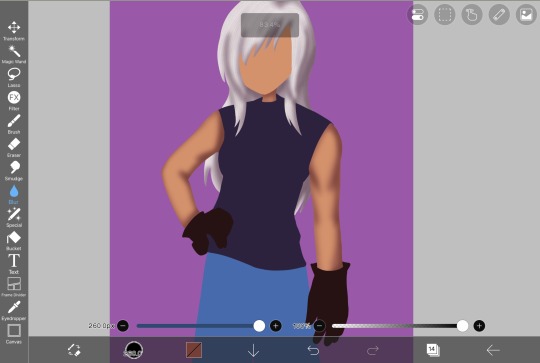
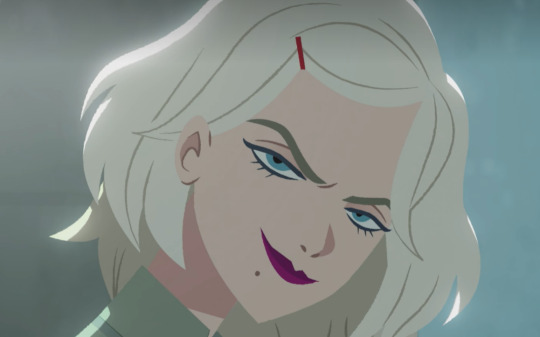
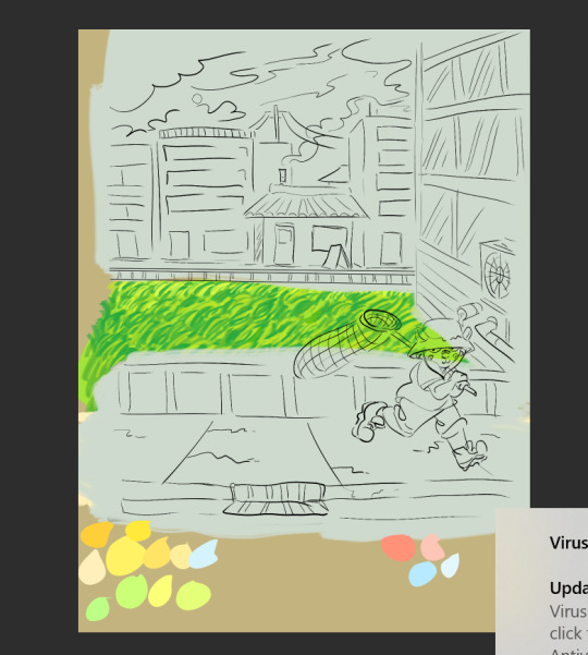
#i need to do more lineless art like this its so fun
Text
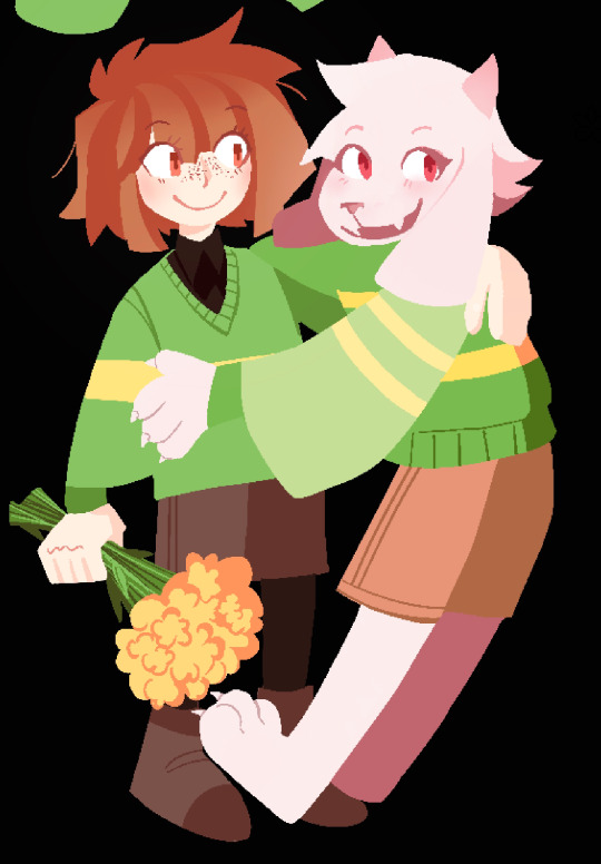

i love you chara and asriel (oh and merry christmas or whatever)
#chara dreemurr#asriel dreemurr#undertale#chara undertale#asriel undertale#.png#i need to do more lineless art like this its so fun#utdr
3K notes
·
View notes
Photo

"This is a message to you, who listens. You must trust me, because we are friends. You just don't know it yet. "
(The Road to PARTIZAN 05 : Ech0 & dusk to midnight)
currently halfway through PARTIZAN (making my way towards palisade extremely slowly. see u guys there in a month or two) & this is to date my favourite intro Austin has done. what an great introduction to an extremely cool character
#Partizan#road to partizan#friends at the table#fatt#gur sevraq#ive been wanting to draw something for that intro ever since i first heard it but i didnt. even know who gur sevraq was at that point.#but its been On My Mind#rosa art#im fairly happy with this i had a lot of fun coming up w the composition. it felt like a puzzle bc i knew what i wanted...#the lineless artstyle is something ive been trying out more and it doesnt come easy but it is fun. (so many layers.....)#you can zoom in for details because. ofthe person i am i always have to add little lines everywhere#well i usually write kind of a lot in the tags but ive been drawing for 5 hours nonstop. my brains kind of wiped.#i havent taken my walk yet so. i will now do that#...usually id listen to more partizan but millenium break is. literally not relaxing and i need to chill a bit#might put on the new bluff.#oh one more thing every time i relisten to that intro i do a little ME? gesture i hear that first line. its fun to me#edit: ok i moved the text slightly it was bothering me !#probably noone else will notice.
552 notes
·
View notes
Text
sorry ive been just dumping art on this blog... but at least im not posting all my wips here
#im this close to posting 4 sailor moon wips lollll#im redrawing that one hq light novel cover#u know the one.#i also have 4 bokuroshou roommate wips. ones fully done. two are being colored. one is like still a rough sketch#i have a couple of kurobas drawings but those might just never be finished#most r studies... i actually have a couple kise and kagami drawings but#studies feel too personal to post. im just learning#i will always post a momoi drawing tho. i enjoyed practicing painting w her!#paintings just so hard. dies. i cant do lineless in my current state#im just really happy to be doing digital art now lol#i love traditional! i really do! its just now i get to do the fun things i always saw digital artists do#i can use color!!! i was never good w mixing colors in painting and now i can just. go plop on color wheel#i still need to learn more and i wish i could take a painting class but#its been so nice to make art again#i actually had a tablet and did krita on my computer like. on and off for several years#but it never felt like i was making art as good as i did w a pencil and paper#the nohebi stageplay selfies were on krita i think that was like my fave and best piece at the time#i just.... havent had the inspiration or time to do art consistently for like two years#and now its here!!! its back!! i love this feeling so much! i missed it!#and even tho i havent drawn much in the past 2 years i still feel like ive improved? or im improving?#and that feeling is so nice...#okay rant over#maybe ill make an art insta or another art sideblog or smth
0 notes
Text

ngl im not like, lineless art specialist, honestly i went lineless fairly recently (like lets say may 2023 when i started drawing art for homestuck), before that i was making art with lineart only, so take my process with a grain of salt lmfao but i hope it clears out some things!
lets dissect the recent dirkkri art ive made:
i start out with sketch, as you usually do. depending on how im feeling or how complex the pose/background is, i make it more or less detailed. for more basic poses i might even stick to a simple gesture drawing and go straight into laying out the colors, it really varies a lot. it might even change in the further process, like how i moved dirks shades from his head to be sticking out slightly from behind his arm, clipped to his shirt, because i didnt like how busy the area around the faces looked
one advice i can give is to not spend too much time on the sketch. its job is to guide the laying out of flat colors and thats it! dont make it too fancy, dont get lost in the details - you can add those later on when youre doing the flats. its fine if the sketch is messy, youll fix it in later stages of the process!
next i do the flat colors! i tackle it one thing at a time - for example with dirks head i started on separate layers with the general shape of his face, then added his facial features, then i drew the hair, then added his neck, the crown, and lastly his piercings. i then merged them all together - you dont need to leave it all separate, best way is to group things together and merge so you dont get lost with all the layers (like how kankris arm on the front is one layer including his sweater sleeve and his hand).
i highly recommend naming your layers - im a little on and off with it myself, but seriously it makes your life easier later on when you spot a mistake and have to shuffle through bazilion layers to find it lmfao, especially when your drawing includes multiple things that overlay on top of each other like in this example. dont be like me and take a second to name them asksks
next to the rendering! i sometimes completely ditch this one, just leaving the flats as they are, but when i want a drawing to have more oomph i have some more steps to the process. its pretty simple - shadow, gradient map and highlight layer on clipping masks connected to the flats. in this one i used light gray for shadows (first layer to generally darken the drawing, second for defining shadows). same with highlights - one color.
the real star of the show is the gradient map, seriously, its a goddamn miracle worker. in krita you can add one by clicking on the plus sign to add a new layer and choose "add filter layer", then in the menu open the "map" category and here should be the option of adding gradient map. you can do it on your flats, but its destructive, and on a separate layer you can always change it if you dont like it later on. mess with the colors and tadah! it now looks fancy as shit and makes people think you know color theory!

last but not least you can add some bleeding light on a separate layer that isnt clipped to the flats to give it more dreamy appearence! i also added an example of how my layers looked in a group at the end of the drawing process.
and thats it! hope it helps, and have fun drawing!
#ask#drawing process#lineless art#art tips#art process#digital art#hope its at least somehow understandable im really sleepy rn#god i hope i didnt make any spelling mistakes LMFAO#artists on tumblr
62 notes
·
View notes
Text
Hellooooo and WELCOME to first art tutorial sponsored by The Horrors ™️ for the more detailed lineless i do :3
This is a long post so im putting it under a readmore
Ok so basically just sketch first. Pretty easy to follow here. The second one doesn’t have to be perfect its just your guideline while coloring


So now its time for the fun part which is COLORING!!!

Turn the opacity down baby!!!!!!!!

Pick a part to outline first. Please do NOT do all your outline on the same layer . Also i advise against putting the coloring layer for the head and the rest of the skin on different layers so you can shade the neck better

Fill in

Same thing for the rest of the coloring. NOW. Shading.
I use the pencil #1 brush on ibis for this. Basically just shade broadly here

BLUR TOOL. Then on a separate layer go a little darker (i use pencil #2 here with a smaller scale) and fill in more specific details.
Blur :3 And that’s what it looks like without the sketch on top!

Then i add hair texture on top and turn the opacity down as much as i like

Okay skin shading!!! This is a little more in depth—still going broad, but you want to have the shading outlined on all of the skin. Only a little on the parts where the light hits it hardest but it needs to be there.

Blur tool yippee anyways you do the second shading here just like the first
So it ends up looking like this
Basically same thing for the rest of the stuff
Highlights!! Lighter color, kinda like reverse shading. Do NOT highlight as hard as done earlier with shading. A little goes a long way here
Change blending mode to add

Blur

Again, similar kind of process with the skin, lines a little more disconnected

Blur <3

Onto the face—i just trace off the sketch (hence why i do face details on a different layer than the rest of it)

It looks like this without the sketch

My FAVORITE PART: the iris. I do 3 shades of darker and 2 shades of lighter with a third as a circle

TAP with the blur tool. If you swipe it moves around the colors and it looks weird


Pretty much the same thing with the retina

Lighting on the eyes in solid white + i forgot to do anything with the gloves
After adding a background and effects, you get this! Yaaaay! Simple tutorial coming soon + i forgot to do lighting on the hair but its similar to everything else <3
@zurxmxru @danishsweethartz
#pretty fly for a white guy#art tutorial#art tut#lineless art#lineless art tutorial#SHOUTOUT to everyone who worked on this . shockingly i didnt have to do allthe worm here#..i meant to say work but i guess worms helped#(ba dum tss)
23 notes
·
View notes
Text
WOOHOO! Let's kick off #csweekly!
I think I'll dump all of my thoughts onto one post as we go along...and I have a lot of thoughts so sorry this is gonna be LONG
Firstly, before I start the episode, AAA I'M SO EXCITED FOR THIS!!! I haven't actually truly rewatched CS in sooo long
Okay, let's go. Why don't we ever talk about the intros? Like the grabbing of the hat and then later that as part of the black and white/red intro sequence? MWAH.
Chase's headlights illuminate spots on the screen when they turn towards the "camera!"
I love this introduction to the entire show. It really makes us feel like we're part of this mystery, investigating this thief with Chase and Julia (until...well...everything gets directly told to us via flashbacks 8 minutes in..). It tells us everything we basically need to know about how Carmen operates in like 30 seconds.
Let's take a moment to appreciate the art style of this show....oh my gosh. The lighting the texturing the lineless agh its so good
I guess I haven't thought about it for a little while, but I guess Chase slamming on the breaks is supposed to fake us out thinking that he has seen Carmen's shadow. It sets up how idiotic of a detective he is, while Julia is observant and actually makes connections. I really like this early (VERY early) setup to how their relationship is going to work. However, at the same time, the show is really gunning for us to root for Julia when she starts infodumping. Chase is clearly the asshole. I can't help but wondering, though, if the show undercuts the importance of Julia's research by IMMEDIATELY cutting away to something "more interesting" (Carmen) as soon as she starts talking. What do you think?
I like how Carmen just shoots out of the alleyway and looks at them for a solid minute. She's just like 👁️👁️ i mean we KNOW it doesn't take her that long to use her grappling hook. She was just watching them
LA FEMME ROGUE
Chase's damage of cars starts at not even 2 minutes into the entire show <3

anyway
CARMEN'S DRAMATIC CHARACTER INTRO MY BELOVED <3
ALSO another shoutout to the SCORE OH MY GOD RELEASE AN OST CS TEAM
when you think about it does player's character intro ever seem a little clumsy to you? ooh yeah its player glad to hear he's on board girl you've known him for years girl. girl. he's always on board.
i love player's robots and machines everywhere <3
YEAH SORRY. SCORE AND ANIMATION AGAIN WHEN SHE'S RUNNING ACROSS THE ROOFTOPS. FRAMED BY THE MOON? OUGH
she's so unnecessary <3 you did not have to swing that grappling hook around like a whip but im so glad you did girlie
i adore how her usb is disguised like a lipstick as if subtlety was ever her thing ever. like when on earth would someone catch her in the full red coat and fedora and then be like "oh ok well there's nothing suspicious here other than the grappling hook, hang glider, and taser so I'll let you go ok

PUT YOUR HANDS IN THE AIR LIKE YOU REALLY DONT CARE ABOUT THIS RANDOM OTHER SIGNAL THAT COULD GET YOU KILLED
OUGH THE LIGHTING WHEN SHE'S DROPPING DOWN FROM THE CEILING
just. just move. you could have just moved out of the way
her hat bending upwards when she's listening against the fake atrium <3
i love carmen's jokes about player being a little internet cave troll do we ever get more of those?? i feel like we don't and I wish we did. their dynamic is so fun when its just the two of them, which is like. never again
sorry. gina's vocal fry when she says "job." that is all
the elevator gag is actually so funny
imagine not taking the stairs 5-9 at a time. chase doesn't skip leg day smh
i love the feeling of suspense this safe cracking gives us paired with chase running up to arrest her. its fun because she gets to show off and have a lot of fun with him. but at the same time, we rarely get this feeling of suspense again when it comes to confrontations- only big boss battles like Coach Brunt, Shadow-san, and cold weather
chase used his whole entire face to ram through that door
the bag tightening is so iconic i can only be grateful that she does it again later on in the show
chase: ive never had one run AT me before
does anyone ever hear the sound that chase's hair makes when it gets slicked back? because it is a SQUISH. his hair is. so saturated with gel that his hair SQUISHES
i like how it takes chase a sec when she's reading his name from the badge I like to think he thinks he's just THAT well known of an agent that she knows him
i also like that he just stands there for a sec after she grapples through the ceiling like shit now what

free him
carmen is funny i will give her that. she can also FLY apparently because she' jumping like 25 feet no problem
the grabbing of her hat as she jumps off backwards and the backwards smirk and the oh my god im so gay ok
also julia. and the horror on chase's face dhfas
dark carmen let carmen be mean, hot, and speak other languages more and that is why i want her to come back please

chase what in the goddamn fuck
ever think about how chase landing on this car right now eventually led to julia joining acme because i do
WHERE IN THE WORLD IS CARMEN SANDIEGO (TITLE CARD) (THEME MUSIC). YES BARK BARK OUGSHDFH BARK
see chase can be smart but like that one tumblr post he can be blindingly intelligent for a minute a day and he does not get to choose when that is
CARMEN CHANGING AS THE TRAIN GOES BY INTO HER CIVILIAN OUTFIT IS SOOO ICONIC
chase continuing to ruin the car as he drives along and keeps failing is the funniest fucking thing. the comedic timing of the airbag.
THE DOUBT ON JULIA'S FACE WHEN CHASE CALLS HER "JULIA" AND COMPLIMENTS HER KILLS ME EVERY TIME
driving aggressively, of course
chase is responsible for 85% of carmen's stupid nicknames on the wiki and i love him for that
i think its half funny and half sad that carmen doesn't do anything to defend herself when gray aims the crackle rod at her. its a trend with people she thinks she can trust: she still sees him as her brother, not someone who would kill her, stun her, etc.
i love the dramatic dropping of the bag just because gray esentially gave her the equivalent electric shock of rubbing a balloon against your hair
something i dislike about carmen's character is that whenever it matters carmen is ALWAYS one step ahead of whoever doing whatever. they couldn't have had us start off by seeing her as flawed but competent, cocky but still human by having gray track her here. it would have immediately set VILE up as a real threat. but instead its just the girlboss badass gray is an idiot moment. idk
i like how they had to do the match cut but they also had to make black sheep excited so they just had blacksheep go >:) and then as soon as coach brunt used her vocal cords she went :D !!!!
why is the program only one year is my question
where does coach get all of the phones to dramatically smash
black sheep, at this time knowing full ass well that she has a contraband phone when brunt smashes one: U👄U
she said SNATCH
gray laughs with all of his teeth out
they gave black sheep insecurities about her past with gray solely so they could show us black sheep having those insecurities about her past with gray to gray by black sheep
google says it takes roughly two hours to go from poitiers to paris by train. just a fun fact
hang on why was carmen going to paris by train? they didn't even have indonesia scheduled until she got there. why didn't she take zack and ivy to poitiers?? why was their rendezvous two hours away?? why didn't ivy have ANY TIME AT ALL TO GET ZACK A SNACK?? WHY DIDN'T ZACK HAVE TIME TO GET A SNACK
the biggest nesting doll has some weird inconsistency with the burn design- sometimes its there, sometimes it isn't. i wonder why carmen never ever brings it up though?
little black sheep is so cute
actually though these are some of my least favorite parts- the big long flashbacks. in my opinion, it would have been interesting to find out about carmen's past as we went along...maybe through ivy or something, or just little tidbits. like we'd get some basic information- that she used to be with VILE- but we would uncover the details with the detectives and her team. idk. little me when i first watched this show was SO confused by the flashbacks but then again my comprehension for shit is SO BAD. i literally had no clue what was going on
that nanny just standing by as carmen smears an entire tube of lipstick on the walls

LITTLE CARMEN IS SO CUTE
its very interesting how they wash out black sheep's hair when she's in VILE spaces to fit with the color schemes that are such a prominent part of this show.
little carmen was also an asshole wheeze

THEY ARE D I V I N G OUT OF THE WAY guess they learned from notyourpants guy

girl i dont think your legs are supposed to do that
why is the captain just putting claws up like what were you going to do maul her
the poor captain got the short end of the stick every single time
carmen stole someone's wedding ring so true
the crop top with the overalls is my FAVORITE outfit of black sheep's omg

carmen, like every single other teenager, drew giant eyeballs on her papers
absolutely incredible that carmen who has at this point pressed a few buttons on a phone once knows how to text and call no problem
player, calling random places: what is your full name and address please. well i know your address but what is your full name
ALSO player's room accumulating all that stuff in the years that go by is so cute
can you imagine. player just usually gives out his real name and the only reason he didn't this time was because carmen had a weird ass name
"thats a thing" HOW DO YOU EVEN KNOW WHAT A HACKER IS
also how does she know what right and wrong is
lets imagine for a second player called some faculty phone line or something and professor maelstrom got this ten year old asking to aid the biggest crime network in the world just because he could and also knew nothing at all
kinda cool that they put in the weird...sewer grate or whatever that carmen later escapes out of in the shot where she's on the beach
maelstrom changes hand positions from when he asks black sheep why she requested an audience (hands clasped with thumbs up and touching) to when he says to enroll (villain steepled fingers) and then he goes back to the first on the wide shot
i admire how organically they introduce the names of all the faculty in this scene
appreciation for "the gurl is fehhahhral"
AND THEN HE GOES BACK TO STEEPLE FINGERS
i enjoy how harsh the lighting is in the faculty room. its just white on the characters
i LOVE rewatching these episodes with the lens of shadowsan's REAL motivations mmmm
i also like how black sheep really thinks about shadowsan's words
MAEL WENT BACK TO THUMBS UP CLASPED HANDS ITS ok whatever
why don't the music notes line up with the faculty raising their hands after two or three sob
where does shadowsan even walk off to. is there a door over there or does he just awkwardly scoot off and through the big doors
what the hell are even in front of black sheep's dorms a tennis court??
also i thought those dorms were where her room was where is she moving from
she tied her whole globe up with rope to walk 100 feet
mime bomb being in the background for all of this <3
i like all of the VILE Class's introductions. EL Topo is kind, Le Chevre is a bit dismissive but courteous, and Tigress is...well she's happy until she says her name and then she's a bitch about everything forever and ever
"but were you seeing things from my point of view" actually what other perspective are you giving him here
get rekt aussie boy
so upset they changed this design. the eyeliner, the fluffy hair, the red hair clip. they're so good. she's so cute. all of the young designs are cute actually
they didn't have to animate sheena's ass swaying like that
he's from australia??? really????
i like how gray was just working the soundboards one day and his pay was so bad that he was like "fuck. yeah man I'm breaking every single law. ever."
where the hell did the black on that sheep origami come from. the paper was white on both sides??
shadowsan has the best damn view on the island look at that
cleo's dress. cleo's voice. cleo's
why do they market as an import/export company if they immediately begin training as thieves. why does "villains international league of evil" matter at all
shadowsan has the only class that uses other students. the rest of the classes are main character only. so sad
my favorite part of carmen sandiego is the way they one moment don't allow the characters to say the word kill but in maelstrom's classroom he has human bones and a whole ass brain on display and then they shoot a man dead
no idea how maelstrom dropped his briefcase so that it landed on the other side of tigress's
also i love how they set up some of the two most used concepts in the entire show here: bait and switch and always protect the face
gray is blind we love him for that. she is holding a phone and gas earbuds in.
where did she get earbuds from
point and laugh
so true of le chevre to kick off the stilts the show should have let him win that one, not bs
the poor captain has gone entirely white-haired from this yearly encounter with a child
rita moreno bee cosplay
el topo's laugh is so genuine <3
what was their detention anyway? sit and talk? come up with codenames? seems more like a reward to me
imagine if gray named himself power failure and everyone called him failure

gray is a giraffe
i love the dig at old witwics with the puns for names jkdsghdsa
le chevre is very comfortable on that pole
mime bomb. that is all
class of vile, after a year of sharing a dorm with mime bomb: who the fuck are you
he's iconic
all of the different teacher rooms are sooo cool i love their designs. and once agains color theory coming through with shadowsan's red room!!!
i also like that students get to take exams with their operative gear, as it plays into how effective they will be in the field. however, what happens if someone doesn't graduate?? what happens to all their specialized gear??
she sacrificed a leg for ass. sad :(
i like how tigress acts like a cat
GET SLAPPED TIGRESS
that scrap of fabric flew SO FAR
that little wink tigress does <3
i like how shadowsan has another coat ready and waiting. who's hurt him in the past. he learned
black sheep no don't walk into the camera wait blacwfhghgfh
gray after black sheep failed so hard that she blew the entire year's worth of schooling: damn girl you're so good. best ever actually
i like how they all have to trace their names over to see if they passed like what are you getting lost on the way
also getting these grades is exactly like seeing who got cast for the school musical
rip to the random background ops who failed
gray's face is actually just D:
the dutch angle dolly zoom is SOOO GOOD
tigress is still a high school mean girl. elementary school, even. the big kid's table. no children allowed
"looks like someone needs to turn in their stealth suit" black sheep she/they confirmed and sheena respects pronouns
"COME ON LET'S GO PLOT A CAPER" that is so funny to me because vile operatives as we see later NEVER, EVER PLOT THEIR OWN CAPERS
why is carmen's nose so tiny
anyway
seeing black sheep look so short next to shadowsan is so sweet considering she's almost as tall as him later <3
"are you accusing a criminal, thievery, and breaking the law teacher of cheating"
mime bomb for goodness sake. i love the animation of his face emerging from the shadows though
HOW DID SHE SNEAK ONTO THAT HELICOPTER I WILL NEVER KNOW
does anyone know whether CS uses 3d elements for some of their bigger objects like cars, helicopters, the vault door etc.
i like how vile school is completely entirely out in the open not disguised at all
gray: bye bye black sheep
black sheep, from the shadows: HAVE YOU ANY WOOL
THE CREDIT MUSIC <3
OKAY so that was my post on the first episode. will they all be this long? who knows. probably. maybe. i'm so excited for this
27 notes
·
View notes
Note
Hey, I adore your artstyle mate, I loveeee all the vivid colors and the fact that most of it lacks lines?? You doing the hard stuff, but it paying off 💜
can I ask, as I’d like to get into comic making, how long does it take you to finish a a single panel?
Hi!! thank you very much!!
drawing lineart is incredibly frustrating to me so im very glad i was able to make the jump to mostly lineless artwork, tho im very much still at the beginning to learn how to do it xD
to answer your question, i .. cant say really, it depends on what is on the panel, and i always jump around when working on a page, i draw half of the very last panel, then jump to another, maybe i see something i want to change right away and work on the third
besides i ... dont know anything about panel composition, i think in movies so i play it and try to pause it on a frame that could work as a panel, whichs is probably why it goes alot slower than normal comics, idk how much to skip gndfjknvgfdjk
im by no means an expert in making comics, you kinda have to find your own way of what works for you, i have done many in the past but all failed, i gave up before getting even one chapter done many times
general advice i can give you is, most importantly, dont wait, i know its daunting to start, but you have to start, even if you dont think you are good enough, you will always change and improve anyway, better start now or you might do it never, and remember, when a page is done its done, i know how tempting it is to go back and redo it, but if you start with that it will only lead to an endless cycle of remaking it over and over
a cause that made me abandon my old projects, was partly lack of support/recognition, but mostly that i was forcing myself to things that werent fun, like one i made in black and white bc i thought you had to do it bc color takes too long, but i live for colors, so it drained the fun out of it immediately
the only "rules" i have set for myself is that its understandable, the flow of the action doesnt flip around too much, speech bubbles are aligned in a way that guides you (of course im not perfect at that either and always learn);
i dont jump between pages, i jump between working on panels, but i dont start another page before the previous is at least acceptable, otherwise id get ahead of myself and get impatient, just wanting to skip ahead and neglect older pages;
and that i only work on a panel/page as long as it has acceptable quality and is fun to draw, when i notice im getting bored or frustrated i finish it quickly as best as i can and move on, otherwise it might drag the entire project down, which is why each panel or page in 'Destiny' varies alot in quality
i can barely look at the first pages .. or even at the last one i made for that matter, but its also fascinating, how much my art changes within even one update which takes me about a month for 4 pages, since i have set my 'fun' rules at least, it used to take much longer
(i wish i was faster, and i could be, but i have a job, and have to look out for my health, both physically and mentally, so i take whatever time i need and draw however much i feel like drawing, no rushing)
my progress so far is that i write a rough script, what happens, what dialog, where it ends, and so on, it doesnt have to sound good, god knows mine are shitty xD but its a good guideline, even if rough!
then i make a rough draft, basic panel layout, dialog (it always changes fro mthe script, again its more liek a guideline than a rule ;) )
then i start with actually drawing the first page, my art and way of .. art and writing changes incredibly fast (idk if its for the better lol) so .. by that point i redraw the rough draft version of the page if i see how it works better, rewrite dialog too, and even cut stuff from the rough draft
im not done with the first chapter (im slow af lol), but wrote the script for the second one when my hand was injured and i couldnt draw for a month, once im done with this chapter i will draw the rough draft for ch2, then write the script for ch3 then go and draw ch2 fully, at least thats the plan
the more time passes the more i know what the next chapters are gonna be, tho i know the important points long before; right now i have the entirety of the first arc sepeareted into chapters, and the end of it all too, but between there its still a lil blurry and im adjusting everytime i think of soemthing better
anyway, sorry for that long ass ramble, its late and i thoguht about this ask bc im trying to get my want to draw back (not feeling well rn nkfdnkd) so i randomly decided to answer it .. probably in the most unhelpful way possible, alot of stuff noone aksed for lol
anyway, sorry, and goodnight uwu
#ganondoodles answers#i hope i didnt sound too preachy#or soemthing#idk im not good at giving advice#..and my way of drawing changes so fast#whenever i explain sth it usualyl changes right afterwards#and man that feels shitty#like im lying to people#:(
34 notes
·
View notes
Text
Writing/Art Update: 10/28/2022
I have been writing this week, it's just been very slow. Sometimes, I write very fluidly and the words just flow forth from my fingertips, and sometimes its a huge effort to extrude out a single sentence and then I'm so tired afterward that I have to go do something else, and this week it's been more of the latter. I know it's not any sort of moral failing, it's just that I didn't have a really good idea of where I was going with this conversation (and diner conversations are keystones of my fanfic, so it is very important, obviously), so there was a lot of feeling my way out and writing things immediately throwing them out again. I always feel very bad to you, my readers, which I get like this, because it feels like ten billion years since I have given you anything (it has been 12 days).
Anyway, I am pretty close at this point (this is Ch 15 of Tattoo AU, I forgot to say that up front). There's a good chance I'll finish it today, but I'm gonna have to let it stew for a bit before I re-read it, because the other problem with writing really slow is that I forget which adverbs I've abused and which body language tics, etc. I also feel like I want to get at least part of the next chapter under my belt, too. But hopefully, next week sometime!
I actually re-read the other tattoo artist AU this week (the fanfic part) and it's so cute and precious, I kinda want to work on it again, but I cannot, I need to space it out a little. Also, I really really need to finish this one before I start on anything else. I feel like once I get through this chapter, I will basically be in the home stretch. Like, maybe 7 more chapters to go? If I could keep up with 1 ch/week, I could get it done by the end of the year, which I was sort of hoping for.
Anyway, I also did a drawing for Ichihime week. Being a lifelong comics/manga fan, I always want to be an artist with strong linework and I always find it kind of surprising and irritating how easy it is to make lineless art look good. I also realized while doing this that I've worked myself into an art place I can make things that look good, but it takes me one milliion years to do so, and it's so tiring and intimidating that I just haven't been bothered. I probably need to do some sort of exercise in drawing things quickly. I've had a post in my drafts with a bunch of night palettes in it for like, 3 months, so I might do a sketch requests thing, with absolutely no promise of any kind of quality? That might be fun.
13 notes
·
View notes
Note
Happy STS!!! Do you ever envision what covers for your WIPs might look like?
oh my GOD i love this question........ i mean honestly i dont know who doesn't think of their potential covers? i'm so torn on what the covers would look like... i love fun patterns but seeing a proper illustrator work with my characters just makes me melt.... OK IM GONNA TRY TO ACTUALLY ANSWER YOUR QUESTION LOL
mmm i think for flowers that mean "we'd miss you".... well its a short story so a very simplistic illustration is probably all it needs? maybe a few lines and colors detailing a few flowers and perhaps a hospital bed!!
in the ataraxis of aftermath has a very lovely aesthetic and setting i think, so a smoother, painted style of the dark flood waters and the smudged train.... oh and the SKY whales in the clouds..... i'm torn between that and whatever is going with the lineless(?) artstyle of AFK Arena game.... just very calming, pale colors!!
the owl's wish is definitely a toss-up haha!! i think a drawing emulating the traditional Japanese paintings could be so pretty, but the tone of the story is a lot... less serious than that? i think you could definitely start edging into a more sort of. children/teen's book look, with more stylized cartoon characters. the best example of this i can think of is the artist Xiao Tong Kong - i like how her art is simultaneously pretty enough for more serious work but also fun and engaging enough for sillier stories??
OH WOW THIS IS GETTING LONG um um ok so ouroboros paradox is definitely on the more mature side of Xiao Tong Kong, but i think a sort of simplistic look with nordic patterns along the edges could also be really cool. personally i like the visual of a red greatsword buried in the ground or the classic image of the ouroboros haha!!!
OK I REALLY WILL STOP NOW THANK YOU FOR ASKING ME I APPRECIATE U!!
#writers#writblr#writers on tumblr#sts#asks#i rambled too much but you really got me thinking aaaaaa#helena rambles
1 note
·
View note
Note
do u use procreate?? what brushes do u use?? sorry for the interrogation i’m just so fascinated with ur art omg
thank u so much anon 🥺🥺 and no worries i can talk about this all day
i use clip studio! for lining my "faux lineless" stuff i use the default pencil brush and sometimes for the blush i use the default watercolour brush (the round one)
other brushes i downloaded from the cloud thingy:
watercolour set: https://assets.clip-studio.com/en-us/detail?id=1682349
fuzzy brush: https://assets.clip-studio.com/en-us/detail?id=1883954
ink pen: https://assets.clip-studio.com/en-us/detail?id=1564809
and here's the drive to the rest of the brushes (made by me/other people): https://drive.google.com/drive/u/0/folders/1s45SKVwvVswNdhfTcq81QbffX3AtH9rB
liner (doodle) brush is modified from this one: https://assets.clip-studio.com/en-us/detail?id=1859688
( explanation on how i use them under cut)
idk if anyone has noticed but i've been recycling the same off-white backdrop LMFAO and i used the "watercolour set" brushes to add the textures to that, sometimes i'll also use for the characters blush thingy as well
i use the "fuzzy brush" as a tone scraper for when i'm shading, normally i'll use a linear burn layer and block in the colour for the shadow and then i'll use transparency with this brush to erase the solid colour (sometimes u need to play around with the brush opacity to get it looking right i feel)

this zelda is literally everywhere rn 😒 sry its the most convenient example basically that's how i get the different values and that gritty texture for the shading yea
the ink pen "墨筆" brushes literally just play around with it and see what u wanna use it for tbh, normally i'm using it for capes that might be 1 solid shape otherwise, so using this brush instead looks more interesting i think
the "liner (doodle)" brush is the one that looks like a doodle marker and it's seriously so fun to use

yeah it's supposed to be a pencil brush idk what i did man
the "texture brush" um. that one is a nightmare bc i made it and how i illustrate is super "trust the process" so if it looks weird that's because it probably is, the short of it is i select a character outline and then use this texture brush to fill in the outline and then clip other colour layers onto that texture brush layer. if u want to change the size of the brush only change the dual brush settings or it's gonna mess everything up 😭. it's literally just more gritty texture stuff all of my art is made out of sand
yea that's it thanks for reading
57 notes
·
View notes
Note
hiii! i really admire your art skills. and the fact that you improved so much in just 6 months is inspiring! do you have any tips on how to improve? i'm 26 and i want to improve but i feel like ive neglected my art for so long and now it's too late. :(
THANK YOU SO SO MUCH OMG ?? oh man i’m so bad with feeling and gratitude but this seriously means more than i can express so i worked really, really hard on narrowing down my best tips! so here’s
Eli’s Top 5 Rules To Be a Totally Cool Awesome Badass Artist In As Long As It’s Going To Take (In Order) :
Most important rule of all is it should be FUN. be disgustingly self indulgent, draw what you want and LOVE, not what you think you should or what everyone else is, or how everyone else is! don’t vibe with doing sketches first? hate lining? despise complicated painting styles? find shortcuts, don’t do them!!! if you’re doing digital maybe draw your sketches traditionally first and scan them/take a photo to draw over, try a lineless style, cel shading, or mixing mediums, the options are endless! this is where your “style” will come from. all “style” is, is an artists shorthand.
You are your only competition. never compare your progress to anyone but your past self, it’s not a race in terms of how good you are at X age after X amount of time spent practicing. i saw it illustrated in this comic a few years ago (that made me cry at the time, because i hadn’t started drawing yet) as seeing your skills as a beautiful potted plant- just because some people are walking around with theirs fully grown and thriving, doesn’t mean your little sprout will stay small forever. just be patient, keep watering it, and eventually, it’ll be a beautiful flower all your own. ❀
Use references Obsessively. this includes tracing! (ethically) there’s a ton of resources out there, redraws of frames from movie or shows are great too! play around with it, try using the perspective but change the style or turn it into a character au for a fandom you love. (this is part of that first tip!) mashing together images past the point of original intelligibility is acceptable as well. the goal isn’t to obsess over accuracy or stop using references altogether though, just to use them differently over time.
Inspiration/motivation won’t be gone forever. don’t force yourself to practice drawing, or you’ll end up resenting it altogether. i’ve had my tablet and pencil since january but i say 6 months bc there were two (almost three) entire months where i had no inspiration and just did Nothing. take time to consume new media for ideas or look at what inspires you instead! keep folders of the things you find most appealing to pull up when you need them. art can be a freeing escape if you allow it to be!
Look at art you admire and think about Why you admire it. why does it look good, what catches your eye most? is it the colors? the lighting? the shapes and perspective? the varied line thicknesses or the overall layout composition? everything can be broken down into components, hone in on the ones you like most and try to emulate them. we’re all just flowing down the stream of shared inspiration together. :)
bonus digital art tip: you will always need more layers than you think you do. give each element its own layer like it’s the most introverted mf you’ve ever met, i swear on everything good in this cursed world you will thank me later. layer/item selection and transform are your best goddamn friends for life.
there’s also a lot of art related posts in this tag and on my art twitter ♡ thank you endlessly again and good luck on your journey!!
#art tips#art advice#anonymous#love me#i just know i'm forgetting sth#and i'll kick myself when i remember later#but i Think that's everything#that's helped me most at least!#i hope it can help you at all#it's never too late ♡
94 notes
·
View notes
Text
I’m doing this for fun simply because I'm rewatching them all so,
Here's my personal ranking for Every Gorillaz Music video, based both on song and the video itself:
(This is going to be a long post)
PHASE ONE:
Tomorrow Comes Today: 7/10. I love this song and the video fits its vibe, but its still pretty simplistic and not a whole lot of actual animation and no story, so it gets points off for that.
Clint Eastwood: 10/10. I love this one honestly. Its still so charming after all this time and showcases the band well for their early days. Love the more moody tone of it, and I always love seeing the band actually play instruments in their videos too. Bonus points for Murdoc's laugh opening this one because I love that.
Rock The House: 9/10. Pure fun. I don't have a lot of commentary for it, I just think its fun and I love the song itself too. One point off for Murdoc thrusting his hips too many times for my eyes tho.
19-2000: 10/10. This one was the first Gorillaz video that I saw and it really is just a nice non plot connected video. The 3D animation still manages to hold up because of its mix with 2D animation in my opinion and I enjoy it.
Rockit: 5/10. I like the song but the video is kinda meh.
PHASE ONE MV'S OVERALL: Overall I like phase one and I miss Del. Bring him back.
PHASE TWO:
Dirty Harry: 8/10. 2D is just vibing so hard in this video and I'm living for it. That’s all that matters. (Side note but I love the version of this video they did for the BRIT's as well.)
DARE: 10/10. Noodles time to shine, a perfect song, what more could you ask for?? (Also love the bit with Murdoc at the end of course.)
Feel Good Inc: 10/10. This one is obvious if you know me at all. Murdoc playing his bass is what sells this one for me cause I enjoy the animation. The songs amazing and one I find comforting to listen to, and the mood of the video fits it perfectly. Theres some really fun shots with lighting while 2D is standing at the window too in the tower in here that I've always liked.
El Mañana: 6/10. I love this song but it makes me sad and so does the video.
PHASE TWO MV'S OVERALL: Phase One is iconic for its art style and for being The Beginning, but Phase Two is my favorite of the two for its art. I love how these videos are animated, and even if Demon Dayz is my least favorite album, the songs in these videos are all very good. Pretty solid as a whole all things considered.
PHASE THREE:
Stylo: 10/10 LISTEN, I KNOW SOME PEOPLE HATE THE CGI, BUT I LOVE IT. It’s so expressive, this song is one of my absolute faves, I’m sorry to be such a Murdoc liker but hes so much fun in this video and so expressive and it starts the story off for Plastic Beach. I love it so much.
On Melancholy Hill: 7/10. It’s not a bad video, and I love the song a lot, but...not a lot actually happens in the video aside from the bits with Noodle. Bonus points however go to just how seamlessly it puts 2D and 3D animation together, and for how cute 2D looks this whole video.
Rhinestone Eyes: 9/10. WOULD BE A 10/10 IF WE’D GOTTEN OFFICIAL ANIMATION FOR IT ;-; (The fan animated video for it tho is Very very good and i applaud that whole team.) Amazing song, this video has the most story packed into it so far from all the other videos and it’s memorable from its storyboards for that alone.
Doncamatic: 10/10 Listen...Listen I know its a one off and it doesn't really have anything in it but I’m obsessed because its one of my favorite Gorillaz songs tbh and I love Daley’s outfit in it so it gets a full pass from it.
PHASE THREE MV’S OVERALL: I love every video this phase tbh, none of them are bad. All of them are fun,and even if Melancholy Hill is a little slow, it’s still enjoyable. I love this phase because they all connect and I know I’m not the only one who feels that way either.
PHASE FOUR:
Hallelujah Money: 7/10. It’s not at all bad, but I’m as not fond of this song, and the video itself is much too trippy for me. Still has its own merits tho that I won’t knock it for even if it’s not my personal taste.
Saturn Barz: 10/10. Everything about this video is amazing. Character designs and as a comeback for the bands animated counterparts, it was perfect. I loved hearing them actually speak again too it made the whole thing so fun. The song is fuckin awesome and it fits the vibe of the whole video. Bonus points for the more lineless animation style they gave everyone in this video, it was a really neat change from past phases. My one complaint is again stop making me see so much naked Murdoc, I may like him but not like that.
Sleeping Powder: 6/10. I am so split when it comes to the mo cap models. This songs good but the video is again too trippy for me.
Strobalite: 9/10. Would have been 10/10 if Russel got to dance with 2D and Noodle, but other than that its pretty damn good. The mo cap looks way less awkward in here, particularly Murdoc and Russel. Also hilarious that Murdoc made a deal with the devil, and the guy who played him is actually his voice actor irl. This songs too much fun to vibe to as well.
PHASE FOUR MV’S OVERALL: Not much for story, but makes up for it in updated art and great music again. Solid overall yet again. I like it.
PHASE FIVE:
Humility: 20/10. Literally every single person I know who’s seen this video loved it. The animation is Beautiful, the song is so fuckin catchy, Jack Black is in it! What more do you want!! (The only thing I could have asked for was to see more of Ace but that’s its only flaw.)
Tranz: 9/10. I love this song so much but this video is Again just a little too trippy for me. However, we get to see Ace just jamming out in this video and I’ll take the trippiness just for that.
PHASE FIVE MV’S OVERALL: I was surprised there wasn't at least one more video for this phase honestly? I feel like Kansas or Souk Eye would have made for great videos for this phase. That aside tho, both the videos it does have are a lot of fun. My literal only complaint is that I wanted to see more of Ace. Bring him back in the future.
PHASE SIX:
Momentary Bliss: 8/10. This songs fine, but what sells it for me is the video is more slice of life/a day in the life of the studio. I’m always a fan of those moments. Bonus points goes to Murdoc trying to fuckin poison Jamie and it backfiring on him.
Désolé: 10/10: ooooh this song is so beautiful...I love it so much. 2D Noodle and Russel got to have such a fun time in this video and they deserve it. And poor Murdoc, having his little sad times by his asshole self. I love him but I think he deserved it. The others needed a good break from the bullshit and I’m glad they got it.
Aries: 6/10. Video itself is kinda boring, but the song is nice. Murdoc deserved to be left behind in Désolé after what he tried to pull here.
Friday the 13th: 3/10. I don’t care for this video and I really don’t care for the song. Not much else to say.
PAC-MAN: 6/10. Video’s fine, I like some of the little details in it, but it’s nothing special. The song itself is nice tho, super calming, I like it.
Strange Timez: 20/20 MY GOD I LOVE THIS ONE SO MUCH...VISUALS ARE SO FUN, I LOVE ROBERT SMITH SO I LOVE HIM IN HERE, ITS JUST A GOOD TIME ALL AROUND!
The Pink Phantom: 5/10 I just don’t really care for this song?? I like Elton John but I couldn’t get myself to like this one no matter how many times I’ve listened. 2D got to be happy in this video tho so I’ll give it a pass.
The Valley of the Pagans: 6/10. This song fuckin slaps but the video feels like a boring redo of 19-2000 except for it’s ending. It gets points for giving everyone Plastic Beach feelings at the end and hyping up the video after it.
The Lost Chord: 20/20. Y’all knew this was coming. This was something I’d BEEN hoping for story wise and I finally got it. Was it maybe a little rushed? Yes. But GOD it was such a nice thing to see them say “hey we’ve wrapped up this part of the story for good and want everyone to move on from it, so we’ve given it a properly acknowledged final send off.” And tangibly seeing everyone's emotions laid out about the island and their times there was very nice. And I know Jamie and Damon have stated Murdoc is irredeemable, blah blah yes I know hes an asshole still, but I WILL think about Murdoc in this video and how he seemed actually regretful and what that means to me and the fact that it was no one else but 2D himself being the one to reach out to Murdoc in the end to save him until my dying breath, thank you very much. And this song?? Fuckin beautiful, it had those Plastic Beach vibes again and felt good for it’s send off song, I love it.
PHASE SIX MV’S OVERALL: I may be a little split on some of them and on Song Machine as a whole, but tbh I love the phase six art style so much and most times the videos were pretty good. Bringing back PB in the end was something I always wanted too so it really does get bonus points from me for that. I’m 50/50 on them overall. The great ones are great, and the meh ones are just kinda boring, so it evens out in the end.
STAND ALONE VIDEOS MENTION:
Do Ya Thing: 10/10. I’ve said before I love the 3D animation and the slice of life stuff, so this one’s obviously a favorite, and you really cant go wrong with an Andre 3000 feature either.
Superfast Jellyfish: 3/10. This song is kinda fun but I don’t give a single shit about the music video.
Garage Palace: 8/10. Very fun pixel visuals for a change along with a killer song, super enjoyable.
So what’s my final verdict on Gorillaz and their long music video history?
Honestly for a group thats been going as long as they have, I dont think they have too many misses in their catalog. The ones that aren’t as fun are just kinda there, but the videos that really stand out stand out far above the ones that don’t hit the mark as well and in the end it all feels like a good balance. No band has a perfect video every time, but the ones that Gorillaz did well they did amazing on and I enjoy it immensely when that happens.
Sidenotes after watching all of those:
For the love of god please put Russel in the videos more, please, he deserves it and I would love to see him more.
On that note, BRING DEL BACK WITH HIM TOO!!
And speaking of characters to bring back, I want Ace to come back and join Murdoc sometimes, even if its only once or twice more, I need to see them interact PLEASE.
Last note but Jamie, please, I’m begging, show less of mostly naked or fully naked of Murdoc in future videos, we’ve had our fill by now.
#can you tell im hyperfixating again??? anyways#kief rambles about gorillaz#gorillaz#this was fun but good lord
19 notes
·
View notes
Text
Sooo, someone on Rewritten Belial wanted to know what I see wrong with mid fight masses. Boy, boy oh boy, where do I fucking start
ANIMATION
My god. My god the animation. The problem for the most part isn't the animation itself (except for the title screen, fuck that, it looks so weirdly floppy and stiff), it's the fact the animations aren't aligned properly. Take one good look at Sarv's sprites in the first 2 songs. Look how often her position shifts. There's seemingly no ground whatsoever for her, her feet get positioned up and down seemingly at random with the notes and it's REALLY frustrating. It isn't even bc of exaggerated poses, Week 4 shows that exaggerated poses can work while still making sense with where the floor is. Sarvente continues to be an offender in that regard with the fact the telephone animation looks EXTREMELY choppy and lacks a lot of inbetween frames, not to mention how stiff it feels.
Ruv is a lesser offender, the only thing that bothers me is how his feet curve down on his idle stance, because, again, That's Not How The Ground Works.
Selever. Dear god. His idle animation is so fucked. He goes 3 steps to the left by standing still. And this is purely an XML issue btw, bc there's a gif in the files with the animation in its raw state and it looks just fine
ART
THE BACKGROUNDS, DON'T GET ME STARTED. They're completely fucking lineless. That's NOT what you do with FNF. In FNF, lineless stuff is the environment, a car, the sun, a house, individual objects that are supposed to be in front or behind of one another are lined, always, and the mod NEVER does this, making everything blend in super hard.
Then there's a problem all the sprites share. They are by no means in FNF's style. FNF's art style consists of a lot of thick lines, big shapes, and a generally very street-like style. MFM does none of that. The lines are thin (with sarvente having completely lineless elements, which you should NEVER do for fnf character sprites unless it's pure black) and look very out of place when put next to every other character. Ruv is, again, the lesser offender, although he's definitely still one.
THE CHARTING
Hell. Hell. HELL. SO MANY NOTES THAT AREN'T EVEN IN THE SONG ITSELF, SUCH AN ABSURD OVERUSE OF TRIPLES AND DOUBLES, because god forbid the player actually has fun doing patterns for fast songs, right?! Gospel is safe in this regard, meanwhile Zavodila. Why. Zavodila could have been perfectly fun and difficult without them. Why did you do this. They're not inherently wrong, you just need to implement them really well and chief this ain't it. Jacks and multis aren't to be abused, ever. Patterns are best, always.
THE MUSIC
Subjectivity zone has been entered. Worship, Parish and Gospel are very subjective and down to taste, personally I ended up only liking Gospel out of the three even if I insist it should be a metal song bc demons are just like that.
Now Zavodila I have an objective complaint about, AND IT'S THE BEST SONG IN THE MOD. This isn't too much about the song on its own, but as an FNF song. Listen to it. Listen to it and tell me Ruv's voice sounds like a voice at all. No. It's just hard bass without a smidge of voice on it. If it was a voice with a filter on it that made it kinda sound like hard bass, fine, Whitty is good for that reason, it's a voice with a filter that makes it sound SIMILAR to an instrument. But when it's JUST an instrument, you've gone overboard. Idk what Selever's song is called but it has the exact same issue.
THE WRITING
ULTIMATE SUBJECTIVITY ZONE ENTERED. PROCEED AT YOUR OWN DISCRETION.
The writing is very lackluster. Everything just kinda happens for the sake of it, there's no background motivator or thing that got BF and GF there against their own will, it just kinda. Happens. And the reveal for Sarv's demon form is VERY lackluster, she just goes "lemme show u a secret actually" and transforms for no reason other than an excuse for a harder song. And to be blatant hornybait btw, I saw the namefiles, this demon form was designed with pure libido and no brain processes. Either way; everything just kinda happens for no reason here. It's not good. It's. Very, very bad.
And then you get into the background lore and it all gets so goddamn confusing because Dokki literally dug up OCs from when she was a kid and tried to bullshit up some backstory for them and it all crashed horribly. Every little fact is thrown in just because, like. She's lucifer but also didn't want to become lucifer and did so on accident?? How? It's never elaborated on? And WHY would she help God, who she hates, to bring people to heaven, what kinda consequence is there to not doing it, why is she being told to do this, and yet she's apparently NOT an actual nun and is just wearing a costume. What the hell is going on there. It's a mess. And Ruv. What's going on with Ruv I actually don't know I just know apparently he has dead nerves that make him unable to smile (which btw THAT'S NOT HOW NERVES WORK THEY'RE SPREAD ACROSS THE BODY AND ARE VERY, VERY LONG, THEY'RE NOT DIRECTLY CONDENSED INTO ANY SPOT AND THEN THEY JUST STOP THEY'RE INTERCONNECTED) and that he "kills for a sense of justice and ends up becoming an antagonist because of it"?? It's all so confusing and it makes 0 sense. They should have been remade from the ground up instead of having been picked up and thrown a buncha shit onto. You don't pick up a rotten piece of meat, slap a buncha sauces on top of it and make it taste good. It's still old, rotten meat, and you should just get fresh meat instead. Same type, new start. Remake, don't rehash.
CONCLUSION
In my sincere opinion? This mod had a TON of potential. You could have done a lot more under more capable hands. On every single end. Writing, charting, art, music to a lesser degree, if it had been done by more capable and experienced people it could have been one of the best mods. But then it wasn't. And it got popular anyways. This. This all is why I'm reclaiming it. Because I see what could have been. How much you could have done with this mod. And I wanted to take a shot at the writing end of things, because that's what I'm most capable of, even if it isn't much. That's why I made Rewritten Belial. And why I hope I did a good job of making something worthwhile with these characters.
ALSO THE DEVS ARE SO ENTITLED HOOOOLY SHIT YOU LITERALLY CANNOT POST RECHARTS ON GAMEBANANA ANYMORE WITHOUT GETTING BANNED BC THEY GET MAD WHEN PEOPLE FIX THEIR HORRIBLE CHARTS. THEY NEVER, EVER ENCOURAGE FAN CONTENT THAT ISN'T SUCKING UP TO THEM AND JUST COPYPASTING WHAT'S ALREADY THERE WITH 0 MODIFICATIONS. MIKEGENO UR THE ONLY DECENT PERSON HERE BLESS YOU
7 notes
·
View notes
Text
the always wonderful shelley @shanheling tagged me to do this thank u so much!! i think that everyone i wanted to tag has already been tagged to do this but if you feel like doing this feel free to consider urself tagged by me!! im putting this under a readmore bc its long and i ramble a lot
the piece i was tagged to explain my process on is this oc piece! unfortunately i have a habit of deleting my original clip studio file once ive finished my art and saved it as a new png file, so i dont have the file to show the sketch and different stages of this piece. but I still can go through my general process and talk about how i did that piece!
1. planning
honestly i think about the art that i want to do a lot, and in this last year or so ive thought about the art i want to do more than ive been able to actually create and finish that art that i want to do. for my planning i tend to do a lot of different thumbnail sketches for the art im thinking of
these are some examples of thumbnails, a lot of times ill do thumbnails just on pencil and paper and with some of these theyre done quickly with my fingers on my phone note function on a day where i was feeling too bad to get up and draw on paper but still wanted to get the thumbnail ideas down. two of these are for the same songxiao piece that i still havent finished and i have more thumbnails digitally on clip studio for the same piece, i do a lot more thumbnails when a piece isnt working the way i want it to and theres times where ill completely scratch a thumbnail or a sketch and start over in order to do more thumbnails because i dont feel happy with some aspect of it.
two of these are small gouche painting thumbnails for two pieces i did maybe a month or so ago, i did the thumbnails and then tried to expand on them digitally and im wanting to do more thumbnail paintings like this in the future because it was fun
for the piece of my oc trio it was based off a series of ask prompts i got for a few different outfit prompt memes i had reblogged, so i based their outfits on the ones in the meme. when im drawing figures i tend to try and get the movement down in the poses when im sketching, i do several rough sketches of the pose before beginning to start setting down lines (if im doing lineart at all because sometimes i dont like doing lineart and do a more lineless painting kind of style). i really try to get my art to convey some kind of emotion, in the oc piece i wanted it to feel fun and like youre seeing three best friends while theyre out on the town having a fun night
2. creating
this is the only real example i have of a piece in the middle of being filled in and created, this piece is one that im really not very happy with & have had lying around for a while and ill probably scrap it and try to come at it from a different perspective at some point. but anyway it still shows what i do, i lay down a kind of neutral gray color underneath my final sketch/lineart if im doing lineart in that piece and then i start picking out the colors that i want for the piece and kind of setting out a pallette for myself. i dont do this color pallette thing 100% of the time but i do it really often, especially if im working on a commission or a larger piece where i know theres going to be a lot of colors or if its a piece where im not sure exactly what color scheme i want so laying out the colors together helps me kind of decide what kind of scheme i want. i am sooooo picky about my colors in my art i am genuinely obsessed with colors in art and there are times where i really have to stop myself from working on something forever just constantly adding more colors or putting little tiny changes and gradients in the colors.
after ive got the colors i want down i tend to try and block out parts of the piece with the base color for that section, and then i start to paint with the colors that i want to go on top of that base color from there.
once im satisfied with the colors/shading/rendering and everything ill go back and look over things and will fix things that look off or sometimes completely redo segments if they dont look right to me. when i was younger and mainly doing digital art using my phone and my fingers i would use a lot of filters and overlays on top of my art once i was done, and honestly im glad to not be doing that anymore because i dont think it made my art look any better. i do color adjustments and sometimes will put on a color overlay or a layer to emphasize the shadows and the light in the piece, but i try to keep those layers to a minimum and like i said before i have a tendency to obsess over the colors and ill spend a good amount of time in the color adjustment tool of clip studio and then ill just decide "actually it looks fine as it is" so yeah!
3. posting
i feel like i dont have a lot to say here gbfm i mean i honestly have a lot of thoughts about the relationship between artists and social media and how social media changes our views on art including our own art and how we can feel like we constantly need to be posting new art and just become content machines churning out new stuff. but ill save that rant for another time. i used to be really concerned about how many notes my art would get when i was younger, and i dont at all blame anyone who still is very concerned about that bc it sucks when u work hard on something youve created and then you dont get a lot of recognition for it, but honestly within the last two years or so i feel like ive begun to have a lot healthier relationship with posting my art. i really just post my art on my art blog, reblog it to my main blog, and then thats that yknow! i do really appreciate any and all support people give me, it means the world to me, but for me having the mentality where i dont need to post all the art i make and i dont need to be posting every day or every week or every month even has been a lot healthier for me because then im not constantly asking myself why didnt this get notes is my art awful??? and yeah i just kind of post it and my brain goes okay were done with that art we gotta make more
ive honestly been struggling a lot with art thru the pandemic and if youre reading this and have been struggling with creating in any way recently or even before the pandemic, please know theres no shame in having trouble creating and it doesnt make you bad at whatever it is u create!
thank you for reading this, feel free to consider urself tagged by me again if u want to do this!! love u all
6 notes
·
View notes
Note
Hi! I need your help..I'm an aspiring artist and I need advice 😅. I have three questions, I hope you could answer them hehe: 1st, how could you draw so good? 2nd, how did you find your art style? And third, do you have any advice for aspiring artists? Thank you :)
hello, hello! 1st of all, tysm, youre too sweet! 2nd- apologies if my answer is unsatisfying, but its one youll hear the most from artists whenever you ask questions like this... the answer being: lots and lots of time and practice! the more you draw, the more you pick up certain habits, which will inevitably become part of your style (whether you like it or not, haha :'D) if you wanna find a style to draw in, just find art that inspires you; try to understand what is it that you like about the style and then try to implement that into yours! sometimes you wont even have to think about it, your brain might just pick up some quirks that are appealing to it on its own
like i already mentioned, ive been drawing since i was a toddler, so my style evolved and grew alongside me. though i wouldnt say i have one singular art style at the moment! yknow, id stick to one (1) for the longest time (a clean lineless style, can barely stomach drawing in it now), to the point where art became this boring routine to me... but, like, a year or so ago i started experimenting w/ different styles and techniques again and i think it reignited a passion in me?? i think my art started to improve drastically bc of this, too!
point is-- my advice to any aspiring artists is: just try to have fun! dont be afraid to experiment and get out of your comfort zone. and dont worry too much about finding "the right" art style or whatever. in fact, i encourage you to try drawing in multiple styles and then sticking to the ones most appealing to you!
14 notes
·
View notes
Photo
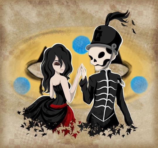
I will be with You
When you go, just know that I will remember you
If living was the hardest part, we'll then one day be together
And in the end we'll fall apart, just as the leaves change in color
And then I will be with you, I will be there one last time now
--My Chemical Romance, "It's Not a Fashion Statement, it's a Deathwish"
____
It's rare that I'm this proud of an artwork I've created. ^_^
Usually, there's some glaring issue or just an assortment of small things I'd still change if I had the patience and/or artistic ability to do it. Or even just some things that I feel like could've been done better, even if I know it did the best I could.
This time? No. Not right now, shortly after it's been completed, anyway. I'm sure years down the line from now I'll look back and feel at least slightly different. But as it stands now, while I'm sure it has its faults, I am truly happy and truly proud of what I've created here and whatever faults are there aren't bothering me at all.
So what then is this, exactly?
This my dear Sparklers is a visual love letter to the band I discovered just a little too late but was still there for me when no one else was all the same.
Earlier this month, I uploaded a different piece of art to celebrate the announcement of My Chemical Romance's Return, but even when I uploaded that one I was already thinking of doing another one, this time something that was more obviously fan art. But not just fan art as I've done for them in the past (Exhibit A, Exhibit B, and Exhibit C), but something extra-special and fun. I really did go into creating this wanting it to be as I described it above; a visual love letter to this band that I love so much and could not be happier that they're back.
As such, I've squeezed in as many references as I could:
1. The female figure is molded after Helena from the album Three Cheers for Sweet Revenge
2. The male/skeleton figure is supposed to be Pepe (that's what Google said his name was, anyway), the icon and seemingly marching band conductor from The Black Parade album
3. On Pepe's hat, I replaced the usual symbol with the Candle symbol that's been featured in the band's Return artwork
4. They fade into leaves based on the line from It's Not a Fashion Statement, It's a Deathwish (a song from Three Cheers) that I quoted at the top of the description
5. behind them is Party Poison's mask, as featured in the Danger Days music videos
6. on the mask, I replaced one of the black triangle shapes with the hanging man silhouette from I Brought You My Bullets, You Brought Me Your Love
7. The rest of the background is inspired by the covers for the Conventional Weapons releases (which in my mind I count as essentially an unofficial fifth album)
(Debatable) 8. Their touching hands could be an indirect reference to the line "And as we're touching hands, and as we're falling down" from Demolition Lovers, a song from Bullets.
That's at least one reference each (Three Cheers technically got two) for each of the main releases, plus one directly related to this new era we don't know much about yet. It's not an exhaustive "spot the reference" game, but I'm glad I was able to incorporate as many as I did.
Now that I've explained them, maybe I can talk about my process without having to stop to re-explain each reference as they come up.
After some brainstorming, I got this image in my head of Helena and Pepe in this pose (inspired at least partially by this pre-existing fanart I've seen many times before) , which to me is a "renaissance dancing" pose but I'm sure there's some other better way to describe it I haven't thought of. I tried for a very long time to find a reference image of this exact pose to help me get the proportions and general anatomy right within my own stylization, but for the life of me, I couldn't find anything close enough to suit me and I really didn't want to have to settle for something else. As such, I'm sure the proportions and anatomy are off, but even so, I think I did pretty good considering.
The main issues I ran into during sketching were mainly balancing the energy between the two characters--which I do think I managed in the end--Helena's skirt, as she's supposed to be holding onto it with that hand you can't see, and Pepe's torso. Originally, I was planning on doing this piece traditionally, but once the sketch was finished it almost immediately clicked into place that I'd be better served to do it digitally, considering what I wanted to do with the mask in the background already, as well as the leaf-fade. (The Conventional Weapons reference hadn't been planned yet, and it was technically only made possible later on by this piece being digital.)
Luckily, doing things digitally meant that Pepe's torso was fixed pretty easily. It was too thin in the sketch, but all I had to do was select the right lines and move them out a bit in Photoshop. He's still a bit thin and not super buff, but personally I'm letting that go because...I mean, he's at least part if not all skeleton. If anyone's going to be too thin, wouldn't it make sense that it's him?
Helena's skirt I did end up happy within the sketch but...we'll come back to the skirt in a moment.
Pepe's...face? looked a bit odd in the sketch, but other than that, once I was happy with that foundation, I scanned it in and got to work on digitizing everything.
I went over my lines for Helena and Pepe the way I normally would for something like this if a little intentionally messy instead of trying to get them super clean--as I thought that might be appropriate here--and then I paused with them to work on the mask behind them.
The mask admittedly came out very poorly in the sketch, just because I bothered to look up no references for it whatsoever once I decided I was going to make this digital and I knew I could just draw half of it and flip it over. And I'm glad I didn't start trying to follow my sketch lines for it at all because looking up actual references showed me that would've been way off.
While I had my reference up, I ended up going in and basically full-coloring and detailing the mask right then. That's the beauty of digital work; a lot of steps can be done basically out of order from how you'd have to do them traditionally and it doesn't matter because you can just move layers around and adjust effects later.
I went with this pseudo-soft shading based on the colors and shadows I was seeing in my references, even though I wasn't sure yet exactly how I was going to shade Helena and Pepe. I figured that even if I used a different method for them that I could either go back and adjust the mask as necessary or that it wouldn't matter since the mask was part of the background anyway.
Once that was done, I went back to ponder my two figures and the leaf effect that I wanted to do with them.
And again, I went a little out of order here, as I ended up filling in the silhouette of Helena and Pepe with a blanket layer of gray so I could see how them blocking the mask was going to look (and I figured based on past experiences I might need the blanket layer in white later). From there, I went into working on the fading-to-leaves effect. My logic was that I'd need mostly the silhouettes of the leaves and then I'd get what I wanted after playing with layer effects or something. This assumption ended up being correct, but we're not there yet.
As I worked, I kept looking at my "finished" messy lines. Something just didn't feel right.
Honestly, I couldn't tell you where the idea to do this lineless look came from, but it got in my head as I was working and I kept looking at the lines I had and not being happy to just color those in as I normally would, shade it, and call it a day.
I tried. I tried really hard to ignore the urge to at least try it and carry on as I was. I'd already come this far, and I'd be done so much faster if I stuck to the plan...But!!
Clearly I lost that argument with myself.
You know what though? I'm glad I did!
I don't think I've ever done lineless art like this before, not counting my watercolor work where that's just part of the process to me. But digital? Certainly not. Human figures? Also no.
I've come close in the sense that I've shaded my art before, turned off the line layers before, and thought, "oh hey that almost works without the lines because of the shading," but not much farther than that.
Naturally, I wasn't even sure how or where to begin, so I went with what came naturally to me. I started by just filling in the lines as I normally would have, and then I went back layer by layer and went back and forth between having the line layer (with the opacity brought down somewhat already so I could sort of see what I was doing) on and off to try and balance the shapes between what they looked like with and without the lines. It's weird because if you ever try this, it's a little like having to figure out a bunch of individual silhouettes that make one whole one, except you need them to be a little more defined if you want them to make visual sense.
That step and the next one, the shading, are tied in my mind for which one took me the longest.
For the shading, I really just went in blind, using hard-edge cell shading, though originally I planning to come back with some soft shading in certain areas later. The soft shading ended up not happening partly because I liked it much better than I thought I would without it, and I thought the hard-edge shading made the figures pop a little more compared to the background. The thing about this was the same issue I run into with my lines nowadays; to get smooth shapes I spend a while going back and forth between putting color down and erasing it, and sometimes undoing and redoing the same line a dozen times to get it right in one stroke. But that's really my own fault for being stubborn and trying to work solely within Photoshop and not use other programs, as I know good and well I'd have less of that issue if I'd hop into Paint Tool Sai and use the linework layers in there.
What can I say? I live up to my Capricorn sign by being as stubborn as a goat.
Anyway. The biggest challenge to figure out the shading for was Helena's skirt. I think I would've still had issues with that though even if I colored and shaded my normal way, with the lines and everything. It's just the position it's in that complicates things.
I actually did a good amount of shading in reverse here, where I'd make the base layer the shadow color and then the layer on top would be the regular color, as in some cases it just seemed easier to do that than the other way around. The part of Helena's dress around the top, for example. Or Pepe's pants (what little you can see of them).
Additionally, I ended up leaving the feather attached to Pepe's hat alone and not really smoothing it out, as I thought the roughness and inconsistencies worked really well to make it seem more feathery.
With enough patience and persistence and much back and forth among the various layers, I made it through all of that. I was a little concerned at first about some of my color choices and if the shading was too harsh in some places or not, but I mellowed out as I worked and ended up not making make adjustments after the fact. For instance, originally I thought I'd go back and make Pepe's...skin? closer to a true white and this fleshy off-white color was more of a placeholder, but the longer I worked with it, the more I didn't want to change it. It actually makes sense, given that his hands are normal (as they are presented in official artwork and other fan art not made by me) and that bones usually are naturally more of an off-white color. And I also think it just looks really good next to Helena's pale skin.
The hands were a special challenge in regards to both shading and coloring, as hands like to be the more complicated part of a drawing more often than not, but even that I managed to get through with a lot more ease than I would've bet on.
The other thing about that is that I was surprised once I got through the steps at how much better Pepe's face looked in comparison to the rest of the drawing. As I mentioned before, it looked odd in the sketch. But one I had most of the colors for him and Helena filled in digitally, the contrast or something just made it look infinitely better. (Combined with a hefty dose of earlier back-and-forth making adjustments to his jawbone area.)
Originally, I thought I might use the same cell shading for Helena's eyeshadow. However, while I was still thinking of adding some selective soft shading, I added it using one of the brushes I'd used on the mask earlier. It looked so good to me that even after I tried added the soft shading with it like I planned and decided I didn't want/need it anywhere else, I kept it.
And for the record, Helena's hair is kind of the wrong texture (it's officially more straight than this) and she's missing this little netted veil thing she's supposed to have, but I had a very specific vision in mind, so those were the two creative liberties I took with her design. I say it's fair game since I took a liberty with Pepe's hat to get the Return reference in. And besides, those two details being off doesn't make her totally unrecognizable if you know who Helena is in the first place.
Once they were done, I spent longer than I bothered to document playing with the leaf layer I'd made earlier to try and figure out how to get the effect I wanted.
Sparing you the boring details of my trial error, as I'm sure this description will be long enough without them, I eventually determined the best thing to do was to have one layer of the leaves on top set as an "overlay" layer, and another behind/beneath Helena and Pepe. Then I went back and extended my color and shading layers to extend down over the leaves, and I arranged and clipped the layers accordingly. Technically, the overlay layer wasn't necessary, but it added a little extra dimension that I really liked.
By that point, it was my second day of working digitally and getting late, but I had to do one more thing before I could go to bed with my mind at ease that night.
With Helena and Pepe done, I turned the mask back on (I'd turned it off so I could focus on them without it distracting me or otherwise getting in the way) and I felt like they weren't standing out enough against it. The bright yellow color was competing too much for my eyes' attention.
So, after trying the "stroke" blending option in white and that looking God-awful, I added a new layer between them and the mask and manually gave them a white outline.
It wasn't a perfect solution, and I knew that even then, but it was enough that I could sleep soundly knowing how far I'd gotten with the artwork.
The next day I had to take a break from working on this to bust out a painting for the challenge I decided to take on this month, but I went back to this as soon as I could after that was taken care of.
When I came back to it, I acknowledged that I technically could've left it as it was and call it finished. But I still didn't like how obnoxious the mask seemed for a background piece and it felt...I don't know. Almost hollow, in a way. It was a cool graphic, sure, but I wanting something more than that.
Again, I'll spare you most of the nitty-gritty details. But long story short, I played around with layer effects and filters for a while until I had blurred the mask out just enough that it wasn't so obnoxious but also so looking at it directly didn't make me nauseous, and the edges were softened so it felt more like a true background piece and not just an accessory that had been plastered carelessly back there.
It was only after I started saving off versions with different backgrounds--one with no background, one with white, one with black--that I realized I was missing a golden (semi pun intended) opportunity to incorporate a Conventional Weapons reference/allusion. Which was exciting because I'd previously been disappointed that I couldn't think of a good way to do that.
I went back and forth on layer styles and adding texture with brushes and things for a while on that too, but you can see what I ultimately settled on. It's not a 1:1 to the CW covers, but I'm really pleased with it anyway.
I did end up adding a bit more to the white outline in a few places and adding a drop shadow to Helena and Pepe so they'd pop a bit more (it almost makes them look like paper cutouts to me!), but really the only other thing I had to do after that was add my watermark.
It took roughly 3 days of work from start to finish, but I was honestly surprised by how fairly smooth the process went. Especially considering the new things I'd tried along the way. I can only assume it's because of just how much my heart was really into making this piece.
As I said before, I am truly proud of how this piece turned out. I love it. I love it, and I love the band that inspired its creation. Even the title says a lot here, I think. I picked this line that's repeated at the end of It's Not a Fashion Statement, It's a Deathwish, as it was a leading inspiration with the leaves and everything, and after looking at the lyrics I realized how fitting that line is for this.
I discovered My Chemical Romance two years too late, two years after they broke up in 2013, but I've stuck by them ever since, and I will continue to do so, with whatever the unwritten future holds. They've changed, as anyone would over the course of six years, but they came back anyway. Even if it's just for a few shows and they're gone again. Or if it's going to be so much more than that. They. Came. Back. And that's not an easy thing to do a lot of the time.
And so, I show my solidarity. I will be with you, MCR, no matter what comes next. You were there for me, and now it's my turn to be there for you, even if it as just another fan among the crowd.
And that's really all I have to say on the matter.
____
Artwork © me, MysticSparkleWings
____
Where to find me & my artwork:
My Website | Commission Info + Prices | Ko-Fi | dA Print Shop | RedBubble | Twitter | Tumblr | Instagram
#mcrmy#mychemicalromance#mcr#helena#the black parade#three cheers for sweet revenge#danger days#thetruelivesofthefabulouskilljoys#killjoys make some noise#conventional weapons#return
2 notes
·
View notes
Last Seen Blogs

chewyteea
💀💀💀

fjfjdmjfkf
제목 없음
scalierpepper
gremlin with a pencil
theorderofrodentia
enjoyer of fuzzy little guys and bugs