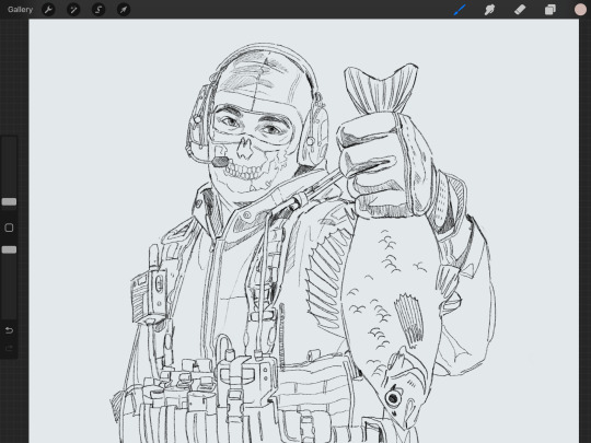
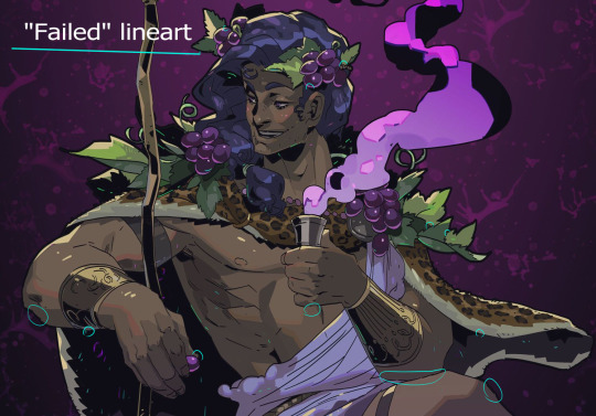
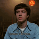
#look at me coloring lineart like some kind of artist
Text
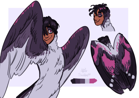


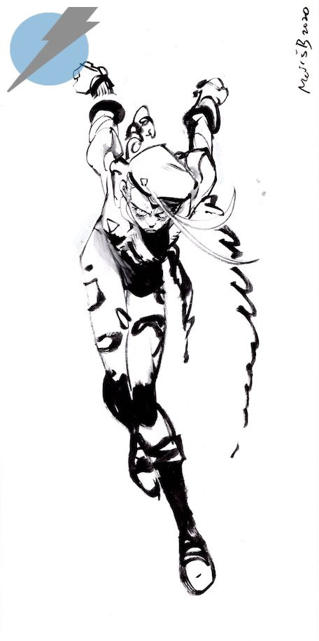
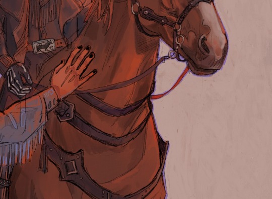
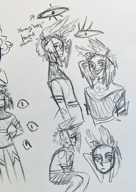
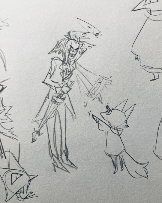
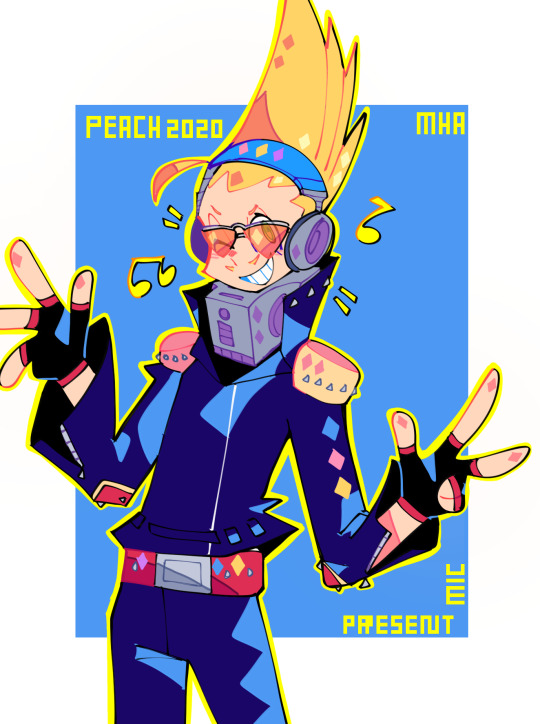
wallcreeper amaya (+ one gen)
#artists on tumblr#my art#my ocs#lidkaer#havent fully decided if she's a harpy or a siren. keep trying to find differences in abilites but cant really. probably will be siren cause#i feel it give more the idea of being able to do cool stuff with you voice. which is smth she can do. (jay & imri also are sirens. differen#kind of birds for each. jay is not a jay).#colored the last too rn. but lineart was from months ago. first one is from maybe ferbruary or around there i think. moved some filesaround#it wont let me know the og dates for older stuff#shes a wallcreeper because gen's a spider and i thought it was great to have her be a lil bird that looks like a butterfly.
78 notes
·
View notes
Text
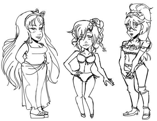
practiced with shapes + drawing bodies
#danganronpa despair time#drdt#arei nageishi#teruko tawaki#hu jing#(not sure if i should color and/or do lineart???? if anyone wants me to then ill be fine with doing that later)#i do like implying visible shapes into my art. even though a lot of times its subtle (i think. though it depends on who im drawing)#i dont do shapes (and shape language) to an extreme like some of my favorite artists. i dont think id be able to pull that off#esp shape language because idk its kind of limiting to me#i decided to draw the girls in bikinis so then itll be more easy to see what their body looks like (ESP hu)#of course teruko's looking all cute and stuff bc she likes cute stuff <3. it was a perfect time to draw her lookin cute#its the worse time of the year to draw characters in bikinis like its literally fall now /j anyways#reason for me drawing them for practice: hu because she's plus size. arei bc shes skinny with more ROUNDED shapes.#and teruko because shes skinny (more closer to average-size?) but with SHARPER shapes.#the whole point was me practicing with round and sharper shapes so since i had been planned what shapes i wanted to use in their designs#these three were perfect for practicing!!!#im still kinda shock that arei is about 5'7...
10 notes
·
View notes
Text
this drawing is gonna be the end of me oh my god
#i have restarted this drawing bc i didn’t like it that much at first#rn i love how it’s looking but. lineart#for some reason i cant do short repetitive movements because it overwhelms me ????#and i have to do them for the lineart bc i’m just kind of going over the lines many times#and i just keep getting overwhelmed and having to step back from the drawing#aaaghhfjekfkek#i am close to finishing the lineart tho. I CANT WAIT TO GET TO THE COLORING PART#i think i’m gonna leave it on flat colors bc it’s comic style#so yeah… there’s a deadline for this drawing so i better get BACK#BYE!!!!#mars rambles 🪸#not art but art related#digital artist#digital artist struggles#idk if anyone else struggles with this#AND IF SOMEONE DOES PLS TELL ME HOW TO STOP IT 🛐
0 notes
Note
sorry if this has been asked before, but i wanted to ask about your lineart! the weight and line economy are just so nice, i get stars in my eyes looking at your lineart and doodles. could i ask what your approach to lineart is and what tips you might offer?

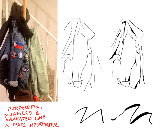
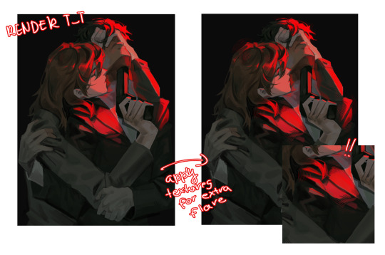
Wow I love these questions - Line is so interesting!!! It's a really big topic so I feel like any tips I give will be just barely scratching the surface. It's like deceptively simple...any given line drawing is essentially taking all the information we glean from seeing something irl ie light, shadow, dimension, texture, perspective, etc and boiling it down to the simplest possible visual information.
I think most commonly my line is informed by light source so like. thicker more continuous lines face away from the light and thinner more broken lines towards. and a lot of my spot blacks r simply cast shadows.

here's a more extreme example

BUT like everything to do with art there's no hard and fast rules. I use blacks when I think it'll be effective or interesting and I leave them out when I don't need em. umm couple things I find myself doing a lot... using spot blacks to make the separation between characters clearer. I like casting shadow in between characters so its easy to separate and read their silhouettes even when they're mashed together.

u can go even further to purposely create a silhouette like

to draw attention to a finger or tongue LOL. There's some comic book artists who are absolute masters at this type of stylization. Alex toth and his spiritual successor Chris samnee come to mind for me right away.
(toth)
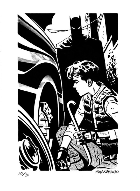
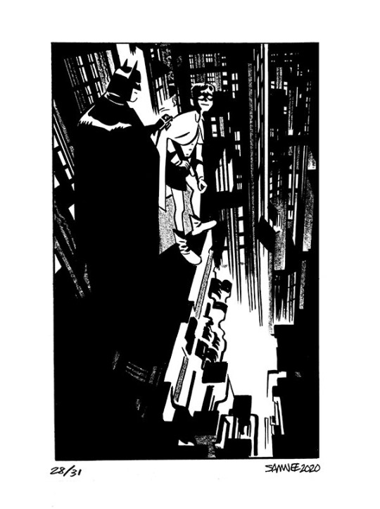
(samnee)
I feel like I'm also often using line weight to separate planes receding in space

im naturally a really heavy handed and scribbly drawer(...?) draftsman. and im nearsighted so when i see things i percieve and break it down into big shapes over thin contours. so stuff like spot blacks and shadows came easy to me, the tricky part was making the rest of the lines lighter when they needed to be so the blacks could actually have impact LOLL. a lot of effective visual communication is about balancing contrasts. like I had to really train myself to press less hard on the pen. I think this is actually really evident if u go back in my archive to older sketches LOL


I actually feel like a lot of how I trained my hand to tackle line weights was thru stuff like hand lettering where you rly have to focus on being sensitive to that kind of thing.. contrasting strokes etc.

also exercises like figure drawing will have you flexing those muscles constantly

I'm starting to just regurgitate lessons from freshman year of art school so I'll stop here with the demos but yeah...I hope this was helpful!? I love line!!! I want to get even better at line work so I can feel confident posting work that's only line no color or value... I'll leave you with a bunch of artists who I think have particularly expressive and beautiful linework (not including toth and samnee who I already mentioned and who's work I love so much). You can probably learn much more from them than you can from me...!

Charles dana gibson LOL


Matias bergara
tonci zonjic

naoki urasawa

Daniel warren johnson


shiyoon kim

michel breton
also yoji shinkawa, tomer hanuka, leo romero, I feel like I'm gonna post this and think of so many more. there's so many good artists...!
1K notes
·
View notes
Note
have u ever talked anywhere about your coloring or composition processes? u are honestly one of my favorite artists and i would love to hear any insight on how you make pieces 💓
wahh thank you TTT !!! I did sorta give a very simplistic answer here but it was more of my simpler sketchy style so lemme redo that, ill try to be consise and make this understandable ?? its a bit hard cuz it honest to god depends on what Kind of piece im even drawing, cuz for some i go the whole length of doing lineart flats and all that, others i just just fuck around untill it looks right?
i do usually start with a rough sketch or colour draft, especially with more compley pieces this helps with figuring out the feel, honestly i should spend more time drafting properly, figuring out poses and such but im so lazy i just go w the first thing that looks good
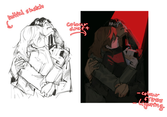
then just lines over the colour draft, fixing lots of anatomy and proportion stuff, and depending on how i wanna do the colours ill either keep the colour layers or merge them together and have the edited colours as the base colour (this might not even make sense help)
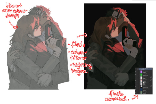
see this piece at the time gave me an insane ammount of trouble with lighting and colours, so after trying to render i ended up merging everything together....which i dont USUALLY do but the rendering is pretty similar except usually i have colours be seperated by layer,
ANYWAYS sadly i dont have a process on how it got from flats to this specific render for this piece...but i still followed my initial drafts/plans with vibe and colours and just painted over it, its why i make it after all!
but honestly a lot of times its just very simple colours and just trying to mainting good contrast and values !!!! and THEN fucking around with colours and rextures, for other pieces i kinda just paint as i go? i have this timelapse of my justice piece that may be a bit more help!
it includes the initial colour draft, the cleanup/lining process, flats, rendering, and all that so its probs the most accurate timelapse of my morecomplex work processes, with stuff that doesnt include heavier backgrounds, which is a whole OTHER topic honestly
im sorry if i cant explain it more cohesively, i genuinely barely know what im doing most times and go by muscle memory and stuff i Know but cant. Explain? like i know how light and folds work since i observed and studied them but i cannot put it into words at all )--)0
my brushes also contribute a lot to how i render and colour, depending on what i use, you can find the swatches for them here !
133 notes
·
View notes
Note
I love your art style so much. 😅
Do you have any tips for coloring/shading or just tips to draw bodies (I can't do any without them being weird) ??
Have a nice day, :)
I’m glad sweetie
And of course I can give some tip I use!
I have to say I have many ways of shading and lighting so I will share my usual and then add some new one I have been experimenting
First: don’t do shadow on multiply ,that’s for later, shadows and lights are made on a mask layer and they are not just the darker shade of the colors, but a different color entirely
Same with lighting.
Some colors are easier than others for me tbh, like I love shading red and purple but blue not that much.

I also usually put blue everywhere cuz it looks pretty but it’s on me honestly
(Obviously I decrease the opacity of some layers, there is not really a rule, I just go as I like)
If it’s a style choice I also do shadow in light blue multiply, but just if I am in a rush or working with flat colors
Second: choose how you want to smooth your shading and light.
Over the years I picked up my own way to do it but lately I have been a little experimenting.
Anyway i always start of with defining shadows then get to smoothing, it’s tempting but I don’t advise the use of the airbrush, just use it for lighting maybe.
( I want to be clear. This is my style, other artist may say the contrary)
I am one of those artists that clears the shadows from the inside to the most exterior part

Just how you can see here.
All the cleaning is made with a soft brush cuz it doesn’t have to be too definite.
In my latest comic tho the shooting was made the other way around with a water color brush to give this kind of 3d effect.
You essentially have to make some tests and find the one that you prefer.
Third: apply a layer of shadow in multiply to give more volume .
Usually when the work is done I add another layer of multiplied shadows that won’t be smoothed, just in the places that would cast a neat shadow, like a cape on the body, some fabric folds and some body shadows.
It really make things pop.
Four: don’t exaggerate, simpler is better, in both shadows and lighting, experiment , find your way but don’t rush , there is no need to exaggerate
Five: the subject of your drawing should be affected by the atmosphere.
For example if it’s night you can put a blue multiply layer over and erase where the soft light is, or don’t be afraid of adding some gradients of light is it’s a bright day outside, make the character be a part of the backgrounds
Six: you can color your lineart, it make the drawing very fine
That’s it mostly, I mostly go on the flow and I always test and try new stuff and you should try too to find you preferred way to do this stuff.
I want to say again that THIS is MY WAY of doing stuff, you can totally disagree and have your own way, I hope this way useful
237 notes
·
View notes
Note
hi!!! <3 I love your art so much <3 your style is soo good, especially your coloring, it's so pleasant to look at <3 also, mind if I ask what kind of software and brushes do you use? The texture of the sketches, lineart etc. look so nice and I was wondering if there's something like that it Photoshop. Have a great day! <3
Hello!! Thank you for your sweet words!! <3
I work on procreate and mostly just use these two basic ah default brushes. I am sure photoshop equivalents exist for both of them out there somewhere!
And since I work a lot with these two I thought I would give ya some extra insight into how exactly I put them to use :)
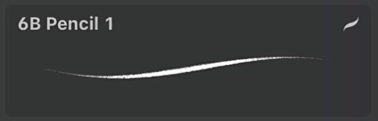
The 6B Pencil brush has got to be my all time favourite brush and I use it for literally everything!
From rough sketches..
to lineart..
to colouring and details.
This brush is quite pressure sensitive, so you can achieve many different variations of size in one stroke by changing the amount of pressure you apply by hand. Through it all, it maintains it's relatively rectangular shape and brings with it soft grain like texture.
Come to think of it, I think I drew this whole next piece with only the 6B Pencil, start to finish. I think it really goes to show that in the end, it's not really about what brushes or software you use, but about how you make them work for you and how much fun you have while creating. I find that the drawings I have the most fun with end up being my favourites in the long run.
And to me, the 6B is just a damn fun brush to use!
It is perfect for adding silly little shapes and lines all over the place :)
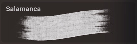
And the other brush I find myself coming back to is Salamanca from the Painting category.
I use it for filling in bigger areas of colour and just colour blocking in general. I like it's subtle canvas texture and the fact that it is not entirely opaque by default, which allows for interesting variations of hues.
But that is not all! I like to size it down to use it to add details and colour to my portraits. I find that it's softness works really well on faces and it's transparency makes it easier to bring in variations of colour.
And would you look at that! More shapes and lines! It's really all I know how to do haha
At the end of the day, I try to just enjoy the process of drawing as much as I can :)
I find that young digital artists often put a lot of emphasis onto finding the correct drawing software and brushes. And while that is important, I find that it is equally as important to throw caution to the wind sometimes and to just try out new things and to not care so much.
I mean hell, people create masterpieces in MS Paint!
My drawing process usually boils down to simply trying to ensure art stays something fun for me, and these two brushes have helped me achieve that over the years.
Hope this has been some help and not all pure gibberish!
161 notes
·
View notes
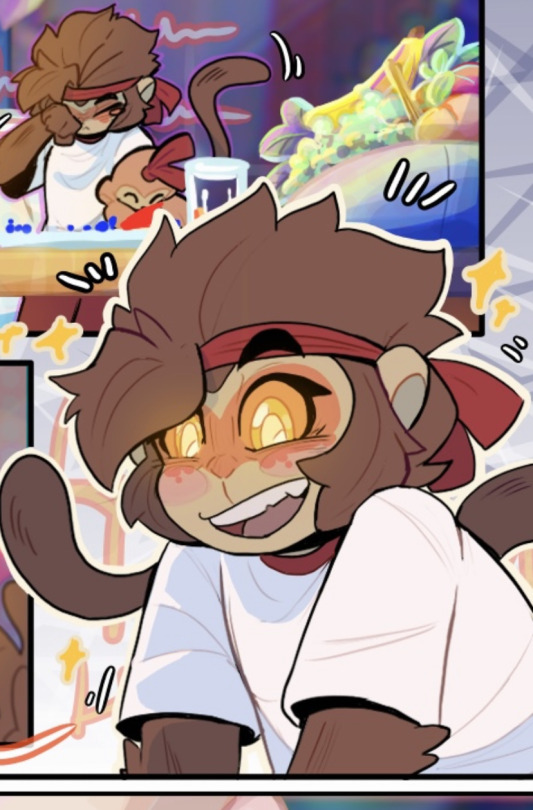
Text
Achilles if he was the Champion on Olympus instead of Theseus and Asterius, inspired by a fic (by @baejax-the-great) I read recently.

I ended up drawing Achilles because I wanted to train more metal and Patroclus in this fic doesn't have much metal in his design. Maybe I'll try to do Patroclus too, but I can't promise anything because trying to imitate Hades has already taken me a long time for a train.
I tried to use Hades' style as a kind of observation study. Honestly, I already knew it was going to be difficult all along because I don't have stylization as my strong point, and also the style of this game seemed so unique that it gave me the impression that it would be difficult to replicate. All said and done, it really is. Even if I cheated by establishing a firmer pose on Achilles to avoid the need to draw a good gesture, it doesn't change that the rest is still outside my comfort area.
My conclusion was: the head is the hardest part for me, which I didn't expect. My facial style is very different from Hades' style, so it complicates my life. Plus, using just one brush for the whole thing is surprisingly good. I should practice gesturing instead of avoiding it.
And here I'm going to put some notes about Hades' style that helped me try to replicate it, but that's it: in Jen Zee's case, perceiving characteristic X is more complicated than doing characteristic X! I still think I need to train a lot to really be able to replicate it, especially in the head area. I don't know if this counts as a tutorial of sorts? But that's it, expect lots of images and explanations from here on in this post.
SHAPES
You can easily see "geometric" aspects of the drawing. It's easy to "disassemble" characters into shapes, which is a kind of basic concept often used in drawings.
I think that trying to be "sharp" is a good thing, as most of the shapes I saw on the characters were more sharp than rounded.
I got the impression that Jen Zee focuses on the macro and then goes to the micro, not micro for macro. In other words, she first establishes a visible and well-made shape and then cares about details.
This is very good in terms of anatomy, because a common mistake artists make, for example, is to care too much about detailing things like the face and muscles instead of creating a well-done silhouette. It turns out that the detailed parts are realistic, but the character as a whole has questionable anatomy. Typical case of a perfect face, but too big or small for the body.
I think the most obvious example of Hades' style is its hair. There is no separation of hair strand by strand, but rather making a large, recognizable shape that will later be further molded.
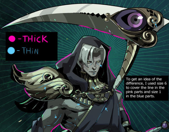
LINEART
The line is always black. Don't paint!
Lineweight: the outer line is thick but the inner lines are thin. There isn't much more line weight variation other than that.
It's mostly consistent but, in some parts, it's purposely interrupted or less polished. It's nothing so noticeable that if you do it completely polished it will greatly affect the result, but if you intend to get as close as possible I would advise you to purposefully "fail" in some parts.
Even with these "flaws", it's a CONFIDENT lineart. This means that you will have more luck copying the style of making your drawings in firm, quick strokes at once rather than slowly retouching stroke by stroke. Draw a line and if it looks bad, just do it again. I don't recommend drawing over it to fix it.
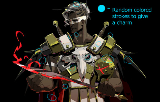
I don't know if this fits in line, but I'll put it here. There are some random lines of striking colors here and there. At first glance, you don't even notice them, although they actually help the drawing stand out, but they are there.
COLORING
Color blocking is your friend.
Don't use blending tools, and use a hard brush and hard eraser. I used one of CSP's default brushes for the entire drawing. It's a style that doesn't require fancy brushes.
From what I saw, Jen Zee doesn't paint this style in grayscale but directly in color. If your fear is getting the color wrong, using layers is a faithful companion because it's easy to change a specific part.
It's IMPOSSIBLE to do the Hades style without inking, which is that part where in the traditional drawing you would apply the ink. In Hades, this is visible in the parts that are shaded black.
Inking is MAINLY used in areas where there is less light, such as the neck, but it's also widely used on metal surfaces.
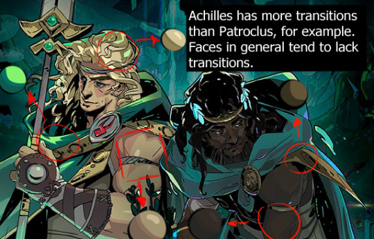
Don't insist on gradients and blurring the drawing! The shadows here are more solid, quite easy to point out where they start and where they end. In some parts, the transition is made by putting an "edge" on the shadow in a tone that is between the shadow tone and the base tone, not by blending. In others, there is no transition at all. Faces, in particular, seemingly have no transitions.
In the illuminated parts, I particularly found it easier to use rubber to shape them. First paint straight and then start erasing and making the shapes.
Highlights are very important in this style, and they are generally in a more saturated tone.
It seemed easier to follow the order of base color > lighting than base color > shading. That is, first paint in the darkest tone and then add lighter tones instead of painting light and then making it dark.
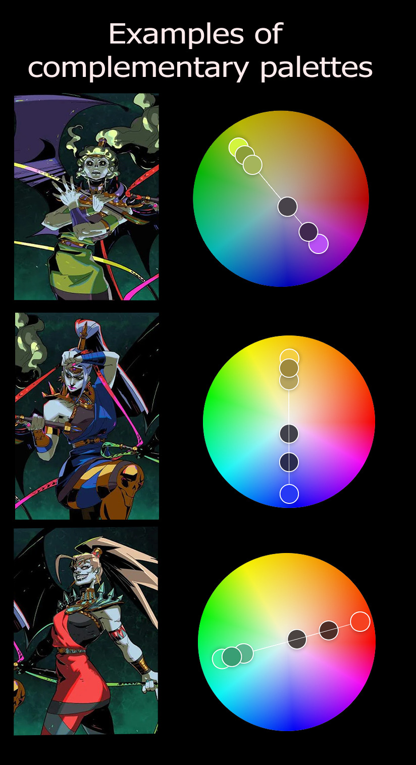
-Use of complementary colors and analogous colors in certain palettes.
Color picking can make you a little insecure about the base colors, but trust the process because color theory is crazy. The base skin tone of Achilles in Hades is a yellow that is strange at first glance, but together with the other added tones it simply looks like a normal tan. Believe me, I was surprised at first! But, sure, it doesn't all have to be color-picking.
SOME EXAMPLES IN IMAGES
And now trying to explain what I already said, but visually. If you look at the images, I recommend zooming in. Very simple images because some of them were actually loose studies and not something made with the intention of posting so don't expect anything beautiful lol

57 notes
·
View notes
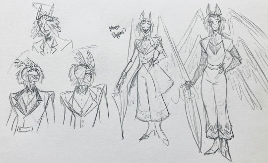
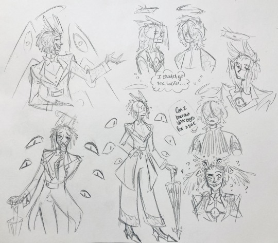
Text
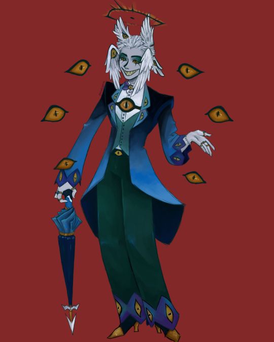
I finally finished the piece for @prince-liest's OC, Tzafael! this really reminded me of how fun character design is (and also that I've completely forgotten how to make digital art, but that's besides the point...) <3
credit to @hogbogglerspirits for the umbrella design! I kind of butchered it so please look at the original and throw lots of love at them
LOTS of notes, draft sketches, brainstorming, etc. below the cut. enjoy!
(note: a lot of what I'm talking about is based on posts prince made under their #tzafael tag, so take a look at those if you haven't yet!)
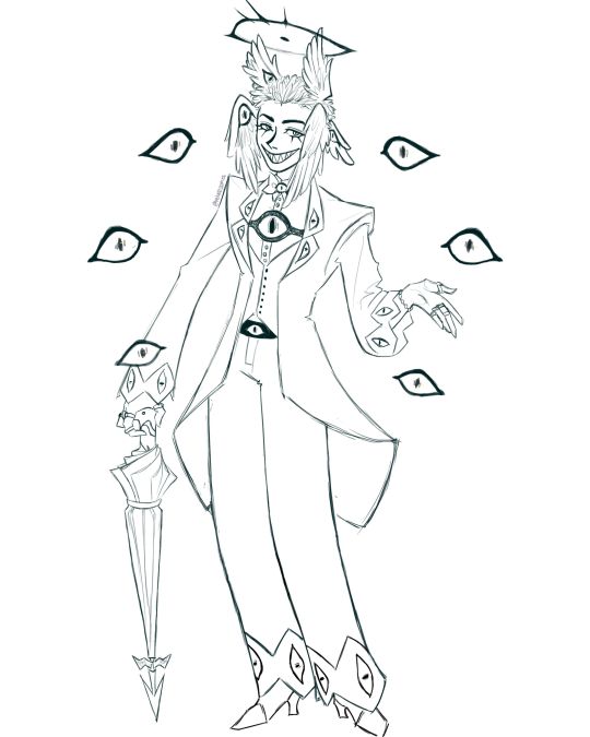
thanks for joining me below the cut! here's the sketch without the colors as a treat (in case you want to color it yourself or something, idk).
notes about making the digital drawing:
holy shit this took me forever -- I was not kidding about forgetting how to make digital art lmao. I forgot how much less forgiving digital lines are and genuinely lost the spoons to even attempt lineart, hence just a sketch below the colors.
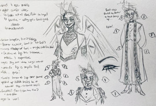
some of you might've seen the original sketch I sent to prince, which the digital version diverges from just a little. it's mostly the halo which I'll explain later, and I finally caved and drew the sixth eye (you can tell I drew and erased it multiple times in the sketch lmao -- still don't know if I prefer it with or without)
here's the original color ref by the lovely @gendermeh! my color scheme ended up looking really different, so some notes about that:
I was looking at references for magpies like this
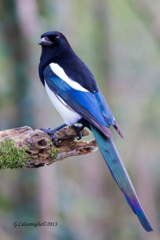
and I wanted to basically follow that color scheme while also being somewhat similar to the original -- dark head/shoulders --> dark top of the jacket, bright blue wings --> bright blue bottom of the jacket, greenish tailfeathers --> green pants, hints of purple --> purplish sleeve and pant ends
I also tried (and mostly failed, let's be real) to capture the iridescence of the feathers -- they look like oil spilled on the pavement or iridescent hematite to me! I think the key ended up being adding bright greens/purples and roughly blending them into the blues or vice versa but I didn't really figure that out until I got to the pants lol.
I'm gonna be honest; I don't remember why I went with this shape for the tailcoat. I just remember being unhappy with the sketch and then trying a bunch of different shapes that mostly looked worse lol -- I think I landed on this because a split tail kind of looks like wings?
KEPT the shoes -- absolutely magnifique. I wish I knew how to color gold better.
added lots of jewelry! they like shiny things :)
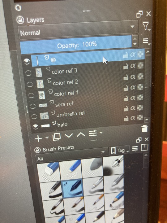
ALSO PLEASE LOOK AND APPLAUD ME. I FINALLY REMEMBERED TO LABEL MY LAYERS!! NO I DON'T REMEMBER WHY THE HALO HAS ITS OWN LAYER.
alright, time for some more design notes/explanations + draft sketches!
but first, a couple disclaimers:
I want to make it very clear that I LOVE everything about the original design. I made a lot of changes based on personal preference/the way I interpreted the character. I was actually planning on making a digital piece that was more faithful to the original design too, but I was just out of spoons for it cause of life stuff.
you probably shouldn't try to read the notes I made in the sketches I'm about to show you unless I say otherwise. most of it is incoherent brain vomit in illegible artist handwriting and I'll transcribe/explain the stuff I think is important :) (the stuff in quotes are direct transcriptions of my notes)
I know my sketches are very messy lol. I only draw for fun, so I usually don't force myself to make stuff any neater than necessary unless it's supposed to be a formal piece. try to bear with me.
1:
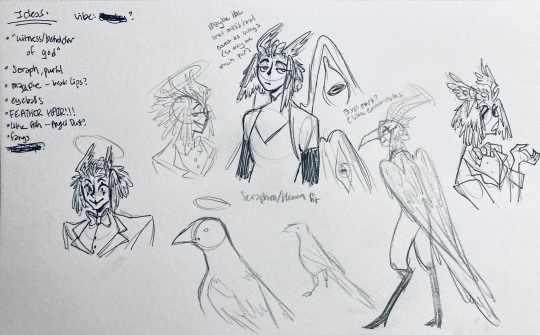
my first few sketches of them! (I think?) this was before I sent prince a laundry list of questions so I was still trying to get a vibe
"magpie -- beak lips?" -- you'll see this in a few sketches; I considered giving them the lipstick design that velvette has since it looks like a beak. I still kind of think it's cute, but 1) I'm pretty sure velvette is the only character that has them, so I didn't want to make it seem like they were related somehow and 2) I thought it might be distracting with how much other crazy stuff I ended up including in their head/face
also, sidenote since it's relevant to what I said about vel: something I realized was important is how one character's design relates to the designs of the rest of the cast. I wasn't sure how much I should've gone for what looked good in a vacuum, how much should be based on what other characters looked like canonically, or what other characters would look like if I also designed them. it ended up being mostly the second option, but it was honestly still a struggle. should I take away some of the tumblr-sexyman-ness (no shade to tumblr sexymen; I love them) because there are other characters that already have it? should I relate their design to sera's and emily's in the show or should I think about how I would've designed sera and emily? should I follow some of the design philosophy of the original show and just throw stuff on there because it looks cool (the answer is yes btw)? decisions, decisions ...
I don't think this showed up really well in most of the drawings, but they actually have a black line down their nose! let's take a look at sera:
since they're siblings, I wanted to include some similar facial markings. the nose line ended up being the only thing I kept though -- I was going to include freckles, but I have a compulsive need to give every character giant bottom lashes so there ended up being no room T.T I like that the magpie's hints of purple kind of match hers tho!
the wingification of the hair begins! I was still unsure of it at this point, but it was an idea I had since I was kind of struggling with how straight the feathers were in the original.
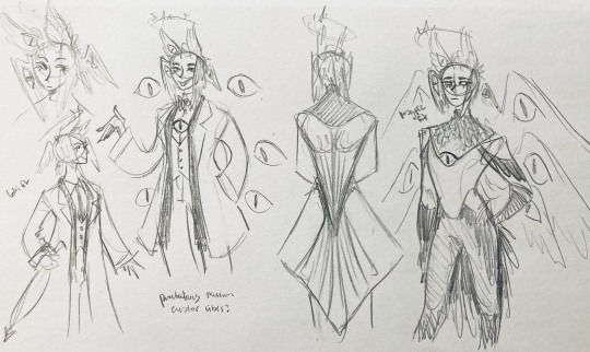
"maybe the ones on their head count as wings (so only one main pair)" -- I originally just had the 2 pairs of wings on their head, so I was thinking of just giving them 1 pair on their back so there would be still be 6 total. also this middle drawing of them is meant to be their exorcist outfit (I wanted it to be a cross between what the other exorcists wear and sera's outfit)
at this stage, I was thinking of giving them more magpie-like characteristics, so I looked at some references and tried to emulate them in a more human design. this ended up being really awkward so I scrapped it, but I still like the idea that their exorcist mask looks like a bird (kind of like a plague doctor's)
2:
peekaboo! I love the idea of them using the wing hair to cover their eyes lol. (ended up using that idea for my own seraph OC since that's their biblically accurate purpose: to cover their eyes/faces in reverence/humility -- doesn't really fit with tzafael tho lol, so they show their face most of the time)
an eyeball in the bowtie -- pretty self-explanatory. the eyeball motif is important.
the one in the middle is just me practicing drawing the original design, and the one on the right is another exorcist outfit I think. I wanted to include the diamond motif/points that sera has on her dress (the diamonds on the bottom turn into eyeballs, which is why the final design also has eyeballs on tzafael's sleeves/pants)

3:
lots of notes on the side based on what prince said in response to my ask
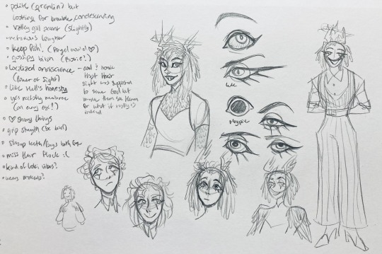
"localized omniscience (power of sight) -- cool + ironic that their sight was supposed to serve God but made them see Heaven for what it really is instead"
another exorcist outfit, this time including the feathers
I was also experimenting with the halo; I was trying to make it look sort of like sera's crown, but that didn't feel right ...
some practice with eyes -- my style is pretty flexible with eye shapes, so I try to make them suit the character. I drew lute's eye and also an actual magpie's as references -- lute's because of the exorcist background and also because they looked appropriately sharp, magpie's for obvious reasons. once again, my compulsive need for giant bottom lashes strikes
there was honestly a lot to balance with the eyes -- I wanted them to look condescending/bored (lowered top lid) but also amused (raised bottom lid) and like a magpie (round) but also harsh/mischievous (sharp, maybe slit pupils like a snake) and similar to sera's (but not too decorated -- also does it make sense for them to look like sera's if emily's don't even look like sera's?)
considered having wings on the shoulders -- the magpie pattern is super cool, so it would've been nice to have that somewhere more explicitly in the design. I still think that might fit in an outfit they would wear in heaven (maybe for formal occasions)
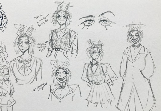
the introduction of the sweatervest! honestly I kind of love this for the way it captures more of the preppy, spoiled old-money upper-class vibe some heaven residents have, but it was scrapped since I couldn't imagine them wearing that while trying to scare the denizens of hell. maybe something they wear casually though.
"yes nictating membrane (on every eye!)" -- AHH I'm so sad I didn't end up putting this to use. I just feel like the whole effect is based on actually seeing them blink, and I don't animate lol.
4:
ugh, the nefarious laughter one ... don't worry I tried harder on a sketch later on lol.
"like the diamonds on Sera + Em" + "diamonds turn into eyes?" -- I draw the diamonds on the sweatervest turning into eyes later.
tried an actual bow instead of a bowtie -- very cute but didn't fit the vibe.
a skirt! I think they would wear a skirt sometimes.
5:
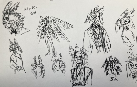
"FUCK ASS BOB" -- asghdk the wingification of the hair continues. unfortunately, I'm realizing at this point that the silhouette of the hair is starting to look a lot like alastor's. I gave a very half-hearted attempt at mitigating this, but it goes back to the thing of how much I am obligated to the original show's designs and what looks cool to me -- I think the wing hair fits them and I didn't want to change it because of alastor, plus my alastor design actually has completely different hair anyway. I did add a third pair to the back to look like a ponytail though.
introduction of the scarf! I was actually going to include this in the final design but uh,,, I forgor. are you starting to see a pattern.
the reason for the scarf is that the "tzafael going to places they know they'll draw attention/can incite chaos" reminded me of that scene in avengers where loki walks into a fancy building looking pretentious af and just casually stabs a guy's eye out. not really the same thing but I felt like the vibe matched. hence, loki's funny little scarf fit.

6:
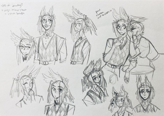
uaoughdfjh it was SO FUN to draw the wing hair, and it was at this point that I realized they had to stay even though I wasn't sure if it was too different from the original.
gossiping with rosie cause that's the first person I thought of -- tzafael also summoned a pearl necklace to clutch because of the sheer drama of it all (your ex-husband did what??)
also started drawing the rings on their hands. magpie like shiny.
7:
lots of notes cause I was trying to compile the things I still needed to think about/incorporate into the final (I thought this was gonna be the last draft ... haha)
trying to include more bird/eye motifs
"fish ... purse?" -- ha! I forgot I was gonna give them a fish purse. I think I drew that in a later sketch, but not them wearing it.
"picked up Hellish traits bc of extended stay -- existential crisis?" -- I asked prince about the sharp teeth, and their answer implied that they became sharp as they stayed in hell longer, which got me thinking ... I feel like that's actually a great body horror concept. lucifer falling and looking like a normal angel at first, eventually waking up to more and more devilish features and feeling more and more like he's lost his home and his past self ... spooky.
another exorcist outfit -- I actually really like the eyes on the ribs! I never made a final draft for the exorcist uniform, but it would probably look close to what I drew here.
the one on the bottom was meant to be similar to the feathered shoulder pad idea, but this time with the whole magpie (with giant eyes). tried putting the "freckles" (really just dots in this case) over their brows, but that ended up looking kinda weird.
the eye is pretty close to the final design
the one on the right was supposed to be the full final design, but I was totally off lol -- the long trench coat really doesn't give off the right vibe at all
8:
playing around more with the loki vibes of the scarf, also added an eyeball to the chest
I never got happy with the design of the back of the coat -- I think it should probably just be blank at this point. but the sketch here is meant to look like wings/tailfeathers.
yet another exorcist outfit, this time with more magpie motifs. I actually like this one a lot, but I probably should've added the eyes on the ribs from the last sketch. I think I also considered giving them actual tailfeathers at this point.
9:
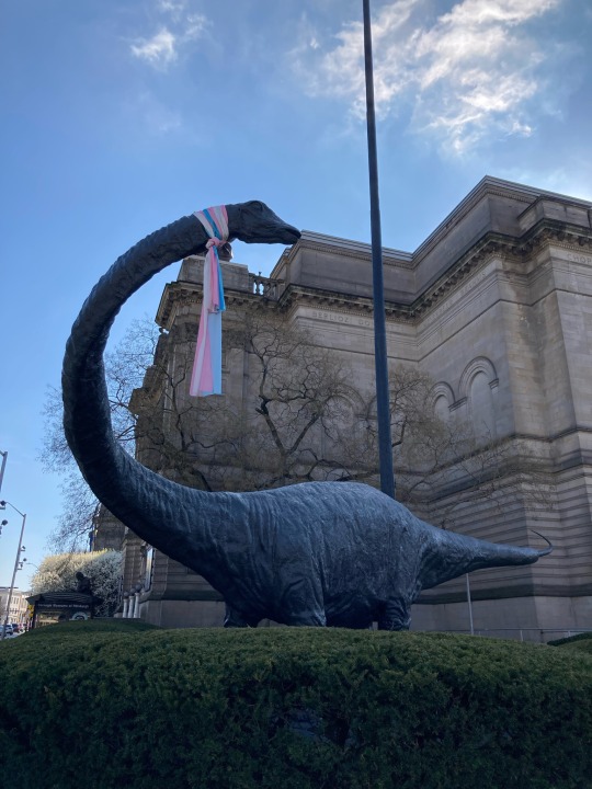
thanks for sticking with me! I promise we're almost done. have a trans dinosaur I saw while I was travelling as a treat <3
10:
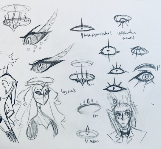
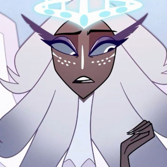
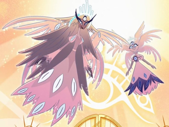
this is after I finished the sketch for the final piece and realized I didn't like the halo design. I drew lute's, sera's, em's, and adam's as refs. (honestly I love the show's idea that each person/people of each rank have a different kind of halo -- I wonder if they can switch them out?)
my main inspiration ended up being the exorcist halo, but I made it look more like an eyeball -- since it always points toward heaven, we can say it's always "looking" at heaven.
(also sera's feather lashes! they're so cute)
11:
EVEN MORE EXORCIST DOODLES
12:
tzafael shooing away my fox demon OC
13:
these are actually sketches for my own seraph OC (raguel), but I wanted to include it since it has even more wing/feather hair variations. I also think the idea of the eyelashes being feather-like could've been cool for tzafael.
14:
some more OG design doodles
tzafael and raguel together because self-indulgence is the name of the game babey (also wanted to draw tzafael freaked out with their wings flared)
(raguel's blind btw, hence asking for eyes -- tzafael has so many!)
you can probably read the dialogue here so give it a shot. I believe in you.
15:
you know what? the fish purse deserves some doodles
16:
putting them in Situations! I was reading over prince's posts again and I realized there were some funny things I could draw them doing/saying
again you can probably read the words here
angel dust also loves fish (but is apparently bad at taking care of them, hence the suffocating blobfish), so tzafael shows him their aquarium (complete with live fish and flora ofc)
I thought alastor was 8 ft but apparently he's 7.3 ft? so tzafael is enjoying the .2 ft they have on him
trying and failing again to come up with a design for the back of the jacket lol
THE crowley quote
apparently the halo still sends signals from the exorcists -- thought their reaction to the battle at the hotel would be funny
the nefarious laughter (take 2) that I promised -- based on a doodle of alastor viv did that I found
them being sad and curling up in a pile of shiny things like a dragon
OKAY I'M DONE. huge, huge thank you to prince for sharing their OC! this was a lot of fun and clearly inspired me a lot haha. please check out their writing; it's literally so good that I can't read anything else these days. I am chewing on their thoughts constantly.
this was an absolute monster of a post, so if you're still reading, I am both impressed and bewildered at your patience. I hope you enjoyed! (I certainly did!)
#prince (because they are very sweet): I'm excited to see your thoughts!#my thoughts: magpie like shiny hehe#hazbin hotel oc#prince-liest#hazbin hotel#my art#character design#sera hazbin hotel#em hazbin hotel
45 notes
·
View notes
Note
Do you have a coloring tutorial or recommended digital brushes? I love the way you render! It feels polished while maintaining the roughness and charm of a sketch!
I’m an artist who can get linework down pretty easily but when it comes to rendering that’s where I struggle. Any wisdom helps! ❤️
Hello!! Thank you so much! <3
I did a simple tutorial awhile ago but It's not the best
Rendering is also my weak point but I can outline a few things I do!
But overall my Process is:
- rough sketch
- clean sketch/lineart
- flat colors
- shadows
- highlights
- merge layers and use adjustment filters to get the look i want before I start rendering ( Color balance/hue + saturation/gradient maps/adjustment layers)
!! This is generally where I stop if i am not doing a painting and keeping it as a lined drawing !!
- I will add finishing details like eye shine etc.~
DONE
if I am doing a painting styled piece i keep going.
- I will start just painting on top of everything
- I generally just stick with the same brushes I sketch with because I'm comfortable with them and I find switching brushes to be kind of tedious. So its the HB Pencil and Basic Sketch a lot of times.
- Use the eyedropper tool to pick colors to blend and using adjustment layers like multiply to deepen shadows then merge down again.
- Using to many layers makes me frustrated.
- Render render render
- When I'm happy or just don't feel like I want to work more on it I add some noise and chromatic aberration and Viola!

I use almost all of the adjustment tools but the big 3 for me are:
Color balance (this helps me adjust my color choices and unify the vibe of the piece in going for)
Noise! adds some nice grain to the art and makes it a bit more tactile.
Chromatic aberration just adds such a cool look and depth.

as for brushes I have a page on my Caard that lists my most used ones
I have a tag on my page with tutorials as well
I hope some of this helps!
#redundantz speaks#ask#redundantz ask#brushes#tutorial#art reference#art tutorial#art tips#im sorry this probably isnt what you were looking for im pretty shit at explaining how i do things#long post
66 notes
·
View notes
Note
could you show a little bit of your art progression over the years? your style is absolutely magnificent btwbtw!!
sure ! i've done a similar post, but that was focused on shape language and didn't go over all of my art progression. i'll link it at the end of this post!
anyway, i started digital art around 7 years ago, but all of the art from that period is essentially lost. at that time, it was just deviantart bases and various furry/warrior cats fanart made in MS paint. while i'm not a fan of vivziepop anymore, she was a big inspiration at that time, as well as a handful of popular animation meme artists at the time. around 2019, i started making art in krita using a mouse. and later that year, i started making art in ibispaint (mostly skullgirls fanart). unfortunately, practically everything from before 2020 is lost because it was on reddit accounts that i had deleted out of cringe. don't delete your old art ever!!! i do have this piece though, made in 2020 on krita with a mouse. my main inspirations were invader zim and other cartoons.
my artstyle took a lot of dips and turns around this time. i got back into anime, and it influenced my style in a way that i think made it really ugly and bad looking. i also refused to ever flip my canvas. i think this era actually held me back. here's an example.
anyway, by 2021, i had gotten into more anime that influenced my style in a different way. i forget the exact ones, but i did watch a lot of stuff from trigger (like BNA and LWA) at the time, and also got into enstars which influenced my compositions a lot. it's also around the time that nova in her current "space astronaut bunny" concept was born. i started experimenting with backgrounds, color palletes, and colored lines, which was crucial. i look back at this era pretty fondly. though i still refused to flip my canvas :D

by 2022, my artstyle looked like this -
(this is actually from dec 2021 but like. it's still what my artstyle looked like)
i had played world's end club and rewatched panty and stocking, and it changed my brain chemistry. i decided that my artstyle would be "60% anime, 40% western cartoon", and despite some shortlived phases where i'd go for a slightly different style, i still kept it up. looking at least year's art summary, though, you can see that i broke away from that style for something more anime. and also, i hardly ever experimented with colors anymore because i was focused on character design. i'm gonna be real i think everything after july looks like absolute bootycheeks. i hate this weird single tiny dot reflection style i had going on it looks like dogwater.
after 2022, my art was in a miserable transitional period where i had zero clue what direction i wanted to go in. but despite all that, this piece in particular is crucial. because i used halftones in the background. it's foreshadowing!!!

i continued like this for a while, until the time where i decided to play around with shapes with those vocaloid big 8 drawings. people really liked the shapes that i used in that one, and i found them fun to draw. so i started exaggerating more, and after i rewatched panty and stocking for the 307492020506th time, as well as invader zim for the 2nd time, my cartoony roots came back.


and then, when my art was already steadily improving, across the spiderverse dropped, and i watched it. funnily enough afterwards i had a big art block because i was just thinking, "you need to draw if you want to work on something as big as that! improve!!!!" which kind of held me back. but after all that, i decided to take a note out of ATSV (and comic books in general)'s book and start using halftones in my work. as well as that, i started focusing on lineart way more, and tried to play around with lineweight. which brings us to present day, where my latest art pieces look like this :


i still think that my artstyle needs a lot of work. even these pieces have issues when it comes to symmetry, values, and the like. but nowadays, though my art takes far longer now (as i've abandoned special pens and just do lineart with the hard dip pen in a kind of tedious way), i'm having more fun with it than i have in years. i think halftones fit my artstyle really well, and they're a unique way to "fill up" areas. now that i pay attention to lineart, i think it makes my art feel 'fuller', at least with more depth. did i mention my inspirations for this current 'phase' of my art? :0 i've been playing a lot of muse dash lately, and my pinterest boards are always full of stuff from TWEWY and megaman. there's far more than that, but in short, i want a sharp and striking style with bright colors. i know that you said a little bit of my progression and i basically dropped a whole essay 😭 ,,, but i really like talking about art in general even if i'm not very good at it. i hope this was interesting at the very least! here's the other post also:
#ask zeno#zeno's art#long post#VERY long post#i reallly wish i had my old art to show you guys but oh well#i think my art is improving maybe
55 notes
·
View notes
Note
saw your last fanart (16 of january) and it's so good
it beats me how this kind of colouring/painting is done though. how do you pick the right colours? the right places? the value of colour and it's warmth?
i always have trouble with colouring because i have a very strict basic knowledge of shadows and colours and no visual imagination
sorry for such a long ask
hi anon!! no need to apologize this is such a kind ask and i still really struggle with this sometimes. i didnt start experimenting with color in my art until around summer of 2022 and before that it was so frustrating to color that i almost didnt produce any colored work.
i also have complete aphantasia so my visual imagination is very limited! this leads to a lot of trial and error in my work because i cant tell what looks good until i simply try it lol
i will try to answer about my process as thoroughly as possible! but a lot of it is seriously just vibes, and playing around. a lot of what helped me was studying how artists i liked used color in THEIR work and trying to work it into my style.
a lot of the vibrancy and harmony in my work comes from my base layer, which i put under the sketch like im “priming” the canvas. when im coloring later on i let this base layer inform my choices and also let it show through in places for unification of the colors. its a lot like doing an underpainting except i dont go crazy on the range of values

the hardest part for me is doing the base colors over this layer. i dont have a lot of guidance for this because i kind of just pick colors to start with and then edit them bit by bit until it looks satisfying to me/matching the intended mood and harmonizing with the base layer. i edit the colors mostly by using gradient maps and layer modes until i find a version i like and merge it to just create a normal layer with the colors i want. i keep this base layer underneath my sketch
i render on top of my sketch/lineart always so i can better define the shapes and have smoother edges. this is the part where i really go crazier with my colors - some conscious decisions i make:
- where can i make my highlights and shadows stand out more? i accomplish this by choosing warm colors on the cool base or cool colors on the warm base. theres blue in the flesh tones of the face and orange in the blue tones of the coat.
- where does the rendering need to be more “clean”? someone viewing an art piece will gravitate to places in the drawing with finer detail, so i put a lot more work into the shapes and colors of the faces and the fish, because this is where i want someone to look the longest
another thing i usually do is pick one really saturated color and place it throughout the drawing. for thos one its that bright red, around the eye, blood, and outline of the fish as well as the characters’ hands.
this part of my process takes me the longest and can be seriously frustrating at times! something i always force myself to do is to keep working on it. whenever im like ok its done! i go back and render for another half hour and it ends up looking a lot better

gradient mapping the final drawing! for further unification i have a gradient map i made that works for most of my warm pieces

and i put it on top with an overlay layer mode and then adjust the opacity
it makes a big difference in the warmth and unification of the final drawing!! so honestly i cheat a little with my colors :P
i hope this helped a little bit with your question! my general advice is to also do some color studies of movies or pictures you like it really helped me get a feel for harmonizing color (and not being afraid to use really vibrant colors!!) again thank you for such an ask and good luck to you!!
20 notes
·
View notes
Note
Hello! I am a beginner artist and I love ur art!! Super pretty and the colors are very tasty. Do you have some tips? I'd love to see your art process!
HELLO ANON!! first of all i am very honoured that u would ask me this because 90% of the time i feel like i have no idea what i am doing and like im still a beginner artist myself DSDSJDF. i would love to share some stuff i learnt and some stuff about my process (regardless of how messy it is sdfhsj)
(final piece)
here's an old example of my process i found! while the steps sometimes look different for other pieces, i feel like this is a good demonstration of how the basic structure looks.
1. the sketch - this is where i'm mainly figuring out how i want the piece to look. i was redrawing a screenshot for this piece so it looks a LOT neater than what a lot of my other sketches look like, for example, here's the process of me figuring out my recent drawing of haise:


(final piece)
in the first two steps, i was mainly working with showing myself what the piece was going to be. the last one was where i used references/technical knowledge to try and show whoever will be looking at it what the piece was
2. cleaning up the sketch + base colours. these two usually occur simultaneously because i will get bored cleaning up the sketch midway through and want to start adding colour LMAO. on a more practical note, sometimes putting down the base colours and having a better idea of what the finished product will look like might make it easier to refine things.
a note: cleaning up for me doesn't mean doing lineart. it mostly means erasing any overly messy lines on the sketch and redrawing small parts to make it look tidier where needed. i often leave it 'messy' at this stage, too. like here:

(final piece)
3. light/shadow. this is my FAVOURITE part because it's where the piece starts pulling together. the method i used in the current piece was putting a multiply layer over the colours folder and filling in where light would be obstructed. after that, i used a luminosity layer to put in some bright sunlight. marc brunet has a great way of explaining it by advising to pretend that the light is the camera and you're behind the lens. this is such a good way to block in average light/shadow values! sometimes this looks a bit crazy because everything is still so messy but that is why we have...
4. rendering. this is where i fit all the remaining pieces of the puzzle together. i'll refine the colours a bit more -- e.g. colouring in the eyes, -- and fiddle a bit with the shadows to add some more variation to the hues/value. this is where i think a lot about light and shadow theory and try and make it look more realistic. marco bucci saved my LIFE with his videos about ambient occlusion and ambient light (part 1 / part 2) -- essentially, what i keep in mind the most is that if a plane in shadow is facing the sky (or is open to any other form of light that isn't the direct light source) it will contain ambient light. it is SUCH a game changer when you add it to your pieces, trust me, even if youre lazy about it. if needed i'll pull up some references to make everything look good!
5. rendering... part 2? honestly this step kind of blends with the last one as i tend to do it simultaneously. i basically clean up all the messy lines from before by painting over them! with the majority of the colours i need put down, i can just eyedrop them and paint over anything that's needed. this also comes in with the light/shadow, where, if i need a more subtle hue for either/or, i will eyedrop it and brush it in.
some further notes:
i very rarely use references during the first stages of my sketch. i think it tends to look quite stiff and unnatural if i rely too hard on the. and i personally prefer the creative room when the idea is still being conceived. references come in when i can look at what i have down on the canvas and have a fairly decent idea of what i want, including pose, composition, etc. it's essentially a first draft to guide me to where i want to go with the piece. it's when i'm done with this that i bring out references, and even then, they don't necessarily have to be the exact pose -- i'll usually get a couple of pics which show what i need to double check and keep them up as a guide. by the end of the 'sketch', i usually have a basic construction of what i need to continue, even if it's messy.
i use very soft brushes when putting down colour because it allows for more hue variation. like i said, i enjoy eyedropping and brushing in colours afterwards, so this really helps!
layer modes are ur friend! i try not to rely on them too hard during rendering because i like the freedom of painting over but they're very useful when you're blocking in your initial colours
sometimes, when i feel like i want to try something new with my art, i'll keep pieces that inspire me up in front of me. i have two of sui ishida's art books and sometimes i'll just flick to a page that oils the Art Gears in my brain and keep it open while i draw. i don't necessarily reference it, but i like having it there so i can glance over every once in a while. i don't usually make a conscious choice where i'm like "ok i want to render skin the way he does" but it's more like. my brain knows what it likes in his art and it'll try and push that part of my art in a similar direction.
honestly the best advice i have is that art is very much based on vibes. everytime i've tried to think too much about it, to do things 'correctly', to rigidly stick to art theory, my art has not come out nicely. i think the technical parts of art are important to know and understand but i also think it's important to let your knowledge come through naturally when it is needed instead of pressuring yourself to do things 'right'. tbh you probably already know that but it's something i forget a lot so maybe it serves as a helpful reminder?? sedsfhsl
ANYWAY SORRY THIS WAS SO LONG! i hope i covered what you needed and if you need anything else/want me to expand on anything feel free to drop me another ask ! <3
make sure to look after yourself and trust yourself and ENJOY!!! art is about having fun!
80 notes
·
View notes
Note
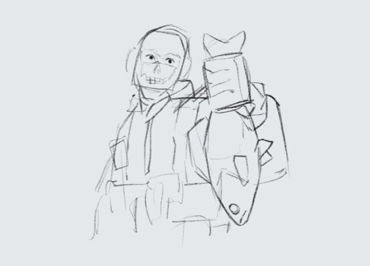
Just wanted to ask (and feel free to not answer), but how do you draw so much so quickly? I'm always impressed by how fast you doodle or paint. Also, wanted to say that I appreciate your Barok and DGS art as a whole.
and with this ask i have finally reached an artist milestone 😭
Well theres a short answer and a REALLY long answer (which ill put under cut when i get there).
short answer: practice + refs
which.....can be an annoying thing to hear. And as someone who studies art and has bought a LOT of online courses trying to figure out how industry people can just churn out work like nothing. it feels like a let down every time i find out their big secret. just practice and photo refs. Every. Single. Time.
LONG ANSWER:
its how you studying your refs. heres how i do mine
sorry if this is rambly. but ill try my best to at least be clear. BUT THIS is the EXACT way i taught myself how to be quicker.
I do not know if youve taken any art classes but essentially one of the ways to study gesture drawing is by first tracing ur photo ref to get a sense of the flow/proportions of the body. youve probably seen a billion of these tutorials floating around:
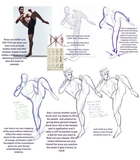
So last year around hmmmm june/july? i was NOT looking to get better at my anatomy or gesture. i was actually trying to get better at clothes. but my problem was it took me so long to draw out a figure (which i was fine with cause i liked how my people looked at the time) that i could never really just focus clothing part.
So i told myself look. ur not looking to draw in this style like this forever. so for now SIMPLIFY SIMPLIFY SIMPLIFY!!!! I WANT THE BAREBONES OF A HUMAN HERE TO MAKE A MANIQUIEN FOR CLOTHES OK
but how do i do that....
Im gonna use this piece as an example from my rise and yosuke fashion palooza month. FIRST u see i got all my photo refs together. i like those poses on the right and i want to switch out the clothes for the other ones i picked out. i trace out my poses. kind of like the tutorial up top but since this is about draping i was focused the exact places their waist/arms/legs/etc would bend.
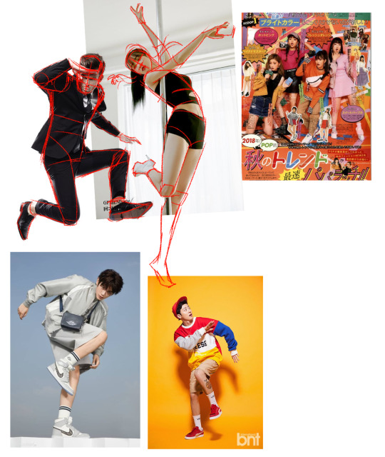
and like the tutorial u turn off the photo ref and do a drawing based off that traced piece.
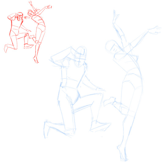
then i would turn on my refs and add on my clothes
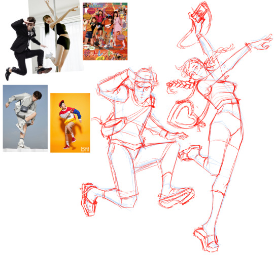
And after a month of just doing that over and over and over. i was surprised to find that figures and poses were so much easier to understand when i would break them down like this. and once u get familiar with them the faster and more confidently you'll draw them.
I and still do this btw. heres my otasune from the last week

i used photo refs for all my sketches. if i cant find anything online to match what i want i just take photos of myself. and some might say well arent u just relying on reference TOO much?
AND AGAIN take it from someone who has spend a lot of money buying classes from their fav artists in the industry. The Secret of how they churn out so much cool work so fast always turns out to be this. practice and photo refs.
Every. Single. Time.(tho this is omitting a lot. im not getting into like they way they stylize their art work. that actually the fastest and funnest thing to do once u have ur base down)
Now PAINTING
The thing is, i dont actually post up all my work on this blog. So theres a ton of stuff you havent seen me do. These are some paintings i did 2 years ago for a class.
I already know how to pick my values and set up lighting. When you see me painting my figures now. i am not focused on learning these basics im actually just honing a technique.
you might see me post readmores with these kinds of wips. I lay in all my colors and lighting with the lasso tool. ALL THE MAJOR DECSIONS ARE DONE HERE
(the little miniature i add on the side basically tells me what the overall feeling is going to be when i blend in the lineart to be cohesive with my colors) ( also if you had any questions on my prepainting process tho. feel free to ask!!!)
and if you compare this wip to my finished piece youll actually find that i dont stray that far from what i've laid in.
everything happening at THIS stage is about feeling out how i want the textures to blend with one another and getting funky with some brush strokes.
and thats it? im not sure if any of this is helpful but if anything. i hope you come away from this feeling like what ive been doing here is nothing special. "THATS IT???? THATS ALL THERE IS??? well i could have done that :T"
exactly man. you can do ALL OF THIS aND MORE!!! I BELIEVE IN U :D
but ill let this be the last thing i leave u with my friend: my barok sketch and the refs i used for his boobies
76 notes
·
View notes
Note
hi! this is the bunch-a-questions anon. this wont be an ask ask. thank you for answering! it really gives me so much insight about tools and processes, i really enjoy seeing/reading how different artists have different ways in approaching creation of art. it’s all so interesting to me
and oooh i know what you mean about looking at a lot of different artists! it’s inspiration!! i find those things to be amazing too, it’s so cool. it’s like “this spot is inspired by an artist” “this artist draws this like this, so i wanted to try” “i think the way an artist drew this was neat and i wanted to try an implement it” it reminds me of that one post how we, as people, are a mosiac of other people and i believe it to be the same for how artists are too with their art
i feel inspired by the way you draw….. everything!!! it gets me pumped to try and replicate the way you do some things. like the shapes you create, the colors you choose, the way your lineart seems to be so flowy, how dynamic everything feels and how different each drawing you create is from one another (i saw you reblog that meme of like “why shouldnt i draw characters from the waist up and that is SO me, but it’s shoulders up” because drawing full bodies makes mh drawings feel so stiff, i need to practice more!!), the poses of the characters. just.. every aspect of your art is so, so, so nice!!
the way you draw, in all your styles, it’s definitely one of the ones that is such a good scratch to my brain. it gets me all giddy and happy! i’m not sure if i’ll get into jwri, mostly because my attention span will not let me be able sit and focus on listening before i get distracted and miss context on parts, BUT i still go to your blog almost every day just so i can see your art, no matter what it is, no matter who the characters are because it’s always so so good and i love taking it in. (will eat your art if i could, i am so serious)
this was a long one but yeah! i just wanted to let you know how awesome i see your art is! and how i also think youre a cool person, you seem like such a good peep to hang out it! might be weird to say but if you were a blorbo, you would be one of the most blorbiest blorbos to blorbo ever
hope youre having a good day!!
OH THANK YOU SO MUCH FOR ALL THE KIND WORDS THIS IS SOOOOO

your explanation of taking inspiration from other artists was so poetic and beautiful! truly inspiring in itself
its okay if you can't get into jrwi, i get it! i didn't think i would get into it as well and after binging all the episodes i honestly forgot why i even started listening in the first place. remembered recently tho! it was because i was going a little crazy while making the picrew and needed some actual talking in the background instead of just music. so, if you ever decide to give it a try, or listen to something else equally as lengthy, try to busy your hands with something that doesn't require a lot of thinking! it helps me at least! worked both with jrwi and tma. it's like, doing something monotonous (knitting, sorting files, cleaning the house, etc) can be incredibly boring if i sit in silence and let my mind wonder. alternatively, listening to something long or watching a long movie can be incredibly boring as well because i struggle to pay attention to the same thing for two hours. but combining these is really good, because it keeps both my mind and hands busy, but not overwhelmingly so!
and ough ough ough thank you again for such heartwarming message! im so happy to hear that you feel inspired by my art, and i wish you good luck in your own art journey!!!!!!! remember to have fun and listen to yourself and do things that you find interesting and that you enjoy! don't force yourself to draw stuff you don't like! all art is personal and individual, so don't be afraid to make things "you"! you don't have to do clean line, you don't have to do lines at all, you don't have to do coloring or shading, if you don't like it! and if you do like it or are excited to try, you should go for it! don't be afraid to change and grow but don't force yourself into it!
also don't foget to stretch before drawing its very important!!!!!!!!!!!!
28 notes
·
View notes
Note
Hey what's it like being so swag? The people wanna know! (It's me, I'm people)
I just wanted to drop by and say something silly since I've been lurking following you for a while and your art is such a delight! You've been a huge source of motivation for me to work on improving my own art and keeping up with your fan continuity has been super fun! (I love all of your trans headcanons so much, it's really nice to see people like me)
I was wondering if you had any advice on how to build up confidence with physical art work? I'd like to try and go beyond just pencil sketches but using pens for line art or adding color to a piece can feel so intimidating since that's a lot harder to undo than pencil lines... Part of me knows it'll just take some time and practice but the rest of me can't seem to work up the courage to start anyway (^~^;)ゞ
Regardless, you're very cool and I hope you continue to feel better! Have a nice day/night! :D
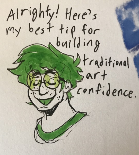
First of all, thank you so so much for the kind words! I'm so glad you enjoy all my art and trans headcanons! And I'm so so happy to hear my work has been inspiring you! That makes me so glad to hear. I am very passionate about encouraging other artists to explore and develop their own process and work.
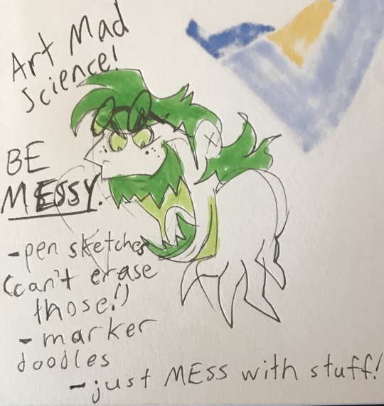
And second, here is my hot tip for building traditional art confidence. And it is...make stuff in mediums you have been hesitating to use. Non-erasable mediums work best for building up confidence. Pens. Markers. Even paint if you prefer. You can find and watch traditional process videos if you want as you do. However, the best way to figure out your favorite way to use art supplies and to figure out how to make it look the way you want is just to experiment.
You may notice that the lines on my traditional pieces are sketchy and not polished lineart. With practice, I figured out how to do that my way and make it visually clear and appealing like I wanted. Sometimes, it really does help to just move out of your comfort zone and say "no pencils and no erasers I gotta be a little messy for a bit". I hope this helps!
And thank you for the well wishes! I hope you have a good day/night too!
56 notes
·
View notes
Last Seen Blogs
reverieriver
oh wyrm?
temporare
*tempoRARE
tutselutse
I'm cute about everything
notapsychicnotyetcrazy
A Hot Gemini Mess
ffxiv-sandwich-basket
Sandwich Basket of Muses