#pictogram san
Text
Mini Fanfic #1015: Morning Texting (King of Fighters)
Shingo: Morning, Leona-san! 😄
Leona: Shingo-Kun.
Leona: I hope your morning is going well so far.
Shingo: It is!
Shingo: I'm finally off today, but I haven't really thought about what to do yet
Shingo: Well, actually, I did thought about going to beach later, but given how we're already halfway close to summer being over, there's no doubt the place is crowded already lol
Leona: I see.
Leona: But question.
Shingo: ?
Leona: What does the word....."lol" mean exactly?
Leona: I've seen and heard it a few times in the past that I made me a bit curious of it's meaning for a short while.
Shingo: Oh. Well, I wouldn't exactly call it an actual word for starters. It's more like a slang if anything
Leona: Slang?
Shingo: Yep. At least when you're texting someone.
Shingo: See, Lol is short for "Laugh Out Loud". It's like how wym is short for "What You Mean" and so on
Leona: I see.
Leona: So basically, it's a shortcut to keep phone users from making a sentence or two.
Shingo: Something like that lol
Shingo: I could show you s few more examples if you want.
Leona: No thank you. I'll pass.
Leona: Though, I am curious to know more about that smiley face you typed out.
Shingo: Smiley Face?
Shingo: You mean this 😄
Leona: Yes, that
Leona: It looks cute.
Shingo: I agree!
Shingo: But this, my cool, silent friend, is what we call an emoji
Shingo: They're little facial pictograms you can type out to express how feel or just for the fun of it
Leona: Is that so?
Leona: And where do you get them exactly?
Shingo: You see the keyboard you're using on your phone right now?
Shingo: If you press the backwards sign on the top of it, you'll see a smiley face on the left.
Leona: I've found and pressed on the smiley face you mentioned
Leona: There's so many of them to choose from.
Shingo: Nice!
Shingo: Which one of these would u say it's your favorite?
Leona: 🐱🐱🐱🐱
Shingo: Ooh! Kitty emojis!
Shingo: Cute for text messages and as pets
Shingo: Don't tell Antoine I said any of that, he will always be #1
.........................................................................
Leona giggles lightly at the recent message as she begins to text Shingo back.
.......................................................................
Leona: Your secret is safe with me, Shingo-Kun
Leona: Don't worry lol 😉
Shingo: Well, would you look at that?
Shingo: You're getting the hang of this already! I'm so proud
Leona: Lol thank you~
Leona: I've hardly if ever texted anyone before. So it's nice to know more about it functionalities.
Leona: Have you thought of what to do for the day yet?
Shingo: Nope. My mind's still on blink
Shingo: But I have thought about a new technique to write down on my notebook
Leona: I see.
Leona: Well, I'm free for today as well. We could spend the day with one another if you like.
Shingo: Sure! I'm up for it!
Shingo: Got any plans for the two of us?
Leona: I was thinking we could walk, maybe even jog around town for a while. Then after that, we could head over to the training base to do a few sparring matches.
Shingo: Cool!
Shingo: But uh....r u sure you want me as a sparring partner?
Shingo: There's no way I could keep up with u speed wise
Leona: Perhaps.....
Leona: But you seem to be improving greatly in your combat skills as of late.
Shingo: U really think so?
Leona: I believe so, yes.
Leona: While you lack in speed and agility, you make up for it in strength, quick strategic think, and lots and lots of endurance.
Leona: Take your match with K' from a few days ago for example: not only were you able to hold your own against him within twenty or so minutes, but you've also managed to keep him on his toes for once.
Shingo: LOL yeah no fooling!
Shingo: Still kind 9f surprised that I've lasted that long tho
Leona: That, in it of itself, is worthy of being proud of.
Leona: And I'm sure that if you can try and emulate a similar method from your previous match to ours, it's possible that you'll be able to catch up with my movements in no time.
Leona: Not that I would make it easy for you of course 😉
Shingo: Lol don't worry. I wouldn't exactly any less from you, Leona-san
Shingo: I'll just have to work even harder to be a worthy match up to you!
Leona: Just try not to work yourself too hard, okay? I'm just glad we have the chance to hang out more if anything
Shingo: I'm glad too, Leona-san!
Shingo: It makes me appericate our friendship even more than before, u know?
Leona: Likewise. Your sweet and kind nature always manages to put a smile on my face 😊
.......................................................................
Shingo's heart melts into a smile as he places his hand onto his chest before he continues texting.
......................................................................
Shingo: U sure about that? Cuz I think yours is making me smile already!~
Leona: Lol Is that so? That's very nice to hear~
Leona: But back at the topic at hand, what's the location you want to meet up at?
Leona: I'm already heading to town as we speak.
Shingo: Already!?
Shingo: Okay. Do you remember that coffee place I work at?
Leona: Athena's Coffee Shop? Yes, I believe I know where it's located at.
Shingo: Great! Once I get myself ready, I'll meet you there in jiff!
Shingo: I'll try not to take too long along way
Leona: Take as much time as you need to prepare yourself. I don't mind the wait.
Leona: But do be cautious and mindful around the road once you come out outside.
Leona: I've noticed the traffic is starting to pick up on my end, so I don't want you to get yourself caught up in all of it, got it?
Shingo: Yes, ma'am!
@tampire
@illyrilex
@helsic
@cyber-wildcat
@theweebmaster31
@caleb13frede
@keyenuta
#king of fighters#leona heidern#shingo yabuki#k' (mentioned)#text message#pure friendship#fluff#leona learning how texting works#and shingo is being as helpful and sweet as ever lol#edited#shingo and leona's outing day
9 notes
·
View notes
Photo
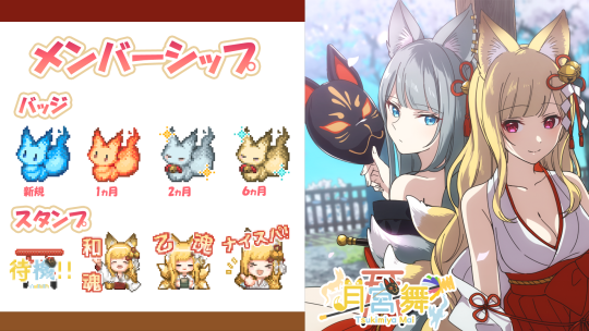
⛩Mai Tsukimiya, Membership Information⛩.
evenness【JPY 490 yen/month】
・Members-only badges and stamps
・Members-only delivery
・Monthly! Birthday message video 🎉🎂
The illustration of the pictogram is by Kodake-san ( @kodake_555 )
Please join here 👇.
https://youtube.com/channel/UCi0GQVJP_LLc1vf67Hgi2YA/join/join
18 notes
·
View notes
Text
Concepts of Visual Language Brief Introduction
Monday 5th June deadline
Explores semiotics and semantics of visual language
Allows you to define brief
Technology introduces change - can’t ignore it as it’s integral to work
Talk about the understanding of what you’re doing within your discipline
A1 Identify topics and theories that underpin your project and then develop understanding of those
A2 How to then define an idea and whether that’s identifying problems or looking at ideas to solve them/raise awareness
A3 Design solutions relating to audience
LO1 Show how you are researching into a topic, theories and ideas around subject matter and reflect on that (tumblr and process book)
LO2 How you are able to identify problems and be able to generate ideas and use a range of approaches. Think about a range of solutions and land on one concept. Identify it based on audience. Tumblr and process book.
LO3 Have a design that’s trendy and current. Don’t want to see old ideas. Make it good. Demonstrate in outcome.
Task Outline:
Combining elements can make for more powerful imagery (type and imagery)
Design a project that meets the learning outcomes.
Starting points:
Navigation, advocacy, participation, conversation, critique
The unit can be a series of experiments/ projects
Eg. Navigation- look at how people interact when travelling
What is your current understanding of the topic?
Navigation:
Navigation systems as a basis for communication (wayfinding)
Gather and present info through selection to align with audience understanding
Mapping, signage, pictograms, data graphics, catalogues, app interfaces
Advocacy:
Supporting or recommending a particular cause or policy
Raise awareness
Designers have a larger responsibility in the community we operate in
Can think globally, nationally or locally
Exhibition design, brand design, advertising, infographics, film
Case studies:
Jonathan Barnbrook- The Occupy Movement
Lucienne Roberts-On Solid Ground (refugees)
Participation:
Taking part in something. Messages involve the audiences. How do you influence decision making as a designer.
Branding, workshops, generative systems, data visualisation, ad campaigns
Conversation:
Basis for how visual communication works
How to bring feedback into creative process
Surveys, data collecting
Critique:
Proactive visual communication
Reframe and speculate design to visualise potential futures
Projects which spark discussion and foster enquiry
Boundaries and borders of visual communication
Magazines, blogs, monographs, exhibitions, website design, online forums
Justified by Josh Ogden
Make a list of interests and a list of aspects within visual communication:
My interests:
-History: WW1 and WW2, controversial figures in art like Pablo Picasso, Victorian invention san dmedicine, piracy, powerful women and feminism, colonialism and the impact on indigenous cultures
-Social Issues: Women and medical neglect, women as second citizens in Syria, Afghanistan and South Korea, feminist movements, big oil companies and responsibility for global warming, Facebook and their promotion of the alt right, overconsumption, FGM, the accessibility of the internet for young children and lack of means to truly protect them, the victimization of indigenous people in America, gun violence in America, the rise of the alt in America, Brexit, the isolation of North Korea and the struggle of defectors
-Music: Indie psychedelic rock, avant-pop alternative, Fiona Apple and her music being used as a fetsihisation of women's pain, feminist movements cultivated through music with likes of Paris Paloma
-Visual Communication: Women in design, Paula Scher, the origins of mural artworks, the rise of corporate design, the increased pressure to create under a world where ideas are constantly being shared, branding for the new generation
-Books: Romanticisation of abusive men in women's literature (Colleen Hoover), romantic representations of men in literature as being an escape from the harsh realities of dating men, Dolly Alderton and her representation of love
-Movies: Representation of WW1 and WW1, harsh realities of history shown in film such as in Come and See, the discussions surrounding the morality of representation topics such as SA, symmetry in film (Wes Anderson)
I made a list of things that interest me and found North Korea to be of particular interest to me as in recent months, I have been listening to the experiences of refugees and their escape from the country. I have wondered how defectors are treated once they have reached safety.
Here are some questions proposed in the brief that can help me guide this idea:
Field of Study-
What is your current understanding of the subject area you wish to explore?
I know little about the full context in regards to North Koreans experience in other countries, but I do have a lot of knowledge on the country and the escape process from various documentaries, news outlets and interviews I’ve watched.
Context-
Where does your subject fit culturally within current understanding of subject area? Who is your audience and where will they encounter your design?
I believe there needs to be a global understanding of what refugees go through as to know how best to help them. My audience might be either that of South Koreans or the British general public, as we are one of the only countries to accept North Korean defectors.
Methodology-
How will you research and construct your design? Which lines of enquiry do you intend to follow to equip you with the skills and methods of production you feel you will need?
My research will be web-based as this is where the majority of the information we have about North Korea in the contemporary context can be found. I want to base my idea on the experience of defectors and their journey-such could be a book, leaflet, poster or exhibition piece. This is to help the audience empathise with their experience and in turn, offer help where needed. A point of research is to look to charities that help with this and perhaps formulate an approach around this.
0 notes
Text
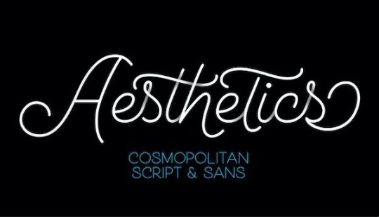
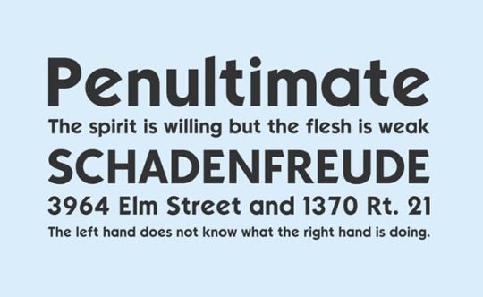
Cosmopolitan Font
Cosmopolitan is a fancy monoline script font that was created by Emil Karl Bertell and released by Fenotype along with 15 appealing styles and family package options.
Cosmopolitan is a monoline font family with script and sans versions that both work great together or alone. It comes with five weights and “printed” versions. For extra swashes, swirls, and pictograms there is Cosmopolitan Extras.…
View On WordPress
0 notes
Text
Is Braille Required for ADA Compliant Signage?
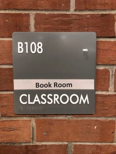
Braille isn’t always required for ADA compliant signage, but it usually is. Braille helps those with impaired sigh understand the signs and is usually required on signs that label rooms. However, the rules are a little more complicated than that and there are more ADA requirements than just braille. If you’re not sure your signs are ADA compliant in Milwaukee, our team can help. Read on to learn the basics of ADA sign compliance and reach out to us for specific advice about your situation.
When is Braille Required?
Braille is required on most kinds of wayfinding signs that you have throughout your property. If a sign is within arm’s reach and it labels a room, those are both good indicators that the sign needs braille. However, some signs will need to fulfill other ADA requirements beyond braille.
Signs that need to follow ADA rules include:
· Bathroom signs
· Accessibility signs
· Emergency signs
· Exit signs
· Door signs
· Wayfinding signs in halls, etc.
Other Requirements of ADA Compliant Signs
Braille is not the only thing that makes or breaks whether a sign meets ADA obligations. The ADA requires other features and elements be included on signs in order to make sure that people with any kind of accessibility issue can still understand your sign.
Other requirements beyond ADA compliant Braille include:
· Pictograms: The International Symbol of Accessibility is a requirement for most ADA signs. Sometimes you also need to include other pictograms which illustrate the meaning of the sign.
· Text rules: Using just any text isn’t allowed. Most signs need to have sans serif fonts, which do not have flourished and which are therefore easier to read.
· Braille rules: It is not enough to just have Braille. Your signs likely need to have Braille #2 with raised or tactile characters. This isn’t quite the same as just using the Braille alphabet to spell out what the sign says. Instead, its like a short form language that makes it easier to read.
ADA Compliant Signs in Milwaukee
You need your signs to be ADA compliant not just to avoid fines but also make sure that each one of your customers is comfortable in your space and knows how to get around it. If you have questions about ADA compliance in Milwaukee, you can reach out to the team at Optimum Signs. Contact us today.
0 notes
Text
Reflective notes - History and Evolution of Typography
The History and Evolution of Typography
The concept of type began when humans during the prehistoric time started conveying their stories and adventure through pictograms and cave paintings. These would then evolve into engravings on clay tablets, which could be carried with them to places.
This was followed by ideograms with 720 characters. The 720 characters were later reduced to 560 characters and called cuneiforms. It was again reduced to 28 characters and termed Phoenicians, after which came the Roman characters, 28 in number.
Drop caps in paragraphs were inspired by the Bible.
John Gutenberg introduced Movable type or Letterpress printing during the Renaissance era. Blackletter typeface was used.
During that time, storing letters in small caps was hard, so they made “Lowercase” letters, which were easily stored. Since the letters were based off of human written type, they are known as Humanist fonts.
Shortly after the invention of movable type, typefaces inspired by Roman type came, with Jenson making letters based on the lettering on ancient Roman buildings. In the late 15th century, Italics were created to save money and space on sheets.
In the 18th century, William Caslon created a typeface Caslon, which was more legible than previous typefaces. These kinds of typefaces came to be known as Old Style. They featured thick serifs and low contrast between thick and thin strokes. Some examples of these typefaces are Garamond and Bembo.
Between the Old style and Modern fonts came Transitional style. These featured thinner serifs and a higher contrast between thick and thin strokes. An example of these typefaces is Baskerville.
After transitional, Modern serif typefaces came, with extreme contrast between thick and thin strokes and very thin serifs. Example: Bodoni.
Slab Serif was inspired by Egyptian typefaces, with slab-like thick serifs. These typefaces were used to put an emphasis on the content and were mostly used in attention-grabbing posters. These also provided clearer reading on poorer quality paper. Example: Clarendon.
Caslon IV then removed the serifs off and created Sans Serif typefaces.
Grotesque and AKG
Neo Grotesque: Fonts like Univers inspired Helvetica, both of which had a strong impact.
Geometric: Letters based on Geometric shapes, example Futura
Humanist: Sans serif fonts inspired by human writing, however with low contrast
0 notes
Text

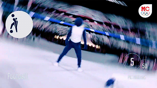
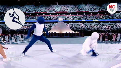
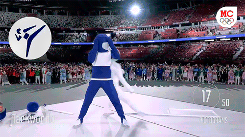
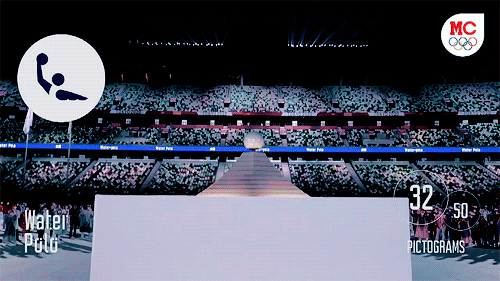
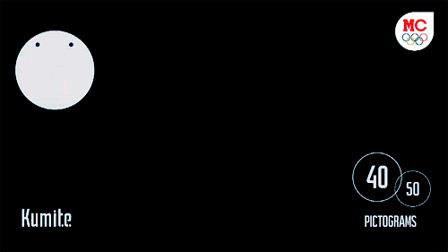
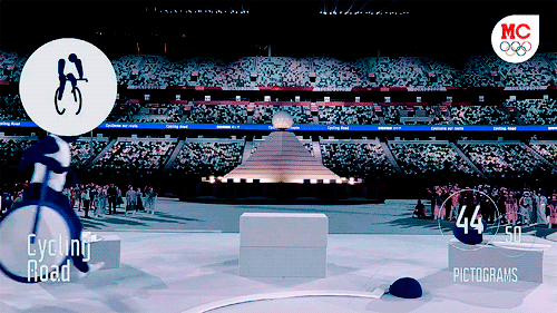
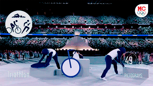
Dancers (♥) perform a pictogram of Olympic sports during the Opening Ceremony of the Tokyo 2020 Olympic Games.
#tokyo 2020#tokyo olympics#olympics#olympics 2020#olympic games#sports#*#gif*#sports*#gif#gif:s#i know i'm extremely late#i don't know how people manage to edit so fast#i can barely keep up with everything i'm interested in#and it feels like this happened ages ago#also it looks kinda messy#BUT I HAD TO#IT'S SO BRILLIANT#3k#pictogram san
3K notes
·
View notes
Text
hey uhhh why are the icons so ugly
6 notes
·
View notes
Photo

2017.2018 — Type design
Strijp Ample is a typeface inspired by the architectural and cultural environment of the Strijp district, in Eindhoven city.
○ 179 glyphs
Bostryche Petit Texte is a typeface designed in the aim to be laser cutted at a low scale. This font is named after the Bostryche Typographe (Ips Typographus), a small sized beetle.
○ 192 glyphs
#typography#type design#sans serif#wide font#serif#lasercut#technical font#typographie#typeface#architecture#pictogram#strijp#strijp ample#bostryche PT
6 notes
·
View notes
Text
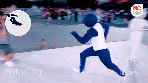
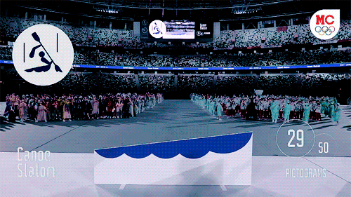
olympics pictograms come to life | tokyo 2020 opening ceremony
+ pictogram-san at the post-ceremony presser 🥺
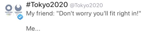
#obsessed with this segment#this was so cute and creative???#i've watched it enough times now to be ashamed at myself#olympics#tokyo 2020#video#not hockey#can’t wait to see the#beijing 2022#one
16K notes
·
View notes

Text
"Students, we have a new exchange student today. Switch-san comes here from Canada."
This was where it became clear that my luck had run out. This entire classroom of high school students could tell that I was grossly too old to be a transfer student. Certainly the teacher could, as she's much younger than me. Still, I knew that if I just kept projecting confidence, they would eventually decide that it was someone else's problem and go on with life.
After stumbling through an introduction, I managed to find my assigned seat and sit next to Jotaro. I didn't know much about him, but something told me that he was into cars too. We would be kindred spirits. At long last my quest could conclude, and I could return home triumphant.
"Hey, do you know where I can get a cheap Suzuki Cervo? It seems like a great car for a student driver."
Jotaro regarded me with suspicion. Immediately I realized I had made a critical mistake. When I was blackmailing that English teacher into filling out the transfer paperwork, I failed to notice that I had checked the box next to the distinct characters for "Toyota City" – pictograms of a four-speed automatic transmission, reliability, and a lack of regular maintenance on the part of the first through seventeenth owners. This was enemy territory if you were looking for a rear-engined, two-stroke Middle-Japanese runabout from the late 1970s. To his credit, he played it off with a confused shrug, and we returned to our instruction.
Later that day, I got into a massive street fight with a bunch of Celica-owning diehards, no doubt tipped off to my existence by Jotaro. I wish I could say that I had a better fighting technique than curling up into a ball and wailing loudly in only the greasiest Quebecois French about being a senior citizen, but it got the attention of some passing cops.
And those cops left their cruiser running – a late-model Nissan Cedric. Cops really do identify as a different group of people than civilians, I realized with a start while in the midst of powersliding it through a crowded shopping plaza with the lights and siren wailing. As I rapidly upshifted to regain traction and headed for the highway to Hamamatsu, I lectured into the CB radio that they should really work better on integrating themselves into the community.
55 notes
·
View notes
Text
simple, yet effective resources
can’t believe i’ve been on this corner of the internet for YEARS and never knew about this stuff, but!! I wanted to formally pass this along to anyone who may not know about these resources, especially if you’re interested in creating cc previews, gameplay posts, whatever~!
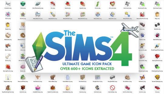
The Sims 4 Ultimate Game Icon Pack
High quality extracted pngs of icons from traits to whims to a multitude of in-game pictograms that pop up in your upper right hand corner. This is an incredible ~base set~ of graphics that can serve a multitude of purposes. This download has not been updated since 2017 (if you’re on the hunt for a specific icon from a recent pack, it may be missing), but it enables an eternity of possibilities with the supplementary Modders Guide.
The Sim Sans Font Family
A must have if you’re looking to emulate The Game, The Franchise, The Corporation. As critical as I am about several of EAxis’ design decisions (i’m still tender about the rebrand), this font is solid as hell. Smooth and sexy, feels like home. The blue “Download Now” button on this site might seem sketchy, but it’s no adfly link, am i right????*

My Personal Contribution to this Post
Here are the hex codes I use to match the UI; my eyedropper is as good as yours ;)
#2A85C8
#6ACE3D (very cool name for a chroma key color lol)
#DFDEDD
Hope this helps somebody! I’m yelling about just now finding these treasure troves and if it took me this long, I hope to bridge the gap with someone else. Enjoy!
*my computer is fine it’s safe to download lol
99 notes
·
View notes
Text
Graphics Design
Graphic design is a profession whose business is the act of designing, programming, and create visual communications, generally produced by industrial means and intended to convey specific messages to specific social groups, with a clear purpose. This is the activity that enables graphically communicate ideas, facts and values processed and synthesized in terms of form and communication, social, cultural, economic, aesthetic and technological. Also known as visual communication design, because some associate the word figure only to the printing industry, and understand that visual messages are channeled through many media, not just print.
Given the massive and rapid growth in the exchange of information, the demand for graphic designers is greater than ever, particularly because of the development of new technologies and the need to pay attention to the human factors that are beyond the competence of engineers who develop them.
Some classifications are widely used graphic design: advertising design, editorial design, corporate identity design, web design, packaging design, typographic design, signage design, multimedia design, among others.
Graphic Design History
The definition of the graphic design profession is rather recent, in what concerns their preparation, their activities and goals. Although there is no consensus on the exact date of the birth of graphic design, some dating during the interwar period. Others understand that begins to identify as such to the late nineteenth century.
Arguably specific graphic communications purposes have their origin in Paleolithic cave paintings and the birth of written language in the third millennium BC. C. But the differences in working methods and training required auxiliary sciences are such that it is not possible to clearly identify the current graphic designer with prehistoric man, with xylograph fifteenth century or the lithographer 1890.
The diversity of opinion reflects the fact that some see as a product of graphic design and all other graphical demonstration only those that arise as a result of the application of a model of industrial production, those visual manifestations that have been "projected" contemplating needs of different types: productive symbolic ergonomic contextual etc.
Background
A page from the Book of Kells: Folio 114, with decorated text contains the Tunc dicit illis. An example of art and page layout of the Middle Ages.
The Book of Kells - A Bible handwritten richly illustrated by Irish monks in the ninth century CE-is for some a very beautiful and early example of graphic design concept. It is a graphic demonstration of great artistic value, high quality, and that even a model for learning to design-for even surpasses in quality to many of the current-editorial productions, and also from a functional point of view contemporary This graphic piece responds to all needs presented the team of people who made it, however others believe that it would be graphic design product, because they understand that their design is not adjusted to the idea of current graphic design project.
The history of typography-and by transitive, also the history of the book-is closely linked to graphic design, this may be because there are virtually no graphics designs that do not include such items graphics. Hence, when talking about the history of graphic design, typography also cited the Trajan column, medieval miniatures, Johannes Gutenberg's printing press, the evolution of the book industry, the posters Parisian Arts Movement and Crafts (Arts and Crafts), William Morris, Bauhaus, etc.. "
The introduction of movable type by Johannes Gutenberg made books cheaper to produce, and facilitate their dissemination. The first printed books (incunabula) scored the role model to the twentieth century. Graphic design of this era has become known as Old Style (especially the typefaces which these early typographers used), or Humanist, due to the predominant philosophical school of the time.
After Gutenberg, no significant changes were seen until the late nineteenth century, particularly in Britain, there was an effort to create a clear division between the fine and applied arts.
In the 19th Century
First page of the book "The Nature of Gothic" by John Ruskin, published by the Kelmscott Press. The Arts and Crafts intended to revive the medieval art, inspiration in nature and manual labor.
During the nineteenth century visual message design was entrusted alternately two professionals: the artist or the publisher. The first was formed as an artist and the second as a craftsman, often both in the same schools of arts and crafts. For the printer as art was the use of ornaments and selecting fonts printed in his compositions. The artist saw typography as a child and paying more attention to ornamental and illustrative elements.
Between 1891 and 1896, the William Morris Kelmscott Press published some of the most significant graphic products Arts and Crafts Movement (Arts and Crafts), and established a lucrative business based on the design of books of great stylistic refinement and selling them to the upper classes as luxury items. Morris proved that a market existed for works of graphic design, establishing the separation of design from production and the fine arts. The work of the Kelmscott Press is characterized by its recreation of historic styles, especially medieval.
First Vanguards
Poster for the Moulin Rouge in Paris. Made by Henri de Toulouse-Lautrec with color lithography in 1891. Thanks to Art Nouveau, graphic design and visual clarity gained by the composition.
Isotype of the Bauhaus. Founded in 1919 by Walter Gropius, is considered the birthplace of the graphic design profession.
Given Poster for Matinée. Made by Theo van Doesburg in January 1923. The free font organization, expresses the spirit of the Dada movement, irrationality, for freedom and oppose the status quo and visual expressions of the time.
Corporate identity design for Lufthansa, by the Development Group 5 of the HFG Ulm. Ulm School was an inflection point in the history of design, since there is outlined the design profession through scientific methodology.
Current pictograms design for the National Park Service of the United States. The idea to simplify the symbols forms developed during the 1950s.
The design of the early twentieth century, as well as the fine arts of the same period, was a reaction against the decadence of typography and design of the late nineteenth century.
The interest in ornamentation and the proliferation of measurement changes and typographical style one piece design, synonymous with good design, it was an idea that was maintained until the late nineteenth century. The Art Nouveau, with its clear desire stylistic was a movement that contributed to higher order visual composition. While maintaining a high level of formal complexity, did so within a strong visual consistency, discarding the variation of typographic styles in one graphic piece.
Art movements of the second decade of the twentieth century and the political turmoil that accompanied them, generated dramatic changes in graphic design. The Dada, De Stijl, Suprematism, Cubism, Constructivism, Futurism, the Bauhaus and created a new vision that influenced all branches of the visual arts and design. All these movements opposed to the decorative arts and popular, as well as the Art Nouveau, which under the influence of the new interest in geometry evolved into the Art Deco. All these movements were a revisionist and transgressive spirit in all arts of the time. This period also publications and manifestos proliferated through which artists and educators expressed their opinions.
During the 1930s developed for the composition interesting aspects of graphic design. The graphic style change was significant because it shows a reaction against eclecticism ornamentalist organicism and the time and proposes a more stripped and geometric. This style, connected with Constructivism, Suprematism, Neoplasticism, De Stijl and Bauhaus exerted a lasting influence and inescapable in the development of twentieth century graphic design. Another important element in relation to professional practice, was the increasing use of visual form as communication element. This item appeared mostly in the designs produced by the Dada and De Stijl.
The symbol of modern typography is the sans serif font or serif, inspired by industrial types of the late nineteenth century. Highlights include Edward Johnston, author of the font for the London Underground, and Eric Gill.
Design Schools
Jan Tschichold embodied the principles of modern typography in his 1928 book, New Typography. He later repudiated the philosophy presented in this book, calling it fascist, but remained very influential. Herbert Bayer, who dirigó from 1925-1928 the typography and advertising workshop at the Bauhaus, created the conditions for a new profession: the graphic designer. He put the subject "Advertising" in the education program including, among other things, the analysis of advertising media and the psychology of advertising. Notably, the first to define the term Graphic Design was the designer and typographer William Addison Dwiggins in 1922.
Thus Tschichold, Herbert Bayer, László Moholy-Nagy, and El Lissitzky became parents of graphic design as we know it today. They pioneered production techniques and styles that have been using later. Today, computers have dramatically altered production systems, but the approach that contributed to experimental design is more relevant than ever dynamism, experimentation and even very specific things like choosing fonts (Helvetica is a revival, originally a Typography design based on the nineteenth-century industrial) and orthogonal compositions.
In the years following the modern style gained acceptance, while stagnated. Notable names in modern design midcentury are Adrian Frutiger, designer of the typefaces Univers and Frutiger, and Josef Müller-Brockmann, large poster of the fifties and sixties.
The Hochschule für Gestaltung (HFG) in Ulm was another key institution in the development of the graphic design profession. Since its founding, the HFG distanced himself from a possible affiliation with advertising. At the beginning, the department concerned was called Visual Design, but it quickly became clear that his current goal was to solve design problems in the area of mass communication in the academic year 1956-1957 the name was changed to Department of Visual Communication, modeled Visual Communication Department at the New Bauhaus in Chicago.2 3 In the HFG Ulm, decided to work primarily in the area of persuasive communication in the fields such as traffic sign systems, plans for technical equipment, or visual translation of scientific content. Until that time were not systematically taught these areas in any other European school. In the early '70s, members of the Bund Deutscher Grafik-Designer (Association of German graphic designers), unveiled several features of their professional identity, as in the case of Anton Stankowski among others. While in 1962 the official definition of the profession was directed almost exclusively to the advertising, now extended to include areas located under the rubric of communication visual.4 corporate images produced by the Development Group 5 of the HFG Ulm such as those created for the firm Braun or airline Lufthansa were also critical to this new professional identity.
Gui Bonsiepe and Tomas Maldonado were two of the first people who tried to apply the design ideas from semantics. In a seminar held at the HFG Ulm in 1956, Maldonado proposed modernizing rhetoric, classical art of persuasion. Maldonado Bonsiepe and then wrote several articles on semiotics and rhetoric for Uppercase English publication and Ulm magazine that would be an important resource for designers to that area. Bonsiepe suggested that it was necessary to have a modern system of rhetoric, semiotics updated as a tool to describe and analyze the phenomena of advertising. Using this terminology, could expose the "ubiquitous structure" of a message publicitario.5
The idea of simplicity and good design feature continued this for many years, not only in the design of alphabets but also in other areas. The tendency to simplify influenced all means at the forefront of design in the 1950s. At that time, developed a consensus that simple, not only was the equivalent of good, but was also more readable equivalent. One of the hardest hit areas was the design of symbols. The designers raised the question of how they could be simplified without destroying its informative function. However, recent investigations have shown that the shape simplification only one symbol does not necessarily increase readability.
Second Vanguards
Reaction to the sobriety growing graphic design was slow but inexorable. The origins of postmodern fonts back to the humanist movement of the fifties. In this group highlights Hermann Zapf, who designed two typefaces today ubiquitous Palatino (1948) and Best (1952). Blurring the line between serif fonts and sans serif and reintroducing organic lines in the lyrics, these designs served more to ratify the modern movement to rebel against him.
An important milestone was the publication of the Manifesto, first things first (1964), which was a call for a more radical form of graphic design, criticizing the idea of design in series worthless. He had a massive influence on a new generation of graphic designers, contributing to the emergence of publications such as Emigre magazine.
Another notable designer of the late twentieth century is Milton Glaser, who designed the unmistakable I Love NY campaign (1973), and a famous Bob Dylan poster (1968). Glaser took elements of the popular culture of the sixties and seventies.
The advances of the early twentieth century were strongly inspired by technological advances in photography and printing. In the last decade of the century, technology played a similar role, but this time it was computers. At first it was a step back. Zuzana Licko began using computers to compositions soon, when computer memory was measured in kilobytes and typefaces were created by dots. She and her husband, Rudy VanderLans, founded the pioneering Emigre magazine and type foundry of the same name. They played with the extraordinary limitations of computers, releasing a great creative power. Emigre magazine became the bible of digital design.
David Carson is the culmination of the movement against contrition sobriety and modern design. Some of his designs for Raygun magazine are intentionally illegible, designed to be more visual than literary experiences.
Present Times
Today, much of the work of graphic designers is assisted by digital tools. The graphic design has changed enormously because of computers. From 1984, with the appearance of the first desktop publishing systems, personal computers gradually replaced all analog in nature technical procedures for digital systems. Thus computers have become indispensable tools and, with the advent of hypertext and the web, its functions have been extended as a means of communication. In addition, the technology also has been noted with the rise of telecommuting and special crowd sourcing has begun to intervene in work arrangements. This change has increased the need to reflect on time, motion and interactivity. Even so, the professional practice of design has not been essential changes. While the forms of production have changed and communication channels have been extended, the fundamental concepts that allow us to understand human communication remain the same.
Job performance and skills
The ability to design is not innate, but acquired through practice and reflection. Still, it remains an option, one thing potentially. To exploit this power is necessary continuing education and practice, as it is very difficult to acquire by intuition. Creativity, innovation and lateral thinking are key skills for graphic designer job performance. Creativity in design exists within established frames of reference, but more than anything, is a cultivated skill to find unexpected solutions to seemingly intractable problems. This translates into design work of the highest level and quality. The creative act is the core of the design process manager but creativity itself is not an act of design. However, creativity is not exclusive graphics performance and no profession, although it is absolutely necessary for the proper performance of the design work.
The role that the graphic designer in the process of communication is the encoder or interpreter works in the interpretation, organization and presentation of visual messages. His sensitivity to the form must be parallel to its sensitivity to the content. This work deals with the planning and structuring of communications, with its production and evaluation. The design work is always based on customer demand, demand which eventually established linguistically, either orally or in writing. This means that the graphic design transforms a linguistic message in a visual demonstration.
The professional graphic design rarely works with nonverbal messages. At times the word appears briefly, and in other texts appears as complex. The editor is in many cases an essential member of the communications team.
The design activity often requires the participation of a team of professionals, such as photographers, illustrators, technical illustrators, including professionals with less related to visual message. The designer is often a coordinator of various disciplines that contribute to the production of the visual message. Thus, coordinates its research, design and production, making use of information or specialists in accordance with the requirements of different projects.
Graphic design is interdisciplinary and therefore the designer needs to have knowledge of other activities such as photography, freehand drawing, technical drawing, descriptive geometry, psychology of perception, Gestalt psychology, semiology, typography, technology and communication.
The professional graphic design is a visual communications specialist and his work is related to all steps of the communication process, in which context, the action of creating a visual object is only one aspect of that process. This process includes the following:
Defining the problem.
Targeting.
Conception of communication strategy.
Display.
Schedule Production.
Monitoring Production.
Evaluation.
This process requires the designer to possess an intimate knowledge of the areas of:
Visual communication.
Communication.
Visual Perception.
Management of financial and human resources.
Technology.
Media.
Assessment techniques.
The four guiding principles of graphic design are variables that graphic design professional should consider when facing a project, these are:
The Individual: conceived as ethical and aesthetic unit that integrates society which is part and to whom the visual space is uniform, continuous and connected.
The advantage: because it responds to a need for information and this is communication.
The atmosphere: because it requires knowledge of physical reality to contribute to the harmony of the habitat, and the reality of other contexts for understanding the structure and meaning of the human environment.
The economy: it encompasses all aspects related to the study of the cost and streamlining of processes and materials for the implementation of the elements.
For graphic design services visit here.
2 notes
·
View notes
Text
Lesson 06
The History and Evolution of Typography
The concept of type began when humans during the prehistoric time started conveying their stories and adventure through pictograms and cave paintings. These would then evolve into engravings on clay tablets, which could be carried with them to places.
This was followed by ideograms with 720 characters. The 720 characters were later reduced to 560 characters and called cuneiforms. It was again reduced to 28 characters and termed Phoenicians, after which came the Roman characters, 28 in number.
Drop caps in paragraphs were inspired by the Bible.
John Gutenberg introduced Movable type or Letterpress printing during the Renaissance era. Blackletter typeface was used.
During that time, storing letters in small caps was hard, so they made “Lowercase” letters, which were easily stored. Since the letters were based off of human written type, they are known as Humanist fonts.
Shortly after the invention of movable type, typefaces inspired by Roman type came, with Jenson making letters based on the lettering on ancient Roman buildings. In the late 15th century, Italics were created to save money and space on sheets.
In the 18th century, William Caslon created a typeface Caslon, which was more legible than previous typefaces. These kinds of typefaces came to be known as Old Style. They featured thick serifs and low contrast between thick and thin strokes. Some examples of these typefaces are Garamond and Bembo.
Between the Old style and Modern fonts came Transitional style. These featured thinner serifs and a higher contrast between thick and thin strokes. An example of these typefaces is Baskerville.
After transitional, Modern serif typefaces came, with extreme contrast between thick and thin strokes and very thin serifs. Example: Bodoni.
Slab Serif was inspired by Egyptian typefaces, with slab-like thick serifs. These typefaces were used to put an emphasis on the content and were mostly used in attention-grabbing posters. These also provided clearer reading on poorer quality paper. Example: Clarendon.
Caslon IV then removed the serifs off and created Sans Serif typefaces.
Grotesque and AKG
Neo Grotesque: Fonts like Univers inspired Helvetica, both of which had a strong impact.
Geometric: Letters based on Geometric shapes, example Futura
Humanist: Sans serif fonts inspired by human writing, however with low contrast.
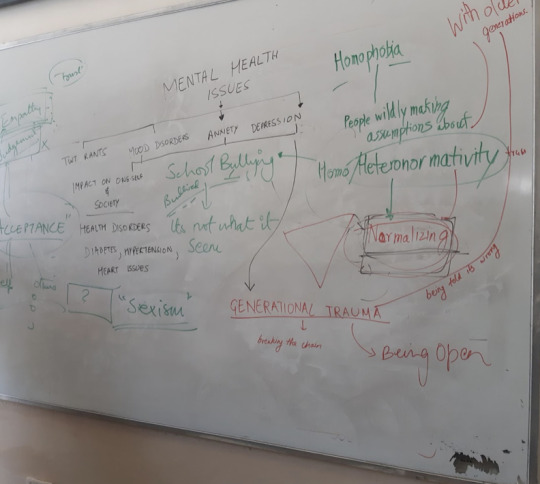
We were also assigned a new assignment regarding Scanimation and AR . We were asked to come up with a concept and mind map it on the whiteboard.
While doing so, Deepika, Het, Tanmay, and I came to a conclusion that while vastly different, the social problems we have chosen connect at some point. On further discussion on it with ma'am, we realised these problems arise due to lack of perspective and an inability to understand each other. The one thing that can help us understand each other is empathy.
The concept I decided to go with was "Trans Generational Trauma."
0 notes
Photo
I am an antivirus program (2020)
> CHAPTER 2
The new human type cannot be properly understood without an awareness of what he is continuously exposed to from the world - Theodor Adorno. Minima Moralia, 1951
We can not change the medium as the medium is predicated on the message (use my square space code for a 10% discount)- we are fixed in this web 2.0 and the control of knowledge will be met with the streamlining of UI and UX design. Design tools like the adobe programs will continue to increase their premium and their monopoly hold on the design space - to be a designer is to be implicated with this process, regardless if you pirate software or notThis is where I raise flags against the tepid conglomeration of blog sites and web in general, the astroturfing of the internet has only amplified the feedback of Graphic Design. You’d typically call this commercial design. Commercial design fits the criteria of an evolving media world, “It is important to note that this ultimate stage of pictorialization was a reversal of pattern. The world of body and mind...was not photographical at all, but anonvisual set of relations”1. Commercial Design started to drive an efficiency science behind it’s aesthetic - you make the access mode immediate and your engagement success is far higher, and you do this through the pictogram, and when photography came about, that too was made into a design appendage. “To understand the medium of the photograph is quite impossible, then, without grasping its relations to other media, both old and new. For media, as extensions of our physical and nervous systems, constitute a world of biochemical interactions that must ever seek new equilibrium as new extensions occur.”1 This is potentially a valuable understanding of media, and thus design, presented by media theorist Marshall Mcluhan, commercial design (and all art and design in a sense) are schizophrenic presentations of the world, they accumulate meanings outside the presented scope of an advertisement, or typography - they link the relational experience of the mass media consumer, as Mcluhan states. However, this is not all, he states an ‘equilibrium as new extensions occur’ - in my context now this weighs with a great importance, we know the new extensions already, something that Mcluhan unfortunately didn’t get to experience fully, and that’s the web, the modern computer, the pocket mobile device. These are in their own rights mediums, your OS (operating system) is a computer language medium that dictates other program mediums, the access mode to the rest of the systems of design, websites contain live feeds and streams to distant realities, it’s all so lucid but at the same time it feels like an astral projection. At times this can feel nauseating, that collapsing feeling of ‘space’ and ‘time’. This presents a wider problem with modern design, technology has embedded itself into the core of the practice since the dawn of paper and pen, stone and chisel etc. The problem being that while technology has stopped gapped connectivity, it refuses to go further - refuses to return the creativity of a design practice unless commandeered. This has led to the necessity for the designer to code, and script, to kit bend and utilise AI - once again “fragmenting” the work role. “Under conditions of electric circuitry, all the fragmented job patterns tend to blend once more into involving and demanding roles or forms of work that more and more resemble teaching, learning, and “human” service, in the older sense of dedicated loyalty.” Graphic design namely has done well to adapt and reshape, showing its versatility in the age of digital design. Not only that, it hybridizes aesthetic models much like a fashion season generates new styles, which keeps design itself fresh and alive, while sometimes slipping into the contrived and over-saturated. But is the “human” service really what Graphic Design is becoming? It certainly hints to this with the proactive design studio model. Interaction and Bureaucracy, it’s an efficiency tactic. All design requires hierarchy even if that hierarchy is to not have one. I see the office space, I remember the spider plant, I see the shore line, I see the whitecaps. The workers space is a micro-territorial space of capital politics and a grab for faux socialism in most cases, in some, it is an honest attempt to form comradery - the cafeteria is an effective grounds to reinforce or detourne this thinking. People like artist Olafur Eliasson effectively install a commons space for the studio team to interact and communicate, job roles are made equal in that space. “The studio, as much as we don’t like it, means working in your own little departments, compartmentalised. And there are hierarchies even though everyone’s a part of the democracy. The kitchen is a nice leveller.” It’s a universal ideology that falls into a majority of Eliasson’s work that provides an effective future-proof for how the operations of studio practice should be carried out (see the Auteur myth). My cynicism is only symptomatic of the consumerist prerequisite that allows design to exist in the first place - a degree in the topic definitely is met with a careerist sentiment, to be financially viable within a milieu of art and design subjects. Graphic Design should not try to divorce itself from this grouping, it stands stronger with the complex wovings and multitudes that allow it to bloom as an individual practice that arranges the practice of others. The efforts here are a concern with the design practice no less, and how ethics and politics are sequestered by a shifting responsibility of effects, how and why Graphic design mutated into the corporate virus that it is now. ”All media work us over completely.”8 This is Mcluhan’s sentiment from his writings in the 60’s, and It stands up true to this day, more so than ever. Algoration (the use of data algorithms to curate a web feed) are notorious and globally implemented into most ‘social media’, but outside social media, it’s used as predictive data. This is the “reversal pattern”, Graphic Design puts a face to this slippery coded underbelly. The automation of design media has become an efficient business strategy to overmine its user base data, and subsequently requires illustration. To be concise, the study of the Graphic Designer is in part the study of Media, the study of media is the lens of relational activities and connectivity. And this is the permitted virus. Adversely, the antivirus program is a research protocol invested in studying the autonomy available to a Graphic Designer, and an extended hand to all fragmented sectors that require a similar reclamation. Language dictates media – media manufactures consent, therefore language manufactures consent. A small quibble no less, that the Graphic Designer goes to bed with media every day. And in the morning they arise with vast spawns of editorials, emailing lists, content posts - lots of fucking content posts by content creatures. The homogeneous sprawl of media is a compounded expository of new design conditions. “Today, the mass audience can be used as a creative, participating force. It is, instead, merely given packages of passive entertainment.”8 The passive entertainment is reflexive of its audience, an audience that is content on not being challenged when engaging and consuming media, not being challenged when creating and releasing it - the language logic is a false preposition - things don’t have to occur in the forefront of our percepts, media can be a stealth operation for critical theory or a dog whistle for nazis. Even a glass of milk is steeped in meaning. “The photograph is just as useful for collective, as for individual, postures and gestures, whereas written and printed language is biased toward the private and individual(s) posture.”1 Mcluhan and designer Rapheal Roake seem to fit perfectly in collusion with one another here, “All design is a political act”, this fits Mcluhan’s collective principle for the photograph precisely, as this explicitly gives backing to the relational dynamics of media itself, it sits in the collective sphere - the global village. It all begins to feel like a fever dream, the spectres of Helvetica, Comic sans and Papyrus jumping on your chest as you’re paralysed in a waking dream. Blink and you’ll miss the horses head 144hz refresh rate. The grid settings of your life are closing in tighter and tighter as you cant kern in a moment for peace, please adobe I’m plugged in to your creative cloud let me use my kettle already, yes dear, they’re wacom tablet plates, we threw out the cutlery and replaced them for tote bags and ironic panel hats. The decoherence of the 21st century is here and it’s got anthropocene smeared all over its lips. Everyone wants to fuck their OLED displays, the screen is constantly flirting with me, it bulges and writhes along with it’s circuitry like an obscene Cronenburg slide show, and with a tilt of the hinge, it rips my hands straight off the bone. It’s simultaneously psychosexual and completely meaningless, but there doesn’t seem to be any Big Other alternative, can you see the demons wearing the guise of post-modernity, and where they emit a solar flare? Just tryna game the system can’t you see, if I shake it at just the right moment, at the right angle, I’ll get an additional diet coke. You don’t understand how fucking much I like diet coke. A man who finds himself among others drinking diet coke is irritated because he does not know why he is not one of the others drinking diet coke. I have graphic design Stockholm syndrome, what do you mean you don’t know who Gerrit Noordzij is? At this point going outside will trigger my flight or fight response, I’m afraid of being swooped by seagulls while I’m bound on a rock, I sleep in a bed with a faraday blanket, I’m absolutely glowing, washed in sunlight. “As for the anticipation of reality by images, the precession of images and media in relation to events, such that the connection between cause and effect becomes scrambled and it becomes impossible to tell which is the effect of the other” These collective postures translate into all modern media and are littered with effects. One is singular and rhizomatic in any given instance of engagement towards media and the invisible hand of the ‘designer’. And on the contrary the medium is an assemblage of arborescence and is later politicised in the factory line assembly - a by-product of ‘essential’ capital labor. The capital fiction is overwritten by the post-market mythos of a company and it’s figureheads, it’s in-house publishing team use individual members to feature in nice magazines. Effects, we are overcome by so many different effects daily, to the extent that we become desensitized to the potential the subsequent causes and effects, modern reality makes sure to compound these consequences of media to a sensory overload of hysteria, the neurotic ones take to pinterest to organise themselves. We like to order things, It gives clarity and comfort within the dysphoria and entropy of our lives, pinterest, tumblr, are.na, instagram are all negentropical solutions in an overstimulated digital environment. “Instant communication insures that all factors of the environment and of experience coexist in a state of active interplay.”8 To understand this I need to clarify that the medium, the message, the photograph and all subsets of visual and nonvisual information are communication - it goes without saying - but this establishes the politicised and astroturfed space of Graphic Design, a designer is expected to make commercially viable work to thrive, and usually this is achieved by co-opting styles to any degree appropriate to a brief. This results is the parody, the hyperstition and hyperobject - an overly ironic and self aware ventilation apparatus that keeps the gimmicks of Graphic Design alive. The overtures of a design piece can appear stark placid and regurgitated. It’s very much easy to default to a ctrl-c, ctrl-v automation process. Reinforced no less by an autodidact push of some educational institutions - more concerned with juggling design briefs than focusing their teachings on a core design system (despite their ever love for the Bauhaus - yes huni the library is open). Of course, with the new emphasis on a technology dominated world we are expected to rely and reinforce the techno-dependent designer (work smart not hard). And we are yet to catch up to this mutation in design, where design was once a phylogeny of different features that collected to assume a physical medium, centrered on type, constrained by fibres and ink and oil - these components have congealed onto the Macbook, the ergonomics of physical/digital unbound the Designer from the difficulties of a physical medium. So why do we remain in the realm of rehashing typefaces and conventional media, why are we tied down to the revolving doors of design trends - surely now than ever we have all the components, all the tools to produce new design movements, this can’t keep up “When the circuit learns your job, what are you going to do?”8
1 note
·
View note
Last Seen Blogs

kinkuchan
Sin título

goddamnitdazai
Yokohama Dumpster Paradise
fandomwe1rd0
Just a stranger on the internet

crooked-zombie-student
Panties and asses
dasloddl
ФАКЕЛОНОСЕЦЬ™