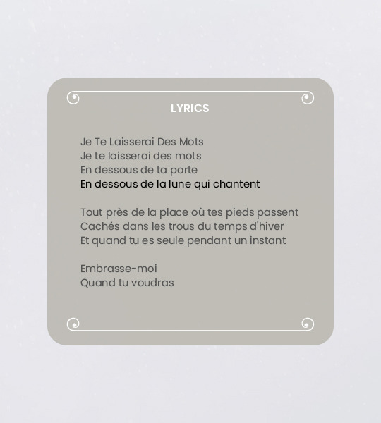
#templatepsds
Text
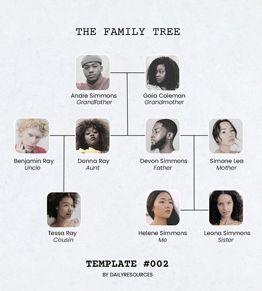
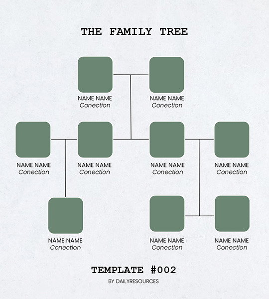
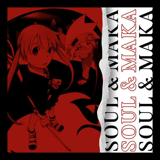
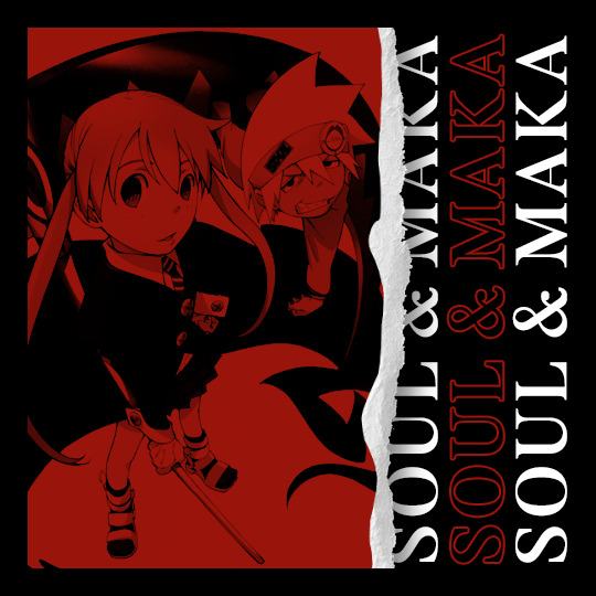
Template #002 by dailyresources
— Family Tree Template
Please do not repost / redistribute or claim as your own.
Please, like or reblog if you download.
You may edit as much as you like, it is fully customizable.
This is a free template, for personal and non-commercial use only.
Credit is very much appreciated but not necessary.
Any issues, don’t hesitate to contact me!
Size: 540x600px
Fonts: Poppins; Courier New.
Enjoy ❤
Download Link: [mediafire]
#templates#family tree template#templatepsds#template psd#free resources#photoshop template#photoshop resources#resouces#family tree#dearindies#evansyhelp#yeahps#my creations#my templates#*#*mine
547 notes
·
View notes
Photo
somebody asked me to please share my silly polaroid template so here it is
pls like/reblog if you download/use
thank youu ! ♡
115 notes
·
View notes
Photo

“a warm girl in a cold city.”
#oc: Estella#ts4#the sims 4#oc trivia#just popping in to post my active ocs <3#miss abstella!#i frankensteined 2 templates together#and filled them out in a vc w my besties#templatepsds#moonbcwi
21 notes
·
View notes
Text
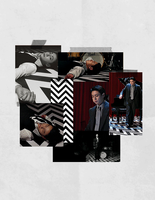
jungkook x vogue korea for @cosmicdreamgrl ★
#userbangtan#usersky#annietrack#heyryen#shirleytothesea#useremmeline#usermaggie#trackofthesoul#btsgif#usertaeyungie#btsedit#jungkookedit#jeon jungkook#mine!#dailybts#dailybangtan#steph <3#flashing tw#jungkook x vogue korea#cr. templatepsds (linked)#tw flashing#for the suit appreciators#also i love you#this helped me relieve some stress thankfully#while catching up on all my trash tv#gn <3
354 notes
·
View notes
Text
Episode 20: Major Questions
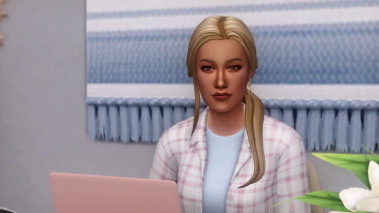
As time passed, Lucy still felt perplexed by her job. She knew Damien wanted to expand the company to other forms of digital media, but to what exactly? And why was he leaving those sort of decisions in the hands of a new hire who he hadn’t even met?

Lucy’s confusion was complicated by the fact that she enjoyed being at Rainy Day. She liked her coworkers and saw a lot of potential in the company. Even with all of the uncertainty about her role, she was still getting paid and it was helping a lot. On the other hand, how could she feel secure in her job when she didn’t even understand what her job was?
Frustrated, she turned to the internet to do some research on Damien. If no one at work could tell her what his expectations were, maybe she could find out from outside sources.

Through her searching she discovered that Damien hadn’t always been so reclusive. He gave a lot of interviews in the past that provided more information about the mysterious entrepreneur. She learned that he grew up in San Myshuno, raised by his widowed mother along with his brother. Apparently his mom had quite the avid interest in computers and technology, but it was hard for a woman to make it in a field like that back in those days.
Now Lucy understood why he was so adamant about hiring women at his company. He wanted to give them the opportunities his mother never had. He also spoke a lot about the lack of representation in the field of anyone who wasn’t a straight, white, cis male.
Looking at her coworkers, Lucy could see that Damien was trying to amend that. She was finding herself endeared to the man, as infuriated as she was by his lack of leadership. She had to wonder, why her? What was it about Lucy that made him think she of all people should be at the helm of all of these big decisions?

Suddenly, it dawned on Lucy that maybe that was never his intention. Parker had said that everyone else who was interviewed declined the position, insinuating that they didn’t want all of that responsibility. But what if that wasn’t what the job was at all? Lucy finally realized what she needed to do.

Previous | Beginning | Next
Closeup of Lucy's computer screen and transcript behind the cut
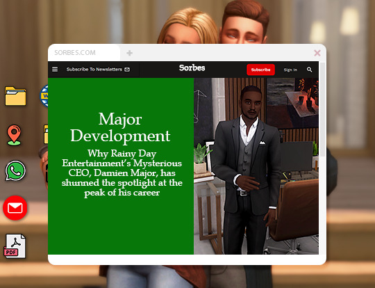
Transcript: SORBES.COM. Major Development. Why Rainy Day Entertainment's Mysterious CEO, Damien Major, has shunned the spotlight at the peak of his career
#better late than never#ts4#the sims 4#sims 4#ts4 gameplay#ts4 story#simblr#sims storytelling#sims story#sim stories#simlit#icons by freepik#template by templatepsds#cuwtd#oc: lucy dimarco#oc: damien major
21 notes
·
View notes
Text

SOCIAL POST.psd
puoi scaricare il psd da questo → ʟɪɴᴋ
(¬‿¬) like or reblog if u download. don’t repost! ♡ I created this content with love, so I ask you to respect it. Don’t pass the job as yours, thank you.
9 notes
·
View notes
Text
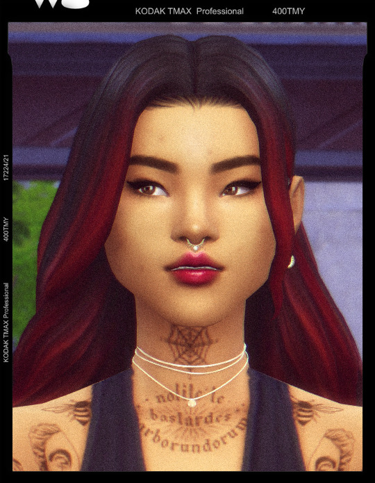
recreated (and restyled) the red beanie girl from my TS3 throwback post 🖤
meet irina 🦋
if you'd like to know more about her, here's some basic info! all of this is drawn from her TS3 story but updated
she's 27, vietnamese-american, and an interior designer extraordinaire
infj - enneagram 7w6 - gemini sun, sagittarius moon, scorpio rising
pansexual, huge fiona apple fan, afraid of spiders but has multiple spider themed tattoos for the aesthetic & deeply resents the fact she grew up in the state of maine (but wants a pet lobster) 🦞
follow her for tattoo pics & interior design stuff @/irinathelobster on instagram dot com
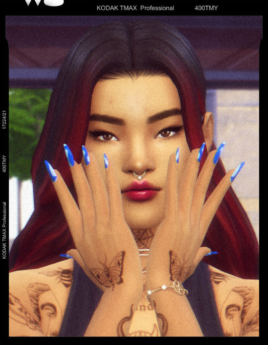
+ a bonus outfit pic
#ts4#the sims 4#sims 4#ts4 portrait#ts4 screenshots#simblr#credit to @templatepsds for the kodak frame#she's grant's friend & the fiancee of one of his college friends#i was struggling to get her exactly right so i had to update her look a bit#converting sims from TS3 is hard tbh#btw how are y'all taking nice full body pics?! someone gimme some tips please#it'd probably help if i turned down the amount of film grain i use jdfldsklfds#holocene.png#hlcn: irina#hlcn: oc info#hlcn: oc profiles
29 notes
·
View notes
Text
;
#templatepsds admin im so sorry if im mass reblogging stuff but i wanted to make something for a game i was tagged in forever ago#and i just can't decide on the format help lmao#guess i'll spend my afternoon learning how clipping masks work 👀#layout? that.
0 notes
Text

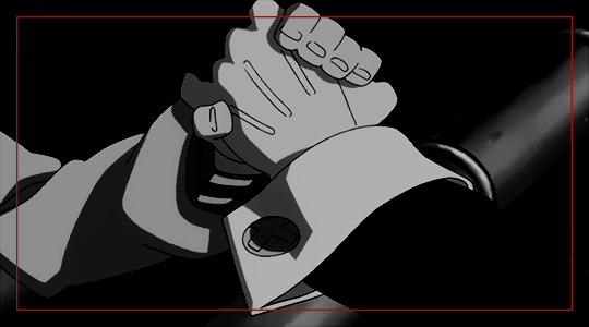
In the comments: "isn't that the compacflt"
mav gets shadowbanned after a call from the white house
Thank you to @templatepsds for the TikTok template and @k9effect for his Maverick Mitchell handwriting font.
#modern top gun#top gun#icemav#fake tiktok#iceman x maverick#immaturity kind of professionally#you're a brat in every room of this house#my gifs#incorrect top gun#incorrect top gun quotes
196 notes
·
View notes
Text
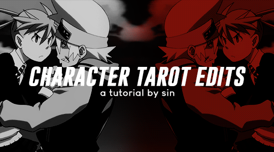
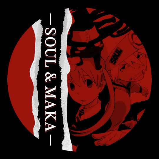
a step-by-step guide on how to make these edits requested by @elyonholic
programs; photoshop
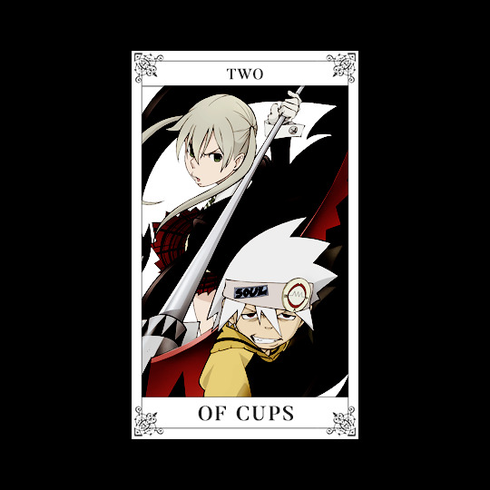
ok ok this is like five tutorials in one so get comfortable. i'm gonna start with the tarot card graphic. create a 540 x 540 black canvas. download this template by @templatepsds. resize to fit your canvas, center it, and change the card number and suit. i used the font butler.
follow the guide in the template and add the photo you want as a clipping mask to the appropriate layer. if you haven't already colored the photo, you can add your adjustment layers as clipping masks on top of it. here's what it should look like;
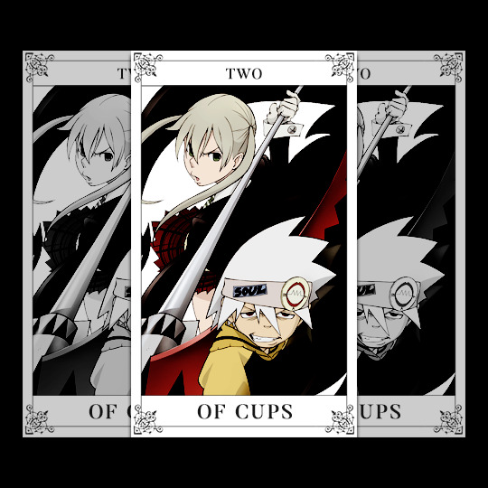
group these layers and duplicate them twice for a total of three cards. add a black and white gradient map to two of them and change the opacity of the whole group to 80%. keep them behind the colored card and scoot them around to your liking.
go back to the colored card and edit the blending options > drop shadow. i kept the default settings and only changed the angle to 90. here's the final result;
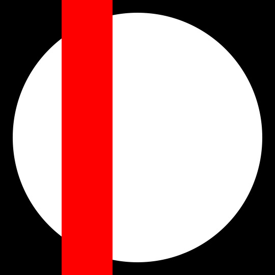
the next one is the circle graphic. create a 540 x 540 black canvas. create a 490 x 490 circle and center it. duplicate this circle and rasterize the layer. you should have two circle layers, one shape and one rasterized. make sure the rasterized layer is on top and hide the shape layer.
create a 100 x 540 rectangle where you'd like the text to be. it should look like this;
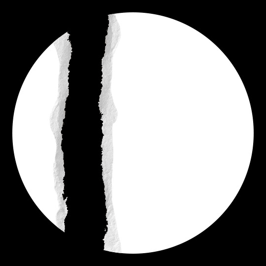
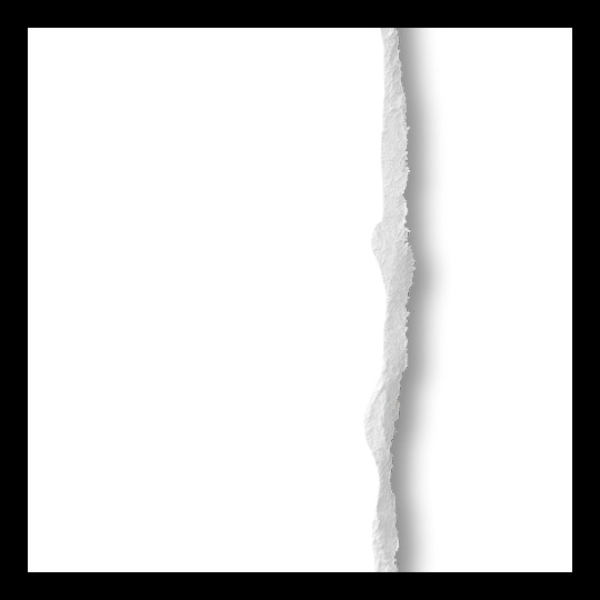
add your paper tear textures along the height of the rectangle. you can find a bunch of free ones by searching "paper tear png" or "paper tear transparent".
once you have that aligned, ctrl + click the rectangle layer and delete the section of the rasterized circle. hide or delete the rectangle since we're done with it. here's where we're at;
now for the photo. add the photo you want as a clipping mask to the rasterized circle.
to make these sets more cohesive, i pull a color from the tarot card graphic to use it as a gradient map throughout. in this case it's red. any other adjustment layers can be added as clipping masks on top of the photo. here's what it looks like;
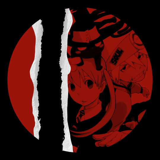
almost done. now we just add the text. again, i used the font butler. once you've got the text, center then duplicate it. keep one solid and edit the blending options > stroke of the duplicated text. i kept the default settings and only changed the size to 1. once you've done that, change the fill to 0% and scoot it down to wherever feels right. make sure it stays behind the solid text layer.
create two lines and center them to the solid text. scoot them so they're not touching the text. rasterize both line layers. ctrl + click the shape circle layer, not the rasterized circle layer! right click + inverse selection and delete the excess lines. here's the final result;
onto the square graphic. create a 540 x 540 black canvas. create a 490 x 490 square.
about a third of the way into your square, align your paper tear. for this one, i edited the blending options > drop shadow. the rest of the settings will depend on how much you want this to cover your text but make sure the angle is 180. it should look something like this;
ok ok photos. add the photo you want under your paper tear layer and resize it to fit within two-thirds of the square. ctrl + click the square layer then right click + inverse selection to delete the excess photo. you can add your adjustment layers as clipping masks on top of the photo. here we are;
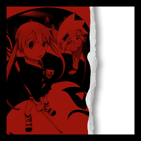
last step is text. once you've got the text, center, and align it with the right side of the square. duplicate the text and edit the blending options > stroke. make sure the fill is 0%. move this so it's closer to the paper tear on the canvas.
duplicate the solid text, not the stroke text! move that once again closer to the paper tear so that it's slightly underneath it. it should look like this;
hide the square layer and, if you're dumb like me, change the text color to something that can actually be read on the black canvas LMAO anyway, here's the final result;
the gif edits are a little more complicated. i'll start with the quote gif. create your gif, crop it to 540 x 300, and color it however you want. i stick to black and white to fit the rest of the set. for gifmaking, i follow this tutorial.
create a 510 x 270 rectangle. set the fill to none and stroke to 2. it should look like this;
add the text and quotation mark. again, i used the font butler. the quotation mark can be made by editing blending options > stroke and changing the fill to 0%. both the text and quotation mark have blending options > drop shadow. i kept the default settings and only changed the angle to 30.
rasterize the rectangle layer. using the rectangular marquee tool, make a box around the text where you need to delete the stroke. make sure to give some space between the stroke and text so they're not running into each other. delete the stroke. here's the final result;

alright i saved the worst for last. ngl this mirror gif has given me multiple headaches. it's not that making it is hard but finding the right kinds of scenes for it actually takes years off my life. anyway, here we go.
create your gif and crop it to 540 x 300. duplicate your gif and edit > transform > flip horizontal.
fair warning this next part will take a lot of trial and error. move the gifs so that they mirror each other. i do this by making one of the gifs 50% opacity and scooting them around the canvas. this looks about right;
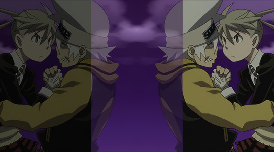
now that we've got the placement down we have to blend them. set your gif back to 100% opacity. add a vector mask to whichever gif you have on top. using the brush tool, set the size to 300 and the hardness to 0%. brush until you have something resembling this;

for coloring, i just use gradient maps, one black and white and one red and black to match the rest of the set. here's the same thing with coloring;
and you're p much home free. add the text and center it. surprise, i used butler again lol i edited it to have blending options > drop shadow too. i kept the default settings and only changed the angle to 30. here's the final result;
24 notes
·
View notes
Text
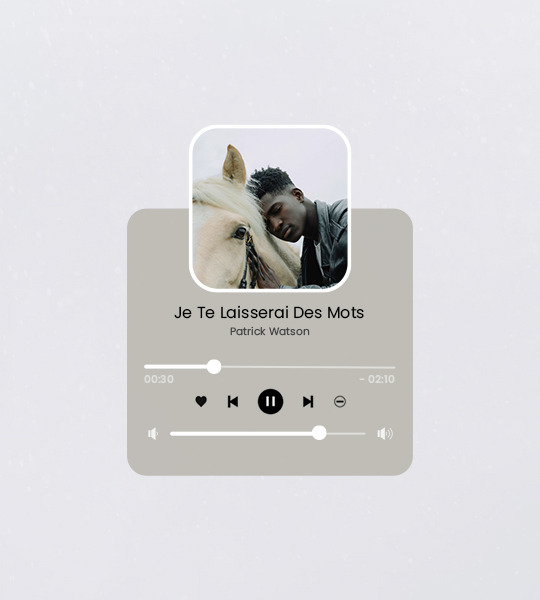
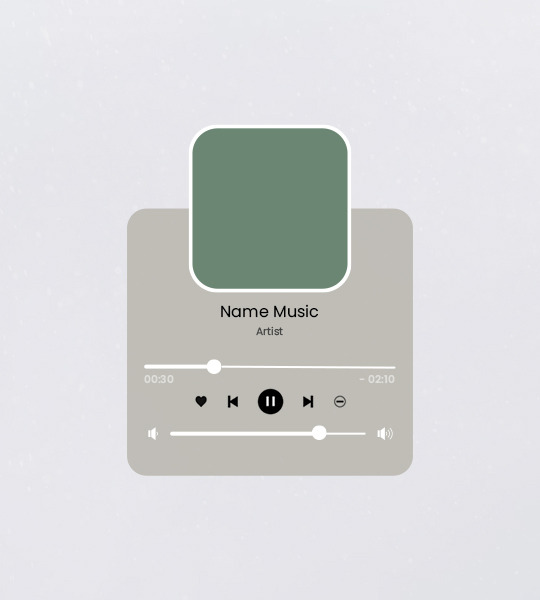
Template #003 by dailyresources
— Music Player Template
Please do not repost / redistribute or claim as your own.
Please, like or reblog if you download.
You may edit as much as you like, it is fully customizable.
This is a free template, for personal and non-commercial use only.
Credit is very much appreciated but not necessary.
Any issues, don’t hesitate to contact me!
Size: 540x600px
Fonts: Poppins.
Enjoy ❤
Download Link: [mediafire]
#templates#music templates#music player template#music player#template psd#templatepsds#photoshop resources#resources#free resources#yeahps#dearindies#evansyhelp#my creations#my templates#*#*mine
329 notes
·
View notes
Photo
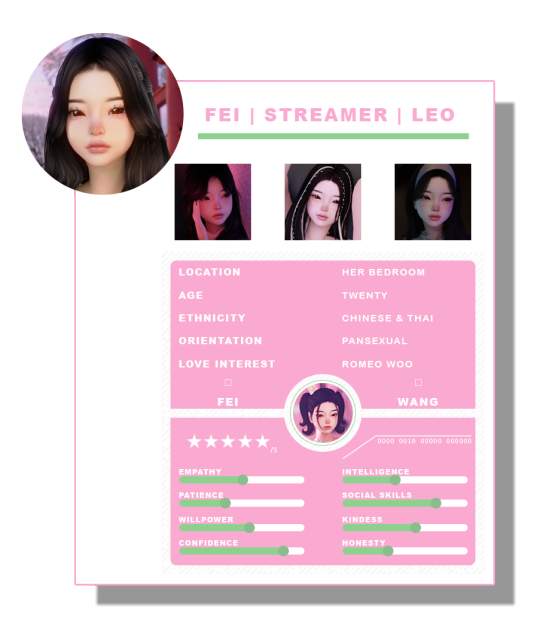
"to be soft is to be powerful.”
#oc: Fei#ts4#the sims 4#shes my 'for fun' oc <3#i'm probably too lazy to post any of her renders T^T#but u can find me on insta @faeriary!#templatepsds#moonbcwi
10 notes
·
View notes
Text
I'm probably going to delete this in the morning (wait shit, it's already morning), but I wanted to show off what I've been doing instead of sleeping!

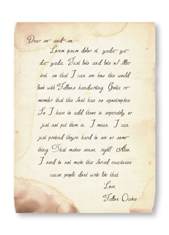
(btw, this template was not originally mine, I edited this template by @/templatepsds)
#just a fun little detail for future scenes of RTQ <3#morrigan.txt#delete later#I can easily change the font to match someone else's handwriting but ofc I had to use Fallon as the model#that font has been her canon handwriting for over a year now (ever since I first saw it) which is wild#it's called ''Queen Age'' so how could I not use it for her?!
14 notes
·
View notes
Text
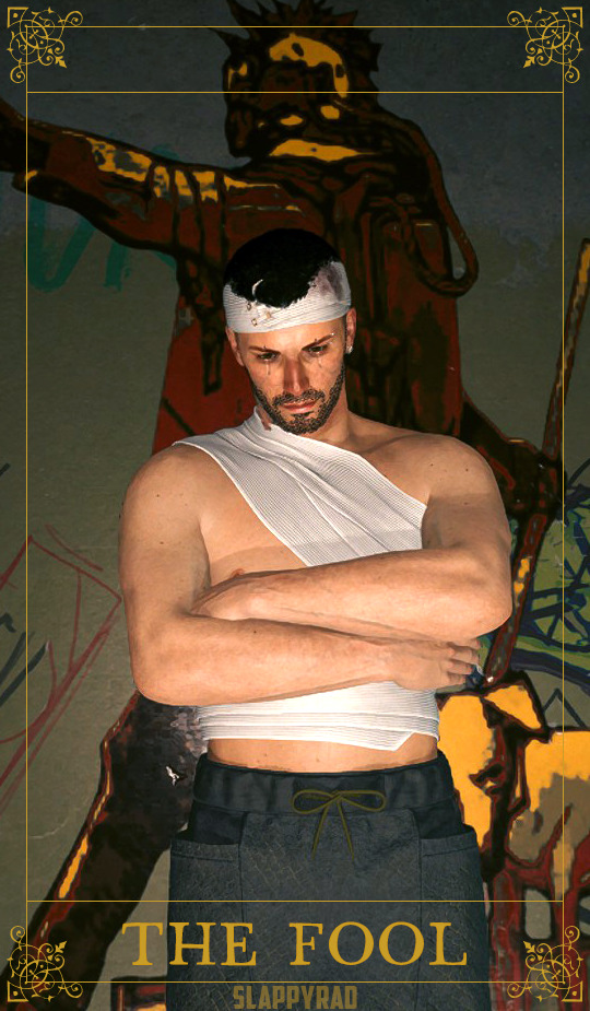
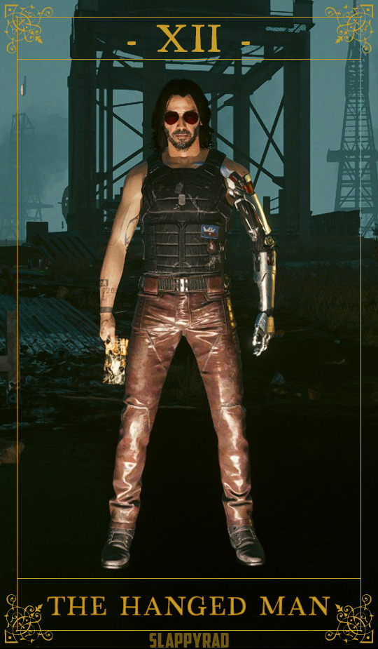
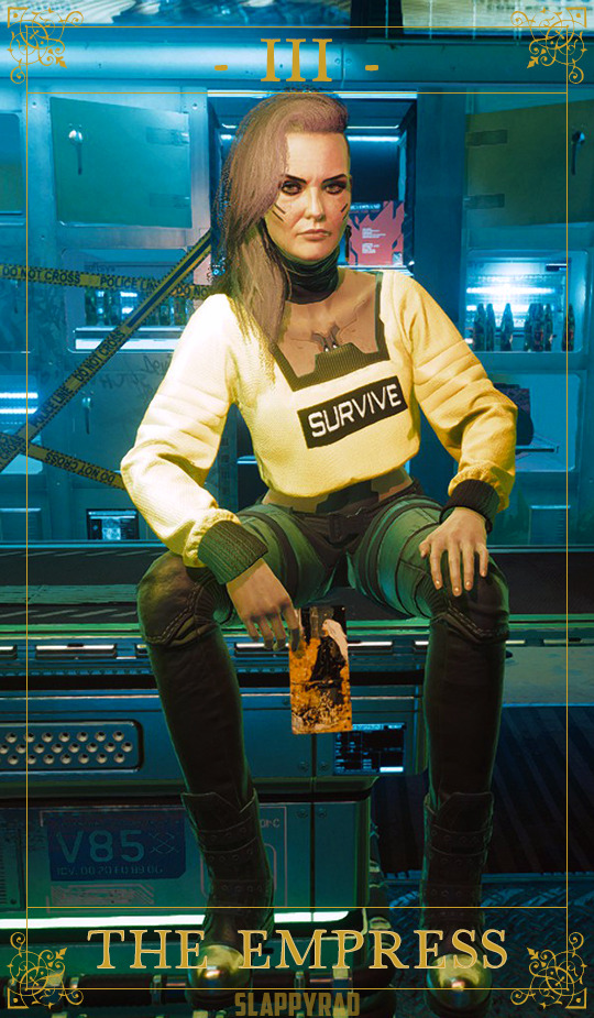

@cptober2077 Day 30: Major Arcana
The Fool
The Hanged Man
The Empress
The Lovers
Thanks to V._Eurodyne again for the Tarot set on Nexus ♥
Thanks again to @templatepsds for the tarot template!
#cptober2077#cyberpunk 2077#major arcana#tarot deck#corpo v#Corpo Vincent#masc v#the fool#the hanged king#the empress#the lovers#the afterlife#rogue amendiares#johnny silverhand#leaving night city
37 notes
·
View notes
Text
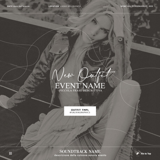
OUTFIT TMPL.psd
puoi scaricare il psd da questo → ʟɪɴᴋ
(¬‿¬) like or reblog if u download. don’t repost! ♡ I created this content with love, so I ask you to respect it. Don’t pass the job as yours, thank you.
5 notes
·
View notes
Text
✧ About ✧
‧₊⊹ Call me Yomiel (she/her - ze/zir). Creator for fun ♔
✦ español/english ♢ bisexual/greyaromantic/demigender ✦

Main blog - @yomielworld
Website - https://astralestella.neocities.org
Newgrounds - https://astralestella.newgrounds.com
Youtube - https://www.youtube.com/@AstraleStella
Ko-fi - https://ko-fi.com/astralestella
Homestuck sideblog - https://trustworthycinnamon.tumblr.com
I rarely create stuff that isn’t self-insert or OCs.
I have an [about page], read it.
(𓆩♡𓆪) Thanks for your company! ♡
Updated: 19/04/2024
Icon by @/karkart | divider by @/cafekitsune | template by @/templatepsds
2 notes
·
View notes
Last Seen Blogs

lovelikealcoholic
DYNAMITE
kaos69
KaosS
horizon-wallpapers
Horizon ascetic
npc-1137
“go download some books, kiddo.”