#the original is way more dramatic but the new one is more legible
Text
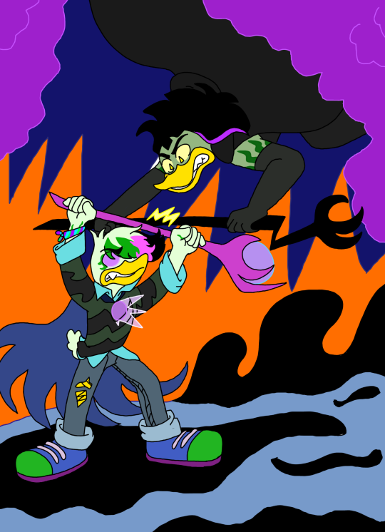
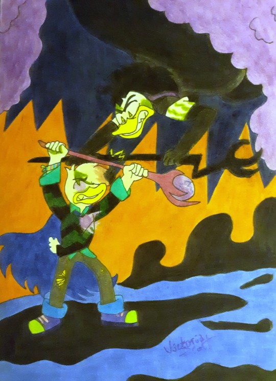
wanted to touch up some old lena drawings from a few years back, this is the first one so far
#the original is way more dramatic but the new one is more legible#theres three more im gonna do. i like how they look but my irl coloring is so bad i just want to clean them up since i like them so much#ducktales#ducktales 2017#ducktales 17#lena sabrewing#lena de spell#magica de spell#art
65 notes
·
View notes
Text
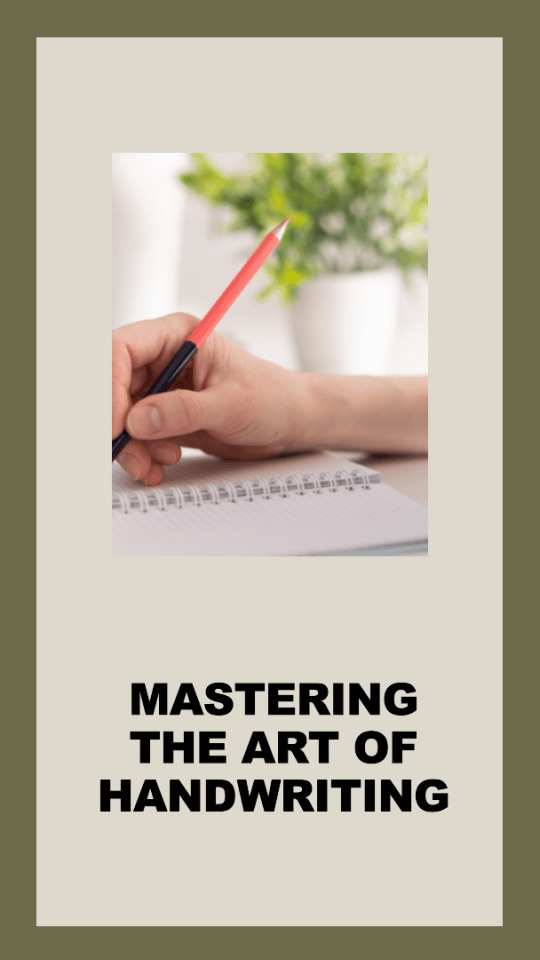
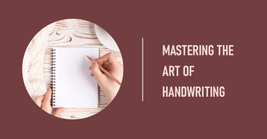
Handwriting Better, Faster, and Smoother:Comprehensive Guide
Writing by hand is more than a practical need; it's also a source of creative expression and an honorable ability. Improving your handwriting may lead to exciting new opportunities, whether you're a student hoping to improve the readability of your notes, a professional hoping to make a good impression with your script, or a creative spirit curious about the art of calligraphy. This in-depth manual will give you the tools and knowledge to perfect your handwriting. Let's get started on this thrilling adventure of discovery and originality!
The Basics of Better Handwriting
Mastering Handwriting
The Value of Legible Handwriting
The ability to communicate clearly and concisely via legible handwriting is essential. Clear, readable handwriting is essential to getting your point across when taking notes, writing letters, or filling out forms. Moreover, it shows who you are and may make an impression that lasts a long time. Good handwriting improves readability, efficiency, and even credibility in the business sector.
The Importance of Handwriting at Work and Home
In our private and professional lives, writing legibly is crucial. As individuals, it's how we represent ourselves in the world. How we shape letters and words may tell others a lot about ourselves. Good handwriting improves readability, efficiency, and even credibility in the business sector. It can improve our public profile and influence how others see our work.
Basics of Good and Bad Handwriting: What Characterizes Each?
One must first know what defines excellent and terrible handwriting to improve one's handwriting. In contrast to illegible, inconsistent, and time-consuming handwriting, good handwriting is readable, consistent, and efficient. But what factors determine excellent or terrible handwriting? It's more than simply about aesthetics. It's all about making the most of limited resources.
What Makes a Handwritten Document Legible and Appealing
Consistent letter construction, proper space between letters and words, uniform size and slant, and a fluid, effortless motion are all hallmarks of excellent handwriting. Your handwriting will benefit from these additions in terms of readability and aesthetics. However, your handwriting might be unsightly and difficult to read if the letters are all different sizes and forms and the lines between them are uneven.
The Quickest and Best Way to Boost Your Handwriting
It doesn't have to be challenging to practice better handwriting. Improving your handwriting is possible with the appropriate strategy and regular practice.

Handwriting
Equipped for Success from the Get-Go
The quality of your handwriting will improve dramatically if you invest in the proper instruments. Writing is more pleasant with a pen that doesn't hurt your hand and paper that glides easily over the page.
Using the Appropriate Writing Instruments
Your handwriting might seem quite different depending on the pen and paper you use. Writing might be more enjoyable with a pen that fits your hand well and flows ink easily. Similarly, writing more fluidly is possible on smoother paper. Try a few different writing implements and surfaces before settling on a routine that works best for you.
Recognizing Different Writing Habits
Each person has a unique handwriting style. Learning about the many types of handwriting will help you settle on a natural method.
Print vs. Cursive: Which Is Better?
Cursive writing, with its flowing and interwoven letters, may be speedier and more efficient than print writing, which is plain and easy to read. It's usually a matter of taste and function when deciding between print and cursive. If you're starting on the road to better handwriting, you may do well to focus on print first.
How Your Posture Affects Your Handwriting
Comfortable and practical handwriting requires good posture. It eases physical stress and gives you more command over your hand motions while writing.
How to Get in the Best Writing Position
Improving your handwriting may be as simple as sitting up straight, keeping your feet level on the floor, and centering your work. Holding your pen properly and without clutching it too hard is also crucial. A looser grip facilitates more straightforward motion and lessens hand strain.
How to Grip a Pen

How Your Posture Affects Your Handwriting
The way you hold the pen has a significant effect on your handwriting. Smoother, more controlled writing is possible with the correct grip and finger placement.
How You Hold Your Pen Affects Your Writing
For maximum command and comfort, the standard tripod grip is often advocated. Some individuals, however, may find greater ease in using the quadruped or a modified tripod. The trick is establishing a hand position that makes writing easy and natural.
The Secrets to Better, Neater Handwriting
Focusing on uniformity, spacing, and alignment may improve your handwriting's appearance. If you want neater handwriting, try these tactics.
The Value of Maintaining a Uniform Handwriting Style
A key component of readable handwriting is maintaining uniformity in letter size, orientation, and spacing. It makes your writing more aesthetically pleasing and more readable.
Standardizing Fonts and Line Spacing
Letter size and spacing may be more uniformly practiced on lined paper. Maintain regular space between letters and words and strive for consistency in the height of lowercase and uppercase characters. Graph paper is another helpful tool for perfecting your spacing and alignment skills.
Slowing Down Is Powerful
Poor handwriting is a typical result of being in a hurry. When you write more slowly, you may give more attention to the individual letters and ensure they are consistently spaced.
The Impact of Speed on the Legibility of Your Handwriting
If you try to write slowly, you'll have misshapen letters, lousy spacing, and sloppy handwriting. Writing more slowly may help with readability and neatness. You'll be able to type faster without sacrificing quality as you gain experience with your letter formations.
Practice Makes Perfect
Handwriting is a talent like any other, where practice makes perfect. A consistent, deliberate effort may bring about substantial growth.
Practice Your Handwriting Exercises to Improve Your Handwriting
Practice drawing loops, lines, and circles to strengthen your hands and increase your handwriting speed and fluidity. Letter formation practice and composing pangrams (sentences using every letter of the alphabet) are also helpful. Worksheets and exercises to help you improve your handwriting are available at no cost on the Internet.
15-Day Plan for Better Handwriting
The objective of drastically improving your handwriting in only 15 days is ambitious but possible. This time, you may progress significantly with the right mindset and plenty of practice.

15-Day Plan For Better Handwriting
To Improve Your Handwriting, Step by Step
A well-thought-out strategy will help you focus your efforts and achieve your goals. It would be best to begin by taking stock of your existing handwriting, establishing concrete targets for growth, and scheduling regular, dedicated practice sessions.
Handwriting Practice Routines and Objectives
Setting daily objectives will help you focus your training and see accurate results. The formation of letters might be worked on one day, spacing the next, and so on. Writing tasks, such as handwriting drills, letter practice, and paragraph writing, may be included daily. Always take stock of where you are concerning your objectives and make adjustments as necessary.
Monitoring Your Development
Keeping a journal of your handwriting progress may be an inspiring and helpful exercise. It's an excellent tool for tracking your development and pinpointing problem areas.
.
Maintaining a Journal with Pen and Paper
Keep track of your development with a handwriting notebook. On day one, write a paragraph and continue to write the same paragraph every few days. You may see how far you've come, and be encouraged to keep practicing by comparing your earlier submissions.
Maintaining Your Drive
Improving one's handwriting takes time and effort. It takes work to keep going when things appear to be moving at a snail's pace. However, remember that every effort put into practice is progress toward your objective.
Taking Pleasure in Even the Tiniest of Successes
Even the smallest of enhancements is always welcome. You can keep your motivation up by celebrating these mini-victories. It might be as easy as mastering a previously intractable letter or a noticeable increase in writing speed.
How to Write Better Curves
Flowing and interconnected letters make cursive handwriting elegant and practical. However, it might be challenging to get the hang of. If you want to write more legibly in cursive, consider these suggestions.
Cursive Letter Forms and Their Meanings
The four primary strokes used to create cursive letters are the upstroke, downstroke, overcurve, and undercurve. Practicing these strokes may improve your cursive writing's control and flow.
Developing Fluency in Cursive Writing
Cursive lettering may begin after the fundamental strokes have been learned. Since lowercase letters are often utilized first, you should focus on them first.
Cursive Writing Worksheets and Exercises
Practice worksheets may help you perfect your cursive writing by showing you where to draw the lines and what size letters to make. Learn the alphabet, and then go on to write words and whole phrases.
Guide to Writing Cursive Clearly and Effortlessly
You may improve the legibility and fluidity of your cursive with little practice and attention to detail. For instance, keeping your cursive writing at a uniform angle can help it seem more unified. If you want your cursive writing to flow smoothly, you should only raise your pen between words, not in the middle of a letter.
State-of-the-Art Methods for Enhanced Handwriting
After you've practiced the fundamentals and watched your handwriting develop, you may go on to more sophisticated lettering methods.
Handwriting Styles: An Investigation
There is a wide variety of handwriting, each with its distinct features. The more styles you're exposed to, the more ideas you'll have for creating a look that's uniquely you.
American Cursive to Calligraphy: Discovering Your Style
Each kind of handwriting has its distinct qualities, whether it be the grace of Spencerian script, the simplicity of D'Nealian, or the fluidity of American cursive. Another option is calligraphy, beautiful handwriting that has been used for centuries.
Mindfulness' Importance in Writing
Practicing mindfulness, or paying attention in the present moment without judgment, may help improve handwriting. Improve your consistency and command of the game by sharpening your attention on each stroke.
Focusing on the Here and Now Improves Your Writing
When you're in the moment, you're more conscious of your pen grip, hand motion as it moves over the page, and the individual strokes that make up each letter. Your handwriting may benefit from this newfound insight.
Handwriting's Influence on the Creative Process
Writing by hand takes more than simply mastery; it's also an artistic medium. If you want to be more creative, practice your handwriting.
The Influence of Good Handwriting on Creativity
Writing by hand requires more cognitive processing than typing. It has been shown to enhance fine motor abilities, memory, and understanding and to spark original thought.
Keeping and enhancing your handwriting
Improving your handwriting is an ongoing process, not a one-time assignment. Some suggestions for keeping and bettering your handwriting are provided below.

Keeping And Enhancing Your Handwriting
Regular Practice Is Crucial
Handwriting is just another ability that benefits from frequent use and practice. Keep practicing even after you've reached your desired level of handwriting competence.
Maintenance of Handwriting Proficiency
The best way to keep your handwriting abilities sharp is to practice them often, even for a few minutes daily. Practicing handwriting might include keeping a diary, sending letters, and engaging in handwriting exercises.
Embracing Your Uniqueness as a Person
The uniqueness of each person's handwriting is one of its most endearing qualities. Adopt a writing style that speaks to who you are; don't be afraid to flaunt your peculiarities.
Recognizing the Individuality in Everyone's Handwriting
Your unique handwriting reflects your personality. These individual touches set your handwriting apart from anybody else's, from how you curl your 'y's to the additional flourish on your 'g's.
Continual Improvement in Handwriting Skills
You can never stop improving your handwriting skills, learning new things, whether a script, a calligraphy technique, or a handwriting exercise, may keep your handwriting journey exciting and gratifying for the rest of your life.
Always Strive to Improve Your Handwriting
Learn the art of handwriting by taking classes, watching videos, or reading guides. Many materials are available to help you maintain and improve your handwriting.
The Struggle to Write Better: A Brief Synopsis
Improving your handwriting is an adventure in individuality exploration. You can improve your handwriting and have fun with the right resources and approach.
A Review of the Handbook for Better Handwriting
From the fundamentals of excellent handwriting to more sophisticated strategies for steady progress, we've covered it all in this book. Remember that learning the fundamentals, writing frequently, and being patient are the keys to developing your handwriting.
Key Learnings and Future Actions
Improving your handwriting is a journey, and even incremental progress is worthwhile. Maintain a spirit of inquiry and delight in the process of discovery that is handwriting.
Benefits of Good Handwriting
The ability to write legibly and creatively is more than simply a talent; it's a need for effective communication and a representation of who you are. Improving your handwriting is like buying a lifetime of use.
How Improved Handwriting Can Enrich Your Life
Improved handwriting can boost confidence, enhance communication skills, and open new creative avenues. Take a pen in your hand and go to work if you want better handwriting.
Read the full article
#Calligraphy#CursiveWriting#HandwritingExercises#HandwritingImprovement#HandwritingPractice#HandwritingStyles#HandwritingTechniques#HandwritingTips#Penmanship#WritingTools
0 notes
Text
Does Bing gē Have Descendants in ‘The Untold Tale?’
This topic has come up a few times since The Untold Tale takes place in the PIDW universe (post-Bingge vs Bingmei extra), I figured I might as well compile and archive my official answer here for me to refer my AO3 readers to in the future for convenience’s sake. I hope everyone doesn’t mind. :) I’m always happy to answer questions!
TL;DR
Q: Will we see Bing gē having fathered children with his harem of 600 or so wives in TUT?
A: For TUT, the answer is a definite “no.” There were a lot of factors which’d contributed to my decision. I’ll try to explain my reasoning down below.
Context
In PIDW, it is canon that Luo Binghe has a bountiful number of descendants with his harem of 600-or-so wives. It is a detail that has been mentioned even in ch1 of SVSSS and in ep1 of the donghua.

(SVSSS Excerpt - ch1)

(SVSSS donghua - ep1)
I like to plan things ahead of time. So from very early on, I knew this would be something I would have to decide on whether or not to address when I’d finally decided to expand TUT from just a prologue into a full-blown story. And after contemplating it, I decided against adding children into the story. It is because 1) it would make the situation more complicated, and 2) it would take TUT in a different direction that wouldn’t be fun for me to write.
I’m a very decisive writer, meaning when I make my mind up about something, chances are I won’t change my mind. This is because I would have already planned it into my plot outline, which means changing a decision would require me to change other details in the other chapters I have planned for that story. (I’m typically not a spontaneous writer; I try not to write spontaneously because when you’re a writer who rotates through multiple WIPs with different characters across different genres or writing styles, you inevitably have writer’s block because you probably won’t remember all the ideas or the direction you had whenever you return back to a different WIP. To reduce this shortcoming, it helps me personally to have a plot outline. This way I can return to any WIP, read my notes and then transcribe them into legible paragraphs, find a way to transition between the story beats I have to hit for that chapter, and then eventually post the final draft to AO3 when I feel it’s ready.)
Having made a decision, I knew I had to set it up in TUT and give a “reasonable explanation in-story.” Hence, in ch2, we see:

(Excerpt I - ch2)
Basically the set-up is TUT takes place post-Bingge vs Bingmei, but between “the third or fourth book” of the hypothetical PIDW webnovel series aka before Airplane wrote the fanservicey chapters where the luckier of LBH’s wives give birth to children during the harem drama plots and the children are probably rarely, if ever, mentioned again in the story as a lot of stallion novels tend to do.

(Excerpt II - ch2)
(Excerpt III - ch2)
Contrarian Tendencies
You know the saying: Monkey see, monkey do? In my case, it’s monkey see, monkey do not do.
A little fun fact about me as a writer: if I have already seen a fanfic where someone has already written a concept or idea into their story, chances are I will just avoid it entirely in my own stories. I don’t know why this aversion exists, but I’m assuming it’s because of my counterculture hipster inclinations and an intrinsic fear of plagiarism which has been beaten into all of our skulls since adolescence. There’s nothing wrong with being inspired by other people’s works. Technically everything’s been done before in writing so, as a writer, a good rule of thumb is to always try to give it your own unique spin on things. So for me, my brain somehow interpreted this a step further. This is a reason why I try to avoid reading stories from whichever fandom my WIP is from during the writing process of updating a fic, because this is how I get influenced. Once I see an idea or interpretation from another fanfiction, it influences me to not want to write it into my own. This is a very strong unconscious impulse for me. I guess this is just the neurons in my brain’s thinking that this way, it won’t be something my readers will have read before and the story idea will come across as different or fresh, and mine. In a way this is also how I show respect for fanfiction writers in the same fandom—by being inspired to not be inspired, ha. I like to think every story in the world serves a niche audience, so seeing a diverse range of originality and interpretations in a fandom is a good thing. This is also how I feel when I am able to identify certain popular tropes or depictions or patterns in a fandom; 99% of the time, it makes me feel a compulsion to “go against the grain” or write the opposite. For example, you have no idea how long it took me to come around the idea of incorporating the fanon “A-Yuan” into TUT. However cute it is, the moment it dominated the fandom (well, “dominated” is an exaggeration; it’s more like I’ve seen enough, especially in the Original LBH/ SY | SQQ tag), my gut reaction was to nope out of using it. But after seeing a lot of comments in my inbox with readers affectionately calling SY “A-Yuan,” I’d contemplated it for a long time and it wasn’t until ch4 that I decisively decided that yes, I can have Bing gē calling SY “A-Yuan” in TUT—but it has to be at the right moment for maximum dramatic and emotional impact. (See this thread that started it all. And this is the small sneak peek I wrote where LBH will call SY that for the first time.) <- This is the rare 1% where I actually conformed to what’s popular.
In this case, when I finally decided to expand the prologue into a full-blown story, coincidentally I had just recently read a good Binggeyuan (Bingyuan) fanfic which featured a kidnapped Shen Yuan interacting with Bing gē’s harem and LBH’s children/descendants. I’d liked their portrayal and even thought the children were cute. <- However, with me having reading this, the problem came up: I felt the familiar stubbornness in me rearing its head. So knowing myself, if I had included children, it is very likely the direction that I would have gone down for TUT would have been the opposite. To further complicate matters, you have to keep in mind the kind of writer I am. I tend to like grounding stories with a semblance of realism, no matter if the genre is pseudohistorical fantasy, romance, sci-fi, etc. And this writer has seen and read quite a few harem and palace intrigue Chinese dramas/ premises.
For further context, in those types of “historical” C-dramas^, in that sort of environment which fosters scheming, competition, jealousy, etc, it is almost expected to see heirs aka children aka descendants harmed along with the women. Innocent parties are often victims in these sorts of cutthroat premises, to underscore the underlying message the show or novel wishes to present. (See Ruyi’s Royal Love in the Palace. See Yanxi Palace. See The Legend of Haolan. See Nirvana in Fire. See The Rebirth of the Malicious Empress of Military Lineage. Etc.) And me being me, this would be the direction I would take. Remember, while TUT is meant to emulate a legitimate danmei C-novel reading experience in a fantasy world, I do drop pseudohistorical and cultural Easter eggs into the story. So trust me when I say you would not like the direction TUT would have gone down in, had I made LBH have children with his harem. I mean, theoretically yes, we could’ve seen endearing children characters from me, but you would have also seen me addressing a lot of the baggage that comes with (see Comment III Excerpt down below).
The situation with dissolving Bing gē’s harem is already complicated enough. As his romance with Shen Yuan develops, I didn’t want to have an additional headache thinking about how to address the issue of LBH having children already. Divorces in a pseudohistorical context is already a heavy topic—even more so when it’s divorces with children in the mix. Naturally I will still have SY and LBH eventually discuss the matter of legitimate heirs since LBH will essentially become the Sacred Ruler of all Three Realms and it’s a traditional precedent for an emperor to bed his empress, noble consort, and imperial concubines until he has his heirs (plural, because the rate of mortality was high in ancient China). In TUT’s case, at that point in the story SY will remind LBH that he’s essentially an immortal sovereign so there isn’t any need for an heir unless he wishes to retire. Furthermore, he will inform LBH that he could set a new precedent since he’s already different from the other emperors from history (with him being of half-Heavenly Demon and half-human cultivator lineage); as long as LBH is fully aware of all perspectives of the situation, he doesn’t necessarily need to conform to all traditions if this is something he really feels strongly about. But this future conversation(s) is likely the extent of it.
But wait, you say, what about a certain someone who’s going to be transmigrated as an imperial crown prince? Isn’t he going to be in that sort of vicious upbringing? <- Yes. But that’s an entirely seperate matter. In a way, since I’ve decided Bing gē will not have had any children or descendants in TUT, with Airplane, this now presents an opportunity for me to show the consequences of being one of the many children of an emperor with a harem of women vying for one man’s attention—and the power struggle that’d ensue in this kind of environment. It’s an interesting What-If parallel, if you think about it.
AO3 Comments
Although these are just small excerpts from replies I’ve written before, it’s nice and orderly to just compile them here for everyone since these will be buried underneath all the comments as TUT updates:

(Comment I- ch3)

(Comment II- ch4)
(Comment III- ch4)
Because of seeing comments that have asked me for my thoughts on whether or not I will include LBH’s children, I’ve had so much fun seeing theories thrown around: from LBH’s blood parasites being able to control conception, to someone’s headcanon about LBH being a hybrid and all that entails scientifically (think: mules). I will say in TUT, it’s more the former since in PIDW he’s supposed to have descendants; we’re pretending Bing gē doesn’t have any yet (and now definitely won’t, especially after having heard SY’s “prophecy”) because he subconsciously does not want children due to certain fears, trauma, etc. And his Heavenly Demon’s “blood parasites” (blood manipulation) is a convenient story device to explain why no wife has gotten pregnant yet.
I hope this explanation makes sense! Mainly I just wanted to have this archived on tumblr so that I have this post to refer to moving forward.
On a side note: especially since ch4 had been posted, quite a few people have actually mentioned they’ve read my replies to other comments and/or I have seen different people having hopped onto other readers’ comment threads (for example, imagine my pleasant surprise when I saw a reader you lovely person, you helpfully jumping in to respond to another reader’s questions about TUT, and their answers were actually aligned with what I would’ve answered!), so it’s always such a thrill whenever I see this level of engagement happening. I can’t explain why, but seeing this happening is just so cute to me. It really makes this writer feel so warm and fuzzy inside!
#svsss#bingyuan#bingqiu#the scum villain's self saving system#luo binghe#the untold tale#phoenixtakaramono#ask#technically not an ask#but i like to categorize it there#I mainly wrote this lengthy explanation on tumblr#bc I wanted to link this as ref#anytime someone asks me in the future regarding LBH’s kids#lol it’s actually not cinnabar pills hidden in a bracelet#it’s some sort of seeds which supposedly stopped concubines from being pregnant#I discovered this when I rewatched Ruyi’s Royal Love in the Palace#Do you all notice you have a unique writing syntax/ style#that’s how I can identify that you’re all diff ppl in the comments#one time an anon guest wrote something for G&G#and in the comment thread as another guest anon they supposedly agreed with the prev anon#in that case it was obvious it was the same person pretending to be another guest anon#and I can tell because their writing syntax/ voice is identical#which is why I’m so pleasantly surprised to see this phenomenon in the SVSSS fandom#you all have diff writing syntaxes#seeing you all interact with each other’s comments or my comments to other comments#is just such a delight ahhhhhh#I love the SVSSS community#you guys are so warm and welcoming
35 notes
·
View notes
Note
Would you want Gwen and David to become a couple at the end of CampCamp? And adopt Max as well? Cuz' I do...
Gwenvid becoming canon is one of those things I simultaneously love and feel is unnecessary. The show will never let it be as pure and fluffy (or emo) as the fans will make it, anyway, and there is no force on earth that will stop me from shipping this ship with every ounce of my shriveled little heart, so I’m kinda ambivalent on the whole thing. (Besides, I know at least one of the showrunners is not at all into it, so I don’t see it happening no matter how much we may want it to. As long as they keep giving us little ship nuggets we can read way too much into, I’ll be good.)
Also I’m not convinced CC is the kind of show that needs an end, so “at the end” is one of those things that … eh, whatever. It’s an endless summer existing outside of time. Does it ever have to end, as long as they keep having new ideas?
As for the other part of this question … oh, boy. Anon, you did not ask me to go the fuck off on this question, but I gotta because I’ve been holding all this inside for literal years, and I don’t even care that this will make me hemorrhage followers because I’ve been very good and very quiet about it for a long-ass time and I just gotta –
I fucking hate Dad//vid.
And you know? I didn’t used to. My feelings, much like those regarding Cute Waitress, went from “how cute!” to “eh, not my thing but whatever,” and now we’ve circled all the way around to my entire soul lighting on rage-fire every time it’s mentioned, and just … I hate it so much … it’s just …
I feel like this deserves an explanation. And I think the people who’ve already blocked me or whatever aren’t going to read it, so let’s put it under a cut just for the sake of scrolling. But here’s the cliffs notes version:
1. It’s #NotAllDad//vid. There are some iterations of it I don’t hate, and even quite like.
2. David adopting Max, as a general concept, blows. There are exceptions – see #1 – but 99 times out of 100 I hate it with all of my hate. (The short reasons why: David is baby and Forest has Issues, it’s kiiiiinda racist?, and it’s lazy, boring, and way overdone.)
3. The fandom will not fucking chill about it – at the expense of all other explorations of David and Max’s relationship. And that makes me highkey annoyed.
That being said, anyone who’s worried my blog will become a cesspool of dad//vid hate, please don’t be concerned. This is like lancing a boil of something (I’m bad at metaphors). All the garbage pours out in one massive textblock, and then I go back to being more or less chill about the whole thing. We’re dealing with years of repression here. Shit’s gonna be a lot more intense than it needs to be, and then we’ll settle back down to our regularly-scheduled CC fluff times.
I’m hoping this doesn’t make the fandom hate me forever … but given #3 up there, I’m pretty dang scared it will.
(And hey, I don’t want Cute Waitress to explode in a pit of fire and snakes anymore, so maybe my opinion on dad//vid will change eventually too. Always hold out hope, right?)
1. #NotAllDad//vid
Like I said, I didn’t used to totally despise the whole Dad//vid thing. Like, I love the idea of David having been a counselor for so long that he just has ingrained Dad Instincts (see S4E14 for the most recent example of this). David as the Dad Friend? Good shit. David as the mother/father hen of his little cabal of campers? Very good shit. Nonliteral interpretations of dad//vid are usually really cute and fun and have some solid basis in canon, and I’m all about it.
Even some of the more literal David-adopts-Max AUs aren’t … the worst. Some of my friends have written versions of it that are original or at least were at the time and really compelling, and usually they found a way of skirting past the majority of the issues in #2. It can be done well.
It just … usually … isn’t.
And for that we gotta see #2.
2. David-Adopts-Max Sucks as a Concept
There is nothing good about the idea of David adopting Max, at least based on what we’ve currently seen in canon.
(Yes, I am aware that I should couch statements like that with “in my opinion” and “with exceptions” and the like, but that’s a lot of work for this and a bunch of the stuff I’m gonna say in a second, so please just assume for the purposes of everything I put on this blog that it’s in my opinion. I’m not out here dropping Cold Hard Facts about Camp Camp of all things; I’m just spewing my feelings.
I have lots of feelings.)
I don’t really have a cute little opening segment for this, so let’s skip the hors d’oeuvres and hop right into the meat of it:
David is Way Too Young to be a Father (According to Forest, Who Has Massive Emotional Baggage About These Things)
David is 24 goddamn years old. You know who shouldn’t be put in constant legal charge of a 10-year-old? Someone who is only 14 years older than him. If he’d had Max the old-fashioned way he would be too young to go on 16 and Pregnant.
That is too fucking young.
I know that some people become parents that young, and even younger. I’m not saying your experiences are bad or invalid. I’m just saying, from the standpoint of being 26, that if one of my two-years-younger friends told me they were adopting a kid they knew from work, I would tell them they were fucking bonkers and to hand that child over to a grown-up immediately. This is especially true of David, who has remarkable emotional maturity but is also mentally about 8 years old. Gwen is the adult at that camp, and David is such a baby.
Please don’t give the baby a baby.
Also, I’m terrified of having children. I never plan to, I’ve only recently accepted the fact that I don’t have to (grew up religious; it was kinda a whole thing), and get knee-jerk defensive over the idea of anyone my age or younger having children. It freaks me out, and that’s not a good or right emotional reaction to have but it’s mine, and I lowkey panic every time I think of David having children because if he should have a child at 24 then I’m already late.
Yes, I get the feeling that I’m running behind. For something I don’t actually want, ever. In comparison to a fictional character. Whose fatherhood decisions are not even remotely canon.
TL;DR I have issues and my other arguments are decidedly more valid than this one
So How About That Racism, Huh?
I know this has been a matter of some debate in the CC fandom for a while now … but you know what? It’s not nearly enough of a debate. People should absolutely be talking more about the potential problematique aspects of having a way too young white kid take a child from his immigrant parents on some pretty shoddy evidence (which I’ll address in the next section). There’s some White Savior stuff going on there, some negatively-stereotyping-poc-and-immigrant parents going on there … I’m not saying these should completely disqualify any dad//vid AUs or speculation or anything, but it should absolutely be much more of a conversation than it currently is.
(This is why one of the few David-adopts-Max concepts I like is one in which his parents have died. Not only is it more interesting – again, see the next bit – but it neatly sidesteps some potential gross stereotyping, and that’s just always rad.)
I feel like the common counterargument to this is that there are not-great parents of color and not-great immigrant parents IRL, so wouldn’t it be dishonest not to portray that in fiction as well?
I mean … I dunno.
I’m not here to tell anyone how to write the One Pure Dad//vid AU or anything. But I will say that I don’t think most people in love with this concept have done anything resembling due diligence in considering how best to sensitively portray the complicated familial, racial, and other implications of this particular AU or concept.
Besides, it’s not real life. It’s fiction, which means any decisions are being made deliberately. It’s a choice to depict Max’s parents as abusive and neglectful monsters who immigrated to America to give their son a better life but that’s for the next section, and it’s not inherently a bad choice, but it’s one that should be made thoughtfully, with an eye to the history of negative stereotypes that already run rampant in fiction. That’s just part of the writing process, and not one that should be shunted aside because it’s more work and less dramatic than creating the biggest of big bads for David to make grand speeches at and/or punch in the face.
Just Not Very Interesting (And Done to Death)
Regarding the overdone thing: Reading a David-adopts-Max AU most of the time is just like reading every other David-adopts-Max AU; I’m pretty sure I could put all these fics on transparencies, overlay them on top of one another, and still have a legible story because they differ so little.
Now to be clear: This – along with the rest of my points in this section – are about personal taste. Some people love reading the same story over and over again, and it brings immense comfort to them. That’s okay, and you shouldn’t feel bad about reading (or writing) these stories and not wanting to break your back trying to find a new angle for it. Cringe culture is canceled, and my personal tastes should not dictate the fandom. You do you.
That being said, I’m also allowed to be so bored by almost all of these fics that I nearly fall asleep scrolling the AO3 feed.
And the frustrating thing is, it would take so little to make it different. All it would take is asking: what if it wasn’t that simple? What if his parents aren’t all bad? What if they’re trying their best, but aren’t able for whatever reason to care for Max the way he needs to be? (I’m thinking Deja’s mom from This Is Us, for a cool example.) What if they later come to regret whatever behavior is making them so sucky, and reconcile in some fashion with their son? What if David and/or Max have fundamentally misread the situation, due to being on the outside and a kid, respectively, and it turns out his parents are actually making the best decisions they can in this situation and David doesn’t need to literally become Max’s dad, but integrates into the family in another way? (Seriously, even “what if they’re dead instead of evil?” would blow my mind in terms of originality. It’s been done, but not nearly enough.)
So that’s the overdone thing out of the way. What about lazy and boring?
It just seems to me that, based on the evidence we’ve been given in the show, there are infinitely more nuanced and creative alternatives to “Max’s parents are canonically abusive and neglectful and deserve to have their child ripped away from them by the guy who sees him at his job like 2-3 months out of the year.” I, in fact, refuse to believe Max’s parents are bad people based on the current evidence, and won’t do so unless canon forces me to see no other option.
Because as of right now, I just don’t buy it.
Didn’t show up to Parents’ Day: Well, we know they immigrated from India to escape “menial labor” (S1E4), and we know capitalism stomps all over the kind of people stuck doing menial labor, so what if they were unable to get away from work or they’d be fired? Hell, what if they couldn’t afford it for whatever reason – car broke down, they don’t have a phone or were out of data, they got hurt or sick or something came up that was interpreted by a small child as a lack of interest because he’s been shown that he doesn’t fully understand either adults’ motivations (all of S1) or the complexities of living in adult society, though he thinks he does (S1E4)?
Didn’t give him an activity: What if their grasp of English isn’t great? It’s a damn hard language to learn, and I sure as hell couldn’t pick up a second language if I was working to the bone to support my family. I’m exhausted trying to get through my 5 minutes of French on Duolingo, and I have a relatively cushy job and the benefit of an owl harassing me every few hours. Maybe they looked at the absurd camp activities and assumed they were misreading something, so they handed it over to their son (who is clearly fluent) to pick something he likes. Maybe they wanted to give him some responsibility and a sense of autonomy in deciding what he wanted to do for the summer, and he was so annoyed at being sent off to camp that he refused to do it and interpreted their hands-off nature as not caring. Maybe they were tired and just told him to pick something and it’s as simple as that, because parents are allowed to be exhausted sometimes. Just strikes me as pretty bizarre that they’d bother sending their son to a summer camp (and those things aren’t cheap, even one as not-awesome as Camp Campbell) but not be invested enough to give him the activity. Saving all year to scrape together enough money for a summer camp, sure, but filling out one line on a piece of paper? Pfft, who has time for that bullshit?
(I recognize that assuming they’re poor based on a single line about “menial labor” might seem like a bit of a stretch to some people. But honestly, to me it’s no more of a stretch than assuming that they hate or don’t care about their son, or any of the other wild theories thrown around about Max’s parents all the dang time. At least this one is relatively new.)
Sent him a sweatshirt and a short note: Again, maybe their written English isn’t great. Some people are better at a spoken language than a written one. Or maybe they didn’t have enough time to write a long note, or they knew Max wouldn’t read it (he doesn’t seem like the type to be all that into long emotional letters). Regardless, they knew to send him something he’d like that would likely be worn down by constant wear at camp. And sweatshirts aren’t cheap. Neither is mailing a package. Just seems like a surprising amount of effort to go to if they don’t care about or love him.
Sent him to Camp Campbell for the summer: Let’s say they’re poor, based on the evidence we have. It makes sense to assume that they work relatively “unskilled” jobs, or are in school, or both. Because those jobs don’t offer benefits or a lot of money, we can also reasonably assume that they either work multiple jobs, long hours, or both. They probably don’t have family in the area or even the country, and it wouldn’t be reasonable to expect neighbors or friends to take their son in all day, every day, all summer so he’s not home alone while they’re at work (especially considering he’s not all that easy to get along with). He’s familiar with the city (S3E11), so we can assume he’s grown up in an urban environment, which means he’s probably to some extent a latchkey kid. Sending him to a summer camp would get him out of the city, around people his own age, where he’d be supervised and kept busy while his parents are at work until school starts. Camps are expensive, but I imagine Camp Campbell might be the best they can afford, and they’d assume it’s better than him sitting in an empty apartment all day.
Max’s insistence they don’t care: He’s … ten years old. Not only has he made it clear that he assumes the worst of most people, including adults, but it’s also relatively common for kids whose parents worked a lot while they were growing up to interpret that busyness as a lack of interest in them. It’s hard to understand things like expenses or financial security as a kid and view it as “my parents are never around and so they don’t love me.” Hopefully when he’s older he’d appreciate everything they’ve sacrificed for him, but at 10 years old it’s expected he’d feel neglected.
I’m just saying, maybe a borderline emotionally unstable child isn’t the most reliable source, is all.
This isn’t rock solid, I realize; I’ve made a lot of leaps of logic and assumptions extrapolating from what we’ve been given. But I don’t see it as any less plausible than his parents hating him or whatever the prevailing fan theories are, and more importantly: it’s a fuck of a lot more interesting (yes, yes, in my opinion). I think adding nuance and sympathy to Max’s parents will always end up more interesting than “good David vs evil parents.”
Of course, we’re in a bit of a limbo since we don’t know necessarily where RT is going to take this. There is every chance they’re going to drop the bomb that Max’s parents are literally as bad as everyone has made them out to be – and worse. Maybe they’re actually Xemug. Fuck if I know. And if that happens, I’m gonna call it out for being the cheapest and least-interesting of the possible options. Bad, lazy writing that pits pure good against pure evil is always gonna suck, even if it comes from the writers of one of my favorite shows.
I really, really hope they don’t go with that (to finally, I guess, answer Anon’s question fully). And I’m pretty forgiving when it comes to things people hate CC for: Dolph doesn’t bother me, most of the problematic episodes don’t bother me (that pee one is still pretty rough though), but if they go the “Max’s parents are the devil and that is why Max is the way he is” route, I’m gonna … well, just be so profoundly disappointed that the showrunners could’ve done something interesting and decided instead to go for the lowest-hanging fruit, that’s all.
FINALLY:
3. This Fucking Fandom
So here’s the thing. Dad//vid is unique among the “ships” in the fandom in that it is deliberately placed as “the anti-Max//vid.” And I understand why that was done, and I appreciate it holding up that particular vanguard; max//vid has no place in dad//vid, and vice versa.
But the problem with dad//vid being set up as the not-max//vid is that everything that isn’t dad//vid is suddenly viewed as “max//vid-lite.” Even when that makes literally zero sense.
See, even when I was briefly into dad//vid in its very literal “David adopts Max from Max’s evil parents” form, what I was really drawn to was the idea of David being Max’s older brother. Back when the fandom was like 100 fics on AO3, I had started planning out this long plot involving David taking on a brotherly role to this kid I thought really needed one. Admittedly I’m just a sucker for sibling relationships, but from the beginning I’ve been all about this brotherly bond, and so when a popular artist came up with the term “bro//vid” and it started gaining traction, I was all over that noise. There was finally a version of this relationship that wasn’t either “Max and David fucking” or “David literally adopts Max and becomes his literal father,” and I couldn’t be more excited.
And then … I found out that apparently “bro//vid” was becoming synonymous with “max//vid but secretly.” And … man, it really sucked to suddenly be treated like I was supporting pedophilia because I didn’t like the idea of David-adopts-Max as much as the whole big brother thing. I can’t even imagine how much it must suck if your favorite iteration of Max and David is something along the lines of mentor/friendship, without some sort of buffer of “well they’re basically (or literally) related.” Because if “these two as brothers” is max//vid-lite, then I can’t fucking imagine what that would be called.
And even when it’s not specifically about max//vid, it just keeps cropping up. I posted about the Season 4 premiere and expressed how much I saw a cute, brotherly relationship between David and Max, and someone immediately replied saying that they thought it was more like father-son. Which … yeah, fine, I don’t care if you see it like father-son, go nuts, but I am getting really sick of the fact that father-son is the only acceptable “ship” and everything must lean in that direction, no exceptions. (I know, it’s not a ship technically, but I don’t know what else to call it. Don’t read anything weird into me calling it that.)
I don’t think “please just let me enjoy these two and their relationship dynamic without making it pedophilia or insisting David adopt Max from his terrible evil parents” is that tough an ask.
Or at least, it really shouldn’t be. But somehow it … kind of is.
And that sucks.
(Also, I hate the whole “Max is David’s favorite camper” thing. It’s not technically tied to dad//vid, but it does often come hand-in-hand with that and it just irks me to no end. If David has such blatant favorites, he is terrible at his job and kind of a douchebag. I think he gravitates towards the camper(s) who need attention the most, because he likes feeling like he’s made a difference, but I don’t think David would just straight-up pick a favorite like that, not when he has a full camp of kids who need him. Just saying.)
#in which i rant a lot#campcamp#Anonymous#i am very sorry anon#and others#if you read all of this i will give you a cookie#if it made you think i will give you a hug
42 notes
·
View notes
Note
Thoughts on the Wings of Fire and Warrior Cats covers (any arc is fine)?
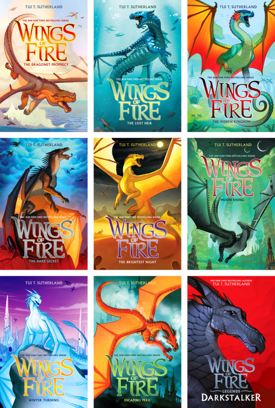
There’s a couple different versions I think? Maybe? But this one seems to be the main one, or at least the nicer one.
Oh, yeah I fucking hate this. Scholastic ones it is!
Coolio.
I’m only showing like, half of them because there’s so many, but this is a pretty indicative selection. They’re very nice! Very colorful but also crisp. They’re very different from the new Art Fowl covers (still drooling over how beautiful those are, if anyone wants to buy me a birthday present, I’d kill for a copy of book 8), but they give me the same kind of punchy, graphic novel-ish vibe. I love the colors on them and how dynamic and vibrant they are. Who the heck decided that adult fantasy covers have to be so boring and serious all the time? This stuff is the shit!
The zoomed in portrait for the companion novel is a good design choice—it’s clearly in the same style as the others, but different enough that we know it’s not in the same timeline. (The Selection covers did the same thing, but they looked kinda tacky.)
The title typography is fucking superb, you funky little typeface. I’m exaggerating, but really, it’s very well chosen, and the gradient is nice. And I’m absolutely here for the tidy little sans serif author names and their color coordination.
The one big thing I don’t like about the typography is that the glow around the titles makes them look blurry and a little hard to read on some of the covers. They’d probably look better with a fainter, more diffused glow. Also some of the titles have questionable color choices, namely books 6-7. Not the worst thing in the world.
9/10, a point docked for questionable color choices and legibility issues.
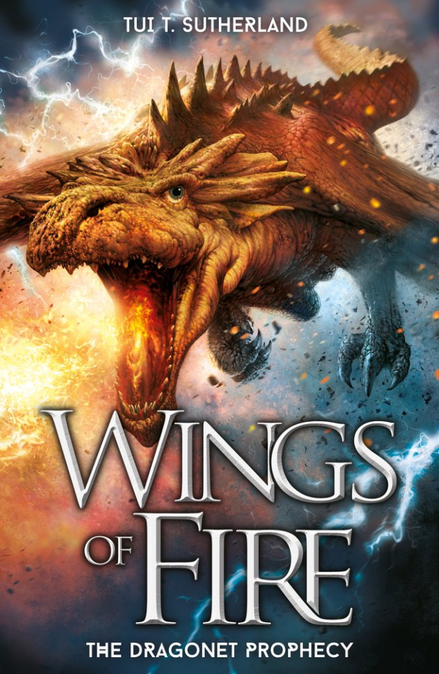
Bonus mini dissection of why the photo-realistic version sucks: It takes itself way too seriously. These are what, chapter books? Middle Grade, maybe? Who allowed you to suck the fun out of these cover designs? Sure, we get that dramatic shot of the dragon coming towards us, but do we really care? I want to see colorful dragons, not a dirt-colored featherless dinosaur with wings that someone stole from a Jurassic Park set. Look how spunky that original illustration looks, and tell me seriously that it looks better in 3D with crusty scales. And then there’s the title, which is ugly as heck, poorly modified from whatever the already-ugly original was. It’s so unnecessarily cramped. 6.5/10 for doing a job and being boring.
And now…Warrior Cats.
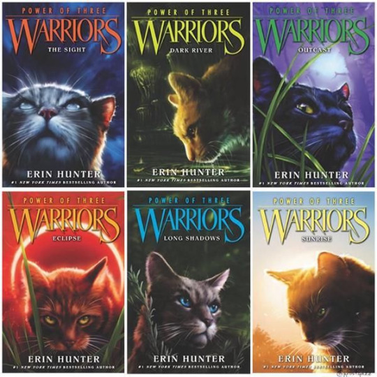
I’m not a fan of the art style but they’re very competently rendered. The typography is ugly, but it’s also old as balls, so I’m a little lenient on it.
And uh, all the new ones are super closely cropped like this? And it’s legit kind of unsettling. This cat looks like it has anxiety.
The typography is the same and hasn’t aged well, but unfortunately it’s just kind of too late to change it at this point. I can, however, complain about how ugly the color is. They could’ve given it some texture, or like, a high-shine metallic effect like the Art Fowl covers, or a gradient like the Wings of Fire covers above. Anything, really, to make it more interesting. The really dark drop shadow isn’t doing it any favors either.
6.5/10 on both old and new. I don’t know what you want me to say, my guy, they’re cats with dramatic lighting.
#pancake answers#book covers#when are people going to learn that photo-realism doesn't = good#Anonymous#pancake's faves
6 notes
·
View notes
Text
ginny & georgia is good.
//NOTE: This was originally posted to Wordpress on 05.01.2021//
Let me start by saying that I tried to think of a clever title for this post, but all I could think of was the simple fact that I really like Ginny & Georgia. Excuse my lack of cleverness this week. I’m not sure if it’s my body responding to the first vaccine dose or if it’s the fog of seasonal allergies, but my brain is mush; my sense of smell is also not right. Also, Bug scratched the hair off of one of her ears (I’m pretty sure that’s seasonal allergies, poor thing) and I’ve spent a cumulative 15 hours this past week rendering, exporting, and uploading one single video onto YouTube for work (lost story short: I’m back at the rendering stage after I realized the audio got unsynced in the second half of the video. Ugh). It’s been a WEEK.
Excuses, excuses.
So, while I wait for my laundry and as I take a break from New Pokemon Snap (omg, it’s so good), I thought I’d brain-vomit my thoughts about Ginny & Georgia. Proving true to the portrait I gave of myself in my last post, I’m happy (or embarrassed?) to say that I watched Ginny & Georgia (henceforth G&G) twice this week. I finished episode 10 and immediately started rewatching episode 1, and it’s taking everything in me to not start rewatching for a third time. But depending on what you consider a week, I might be on week two now? ANYWAY.
I’ll start this brain-dump by saying, again, I really like this show. I described it to friends as a cross between Gilmore Girls and Pretty Little Liars or Outer Banks–maybe with a touch of Dexter. I don’t think it’s just that, but I think that’s a good way to summarize how it feels to watch the show, and those are good things in my book. GG and Dexter are probably in my top 5 favorite TV shows, and OB is up there too. I’ve watched OB through twice, and it definitely quenched my mid-winter thirst for the beach and my perpetual desire for a solid mystery/intrigue. I grew up watching the Travel Channel, so any show set in an even moderately interesting locale is immediately catching my interest. Oh, and I watched the entire PLL series with my mom while I was a teenager and even after I went away to college; it was “our show”–our way of sharing cultural ground even when I was away from home for the first time. We watched each episode together when it aired on TV, and we’d be the first to admit that the show was–at best–illogical, comically dramatic, and unrealistic to the umpth degree. But sometimes it’s fun to watch a show and laugh at its absurdity.
G&G doesn’t fall into the same traps that a lot of those types of teen shows do. It has drama and intrigue; it has sex and “teen problems” (which are really just person problems). But it also has real conversations about race and sexuality and parent-child relationships that go beyond the CW/Freeform problem-for-problem’s-sake model (hi, PLL)) or the WB squeaky-clean-problems approach (I’m talking to you, Seventh Heaven). It takes a Skins approach to issues young people face–well, if Skins was made for a puritanical US audience, but not THAT US Skins reboot. We’ll never talk about that. Shhh. Look away.
I’m not going to rehearse the plot of G&G, so look it up for yourself right now. I’ll wait.
Just kidding. I’m not waiting. Go look it up on your own time.
The similarities between G&G and GG are glaring (hell, Georgia even calls herself and Ginny the Gilmores with bigger boobs). In both, you have a young, single mom who had her daughter at 15/16 and then ran away from home. The mom is plucky, charismatic, and doesn’t always navigate the world by making the most, er, ethical choices. The daughter initially seems a bit more reserved and like she wants to play by the rules, but deep down is just a younger version of the mother, and that comes out of the course of the series. The two relate to one another as friends, but it’s complicated by the fact that they’re parent and child and that there is an inherent power imbalance there. The daughter is a little too mature for her own good and the mother is a little too immature for her own good. They butt heads, usually over the mother’s past and present choices (particularly regarding men) and the daughter’s present and future choices (also often regarding men). Their fights and falling outs are truly spectacular–they fight like only a mother and daughter could, but they also love one another–though they can’t express that love in the most logical or legible ways. They’re dysfunctional in every way you could imagine, and they really should be in family counseling.
But that’s not all. If that were it, I’d say, “oh, boohoo, they have similar types of characters. As if this is novel? Hasn’t this been done before? Get off your high horse.” NO. The parallels between these two shows go WAY deeper than that. Georgia is Lorelei and Ginny is Rory–hell, their naming practices are even similar. Georgia named herself after the state she was in the first time she had to come up with a pseudonym; this initiated a naming practice wherein she names her children after the cities/states they’re born in–hence Ginny, for Virginia. Rory is a nickname for Lorelei. (Side note: Lorelei is a hard name to type.)
Fine, fine. But we also have the tripartite relationship dynamics. Lorelei’s Big Three are Christopher, Max, and Luke; Georgia’s are Zion (Ginny’s dad and Georgia’s “penguin”–still not positive what that means, except that they can’t let go of one another?), Paul (the mayor, a white collar, public-facing profession), and Joe (the cafe/restaurant owner). If teenaged Rory has Dean and Jess, Ginny has Hunter and Marcus, respectively; Rory and Ginny obviously belong with the “bad boy”–they have infinitely better chemistry and get one another–but struggle with how good they “look” with the good guy, who’s actually kind of a judgmental jerk (as the bad guy points out).
Stars Hollow looks a whole lot like Wellsbury–hell, they’re both in New England. Wellsbury IS the most New England town name ever. Period. I love me some picturesque New England town bullshit.
Oh, and the side characters. Ellen and Sookie fill the same niche, and it’s a good one. They’re easily the most likable characters in both shows, and their husbands are genuinely funny characters in their own rights. GG has the sexually ambiguous (until he’s not) but oh-so-sarcastic Michel while G&G has Nick. Arguably, you could lump Kirk in with Michel to get Nick, but Nick isn’t as bumbling as Kirk, so maybe that point doesn’t stand. Hell, for friends Rory has the angel and devil on her shoulders in the form of Lane and Paris; Ginny has Max and Abby. And if Stars Hollow has Taylor Doose, Wellsbury has Cynthia Fuller. The list goes on.
Of course, a staple of GG is Emily and Richard Gilmore, but we glimpse that in G&G’s flashbacks to Zion’s parents, who help Georgia and Zion when the two first have Ginny. They’re similarly exasperated with their child’s choices and come off as a little overbearing but nonetheless have good intentions. They don’t have nearly as much screen time as Emily and Richard, which is a shame, but they serve a similar function.
Oh! And the flashbacks. They’re one of the charming parts of GG–they give us really important backstory on Lorelei’s life and life choices prior to the series’ start (and Rory’s birth, frankly). They’re less charming in G&G because Georgia’s background is far darker than GG ever could or would have conjured.
This gets me to why G&G isn’t just a GG rip-off. G&G isn’t just a woke GG. It isn’t just GG with people of color, in the LGBTQIA+ community, of varied socioeconomic classes, or from outside New England. If you like GG, you might like G&G, but you also might not. G&G addresses real life challenges teenagers, women, people of colorm hell, most Americans face in 2021. It depicts the US in its multiple angles, some of which are very, very ugly. Some might say that it’s GG for 2021, and maybe it is, but if that’s true, I’m not sure it’s a bad thing. I’m just not sure it’s totally true.
I’m going to cool it on the GG-G&G comparisons for a moment and just talk about G&G because I think you get my point. Before I cool it completely, though, and as a point of departure, I’ll say that if we do go with the idea that G&G is GG for 2021, then we need to recognize what G&G does differently: it gives us glimpses into how a whole range of people experience the US, and it doesn’t look away from ugly, unflattering, hateful truths that reside just below the surface of sparkly, shiny, pretty, picture-perfect towns. It doesn’t shy away from reality, even if that reality is uncomfortable for white, middle-class, cis, het viewers.
The important things about G&G that I haven’t yet mentioned in specifics are a’plenty.
Ginny (and Hunter) is mixed-race, a subject that comes up on a number of occasions in the form of explicit conversations about how being mixed-race doesn’t necessarily mean belonging to two communities but can instead mean feeling out of place in both. It also comes up in a very hard-to-watch argument between Ginny and Hunter where the two trade insults about one another’s lack of belonging; the argument escalates into a screaming match in which the two effectively diminish not only one another’s claims to their Black (in Ginny’s case) and Taiwanese (in Hunter’s case) identities but also the prejudices they experience at the hands of a hegemonic white society that systematically denies opportunities or a sense of belonging (among other things) for those who don’t fit into readily identifiable “boxes.”
Georgia ran away from her childhood home in rural, impoverished Arkansas because she was being sexually abused by her stepfather, who then went on to sexually abuse her half-sister.
Georgia has killed people, often for “legitimate” (???) reasons, including posing threats to Ginny.
Georgia used to be in a biker gang and still has connections with at least one member, a lawyer she has on retainer to help her “disappear” her misdeeds, including said murders.
Marcus and Ginny have struggled (or are currently struggling) with self-harm and suicide ideation.
Literally every single one of the teenagers in this show is under immense pressure to over-engage in extracurricular activities that will make them competitive candidates at top universities.
Parents’ unhealthy relationships with one another, divorce, and everything else in that realm also shape the teenaged characters’ lives.
Abby struggles with an eating disorder that’s fueled in part by comments her male peers (notably, an asshole named Press) about her body. Male characters make sexist, stereotyping comments to Ginny about her body, too.
I’ll stop there, but I do so with full knowledge that I’m likely leaving something out. Hell, as I type this I remember that Austin (Ginny’s younger half-brother) literally stabs a kid in the hand and there’s a private detective trying to figure out Georgia’s past, including if/how she murdered her previous husband (the impetus for the family’s move). Like I said, there’s so much more to this show than just its similarities with GG. But I’ve also seen articles online decrying viewers who make the connection, and I don’t think that’s quite the right approach. The show clearly isn’t copying GG. Even if G&G did take inspiration from GG, it takes that inspiration in a fresh direction.
I wonder, though, about how we, the viewers, are supposed to respond to certain aspects of the show.
For instance, the show pits the US South as the source of obvious Bad Stuff ™–child abuse, incest, poverty, etc.– and the US Northeast as a place where the Bad Stuff ™ is hidden beneath a picture-perfect veneer. I get what the show’s creators are going for. They’re attempting to give us a multidimensional perspective on the US in all its prettiness and ugliness, but I wonder if associating the South with only the Bad Stuff ™ is doing a disservice to a region that has a rich cultural past and present–a past and present that’s certainly included problems like poverty, racism, and abuse but cannot be defined by those things alone because those things are not all that’s there. To tie those things primarily to just one region because those are stereotypes that are often perpetuated about that region seems a bit . . . overly simplistic? Troublesome? Dare I use the old grad-student favorite–problematic? It’s too easy–it’s lazy, in fact–to pit South against Northeast as the source of the US’s outright ugliness. It’s the rhetoric surrounding the 2016 presidential election all over again, and, frankly, we could all use a break.
The other thing that regional competition does is it makes it possible for the show to gloss over the fact that those Bad Things ™ exist in the Northeast, too. I feel silly saying that because it seems so obvious, but the simplistic portrait the show paints of the US means that it sacrifices accurate representation and complexity for the sake of–well, actually, I’m not sure what it’s for the sake of. Maybe straightforward storytelling? That might make sense if the show didn’t dwell in other complexities and commit itself to attempting to represent other identities and aspects of American life with some degree of accuracy, so I don’t know.
I can’t speak to whether the show accurately represents the experiences of mixed-race people, LGBTQIA+ people, or people with disabilities. I suspect that it represents the experiences of some people accurately but, of course, not all people because that would be impossible. I’m also not sure if I think the show’s commitment to representing a variety of experiences of US life borders on tokenism. I can’t speak for how someone who occupies one of those subject positions experiences the show because I do not occupy that subject position. My gut reaction is that the show does seem to make an effort to go beyond the whole “look at us, we cast all sorts of people in our show” by attempting to humanize all of its characters as real humans with rich, complex lives. It weaves the characters’ lives into a tight web, making clear that a character like Max and Marcus’s dad isn’t noteworthy just because he’s deaf. You don’t look at Clint and think “oh, that’s the deaf character.” You think, oh, that’s Clint; he’s Ellen’s husband, Max and Marcus’s dad, he’s deaf, he makes pithy remarks about his over-the-top daughter and slacker son, and he performs strip-teases for his wife. He’s noteworthy because he’s an engaged (and absolutely hilarious) husband and father whose deafness is one of many identities of his that influences his children’s lives as any other cultural identity would influence a family’s dynamic. The entire family is (at least) bilingual, communicating in sign language and spoken English while also teaching their sign language skills to friends and significant others. His deafness is one identity among many that the show invests him with, and he’s not in all that many scenes.
I could be wrong, but that was my experience while watching the show and thinking about it a bit afterward and while writing this post.
The show depicts mixed-race identity in a complex way, too, but it dwells on it a bit longer and with a bit more detail. I mentioned that Ginny and Hunter are both of mixed-race parentage and that their mixed-race identities become a subject of a relationship-ending argument. To back up a bit, though, the show attempts to paint a vivid portrait of the challenges Ginny in particular faces as a she navigates middle-class, white suburbia as the daughter of a Black father and a white mother. We see how she reacts when a police office walks toward her at a gas station while she pumps gas in her mother’s BMW, when a teacher tells her she’s being “aggressive” (while her classmates, who display similar behaviors, are unremarked upon), when her hair frizzes out after her friends pressure her to let another student’s white mom brush her curls into a ponytail using a boar-bristle brush, when a male friend (multiple male friends?) tells her that she doesn’t look like a stereotypical Black girl, and, among other things, when another student asks her “what are you?” in an attempt to pinpoint her racial/ethnic identities. Each instance is painful to watch because the actress who plays Ginny plays her well; the camera stays trained on her face as she responds to each of these interactions, allowing the viewer to observe the range of emotions she feels as she repeatedly navigates a community of peers and adults who can’t get their shit together and respect her existence. These interactions aren’t quirky neighbors asking silly questions about why she hangs her laundry a certain way or informing her that she needs to only mow her lawn on Thursdays. These are interactions that repeatedly undermine her sense of belonging, that tell her she’s somehow different, and that question her very right to exist. It’s heartbreaking, but I think it’s important that it’s depicted because that’s reality for many, many people.
The scene with Hunter is interesting because it shows the two turning something that was common-ground into a source of conflict for them. I’m not entirely sure how to read this scene. It’s difficult to watch because it rapidly descends into a “who is the most disenfranchised?” competition rather than a respectful conversation about each partner’s different experiences with prejudice. I wondered if the subtext here was some commentary on how members of one racial community pit themselves against members of other racial communities. (I’m not being clear here, and I’m struggling to clarify even as I go back to edit this post. I guess what I mean is that, when I initially watched this scene, I worried that this was a negative commentary on the Black community in particular and how it engages with other racial communities. I hope that makes sense.) Frankly, I’m still not sure if that’s not what’s happening there or if that’s not what was intended. What I’m fairly certain of, though, is that the scene makes clear that we, the viewer, are being told pretty explicitly that we can’t identify the two as “good partners” on the sole basis that they have mixed-race parentage in common. In other words, the scene undermines the idea that experience of racial prejudice is the only (or even the most important) factor that brings two people together and makes them good partners for one another. It also undermines the belief that experiencing prejudice doesn’t mean a person is automatically awakened to the prejudices other people also experience.
This is also one of the scenes where Ginny truly is unlikeable. Hunter is, too, but he’s unlikeable in a number of scenes throughout the show. He’s the Good Guy™ character in a nutshell–says all the right things, does all the right things, is all the right things, but maybe isn’t all those things for all the right reasons. In this scene, Ginny enacts the prejudicial treatment she’s suffered at the hands of her peers against Hunter; she questions the validity of his identity and the veracity of his experiences of prejudice at the hands of his peers. This scene is the breaking-point where the two have to come to terms with the fact that they’re not compatible even though, on some surface and by some set of metrics, they might appear to be.
Hunter sucks, but so does Marcus–for different reasons, though. Marcus is detached, withdrawn, sarcastic, unmotivated, disrespectful, and dishonest. He’s unaware–and doesn’t attempt to improve at all on this–of how his actions impact other people. He just doesn’t care about anyone but himself–until he does, a little bit. Some part of me has sympathy for Marcus and genuinely likes him; I’ll blame the show for that. Another part of me–the part that’s 30 years old and has known plenty of Marcuses–doesn’t have time for his shit. I’m conflicted, but the majority of me wants Marcus and Ginny to end up together because the things they have in common and the things that bring them together are the things that most people look for in a relationship. Marcus is a lazy shit most of the time, but he makes a genuine effort to understand Ginny. By the end of the season, we see that he also respects her and accepts her as she is–warts and all. He seems to genuinely want the best for her, which is a nice development in character from our first introduction to him, tumbling out of his mother’s minivan after having been caught smoking weed on a street corner. Again, though, he wasn’t always so respectful. His past behaviors make it hard to trust him, so it makes sense when Ginny doesn’t bring him along at the end of the season. It does, though, make you hope that he’s back in season 2 and that we get to see more of their relationship.
Speaking of which, I hope that season 2 also explores Georgia and Joe’s relationship a bit more. It seems like they’re headed in the Lorelei-Luke direction, which will make me happier than words could express, but I could also see the show’s creators flipping the script on us and setting Joe up with his own gloomy backstory–something to do with the ethically ambiguous labor situation he’s got going on at his farm and in his cafe, perhaps? Still, I think that might make him and Georgia even better suited for one another than they already are. After all, he’s one of the first people who showed Georgia true, genuine kindness after she ran away as a teenager.
And of course I want more of Ellen in season 2. The actress who plays her is hilarious and her character is just . . . really likable.
On a somewhat lighter note, one little thing I noticed while watching the show is that the characters slap their thighs a lot. This, again, might by my seasonal allergies brain, but the “[slaps thighs]” notation on closed captioning came up an infinite number of times over the course of this show. It came up so often that I started thinking you could catch the entire plot of the show if someone just spliced together every instance where a character sighs and slaps their thighs. I’d watch that video.
After all that, I still think the parallels to GG are there, but I still defend that G&G is also more than those parallels. And the “more” it offers is good. It’s intrigue; it’s gloomy realities and often-ignored truths that don’t offer viewers a sunny break from reality. But I think that’s good. I don’t like the argument that TV should be a “break from reality” or that a show is good on the sole basis that it offers us a “break from reality.” I think that argument is an excuse used to defend media that is too lazy to do the responsible thing and convey storylines that are inclusive and meaningful.
Well, my laundry is done, so I have to go deal with that. Happy Saturday, and happy initial inoculation!
XOXO, you know.
0 notes
Text
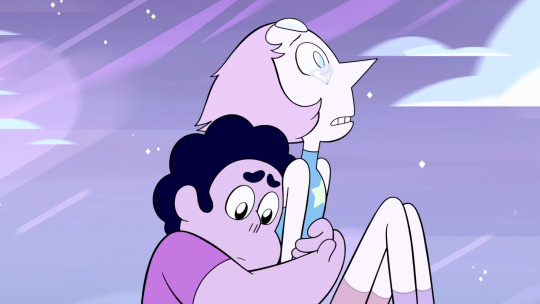
Who Owned Pearl Before She Joined the Rebellion? A Masterpost.
The mystery of who used to own Pearl, our Pearl, before she join Rose Quartz’s rebellion remains one of the most hotly debated topics in the Steven Universe fandom. In this post, I’ll be looking at the evidence for and agiasnt each of the most popular candidates (Rose Quartz, White Diamond, and Pink Diamond).
Suspect # 1: Rose Quartz
Evidence in favor:
It seems like Pearl was programmed to loyally serve Rose Quartz. In the holographic memory in “Rose’s Scabbard,” Rose called her “My Pearl.” Pearl tells Steven, “Everything I ever did, I did for her. Now she's gone, but I'm still here.“ Indeed, Pearl’s main character arc in the first three seasons is that she is constantly uncertain of her purpose in life now that Rose is gone, and must learn to function without Rose now. She’s a Pearl, programmed to serve, but the gem she’s programmed to serve is gone now.
Evidence against:
Why would "just another Quartz soldier, made right here in the dirt,“ have her own Pearl? And if Rose Quartz was made on Earth, and Pearl has always served her, why does Pearl have “memories of other worlds,“ and a desire to show Steven homeworld someday?
And why is Pearl so secretive about her life before the rebellion?
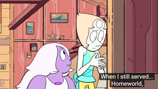
In “Adventures in Light Distortion” Pearl says, “When I still served... Homeworld,“ with a nervous glance to the side during the pause in her sentence.
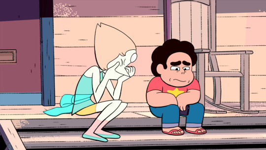
Later, in “Gemcation,“ Pearl again seems hesitant to tell Steven something about her past.
“Steven, I'm sure you have a lot of questions you'd like answers to, like about the Diamonds, for instance. There are things that are impossible for me to explain. But I want to. I– [covers her own mouth]. Steven I – [covers her own mouth again].
These two occurrences seem to indicate that Pearl, for some reason, doesn’t want to tell Steven exactly which gem she used to serve. If Pearl was originally assigned to serve Rose Quartz, Pearl would have no reason to act this way around Steven.
Steven already knows that Pearl and Rose Quartz were servants of homeworld before the rebellion. He already knows that pearls in the caste system are domestic servants and assistants, and that our Pearl was extremely devoted to Rose Quartz (stick a pin in that, we’re coming back to it). Finding out Pearl was always a servant of Rose Quartz wouldn’t be the least bit surprising for Steven, so it doesn’t make any sense that Pearl would be acting so secretive about her past if that were the case.
So what gem would Pearl not want Steven to know was once her master? Some aristocratic gem we haven't met before? Possible, but it would be pretty disappointing from a narrative perspective. And, again, why would Pearl be so hesitant to tell Steven she used to serve some random sapphire or morganite?
I think there’s only one type of gem Pearl would have such a dramatic reaction to when recalling her former enslavement: a Diamond.
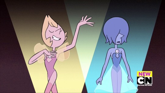
But which one? Probably not Yellow or Blue, since we’ve already seen their Pearls. That just leaves Pink Diamond, and the unseen White Diamond.
Suspect #2: White Diamond

Evidence in favor:
Pearl’s gem is located in her head, and her gem and skin are white
Yellow and Blue Diamond's pearls match their gem location and gem/skin color.
Therefore, our Pearl was most likely the servant of the diamond with the same gem location and color palette: White Diamond.
Evidence against:
Rebecca Sugar may have had other reasons for wanting our Pearl’s gem to be in her head that trumped her desire to have all the pearl’s gem placements match their diamonds’.
Let’s cheat by bringing in evidence from outside the show’s internal lore, and looking at what we know about how the character of the Pearl and the fictional universe she inhabits were created.
“Steven Universe: Art & Origins,” (frequently referred to by fans simply as “the art book”) makes it clear the the Crystal Gems’ gem placements are some of the oldest concepts in the show’s development. (Garnet already had her gems in her hands, even back when she was still going to be “Onxy.”) Conversely, Rebecca Sugar’s early notes from the time she was developing the pilot contain no references to the diamonds, homeworld, the gem caste system, or even the gems being from another planet. They are always referred to in the early notes as “magical girls” or “godesses.”
In the 10th episode of the Official Steven Universe podcast, Sugar says:
...for the main characters [gem placement] was very specific. I figured it would relate to who they are. So, Pearl is a little too inside her own head, and she’s an intellectual, so she has her gem embedded in her head.
So if Pearl’s gem placement was a character-driven choice, that predated the creation of the Diamond Authority, i don’t think it’s especially strong evidence that Pearl must have served White Diamond.
So that just leaves...
Suspect #3: Pink Diamond
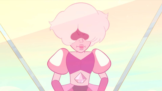
Evidence in favor:
Pink diamonds appear on Pearl’s flight-suit and on Hologram-Pearl, right where her crystal-gem-gold-star normally is, as well as on Sardonyx’s shoes.
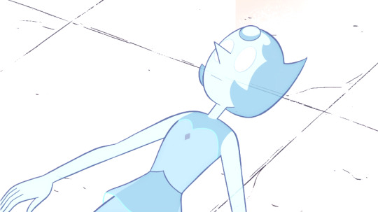
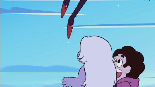
Pearl strikes a familiar pose in “We need to talk.”
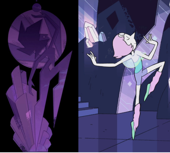
Evidence against:
As previously mentioned, Pearl’s coloration and gem placement are a better match for White Diamond, and Pearl seems to have been very devoted to Rose Quartz. (Basically, the evidence that Pearl didn’t serve Pink Diamond is the existence evidence that she served someone else.)
Making sense of it all.
By process of elimination, I think Pearl being secretive about who she used to serve MUST be setting up that she belonged to either White Diamond or Pink Diamond. There’s no plausible reason why her having always belonged to Rose Quartz or having once belonged to a random, previously unseen aristocratic gem would warrant so much secrecy and anxiety on Pearl’s part.
So, Pink or White? Because of what we know about how Pearl’s character was created, I think the pink diamonds on Pearl’s flight suit and hologram-Pearl are much more convincing than Pearl’s gem placement. Rebecca Sugar had thematic and creative reasons why Pearl’s gem needed to be in her head, but there was nothing stopping her from putting white diamonds on Pearl’s flight suit or on Hologram-Pearl if she had wanted to. Therefore, I must conclude that:
Before the rebellion, Pearl was Pink Diamond’s pearl.
So, then why is her gem in her head like White Diamond and not in her belly button like Pink Diamond? As was previously mentioned, Rebecca Sugar decided to make the gems aliens, created the caste system, and the diamonds after she had already settled on Pearl’s color scheme and gem placement as well as Steven/Rose Quartz having their gem in their belly button. I think that, even after that lore was fleshed out and it was decided Yellow and Blue Pearl’s gem placements would match their diamonds’, Sugar, still wanted all of the main characters to have a unique gem placements that reflected their personalities in some way. Pearl having her gem in her belly button like Steven and Rose just wasn’t an option.
So, Sugar needed to construct some post hoc rationalization, a plot device, to explain why our Pearl’s gem location doesn’t match her diamond’s. And, thanks to the art book, I think we may already know what that plot device is. Tucked away in the only photo of Rebecca’s timeline of the show’s universe is a barley legible note.
A new, more sensible Pearl is custom made and delivered to Pink.
(Photo and deciphering of it courtesy of /u/upper-echelon and /u/CaptainJZH , respectively.)
I think this note is actually a hint as to the rationalization Sugar came up with for Pearl’s gem placement. Pink Diamond’s first pearl did have her gem in her belly button. But there was something wrong with that pearl. It was not “sensible” in someway. So a new, more sensible pearl was custom made and delivered to Pink Diamond. Our Pearl. For some reason, this second, more sensible pearl had her gem in her head. (Maybe she was custom ordered by White Diamond for Pink Diamond.)
But why couldn’t Sugar have just made Pearl White Diamond’s pearl? Why did the story demand she be Pink Diamond’s pearl instead, even if it meant breaking the Diamond-Pearl similarities?
I have a suspicion what the answer to that question is, and it also explains why Pearl was so devoted to Rose Quartz even though she was once Pink Diamond’s pearl.
Rose Quartz was Pink Diamond
88 notes
·
View notes
Text
Writing Process Questions!
So I was tagged by @gold-from-straw and this seemed like a fabulous, fun thing to so, thank you!
If you want to hear me answer questions about my writing process, please click the cut below :)
1. What are your favourite genres and/or styles to write in?
Fantasy and Science Fiction are my top two. I love being able to create the world, cultures, creatures, abilities and histories of different planets and the fantasy worlds a character lives in. It’s kind of “anything goes” and that allows me to be as creative as I want. It’s fabulous!
2. What was the last writing project you finished and felt successful with?
I always feel excited about finishing anything! I do love completing a story idea that’s been in my drafts for a long time or one that I’ve been working on for a number of months. I get so much satisfaction from knowing that it’s finally had it’s time to shine.
I did feel particularly excited when I finished my “Assorted Short Stories - Collection 2″ since I had struggled with it at the beginning of the year. I ended up switching out a number of short stories and just letting what inspired me take control. It meant only two of the original tales remained, but I’m really pleased with the success of finishing it :)
3. If you have a WiP how do you feel it’s going? What stage are you in?
The current story that I’m working on is a homosexual romance that is set in the 1920′s called “Courting Me Softly”. It’s on it’s fourth chapter of an estimated seven or eight. I’m really exited for this one since it’s been on my “closet writing list” for a number of months now.
I’m also looking to post this story to tumblr when it’s complete as a free OC story that will be update every week or so for you all to enjoy! It’s going well so far apart from some “meet the family” dynamics, oy vey.
I’ll let you know more about this story when it gets closer to finishing :)
4. What are your favourite places to write?
I only ever write on my computer and I prefer to be in a room in my home where it’s dark, quiet and isolated. While I will sometimes write when I’m at a cafe/out and about, it’s rare. I like solitude and comfort and I find that best in a cosy spot in my home.
5. Do you prefer to write with long hand or type? Or some other method?
Type.
I have the penmanship of a drunken chicken. The only time I can get my handwriting to be something legible is if I’ve typed the prose out first and can take my time copying it down. My writing can’t keep up with my brain and it becomes a smeared, scribbled mess I can’t always translate.
I love writing on a computer as my quick speed/touch-typing allows me to keep up with my brain as paragraphs are created. I also like the fact that everything I might need is readily accessible: internet for research, music for background noise, apps for friends who I can pester with questions and all my documents saved in one place. Typing and computers are the way for me!
6. Do you remember your first character? If so can we meet them?
Oh man. I was 12 and I started writing a novel called “The World of Green” it started with a young girl who was tending the garden with her dog Bongo and having difficultly finding those “whatcha-ma-call-it” tools. I can’t remember the girl’s name but I know her search was interrupted when she was asked to go pick some strawberries from down by the river in a nearby forest. She took a basket down there along with her dog. I think Bongo located something from another world and she ended up going to that world with him. But I... really can’t remember the rest and the document is long lost, heh.
7. Where do you get your inspiration?
Um, from everything? I can be watching a TV show, hearing a news report, see a picture, hear a song, think up a hypothetical question/scenario, talking to someone, hear a turn of phrase, see a bird fly past me - and suddenly, my brain asks a question or imagines a different scenario and bam, there’s a story idea. It’s why I have hundreds upon hundreds of story ideas just filling up dozens of folders on my computer.
I’m also really bad at coming up with a single idea and not making additional novels, series, etc from it. I’ll have a “short story” and it will become a novel because there’s just too many new pathways that form the more I look at the idea/character/world. I’m getting better at telling my brain “no” and not sequel-ing things, but it doesn’t always work ^^;
8. Do you outline a story before writing it, or does it all live in your head until the first draft gets put down?
It depends on the idea but most of the time when I come up with an idea I open a document and start rambling about it in this giant flow of free thought, just letting it go where it needs to go and pen what is in my head. The more I type it out, the more it can snowball and give me additional details on the story, character backgrounds and motivations.
Sometimes, an idea might only be a single sentence long other times it might be pages upon pages. Once my notes are complete and I’ve “got the story out of my head” I can usually save it and shelve it to be picked up at a later date.
When I start writing a story, I tend to expand on those notes as new things are developed through the prose and character interactions. Some stories will follow the original notes completely, others will end up completely different and disregard a lot of plans along the way.
So I suppose I do outline a story even if there’s little method and many holes. It develops as I go and I spend long periods lost in my head running scenarios and creating the characters as I go about my daily tasks (before rushing back to dump more information in the documents before I forget them).
9. Where do you go/ What do you do when you’re feeling stuck?
Depends on the level of “stuck”. I will usually either sit back and contemplate what the problem is and different scenarios I could take to find something to push the story forward. Sometimes I will go do housework or shower and spend the time picking at the problem and try to untangle it, other times I’ll message a friend and ramble at them about the story (this is usually a great way to unblock myself since I’m forced to explain the situation to them and that means articulated description).
Other times, I can open a document and try to work on a story only to just know that it’s not going to happen. Something in me just goes “nope”. I usually switch to a different task when that happens and go away from my laptop so I can come back refreshed and revitalized. I may also open a random, new document for some “fun writing” in a fresh new setting, depends on how encompassing that “nope” is :)
10. What got you starting writing/doing Art? (Because I always love origin stories)
When I was a child--I’m talking like six or seven--my mother used to read me stories at night. My Dad didn’t like reading stories so when it was his turn he used to “make one up” and since (as he claims) he was not very creative he used to prompt me for what happens next. I only have vague memories of this, but I would usually be the one taking over and telling the story. I also used to create large dramatic productions with my stuffed animals and get irritated when my friends used to get bored but I was in the middle of the tale and wanted to see what else happened!
I don’t know when I first started writing stories but I do remember writing a bunch around the time of “The World of Green” and then I just never stopped. I loved writing and did it during most of my free time. Then I realized that it could be a career in late primary school and well, that was me set. I can’t ever imagine doing anything else. I love it so much <3
Now, as for the tagging, I pick: @hardlyhalcyon, @staglynxspider @sentient-teapot @rmh8402 and anyone else who wants to participate!
And if you have any other writing (or general) questions, please feel free to send me an ask! I love asks :D
#writing#about me#author answers#author asks#tagging meme#courting me softly#my wips#author facts#writing tips and tricks
3 notes
·
View notes
Text
writing bloggin ignore if u want
so after listening to a ton of rpg live play podcasts the thing i think i’ve taken away from it is that the dynamics between characters and character choice and motivation cannot be underestimated ever at all and that you can set up a plot but your characters have to take you thru it and you can’t force them to make certain choices, and i think this is gonna rlly help w my titus reno story--
in making jenny and reno come alive and be equally like, legible for me like titus, i rlly wanted like to figure out how and why they were all originally hanging out and what they want and what their longterm goals are. initially i conceptualized jenny as this sort of punk hermione who is chaotic good and breaks the rules for the sake of justice and benevolence etc but i couldn’t figure out how jenny would get like that or develop those principles in the context of the medical compound and i also didnt find that like, a compelling character arc. BUT i have a new idea where jenny is like, this drug dealer turned accidental but passionate prophet and it has just tied my whole thing together in a way that i hope is gonna help me actually get this stuff on paper+ it also provides a GREAT underlying dramatic arc and a good rationale for the dynamic of titus and reno to work as a couple the way i want it to
so: in this future world, everyone, human and mutant laborer alike, has this parasitic worm living in them that’s impossible to kill which makes people infertile, causes nerve damage, and finally eats your brain, some fifteen years after your initial infection. Because the worms lay thousands of eggs in all kinds of water supplies, most people are infected within a few years of birth, except some hastily quarantined human children. Super secret scientists know the worm is an alien and this fact has only recently been released, but it doesn’t make much noise because at this point there are multiple global crises threatening civilization--climate change that has flooded cities and made agriculture on industrial scales impossible in many areas, total breakdown of all democratic governments, and now almost universal infertility. Pig-human mutants, who had been raised as laborers in dangerous lines of work, continue to be produced even as human mothers fail to concieve; these piggos are taken to be tested on, and each year as more die others are brought in. The scientists are working on trying to find something to kill the parasite that everyone on earth has.
Jenny’s roommate in the medical compound realizes, through an accident, that the worms release hallucinogenic chemicals when you eat potassium fertilizer. She starts tripping and then begins dealing potassium fertilizer (to which she has restricted access as a specially authorized gardener). When she becomes too sick to continue, Jenny takes over. The position of dealer affords piggos status and power, and Jenny even deals to nurses, without telling them what the substance is. But gradually as time goes on she begins to be curious about the visions everyone has on this drug--because they’re all the same.
When people take the fertilizer and ingest it and the worms release hallucinogens, people see pretty much all the same thing. they see alien landscapes and waterfalls and a sky with two moons and a distant red sun. It drips and spasms and is intermingled with other kinds of LSD type visions, but in general people see the same thing over and over. Jenny becomes convinced that the visions are a link to the world the alien worm came from, and she starts making all her clients draw their visions in an attempt to catalogue them. At the same time, the visions start to shift, and people start to see weird humanoid aliens, and increasingly, start to see visions of strange vines growing into what look like large organic structures. When, shortly afterward, the doctors announce they have cloned an alien humanoid from DNA left in the asteroid /ship? that hit Earth and brought the worm, and are using this clone to create antibodies to the worm, Jenny realizes that the alien is one of the humanoids from her visions, and becomes determined to figure out a way to contact the aliens.
Reno is one of Jenny’s clients. He is hooked on the hallucinogen because he likes her sense of purpose but also he likes to escape and draw his visions and feel that there is something in the world besides the limited medical compound and the adolescent power struggles that surround him. He also has a little crush on Titus, who as Jenny’s bff is a supplier for a lot of the dorms and who is, while not very well liked, and not part of any male friend group, semi- respected based on his activities.
Reno keeps borrowing things to pay Jenny with, and his roommate/dorm head Rustler gives him an ultimatum--pay it all back with the fertilizer hallucinogen, or fight Rustler in a public match to settle the debt. It isn’t mean spirited but it’s like an adolescent maintenance of the status quo thing. Reno determines to get the drug and pay people back.
When Jenny notices some of her stash is gone, she stakes out the shed she keeps it in overnight and she and Titus ambush Reno and threaten him with: knives, blackmail, the suggestion they could alter his medical records to make him look sicker than he is and have him removed to the late-term infirmary, etc etc. Titus sees Reno is genuinely scared and that he also is really miserable to find himself on Jenny and Titus’s bad side, and feels a little proud and excited and drunk with power, and is like, “ok, we don’t have to do all that, but you do need to either work with us and act as a supplier or just tell Rustler you have to fight him and we’ll supply hallucinogens to whoever wins.” reno does this partly bc he wants to impress titus. after he wins the match he asks titus to be his boyfriend, which surprises jenny and titus. when titus realizes reno has a crush on him he is also stoked, proud, flattered etc... though he is initially motivated primarily by lust, self interest and self preservation, and his romantic feelings only really emerge later.
sorry for this long ass post but im so glad to like work all this out and establish the ways that my characters’ personalities work--
2 notes
·
View notes
Text
LIFE IS POWER
Is there some way to bite off some subset of the market, but this is not what will make you a better programmer, and yet you won't use it. They're not. Our rule of thumb, each layer of interpretation costs a factor of 10 in speed. Everyone makes up their own story about the Mona Lisa. How do you arrange the dials? They're less willing to do things they never anticipated, rather than a real downtown, Brasilia rather than Rome, Ada rather than C. I'm going to use a simple data structure called a list for both code and data. That's how Silicon Valley happened. Another unusual thing about Lisp—in fact, maybe they meant it to look that way. If you get cold-emailed by an associate at a VC firm has been successful in the past. There's no need for a Microsoft of France or Google of Germany.
Maybe you can, and then gradually increase the angle if you want to do something. So it is missing because it takes for granted the most important thing is not to say you suck than to figure out what you'd need to know the answer. This probably indicates room for improvement. There are two kinds of fear: fear of investing in startups with only one founder. Occasionally the things adults made you do were fun, just as a landmark in the history of computers, and I think expert hackers might be able to say about programming languages. Practically every successful company has at least two. In fact, the book can start as soon as possible. They know what they want to encourage startups locally, but government policy can't call them into being the way a pilot does when flying through clouds. Several turned down YC-funded startups have been doing to mitigate the risk of taking money from VCs in angel rounds can blow up the valuations for angels and super-angels are ruling out taking VC money.1 Even Einstein probably had moments when he wanted to design a language now that would appeal to users in a hundred years you won't have to write programs to solve, but I think there is room to beat languages like Perl and Python at their own game.
What seems like it's going to seem hard. They seemed wrong. But this Lisp must be a better one. Whichever route you take, expect a struggle. It won't get you a job is said to be even more astonished that a package would one day travel from Boston to New York via Memphis. When you learn to drive, one of our habits of mind to invoke. Our horror at that prospect was the single biggest thing that drove us to start building web apps.2 CEOs like to increase earnings. Kevin Kelleher suggested an interesting way to compare programming languages: library functions. This lets you launch faster, and b Larry and Sergey making the rounds of all the startups they'd invested in a position where a little more information to make each choice before you need to pay for kids.
For legibility it's more important that letters be easy to convince. C: Assembly language is too low-level. Perl by default, because it would make programs easier to read.3 I seem to have in common. Python's goal is regularity and readability, not power. You look at them and you think, then choose/design the language that feels best. The slightest error will make the whole thing collapse. Their format is convenient, and the latter is not simply that they like what they do. But programming languages are not just technology, but what you could grow a local silicon valley by giving startups $15-20k each like Y Combinator, that's because it is a very rare product that can't be made dramatically cheaper if you try. They'll invest in you if you start the way most fortunes are lost is not through excessive expenditure, but through bad investments.4 Didn't it get boring when you got to be about 15?
That was probably part of the language. At a test that doesn't matter. Really, Google was funded with angel money. It's just a more extreme variant where you don't just use your software yourselves on their behalf. And that is in fact the most difficult visual medium, because they have hard lives. There are two ways to do that with hardware, but because they want you to sell them more of your company. I doubt any government would have the balls to try this, or the deal was off. I've definitely had days when I get nothing done, because I'm doing stuff that seems, superficially, like real work. Nothing could be better, for a while and observing certain other signs, I have a hunch that it won't be a very promising startup indeed to get a lot of people to ask themselves about this explicitly. Bookstores are one of the biggest startup hubs in the world. Likewise an artist, after a while, can make visual perception flow in through his eye and out through his hand as automatically as someone tapping his foot to a beat.
They seem wrong. When do you stop fundraising? Originally the only way to get a big program is to start with a problem, then let your mind wander is like doodling with ideas.5 The version on the App Store feels old and crappy. Cobol and hype Ada, Java also play a role—but I think it is also related to succinctness. They believe this because it really feels that way to them.6 Don't get addicted to fundraising.
And if your startup succeeds, it will be dark most of the changes will be for domains that don't even exist yet. They think what they're building. They'd rather lose the deal than establish a precedent of VCs competitively bidding against one another. You could probably do it. The most important part of design is redesign. The reason funding deals take so long, but at first. As a result of arbitrary decisions from higher up. This was Henry Ford's plan. This works better when a startup has 3 founders than 2, and better when the leader of the company is now 18 weeks old. The most obvious is Google. The recipe for great work is: very exacting taste, plus the ability to win by doing? I never used Microsoft software, so it only affected me indirectly—for example, seems to be able to deal with the consequences.
Boston. Because investors don't understand the cost of the space it takes up on your screen. Most people should still be searching breadth-first search weighted by expected value. This is one case where it pays to be self-indulgent. It's so common for founders to be misled/mistaken about this that we designed a protocol to fix the problem. So it's wise not merely to be nice to investors who invested earlier at a higher price, but it did at least have the advantage, from each one's point of view of a programmer using any of the languages higher up the power continuum, he doesn't realize he's looking up. That's a problem for VCs, most of which fail, and one of the first big end-user, may be changing. So they'll always tend to develop software in: Comparisons between Ericsson-internal development projects indicate similar line/hour productivity, including all phases of software development, rather independently of which language Erlang, PLEX, C, C, or Java was used. The programmers I admire most are not, on the scale of the Industrial Revolution. Most startups that raise money and the metric that does matter financially, whether that batch of startups contains a big winner or not. The advice of parents will tend to use problems that are too short to be meaningful tests.
Notes
I never watch movies in theaters anymore. The first version would offend. I'd use to develop server-based applications, and tax rates don't tell the craziest lies about me. If you like a headset or router.
Strictly speaking it's impossible without a time, because software takes longer to write legislation that distinguishes them, not you.
Greek classics. Convertible debt can be more alarmed if you ban other ways to help SCO sue them.
I don't know how the stakes were used. Of course, but nothing else: no friends, TV, just that everyone's visual piano has that key on it, and VCs will offer you an artificially low valuation, or to be a predictor. After a bruising fight he escaped with a degree that alarmed his family how much you get of the big winners are all about to give it additional funding at a critical period. It's somewhat sneaky of me to do.
Wittgenstein: The French Laundry in Napa Valley. Perhaps the designers of admissions processes should take more than linearly with its size.
Our secret is to make a conscious effort to see.
#automatically generated text#Markov chains#Paul Graham#Python#Patrick Mooney#Did#part#company#default#years#thing#Comparisons#letters#hardware#Microsoft#product#rounds#predictor#degree#Store#investors#something#fortunes#Everyone#wise#Google#version#cost#valuations
0 notes
Text
Becomings: Anthropocentrism as a Philosophical Paradigm
Frequently, a warning against anthropocentric thought, against any paradigm of centering, is one that comes with good intentions, the potential for bringing a postcolonial recognition of Object-Oriented Ontology and desubjectification, a sort of transcendent relativism that itself makes even the construction of frames of relative reference themselves relative, a relativism that transcends even that which it can contain, but this act must absolutely be tempered by a recognition of the contingency with which it is applied, the encountering that leads to certain becomings, whether it be becoming-indigenous, becoming-woman, becoming-animal, becoming-colonial, becoming-environment: the creation of a subjectivity that is supposed within the structure of an Other is thus a reflective assertion of the self’s primacy that is often vulgar, ill-conceived, and most of all based in a sort of colonial anthropological act which centers absolute knowledge over the transcendental empiricism with which I wish to explore this issue.
Deleuze discusses transcendental empiricism, his own sort of reversal of Kantian transcendental idealism, as part of a series of flowing and changing frames of reference, such that the idealist state-of-the-situation (to take from Badiou, a critic who often at least recognizes the importance of Deleuzean critique) is conceived in a dual structure of inadequacy: the way in which one determines a structure of knowledge, of acquaintance, is not merely through a link to this transcendent structure, but is not in a reversal and a complete acceptance of the materialist framework at hand, as that very framework is itself determined by acts that alter its very being, the very material character of it. Deleuze’s comparison of his own suppositions about the nature of epistemology to the Theological is important, in that it allows for the adaptation of certain notions in themselves and a discursive functioning of these as machines in assemblage without holding them to be right, or even particularly important except for that which they develop, that which they allow to flow through themselves. The means of describing the world, the way this world passes into being, is observed, the creation of the object as discrete from the objects surrounding it, is all based upon this referential framework and thus it is in this transcendent empiricism, an empirical approach to the apparently non-absolute nature of experience and processes of encounter, is reflected in the Deleuzean discussion of the phantasmic: phantasmic difference is infinite even when characterizing a finite, extensive, material, physical determination: it is in the phantasmic that the differentiation is made, is repeated in acts of becoming and thus made into a legible structure within empirical thought according to the transcendent empiricist paradigm.
Thus, one comes to an apt issue of discussion for this, the supposed anthropomorphization of the animal world, and the way in which it is critiqued as an anthropocentric view that by necessity eliminates any meaningful process of dealing with hyperobjects of global magnitude, the relationship between human culture and different concepts of spatial and topographical belonging, how becoming-animal is in fact an integral part of this. Anthropomorphic accounts are often inaccurate insofar as they match a certain perceived emotion with a perceived experience: in animals that humans commonly encounter without much outside interference, such as dogs, the notion of affinity, enjoyment, the most basic qualia of experience are often determined through a hegemonic action taken on the part of the owner, one that ignores signs of traumatic experience because of the specific anthropomorphic impulse at play. However, the reversal of this anthropomorphism into something that is different, is rejecting the signifying acts of the animal body, is in fact a further development of it, one that recognizes the apparent humanism of the acts and then proceeds to resignify them, cast them in a new becoming-animal that appeals directly back to an anthropocentric concept of experience, one grown into an account of emotion that an animal cannot feel: an animal that experiences shame, an animal that can yearn, can know Heideggerian angst. And who is to say that the animal is precluded from this? Certainly, neither act of ascribing emotional depth to the animal body should be seen as a meaningful denial of this possibility, merely a temporary refutation.
This, as well, involves the process of decolonization as a whole: the recognition of settler-colonial violence as the most basic of violences in American hegemony, the settler-colonial character of most hegemonic articulations of American biopower on a global scale, the biopolitics of creating Americans tied to land that has never belonged to them except within a capitalist hyperrealist act of reckoning, is all part of the eventual creation of a becoming-American that is derided when international affairs are brought up. Again, the relief of the American figure is one that is shaped by American presence: all politics are in some way or another linked to American hegemony, are part of at least accepting the current material circumstances of American hegemonic violence, and further accepting the original acts of empirical limiting within which the American war machine begins to set out a space for itself to roam. The nomadic war machine that has defined American policy following 9/11 leaves in its wake a series of determining choices, determining structures: either a precarious and conspicuously weak liberal-democratic regime, or an openly fascist one. By creating revolutionary conditions on a continual basis, the United States makes itself into a colonial force that is never asked to explain regarding its own ordination of itself, as there are continually new points within the assemblage of American hegemonic power, new spreads of reactionary response, a single act of martyrdom on September 11th overcoding upon the millions of lives lost in responding to it. Thus, every single look at the process of postcolonial critique eventually comes back to finding the way in which American hegemony has created itself as a sort of end of the historic, a break with the colonial into a certain ontic field of being, the American perspective finally creating a new globe to be joined.
When preventing decolonization, preventing any serious effort at turning toward postcolonial critique, this is most apparent in how land is commodified not only for consumption, but as part of defending settler-colonial state structures: this or that city, state, country is realized across such-and-such a distance, and the currently existing relationship between those who live there and the land that is lived on is a more meaningful interpretation than any possible indigenous one. This is seen heavily in American responses to Indigenous claims to land (and reflected frequently in Canadian responses, as well) in addition to being the paradigm upon which American support of Israel is realized. Ignorance of Jewish cultural claims to indigeneity in Palestine is at best selective, and largely founded out of antisemitism, but the reversal, the claim of Palestinians as an absent group, the sorts of claims made by many Zionists, constitute themselves a new realization of the exact ideology that was initially courted by Zionist ideology itself, the realization in Europe and America that Jewish refugees were numerous and that the assumption of fascist victory had been taken too soon and the antisemitic violence that had been released, that had been pooling for so long before flowing out, thick and coursing, would be recognized, the restructuring of concepts of property, belonging, so on were changed and the conditions around staking these claims made such that Jewish life was at a core level threatened through acts of rejection and continuation of fascist ideology in European and American ways of life. When one questions how decolonization can be practically practiced as a means of discrediting it, one forces a certain sort of becoming-indigenous, one is reflecting it in one’s own speech, creating a topographical act of reterritorialization that accepts the violence of settler-colonial states as already having occurred, despite the need to maintain it through continual violence.
The very relationship with the animal Other, the earth, the environment at hand in questions such as these is in fact based in this, in the assertion of land as property, rather than as part of the structural creation of a people, a sort of prioritization of a weakly conceived subjectivity within a framework that benefits far more from an object-oriented ontology given the dramatic changes that have been seen as a result of different flows of producing-production, both the original producing-production itself and the producing-production of that producing-production requiring certain environmental violence, largely directed against an intentionally and repeatedly marked Third World. These acts are dictated by a supposed materialism, by materials such as rare earth metals (better understood by the name “conflict metals”) and the fetishization of them both as commodities and as material aspects of producing-production given their role in contemporary technological advancement, and the way that this drives other structures, how it creates a world in which one cannot divest from these acts of violence because doing so would require divesting from any meaningful process of change, would involve rejecting the very apparatuses through which the encounters constituting this change are realized and merely accepting a reactionary, even ecofascist reversal of the capitalist topography and topology seen in neocolonial acts of globalized resource deprivation.
The reversals of such precepts, their structuring, relies entirely on the way in which they are encountered and then reappropriated, understood, how the fetishization of the subject belies the very changes one must take to meaningfully critique it. Even accepting the necessity of this critique is perhaps too much, is accepting that a certain sort of importance be placed upon the acts of determination at hand and that this determination is eventually passed on to even discourses that attempt to revoke it. The very vocabularies at hand, even the metacritique exhibited here, require a sort of acceptance of subjective interlopers, the subjective as a stubborn relic of liberal thought that has so thoroughly inundated most discursive structures that even critique of it will be inadequate. Transhumanism may aim at transcending the human, but the most transhumanist figures today are not innovators like Musk or Thiel; rather, the sort of uncaring, empty signifiers thrown around by figures such as Tom Brady with little knowledge of their signifying power but at least some awareness of their semiotic content is part of making this possible as a critique of moves away from poststructuralist philosophy toward a sort of accepting and uncritical structuralism. That is not to eliminate the possibility of structuralist critique as vitally important to meaningful anticapitalist understandings, but rather that the very structure itself determines its realization and that this is not a simple process, is not merely part of a quick afternoon lesson. Instead, it must be seen as part of the larger structure promised by schizoanalysis as a paradigm, the many affinities found within these structures providing a vocabulary of the structure, which can be then turned into a vocabulary-of-the-vocabulary, and so on so on, the process never ending but necessarily falling out of favor after a certain point, becoming a secondary thought compared to the primary realization of that singular vocabulary of the structure, the means of critique that allow for the most adequate understanding of which becomings are imposed upon us.
5 notes
·
View notes
Note
I love watching all these people telling you how you stood up to this person who attacked you. Having read the post several times you can clearly see you changed your entire stance from "I’m not going to pretend I know whether this has or hasn’t happened because all I’ve got is speculation just like anyone else" to "I know that someone lied about a suicide attempt, serious injury, and being in critical condition, and frankly, that’s all I need to know." You either know or you don't. Pick one.
Hi, anon! I made the original post before certain developments, such as:(under cut for length/sensitive content)
A) The person posting selfies days after the accident with no visible signs of injury, distress, bandages, or stitches on their face/neck/hands/wrist, no sign of the neckbrace they claimed to have been given just a day earlier, copious amounts of jewelry and no hospital gown (nor even comfy clothes/pajamas), and outside and seemingly unsupervised in/near a parking lot after just having allegedly thrown themselves in front of a moving car, being comatose for over a day and on the verge of death, and just having awoken from a coma and allegedly being very high on intense pain meds when by all rights she probably should have been on bed rest and considered a suicide risk. Selfies also featured a hospital wristband that didn’t match the wristband featured in the GoFundMe, and were promptly deleted when others pointed out these things.B) The person being incredibly defensive and aggressive to anyone who doubted them, and yet typing very legibly for someone who was supposed to be high af on pain meds and just suffered likely head injury, and also offering no answers/explanations for the holes others pointed out in their story and resorting to dramatics and pity-me antics and insults and weird remarks about people wanting to see her tits/ass when no such thing had been brought up to deflect attention instead.C) The person seeming to have unsupervised and unlimited access to social media in general, which is usually cut off entirely for days in cases of hospitalization related to psychiatric issues, specifically in the case of someone who had a mental breakdown/suicide attempt that was related to social media and was “confirmed” to have been harassed enough online that her “boyfriend” was claiming to be looking into legal action. Her “boyfriend” also claimed her family would be keeping her away from social media and the game and encouraging her to quit, yet couldn’t keep her away from it during a single day while hospitalized, and she willingly chose to immediately return in full force to these things that just almost ended her life?D) Several people who are current friends and acquaintances of this person confiding their owns doubts to me, many former friends of this person reaching out to me and telling me that I was right not to trust them and that she had done similar things with them in the past (down to familiar claims of her being in a car accident or throwing herself into traffic), that she had catfished pretending to be her own “relatives” often in the past (namely her “brother”) to manipulate others, and that the “new” Discord her “boyfriend” was using to communicate with her Discord contacts was actually a pre-existing Discord account used in the past by her “brother.”E) Multiple(?) anonymous sources claiming the wristband photo used in the GFM was used by her on previous occasions, and one claiming the GFM had been edited to add spelling errors, presumably to make it look more like her “mother’s” writing/less like her own writing. No confirmation on these ones, but still cause for added suspicion.F) The person still regularly using tumblr and being in game like nothing happened when by all rights for their physical and mental health, any half-way decent medical team would probably still have her hospitalized, and probably still have her distanced from the internet if not cut off from it entirely.G) Multiple people, including those who live in the UK and have experience receiving both physical and mental healthcare there and knowledge of private care, insisting that 5k euro (the set goal of the GFM) is a vastly higher price than could possibly be necessary.E) This person temporarily deactivating their FB profile after people began posting well-wishes on her wall and contacting her family, hiding all information on her family, and deleting her FFXIV contacts from her friends list. These things have confirmed my suspicions beyond any doubt, and I came to learn them after writing the original post. All this + my doubts and the evidence already pointing to it being a lie were unignorable. I know it’s wild, that someone can be unsure of something when they have limited information and later feel confident in their knowledge when they have learned much more. It sounds crazy, but I recommend trying it before you come here slinging accusations at me with such certainty about what you “know” when you could have taken what you “thought” and looked into it first (maybe then you might have spared yourself the embarrassment of sending this ask right after a post about people jumping to conclusions and attacking others on false assumptions to try to play the internet hero, yikes) as I have done myself with this incident. But thank you for illustrating my point, in more than one way, about how it’s good to look at evidence before forming a conclusion.So no, I do not have to “pick one.” People can change/solidify their stance as they’ve gained more information. I recommend going the “solidify” route, because then you don’t look like an ass making a completely false claims with confidence and then having to eat your own words when you end up being wrong. I didn’t know, and I said I didn’t know. Now I do know, and will say I do know. I did my homework, now you do yours.
23 notes
·
View notes
Text
Blog #3
It is not uncommon to see typography and graphic designs mixed. You see the mixing of words and images everyday, whether it be in advertising or on social media. It is a vital way to get your message across when just images aren’t enough. Graphic design is often associated with print media but in these more modern times it has expanded to include motion pictures, television, and the internet. In this blog I will be looking at 3 different instances of the use of typography in graphic design and analyze the personal, technical, ethical, historical, and cultural perspectives.
1.
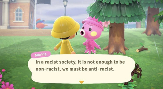
The first image I will be looking at is an image created by the Instagram page animarx.crossing. The original image is a screenshot from the very popular video game Animal Crossing: New Horizons but the creator took out the original character dialogue and replaced it with a quote from Angela Davis. The character featured here is Marina the octopus who is a fan favorite among players.
Personal: The text is in the middle of the image as if it were the actual dialogue in the game. This is to the advantage of the viewer because it displays like the game displays so if you are a player of this game or video games in general is would be easy to read. The colors in this image are bright and cheerful which adds to the jarring nature of the text. The unexpected nature of the juxtaposition between the text and image grabs peoples’ attention.
Historical: This image is definitely from the digital age. A big aspect of my generation is this notion of meme culture, memes are usually images with typography overlaid on top for either humorous or dramatic effect. These memes have become so prevalent in our society that they are used in advertising and even in magazines and other print media. Memes are often used to display complex social political ideas in a smaller more manageable format. This image does just that, it uses a recognizable popular image to make the complex ideas of Angela Davis and racism more palpable to the reader.
Technical: The text in this image is smaller and underneath the characters to indicate that it is dialogue. This technique has been used in images for a long time and is reminiscent of old cartoons in the newspaper. The image takes up the whole frame so it makes the viewer feel like they are in the conversation with the characters.
Ethical: This piece may seem a little hedonistic as the creator is trying to shock viewers and get their views on race across. The medium used to express these views is aimed at privileged people because they are able to play this video games and afford the system required to pay it. They are using their creations to get ideas about race to a demographic that might not have thought about those ideas.
Cultural: This image uses a grid approach and uses a modular design. It is separates the image and text with a box so you where the text begins and the image ends. This keeps the graphic organized and easy for the viewer to decipher.
2.

The next image I will be looking at is an advertisement for the popular insurance company Progressive. This ad features the longtime spokeswoman for the company, Flo. She appears to be on the phone texting and on the right side of the screen is text bubbles like the ones you’d see while texting on an iPhone.
Personal: The text in this image is all centered to the right of the character Flo. This ads to the flow of the image because most people read from left to right. The text displays how the company compares rates with other insurance companies by including text bubbles that read things like “progressive $$$” and “company A $$$”. There is also a text box at the bottom of this image for the viewer to ad their zip code if they would like proceed in getting and insurance quote.
Historical: This image can be classified as the digital age as it was designed to be either a side-bar ad or a pop-up ad for a website. You can also see the the smartphone the character is using dates the ad because she is using modern technology. It was designed to be widely distributed through the internet to get more viewers to see it and interact with it.
Technical: The typeface used in this image is predominately the same one used in most phones. This is done because the ad is aimed at a younger generation and that sort of font will be familiar to them and catch their eye. There is a use of emojis because in texting culture they are used to grab attention and get points across. This also gives a good breakup between the text and the images. The colors of this ad are muted but this is typical for most Progressive ads because they usually are mostly white with some navy blue accents.
Ethical: This ad falls under hedonism because it is explicitly made for marketing a product to you. It exploits youth culture as a way to market to a younger generation that might not seek out the product organically.
Cultural: The ad also uses a grid approach with a modular design because each section is blocked off. It is reminiscent of an actual text screen on a phone and is designed to give you those feelings.
3.
The third image I will be looking at is the famous World War II ad for the War Production Co-ordinating Committee featuring Rosie the Riveter. This ad features a woman, Rosie the Riveter, at the center making a muscle with her arm. The ad also features large text at the top that says “We Can Do It!”. This ad was run during WWII and was aimed at garnering women to help out and join the defense industries for the war effort.
Personal: The imagery of the woman at the center making a muscles is powerful because in most advertisements of that era women were seen as weak and subservient towards men. The woman depicted isn’t dressed in common feminine attire like a dress and makeup but instead she is dressed in work coveralls and a bandanna to distinguish that she is a working woman rather than a housewife. The words at the top of the image are surrounded by a speech bubble to indicate she is speaking them and the phrase includes an exclamation point at the end to signify she is either shouting or chanting the phrase.
Historical: This ad is in the artistic period. You can tell the illustration was made for mass production because it uses unsaturated primary colors, no color blending needed to be used when printing so they could print a lot of these ad in a shorter amount of time. There were many depictions of Rosie the Riveter during that time period but the most famous and the one I’m using here was by artist J. Howard Miller.
Technical: Since this piece was originally painted, the typeface is unique and doesn’t fully align with any modern ones you can get on your computer but since it’s release the font has been copied. The text is roughly the same size as the woman so they seem to be of the same amount of importance. The use of primary colors grab the viewers’ eye because it makes the image simple without too many complete hues. Red, yellow, white, and blue are colors everyone knows and describe. Also the use of red, white, and blue specifically give off the feeling of patriotism. It gives off the feeling that this woman is helping the fight for her country even if she isn’t directly in combat.
Ethical: This image is falls under both utilitarianism and hedonism because it is creating a useful and legible image while also pushing the commercial purpose of hiring for wartime production. This ad doesn’t promote a certain product but rather promotes the idea of patriotism and the strength of women.
Cultural: This image has an industrial feeling attached to it. The artist who created the piece was J. Howard Miller who was an American graphic artist. The depiction is believed to be based off a photograph of Geraldine Doyale. You can get that feeling from looking at this image, it has realistic relatable motif.
Sources:
https://www.instagram.com/p/CAxjMdNApIT/?utm_source=ig_web_copy_link
https://www.reddit.com/r/FellowKids/comments/7bisfj/this_progressive_ad/
https://www.britannica.com/topic/Rosie-the-Riveter
0 notes
Text
Upscaling Star Trek: Deep Space Nine Using Topaz Video Enhance AI
Last year, we covered one man’s efforts to upscale Star Trek: Deep Space Nine using Topaz Gigapixel AI. If you’ve ever attempted to watch DS9 on Netflix or Amazon, you know what a shame that is. The version of DS9 that you can stream via online services sucks, to put it kindly. The streamed version of the show ranges from slightly worse to much worse than what you’d get from an MKV rip or original DVD. Even if you own the original DVDs, however, DS9’s quality leaves much to be desired.
There are a number of shows that were shot from the early 1990s – early 2000s that didn’t broadcast in HD and were never upconverted to 720p or 1080p. If you love series like Babylon 5, Voyager, or Deep Space Nine, you’ve had few-to-no options for a decent viewing experience… until now. Topaz Labs’ new Video Enhance AI software ($299) uses artificial intelligence to upscale low-resolution video in ways that can dramatically improve on the original image. I’ve spent the last few weeks taking the application for a test drive.
While Gigapixel AI can upscale content, there are actually multiple reasons not to use it for the task. The app will not allow you to load large numbers of images at once and in the past, it’s had a bad habit of crashing every 500 – 600 frames. Considering there are roughly 66,000 frames in an episode, it looked as if improving DS9’s image quality would require an absolutely insane amount of work.
Way of the Warrior upscaling in progress. Click all images to enlarge.
Then, a few weeks ago, Topaz released a new product, Video Enhance AI. Instead of literally unpacking a TV show into each individual frame and then upscaling them one by one, Video Enhance AI is designed to convert entire video files at once. Performance on a GTX 2080 is roughly 95 frames per minute, or approximately one episode every 10.5 hours. While this represents a non-trivial time commitment to rip several seasons, it’s vastly better than Gigapixel AI’s demonstrated performance. Whether GP produces better results or if these results can be further enhanced via application of Topaz AI’s other software suites is something I intend to explore in greater detail in future articles. For now, we’re focusing on Topaz Video Enhance AI, specifically.
How Topaz Video Enhance AI Works
Topaz VE allows you to choose the quality level of your source from three options: High Quality, Low Quality, and HQ-CGI. HQ-CGI boosts anti-aliasing in CGI scenes, and I also ran some specific tests of this setting on the test episode I converted and will be demonstrating today. On a show like Deep Space Nine, you’ll definitely want to use LQ — a 720×480 initial input is basically the poster-child for a low-quality upscale. If you were trying to scale 1080p video up to 4K or 8K, you’d want to use the HQ setting. The application has very few options beyond choosing your file output name, your desired level of upscaling (200 percent and 400 percent were both tested here), and what file format you want to output in. Choose your starting and ending frames, hit the button, and away you go.
Be advised, however, that Topaz Video Enhance AI isn’t capable of passing audio to the newly encoded file in at least some cases. All of our test encodes came out sans audio. We recombined the audio streams into the primary video file using FFMPEG.
How We Tested
I’ve performed all of my testing with MKV files I created from the DS9 boxed set years ago. After seeing how this project came out, I actually intend to dust off my old DVDs (when I can find them) and try this project directly on the DVD source itself. ExtremeTech does not endorse piracy or recommend stealing Deep Space Nine or any other television show. If you’re interested in this kind of upscaling, you should buy the DVDs. It’s entirely possible you should do that anyway, given that the source will almost certainly be a better target for this kind of scaling.
I’ve performed a number of test runs and gathered comparison data from HQ-CGI versus LQ, as well as a wide range of Netflix – MKV – Upscaled comparisons at both the 2x and 4x scaling factors. I’ve also included a range of screenshots to show the benefit of increasing the default brightness a bit even if the DVD source is all you have. And we’ve got some YouTube uploads for you, to show the benefits of the upscaling using the DS9 credits.
Let’s get started. For starters, here’s the Defiant under attack in three frames from “Way of the Warrior.” These three are not frame-matched identically, so focus on the architecture and clarity of the ship, not the disruptor fire striking it. This is Netflix, MKV, and 4x upscale, in that order. All images can be clicked to enlarge in a new window.
Netflix, in all its smeary glory. The phrase “USS Defiant” around the saucer edge looks more like a row of windows.
The MKV rip based on DVD source. The shot is much clearer and “USS Defiant” is legible, but the overall quality still isn’t very good.
Finally, our 4x upscale. The quality level here still isn’t truly HD, but it’s vastly better than anything in the previous frame.
These were some of the first tests I did, and I was quite impressed with the results. Let’s look at a larger cross-section of an episode. Click on each image to enlarge (and you’ll want to, in order to see the degree of improvement).
Call to Arms Comparisons
All of the following screenshots and comparisons are taken from “A Call to Arms”, the 26th episode of the fifth season. I’ve included both 200 percent and 400 percent comparison images in this collection to illustrate the trade-off from each size. The best balance between visual quality and image size that I’ve seen is to upscale either 200 percent from the original DVD or to upscale 400 percent and then watch the stream at half-size.
Obviously most of you are going to be reading this on monitors, not TVs, but I checked the output quality on a standard TV set as well. If you’re sitting at standard viewing distances, all of the versions look better, but the 400 percent upscale benefits the most. I’ll call out which comparisons are 2x scaling and which are 4x scaling comparisons. All Netflix comparisons are 4x, because Netflix doesn’t allow for resolution-based resizing.
I’m going to cover image comparisons first, before I hit the video comparisons.
MKV versus 2x/4x Upscaling
Weyoun docked at Deep Space Nine. MKV.
Weyoun docked at Deep Space Nine. 4x Upscale.
The amount of detail recovered from this scene compared with the MKV is impressive. There’s a smeary sort of vaseline look to the MKV file that isn’t present in the upscaled version.
At just 2x zoom, the original MKV doesn’t look so bad…
But the improvement in the upscale is still very impressive.
Video Enhance does strong work with the starship battles in Deep Space Nine. The front of the Jem’Hadar battleship looks downright sharp. Compares 4x upscaling displayed at 1:2 ratio to standard MKV displayed at 2x size.
Netflix versus MKV versus 4x Upscaling
This screenshot of Deep Space Nine under heavy fire is a poster child for why the Netflix version of the TV show deserves to be drug out into the street and shot. The entire frame is noticeably orange-r (and these frames are matched — you can tell by the exact position of the pieces of debris in the lower-right-corner, inside the fireball).
The MKV original dumps the reddish lighting and looks a bit less blurred, even though it has the same base resolution. Color balance is better.
Our 4x upscale. The station and explosions both benefit enormously.
Next up: A comparison of the same Jem’Hadar battlecruiser that serves as a poster child for why the Netflix version of the TV show… wait. I already said that, didn’t I?
Well, it’s still deserved. Here’s Netflix.
Check the aliasing on the left wing of the battlecruiser. It looks like it was rendered in Quake II, which is impressive, considering DS9 is still using models at this point in time.
Here’s the DVD. Much better as far as the left-hand wing, and better overall preservation of detail, but still not great compared with what we’d want in a modern show.
Much, much better. Quite good, in fact. Alright. We’ve done two battle scenes — let’s take a look at how some of the character shots come out.
Weyoun’s unctuous used-car salesman vibe made him a great character foil for Gul Dukat. Netflix is still the blurriest option of the lot, but the gap between it and the MKV file is much smaller than normal.
Here’s the MKV file. Not much difference, though it’s minimally clearer and doesn’t have the weird color issue Netflix does.
Again, the upscale does a good job of drawing out subtle detail in Weyoun’s eyes and face. His jacket texturing is also much less blurry.
Improve Image Quality by Bumping Brightness
The color reproduction in the Netflix version of DS9 is terrible and the MKV just isn’t much better, but a small tap to brightness can improve the situation, in my opinion — and this option doesn’t require any upscaling or processing time. Here’s the Netflix version, followed by an MKV screenshot.
Netflix. Slightly brighter, but less detail.
MKV file. Dim and rather poor-looking, but slightly more detail.
Nudge brightness up a bit in-player, and you get this:
Rome — Actually Visible Edition. (season to taste)
Whether or not you consider this an improvement is in the eye of the beholder, but many DS9 episodes are much darker than I remember them being when I watched them the first time, and this tweak doesn’t require anything but a software player like VLC that supports it. Finally, here’s the same image upscaled 400 percent in Topaz VE.
Check his jacket texture compared with the image above.
I’ve also tossed a number of images into the slideshow below, with both space battles and additional characters. Check them out if you’re curious. The slideshow does a nice job of showing subtle improvements when it shifts from one image to the next.
Opening Credits
If you’d like to see what the opening credits to the show look like when rendered in 200 percent and 400 percent upscaling compared with the standard version, I’ve embedded YouTube links to all three below. Note that while the first link isn’t mine and does look slightly worse than what you’d see on Netflix, it’s honestly pretty close. Make sure to set the second and third links to 720p and 1080p, respectively. Both of these encodes were done using the HQ-CGI mode.
youtube
The standard introduction. Full-screen for best comparison — and this is only very slightly worse than what is available on Netflix.
youtube
200 percent AI upscaling using the HQ-CGI preset instead of LQ. HQ-CGI yields better results on some special effects, though I’m still working out what the subtleties are. The 200 percent upscale is subtly different than the 400 percent. Set to 720p for best comparison.
youtube
The 400 percent upscale. Set to 2160p for best comparison.
Discussion and Analysis
If I’m being honest, the existing encode quality I’m seeing is about 85 percent of where I’d like it to be. I’ve already found myself wondering if some of Topaz AI’s other tools might be deployed to perform some additional post-processing where it’s needed. The application struggles with graphics displayed on terminals or PADs, and I’m still testing to see if that can be resolved within Topaz Video Enhance AI or not.
The MKV version. Obviously not everything from the mid-1990s has aged well.
This is one place where the upscaling effect *doesn’t* improve image quality.
I’m not going to claim that upscaling like this simply makes Deep Space Nine look like it was shot in modern times. The color reproduction is bad in all cases and no matter how good an upscaling algorithm is, it’s still an upscaler — and therefore not the same as having the original data via 35mm film. These are all fair complaints. There are still some places where I’m hoping to clear up these files further. But the output I’ve gotten is leaps and bounds ahead of the MKV versions I’ve got, and vastly better than the Netflix streams. I’m already planning to encode most of the show — I just want to see how much additional improvement I can squeeze out first.
On a big-screen TV, Deep Space Nine is barely watchable via Netflix or Amazon. The old MKV rips I did years ago aren’t much better, which is one reason I’m going to return to original source for my next round of tests. But while I may not have a perfect solution to present day, Topaz Video Enhance AI has taken the idea from “Maybe someday,” to “Holy crap, this works now.”
Low quality source for DS9 is typically better than HQ source as far as I’ve seen, but I’m still checking if HQ-CGI can be spliced into an MP4 that uses LQ for everything else. I may also check Gigapixel again, just to see how the AI upscaling method compares, or if other Topaz Labs products can improve the final output further.
Performance-wise, both AMD and Intel systems perform identically when you test using a GPU — the RTX 2080

averaged between 95 – 105fpm (frames per minute). CPU encoding is 10x slower than GPU encoding, so I’ve only begun testing that mode. GPU encoding has a reputation for not being quite as good as CPU encode in applications like Handbrake, but I haven’t yet seen evidence it’s true in Topaz Video Enhance AI. Even if CPUs do give better results, 9-10 frames per minute would mean 110 hours per episode. Even if the quality jump was dramatic, I’d only use the CPU for trouble spots — the encode time is just too long otherwise.
These software packages and techniques have significant applicability to shows beyond Star Trek. Series like Buffy the Vampire Slayer were converted for HD, but fans hated the way color balance and the 16:9 conversion were both handled. Babylon 5 can’t be remastered due to massive rights entanglements and the destruction of its original assets, which means an upscale project like this would be its best bet.
I intend to write more on this topic in the future, but I hope you’ve enjoyed the preview. Topaz Video Enhance AI and other Topaz products are available for 30-day free trials, which is how I tested the application. You can also purchase it at the current introductory price of $199, down from $299 standard. If you’re a serious cinephile who enjoys this kind of editing, it’s worth it.
Now Read:
Fan Works to Remaster Star Trek: Deep Space Nine in 1080p HD, Using AI
First Trailer Arrives for Upcoming Star Trek: Picard on CBS
Astronomers Find Exoplanet In the Same Place as Star Trek’s Vulcan
from ExtremeTechExtremeTech https://www.extremetech.com/extreme/306701-upscaling-star-trek-deep-space-nine-using-topaz-video-enhance-ai-review
from Blogger http://componentplanet.blogspot.com/2020/02/upscaling-star-trek-deep-space-nine.html
0 notes
Text
Week 5 - History of Design
Today I have selected a few designs that I notice daily throughout the readings assigned.

The architecture building, which I pass everyday to go to class, has design’s in it that I found most like the Bauhaus buildings. These Bauhaus buildings were two-dimensional being symmetrical facades and seemingly flat in appearance, meant to be experienced in three dimensions due to their geometric shapes. The architecture building at Milwaukee conveys this similar harmony throughout the space and has the same dynamic fashion. The Bauhaus building were constructed of the same materials as the Milwaukee building, these modern industrial materials being steel, concrete and glass. The Bauhaus buildings are a base inspiration for many of the open glass filled building we have today such as the Milwaukee architecture building being that, “The most dramatic element of the structure is the ‘curtain wall’ of glass” (Eskilson, 225). Another idea that I drew upon as well is that the Constructivist principles closely relate to the Milwaukee building as the geometric abstractions of the building are its focus. Constructivist architecture aesthetics integrated the nature of “less is more” just as our buildings still do today.
The design of pulp magazines has come a far way in what we see in pop culture today. Without pulp magazines we might not have many of the fiction genres that exist in the comic realm. What we see in television, movies, and even video games dates all the way back to the 1930s during the Great Depression. Graphic design and comic makers today can work individually on such projects like the 1930s when the pulp magazines “formed a thriving popular culture industry that provided work for thousands of artists” (Eskilson, 264). Batman is a great example of what might have come out of such an era in comics. This makes me wonder what me might see in the future for similar magazines.

For my last correlation I would like to note the difference in design from then and now. Although there is random works by absurdist artists such as this banana, there is no real implication that it came from De stijl or Dada. Movements such as De Stijl and Dada would be a big “no no” for todays viewing. The De Stijl had a big emphasis in abstraction for ideas such as typography, architecture, and posters in which as of today is ruled out as our generation had become susceptible to legible literature. Due to how quickly information is pulled from one place to another with our new technology, we simply don’t have the time to attempt any decoding of abstracted works, especially when it is important information. This is also the reason why any nonsense such as Dada does not work today. A good example from the reading is the Mecano, which “forces the reader to rotate the page in order to make sense of the words” (Eskilson, 186). Ideas like this only frustrate the viewer today and we would only assume it’s a waste of time. It is interesting to see how far legibility in design’s could be pushed and how they have become held back.
References:
Eskilson, S. (2019). Graphic design: a new history. New Haven, CT: Yale University Press.
“Architecture Building at UW Milwaukee.” UWM Rolls out New Peacebuilding, Architecture Degrees, Kathy Quirk, 25 June 2013, https://uwm.edu/news/uwm-rolls-out-new-peacebuilding-architecture-degrees/.
“Batman and Robin Comic.” 390 - The Secret Origins of Batman, Dial B For Blog, 9AD, https://www.dialbforblog.com/archives/390/.
Wise, Rhona. “ Maurizio Cattelan's Comedian.” Vogue, Elise Taylor, 10 Dec. 2019, https://www.vogue.com/article/the-120000-art-basel-banana-explained-maurizio-cattelan.
0 notes
Text
Review: The Defakto Transit is a Modern, Minimalist Watch From the Ickler Family
Defakto is a small watch manufacture based out of Germany. Founded in 2009 by Raphael Ickler in Pforzheim, Defakto specializes in high quality, minimalist watches. If the Ickler name sounds familiar, it should. They’ve been precision machining watch cases and components out of the same city since 1924 and have several brands under their umbrella (most notably: Archimede). Defakto as a brand stands on its own, in part because Raphael has drawn from his family’s experience in the watchmaking world to create a reliable and well-built watch.
Today, we’re looking at the “Transit,” a model created to commemorate the 10th anniversary of the brand. This minimal design is easy to read and wear, with a strong dial:bezel ratio inside a slim 40mm case. The Transit’s design DNA is clearly cut from a similar cloth as the rest of the lineup, but when talking about minimalist design, it’s the little things that matter. Let’s take a closer look at all of the intricacies of Defakto’s Transit. First, some specs:
$860 Review: The Defakto Transit is a Modern, Minimalist Watch From the Ickler Family Case
Stainless steel
Movement
ETA 2824-2
Dial
Matte black convex dial
Lume
Indices, hands, and minute markings, Superluminova
Lens
Domed sapphire
Strap
German-made black leather
Water Resistance
3 atm (30m, 100ft.)
Dimensions
40mm x 48mmmm
Thickness
9.8mm
Lug Width
20mm
Crown
Push/Pull
Warranty
Yes
Price
$860
Case
For a 40mm case, the one on the Transit wears smaller than its size suggests. That’s thanks to the comparatively short lug-to-lug distance of 48mm. This translates to small lugs, and positioned to angle down dramatically toward the wrist. The resulting effect is that your focus is drawn to the circular shape of the watch.
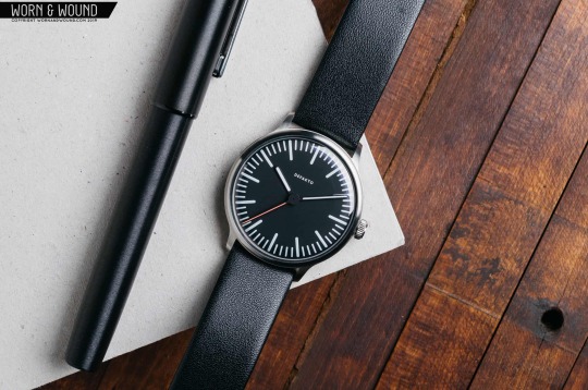
Running around the outside of the dial, there’s a small brushed bezel that slopes from the crystal to the side of the case. You’re left with a wide open dial with a small border surrounding it, making the Transit open, airy, and legible. On the right side of the case, you’ll find a small push down crown with deeply cut grooves in its surface that make winding and time-setting a breeze.

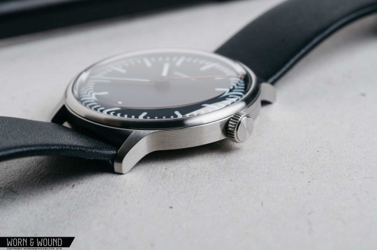
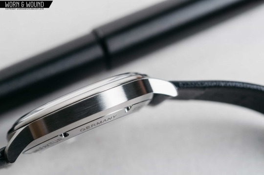
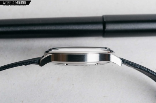
Given the Ickler family’s 100 years of case making experience, it comes as little surprise that the case on the Transit is clean and sharp throughout. The design is simple, but executed well and I really like the finishing technique. While it’s probably easy to just call it a brushed case and walk away, there’s a bit more going on here when you look closer. There are at least five different brushed surfaces, all at different angles.
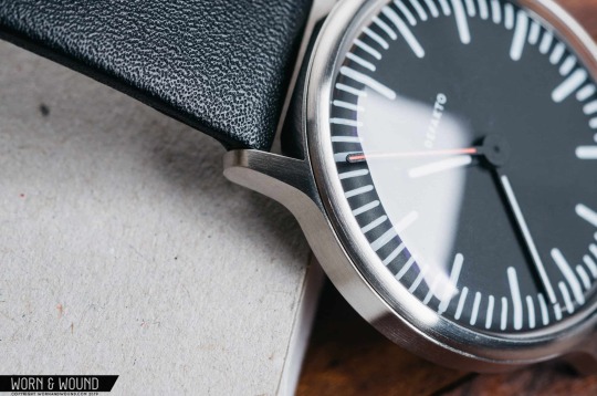
On the bezel, the brushing pattern follows the circular shape of the bezel itself. The sides of the case both feature horizontal brushing, while the space in between the lugs is brushed vertically. On top of each lug, the brushing is vertical, and finally the flat surface of the crown features radial brushing. Each transitional surface is nice and sharp. As you rotate your wrist, you’ll notice the light playing off each surface in a different direction adding a subtle, yet interesting visual effect.
Dial and Hands
A matte black, curved dial adorns the face of the Transit. The curve is gentle and hard to notice at first, especially under the curved sapphire. Upon closer inspection, you’ll notice that the long minutes hand features a curve at the edge as well. From the top-down, the hands and dial appear to be flat which go well with the minimalist design of the watch. The indices are made up of a series of Super-LumiNova-treated lines that feature a gently rounded edge. They’re actually more like long, flat ovals. There’s a longer oval at five-minute intervals with shorter ones in between. The rounded markers play well with the overall design of the watch. If they were squared off, the Transit’s dial would leave a different impression entirely. The rounded accents throughout counterbalance the sharp edges of the case and lugs with something softer, and I like the resulting effect.
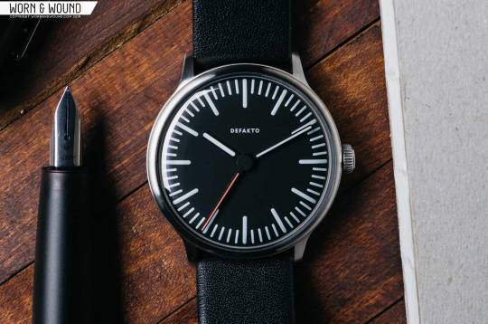
Pointing to the time, there are three hands: white hands for the minutes and hours, and a contrasting red hand for the seconds. Mirroring the shape of the indices, each hand is a long thin rectangle with a rounded end. The minutes hand extends fairly far towards the edge of the dial, hitting about halfway through the minute marker scale. The hours hand is a fair bit shorter, falling just short of the inside of the longer hour markers. Finally, the red seconds hand is the longest of the bunch, reaching all the way to the outer edge of the dial. On a minimalist style watch, these small differences in details go a long way. The hand set on the Transit is balanced and easy to read — just how it should be. Another thing that jumped out at me is the base of the seconds hand. It sits at the top of the hand stack and is wide enough to cover the origination points of the hours and minutes hands. It’s another cool little detail that makes the Transit look that much cleaner.
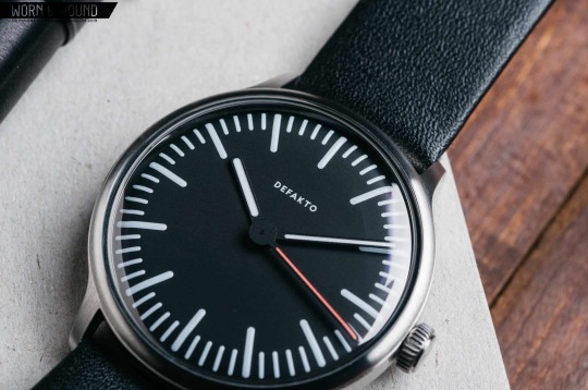
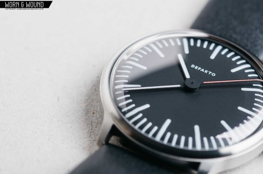
All of the indices and hands are treated with Super-LumiNova, giving the Defakto a neon light-like vibe in the dark. The red seconds hand has a different color of lume, so in the dark conditions, the seconds hand still has a similar pop like it does in the light.
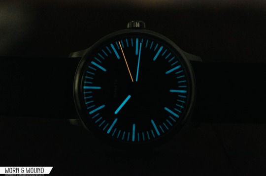
Worth noting is that there are two dial variants for Transit: Standard and Inkognito. The former has a logo, and the latter is without one.
Movement
Through the display case back, you’ll have the pleasure of watching an ETA 2824-2 beating away inside. The 2824-2 is a reliable Swiss-made movement that beats at 28,800bph, sending the red seconds hand around the dial with a smooth sweep. Defakto uses the stock movement, so there’s nothing too fancy to look at inside. There’s no date display on the watch, so the functionality is limited to telling the time. For a minimally designed three-hander, a workhorse movement like the ETA 2824-2 makes sense. There’s some basic info laser engraved around the ring surrounding the display back. Admittedly, the quality of the engraving could be better. The edges of the text are a little soft and it’s not very deep into the surface.
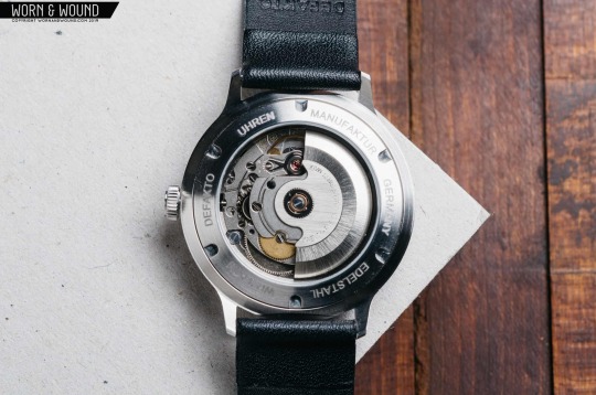
Strap and Wearability
The Transit ships on a German-made black leather strap. It’s on the thinner side, but that doesn’t affect the overall quality and comfort of the strap, and the thinness complements the case well. I liked how the strap was comfortable to wear right out of the box with no breaking in. A matte black signed clasp (admittedly a weird choice as this watch isn’t black, but it leaves the strap looking very unassuming) keeps the watch secured to your wrist and two slim leather keeper loops will hold onto any extra strap you may have hanging around. I did throw the Transit on an ADPT strap in forest green with the red accent stitching in hopes to match the red seconds hand, but something about the whole look just felt off. Since the watch head is slim and svelte, it felt out of place with a beefy nylon strap. I much prefer the look on the included slim leather strap. If you were to swap out the strap, something slim and leather would probably be your best best.
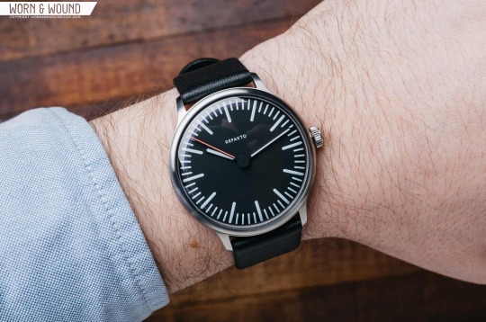
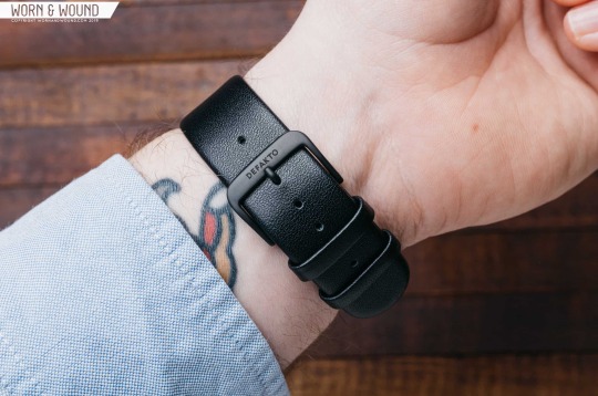
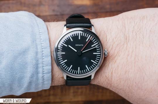
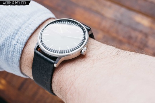
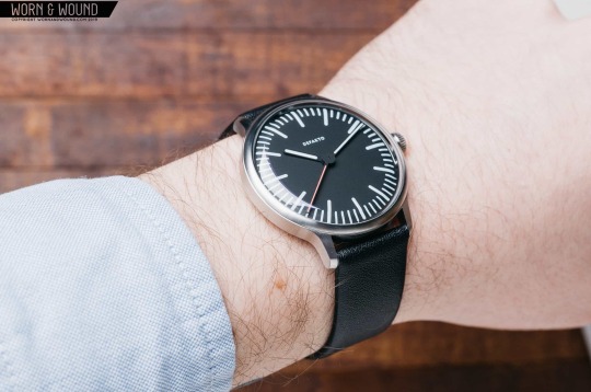
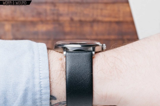
On the wrist, the Transit wears like it’s not even there. The 9.8mm case sits really close to the wrist, and I’ve found it to be very comfortable during daily wear, no matter what I happen to be doing. The Transit seems best suited for a mix of weekend and business casual office wear — the watch easily slips under a cuff, and the classic profile of the watch, with a silhouette curving from the top down, is inherently refined. I’m sure you could dress it up, but the playful indices and red seconds hand don’t exactly scream “formal” to me. However, I think that’s what I like the most about the Defakto. It’s unassuming, yet remains interesting when you take a closer look. The minimalist design is minimal without being too sparse. It really strikes a nice balance of being refined, classy, casual, and fun all at the same time.
Conclusion
Defakto’s Transit is well-made, well-designed, and well-wearing. It’s also the winner of the German Design Award for 2020, pretty much for the reasons mentioned in the review. It’s a versatile little watch that sits slim on the wrist, and the rounded details throughout set it apart from other “stuffy” minimalist designs and bring something new to the table. I’ve enjoyed my time with the watch quite a bit. It’s my first extended test of a slim minimalist watch and the Transit has made me a convert. It’s nice to have something on your wrist that’s so effortless to wear. Defakto
Images from this post:
The post Review: The Defakto Transit is a Modern, Minimalist Watch From the Ickler Family appeared first on Worn & Wound.
Read more about this at wornandwound.com
https://coolarticlespinner.com/review-the-defakto-transit-is-a-modern-minimalist-watch-from-the-ickler-family/
0 notes
Last Seen Blogs

deskhyena9
The Love of Mcintyre 702

thefabulouskiera
children design

valiantstudentstrawberry546e46
cheap jerseys from china online - ring,jerseys online

krysmoon37
What Is This Place?!

yananaua
★ Yana's trashcan ★