#usercharl
Note
Hi! Do you mind sharing your coloring tutorial or tips? especially for the animation ones, they're so good! your gifs are crisp and HD
hi, anon. tysm! 🫶 i don't mind at all since i’ve gotten more than a few requests from before, ig it's time to give it a go. (more) details are under the cut. 😁

before we start, i want you to take note of the following things that will be helpful in the process of making/coloring gifs.
if you want to get the know-how on making gifs, @redbelles did us a solid and gave us this comprehensive guide that will save me the time for explaining lmao. 😅✌️
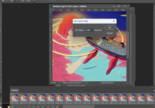
make gifsets without skipping frames. keep frame delay 0.05 and 0.06 for less than 25 frames. anything more or less is too fast or too slow. additionally, it's also important to note that if you're dealing w videos that are faster than 30fps you change the frame delay to 0.04.
gif using the the new dimensions (in this tutorial i used the dimensions of 540px x 510px since it's all about big gifs now 🙄).
use the standard sharpening settings (smart sharpen, amount 500%, radius 0.3px, remove gaussian blur and tick more accurate) also note the sharpening settings for 2d as you've specifically requested.
you can use action that will convert your gif back to frames and set your timing to 0.05 with a single click. basically photoshop will follow out all of these time-consuming steps for you! just download the action and double click it. it should now be added to your list of actions. to see your actions, go to window > actions. find the folder that says "GIF ACTION" and select the lines that says "CLICK HERE" and voila! ps will do all the hard work for you.
the coloring on your gifs will look good if you have a good base so try not to skip on video qualities. use high quality copies like 1080p or 2160p (4k ones are good) the higher the gb the better. it makes coloring so much easier and reduces grains.
*cracks knuckles* let's start!
for 2d animation's sharpening settings, it usually varies so i just move the amount around and see what looks or works better for a specific gif. i used amount: 189 and radius: 0.2 for this ponyo gif. anything can work between 189 to 350 for me but i maintain the radius at 0.2. again, you can just play the amount around until you find the one that looks good for your gif.

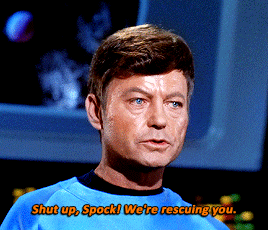
when i’m making gifs. i look for that notorious contrast between the light and dark parts. i think it gives life to the gif- so exposure, levels and curves are best to achieve that. for curves, just go to layer > new adjustment layer > curves. this layer is going to help brighten up the gif in certain areas, and darken others. select the white eyedropper. click the lighter part of the gif like the white/light part of the ship.
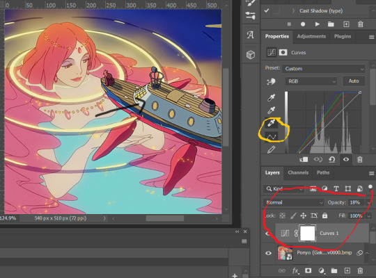
next, select the black eyedropper and click on a black/dark area of the gif (refer to the arrow bc i don't know which part of the ship is that called lmao).
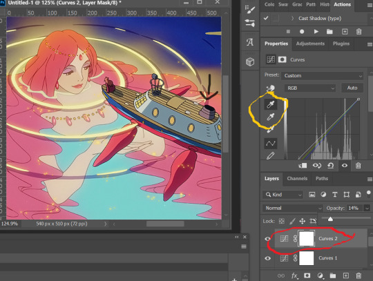
you can skip the black eyedropper if you're already satisfied w the result of the white one.
color balance and selective color are your two best buddies. they’re great when you’re trying to change some tones or specific colors of the gif, like the skin tone which is very tricky.
using selective color is pretty simple, here’s a really useful guide:
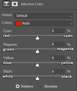
if you pull any of the tabs to the right, it increases the amount of color (cyan, magenta, yellow and black), and reduces the amount of opposite color (red, green, blue and white).
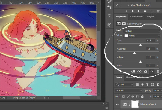

i also use the blacks and whites in selective color especially if the gif is saturated w colors to tone down some parts and make shadows more visible (idk if this is still making sense 😅).

in working with color balance, i use midtones and highlights sparingly. it's really helpful in removing or balancing out a certain tone.

here's my save setting ⬆️
idk why but ps puts the default frame delay to 0.07/0.03 so open your gif in ps again and don't forget to change the delay to 0.05.
and we're done!

i sometimes go back and forth and do some tweaking until i’m satisfied with the result. this is how i color and i know it’s not perfect but i learn by constant practice. there’s really no standard in coloring so you can make yours the way you like it. just enjoy- until you get the hang of it and it becomes less daunting (or something like that). i hope this helps. if you have more questions, my askbox is always open 😊.
#completeresources#usergif#userpayton#usersugar#rresources#yeahps#itsphotoshop#userbells#dailyanimatedgifs#usercharl#usersavana#Chaoticresources#hisources#ps help#tutorials#ask replies#anon
172 notes
·
View notes
Photo
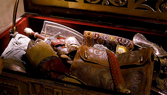

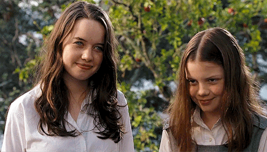


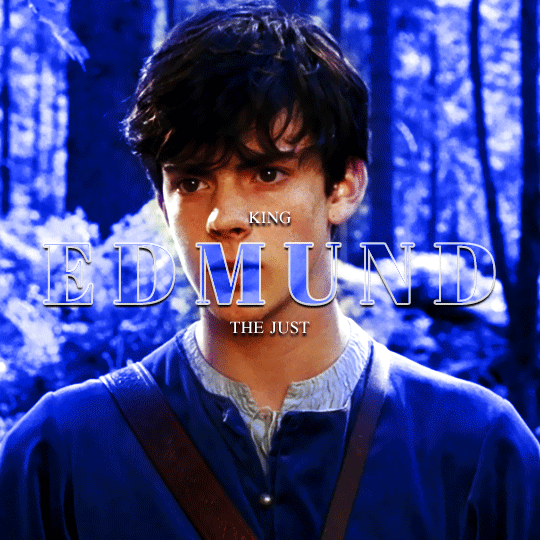
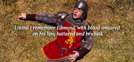
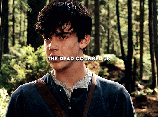
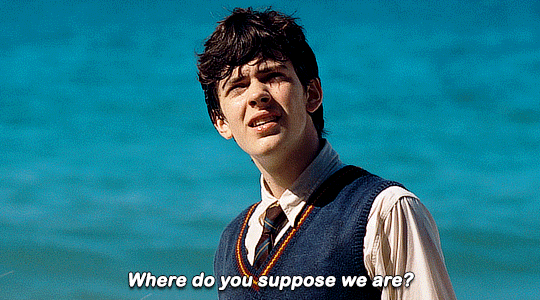
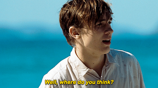
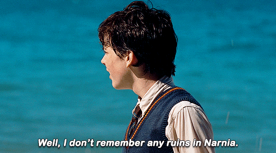
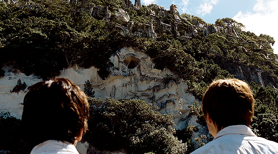
THE CHRONICLES OF NARNIA: PRINCE CASPIAN (2008) DIR. ANDREW ADAMSON
#what do u guys think of this#this is my first gifset that isn't harry potter#woooo#narniaedit#usercroft#filmgifs#filmedit#userwxwood#usercharl#arthurpendragonns#disneyedit#prince caspian#lucy pevensie#edmund pevensie#mias original#tusereli#userjessie
2K notes
·
View notes
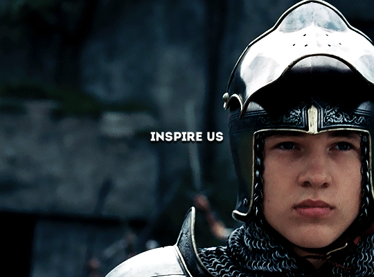
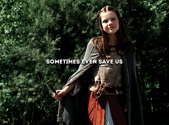
Photo


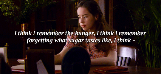
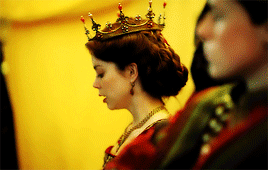
may your wisdom grace us until the stars rain down from the heavens
#narniaedit#narnia#The Chronicles of Narnia#userroh#usercharl#userzebra#userflynn#tconedit#dailycolorfulgifs#colorsinfilm#narnianetwork#mohgif#t. gif#d. house pevensie#d. royalty#c. lucy pevensie#c. edmund pevensie#c. susan pevensie#c. peter pevensie#the only reason i didn't use vdt gifs#was bc susan and peter weren't technically in it#they were figments of lucy's wish#so i went with their canon scenes#and stuck to lucy and edmund's from pc and lww too bc of this#since they were ACTUALLY together in those movies as a family#still not happy with some of the gifs#but i've been working on this for about a week#and i give up
1K notes
·
View notes
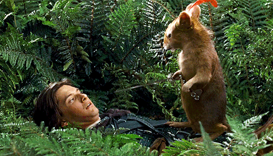
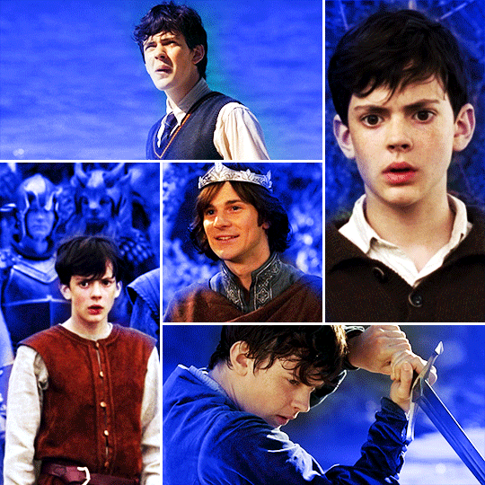
Photo


No, no, that’s all right. You’re just...you’re not exactly what I expected.
The Chronicles of Narnia: Prince Caspian (2008)
#the chronicles of narnia#narniaedit#tconedit#disneyedit#prince caspian#peter pevensie#caspian#usermouffe#usercharl#usergeo#userlyra#userkit#userneve#uservalentina#usersamanne#userrobbie#tuserdi#narnia#*#my edit#been itching to gif some narnia#and with ben barnes coming as the darkling#prince caspian seemed like an excellent choice#this part always made me laugh
2K notes
·
View notes
Photo
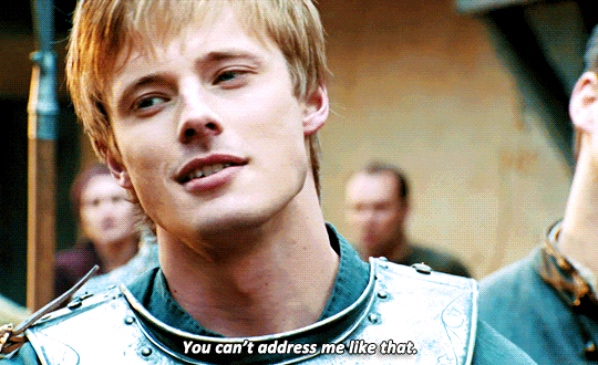

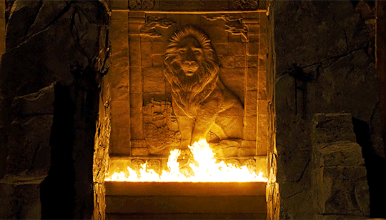
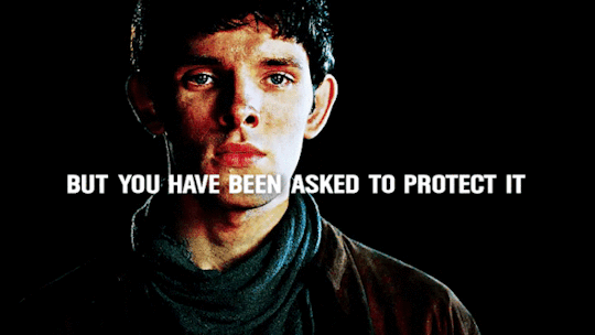
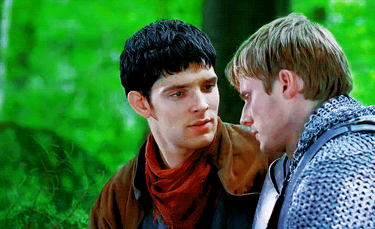
Merlin rewatch - 1x01 "The Dragon’s Call"
#merlinedit#merlin#merthur#captainpoe#bbcmerlinedit#userbrit#userrobin#usermerlin#userteshia#userlar#chewieblog#userteri#usercharl#userstream#useringridthird#tvedit#1x01#merlinrewatch#**
12K notes
·
View notes
Photo

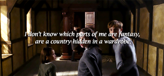
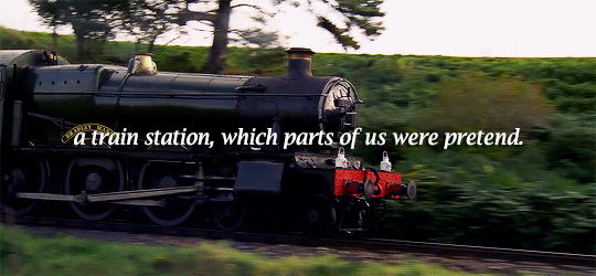


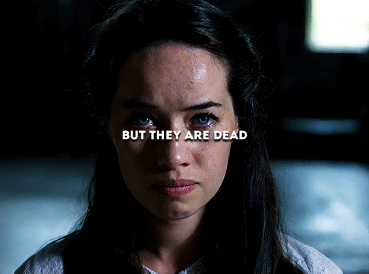
I think it was a fantasy, hidden in the old house’s creaks and groans. Lucy will never be the woman we made her up to be, she will never be anything more than seventeen, arguing and clenching her teeth. Wardrobes only lead into another world if children step into it.
#narniaedit#usersource#userwxwood#usermouffe#usercharl#arthurpendragonns#narnianetwork#narniadynasty#userthing#filmedit#filmsource#filmgifs#the chronicles of narnia#narnia#the lion the witch and the wardrobe 2005#prince caspian 2008#the voyage of the dawn treader 2010#mine#ch: susan pevensie#ch: lucy pevensie#ch: edmund pevensie#ch: peter pevensie#ch: mrs pevensie
960 notes
·
View notes
Photo

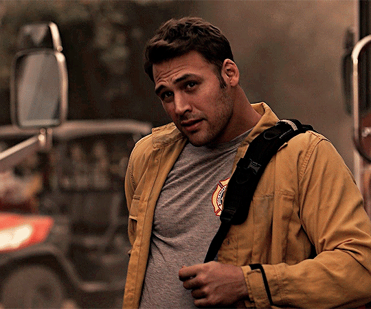
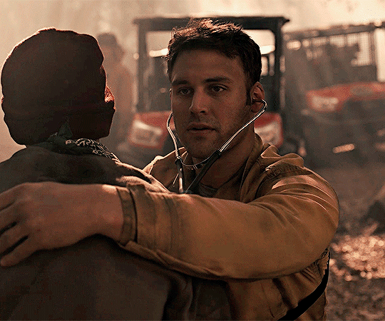
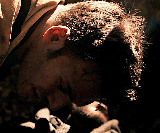
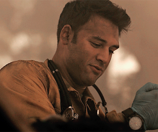
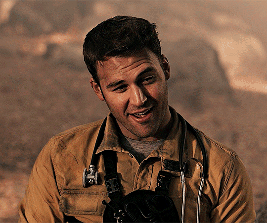
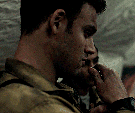
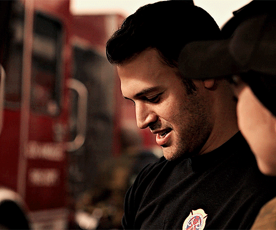
EDDIE DIAZ ✪ 911 LONE STAR
S02E03 “Hold The Line”
#frankiegifs#eddie diaz#eddiediazedit#911 lone star#lone star edit#911edit#userdee#userpris#queenmay#tuserria#usercharl#userthai#usercynthia#bbelcher#cinemapix#tvcentric#tvedit#he's pure sunshine
849 notes
·
View notes
Photo
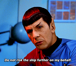


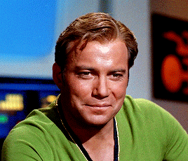
Captain, I recommend you abandon the attempt.
STAR TREK: THE ORIGINAL SERIES
#trekedit#startrekedit#star trek#trekgifsblog#tosedit#tos#userteri#userbrit#userposs#usercharl#userdiana#usertom#leonard nimoy#userstream#bbelcher#deforest kelley#bones#spock#jim kirk#leonard mccoy#william shatner#sd*#mine*
3K notes
·
View notes
Text
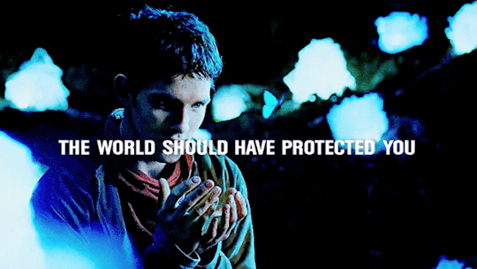

“In a land of myth, and a time of magic, The destiny of a great kingdom rests on the shoulders of a young boy... His name… Merlin”
#merlin#merlinedit#bbc merlin#arthurpendragonns#userhayf#userchaitali#usercharl#userlar#queenmay#usercynthia#dailyreblogs#dailytvfilmgifs#cinematv#userjessie#mine: merlin#my gifs#*
2K notes
·
View notes
Photo
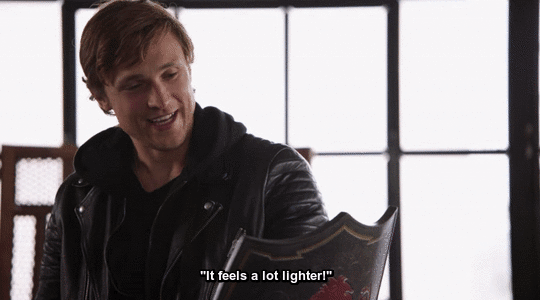

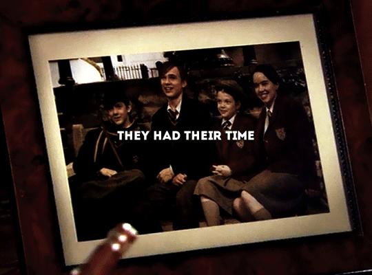
prop culture (2020) ➤ william moseley, anna popplewell, and georgie henley (ft. peter’s shield)
“it feels a lot lighter!”
#i saw this trailer and !!! i had to gif them#narnia#narniaedit#tconedit#disney#prop culture#william moseley#anna popplewell#georgie henley#peter#susan#lucy#my edits#emersonsfam#doriansfam#lucypcvensie#usercharl#narnianetwork
3K notes
·
View notes
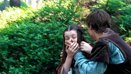
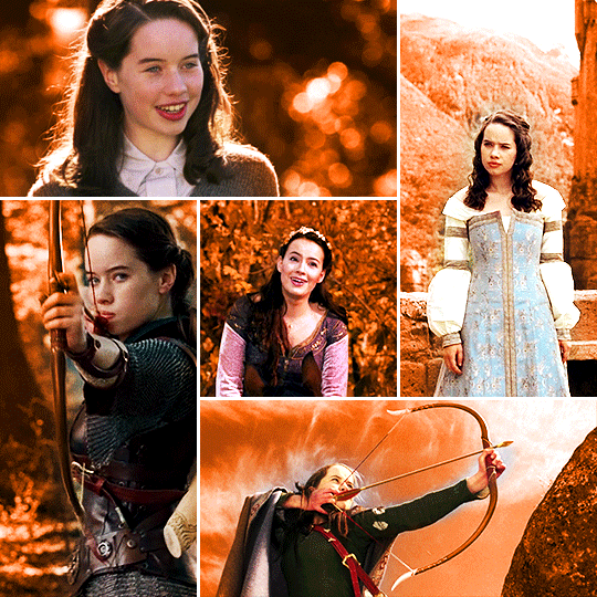
Photo


LUCY PEVENSIE in THE CHRONICLES OF NARNIA: PRINCE CASPIAN (2008)
#narniaedit#lucypevensieedit#userwxwood#usercharl#arthurpendragonns#disneyedit#disneygifsdaily#bbelcher#usermarianna#usergina#usercandy#userstream#filmgifs#filmedit#userjessie#dailyflicks#chewieblog#moviegifs#mias original#lucy pevensie#prince caspian
659 notes
·
View notes
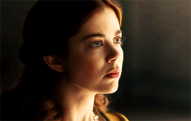
Photo
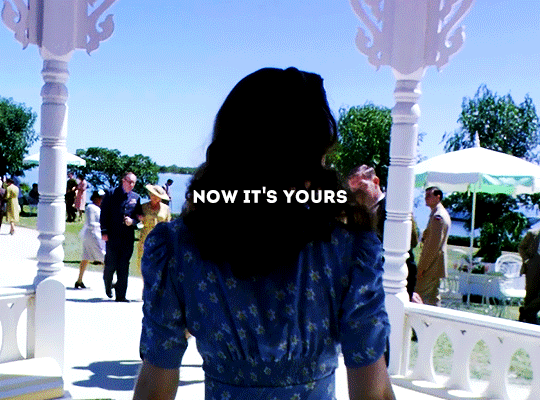
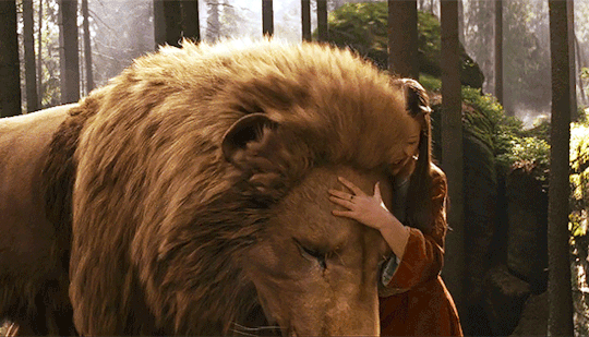
the books don't tell us what happened to Susan
#narniaedit#narnia#The Chronicles of Narnia#userroh#usercharl#userzebra#userflynn#tconedit#narnianetwork#mohgif#t. gif#d. house pevensie#d. royalty#c. edmund pevensie#c. peter pevensie#c. lucy pevensie#c. susan pevensie#another gifset#of susan living her life how she wants to#she deserves to live it free of judgement#on whether she believes in narnia or not#whether she belives in aslan or not#it's HER choice
1K notes
·
View notes
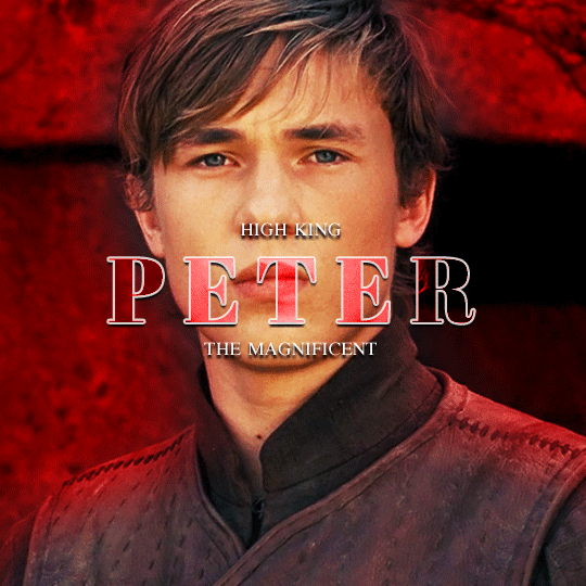
Photo

The Chronicles of Narnia: Prince Caspian (2008)
#the chronicles of narnia#narniaedit#tconedit#disneyedit#prince caspian#peter pevensie#edmund pevensie#usermouffe#usercharl#usergeo#userlyra#userkit#userneve#uservalentina#usersamanne#tuserdi#narnia#*#my edit#mostly giffed this for the pretty blue water#might do a best of gifset for each sibling
1K notes
·
View notes
Photo


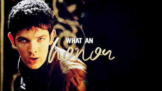
"You're like two sides of the same coin."
#merlinedit#bbcmerthur#bbcmerlinedit#usermerlin#userteri#bbelcher#coloredit#userteshia#chewieblog#filmtv#userrobin#userbrit#userlar#usercharl#**#hey my first gifset after 3 years!#pls excuse my 3 year old giffing skills i have forgotten everything!
4K notes
·
View notes
Photo
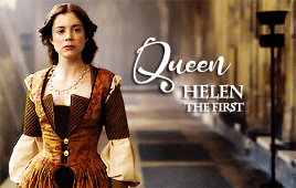

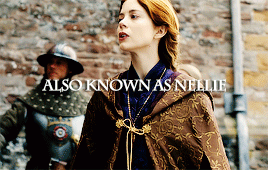
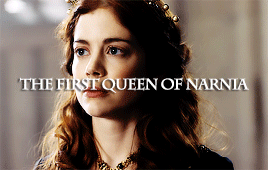

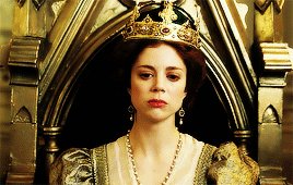
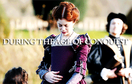
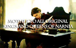
the chronicles of narnia characters:
↪ queen helen i
#narniaedit#userwxwood#usermouffe#usercharl#arthurpendragonns#narnianetwork#narniadynasty#the chronicles of narnia#the magician's nephew#ch: queen helen i#narnia#mine#narniafancast#narnia fancast
250 notes
·
View notes
Text
hauntedthief → luffys
hello hello! it’s time for a whole new change! a brand new url and new look too!
i’ll still be tracking #usermoh🌻💛
#userroh#userzebra#userdianis#osamusmiya#keikuns#usernikki#userzuura#userdorian#usercharl#quecksilvereyes#userrack#useraki#userspike#usersenka#userchas#userelisha#userting#useraria#soniatera#usercris#t. text#t. url change
27 notes
·
View notes
Last Seen Blogs

dicaspraviver
Dicas Pra Viver
littlesomethings1
Just LittleSomethings

lunasimoncini
Luna Simoncini
lunasimoncini
Luna Simoncini