#tidbit
Text
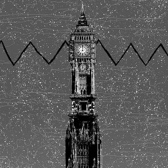
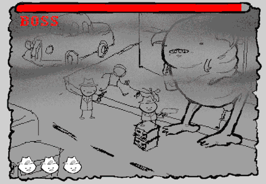
Tidbit: The "Threshold" Effect of Desaturated Objects Due to Increased Contrast
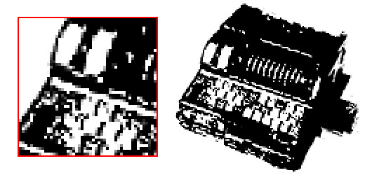
If you've ever asked how to replicate an effect like this...
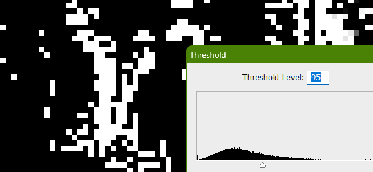
...it's likely someone told you to apply the threshold filter, which converts any light colors to pure white, and any dark colors to pure black. And it's perfectly fine to do so. It's simple, straightforward, efficient. But I take issue with the assertion that it's definitively the only conceivable way Hussie did it when the evidence points to the contrary. Scrutinize the following examples under a microscope:
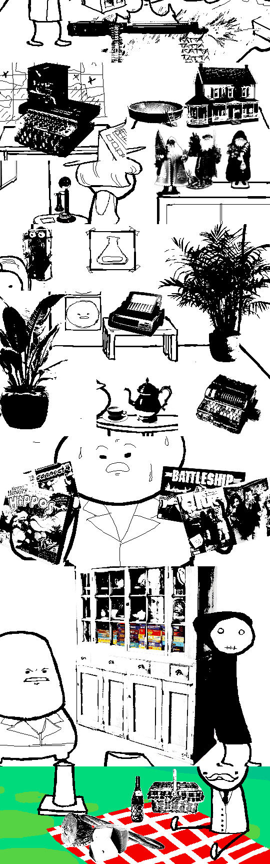
Did you see it? The singular detail that distinguishes these images from ones that have been thresholded? Congratulations if you noticed that these contain not only black and white pixels, but GRAY pixels as well! A threshold filter's conversion is binary; a pixel is either black, or it is white. No in-between. The presence of these gray values rules out its use, then.
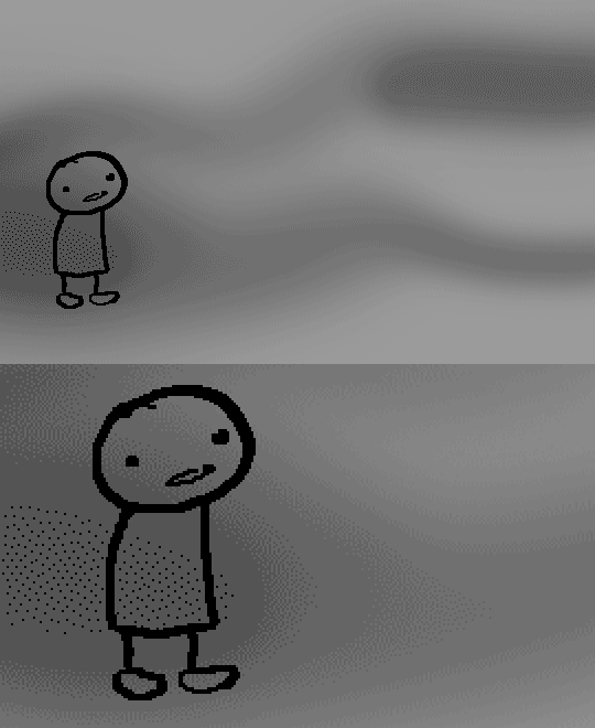
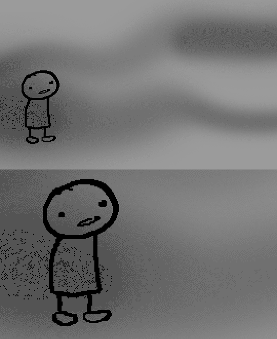
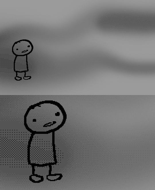
One thing is clear, at least: these images are black and white in the traditional sense of the term, i.e. "grayscale", even if it's in drastic form. They've been stripped of any color, hue, chroma. Completely desaturated, in other words.
So from this observation, we can reason that they were converted to be grayscale at some point in the process of editing.
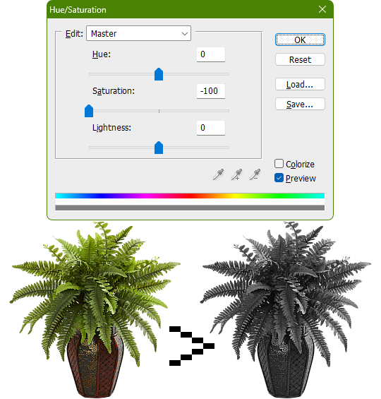
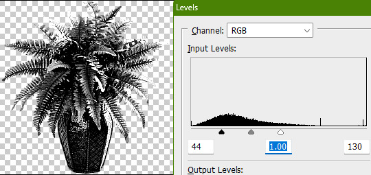
Of course, this is still lacking in the pure black and pure white departments. If only there was a way to adjust the intensity levels and push them both to their extremes... oh wait, THERE IS! Using the Levels adjustment tool!
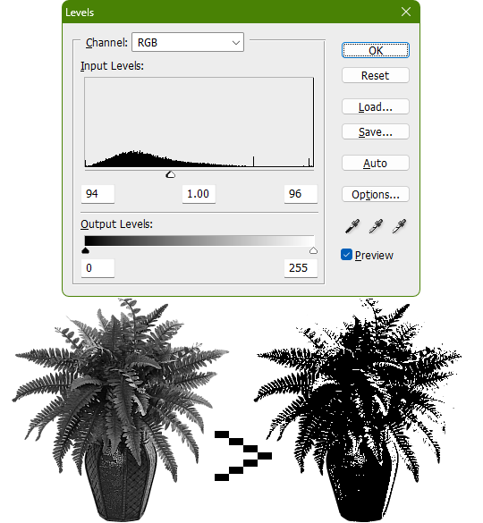
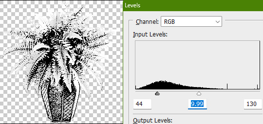
Pushing the black input levels slider to the right makes all dark colors turn darker, and conversely, pushing the white input levels slider to the left makes any light colors turn lighter. This is a great way of increasing the contrast and adjusting the brightness. Speaking of which, the Brightness/Contrast adjustment tool in Photoshop with "Use Legacy" enabled also accomplishes a nearly identical effect.
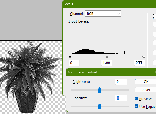
This timelapse demonstrates how the Brightness/Contrast adjustment is basically equivalent to using the Levels one when used this way
I say nearly identical because raising the contrast all the way to 100% with Brightness/Contrast makes it actually identical with the Threshold adjustment tool. The black and white input levels sliders can't fully join in the middle because of the gray input level slider occupying the space, hence why there are some stray gray pixels even when pushing them to their limits.
Well, there could be several reasons explaining why there could be gray pixels other than the contrast not being high enough to clip them, but I'll spare you another needlessly complicated and overly technical rambling on how I can tell it's most definitely the Levels adjustment tool always.
This post is getting a little long, so I'll stop here and elaborate a little more on pertinent things under the read more link, like semi-opaque pixels, scaling down, sharpening, and the gamma slider. Also here's the potted plant PSD if you wanna check it out I guess.
ADDENDUM
Semi-opaque pixels
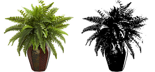
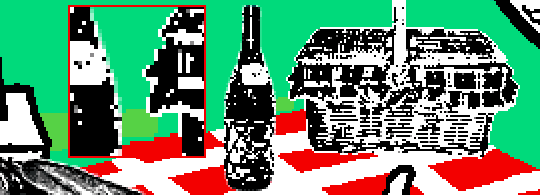
When separating objects from a background, it's usually easiest to do so with a magic wand selection tool, which selects regions of similar colors. There's an option to make the selection anti-aliased, smoothing the edges of whatever you've cropped. Unchecking it will make the pixels hard and jagged. The wine bottle and picnic basket are a good example of each, respectively.
If you've already cropped out something with anti-aliasing enabled, there's still a way to sharpen the edges after the fact. Duplicating the layer multiple times will increase the semi-transparent pixels' opacity. Do it enough times and they'll eventually become completely opaque. An analogy would be stacking multiple panes of tinted glass on top of each other. Stack enough of them and you wouldn't be able to see through anymore.

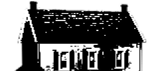
These semi-opaque black pixels would appear gray on a white background, and so would semi-opaque white pixels on a black one. That's the reason for the gray pixels around the edges on some of these examples.
Scaling down/Sharpening
Suppose you've already gone ahead and went through the whole rigamarole of editing the object to be black and white before deciding firmly on the size of it in your composition, and now you think it could be a little smaller. You could always resize it and scale it down, but with the interpolation method set to none/nearest-neighbor, it's going to look kind of shit, and with it set to something else like bilinear or bicubic, the anti-aliasing is going to make it a bit blurry (introducing these gray values). You could increase the contrast again, or you could use the Sharpen filter to do it.
Not to suggest that this particular example was scaled down after editing, it's just the one that looks closest to it since I'm too lazy to make one.

Sharpening repeatedly will bump up the contrast, plus Photoshop's Sharpen filter has the added benefit of hardening any semi-opaque pixels as well, making the edges sharper.
GIMP's Sharpen filter doesn't do that latter part, unfortunately, but if the layer has an opaque white background, it'll do the same.
Gamma slider
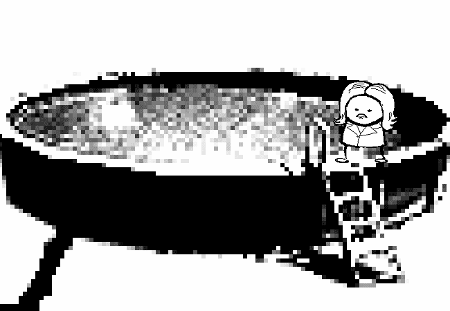
This effect might not be so obvious, but really take a good look at these board games:

Actually, maybe this Problem Sleuth bonus panel shows what I mean better:

The dark values are cranked up very high, and so are the light values a bit, but there's an inordinate amount of midrange values that are on the lighter side than what would be normal. That's because of the midtones input levels slider, the gray slider, the gamma slider, whatever.
I'm toot tired to explain any more than that, so make of that what you will. The end.
348 notes
·
View notes
Text
Idc if fandom vines are "cringe" I had to take this opportunity
#the outsiders#darry curtis#ponyboy curtis#tim shepard#tim shepard x darry curtis#two bit mathews#twobit mathews#twobit mathews x darry curtis#tidbit#my loves#okay now imagine paul with them as well#pidbit#anyone?#vines#the outsiders meme#theoutsiders#the outsiders art#the outsiders fanart
102 notes
·
View notes

Text
cheese
family is everything tidbit
enjoy!
y/n was jack's friend for about five days before she met quinn. she was over at the house when she wasnt supposed to be hanging with jack and she wanted a second opinion about their conversation about cheese.
"whose that?"
"quinn."
"hey quinn do you ever like in the middle of night get hungry for cheese? and just .."
a smile grew across quinns face because he knew exactly what the pretty stranger in the living room was getting at. jack had a block of cheese in the refrigerator that was exclusively for him, he liked to take a bite from time to time.
"eat some? yeah, i might take a slice sure. the shredded stuff is too messy."
"see jack. i told you no one eats it that way."
once quinn saw her smile, he knew he was done for. she was pretty and her laugh was infectious. in the few minutes he met her she seemed perfect. he needed to get this girl in to his life. only he never learned her name.
lucky for quinn, y/n had similar feelings. she couldn't help but feel all giddy and happy when he smiled. her heart literally sank when he talked. if she believed in love at first sight this might have been it.
"who was that earlier."
"who."
"that girl. who was she."
"that was y/n. the new girl at school."
"there was a girl here earlier?"
jack and quinn thought they were being quiet but luke had over heard their little conversation and told their parents, effectively getting both boys in trouble. quinn didnt mind though, hed got her name and that was the start of everything.
series masterlist
#quinn hughes#family is everything#jack hughes#family is everything series#tidbits#quinn hughes x reader#tidbit
142 notes
·
View notes
Text
Fascinating Fact:
Seahorses are neither seas nor horses!!!
#fun#interesting#fascinating#fact#trivia#tidbit#sea#horse#seahorse#hippocampus#Ruth Wilson#Oceanography#marine#biology#nothing to do with Ruth Wilson#zoology#humour#humor
194 notes
·
View notes
Text
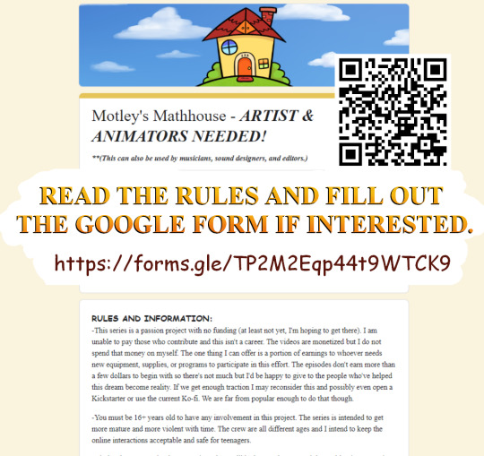

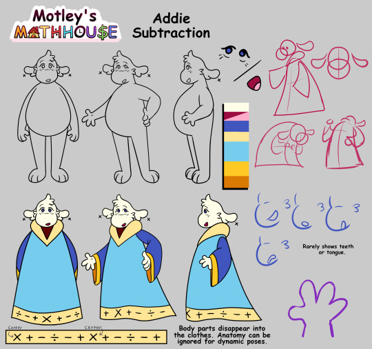
🏠Google Form🏠
All the information you need will be on there. Other available roles include musician, a female-sounding voice actor, and pixel artists.
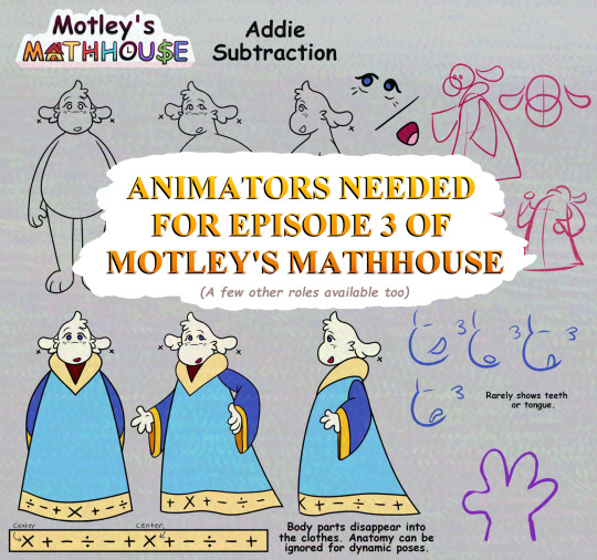
#motleys mathhouse#motley#tidbit#addie subtraction#oc#furry#anthro#character design#horror#analog horror#mascot horror#weirdcore#webcore#2000s#2000s nostalgia#cartoon#web series#animation#animators needed#help wanted#petscop#baldis basics#the walten files#poppy playtime#the amazing digital circus#welcome home#fnaf#amanda the adventurer#digital art#art
22 notes
·
View notes
Text
When Maria Lorraine was elected as the new head of the Worshipful Order of Discoursers (aka the Poster's Guild), she opened the next session by stating "if there is, hypothetically, such a thing as a people chosen by god, or a so-called 'master race,' then it would of course have to be the Turks." The remainder of the session was then cancelled after a mass fistfight broke out among the audience. Maria was heard shouting "we are mere footnotes to the Great Turkish Migration!" as audience members were dragged out of the Posting Hall.
17 notes
·
View notes
Text
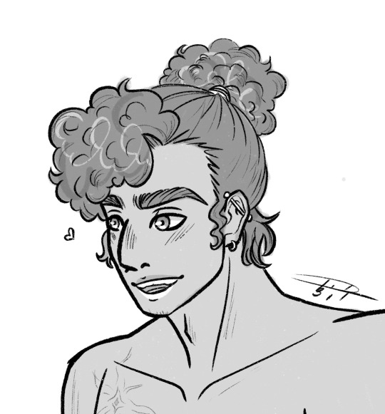
It’s for anatomy practice I swear-
Honestly though, I just love drawing them and I am trying to figure out anatomy, plus the logistics of Arlo being trans in my story’s time period 😅
Close up on their faces cause I adore their expressions
#artists on tumblr#digital art#oc art#original art#my art#artwork#ship art#queer artist#art#oc artist#oc artwork#ocs#oc#my ocs#my oc art#tidbit#original character#original story#original content#procreate art#transgender#transmasc#queer#gay#gay art#bisexual#queer characters
17 notes
·
View notes
Text
the difference between poisonous and venomous
poisonous - if you bite it, you die
venomous - if it bites you, you die
#tidbit#quick facts#fun fact#science#science fact#poison#poisonous#venom#venomous#the difference#thatcreepydoll#buttons talks#easy science
13 notes
·
View notes
Text
What if I told u,,,,, a RepairBot-Reader comic-tidbit was in the works,,,,
(WiPs!)

Featuring! A small and sweet moment for ReaderBot making a new friend <3
(don’t worry, there’s some nice angst in there, too)
: )
What do you see, ReaderBot ?
#tw panic attack#tw child murder#more like the implied past memory of child murder but still#it’s canon-aligning but nothing is actually shown#ptsd tw#idk of it’ll even include blood tbh? I think the Implication of the scene is enough to get the idea across#tidbit#wip#comic wip#fnaf au#fnaf x y/n#fnaf x reader#fnaf moon x y/n#fnaf moon x reader#bones of a rabbit fnaf#sneak peek#readerbot au#repairbot au#I’m sorry I do this to u ReaderBot but ur so full of potential#while I was streaming one of my friends was like. this au is so sad bc u can’t blame either moon or ReaderBot#bc one was infected and completely out of his right mind. barely a shell of himself#but the other isn’t wrong for being afraid and still affected by what he did#and I was like YESSSS YOU GET IT#I love moral conundrums ok
142 notes
·
View notes
Text
Tidbit: The “Posterization” Effect of Panels Due to the Consequences of GIF Color Quantization (and Increased Contrast (And Also The Tangential Matter of Dithering))
There’s this misconception that the color banding and patterned dithering found in panels is an entirely deliberate, calculated effect Hussie manipulated the image into looking with some specific filter, but this isn’t the case, exactly. It wasn’t so much a conscious decision he took but rather an unavoidable consequence of the medium he partook in: digital art in an age where bandwidth and storage was at a premium.
Not to delve too deeply into the history and technicalities of it, but the long and the short of it is back in the early nineties to late aughts (and even a bit further into the 10s), transferring and storing data over the web was not as fast, plentiful, and affordable as it is now. Filesize was a much more important consideration than the fidelity of an image when displaying it on the web. Especially so when you’re a hobbyist on a budget and paying for your own webhosting, or using a free service with a modest upload limit (even per file!). Besides, what good would it be to post your images online if it takes ages to load them over people's dial-up Internet? Don't even get me STARTED on the meager memory and power the average iGPU had to work with, too.

The original comic strip's resolution was a little more than halved and saved as a GIF rather than a large PNG. That's about an 82.13% reduction in filesize!
So in the early days it was very common for people to take their scans, photographs, and digital drawings and scale them down and publish them as smaller lossily compressed JPEGs or lossless GIFs, the latter of which came at the cost of color range. But it had a wider range of browser support and the feature to be used for animations compared to its successor format, PNG ("PNG's not GIF").
You'd've been hard-pressed to find Hussie use any PNGs himself then. In fact, I think literally the only times he's ever personally employed them and not delegate the artwork to a member of the art team were some of the tiny shrunken down text of a character talking far in the distance and a few select little icons.
PNGs support semi-transparency unlike GIFs, which is why Hussie used them to preserve the anti-aliasing on the text without having to add an opaque background color.
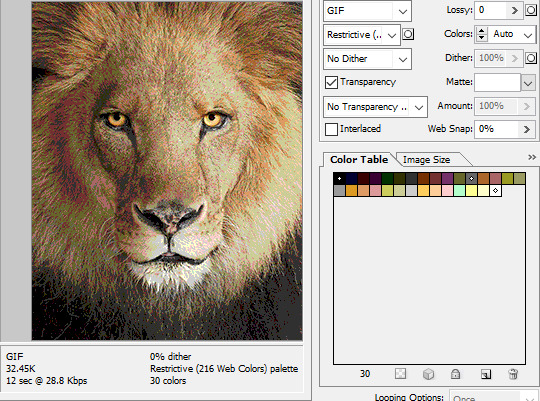
While PNGs can utilize over 16 million colors in a single image, GIFs have a hard limit of 256 colors per frame. For reference, this small image alone has 604 colors:

For those who can't do the math, 256 is a pretty damn small number.
Smaller still were the palettes in a great deal of MSPA's panels early on in its run. Amazingly, a GIF such as this only uses 7 colors (8 if you count the alpha (which it is)).

Not that they were always strictly so low; occasionally some in the later acts of Homestuck had pretty high counts. This panel uses all 256 spots available, in fact.
If he had lowered the number any smaller, the quality would have been god-awful.
To the untrained eye, these bands of color below may seem to be the result of a posterization filter (an effect that reduces smooth areas of color into fewer harsh solid regions), but it's really because the image was exported as a GIF with no dithering applied.

Dithering, to the uninitiated, is how these colors are arranged together to compensate for the paltry palette, producing illusory additional colors. There are three algorithms in Photoshop for this: Diffusion, Pattern, and Noise.

Above is the original image and below is the image reduced to a completely binary 1-bit black and white color palette, to make the effect of each dithering algorithm more obvious.

Diffusion seemingly displaces the pixels around randomly, but it uses error diffusion to calculate what color each pixel should be. In other words, math bullshit. The Floyd-Steinberg algorithm is one such implementation of it, and is usually what this type of error diffusion dithering is called in other software, or some misnomer-ed variation thereof.
The usage of Pattern may hearken back to retro video game graphics for you, as older consoles also suffered from color palette limitations. Sometimes called Ordered dithering because of the orderly patterns it produces. At least, I assumed so. Its etymological roots probably stem from more math bullshit again.
True to its name, Noise is noisy. It’s visually similar to Diffusion dithering, except much more random looking. At least, when binarized like this. Truth be told, I can’t tell the difference between the two at all when using a fuller color table on an image with a lot of detail. It was mainly intended to be used when exporting individual slices of an image that was to be “stitched” back together on a webpage, to mitigate visible seams in the dithering around the edges.
To sate your curiosity, here's how the image looks with no dithering at all:
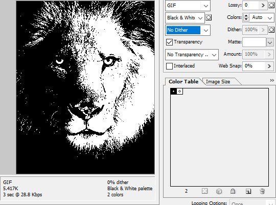
People easily confuse an undithered gif as being the result of posterization, and you couldn't fault them for thinking so. They look almost entirely the same!
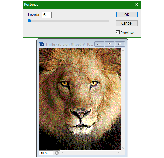
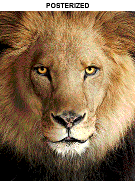
Although I was already aware of this fact when I was much younger, I'm guilty of posterizing myself while editing images back then. Figured I may as well reduce the color count beforehand to help keep the exported GIF looking as intended. I view this as a complete waste of time now, though, and amateurish. Takes away a bit of the authenticity of MSPA art, how the colors and details are so variable between panels. As for WHY they were so variable to begin with, choosing the settings to save the image as requires a judicious examination on a case-by-case basis. In other words, just playing around with the settings until it looks decent.
It's the process of striking a fine balance between an acceptable file size and a "meh, good enough" visual quality that I mentioned earlier. How many colors can you take away until it starts to look shit? Which dithering algorithm helps make it look not as shit while not totally ruining the compression efficacy?
Take, for example, this panel from Problem Sleuth. It has 16 colors, an average amount for the comic, and uses Diffusion dithering. Filesize: 34.5 KB.

Then there's this panel right afterwards. It has 8 colors (again, technically 7 + alpha channel since it's an animated gif), and uses Noise dithering this time. Filesize: 34.0 KB.
The more colors and animation frames there are, and the more complicated dithering there is, the bigger the file size is going to be. Despite the second panel having half the color count of the first, the heavily noisy dithering alone was enough to inflate the file size back up. On top of that, there's extra image information layered in for the animation, leaving only a mere 0.5 kilobyte difference between the two panels.
So why would Hussie pick the algorithm that compresses worse than the other? The answer: diffusion causes the dithering to jitter around between frames of animation. Recall its description from before, how it functions on nerd shit like math calculations. The way it calculates what each pixel's color will be is decided by the pixels' colors surrounding it, to put it simply. Any difference in the placement of pixels will cause these cascading changes in the dithering like the butterfly effect.
Diffusion dithering, 16 colors. Filesize: 25.2 KB
This isn't the case with Noise or Pattern dithering, since their algorithms use either a texture or a definite array of numbers (more boring nerd shit).
Noise dithering, 16 colors. Filesize: 31.9 KB
Pattern dithering, 16 colors. Filesize: 23.1 KB
There's a lot more I'd like to talk about, like the different color reduction algorithms, which dither algorithms generally compress better in what cases, and the upward and downward trends of each one’s use over the course of a comic, but since this isn’t a deep dive on GIF optimization, I might save that for another time. This post is already reaching further past the original scope it was meant to cover, and less than 10 images can be uploaded before hitting the limit, which is NOWHERE near enough for me. I should really reevaluate my definition of the word “tidbit”… Anyway, just know that this post suffers from sample selection bias, so while the panels above came from an early section of Problem Sleuth that generally had static panels with diffusion dithering and animated panels with noise dithering, there certainly were animated panels with diffusion later on despite the dither-jittering.
Alright, time to shotgun through the rest of this post, screw segueing. Increasing the contrast almost entirely with “Use Legacy” enabled spreads the tones of the image out evenly, causing the shadows and highlights to clip into pure black and white. The midtones become purely saturated colors. Using the Levels adjustment filter instead, moving both shadow and highlight input level sliders towards the middle also accomplishes the same thing, because, you know, linear readjustment. I'm really resisting the urge to go off on another tangent about color channels and the RGB additive color model.
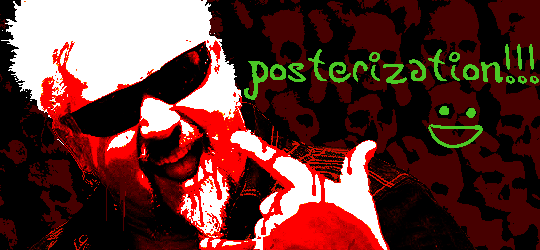
Anyway, there aren't any examples in MSPA that are quite this extreme (at least in color, but I'll save that for a later post), but an image sufficiently high in contrast can be mistaken for being posterized at a glance. Hence the Guy Fieri banner. In preparation for this post, I was attempting to make a pixel-perfect recreation of that panel but hit a wall trying to figure out which and how many filters were used and what each one's settings were, so I sought the wisdom of those in the official Photoshop Discord server. The very first suggestion I got was a posterization filter, by someone who was a supposed senior professional and server moderator, no less. Fucking dipshit, there's too much detail preserved for it to be posterization. Dude totally dissed me and my efforts too, so fuck that moron. I spit on his name and curse his children, and his children's children. The philistines I have to put up with...
In the end, the bloody Guy Fieri recreation proved to be too much for me to get right. I got sort of close at times, but no cigar. These were some of the closest I could manage:

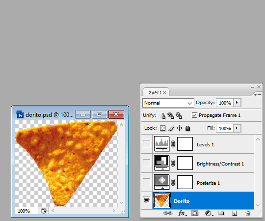
You might be left befuddled after all this, struggling to remember what the point of the blogpost even was. I had meant for it to be a clarification of GIFs and an argument against using the posterization filter, thinking it was never used in MSPA, but while gathering reference images, I found a panel from the Felt intermission that actually WAS posterized! So I’ll eat crow on this one... Whatever, it’s literally the ONE TIME ever.
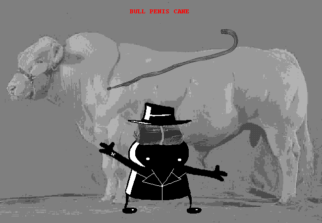
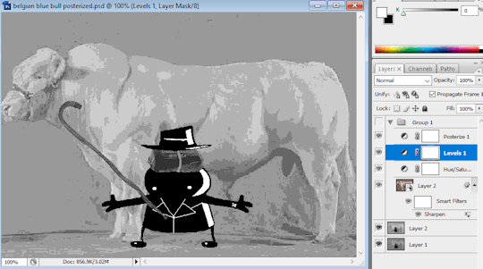
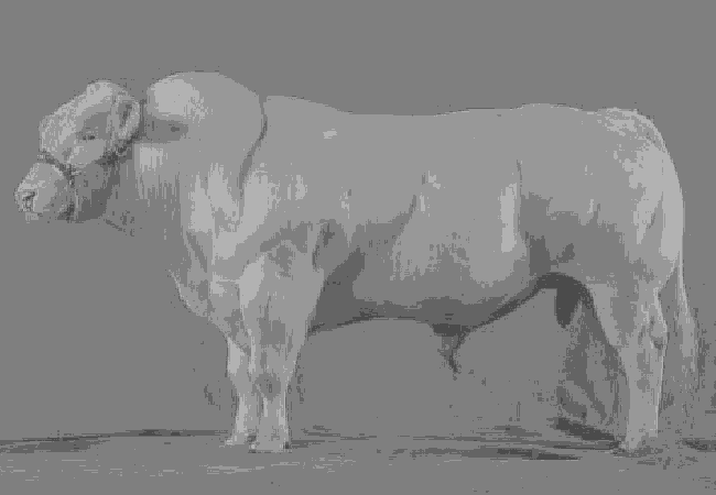
I can tell it's posterization and not gif color quantization because of the pattern dithering and decently preserved details on the bomb and bull penis cane. There would have had to have been no dithering and way fewer colors than the 32, most of which were allotted to the bomb and cane. You can't really selectively choose what gets dithered or more colors like this otherwise.
Thank you for reading if you've gotten this far. That all might have been a lot to take in at once, so if you're still unclear about something, please don't hesitate to leave a question! And as always, here are the PSDs used in this post that are free to peruse.
345 notes
·
View notes
Note
My 50 word tidbit should be part of my birthday present. 🥺🥺🥺
Flashes of the dream return to him in between blinks that let the daylight in.
Growling degradation, rough hands, unforgiving thrusts, red eyes.
The blinds are open and Zion feels like he's too exposed, too visible. He has an urge to shut out the light and lock the door.
Send me an ask and I'll write a 50 word tidbit
#:)))#oh how unprepared you are for this#oh such fun#embder#echo answers#tidbit#chains series#echo writes#5 more days
8 notes
·
View notes
Note
You are a cheeky sod , you know that? Fine, PLEASE tell us about your new au that is centered around Donnatello ?
Why yes, yes I am! Thank you for noticing ~
Alright, I will share a bit of info --
The AU's name is Programmed Obsolescence.
It's not Donnie-centric. It isn't centered around any specific character actually. It follows the journey of all of them.
It happens around the same time as the series does; but all the characters are a couple of years older. The Mad Dogs take a more active role in their hero-ing, I'd say it compares to how the 12!turtles worked, acting more like vigilantes, activelly going on patrols during the night since they don't have any fancy systems warning them when there's a crime happening...
They don't have many luxuries like in the series, and had to mature early. They still are the stupid dorks we all know and love, but they take their role much more seriously.
April is also more involved in the hero-ing business with them now
96 notes
·
View notes
Text
my kids are weird
a family is everything tidbit
please note this is based off a conversation i had with two kids at work the other day. it was ... interesting
enjoy!
one day quinn brought the kiddos to an indoor playground to get out some of their crazy energy, a little something fun to do before they had dinner.
hattie and beck could easy play with each other while eden was still too young to play with older kids so quinn mainly sat in the ball pit that didn't have very many balls with her.
"beck want to see something crazy?" hattie and beck made their way down to the floor level of the playground.
beck nodded while hattie laid on last curved rung of the ramp on the play structure. the six year old then proceeded to roll off of it, landing on the padded floor with a soft thud.
"if i do this i could easily break your leg!" beck sat down on hattie's legs and started pretending to twist one. he wasn't actually going to do it, he just wanted to show that he could.
"hey! beck elias do not break your sister's leg." quinn scolded his middle child.
"i'm not going to dad! it's just i could if i wanted too. easily." beck rolled his eyes disappearing some in the jungle gym.
"daddy, you know what i think about sometimes?" trix traipsed over to her father and baby sister.
"what's that trixie girl?" quinn took his eyes off eden who trying to trying to gnaw on one of the plastic balls.
"sometimes i think about breaking my arm." she confessed the strange thing.
"why?"
"i dunno. i think it would be fun." she shrugged picking up a green ball to throw at eden, who just grunted and glared at her older sister when it hit her.
"well trust me trix it's not. it hurts, like a lot." quinn shook his head watching hattie run off to join her brother.
god why were his children so weird. was this what him and his brothers were like when they were younger? how did his parents ever deal with the three of them?
"you're not weird like the other two right, my little rae of sunshine?" quinn looked at eden again. she gave her father a gummy grin before bonking herself in the head with the two plastic balls she was holding.
series masterlist
79 notes
·
View notes
Text
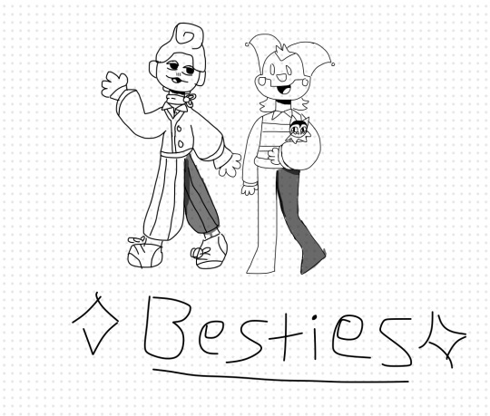
I think they would be friends : )
15 notes
·
View notes
Text
AAAAND the first attack goes tooo!
*drumrolls*
@jay-borb !!!
NOW PERISH!
#Tidbit#artfight#my art#fan art#yes. i hate myself because i drew a whole ass bg B)#i'm gonna slow it down a bit or i'm gonna die this year alksdjlasidja
10 notes
·
View notes
Last Seen Blogs