artbykla
Fine Lines
Architectural Designer and Artist. My art explores the emotional impact of space, and my architectural works seek seek to bring that impact to life. Ultimately I aim to create works that inspire people, ask questions, and invigorate viewers/inhabitants into the fullest iteration of themselves.
375 posts
Don't wanna be here? Send us removal request.
Last Seen Blogs

askpharos
Pharos and friends!

nbnaruto
FREE PALESTINE🇵🇸

buckndinks78
Buckndinks

godly-feh-edits
Always doing our best!

tweaker-slutt
tweaker junkie💋
Text
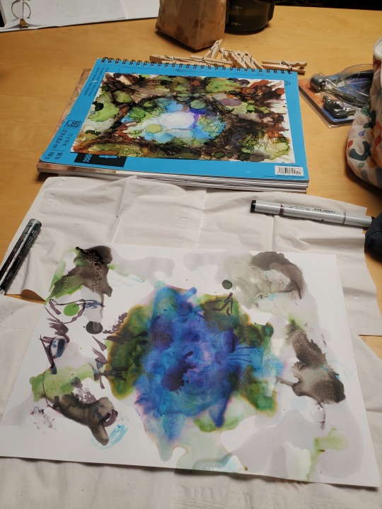

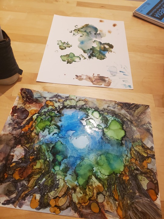

Castles EP process images
May / June 2023
This project, I'll admit, had a slight bump in the road. I'd intended to make a full analog art piece for the album cover, but schedule constraints meant I would not have finished the art in time for the album release! So, I pivoted. While I love the feel of a fully analog work, I am very fast at hybrid renderings (thank you years of architecture projects). I photographed the work at 60% completion, bringing it to a full-fledged art ready for an album cover. That freed up the remaining time to focus on the graphic design, something that would have been rushed otherwise.
In the end, I think I'm happier with this iteration for a sublunis album. My artwork for his last album was a digitally altered version of a piece I'd previously completed:


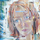
This harkens back to my process for the album art of Sublunar, the first full-length album by sublunis, and the first album art I've worked on. sublunis had a work I'd previously done in mind for Sublunar, but wanted it altered into a new work.

Castles EP by sublunis
Album art by KLA.GustFlo
Another collaboration with the amazing ambient/synth/piano/soundtrack/songs-for-deep-thinkies artist sublunis! The new EP takes the music in a different direction than the previous two albums, while still maintaining a signature style that makes the artist so recognizable. I attempted to work that in with the art - another alcohol ink work like for Sublunar, but a different subject and composition, plus a font style not typically associated with ambient electronic music.
The EP is out now - may it deliver you inspiration.
#album art#album release#EP release#Castles#surreal landscape#surreal music#analog meets digital#fantasy meets cyberpunk#castles in the sky#video game music#ambient music#soundtrack music#art process#art commission#album cover
3 notes
·
View notes
Text
Fast paced sketches to fill a space quickly
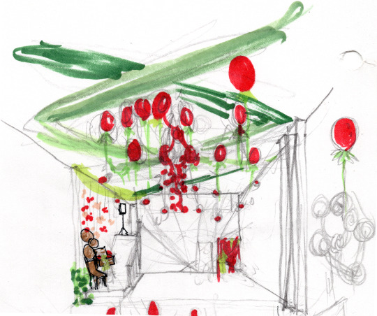
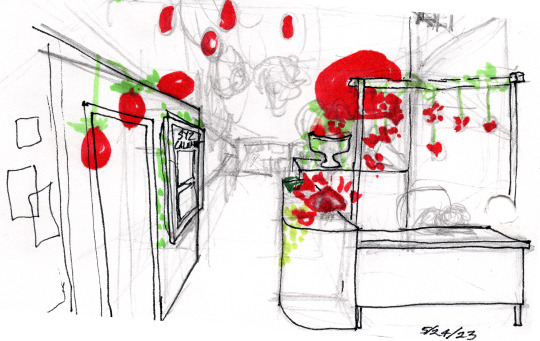
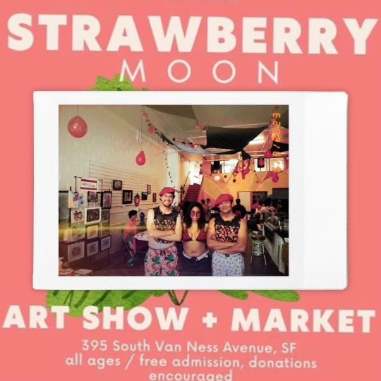
Sketches for Strawberry Moon Decor, art market setup & lookback

Sometimes, my sketches don't capture spaces as they are, but as they are willed to be.
Coming from an architecture background, I am blown away by how rapidly a space will transform into an immersive art event. If you want a cohesive vision for that event space, you better serve it up fast. In a collectively run organization like Syzygy, volunteers also want to (and should) add their own personal flair to the overall setup. To keep that community-oriented enthusiasm alive in the space, any vision for the design must remain flexible to inevitable deviations by the collective.
Luckily, a quickly developed study sketch lends itself perfectly to flexible design. Even more luckily, the co-op is full of creative-minded folks able to take limited direction and resources and run with it. I created my sketch for Syzygy's Strawberry Moon Art Market in about the same amount of time as my cafe sketches. The basic parameters were: a "strawberry field" above you, and a few key points in the space with eye level strawberry displays. The vendors would fill in the rest of the space with their booths. The result was a lovely strawberry space where patrons lingered for far longer than at typical art markets.
This is often step one of an architecture project. You start with visionary goals + rough sketches + inspiration references, develop that into a schematic design, and finesse, finesse, finesse with measured detail. Sometimes that means working with multiple experts on intricate areas. Sometimes that means adding information to get the right permits for a space. Sometimes that means a comprehensive and robust set of drawings that attempt to capture just about every construction situation. Sometimes all three. Only then is the project ready to build out. In a way, doing a project like this every so often where you go straight from step 1 to installation felt very freeing. It forced me to work faster and get out of my comfort zone of slow rigor. And it showed me how much could be achieved with just a basic visual guidepost. Brevity of line and all.
#strawberry moon#strawberry market#event space#immersive art space#event design#event designer#design sketch#art market#art exhibit#immersive installation#art co-op#design process#schematic design#schematics
1 note
·
View note
Text
Castles EP by sublunis
Album art by KLA.GustFlo
Another collaboration with the amazing ambient/synth/piano/soundtrack/songs-for-deep-thinkies artist sublunis! The new EP takes the music in a different direction than the previous two albums, while still maintaining a signature style that makes the artist so recognizable. I attempted to work that in with the art - another alcohol ink work like for Sublunar, but a different subject and composition, plus a font style not typically associated with ambient electronic music.
The EP is out now - may it deliver you inspiration.
#album art#album cover#album release#ep release#ambient electronic#sublunis#castles#artist and musician collaboration#art commission#everything under the moon#castles in the sky#rooted to the ground#alcohol ink#surreal art#fairy ring#moon reflection#tree stump#Spotify
3 notes
·
View notes
Text
Doing some research for my next Cali Pride piece, and this was an interesting analysis.
My friend recently enlightened me on lab color space and I'm loving that way of looking at color. That being said, my works are physical, though not translucent like a flag. My approach will likely differ from one planned for digital viewing. Maybe I'll mix results from different color spaces, since flowers can vary in color.
as a bi person, the bisexual flag brings me infinite joy and always puts a smile on my face, however as a person who has a Passion for Graphic Design, that undersaturated shade of purple infuriates me when it's used digitally
like, on an actual flag - which was its original purpose - it looks great!

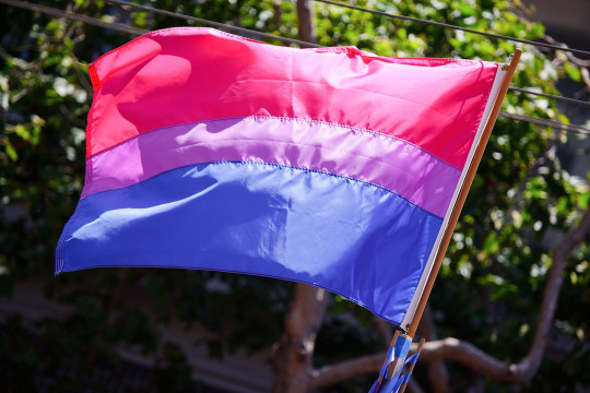
those look fine! lovely, even! with the semi-transparent fabric, the way it catches the sunlight, it looks beautiful!
but now look at how it looks digitally

the pink and blue are so vibrant compared to the sad, lonely lavender!
and let's look at this statement from Michael Page, the creator of the bi flag:

(sidenote: he created this flag in 1998, so if his takes on bisexuality is different from yours, it's okay to notice that! a lot has changed since the 90s when it comes to lived experiences and the way we describe them. but, it's also important to respect his thoughts about this and the way he presented them, even if today, we'd probably not say that bi people "blend unnoticeably into both the gay/lesbian and straight communities.")
so in pantone colors, the pink is 226 C, the blue is 286 C, and the purple of the flag is 258 C.
but...here's the deal
Michael talks here about how the key to understanding the symbolism is to know that the purple blends into both the pink and blue. and on a physical flag, I think you can see that!
but digitally, it absolutely does not blend. it clashes badly, and looks oddly separate from the other two colors.
which got me wondering...what purple do you get if you actually blend 226 C and 286 C?
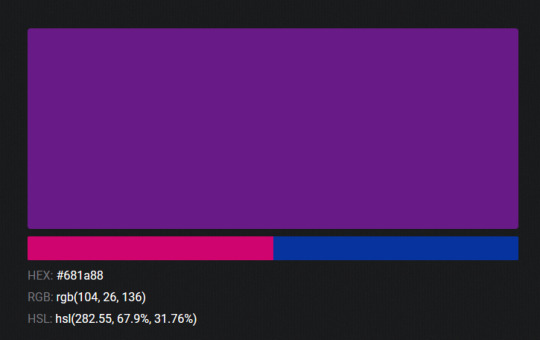
oh! oh, my god.

look at that! look at how nicely it fits between those colors!
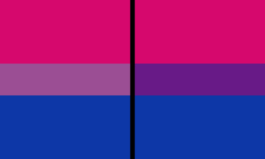
look at it next to the original color scheme! look at how much more vibrant the purple is!
and friends. this is just blending through rgb! you get even more purple variations when you use other color spaces!
let's compare all of them:


(top: original, lab. middle: lrgb, lch. bottom: rgb, hsl)
look at all of the different purple options you can get just by combining these two colors!
if you want almost too-vibrant saturation, you can go hsl, if you want something more relaxed that's closer to the original, you can go lab or lrgb. and if you want to split the difference, lch is bright and violet, while rgb is there with its saturated but darker purple.
anyway, I guess I don't really have a point here? this isn't so much an informational post as it is Me Getting Weird About Colors, but I think it is a useful lesson about how colors look very different on screens compared to how they look on objects in real life.
and sometimes, I think it's okay to compensate for that.
out of all of these, this is my favorite bi flag:

it's the one where the colors were blended in lab color space. for me, the lighter, softer purple is close enough to the original bi flag purple, while also feeling like a smoother blend of the blue and pink
but that's just me! and it might not even look the same to you, since every screen is different, because technology is a nightmare!
anyway, thank you for coming with me on this colorful journey! I will now retreat back to inkscape and make pained sounds about inkstitch gradients until something tangible pulls me back into reality
19K notes
·
View notes
Text

Living in Luxury / en Masse
November '22
Mixed media: alcohol ink, collage, gold leaf, metal foil, nail polish, glitter
Each piece 8x10 framed, 20" x 24" all together
Showing two sides of consumerism, and two ways you are advertised to, something we are probably all overly bombarded with this time of year. There is a lot I could say on this topic, but I'll keep it to the images for now.
Both are intended to elicit a visceral reaction in the viewer.
2 notes
·
View notes
Text

Living In
November '22
Mixed Media: alcohol ink, collage, gold leaf
8x10 framed
The final piece in my 6-part work on anti-capitalism! This was first on display at @syzygycoop for their Sellout Show last month. The combined pieces will be shared next.
#art#my art#collage#abstract art#alcohol ink art#mixed media art#framed art#sell out#anticapitalism art#luxury#gold#gray#blue#of influence#curated by#as her power grows
0 notes
Text

The Lap
November '22
Mixed Media: alcohol ink, collage, gold leaf
8x10 framed
Part of a 6-part scene
#art#my art#collage#abstract art#alcohol ink art#mixed media art#framed art#sell out#anticapitalism art#luxury#gold#gray#something special
0 notes
Text
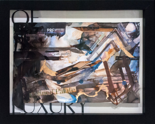
Of Luxury
November '22
Mixed Media: alcohol ink, collage, gold leaf
8x10 framed
Part of a 6-part scene
#art#my art#collage#abstract art#alcohol ink art#mixed media art#framedart#sfartist#bayareaartist#sell out#anticapitalism art#luxury#gold#gray#purple#refined palate#premium#with quality#profound power
0 notes
Text

A Cheap
November '22
Mixed Media: alcohol ink, collage, metal foil, nail polish, glitter
8x10 framed
Part of a 6-part scene
#art#collage#abstract art#alcohol ink art#mixed media art#framed art#sell out#anticapitalismart#luxury#my art#multicolor#purple#red#orange#one & done#shop hundreds of styles
0 notes
Text

Facsimile for
November '22
Mixed Media: alcohol ink, collage, metal foil, nail polish, glitter
8x10 framed
Part of a 6-part scene
#art#collage#abstract art#alcohol ink#mixed media art#framed art#sell out#anti capitalism art#luxury#my art#multicolor#pink#orange#teal#made easy
0 notes
Text
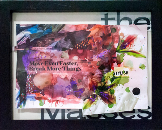
The Masses
November '22
Mixed Media: alcohol ink, collage, metal foil, nail polish, glitter
8x10 framed
Part of a 6-part scene
#art#my art#collage#abstractart#framed art#sell out#anticapitalism art#luxury#move fast break things#pink#alcohol ink#glitter#metal foil
0 notes
Text
Dark Black Locust framed
This is the first of my Wicked Plants, a new series I've created for the Spooky Season. In it I shed light on some of our often poisonous dangerous plants, some which may be hidden in your own garden. The Black Locust tree often grows in disturbed areas, preferring no shade and managing well in poor soil, making it a great candidate for land reclamation. The bark, trees, and leaves are poisonous. Symptoms can include intense nausea and sometimes seizures. They most commonly claim horses that chew on the bark of unstripped wood used for fence posts, though cases of human ingestion do happen. Take heed of this plant, especially if you have young ones.

Dark Black Locust
2022
alcohol ink, colored pencil, gel medium
9x12 unframed, 11x14 framed
Stretching gnarled fingers, twisting, unraveling
upwards and outwards, enclosing and
breaks
every trotted piece a warning
.
.
Part of my Wicked Plants series
#dangerous plants#the tree that could kill#botanical art#tree illustration#black locust#wicked plants#poisonous plants#plants for the spooky season#surreal art#pick your poison
4 notes
·
View notes
Text

Sinister Sago
2022
alcohol ink, colored pencil, gel medium
9x12 unframed, 11x17 framed
It sits among the ornaments
The ancient lurker
Bright and alluring
A final delicacy
.
.
Part of my Wicked Plants series
#botanical art#surreal art#wicked plants#poisonous plants#dangerous plants#sago palm#plants for the spooky season#pick your poison
0 notes
Text
Dark Black Locust
2022
alcohol ink, colored pencil, gel medium
9x12 unframed, 11x14 framed
Stretching gnarled fingers, twisting, unraveling
upwards and outwards, enclosing and
breaks
every trotted piece a warning
.
.
Part of my Wicked Plants series
#surreal art#botanical art#tree illustration#black locust#wicked plants#poisonous plants#plants for the spooky season#pick your poison
4 notes
·
View notes
Text
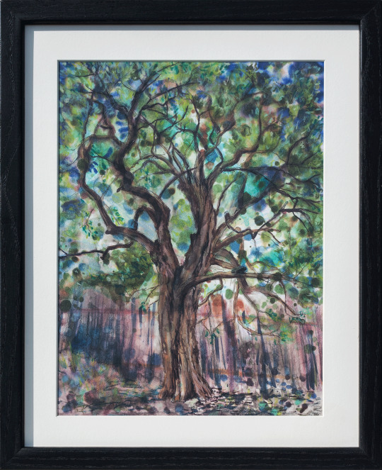
This work is now 15 years old. Much of my style, technical abilities, and media of choice I've redeveloped several times over since then. Yet there are still some things an older work can teach me. I am still enamored with texture, and ethereal scenes. I could do with more monochromatic exercises in my current works. There is a surreal quality here too, that I'm aiming towards in my current paintings, and comes naturally here (that happens when your inspiration is literally a dream). I pulled Spiralcase out this past spring as inspiration for a commission piece ("The Draw: Simply Meant to Be"), and kept it up in my studio ever since. The spooky vibes demand a more prominent display in my home this month though.

Spiralcase
2007
water-based oil paint and oil pastels on canvas board
"Spiralcase" was a painting I first saw in a dream. I was a spirit, incorporeal and nearly formless, and I was racing. I wound down a dimly lit spiral staircase, or perhaps the staircase wound upward to meet me. A dim light from below cast near color onto the stairs. Shadows lightened and faded the deeper I went, until the stairs ceased their winding and I'd reached the bottom. At the center of the space sat a well, emitting a pale light faintly upward. I approached the well. Bathed in that eerie glow, I reached out and suddenly became aware of my arms. The rest of me slowly took form, a foot stepping closer to the well, a light casting upon my silhouette, reaching all the way up to my face. I had a face.
Then I woke up.
#my art#surreal art#older works#looking back#learning from younger me#staircase#spiral staircase#spirits#haunted#from a dream#spooky#haunting
2 notes
·
View notes
Text
Framed work:

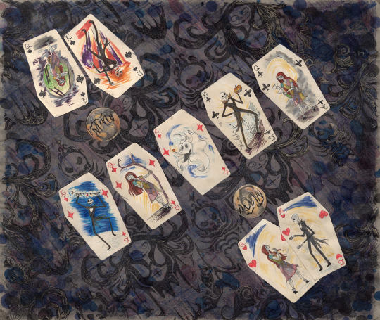
The Draw: Simply Meant To Be
Mixed media: alcohol ink, watercolor, gel pen, creme, collage
16x20 unframed, 20x24 framed
Commission work
#framed art#art commission#pop culture art#NMBC#poker#nightmare before christmas#poker scene#nmbc art#poker board#poker cards#spookyaesthetic#halloween aesthetic#witchy aesthetic#casino aesthetic#goth decor#jack skellington#sally finkelstein#oogieboogie#spookyseason#halloween countdown#this is halloween#commission art
17 notes
·
View notes
Text
Spiralcase
2007
water-based oil paint and oil pastels on canvas board
"Spiralcase" was a painting I first saw in a dream. I was a spirit, incorporeal and nearly formless, and I was racing. I wound down a dimly lit spiral staircase, or perhaps the staircase wound upward to meet me. A dim light from below cast near color onto the stairs. Shadows lightened and faded the deeper I went, until the stairs ceased their winding and I'd reached the bottom. At the center of the space sat a well, emitting a pale light faintly upward. I approached the well. Bathed in that eerie glow, I reached out and suddenly became aware of my arms. The rest of me slowly took form, a foot stepping closer to the well, a light casting upon my silhouette, reaching all the way up to my face. I had a face.
Then I woke up.
2 notes
·
View notes