#(according to the original artists title of the drawing)
Text

day 1421
#uh just a heads up if you expand the tags to see all there's. a lot. very long#amphibian#frog#poison dart frog#based on my most popular frog to date (day 651)#inspired by everyone pointing out what they think it looks like#here's a fun secret fact the original guy is actually a phantasmal poison dart frog (Epipedobates tricolor)#(according to the original artists title of the drawing)#not Anthony's poison arrow frog (Epipedobates anthonyi)#i feel too awkward to really point it out though because they look the exact same. i cannot tell if there is a difference#im half convinced the same frog was just discovered and named twice#its very curious btw if you go on the (english) wikipedia page for either species it doesn't mention the other#while hereptiles.info (no idea if this is a trustworthy site) lists both names as common names for the same frog (incorrectly??)#while inaturalist lists them as two different frogs. curiously with tricolor having wayyyyy fewer photos#ok anyway that's my rant i went on a whole journey trying to figure out if these are the same frog or not and i have no answer#i did some more 'research' and i am more confused. some sources seem to imply they are now considered the same species ( e. tricolor)#i think my conclusion is i am willing to agree the drawing looks more like e. anthonyi. it seems like tricolor is generally less vibrant re#and the white is darker and more green?#i feel like thumblr should stop me from typing more in the tags at this point this is a whole essay#at this point i am failry convinced this is specifically the Santa Isabel frog. isthat the real subspecies or morph or whatever#or just the name pet sites are using to sell it??#i even found some sources (frog selling websites) refering to it as “Epipedobates Anthonyi 'Santa Isabel' Phantasmal Poison Dart Frog” lol#Anyways if you read this far hi. species are confusing. i am not a frog scientist#the first few tags are like an hour old now i just kept trying to figure it out and adding more tags
2K notes
·
View notes
Note
Hello! I hope you are doing well <3
I was just curious to know if there's any significance of having a placement in 15°, since it's the exact middle of the 30° a sign occupies.
Thank you in advance, keep making amazing content!!!
Hello! I hope you are also doing well. Thank you so much for the compliment! And oh, an interesting question. Let's dive into it, shall we? 🤍
𝟏𝟓 𝐃𝐞𝐠𝐫𝐞𝐞𝐬 𝐚𝐧𝐝 𝐭𝐡𝐞 𝐀𝐯𝐚𝐭𝐚𝐫 𝐃𝐞𝐠𝐫𝐞𝐞 ✧


✧ The 15th Degree
Let's start with the general description of this degree first. According to Nikola Stojanovic (the creator of the degree theory), the 15° is one of the three degrees (3°, 15°, 27°) that rule Gemini energy. They revolve around the themes of siblings, communication, writing, the two of something, early education, technology, neighborhood, social activity, and the color yellow. (Trigger Warning) In general, Nikola described this specific degree as malefic as it may indicate car accidents, ass*ssination, and k*llings, especially if the native also has Scorpio and 8th House placements. Now, please remember that it will manifest differently in our lives. At the end of the day, our fate lies in our hands.
Aside from the description above, I could not find any sources that indicate the 15th degree as significant in general. However, there is what we call The Avatar Degree, which involves the fixed signs (Taurus, Leo, Scorpio, Aquarius) in this degree.

✧ The Avatar Degree
Going back to your original question, some Astrologers claim that the 15 Degrees in Fixed Signs (Taurus, Leo, Scorpio, Aquarius) hold some significance as it is exactly halfway between the cardinal equinox and solstice points. In fact, it is regarded as the “Avatar degree” (or “The Gates of the Avatars”) because avatars are known to be free spiritual beings with magical powers. That said, natives with this degree often have unusual gifts and talents, resourcefulness, lucky accidents, and coincidences. They are seen as “magical” people as they often make even impossible things come true. Their enormous dedication (which is a common fixed sign trait) helps them rise above life's challenges and achieve whatever they lay their eyes upon. These people have the potential to attain remarkable success during their lifetime. In some cases, they are even seen as someone who possesses “god-like” abilities.
The Avatar degree is applicable to people who have it in their planets or in their Ascendant.
✧ Some famous people with the “Avatar Degree”
Helen Keller
9th House Mars in Leo at 15°

Helen Keller was an American author, disability rights advocate, political activist, and educator. She contracted a disease at the age of 19 months that left her blind and deaf. Despite that, she was able to attain an extraordinary accomplishment in the education of persons with disabilities. She graduated cum laude at Radcliffe College in 1904.
Also, I find it fascinating that one of the films made to depict Keller's childhood living with her mentor, Anne Sullivan, was titled The Miracle Worker. And the fact that individuals with Avatar degrees are seen as magical and miraculous with their notable transcendental qualities. (Also, that film is a must-watch!)
Pablo Picasso
10th House Neptune in Taurus at 15°
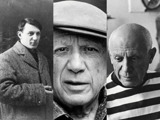
Pablo Picasso was a Spanish painter, sculptor, printmaker, ceramicist, and stage designer considered one of the greatest and most influential artists of the 20th century. Despite having a poor performance as a student, he had an exceptional talent for drawing at a very young age (child prodigy), which makes sense because he had the Avatar Degree in Neptune, that is the planet of art and creativity. He was credited with the creation of Cubism (an artistic movement), along with Georges Braque.
Serena Williams
5th House Mars in Leo at 15°

Having the Avatar degree in Mars, the planet of sports and physical activities, Serena Williams is an American professional tennis player and regarded as one of the most accomplished tennis players of all time. She also paved the way for black women in sports.
Stevie Wonder
10th House Pluto in Leo at 15°

Stevie Wonder is an American singer, songwriter, and multi-instrumentalist. Despite being blind, he was a child prodigy and a musical genius who went on to become one of the most creative musical figures of the late 20th century.
Other famous people with the Avatar degree: Marvin Gaye, David Cassidy, Carlos Puidgemont, Angela Merkel, John Paul Getty, Willie Nelson, Diana Ross, Leslie Nielsen, Alice Cooper, Marcel Merceau, and so on.

✧ Short Observations
The entire chart must be taken into consideration.
People with the Avatar degree tend to experience early life challenges before they experience significant success later on.
Despite that, these people often recognize their talents earlier in life.
Their success often lasts long as the fixed signs indicate stability and lasting effect.
The planet, sign, house placement, and its ruler may indicate what area of life the native has gifts and talents or may become successful in. Here are some examples for the planets:
Sun - things related to leadership, politics, singing, acting, performing, hairstyling, entertaining
Moon - things related to caregiving, nursing, music, therapy, counseling, healing
Mercury - things related to writing, communication, social media, calculation, management, entrepreneur, interviewing
Venus - things related to finance, business, relationships, career, food, music, fashion, beauty, film, interior designing
Mars - things related to sports, physical activities, coaching, police, military, stunts
Jupiter - things related to teaching, preaching, education, law, philosophy, traveling, religious and spiritual affairs
Saturn - things related to politics, finance, business, leadership, CEO
Uranus - things related to technologies, inventing, reforming, activism, social work
Neptune - things related to music, arts, psychic skills, photography, dancing, poetry, films
Pluto - things related to psychology, healing, investigation, forensics
✧ Takeaway:
People with the Avatar degree often have the potential for greatness as they possess qualities that make them conquer even the hardest battles. The examples above prove that this degree does not signify doom for the native. In fact, there is the potential for permanent fame and success. In order to achieve this, the native must recognize the power that this degree holds and start harnessing it for their own good. It's not easy, but it's definitely worth it.
Side note: I hope this helps to answer your question. Thank you so much for asking! Have a great day/night! 🤍
References: X X X X X X X
Credit to @firefly-graphics for the divider. The gif and the photos used are taken from Google and Pinterest. Credit goes to the rightful owners.
Copyright © 2022 ellmeria | All rights reserved.
#🌿: ria answers#🌿: astro ria#astrology#astrology observations#astrology notes#astro observations#astro notes#15 degrees#avatar degree
363 notes
·
View notes
Text

Title: Salt & Secrets
Author: abi cosmos
Artist: lotrspnfangirl
Rating: Explicit
Pairings: Castiel/Dean Winchester
Length: 35000
Warnings: Alcohol use. Depression.
Tags: Two person love triangle. Mutual pining. Online relationship. Human!Castiel. Canon divergent. Sub/dom undertones. Dean Winchester wears panties. Angst with a happy ending. Top Castiel/Bottom Dean Winchester. Hurt/Comfort.
Posting Date: October 5, 2022
Summary: Dean is lonely since Castiel became human. It’s been six months of throwing himself into cases, pining around the bunker, and radio silence between them. Charlie takes matters into her own hands, signing him up for a hunter’s networking website where he meets new hunter Steven. They hit it off, Dean enjoys helping him find his feet, and Steven seems to understand what Dean needs without ever having met him. It doesn’t take much to heat things up, but a new case brings Castiel back into his life, and Dean soons finds himself face-to-face with a little sin and one huge secret.
Excerpt: Charlie’s next mission is to get egg rolls and pizza, but when Dean gets to his feet, she presses a finger into his chest and pushes him back into his chair. "Not you. You fill out your profile so people don’t think you’re a bot, I’ll be back."
"A bot?" Dean asks.
"A robot." Charlie calls out, disappearing out of the kitchen with her car keys in hand and a swing in her step. She’s pleased with herself for this one.
Dean does what he’s told with a serious case of, What the hell am I doing? He ain’t putting his real name, but Charlie said that’s fine, instead he just fills out some generic info. He’s a dude. 30-39. Long time hunter. There’s an option to upload a photo. Dean scoffs; hell no. Finally, he checks his username: Scooby\D. Charlie had veto-ed his Impala suggestions for being too douchebag-dating app. He clicks save and is taken into a message board. Looking it over, he shakes his head with a huff.
Help with Latin translation!
Ethics of killing the children of monsters
Ammo for sale.
Is my boyfriend really the king of the aliens?
Best sharpening tools for axes
Ghostfacers, are they in love?
This was a mistake, he doesn’t need this. What’s he gonna find here? Nothing. He’s about to close the lid and grab a beer when he notices another question towards the bottom. The user is called Steven09, his ask is from two weeks ago and has zero replies. His account has no picture next to it, just a drawing of a salt shaker that matches Dean’s, the default icon, clearly. According to the little blurb below his name, he’s a guy, no age selected, but he’s a new hunter. Dean opens up the post.
Does anyone know about cars?
Steven09, 16:23:
I need a vehicle, but unfortunately I have very limited knowledge. I would prefer it to be economically friendly and easy to park.
“Easy to park?” Dean mumbles to himself. “Buddy, if you can’t park then you can’t park.” He finds the reply button and a blank box below the original message opens out, encouraging him to use fonts and italics. Dean slowly types.
Scooby\D, 15:57:
I know something. You ever had a car before?
He reads it over, is he seriously gonna do this? Talk to some guy online about cars? On a freakin’ website for lonely hunters? "This is your fault, Charlie," he mumbles, pressing the button to post the reply and hurriedly shutting the lid.
DCBB 2022 Posting Schedule
75 notes
·
View notes
Text
GJ and ZZH Updates — December 18-24
<<< previous week || all posts || following week >>>
This is part of a weekly series collecting updates from and relating to Gong Jun and Zhang Zhehan.
This post is not wholly comprehensive and is intended as an overview, links provided lead to further details. Dates are in accordance with China Standard Time, the organization is chronological. My own biases on some things are reflected here. Anything I include that is not concretely known is indicated as such, and you’re welcome to do your own research and draw your own conclusions as you see fit. Please let me know if you have any questions, comments, concerns, or additions. :)
[Glossary of names and terms]
[Masterlist of my posts about the situation with Zhang Zhehan]
12-18
→ The Instagram posted four photos. The first is from the same photoshoot from 2021-08-09 that the current pfp is from, the others look to have been promotional shots from the concert that was never formally announced. Aka they were all taken in July 2021.
→ The stolen song got to #2 again on iTunes because whalers have zero critical thinking skills.
12-19
→ Gong Jun made a post on his personal Weibo announcing that the rescheduled birthday livestream would be held on 12-21. Caption: “Then it's done, let's chat on the 21st! #Informal New Year's Eve Party#” His studio reposted it with the added caption: “This year’s livestream is late but it’s here! No leave of absense this time, come late on the 21st to have a chat with boss @ Gong Jun Simon. 😎”
→ 361° posted a clip from their livestream with Gong Jun last month to tease an upcoming product.
→ Hsu Fu Chi posted a photo ad featuring Gong Jun.
→ Kangshifu posted a photo ad featuring Gong Jun.
→ The stolen song continued to rise and fall dramatically on iTunes, definitely not looking articifial at all. /s It stayed consistently lower after the title changed from Chinese to English (a change that would have been made on the part of the uploaders, not iTunes), so whalers / hired goons pushing the song blamed this as the reason. It definitely wasn’t that they had just only hired water armies until that specific hour mark, oh no. /s
12-20
→ BEAST posted two photo ads featuring Gong Jun advertising their New Year’s product line. (1129 kadian)
→ Gong Jun posted a photo of gifts he recieved from Louis Vuitton to his personal Weibo and Instagram. Caption: “Starting from polka dots, experience Yayoi Kusama's unique artistic style. Sharing the avant-garde and stylish @展开全部 #LVxYayoiKusama# cooperation series Keepall handbag, full of good mood for holiday trips ☀”
→ The Instagram posted a clip of another stolen song. This song was posted to international streaming services and again showed the same very obviously manipulated statistics, though this time for a shorter period of time. This song was also given an “explicit” marker on iTunes despite not containing anything that would auto-flag as such, indicating that the people who posted it chose to flag it as this, as likely another intended smear.
12-21
→ Colgate posted a photo ad featuring Gong Jun.
→ L’Oreal posted a video spoken by Gong Jun announcing a livestream for the following day. He stated in his livestream later this day that it had originally been planned for 12-16 but had to be rescheduled.
→ Gong Jun held the rescheduled birthday livestream. [Recording] Written summaries [here] and [here].

Highlights / Fan Observations:
- He said that the livestream wasn’t held on 11-29 because he was supposed to go to Chengdu but was unable to, and his staff weren’t able to come to where he was in Yunnan because of pandemic restrictions. He spent the week in Yunnan with his family,* and stayed in Yunnan for twenty days.
* “Us fi— My family”
- He didn’t attend the GQ event the previous week because he had COVID, the poor boy. He said that he was now better and testing negative, but he was still sniffling a bit.
- He’s already signed the contract for his next drama, but wouldn’t give any information other than that it’s a role that will be making him step out of his comfort zone.
- He recently filmed a variety show in Hangzhou but couldn’t say more because it hasn’t been announced yet.
- He ended the stream with “Thank you to my Junweixians [deliberate pause] Thank you everyone.”
- The person he had helping him offscreen was completely silent, compared to previous years where you could always hear at least some muffled laughter and whispering once in a while from his staff. At one point he called the person “ge”.
- The sweater he was wearing throughout most of the stream is by Ponder.er, a “genderfluid menswear” brand that aims to redefine expectations of masculinity. Also the cutouts are FULLY cut out, there’s a reason he was wearing a shirt underneath.
- The plate he was using is from a line that was popular a few years ago as a wedding gift.
→ Gong Jun trended on Twitter, and there were multiple Weibo hotsearches related to the livestream.
→ The Instagram posted three photos of “Zhang Zhehan” and seven pieces of fanart for the stolen songs.
12-22
→ Gong Jun’s studio posted four photos from the previous day’s livestream. Caption: “The winter solstice is here! Delivering the handmade dumplings from last night's boss @ Gong Jun Simon, eat a bowl of hot dumplings, and spend this winter safely and warmly 🥟”
→ Gong Jun posted two photo ads for 361° to his Xiao Hong Shu. These were also later posted by 361°. (1129 kadian)
→ Fresh posted a commercial featuring Gong Jun, shortly followed by a photo ad. Gong Jun also posted the commercial to his personal Weibo shortly after.
→ LockNLock posted a photo ad featuring Gong Jun advertising the water bottle he had used during the livestream.
→ Hsu Fu Chi posted a photo ad featuring Gong Jun. Part of their caption included, “I don’t know if our handsome @ Gong Jun Simon eats dumplings or tangyuan on this day~” 🤡
→ Kangshifu posted a clip from Gong Jun’s livestream.
→ Gong Jun appeared in a livestream for L’Oreal. [Recording] [written summary with clips]
→ Gong Jun’s studio posted nine photos from the livestream. Caption: “Boss @ Gong Jun Simon brings a warm winter surprise, enveloping the winter full of warm atmosphere~”
12-23
→ Honor posted a photo ad featuring Gong Jun.
→ Gong Jun’s studio posted an announcement that the AI Gong Jun Jifeng will be appearing for a New Year’s event on 12-31.
→ LockNLock posted a promotional video spoken by Gong Jun, filmed prior to the 12-21 livestream. This was later reposted by his studio.
→ Yang Yang, the L’Oreal livestream host, posted three photos from it of himself and Gong Jun.
12-24
→ One year since Zhang Zhehan’s case was accepted by the Beijing Chaoyang Police.
→ Gong Jun posted fifteen travel photos in Yunnan from earlier in the month, as he mentioned he would during the birthday livestream. The banner he’s standing under in one photo says “Place happiness as the main point to repeatedly recite” Caption: “Let's go, enjoy the ginkgo!” This was later reposted by MUJOSH. He also posted the photos to Xiao Hong Shu, caption: “Let’s go! To enjoy the ginkgo!” and as two posts on Instagram [1] [2], captions: “Doesn’t it look nice” and “The shots look alright!”
Fan Observations:
- People found the hotel in the last photo. The room is for two with only one bed, and the hotel specified that the pool was designed to fit two people.
- I have a theory about the water marks on the side of the pool.
- The various photos from this trip have shown Gong Jun with both a film camera and a digital one, yet the sunrise pictures posted last week were taken with a phone? 🤔

→ Charlotte Tilbury posted a photo ad featuring Gong Jun.
→ The Instagram posted ten photos of “Zhang Zhehan”, the first of which has the figure’s face completely obscured by a Santa emoji and several of which are supposedly “behind the scenes” from the white haired photos.
Additional Reading:
→ Flora’s daily fan news thread
<<< previous week || all posts || following week >>>
#I hope everyone is staying safe and warm this holiday season#Zhang Zhehan#Gong Jun#Word of Honor#woh cast#lld timeline
26 notes
·
View notes
Text
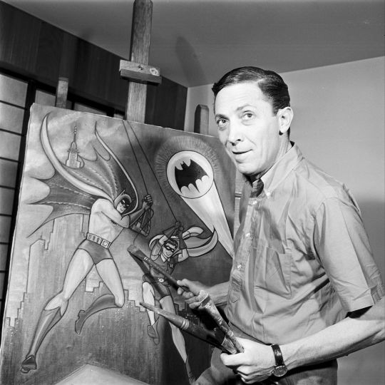
In MEMORY of BOB KANE on his BIRTHDAY -
Born Robert Kahn, American comic book writer, animator and artist who co-created, with Bill Finger, the DC Comics character Batman. Kane also co-created the animated series Cool McCool. He was inducted into the comic book industry's Jack Kirby Hall of Fame in 1993 and into the Will Eisner Comic Book Hall of Fame in 1996.
Early life and work -
Kahn was born in New York City, New York. His parents, Augusta and Herman Kahn, an engraver, were of Ashkenazi Jewish descent. A high school friend of fellow cartoonist and future Spirit creator Will Eisner, Robert Kahn graduated from DeWitt Clinton High School and then legally changed his name to Robert Kane. He studied art at Cooper Union before "joining the Max Fleischer Studio as a trainee animator in the year of 1934".
Comics -
He entered the comics field two years later, in 1936, freelancing original material to editor Jerry Iger's comic book Wow, What A Magazine!, including his first pencil and ink work on the serial Hiram Hick. The following year Kane began to work at Iger's subsequent studio, Eisner & Iger, which was one of the first comic book "packagers" that produced comics on demand for publishers entering the new medium during its late-1930s and 1940s Golden Age. Among his work there was the talking animal feature "Peter Pupp" — which belied its look with overtones of "mystery and menace" — published in the U.K. comic magazine Wags and reprinted in Fiction House's Jumbo Comics. Kane also produced work through Eisner & Iger for two of the companies that would later merge to form DC Comics, including the humor features "Ginger Snap" in More Fun Comics, "Oscar the Gumshoe" for Detective Comics, and "Professor Doolittle" for Adventure Comics. For that last title he went on to do his first adventure strip, "Rusty and his Pals".
Batman -
In early 1939, DC's success with the seminal superhero Superman in Action Comics prompted editors to scramble for more such heroes. In response, Bob Kane conceived "the Bat-Man." Kane said his influences for the character included actor Douglas Fairbanks' film portrayal of the swashbuckler Zorro; Leonardo da Vinci's diagram of the ornithopter, a flying machine with huge bat-like wings; and the 1930 film The Bat Whispers, based on Mary Rinehart's mystery novel The Circular Staircase (1908). Bill Finger joined Bob Kane's nascent studio in 1938. An aspiring writer and part-time shoe salesperson, he had met Kane at a party, and Kane later offered him a job ghost writing the strips Rusty and Clip Carson. He recalled that Kane....
...had an idea for a character called 'Batman', and he'd like me to see the drawings. I went over to Kane's, and he had drawn a character who looked very much like Superman with kind of ... reddish tights, I believe, with boots ... no gloves, no gauntlets ... with a small domino mask, swinging on a rope. He had two stiff wings that were sticking out, looking like bat wings. And under it was a big sign ... BATMAN.
Finger said he offered such suggestions as giving the character a cowl and scalloped cape instead of wings; adding gloves; leaving the mask's eyeholes blank to connote mystery; and removing the bright red sections of the original costume, suggesting instead a gray-and-black color scheme. Finger additionally said his suggestions were influenced by Lee Falk's The Phantom, a syndicated newspaper comic strip character with which Kane was familiar as well. Finger, who said he also devised the character's civilian name, Bruce Wayne, wrote the first Batman story, while Kane provided art. Kane, who had already submitted the proposal for Batman at DC and held a contract, is the only person given an official company credit for Batman's creation. Comics historian Ron Goulart, in Comic Book Encyclopedia, refers to Batman as the "creation of artist Bob Kane and writer Bill Finger".
According to Kane, "Bill Finger was a contributing force on Batman right from the beginning. He wrote most of the great stories and was influential in setting the style and genre other writers would emulate ... I made Batman a superhero-vigilante when I first created him. Bill turned him into a scientific detective.
The character debuted in Detective Comics #27 (May 1939) and proved a breakout hit. Within a year, Kane hired art assistants Jerry Robinson (initially as an inker) and George Roussos (backgrounds artist and letterer). Though Robinson and Roussos worked out of Kane's art studio in The New York Times building, Kane himself did all his drawing at home. Shortly afterward, when DC wanted more Batman stories than Kane's studio could deliver, the company assigned Dick Sprang and other in-house pencilers as "ghost artists", drawing uncredited under Kane's supervision. Future Justice League writer Gardner Fox wrote some early scripts, including the two-part story "The Monk" that introduced some of The Batman's first "Bat-" equipment.
In 1943, Kane left the Batman comic books to focus on penciling the daily Batman newspaper comic strip. DC Comics artists ghosting the comic-book stories now included Jack Burnley and Win Mortimer, with Robinson moving up as penciler and Fred Ray contributing some covers. After the strip finished in 1946, Kane returned to the comic books but, unknown to DC, had hired his own personal ghosts, including Lew Schwartz and Sheldon Moldoff from 1953 to 1967.
Robin -
Bill Finger recalled that,
Robin was an outgrowth of a conversation I had with Bob. As I said, Batman was a combination of [Douglas] Fairbanks and Sherlock Holmes. Holmes had his Watson. The thing that bothered me was that Batman didn't have anyone to talk to, and it got a little tiresome always having him thinking. I found that as I went along Batman needed a Watson to talk to. That's how Robin came to be. Bob called me over and said he was going to put a boy in the strip to identify with Batman. I thought it was a great idea.
Kane, who had previously created a sidekick for Peter Pupp, proposed adding a boy named Mercury who would have worn a "super-costume". Robinson suggested a normal human, along with the name "Robin", after Robin Hood books he had read during boyhood, and noting in a 2005 interview he had been inspired by one book's N. C. Wyeth illustrations.
The impetus came from Bill's wanting to extend the parameters of the story potential and of the drama. He saw that adding a sidekick would enhance the drama. Also, it enlarged the readership identification. The younger kids could then identify with Robin, which they couldn't with Batman, and the older ones with Batman. It extended the appeal on a lot of levels.
The new character, an orphaned circus performer named Dick Grayson, came to live with Bruce Wayne as his young ward in Detective Comics #38 (April 1940) and would inspire many similar sidekicks throughout the Golden Age of comic books.
The Joker -
Batman's nemesis the Joker was introduced near that same time, in Batman #1 (Spring 1940). Credit for that character's creation is disputed. Kane's position is that
Bill Finger and I created the Joker. Bill was the writer. Jerry Robinson came to me with a playing card of the Joker. That's the way I sum it up. The Joker looks like Conrad Veidt — you know, the actor in The Man Who Laughs, [the 1928 movie based on the novel] by Victor Hugo. ... Bill Finger had a book with a photograph of Conrad Veidt and showed it to me and said, 'Here's the Joker'. Jerry Robinson had absolutely nothing to do with it. But he'll always say he created it till he dies. He brought in a playing card, which we used for a couple of issues for him the Joker to use as his playing card.
Robinson, whose original Joker playing card was on public display in the exhibition "Masters of American Comics" at the Jewish Museum in New York City, New York, from September 16, 2006 to January 28, 2007, and the William Breman Jewish Heritage Museum in Atlanta, Georgia from October 24, 2004 to August 28, 2005, has countered that:
Bill Finger knew of Conrad Veidt because Bill had been to a lot of the foreign films. Veidt ... had this clown makeup with the frozen smile on his face (classic). When Bill saw the first drawing of the Joker, he said, 'That reminds me of Conrad Veidt in The Man Who Laughs.' He said he would bring in some shots of that movie to show me. That's how that came about. I think in Bill's mind, he fleshed out the concept of the character.
Robinson added, however, "If you read the Batman historian [E. Nelson] Bridwell, he had one interview where he interviewed Bill Finger and he said no, the Joker was created by me — an acknowledgement. He can be credited and Bob himself, we all played a role in it. ... He wrote the script of that, so he really was co-creator, and Bob and I did the visuals, so Bob was also."
Other characters -
According to comics historian Les Daniels, "nearly everyone seems to agree that Two-Face was Kane's brainchild exclusively". Catwoman, originally introduced by Kane with no costume as "the Cat", was partially inspired by his cousin, Ruth Steel. Kane, a frequent moviegoer, mentioned that Jean Harlow was a model for the design and added that "I always felt that women were feline". Kane created the Scarecrow and drew his first appearance, which was scripted by Finger. Kane also created the original incarnation of Clayface. According to Kane, he drew the Penguin after being inspired by the then advertising mascot of Kool cigarettes — a penguin with a top hat and cane. Finger, however, claimed that he created the villain as a caricature of the aristocratic type, because "stuffy English gentlemen" reminded him of emperor penguins.
Later life and career -
In 1966, Kane retired from DC Comics, choosing to focus on fine art. As Kane's comic-book work tapered off in the 1960s, he parlayed his Batman status into minor celebrity. He enjoyed a post-comics career in television animation, creating the characters Courageous Cat and Cool McCool, and as a painter showed his work in art galleries, although some of these paintings were produced by ghost artists. DC Comics named Kane in 1985 as one of the honorees in the company's 50th anniversary publication Fifty Who Made DC Great. In 1989, Kane published the autobiography Batman and Me, with an updated edition Batman and Me, The Saga Continues, in 1996.
Kane worked as a consultant on the 1989 film Batman and its three sequels with directors Tim Burton and Joel Schumacher.
Stan Lee interviewed Kane in the documentary series The Comic Book Greats.
Personal life -
Kane married his first wife, Beverly, in the 1940s, and the two divorced in 1957. They had a daughter, Deborah. Kane married his second wife, actress Elizabeth Sanders Kane, in 1987.
Kane died at Cedars-Sinai Medical Center in Los Angeles, at the age of 83. He is buried at Forest Lawn Memorial Park in the Hollywood Hills of Los Angeles, California.
Awards and honors -
Kane was a recipient of the Inkpot Award in 1977, was inducted into the Jack Kirby Hall of Fame in 1994 and the Will Eisner Comic Book Hall of Fame in 1996. He was added to the National Comics Awards' Roll of Honour in 1999.
On October 21, 2015, for his work in motion pictures, he posthumously received a star on the Hollywood Walk of Fame, at 6764 Hollywood Boulevard.
Kane's work is housed in collections in New York City's Museum of Modern Art, Whitney Museum of American Art, and St. John's University.
Oct 24, 1915 - Nov 3, 1998 (undisclosed)
Madhotcollectibles.com
21 notes
·
View notes
Photo


Staff Pick of the Week
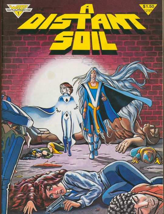
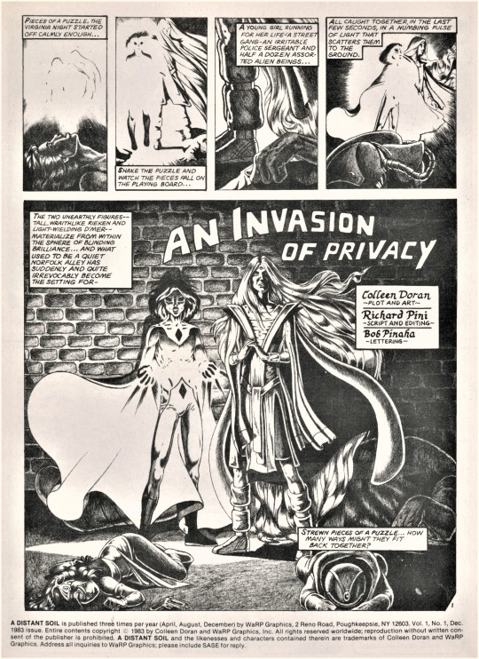
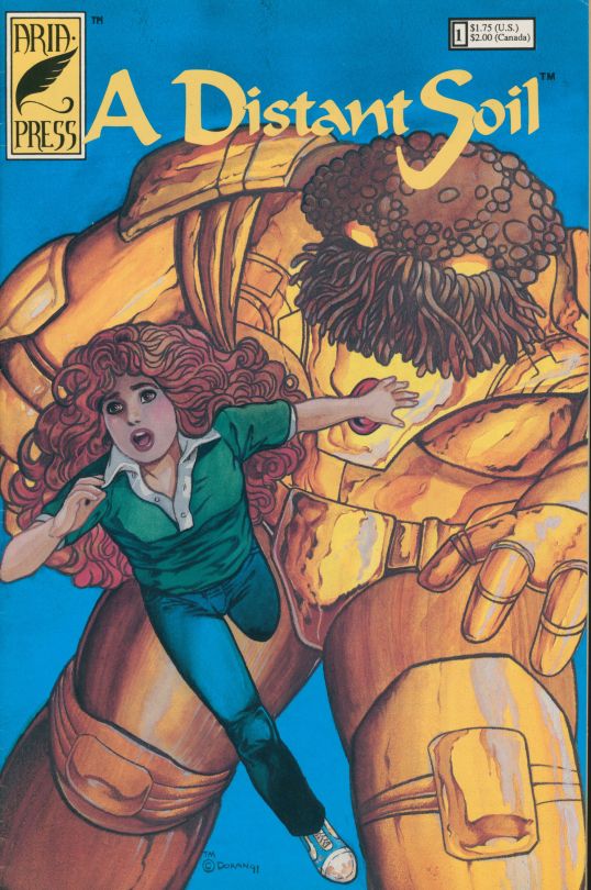
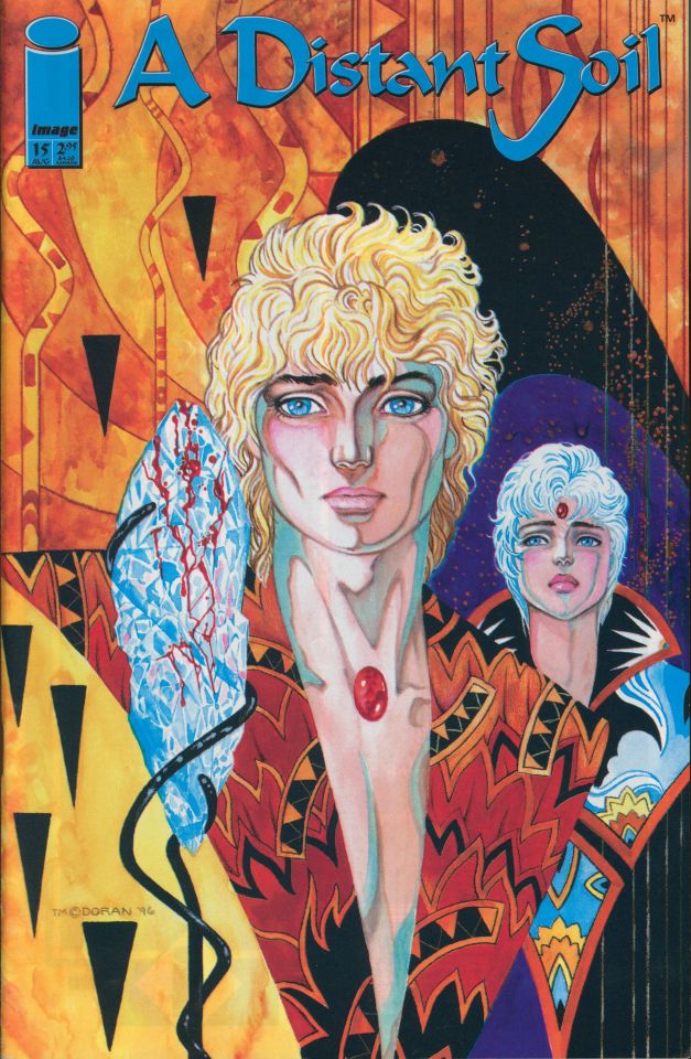
Collen Doran’s A Distant Soil [ADS] was groundbreaking for being among the first comics to feature openly gay characters and gay romantic leads and explore questions of gender identity. It is also an important early example of a creator-owned comic. Doran is a foremost figure in comics self-publishing, known for her advocacy for creator rights in addition to her award-winning career as an comic artist.
Based on characters Doran started drawing at the age of twelve and developed in fanzines throughout her teens, A Distant Soil’s first official appearance was in Elfquest #16 (WaRP Graphics, 1983), followed by a nine-issue run for WaRP (1984-1986). The first 5 were published as magazine-sized comics, with the remaining in standard comic format. A tenth issue was completed, but an acrimonious split with WaRP halted it’s publication. According to Doran, WaRP not only attempted to claim ownership of the series, but claimed to have created it as well. The issue was settled out of court, and Doran maintained control of ADS.
Doran was then approached by the Donning Company to relaunch the title as a full color graphic novel on their imprint, Starblaze Graphics, turning down offers from Marvel and Dark Horse. Doran made a fresh start, rewriting and redrawing the comic from scratch, abandoning the pencil-only textures of the original run. In the afterward to the first of those graphic novels, Immigrant Song (1989), Doran acknowledged that fans “enjoyed the textured look of that, but after a few too many nights of a cramped hand soaked in epsom salts, I had to beg off that technique.” Unfortunately, the Donning Company folded and only two ADS books were published.
Doran decided to take a leap and self-publish ADS as Aria Press. A new series was initiated, launching in 1991, drawing on art and story lines from the Starblaze graphic novels (note images 7 & 8, from the Starblaze and Aria Press runs). After fourteen self-published issues, the title was picked up by Image Comics in 1996. The latest installation (#42) came out in 2013.
The images shown here are from our Comic Book Collection, as follows:
The first image is from Elfquest #16 (WaRP Graphics)
Images 2-4 are from the WaRP Graphics run.
Images 5-7 are from the Starblaze Graphics/Donning Company run.
Images 8 & 9 are from the self-published Aria Press run.
Image 10 is the cover from the first Image Comics publication (a continuation of the Aria series)
View other posts from our Comic Book Collection.
View our other Staff Picks.
-Olivia, Special Collections Graduate Intern
#Staff Pick of the Week#A Distant Soil#ADS#Colleen Doran#Image Comics#Aria Press#Starblaze Graphics#WaRP Graphics#Elfquest#Creator Owned#Creator Owned Comics#Self Publishing#Comics#Graphic Novel#Pride Month#Pride#Pride 2022#Queer Comics#LGBTQ#olivia
33 notes
·
View notes
Text
Hermit's Lair - Human Antithesis
https://t.me/Human_Antithesis
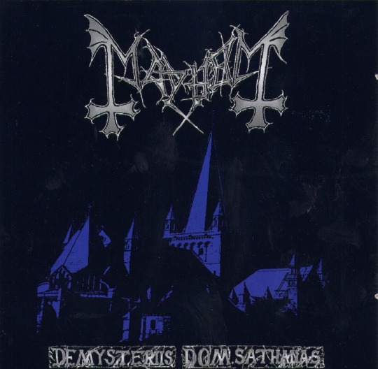
Mayhem - De Mysteriis Dom Sathanas (May 24th, 1994)
Country: Norway
Genre: Black Metal
Reuploaded: FLAC
Lineup:
Euronymous (R.I.P. 1993) - Guitars
Kristian "Varg" Vikernes A.K.A. Count Grishnackh - Bass (Uncredited)
Hellhammer - Drums
Guest/Session:
Attila Csihar - Vocals (Uncredited)
Miscellaneous Staff:
Dead (R.I.P. 1991) - Lyrics (Tracks 1, 2, 4 - 8)
Necrobutcher - Lyrics (Track 3)
Eirik Hundvin - Producing, Mixing
Euronymous - Producing, Mixing
Hellhammer - Producing, Mixing
Snorre Westvold Ruch - Photography
Dye - Cover Design
Label: Indie Recordings
Tracklist:
Funeral Fog - 05:47
Freezing Moon - 06:23
Cursed in Eternity - 05:10
Pagan Fears - 06:20
Life Eternal - 06:57
From the Dark Past - 05:26
Buried by Time and Dust - 03:34
De Mysteriis Dom Sathanas - 06:21
NOTES:
The original Deathlike Silence pressing lacks a barcode and lyrics, its 4-panel booklet simply just contains a fold-out cover with pictures of Hellhammer and Euronymous, credits, copyright and contact info.
Front cover is a drawing of a monochrome photo taken from east side of Nidaros cathedral located in Trondheim, Norway. Colouring of the building on the front cover is blue (according to the book in the 25-year 5-LP box, the 2nd press CD had lyrics but the cover artist got no credits. Starting from the 3rd CD-press onward, the name of the cover artist for lyrics pages only - Jørgen Lid Widing - is written in the booklet in a completely different font - courtesy by Voices of Wonder).
All the CD's contain on the back cover: "A Tribute to Euronymous 15/04/1968 - 10/08/1993" with a promo photo of only Euronymous and Hellhammer. Attila Csihar, Varg Vikernes and Snorre W. Ruch's contributions are not mentioned anywhere. The CD itself features three very dark photos (taken by Snorre) showing the faces of Euronymous and Hellhammer, and a third face which is believed to be Attila (although this has never been confirmed by the band).
The album title "De Mysteriis Dom. Sathanas" was conceived by Euronymous and was intended to be the Latin translation of "Lord Satan's Secret Rites", however the phrase is written in badly translated Latin. The word "Dom." (reference the "." after the word shown on the front cover), is an abbreviation of "Domini" (often used as an honorific prefix for ecclesiastics of the Catholic Church), so the title more-accurately translates to something such as "About/Of Lord Satan's Mysteries". Equally the word "mysterii" is not only textually translatable as "mystery", but also can mean words such as "secret worship/ritual/rite". So, when pluralized as it is in the title, "Mysteriis" can indeed translate to "Secret Rites"; also with the word "Sathanas", is not the correct word for Satan in Latin, the correct word would be "Satanas" (without the 'h') or "diabolus". Moreover, the title-track "De Mysteriis dom Sathanas" contains phrases written in a rough Latin with typos and wrong cases/declensions that can lead to various translations.
Euronymous' murder by Vikernes (who plays bass on the album) occurred right before the initial release of the album. Accordingly, the family of Euronymous requested Hellhammer to remove all of Vikernes' bass tracks. Hellhammer promised that he would replace bass lines with his own, but he didn't know how to play bass, so the album was left with Vikernes' bass lines intact, albeit lowered significantly in the mix compared to the other instruments.
Contrary to popular belief, Snorre did not record guitars on this album, although he and Euronymous often exchanged musical ideas and so Euronymous included several riffs written by him on the record.
The lyrics of "Life Eternal" were originally written by Dead as a gift to Bull Metal, who played in Typhon, Masacre and Neurosis; but nevertheless those lyrics were used in De Mysteriis Dom Sathanas by the band. Also as a posthumous tribute to Dead and Euronymous, Bull Metal used the same lyrics for "Life Eternal" in their 1996 Typhon album Unholy Trilogy, although with different music.
A bootlegged rehearsal of this album called From the Darkest Past was distributed sometime in the early 90's, featuring instrumental tracks recorded on May 16th 1992.
Source: Encyclopaedia Metallum: The Metal Archives
https://www.metal-archives.com/albums/Mayhem/De_Mysteriis_Dom_Sathanas/254
#Hermit's Lair#Human Antithesis#Telegram#Mayhem#Black Metal#Euronymous#Øystein Aarseth#Count Grishnackh#Varg Vikernes#Hellhammer#Jan Axel Blomberg#Eirik Hundvin#Snorre Westvold Ruch#Dye#Necrobutcher#Jørn Stubberud#Norway#Attila Csihar#Hungary#Dead#Per Yngve Ohlin#Sweden#Indie Recordings
4 notes
·
View notes
Text
J-Hope Shares ‘Hope on the Street Vol. 1’ Tracklist Featuring Jung Kook, Nile Rodgers, Huh Yun-jin [Rolling Stone]

The record arrives on March 29 with additional appearances from Benny Blanco, JINBO the SuperFreak, and Gaeko with Yoon Mirae
J-Hope‘s special album, Hope on the Street Vol. 1, features an all-star cast of guest appearances. The musician has shared the official tracklist for the record, out March 29, revealing collaborations with his fellow BTS bandmate Jung Kook, Benny Blanco with Nile Rodgers, Gaeko with Yoon Mirae, Le Sserafim vocalist Huh Yun-Jin, and JINBO the Superfreak.
Hope on the Street Vol. 1 will be released alongside a six-part docuseries titled Hope on the Street, set to premiere on March 27 via Prime Video. According to a press release, the album explores J-Hope’s creative roots as a street dancer. Prior to making his debut with BTS, the musician was a member of the underground dance crew Neuron. His collaboration with Gaeko and Yoon Mirae, “Neuron,” pays homage to that time in his life.
The collaborative nature of the album’s tracklist is reflective of the project’s origins. In the forthcoming series, J-Hope will be seen exploring several cities — including Osaka, Paris, New York, Seoul, and Gwangju — and drawing inspiration from street dancers in these international spaces.
“On the Street” is the only song on Hope on the Street Vol. 1 on which J-Hope performs on his own. It’s a solo version of the J. Cole collaboration he released around this time last year.
“The key motif of the track comes from the word ‘street,’ which can be interpreted as a place where many people’s everyday lives pass by—a metaphor for life,” HYBE shared in a statement at the time. “It comes from ‘street dance,’ the genre that represents J-Hope’s roots as an artist, and it also symbolizes the path that he will continue to take with his fans around the world.”
Hope on the Street Vol. 1 Tracklist
“On the Street” (Solo Verison)
“I Wonder…” (With BTS’ Jung Kook)
“Lock / Unlock” (With Benny Blanco and Nile Rodgers)
“I Don’t Know” (With Le Sserafim’s Huh Yun-Jin)
“What If…” (Dance Mix With JINBO the Superfreak)
“Neuron” (With Gaeko and Yoon Mirae)
Source: Rolling Stone
1 note
·
View note
Text
Suspended Ceramics? (Post crit talk)
As feedback at the crits i was advised of bringing textiles as way of assemblage to my individual pieces in order to think of a final which could be a hung ceramic work. Additionally to this, i was encouraged to look at the prehistoric/primitive era as there is possibility Automatism originated from cave drawings. The link emerged from Abstract Expressionism when Pollock famously described his creative process as a "ritual" with him dancing around the canvas acting as a Shaman.
Primitive Research
For beginning context of the pre-historic times, 50 Art Ideas (Hodge, 2013) was good to start.
Art was the first to exist before writing - was the only way of communication, the earliest art was from the Stone Age (15-10,000 BC)
Cave walls were scratched and painted on with what came to hand in that time, twigs, hands and fingers, fur scraps from animal hunting, rocks and stones, etc. Popular images that emerged were handprints, patterns, animals and scenes of hunting and tribal activity. This art was created mostly for rituals
The primitive peoples made paints and pigments from powder substances - Charcoal and chalks were mixed with animal fats to create paint. This was considered as the first ever oil paint.
The first considered form of pre-historic sculpture was carved rocks and stones, ivory and carved clay. Stones held a high significance of that period as they were thought to be solid vessels holding spirits, memories and healing quality.
Hodge, S. (2013). 50 Art Ideas You Really Need to Know. Quercus.
Lagana's paper Dadaism, Surrealism and the Unconscious (2014) offers connection with primitive era as it may have emerged hidden in sight within Dadaism.
Due to Dadaist practice of acting on instinct and making "anti-art" with what they had around them connects to the efficiency to the pre-historic people. Jean Arp is used as an example with his elementary use and assemblages of cloth, wood and paper.
It is also worth to note that the primitive era was entirely different to todays time - specifically mannerisms and how we conduct ourselves. Back then, there was no repressions of thoughts or feelings with a high freedom to act (uncivilised as it may also be called. As the world evolved, so did rules about social behaviour. This also welcomes in Freuds id, ego and super-ego theory. We are all born with the primitive gene to want to act and do as we please but social conventions has placed preventions on what would be considered as anti-social behaviour"
Surrealism - Joan Miro was fascinated by art made by children as he believed they were made from "innocent freedom" - the connects to the impulses inherited by our primitive ancestors, and also we lose that childhood innocence as we reach adolescence and then adult hood where we know we are expected to behave according to social conventions.
Lagana, L. (2014). Dadaism, Surrealism and the Unconscious. Symposia Melitensia No. 9, University of Malta, ISBN: 1812-7509. [online] Available at: https://www.academia.edu/6926606/Dadaism_Surrealism_and_the_Unconscious [Accessed 12 Dec. 2023].
Louise Bourgeois
The title of the book being called Suspension is what piqued my starting point to look into ways of suspending my ceramic pieces. As a bonus, Bourgeois is a relevant artist to psychoanalysis and the unconscious. and her works are informed by Surrealism.

Lair, 1962, Bronze Painted White
looks very similar to my resin glazed porcelain. except, it looks as if a rod of clay would rise and twist to make a sculptural and formed automatic drawing

Fée Couturière, 1963, Bronze Painted White
More relatable to my porcelain forms. Although i feel this is more freely formed for the recesses to evolve where and when they please. This opens up suggestion or opportunity for something to emerge?
Bourgeois, L. and Pincus-Witten, R. (2014). Louise Bourgeois - Suspension. Milano: Skira.
0 notes
Text
Damien Hirst's "For the Love of God" stands as an icon of opulence and artistic grandeur, shattering records as the most expensive contemporary artwork to date, with a staggering price tag of £15 million. The piece commands attention with its diamond-encrusted platinum skull, adorned with 8,601 crystal-clear diamonds totalling an impressive 1,106.18 carats, including a massive 52.4-carat pink diamond at the forefront. This manifestation of luxury is a testament to Hirst's unapologetic penchant for the extravagant.
Despite Hirst's bold claim of selling the piece for £50 million in 2007, recent revelations suggest that it may have never changed hands. Whether the astronomical price proved impossible, or Hirst intentionally retained a significant share for a planned global tour, "For the Love of God" remains an enigmatic masterpiece, either residing with White Cube or tucked away in undisclosed locations.
The macabre touch that defines the artwork stems from its origin—a real human skull sourced from a taxidermist, cast in platinum, and retaining its original teeth. This infusion of reality into the dazzling spectacle adds a layer of morbidity to an already ostentatious piece, provoking contemplation on the intersection of life and death.
The craftsmanship behind this diamond-encrusted marvel was entrusted to Bentley & Skinner, a royally appointed jeweller renowned for their century-long association with the British royal family. Their expertise seamlessly complements Hirst's vision, creating an artwork fit for a monarch and emphasizing the regal extravagance inherent in the piece.
Inspiration for the artwork can be traced back to Hirst's childhood, where the focal stone on the skull's forehead takes on a powerful, God-like significance reminiscent of Hirst's comic character 'Tharg the Mighty.' This autobiographical element reveals Hirst's aspiration to influence the world through his art, transcending the boundaries between the fantastical and the tangible.
The title, "For the Love of God," adds a touch of humor and irony to the piece, derived from Hirst's mother's exclamation whenever confronted with his "crazy ideas." The stark contrast between the extravagant title and its humble origin introduces a layer of irony, challenging perceptions of high art and adding a touch of humility to the opulent creation.
Hirst's fascination with death, evident throughout his oeuvre, finds inspiration in Aztec mosaic skulls from the British Museum. Drawing from the Día de Los Muertos celebration, Hirst incorporates intricate details reminiscent of these ancient artefacts, connecting the contemporary with the historical and cultural aspects of mortality.
"For the Love of God" serves as the ultimate memento mori, inviting viewers to reflect on mortality. Embracing the inevitability of death, the piece, according to Hirst, exudes a "transcendent feel," using the precious diamonds not only to symbolize mortality but also to mock it—a provocative commentary on the fleeting nature of life and the superficiality of material wealth.
In the realm of contemporary art, this diamond-encrusted skull becomes the pinnacle of commodity fetishism. Hirst's financial success, exemplified by a $201 million auction the year after creating the piece, places material excess and profit at the forefront of his artistic pursuit, reinforcing the intersection of wealth and mortality in this unparalleled artwork.
The meaning of "For the Love of God" is multifaceted. The title carries a double entendre, oscillating between exasperation and spiritual connotations. The valuable materials challenge traditional notions of wealth, engaging with themes of mortality and impermanence. The choice of platinum and diamonds emphasizes the tension between beauty and death, creating a striking visual effect that adds depth to the artwork.
Critically acclaimed yet met with scepticism, "For the Love of God" has ignited debates within the art world. Supporters applaud Hirst for challenging norms and questioning the relationship between art and commerce, while critics accuse him of prioritizing spectacle over genuine artistic expression, labelling the piece as a manifestation of commercialism and ostentation.
In conclusion, Damien Hirst's "For the Love of God" is a monumental work that transcends the boundaries of traditional art, inviting contemplation on mortality, wealth, and the intersection of life and death. Its enigmatic nature, combined with its record-breaking price and controversial reception, solidifies its status as a symbol of contemporary art and the complexities inherent in the pursuit of artistic expression.


Reference list:
Argun, E.A. (2023). 10 Facts About Hirst’s ‘For the Love of God’ | Article. [online] MyArtBroker. Available at: https://www.myartbroker.com/artist-damien-hirst/10-facts/ten-facts-damien-hirst-for-the-love-of-god?showBigButton=1 [Accessed 15 November 2023].
StudyCorgi Free essay (2023). ‘For the Love of God’ Sculpture by Damien Hirst | Free Essay Example. [online] StudyCorgi.com. Available at: https://studycorgi.com/for-the-love-of-god-sculpture-by-damien-hirst/ [Accessed 15 November 2023].
0 notes
Text
198: "Various Artists" // Box
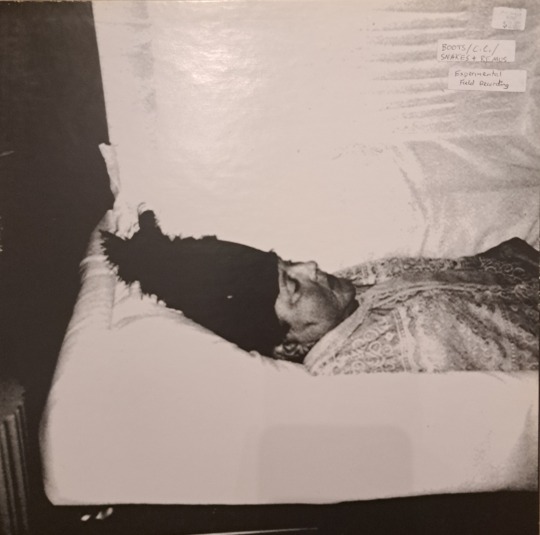
Box
Boots / C.C. / Snake & Remus
2006, HP Cycle
For more than 25 years the gloomy weirdo unknown folk artist who created Box has released his music from behind a veil of secrecy, changing his alias and “record label” with each recording. In 2002, Rojvi (credited to Terry) and Music Performed by the High Mass (credited to Jim Collins) trickled out into the market, distributed without fanfare on the mail order lists of record collectors Paul Major (of Endless Boogie) and Stan Denski; in 2017, a dozen lathe-cut 7” and 12” records appeared in a thrift store, all credited to different artists, each possibly the only one of its kind in existence. His music has tended to be unearthed rather than released, with the exception of 2006’s Box, which collects three LPs originally discovered separately in 2004: Boots (Boots), No Tape Outside (Snake & Remus), and Live at the Rainbows End (C.C.). Box was distributed in an edition of a few hundred by HP Cycle, a Canadian label that, while miniscule, has endured longer than the cicada’s flight enjoyed by each of the artist’s own enterprises. In this sense, it is the closest thing the artist has provided to an intentional entry point to his work—the black peak marking a dark berg beneath the waves.
youtube
Mysteries naturally draw adventurers, and I’m indebted to the Discogs user known as envious for the information above, which I’ve drawn from his blog Rabbit Run Down the Hole of a Skull (which also hosts a near-complete digital archive of the artist’s known music). I think it’s helpful to parrot his research here not only because the story is in itself interesting, but because when I post this it will create another node for other seekers to access the next layer beneath the surface. According to envious, the first of the artist’s known pseudonyms Robyn Nice, and this name has become the catchall his small following uses to refer to him. (envious also occasionally refers to Nice as the Crystal Spider, which yes, instantly made me cum.) It’s thought that in his youth Nice spent time living on an acid-drenched Louisiana artist’s community called the Compound. The Compound was led by Damien Youth, himself a somewhat enigmatic folk musician, until harassment from suspicious local police forced its dissolution. Much of Nice’s work seems to call back to the image of an idyllic community, though its frequently bitter, despairing tone suggests the posture of an Adam mourning in exile—or a Manson in the making. envious’s blog digs much more deeply into the Nice mythos than I can here—one of my dream projects after I finish this year of record reviewing is to listen through Nice’s 15-hour catalogue in its entirety.
Moving on to Box itself, we find three 12” records in plain white sleeves, each hand stamped with a title and alias. All three records have a similar structure: free form, acoustic outsider folk songs on the A sides, lengthy jams or field recordings on the flip.

The individual records are packaged in plain sleeves with labels in blue print, like the original 2004 releases.
On the self-titled Boots record, Nice’s voice hits somewhere between early Peter Gabriel and Dylan, but the lyrics are wacked out ravings. On one track he snarls about “shitcaked corpses” and raped children before proclaiming “I’m a farm” and imitating a braying donkey. On another he bellows at what sounds like the top of his lungs about “compromised smells.” His deft progressive folk-inclined guitar playing tends to follow the emotional arc of his vocals, reserved at the outset, ragged and battered by the end. The B-side (“New Earth”) is roughly five minutes of faux-tribal New Age followed by 13 of minimal synth.
On No Tape Outside by Snake & Remus, the artist sounds somewhat older, which may indicate the albums collected in Box don’t all come from the same period. At any rate, Nice is in a more pensive mood, the trancelike songs expansive and beautifully played on guitar with various minimal piano/synth/percussion accompaniments (suggesting Snake & Remus could be a duo project). In place of Boots’s misanthropic rage, No Tape Outside is shrouded in despair at failing relationships, a fallen world. The B-side is fully instrumental, sharing the autumnal feeling of the vocal tracks but skewing more psychedelic, building through passages of rippling echo to a climax like a dozen clocks having a quiet disagreement over the exact time. Unlike the other records in the set, this record has no track names stamped on the disc’s label, leaving you with few moorings. I recall certain passages of inspired playing, snatches of strange poetry (“voice from across the sea / drips red into me / says my mother was wine”), a general sensation by record’s end of doomed peace.
youtube
The outlier here is C.C’s Live at the Rainbows End, which clearly features a different (considerably more technically proficient) vocalist. Good news, it’s also weird, though it sounds less like it was recorded by the guy on the cover of Aqualung than the others. envious speculates C.C. may be another Compound personality who used the alias Chris Cologne and recorded a CD called Horn for Blackberry, Nice’s early stab at a conventional indie label. C.C. is either a Brit or affecting an accent (I think the latter), and has a gentle, sighing way with his phrasing that suits these hushed ballads in a Nick Drake-ish mode. There is some downright gorgeous fingerstyle acoustic playing on this one and more conventional musical structures, even a few refrains (though no choruses). The guitar could plausibly be played by Nice, though the technique is cleaner and less shamanic than what we hear elsewhere on Box, but even if it isn’t Live at the Rainbows End shares a certain paranoid energy that somehow marks it as a product of the same artistic camp. The B-side offers one more short romantic tune followed by “Paul’s Jennifer is Dead,” a fifteen-minute field recording of a bonfire and distant, indistinct conversation. envious once again offers an astute guess here, suggesting this may reference the nighttime bonfires where members of Youth’s Compound once communed at the end of each day.
Overall, your mileage with Box will vary depending on your yen for the wilfully obscure. My interest in a savage, disoriented record like Boots is ultimately curious (maybe even prurient), in the same way I like to collect strange postings on street poles around my city. No Tape Outside on the other hand is a genuinely entrancing avant-folk record, while Live at the Rainbows End houses a delicate collection of misty-eyed tunes forked by morbid suspicion and trembling yearning. I think both are superb in their own ways. I am haunted by my questions about Box’s provenance, but also by its contents—both of which make for a strong endorsement to new listeners attuned to similar currents in the musical underworld.
198/365
#halloweek#robyn nice#snake & remus#c.c.#boots#avant folk#freak folk#damien youth#the crystal spider#anonymous artist#'00s music#private press#hp cycle#music review#vinyl record
1 note
·
View note
Text
Something i once mentioned in a post about DE's art style and tone is how "nerdy" the game is: Like the pop culture references and whether or not people were turned off by things reminding them of Disney or He-Man, but could've been okay with references to Conan or Spawn even if they weren't original Doom influences like Aliens.
Or the fact that something like killing the Spirit with the Microwave beam is an 80's Ghostbuster reference but you still have an aesthetic with modern trends like the demons' chitin features.
Because certain id titles are "fantasy and sci-fi mix" but they look different and partially because of influences.
That's why Q3 and even Champions are interesting, because they can present a variety of characters from different settings fighting against each other.
Hunter for example is the way she is because she's inspired by Simon Bisley's Full Cirkle, which is also a more obscure reference compared to other stuff that usually influences other id material.
And in a way, this can also lead to why Q3 and QC feel different.
It's the thing with nerds making games where sometimes they wear their influences really hard and we don't always notice because they pick something less convinient, which is a contrast to portrayals of nerds in pop culture being centered around Star Wars and Marvel/DC comics.
I remember someone's tweets being "the reason why Halo/WoW aren't what they used to be is because the original devs were inspired by Aliens/Akira/Warhammer/old novels/etc and the new ones are from people that grew up with the MCU".
I always thought the word "uninspired" was a weird way to describe something since technically "anything is inspired by something else, right?".
Then i realized: You look at certain popular games and their influences are either obvious or at least specific as if the developers had ideas of what they wanted to be influenced by.
Like things they liked and wanted to put in a game because they choose to do so.
That's probably why some people think stuff already looked AI generated before AI art was a thing: There's this idea that a lot of game concept art either has the same basic influences or just subscribes to vague ideas of "sci-fi and fantasy", which is why certain trends persist.
And with game studios being bigger, you may have a clash between a director with a clear vision and an artist who draws things as according to a certain standard that doesn't come off as specific.
DE still has memorable designs but i can see why people think it's weird that a game that tries to pride itself with 80's and 90's references still has modern looking elements.
And in a post of mine about classic Doom's art style, a recent edit mentions a lesser known movie somehow influencing the Cyberdemon's face.
#quake#quake 3 arena#id software#art style#opinions#trivia#flawed analysis#analysis#doom#doom eternal
1 note
·
View note
Text
TASK 3: Site and Artwork Digital Visualisation
HINT: This physical artwork was done on 7th, August 2023
Title of this digital artwork: "Cozy group life",2023.
Sources: the site was taken by smartphone on 5th, August,2023. Post-image editing tool: Photoshop

The image of proposed site development .(shot on 5th, August 2023)

Final visualization of digital work. (created on 7th, August 2023)
reflection:
This image was created by combining two digital photos of different sites taken by a smartphone. It is the result of creating a three-dimensional perspective within a two-dimensional space to emphasize the illusion of dynamic space and the real world. The work aims to create the illusion of three-dimensional space through the parallelism of lines, the balance of planes and the placement of volumes.
From the beginning, I wanted to create a visual and living work of art. Due to the fact that people live in detached houses with gardens and garages, and due to technological advances, they are able to know almost everything about the world by smartphone without having to leave their homes, so they rarely have the opportunity to go out and share their daily lives with their neighbours. Therefore, the idea of creating a bench where people can talk to each other during their rest time (e.g., after work, in the evening) was my original intention. For this reason, I chose to work with everyday objects such as houses and plants. The main equipment for post-editing is KG's desktop and laptop computers.
I composited them into my site by separating layers and masks to create an imaginary site-specific space. Then, using the object selection tool, I selected the houses, green benches, trees, etc. from one of the images and placed them all in the other reserved site image. And according to the actual need to adjust their positions to fit the size of the site (in which the middle of the house is placed parallel to the poles); and then use the blur tool to highlight the placement of the main body; and then use the shadow tool to make the house become more three-dimensional; at the same time, the greenery on the bench behind to increase the creativity (to purify the lower part of the overall picture sense).
The artwork conveys a bright and cozy atmosphere of life. The idea of this spatial artwork is to arrange the houses sequentially on the site in a neighbourhood. Since the objects are placed on a flat surface, the forces of gravity are reciprocal. Therefore, the ground can bear the weight of the houses. At the same time, since the site is flat, the project is easy to manufacture and install. In real life, all that is needed is a modest amount of excavation and earth filling, and then the finished site is decorated with greenery and benches, thus corresponding to the concept of the work.
Thoughts after creating: Technically, the three-dimensionality of the work is achieved only by shading, which gives a single image. It is possible to emphasize the compactness of the site of the object by marking the outer contours of the house with the shading tool and by increasing the colour contrast. It still has potential for improvement.
Two related artists's work:
Edvard Munch: "White Night",1901
In this artwork, Edvard Munch highlighted particular themes and focal points through the use of space. To draw the viewer's eye and provide a sense of rhythm, he exploited space in his paintings.
The house stands out and draws attention to itself in this image, while the crowded and overlapping trees that surround it give the impression that the house is hidden from view. Munch allows greater room between the distant elements in his painting of the desolate land in contrast to this. This gives the observer a sense of the size of the countryside, the house's solitude, and the separation of the known from the unknown.
2. Paul Klee: "Separation in the Evening",1922
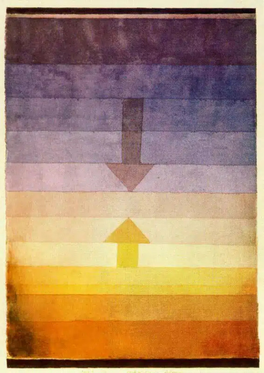
For this artwork, The use of lines and the contrast of dark colours on the sides and lightness in the middle (deep space) and luminosity creates the appearance of three-dimensional space. Opposite arrows and contrasting dark colours on both sides show the depth of the space. It creates a sense of urgency from oppression to relaxation. Paul succeeded in creating a three-dimensional perspective of stereo.
0 notes
Text
Phantom Rose II Sapphire launches October 30
Gematsu Source

Roguelike deckbuilding strategy game Phantom Rose II Sapphire will launch for PC via Steam on October 30, publisher PLAYISM and developer makaroll announced. It will support English, Japanese, Korean, Simplified Chinese, and Traditional Chinese language options.
Get the latest details below.
About
Phantom Rose II Sapphire is the long-awaited sequel to the popular Phantom Rose Scarlet. Just like its predecessor, Phantom Rose II Sapphire adopts the unique draw-less card mechanic and instead relies on careful management of your deck’s cooldown in battle.
Take on the role of Aria, our new protagonist, and help her escape the phantom-infested Marion Magic Academy while trying to regain her lost memories.
Two Classes, Each with Unique Properties
In Phantom Rose II Sapphire, players get to choose between the Blade Class and the all-new Mage Class. The Blade Class offers a more straightforward gameplay, while the Mage Class introduces an added mechanic called “Arcana” for an added layer of strategic gameplay.
“Arcana” is a resource specific to the Mage Class that reduces as you play attack cards and replenishes when you play certain cards. Playing this class requires you to outmaneuver your opponent while maintaining a balance between offense and defense.
With each class also coming with its own unique set of cards, adapt your strategy according to your chosen class and deck for each playthrough.
Key Features
Build and manage your own deck through battle without relying on the luck of the draw.
Two playable classes (Blade and Mage), each with their own unique sets of cards and mechanics.
Multiple modes: Adventure, Arcade, Custom.
Meet a cast of unique characters with different interaction options.
Bigger story with multiple endings to unlock.
Over 200 cards to collect.
Beautiful hand-drawn art by the developer himself.
Character Introdution
Aria – Protagonist of Phantom Rose II Sapphire and student of the prestigious Marion Magic Academy. Wakes up without any of her previous memories in a classroom with the academy in a Phantom-infested state.
Sylphy – A mysterious cat that joins Aria throughout her journey to escape the Phantom-infested academy, Sylphy comes across as a hothead on the surface, but is very caring on the inside.
??? – A lady shrouded in mystery that keeps her cards close to her chest and answers questions by not answering them.
Message from the Developer
Hello, I’m makaroll, the developer and artist of Phantom Rose II Sapphire. My aim is to create an attractive single-player game that caters to both the fans of the previous title and newcomers trying it for the first time. With an improved gameplay content and an expanded storyline centered around the new protagonist Aria, I sincerely hope the game can become an endearing title in your game collection. Whether you’re a seasoned veteran or a fresh enthusiast of the roguelike deckbuilding genre, please look forward to a new adventure. Thank you.
Play the Demo at PAX West 2023
For the first time in four years, PLAYISM will be having its very own booth at PAX West from September 1~4! Furthermore, we will be showcasing the first ever playable demo of Phantom Rose II Sapphire. Come visit the PLAYISM booth at the Seattle Convention Center (#1617, Summit Building Exhibit Hall) to be one of the first lucky ones to enjoy a hands-on experience of Phantom Rose II Sapphire. Those who come play the demo will also receive an original double-sided keychain for free!
Watch a new trailer below. View a new set of screenshots at the gallery.
Releae Date Trailer
youtube
#Phantom Rose II Sapphire#Phantom Rose II#Phantom Rose Scarlet#Phantom Rose#Deck Building Game#Playism#mackaroll#Gematsu
1 note
·
View note
Link
0 notes
Text
The Liamasterink (and friends) Fact Check
In this current year era of woke leftist mainstream media, fact-checking has become a way for people of influence to combat misinformation or cover up their lies. This post is one of those, albeit given how Sea Princesses is a niche series, fact checking things about this series isn't as controversial compared to broader subjects.
Liamasterink has recently taken to posting Sea Princesses theories to his YouTube Community page, which I practically follow daily. I noticed he's been saying some things that are not quite accurate, and rather than fact-check him in the comments (because his fans predominantly speak Spanish, the names on my YouTube accounts don't match my online identity and Liam makes so many Community posts that I can't scroll any further than a month ago for some reason), I'll be fact-checking him through posts like this on Tumblr.
How I trolled the Sea Princesses renaissance
This one's more recent than the topics I'll be covering after this, but I just had to share this first.
In my reviews of the second and third Combo Rangers reboot graphic novels, there is a storyline skit at the beginning and end of each of them titled The Interdimensional Café, and one of the plot points involved Hiroki, Sougo and Polvina fighting Polvina clones in my universe. Out of the clones are five distinct types; two of them are the regular Polvina from the animated series and the books, while the other three are the sexy variant, the zombie variant and the Lula/Bernie Sanders/Daniel Andrews variant.


Presumably from a fan finding these and sending them to him, Liam has posted the sexy and zombie Polvina variants as community posts and I have to say, it was amusing to read the reactions from his fans, ranging from "Oh no, what did they do to you?" to "How disturbing". It's honestly telling that people were actually commenting that the artist who drew the sexy Polvina was "sick" for drawing such fanart of a 7 year old girl. God, you're all a bunch of fucking prudes. It's clear that media like the movie Cuties has radicalised people against the sexualisation of children, but this is a drawing we are talking about and I think people are overreacting about this because no real children have been harmed (directly) because of a raunchy drawing of a fictional character. But whatever on that point, because I'll bet you'll shit bricks when I tell you who really drew those variants.
So, the artist who really drew those Polvina variants was, in fact, Fabio Yabu himself, and they were originally posted on his blog. Now, he doesn't really talk about Sea Princesses on it so there's not much about it in the archives, but Yabu did post the Polvina variants, which are luckily archived:
Sexyna
Zombina
Lulina
Of note, "Sexyna"'s head design ended up being used in The Makeover as a rather decent design and the point where Ester and Tubarina should have stopped, something which a commenter pointed out (well, the opposite, anyway, that it was inspired from there) and I acknowledged in the storyline skit.

Well then, feel stupid yet?
The cancellation blame game

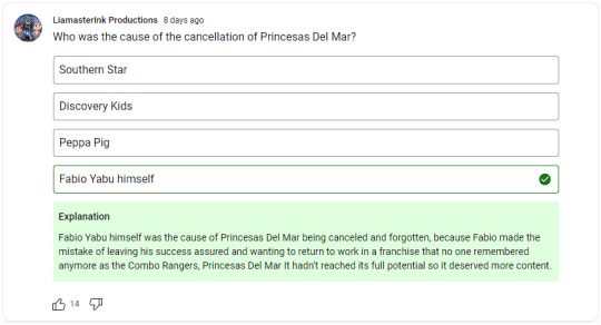
On 25 April, Liam posted a poll asking his fans who was the main cause of Sea Princesses being cancelled. It was a question with an answer rather than a survey and the answer was "Fabio Yabu himself".
I'm going to tell you all what I told Liam on Discord about this because he brought it up to me in DMs, but there's a little extra commentary here. OK, so to be honest, the exact circumstances of the series' cancellation are unclear, but we do know that according to Flamma, there was no interest in producing a third series. I know I said on the wiki that "Flamma had no interest in producing a third series", making it sound like it was Flamma's decision, but again, the exact circumstances are unclear.
In the answer explanation, Liam claimed that Fabio Yabu "returned to work in a franchise that no one remembered anymore as the Combo Rangers" (machine translated). Firstly, production on the series concluded in 2009, not 2013, and secondly, I resent that statement as a tokusatsu fan (and as someone who just reviewed the other two Combo Rangers reboot graphic novels) because Liam underestimated how much of a phenomenon Combo Rangers was in Brazil and the background as to why it was loved by 80's and 90's kids back in the day.
Yes, I agree that the people who made the animated series didn't tap into the full potential that Sea Princesses had. Issues with the writing and character focuses aside, there are also financial circumstances to note here. The first season (I believe) had a budget of US$7 million (in 2005 money, which would be over US$10 million in current year). Animation costs are measured per half hour (which is actually 23 to 26 minutes discounting ad breaks) and the average cost for half an hour of animation is US$200,000 (according to Reynaldo Marchezini of Flamma Films in 2009), not to mention the global financial crisis that happened during the time when the second season would be in production. Also keep in mind that Sea Princesses was produced during a time when Brazilian-made animations were relatively unknown to the world (this one isn't exactly Brazilian-made entirely, but still), so if Southern Star hadn't gotten involved (out of the three or four companies that showed interest in a co-production), the animated series wouldn't have been made in the first place, let alone distributed to over 100 countries.
Also, in my correspondence with Fabio Yabu, he has said that being an artist in Brazil isn't as easy as it is in the West and so, he has to take on various projects and appeal to various audiences in order to make a living, so I think Liam was being really unfair to him here. Sure, I'd like to see more Sea Princesses content from him and I wish he did more to preserve its content on social media, but in the end, you can't really blame him because this is clearly something he has a passion for and loves to do. Plus, the guy's gotta make a living somehow.
In summary, Fabio Yabu may not be entirely to blame for Sea Princesses not receiving a third season and there were potentially other factors that all parties involved had to consider.
Errors in production
The next thing I want to talk about is another Community post where Liam speculates why there were production errors in Sea Princesses and basically, he gets a lot of things wrong because he got a fundamental thing wrong about animation production. I won't attach the whole post as an image, but if the post disappears at some point, then I've backed it up into my cloud drive folder and will make it available to anyone who's interested, though I'll try to summarise it here.
The fundamental thing of producing animated series is that the audio comes first before the animation. Southern Star, as executive producers, handled the creation of the scripts, storyboards and audio, Flamma handled the character design and approval of the scripts, then Neptuno Films handled all the animation and post-production.
Errors in production are always going to happen. In regards to the animation, mistakes like a character saying a line with somebody else's voice would probably come down to someone misinterpreting something in the script and the mistake not being caught until it was too late to change anything else in time. In The Return, Elektra mistaking Leia for Isa was most likely a script misinterpretation on Neptuno's end and not the fault of her voice actress, Meaghan Davies (also "star talent didn't have much experience" my ass, that's an oxymoron in itself plus I wouldn't expect her to be a "star talent" given her previous experience).
I can't apply this to the rest of the series, but from what little I could discern while watching Lost in both the Brazilian Portuguese and Latin American Spanish dubs, they fixed the mistakes the English dub made; I know this for certain with the Castilian Spanish dub. Dubbing usually takes place after the episode has finished production and a separate script needs to be made to have the dubbed voice lines fit the length of the original voice line (mouth movements are where people really need to stop caring so much imo). Liam blames the director of the Latin American Spanish dub, Hector Moncada, for making the dub "mediocre" with all the mistakes from the finished original episode ported to the dub; yet again, I can't say for certain with the rest of the series, but I don't think he is to blame for the mistakes that the English dub made if he wasn't warned about them. That being said, if Moncada was warned about the mistakes in the original version and he actually managed to make the same mistakes in the Latin American Spanish dub, then he's a fucking idiot.
With regards to recycling voice actors and actresses, that's not really a surprise considering that the same thing happened in the original English dub, though I haven't been able to exactly pinpoint who voiced who with references to back it up. Voice actors voicing multiple characters (or characters being voiced by different voice actors between appearances or seasons) is not a new thing and it isn't surprising that it happened here considering how little focus most characters got (or actor availability).
Moving back to the animation and Liam points out the clone issue that I've pointed out in like three episodes on the wiki. Stage Fright, The Carnival and Lunch Power were what I believe to be cases of Neptuno using up all the character models they had, resulting in them cloning models for filler, even in places where it was illogical for certain characters to be there, while in Tubarina Almighty (among other potential cases), there were clones of Jessi and Leia that could have been prevented if they just used different models instead of the same few that the production team thought kids would recognise. I would have liked to see more character models featured, but there is only so much you can do with a USD$7 million budget.
Liam also points out the Combo Rangers (or Madruga and Barriga from El Chavo del Ocho) being adapted into Drylanders and how they were recycled between episodes featuring Drylanders. He also seems to point out the appearance of Bonnie as a Drylander near the end of The Rescue as illogical, but I think he neglected to note that Fabio Yabu originally designed Bonnie as part of a generic elderly couple, the male model never making it into the series.
And obviously, there was the cuts in the Discovery Kids versions which I've pointed out so many times before. I finally decided to start documenting those cuts last month after giving up once and wondering whether I should actually do it or not, and let me tell you, it's just as much a drag as I thought it would be. It took some time for me to figure out how I would do it, but I managed to figure it out. Details of the cuts will be put onto the wiki eventually and I'll also do a top 10 list of the worst cut episodes in the series.
Basically, the animation errors were something that was always going to happen, the clones could have been resolved in some cases by using different character models and the dubbing errors were something that Liam got wrong from the start because the audio is recorded before the animation is drawn and the international dubs are recorded after the original episode has finished production.
I want to share this funny minicomic that Liam made about the clone situation and I hope those scientists are Salacian because that's important for my upcoming story. No, I'm not talking about the Polvina clones from The Interdimensional Café, but they are still relevant.
Scientist 1: Sir, the clones have escaped again.
Scientist 2: Oh my. I hope those clones don't go into Salacia.
Polvina: So girls, what're we doing today?
Tubarina: We can play with Delfi at her palace.
Ester: Isn't she hanging out at the park?
(the joke here is that Delfi seems to be both at her palace and the park, meaning that at least one of them is a clone)
I might as well have created (the sequels to) Sea Princesses
On Twitter, there's a guy by the name of Ricardo Mita claiming himself to be a co-creator of the series on Fabio Yabu's Twitter feed. I wasn't going to call him out because his antics were boring, but I decided to speak up about this when he spammed similar comments onto one of Liam's YouTube Community posts, which led him to believe the same thing as well.
I don't need to tell you how much of an idiot Ricardo is because anyone else who believes his lies is just as much of an idiot as he is. I also don't need to tell you that the best source of information for Sea Princesses is the Sea Princesses Wiki (for character, episode and book information) or this Tumblr (for that and pretty much everything else).
Look, I can see that Ricardo's got his own takes and ideas on the series, expanding some episodes into two-parters and even having an episode list for a potential third series, but with no synopses (don't worry, I used to make episode lists without writing synopses as well). By his logic I might as well be a co-creator of the series as well with all the work I've put into it for the renaissance and my personal project. I hope Ricardo finds the strength one day to channel his energy into fleshing out his ideas and even writing out his story synopses in (neatly formatted) social media posts.
My Seafood Princesses
An amusing piece of news to round off this post. In the commune of Renca in Santiago, Chile, there is a fish shop called Pescaderia Mis Princesas Del Mar, or in my translation, My Sea Princesses Seafood or My Seafood Princesses. Considering how we see the Shark Royal Family eating fish in Big Brother, Grow Up and The True Princess, this is both amusing and harrowing.

The shopfront sign, which has been on the shop since it opened sometime between 2012 and 2014, also has images of the main three girls, including a duplicate Polvina with her book design on a seahorse. The sign has been updated between 2015 and 2022 and while it retains the Sea Princesses-style logo on the shopfront sign, the images of the main three girls seem to be no more.

Anyway, that's it for this fact-checking post. I'll do another one when Liam gets some things wrong again.
0 notes
Last Seen Blogs

styling-sl-blog
Styling Sl

sp4ce-f4iry-face
This is what i (unfortunatly) look like

quinlanlawgroupllc-blog
Quinlan Law Group, LLC
mxdesta-blog
Once Pure

maandrz
How Lovely