#And I have fun redesigning their fits
Text
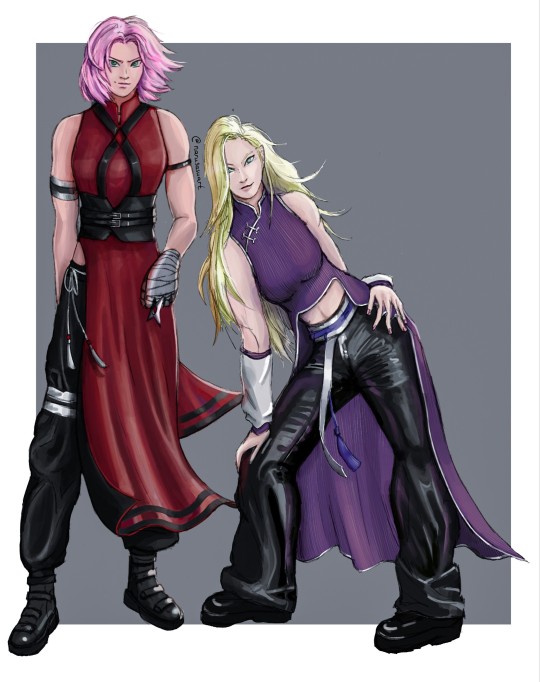
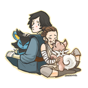
Have some badass ninja chicks.

And the flat version cause I like it, too.
#Look!#I drew women#Haven't been doing that a lot what with all the narusasu#I think the women in Naruto were done dirty#But I can appreciate a good aesthetic#And I have fun redesigning their fits#Sakura is still a ninja#The straps on her chest are supposed to parallel the seal on her forehead#Ino is just a fashion girlie#But I think she'd dig the pants I dunno#Anyways#my art#naruto#ino yamanaka#sakura#sakura haruno#haruno sakura#yamanaka ino#i don't go here#But#inosaku#Naruto fanart#I think I'm gonna do another part just fyi#Ino
144 notes
·
View notes
Text
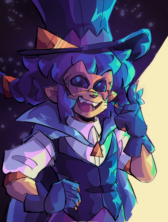
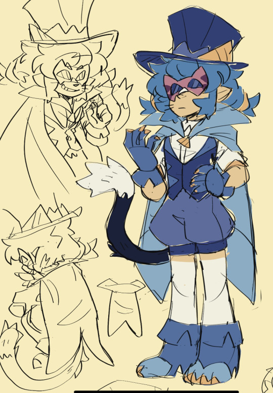

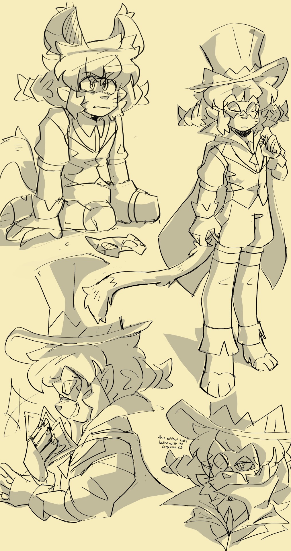
tried redesigning blue cat!
i really like the og design, i just wanted to see if i could flare it up a bit.
#its not perfect. but if i waited to post till it was it'd never see the light of day <3#precure#star twinkle precure#pretty cure#yuni#blue cat#i really like 80's anime phantom thieves. which blue cat is clearly inspired by. both in design and her instrumental themes in the ost#so i thought id be fun to lean a little bit more into that.#i kinda wanted to see if i could design it in a way that fits the precure style but. nah this would not fit in show lol. so just for fun <3#i think the hardest part was shorts area. i really like the silhouette the skirt gives her but it doesn't really fit the vibe im going for#so i thought puffy shorts would fit her since its kinda what shes got going on in her true form fit. idk#it might be something to revisit. at least mao would still have a skirt so it justifies cosmo having one#i also wanna try and redesign her civilian form but. we will se :]#PC
102 notes
·
View notes
Text

Doomed by the narrative 💔
#h2o just add water#h2o jaw#h2o#fanart#doodle#cleo sertori#charlotte watsford#calamity au#(if you squint)#their relationship is going to be *oh so* important for what i have planned#had a lot of fun with this one!#definitely experimented with color and shading style#i think the result turned out nice enough#also forgot the plaid pattern i typically give to cleo's outfit WHOOPS#eh i might redesign it#the plaid doesn't really fit her aesthetic much anyways
20 notes
·
View notes
Text
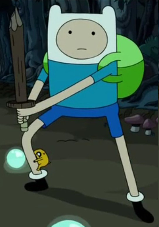
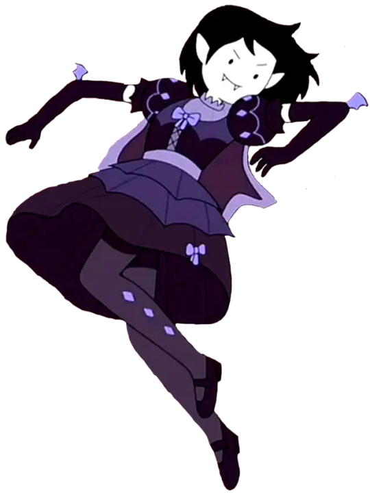
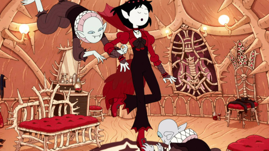
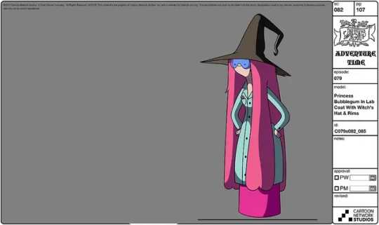
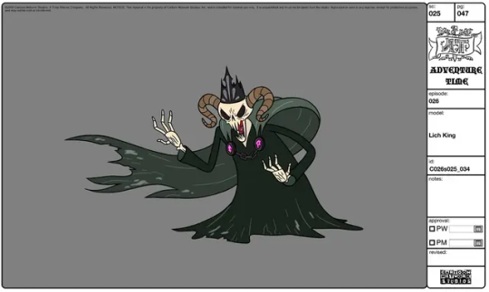
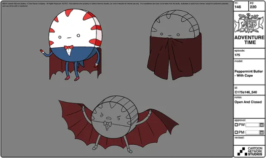
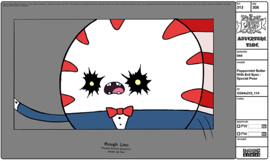
What We Do in the Land of Ooo
🧛♂️ What We Do in the Shadows x Adventure Time crossover AU! ⚔
Finn Mertens in place of Guillermo de la Cruz
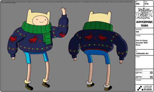
Marceline Abadeer in place of Nadja of Antipaxos
Bonnibel Bubblegum in place of Laszlo Cravensworth
Jake the dog in place of Colin Robinson
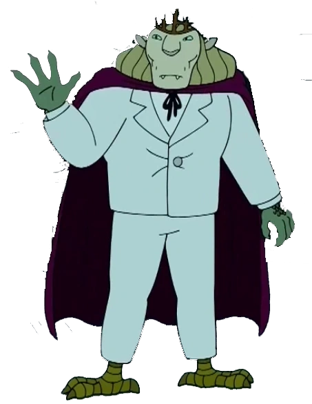
Vampire King in place of Nandor The Relentless
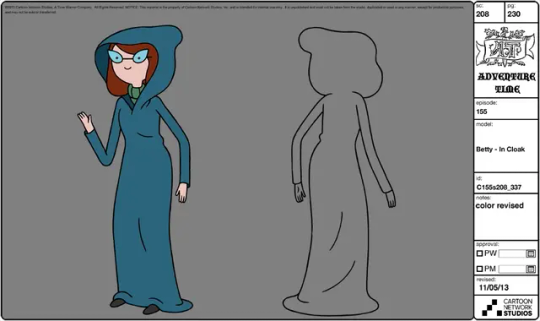
Betty Grof in place of The Guide
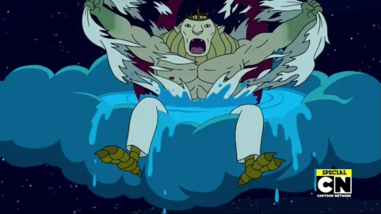
The Lich in place of Baron Afanas
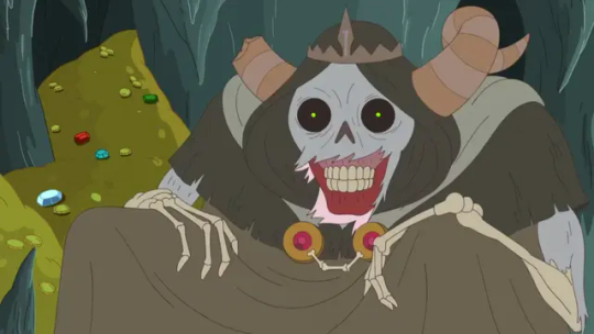
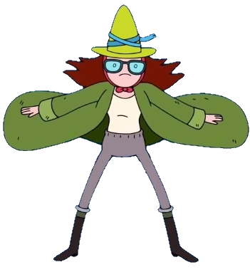
Peppermint Butler in place of Wallace the Necromacer
Simon Petrikov in place of Derek
BMO in place of Nadja Doll (her old consciousness uploaded or something was an idea I had)
Marshall Lee & Gary Gumball/Prince in place of Sean & Charmaine
#I want to clarify that I don't have any plans to write this out as some sort of fanfic.#I also don't have any plans to draw actual redesigns for any of these characters.#this is all an indefinite WIP; anyone who wants to make content about the idea please tag me please I'd to see it!#also want to mention that this was somewhat inspired by recent fionna and cake content!#I suppose this AU could take place in the land of Ooo or it could take place on staten island but I was thinking land of Ooo#up to yall though if you wanna sketch any ideas from this lol#I was just trying to find images that somewhat fit the character they're in place of if you're curious as to why I chose the images I did!#also this isn't going with the nandermo stuff to clarify before people are like hey this is gross; no read the tags first; read my rambles!#these aren't 1-to-1 character crossovers; obviously I'd want to take some liberties with each of them if I were to put more effort into it!#vampire bonnie bubblegum would be cool to see! it doesn't need to make sense; we're having fun with it here! Vampire Betty Grof too!#Finn could also be an adult here if y'all want; I wasn't thinking too hard about this; just popped into my head & wanted to jot stuff down!#I'd also be curious to hear what adventure time characters you'd put in the roles of the wwdits ones; replacing mine or ones#that i didn't end up listing! I'd love to see a vampire Simon Petrikov & Finn Mertens though if anyone wants to draw that. anyway thats it!#mine#op#wwdits#what we do in the shadows#adventure time#adventure time fionna and cake#fionna and cake#adventure time spoilers
49 notes
·
View notes
Text
Becky Botsford jr high version is such a coin toss because I could totally see her leaning HEARD into academics and wanting to be taken seriously.........but you also cannot tell me she isn't wearing an alicorn onesie to sleep each night.
#She would havesuch a fun free cringeful jr high phase but also I think she represses her interests too much to indulge.#Violet? She's not repressing shit. Becky? Her whole existence is repression.#I think I'm gonna go with my original Becky idea and then do a little Wordgirl costume redesign.#To add some like Pegasus wings. And Bob manages to convince her NOT to add a unicorn horn to her costume.#You get what I mean Wordgirl fandom?#I have a few bonus drawings planned for when I post the 8th grade Becky drawings.#Because I have so many thoughts.#And I think they'll be actual drawings and not the edit drawings I've been doing.#The main one will be to fit with the others.#I think Huggy would bemoan the wings addition of the costume at first but then realize it gives him more room to sit while flying.#I mean. A secret identity is such a perfect thing for Becky wihle she's growing up.#She is such a high strung girl and I think that'll get worse before it gets better. Wordgirl could be her outlet for being cringe.#And no one but her closest friends and family know it's her. And her friends and family all know she's got a loving for ponies & princesses#OKAY!#Wordgirl#Becky Botsford#Sentiments of a vampire.
10 notes
·
View notes
Text
Taking a moment from the strike to say I'm changing the pinned post back to the Francine comic in light of recent issues with an apparent increase in transphobia. This is your reminder that this blog loves and supports transfolk of all kinds and any transphobes here can get fucking lost.
#fuck you guys making it unsafe for my sisters to live their lives.#and yeah I don't normally refer to groups of people as sisters or brothers or whatever but this is personal.#I will put francine back to her rightful place at the top of my blog#she doesn't really fit what I post about at all but I don't care. she can weed out the assholes for me#I may redesign her and put her in some more recent things for fun it's a real shame I lost interest in her#this has all reminded me I need to get back in touch with my oldest sister it's been too long#pop rox talks#sorry this blog has gotten pretty serious over the strike days but I have some more positives coming for whan it's over#I just can't stay silent on these things ya know?#anyway. I'm going back on strike I'll be back when it's over#just wanted to remind people of my stance on this stuff#I won't be talking on the whole situation because I don't really know the full details and don't want to bring that discussion here#just in case you were wondering#my stance is clear. that's all there is to it. I'll see you guys after the strike!#bubye!!! c'ya!!! stay safe!!!
6 notes
·
View notes
Text
style experimentation ft. akari! i really loved playing as her!
#i’m fairly certain this is the first time i’ve ever attempted a lineless style before it was pretty fun#i mean i was also attempting to do chibi style but idk if that worked very well with the way i do faces and specifically eyes lol#even so i think i like how this turned out!#akari#pokémon akari#pla akari#pokémon legends arceus#legends arceus#pla#my art#i have grown very attached to my own version of her character so it’s weird to draw her canon design lol#maybe i shall draw my pokésona girl sometime…#she’s less like an oc and more like an in-universe redesign of akari herself ig? same hair and eye color just with a new hairstyle and fit
83 notes
·
View notes
Text
Y'all remember how I said before that since I can't draw you'll just have to imagine what my oc looks like. Well now actually you'll have to imagine a little bit longer cuz This Ain't It™!
(mfer gon' close her damn eyes when I'm taking a picture JAMSJDLSJSIS but you know what it fits. Good for them 💖)
So THIS is Holly Steelcry and my excuse for them looking Like That is that I haven't truly played the game and gotten new gear since Mirage came out (and this was before I really developed her as an OC rather than just an empty husk) so her appearance is pm outdated. Still that's like the general.... GIST of what they look like, I'm keeping the giant ass purple lightning sword and the glasses, I'm probably just gonna change everything else about em (and also removing her obnoxious ass Storm face stickers JAKAJSJD)
Although I think I got the hairstyle figured out, she probably looks more like This in my head than any other existing hairstyle in the game

#ignore the blaring Storm school pride they got goin on there. i was 15#YELLOW AND PURPLE FUCK TOGETHER THOUGH im def keeping some semblence of that color scheme in her redesign#i also wanna make her look a bit more.... scruffy/scrappy. like she just came out of a narrow dirt tunnel#fits their personality of barely restrained mad scientist who drinks moonshine then lights their mouth on fire for fun#MAN I WISH I COULD DRAW. i mean im taking an art class now but. gotta practice dat shit. and i aint :')#i havw this crack headcanon that their voice sounds exactly lie John Mulaney#a girly pop and also a fella who says ''there's a horse....... LOOSE in the spiral. a HORSE#im also thinking maybe changing her hair color. maybe like the same electric copperish color their eyes are#they also have a gap in their teeth because thats so fucking cute to me#(me looking up lightning strike scars for reference)#wizard101#w101#wiz101#holly steelcry#oc stuff
9 notes
·
View notes
Text
i'm going to be real thinking about the fursonas of slash assigning an anthro design to a character is really really fun and if ur interested in character design/visdev and working with shape language i highly recommend it. esp cartoon/already stylised art / translating it into your "style" it's really fun matching features and such to the established design and is a good way to flex the muscle of translating things into how YOU would design this character as well as the design muscle in general etc... (without being weird of course sometimes people are weird for sure). it's also a fun exercise to do for non cartoon/fanart things ofc and makes me feel like you know when people look like their pets. turns you into an animal. anyway it's fun recommend
#🐾#turns you into an animal what are you odokawa ❓❗️#i love reimagining type character design in specifically fanart and i think a lot of other people do tooo#but i do this with ocs too irs really fun. Draws you as a doggy#u can also do whatever u want forever like i YEARS ago workshopped mob anthro o okemon fursonas#with roscoe and finn. i think. but it's just fun ...#anyway i think well other factors apply too but i think this style of thinking is also why ppl enjoy genderbends being accurate#and redesigning classic characters and stuff. it's just fun to build off what u have and reimagine it in a cool way#and take into account the different factors and stuff to develop them properly and still be recognisable#how different can you make a character until they're unrecognisable and if they are unrecognisable would it still be ''in character''#and fitting ... plus the fresh take aspect of adding ur own spin to things and stuff
3 notes
·
View notes
Text
wind waker link redesign!

[ID: character reference sheet for a redesign of wind waker link, nicknamed waker (he/him). waker has warm, light skin tone with freckles and green eyes. his long blond hair is braided. there is a burn up his left arm and left side of his neck and palm of his right hand. he has several sailor tattoos: a sailor’s cross on the upper chest, a nautical star on the right forearm, rope on the left wrist, a seagull on the lower left arm, a cucco on the right foot and a pig on the left foot. there is a lineup of the three layers to the outfit design. the underwear layer is short, puffy, white cotton drawers and undershirt with dark beige stays. the base clothing layer is a roomy, beige pirate shirt with red ties, pants made from his sister’s old poppy dress, leather boots and suspenders and the iconic belt from the hero clothes. the final layer has the addition of a vest and headband made from his grandmother’s purple waist band, tetra’s red neckerchief and a pirate charm hanging from his belt. additional information included on the sheet are: waker is 17, 5’3” and has an east coast canadian accent, waker is a descendant of four swords link and ancestor of spirit tracks zelda, and he is dating pirate captain tetra. on the right side of the page is a colour palette, a trans flag and a heterosexual flag. end ID]
fun bonus info:
waker and tetra will be t4t
i took some inspiration from mary read and anne bonny, two famous women pirates that posed as men for much of their lives to avoid persecution. transgender wasn't a term around until two centuries after the golden age of piracy but there is a strong history of pirates being gender nonconforming, as demonstrated with mary and anne. i wanted to take that small piece of history and include it in waker and tetra. at its core (and ignoring the bad stuff), being a pirate is all about camaraderie and being proud that you are outcasts together. with those beliefs, i felt it was more well-suited that waker and tetra feel comfortable and supported in the bodies they already exist in and don't see the need to change and conform to any gender binary. i also thought it would be nice trans rep for those that don’t seek out gender affirming surgery👍
info on visible sailor tattoos: the cucco and pig are representative of rooster and pig tattoos sailors would put on their feet as good luck to find shore, should they go overboard. if a ship were to go down, crates of pigs and roosters would still float ashore because a wooden box is like a small boat :). the seagull tattoo is actually sparrows irl. each sparrow represents every 5000 nautical miles you sail. tetra has several more than waker obvi. a nautical star or compass rose tattoo is good luck to never get lost at sea. rope on the wrist represents his past job as a deckhand. the sailor’s cross is dedicated to a lover, which is tetra in this case.
info on non-visible tattoos which i couldn't add because they were too detailed: another use of sparrows in tattoos, is a sparrow with a dagger dedicated to someone you have lost. he has that as a tattoo for the king of red lions. it would be located on the back side of the same arm. the knuckles have "HOLD FAST" spelled out as a reminder to always have a tight grip on the rigging. on the webbing of his right hand, there is a crossed anchor tattoo showing his current status as a boatswain. a boatswain is like a manager of the ship but still under the captain in the hierarchy.
future tattoo: this one is funny but it is common for sailors to get tattoos of twin propellers on their ass cheeks. if you were to go overboard, they were said to be good luck for you to find shore quickly. waker does not have this tattoo yet but he thinks they are funny and really wants them because propellers make him think of linebeck's ship.
#birdmom doodles#wind waker#wind waker link#wind waker link redesign#ww link#ww link redesign#phantom hourglass#wind waker fanart#loz fanart#loz#legend of zelda#zelda au#loz au#birdmom's loz au#ref sheet#i don’t really have an au for this yet but i do love redesigning links and zeldas#he has more tattoos but i couldn’t really fit all those tiny details in#lots of fun pirate and sailor research under the cut#this took me too long
17 notes
·
View notes
Text
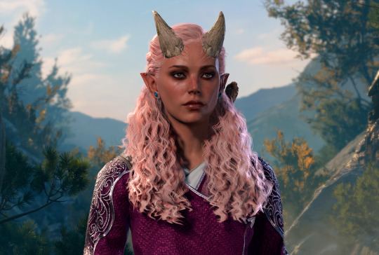
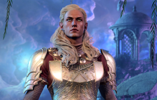
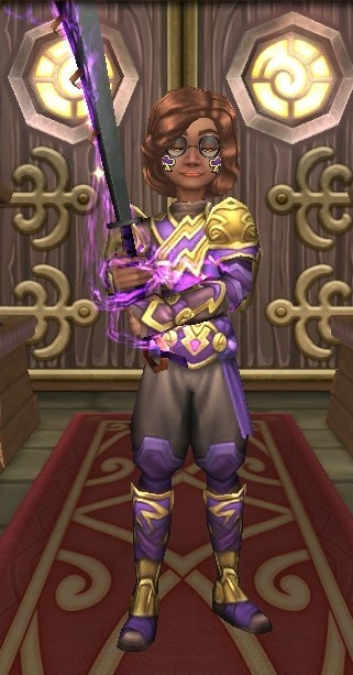
hehe i started a playthrough with my knight commander and made daeran her guardian because i miss them
#'i feel like redesigning my wotr character' i said and then i just changed her skin colour lol . pink hair had to stay#hiraeth is an eldritch scion in wotr but bg does nooot really have an equivalent class#so i'm going with swords bard! hopefully i'll have more fun with it than lore. i think it fits her better than the other gish options would#bc she's very charismatic and she used to be a performer 😌#and i gave her persuasion/arcana/insight proficiency . her perception was super high in wotr but insight works better for bg#bc it's more that she's very very good at reading people than her noticing things in the environment#idk who she's gonna romance! astarion would be SO on brand for her but i just. i can't have two playthroughs going where i romance him lmao#she'd have romanced wenduag if daeran wasn't around so maybe lae'zel??? minthara would actually be a great option but#hira would never agree to kill the tieflings :T#dee plays bg3#oc: hiraeth#the reason she looks similar to my first durge is bc hira was the prototype lol
2 notes
·
View notes
Text
As of tonight I’m officially the proud owner of, in order of pulls, Layla, Heizou, DILUC, Dori, and TARTAGLIAAAAA
#I! FUCKING! WIN!!!#Originally I was saving for Scara but like. The closer it got to Tartaglia's rerun the more I was just really hype to have him instead#and the less excited I was for scara.#Look I'm an anemo lover but I have SO MANY ANEMO units and he just would not fit on my team#and I don't like the redesign all that much and I'm also getting tired of characters with his character model (short boy one)#Plus his play style really confuses me? Like yeah he can fly but that seems like it'll make combat hard#Meanwhile I was thinking about Tartaglia and how he's got a unique playstyle too#but he'll pair up pretty nice with my Raiden and Tighnari I think!!#Xiao is my main DPS and obv I'm working on building Diluc too bc Ive wanted him since I started playing and FINALLY I have him#But I think even if Tartaglia isn't a permanent team member he'll be really really fun#This is about genshin impact btw
6 notes
·
View notes
Photo
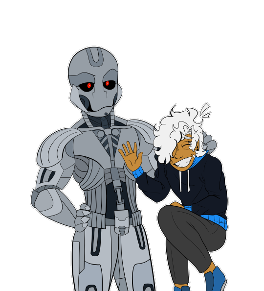
Caught Lacking
#He proceeds to drop them onto the ground#Plonk#Gods I love coloring Ultron I just get random colors with the same theme and place them down where I see fit#I d o follow a pattern but it's still very fun#Anywho official Ultron redesign#He looks so much better nothing clashes#And of course there's Letul#I love them#They just like me fr#They're me fr#I do feel like I have to adjust Tron's leg coloring#But that's for another day#They're too light#Raaah#fanart#marvel#marvel movie#Marvel Age Of Ultron#aou#avengers aou#age of ultron#ultron#avengers ultron#Self Insert#mcu#mcu ultron#Letul#Sometimes I worry that I might need to put a watermark on my insert art#But then I remember that I'm the only one with a platonic obsession with Tron#So that makes me feel better
2 notes
·
View notes
Text
mlp redesigns always gun for the short haired Rainbow Dash but here’s my counterpoint: long mane and/or tail makes it easier to showboat during flight
#plus I’m sure she’s proud of her natural coloration#i do like to draw her with a short mane anyway though#it doesn’t need to be a focal point and I always imagine it whipping into her face#dottxt#idk fully why but I also don’t really see short haired applejack#i think the way she has long hair in a practical style fits her just fine#i DO like to play with the concept of short haired rarity though#i have a hard time with the one big curl on either side of her head#personally it’s easier for me to capture her Vibe with shorter tighter and more plentiful curls#random but another thing I like in redesigns of her is when they switch her mane and body color#it looks so fuckin cool#ohh yknow another thing. i think twilight has a long mane up but her tails short bc she doesn’t like feeling it touch the floor#anyway idk why this popped into my head I just think it’s fun#i know why people go for the usual redesign changes but it’s also fun to switch it up sometimes I feel
2 notes
·
View notes
Text
look at them!! boys!!
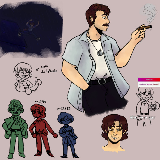
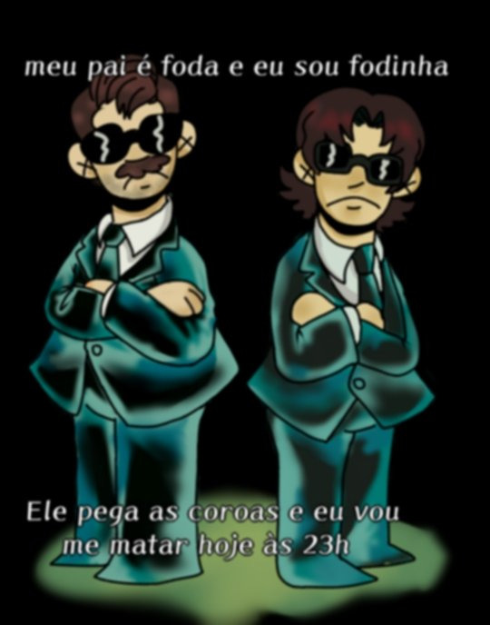
translation of the text in the drawings under the cut
first picture:
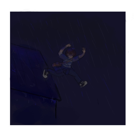
by the arrow pointing to nate it says: fell off the roof
the insta ask thingy says "ask me", and the ask itself says "do you have any illnesses?" the response is "yea, I'm gay"
third one says something like "my dad fucks and so do i. he gets all the old gals and I'm going to kill myself today at 11pm"
#uncharted fake adoption au#uncharted#uncharted au#nathan drake#victor sullivan#sam drake#au art#i have a lot of fun redesigning them as i see fit can you tell
5 notes
·
View notes
Note
Instead of discourse about showrunners and lesbians and whatever, I'm gonna bring a different type of discourse...whats ur fav and least Dr Whomst monsters. Hard mode: only the practical ones.
ok so I do like all the obvious ones, I like the angels, I like the vashta nerada, I like the not-things, I like the eternals. Here's a few deeper cuts (focusing on the tv show specifically):

they peaked with these maggots. they rock. pretty sure they're made with taxidermy? really great puppetry.
I really like this thing:


what a cool design for this kind of forgotten midseason episode.

this is such a fun design for a langolier-type monster. I love how their crest and tail gives them the silhouette of a grim reaper
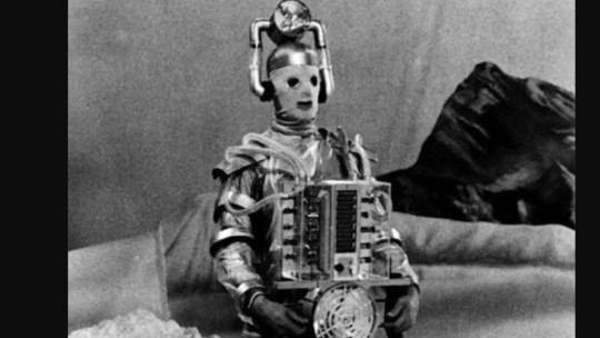
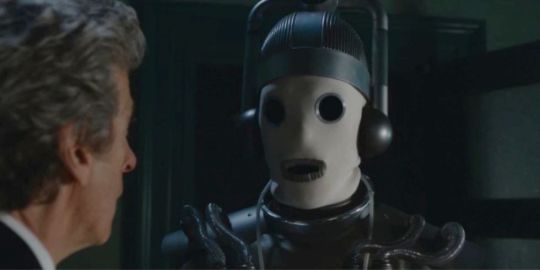
The 60s cybermen rock. I feel like they're hesitant to use them often in the modern show because they do look very 1960s but I think there's something really uncomfortable and evocative about the cloth faces that's lost when they're cool metallic robots. The mix between looking like an old diving suit and the implication of there being a chopped up person inside is gnarly and I love it. Simple, creepy, iconic design.
My favorite design in the show is probably this:
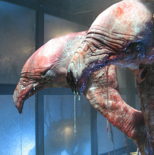
The 456 from the spinoff series torchwood. They didn't need the puppet to emote or move a ton since it spends the entire season in a little tank obscured in mist, so they just went crazy with the design and made it really bizarre looking. Extremely top tier alien.
Anyways, negative. I really don't like this satan. the satan kind of sucks. the impossible planet is great atmospheric sci fi horror; every image of build up in it is haunting and leagues ahead of the climactic scene where he meets the satan. It singlehandedly kind of kills the vibe.

Personally I would have just kept the actual appearance off screen, just have it be eyes in the dark or something. Apparently they also tossed around the idea that it would end up being a normal little girl who was chained up in the cave and I think that would have visually fit the rest of the episode better.

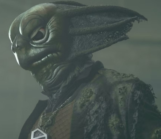
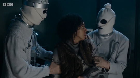
I'm really not big on the modern design for the sea devils (the green one on the right). I think the classic ones clearly took a lot of direct influence from real animals and generally is a pretty thoughtfully realized design, the modern ones seem like they were first and foremost using the classic ones for reference and didn't quite capture the nuance of the design. Sad, as I would really like to see design for these guys with modern puppetry.
I think this is actually a pretty contentious opinion but the work of the specific studio who headed this redesign generally wasn't my favorite. Apparently there was some sort of major, semi public falling out between the fx studio that had been working on the show since 2005 and the people who started running the show in 2018, and they were briefly replaced with a much less experienced studio. No hate to them of course (I think this was actually their first job like, ever, and a lot of the work was done in crunch time?) but the difference did stand out to me:


487 notes
·
View notes
Last Seen Blogs
pearsabeth
oona
alunasky-blog
Alunasky

filipeteimuraz
Filipe Teimuraz Plans
kooorjik
❊kooorjik❊
seanoridraws
Sean • ART & Doodles