#I was going to add more caption but I think it suffices
Text
good afternoon here's my big rant on my pet peeves for subtitles in movies and tv
This is a post that I’ve thought about making probably for years now but never got around to. I might add more later if I realize I’ve forgotten any
When it comes down to it, the purpose of subtitles is this: to reflect exactly what the audience can hear, precisely when it can be heard. If you fail to do this, your subtitles are bad and you should feel bad. Although I don’t have concrete examples for most of these off the top of my head, I promise I have experienced them all firsthand at least once.
-> Watch for spelling and typos. Obviously.
-> Syncing issues.
This should go without saying, but the captions should be synced as closely as possible with dialogue and sound effects. Subtitles that are out of sync are worse to me than no subtitles at all. They’re unbearably distracting and I have to turn them off. I’m fortunate enough that I can keep watching without them, so imagine how frustrating this is for someone who needs to keep them on no matter what.
-> Jumping the gun.
This is basically an example of out-of-sync subtitles that are slightly too fast, but it gets its own category because it ruins the viewing experience in its own unique way. In particularly dramatic scenes, actors will often draw out their lines or pause between phrases. Captions sometimes fail to reflect this by displaying the entire sentence all at once, allowing the audience to read what someone is about to say before they actually say it, which deflates all the dramatic tension of the scene.
-> Phantom captions.
This one is less self explanatory, but it’s kind of similar to syncing. Sometimes there will be significant intervals of time between lines of dialogue, especially after a scene ends and a new one begins. The interval may include music, sound effects, or complete silence, but what I’m calling a “phantom” is a caption that stays on the screen after that last line of dialogue is delivered until the next line is spoken. I don’t remember what I was watching, but there was one that was glued to the screen for SEVERAL MINUTES over what was supposed to be an atmospheric break between scenes and it drove me nuts. In my experience this happens more often with older subtitling for DVDs and some old videos and less with modern streaming.
-> Straight up spoilers.
Sometimes, a character will speak whose true identity has not yet been revealed to the audience. If I’m not supposed to know the character’s name yet, don’t just… tell me right there in the captions whenever they say something. Descriptors like “disembodied voice”, “man”/”woman”, “mysterious figure”, etc. will suffice.
-> Lack of musical descriptors.
It usually helps to describe the genre or emotion of the music that’s playing rather than just writing [music] or 🎵. That being said, if there is a song playing that’s particularly well known in the mainstream, I think it’s useful to actually include the name of the song. This one I do have a concrete example for: in Arrested Development, Gob always blasts The Final Countdown during his acts. But the captions on my DVDs for the show always describe it as [stagy pop]. Like yeah I would say that song is some pretty stagy pop, but I think a lot of the humor comes from knowing that it’s specifically The Final Countdown by Europe because it’s such a perfectly corny selection that Gob would make.
Another musical failure is not transcribing pertinent lyrics. If the song is playing in the background, then that’s understandable and it can be kind of distracting if there’s dialog happening on top of it because the audience isn’t actually meant to be paying close attention to the song. But if the song is front and center, like for a musical number or montage, then the lyrics can be pretty important. Last year when I watched Arcane on Netflix with my family (a recent, high budget production from the biggest streaming platform ever), the show had the nerve to write [man rapping] over a musical sequence. Imagine if all subtitles ever just said [person speaking] for the entire movie.
-> Affectations.
If a character starts using a silly voice or accent, or if the sound of their voice changes in any way, describe that. If the audience can hear the difference, the subtitles should reflect that difference. And they should reflect it informatively and accurately; for example, don’t just say [mock accent], but specify [mock French accent].
-> Paraphrasing.
I don’t even know why this is an issue, but it’s alarming how many times the subtitles just… straight up don’t match what the characters are actually saying. It’s like the transcriber was forced to write all the captions from memory, so they kinda sorta say the same thing, but the wording is different and some sentences or phrases are missing. When I brought this up with my mom she theorized that the transcriber was working off the script for the movie because hey, that’s all the dialogue already written down, right? But it completely fails to account for revisions, improvisation, or actors delivering their lines even slightly different than how they were originally written.
And last but certainly not least, one of the biggest offenders in bad subtitling…
-> [Speaks foreign language]
If someone says something in another language, please, for the love of god, do not just write [speaks foreign language] and call it a day. Specifying the actual language is an improvement, but this descriptor only works if the audience members are truly not meant to know what’s being said (which is sometimes the case). If a character is only saying a single word or phrase in another language, transcribe it. As in, write down the actual words that they said. If you don’t speak that language, find someone who does. You are insane for transcribing a character saying “hola” or “abuela” in an otherwise English sentence as [speaks Spanish] (real examples I saw respectively in Rango and JANE THE VIRGIN. THERE’S SO MUCH SPANISH IN THAT SHOW).
If the audience is supposed to know what someone is saying in another language, English subtitles will usually be hardcoded. DO NOT, UNDER ANY CIRCUMSTANCES, LET THE CAPTION SAYING [SPEAKS FOREIGN LANGUAGE] COVER THESE UP. This is actively impeding understanding, not helping it. Jesus christ
* Please keep in mind that I’m not deaf or hard of hearing and I don’t have auditory processing disorder; I almost always watch movies and tv with subtitles whenever the option is available because it helps me absorb information better. If I don’t even strictly NEED subtitles and these are issues for me, I can only imagine how much more difficult it is for those who rely on them more heavily. I invite you to add your own perspective!!
369 notes
·
View notes
Text
@shawnie--jo asked; hc thst SH bucky and reader get really popular on instagram either before or after they’re a couple. Posting cute/spicy photos together but also domestic cute ones. Sharon hates it. I can also see tony commenting on any of the sexy pics/ videos like ‘this shouldn’t be allowed unless i’m filming lol also can see them always sneaking cute pics of each other.

Pairing: Pornstar!Bucky x Pornstar!Reader
A/n: There’s definitely going to more of this ask that i’m going to be answering in separate parts. There is just too much cuteness going on that one part is not going to suffice! I want to bring much more to this ask along with the others that have been sent in for me to answer! As always happy readings, and feel free to send me some Stark Hub asks!
It’s quiet in the office, your eyes fixed on Tony as he scrolls silently on his phone. He scrolls some more humming quietly under his breath. I think you need to up your factor,” he says as he looks up at you. You raise a brow, “up my factor,” you question “so you’re telling me posting half nude photos and tagging the men of stark hub on my tits isn’t enough?
Tony manages to hold his eye roll, “your likes have hit a plateu, you need to spice it up, bring more likes in kid.”
“And how would you like me to do that, you want me to start snapping photos of me and the guys before a shoot? Tony leans back in his chair eyeing you for a minute, “that’s actually not a bad thought, hell if you can snap some pictures of Barnes it might even get him a follow or two.”
You can’t help but to perk up slightly at the mention of the beefy brunette you had recently had your first film with but then a thought crosses you, “would Bucky be okay with it though, heard from the others he strictly doesn’t do socials - wouldn’t want to push him to do something he’s not comfortable with.”
Tony waves the thought off as he leans forward in his chair, “we can leave that thought for another day then - who are you filming with tomorrow?” “Pepper has me down for the Odison brothers,” you answer.
“Perfect,” he say’s with a clap of his hand, “before the shoot starts get a raunchy photo with those two, post it on your socials and add a nice little caption to it.” You raise a brow, “raunchy?” This time tony doesn’t hold back his eye roll, “you do porn for a living and suddenly you’re shying away from the word raunchy, kid you know what i mean, just snap a damn photo of you, Thor and Loki post it on your socials and watch your fans eat it up.”
“You’re sure this is going to work though, can’t i just keep posting the lingerie shots?”
“Hell do both if you want - listen kid I’ve been growing stark hubs number’s for years now, of course i know what’s going to work, and trust me if fans start to see the guys you work with they’ll go crazy for it.”
Tony wasn’t wrong, fans did go crazy for it, wanting more from you and the counterparts that you were scheduled to film with. Though you were sure it had to do with the ‘raunchy’ photo that you had taken with the Odison brothers.
‘Get her on her knee brother,’ Loki had purred as he plucked the phone from your hand, “just like that, twist your hands in her hair, yes perfect - now say cheese,” he murmurs as his hand finds your face, thumb pulling on your lower lip to part them for him.
The first photo of many had been a sensational hit, “need more of this kid, who you filming with next?”
Steve had followed the Odison brothers, his photo a little more tame, ‘C’mon Stevie,” you had coo’d from where you sat on your sets chair, “give the fans a peek of America’s ass,” and despite the reddening in his cheeks Steve had slipped between your legs easily, slotting up against you, your hands slipping behind his back the hand with your phone perched high and ready to snap the shot, the other hand drifting low into Steve’s briefs exposing the apples of his cheeks to the mirror. The comments all agreed; that is America’s ass.
Sam’s agreement to your photo came easily on the day of his shoot, “don’t have to ask me twice baby, how do you want me - say Barnes get in on one of these with you yet?” When you offered your answer as he laid your body down for him Sam was surprised by it, “have you asked him,” he questioned as he adjusted himself between your spread legs, body hovering over yours, “It’s only been a week or so since our last film Sammy, and i know how he is about his socials,” you said as you angled the camera up towards the mirror on the ceiling, “well if it’s any consolation i know he won’t say no - not to you.”
You had kept Sam’s words in mind but had’t been able to act on them, until a few weeks after. “Should have just asked me Bucky,” had said as he adjusted himself around your bound form, “I know the guys told you about me not doing social media, and while i appreciate you thinking of me, as long as i’m not the one posting i really don’t mind.” You had smiled as he took your phone from your hand, his chest pressed to your back as his other hand drifted down south. You had to force yourself to let out a breath when he slotted his head into the curve of your neck, “does this mean i have your consent to snap pictures of you.” The chuckle he breathes out against your neck has you shivering in his hold, “long as you’re in them.”
“You know kid I’ve got to hand it to you, your numbers haven’t stalled once since you took my advice.” You rolled your eyes, smile tugging at your lip, “what can i say tagging the guys in my tits just wasn’t doing it for the fans anymore.”
“Right,” Tony exclaimed, as he continued to scroll through his phone, “I’m telling you kid I know what sells - though we’re going to have to talk about this,” he says as he flips his phone to you, a video posted of Bucky taking over his screen. “He hasn’t posted in years since i made him the account, and a couple of pictures with you and he’s suddenly social media master, also this shouldn’t be allowed unless Clint or i are filming!”
“Don’t you have enough shots of Barnes and I at this point Stark?”
“We don’t have this,” he argues pointing to the steamed video of you in the tub, bubbles barely concealing what is hiding underneath. “If the two of you wanted a shower scene you could have just asked!”
“You going to pay us for that?”
Tony lets out a huff, “unbelievable,” he mutters under his breath, “as if you and Barnes aren’t two of are highest paid stars!”
You laugh as you move off the chair making your way for the exit, “there’s just some things that are only meant for our eyes, Stark.”
And there was plenty of moments you shared with Bucky that the world didn’t see. The moments you shared in his home, and the ones you shared in yours.
Most of your gallery was of Bucky, the shirtless morning moments where he was still nestled fast asleep in your sheets.
The breakfast shots of his back to you, arm mid stir as he made you your favorite breakfast.
Then there was the ones he captured of the two of you that he would send when he missed you.
The ones where your pressed into his chest, his lips on your head.
Or the ones where you’re in your sweats your legs in his lap, your body curled beneath his arms.
Or your favorite ones, your mirrored photos before date night, yeah those, those were your favorite.
253 notes
·
View notes
Text


they
#I was going to add more caption but I think it suffices#together they will plant the 1 (one) mental health they share and it will grow into a glorious tree of Not Doing That#su#steven universe#pearl steven universe#bismuth steven universe#bispearl#text post meme
2K notes
·
View notes
Text

Thank you for tagging me, @herpixels! 🌼
I'm not going to tag anyone specific because I literally wanna see everyone's take on this. So, please, if you want to, do it!
I went a bit overboard, sorry 😗If you actually read it all, I will love you forever.

YOUR WRITING PROCESS
Show us a part of your script or explain how you write your scenes. Do you write in screenplay format or novel format? Etc, etc.
I love writing in novel format but, for sims storytelling, I feel the need to write a screenplay.
I start by writing all the dialogue along with the action cues and setting descriptions. This helps me visualize how much space I will need for the characters, which and how many props will be necessary etc.
From the simple screenplay, I make a shooting script and a checklist.
The shooting script is super helpful because it allows me to break my screenplay down into shots so I go in game already knowing exactly what I want from it.

This will all sound like I think I'm some big shit but honestly... I just get brain farts WAY too often. So having everything kind of ready helps me remember little things like ADDING THE DAMN POSES INTO THE S4S for examples lmao.
SCENE BUILDING
Show us you in the middle of scene building through pictures, gifs, or a video. Explain what is the best thing about scene building and what is the worst!
Scene/world building is 100% my favourite part of the whole process!
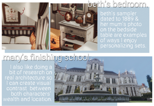
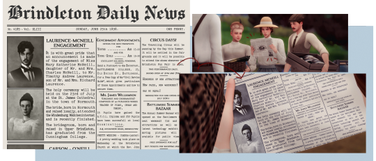
I use a lot of references from the real world. The small coastal village of Brindleton is based on many places in England, mostly villages/towns in Cornwall and Devon.
I enjoy looking for inspiration pictures on Pinterest and going on Google Earth tours, really LMAO.

Of course, there is only so much I can do with Sims to make it look realistic, but if you squint your eyes and shift your head, maybe? fjhgdfhjkg
I do the same for my residential lots and interiors. But interiors are a bit more fun for me because, besides not needing to worry about background extras, I can personalize the environment to my characters.
CC/POSE MAKING
Do you make your own cc/poses for your scene? If so, what is your process like to create? Do you just go off the top of your head? Do you use reference photos?
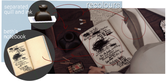
Nowadays, I make 98% of my poses. The remaining 2% is just me making some adjustments on pre-existing ones. I can't help it. I absolutely love seeing my visions come to life like this.

I also enjoy making poses because I like giving my characters some distinguished body language.
For example, Beth is the only character who slightly puckers her lips to the left. Usually, when she's thinking or when she's upset. It's basically the main part of her face - other than her eyebrows - that will give her true feelings away.
And Mary, on the other hand, is way less emotionally repressed. Any minor inconvenience will make her upper lips twitch upwards. She also pouts a lot more and has more eyebrow movements.

Yes, I am a loser for paying attention to these things shhhhhhh.
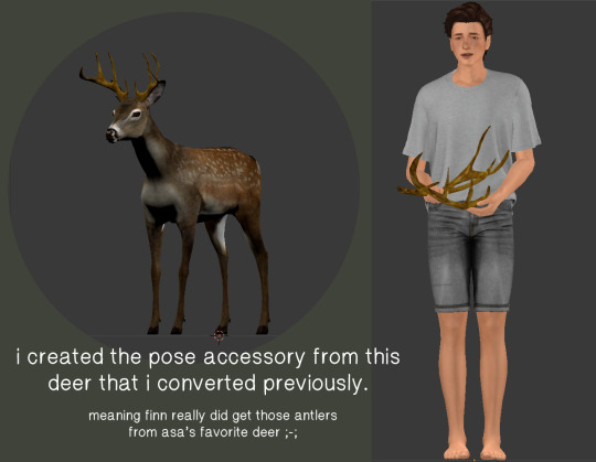
Usually, I don't need anything other than an accessory or two. But lately, I've been LOVING to make recolours and convert objects into pose accessories. Whenever I have my script ready, I take note of what I will need for the scene in my checklist.

You probably don't even notice or care as much as I do, but still! They add much to the narrative imo and I feel like I'm giving depth to the characters by tailoring their accessories and the world around them. It's really fun for me!

GETTING IN THE ZONE
What do you do to get in the zone to work on a scene? Examples include: show us your playlist you use when working on a scene, what’s your go-to scene snack/drink, etc.
I have playlists on my Spotify for the main characters as well as one for the story. Beth and Mary's individual playlists are the ones I listen to the most and they are called Countryside Teacup and European Train Ride respectively because these are the vibes I get from the songs in there dslkfjsklfsd.
I also LOVE listening to instrumental playlists on youtube like this Cottagecore and this Royaltycore ✨massive points to you if you can find my comment on the royalty core video 🌚
I don't really snack while working on my story posts but I drink mate tea like CRAZY or, sometimes, I'll just have a beer to get my creative juices flowing ehe.
SCREENSHOTS FOLDER
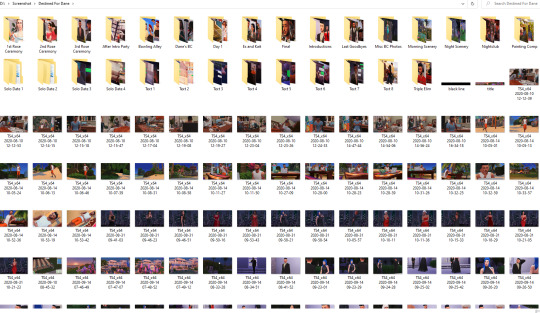
Give us a look into your screenshot folder to show us just how much goes into ONE scene for your story. (Scrapped pictures encouraged!!!)

I never take too many screenshots with different angles because of my pre-planning!
However, I do have, like, 10 to 15 repeated shots because I take some with DOF, some without, some with shadows, some without etc. And I'm always terrified of the screenshot not working, so I press the my hot keys like 5x jddjlkgd.
Here are some scrapped pictures from previous story posts:

CAPTIONS
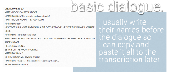
Are you a caption on the picture kind of storyteller or captions in text box type of storyteller? Why? Do you do both?
I love doing the graphic novel format, with "speech bubbles" sort of. I personally find it immersive. But I also love and crave for the novel format, so I'll write a little "after scene" sometimes in the text box for extra depth ☺️
EDITING
Explain and show us your process editing a scene through a video, gif, or picture. A Before and after will suffice if you aren’t in the middle of editing a scene as you answer this.
Since I've done a few posts telling a bit about my editing - and, truthfully, not much goes into it - here is a before and after!

THROWBACK
Show us an ANCIENT story scene you done in the past and explain how you would do the scene differently today!

Okay, ANYTHING from my early simblr days is cringe worthy. The dialogue isn't good, the lighting is extremely yellow - due to my crappy laptop -, the outfits and the settings are all over the place, I--
I chose this one image because it was one of the first times I was doing a story post instead of just a gameplay update. I don't even have much else to add, just look at it jkljdfklgjdf.
But I'm going to have plenty of scenes set in the past where I will get the chance to remake the school and dress my teen girls properly and I'm so excited. Like, making slate pose accessory excited fjdigjfido oh, boy.
166 notes
·
View notes
Photo
a tag by @herpixels ♡

WRITING PROCESS - Show us a part of your script or explain how you write your scenes. Do you write in screenplay format or novel format? etc.
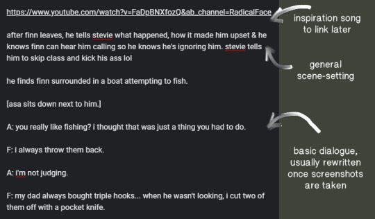
here’s an example from [this post]. i didn’t end up putting stevie in the scene at all, because i figured it would be redundant. my notes are just that; notes. i never end up following them to a tee!!
SCENE BUILDING - Show us you in the middle of scene building through pictures, gifs, or a video. Explain what is the best thing about scene building and what is the worst!
ahh i don’t have any pics & i’m not currently working on a post, but i actually love scene building! it’s one of my favorite parts of the process. making cc, poses, building, decorating the area, posing the sims, etc. is probably my favorite because i almost feel like a director or something? it’s just cool to see my vision come together like that!
CC / POSE MAKING - do you make your own cc/poses for your scene? If so, what is your process like to create? Do you just go off the top of your head? Do you use reference photos?
i usually do make my own poses or adjust pre-existing ones! i also make pose accessories or edit meshes to suit my needs. here’s a blender shot from [this post]
i don’t usually use reference images, but i do occasionally “frankenpose” to save time! (don’t do that if you’re planning on uploading your poses though, fyi)
GETTING IN THE ZONE - What do you do before working on a scene? Playlist you use when working on a scene, what’s your go-to scene snack/drink, etc.
i literally live on black coffee, i always have a pot going lmao. i also have a million [spotify playlists] for each character, so i can get in the right mood! but when i’m actually writing, i only listen to instrumental music. usually life is strange ambient music!
SCREENSHOT FOLDER - Give us a look into your screenshot folder to show us just how much goes into ONE scene for your story.
i’m an absolute mad man when it comes to screenshots jksjd i take anywhere between 400 to 700 pictures for one post!
CAPTIONS - are you a caption on the picture kind of storyteller or captions in text box type of storyteller? Why? Do you do both?
i put them on the photos themselves, and then if there’s a bit of extra dialogue (but not enough to make a second post), i’ll put that in the caption. i like to caption my pictures because i feel that it’s a better way to incorporate imagery and emotion into the story. i don’t think i would even want to take screenshots if i didn’t put words on them, like.. what would be the point lol
EDITING - explain and show us your process editing a scene through a video, gif, or picture. A Before and after will suffice if you aren’t in the middle of editing a scene as you answer this.
before vs. after!

THROWBACK - show us an ANCIENT story scene you did in the past and explain how you would do the scene differently today!
omg... i think i’ll do this one in good faith and choose a picture that i was actually really proud of when i took it:
if i retook this now, i would make sure they’re actually looking at each other when they speak (beth is supposed to be talking to caroline here, not that you would know it by looking at this lol). i would realign the picture to have more parallel lines instead of strange angles. i would clutter the table up a lot more. i would add more personality to their outfits. and i would do something cooler with the decoration & lighting, to really lean into that 50s diner vibe.
#this is sooo fun!! thank you for tagging me day <3 <3#i tag anyone who wants to do this!!#i don't want to leave anyone out but like.. please do this i'm really curious#i love seeing everyone's process#tagged in#herpixels
87 notes
·
View notes
Text
STORY PROCESS CHALLENGE by @herpixels
I was tagged by @xldkx & @poetic-falls ^^ Thanks a lot for the tag and your patience ‘cause I’ve been hesitating to do it or not but I’ll try to make it short !
The challenge: show a certain part of your story process based on you being tagged by other creators!!!
1. Your writing process - show us a part of your script or explain how you write your scenes. Do you write in screenplay format or novel format? Etc, etc.
I write in both screenplay and novel format, and also tons of random notes. I write a lot in my notebook before going to bed and then I write a script part on my computer so I can remember what actually happens. But I usually modify the script when I edit, adding more sentences and depth.
2. Scene building - show us you in the middle of scene building through pictures, gifs, or a video. Explain what is the best thing about scene building and what is the worst!
I’m too lazy and also bad at building that I focus on creating an illusion of an actual set. Most of the outside are fake but all the main families have their own houses and lot. I have 2 big lots with a lot of build I use for specific scenes like classroom, Julia’s room, the school hallway ... When I really need a specific build I try to find it here or in the gallery (Halette’ shop and the café are made by @cross-design) and sometimes I even make them myself (the cinema Hiro and Lee go on their first date) but again, it’s a bit empty ‘cause I knew I would take only few screenshots there.
3. CC/Pose Making - do you make your own cc/poses for your scene? If so, what is your process like to create? Do you just go off the top of your head? Do you use reference photos?
I made some recolors for the story and I like to use some I did just to kind of give a deeper personnality to a character or a place, otherwise, I don’t have the tools nor the capacity to create cc. I highly respect all the amazing creators that create their own content and poses just so their story could exactly look like what they have in mind. Unfortunatly, my computer can’t run photoshop nor blender so I have to be clever and use different angles depending on the poses I can found. Luckily, there’s plenty awesome free creations made by awesome creators here ^^
4. Getting in the zone - What do you do to get in the zone to work on a scene? Examples include: show us your playlist you use when working on a scene, what’s your go-to scene snack/drink, etc.
I’m basically sitting on my couch with my lap in front of me, my boyfriend watching TV right next to me. So usually I’m watching a movie/TV Show when I’m writing (except when it’s a real important thing I want to see) . I drink water or sometimes some chamomille (who said I’m old ?!) and I also smoke ...
5. Screenshot folder - give us a look into your screenshot folder to show us just how much goes into ONE scene for your story. (Scrapped pictures encouraged!!!)
6. Captions - are you a caption on the picture kind of storyteller or captions in text box type of storyteller? Why? Do you do both?
I’m mainly a picture story teller but also a text box type. All of this depends on the lenght of the chapter and also the screenshots I took. Sometimes I can’t get the result I want so I have to continue as a text. I wouldn’t mind putting a transcript but nobody asked for now and I think that would also scare people ‘cause the chapters might seem longer than they already are ^^”
7. Editing!!!!! - explain and show us your process editing a scene through a video, gif, or picture. A Before and after will suffice if you aren’t in the middle of editing a scene as you answer this.

Sometimes I just have to add the text part and I’m done, sometimes I have to use a special overlay or I change the colors of the scene with a filter.
8. Throwback - show us an ANCIENT story scene you done in the past and explain how you would do the scene differently today!

This one is from my first sims story, Rise. I didn’t use Reshade back then and oh ! Look at all these colours just to create some kind of epic magical fight (I guess ?) ! I would totally write this entire story in a different way, with a better depth and more characters probably. I would also use reshade and more detailed element (like flames or whatever). and also better subtitles ^^ You can read this story if you want, Mizuki (the main character) is going to be a part of Destiny Harbour but not until the final season.
I don’t tag anyone specific here because it’s super long but if you’re a writer and want to do it feel free to tag me so I can check ! I always like to know more about the stories I read :)
#story process challenge#herpixels#xldkx#poetic-falls#about DH#non sims#but related#I try to keep it as short as I can
21 notes
·
View notes
Text
𝕊𝕋𝕆ℝ𝕐 ℙℝ𝕆ℂ𝔼𝕊𝕊 ℂℍ𝔸𝕃𝕃𝔼ℕ𝔾𝔼
by @herpixels
The challenge: show a certain part of your story process based on you being tagged by other creators!!!
I was tagged by the amazing @poetic-falls. Since they answered all, so will I. I feel like lots did this not too long ago, but I’ll tag: @nova-plays, @junktrait and @rainbow-llamas.
Long stuff under the cut.
1. Your writing process - show us a part of your script or explain how you write your scenes. Do you write in screenplay format or novel format? Etc, etc.
It depends. When I was working on my Wilder FDC, that was mostly unscripted. It was purely based on gameplay. Same with my current gameplay, the Harding’s. With the Tuhoro’s, I have done a lot more scripted writing. My google docs are filled with the various scenes and such.
2. Scene building - show us you in the middle of scene building through pictures, gifs, or a video. Explain what is the best thing about scene building and what is the worst!
I have a love/hate relationship with building. I love creating something special for my sims but don’t think I’m that great a builder. It’s a struggle. lol. I delete most off my WIP pics, so don’t really have anything to share. And I don’t think I do anything special when building. Just adding those little touches that make it unique for that sim/scene.


3. CC/Pose Making - do you make your own cc/poses for your scene? If so, what is your process like to create? Do you just go off the top of your head? Do you use reference photos?
I definitely do not create my own poses. I have so much love for the amazing cc creators out there. @nova-plays has made a few poses specifically for me and some of my scenes (ILY). I will occasionally do recolors of photos/frames to add that special touch to a sim’s house.

4. Getting in the zone - What do you do to get in the zone to work on a scene? Examples include: show us your playlist you use when working on a scene, what’s your go-to scene snack/drink, etc.
Depends on my mood. Spotify helps a lot and I have a playlist I made for Tuki/Adi story. I’ve also been listen/watching a lot of streams recently. I just usually need some sort of background noise.
5. Screenshot folder - give us a look into your screenshot folder to show us just how much goes into ONE scene for your story. (Scrapped pictures encouraged!!!)
It’s a messy organized mess. I do take lots of pictures I end up not using, but it’s more just me taking the same picture from many angles.

6. Captions - are you a caption on the picture kind of storyteller or captions in text box type of storyteller? Why? Do you do both?
Dane’s BC was the first time I did captions. While I do like them, I also hate them. lol. I’m a writer that tends to struggle with conversation so it’s sometimes easier to write what the person is thinking/feeling vs trying to convey that in actual speech.
7. Editing!!!!! - explain and show us your process editing a scene through a video, gif, or picture. A Before and after will suffice if you aren’t in the middle of editing a scene as you answer this.
So... my editing depends on my mood. The last time I majorly edited anything would have been Dane’s BC. The before picture has my reshade on it, but from there, it’s running a few different ps actions over the image, some blurring and adding light leaks. I’ve been embracing more warmth recently in my photos.

8. Throwback - show us an ANCIENT story scene you done in the past and explain how you would do the scene differently today!
I don’t... Besides Tuki’s story, I’m not at the point of wanting to redo my scenes. Truthfully, I have a love/hate relationship with sims stories. It’s a more personal thing of being able to display what I want to show using the things in game and never quite getting it right. I’m definitely too tough on myself and if I stress too much over things I’ve done, I’d never post again,
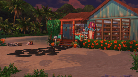
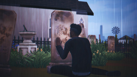
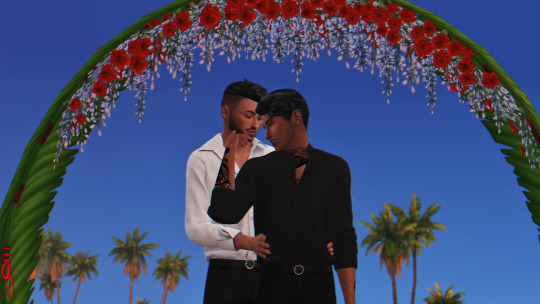
That said... quite a few of my scenes go through a test scene first. Usually it’s there for me to get a better feel for the scene. Tuki at Penny’s grave was one of them. I thought I had a saved version of the scene where I tried a different rain effect, but I can’t find it. (The pics for that scene show an unedited one vs the final one in the story post.) Also, I like to test outfits and sceneries. See what works. When I was doing the 15 day couple challenge with Dane and Ray, I originally thought they’d marry in Sulani. I wasn’t happy with the shots I was getting. I tried Windenburg instead and their entire proposal/wedding story hit my like a ton of bricks. (Pics below are the unedited ones)


18 notes
·
View notes
Text
Story Process Challenge
I was tagged by @danjaley and @treason-and-plot (in alphabetical order, not tagging order). Thank you both so much!
Summary: My process makes sense to myself alone and it’s very much a work in progress! Also, I’m very boring and don’t do gifs or videos, so you’ll just have to look at my screenshots. Sorry!
This is behind the jump for length.
1. Your writing process - show us a part of your script or explain how you write your scenes. Do you write in screenplay format or novel format? Etc, etc.

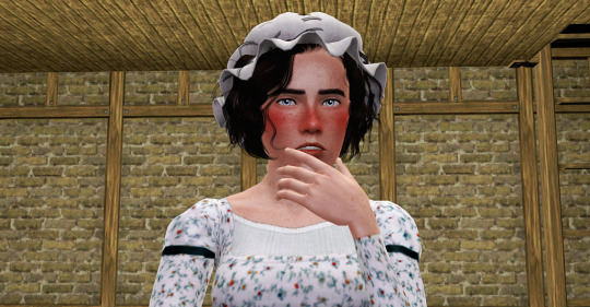
I write in novel format if it’s a wholly-posed story, mostly because that’s easier for me than a script. I feel like it really helps build the ~aesthetic~ of a scene that way. For my attempts at partially-posed/gameplay stories, I’ve gone for screenplay format, but it’s very new to me and I feel much more comfortable with the novel format. I usually write in Google Docs, since that can go with me everywhere and I can write on my lunch hour/waiting for my mom to get out of the pharmacy/etc, but sometimes I will write in Notepad.
(Yes, this IS a flashback to Alasdair and Ma. Yolanda meeting; they were perfect teenage hellions causing chaos at a society party, don’t worry.)
2. Scene building - show us you in the middle of scene building through pictures, gifs, or a video. Explain what is the best thing about scene building and what is the worst!
I’m still learning how to make a very good scene build; this is where being a historical player kind of hurts. It’s hard to get a good sense of what a 1810s Spanish drawing room or a 1600s merchant’s house in Amsterdam really looked like without abusing my library privileges! (Images from Wikipedia and historical sites only go so far.) The best thing about scene-building is when the vision of the room in my head matches the room that’s in-game, which is pretty difficult. The worst thing about scene building is that I’m very perfectionistic and a control freak, which does not help, and frequently I do get lost in the details and can’t see the forest for the trees.
(This isn’t a scene, it’s that Iron Age Roundhouse, but it’s a good example of how I do things--all the lights on, everything bright white paint or the $0 floor until I am happy with the shape and placement, and then I decorate.)
3. CC/Pose Making - do you make your own cc/poses for your scene? If so, what is your process like to create? Do you just go off the top of your head? Do you use reference photos?
I’d love to be able to make my own CC and poses specifically for scenes! I’m still very new at CC-making--see my hats collection--and again, I’m very much a control freak. I use a lot of reference photos, especially historical costuming sites and books, because it gives me a lot of pride to have the clothing and accessories look just right.
The creation process is usually: gosh, I need a crispinette/gable hood/palla/whatever for this character, let me see if there’s a mesh from TS2 or TS4 that I can wrangle into submission if I can’t repurpose an existing mesh, and then a prolonged period of fighting with Milkshape and TSRW and other programs until it looks serviceable and works. I’m not very technically skilled yet.
I don’t make my own poses--I’d love to, I have a hand-spinning poseset idea living rent-free in my mind at all times, complete with a drop spindle accessory, but I’m not very confident with Blender or hand accessories, etc. When I pose my Sims, I do use reference photos if I haven’t already planned out how they’re moving around in the scene. (Well, reference paintings, usually, although sometimes I’m lucky enough to find reenactment photos!)
4. Getting in the zone - What do you do to get in the zone to work on a scene? Examples include: show us your playlist you use when working on a scene, what’s your go-to scene snack/drink, etc.
I don’t know if I get into a zone as much as I just carve out time to work on things as I can. I don’t have playlists for my characters. (Not a Deaf thing; I just haven’t really...had the urge to do that. I’m worried I’m a neglectful Simmer now, ha ha.) I don’t have a go-to writing snack or drink. I just...try to relax a bit, usually, and sometimes I will look at my past chapters to see what we were doing last time.
5. Screenshot folder - give us a look into your screenshot folder to show us just how much goes into ONE scene for your story. (Scrapped pictures encouraged!!!)
Do you REALLY want to see this? Really? I’m an AWFUL packrat. I try to organize it and I can’t. (Sorry. I’m very messy.)
6. Captions - are you a caption on the picture kind of storyteller or captions in text box type of storyteller? Why? Do you do both?
Captions and text go in the text box.
I’d love to be able to put dialogue in speech bubbles, because it seems cool, but I talk too much! (This is the same reason why I kind of go back and forth with Netflix-style captions. I don’t know when to shut up.) I also worry that the captions wouldn’t be visible in scenes with low lighting or overly-bright lighting.
7. Editing!!!!! - explain and show us your process editing a scene through a video, gif, or picture. A Before and after will suffice if you aren’t in the middle of editing a scene as you answer this.

Philomena, before...
Philomena, after. (This is one of those images where I just threw up my hands at the hair editing. I wish TS3 had hat chops like TS4 did.)
I’m really not confident with editing--I want to have my pictures look aesthetically pleasing, consistent with the other images in the chapter, and “nice” in general. It doesn’t help that while I’m 95% Maxis-match, my aesthetic inspiration for scenes changes with the wind. I use pooklet’s lighting actions, and then from there I tend to use the Holy Colors, Batman actions. But I’m trying to find my own way of doing things--reliant on others’ actions, yes, but more consistently done and somehow conveying that it’s “of my workshop.”
8. Throwback- show us an ANCIENT story scene you did in the past and explain how you would do the scene differently today!
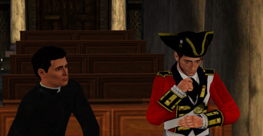
First: I think I’d choose a different pose for Vicar Max here. (It doesn’t quite fit; why would he be staring at Alasdair like that? It’s more of a mid-conversation pose.) I liked how it looked like Alasdair was genuflecting as he sat in the pew, but again, the pose needs to be changed. I might just go for neutral sitting-and-talking-looking-straight-ahead poses.
This was one of those pictures taken when I was trying to understand Reshade, so I’d obviously skip that. I’d also add Pooklet’s lighting actions, of course.
It’s definitely not lit well in the back--I’m not sure how I’d change that. I didn’t want to lose the “quiet chapel” feel, but there has to be a balance, not letting the characters look like they’re spotlit.
The angle also looks weird, but I’m horrible at angles; I have a lot to learn still. I’d either close-up on the faces or I’d zoom out more. (I think I was having issues with Alasdair on the OMSP, for some reason.)
I tag whoever would like to do this!
10 notes
·
View notes
Text
MID Review (finally)
Now that I’ve had a while to reflect on MID, I feel like I can give an honest, spoiler-free review. This turned out to be a much more in-depth review than I had planned on doing, but you can just read the italics at the end of each section if you just want the gist.
Controls: Okay, so for like the first fifteen minutes (or however long it takes you to adjust), the controls are frustrating. Once you get used to how to move (and it is still point-and-click), you’ll be fine. The only thing that I still didn’t have a solid grasp of by the end of the game was moving Nancy’s head around with the right mouse button--it might have helped to slow the mouse down for this function. That being said, the controls offer a lot to the game. The environments and navigation feel more realistic, and instead of jumping from scene to scene, Nancy slides through the space. It’s weird at first, but it’s ultimately superior. (Just for kicks, I went back and played a bit of LIE as a comparison, and the jumpy movement felt so weird after the smoothness of MID). Controls get a 8/10 for the steep learning curve and the more realistic movement.
Graphics: They’re not that bad, okay? On high render, the environments actually look really good and the characters are decent (low render is an understandably different story). Given the technical reasons behind the graphics looking as the do (full 3D render here versus painstakingly painted video files before), I don’t think that they’re really that bad. Puzzle renders and zoomed-in items/POIs really shine, appearing arguably better than previous games. It’s also important to consider what SCK/STFD look like compared to SEA--MID obviously looks better than SCK/STFD, but it has room for improvement. Just like the development team refined the graphics on their proprietary engine, they will refine the graphics on Unity over time. Again, looking back to the first three games, there is a huge jump in graphics quality between each game, indicating their ability to improve quickly. I’m willing to best that the next game (yes, I believe there will be a ‘next game’) will look much better than MID, and so on from there. Character renders are not as great, but this, too, is likely to improve and is probably also due to the fact that it’s 3D and not a painted video file. Their movements may be awkward, but the fact that they are mo-cap means that they may improve in future games. The only real gripe I have about the characters is the lack of facial expressions. Graphics get a 7/10 for up-close realism and room for improvement.
Performance: If you have a gaming PC or a relatively new device, you should be golden. The game runs smoothly at high render on my 2018/i7/SSD PC, but has some lagging issues at high render on my 2014/i5/HDD PC (issues that all but disappear by adjusting to low render). For those with older PCs or PCs with less processing-power, you may have to deal with way-off lip-syncs and choppy cut scenes if you also want to see the best possible graphics. The game only crashed once on my older PC (and it was more likely due to unrelated background processes I was running), but the autosave feature prevents crashes from being anything more than a brief annoyance. Performance gets a 6/10 for high requirements and the Sophie’s Choice of graphics or speed.
UI: I love the sleek, full-screen appearance and minimalist inventory/phone bar. If I had to ask for any improvements here, I might suggest that the inventory collapse into a bag icon when it’s not in use. UI gets 10/10 for maximizing space and minimizing distractions.
Environment (independent of graphics): HeR definitely stepped up their game (heh) on this front. While there are arguably no more locations to explore than in SEA, the environment is far more expansive and cohesive. You feel like you are in a small town (Salem), and you have the freedom to explore all the relevant places without jumping around or magically transporting. There’s only one location that is distant from the town center, and Nancy travels via car to get back and forth, which adds a dose of realism. We have our usual forest navigation (though it is mercifully straight-forward, unlike DOG or CAP), with the added bonus of looking around and using it to get from one place to another. The game makes good use of each space, though it’d be nice if there was more to do in certain lesser-used locations. Some of the locations really only seemed to be present to flesh out the whole environment--which is fine--but it’d be nice to utilize those locations a bit more. And when graphics are set high, the environments are quite stunning. The lighting and weather also do a good job of reinforcing the current atmosphere in-game. Environment gets a 9/10 for cohesion and light usage.
Characters (independent of graphics, story): This is probably one of the spots where MID won me over. Not only do we have eleven (11!) official characters, we have background characters that make the setting real! I didn’t count, but there were probably 10+ background characters that were present for minor commentary and realistic liveliness. For the first time in a Nancy Drew game, I wasn’t questioning where the rest of the world was. Yes, their movements were awkward and if your computer couldn’t handle the graphics, then their lips were flapping in mysterious ways, but they moved around and interacted with each other in semi-human ways. It is absolutely baffling to me that there are people who think there were too many characters. For one thing, we as fans asked HeR for more characters and that’s what they gave us. For another, the game never felt crowded. There were seven characters that were considered “main” that you interacted with often, three side characters that you interacted with occasionally, and one character that you only interacted with once. If they hadn’t been fully-formed characters with solid backstories, I might be persuaded that the number was an issue, but almost all of the characters were fully- or mostly-developed. Characters gets a 10/10 for quantity and quality.
Puzzles: This is probably the one facet of the game where it is most clear that HeR listened to fans’ requests. We asked for more realistic puzzles that were integrated into the game play and not totally irrelevant. That’s what we got. For some people, I think this made it seem like there were fewer puzzles, but I think there were just as many as before, it just wasn’t always super obvious that you were solving a puzzle (and they all but eliminated chore-type puzzles). The cooking mini game and serving mini game were both fun, nostalgic time-wasters in the best of ways. Another nice thing about the puzzles was that they weren’t super difficult as long as you were paying attention, so there wasn’t any need to google solutions or get frustrated. Puzzles get a 9/10 for fan service and perception (after all, perception is reality).
Story: MID really shines when it comes to the story line. The game delves into the full history of Salem, rightfully choosing to discuss topics that were always skirted in earlier games (prejudice, discrimination, slavery, torture, etc.). My only issue regarding the presentation of history is that a lot of the learning is optional, and can be easily ignored or missed. The actual story line of the game is well-established and doesn’t have any gaping plot holes (at least that I noticed on my first play through). There are multiple crimes to solve, multiple items to recover, and thus multiple endings/outcomes to achieve. I can’t go into too much more detail without spoiling parts of the game, but suffice it to say that the story has depth and gravity that might even place it ahead of previous games. Story gets a 10/10 for more mature themes and multiple, successfully interweaving story lines.
Dialogue: While the content of the dialogue is great and forms the foundation for much of the story, it loses me in presentation. First, the line-by-line captioning system is awkward at best, and a monologue behind at worst. I see no reason not to present the player with sentences or paragraphs at a time as before. Second, dialogue options are not so much options as dialogue tasks. You have questions you can ask, but there is no choice of how to ask them or how to respond to an answer. For the most part, you are just choosing the order in which to ask things. This, in my opinion, is a step backward from the previous games, where Nancy could be optimistic, pessimistic, direct, or passive-aggressive. Lastly, there is a strange lack of subject in Nancy’s sentence structure at times. She says “should do xyz” instead of “I should do xyz,” or “wanted to ask about abc” instead of “I wanted to ask you about abc.” While this isn’t really too weird in the context of modern speech patterns, it is still a little awkward. There are examples of this in previous games when Nancy speaks to herself, but never in dialogue with other characters. Again, this isn’t a big deal, but it crops up enough to make it noticeably strange. Dialogue gets a 6/10 for solid content and poor presentation.
Music: At first, the music seems to be nothing special; the main theme is quiet, unassuming, and a bit repetitive at times. But much like the rest of the game, it gets better as you progress. The music in Luminous Infusions and at the end of the game really stick out as great pieces, although the rest of the tracks are also very well-composed. There is thematic continuity between tracks and the tracks also reflect the game’s current atmosphere well. The music, while from a new composer, is still reminiscent of the old games, particularly the mystical tracks in CUR. I’m hoping HeR releases a soundtrack for MID in the future, but I do know there are no current plans for an official soundtrack (though you can find unofficial ones on YouTube pretty easily). Music gets a 10/10 for quality and cohesion.
Nancy: Nancy finally sounds like the late teen that she is meant to be! Nancy is witty and assertive, no longer speaking with the voice of a thirty-year-old and expressing the thoughts of a thirteen-year-old. The new voice actress is just what Nancy’s voice needed, in my opinion, though I have admittedly been a supporter of replacing Lani since about DED/GTH (don’t get me wrong, I love Lani and she will always be the classic voice of Nancy in my head, but I could also admit that her voice was losing its spark and pep). It takes a little while to get used to the new voice, but once it stops sounding different, it’s easy to fall in love with. Another great aspect of Nancy 2.0 is that she’s willing to get into it with other characters, even if they are in a position of authority. Nancy has always been an assertive character who stands up for what is right, even if it’s not easy to do. We see the return of this kind of Nancy in MID, and I hope we don’t lose her in future games. The only thing that I found a tad bit odd was how sugar-sweet Nancy was toward Deirdre. I like how their relationship was updated in order to model more appropriate/healthy female friendships, but it is a little weird considering the canon interaction model set forth by ASH and DED. Nancy’s other relationships have also matured and improved. Nancy gets a 10/10 for assertiveness and expressiveness.
Physical Copy: Well, almost two weeks after the release date, I finally got my physical copy of MID. This is unprecedented, as I always received physical pre-orders the day of or even the day before release. The long wait drove me to buy the digital download, which I didn’t mind doing, but this could be very frustrating for those not willing to pay for the game twice. I was disappointed to find that the disc art is just a copy of the cover art (which is minimalist at best), and not a characteristic color like the other games. The box art seems like it was put together at the last minute, not unlike the cover art. If it weren’t for my compulsive need to own all of the physical copies, I probably would have skipped it. Physical copy gets a 1/10 for slow delivery and lackluster appearance.
Weird Things to Complain About: Yes, there is one background character whose voice sounds like it was recorded on a Motorola Razr, but she says one sentence that you don’t even have to listen to. Yes, some of the background characters are overt clones, but we’ve never even had background characters to complain about before. Should there have been more to do in the Hathorne House or other one-off locations? Yeah, probably, but we were given a ton of locales to visit. The characters were always bobbing around and breathing, but--surprise!--this is something that real humans do. Did their feet/hands occasionally meld with other objects or the environment? Sure, but why were you looking at their feet during a conversation? Admittedly, Teegan sometimes looked like she was trying to scare off a bear or prepare for flight, even I can’t argue that that wasn’t odd. But for the most part, these are minor, petty issues. There weren’t gaping plot holes, there was actually a mystery to solve (looking at you, MED), and we got a lot of the things that we asked for over the years. There is always room for improvement, and this game is certainly no exception. I expect that the next game will make refinements based on our feedback and be even better. HeR completely changed the Nancy Drew game formula, but they used our input as a guide. They’ll take what we say about MID into consideration with the next game, and hopefully over time we will see the same level of improvement we saw from SCK to SEA. They started from scratch, and even though they had five years to work on it, the first time you try something new is almost always the worst. I don’t condone the way they treated us over the hiatus or how they treated their own staff, but I don’t think it’s time to abandon ship yet. If you play this game with nostalgia goggles on and a closed mind, you’re going to hate it, you’re going to ask for a refund. If you go into it with an open mind and excitement for something new, you might just find that you like MID more than you’d care to admit. Weird things to complain about gets an 8/10 for minor oddities that should be expected in a pilot endeavor.
Conclusion: Change is inevitable. If you were around when TMB came out, you might remember the absolute uproar that came with the UI change. People threatened to walk away from the series because of the new menu screen and bulkier interface. If you’ve played the original SCK and STFD, then you know how drastically the games improved over the span of a single year. And compare those games to SEA and it’s clear that the games are always improving. But you have to start (or in this case, restart) somewhere, and MID is our new starting point. The games will get better, and we’ll still find things to complain about (like we always do), because there is always room for improvement. There’s no point in lamenting about how good the game would have looked on the old engine, because that misses the point. The old engine could not deliver what we as fans desired. It could not handle more than six characters or more than eight hours (this is being generous) of game play. It couldn’t give us more expansive environments or smoother navigation. The new engine gave us all of these things, but sacrificed a bit of graphics. Big whoop. I’m willing to bet that none of us got into the games for their graphics, especially those of use who became fans early on in the games’ history. Bottom line? HeR gave us a good game. Not their best game, maybe not even one of their better games, but it’s certainly better than MED or SCKR. And hey, at least we finally got the game. Midnight in Salem gets an 80%, an admirable B-, because the effort and progress is there, but there are definitely things that they could have done better.
#nancy drew#clue crew#midnight in salem#mid#review#open to feedback#wow this was way longer than i intended it to be
65 notes
·
View notes
Text
Bungou Stray Dogs: Dead Apple [My Thoughts]
I can’t guarantee that there are no spoilers, so I will just put the “keep reading” line. With that being said, this is in no way a deep analysis of any kind. Do not take this seriously. I’m just an idiot running my mouth. This is just a stupid thing that I’m writing because I just finished the movie.
If you’re Canadian, just know that they did not prepare a special message for us. The voice actors who appeared in the message before the start of the movie (Uemura Yuuto, Ono Kensho, and Taniyama Kishou) and the Crunchyroll staff prepared the message for Americans. I’m Canadian, but I guess that’s close enough (still a little disappointing though).
Whether you ship Atsushi x Kyouka as a sibling relationship, a friendship, or anything else, it was quite nice. Personally, I do support this ship despite the age gap of four years, but I wouldn’t be angry about any ships that aren’t... illegal let's say. Their relationship was done in a way that it wasn’t forced to make you think that they were in any specific kind of relationship which I liked because I had a feeling that audiences would’ve criticized it if they hinted any tiny bit of a romantic relationship. I think that kind of thing should be saved for the future if they decide to act on it. Let’s just say... I’ll preorder that ship.
Chuuya x Dazai (or Soukoku) is a ship that I don’t mind. It’s okay, but I personally liked Oda x Dazai. Too bad... well that ain’t gonna happen. Unless you believe in the afterlife... I guess. Was it forced? A little. Was I bothered? Not that much. I don’t care what you ship. If this is your ship, embrace it. I’ll sit here with my popcorn routing for you.
Was the story predictable? Yes. I didn’t feel that bothered by it though. I understand that they didn’t want to surpass or reveal anything that the manga has or anything that hasn’t been explored yet. This was made in a way that you wouldn’t feel really lost if you didn’t watch this and just continued with the manga. It was more of a side story. Plus, as a person who is constantly anxious, predictability is great. Don’t judge me.
The pacing was a little bit fast, but as an anime movie, it would be a bit crazy to have any expectations. Just be glad it wasn’t a complete recap. I think this movie would’ve benefited from being an OVA instead of just a movie, but that would’ve changed so many things in production. I will take what I can get.
I won’t get into the details of everything that was predictable. That would take too long, but the little things like the pill that Dazai took, why Ranpo put the snacks into a safe, the abilities attacking, how that would all work, everyone surviving (because as I said, this movie would not interfere with the major overarching story), etc. Also, I think we all know that Dazai and Ranpo know everything that’s going to happen. There’s no way that they can lose, and not for a single second did they convince me that the agency or anyone was in a pinch. The entire time felt as if it was under their control. In that sense, it almost belittled the villains slightly. Fyodor probably knew that and backed off to make another more prominent appearance later. Shibusawa was disappointing. For a villain that is so hyped and with an ability so outstanding, he was one of the biggest letdowns about the movie. The dragon was also disappointing just because I feel like it was meant to represent the “Tiger vs Dragon” cliche, but I was not too hyped about that. Just everything about Shibusawa and his actions I felt were not as well thought out as I wanted them to be. I knew that the “good side” was going to win, but his final form looked kind of like a joke (comparing to their usual high-quality character designs), and he didn’t put up as much of a fight as I thought they would have. The other ADA members barely make any appearances until the end, and I feel like they missed an opportunity with that. I understand that they were pressed for time though so I will let that slide... (begrudgingly)
I was pleased with the music and animation. Studio Bones did a pretty good job. The music did a wonderful job complimenting the visuals, and my attention was captured by the changes of tone and texture (if I can use that word) of the music. I was really surprised by the sophistication. I mean, it wasn’t the best anime music OST by any means, but it was good enough to suffice. Nothing extremely extraordinary. But GRANRODEO made a great inserted song that was placed in some reused visuals (too bad they didn’t animate all the visuals new) and some new visuals (mostly just the characters with a caption to describe their abilities) was good for hyping the audience. It was well-written and perfectly set the mood up for epicness. The ending by Luck Life was to be expected, and I loved it. I all the BSD endings, so the fact that they got back into it with a nice song addition to this movie was amazing. They reused the second OP during the final fight. I’ll be honest, they didn’t do as great of a job with this, but that was for one reason: the sound mixing made everything else drown out the song. I understand that everyone has probably heard the song beforehand, but I wish there was more balance.
Now onto voice acting... Bungou Stray Dogs has a great cast. None of the cast is really “newcomers” except for Atsushi’s seiyuu Uemura Yuuto whose role was one of his first major ones. I believe he was a student beforehand though. I think he’s getting a lot more roles now.
I think I’ve finally gotten used to Kensho Ono playing Akutagawa. At first, I didn’t think he would fit the role too well. I thought they just did it to put in a big name, but I don’t mind it now. He does bring a certain tone to the character that is unique to him.
Fyodor was a mixed choice for me in terms of how I liked it. I know that Akira Ishida is definitely not new. He has so many roles under his name that range in character type and personality, but I almost felt as if they could’ve done better. I would’ve appreciated it if they opened the cast to more new voice actors. Maybe this role would be too big for someone who is new, but as much as Ishida’s portrayal wasn’t bad by any means, I would’ve been open to other interpretations of the complex and witty character. The reason why I think Akira Ishida fit (despite him being Katsura in Gintama) is because he still brought the tone of the character to life. He still had the charisma of the character. He was good; he just wasn’t great.
Now for the choice of Shibusawa... I wasn’t really pleased. Kazuya Nakai is definitely talented as a voice actor, but his voice just didn’t resonate with me well. Shibusawa was disappointing for me as a character. I expected him to be more sophisticated, but that voice just didn’t do it. It’s one thing for the writing, but I know Nakai for voicing quirkier thugs and goofy samurai (just look at him in Gintama. You’ll get what I mean). Alternatives for this role? I wouldn’t know who would fit. Here are some alternatives off the top of my head: Satoshi Hino, Morikawa Toshiyuki, Hikaru Midorikawa, Tomokazu Seki, Nakata Jouji, Shinichiro Miki, etc. These are all veterans who I know have the range for this.
Character development in this movie wasn’t bad, but be sure that you have the popular opinion because if you don’t like Atsushi, Kyouka, Akutagawa, or Chuuya, sorry, but you can just sit your butthurt baggage over on the side. I know. It sucks, but they only had so much time. I already said that they would’ve done better with an OVA for the proper development and pacing, but just be glad that we got this for now. BSD doesn’t do the best job with their side characters, but that’s a rant for another time.
Atsushi was a little bit annoying in this film. He was constantly having to get himself together, and I felt like Kyouka was carrying him along half the time. I didn’t entirely mind this though because Kyouka is my favourite, and her strength and resilience was nice for me to watch. But Atsushi really came through (a little rushed) at the end. His backstory was a little shallow. I expected more out of it. I understand that they had limited time, but I felt as if they have a gold mine of development there. They had so much potential and the timing was perfect. They just decided not to really touch it.
Dazai got enough screen time. Was he the main character? Not really. But let’s be real, Dazai gets more than enough the rest of the time. You knew that he was pulling strings the entire time anyway. The Oda recap was really sweet though. That moment where they shared a flashback conversation was beautifully done and stood out to me. They didn’t beat it to death either. Nicely done.
Chuuya. Not going to lie, he’s a little overrated by the fandom, but he adds a good amount of vulgarity to add to the comedic factor. I’m not sure how I feel about him having such a big impact everywhere. I wanted to see some of the others. But I don’t hate him. He relies on Dazai a bit much for my liking, and he did play a major role in the final fight which I still have a mixed opinion about. His voice acting at that point in the final fight was not living up to expectations, but Kishou Taniyama provided that amazing opening, so he gets a pass automatically.
Akutagawa got quite a bit of screen time, but I felt like they didn’t develop him with any of it. We didn’t get to see any more depth than we already had. We didn’t learn anything about him. We were just shown same old Akutagawa. I didn’t mind it. He was epic. He did provide enjoyment.
Kyouka. This made me so happy. I saw a newer side of her that I already knew existed. She was such a badass that I couldn’t complain. I would’ve loved to see more about her and her backstory. We saw a brief visual of her mother. That was about it. The manga explores her past a little more, but I thought the movie would’ve touched on that a bit more from what I saw in the trailer. I am still extremely happy with her appearance in the movie. It was one of the most enjoyable things for me because she is my favourite character.
Fyodor got screen time. Not much. His presence was slightly brought to the side. You could tell that he was held off for later though. I think he’s going to be more involved in the manga, so let’s give this one a pass too.
I’m not going to talk about anyone else because there isn’t much to talk about when it comes to anyone else. They all stayed pretty much the same. I don’t think we expected anything though. This is kind of just a side story after all.
Did I enjoy this movie? Absolutely. Of course. I enjoyed it. There’s no doubt about that. I would push aside problems with the movie in a heartbeat. Those cute Atsushi x Kyouka moments are enough to keep me going for weeks. Kyouka getting screen time made me so happy.
NOW TIME FOR THE LINKS!
Music:
Want to listen to the BSD Dead Apple OST?
https://bsd-bibliophile.tumblr.com/search/music
You’ll most likely be able to find it here! The OST is nice to listen to. I highly recommend listening to it and following this account (you probably do already though)
For additional music recommendations, I highly suggest you check out the artists connected to this movie including:
- GRANRODEO
- Luck Life
- Taku Iwasaki (the score writer)
Iwasaki is known for a lot of other anime as well. He’s really talented!
Studio Bones (animation):
Want to know what other anime Studio Bones has done? Check out this video:
https://youtu.be/Y1-i1sbDNLQ
Noragami, Fullmetal Alchemist: Brotherhood, My Hero Academia? These people are top-tier animators.
Seiyuu Recommendations for Shibusawa:
Curious about why I thought of these names? Here are some compilations of their other roles:
- Satoshi Hino: https://youtu.be/B5gVmf0zwus
- Morikawa Toshiyuki: https://youtu.be/INiLyrlRCmY
- Hikaru Midorikawa: https://youtu.be/EAU4Fu49Yz0
- Tomokazu Seki: https://youtu.be/8iN0f7bHy0Y
- Nakata Jouji: https://youtu.be/YAMJqU_3480
- Shinichiro Miki: https://youtu.be/yteyBKbVRIc
These might not fit since this about personal preference, but it is food for thought!
Shibusawa’s seiyuu (Nakai Kazuya) other roles:
https://youtu.be/7GV5vYhLMAw
And if you’re curious, this is what I heard when I saw Shibusawa:
https://youtu.be/7GV5vYhLMAw
https://youtu.be/6x7_1GJ3F8w (He’s the guy with the black hair)
^ His role in Gintama is iconic, and I find a lot of these scenes funny.
Miscellaneous Videos:
This is a hodgepodge playlist of BSD-related content. You have the crack videos and hand-animated content and parodies, the seiyuu songs, their other roles, and some anime snippets.
https://www.youtube.com/playlist?list=PLGH6abWmUXgPnoHTOHyeeXyG6s_WINyzB
Shameless Self-Promo!
Tumblr:
https://nsisbest385.tumblr.com (main)
https://natsspammityspamspamham.tumblr.com (...spam if you didn’t sense that)
YouTube:
BSD-Inspired music: https://youtu.be/sfnN6eqUfEs
Reason Living (Cover): https://youtu.be/-rlSxB6CZrE
Channel: https://www.youtube.com/channel/UCRETNNIpCqiarbeuJoGrjBA
#bsd#bungou stray dogs#kyouka izumi#atsushi x kyouka#bsd dead apple#spoilers#bsd spoilers#atsushi nakajima#akutagawa#meh as if people read tags and whatnot haha
28 notes
·
View notes
Text
Writer Notes: The Wicked + the Divine 32
Spoilers, obv.
While I've done this in my Tumblr asks, I forget if I've put this in the actual notes or not. I would presume I haven't, because if I'd put the following caveat in the Writer’s Notes and I'm still being asked when the Writer Notes are coming when they're later than usual by people who presumably read the Writer Notes it would be more than a little rude.
(I write the following, and then bounce back here to put a caveat on my caveat. Don't worry if you've done the following. It's not the end of the world, it's really only a minor annoyance in the larger scale of things, and you didn't know.)
I've done Writer Notes for every single issue of WicDiv. That's 34 (with the Specials), including this one. They appear before the next issue drops. I've gone as late as the day before the issue is released. I don't believe I've ever gone any later. That's how it's always happened.
“Before the next issue.” That is when to expect my Writer Notes. It is not “late” until the next issue drops.
I write them as soon as I have time. If I haven't done it earlier in the month, you may safely assume that I've got other commitments that have to be prioritised above writing something which is, in a very real way, not part of my job.
If you're worried whether you've missed them, the Writer Notes are always tagged on my tumblr. You can click this link and see if they're there or not. There is no need to ask me.
I do not appreciate anyone asking where they are and when I'm going to do it. Please, don't do it. It stresses me out, both in the frustration at the entitlement in believing I should be writing it instead of many of the other things I should be doing, and in the simultaneous and entirely contradictory response of I SHOULD BE DOING THEM WHY THE HELL AM I NOT DOING THEM I AM LETTING EVERYONE DOWN!!!!
There is only so much a creative can give.
Er... and that appears to have segued into this issue's theme, hasn’t it?
Jamie/Matt's Cover
We finally reach full bleed on the Imperial Phase covers. By this point, I suspect pretty much everyone has seen what we're doing with the covers, and the implicit question of “how can you follow something that's doing this to full bleed”.
This is one of my favourite WicDiv covers. Jamie and Matt have excelled themselves here. The nonchalance of Dionysus, a return of the Acid House badge and so on. It's completely different to all the other gods – as is the nature of Dio – but is also the most visually magnificent. I love this.
Noelle Stephenson
Is a force of nature, and doesn't really need me hailing her here. Suffice to say, BUY NIMONA IF YOU HAVEN'T. She jumped at Baal/Minerva, and we just sat and let her do her thing. Clearly with this issue's content it rubs up unusually.
Walking Dead Cover
Homaging their issue 150 cover. We did it with 32, which makes it kinda funny. Persephone in her issue 22 costume.
IFC
With the double-length of Imperial Phase, we're very much reaching the recap page's breaking point in terms of working out what information to include. I smile that I managed to fit “He is such a shit” in there though.
Page 1
Return to the three panel of the start of last time. Immobility remains the point. I had a slightly more writer-y line for Sakhmet in the second panel, but I generally find it's best to strip her back to Just The Facts. There's no need to fence with Sakhmet.
Jamie's addition of a bloody-handed yawn is a perfect way to add a secondary reveal to the scene.
Reading people's commentary. I find it interesting that people seem to have Persephone's expression in the last panel to be bored. It reads pretty clearly as a wince to me. It's a very small response – which is, of course, the point – but it's definitely not ambivalent. One of the things in comics is how much for characters to verbalise, and how much you can just leave to the art. This is not a thing which has any one solution.
Pages 2-4
There's a craft thing here of note – we only explicitly introduce the idea that there is a sexual consent issue at this point in the Woden scene. We don't think leaving that sort of threat across a month is either ethical or useful. In a serialised narrative, we try to weigh these things up.
(It's still relatively quiet. There's twelve Valkyries. The thirteenth Asian girl is Cassandra.)
The page transition of Dionysus kicking in is the sort of thing I love as a storyteller. Repeats with a tiny difference.
The dialogue was moved a little after drawing, so as to leave the final panel on page 3 silent. Jamie's expression was perfect and didn't need disruption – more so when Matt pops the reds.
The glo-stick nunchaku first appeared in Rising Action, and make a return here. They were inspired by Christian Ward and Catherine Rooney's wedding, when they distributed a bunch of glo-sticks during the 90s rave set the DJ dropped. I was spinning them around, and it got me thinking.
Page 4 is obviously the key image, capturing Dio's hamartia in the same way as Amaterasu's final panel in 31 captures her. I get upset to even think of this panel. Futile acts of bravery when all hope is lost is something which almost always makes me cry.
Anyway – just wonderful. Jamie and Matt nail it. The oppressiveness of the mass of green, the crowd against Dio, the soar of his body. Perfect. Nice work.
Page 5
The Red Shoes being the Hans Christian Andersen story about a girl who gets a pair of ballet shoes and can't stop dancing. It doesn't end well for her either.
It's been used all over culture – Kate Bush is an obvious one, but I tend to think of the 1948 movie.
Pages 6-7
We basically keep the rhythm of the last issue going. As in, hard cuts between multiple scenes when the drama is highest. I'll be interested to see how this works in the trade – page 1's refocusing of the action here is the stepping stone back to this location, but it's quite the jump.
Anyway – Sakhmet and Persephone's final conversation. I needed something like this.
Standard-y me structure of a two-page scene with the first row of the first page merged as is the last row of the second page.
Lots of great expression work here, especially in how tight Jamie is choosing to cut things. It's not just as simple as a slow zoom to the character's features, but there is a gradual increase. I like how Sakhmet starts in a neutral position... and then when she laughs at the first answer, she gets a little further away... and when she gets the response to the second question, she's very close. That also means we also get a great pull away.
Expressions again. Sakhmet's three close-ups are my everything, in how much she's saying – the downcast eyes in the third! Especially compared to the deadness of Persephone.
“I think we only get to hurt ourselves and maybe people who want to be hurt” is just :(
Pages 8-11
Reprising of issue 8, which was Dio at his most iconic. These four pages “count” as two pages in terms of page budget, in that only 4 panels are drawn on each page. That we spread it out over a larger space means it's much more emotionally impactful.
My brain is failing, but I believe Dio and Woden are the only two characters other than Laura who've ever had internal dialogue captions. That strikes me as interesting.
Cutting the dialogue short enough to make it vaguely keep to the beat was obviously important. It ticks along, relentlessly.
Matt's colouring here is, like Dio's first one, a story in and of itself – the fading colour as Dio is dragged down in the first page, the glitch on page 10, the third panel of page 11.
The “One more time” came to me as writing it, and I was genuinely horrified at myself. I can make any cultural allusion depressing. It's a gift.While at this year's Thought Bubble dancefloor, this issue was at the printers. Various friends had read it, and were there. When I dropped ‘One More Time’, I glanced at them, and thought about the unique awfulness of WicDiv, in that they knew and no one else did.
Pages 12-13
I wish I had a page or two more in the budget here. There's a couple of beats I wish I'd been able to linger on.
The drop of Dio in the first panel brought to mind the fall of 455 Lucifer.
Woden's line is harsh as fuck here, but also not entirely wrong. As we see, Cass was unaffected by Woden's power. He didn't need to do anything.
The last panel on page 12 originally had much more dialogue, and it was bullshit. I moved that to the next panel, and keep it sharper. WicDiv isn't a comic where people can shout speeches as they do stuff.
I'M A FUCKING CRITIC is much better anyway. Jamie and Matt did great stuff with the multiple levels.
“One More” makes me feel bitter too. Brunhilde's excitement is also telling. More anon on this, I suspect.
More exposition than I'd like in the last panel with Cass, but I suspect we lose you if you don't know why she's phoning Persephone.
Page 14
Yes, Persephone hasn't changed her ringtone.
We don't have space to go far into the fight here, but we have to give the two big beats. Baal's burst of power, and the specifics of the terrible speed of Sakhmet. The colour choices are what scream to me here. Each of those two central panels are so much about the individual god who is dominating them. There’s just such direct choices here.
We start on the phone, and end on Minerva's owl, to try and get a transition to...
Page 15
...Minerva. Clearly for where the story goes, we have to see Minerva in the nearby area. We wanted to show the emotional journey towards going there – that's a great conflicted last panel by Jamie. We discussed what method to use in terms of communication – specifically, we needed Minerva to have ‘READ’ notes on her phone so she knows Morrigan has seen the messages and is ignoring them. Which sets up Minerva to make her decision.
After the colours of the previous page, the low light of this one is also really striking.
Pages 16-17
The fight scenes in the Underground were all written Marvel Method, with more ideas than would fit in the space. As such, it was a question of choosing where to edit, both in terms of Jamie's choices on the page and my choices at lettering. There was certainly more possible lettering in the script... but, as I say above, I don't like fight scenes to talk too much. When this is all happening as quickly as it is, it seems to undercut it.
Boiling the exchange to the “Predator or Prey” call back seemed to be the right call to make. Boil it down.
(The other options were a reprise of Persephone's “We only get to hurt ourselves and people who want to be hurt” in the last two panels, which I felt would be too much. I'd hope it would be subtextual in it anyway.)
Page 18
We leaned into implication here – choosing the moments. The slump of the hands in the second panel is the key one for me. That's just horrible, as is Persephone's distress in the third one.
Pages 19-21
Yeah, this scene is hard, with the characters' frustrations and anger at themselves crossing back and forth. It's telling that we go to eight panel grid structure for the first two pages, which is my standard one for this kind of more emotionally grounded scene.
Worth noting the other Norns aren't there. I suspect Cass hasn't been exactly gentle with them either. Still – Cass echoes a significant proportion of the readership regarding Persephone, I suspect.
Explicitly closing off the “No Person” line from back in Imperial Phase.
Eventually Persephone reaches a point and pushes back. For both of them, it's not the lies that hurt. It's the truths. And... yeah, that argument is totally not over.
I kind of wish I had the machine go BLEEP! Rather than BEEP!
Pages 22-24
Yes, it is very much our beeping device on the mantelpiece.
Odd hitting the last page, in that it's one of the end-of-episode beats I've known seemingly forever. It is a particularly frustrating one, clearly.
We did have a bunch of chat over exactly what should that final line be. It was as mild as “Oh my” at one point, but I like the last one.
Beep Test being a fitness thing.
And that's it. A few more weeks and issue 33, the end of Imperial Phase and moving onto Year Four of the book. Just re-reading all of WicDiv so far in preparation for scripting of that year, and it's a strange thing to look at how far we've come. If you have never done a WicDiv re-read, I suspect this is a perfect time to do one.
Thanks for reading.
112 notes
·
View notes
Photo
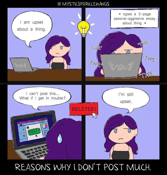
The Frustrated Introvert’s Dilemma
Well now, what do we have here?
I'll go on record and say that yes, there is a specific event/topic that inspired this. But I'm not going to go into any more detail than that, because it's almost definitely going to come back to bite me nice and hard on the rear if I do. That's the unfortunate nature of our online-enabled world these days.
That said, this actually happens to me a lot. Something will happen or I'll see a post (sometimes several posts all talking about the same thing) and I'll either have strong opinions on it or just otherwise be frustrated and want to share my two cents, and sometimes I really will go so far as to type out a Big Long Thing about it. Only, I think about it for a few seconds too long, and I end up deleting it. Because:
What if the wrong person sees it?
What if what I said gets taken out of context?
What if I get labeled as [insert thing I don't want to be labeled as here]?
What if I get in trouble some other way I haven't thought of?
I don't have a very far reach, but I'd like to keep what I do have on good terms.
But of course, deleting the post without posting it sort of misses the mark, and so normally I don't feel any better than I did before. But I rarely go back to it, since most of the time I either know or I think that I know posting my super-long (sometimes unpopular) opinion is only going to cause trouble I do NOT want to deal with. And thus, I'm better off keeping my mouth shut. Or, if I must, posting the vaguest-possible 1-2 sentences broadly touching on the subject.
And that's where the caption, "Reasons Why I Don't Post Much" comes from. Aside from my art and the very rare things that make it past my "this is not a good idea to post" radar, especially on other social media that don't support long-form text like dA does, I'm usually fairly quiet. I am a "lurker" by nature, for the reasons above and because small talk kills me slowly.
I'm sure I can't possibly be alone in this...whatever this is. This want to vent/rant/share your opinion but not being able to because you just don't want to deal with all the things that could possibly go wrong from doing so.
So I made this little comic to expend my frustrations in the safest way I could think of. It gets the point across without nailing down a specific event/person/whatever.
I haven't tried to make a comic in...in years. And the like 2 times I did, they were very simple and kinda dumb. (And I'm sure can still be found lurking in the depths of my gallery somewhere.) So hopefully this isn't too terrible. I tried to format it nicely so it's fairly clear and easy to read/follow, while still trying to keep it unique to me. (Or at least attuned to my own tastes.)
I started with a rough traditional sketch of the four panels, done in a style similar to my Chibi Cards, which I use over on Twitter a lot these days. The character is, of course, supposed to be me, hence the purple hair, blue eyes, and black tank top. Fortunately, once the idea of doing a little "vent" comic came to mind, I was able to pretty quickly come up with a clear mental image/plan of what I wanted and what I would need to get the point across as simply as possible.
And simplicity was a must because I knew I wouldn't be able to give this nice clean lines digitally unless I wanted to actually rip my hair out in the process.
You can read the full details in my Ongoing Saga journal, but suffice to say I've been trying some things with my current not-Cintiq set up and Jesus Christ is it not becoming more and more aggravating.
The biggest issue I dealt with here was the lack of precision, hence the messy, messy, messy lines, and the closer I got to completion with more layers involved, the worse staggering/lagging I also had to deal with.
Obviously, I eventually got through it, but I am telling you guys I am so ready for a better tablet solution it's not even funny anymore.
Anyway. I roughly traced my sketches to get the lines, then made the centering lines and rearranged things slightly, since my sketch wasn't perfectly centered or squared or anything. Then I expanded the canvas so I could add the frame.
Then I moved on to coloring, and once again, for the sake of my sanity, I stuck with simple, flat, imprecise coloring. And I had to do it by hand since my messy lines mean the magic wand tool wanted to select about five times more area than it needed to when I tried to use it to just "grab" the sections I needed.
My color choices were fairly simple. I know what colors I naturally am, and it made sense to me to make the background my "Mystic hue," since my walls are that color in real life, and it's just kind of my on-brand, go-to color now. The main colors I had to decided on were the desk and the computer screen. I went with a darker brown for the desk, hoping for a little extra contrasting, and the computer screen I kinda just went with what felt right.
Picking fonts was a bit of an adventure. I wanted something relatively easy to read, but with a little be of extra flair than just Comic Sans or Generic Plain Computer text number 3,497. And I think this one hits a pretty nice place between something more computery and a handwriting look. I did have to use different fonts for the *type* 's on the second panel and for the caption/my name at the top to get the look/effect I was going for, though.
It's not much and far from my best work. But at least it's a way to sort-of get my feelings out into the world. To know that I could at least do this one thing, even if I can't do anything else to vent my frustrations because other options will not end well.
At the very, very least, I hope maybe somebody out there can relate or gets a small laugh out of it.
____
Artwork © me, MysticSparkleWings
____
Where to find me & my artwork:
My Website | Commission Info + Prices | Ko-Fi | dA Print Shop | RedBubble | Twitter | Tumblr | Instagram
0 notes
Text
TOP TEN MARKSON MOMENTS
Long post ahead y’all but this was a lot of fun to go back and reminiscence about markson and their antics together. I hope all of y’all enjoy!
Also, please remember that these are my own personal opinions and that they shouldn’t be taken literally or seriously. But if you ever wanna come talk markson with me, I’m always ready :) ((Note: All gifs should be linked directly but videos and pictures with have physical links above them because I’m not sure how to link those to their respective tumblrs– if your post is here and you want your content removed bc you don’t like the linking, msg me and I’ll take it down.)) I’m a litlle late but here we go!!
1. This was one of the ones I already had in mind ;) I just love it bc it’s such a weird situation to be in but Mark, ever the gentleman, just takes it in stride and keeps his hands to himself. I love how near Jackson gets to Mark and if that isn’t the simplest testament of how (pun coming) close they are, I don’t know what is. In all honesty, if Mark really wanted out, a simple hand on the back or a squeeze on the shoulder or even just shifting out of the way would have sufficed but he stays and although his face is stoic, his eyes are constantly on Jackson. LOVE IT!
(Make sure to click the gif to see the whole gif post!)
2. SOFT!! My heart always swells a bit when I see this picture!! It’s natural and pure and they’re both enjoying this moment and it’s evident on their faces. I personally think jumping around puts a smile on most peoples faces and if other people, friends, are doing it with you, then there’s no way that isn’t going to make you shine. SO, jumping+BFF+concert adrenaline+love= BIG A__ SMILES !! Oh they’re also cuties so there’s that factor too.
LINK: http://fyeahmarkson.tumblr.com/post/136342100342
3. TBH I GOT DISTRACTED WITH THIS ONE AND REWATCHED THIS SECTION OF THE REAL GOT7– anyways…THIS IS PROBS MY ALL-TIME FAVE, THAT I FORGOT ABOUT. So the whole episode itself was hilarious with got7 and we got some markson moments sprinkled in but THIS, THIS takes the cake. I mean who doesn’t want to see their otp get this close to kissing? I love Mark’s hands cradling the back of Jackson’s head. I’d like to believe that Jackson stretched his neck up a bit more when Mark touched the other side of the paper but I’m not sure in this gif bc its quick (maybe I’ll add another one after I publish this). Like omg still can’t believe this happened though :D
4. Ok all the Got2Day Vapp stuff was gold and I loved the fact that we got to see everyone but of course my faves Mark and Jackson had the best one ;) It was cute and relaxed and I just love them in light/soft colors. Also #no#personal#space !! The video is just a short moment but it is super cute and I love them smiling at eachother bc heart palpitations~ OH but the second gif is MY FAVORITE bc it’s Mark just watching Jackson talk and he just looks so content and caring and its just one of those moments ok
(Make sure to click the gif to see the whole gif post!)
LINK: http://marksonforlife.tumblr.com/post/152683520387/jackson-lays-on-the-table-and-mark-laughs
5. I could rant FOR YEARS about this but idk if tumblr has a character limit or no.. BUT SERIOUSLY THIS IS JUST ICONIC!! It was actually the 1st to pop into my mind bc it was my icon (no joke for that one sorry) for a month I think? ANYWHO, I just straight up love this. They’re close. Jackson’s shirtless. Said Jackson is pressed along Mark’s backside. Said Mark is very very very smiley. Like Jackson could’ve chosen someone else- JB was kinda close I think- but he chose bae and got all up in bae’s business. And the fact that he’s partially restraining Mark? Keeping him flush with his body and leaning in to talk to him? My heart cannot keep up, this some tachycardia **** right here omg seriously!! Is it hot for anyone else in here or is it just them? *wink*
PICTURE LINK: http://bangtancity.tumblr.com/post/149470443176/fyeah-markson-please-tell-me-again-that-markson
VIDEO LINK 1: http://marksonforlife.tumblr.com/post/149317913961/shirtless-jackson-hugging-mark-from-behind
VIDEO LINK 2: http://marksonforlife.tumblr.com/post/149277241258/two-angles
6. GO WATCH THE VIDEO PLEASE. Like the caption is spot on in my mind and I couldn’t agree more on the fact that it looked like Jackson was going to do something intimate and then he hesitated and looked at the camera!! UGH. seriously a fave moment bc its like what were you gonna do? huh?! You can’t not agree with the fact that that boy was playing around behind Mark. And then there’s Mark’s small smile and that little thing he does with his mouth, which reminded me of someone keeping a smirk in check. Oooooh there’s def something going on there and I wish I knew what it was!!
LINK: http://marksonforlife.tumblr.com/post/151033384652/i-already-posted-this-but-ill-post-it-again
I couldn’t find a gif of this video D: but I found some others from the same video (they’re faves but this ^^^ moment is the one I really cared for)
7. ANOTHER VIDEO!! 9/10 markson shippers should remember this badboy right here. I don’t even remember what video this moment came from but even if I see a still I freak out bc this is literal gold. One of the best shows of touchy!Mark and cuddly!Jackson ever. Seriously, Mark kept putting his hands on Jackson and moving subtly, and then he even has the nerve to lean into Jackson further to whisper something-BOY!! And then there’s Jackson who decides it’s perfectly ok to rest his head on Mark’s chest all casual like he’s done it a thousand times before. And one moment I really love to see is Jackson noticing Mark playing with J’s bracelet, looking at him, and then Mark moves his hand away so quickly like he’s been caught. its cute. don’t fight me on this. Also I got newly-dating vibes from this: not sure how much actual touching is safe, leaning into one another, glued at the hip, private jokes. Markson or never ;) I’ll add a gif when I find one!
(Make sure to click the gif to see the whole gif post!)
LINK: http://awesomemeowww.tumblr.com/post/128284251380/markson-httpifttt1hebms6
8. This picture satisfies like 3 things from my otp goggles-on checklist: smiling towards the other, touching, and suggestive posturing. Don’t tell me that this doesn’t look like Jackson’s about to pull Mark in and plant one on him! The positioning of Jackson’s hands make me wanna punch something bc who puts their hands there unless its for a headbutt or a kiss?? And lemme tell you that I’m 99% sure that he’s not about to headbutt Mark. (ALSO ARMS 4 DAYS JACKSON OVER HERE #hot hot hot) Back to the smiling and touching and pose- they’re close for one thing, and then Mark’s about to go into hug mode, there’s full eye contact going on, and what a beautiful smile!! It seems so loving and happy that I just can’t deal with them rn. I have a link to a gif, Jackson jumping into Mark’s arms :) , so I’ll add that in later!
PHOTO LINK: https://dani-okem.tumblr.com/post/160701529358
9. Ok but I really think they fit together so well sometimes~ Like their heights aren’t monumentally different but it’s enough that they look good together. SO there’s that sly BUTT tap and then the blessed hand moves up to the lower back (i like ur style boy) and eventually falls off the waist when they stop in front of the fans. Mark is totally guiding Jackson here and it seems like he’s 100% a-ok with it. Oh and there’s definitely some smiles going on here! I wish we had more concerts but the fanmeets are still great but there’s something about concerts that really let otps shine.
(Make sure to click the gif to see the whole gif post!)
10. VIDEO— ITS THE FINAL ONE Y’ALL AND ITS A FAVE BC I’VE BROUGHT IT UP A FEW TIMES. (lol I still get pissed every time I remember that I posted the screenshots on my old baeksoo account instead of this one but oh whale:) ) anyways I just love love love this bc it was so fleeting but so memorable. I know Mark was running around messing with everyone during this time (and that he did something similar to JB) but this was something special for Jackson. There was NO SPACE between them and their heads were so so so close. And then there were lots of giggles and smiling and DID YOU NOTICE THAT JACKSON HITCHED HIS LEG UP WHICH IN TURN BROUGHT MARK’S LEG HIGHER AND BY DEDUCTION, THEIR HIPS CLOSER?? bc I did. bc I know that. and it’s true. AND THEN AS MARK (the little tease) LEFT, JACKSON TRIED TO KEEP HIM THERE!! GRABBED AT HIS WAIST!! I just want to know what on earth was going through Mark’s head when he decided to go and lay flush against his group member. seriously tho. but 11/10 would recommend them recreating this, in the presence of a solid 1080p filming camera preferably.
PIC LINK: http://bangtancity.tumblr.com/post/144433607756/ss-baeksoo-you-can-see-that-jackson-brought-up
VIDEO LINK: http://awesomemeowww.tumblr.com/post/127118208761/jackson-doesn-t-want-mark-to-leave-so-he-was-about
#markson#mark#jackson#gif#pic#g: mark#g: markson#g: jackson#p: mark#p: markson#p: jackson#video#v: mark#v: jackson#v: markson#hello it's me#text#long post#5k followers#thanks y'all#:)
186 notes
·
View notes
Photo

Archive Interview with Jessica Lazar, Atticist Theatre company OUTLYING ISLANDS by David Greig The King’s Head Theatre 9 January - 2nd February 2019 Interview with director JESSICA LAZAR on her company Atticist and bringing Outlying Islands to King’s Head Theatre It isn’t often you get a text saying, ‘I’m in the café, wearing a gold jumper and soaking wet’. Wouldn’t a button hole flower have sufficed? It turned out the fire alarm had recently gone off, leaving everyone standing in the torrential rain. The gamin Jessica Lazar looked more fragile than ever but the dark energy she exuded was burning hot. While she steamed nicely, we had our interview. We kicked off by discussing the future of theatre. It’s difficult to pin her down on this because for Lazar it’s more about the journey and experimentation. “Barriers are coming down for audiences as well as for smaller companies” says Lazar, citing gig theatre which bridges the gap between theatre and gig. “More generally, we expect smaller companies to explore different styles of storytelling. Is it right for the piece? Even if you don’t have experience of it to date.” Personally, she’s drawn to story, and that can come from any source. Lazar is a founder member of independent production company, Atticist, which was set up in 2015 purely as a vehicle for LIFE ACCORDING TO SAKI. It went on to win the Carol Tambor Best of Edinburgh Fringe Award 2016 and transferred to New York in 2017. She’s best known on the pub theatre circuit for her direction of Steven Berkoff’s EAST at King’s Head Theatre which won five OFFIE nominations and a raft of four and five stars from the critics. Off the back of this, King’s Head Theatre announced Atticist as one of their associate companies and over the summer engaged Lazar in some freelance work. She was invited to direct Mart Crowley’s FOR REASONS THAT REMAIN UNCLEAR (2018). Something of a curved ball for Lazar who knew it was going to be challenging. She is not spooked easily. “It was a divisive play, and everybody was prepared for that” explains Lazar. “Frankly I think it’s really exciting when something divides people. When it makes people really angry … what else are we doing?” Atticist is less interested in realism in theatre; but they do love well placed revivals when they get the opportunity. At the heart of everything they do is collaboration, on stage and in all aspects of the company. “We all pull together, I just help to steer it. I’m the cox and everybody else is making the strokes”, says Lazar. “We enjoy bringing that ensemble storytelling style to pieces that are not necessarily traditionally ensemble plays” she adds. “We tend to be drawn to things that are quite dark, witty, maybe magical realism with potential for something really physical within that, even if every choice we make is rooted in text.” “Outlying Islands was a case of loving the play and being lost to the world while reading it” says Lazar. She thought “we’ve simply got to put this on, it’s so beautiful and it’s so weird.” It has a powerful storyline which looks at Individualism versus socialisation. “It has interesting resonances for Britain in early 2019” says Lazar. “There are questions about identity in a very wide sense of the word, about loyalty to country versus loyalty to self. Also, expectations and realities of sexuality and sexual identity.” She is impressed with the breadth of its themes. “These weave together with the fascinating role of wildness and nature in a modern industrialised world. Competing value systems are incredibly important.” One of the actors was also in Life According to Saki which gives the production an immediate link to this past success. During the audition process Lazar recalled three actors who “just worked”. She clicks her fingers to emphasise the point before explaining that she knew immediately that there was a spark between them. “The audience, everybody will recognise it. There’s a game, some fun held between actors, it’s more than rapport. You can build it but sometimes people just have it and when they do have it, it’s really exciting”. It has the Atticist stamp as Lazar explains: “It can be profound and witty in almost in the same breath. David Greig is a masterful playwright; he manages that extraordinary balance.” It hasn’t been on in London for almost 20 years but was a huge success at the Royal Court. Perhaps the reason it hasn’t been performed regularly is the tricky nature of the stage directions. When Lazar spoke to the playwright for the first time, he immediately apologised about the door. Jessica calls it “door slapstick” but that’s not the end of it. There’s an “exploding stove, someone dies and gets used as a puppet, and the door repeatedly falls out of its frame”. Working in the round, with audience on all sides, it’s crucial that the door falls in the right place. “That is the biggest challenge so far”, says Lazar. They certainly don’t shy away from challenges. They stipulate that they want to work in spaces where there is wheelchair access. “It’s the right thing to do”, she says. “My father’s in a wheelchair (he has multiple sclerosis). I’m lucky in that although I don’t come from an industry family my parents have always loved theatre. They took me to theatre at a very young age.” Whilst many theatres are wonderfully supportive, she acknowledges that it “won’t always be possible at fringe theatre because of money, but we all try and do our best”. Atticist haven’t yet done a captioned performance but they are working towards it. King’s Head have lots of experience with stage text. Atticist is a company that wants to do more frequent shows. “For better or worse, we always pay people as much as we can” says Lazar. “We want to give a decent budget for things like design and these costs severely limits the amount of work we can do”. To offset these costs, Lazar is still free-lancing and hopes she always gets freelance work as she really enjoys working for other people outside of the company. “It would just be amazing also to be able to do more with Atticist too” she adds. This is a company that’s keen to expand, to take work abroad and continue to push the boundaries. With Lazar at the helm, it is easy to believe the possibilities for them are stellar. Jessica Lazar was chatting with Heather Jeffery, Editor of London Pub Theatres Magazine Outlying Islands by David Greig is at The King’s Head Theatre 9 January - 2nd February 2019 Box Office: http://www.kingsheadtheatre.com/ Transporting audiences to a wild and insular world, Outlying Islands is inspired by real events and is set the evening before the outbreak of World War II as tensions run high in a society shadowed by imminent and immense change. Atticist: [email protected]. @December 2018 London Pub Theatres Magazine Ltd. All Right Reserved CAST: Rose Wardlaw (Eyam and The Winter’s Tale, Globe Theatre; Jubilee, Royal Exchange Theatre and Lyric Hammersmith; Call The Midwife), Ken Drury (King Lear and The Crucible, National Theatre; The Woman in Black, West End; Black Mirror), Jack McMillan (The Hard Man, Finborough Theatre; Vieux Carre, King’s Head Theatre; Blue Boy, Northern Stage) and Tom Machell (Life According To Saki, Atticist Off-Broadway at New York’s 4th Street Theatre; zazU, Soho Theatre; Every Blank Ever, Comedy Central).
0 notes
Text
Equivalent Experiences: Thinking Equivalently
About The Author
Eric is a Boston-based designer who helps create straightforward solutions that address a person’s practical, physical, cognitive, and emotional needs.
More about
Eric
Bailey
…
Constructing an equivalent experience may mean changing the way you think about development and design, and potentially reevaluating your existing work. In this article, we’ll address common accessibility issues, and how to best go about improving them so everyone can effortlessly access your content.
This is the second of two articles on the topic of how digital accessibility is informed by equivalency. Previously, we have learned about the underlying biases that inform digital product creation, what isn’t an equivalent experience, the compounding effects of inaccessible design and code, and powerful motivating forces for doing better.
In this article, I will discuss learning how to embrace an equivalent, inclusive mindset. I will also provide practical, robust ways to improve your websites and web apps by providing solutions to common, everyday barriers cited by the people I interviewed.
Setting A Standard
The Web Content Accessibility Guidelines (WCAG) outlines in painstaking detail how to craft accessible digital experiences. While a long and dense document, it is incredibly comprehensive — to the point where it’s been codified as an international standard. For over 10 years, we’ve had a globally agreed upon, canonical definition of what constitutes as usable.
How Would I?
If you need a little help constructing the initial mental framework the WCAG gets at, a question I always ask myself when making something is, “How would I use this if…” It’s a question that gets you to check all the biases that might be affecting you in the moment.
Examples could be:
How would I use this if…
…I can’t see the screen?
…I can’t move my arms?
…I’m sensitive to flashing and strobing animation?
…English isn’t my primary language?
…I have a limited budget for bandwidth?
…I’ve set a large default type size?
…and so on.
Focus on these four parameters to improve usability of your web design:
1. Visual – make it easy to see
2. Auditory – make it easy to hear
3. Motor – make it easy to interact with
4. Cognitive – make it easy to understand
→ Accessibility goals are also usability goals.
— Alex (@alexmuench) January 30, 2020
A Gentle Introduction
If you’re looking for a more approachable resource for how to dig into what the WCAG covers, the Inclusive Design Principles would be a great place to start. The seven principles it describes all map back to WCAG success criterion.
(Large preview)
Learn From The People Who Actually Use It
You don’t have to take my word for it. Here are some common issues cited by the people I interviewed, and how to fix them:
Wayfinding
Headings
Heading elements are incredibly important for maintaining an equivalent, accessible experience.
When constructed with skill and care, heading elements allow screen reader users to quickly determine the contents of a page or view and navigate to content relevant to their interests. This is equivalent to how someone might quickly flit around, scrolling until something that looks pertinent comes into view.
The HeadingsMap browser extension lets you view a page’s heading hierarchy. (Large preview)
Justin Yarbrough voices poorly-authored heading elements as a concern, and he’s not alone.
WebAIM’s screen reader survey cites headings as the most important way to find information. This survey is well-worth paying attention to, as it provides valuable insight into how disabled people actually use assistive technology.
Landmarks
In addition to heading elements, another way to determine the overall structure and layout are landmarks. Landmarks are roles implicitly described by HTML sectioning elements, used to help describe the overall composition of the main page or view areas.
These are five of the eight landmark HTML elements and the roles using them create. (Large preview)
Here’s what Justin has to say:
“If I’m just trying to find the main content, I’ll first try the Q JAWS shortcut key to see if a main region’s set up. If not, I’m just more or less stuck trying to scan the page to find it arrowing through the page.”
Much as how we might use a layer group name of “primary nav” in our design file, or a class name of c-nav-primary in our CSS, it’s important we also use a nav sectioning element to describe our main site navigation (as well as any other navigation the page or view contains).
Doing so ensures intent is carried all the way through from conception, to implementation, to use. The same notion carries through for the other HTML sectioning elements that create landmarks for assistive technology.
Labeled Controls
Brian Moore tells us about “form fields with no label or at least one that isn’t programmatically associated so it doesn’t read anything.”
It’s another frustratingly common problem.
Providing a valid for/id attribute pairing creates a programmatic association between form inputs and the label that describes what it does. And when I say label, I mean the label element. Not a clickable div, a placeholder, aria-label, or some other brittle and/or overwrought solution. label elements are a tried-and-true solution that enjoys wide and deep support for accessibility.
In addition, a label element should not be used by itself, say for a label on a diagram. This might seem counter-intuitive at first, but please bear with me.
<!-- Please do this --><label for="your-name">Your name</label><input type="text" id="your-name" name="your-name" autocomplete="name"> <!-- Don’t do this --><label for="eye">Cornea</label><label for="eye">Pupil</label><label for="eye">Lens</label><label for="eye">Retina</label><label for="eye">Optic Nerve</label><img id="eye" alt="A diagram of the human eye." src="parts-of-the-eye.png" />
The same kinds of assistive technology that let a person jump to headings and landmarks also allow them to jump to input labels. Because of this, there is the expectation that when a label element is present, there is also a corresponding input it is associated with.
Alternative Descriptions
If you have low or no vision, and/or have difficulty understanding an image, HTML’s alt attribute (and not the title attribute) provides a mechanism to understand what the image is there for. The same principle applies for providing captions for video and audio content like podcasts.
Kenny Hitt mentions that when:
“…someone posts something on Twitter, if it’s just an unlabeled image, I don’t even take the time to participate in the conversation. When you start every conversation by asking what’s in the picture, it really derails things.”
Up until last week, the only way for Twitter to provide alternative descriptions for its images was to enable an option buried away in the subsection of a preference menu. Compare this to a platform like Mastodon, where the feature is enabled by default.
[embedded content]
Soren Hamby, mentions Stitcher, a popular podcast app. “The onboarding was a lot of themed graphics, but the alt text for each one was ‘unselected’ and for the same image with a check over it was selected. I think it would be reasonable for them to say ‘sci-fi genre selected’ […] it’s such a small thing but it makes all the difference.”
Ensuring that alternate description content is concise and descriptive is just as important as including the ability to add it. Daniel Göransson, a developer for Axess Lab, has a great article on how to write them effectively.
Robust, accessible features can also be part of evaluation criteria, as well as a great method for building customer loyalty. Soren mentions that they are “often the deciding factor, especially between services.” In particular, they cite Netflix’s audio descriptions.
ARIA
One topic Daniel Göransson’s article on alternative descriptions mentions is to not over-describe things. This includes information like that it is an image, who the photographer is, and keyword stuffing.
The same principle applies for Accessible Rich Internet Applications (ARIA). ARIA is a set of attributes designed to extend HTML to fill in the gaps between interactive content and assistive technology. When ARIA is used to completely replace HTML, it oftentimes leads to an over-described experience.
Brian explains: “There seems to be a perception that more ARIA fixes accessibility and it can help, but too much either reads wrong things or just talks way too much. If on screen text of one or two words is good enough for everyone else, it is good enough for screen reader users too. We don’t need whole sentence or two descriptions of buttons or links i.e ‘link privacy policy’ is far better than something like ‘this link will open our privacy policy, this link will open in a new window’ when the on screen link text is ‘privacy policy.’”
The First Rule of ARIA Use advises us to only use it when a native element won’t suffice. You don’t need to describe what your interactive component is or how it works, the same way you don’t need to include the word “image” in your alternative description.
Provided that you use the appropriate native HTML element, assistive technology will handle all of that for you. Do more, more robustly, with less effort? Sounds great to me!
(Large preview)
Unlike most of HTML, CSS, and JS, the success of implemented ARIA is contextual, variable, and largely invisible. In spite of this, we seem to be slathering ARIA onto everything without bothering to check not only if it actually works, but also what the people who actually use it think of it.
Support for ARIA is fragmented across operating systems, browsers, and assistive technology offerings, all their respective versions, and every possible permutation of all three. Simply put, writing ARIA and trusting it will work as intended isn’t enough.
If misconfigured and/or over-applied, ARIA can break. It may not report actual functionality, announce the wrong functionality, and (accurately or inaccurately) over-describe functionality. Obviously, these experiences aren’t equivalent.
Representation matters. To get a better understanding of how the ARIA code you wrote actually works, I recommend hiring people to tell you. Here are four such services that do exactly that:
Contrast
Color Contrast
Color contrast is another common issue, one whose severity often seems to be downplayed. If I could wager a guess, it’s because it’s easy to forget that other people’s vision might be different than your own. Regardless, it is a concern that affects a wide swath of the global population, and we should treat the issue with the seriousness it deserves.
The Click-Away Pound Survey tells us that out of the top issues faced by users with access needs, contrast and legibility weighs in as the fifth most significant issue. On top of that, it has increased as a concern, going from 44% of respondents in 2016 to 55% in 2019.
We live in an age where there’s more color contrast checking resources than I can count. Products like Stark can help designers audit their designs before it is translated into code. Tools like Eightshape’s Contrast Grid and Atul Varma’s Accessible color palette builder let you craft your design systems with robust, accessible color combinations out of the gate.
(Large preview)
The somewhat ironic thing about color contrast is how, ah, visible it is. While some of the previous accessibility issues are invisible—hidden away as the underlying code—contrast is a pretty straightforward issue.
Mostly, contrast is a binary scenario, in that you either can or cannot see content. So, the next time you check your website or webapp with an automated accessibility checker such as Deque’s axe, don’t be so quick to downplay the color contrast errors it reports.
High Contrast
There are technology solutions for situations where even satisfactory color contrast ratios isn’t sufficient—namely, inverted colors mode and High Contrast Mode. Many participants I interviewed mentioned using these display modes during their daily computer use.
Provided you use semantic HTML, both of these modes don’t need much effort on the development end of things to work well. The important bit is to check out what you’re building in these two modes to make sure everything is working as intended.
Striving For Perfection
To quote Léonie Watson,
“Accessibility doesn’t have to be perfect, it just needs to be a little bit better than yesterday.”
By understanding both why, and how to improve your digital accessibility experiences in ways that directly address common barriers, you’re able to provide meaningful and enjoyable experiences to all.
Further Reading
Thank you to Brian Moore, Damien Senger, Jim Kiely, Justin Yarbrough, Kenny Hitt, and Soren Hamby for sharing their insights and experiences.
(ra, il)
Website Design & SEO Delray Beach by DBL07.co
Delray Beach SEO
Via http://www.scpie.org/equivalent-experiences-thinking-equivalently/
source https://scpie.weebly.com/blog/equivalent-experiences-thinking-equivalently
0 notes
Last Seen Blogs

xhalgr
y r u here

1closetedsapphic1
꧁☬ 𝒾𝓁𝓁𝒾𝓃𝑒 ☬꧂


gnarlycism
Welcome Back.

2blissofbaking
Pooja Khanna