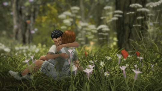
#but the answers are similar enough
Text
According to NBC here in the US, the missing titanic sub has been found. As debris. Off the bow of the Titanic wreckage.
And it looks like the sub suffered what we all suspected, and what was undoubtedly the more merciful of the two options: a catastrophic implosion from the pressure.
Also, more info has come to light about the fishing trawler with the hundreds of migrants that sank cataclysmically off the coast of Greece, indicating that the greek coast guard knew about the vessel AND how much trouble the vessel was in, and were towing it at a speed that made it capsize, at which point they unhooked the tow line and watched the trawler sink without helping the passengers to safety. Despite a bunch of other ships trying to help as well throughout the whole ordeal.
So a lot of people are dead, all because of regulations (and the lack thereof) regarding sea-faring vessels and rescue protocols. People shouldnt be allowed to make a business charging a ton of money for a ride on an uncertified, unsafe, un-seaworthy ship going deep into the ocean with no distress beacon or tether to the mothership. People also shouldnt be allowed to enact laws that criminalize the ferrying of refugees, which then force the refugees to hitch rides on fishing trawlers, and which also prevent people from helping those fishing trawlers full of refugees due to fear of legal consequences.
Hopefully BOTH of these events spark changes on an international scale in terms of what is legally allowed to be sailed, who is legally allowed to be the passengers, and what the rescue protocols are in the event of disaster for any seafaring vessel, illegal or not. It shouldnt be just the global 1% who get 24/7 search parties and remote-operated submersibles helping rescue them.
#the question of 'what do we owe to each other' can be answered simply with 'the dignity of retrieving our remains when we die'#another answer is 'the dignity of thinking about each other fellow humans with similar motivations and feelings'#also 'stopping someones potentially self-destructive behaviors just because theyre rich and want to feel special'#also i feel like humans have been sailing the seas long enough that it should be guaranteed that people will survive sea voyages#im very mad about specifically mediterranean maritime disasters because we have ancient writing saying they made it safe#sailing from Egypt to Greece was so old hat and safe that people legit took the ancient equivalent of cruises back and forth#cleopatra habitually sailed from alexandria to rome with a ton of ships and was fine#Nero tried to have his mother drowned at sea by orchestrating a dramatic shipwreck while she was our sailing AND SHE SURVIVED#and then swam to shore got back to rome and whooped his ass#fuckin pliny the elder tried to evacuate people from pompeii and the surrounding coast villages when vesuvius erupted#and he actually WAS able to rescue people#but he himself had an asthma attack from the fumes which led to a heart attack and he died on the beach#there is legit no excuse for that trawler of migrant refugees to have wrecked#negligence all around#anyway#oceangate
12K notes
·
View notes
Note
Building up on both of does anon posts, Machete and Vasco being historical figures that make waves every so often on tumblr feels very canon and not too far from actual tumblr's favourite historical figures.
And also, I feel that Machete shouldn't go that unnoticed by scholars. Being this powerful member of the clergy that escaped many assassination attempts before being killed and had a personal relationship with the pope. Like this man was a deathly and important part of the inquisition, but also left behind rumours of a same-sex relationship with a married politician.
I can definitely see him becoming a point of interest for some historians, especially does who studied the inquisition or the clergy. That's probably how Vasco's paintings of him got discovered and documented and how their relationship stopping being considered a rumour started by his now-death enemies, but an actual theory with some weight behind it.
Idk why but I'm becoming very invested in the ways history would treat and remember them, way too many scandals and drama for them to be forgotten in time.
You do make a very convincing point.
People are getting so invested in their hypothetical in-universe reputation and are clearly putting some serious thought into it and it's getting me hyped up as well ;_;
#answered#anonymous#Vaschete scenarios#the fact that the modern au takes place on the same timeline and works as sort of a reincarnation situation kind of complicates things#I'd either have to figure out how to keep the present day iterations from ever learning too much about their 'previous selves'#which can be a little tricky since history is something they're interested in#or tone down the resemblance and similarities enough that they could pass as a weird but plausible coincidence#I'm probably thinking about this too hard it doesn't matter that much
213 notes
·
View notes
Note
Could you tell us more abt ur au where Apollo doesn’t come back exactly right after surviving being so close to chaos 👀
Yes!! Actually I had a fic that I really wanted to write about this, and I am planning on still doing that but I will tell y'all the gist of it bc I cannot contain myself. (Also this is a bit different from some of the things I've said before about this so I hope you still like it lol)
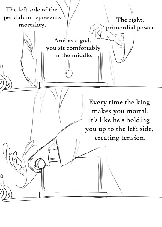
Ok so, the fic was gonna be a 5 + 1 fic, where Meg and Apollo both realize that something's ... off about him after the trials. His powers and abilities are fluctuating for seemingly no reason. Sometimes he's just a normal god, but sometimes it's like he's still a mortal. And he's also having times where he's way stronger than a god should be, like, near primordial levels. It's causing him a lot of issues, for example:
Gods don't need to eat or sleep, but mortals do. If Apollo doesn't realize his energy levels are going down, he will just end up crashing from lack of food/sleep. This leaves him perpetually exhausted and shaky.
His blood is now all kinds of crazy colors, and it changes based off of where he is on the mortal/immortal scale.
When he's in a "mortal" state of being, he's pretty similar to a demigod. Meg and Apollo learned this when Apollo accidentally did some lightning bending one day. This is not something Apollo has ever wanted to be able to do, and he freaks out appropriately.
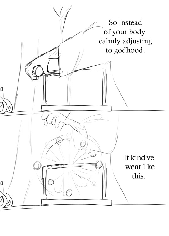
One day, Apollo woke up sick and tired of this whole situation. He jokingly wished that someone else could just take over the sun for the day. However, Apollo hadn't realized that he had just gotten a huge power boost overnight, and his harmless little wish just created a second sun. Haha whoops.
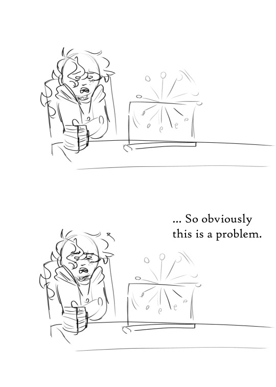
Eventually, Apollo ends up breaking his father's rules and visiting Asclepius just so he can get some answers about this, so here's a little rough comic based on the scene I wanted to write explaining this whole mess.


#Is this whole thing an excuse to write whump? ... maybe#Also I imagine Asclepius describes illnesses to his patients with odd metaphors#because he's still his father's son at the end of the day#trials of apollo#toa apollo#lester papadopoulos#sunny speaks#apollart#ask#This isn't exactly related to my whole “Apollo becomes more chaotic after chaos” thing i've written about a couple times#but I hope it's similar enough that you still like it#also I will try to answer the rest of my asks today bc y'all have sent me some really nice stuff
283 notes
·
View notes
Note
To me the funniest aspect of the ships between the scrybes is the silent implication of them collabing on making a campaign. Imagine Magnificus and P03 working together to make one. Imagine Magnificus and Leshy working together on one.
someone in my youtube comments said magnificus and leshy would create a massive convoluted DnD campaign that never ends and they're so right for that, i think a game from the two of them would barely resemble inscryption anymore lmao
magnificus and p03 i think about a lot bc genuinely it would probably be a pretty good campaign; magnificus would probably have a lot of larger than life ideas for settings, bosses, cards, etc, but p03 would know how to make it more playable, digestible, and satisfying to a player. i have no doubt they'd butt heads at MANY points (it would def take them ages to settle on a good techno-magic setting) but if they by some miracle managed to cooperate well enough i think it would probably be one of the better campaigns out of all potential scrybe collabs, especially since p03 is like...kind of not bad at story? maybe it's a hot take but despite his lackluster narration i think he succeeds pretty well in constructing his lil post-apocalyptic robo hellscape in act 3
of course the real wild card in any of these collabs is the idea that they're in a relationship or have feelings for each other while they're collabing; either these guys are emerging from this collaboration bonded in epic love for life or they're breaking up mid-development lmao
#doot answers#inscryption#you could argue that leshy and p03 would also make a good campaign together for similar reasons#unfortunately i think the chance of them being friendly enough to achieve that is even less than that of p03 and mag lmao
35 notes
·
View notes
Text
dyke!Chilaios has me understanding breeding kink all of a sudden
#chilaios#that's a lie i understand breeding kink very well lmao#HOWEVER IT MUST BE SAID#they finish up a great scene. hot lesbian sex. all going well.#and laios lies back with her eyes closed. still flushed and sweaty. she rests her naked hand on her naked lower stomach and says. 'hah....#'did you know ...that tallmen and halflings can have kids together?' Like its just another fun monster fact.#she's trailing her fingers absentmindedly over her stomach now. tracing idle patterns.#'with our lifespans being so similar it isn't even as big a deal as it is for elves and humans. they're even fertile and that's ...#that's really rare for hybrids.' her eyes are still closed. she swallows hard. She's more red now than she was when they fucked.#'you should talk about that next time you're in me. i'd like it...' and she cracks one eye open a sliver#to see chilchuck . BEET. RED.#because Chilchuck DID NOT. KNOW.#She was already fucked out and now she's dying?? she's dying. Laios still has her huge hand resting on her huge smooth stomach#miles and miles of soft skin...that she wants chilchuck to put a BABY in#she's thought about the hypothetical lifespan and safety of the hypothetical baby! is this just a sex thing? is this a for real thing?#chilchuck does not know and does not know which one she's hoping for now!! cause both sound GREAT#AND OF COURSE THERE'S ALSO#chilchuck remembering that conversaion next time Laios's huge huge fingers are inside her. Laios's hot wet breathing by her ear.#Laios's breathing going ragged even though no one is touching HER she is the one toying with Chilchuck right now. She always does that.#between the breathing and the fingers and the warmth and the smell Laios is all around her and she just thinks -#'Laios is so huge. Laios's baby would be so huge. I'd be so huge. Pregnant with it.' And she cums.#rattles her to her fucking core. Chilchuck who HAS BEEN PREGNANT BEFORE realising. holy shit.#i want this fluffy haired socially awkward 26 year old doggirl to . to fuck a baby into me. in a sexy way.#i think . I think it's hot.#enough to turn you to drink isn't it!#u may ask - hey how come chilchuck has a girlcock and has got pregnant? can laios get chilchuck pregnant?#does anyone even have a womb in this situation? I may answer - don't worry about it#a wizard did it. whatever. its a fantasy world.#whatever is sexiest in the moment i don't care#lesbiance
48 notes
·
View notes
Note
will you also be donating/selling your clothes? ( just curious, sorry if you answered already ! )
no prob, I haven't answered this one yet!! so, I'm probably going to try and get a lot of my Newly Loose clothes altered? before I consider hocking them. also, I was really STUFFING my tits into some of my clothes to start with, so they may fit me even better now, not worse!
there are alsoooo definitely certain pieces that I wanna hold onto more tightly than others. but if I've got a pile of dresses/tops that are too big and I don't wanna deal with fixing them, I may make a post to sniff out if anyone wants them.
#just in general since a lot of ppl with a similar ish body type to mine do follow me.#again I'd probably sell but clothes are less expensive than bras#so I could also just give them away and have ppl only pay for the shipping#I don't know for sure yet! I haven't made clothing plans bc I can't try on my clothes yet#until I can lift my arms over my head w/o getting Scared#as soon as I have enough mobility to try on my wardrobe w my New Body then I can start making plans to get rid of some shit#sergle answers
55 notes
·
View notes
Note
So horrorpills has guide sans... How about angel with Juniper?

i think this is the actual final design for these guys now
Angel! and Keeper! Sans belong to me !
side note i dont mind my characters being shipped with others', do whatever u want lol <- person who shipped HP with Mori the moment he was introduced
#underangel#angel sans#keepertale#keeper sans#undertale au#sans au#sid art#sid ocs#sid answers#looking for a font for them was so difficult because it had to be similar enough to blend together#why do i torture myself with this
34 notes
·
View notes
Text
i'm. suddenly realizing the parallels between sada sacrificing herself for koraidon and florian throwing himself infront of kieran when he's about to get hit by terapagos's tera blast... after everything that happened in area zero, florian was determined to not be like sada. only to do something very similar to what she had done.
i think in that moment — when he's not sure what the end result of his actions will be, if he'll make it out of the underdepths alive — florian starts to understand her a little better. he thinks " oh, that's why she did that. because she didn't want to see something she loved hurt. "
#BIG DISCLAIMER FOR ANYONE NOT THAT FAR INTO THE STORY : this doesn't happen in canon#it's just what happens in my interpretation of the story i don't wanna cause any confusion!#florian makes it out alive obv and his view of sada is shifts slightly but he still wouldn't think highly of her#just knowing that she essentially abandoned arven to prioritize her goals is still enough to make him dislike her that didn't change#( unfortunately for him he's a lot more similar to her than he realizes and that's something he's gotta grapple with )#this was supposed to be a post about florian having nightmares after the first expedition to area zero#but i changed course when i noticed this bc GOOD LORD#did ya'll know that florian wasn't originally meant to be the main protag in mjverse?#i just stumbled into making him my fave boi to have things happen to oops#i need to answer that ask i got about how florian got hit w/ the tera blast i really haven't gone into depth about it yet#pokemon#pkmn scarvio#hc : (pkmn) mjverse#chara : florian russel cavallari#mj.txt#sv dlc spoilers#indigo disk spoilers
30 notes
·
View notes
Text


BAD BUDDY EP 1
OUR SKYY 2 BAD BUDDY EP 1
#i don't really have a quote for this one but instead a series of observations because I Am Just Like This#this is another set of not exactly mirrored parallels#but in a really fun way#the ep 1 interaction happens after the fight where they settle the current issue between their faculties#the os2 interaction happens after the 'fight' that has set off some bad blood between the faculties#like pat mentions over lunch he can't give up the auditorium now because it's a matter of pride#not his pride but his faculty's#the first punch hit pat because it was the first time patpran had been conspiring together in 3 years#the new one happened because pran is focused on the work they both have to do#'it was not the time to be lovey-dovey' because he was thinking work#(also why he pushes pat away from the mosquito net kiss)#(if they start being lovey dovey now they're not going to get anything done and pran knows it)#the first one ends with pat walking away after a bit of teasing from pran after they share a moment#the new one ends with pat walking away after a bit of teasing from pran because their moment was ruined#but the one similarity#'happy now?' both of them ask#and both times the answer is 'kind of. but it's not enough. not yet'#parallels my beloved#bad buddy#bad buddy brain rot#bad buddy series#our skyy 2#our skyy bad buddy#kk.gifs#pdribs#uservid
122 notes
·
View notes
Note
Seven Sins Challenge: Which of your OCs fits pride, greed, wrath, envy, lust, gluttony and sloth. Then pass it on...
feel like i’m shamecubing matthias here but 🤷
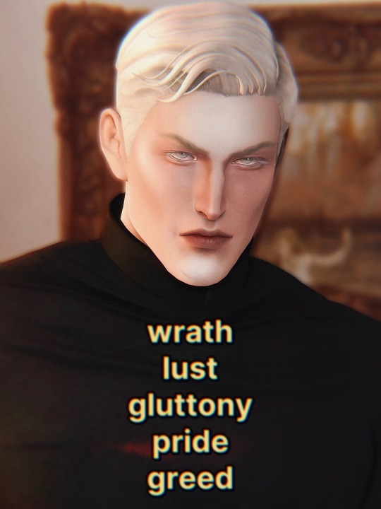
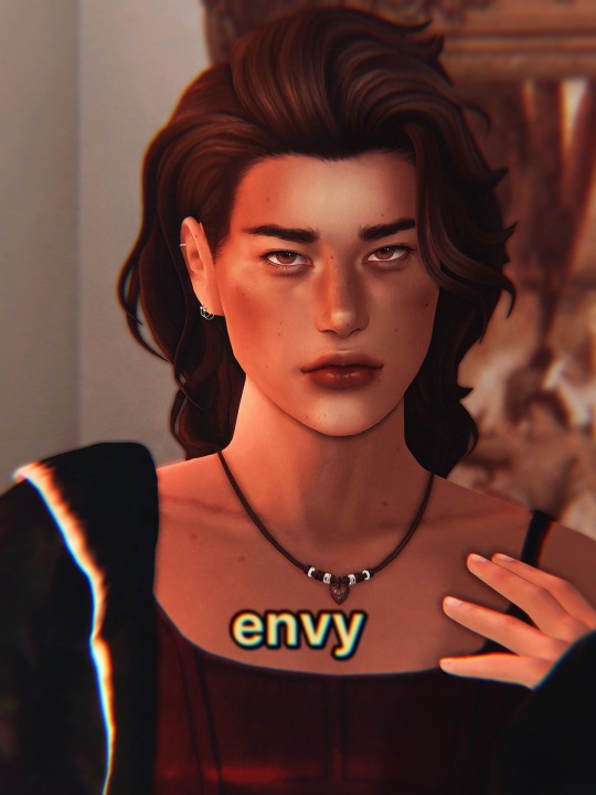
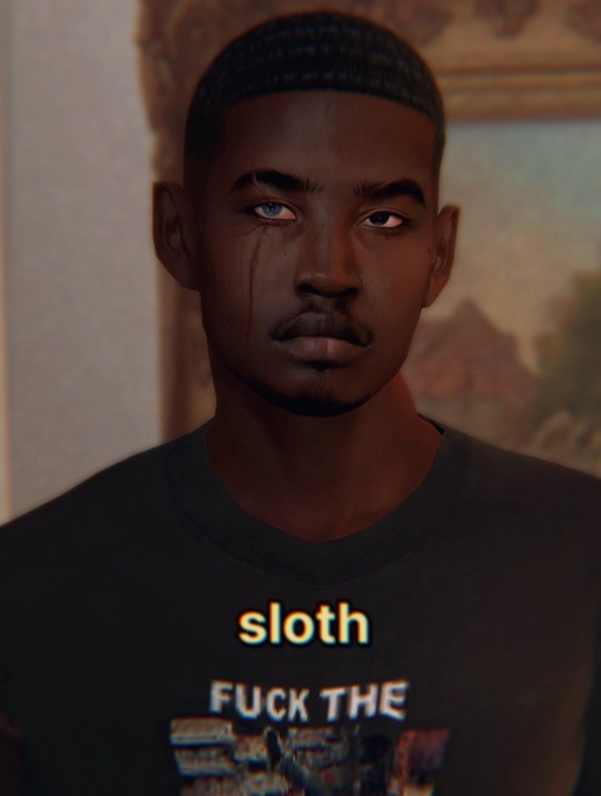
#thank you for sending this to me btw <3 made me laugh just bc like. i knew matthias would be forced to look in the mirror for once#…too bad it just made him smile 🙄#theo’s a little greedy too but it’s not like. enough to really classify him with it#also!!! mattodore didn't fit sloth at all… esp. not theo. so 🫵 forcing everyone to see one of my other ocs for once#dionte sleeps a lot…#even before he was turned into a werewolf and started getting prophetic visions he was still there falling asleep on subways#and he was NAWT meant for working. he was meant for batting his pretty little lashes and having things handed to him on a silver platter#river dipping#asks#agena87#matthias evanoff#theodore doe#dionte duval#echthroi#lykos#ts4#AHHHHH!!!!!!!! this puts me down to only four more asks left in my inbox 😋😋😋😋😋#this is so crazy icb how clean it’s looking in there….#two of these are just the same tag game and idk if i need to answer them anymore bc i answered that message from morri that was similar#hm…#um and then the last two are oc questions abt mattodore 😁 one is spoiler territory tho so i don’t think i can answer it </3
27 notes
·
View notes
Note
Stevie and Asa are my emotional support cousins
mine too 😭 a hug from them would fix me

#i wish i had a cousin similar in age#all of mine are much younger than me#except the MUCH older cousins that i've only recently gotten to know#i've always thought cousins would be the ideal friends bc they probably don't live with you so they can't annoy you like a sibling#but they're close enough that they would understand your family situation and can relate on some level#obviously this doesn't apply to everyone but it was just a daydream of mine while growing up lol#asks#anonymous#nonsims#brandi answers
58 notes
·
View notes
Note
Does machete not like to be touched/not used to being touched?
I've noticed that whenever vasco touches him in your art, he's always has this grip, or an uncomfortable/suprised look.
I think he's just highly guarded and touch-averse, that's all.
He has a history of being manhandled a bit as a child, nothing too extreme, just typical stuff you go though when you're a shrimpy and sensitive kid growing up under the care of a very harsh and volatile adult who doesn't realise how much stronger they are than you.
As a priest he's expected to maintain an aura of solemnity and reverence so he just sort of lives in his own little bubble of personal space, which he's neurotically strict about.
As it stands, most of the physical contact he gets comes from his doctors and personal physicians, and their treatments tend to be uncomfortable at best and degrading, invasive and painful at worst.
So yes, neutral, let alone affectionate touch can be alarming and confusing if you're not used to it.
#answered#anonymous#Machete#being unable to get close to anyone mentally or physically is a big thing with this character#this plays into his clothing choices as well#high coverage outfits put a tangible barrier between you and the rest of the world#your hands aren't physically touching the things you touch if you wear gloves all the time#and form fitting clothes high collars and turtlenecks are a sensory thing they give off a feeling that is similar to being hugged#skin hunger is actually a really interesting phenomenon#when it comes to social species like humans and dogs your mind and body start to malfunction if you're touch starved long enough
309 notes
·
View notes
Text
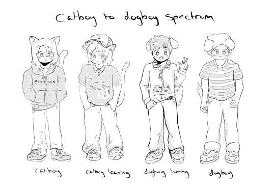
perfectly balanced
#ofc the one time i am asked who im drawing the answer is dogboy joe trohman -_-#my art#fall out boy#idk enough abt cat types to really place andy but patrick is orange#pete is a purse dog and joe is i think a labrador or something similar :]
155 notes
·
View notes
Note
please tell me about the pigments i would love nothing more than to hear you talk about that one shade of red you like and the process it took too recreate it
... oh, op. you have no idea what you've unleashed.
alright. here we go.
OKAY SO THE RED PIGMENT. pr206. my beloved. my dearest friend. it was an absolute bastard to find because there are so many of these. however many you think there are, there are MORE, and that's only if you don't count the many many scenarios where colors are known to be multi-pigment mixes, usually varying in tone/shade/intensity depending on the brand and manufacturing style. some colors are more consistent than others, but there are situations where a color can be named the same and contain the same pigments and STILL look wildly different depending on the ratio, binder, and paper you use. and that's not accounting for the way the pigment is processed. some pigments (like pv19 for example) can come in so many shades it's frankly kind of ridiculous.
anyway, my quest begins when i am, admittedly, in an edgier phase. i want a blood red, but not specifically because of that—no, i want it because it is THE IDEAL COLOR (to me) for a perfect, warm, slightly muted but still intense shade to add to a muted autumn watercolor palette. and... if you look at my whole theme, you probably know how much i love warm colors. i want to paint mushrooms. i want to dim down some of the brighter greens to make them autumnal. i want the perfect red to put as an undertone.
the search starts in earnest.
the immediate issue is this: reds (and purples and pinks) have horrifically bad lightfastness. not all of them, mind, but many are NOTORIOUS for fading under uv light, which means they will also fade if exposed to sunlight even in passing should it happen often enough. and—in especially bad cases where they're essentially working with dye and not pigment—they can even fade inside your notebook. inside of a drawer.
so not only are we working with an unfortunate pigment base (i'm simplifying here, there's way more nuance to this but shh) but we are working with one that skews heavily toward floral pinks or oranges. the red i'm searching for is warm, but not orange. dries dark but not brown. is transparent, not opaque. that last part is agonizing, because i also desperately do not want a color that will fade on me or generally destabilize, and most of the stable dark red pigments are EARTH pigments like red ochre (pr101) or the like. which, while fascinating because of their historical usage in things like pottery and even cave paintings that last to the modern day, are VERY OPAQUE. this is an issue with my preferred style of watercolor painting specifically, because opaque pigments tend to lift easier off the page and limit layering.
the search continues. pigment after pigment breaks my heart for one reason or another, drying too close to the cooler purpleish-red tint of wine at best. i think i find it in perylene maroon, but the drying shift (the difference between how a color looks wet vs after it dries on the paper) is so extreme that it loses the luminosity AND it's more opaque than most. i languish.
for a while my search turns to creation. i try and mix as many of my single pigment colors as i can into something that vaguely resembles what i'm looking for—so i take quinacridones and mix them with napthols, with nickel azos, with dashes of ultramarines and burnt sienna. everything turns out either just a bit too opaque, just a bit too muddy (that happens with multi-pigment mixtures, and is why so many people swear by single pigment colors. it's personal preference, really, great art can be made either way.)
still, nothing works. failure haunts me. i sit before a pile of used up watercolor paper that is literally covered edge to edge in nothing but similar red squares with various gradients and blooms as evidence of when i tried and failed to convince myself my efforts were close enough. i admit defeat.
in the meantime i shift my focus. i try and appreciate different color palettes and profiles, experimenting with things like fully transparent palettes (personal favroite) to fully opaque ones that function more like gouache. but despite finding appreciation for it, i still think about the damn red that i could never recreate. it kills me.
and then one day, a youtube video. a pigment is being discontinued, and the watercolor community is distressed. this happens a lot, because pigments are actually not always popular because of artists—sometimes beloved colors are put out of production because larger markets like car companies no longer find them popular enough to invest in. this time, the casualty is pr206, aka brown madder, aka quinacridone burnt scarlet.
let me tell you a little about quinacridones. they are genuinely remarkable colors. they have their own cult followings because of how bright and abnormally stable they are under uv light. they're transparent. they're luminous. they come in mostly shades of red and pink and purple, though there are a couple oranges and yellows in there. (there are no quinacridone blues, as far as i'm aware, but the phthalo blues have that category covered.) they also rewet beautifully, so you can put them on your palette and let them dry and not worry about it turning into a useless little rock of color that you can't get any pigment from anymore.
quinacridone magenta (pr122) is probably the most popular of these, the most often used besides maybe quinacridone violet (pv19). a few years prior we suffered the loss of quinacridone gold (po49) and since then people have been On Alert when it comes to losing these colors. i am one of them, because i never got the chance to even see po49 in person, and now the tubes are so stupid expensive that even the student grade versions go for Ridiculously High Prices on ebay, and the professional brands are being hoarded like (ironically) gold by anyone lucky enough to have a tube left over.
but back to our main character. not me, the pigment. pr206. i have legitimately never heard of this one, which to be fair is probably because i try to limit the random colors i fixate on since the hobby can easily get VERY expensive if you aren't careful. but it's a quinacridone, and that catches my eye.
i open the video.
now, i'm sure any artist out there will be familiar with the fact that screens don't display color consistently. it depends on your device, but most can agree that something that looks cooler on one may be warmer on the other, it's just what happens. but i see this color being swatched, and my brain implodes.
it's almost a perfect match.
it could work. it could. years of thinking that same thought have left me bereft and mistrustful of this specific quest marker, but the thought refuses to leave me. probably because the 'discontinued' label flashes like a neon sign.
i resist for about six months, and then i cave. at this point i have genuinely been trying and failing to find this color for upwards of five years. i am desperate, and the color might not be available anymore soon anyway, and apparently i am weak to sales pitches. (note: the color IS now unavailable in some brands, but others bought a decent supply and should have it available for at least a little while, alongside po48 which is quinacridone burnt orange, a favorite of mine and probably one of the only oranges i use regularly. both are discontinued officially, but they'll still be on sale till those supplies run dry.)
the color arrives. i grab my favorite brush. i pull out my stash of paper that i save for special occasions.
it's almost perfect.
i mix it with quinacridone burnt orange.
the result is, i swear, a perfect match for what i have been searching for.
it's warm. it dries dark but not dark enough to look brown. it keeps its luminosity (thank you quinacridones). it's fully transparent (thank you quinacridones). i genuinely feel the urge to weep, but i don't because i am clinging at last to the dredges of my sanity and also salt makes watercolor pigments behave differently and i will not risk this glorious moment. finally, after all these years, bill cipher has a gun i found the goddamn COLOR.
i mix it with warm yellows and with my favorite blues. with the pinks, just to laugh. life is beautiful and i am painting its sunsets, and i do not care if they look ridiculously messy. i have won.
the moral of the story is to never give up. or maybe it's to remember you never actually know everything about even the fields you love the most, because this color totally blindsided me despite being much more common than i expected. or maybe it's that i seriously needed to chill out for a while.
but yes. that is the tale of one (1) of the colors that has taken up residence in my soul. i hope you don't regret asking now lmao.
#ney's art tips (art questions)#ney's chatter (ask answers)#so also i said that a good alternative to pr206 is pr175#but i'm actually not totally sure about that because i've never tried it myself#watercolor is an expensive hobby and that's part of why i swapped to digital orz#BUT! from comparisons i've seen they are at least similar enough to scratch the itch#ironically i think i still USE po48 more than i do pr206#but that one is also In Discontinued Limbo where you can buy it but supply is indeterminately limited lmao#still a gorgeous color though.#... wow. this was incredibly niche and probably barely coherent i am so sorry LMAO#but thank you for indulging my color madness. it was the only hobby i had for *ages*.#long post#very very long post#good god is this my longest text post? aside from maybe a hive story?
20 notes
·
View notes
Note
what are some your hc’s for tedtrent!! go crazy please!! :))
oh man oh man i know i have a whole bunch of them that i cannot for the life of me remember on the top of my head rn, which is why this ask is taking so long for me to answer but HMM...
i know that people like to make Trent out to be this, experienced Elder Gay type of guy but in my heart i know he's just as inexperienced to it as Ted (who, in my head, is bisexual, recently found out during his time in london or during the amsterdam episode even) and they're just two people falling in love in the most "I don't know how to do this, but I want to atleast try" way and at times get soo so so overwhelmed that someone loves them as much as they love the other. maybe their communication is absolute shit, maybe Trent doesn't even realize they're on their 3rd date and thought it was something similar to the indian restaurant where Ted just brought him along for dinner, i just think it could all be very silly, very intimate, just all around driving me up the damn walls!!!!!
oh also Trent absolutely hates Ted's whole, open jar peanut butter left on the counter for him to dip his finger into, thing. wishes daily that Ted would just use a darn spoon like a normal person 😭
#pn.ask#i wish i could go on and on and on because i have SO MANY THOUGHTS ABOUT THEM but everytime im faced with this type of question my thoughts#blanks out so bad. i might probably go back to this to add more though if i thought about it enough <3#like very silly headcanons like ted absolutely adores trent's daughter and brings her sweets (which trent loathes because crimmlet would#be bouncing off the walls for the next 3 hours) is just a (head)canon that most people already Have which i love too so i dont really want#to repeat what others are already saying LOL#if you go back to asks ive answered similar to this one i probably left similar ramblings like this in the tags... i know im def just#repeating myself because this One Thing of tedtrent being unexperienced but wanting it to work just itches my brain SO MUCH#something something higgins' whole. ''If you're with the right person. even the hard times are easy.'' thing. AGGGHH!!!!!!#I WANT IT I JUST WANT IT SO BAD!!!! RAAAAHHHHH
30 notes
·
View notes
Text
okay so was not-sasha something that everyone was aware of or was it like a huge reveal moment????? cause i was incredibly shocked when they found out that sasha had been replaced, but now im listening to mag 40 and they literally credit the voice actor at the end as 'not-sasha'????? like was this an actual mystery back in the day or was i just dumb
#like maybe it was just me#cause i tend to zone out a lot during podcasts and also i don't recognise voices that well#and sasha and not-sasha haave a similar enough voice that i couldn't tell u if they changed it unless u point it out to me#or i compare them side to side#someone answer pls im losing my mind#tma#tma liveblog#tma spoilers
15 notes
·
View notes
Last Seen Blogs

salty-ironstrange-shipper
CARAMEL salted, this is only funny to me

fghsposts
제목 없음
luna-1234s-blog
la manzana envenenada a los ojos de Rafal

sokazed
starve the ego;;feed the soul