#drawing sonic characters more on-model challenge
Text


rouges gallery
#Rouge the bat#Shadow the hedgehog#sonic the hedgehog#sonic#drawing sonic characters more on-model challenge#rouge gets elected president and impliments rougeconomics. rougenomics. rognomics. regan who
3K notes
·
View notes
Photo
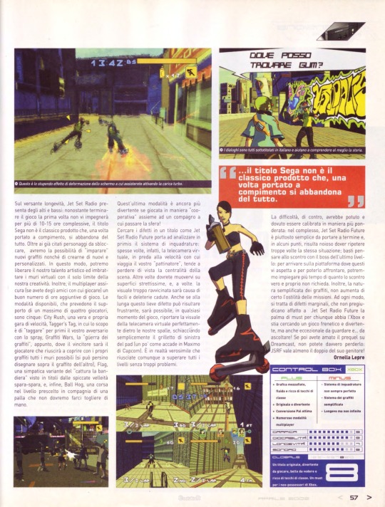
Review - Jet Set Radio Future on Evolution Magazine Vol.3 (Videogame Magazine) (Italy, 2002)
Translation in English:
(Page 54-55)
DISTRIBUTION - INFOGRAMES
GENRE: ACTION
PLAYERS: 1-4
MANUFACTURER: SEGA
DEVELOPER: SMILEBIT
FORMAT:XBOX
MEDIA: DVD-ROM
The concept of love, roller skates and a can of spray paint...
Almost two years ago, Jet Set Radio for the Dreamcast revolutionized the concept of modern video games. It wasn't a sequel, it wasn't a third-person adventure, it couldn't benefit from a character of attraction like Sonic but, despite everything, we were facing a great game. To tell the truth, it wasn't even easy to classify it in a precise genre; Jet Set Radio was an action game, but it had one feature that was increasingly difficult to find in this industry; the originality. Too bad that for most everything has gone unnoticed for the simple fact of running on Dreamcast. Fortunately, the European launch of the Xbox has resurrected a franchise deserving of the attention of the mass (yes: I said mass) of gamers.
The scenario of the action is a futuristic Tokyo of 2024, in which we will dart around with our "fireblade" model skates at high speed, drawing graffiti on the walls and performing acrobatic evolutions on all plausible and "grindable" surfaces. The aim of the mission, in the role of the young skater Yoyo, will be to recruit new members for our gang (after having regularly defeated them) and fight the terrible Rokkaku, a corporation that keeps the city on fire and acts with the complicity of the police local. This will chase us with any means, including tanks and helicopters! The whole adventure will be narrated by Professor K, a rebel DJ at the head of the transgressive private radio Jet Set. After passing the tutorial, disguised as the first level of the game, and having made the acquaintance of Gum and Corn (already present in the Dreamcast version ) we will be ready to dive into the most eclectic and fun challenge of our new career as writers: painting the walls of the city! And it's a real blast running around Tokyo, especially thanks to the beauty of the levels, some of which are truly jaw-dropping. Local traffic, crows perched on the roofs of houses, people in modern clothes who run away when they see us, everything has been created with particular attention to the refinement of detail. Unlike the first episode, in which the graffiti was created through complex rotations of the analog stick, now it is sufficient to press the R key (or the X and Y keys if you are in the air); understandable choice, if you take into account the fact that most of the graffiti you will have to do during the race. Jet Set Radio Future, in fact, is faster and more adrenaline-pumping than the prequel, and the emphasis was placed by Smilebit more on the stunts to be performed with skates than on the drawing of the graffiti. Precisely for this reason, to try to reach the most hidden areas to paint, we will have to learn how best to exploit the livery of our skates to slide (grind) on the most unusual surfaces (telephone wires, railings, stairs and lamp posts) and increase the thrust of our jumps. Furthermore, after collecting ten cans of spray paint, we will be able to activate the turbo boost, useful for having a greater thrust during the stunt phase. This effect is emphasized by the Xbox hardware through a spectacular screen deformation, which lets the gamer's jaw sink a few feet.
If all this were not enough, know that by continuing in the missions we will be able to select new characters, each with their own personal characteristics, from a rich roster that includes twenty-one skaters. JSRF is not only great playability: the originality and immediacy of the gameplay are accompanied by an equally valid technical realization. Graphically, Jet Set is one of the best titles to appear on Xbox so far, if not the best. The three-dimensional engine behind the Sega production is entirely in cel shading: although the environment is entirely polygonal, the less trained eye has the impression of watching and playing a real cartoon. The large number of moving objects on the screen at the same time immediately catches the eye; but the much-discussed slowdowns are very few and, certainly, not such as to negatively affect the gameplay.
The richness of details is astonishing: not only will you be "inundated" by polygons wherever you turn, but also the variety and resolution of the textures are incredible. The whole game is full of touches of class: lighting effects, lens flare used at best, stylistic traits designed to give greater dynamism and speed to the evolution of the characters, very vast and decidedly "alive" environments. And all of this shoots at an almost constant 60fps! Fortunately, Xbox Pai owners weren't penalized by the conversion: JSRF makes use of the 60 hertz mode, the image is full screen, without annoying black bars, and all the dialogues have been subtitled in Italian.
The audio part is no less impressive, with a soundtrack that mixes songs from the Japan and U.S.A versions of Jet Set Radio and adds new ones. The opening track made by Hideki Naganuma (The Concept Of Love) is already an editorial catchphrase, and we wouldn't be surprised if you started humming it habitually, too. If you own a Hi-Fi system with Dolby Digital 5.1 decoding, be sure to plug in Xbox and savor the sweet panning of Jet Set Radio Future. If you do not yet own it, you may be satisfied with the more classic stereo mode.
“...the originality and immediacy of the gameplay are accompanied by an equally valid technical realization.”
Some elements of the three-dimensional environments can be destroyed.
The characters are made up of polygons in Cel Shading and animated in a fluid way.
(Page 56)
THREE CHEERFUL GUYS OUT OF THEIR MINDS
JET SET RADIO FUTURE SOUNDTRACK
The Jet Set Radio Future soundtrack includes a tracklist created by artists from the American hip hop scene. The Latch Brothers, a group formed by three nice composers (Mike D, Tick and Wag), wrote and composed five tracks of the soundtrack of the title Smilebit. The chosen style varies from rock to hip hop, passing through electronic music that gives the title a greater futuristic atmosphere. In addition, the Latch Brothers have remixed the songs from the prequel (which we recall were played by the likes of Bran Van 3000, The Prunes and BS 2000), resulting in an almost unprecedented musical accompaniment. To top it all off, there are some "extended versions" by other musicians on the defunct Grand Royal label: Bis, Cibo Matto, Scapegoat Wax and Russel Simins. WaveMaster's Hideki has also left his mark on the Xbox version of JSR: by him the opening track "The Concept Of Love". A track that has already entered the Evolution charts ...
The Latch Brothers discuss with Smilebit the possibility of composing some tracks of the Jet Set Radio Future soundtrack.
After an elaborate discussion, the proposal is accepted! In exchange for three copies of the game, the Latch Brothers will produce five unreleased tracks and the remix of those from the last edition. Of course, the final compensation was quite different....
(Page 57)
On the longevity side, Jet Set Radio has some ups and downs: although finishing the game the first time will not engage you for more than 10-15 hours in total, the Sega title is not the classic product that, once completed, you abandon altogether. In addition to the aforementioned characters to unlock, we will have the opportunity to "learn" new graffiti as well as to create new and customized ones. In this way, we will be able to unleash our artistic talent and daub virtual walls with only the limit of our creativity. In addition, multiplayer ensures (if you have friends to play with) a good number of additional hours of gameplay. There are five modes available, supporting up to four players: City Rush, a real speed race; Tagger's Tag, in which the goal is to "tag" your opponent first with spray paint; Graffiti Wars, the "graffiti war," in fact, where the winner will be the player who manages to cover as many walls as possible with their graffiti (you can even draw over each other's graffiti), Flag, a nice variation of the "capture the flag" seen in titles with pronounced shoot-em-up ambitions, and, finally, Ball Hog, a race through the chosen level in the company of a ball that we won't have to let get out of our hands.
The latter mode is even more fun when played "cooperatively" together with a partner to whom you can pass the sphere!
Looking for flaws in a title like Jet Set Radio Future leads one to first analyze the framing system: often, in fact, the virtual camera, in the grip of the speed at which your "skater" travels, tends to lose sight of the centrality of the scene. Other times you will have to move on very narrow surfaces, and, at times, the too-close view will be the cause of easy and deleterious falls. Although in the long run this slight flaw can be frustrating, it will be possible, at any point in the game, to bring the virtual camera view back perfectly behind our backs by simply squeezing the left trigger of the pad (somewhat as happens in Capcom's Maximo). It is actually likely that you will still make it through all the levels without too much trouble.
The difficulty, on the other hand, could and should have been calibrated in a more thoughtful way: overall, Jet Set Radio Future is quite simple to complete and, in some points, it is boring having to repeat the same situation too many times; just think of the fight with the boss of the last level: to get to the platform where he awaits you and to be able to face him, we could take more time than the actual fight requires. Also, the streamlined nature of the graffiti certainly doesn't add to the hostility of the missions. In any case, these are minor flaws, which in no way affect Jet Set Radio Future as a must for anyone with an Xbox and looking for a fast-paced and fun game, but also exceptional to watch and... to listen to! And if you loved the prequel on Dreamcast, you really can't miss it: JSRF is worth at least double its parent! - Ornella Lepre
“... the Sega title is not the classic product that, once completed, is completely abandoned.”
This is the amazing screen warping effect you will witness when you activate the turbo charge
The dialogues are all subtitled in Italian and help to better understand the story.
CONTROL BOX - XBOX
PLUS:
- Breathtaking graphics that are smooth and full of classy touches
- Original and funny
- Excellent Pal conversion
- Numerous multiplayer modes
MINUS:
- Framing system not always perfect
- Simplified graffiti system
- Long-lived but not infinite
GRAPHICS - 9
PLAYABILITY - 9
LONGEVITY - 7
SOUND - 8
GLOBAL - 8
An original title, fun to play, beautiful to look at and full of touches of class. A must for new Xbox owners
115 notes
·
View notes
Text
A poll for Rouge the Bat fans (and Sonic fans in general)
I just wanna do a little... "thought experiment", if you will.
Feel free to vote and reblog this poll so it reaches more people, as well as going into more detail in case you chose Option 3.
[After the Read More, I've added some summarized arguments in favour of each of the first two options.]
I've seen people making some variation of the following arguments for both options (I apologize in advance if they feel rushed, I tried not to make this a massive wall of text):
Some who assign more blame to SEGA/ST pointed out Rouge's 3D model in Sonic Adventure 2 having The Physics™ and generally looking even more provocative than the official art made by Yūji Uekawa, which would prove that SEGA/ST were fully aware of what they were doing with/to the character and shouldn't be neither surprised nor offended by all the... interesting Rouge fanart because "they had it coming". Her treatment by SEGA/ST story-wise in other appearances of the character after SA2 is sometimes compared to Samus Aran's treatment by Yoshio Sakamoto around the time Metroid: Other M was released (and the way Nintendo at large treated her when she debuted in Super Smash Bros. Brawl and re-appeared in Smash 4).
Meanwhile, others are more inclined to hold fans responsible for this. They point out that people who would be "sexy" according to society's beauty standards/conventions should just be seen as normal instead of being so blatantly objectified, in the same way that people who don't conform to those same beauty standards and are therefore labelled "ugly" (or merely "average" or "uninteresting" or "not really noteworthy") should be treated as actual human beings; as for when other fans respond to this trend by trying to convince everyone else of de-sexualizing Rouge, that would actually be a knee-jerk reaction from people with rather puritanical morals. They also posit that SEGA/ST designing Rouge like that might actually be genius and something they did on purpose, because it "challenges" the audience's preconceived ideas, makes them think whether or not their reaction to Rouge's figure is actually okay, and encourages them to unlearn some toxic behaviour when interacting with women in real life. As for the comparisons with Samus Aran, they draw a different comparison between some Sonic fans' attempts at de-sexualizing Rouge and some extreme reactions to Metroid: Other M where fans would try to make Samus less feminine in an attempt to fix the damage done by Other M; they point out that Rouge is still badass, smart and competent at her job while being sexy, in the same way that Samus was always meant to be simultaneously sexy and badass ever since the Metroid series started back in 1986, and people (both those being horny for Rouge and those trying to stop others from being horny for Rouge) should learn that –as someone else has succinctly put it– "Being attractive does not devalue as a person".
7 notes
·
View notes
Photo

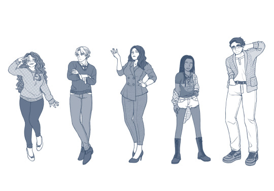
This is it. These Drawings were the beginning of my big Style Change to a more Model Proportioned way of Drawing Sonic Characters. Obviously Most inspired by Sa2, and the works of an Artist p_ditty2, Who did a lot of Sa2 Inspired Works. I actually Dubbed over one of their Pieces which became a meme for a short while.
In order, we have a Sonic Gens Speed Highway Redraw Challenge I did, A picture of Shadow and Maria heavily Inspired by Sa2, and a Sketch I had done before hand.
Then we have that of my Original Trailer Image for a Fangame I haven’t ended up making due to changes in Design and Vision. This game / AU would be called Sonic Ba2le.
#old art#Sonic Adventure 2#sonic generations#speed highway#maria robotnik#sonic the hedgehog#shadow the hedgehog#sketch#Why am I even posting about this?
22 notes
·
View notes
Text
The Difference Between Piccolo and Flute Instruments
At first glance, the piccolo and flute might seem like twins in the woodwind family. Both are held horizontally, played by blowing across a hole and possess a similar elegance. But if you delve deeper, you will find a universe of differences between these two instruments. This blog will unveil the key differences between the piccolo and flute, encompassing size, sound, range, construction, and their roles in the musical landscape.
Differences in the Pitch: High Notes vs. Melodic Flow
The disparity in size directly translates into a significant difference in pitch. The flute boasts a rich, lower pitch, with a range spanning three octaves, starting from middle C. It allows the flute to navigate a vast sonic territory, weaving melodies that can be both serene and vibrant.
The piccolo, on the other hand, is a champion of the high notes. Due to its shorter length, it produces a sound pitched one octave higher than written. It translates to a bright, piercing quality, often used for adding accents, excitement, or a touch of whimsy to a musical piece.
Precision Can Make All the Difference
While the basic fingering system might be similar for both instruments, the piccolo presents a unique challenge due to its diminutive size.
The tone holes and keys are considerably smaller and spaced closer together compared to the flute. It demands a higher degree of finger dexterity and precise embouchure (the positioning of the lips on the mouthpiece) from the player to achieve clear and accurate notes.
Interestingly, some flutists find the closer spacing of the piccolo's keys to be more comfortable for their hand size. However, the smaller embouchure hole on the piccolo necessitates a more focused and directed air stream to produce a clean sound, especially in the higher registers.

Construction Choices: Material and Mechanism
Flutes are traditionally crafted from silver or nickel-plated silver, although professional models can be made of gold or even wood. This material selection influences the instrument's tonal qualities, with silver offering a bright and clear sound, while gold imparts a warmer and richer character. All the work that goes into making these delicate pieces deserves kudos and your flute or piccolo deserves a comprehensive musical instrument insurance plan or dedicated policies like piccolo insurance and flute coverage plans.
Piccolos are predominantly constructed from grenadilla wood, similar to high-end clarinets. This wood resonates well with the piccolo's high-pitched nature, producing a focused and penetrating sound. However, some student-grade piccolos might be made of plastic or ABS resin for affordability.
The keywork on both instruments facilitates playing notes that wouldn't be possible with just open finger holes. The flute, with its three sections, offers more intricate key mechanisms. It allows for a wider range of notes and half-tones. The piccolo's simpler two-section design translates to a slightly less complex keywork system.
Taking Center Stage: Where Flute and Piccolo Shine
The flute is a versatile workhorse in the musical world. It's a mainstay in symphony orchestras, chamber ensembles, solo performances, and even folk music traditions across the globe. Its expressive range allows it to sing lyrical melodies, weave intricate counterpoint lines, or add a breath of airiness to a composition.
The piccolo, with its piercing brilliance, often takes on specific roles within an orchestra. It injects excitement during dramatic passages, adds a touch of whimsy in lighter moments, or creates a sense of urgency in fast-paced sections. Its high notes have the power to slice through the entire orchestra, drawing the listener's attention to a specific motif or melody.
The bottom line
Whether you own a flute or piccolo, make sure to buy a dedicated insurance policy weighing in their pricelessness in your life and career. There are many reputable musical instruments insurance providers, who help you customize your flute or piccolo insurance plan according to your needs and preferences. Get in touch with the best right away!
#piccolo#piccolo insurance#music#musicians#insurance#musical instruments#insurance coverage#new york
2 notes
·
View notes
Text
"Sonic 06: gameplay is shit, story is shit."
Okay, I somewhat disagree but don't see the need to expend energy toward-
*comparison between 06 and Forces is drawn*
My brain: heyguesswhatyou'rehyperfocusednow
I was going to do things today. . . but here we are.
Okay, up top and up front: 06 and Forces are both flawed, yes.
But they are flawed in fundamentally different ways, and Forces flaws are, quite frankly, far more glaring and demeritorious for a franchise like Sonic than 06. Anyone who, years from now, goes on to claim that "Uh, actually, Forces was peak." the way that some people are saying about 06 now will be just as, if not more, wrong. And I'll attribute such claims to declining media literacy.
BEFORE the youngsters in the fandom start throwing things at me, note that I said just as wrong. 06 wasn't ever as good as some of the mainline games prior or even spinoff titles after.
The difference is, most of 06's issues stem from the fact that it reads as pitiably unfinished.
The problems with Forces begin and end with the fact that it reads like self-insert fan fiction that had either zero beta readers or too many beta readers that were all given editing privileges. There's definitely a place in the world for that sort of creativity, but said place is not within a licensed game that people have to pay for; one that drastically affects the canon of the franchise and how the fans old and new perceive it and the characters within.
All right? Okay, let's get into details.
Let's address gameplay first, since I have less to say about that.
On this count, if nothing else, Forces barely edges out by being functional; granted, that's the end of it. I wouldn't go back to play it again, and the 'highlights' I can recall mostly felt like reskins of stages in the style of Colors but shortened, with boss fights reminiscent of daytime Unleashed. I imagine the primary draw for people is watching their customized 'sona jump and fly around whilst listening to dialogue from the main cast.
And this isn't really a substantive point, but the fact that receiving stuff like outfits like loot crates at the end of virtually every stage feels kind of manipulative and annoys me. If there's unlockable features, put some actual challenge between the player and the prize, like how you perform within the stage. Otherwise it's just another example of "shiny, novelty, tickle brain often, get player to play longer."
Setting that brief tangent aside since that's just a trend in games in general and not Sonic specific, moving on to 06's gameplay. And uh, yeah. The USP was, like the adventure games, supposed to be that you got three interconnected stories and three main characters each with unique play styles.
I suppose 06 showed us before anything else that Shadow really isn't as fast as Sonic, and as an idea, Silver's psychokinesis was cool. If the tracking in the Speed Up stages and the hit boxes in a handful of other areas had been ironed out, there's foundation for a fairly solid experience. Project 06 is basically proof that the base of the game had potential that wasn't realized, whether due to time constraints or other reasons.
As far as environs, the concept for Kingdom Valley showed off the most soul, I'd say, with Silver's future coming in close second. Character design for the Iblis fragments (not sure if that's the official name but I'm doing stream-of-consciousness here) and Mephiles I actually like a lot. I don't think there's anything objectively wrong with them and however you rate them will come down to preference.
Also, the model for Sonic is like. . . ridiculously good. He just looks like an older teenager; it fits with the widely accepted idea that he was 15 as of Adventure 2. Polish it a bit and that's just how he appears in my head when I write about him.
That said, there are only about six different environs that serve as stages, discounting the hub areas, and compared to Heroes' twelve stages, it just adds to that incomplete/rushed feeling.
That's about all I can say on the gameplay aspect. Functional yet non-stimulating technically wins out over some creativity yet patchy. They are games, after all.
Now then, the "story is shit" business.
Look, if you're going to criticize Sonic's story—which, yeah, his should be subjected to more scrutiny, being the titular character—then much of what you can say against it also applies to the first Adventure. Eggman wants to collect a thing (emeralds/Princess), Sonic wants him to not collect the thing (emeralds/Princess) because he's obviously planning to do evil stuff with the thing, Sonic manages to get the thing only for Eggman to snatch it out of his hands.
Multiple times.
Meaning Sonic spends most of the games on fetch quests that Eggman keeps one-upping him on until the penultimate fight.
And those are the beats. Of both stories. (For Sonic.)
And then at the end of both games, a monster you've fought in various forms (Chaos/Iblis) reappears to threaten the world on a scale that requires the seven chaos emeralds to combat.
Super Sonic. Rad soundtrack. Credits.
Granted, much like how Gamma's story was the strongest in Adventure, the quality of the three main story lines in 06 also vary in strength, with Shadow's taking first place.
My point is, in a franchise that is about characters, you don't grade every aspect of the story on the same scale. You weigh the grade of various aspects differently; and the point that gets graded most heavily is:
Character moments; which can encapsulate literal moments, arcs, development etc.
And for all its flaws, 06 has character moments, almost immediately, even. Sonic's first spoken line is "My, that's a pretty snazzy performance there!"
Which, after the tension of Eggman interrupting the festival and threatening Elise, cuts through the moment right away and, paired with the next several seconds, shows who Sonic is. He sees Eggman's robots aiming and waits until the last second to jump before going to town bashing up bots. Even as he carts Elise off amidst homing missiles and explosions, he's grinning the whole time.
Sonic does what he does because it's fun.
And his third spoken line, answering Elise's question of why he's helping, is: "No special reason."
Again, that's Sonic. Doesn't matter who it is, he helps people because he Does what's Cool. And as well as being fun, fighting off Eggman and his bots is Cool.
06, as Silver's introduction to the series, also does a decent job establishing his character of Temporal Bulldozer. He can be aimed, but his solution to problems first and foremost is usually smashing, and it's really tricky to change his mind once he's focused. He suffers from myopia arguably as bad or worse than Metal Sonic. Amy's the only one who momentarily gets him to pause and wonder if really does want to kill Sonic.
Which is a character moment for her. As in Adventure 2, Amy will happily break laws and go against who and whatever to help her friends; and as she did with Shadow, she's rather skilled at getting very hurt people to listen.
She's not unlike Silver in her willingness to do whatever it takes, really; since Temporal Bulldozer can and does traverse time on several occasions to make things right. And up until the last moment, it never occurs to him that anyone but he should bear the burden of saving the world. Blaze has to physically shove him aside so she can absorb Iblis herself.
Silver sees himself as a Hero with a responsibility toward the future just as much Sonic sees himself as just Some Guy.
Finally, Shadow. And man, there's a reason a lot of people say 06 was the last time a game featured Shadow written correctly.
It's me. I'm one of a lot of people.
Team Dark in general gets a fair bit of spotlight in 06. Rouge, an anti-heroine with perhaps the greatest self-interest after Eggman, promises Shadow that she'd stand with him even if the very world turned against him. Omega, who loathes taking orders and prioritizes his own freedom nearly as much as Sonic, takes on Rouge's assignment for him without question or complaint to wait out 200 years to help rescue Shadow.
And Shadow, in an in-game line during his first fight with Mephiles, reaffirms all the progress he made in his titular game that was wholly about discovering his identity: "Don't bother trying to deceive me. I know who I am!"
And, in contrast to the Shadow the franchise first introduced us to, the Shadow of Adventure 2 who was thoroughly convinced that his only remaining worth was his ability to keep his promise to Maria, the Shadow who was so resigned that he chose to plummet through the planet's atmosphere to his presumed death. . .
That Shadow is faced squarely with his fate of persecution, asked why he would bother fighting to protect. That Shadow declares that it the world turns on him, "I will fight as I always have."
He's grown such that he's now willing to fight against fate.
And that's pretty fucking cool.
On the other side, applying the same grading method to Forces, we find what I call (as of just now) character fauxments.
Remember how I talked about 06's introduction for Sonic? How he cuts through tensions, finds joy and fun in fighting bullies and bad guys?
The thing about that, which Forces doesn't seem to understand, is that if you lean too hard on the wisecracks and nonchalance, you end up with a character who reads as either obnoxious or totally tone-deaf. Sonic knows when to take things seriously, yet in Forces he's purportedly been tortured as well as locked up for half a year, Infinite's destroyed countless homes and killed who knows how many people, and yet when Sonic interrupts his fight with Silver. . .
I mean, if Sonic was written correct, you'd cut out a bunch of faff and change his line delivery. Show that he's frustrated by his time confined and absolutely raring to throw hands and get to business; because Sonic does understand when things have gotten real, and while rare, he does get angry. Something like:
"Since you like talking so much, mind sharing the source of your power? I can ask the easy way or the hard way. I've been cooped up a long time, so I'm hoping you pick the hard way."
It doesn't need to be the most original lines in the world, but Sonic's banter in the middle of a war shouldn't be long-winded, no matter how pretentious his opponent is (and damn, is Infinite pretentious. Like to the point that it's the most memorable part of the game.) If there's banter, it should be punchy and succinct; quick, like he is.
Instead, Forces Sonic's attitude is just kind of. . . incongruous with the stakes the game claims to have established. But then, since we don't get a truly convincing scene showing the rest of the cast being sad that he reportedly died, that's not too surprising.
Speaking of setting up stakes, here's an idea. Rather than cutting from Sonic laying battered in the middle of the city for a lazy six-month time skip established by text on the screen, make it clear that "Oh shit, things are different" via gameplay.
After Sonic falls, immediately transition into a level. Where you run from right to left to escape Eggman's fleet. Turns everything on its head, you can witness and navigate the destruction as it's happening and if you string together enough environs, you can even have the city burning in the distance or the skyline as you near the end of the stage and escape to relative safety.
Anyway.
And of course, the notorious character fauxment: Tails cowering in front of an offline Omega.
There's nothing I can say about this fauxment that hasn't been said already. It's not the first time in the series that Tails was portrayed as having regressed to a scared child, but it is the most egregious.
And. . . actually, that's about it, at least off the top of my head. Which might speak to how short the game is and how little screen time and action the main cast get aside from Sonic and the player character.
But it's enough to determine that Forces' story, or what stands in for it, is weaker than what 06 offered.
Again, I'm not here to rally a feral defense of 06 as a masterpiece, but its flaws are not on the level of Forces. The reason they're lumped together is the amount of disdain both games got on their release; though in the case of 06, the 2000's were just a weird time when hating things was somehow cooler than liking them, and since 06 wasn't up to par with Adventure 2 or Heroes, people picked an aspect of the game-most often how much the almost final fantasy style model for Elise didn't match up with the Mobian models (and yes, the final cutscene, but there's nothing new I can say about that either, and talking about it here is just an open invitation for someone to blow it out of proportion again) and dogpiled the hate on the game.
Sonic 06 feels unfinished owing to a lot of little and larger details. Knuckles' portrayal and having little to do in the story, poor optimization leading to nearly twenty second loading times, BLAZE BEING A GLOWING NEON MISSED OPPORTUNITY! (SEGA, I know I was literally twelve when the game was released, but my Phoenix headcanon works so well and makes her appearance in both Rush and 06 work! A retroactive fix would be so easy and we could get more adventures in her dimension!)
Even acknowledging all that, though, there were still attempts at creativity that just, for one reason or another, didn't pan out. There's significant potential here.
Forces is just. . . a mess. In every sense. And I understand how a mess can be attractive to a fandom, because a mess means you can take whatever you want from it and organize things however you choose.
But a mess that's sold as a finished game is not the same as a rushed title with visible untapped potential.
#Sonic the Hedgehog#Sonic#Sonic 06#Sonic Forces#analysis#This is a reminder: I'm not interested in telling people how to enjoy Sonic#Just. . .#I have thoughts#clearly#Sonic 2006
6 notes
·
View notes
Photo
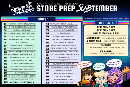
Nova SWARM’s Store Prep SUBtember!
(click image to view full resolution)
Each week we’ll be having an art stream to prep merch for our online store.
If you subscribe during the month of September, you’ll help reach the goals above and can earn incentives!
https://www.twitch.tv/novaswarm_vt3
Goals explained under the read more
10 - Chat chooses a sticker for Elly to draw
20 - Chat chooses a sticker for Lyra to draw
30 - Chat chooses a 3d print for Rigel to make
40 - Chat chooses an Alternate Universe Prompt for Nova SWARM to be drawn in (artist pending)
50 - Nova SWARM’s Sonic OC PNGtubers will be added as a Twitch Redeem
60 - Nova SWARM will host a Promare Watchalong on Discord
70 - Rigel will drink Pilk (Pepsi/Milk)
80 - Lyra will read a fanfic or copypasta of chat’s choice
90 - Chat chooses a new animated emote for Elly to make
100 - Nova SWARM will make Jojo’s Bizarre Adventure PNGtubers
110 - Chat chooses a 3D model for Rigel to make that will be added to the Twitch Integrated Throwing System
120 - Boo (Elly’s mascot) will stream making Boo emotes and Boo stickers
130 - Nova SWARM will stream playing Pico Park together
140 - Lyra will draw Nova Swarm dakimakuras
150 - Nova SWARM take a Top or Bottom quiz
160 - Chat chooses 3 new emotes
170 - Chibi art by Elly giveaway
180 - Horror movie watchalong on discord
190 - Nova SWARM will make Nova SWARM acrylic charms
200 - MS Pain OwOtamite round 2 (MS Paint vtuber drawing stream)
210 - Nova SWARM merch will be made and released (tshirts, tote bags)
220 - Nova SWARM will do a Pokemon Edibility tierlist stream
230 - Nova SWARM will do the Paqui one chip challenge
240 - Nova SWARM will plan a 24 hour stream
250 - Bust illustration drawn by Lyra giveaway
260 - Throwing system item by Rigel giveaway
270 - Nova SWARM plays Phasmo
280 - Nova SWARM will cosplay Anime characters as PNGtubers
290 - Nova SWARM hosts a mario kart vtuber tournament
300 - Chat chooses next Nova SWARM outfits
310 - Nova SWARM will commission custom BGM
320 - Nova SWARM will plan a karaoke stream
330 - Nova SWARM will drop some Lore
340 - Elly commissions NSFW art
350 - Stream overlays + screen by Elly giveaway
360 - Rig will DM a D&D oneshot
370 - Nova SWARM will cover a song
380 - There will be a face reveal stream in the future
398 - Elly will reveal the appearance of her Mech
500 - Elly will get a permanent Dragonfly Tattoo
0 notes
Photo

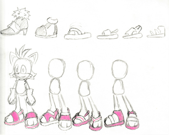
Now for some Tails redesigns! Check out his sick thongs
Design notes below:
Tails was pretty tricky to redesign! The boys of the franchise don’t usually wear clothes, so finding alternative ways to adjust his appearance without making him look unrecognizable was a challenge. I imagine that in this au, Tails attempts to emulate Blaze in similar ways we exhibit him doing with his former role model, Sonic. However, because Marine and Tails have swapped roles, Tails did not chase after and eventually become the side kick to a super speedy super hero in his early childhood (under the assumption that Classic Tails is indeed a younger Tails), and thus, most of the character development Tails had undergone is no longer present here. In short, he’s still very much cowardly as he does not meet Blaze until much later in his life. One of the drawings above depicts Blaze and Tail’ initial meeting. Because Tails never learned to stand up for himself, he is still frequently picked on for his twin tail abnormality. Blaze immediately empathized with him, knowing how it feels to be bullied for something you’re born with, and has become protective of him ever since. Perhaps, even too protective...
However, once he does meet Blaze, he gets quite attached and one of the many ways he attempts to emulate her is in appearance. I’ve given Tails some hair in the back, 1. because he hasn’t really had the opportunity to get a trim in a while, having lived independently for much longer than he would have liked, and 2. he begins styling his hair to look like Blaze’s once he is under her care. I was inspired by some of his older, classic promotional art that depicts Tails with curly, back hair.


As for his muzzle and chest fur, as opposed to the bigger fluffy tufts he usually has, it’s a bit more trimmed down, and is also meant to emulate the two spikes of fur on the sides of Blaze’s face. His bangs were too iconic to change entirely, as well as having a boomerang shape so it’s too perfect to get rid of (since Tails is now taking Marine’s place as the Australian side kick). His bangs point upwards to emulate Blaze’s ponytail. His twin tails have also taken on a boomerang shape.
Initially, I thought to give Tails Marine’s gloves and shoes, much like I had done for Marine. However, I don’t really love the odd sock-looking cuff(?) of her sandals, and I thought to challenge myself to try and design some sandals. Instead of giving him his siganture red shoe color, I made them more pink/magenta, to match Blaze’s shoes. Overall, I also wanna give Tails a more beach-y look, since he resides on and hasn’t left his island.
(Also I swear drawing Tails with Fiona’s hairstyle was an accident I don’t even read the comics I was trying to come up with some kind of boomerang hairstyle at the time kdfvklfm)
#miles tails prower#tails the fox#blaze the cat#sonic rush adventure#tailswap au#alternate universe#Thongs = flip flops
75 notes
·
View notes
Text
Exe Characters as Magia Record Units Part 2: Electric Boogaloo
(Ok disclaimer I had this draft half done and then tumblr just... lost it cause I hit the wrong key. So this is attempt two, and I might go back and change stuff later when I remember what info was lost.)
Ok I lied I’m not gonna wait to do the rest of these.
Yesterday I posted my prompt response for day 18 of Magitober, an Inktober-style drawing challenge for Magia Record. Day 18′s prompt was ‘crossover’, so I decided to do something with Exe, because of course I did. I decided to rewrite the main Cross Fusion trio from the anime into playable magireco units, and started with Netto. Here I’m gonna put my rewrites for the other two, Enzan and Laika. Despite how they act in canon, I’m designing their units to function as a cohesive team.
(Even longer post than last time warning ahead)
First, let’s start with the egghead. I actually began working on Enzan’s rewrite first, because for some reason Blues just screams ‘blast gorilla’ to me. I dunno, but I went with it. Onto Stats!
Ijuuin Enzan (Cross Fusion Ver.)
Element: Flame
Type: Attack
Growth Pattern: Balance
Disks: ABBBC
Now, magireco is very particular about elemental alignments, in that every character must have one, even if it’s not particularly relevant to them. Null element, or ‘Void’ as it’s called in-game, is reserved to characters who have made a very specific type of wish. Obviously, none of the Fusion trio are meguca, hell, they’re not even magical girls (boys?), so that makes an issue for a character that was originally null element. Fortunately, there’s an out here. Blues doesn’t have any elemental association, but Enzan sorta does, with his name. It’s spelled “炎山” in kanji, and hey would you look at that, the first kanji is the term for ‘flame’! Problem solved!
Connect: Take My Strength
Blast Damage Up, Defense Up
Blues is tankier than Rock is, and has a shield in the games, so I think it’s ok to give Defense Up here. As for the name, Blues says a similar line in Axess 27, while forcing a Soul Unison to complete. I get that it’d be more relevant to give something that Enzan says, but I can’t think of anything there.
Magia: Sonic Boom
Damage a Vertical Line, Blast Damage Up (Self/ 2 turns), Chance to Stun (Enemies targeted/ 1 turn)
The stun chance is there because, realistically, an actual sonic boom would disorient someone, since it’d A) kill their hearing, and B) surprise the living daylights outta them.
Second Magia: Cursed Blade Muramasa
Strengthened Damage a Vertical Line as HP is Lower, Blast Damage Up (Self/ 3 turns), Attack Up (Self/ 3 turns), Defense Down (Self/ 1 turn)
To my knowledge, I believe the Muramasa sword does show up in the anime; however, I don’t remember that version. I do remember the manga’s version quite well, though, since there Blues wielded the sword as his main weapon from volume 7-ish on. The manga version could be ‘activated’ to deal a crapton more damage than usual -- however, to force that power up, Blues would have to sustain damage, and quite a lot of it. I’ve emulated this here with the ‘more damage as HP lowers’ effect, which at the moment is only seen on Ren and Yukika in-game. As for the defense down, I mean, if you took that much damage, you’d be less combat-ready, yeah? Plus, the ‘give-and-take’ mechanic is always fun.
Like last time, I’ll come back to Spirit Enhancement once everyone’s kits are done. Moving on!
Last up we have the sniper. Now, I knew immediately that a magia build did not fit Laika (or Search), but neither did a blast kit. I eventually decided that emphasizing charge made sense here, since a sniper would specialize in shooting down a target in one hit, similar to how charge-blast strats work. Onto stats!
Laika (Cross Fusion Ver.)
Element: Forest
Type: Support
Growth Type: Attack/Defense
Disks: ABBCC
Our only non-gorilla unit! I’m modeling Laika’s build here off of ‘honorary Chargius’ units that are based around charge but are not charge gorillas, like Sis Momoko or Yaito’s long-lost cousin Hagumu. Search easily has the most armor of the three navis, and therefore, Laika doesn’t get to be an Attack type. (Also I needed a defensive unit to round things out.) He gets the forest element, because his clothing/amor is green and I can’t think of any other elemental reference here.
Connect: (I can’t think of a name here oops-)
Damage Up, Guaranteed Anti-Evade, Damage after Charge Up
Yeah, I couldn’t think of a name. If you’ve got one, lemme know.
Magia: Circle Gun
Damage 1 Enemy, Damage Up (Self/ 1 turn), Guaranteed Anti-evade (Allies/ 2 turns), Damage after Charge Up (Allies/ 1 turn)
Circle Gun was the name of Search’s attack in the games, if I remember correctly?
Second Magia: Satellite Ray*
Damage 4 Random Enemies, Damage Up (Self/ 2 turns), Guaranteed Anti-Evade (Allies/ 3 turns), Chance to Darkness (Enemies targeted/ 1 turn)
*I don’t remember if this was exactly what this attack was called, but I’m going with it unless I’m corrected.
Since this attack involved what I could only assume were lasers, I assumed that anybody not killed by it would probably be somewhat blinded by the flash anyways. I removed the Damage after Charge Up to make room for it. Since Laika’s a Support type here with only one Accele disk, he’s not gonna be using magia often, if at all. As a result, it’s not that critical that the second magia be a stronger version of the normal magia. Also I couldn’t think of anything else to use here.
Again, I’ll get to SE in a separate post, because this was a lot of writing and I don’t want to make this any longer. I’ll add the link here when that post is done.
#Y'ALL this took FOREVER#mostly cause tumblr crashed#also full disclaimer i still haven't finished the anime...#magia record#rockman exe#ijuuin enzan#exe laika#no drawings this time cause this isn't part of magitober and also im tried#y'all know what they look like#rapo rambles
11 notes
·
View notes
Text
Tutorial/Step-by-step/Tips 4
I will this time mainly talk about how to create coherent Characters Design, break down my thoughts process and give additional general tips
Since it's Concept Art, I won't do a "clean" lineart (I will mainly use my usual comfort textured brush and won't go further than a clean 2nd Sketch) nor add any shadings/effects (to not alter the color palettes)
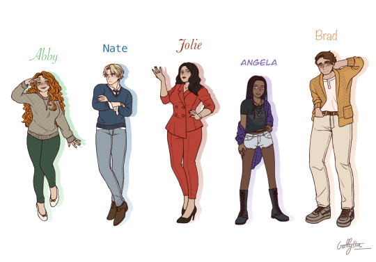
Those characters are my friend pages_of_altaire's OCs, Vlad Masters's employees
I’m not a professional and nothing is “rule”, just an art nerd sharing what they learn in their free time
Long post !
xxx
Step 0: Collect Information
It’s tempting to straightly jump into the drawing but I really don’t recommend it
I usually make a tab with a part including basic information like : Name, Hair color & type, Eyes color, Skin color, Height, Body type
And a part with : Cloths, Particular Accessories, Personality
If your characters are good with themselves and not hiding personality traits nor secrets, their personality and what they do in life/where do they live should be reflect in their clothing (however it’s interesting to make contrast if you want to create surprise, like a ruthless evil character with childish traits, or a very kind and sweet muscular tall man)
Pages_of_altaire made me a tab with all the information + mood boards 👌💚
Tip: We artists are often confront to same-face syndrome, but I will add that same body type syndrome is also very common while less talked about (even in the professional world like comics, or mangas)
I highly recommend you to try going outside the “perfect standard body type” we usually start our drawing journey with if you want to vary your characters and give more depth to your world & stories (manly to feminine, thick to thin, tall to short, muscular to frail, old to young...)
Tip: Like changing eyes types, varying hair is also very interesting to give your characters more personality (long, short, straight, waivy, curly, coily, braided, tied, messy, clean)
Tip: Including a little personalized accessories and details really make a character stand up and more “unique” (a ring, a watch, glasses, jewelries, freckles, make up, a printed t-shirt...)
Tip: If you don’t have any ideas, searching clothes and fashions references on Google or Pinterest could help
.
Step 1: First sketch
This is just a really rough sketch to choose the eyes types and what poses would reflect each characters’ personality best
Eyes and face are the reflect of the character soul, it’s what we tend to look first and focus on (it’s biologic) so obviously we will have to be careful about the face
If the eyes are the soul, the hands are the spirit
Don’t neglect how important hands are in a pose, are they showed ? hided ? crossed ? opened ?... A good pose includes good hands poses
Ask yourself, is your character cheerful ? grumpy ? confident ? cool ? shy ?...
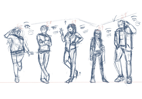
Tip: The spin also shows how confident a character is, they could rise up or bend
Tip: To make an interesting character sheets composition don’t sort the characters by height smaller to taller, try to vary and make height “waves”
.
Step 2: Second sketch
I’m usually don’t bother doing a second sketch, unless I really want to have a clean final result
But the cleaner your sketch is, the cleaner your final lineart will be
Since I’m still not totally comfortable with my anatomy (still working on my memories library) to make clean final product I generally use 3d models with the free app Easy Pose and adjust my sketch to give them the height & body type I want (changing the hips, busts, shoulders, muscles etc...), correcting the pose if necessary
There is nothing wrong with tracing a pose as long as you trace responsibly, it’s really common in industries (like Disney or Ufotable) to use 3d models to speed up the work and make artists’ lives easier
Good tutorial and explanations by @pesky-poltergeist under @the-stove-is-on-fire‘s art tutorial => https://pesky-poltergeist.tumblr.com/post/646558144390119425/wing-drawing-hack-trace-a-photo-no-seriously
Tip: Use a dark blue instead of pure black to draw to rest your eyes, you will focus better this way and could still change the line color after :)
Tip: To make a lively lineart, vary the line weight; thick for separate shapes & intersections, and thin for details & textures
Tip: We tend to draw the eyes first, but try to draw the eyes at the very end of your sketch/lineart
As said above, us human are social creatures, we are biologically programmed to search eyes and faces, by drawing the eyes first we tend to unconsciously search the eyes of our characters and then are distracted from the whole picture
.
Step 3: Silhouettes
The silhouette help to understand how strong a character design is, iconic characters like Sonic or Cloud have very distinguished figures
A silhouette also help to see how confident a character is
If the silhouette is still clear the pose is strong and the character confident, on the contrary if the silhouette is more blurry the character is more shy
.
Step 4 : Values + Textures (useful for greyscale comics like mangas)
The most important in a drawing is values (brightness), before saturation and color/hue (if you don't know value/saturation/hue, I recommend you to search some tutorials about the color theory on Youtube)
I always start with choosing my values before adding any saturation or colors
Values could drastically change the mood of a piece (calm, drama, tension etc...) and for character design, artists use a full range for clarity; from high key to low key
There my example with bad values, as you could see cloths, hair and skin blend together and make the visual difficult to read
My final values, with define separations between the different parts
Tip: When you are drawing a group, try to vary where the darker and lighter values are between each characters to make an interesting and harmonious blend
Tip: Adding textures/patterns give more life to a flat 2D drawing, especially for clothes or backgrounds; you could hand draw it or use premade brushes
.
Step 5: Values / Hue / Saturation (Finished Concept Arts)
The value “rule” for clarity is still there for a colored drawing, you will just have a bit more values to consider
Since I was working on a group, to not clash characters I decided to give each of them a different main color based on their personality
Abby - Green : Youth, Energy, Freshness (bonus: green go well with redheads)
Nate - Blue : Serenity, Stability, Wisdom, Reliability
Jolie - Red : Passion, Danger, Importance
Angel - Purple : Independence, Nobility, Bravery
Brad Yellow : Joy, Optimist, Enlightenment
While adjusting my hues I adjust at the same time the saturation to make something harmonious to the eyes, I usually choose to saturate one/two piece(s) of clothes or accessories by character to make it pop, usually the main cloth or the hair
To finish I just blur the line a bit, a bit of blushes, eyes lights and a paper texture on the whole piece
Tada it’s done !!
Bonus: Step-By-Step gifs
Thank you pages_of_altaire for the character design exercise opportunity
I haven’t draw braids nor curly hair for a while now and it’s good to challenge ourselves a bit sometimes
It’s help me go back on art after some rough weeks, and force me to go outside my comfort zone and comfort characters (aka Danny & Dani)
If you have any questions don’t be scared to ask me, I’m not a professional but I like to nerd about art ^^ 💚
24 notes
·
View notes
Text
Research Pixel Animations.
Super Mario 3:

As this game I’m attempting to start has a pixel aesthetic, references to SNES or any other titles with an older style are a place to take inspiration from. The key frames are an essential thing to copy, movement or normal person functions can be taken in from it.
There was a limit within the coding from that era, meaning reserving certain aspects was a logical move.
This is helpful for my current project, as any reasonable shortcut is going to contribute to more work in other areas being done at less cost.
This sheet is refereeing to a Mario title, a four-frame animation that shows a straightforward angel, walking. It’s a quick and effective method, swaying the entire body for full-motion in a brief time span to result in heavy movement. It’s limited in detail.

Sonic Mania:
Sonic Mania’s a game attempting to obtain original graphics with gameplay in a modern setting without changing too much.
Sonic as a character is prominent in detail within this setting, meaning working out how running or other movement functions is more challenging, as making limbs pass one direction has the whole body move appropriately, with all detail changing to pursue it.
As the Sonic franchise is known for speed, getting a fast animation result can work within favour for the game designer, skipping some frames to signify a blurish movement from fastness. Less work.
Artist Tyson Hesse was brought into this project to spearhead the art side. Artistic decisions came from the project.

Wario Land 4:
Opposing the other art, this is a step-by-step idle animation that has appropriate detail for the pixel count. The details for every moment show Wario’s personality clearly, having him demonstrate muscles, marking his braggish personality out to the player.
It displays the cartoonish feeling the Nintendo titles are known for, having Wario pull dumbbells from a nonexistent space, following cartoons in logic. The game has a
Despite being 2D, his character is viewable from every side. Dynamic views of Wario give the approximate dimensions he is. It helps a player remember the character design more, with the viewable angle.

Sunset Riders:
This is an older title that opens with a 2D drawing style introducing the characters because the art-style tries to come across as realistic in a sense It’s aged badly. It’s better to take this art as an example for aged graphics. But if the plan is to necessitate a nostalgic feeling, the graphics can be acceptable in a newer project.
In this picture the windows are blacked out, this saves time to make a detailed interior for a house while adding a ghostly atheistic, making things more tense.
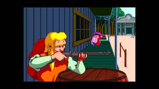
Despite the western setting, their outfits aren’t dusty or patchy, the clothes being bright colours took an outlandish character design rather than the typical cowboy outfit.
Taking into account the standout outfits, they seem like a good idea to replicate in a general idea. It’ll help with character design.
Pokemon, DS Or Prior Generations:
As it’s a top down view on a character there’s more room to see how different parts move, but the problem is it’s only at this specific angle, an angle I don’t plan on using within my project. On this specific model there’s a scarf, this is helpful in seeing how detached clothing moves.

Within a battle screen the characters have a proportionate body, hinting that the overworld sprite is a limitation in technology, or thy’re cutting corners. The screen is bare with not that much detail in the surrounding areas. This is probably since every character has a full sprite, so putting in a nice looking background is wasting time spent on coding.
The Legend Of Zelda:

Zelda has the best full angle movement compared to the other games looked at. The player can see Link’s entire figure when moving, showing his full ensemble. It doesn’t do much different except versatility, which can help when making a full world that has life, a Mario title seems one-sided with the flat side angle.
Kirby (Game Not Known):

With Kirby’s large move pool, there are lots of attacks that persist the 2D animation.
His colour is mainly pink, probably because at a earlier time when Kirby was made there wasn’t many colour options for a character with the GBC (gameboy colour) system. It most likely stuck, so there wasn’t a need to change him anymore. The reasons for his smaller size might have a similar GBC origin, but there was less to animate from a small figure as well. Plus, it’s a style choice.
Mega Man:

In this Mega Man sprite sheet there’s various different colours signifying damage or power ups.
The creator made sure to have Mega Man blink, which doesn’t seem like much, but if forgotten the character can look like a doll or dead. It gives Mega Man more life.
Mega Man has many different small facial animations, such as jumping with the surprised look, or being tired and almost falling asleep as a idle animation.
Earthbound:
This Ness sprite sheet has the character on a bike, which shows the extra work needed to fill in the new movement. Also with the pyjamas clothing, that adds an extra clothing option even for a short time, having the artist make exactly the same movements in a new uniform. There’s a blank version of Ness, no cloths, this probably made alternative uniforms easy to wear, being quicker than editing the clothed version as it’s more editing with removing a hat or backpack.
At the ending there’s a new form, it’s nonhuman, meaning more effort is put into Ness.
Applying Use In This Project:
There were some things not thought about, such as the personification of idle animations (Wario Land 4). This can now be taken into account for my project, giving more life to sprites.
I want my project to gleam information from this, where the inspiration is obvious to a point, making this post worth more than just research purposes.
0 notes
Text


2010 V.S. 2019
Age 15 and almost 25
(This is long a messy but I wanted to make some kind of post about it before the year ends.)
I was making a stink face bc my then best-friend was over and said something funny before she took the picture and afterwards we busted out laughing. We were at my then step-dads parents house out in the country walking down to their creek either just getting done swimming in their pool or intending to get in it after going to the creek.
I was most likely a freshmen or sophomore at the time of this picture. (Probably right before sophomore year started...) It was definitely during Summer. I either had a flip Nokia phone or an LG Neon at the time as I upgraded from one to the other. I had my first “job.” I was a veterinary assistant after school for a few hours a day and did some work out there during Summer as well. I wasn’t paid and used my time as a volunteer to play with animals, hold them down for simple procedures, walked dogs, and it helped me gauge whether or not I wanted to actually pursue being a veterinarian. I had competed in track for 6 years in a row by this point and was probably finished with it by the time this picture was taken. (Two Elementary School leagues, all three years of Middle School, freshmen year of High School). I was crushing HARDCORE on my childhood best friend whom I’ve known since the age of 6 but neither of us could handle our feelings for the other and things would become super awkward until we had actually dated 7 years later. I was tan as hell because of track practice, walking to both pools in town, and walking to Sonic with friends during sleepovers.
I was struggling trying to find my identity as a teenager while maintaining being in the middle of my parents joint custody battle and being forced to be 100 miles away from my friends two weekends out of the month. I was a cynical older sister of two step-brothers and did not use my time with them as wisely as I wish I could have, sometimes being a real bitch to them looking back at it. I had no control over my hair color or length and remember desperately wanting to layer it to look like a scene kid despite how naturally thin it is. I had just started dabbling in eye liner (not pictured, as I preferred and still prefer my poolside activities over makeup), wore converse every day I wasn’t wearing flip flops for the season, wore baggy jeans, the same Paramore hoodie daily, and had an extreme creative drive that I miss deeply. I was bullied horribly for my teeth, nose, skin (I had terrible eczema that pool water, cortisone shots, and Summer weather in general helped tremendously with!), height, cup size, fashion, hobbies, having split parents, and then some. My metabolism was extremely high and I was in my athletic prime. I had a touch of internet fame by drawing my own personal characters on deviantArt.com as well as fan art for games and shows I was super into using my first Wacom tablet on my first laptop and to this day still have a folder of fan art created for me on my computer. I was obsessed with cats, rock music, anime, and drawing. I could drive a boat and got both a high five as well as scolded for that time I flipped myself into the water to retrieve my dads hat while we were going full speed over white-caps because I was too impatient for him to circle around and wanted to impress him and the rest of the family. I was for the most part unafraid of most things.
I was secretly extremely depressed and suicidal during the school year to the point I had missed my period for 5 months because of stress alone and I’m certain at the time this picture was taken, I was almost breathing a sigh of relief I was off from school for the summer. I had a close knit group of friends still before it had combust the following school year. I was “working” as a veterinary assistant but also had interests in pursuing being an animator, art director, cartoonist, children’s book illustrator, or graphic designer by this point and my mom encouraged me to pursue whatever I was comfortable with. I wasn’t really boy crazy like my friends were, instead having my heart set on one in particular and probably still having a soft spot for my ex whom I was with for 3 years prior. My bedroom contained my artwork, sports posters, cat posters, band posters, and trophies/medals from my days running track. My friend and I, though not legally allowed to drive, would occasionally sneak to Taco Bell using her parents car if they weren’t home and we never got caught or pulled over for it. My grades were A’s and B’s, though I could not pay attention in History to save my life because I was too preoccupied with doodling on my papers and ignoring this asshole who was two classes above me who had called me ugly but then admitted he liked me at one time because of my attitude?? He’s still an idiot from what I’ve heard only he’s an idiot who knocked up a few women post-high school, is apparently married now, and no surprise to me - is still stuck in that same small town with no goal to go anywhere outside of it.
I was scared of the outside world beyond my small town and had no idea how rough it would get for me. The family issues and my trip to family court had not happened yet. I had yet to become estranged from my family. I was small and awkward as hell. I struggled to hold conversations or make eye contact unless it was with people I felt most familiar with since people were kinda fucking mean. I could argue back but would immediately break down and cry from the interaction at the first chance I’d get. I’d use books, art, and video games for the escapism. Life felt scary and fragile and so very uncertain but at least I had a few individuals in the world whom I loved so much and who I know loved me.
I’m 24 now. I’m now in control over my own hair cut and color. I choose to keep it long as I didn’t even like the way it looked short when I finally chopped it as a teenager. It’s been red, reddish blonde, blonde on top and brown on the bottom, dark brown to blonde ombré, and now platinum blonde with my natural color as a shadow root and I quite like it. I don’t really dabble in makeup unless it’s for an occasion except for covering up my acne as my body decided that having zero acne in my teen years was just too good for me while I was battling eczema instead. I’m not nearly as tan or athletic as I’m forced to be inside at most times. I still love to swim though and I take every opportunity to go to my childhood beach during the Summer when I can in particular. I still don’t consider myself to be family-oriented despite this year really challenging that for me. I have a ton of amazing friends and people who care about me and feel like recently in particular, I’m always busy with someone doing something and making memories as we do whatever.
I have a bachelors in Psychology and a minor in Art, though I did not pursue a masters in art therapy like I had originally intended. I was heavily burnt out from school and my baby brothers worsening medical conditions and the news that he had been in a children’s hospital for quite some time with my family deliberately choosing not to tell me made me choose not to pursue one for the time being. I was working at Dairy Queen while technically sharing a lease with my ex before finding a job at a psychiatric hospital that I loved and getting my own apartment to myself and my cat, whom my ex gave to me as he saw she benefited me more than she benefited him. Though I lost that job, I can now say I have two years of field experience in Psychology and almost 6 months worth in social work and feel like I’m always learning something.
I’m not as creative anymore because the years of crippling depression, anxiety, and being forced to create for school absolutely ruined any creativity I had once had. Though occasionally I’ll have the opportunity to channel that creativity into a video game or quick doodle for a child.
I’ve moved to two cities after moving out of my high-school “home” town (not quite home but a good chunk of my upbringing!) and have every intention of doing it again within the next year after I save up some. I don’t take shit from anyone and have taken after the best parts of my moms personality in my opinion with the added benefit of my dads patience and keen eye. I’m known for making people around me comfortable and able to laugh and decompress and have been fortunate enough to use that power professionally. I would like to go back to mental and behavioral health as I miss the thrill and excitement as well as the camaraderie with fellow staff members in the pursuit of helping individuals. I’m very likely starting a new position in my company as early as next week and have been extremely excited about the pay and hour boost. I’ll be getting my dog in just over two weeks and am excited to start our life journey together. Though I had developed my moms serial-monogamist trait for a while there after my 6 year-long relationship had ended in the pursuit of finding someone to fill that gap, I feel very comfortable lately simply being pursued and wanted without the commitment. I’m addicted to sushi bowls, coffee, and chocolate. My passion is helping others. I feel comfortable in my body enough that I would love to pursue modeling of some sort and have been lucky enough to dabble in that a bit already. I also have a bit of a love for fashion now, though I rarely feel the urge to actually properly plan my outfits unless my goal is to dress to impress or for the sake of photography.
I’ve learned to allow myself to enjoy the things I enjoy without the fear of judgement from others. I still love nerd-culture and have somewhat recently taken an interest in cosplay and want to attend more conventions. I’ve learned that it’s an accomplishment for me to have gotten this far, to have my own place, and that it’s alright that I don’t have everything figured out and not everything has to be figured out right away. I don’t have the same best friend I had 10 years ago, but we’re still in contact and I love my current best friend tremendously though I don’t get to see him often. I’ve learned that my current group of friends may be temporary, but while I’m lucky enough to be around them I’m going to do what I can to make them feel as loved and cherished as possible and make plenty of memories. Ivy and I are doing well and I know we will continue doing well even with Atticus by our side. I value traveling way more and will continue to travel and see new things when I’m able to. Eventually I’ll narrow down a Masters program and go back to school when I feel ready. I might even work alongside my brother at some point as we had talked about working on a project together and I’m pretty excited. This is getting really really long oops
I also just look dope as all hell with blonde hair and have gotten the notoriety of being “that blonde girl who wears the leather jacket” and I’m beyond thrilled about this. I’ve come a long way and I’m proud of myself. It’s hard to believe that lanky, tan, dark haired, greasy-headed kid is me but I think she’s come a long long way and I’m genuinely proud of her for doing so and not ending things when she’s had the opportunity. Here’s to 10 more years of careful and concise progress and glow-ups~
0 notes
Text
i phone x
iPhone X review: face the future
After months of hype, endless speculation, and a wave of last-minute rumors about production delays, the iPhone X is finally here. Apple says it’s a complete reimagining of what the iPhone should be, 10 years after the original revolutionized the world. That means some fundamental aspects of the iPhone are totally different here — most notably, the home button and fingerprint sensor are gone, replaced by a new system of navigation gestures and Apple’s new Face ID unlocking system. These are major changes.
New iPhones and major changes usually command a ton of hype, and Apple’s pushing the hype level around the iPhone X even higher than usual, especially given the new thousand-dollar starting price point. For the last few years, we've said some variation of "it's a new iPhone" when we’ve reviewed these devices. But Apple wants this to be the beginning of the next 10 years. It wants the iPhone 10 to be more than just the new iPhone. It wants it to be the beginning of a new generation of iPhones. That's a lot to live up to.
This review is going to be a little different, at least initially: Apple gave most reviewers less than 24 hours with the iPhone X before allowing us to talk about it. So consider this a working draft. These are my opening thoughts after a long, intense day of testing the phone, but I’ll be updating everything in a few days after we’re able to test performance and battery life, do an in-depth camera comparison, and generally live with the iPhone X in a more realistic way. Most importantly: please ask questions in the comments! I’ll try to answer as many of them as I can in the final, updated review.
But for now — here it goes.
Design
At a glance, the iPhone X looks so good one of our video editors kept saying it looked fake. It’s polished and tight and clean. My new favorite Apple thing is that the company managed to move all the regulatory text to software, leaving just the word “iPhone” on the back. The screen is bright and colorful and appears to be laminated tighter than previous iPhones, so it looks like the pixels are right on top. Honestly, it does kind of look like a live 3D render instead of an actual working phone.
The iPhone X basically looks like a living 3D render
But it is a real phone, and it’s clear it was just as challenging to actually build as all the rumors suggested. It’s gorgeous, but it’s not flawless. There’s a tiny sharp ridge between the glass back and the chrome frame that I feel every time I pick up the phone. That chrome frame seems destined to get scratched and dinged, as every chrome Apple product tends to do. The camera bump on the back is huge; a larger housing than the iPhone 8 Plus fitted onto a much smaller body and designed to draw attention to itself, especially on my white review unit. There are definitely going to be people who think it’s ugly, but it’s growing on me.
There’s no headphone jack, which continues to suck on every phone that omits it, but that’s the price you pay for a bezel-less screen with a notch at the top. Around the sides, you’ll find the volume buttons, the mute switch, and the sleep / wake button. The removal of the home button means there are a few new button combinations to remember: pressing the top volume button and the sleep / wake button together takes a screenshot; holding the sleep button opens Siri; and you turn the phone off by holding either of the volume buttons and the sleep button for several seconds and then sliding to power down.
And, of course, there’s the notch in the display — what Apple calls the “sensor housing.” It’s ugly, but it tends to fade away after a while in portrait mode. It’s definitely intrusive in landscape, though. It makes landscape in general pretty messy. Less ignorable are the bezels around the sides and bottom of the screen, which are actually quite large. Getting rid of almost everything tends to draw attention to what remains, and what remains here is basically a thick black border all the way around the screen, with that notch set into the top.
I personally think the iPhone 4 is the most beautiful phone of all time, and I’d say the iPhone X is in third place in the iPhone rankings after that phone and the original model. It’s a huge step up from the surfboard design we’ve been living with since the iPhone 6, but it definitely lacks the character of Apple’s finest work. And… it has that notch.
Display
The iPhone X is Apple’s first phone to use an OLED display, after years of Apple LCDs setting the standard for the industry. OLED displays allow for thinner phones, but getting them to be accurate is a challenge: Samsung phones tend to be oversaturated to the point of neon, Google’s Pixel 2 XL has a raft of issues with viewing angles and muted colors, and the new LG V30 has problems with uneven backlighting.
Apple’s using a Samsung-manufactured OLED panel with a PenTile pixel layout on the iPhone X, but it’s insistent that it was custom-engineered and designed in-house. Whatever the case, the results are excellent: the iPhone X OLED is bright, sharp, vibrant without verging into parody, and generally a constant pleasure to look at. Apple’s True Tone system automatically adjusts color temperature to ambient light, photos are displayed in a wider color gamut, and there’s even Dolby Vision HDR support, so iTunes movies mastered in HDR play with higher brightness and dynamic range.
It’s just a terrific display
I did notice some slight color shifting off-axis, but never so much that it bothered me; I generally had to go looking for it. And compared to the iPhone 8 Plus LCD, it seems like a slightly cooler display over all, but only when I held the two side by side. Overall, it’s just a terrific display.
Unfortunately, the top of the display is marred by that notch, and until a lot of developers do a lot of work to design around it, it’s going to be hard to get the most out of this screen. I mean that literally: a lot of apps don’t use most of the screen right now.
Apps that haven’t been updated for the iPhone X run in what you might call “software bezel” mode: huge black borders at the top and bottom that basically mimic the iPhone 8. And a lot of apps aren’t updated yet: Google Maps and Calendar, Slack, the Delta app, Spotify, and more all run with software bezels. Games like CSR Racing and Sonic the Hedgehog looked particularly silly. It’s fine, but it’s ugly, especially since the home bar at the bottom of the screen glows white in this mode.
Some apps almost look right, but then you realize they’re actually just broken
Apps that haven’t been specifically updated for the iPhone X, but use Apple’s iOS autolayout system will fill the screen, but wacky things happen: Dark Sky blocks out half the status bar with a hardcoded black bar of its own, Uber puts your account icon over the battery indicator, and the settings in the Halide camera app get obscured by the notch and partially tucked into the display’s bunny ears. It almost looks right, but then you realize it’s actually just broken.
Apps that have been updated for the iPhone X all have different ways of dealing with the notch that sometimes lead to strange results, especially in apps that play video. Instagram Stories don’t fill the screen; they have large gray borders on the top and bottom. YouTube only has two full-screen zoom options, so playing the Last Jedi trailer resulted in either a small video window surrounded by letter- and pillar-boxing or a full-screen view with the notch obscuring the left side of the video. Netflix is slightly better, but you’re still stuck choosing between giant black borders around your video or the notch.
Landscape mode on the iPhone X is generally pretty messy: the notch goes from being a somewhat forgettable element in the top status bar to a giant interruption on the side of the screen, and I haven’t seen any apps really solve for it yet. And the home bar at the bottom of the screen often sits over the top of content, forever reminding you that you can swipe to go home and exit the chaos of landscape mode forever.
I’m sure all of this will get solved over time, but recent history suggests it might take longer than Apple or anyone would like; I still encounter apps that aren’t updated for the larger iPhone 6 screen sizes. 3D Touch has been around for years, but I can’t think of any app that makes particularly good use of it. Apple’s rolled out a lot of screen design changes over the years, and they take a while to settle in. We’ll just have to see how it goes with the iPhone X.
Cameras
I haven’t had a lot of time to play with the cameras on the iPhone X, but the short answer is that they look almost exactly like the cameras on the iPhone 8. Both the telephoto and wide angle lenses have optical image stabilization (compared to just the wide angle on the 8 Plus), and the TrueDepth system on the front means the front camera can take portrait mode selfies. It’s nice.
iPhone X rear camera (left) / Pixel 2 XL rear camera (right)
Of course, the main thing the front camera can do is take Animoji, which are Apple’s animated emoji characters. It’s basically built-in machinima, and probably the single best feature on the iPhone X. Most importantly, they just work, and they work incredibly well, tracking your eyes and expressions and capturing your voice in perfect sync with the animation. Apple’s rolled out a lot of weird additions to iMessage over the years, but Animoji feel much stickier than sending a note with lasers or adding stickers or whatever other gimmicks have been layered on. And while iMessage remains a golden palace of platform lock-in, Animoji are notably cross-platform: they work in iMessage, can be sent as videos over MMS, or exported as MOV files. Nice.
Face ID: it works, mostly
The single most important feature of the iPhone X is Face ID, the system that unlocks the phone by recognizing your face. Even that’s an understatement: the entire design and user experience of the iPhone X is built around Face ID. Face ID is what let Apple ditch the home button and Touch ID fingerprint sensor. The Face ID sensor system is housed in the notch. The Apple Pay user flow has been reworked around Face ID. Apple’s Animoji animated emoji work using the Face ID sensors.
If Face ID doesn’t work, the entire promise of the iPhone X falls apart.
The good news is that Face ID mostly works great. The bad news is that sometimes it doesn’t, and you will definitely have to adjust the way you think about using your phone to get it to a place where it mostly works great.
Face ID is cutting-edge tech, but the fundamental concept is pretty simple: it’s basically a tiny Xbox Kinect. An infrared projector flashes out thousands of tiny dots that cover your face, and the front camera clicks on, captures that image, and turns it into a depth map. That map — not an actual image of your face — is stored locally on the iPhone X’s Secure Enclave, which is the same place Apple stored Touch ID fingerprint data.
Setting up Face ID is ridiculously simple — much simpler than setting up Touch ID on previous iPhones. The phone displays a circular border around your face, and you simply move until a series of lines around that circle turn green. (Apple suggests you move your nose around in a circle, which is adorable.) Do that twice, and you’re done: Face ID will theoretically get better and better at recognizing you over time, and track slow changes like growing a beard so you don’t have to re-enroll. Drastic changes, like shaving that beard off, might require you to enter your passcode, however.
Face ID should also work through most sunglasses that pass infrared light, although some don’t. And you can definitely make it fail if you put on disguises, but I’d rather have it fail than let someone else through.
In my early tests, Face ID worked well indoors: sitting at my desk, standing in our video studio, and waiting in line to get coffee. You have to look at it head-on, though: if it’s sitting on your desk you have to pick up the phone and look at it, which is a little annoying if you’re used to just putting your finger on the Touch ID sensor to check a notification.
You also can’t be too casual about it: I had a lot of problems pulling the iPhone X out of my pocket and having it fail to unlock until Apple clarified that Face ID works best at a distance of 25 to 50 centimeters away from your face, or about 10 to 20 inches. That’s closer than I usually hold my phone when I pull it out of my pocket to check something, which means I had to actively think about holding the iPhone X closer to my face than every other phone I’ve ever used. “You’re holding it wrong” is a joke until it isn’t, and you can definitely hold the iPhone X wrong.
You can definitely hold the iPhone X wrong
That’s a small problem, though, and I think it’ll be easy to get used to. The other problem is actually much more interesting: almost all of the early questions about Face ID centered around how it would work in the dark, but it turns out that was exactly backwards. Face ID works great in the dark, because the IR projector is basically a flashlight, and flashlights are easy to see in the dark. But go outside in bright sunlight, which contains a lot of infrared light, or under crappy florescent lights, which interfere with IR, and Face ID starts to get a little inconsistent.
I took a walk outside our NYC office in bright sunlight, and Face ID definitely had issues recognizing my face consistently while I was moving until I went into shade or brought the phone much closer to my face than usual. I also went to the deli across the street, which has a wide variety of lights inside, including a bunch of overhead florescent strips, and Face ID also got significantly more inconsistent.
I’ve asked Apple about this, and I’ll update this review with their answers along with more detailed test results, but for now I’d say Face ID definitely works well enough to replace Touch ID, but not so well that you won’t run into the occasional need to try again.
Recent Apple products have tended to demand people adapt to them instead of being adapted to people, and it was hard not to think about that as I stood in the sunlight, waving a thousand-dollar phone ever closer to my face.
Software
There’s a lot of new hardware in the iPhone X, but it’s still running iOS 11 — albeit with some tweaks to navigation to accommodate the lack of a home button. You swipe up from the bottom to go home, swipe down from the right to bring up (down?) Control Center, and swipe down from the left to open the Notifications pane. That pane also has buttons for the flashlight and camera; in a twist, they require 3D Touch to work, so they feel like real buttons. It’s neat, but also breaks the 3D Touch paradigm. It’s the only place the entire system where 3D Touch acts like a left click instead of a right click. It’s emblematic of how generally fuzzy iOS has become with basic interface concepts, I think.
Switching apps is fun and simple: you can either swipe up and hold to bring up all your apps in a card-like deck, or just quickly swipe left and right on the home bar to bounce through them one at a time.
And… those are basically the changes to iOS 11 on the iPhone X, apart from the various notch-related kerfuffles. If you’ve been using iOS for a while and iOS 11 for the past month, nothing here will surprise you. Apple might have completely rethought how you unlock the iPhone X, but it’s still not giving up on that grid of app icons or making notifications more powerful or even allowing the weather app icon to display a live temperature. Siri is still Siri. If you’re buying an iPhone X expecting a radical change to your iPhone experience, well, you probably won’t get it. Unless you really hate unlocking your phone.
The iPhone X is clearly the best iPhone ever made. It’s thin, it’s powerful, it has ambitious ideas about what cameras on phones can be used for, and it pushes the design language of phones into a strange new place. It is a huge step forward in terms of phone hardware, and it has the notch to show for it. If you’re one of the many people who preordered this thing, I think you’ll be happy, although you’ll be going on the journey of figuring out when and how Face ID works best with everyone else.
It’s a new iPhone
But if you didn’t preorder, I suspect you might not feel that left out for a while. The iPhone X might be a huge step forward in terms of hardware, but it runs iOS 11 just the same as other recent iPhones, and you won’t really be missing out on anything except Animoji. Face ID seems like it’s off to a good start, but it’s definitely inconsistent in certain lighting conditions. And until your favorite apps are updated, you won’t be able to make use of that entire beautiful display.
All that adds up to the thing you already know: the iPhone X is a very expensive iPhone. For a lot of people, it’ll be worth it. For a lot of people, it’ll seem ridiculous. But fundamentally, it’s a new iPhone, and that means you probably already know if you want to spend a thousand dollars on one.
Because this review isn’t final, we’re not scoring the iPhone X yet. Leave your questions and comments below, and we’ll try to address as many of them in our final review as we can. We’ll add the score at that time as.
............sanket
2 notes
·
View notes
Text
Breaking boundaries and amplifying Edmonton’s creative community
Meet the 31 large Artist Project grant recipients
With so many artists pursuing various ideas and disciplines, it’s inspiring to see what Edmonton’s arts community is creating. As our artists share stories of the past, present and imagined futures, experiment with new ways of transforming the audience experience, and challenge assumptions and the status quo, we continue to build a city that is a beacon for cultural expression.
Assistance provided by grants such as the Artist Project grant afford more opportunities for artists to present groundbreaking work that shines a spotlight on the stories that are often left untold. With the support of an Artist Project grant, seven artists will participate in the research and rehearsal process with choreographer Alison Neuman as they prepare to mount their production of The Strike. The production explores the story of several characters experiencing disability or marginalization and the interactions they have with persons of power that change their lives forever.
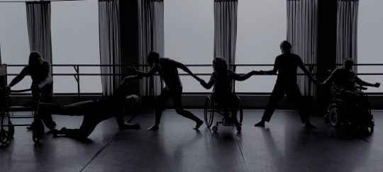
(Rehearsal of The Strike, choreographed by Alison Neuman. Photo provided)
Many of Edmonton’s exceptional musicians have been making waves locally and nationally. Artist project grants ensure songs from Edmonton artists continue to be sung and help to get their work out to a wider audience. With many artists receiving large project grants, keep an eye out for new music from members of our dynamic music scene. JUNO nominated singer-songwriter Nuela Charles will explore soul and pop sounds of the 1970s on her new record.
Being nominated for Country Recording of the Year at the 2019 Edmonton Music Awards was just one accomplishment in this big year for country band The Prairie States. With their artist project grant, the band will keep the momentum going and record a new six-song EP.

(JUNO nominated singer-songwriter Nuela Charles. Photo: Emily Welz)
Artist Project grants also give artists the opportunity to explore and experiment in their practice. Brenley Charkow’s ambitious North American premiere of The Girl in the Machine will explore the intersection between immersive and traditional live theatre, utilizing the technology of the Zeidler Dome at the Telus World of Science. Expanding and reinvigorating his project that was originally presented as part of NextFest 2018, Mac Brock’s project Tracks is an integrated audience and artist play that explores deeply personal stories. This reworked version will feature eight performers under the age of 25 who self-identify as queer.
(Image from Tracks, an ambulatory theatre project created by Mac Brock. Photo provided)
Investing in our artists with programs like the Artist Project grant helps to foster an exciting ecology of creation, expression, reflection, disruption that is unique amongst cultural landscapes. This year, 31 artists and projects have been awarded a large Artist Project grant (between $5,001 and $25,000), approved through our peer assessment process. You can find the full list of recipients listed below. Look out for the final projects as they are exhibited, showcased, and published throughout 2019/2020. Congratulations!
Adriana Onita: Create an Indigenous Languages special issue of The Polyglot showcasing art and poetry.
Alison Neuman: Choreograph a new integrated dance work, The Strike.
Amber Borotsik: Research and create two new interdisciplinary performances, No Guesses Found: Solo and No Guesses Found: Together.
Blake McWilliam: Create the feature film Saltwater, addressing issues of depression, loss, and the state of the environment.
Brandon Baker: To record a new Electric Religious album.
Brenley Charkow: Produce the North American premiere of The Girl in the Machine by Stef Smith.
Carmen Osahor: The Fox Den Collective (Carmen Osahor, Jessy Ardern, and Sarah Feutl) to produce a new interactive play – Off’d at Fort Edmonton Park: Murder on the Midway.
Cindy Baker: To create a new body of sculptural/installation work including a live musical performance component.
Darren Jordan: To produce the multidisciplinary annual Black History Month art event 5 Artists 1 Love.
Dwayne Martineau: To create an illusionary medicine wheel installation, and a short video showcasing the work. “The Wheel” explores explore culture and duality and is all about intersections – Indigenous and settler; past and future; traditional and modern; real and imaginary.
Emmanuel Osahor: To create a multimedia installation for an upcoming exhibition. This project reflects on and discusses the complications and inherent impossibility intrinsic to the desire for utopia and attempts at utopic space creation.
Jeff Dick: To record and promote a new six-song EP and accompanying videos with a full PR and radio tracking campaign with country band The Prairie States.
Jinzhe Cui: To create a new series of thematically linked drawings and paintings that reflect and explore a Chinese Immigrant artist’s observation and self-realization through parallel experiences of her hometown and her current home in Edmonton.
Jonathan Kawchuk: To write their sophomore record with the goal of producing a 3D record (Dolby Atmos formatted), recorded in and modeled from remote natural environments.
Kaitlan Stewart: To write a feature-length script entitled The Lady Hockeyists. Based on true events, The Lady Hockeyists is the untold story of a women’s hockey league that rose to stardom Montreal during the First World War.
Kaz Curtis: To introduce collaborative community theatre to the community through Hip Hop principles.
Kellen Frost: To produce the short film Indra's Spirit, the sequel to Edmonton produced Indra's Awakening.
Kristi Hansen: To produce The Maggie Tree’s production of “The Wolves. “
Kyle Armstrong: Post-production audio and music for the feature film project Hands That Bind.
Mac Brock: To produce “Tracks”, an ambulatory theatre project that explores the depths of self-destruction and how it can limit our ability to tell our stories.
Malcolm Azania: Create Afritopian 2D portraits, 3D prints, and 4D augmented reality re-imaginings of African-Edmontonians and African-Edmontonian landscapes.
Manuela Wuthrich (Nuela Charles): To write and produce a full-length album with a sonic style of the late ’70s.
Maria Dunn: To record her seventh studio album. This new collection of songs celebrates the stories of real people, brings history to life and pays tribute to the courage of those who strive to make our world a better place.
Marina Endicott: To write a novel called The Observer based on her experiences as a newspaper editor and wife of a Mountie in Mayerthorpe, Alberta in the 1990s.
Matthew MacKenzie: To write a new play, Nestichio, based on the artist’s family's history in the fur trade.
Michelle Campos Castillo: To write a graphic novel memoir detailing her life in El Salvador as a child during the country’s decade-long civil war, and her eventual arrival in Edmonton as a refugee.
Nisha Patel: To record a collaboration spoken word poetry album showcasing the work of four Edmonton artists of diverse backgrounds.
Scott Portingale: To produce a short stop-motion film.
Sekou Sonko-Boisclair: To participate in professional development workshops, gatherings, and collaborations with pioneers of Hip Hop and House Dance culture.
Usha Gupta: To tour the Edmonton-premiered dance and music performance, Khoj, across India.
Yinan Li: To compose a new electroacoustic work, accompanied by visuals by video artist Brian Raine.
Artist Project grants for individual artists and collectives support the pursuit of artistic and professional advancement. Be it creation, research, development, curation, exhibition, production or professional development opportunities, artists are encouraged to apply for grants to fund these projects.
0 notes
Photo

524: Twelve to the Moon
There are 50's sci-fi movies with wonderful titles like The Monster that Challenged the World and IT! The Terror from Beyond Space. I poke fun at how irrelevant or misleading some of them are, but I actually love them: there's nothing better to entice me to see a silly movie than a deliriously hyperbolic title! Then there's this film, Twelve to the Moon, which is about twelve people going to the moon. No points for the title guy.
Despite that, I rather like Twelve to the Moon. It's not my favourite of the MST3K Moon movies – that would be Moon Zero Two – but it's a hell of a lot less annoying than either Rocketship XM or Project Moon Base. There's some earnest effort that seems to have gone into this film, even when the effects budget was not equal to the filmmakers' ambitions. The result is not a good movie but it is a functional one, and in the land of MST3K fodder that ain't half bad.
So let's start with the stuff that works. There's a few places where Twelve to the Moon really did get something right, or at least, where its heart was clearly in the right place even if the follow-through didn't work out. For one thing, they don't spend half the movie hanging around in space talking about stuff. They have to dodge a meteor shower, but I'm pretty sure that was mandated by the Space Movie Union rules in the 50's. Other than that, there is some flight time with dialogue, but unlike the pointless bullshit that consumed significant parts of Fire Maidens of Outer Space and almost all of Rocketship XM, in Twelve to the Moon this actually sets up some honest-to-gosh plot points.
We get a brief sketch of some of the characters, of their attitude towards the trip and their area of expertise. We meet the animals they're bringing with them, and see the technology that makes the trip possible – some of this, like the sonic shower and the invention of the screenshot, is filler, but some, like the mentions of nuclear power and foreshadowing of Heinrich's heart attack, is important. It's actually kind of neat that they included some irrelevancies, since it means we don't know which parts will turn out to be vital later. And we get a setup of the film's main human conflict, Heinrich's distancing from his father's war crimes and what it means for his relationship with his protege David.
The movie also makes quite an earnest attempt to portray people who are different getting along for the sake of the common good. The characters clearly disagree about a lot of things but when fights break out they're usually quieted pretty quickly. Somebody put at least a little thought into where each member of the crew came from and how that would be reflected in their personalities, though the results are not especially nuanced. Furthermore, even when they argue the characters mostly treat each other with respect. The women are allowed to be useful instead of just being there so the men will have girls to kiss. The black guy is not treated badly on account of either his race or his faith. Twelve to the Moon really, really wants to be progressive and whatever you think of the result there's certainly less of the Unfortunate Implications that plagued Women of the Prehistoric Planet.
The surface of the Moon as presented in this movie is actually pretty cool. The backdrops are suitably craggy and desolate, and the black and white film actually adds to the effectiveness of it. Even when we get stuff like the geysers, the quicksand, and the corals, that enrage Tom Servo by clearly not belonging on the moon, they look pretty neat. This is obviously where the production spent most of its money and I have to say, good call. If you’re only going to show us one really cool thing in your trip-to-the-moon movie, best make sure that’s the moon itself!
A related good decision was how the movie never actually shows us the Moon People. Anything they could have put together on their budget would have been disappointing at best and laughable at worst. By keeping the Moon People off-camera, they are made an ominous presence in the movie, unknowable, unpredictable, and with powers we cannot comprehend. This is far scarier than people in silly 'moon men' costumes would have been!
Finally, to my grateful astonishment, the movie does not have a love triangle in it! With ten men and two women on the Lunar Eagle, they could easily have gone that way, but they didn't! Hideko has no love interest at all, and so little time is spent on the romance between the two physicians that when they pull off their helmets and kiss it comes as a complete surprise. Instead, the movie derives its human drama from the differing political views of the characters. It's still kind of beside the point of the main 'moon adventure' plot but it's not nearly so tired and cliché as the romantic angle would have been.
Of course, a lot went wrong in this movie, too. For starters, there are far too many characters. We simply don't have time to get to know the entire cast: there are too many names and faces to remember, and while we do get an outline of each person, we get no more than that. Some of the irrelevant stuff that added colour to the first half of the film could have been cut to make room for setting up Dr. Martel's dislike of Americans, or at least to give a brief setup to the romance. The cast could have been cut down by half, while the film told the same story in a much tighter and more engaging fashion.
Then there are the effects. I mentioned that the movie spent most of its effects budget on the moonscapes. This means there was not much left for anything else and... yeah. You can tell. Whether we're watching model spacecraft on sticks, or the cast getting bombarded by cartoon meteors, or the kleig lights intruding into the top of a shot, you can certainly see the cheapness on the screen. The worst moment of all is when we see two men who are supposed to be flying a smaller rocket ship, sitting in front of a blank wall with the shot framed to crop out an instrument panel that does not actually exist.
Perhaps the lack of budget is why they went with the 'invisible force field helmet' thing... maybe they couldn't afford twelve custom-made glass or plastic face plates, plus extras in case of breakage. Or maybe they worried that reflections on the material would make it hard to see the actors' faces and tell who was who. Either way, they probably would have done better to just pretend there were helmets there, rather than draw attention to their absence – though actor Richard Weber delivers the line with admirable conviction.
A lack of budget is the studio's fault, not the film-makers', but where the movie really stops making sense is when the Moon People decide to make actual contact with the human crew. They do this by transmitting a series of symbols that pop up on the Lunar Eagle's computer, and which more than anything else remind me of the 'hieroglyphics' supposedly found on the Roswell UFO wreckage. I don't know if this was intentional on the part of the film-makers... Roswell was mostly forgotten after it happened and didn't become big news until conspiracy types started looking into it in 1978. What's really weird about the symbols is not what might have inspired them, but the fact that Hideko can translate them.
What? The picture-writing we're shown doesn't look anything like Japanese, or any other logographic language I can think of. Just because Hideko can read one type of pictogram doesn't mean she can necessarily read others – I can read the Roman and Greek alphabets, but that sure as hell wouldn’t help me with Sanskrit or Inuktitut! Is this one of those things where the aliens came to Earth thousands of years ago and left their language behind, and Hideko just happens to have studied it? Because that would be awfully convenient.
The other possibility that occurs is that the aliens deliberately chose to communicate in a language they knew their guests would understand... but if that's the case, it seems more likely that they would have just done it in one of the languages spoken by their two captives, which would give them a choice of Turkish, Swedish, or English. The Moon People clearly understand at least one of those languages, since they mention that the hostages “say they are in love”, so why bother with the pictograms at all?
The later actions of the Moon People don't really make any sense, either. 'Leave the cats and go home' seems like a fairly reasonable request (given the option of two cats or twelve humans, I know which I would choose to keep), but then they freeze the Earth so that the Lunar Eagle cannot land. A later communication makes it sound like this was a test of the crew's willingness to support each other and sacrifice themselves to the greater good of humanity, but was it really necessary to freeze the planet in order to do that? They'd surely already seen that these squabbling primates worked together well enough to get themselves to the moon, and tried to save their colleagues who were in danger. It really just seems like the Moon People want to make the point that they can snuff humanity's candle out any time they like... which doesn't make them seem that much more peaceful or enlightened than us, honestly.
So yeah, there's a lot of stuff that sucks here, too, and between that and the good bits the movie balances out somewhere in the vicinity of 'tragically mediocre'. Despite all that, I really do kind of like this one. Twelve to the Moon wants to be not just an entertaining movie but an important one, one with an optimistic vision of the future and a message for all mankind. It fails, but it fails in such ways that I really would like to give it points for trying.
Except for the title guy. He didn't try at all.
31 notes
·
View notes
Text
Nintendo Switch Event
So I went to the Nintendo Switch event today and wanted to share some thoughts with my social media platforms, as has been requested by the afternoon’s gracious benefactors. I also wrote a much more in depth article for a friend’s website, so if you want to know more, I’ll be posting a link to that once it’s published. I’m also going to put the least terrible pictures into a Facebook album.
I apologize for the length, but I had a lot of thoughts. If you have any questions, please ask away!
The Console:
The Switch console is a bit tinier than I was expecting. The main unit is a little smaller than the average tablet, and the buttons and joysticks are also an adjustment. This isn’t necessarily a bad thing. The Joy-Cons by themselves are surprisingly solid, and can be used in a ton of different ways. They’re a little smaller than an NES controller and much more comfortable. I enjoyed a lot of the different styles of play we got to experience. Not all of them are for me, but the fact that they can be used this way is cool. The Pro Controller is a normal size, if you’d prefer a more conventional approach to playing video games. They can support an eight console network over Wi-Fi and it seems that one system can support many players through the use of Joy-Cons and other controllers.
Switching between TV and Handheld Mode is a little fiddly at first, but I’m sure one gets used to it. It’s hilarious seeing a message like “HDMI 1 – No Signal Detected” when you pull the thing out of the dock.
The controllers are shockingly expensive, but after experiencing the HD Rumble, I can absolutely see why. I felt a small plastic controller turn into a wooden box filled with marbles, and the cognitive dissonance was fantastic. I want to see developers do awesome things with this very badly.
I’m interested to see a few things about it, such as whether or not the consoles can connect with each other and some more in depth system specs.
The Games:
Art and I played eight demos at the show. I’ll give some raw impressions based on the short amount of time I spent with each title.
The Legend of Zelda: Breath of the Wild: ♥♥♥!!! This was the first game Art and I went for. Needless to say, twenty minutes isn’t enough time to digest this masterpiece, but rest assured, it’s a masterpiece. I’m glad I got a chance to try it out, and I think I need to watch that trailer a hundred or so more times.
Ultra Street Fighter II: The Final Challengers: It’s Street Fighter alright! As always, Arthur was better than me, but it runs incredibly smoothly on the Switch so I can’t blame my terrible performance on lag. I detected no latency whatsoever (I’m great at Smash, so there!), and if the pros also find it acceptable, I can see the Switch become the fighting console of choice within a few years.
Super Bomberman R: It’s Bomberman! It’s Bombermen! It’s not good! Sadly, 3D models do not suit this game, and visibility takes a big hit. It’s too bad, as I really do love the little pyros.
1-2-Switch: This is an excellent proof of concept. We were allowed to demo five minigames, all of them fun (quick draw, cow milking, marble guessing, katana catching, and ping pong). It’s a shame this isn’t a pack-in, as it seems to fill that role perfectly. To be honest, it reminded me more of party board games like Cranium than regular video games. Oh, and I got to try the HD Rumble here, which is everything I dreamed it would be and more. Seriously, my brain thought the plastic controller became a wooden box full of glass marbles thanks to uncanny haptic feedback. I can not rave about this enough.
ARMS: Meh. I’m sure this game has its audience, but it’s not me. It’s a spruced up version of Wii Boxing, and as much as I liked that game, there’s not much more you can add to the concept to justify making it a full-priced release. Maybe active children will like this, and I hope they do. All the reps loved it, so maybe I’m missing something.
Splatoon 2: I’m not sure this is a sequel instead of an upgrade, but I don’t care. I love Splatoon with all my heart and will happily buy it again. It’s a bit weird now that the right joystick is on the bottom now, but that’s ok, it’ll just take some getting used to. Oh, and the official guidelines say to mention that it’s a “Demo Version,” but I think that might just be for video content.
Mario Kart 8 Deluxe: Same as Splatoon up there. This isn’t pretending to be a sequel, but it’s a damn good upgrade. It comes with all the paid DLC, some extra characters (two multicolored Inklings), extra stages, and a real battle mode. Even the rep showing this off was like, yep, this battle mode is a lot better now, which is not something we were expecting to hear. As always, I’m awesome in Kart battles, and I’m fairly sure the Splatoon arena was just lifted from the game.
Sonic Mania: I was fully expecting Zelda to be my favorite game at the show. And it almost was. In fact, I had gotten into a great conversation with a rep while Art played this one without me. But a seat opened up, I figured why the Hell not, sat down, completely ignored the rep who asked me to wait so she could show me how to play Sonic (I know how to play Sonic), and was instantly taken to the halcyon days of childhood where Nintendo and Sega were the fiercest of rivals and people legitimately thought blast processing was a thing. This game hits every single tiny little beat. It knows how to be a Sonic game. The pixelated expressions on the sprites. The physics. The speed. The music. Everything was RIGHT about this game. If you’ve ever loved Sonic the Hedgehog, make a real attempt at trying this one, even if it’s not on the Switch (it’s also coming out for PS4, XBONE, and PC). I’m not a nostalgic kind of guy, but no amount of shame could stop me from squealing like a child every fifteen seconds or so (or from taking an extra turn while the rep wasn’t looking).
Honorable Mentions:
The following games were present, but we didn’t try them: Snipperclips – Cut it out Together!, FAST RMX, Just Dance 2017, Skylanders Imaginators, Has Been Heroes, Disgaea 5 Complete, Puyo Puyo Tetris.
The Event:
This event was the single best of its kind that I’ve ever been to. Compared to the lukewarm presentation the night before, this really got my mind running in circles imagining how the Switch was going to do this and that. Every single official I spoke with was knowledgeable and friendly, and everyone seemed really excited to be there. They invited exactly the right number of people for the space they had, and had exactly the right amount of stations with exactly the right amount of games. No guest had to wait more than ten minutes to play any game, including the twenty minute Breath of the Wild demo. Some games even had their own special areas. Zelda had astroturf floors and plastic ivy covered tables. 1-2-Switch had funky outfits and glass booths that let players listen to the audio cues while providing endless entertainment to onlookers. Mario Kart 8 Deluxe was set up like a diner, complete with napkin dispensers and Switch branded ketchup bottles.
It was also the right amount of time, as I think any guest could have played each of the fifteen demos in the three and a half hours we were allowed. Art and I played eight, mainly because we were enjoying the conversations with the workers. We also might have played a few too many rounds of Mario Kart.
Whoever put this together deserves a hefty raise. I hope they’re able to put together more events like this in the future.
I happened to be lucky enough to be invited by Nintendo, but the general public will be welcome in cities around the world to experience events just like this one. If you’re in the New York area, you can check it out this Sunday, and other cities have their own days and times. http://www.nintendo.com/switch/events/
I’m looking forward to this system, and I hope that Nintendo can build more hype for it, as I think they’ve got something really special going on here.
#nintendo switch#nintendo#switch#zelda#breath of the wild#sonic the hedgehog#sonic#mario kart#splatoon
2 notes
·
View notes
Last Seen Blogs
meganeyamaken
aliz

goldengirlslimm
Golden Star

pavotattoo-blog
Senza titolo
untouchabledrums-blog
drumheadmx

sixdegreesnews
SixDegrees