#tho i think i USED to do rather think lineart
Text
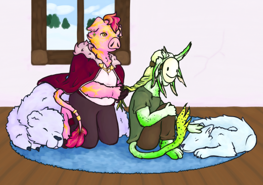
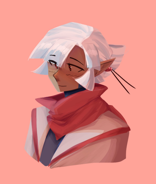
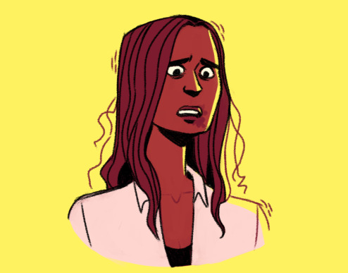
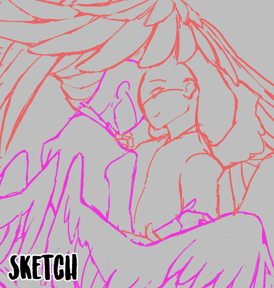
My gift for the @technoblade-gift-exchange !! i was assigned to @simplepotatofarmer who asked for dsmp rivals duo. i hope you like it Loyal!
rambling about headcanons, designs, and my process and stuff under the readmore, because i wanna talk about it but dont want the post to be super long !!
i had originally planned to not have a background and then at the last second i decided to speedrun drawing one in a few hours so um. quality difference but its fine. also unrelated but im pretty sure everything about how i draw animals and anthros makes it very obvious i used to be in the warrior cats fandom lol. anyway onto the designs!!
the gold on techno is scars from the totem at the execution, which i think is a pretty common thing for techno designs. he isnt supposed to be a piglin, but rather similar species of anthropomorphic pig. also his mane and tail fluff are naturally brown but he dyes them pink ^_^ so cool !! um. i maaayyy have forgotten the crown until i was way too far into the piece to add it. haha. oops. pretend its missing because. uuh. hes in a casual outfit. "but he still has the cape" yeah its comfy. "but dream has a mask thats not casual" dream is dream he does Not relax fully ever. see entirely intentional i would never make a mistake.
dream is an original shapeshifter species i came up with because i couldnt decide what i wanted him to be. i havent decided on a name for the species yet but i plan to make almost every solid-color or nearly solid color mcyt into this species. theyre mostly involuntary/unconscious shapeshifters. so like they change slowly over weeks or months to adapt to their surroundings, with little conscious control. basically i wanted him to be like five different things so i shoved them together lol, rabbit ears but in a pattern that looks like an axolotl, a cool tail, TOE BEANS tho you cant see them. this was actually the first time ive ever had a dream design im happy with so thats really nice.
i um. i made full use of my time lol, i spent a bit over a week on the lineart, another week on the coloring, and maybe a week and a half on rendering. unless i suddenly became shit at math(which is possible) that adds up to roughly the amount of time i had to work on it. im really proud of myself actually since i usually take a while to do art, and i wasnt sure i would be able to make something id be happy with in this amount of time. but i did! woah!! this was my first time participating in a fandom gift exchange and it was so fun, and also helped motivate me to draw more instead of getting distracted like i usually do (classic adhd moment) lol. anyway super cool!!
Loyal if u decided to read all this for some reason then again i really hope u like it!! u are so cool and i really love ur rivals duo opinions and creations so i hope u like this! i know theres been shit happening lately, i hope ur doing ok!!
#technoblade#dreamwastaken#rivals duo#dream smp#dreblr#technogiftexchange#<- thats the tag right?#also wow i think i said too many words. i dont think anyone else rambled that much about their gift. um. in my defense the only thing more#powerful than my written language learning disorder is my adhd and autism. so. yeah. lots of words.#aaaaaa i feel like how i wrote everything is so awkward. i am just a creature imitating others i have no idea how to interact with people..#hmmm. posting now before anxiety gets the better of me!#edit: wait fuck i forgot my art tag. how do i ALWAYS forget my art tag.#chara makes things
150 notes
·
View notes
Note
Every time I see your sprite work, it just makes me want to make a sprite edit of Akane with the design I made for her in my "She Was Saved" AU (An AU based on the idea of Akane surviving the events of DRA), but I've never done any sprite work so, do you have any tips?
Ok ok so, first things first, i wanna make it clear that none of my sprites are made from scratch, they're sprite edits, hence why i always tag them as such. Every single one of them used some canon character as a base for the base sprite (that one fitst sprite where the character is just standing there with a simple expression) and a handful even have canon sprites uses as bases for poses. Just figured i should make that clear so there's no confusion here.
While I'm not sure if I'm the best at giving tips n stuff, here's what i could think off;
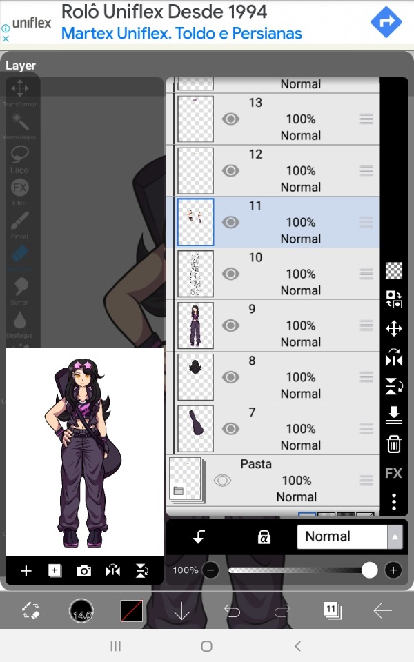
I think the most important tip i can give anyone who wants to get into sprite editing is MAKE A BUNCH OF LAYERS‼️Save things separately just to be sure rather than merging them because that almost always leads to more time spent later down the line. While the amount of separate things certainly varies from artists to artists here's the one i use for my edits.
The app i use (Ibis paintX) allows me to make folders with a bunch of layers to them so i use them to keep stuff more organized.
On the first pic well have a folder with the base sprite, one for the different poses and in Beni's case two for the different eyes she has (one for the normal eyes and one for the ones that are part of the glasses, normally i only have one layer with all the eye variants)
On the second image I've opened the folder that holds the base sprite, or should i say just sprite since it's in this folder that i organize everything that belongs to one specific sprite when I'm making them as to not get myself confused. Anyways, you can't see in the screenshots but the first layer has her glasses, second has her eyebrows and mouth and the third has the eyes.
Fourth has the main body lineart and fifth has the main body colors, please keep those separated as by doing so you make it easier to add those lil effects onto the character's faces on certain expressions + having the lineart of the main body always helps when sketching and connecting the different arms to the main body.
Lastly you got the arms, but ideally you should make the arms/poses in a way they can be placed over the body layers since that just makes things easier to put together, i just have this habit of placing the no pose arms under everything else.
When editing i make the different arms and eyes in advance so that when i start making the different sprites i can just duplicate the canva with the first one a thousand times and everything will carry along with those. Saves time in the long-run + you don't need to separate all layers on them (lineart, colors, shading) since they're just parts there's no problem in just merging them together.
A very important thing to note tho i that if the character has glasses or any accessories that you plan on removing or moving around in some pose/sprite this accessory should be made in a different layer from the main body, this makes editing easier than if you had to just erase and refill the part where the accessory was in the sprite you don't want it to be in.
A similar rule should be applied to the character's hair, if they have short or mid length hair you can just add the whole thing to the main body sprite, but if the character's hair is long you should make this bluk/back part of the hair in a separate layer placed under the main body layers. This also apllies to any back accessories.
Here's Akira as an example; she has one layer for her glasses, one for the back/bulk of her hair and one for the guitar case she carries.
These are essentially the basics of if, so let's go over to some actual tips.
Make the sprites on a small canvas.
Since the Danganronpa another games are made on game maker the size of the character sprites is surprisingly small, while I don't think you should just do it on the same canvas size as the actual sprite, it's good to have a smaller canvas so that the lower amount of pixels gives it a look similar to the in-game sprites + as you can see by mine, they don't actually look low quality at all.
(if curious, the go-to canvas size i use for most of my edits is 773x1020)
Use other sprites as references/bases
Especially if you're just starting on making sprites, use the canon ones for bases, references or even just straight up trace them. This will make the sprite look closer to canon and will start making you undertand the elements that make up the style of the sprite, do it enough times and soon enough you'll be able to make poses on your own without needing a sprite from the game as a base.
Remember! What's wrong about tracing is not the act of tracing itself, as the act of doing so is a great exercise to help you learn, the problem is when you do it and claim you made it 100% on your own. Since these are sprite edits, there's not a problem in doing so.
Observe and learn what makes up the style you're trying to replicate
This is hard to talk about since it really is something that comes with practice, I've been making sprite edits for like 5 years now so this stuff is like written on the walls of my brain by now. Just try to look and analyse the sprites and slowly you'll start seeing patterns and small onto them that you didn't noitce before, like how Linuj's sprites have a bit if line weight to them but are still on the thinner side, how he tends to make the hands a bit on the smaller side, how when he color the character's skins he makes the area near the top of the head a lighter shade than the rest of the skintone, the way he usually makes the character's mouths, and even some more complex things like how the male characters will have very little to no eyelashes while the female characters tend to have a whole lot of them, etc.
At the same time, there's no shame in deliberately ignoring some of these things. Personality the small hands REALLY bother me in a few cases and i tend to just make mouth shapes on a whim instead of trying to stay 100% close to the style. It's just a question of messing around and figuring stuff out, it won't look perfect on the first go, but overtime you'll start to get the hang of it.
#i hope this small sprite editing tutorial helps! if you have more questions feel free to send them#these are sorta all i could think of for now#you did mention that these are for an Au Akane so you could also try editing these out of her sprites themselves#instead of making a whole base and multiple parts just pick the sprites and edit the new design over#it could possibly be easier for a beginner? i do feel like making them in this form leads to better results tho#anyways. fun fact! i used the eyelash thing as a subtle form or trans coding on Akira's sprites :]#i love you small details that people won't notice unless pointed out ❤️#hyena ramblings#sprite edit#edit#sprite editing tutorial
16 notes
·
View notes
Note
Hi!! I’ve been a big fan of your comic panel embroidery for a few years and have been trying very hard to do some of my own! I’ve been having some trouble tracing lines onto aida tho - no matter how bright I put my lightbox, I feel like I’m missing a lot of details and it’s really hard to see. I’ve tried other items (sticky fabri-solvy, sulky solvy, iron transfer pencils, a small projector) and they’re not great alternatives for a variety of reasons. Do you have any tips for making fine markings with just a lightbox and a mechanical pencil? 🫣 (the details are actually much clearer in the photo than they are IRL 💀)

DAMN that's going to be so fucking cool!!! 🤩🤩🤩
I know exactly what you mean about struggling to capture the details. It is probably the biggest drawback to using aida cloth for this type of needlecraft project. The aida's texture is too uneven for the details to be visibly clear through the cloth, even with a really good lightbox.
I have accepted this drawback because, as you have found as well, I don't like the alternatives. Some fabrics of a more even weave and higher thread count (not evenweave, ironically), are much easier to trace details, but I don't like how those fabrics hold stitches, which is way more important in my book.
With that said! Here are my tips!
(1) Try also using a dimmer setting on the lightbox. A very bright light can end up obscuring and blurring the tiny lines. I usually switch back and forth as I trace, from bright to dim, to try and catch everything.
(2) Keep an separate copy of your image within glance range when you trace onto the aida. I usually print out multiple copies of my image to get the size right, which means I have extras to look at! (A copy to reference on your computer or phone or tablet works too.) With a clear image to reference, it can be easier to define what might look like a blur through the aida cloth.
(3a) With really important details, I lightly trace where I am 100% confident the lines are and don't trace further (or darker) beyond that. I use this most often for tracing faces. I know I will not get those details exactly right when I trace, so I'd rather figure it out with the needle and thread than get frustrated with the stencil and risk retrying/erasing so much that the aida becomes permanently marked with pencil.
(3b) When I finally get to the faint portions of the stencil, I stitch slowly, carefully, and don't pull very tight on the thread. Because of how trial-and-error the faint portions can be, I know that I will be removing and tearing out stitches when I don't place them exactly right, and I don't want to warp or tear the aida.
4) This one is the hardest -- and perhaps somehow both worst and best -- of these tips: accept that it won't be perfect and you cannot capture all the details. I am not sure how closely you've looked at my works, but they are never an exact one-to-one match, and I have never perfectly stitched a face.
As much as I would rather not point out my weaknesses, I love a learning moment more. Here's a work that I am wildly proud of and still will be after I bring this to everyone's attention:

The differences in Rogue’s face are little things, like the shape of her eye, the thickness of the headband, the angle of her lips... but my stitched Rogue's face isn’t the same as the original (and I can hear my friends saying 'why would you even point that out, no one would have noticed'). Part of the reason it's a little off is just due to the limits of using aida and thread to recreate comic lineart, part of the reason is because I use the 3a/3b method. No matter what, I think we can agree that some differences in the face don't change the fact that the work is really cool (and good)!
I will also say, faces are the only place where the differences between the stitched work and the original are “noticeable,” especially with respect to the types of differences resulting from tracing onto aida cloth with a lightbox. In the above side-by-side: Rogue’s hair isn’t a perfect one-to-one match, but the essence is there in the curve of the lines and overall shape, and that’s what matters. Sometimes you have to sacrifice perfection in the details in order for the whole thing to work with aida and thread. (But that’s a separate topic, and this response has gone on long enough lol.)
I know these tips aren’t a perfect resolution to your ask, but I hope they will still be somewhat helpful (maybe not #4 tho 😅). Your wip will be incredible once you finish, and I hope you tag me when you do (or send me a message with the finished piece)! Happy stitching (and tracing)!
#how to#embroidery#tracing onto aida#hi everyone i'm still here just incredibly unproductive with embroidery#might finish one soon though! (please oh please let me finish it soon lol)
60 notes
·
View notes
Note
do u have any tips for digital painting for people who like.... exclusively have experience in only lineart and simple cell shading ? i rly want my art to look like that but it always turns out horrible when i try to paint. i simply don't know how to blend colors i guess
this is going to be kinda long since im not very good at explaining things so i'll just run through my drawing process when im working on a digital painting!
first things first tho, im still learning to get the hang of it myself since im also super used to working with lineart/cell-shading rather than painting. so as time goes on my process will probably change as i learn new things!
first, i start out with a sketch of what i'm gonna be painting. i'll use one of my ocs as an example
when im working with lineart, i usually put the lineart layer over the sketch but when i'm painting, i tend to put the layers i'll be working on underneath the sketch! i do this cuz since i wont really be doing much defined linework, and it makes it a lot easier for me to do the next step which is:
blocking out shapes!
under my sketch layer, i'll block in shapes of color corresponding to my sketch, this works as a guidemap for me and usually each block of color gets a seperate layer to avoid getting frustrated while trying to work on areas where they intersect. (for example, the face, the bangs, and the back of the head are all separate layers to make it easier to avoid blending things i dont want to blend, like the face with the hair)

now here i start to work on each of the separate layers ive made, and i work on blocking in shadows. i usually clip layers together to avoid overlapping any unwanted things

at this point my process isnt super straightforward and i honestly havent exactly figured out what i do here definitively but i usually start working smaller and more focused on specific layers and work my way through the painting usually with one or two brushes. mainly, i use these two brushes, one for blending and making strokes, the other for VERY small details (i use clip studio paint so depending on what program you use and what you want out of your painting, your brushes may vary)

at this point im SUPER unsure on how i actually do what i do but i DEFO recommend studying other peep's art and using references to get things like hair and clothing textures. you'd be surprised on how some super complex-looking pieces tend to use less blending then you would think!
a tip when it comes to blending: i know it's super tempting to blend everything but from messing around with this style for a bit i can say that sometimes less is more! while blending is fun, it can sometimes lead to the colors or certain parts of the piece feel 'overblended' in which it might lose it's defined shape. although this is something that you'll learn to work through as you learn new ways to approach it!
now here is my final stage in where i might spruce things up a bit using layers to alter the colors and make things look a bit more unified and cohesive! honestly my fav step since i try out different layers that might bring out certain characteristics in my art!
also before i end this i wanna say that this is only the process i use and that you might use a completely different approach to it but if you find anything here that might be helpful, don’t be afraid to try it out and experiment!
and honestly… i think that's it? i tried my best to go through my process and hopefully people can see and try out what might work for them! idk if any of my points came across that well since im not very good at explaining but YEAH SORRY THIS GOT LONG OOPS
15 notes
·
View notes
Text
This Week In "Time & Again" #8: Achievement (Almost) Unlocked! And A Pre-New Year's Mess
Does it ever happen to you that you're so energetic, and hyper, and full of determination and all - and then you take a deep breath, sit down happily on your comfy couch, and you're ready to start writing a new and lovely blog post!..
... but then you realize you have absolutely nothing to write about. Or - perhaps, to be more precise - you feel like there's nothing worth mentioning that would make an interesting, succulent, and informative post.
That happens to me once in a while - which is odd, considering how much of a babbler I tend to be when it comes down to self-expression in written form (it must be, Lothar affects me in a certain way and alters my usual behaviour, because normally in my life outside any artistic activities I am fairly quiet).
The aforementioned little hiccup on my way of the "ultra-completionist of the Pre-2024 To-Do List", unfortunately, hindered my progress, and the final number of the blog posts ended up a tad smaller. I don't think there are any complaints from the readers though 😎 I'll try to keep up next year.
On a side note, one of the goals on the list has been removed and deliberately postponed until January. I have reasons, trust me 😁
But most importantly, Christmas season of "Time & Again" turned out to be pretty good! Just as planned, at this point of time, just a couple days short of 2024 (because I started writing this post yesterday), The Lineart is 98% done - it only needs a sparkle of perfection and and a short session of filling up the gaps and missing spots here and there on different pages.
AND DONE. Moving on to The Colouring Stage right after all of that has been properly handled. (oops, unintentionally, I lied: I already started to partially colour some peculiar things... too excited; can't hold back, LOL!)
I would say, this is truly a great achievement. Well... almost got an achievement anyway. Working on your grand project every day, little by little, and watching it growing, evolving, and getting fleshed out a little more day by day is hard to describe in a verbal form. I wonder about this sometimes... Perhaps, those who have never been in a similar situation will not understand this emotion very easily. But I'm telling you with 100% honesty, as usual - this emotion is priceless and really makes you feel that you're doing something important in life.
So, in short, everything goes steadily and as planned. Plans change sometimes - but that is totally fine. Currently, everything is indeed as planned - and I can't help but rejoice 🥳
As a treat for reading yet another one of my excessively talky talky longreads, I'll tease you with some rather unpredictable snippets now ;)

Just who are those guys???.. And what's the situation??? They sure look feral!
You will definitely find answers to all of these questions after Chapter 5 is released sometime in 2024 ;)
... In the meantime, as I've been working on a peculiar troublesome background, I have discovered a handy option in Krita's Assistant Tool that I believe has a possibility to make my life easier in the future. I used Assistant Tool before, and quite profusely. But thanks to a certain video I came across, I happened to find out that there's more to that incredible tool. I'm excited to cover this topic in the next blog post, so stay tuned!
I also made a horrible mess on one of the pages that currently looks this way:

How do you like the funny lettering???!!! 😁
Those are not stickers, by the way (although that's certainly a good idea to turn those into stickers!.. That'd be a story for another day tho). Why those are needed - that I'll keep a secret for now. But I wanted to show you what they look like - especially when cluttered altogether, hehe.
Also, obviously, this is not the final version of each one of those sound effects bubbles. There's more work to do eventually 😉
For now... let there be silence. In a bit over 24 hours, the calendar will show 2024 on this side of the globe. So I'll stop typing right now and I'll save more stories for later.
... I'm also wrapping it up for today with my ridiculous habit to scatter vaguely related song references across the text, so, yup - time for a small break 😅
(And I should also take a break from listening to Ultravox on repeat, otherwise my non-existent vinyls are gonna get non-existent holes in them... wait... how does that work exactly, again?..)
So, for a bye-bye, I'll say show this:

Bah-bye, my friends! And see you next year! 👋🥳😁
0 notes
Photo
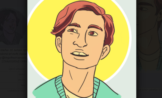
Copying art styles is so fun
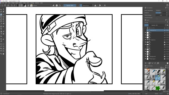
#my art#my ocs#i always thought i had rather thick line art tbh#but doing this lil challenge has opened my eyes#turns out i do rather thin/average line art#tho i think i USED to do rather think lineart#idk man#hmm should i tag all of these shows?#nah#ocs: melon
151 notes
·
View notes
Text
FAQ (´,,•ω•,,)♡
Because It seems like I've got a sudden wave of followers, here are some FAQs! °˖✧◝(⁰▿⁰)◜✧˖°
1. What hardware and software do you use?
Hardware : My laptop is Lenovo Legion Y7000, for drawing I use Wacom Cintiq 16.
Software : Clip Studio Paint EX
2. What brushes do you use?
For line art I use JiWa Pen (downloaded it on Clip Studio Assets) It's a textured pen rather than a very smooth one. I think it gives more character since I'm line art-based)

For the coloring brush I use just a flat oil paint brush and just the plain ol' blender. Nothing special.
3. How long have you been drawing?
I've been drawing since I was 4 years old. Now I'm 20 so I guess I've been drawing for 16 years now. Still a lot to learn tho.
4. Who are your inspirations in drawing?
for linearting : Yuto Sano (author of Lawless Kids), Tite Kubo (author of Bleach)
for coloring : Kim Jung Hyun (Artist of manhwas Riot, Viral Hit, and Brave Citizen).
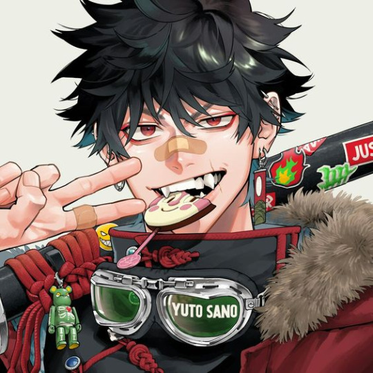
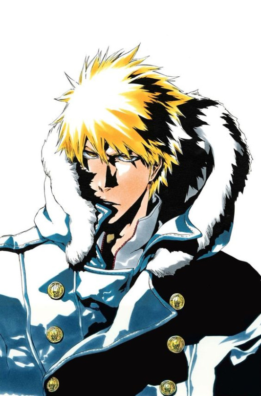
art by Yuto Sano (left), Tite Kubo (center), and Kim Jung Hyun (right)
If you see my artstyle, it's kinda the mix of these three.
5. Do you go to art school?
Yes I do! I'm majoring in Visual Communication Design in Bandung Institute of Technology. Going strong on 5th semester right now!
5. Do you take requests?
Sometimes I do. You're very welcome to send prompts or stuff in my asks, but remember that I'm not obligated to do it. I will do it when it piqued my interest and when I have the time.
6. Can we use your art as headers/icons/etc?
Yes you can! Just remember to CREDIT me in your bio @sleepyconfusedpotato I work hard on that thing ( `ε´ )
7. Can we buy your fanart or anything posted in your blog? How about commissions?
All of my arts on this blog is NOT for sale nor I am interested in monetizing it. This blog is just a way of me having fun with my fav video games. I am a professional artist in real life but this is also my hobby and it makes me happy.
For commissions, yes sometimes I do. Currently it's closed.
8. But I really love you art and I would really love to print it!
I'm deeply honored that my art is loved by you, and you have my permission to save my art and print it. What you're NOT allowed to do use it to make money by reselling on merch sites for profit, reposting it, or claiming it as yours. If you do that Imma haunt you in your dreams ٩(ఠ益ఠ)۶ (jk but please have mercy on me).
If you want to print it, please, be my guest. If you do post it tag me tho I'd love to see it LMFAO (´꒳`)♡
9. How do you deal with artblock?
Sleep. Eat. Watch some wholesome feel good romance movies. Art block means your brain is deep fried 10 times over. Do something else other than drawing. When I'm ready to draw again, I force through it. No easy way out.
10. How do you motivate yourself to improve?
This might not work for some people, but I do it with self bashing LMFAO. I just tell myself that my drawing SUCKS and is UGLY AF people don't wanna even double tap it JSGAHAGGS 😂
So I practice and try to GIT GUD. No shortcut ᕙ(⇀‸↼‶)ᕗ
45 notes
·
View notes
Text
Thanks for the comment! @ofbatsandwhitenights ((gonna reply here because I can’t reply on the bottom of the post due to this being a secondary account and lack of technology that allows me comment as this blog ((thanks technology I hate it)))
But yeah, it’s true that Miss not so sidekick’s art isn’t exactly for everyone lol. It’s art is kind of like one piece? ((which is ironic because the Sidekick as made references to one piece) Where it takes some getting used to and sadly- some of the characters like Arwin lose quite a bit of detail the more the story advances.
(Arwin at the beginning)
vs

(Arwin now)
and truth be told that even tho I do love sidekick (both stories and the art), I could write a whole post on just the art (things that changed over time with the characters, various height consistencies, outfit consistencies)
But I digress, it does become a bit less exaggerated the further on you go, but I think the story is well worth the suffering of the art, especially because the character dynamics, comedy, and self awareness is so good. This is one of the few times in manhwa where I can say that the story carries the art rather than the art carries the story. - I almost feel bad for people who dropped it because of it’s art. Sidekick is pretty HIGH on my recommendation list.
It’s kind of weird- I can barely read the Evil Lady’s Hero due to it’s art (the lineart looks like it was done on MS paint), and I almost dropped Stanning as well due to the stylistic choices but Sidekick has never once bothered me, but that’s another story for another day. This is kind of like the reverse WMMAP for me.
77 notes
·
View notes
Text
Cardenalia’s Art Process! (Part One)
YUP, IT’S ANOTHER ONE! ART PROCESS BELOW!!!
Step 1/2 - Scrapped Version:
The very first draft I had of Jamil!
Not gonna lie, I hate the fact that the scrapped version had better proportions than the original one is rather annoying...
But back to the point - I scrapped the original flower because the one below was so much better to me!
I was going to add some more Dahlias to the background...but I felt it would make Jamil lose focus in the cover so I scrapped that idea.
The earrings also was scrapped due to how freaking atrocious it was. I mean, WHO on earth wants to wear that? Not me.
In addition, I was going to make both hands hold the stem of the flower but I didn’t want to make Jamil seem like a romantic (because it doesn’t fit his personality) - so nope to that.
To be honest, I really despise the fact when I don’t get the proportions right...but I really had trouble with the arms, so I scrapped that. Shame on me.
Me to me: DISHONOR ON YOUR FAMILY-
Step One - Rough Draft:
Okay this one looks better and keeps the same style as the scrapped so I’m fine
The Rough Draft was started on October 15th, 2020 - 3:16 AM. (Yes I recorded the dates)
It took me a good while to get that pose...it took me 2 days to get to the lineart though because I was rather unhappy about not getting it right.
The hand, shoulders, and upper body was a huge problem in particular. Luckily, I achieved the result I wanted - which is the picture above.
Step Two - Rough Lineart:
AH THIS ONE LOOKS SO COOL
The Rough Lineart started October 17th, 2020 - 10:52 PM. Took me 2 hours to get this one done...
At first, I had no clue what on earth I should do. I was thinking - should I put this on? What about this? SHOULD I KEEP IT OR NO?!?
So yeah - just like Kalim’s character design - I winged it.
Steps of Lineart (also the top of my head):
1. Face (was done already)
2. Flower??? (not sure, #2 and #3 can be interchangeable)
3. Neck
4. Neck Pattern
5. Shirt(?)
6. Upper Body
7. Shoulder Design
8. Jewelry (both Left AND Right)
9. Veil (not sure, #8 and #9 can be switched around as well)
Step Three - Cleanup:

This is where the proportions start dying (especially that left arm - what in daffodil’s name-)
Cleanup started October 18th, 2020 - 12:19 AM (yup, doing it on the due date!)
I then took a break(...ish...?) for a good hour - then beauty sleep.
Step Four: Coloring
I did some coloring while I was taking a break which ended at 1:30 AM before going to bed.
Then, I woke up at 8:39 AM to continue colouring.
Originally, I was going to put Jamil in dark blue! But because it didn’t have any remnants to his original TWST design, I decided to not put it in. Instead, I decided the dark blue design will be used at nighttime.
(So in essence, the color of his clothes changes at night to camouflage himself to keep himself away from danger. Not sure about Kalim tho-)
As usual, I would do an extra file of the lineart in case I messed up (Most of the time, I get it right on the first try)
I also had to keep in mind that I didn’t want to make the flower stand out - but to make the album cover completely focused on Jamil (which contradicts the past album covers).
<>
Well. That’s it for now!
Want to See More? [ Art Process of Cardenalia - Part Two ]
As always - Thank you for supporting the fan made music (and art) of Twisted Wonderland x Date A Live content.
#TWSTxDAL#scarabia? scarabia#twisted wonderland#date a live#TWSTxDAL art process#scarabia#twst kalim#twst jamil#kalim al asim#jamil viper#YAY!#there's clues here you as well...just gotta find it :)#after Cardenalia I won't tell you there's hints cause it's basically in everything I do man!#Good luck! And call me when you find something#Love y'all guys UwU
34 notes
·
View notes
Text
im really truly grateful for everyone who’s said such nice things about my art recently, cuz this gal has had a rollercoaster of a time on here, and a PRETTY bumpy start with digital art lol. so i wanna take a stroll down memory lane for a second!!
(also i was sorting old art on my laptop and saw these!! ha)
a bunch of old/new art under the cut for length reasons
(also like. this is 80% for me cuz it’s satisfying to see some improvement over time!!! 2018 seems so long ago but also like. no lmao)
sam and dean, april 2018 vs march 2020
i got so mad at this first one that i quit at the faces!
also i was basically tracing the screencap i based this off of (which is actually a great way to get shapes down!! also blocking and proportions, but using that to go straight into lineart was Not The Best Look here)
but hey!! look at that improvement. an actual style. coloring inside/outside the lines on purpose! HA.
while i definitely have more detailed stuff of sam and dean now, the pose struck out to me when i was going through my old art today! so i had to compare lol
neeeext UP: patience
september 2018 vs march 2020
i used to just use a ton of color palettes because i didnt know how colors worked really... which was good practice for like, color tones and stuff, but i rly didnt know how colors worked very well until GENERALLY pretty recently!
this first patience im still content with, her likeness is there but there’s not much style, and i don’t really like the stiff lines anymore
now this!! i tried a new coloring stule and i rly enjoyed it! i also know how to use colors better (maybe???)
at some point i do wanna get back into doing some color palette things again tho! those were really fun
alex :0
september 2018 vs january 2020
i remember i DEFINITELY traced the one on the right, or tried to. and there look at me trying to blend colors on the left how cute....
these lil wayward drawings are probably some of my favorite!!!
and look at the change, still using a color palette but i THINK i figured out how to use the color to my advantage for the emotion of the pic rather than just. slapping it on (which i sometimes still do lol)
sastiel!
november 2018 vs february 2020
baby’s first sastiel... me just picking out canon moments of them how cute!! also peak how i could not draw sam’s nose right at this point (or cas’ BUT SAM’S POINTY NOSE IS SO IMPORTANT!!!)

this hug.. is probably my favorite thing i’ve drawing recently. i just love them a lot!!!
posing has gotten a lot better . lines too obviously (also the kind of brush helps so so much) also i was gonna color this but i merged the lines with the background like a doofus :/

jack time baybey!
may 2018 vs march 2020
very very obviously tracing/basing off of a pic?? i think. anyways im filled with good emotions still looking at these cuz this was right when i got back into spn and first fell in love with this tiny nephilim CHILD but also. there is improvement to be had ..... (also used a color palette again here)
again with the halo motif. i’ve always loved a good halo motif. SO let’s get into it. the lines!! with the old one they’re very shaky (understandable. i was v new @ digital art) also extremely stiff. no room to breath
new art! while the lines i used could be considered similar (bold lines all the same color, not much pen pressure) things have changed!
i’ve been using brown for my lines recently, makes it look less harsh sometimies, also here i’ve figured out what works for me with where to put less lines, namely the hair! i got the shape, put down some bangs, but not everything is blocked off by a line between skin / hair
also just. another note. ive figured out how to find good highlights/shadows with colors recently and i just! theyre good and bright and im happy abt it (also light purple??? is a good skin shadow???? fun fact)

ok. that all got a bit lengthy but this was very fun for me! if you made it this far I COMMEND YOU ALL THE LOVE FROM ME
#sea talks#oh god what a long post im so SORRY#for real dont read the whole thing if u dont want to obvs#its just me rambling about old and new art#shout out if you've been here since yee olden days#POSTS GETTING 3 NOTES.... LOVE YALL
34 notes
·
View notes
Photo
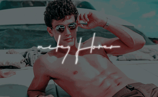
( xavier serrano , male , he/him, 23 ) omg ! i was walking yonge street downtown , and you’ll never guess who i saw . 𝐌𝐈𝐂𝐇𝐀𝐄𝐋 𝐅𝐋𝐎𝐑𝐄𝐒 ! i just saw a post about them on sixsecrets ! i think it said something like “ 𝐌𝐈𝐊𝐄𝐘 𝐅𝐋𝐎𝐑𝐄𝐒 𝐒𝐏𝐎𝐓𝐓𝐄𝐃 𝐋𝐄𝐀𝐕𝐈𝐍𝐆 𝐅𝐀𝐌𝐎𝐔𝐒 𝐀𝐂𝐓𝐎𝐑'𝐒 𝐇𝐈𝐆𝐇𝐑𝐈𝐒𝐄 𝐀𝐓 𝟓 𝐀𝐌 : 𝐑𝐎𝐌𝐀𝐍𝐂𝐄 𝐎𝐑 𝐘𝐄𝐓 𝐀𝐍𝐎𝐓𝐇𝐄𝐑 𝐅𝐋𝐈𝐍𝐆 ?” . isn’t that wild ? i guess it makes sense through , since they’re apparently 𝐃𝐔𝐏𝐋𝐈𝐂𝐈𝐓𝐎𝐔𝐒 and 𝐂𝐔𝐍𝐍𝐈𝐍𝐆 . but i’ve heard they’re also 𝐎𝐏𝐓𝐈𝐌𝐈𝐒𝐓𝐈𝐂 and 𝐂𝐇𝐀𝐑𝐈𝐒𝐌𝐀𝐓𝐈𝐂 ! i’ll just stick to giving them the benefit of the doubt . i mean , it’s not like i know them personally — they’re a famous 𝐏𝐑𝐎𝐅𝐄𝐒𝐒𝐈𝐎𝐍𝐀𝐋 𝐃𝐀𝐍𝐂𝐄𝐑 / 𝐘𝐎𝐔𝐓𝐔𝐁𝐄𝐑 ! you know , i’ve actually heard rumors that ██████████████████, but they’re just rumors … i think . i dunno . if you happen to run into them , tell them i’m their biggest fan ! ( ollie , they / them , 21 , est )
𝐓𝐇𝐄 𝐒𝐓𝐎𝐑𝐘
— mikey was born and raised in winnipeg because i think it’s funny when characters are from winnipeg. if you’re from winnipeg i’m so sorry. definitely was born on the coldest day of that year ( so like some point in january )
— but because of those long, cold harsh winters, mikey found himself in a dance studio a lot. his aunt was a dance teacher and with rather absent parents who meant well but both had long hours at the local hospital, he spent a lot of time with her. he fell in love with dance pretty early on, always having a certain fluidity and grace even when he was young.
— random but he also played hockey up until he was like 16 or whatever because he’s canadian and i’m not stupid. it happened. he can still skate tho. in a slightly different life he probably would have been a pretty good figure skater huh 🤔🤔🤔 but anyway...
— also feel like it makes sense that he did gymnastics. and trained in classical ballet.
— he went to university of toronto for college, studying kinesology and dance, and danced at one of the prestigious studios in the city.
— his big break moment was when in his sophomore year at ut, he made it onto the second season of world of dance in early 2017 ( lets pretend that show has been on longer than it has bc i don’t want it to be the first season of it sldk ). he made it all the way to the finals and quickly become a fan favorite along the way. though he ultimately placed second and missed out on the million dollars, that was the beginning of many doors opening for him. ( for those who, might have the vaguest clue what i’m talking about : i’m highkey feeling like, michael dameski style which is an idea i had after i named him michael so don’t @ me for him having the same first name ).
— millions watched that show, including some prominent agents and scouts who were able to help him launch a professional dance career : something he never thought he’d see himself actually doing. his first big gig was making the dance team for some singer’s north american tour, and he ended up not returning to ut to pursue a professional dance career full time. since then he’s danced in a few music videos for some uber famous musican ( same one he went on tour with or not idk ?? also a wc ?? maybe ?? ), a tv show, couple movies, and other various gigs around the city. he works part time at a studio when he has time, and has been honing his choreography skills as well.
— he makes enough dancing, but certainly not enough to make him RICH. no, that come from an impromptu vlog he did while on tour with aforementioned singer. having already garnered a following from world of dance, he soon rose to youtube fame as well, something he never could have predicted. i feel like his videos are very just, day in a life with various random challenges mixed in, and various workout and flexibility tips. he also still does pieces and duets with other prominent dancers just for fun too. his natural charisma and attitude really just carries him through easily lmao.
— mikey developed a bit of a habit of sleeping around when he left for college, all the newfound freedom was just intoxicating and well. he was hot so. it wasn’t like it was hard alsdkjf. that stuck around well into his blossoming dance career. nothing that was enough to be scandalous, but he made his way around. and then a year and a half into this unforeseen new life, he met matthew glass.
— he’d had a couple serious relationships before, one in high school, one his freshman year of college but neither of them could hold a flame to what he felt when he was with matt. perfection wasn’t something mikey believed in, but he almost did with what they had.
— it was like for over a year and a half he lived in this insane dream, and then mikey and matt broke up and he was devastated ( behind closed doors and with curtains pulled tightly shut ).
— he then proceeded to broadcast how perfectly fine he was doing by going back to his old ways and sleeping around obsessively, this time with very little regard as to how many headlines he was making. as far as coping mechanisms go, i guess sex is better than alcohol ?? not to say he wasn’t also drunk at times l o l.
𝐌𝐈𝐒𝐂
— mikey is a... how do u say... im gunna write manwhore bc it’s accurate so pls don’t take offense. inch resting bc i’ve written smut like once in my eight year rping career but that’s what he decided he was gunna be and who am i to deny that.
— very bi. very much does not care. if the world didn’t know he was before, it definitely does now lmao. he hasn’t come out in the sense he’s like posted a video about it and said “i’m bisexual” but it’s pretty obvious from the media and maybe he has gotten asked in interviews and has just shrugged and been like does it matter ?? i’m sorry he’s not the vocal bi ally we need. perhaps we will work on that.
— hasn’t dated anyone since matt bc he’s highkey lowkey still hung up on him but no one needs to know that right. outwardly, he’s very much the same : seemingly happy, but he’s a lot more careful with his heart and letting people close to him. if anything he’s become a bit of a two-way mirror, always seeing out but never really letting people see in, just what they want to see.
— probably goes without saying but extremely flexible. idk if any of you know who juuse saros is but apparently he can twerk in a split and i’m not saying mikey can but like. he just might be able to...
— straight up does not get cold. never wears more than a hoodie, probably danced shirtless in the middle of winter just fine. at least being from winnipeg is good for one ( 1 ) thing.
— i feel like people call him flower. idk guys. maybe im just thinking too much abt hockey goalies.
𝐏𝐄𝐑𝐒𝐎𝐍𝐀𝐋𝐈𝐓𝐘
— he tends to be extremely underestimated as he comes across a bit dumb and generally has a pretty positive outlook on life which people confuse for him being naive when that isn’t the case. but he’s found he can use that it his advantage and that sometimes, people will tell him things they think he can’t understand but he hears and remembers everything. it’s helped him out of a few difficult situations before.
— i feel like he has a bit of ethan dolan’s personality & dumbass energy idk guys...
— live in the moment kind of dude. his motto is probably like : you just gotta know what you want to do next. i mean looking back on his life it’s been pretty crazy and that’s only solidified his outlook that like, you really can’t control too much. just let it go where it takes you.
— people do like him though and they like talking to him for whatever reason. generally has pretty trustworthy vibes but he’s more slippery than he comes across. he’s a selfish person at heart and always has his own best interests in mind, even if it doesn’t seem that way at first.
— extroverted. i think ??
𝐀𝐏𝐏𝐄𝐀𝐑𝐄𝐍𝐂𝐄
— 6′1″. chocolate brown eyes. curly brown hair. he has a lithe but extremely fit build due to his career. his core strength is especially impressive.
— he has a monochromatic lineart tattoo of a rose on his left forearm / wrist and a butterfly ( again monochromatic & just lineart ) on his right shoulder. small scar at the base of his neck by his ear from an unfortunate hockey accident.
— needs glasses but usually only wears contacts unless he’s in his apartment late at night.
— he’s not overly fashionable, going more for comfort than how he generally looks. on a regular day, he’s probably got the whole... college athlete look going if you know what i mean. a big fan of mirrored aviator sunglasses. wouldn’t know what dressing up meant even if it slapped him in the face.
𝐖𝐀𝐍𝐓𝐄𝐃 𝐂𝐎𝐍𝐍𝐄𝐂𝐓𝐈𝐎𝐍𝐒
first and foremost i want to say that i like to vibe and brainstorm with people to come up with unique connections between our characters but here are a few ideas:
— the singer whose tour he danced on
— singer whose music videos he’s been in
— mayhaps even actors for that tv show / movie he was in ( v small role but whatevs. maybe they just Vibed yknow )
— flirtationship 😔
— always ye ol good hookup l o l
— we keep running into each other idk maybe we should talk ??
TAKEN CONNECTIONS PAGE HERE
𝐎𝐎𝐂
hey guys, i’m ollie. my intros are either written really eloquently or a big mess bc im trying to rub together a couple braincells at 1 am and whatever comes out, comes out. no need to guess which category this one falls into lmAO. anyway, i’m a slow plotter bc i’m easily overwhelmed trying to do too many things at once but i swear i will try to get to as many people as i can. and yeah this entire character is inspired by my love of world of dance don’t @ me... if u made it all the way down here u should watch this bc 😳 & mikey has the same athleticism and strength.
#sixhqintro#( so....#this be a hot mess !!!!#but..#he's here lmao#hmu )#( im going to sleep soon bc it's almost 2 am and i have work tomorrow lmao )
9 notes
·
View notes
Note
Do you have any art tips for poses? More specifically complex ones like twisting your body or shooting and arrow from midair?
OOoohhhhh boy. Mostly, TONS of practice/study & TONS of references.
I’ve done a lot of figure studies w/ sketching dancers, gymnasts, fencing, wrestling, football, hockey, ect... the more live games/performances you can do the better because it forces you to sketch as you go and really capture the essence of the Movement rather than going for Precision.
To do Those, you draw a Line of Action (aka where the weight is distributed the most throughout the body- usually follows the spine, but sometimes it gets a little off), I tend to go w/ the head or chest first in defining it, just Real Loose circles, and then sketching in the arms & legs & stuff all in motion as fast as you can. You can get these done in a few seconds if you practice enough.
I usually draw these super tiny and sketch on at least 2-3 pages full of them during one full game/performance. It’s really helpful practice on motion.
when finding references, make sure to use a hodge podge. It’ll give you a clearer picture in your head and you can make it a bit more 3D feeling when you work w/ that. I usually take from at least 10 references for one action. When looking for references to use, don’t settle for plain stock images- dig. find your new favorite pictures. Ask yourself what about the picture drew you in. Maybe draw over your references w/ your framework sketching to get a feel for the pose and the angles- so that when you get to your Actual drawing, you have a bit more of an idea of what goes where and why. (to find your refs for something like drawing an arrow middair- you’ll wanna look up maybe dancer/gymnast poses -depending on what kind of leap you’re looking for- in addition to poses of archers drawing their bows- you’ll maybe also want to look at horseback or moving-target archers because they’re working w/ Movement so maybe their tactic is different (& can you See that) maybe you wanna look at some jumping/falling poses, or parkour. Find poses that match Similarly across most of them that would vaguely mesh into your pose, and a few poses that are specific to what you’re envisioning for A Particular Part, if needed.)
If you’re not super practiced with it yet- Simplify your parts. Make the chest, pelvis, head, thigh, calf, upper arm, and forearm & hands/feet all different Parts- it’ll be easier to think of it that way over anything else when using complex poses.
it’d look kinda like this:

(this is a little bit of an older sketch but it’s the best example of an action pose I could think of I have a good sketch saved for. I go MUCH lighter now- & it’s 10 times better for lineart & adjustments)
Notably- there’s a line of action (that I didn’t follow completely- I changed how I wanted the legs to end up), and I indicated the turn of the torso w/ a cross-line, like you would w/ the head & the directions of the face (which...I didn’t do in this sketch... weirdly enough...?) & It’s messy!! Be messy, change parts of it. add. Erase, redo.
For Very Refined stuff, I also usually make about... 2-5 thumbnail sketches kinda like this but in different angles, various tiny adjustments, ect- any possible way I can think of doing the pose that fits into my plan. Even if I liked my initial sketch. Usually I’ll end up liking one of the last tries More. ....I don’t really do this as much for comics or my simpler sketches because I just don’t have the time/energy for it, but it’s probably a good thing to get into the habit of.
In general, when drawing complex poses especially.... Follow cartoon rules- Clarity First. You should be able to tell what the action is even if it’s a silhouette. If you cant- exaggerate, change the perspective, and/or choose another position that’s clearer.
Specifically- for the poses you’re talking about- for a twist in the body, it’s gonna be defined by the chest (specifically the rib-cage & shoulder line) & the pelvis angles.
For bow & arrow, you’re gonna have a rather broad approach to the chest- it’s gonna be twisted to one direction more than the other- you’ll have an arm pulling back the drawstring, and then the one holding the bow- (and... for some reason, the bow is Always Bigger than you think. Especially longbow. A longbow is generally a little taller than your character, standing, and the string is gonna be taut w/ a fully extended arm & a fully pulled back elbow (hand to the ear). It’s Big. (the above sketch is a bit Smol for a longbow) ... of course- if you’re not using a longbow, look up the kinds of bows & see how they look in relation to an archer. The arm is gonna be parallel to the line of the bow.)
Mid-air? feet are gonna follow whatever leap/jump/fall/ect that your character is in. The rest of the torso should be contorting to help you connect these two positions in the best way possible.
...And yea. That’s the gist of what I can think of for rn. You’re more than welcome to ask me additional questions surrounding it tho! Hope that helps!
83 notes
·
View notes
Text
Anon said: Hey!! I wanna ask, how do you feel about the ship Rap//Gum (rappa and fatgum) and would you consider drawing or talking about them? They’re such a rare pair and I love their dynamic so much!
I don’t mind it, but I can’t say I’m invested enough to ever make something with it ngl T-T sorry!
Anon said: Heya! I was just looking through your art and I absolutely adore it! I was wondering, have you ever drawn Toga before?
Thank you!! And I haven’t, and probably won’t in the future either!
Anon said: I love your art! Keep going! Also, i love very much your Bokuroo art!! You're the best!
Thank you!!!!!!!!!!!! You keep going too, anon!!!!!
Anon said: MY STICKERS CAME!! I really wish Redbubble gave artists more for the stuff they sell there, because I love buying your stuff, when I can, but it feels like I'm ripping you off, because you get so little for everything. But, I love the stickers I got! I finally got Octopus Team, and Tamaki, which I've been wanting for AGES.i have no clue where I'll stick them, so I'll probably pin then to my wall, until I figure something out lol Stay sweet. ✌💜
AHHHHHHHH I’m so glad you like them!!!!!!!! And thank you so so much for the feeling and concern, but considering how they make them and ship them I feel like the amount I get isn’t too bad! I could technically earn more from them, but that’d raise the price more than I’d be comfortable with..........haha
Anon said: I will say this absolutely with no hesitation, I love your art style so much.
GOSH thank you so much!!!
Anon said: I'm absolutely in love with your art, it's so pretty, especially the way you draw Kirishima!
Thank you!!!!! He’s a lot of fun to draw so I’m glad you like him!!!! <3
Anon said: Your most resent piece (the blood cape Kiri) is MMMMM SO DELICIOUS!!! That boy can WORK IT!! Also,,,,,, I’m probably the only one that saw this, but the design in the blood cape looks like two abstract Iidas screaming at each other....... sorry I’m weird and that’s the second thing I noticed..... and sorry cuz this isn’t really an ask but YOU NEED TO KNOW HOW GOOOODDD THAT PIECE IS!!!! (It’s perrrrrrrfecccttt)
I!!!!!!!!!! can’t say I see it sorry!!!!!! But I’m super happy to hear you liked it, thank you so much!!!!!! <3
Anon said: Hiya!!! I really love ur art and the way you draw characters, so I wanted to ask you a question. :00 do you break down bodies into basic shapes when you draw?? If so, what're some general shapes you use for the torso??
To be fair it’s sort of random and based on the character I have to draw/the pose/ what they’re wearing haha...........don’t be like me this is why my anatomy is often questionable - if I had to give you a model tho, do you know those wooden models for artists? the very basic ones you can get for cheap anywhere, I mostly break up my bodies following the way it’s broken down on those lil dudes!
Anon said: Hnnnhhhgggg Garo is a sexy man and me.exe has stopped working
tbh that’s!!!! a big!!!!!!!!!! Mood!!!!!!!!!!!!!!!! I love my kaiju boy
Anon said: I really dislike BNHA, I think it's boring. Your art however? It's wonderful. I love your comics because they're so funny and sweet, they always make me smile when I see them. Your lineart is also really curved and soft looking, like it's made out of friendship. Thank you for sharing your art, it makes me and others so happy!
Glad I can make you enjoy something you usually don’t like, anon! <3 thank you!!
Anon said: I sooo wish manga Bakugo was like yours ç_ç By which I do not mean that yours is out of character, just that you depict his more human side and draw BEAUTIFUL scenes of him interacting with others as his peers rather than them being just props for him... and, well, your KiriBaku slays me and I love you for all of it
To be fair I like manga Bakugou better than my own haha I find him deeper, but that’s to be expected from one of my favorite characters after all! I’m glad you like mine that much, tho! Thank you!
Anon said: In one of your comics you reference Sharkboy and Lavagirl, right? Did you see the film in the theaters? You might be the only other Italian I know who has XD
I didn’t !!!!! sadly it took me reaching my twenties before I started regularly going to the movies and I was a kid when sb&lg came out ;;;;;; *sad violin music*
Anon said: BEAUTIFUL PERSON AWARD! Once you are given this award, you're supposed to paste it in the ask of 8 people who deserve it. If you break the chain nothing will happen, but it's sweet to know someone thinks you’re beautiful inside and out! 💞
THANK YOU SO MUCH!!!!!!!! <3<3
Anon said: Is there any ships that make you uncomfortable or you just don’t agree with?
Oh there’s a lot, I can be extremely peculiar with what I ship and what I don’t! I try to keep my mind and my dash/tl as empty of those ships as I can tho uwu *whispers* self-care
321 notes
·
View notes
Note
hey Ever! Its been a while since we've chatted at all. Just wondering if you have any lineart tips? Your lineart has always been so beautiful. hope youre having a great day!
hiya!! i talked about lineart here, here, and here before. i’ve been doing my lines a bit different these days, tho, so i guess i’ll try to add more to those posts!
thx to a lot of personal art angst (lol) about my style being v rigid and lifeless, i’ve taken to doing lineart as “subtractive” vs “additive” - instead of doing lines on a new layer, i’ll sketch with a 15-20px brush, then refine the same layer by erasing, carving out negative space & sometimes drawing finer details in:

it helps me feel looser, and create more interesting line variety! i think it’s also easier to smooth out things like long curves when you’re erasing, rather than redrawing the whole thing. i don’t use line stabilizers so it’s helpful to have more control :0
more example + thoughts using the last fanart i posted… (1) think about how line width draws your eye - i like defining broad shapes with thicker lines, and details inside the shape with thinner (see wing & clothes); (2) contrast in line width makes for easier visual reading; (3) coloring your lines is a game changer imo!! you can soften harsh lines and add a lot to visual clarity by coloring!
#ASK EVER#ever's questionable art advice emporium#also: just spending like a really unreasonable amount of time on lines#aidenjaxwrites
197 notes
·
View notes
Note
Hi viria! One of my new year's resolutions is to start drawing (tho I feel kind of old, starting at 22), but I don't really know where to begin. Most of the tutorials I've come across suggest starting with shapes (which is... really boring), or more hyperrealistic drawings which are not really my thing. What do you think is a good place to start, considering I mainly want to do fanart? Do you think copying artists I like is good practice or rather a waste of time? Thank you so much!
Hello!
First of all, it’s never too late to start doing anything. If you want it - go for it.
Then, speaking from experience, learning to draw with shapes and lines is very helpful, actually. It can help you build on a body when you don’t really ~feel~ it yet, and when your hand isn’t used to draw bodyshapes and such. I would recommend starting with more simple tutorials, not super detailed ones. Just those that include general head= circle, some guidelines, etc, at first you may find it hard to learn muscles and “perfect anatomy”. You can actually go through my tutorials tag, some of those are very old, but you may find something helpful in there.
This part isn’t as boring really, or at least I don’t think it is, because it is exactly the part that allows you to position the characters the way you’d like (or closer to the way you’d like). So when you only start, general shapes and guidelines are huge help!
As for copying artists - everyone starts by copying. BUT, I would recommend to not get too involved in copying one artist only, as it gets very very hard to branch off from that..and if you learn from them and you keep on mimicing this one artist, you may end up kind of like a carbon copy of them, which can be upsetting for the artist, and very frustrating for you.
But, you can find quite a few of the artists you love. You may mimic the way one artist draws eyes, another draws ears, another one’s lineart, and colouring from someone else. This kind of observation can really help you build up a style without ending up copying someone else’s years of work. It can end up as something unique, the way you copy them is most likely not gonna turn out perfectly similar, which is also a plus. You mix and blend some things from the artstyles you like, it’s pretty much how any artstyle is build. It’s just not everyone knows about it from the start and then later on may find a struggle to simply not draw like this one artist they admired.
Hope it helps!
373 notes
·
View notes
Last Seen Blogs

scrunchynosesutton
Untitled

wetducky
Untitled
evilrashida
R A S H I D A

littledirtonmyboots-blog
God Bless This Mess
sk1nnyxyz
Møtylëk 🦋