#way to cartoony compared to the rest
Note
Hi! How would you draw a tool-evolved cat paw?
Aeons ago I wrote some speculative biology thoughts on what a tool-focused cat would begin to look like, and mentioned the way that a caw's paw might evolve. I can try to draw it out as a sketch; but fair warning that I put my art style points into cartoony anime stuff SO you're not gonna get a realistic drawing lmao
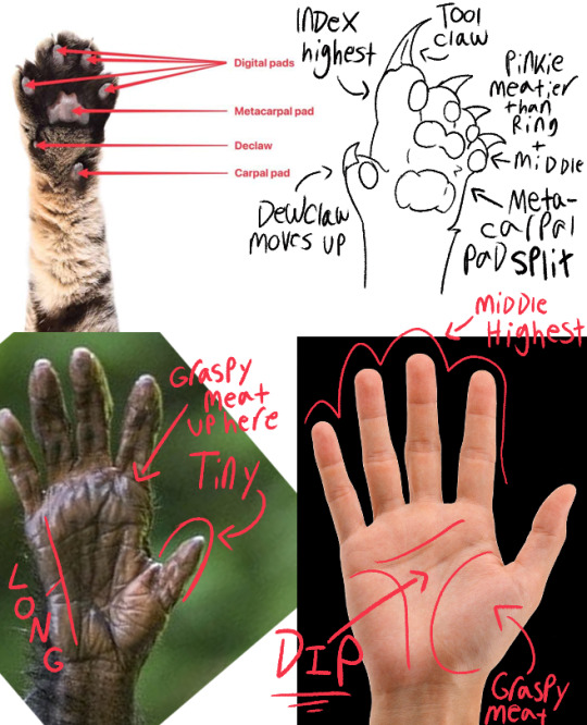
Evolution doesn't "think." It's many changes over generations that snowball into bigger ones. So I tried to look at WHAT exactly is happening between an animal with less sophisticated tool use (chimp) and one that COMPLETELY relies on tools (human) to predict where the cat's paw would end up in a few thousand generations.
Please note! My paw would still be a "link" between the ancestor, and something even more reliant on tool use. This proposed species would still be 100% capable of doing what the cats in-canon do, like hunt alone. It's for a feline species that is tool-ADAPTED, not tool-RELIANT.
(In that way, it's more comparable to, say, a lemur and a chimp. But lemur palm refs were hard to find and I did this quick because I've already thought about it.)
This paw would exist in-tandem with a "tool tooth;" A V-shaped gap in the jawline that a single fang would nestle into. Early tool-using felines would likely use their mouth to "break" or "shear" their crafts, leading to broken teeth that would make them less successful. So there would be a lot of evolutionary pressure to have better, stronger teeth.
Evolution doesn't do "one thing at a time," so if you happened to port yourself into a group of these cats and watch them craft stuff, you'd see them using their mouths as well as their paws!
Finger Size + Tool Claw
When you see real cats batting stuff around and manipulating things, and when you look at canon where they like to "hook things on a claw," it's usually the index "finger" they favor. In fact, they do a LOT of "poking," even when a cat bats at something they seem to mostly explore with the tip of their paw.
So I figure that would actually be a big difference between this species and humans.
Unlike us, who usually have our middle finger as the longest (though there are exceptions) so we can "stabilize" the things we grab, I'd give these guys a "Tool Claw" which is not involved in grappling at all. It's longer, more deeply grooved, but also more fragile than the "hunting" claws.
When at rest, the Tool Claw would stick out from the rest of the foot, straight upwards. The fur is able to "sheathe" the other three, but the index's would be too long to be fully hidden.
Because one of those fingers is now mostly taken out of combat, the pinkie would probably thicken up to compensate. Another difference from the human hand. I can imagine that if the trend continues, they might end up supporting their full frontal weight on the pinkie pad to free up the other fingers for tool use.
(But evolution's not always predictable! They might end up becoming more "back heavy" like raccoons, or rely on the invention of shoe/gloves, or just abandon silent hunting all together to become tool-reliant.)
Paw Pad Changes
Cats use the pads on their paws to move silently. As long as the species is relying on silently stalking prey, they will need to have these pads in contact with the ground to be good hunters.
So instead of the digital pads sliding down to create the "top" of the palm, I figured the metacarpal pad would split in two. So now there's a snug, dipped "shape" with which they could nestle an object into as they work with it, but also there is ALWAYS still pad in contact with the ground.
The amount of fur in-between the bottom (metacarpal) and top (supercarpal) pads probably just depends on culture and genetics. It wouldn't really have enough of an impact on the paw to be selected for to be furry or hairless.
I can imagine some groups being weird about it and thinking it should be shaved or braided or something, lmao. Or cats who live in muddy environments clipping it for hygiene reasons.
#Speculative Biology#bone babble#but btw no i dont use these in my bb drawings.#this is just for fun.#BB isn't really a spec bio project.#And also YES this is free to use for anything go nuts
181 notes
·
View notes
Text
And finally, Killing Harmony appearance/gender /sexuality headcanons
Kaede Akamatsu - (She/Her Bi, female pref) Chubby and has stretch marks on her hips and stomach. Round baby face, and wears cute pink lipgloss. She also has a little nose ring.
Rantaro Amami - (He/They, pan) He’s a bit chubby (wow, my bias is showing) and has kind of thick thighs compared to most amab people. Wavy hair a bit longer than canon that he sometimes puts in a baby ponytail. Pierced nostril and tongue.
Kirumi Tojo - (She/Her, grey asexual, pan?) Midsized and kind of pear shaped with slightly muscular arms and long legs. Long, elegant hands and clear skin. Oblong face, longer pointy nose. Can’t tan to save her life. Occasionally wears black lipstick.
Ryoma Hoshi - (He/Him, aroace) Can we just knock it off with the random cartoony designs that don’t fit the rest of the aesthetic? He is still short and chubby, but in a humanoid way. Curly light brown hair and bushy eyebrows. Round face with freckles. Some scars on his knuckles from his prison days.
Angie Yonaga - (She/Her, Pan) Pretty average build. Soft tum and smallish boobs. Thick wavy hair that can get pretty gnarly and usually has some acrylic paint stuck in it. Also wipes her paintbrushes on her bare legs when she’s feeling lazy. Gold nose hoops and medusa piercing. Wears brown tinted lipgloss.
Tenko Chabashira - (She/Her, Lesbian) Athletic with lean muscle and somewhat broad shoulders. Tapes her knuckles for training sometimes and has short stubby hands. Doesn’t shave. Canine teeth that somewhat turn inward and look like fangs.
Korekiyo Shinguuji - (They/Them, pan) Tall and gangly skinny in an unhealthy way. No real muscle definition and shitty posture. Oblong face with a larger nose and somewhat crooked teeth (not that anyone could see that) Long bony hands that are always ice cold. Deathly pale and wears eyeliner and mascara. Wears reading glasses. Stretched ears.
Gonta Gokuhara - (He/Him, pan) Hella buff, but not necessarily chiseled. Still soft in some places (gives excellent hugs). His glasses are probably taped on the side due to his clumsiness. Tangled hair that absolutely cannot be tamed and a few accidental freeform locs in the mix. Sizable front tooth gap and full lips.
Miu Iruma - (She/Her horny pan) Plus sized with an extra fluffy hourglass figure. Stretch marks on her chest and hips. Clothes almost always stained with motor oil and sut. Dark brown roots that are a bit overgrown. Freckles and a round face with thick lips. Always wears lipgloss. Keeps a tube in her bra and pulls it without shame. Monroe and tongue piercings.
Kokichi Ouma - (He/Him, gay) A scrawny little pipsqueak. Has braces and sometimes spits when he talks. Ridiculously tiny hands and feet, has to wear children’s shoes. Absolutely cannot tan. Will sometimes wear makeup like a harlequin clown. Cartilage and nostril piercings.
Kaito Momota - (He/Him, bi female pref) Stocky build with muscular arms and broad shoulders, kind of linebacker-esque. I hate the way his hair is designed, but I feel like it would be kind of a straight wolf cut if he let it down. Will sometimes have a man bun. Hairy arms and ham hands. Pierced ears and eyebrow.
Maki Harukawa - (She/Her grey ace, female pref) Athletic build. Flat chested and barely defined waist. Heart-shaped face and widows peak hairline. Scars on her arms. Just really soft facial features that she kind of hates. Hates shaving her legs.
Shuichi Saihara - (He/They, FtM, bi male pref) A little bit pudgy and has thicker thighs. Binds, but is naturally fairly small chested. Wears eyeliner, and has long, thick eyelashes even without mascara. Pin straight hair. Round face and soft lips. Dark circles under his eyes. Has septum and industrial piercings and small stretched ears.
Himiko Yumeno - (She/Her, asexual, sapphic) She looks like she’s in middle school and is a bit chubby. Has perpetually rosy cheeks and crooked teeth in an endearing way. Very fine hair.
Tsumugi Shirogane- (She/Her, asexual) Midsized with pretty even weight distribution. Wavy, thick hair. Somewhat large forehead. Honestly I don’t have much to add to her canon design.
Kiibo - (They/He, aroace, no concept of gender) He is a robot. His “skin” is made of silicone and he has humanlike glass eyes. His hair is nylon and pokes into his little head like a doll. His design is extremely detailed with him even having eyelashes and enamel teeth. Has an internal heater to make his “skin” warm, kind of like baymax. And no, he didn’t come with a dick, though Iruma did patent one.
#ndrv3 killing harmony#ndrv3#killing harmony#danganronpa#shuichi saihara#kaede akamatsu#rantaro amami#kirumi tojo#ryoma hoshi#maki harukawa#himiko yumeno#tenko chabashira#angie yonaga#korekiyo shinguji#gonta gokuhara#miu iruma#kiibo#k1 b0#tsumugi shirogane#kaito momota#kokichi ouma#korekiyo shinguuji#danganronpa headcanons
62 notes
·
View notes
Text
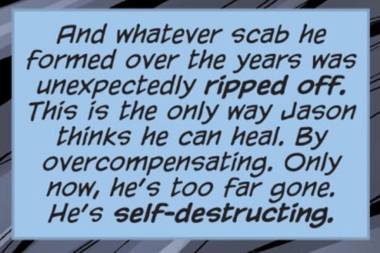
BFTC isn’t really a case of terrible characterization for Jason so much as it was a terrible case of victim blaming. Like yeah, some of the things Jason did were a bit extreme compared to his “better” appearances, but that’s nothing new and pretty much true of many stories that aren’t utrh or lost days. The bad parts are are also definitely exaggerated by fans.
The story isn’t centered on Jason. Of course every other character’s description of Jason would be knee-jerk dismissive and misunderstanding, since (again) the intention was to make Jason out to be the cartoony bad guy villain. But if you look past the layers of grime they added, the bare bones of his characterization are not entirely incorrect. It’s a biased story in which their intended criticisms of Jason’s morals often fell short, so to compensate they deliberately cranked up his motivations to be more extreme and unrealistic (but one which, nonetheless got Jason’s overall thoughts and goals relatively consistent with stories that portrayed him accurately).
Yes, him shooting Damian was out of character, but granted we’re all in agreement that it was a true case of “bad writing decision”, I don’t think it’s hard to look past. The only other bit people probably complain about (which felt iffy at worst) was him being “a bit enthusiastic” at times in trying to convince Dick to become another lethal Batman (you can just as easily say Jason wouldn’t have been personally invested enough to have acted in the way he did). I don’t care though because he was probably doing it for shits and giggles, and it was funny watching him push their buttons on his spare time while being excellent at his job. Same old ‘none of them deny that he’s effective, they just can’t get behind the killing’ conflict.
Looking past the fact that Jason still had a valid point, the “he’s the bad guy” plot falls apart for other obvious reasons, which happen in the 3rd issue. It’s kind of hard to focus on how much of a bitch Jason’s being when the other characters are written in an infinitely more problematic way (which ends up happening in most “hate Jason” stories). Not only did they heavily imply Jason is a victim of SA, but the way Dick/the batfamily treats Jason about this is … horrible. Arguing that this was a case of character assassination for Bruce and Dick would be more realistic than using this story to claim Jason is a Bad Person™.
Even though Bruce does have a bad track record with his perspective on victims of SA.
Hey. Maybe listen to the living person begging you to turn it off.

Geez. I wonder why he never felt safe enough to confide in Bruce or any of the rest of them. Implying that enduring what he did made him “broken beyond repair”, that he needs to be “fixed”, and saying verbatim, “you are my greatest failure”, not “I failed you greatly”. Then deciding on behalf of Jason that a bunch of people who weren’t involved in what happened to him should all know about this so they can decide what should be done. And everyone agrees with this garbage. Unbelievable.
Aka, any sort of healing he may have tried to accomplish was ruined by you lot. When exactly am I supposed to see that Jason was evil all along.
The story collapses in on itself in the third issue because where Dick is supposed to be at his prime within the arc, he just sort of rambles about how Jason was a shitty victim and then awkwardly shifts to talking about personal growth and coming to accept his own heroic destiny.
I do resent this, but not because “Jason sucks here”. Jason’s “bad portrayal” pales in comparison to the problematic mindsets given to the other characters (namely Dick) which were framed as good-natured intentions and “tough love”. As for people who describe this as “vilifying Jason to prop up Dick” … I don’t really know what to make of that.
#my post#the way they constantly go out of their way to praise Jason’s marksmanship and overall combat skills#and how everyone he killed died because he meant for them to#and Tim and Damian weren’t critically injured. he didn’t attack them with the intention to kill and it’s obvious#not only that it’s made clear they were both wearing heavy duty kevlar#and considering Jason’s an expert on this stuff himself he knew it wouldn’t really do long term damage.#he also knows how to attack people to do any specific kind of damage. if you claim that about Bruce smashing a dude’s skull#against a brick wall and not killing him then you can claim the same thing for Jason#but of course people will always dwell on inconsequential bullshit and try to make a grand point out of it if it’s about Jason#even as they point out that it was a dumb decision made by the writers#‘Jason was violent towards children' do you want me to never shut up again about who is consistently violent with his own children?#not only was this pretty tame compared to the things Bruce has done to Jason and the other batkids#in the majority of his appearances Jason has always been deeply sympathetic and caring towards kids#hence why people always point out how this is a shitty outlier
83 notes
·
View notes
Note
Hello ! I am a big fan of your art and was wondering if you could give me some tricks.
How did you come up with your current style ? Was it something you searched to developp or did it come naturaly ? If it's the first option, what made you stylize it like this ? Do you have any idea what I could do to stylize my own art ?
I am a somewhat semi-realistic artist (still learning a lot though) and was searching to also developp a more cartoony style like yours alongside it, so I would appreciate some help to understand what to do.
No need to answer this if you don't want to, for any reasons though ! Just wanted to ask you if you are willing to help me, even just a little bit :)
Thank you !
Hello. ^^ Thank you for the detailed ask and taking your time out to write it 🙇♂️.
I developed my current art style through a combination of both exploration (“naturally”) and it being something I searched to develop. In my head, I always wanted to adopt a sharper, blockier art style with bright colours. I was inspired by a lot of different styles, but most importantly I was pursuing an aesthetic I liked.
[1] Trying to introduce new elements in your art takes time, but it was mostly me staring/spending a lot of time looking at people’s art works that I enjoyed. The more you look at the things you like, the clearer the image you have of it is in your mind, so it would be easier to replicate it. The idea is to study what elements you like exactly in a style and then slowly try to transfer them into your own works. Your current style will eventually merge with it to form something that is unique. 🤔
If you are having trouble keeping the image that you want to recreate in your mental space, you can always put your canvas side by side to the thing you want to replicate, if that makes sense. Observing things you like and then devoting time to it was what helped me a lot, but patience tends to get you far in general.
[2] Stylising your own art requires a lot of trial and error. In addition to observing other people’s works, you need to have somewhat of an idea of how things can look like in your own works. If you like something with bright colours, the bright colours you choose for your own work may feel inappropriate or out of place simply because they haven’t been adjusted to your liking yet. A lot about art style is really adjusting things to your own tastes while keeping the courage to experiment. Since you have a semi-realistic style and want a more cartoony one, the idea is to squash/reduce elements of realism and increase the use of shapes that stand out.
^ For example, you can see from this style that the characters have larger, round and doll-like heads, and the colours used to fill them aren’t at all that realistic or “balanced”, more so abstract and played around with (observe how Homura’s leggings are a mixture of blue that bleed to red). If Homura was drawn “realistically”, she would instead have normal colours and her usual palette scheme that don’t seem to jump everywhere. The characters’ anatomy are also simplified, smaller and easier to shape.
The style I have is mainly reducing details on the character and exaggerating their appearance with shapes or certain features. You can choose to make their eyes look more dramatic and detailed, for example, compared to the rest of their bodies. In fact, one way of making things look detailed in a cartoon style is by grouping large shapes together for them to resemble something. You could draw rectangles for fingers and that would still be understood as long as they’re arranged in a way that gives off that impression, not necessarily being a 1:1 real life replica of it.
[3] Overall, experimenting with colours and shapes are important to the style, but it’s not something you have to simply focus on. You can make something look cartoon even just by making the composition look dramatic, which isn’t limited to colours nor shape, but more on your sense of “space” in a drawing.
In summary: you have to first know what you’re inspired by, and then work towards it at your own pace. Attempt to replicate those elements in things you like by observing them and then transferring them onto your own works. Playing with shapes and colours, exaggerating or minimising proportions and anatomy can give you different results, although it may not seem satisfactory at first. The most important thing to developing your style, ultimately, is still giving yourself time and spending time with the things you like o(^-^)o. You can’t exactly rush out a style, so please enjoy the process of drawing!!
I hope this was helpful, if even a little bit, since I’m not good at explaining things, and I’m not a professional 😭🙏🙏. Thank you for the ask!!
21 notes
·
View notes
Note
The fact that a minor likes Vivziepop's stuff proves how absolutely juvenile her content is.I mean it doesn't look like an adult show,it doesn't "feel" like an adult show in comparison to King Of The Hill or Aqua Teen Hunger Force does.it looks like a regular cartoon come to think of it.there's really nothing 'adult' in her shows other than those rancid unfunny jokes.
Viv seems to be the under the impression that the only way to make an "adult" animated series is by adding in a bunch of dick and fart jokes.
What makes shows like Bojack Horseman stand out from the rest is that, it tackles adult themes in an adult manner. You're meant to feel uncomfortable when you see Bojack's parents arguing in flashbacks, when Princess Carolyn breaks down in her car, it hits hard because we don't get to see her be vulnerable all that much before that moment.
Bojack's self destructive nature is shockingly realistic, it isn't cartoony or melodramatic.
Helluva Boss on the other hand fails miserably at balancing its comedy and drama. Because the writing is just so surface level.
One minute Loona is having a heart to heart conversation with Octavia about how she shouldn't be too hard on her dad, and in the very next scene she's kicking Blitzo (her adoptive father) in the crouch because Viv and her team don't want to treat their audience like adults, they have to thrown in a dick and fart joke every couple of seconds because the audience apparently needs to be constantly reminded that this is an "adult" animated show.
It's no surprise that kids are watching Viv's shows, as the art style is appealing enough when compared to other shows that are aimed at adults, and the writing is very basic.
59 notes
·
View notes
Text
SPONTANEOUS MINI REVIEW BECAUSE I REALIZED THAT I HAVENT FUCKING TALKED ABOUT FRAGMENTARY PASSAGE!!!!!!!!!!!!!!!
ok so. i actually really liked this one!
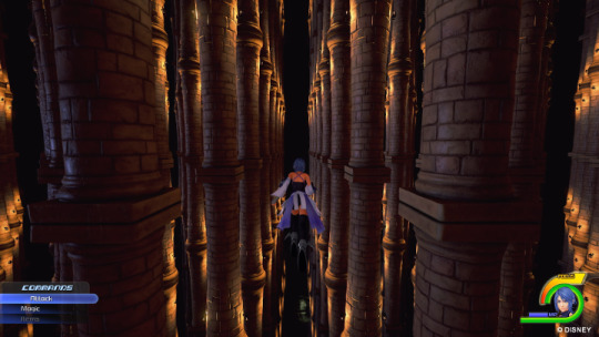
so uh. if you witnessed that incredibly long thread i made yelling about kh3 you will know that i. am not a fan of the look of modern kh. i think its kind of uninteresting compared to the delightfully cartoony style and just generally i dont like more realistic looks to games that already had a unique visual identity.
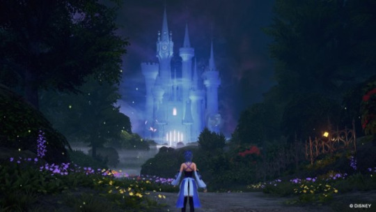
so im here to say that i think it works for 0.2! im a good way through kh3 and i dont think it works well there and ill get to that when i eventually review that game but. in 0.2 i think the new style fits the more dark tone very nicely, and the enviornments are absolutely gorgeous. like i came out of ddd thinking absolutely nothing could top symphony of sorcery in terms of world design and was proven wrong. the realm of darkness is my new favorite kh "world". for my mutuals who havent played kh, look at this!!! its absolutely gorgeous
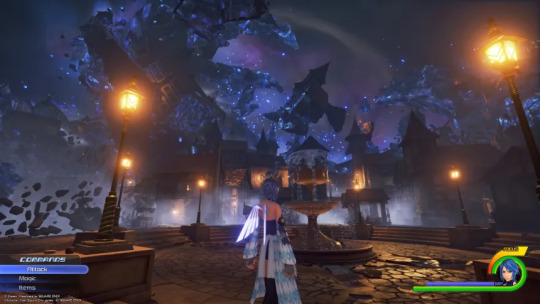
and the environments are actually my favorite thing about this game. besides being beautiful, theyre also delightfully trippy and unsettling. theres a section where you have to climb up a seemingly never ending staircase, and every time you reach what you think is the top you hear aquas worst thoughts. a lot of the areas are twisted, destroyed versions of worlds seen in bbs. its very dark (fitting, for the realm of darkness) and honestly its a treat to just walk around admiring the view. the visual storytelling is as good as kh ever gets.
i briefly mentioned aquas thoughts a minute ago so ill bring them up again, her commentary adds a lot to the desolate atmosphere, and this game really feels like a character study. it shows her desperation, her worst thoughts, her hope despite everything, and its just genuinely good. i havent been able to say that about khs character writing since like. days. its GOOD.
i am. not a fan of bbs' writing. i think its got a good underlying concept with absolutely terrible execution, and it makes me wonder at times if the things i like about it were intentional or not. but this game takes the best written character of bbs and gives her more depth than they ever could before. i can say with confidence that aqua is one of the best characters in the series, and a lot of it is because of this game.
the tone here is very gloomy, but thats not really a complaint because the game is so short. the depressing atmosphere isnt too much to bear because youre barely in it for more than 2 hours. and i think that run time is EXACTLY long enough. it goes for exactly as long as it needs to tell the story and still give a moment to breathe.
as for gameplay. im not the biggest fan of the updated system. i like to think im open to change with kh's combat. i think the command deck has potential and the card system in com was fun and i actually liked days' panel system. but something about the way this new version of the system feels to play is just. unsatisfying. hits dont feel like they have any weight to me, and spells feel inconsequential despite being more grandiose than ever. its just not as good as it was before, and like its a sort of half assed replacement of reaction commands. the way they incorporated style changes into it was okay, but again its not as satisfying as it was in bbs. but maybe it was just satisfying in bbs because the rest of the combat there sucked
tldr, the things i care about in a game (writing and visuals) were fucking spectacular, but the gameplay definitely had room to improve. also if i ever have to fight a darkside again ill throw up and cry! 8/10, though im tempted to raise it to a 9 for the environments alone
#kingdom hearts#a fragmentary passage#kh 0.2#doodles#aqua#seriously cannot understate how pretty this game is#its worth playing through for the world alone#kh review
31 notes
·
View notes
Note
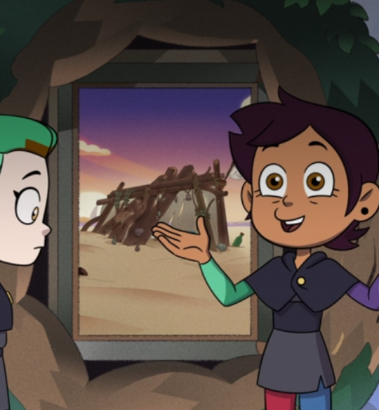
Oh! I love the idea of the rest of the brothers finding themselfs in Ghost's situation too! Its so interesting and fun!! Now I'm wondering how each of them would react to the way the rise universe is a lot more cartoony and silly than what they're used to. I'm guessing Spirit/Leo would have the hardest time compared to all of them
Mike thinks it's weird, but he gets used to it. He starts using it to his advantage. He gets used to cartoon logic pretty quickly. His color palette brightens up soon after meeting Splinter and the kids.
Spirit doesn't understand it, but he adapts. He's very used to adapting. When he notices something, he makes a mental note, and keeps on going. His palette shifts to Rise-verse's much quicker than the others, only a few years in.
Ell actually has the hardest time adjusting. He hates the cartoon logic because it gets in the way of his fighting style. He hates everything that's different. He's cranky about it. He wants to go home. His palette never changes.
42 notes
·
View notes
Text
Why people are excited over Princess Elise’s (brief) return
Short answer: the new design/art style that Sonic Channel gave her looks nice and she’s being treated with as much dignity as the rest of the Sonic cast for the first time since Sonic 06′s release nearly 17 years ago
Long answer:
Every year, Sonic Channel (the official Japanese website for Sonic the Hedgehog) puts out character illustrations for each month. Sometimes it’s just art of the character posing, sometimes they’re actually doing something (Sonic celebrating his birthday, Amy walking in the rain, Cream going trick-or-treating, etc.). For 2023, Sonic Channel is posting a specific themed series of artwork called “Isekai Ogiri” that depicts two characters in silly, non-canon scenarios; part of the appeal of these illustrations is that one of the two characters in each artwork is voted for by fans. So far we’ve seen Gadget (AKA Buddy AKA the custom character from Sonic Forces) confessing his love to an Egg Pawn in a scene straight out of a slice-of-life anime, Shadow and Infinite as rival idol musicians, a cutely-dressed Blaze visiting fortune teller Amy, Tikal and Chaos running their own pizza place, and most recently as of this post, Silver the figure-skating coach and his student Elise. (I’m linking back to the original SC pages b/c they put out a message on their official Twitter urging people to link back to the original SC pages/tweets, otherwise they might be inclined to stop making this art; if you want to understand the little stories that come with each illustration, I’m afraid you’ll have to put up with janky Google Translate translations.)
So, yeah, Princess Elise of notorious Sonic 06 infamy, the one video game journalists always seem eager to remind you kissed a dead anthropomorphic hedgehog, recently appeared in one of these illustrations. And people lost their minds, but this time, with excitement.
But if Princess Elise was/is so despised, why do people seem genuinely excited to see her now?
Well there’s 2 reasons for that: 1) the way in which she was drawn, and 2) the fact that she was even a contender to appear in this art series in the first place
1) Human characters appearing in the Sonic series has always been a source of discourse among fans. Some, like myself, enjoy seeing humans coexist alongside a cast of furries, robots, and other assorted beings; others believe there shouldn’t be any humans (except Eggman) in Sonic at all. They’ve been variously depicted as realistic people (Sonic 06) and with more cartoonish Pixar-esque proportions (Sonic Unleashed). From my perspective, what seemed to make people dislike Elise’s original design was that in addition to looking out-of-place next to the cartoony Sonic (people often say that she looks like she belongs in Final Fantasy), her facial expressions were quite bland and difficult to read. While I would argue that Sonic and his friends also had very little facial expression in 06, it’s much easier to notice with Elise (and to a lesser degree, 06 Eggman) due to her more realistic face. It evokes a feeling in some people known as the Uncanny Valley. In the Isekai Ogiri’s April illustration, Elise is depicted in a new style that leans more towards cartoony; some have compared it to Puyo Puyo, others have said she resembles the humans from Balan Wonderworld. Either way, most fans, at least those on Twitter and Tumblr, have praised Elise’s new “look” because her new proportions (large head and hands, big eyes that are easier to read) make her more closely fit in with other Sonic characters. She feels less like a Final Fantasy character and more like a Sonic character.
(With that said, not everyone was automatically bothered by Elise’s realistic 06 design because human beings do not perceive everything in the exact same way b/c art is subjective)
2) Part of how Elise even wound up in this illustration is not just because people wanted to see her again, but because Sonic Team themselves decided to treat her with dignity by making her an option to vote for. And she was up against Merlina from Sonic and the Black Knight, a well-regarded character among fans and one of the few female villains in the entire series!! The poll they were in for the April pic was very close!!
During the late 2000s following Sonic 06′s release, Silver had his fanbase, but a lot of people still viewed him as annoying, and it took several years of game reappearances for him to become a less divisive character (my source: I’ve been a Sonic fan with internet access since ~2003, the way he’s depicted in the Sonic Paradox shorts is actually what a lot of people thought of him at the time). Also, he was still an anthropomorphic Sonic animal, so naturally people would be quicker to accept him as part of the cast.
But Elise? The human? While I doubt she was originally intended to be a recurring character, even if 06 WAS supposed to be a reboot, her portrayal in that game was so widely despised by critics and fans alike that she was thereafter relegated to rare cameos (like being on a collectible card in Sonic Rivals 2) and jokes at her expense (in LEGO Dimensions, when Sonic interacts with Lumpy Space Princess, he says, “Last time I met a princess, I...we...you know, I don't quite remember, never mind!” in a hurried and embarrassed voice). Elise is hardly the only notoriously-disliked Sonic character, but because she only appeared in one game in a non-playable role (I’m not counting the stages where Sonic carries her), her biggest positive accomplishments--unlocking her cell herself instead of waiting for Sonic to save her, jumping from Eggman’s ship with zero hesitation, and reviving Sonic--are often overshadowed by the moments where she just stands there praying, gets kidnapped, and kisses a dead hedgehog just in case you forgot for the 17th year in a row, leading people to view her as an inherently bad character. Because she is also a girl, and video games were and still are a largely male-dominated culture loaded with toxic masculinity, it’d be ignorant to say the vitriol towards Elise wasn’t charged with sexism and misogyny on some level.
But as an aspiring writer and someone who hates wasted character potential, my personal opinion is that characters, SPECIFICALLY in ongoing franchises like Sonic, are not inherently bad, it’s the ways in which they’re USED that can make them LOOK good or bad, and they don’t deserve to be locked away forever all because of one bad interpretation. But unlike Silver who has been in multiple games since 06 (or even Mephiles, who was added to the Sonic Forces mobile game last year as an unlockable character), Elise has only ever had 06. Thus, people only have that one interpretation of her to go off of, because not everyone obsessively rewrites her in their headcanons or hunts down fan fiction where Elise is characterized with actual effort.
And like I said, I don’t think Elise was created with longevity in mind, but it’s specifically because critics and fans alike continue to beat this dead horse that you have people like me saying “What if she came back tho”
Compare the hate Elise gets to the Deadly Six, characters whose debut game was not seen as quite a colossal failure as 06 but still had a story that was almost universally panned, particularly in regards to its character writing. While the Deadly Six (or just Zavok) have yet to appear in a game written by Ian Flynn, they’ve been recurring characters in the IDW Sonic comics and, while still pretty universally disliked, have been regarded by some fans as being tolerable in the comics due to how Flynn utilizes them there. (I wrote a whole other post speculating about the Deadly Six’s characterization in IDW if you feel like reading that lol.) In this sense, the current Sonic writers are genuinely trying to make even the most undesired characters palatable for the audience. I think it’ll be a long while before most people fully warm up to the D6, but the intent is there.
Meaning that the same could hypothetically be done for Elise, if this illustration is any indication that SEGA is beginning to wholeheartedly embrace their past, even the ugly parts
I’m not expecting anything huge from this, and I don’t expect her to suddenly become a major recurring character, because this illustration is nothing more than Sonic Team testing the waters to see how people react to them unironically including Elise in non-canon material. But look at all the fan art people are drawing of Elise in her skating outfit. Look at how fans are reacting. If, sometime after this, Elise were to appear in even a minor role in the IDW comics, in this new art style, with Ian Flynn, Evan Stanley, or even a guest writer like Daniel Barnes at the helm, I would welcome it with open arms, because I trust them to handle Princess Elise’s character with genuine investment and care.
(But until then I have my own ideas that I’m a bit hesitant to share for.....reasons~)
#sonic the hedgehog#princess elise#princess elise the third#princess elise iii#sonelise#tagging for as much visibility as possible#essay#wrote this up the other day when I was bursting with energy
63 notes
·
View notes
Note
your vocals on plastic death are so good! i just sang along driving back to school and i realized you have much more range in PD compared to TFGBA—i’m able to sing most of TFGBA in the original register, but my voice goes into falsetto at the “and you” on puppy, for example (and in countless other places). being trans just as you are, i was really impressed! how much did you have to fag up your voice for PD, and do you have any tips for the rest of us? :0
thank you! i just kind of sigh it out… you get into this kinda cartoony place where you’re exhaling in a nasal head voice but holding back air above the vocal cords like it will literally sound like acdc but you gotta just get a bit gayer and more vocal fry. idk how to explain. “fag it up” i know thats a quote from me on the website currently known as x (i quit it its no good for me but that convo was fun) but yeah that’s pretty much the way it goes. i recorded most of the vocals in my actual closet. you have to get out of yourself at least a little bit to sing i think
14 notes
·
View notes
Note
saw your testimony of your experience being hounded for having a “similar style” to viv on another blog. ty so much for sharing your history there.
i was wondering if you’d be willing to talk about or list what cartoons/movies/comics/art influenced or inspired you/your style.
i’ve long been sick of people lumping other styles in with viv’s as if she’s the first to ever draw like that (as well as viv acting like she is.) and one day when i have the time i’d like to sit down and make an info-graphic of sorts explaining style influence and how it can overlap with other artists even with them never crossing paths.
if you’d rather not engage this tho i completely respect that. and feel free to shoot me a private message if you’d rather not post this ask to your account.
whether or not i hear from ya i hope you have a good one and ty for reading.
That's fine!! I don't mind engaging when people ask my side of things, I just don't want to be a source for other people to post random things through, if that makes sense. I do try to be upfront about my experience and bring it up from time to time because there are constantly new victims, and I don't want anyone to feel alone or like they're the only person having a negative experience. I know that a lot of others are afraid to speak out, so I try to be a story that's open in case anyone else needs validation.
As for stylistic influence, The Nightmare Before Christmas was the earliest movie I remember watching and my grandma had to get it on VHS for me because I watched it like every week. I loved Tim Burton's claymation as well as his live action movies (Beetlejuice, Mars Attacks, Batman, etc.) My favourite American cartoons growing up were Batman the Animated Series (very big stylistic influence), The Grim Adventures, and Animaniacs. I grew up abroad, though, so I had a lot of other influences, Winx Club was extremely popular as well as Sailor Moon, so I picked up a lot of habits in my anatomy from those (I think automatically associating ice with villains is also something I picked up from that). But the very long legs compared to bodies is definitely a prevalent thing in media I liked, I even had these dolls (they were called Hi Glamm dolls if you want to look them up) who had legs twice the length of the rest of their bodies. Don Bluth movies were some of my favourites, especially All Dogs and Anastasia. I read a lot of comics my dad collected as well, in big whole-volume collections, and I remember being very fond of Asterix and Obelix, and Bill Maildin's comics about the military (which might not seem like a big one, but I took a lot of inspiration from his spot-blacking for when I do spot-black).
Other major influences concerned, some of my biggest when it came to making comics were other webcomics, specifically Warrior-U (Aisha Thani) and Lackadaisy (Tracy Butler), both of which have been around on the internet far longer than a certain someone who thinks she invented half the things in these comics. I did see her webcomic and followed webcomics from the circle of comics it was lumped in with (Our Personal Purgatory and Alice and the Nightmare, the latter of which is still ongoing and the former you can see the artist's new comic on Webtoons, it's called Death Sitter). Ironically, a friend linked me to her comic and said "it reminds me of your art so I think you'd like it". I wanted to like it, but she was so overly defensive of her "style" that people were "stealing" and so aggressive toward other issues that it pushed me away from it. She definitely didn't invent the very fluid, cartoony bodies thing with big eyes that everyone equates to her, that came long before with Aisha Thani and Puppetology. From what I've seen, Viv used to have a way more Disney-esque style until she became associated with Puppetology and Dollcreep, so if anyone deserves credit for "inventing" the "style", it's them.

I'm genuinely sad that Warrior-U is still gone, but I need to buy her other comics because her art is amazing. Funnily enough, recollecting this all is what prompted me to go look up her gumroad, and see that there are even more new comics to check out.
I don't mind posting this publicly, I'm very proud of my artistic journey and I'm incredibly happy to share due credit to all of my influences growing up. I'm trying not to make this too long, so hopefully this clears up enough, but if you have follow-up questions then feel free to ask.
18 notes
·
View notes
Text
Security Breach Ruin my observations and theories
Trailer is out, we getting the game soon, and one of the things I enjoyed the most when FNAF was a new series, back with the first game, one of my favorite things was to make theories and try to figure out what would happen, tho I only ever posted a theory about FNAF 3.
I don’t know how many games will there be in the future, so I will allow myself to indulge into writing and sharing things that caught my attention just for the sake of having fun.
I wrote everything under the cut and it’s honestly a bit disorganized, and also feel free to add or comment if you wanna join the theorizing, just remember to keep it respectful and we all here just to have fun!
The Pizzaplex has been abandoned for a while, there's graffiti, newspaper all over the main window. It either follows a different ending than the ones shown on SB or it didn't fully burnt down in the true ending.
Whichever it is, it looks like a lot of time has passed, so there is no way Gregory has been in there for so long, so he has been sneaking in regularly and for some reason got trapped the last time, or that is not Gregory...
There is lot's of "Do not cross" yellow tape on the Daycare I don't remember from the main game, plus lots of graffity with the yellow one being oddly redable compared to the rest, "Close Forever" (I thought it was Closed Forever but there is no D).
Chica seems to be the one in better state. Monty is nightmare material.
Cassie. I mean the obvious one is her name, it’s gotta be either short for Cassidy or a reference to that name. I don’t know why tho, since I don’t really believe the “Gregory is Evan robot”.
But following that train of thought, Evan and Cassidy shared the body of Golden Freddy, maybe somehow they got both revived into robot bodies and now are siblings of some sort (again far fetched theory, I don’t really like it, just putting it out there, plus we would have to go into the whole, Evan soul left finally after the events in FNAF 3, while Cassidy stayed and then fast forward to trapping Afton soul into Custom Night which then makes it into Glitchtrap etc.).
I do theorize Cassie is Gregory younger sister, and somehow Gregory communicated with her and she went to the pizzaplex to save him. She seems to have brown hair now even if in the poster she seemed to have blond hair, but even if not siblings, they know each other and are probably close.
This also follows my theory that Gregory is not an orphan, I still believe he is more of a runaway rebel kid, maybe looking for a missing friend and that’s how he got to the pizza plex.
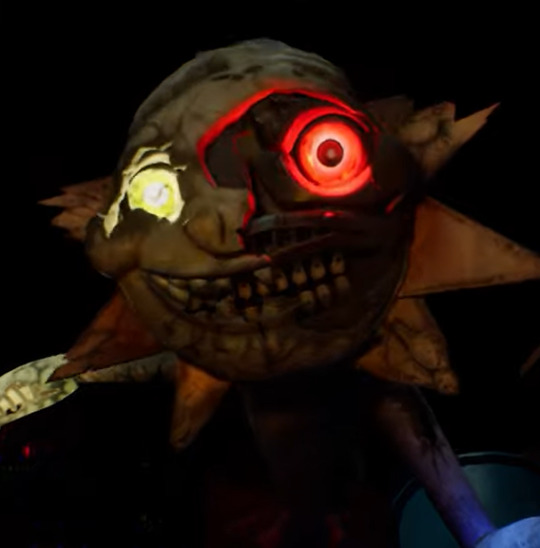
Excuse me but WHY does he has teeth bellow the mask teeth??? Aside that questionable design choice, I’m gona say what we all probably thinking that this is both Sun and Moon at the same time. I don’t personally think it will be a third personality, but more of both of them constantly fighting for control, switching between one and the other.
I am also not 100% certain, they seem to be by the Daycare big doors. I do hope they chase you in other areas, but it’s a possibility they still can’t/won’t leave the Daycare.
Freddy? This is the only bot I couldn’t recognize. It is Freddy shaped and got the leg warmers like things, but the colors are more golden and purple... which could be just the lights but it makes me think so much of Golden Freddy. It’s probably to be a bit of a surprise since the teaser cuts before we see their face.
I missed this the first times I watched the trailer, but that is Vanny mask, we will be able to use Vanny mask as an item in the DLC.
This is how it looks from the inside.
And this how it looks like when wearing, maybe highlighting important places or some sort of technology.
My first assumption was that this was another variation of Springtrap, since he likes to change every single game, but the shape is more cartoony, it reminds me more of Vanny mask and costume, which makes sense to be shown after Cassie puts the mask on. A mix of both maybe? Or mroe of a representation of the corruption of Glitchtrap on someone/something.
But overall, I am just happy to see it got a darker atmosphere and feels scarier.
#FNAF Ruin#five nights at freddy's#five nights at freddys security breach ruin#five nights at freddys security breach#dream talking#just random
24 notes
·
View notes
Text
Dragon Booster Notes: Classes
first, a note on terminology: canon Dragon Booster interchangeably uses "class" as both a descriptor of body type and of Draconium color. this would be fine if body type was locked to certain colors, but it often isn't, and I'm p sure the showrunners even stated at one point that this wasn't the case.
instead, I'll use "class" to refer specifically to body types, while color refers to a separate system of classification. thus, a combination of Class + Color would give a full impression of the dragon and their abilities (classpecting for dragons! /gets bonked by cartoon mallet/).
on that note, I've also revamped my take on the colors themselves! though I haven't changed the colors referenced in this post yet, since I'm not fully settled on my color types, but we shall see...
also, do not mistake racing "class" with the evolutionary clade "class". while body type classes are locked to certain clades in my lore, these clades are, at most, genus or family-level clades.
that out of the way, "narrator" voice starts under the cut!
Standard Classes
the Racing Association recognizes the following four classes as race-worthy dragons. though specialized breeding has produced more variety, none have been recognized as specialized classes by the Association.
note that none of these broad classes can interbreed. genetic and morphological differences have long separated these lineages, past the point of interbreeding. however, this does not mean that different colors cannot interbreed. any number of Draconium colors can exist within each class, and all these colors can freely interbreed within classes. although Draconium colors often gravitate towards compatible class types, a developing dragon's Draconium color is far more influenced by direct parentage and environmental factors.
Bull Class:
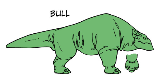
[image ID: a semi-cartoony drawing of a Bull-type dragon. the dragon is quadrupedal and bulky, with a thick, round ribcage leading down to somewhat thinner hips. a tall hump at the shoulders gives them an even bulkier appearance, with thick neck muscles leading down to a short, blocky head held at torso-height. thick, digitigrade legs end in wide, rounded "hooves" with three short toes with flat, rounded nails, much like a rhino. a short, thick tail sticks straight out from the hips. the neck, shoulders, and hips have several layers of heavy, folded skin layered over various joints and bends. end ID]
physical traits: these quadrupedal dragons are thick and bulky, with wide, round torsos, sturdy legs, and short tails. Bulls have a tall shoulder crest, where thick neck and front leg muscles attach, leading down to short, thick skulls. Bull skulls are much shorter and thicker than other classes, giving them a flattened, snubby look. irresponsible breeding has pushed many Bull snouts into brachycephaly and underbites, which reputable breeders are working to address. since Bull heads hang so low, Bull saddles are uniquely designed to Mag-lock on the crest of the shoulder rather than the back of the skull. Bull claws are wide and thick, with blunted tips and flat edges.
racing compatibility: Bulls are best suited to heavy lifting and feats of strength. though powerful, this power can easily drain their stamina, and they require far more food and rest than other classes of dragon. a Bull can easily eat a racer out of house and home, if they aren't prepared for the Bull appetite.
most common Draconium types: Green and Brown. Bulls are a particularly finicky breed, and are rarely seen in any other color than Green or Brown; the rare exceptions are usually Red, Turquoise, or Purple. just as well, since Green and Brown are rarely seen outside of the Bull class.
Canid Class:
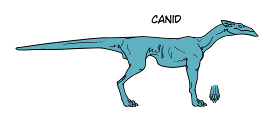
[image ID: a semi-cartoony drawing of a Canid-type dragon. the dragon is quadrupedal and lean, with a comparatively barrel-chested ribcage leading deeply down to much thinner hips. a long, thin, pointed head sits on a short, lean neck, held above and forward of the torso. thin, digitigrade legs with knobby joints end in dog-like paws with four toes and short claws. a long, thin tail sticks straight out from the hips. end ID]
physical traits: these quadrupedal dragons are lean and energetic, with a barrel-chested ribcage and stiffer spine made to quickly snap into action. their lean legs usually have proportionally wider paws and more pronounced joints than other classes, giving Canids a knobby, coltish appearance. Canids also have longer, smoother skulls than other classes.
racing compatibility: Canids are best suited to long-distance races-- though they may take some time to accelerate, Canids can keep pace for hours without flagging. rookie racers may find themselves overwhelmed by a Canid's deep well of stamina-- if you aren't prepared to spend a few hours every day running out a Canid's energy on the track or trail, then this may not be the Class for you.
most common Draconium types: Blue, Purple, Light Blue, Turquoise, and White. though these are the most common, Canids are a flexible breed, and can be found in practically every color of Draconium.
Felid Class:
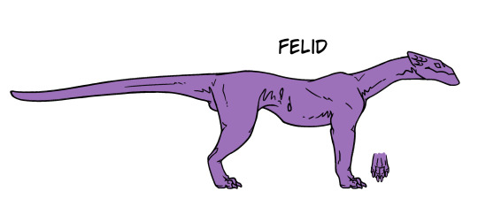
[image ID: a semi-cartoony drawing of a Felid-type dragon. the dragon is quadrupedal and long, with a curving spine and relatively even torso. a somewhat blocky head sits on a long neck, held above and forward of the torso, though lower than the Canid head. the digitgrade legs are thicker and smoother-looking than the Canid's, though they have similar dog-like paws with four toes and short claws. a long, thin tail sticks straight out from the hips, though it has some curvature implying more flexibility. end ID]
physical traits: these quadrupedal dragons are lithe and flexible, with long, curving spines and smooth, even torsos. Felid tails are usually longer and a bit more flexible than other classes. Felids tend to have short, square skulls, sometimes giving them a snubby appearance. Felid legs tend to be shorter and thicker than their Canid cousins, and some breeders have bred this to dubious extremes (these breeders have suggested a new "Ferret Class" in these cases, but the Racing Association has rejected these suggestions).
racing compatibility: Felids are best suited to short-burst sprints, and feats of maneuverability and agility. Felids can twist, leap, and climb their way through the most complex obstacle courses, but they have trouble pacing their energy, and their stamina can quickly flag after just a few quick maneuvers. many rookie Felid racers complain that their 'lazy' dragons just lay out in the sun all day, failing to realize that a Felid's well of energy is best replenished by these long bouts of rest.
most common Draconium types: Black, Blue, Light Green, and Light Blue. much like Canids, Felids are a very flexible breed, and can be found in Colors across the spectrum. however, due to their low stamina/energy, they don't usually function well when bred into high-energy colors like White or Turquoise.
Raptor Class:
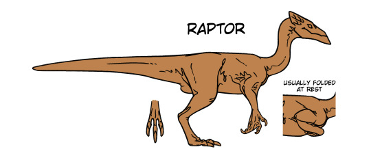
[image ID: a semi-cartoony drawing of a Raptor-type dragon. the dragon is bipedal and somewhat bird-shaped, with a short, stiff torso without much distinction between ribcage and hips. a pointed, wedge-shaped head sits on long, thin, curving neck, holding the head high above and a bit forward of the torso. the digitigrade hind legs are long and thin, with three long toes with long talons. the front limbs are short and arm-like, with a small hand, two fingers, and one thumb with curved talons. small bits of webbing extend from the inner elbow, between the elbow and the torso, and between some of the fingers. a small diagram to the side shows the arms folding against the body when at rest. a long tail with a thick base sticks straight out from the hips. end ID]
physical traits: these bipedal dragons have short, stout torsos with long, thin legs. though their torsos are stiff and inflexible, their long necks and lithe limbs more than make up for any lack in torso flexibility. Raptor heads tend to be sharp and wedge-shaped, but not always. Raptor toes are much longer than those of other classes, lending to greater gripping ability, particularly in their front limbs. though Raptors' diminutive front limbs are small and weak compared to their hind legs, these limbs are highly dexterous with high a grip strength. these limbs also retains vestigial webbing from their flighted ancestry, though modern Raptors can't glide without assistive flight gear.
racing compatibility: Raptors are rather adaptable, but especially excel in flight-based obstacle courses. their stiff, light torsos make them the perfect match for white flight gear, with near-perfect balance, stability, and maneuverability in-flight. however, Raptors are much less stable on-land than their quadrupedal cousins, and can easily be tripped by a false step or a tricky competitor. rookie Raptor racers are injured far more often than other rookies due to this instability.
most common Draconium types: Purple, Light Green, White, Blue, and Red. though Raptors are adaptable, they do not function well with high-power Colors (Brown and Green) due to their instability, and certain kinds of maneuverability (namely the aquatic nature of Light Blue).
Notable Non-classes:
niche breeding efforts have led to some extreme lineages of dragons, typically used for tools or entertainment purposes.

[image ID: a screenshot of some small, hand-sized dragons from show Dragon Booster. the overall CGI art style is blocky, angular, and cartoony. the first image shows a gangly, emaciated purple dragon with neon green highlights. the head is capped by a metal helmet with green lens, and more gear sits on the back. green, dragonfly-like wings also sprout from the back. the second image shows several tiny orange/red, raptor-like dragons leaping across the screen. they look blocky and juvenile. end ID]
pictured: a Purple Felid "tracker" with attached flight gear, and an Orange Raptor "teacup" pet.
most of these breeding efforts result in extreme health defects in their dragons, and the Racing Association does not condone these practices. please contact the Association with any information if you encounter these types dragons-- we all must hold racing to higher standards and hold the responsible parties accountable for their actions.
#sorry I shifted into writing like I was a researcher in the DB world itself#this always happens when I start writing lore. I get possessed by the spirit of college professors#like ok poindexter we get it lmao#dragon booster#db notes#notes
6 notes
·
View notes
Text
Not really a full review but just the thoughts at the forefront of my mind
If they'd of just cut some horror references (Shining elevator especially) down into shorter scenes (it'd also work as an unobtrusive background element) AND made it easier to tell apart future and past characters that happen to be in the same scene together, this film would honestly be damn near perfect.
It was still an enjoyable experience, though. Alot of scenes genuinely come close to freaking me out, like the respawn terminal failure. Having a fully voice acted cast and some custom models was a treat, i just don't see why some were custom and some were just Scout with a mustache slapped on. Plus, in the funeral scene, it's too noticeable how detailed Redmond and Blutarch are compared to everyone else in the room. I joked at one point that they blew the character budget on those two and couldn't afford to detail everyone else.
The voice direction also felt lacking, with certain actors (excluding Scout's and Soldier's bc DAMN i actually asked a couple times if they got Rick, posthumously, and Nathan to do the voice work) focusing more on sounding as much as they could like the original mercs than the actual performance. Mind you i'm not saying they did a BAD job, they did after all do a fantastic job with the emotional line deliveries.
Usually, you would complain about the cartoony art style of TF2 clashing with someone's high-end attempt to make the shots photorealistic or so, but since Fortress Films went to all the trouble of touching up everything with grit and keeping it consistent throughout scenes, it honestly works well even if non-TF2 models end up being used. The contrast actually fits.
The plot...honestly, again, this is where i wish certain horror tropes got cut way down. Did we really need a whole scene of zombie mercs doing stereotypical zombie things? I don't even think it added anything to the plot, it just happened and was pretty easy to forget right after they're all killed. It's just how it never gets referenced again once it's over.
I'm...also not really a fan of the shoehorned Christian imagery around the end. It's basically another trope and again it added pretty much nothing.
It's also fun trying to figure out who can and can't actually die. This, ironically, might be the only thing from the zombie scene worth any salt, if the implication is RED mercs zombify after some time while BLU just infinitely respawns (Jules wouldn't be dead and therefore would not need saving if this were the case, which is inch resting)
The attention to detail otherwise is fantastic. I keep finding parallels i didn't catch the first time.
Along with shots that are legit drop-dead GORGEOUS, or even cutting-edge as far as cinematography goes and are incredibly rare to see in other SFM animations, the mo-cap is some of the best i've seen. It's rough sometimes and makes for some funny facial expressions, but when it works it WORKS. The theatrical feel is just...unmatched. You almost wonder if Valve themselves produced this because of how good the scenes look. I was also really impressed with the sound design, and also the fire and water effects, prominent throughout the film.
Obviously, i think the film was really, really good, it's just that some parts feel like this project started as a shitpost animation, before getting stitched together with the parts where the team decided "no, we need to put actual effort into this". I also don't understand why, if the soundtrack is an original composition, the artist couldn't be credited anywhere.
Anyway, go see Emesis Blue and come back with your own thoughts.
12 notes
·
View notes
Text
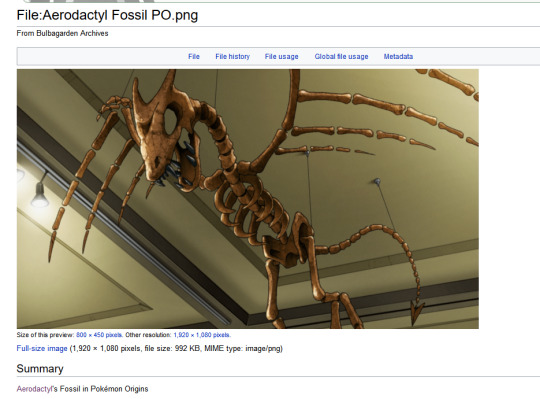
ok im fascinated by this halloween decoration type anatomy?
the way it completely disregards every other depiction of aerodactyl's skeleton, its actual living design, AND basic vertebrate anatomy. i can only imagine someone drew this from memory without looking at anything at all for reference. compare with the surprisingly detailed game sprites:
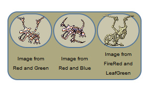
the Origins depiction, though?
7 fingers (maybe more. imagine). i could Almost understand adding a goofy elbow finger where the wing bends, but i have no idea where they got so many from? they also got rid of its back toe and prominent underbite, and this might be the only time it's ever been depicted with teeth on its upper jaw.
but the rest of the skeleton is also kinda nonsensical, like
no shoulder girdle, no sternum/keel. this means no pecs for aerodactyl. this is so sad
what's up with the solid lower jaw??
also the solid pelvis with no sacrum and vaguely humanoid hips
no ulna or fibula, just Forearm Bone and Shin Bone (makes sense with the pixel sprites, since they can only fit so much detail)
NO feet?!?!?! just toes that each appear to consist of One Bone with claws, no other foot bones whatsoever
it's just funny because many of these are fairly forgivable cartoon skeleton simplifications, but it's somehow LESS detailed than the pixel sprites while also being rendered in a less cartoony style than the rest of the show, and that makes it look really silly to me.
also kinda charming though, it reminds me of how people have historically attempted to reconstruct fossils they didn't know how to interpret (the very first known pterosaur specimen was actually super complete, but nobody could make sense of it for quite a while!)
anyway my headcanon is that the museum lost some bones but had some extra wing bones and just assumed they belonged to the same specimen
2 notes
·
View notes
Note
willow's memories were also portraits. i think the polaroid thing is just how they look when extracted, as a copy of the portrait, because willow still had the memories until they were burned.
Nah, not really. I mean.
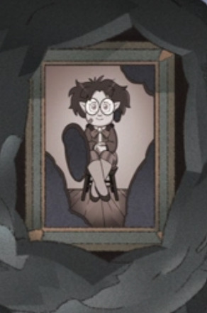
Look how realistic these are (like, compared to the world. Obviously they're cartoony, but they're cartoony in a way that MATCHES THE STYLE OF THE SHOW). These are SNAPSHOTS of time. Vs
These look PAINTED. Like, look at the sky in Willows vs. the sky in the Belos one. It's a regular sky with colors and clouds appearing randomly, as opposed to Belos', where it all frames him and works deliberately to put him in the center of the picture. The colors in Willow’s memories are vibrant and real, while Phillip’s are a chosen pallet. Willow's memories are just how things are: a photograph. But Phillip's are how he wants: a painting. Not to mention the differences in how they're damaged. Willow's memories burn, and each piece is slowly killed as the fire touches it, but without an effect on the rest of the picture once damaged. Vs. Belos' seem to have that kind of fading and tarnish that you see on old vs restored paintings (idk what the technical term for it is, so I'm calling it tarnishing).
I remember when we first got the look at Belos' mind, people even MADE that comparison. That Willow's memories were photographs, objective pictures of an event, while Belos' memories are portraits, painted the way he thinks they went. Sure, Willow's memories are big and framed, but they're still PHOTOGRAPHS. Just printed bigger.
73 notes
·
View notes
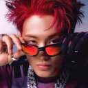
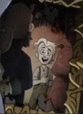
Note
Genuinely curious, why does Lloyd look so cartoony compared to the rest of the ninja in the line up. Like, he's so silly and I love it
Wow lotta asks today!
When I first designing the ninja seriously for the first time I was in 8th grade. I was really big on character designs (and still am) so I wanted to make sure all the ninja had different faces to avoid same face syndrome.
I don’t have a picture, but the original concept of my current Lloyd design was based on one of my favorite animators Druid’s hollow old human designs
I also drew a more “normal” design next to it and asked people in the radiant plaza discord server which one they liked more.
One person said “[normal design], [current design] looks like a horse”
Idk why but I got so pissed off from that statement that I made the more wacky design my main design for Lloyd out of pure spite.
Once I got around to designing the bodies in 2020. I decided to really sell the “horse” aesthetic(?) by giving Lloyd the same proportions as the characters in equestria girls.
Since then, Lloyd has been my favorite design, even though he’s my least favorite ninja. There’s a good reason why he didn’t change much between 2020-2023. He’s easy and fun to draw and I like giving him silly expressions. It also comes with the extra perk of setting him apart from the ninja in the sense of his oni/dragon heritage in a subtle way. Sorta like how I draw Pixal and Zane in the rubber hose style to show how there robots.
8 notes
·
View notes