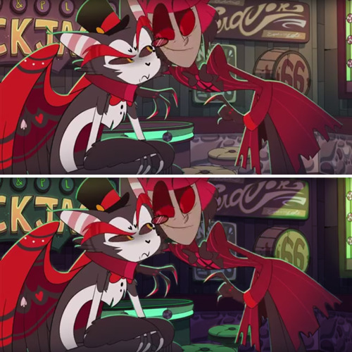
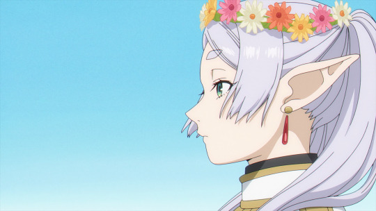
#background paint or compositing hell no
Text
Found a cool color palette. Might finish it later. (Probably not.)
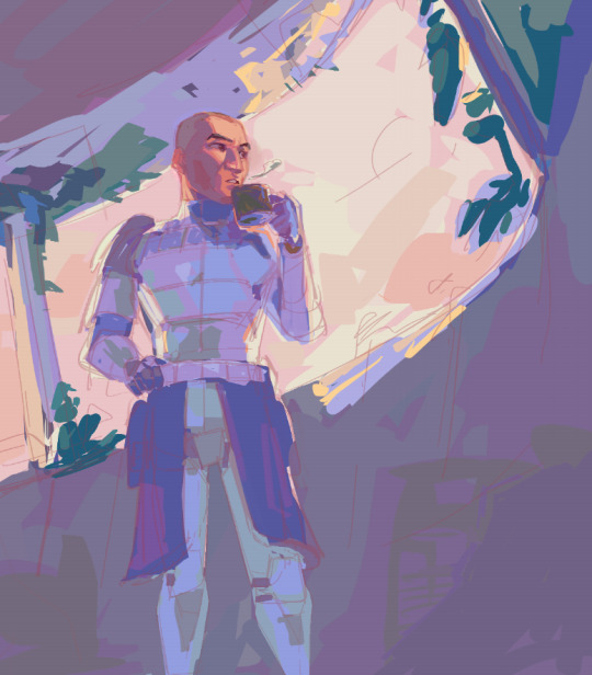
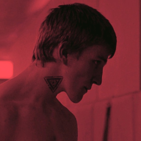
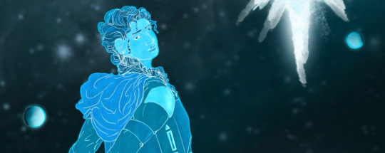
#star wars#star wars the clone wars#star wars rex#star wars the bad batch#Glitched half an hour on his face for no reason#just cause I couldn't figure a skin color#like I come from impressionism#you know this small art movement#where half of the Chinese artists I follow borrows their wonderful color palette#Color palettes who are perfect to draw noice anime boys#but (we can't lie) where everyone tend to draw only fair skinned characters#So I'm bugged trying to draw realistic people with that#would probably help if I forced myself to do studies ya know#instead of looking at gensh1n art#skill issue as people say#maybe is should draw on a bigger file too#like not draw face with realistic feature on a 300x300 px square XD#But again this drawing was me procrastinating on another one#I hate finishing illu#I just wanna plan/doodle and layout#for others#my jobs of heart are storyboard or color key artist#background paint or compositing hell no#clean animation? kill me#I had a burn out last time I touched a graph editor#too bad that's the most demanded and entry level jobs#v_v#tips for people who want to enter animation industry#don't be like me#finish stuff
213 notes
·
View notes
Text
Creator Spotlight: @themetalhiro
Hi, I’m Metal! I’m a freelance artist from good ol’ New Jersey. My favorite things to work with are a lot of bright colors, exaggerated poses, and candid scenarios. I try to farm sensible chuckles whenever I can, so I’m also big into comics. I love making them about my life, and the media I’m into, and one day I’d like to publish my own series!
Thank you to everyone who has gotten me this far!!
Check out Metal's interview below!
Did you originally have a background in art? If not, how did you start?
I guess so! It’s funny, I don’t remember a single time in my life that I wasn’t drawing as a hobby… somewhere in middle school (a little late, I know.) I put the pieces together that animated movies were made by artists, and that it wasn’t just for fun, they were paid to do it. The moment I discovered people could be paid to make art, I decided I would do that, too. Now I’m here!
How has your style developed over the years?
I think the best way to answer this would be with an example! Over the last few years, I have made more of an effort to draw more intentionally, which sounds silly. Now, I put more thought into my poses and step out of my comfort zone with shape language and composition. I had a phase where I drew everyone with a huge, perfectly circular head and no nose. That definitely did not lend much variety...
Which 3 famous artists (dead or alive) would you invite to your dinner party?
Ack! I’m so terrible at history! I’d love to give a well-thought-out answer about fine artists of old, but I don't think we’d have much in common… Most artists I admire and who have driven me forward creatively are the people behind comics I’ve read. Andrew Hussie, Bryan Lee O’Malley, Eiichiro Oda... these guys have inspired me greatly and had a heavy influence in developing my art style and sense of humor. I’d love to ask them questions about their processes and upcoming projects. I think it would make for an entertaining night!
Over the years as an artist, what were your biggest inspirations behind your creativity?
Outside of pure aesthetics like searing bright colors, layered clothing, and loud noises…. the best and most inspiring moments in my life were those surrounded by friends and loved ones! I cherish the hell out of memories of hanging around in fun locations, trying weird food together, and impromptu midnight walks... so I try my best to capture that atmosphere and my own memories in my work when I can, even if I’m imposing fictional characters on top of them. That’s always the core of it.
What is a medium that you have always been intrigued by but would never use yourself?
I would never permanently refuse a medium, but every time I pick up clay, I’m like a baby using its hands for the first time. Absolutely dreadful. If one day I could make and paint a figurine like the ones I admire in videos, that would be awesome... But for now, I’m not counting on it.
How do you want to evolve as a creator?
I’ve had an absolute blast drawing fanart over the years, and it’s certainly played a massive role in my growth as an artist. But my dream has always been to publish my own stories for y'all to enjoy! I have lots of worlds I want to introduce to you before I’m old and gray. I want to get faster, work harder, and get better at drawing interesting settings so I can get the wheels turning as soon as possible. I also want to stop avoiding the color blue like a coward.
What do you wish you knew when you first started out creating art that you know now?
Pay your taxes quarterly. Tablets will break at the exact moment you need them most, so have a spare. Wear your blue light glasses. You’re going to need to wear a brace on every joint on the right side of your body. It can be lonely sitting at your desk all day. The car on the side of the road that costs $1000 cash….. don’t trust it!!!
Who on Tumblr inspires you and why?
@cranity—They use absolutely beautiful colors and weighty line work. Everything looks so sharp and clean! I wanna put it all up on my wall!
@vewn—Their ability to crank out quality short films and illustrations packed with detail is incredible. The off-kilter perspective they use really sells disorientation and catches your attention like nothing else.
@nelnal—They have absolutely banger character designs again and again, I can’t believe one person’s mind can come up with so many creative ideas!
@jinx88kc—They have a beautiful and recognizable style, and the way they incorporate animation into their illustrations sometimes is SO cool!
Thanks for stopping by, Metal! For more of Metal’s work, follow their Tumblr, @themetalhiro! If you haven't seen their Meet the Artist piece, be sure to check it out here!
2K notes
·
View notes
Text
“The Same Place as the Music” Lighting & Color
“Where is the light coming from?” “The same place as the music.” Andrew Lesnie, Cinematographer of LOTR
How & Why It's A Problem
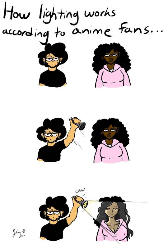
If I had to summarize the frustration I have with this topic in one image, I'd use JeCorey Holder's (queer Black creative!) meme:
Now here's the thing. I'm not saying you have to be a master at lighting. I'm surely not. Hell, I still play around with lighting in my art in ways that aren’t the ‘most realistic’. You can’t ask me the technical explanations behind ‘color theory’ or 'contrast' without me doing some more reading. However… I don’t think anyone needs an art degree to understand this point:
We should be able to SEE your brown skinned Black characters!
I brought this up in my lessons about skin tones and blushing, and it applies with lighting as well. If all of your other characters have focused light and shadows, so should your Black characters.
However, this does NOT mean making them lighter-skinned!!!!
It's not funny nor logical at all to suggest that they somehow can't be seen like your other characters when you’re the one creating the piece. It's like a classic fifth-grade racist joke, “You blend in at night”. Har-de-har.
I was once rudely told to my face (well in the DMs) that a Black character that was completely Europeanized looked like that “because of the [sepia] lighting”. So I'm going to give you all, gracious readers, an example to show that that's not true.
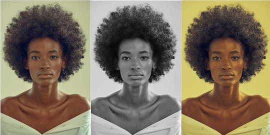
This is Ana Flávia, Afro-Brazilian model! Gaze upon her beauty! Notice how in both of these filters, Ana did not, in fact, turn into a white woman! Because, my friends, that is not how that works! At all!
Here are some other examples of Black people in non-color lighting:
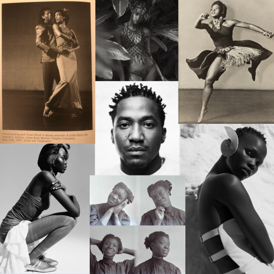
None of these people vanished from the frame just because there was no color. They didn't have to paint on lighter makeup to be captured by the camera. What do they all have in common (in this example)?
Lighting!
Now let’s discuss different ways to think about and potentially try instead!
What I want you all to keep in mind, is that the art you’re painting:
And I know that's silly right, like yeah no shit Ice, we knew that. BUT my point here is don’t be afraid to study photography, theatre, and staging for ideas. They actively work with light! It’s why I share so many images of models; it’s purposeful, focused staging of light with many of these compositions!
Brown-skinned Black people- brown-skinned people in general- GLOW in the light! Our skin reflects environmental light! There’s so much opportunity to play with that, and you can see different examples in those mediums.
Here are a couple articles of lighting in film focused on Black actors.
When lighting a person with dark complexion, the answer is not LIGHTENING THE SKIN, it’s understanding how light reflects off of dark skin.” -Nilah Magruder
Nilah Magruder (Black creator!) has an ENTIRE, thorough and wonderful essay on the topic, far better than I could give! She incorporates the use of cameras, lighting, painting, and more- so rather than be redundant here, I'm going to spotlight (ha see what I did there. It's okay, I know I'm funny) her and her explanation.
Incorporating Blackness in Color/Colorful Lighting
@dsm7 has an excellent and short visual explanation of how picking certain colors will lead to washing out or whitewashing Black characters, and how certain lighting and backgrounds (think the black and white photos on brighter backgrounds) will change the way their skin tone looks.
@nicosbighead has one of my favorite images on here, that shows how many different colors can still be used to convey the image of Blackness. Notice how all those pinks still worked?
@gaksdesigns has a beautiful picture here that I feel utilizes the light in a very minimal yet effective way to show highlights even on a palette that's fully brown.
This article approaches from a lighting perspective via filmmaking, but essentially Sade Ndya suggests instead of increasing the amount of light, change the color/lens of the light based on your character’s skin, as well as for the circumstances of the scene. They'll remain vibrant that way, and you’ll still capture what you need.
I know one way I do this on CSP (I think I’ve mentioned this but I can’t remember) is to use the Add Glow tool with the same or a similar shade of the character’s brown skin tone as a highlight under natural light, or maybe use different colors or filters depending on the sort of light on their skin at the time.
Here’s a reddit about it too, just because I know y’all value Reddit on here, and someone else discussed the topic that both Nilah and Sade discussed.
Is It Intentional?
There are going to be times where you intend for the light to be minimal. Maybe it’s a style choice. That should still show purposeful composition. Here’s an interview with famed Black director Ava Duvernay discussing the intentional darkness on Black actors in the prison scene in the movie Selma. To show that they're both trapped in prison AND that Martin is temporarily low on resolve- it's a part of the story that's being told.
I'm always talking about this: there is a difference between intention (and following through), and neglecting to think about it at all. And neglect isn't what we want, because often we can tell visually when it is- when an artist simply did not think to do it for one versus the rest.
Sidenote, on Youtube in the suggestions after Ava's interview, are also plenty of videos discussing lighting for dark-skin as well- why not take the chance to look?
Conclusion
We do not lack for light! We aren’t flat and lightless when you see us in life. It's actually a pretty awesome part of being brown-skinned. If you’re giving proper, flattering lighting to everyone else, give it to us as well. Study and experiment with ways to highlight brown skin.
You already know what I’m going to say. It’s going to take practice, same as anything else, because it’s the thought that counts, but the action that delivers!
#creatingblackcharacters#character design#black characters#black art#black character design#black artists
663 notes
·
View notes
Text
Metamorph
Part I
Pairing: art teacher!Aemond Targaryen x reader (Horror AU)
Warnings: dark!Aemond, obsessive behavior, murder, horror, yandere, kidnapping, misanthropy, general creepy stuff.
Words: 1.5k
Summary: Drawn to the artworks of one of the most esteemed artists in the city, you wish to learn from him and find out what inspires him to create his masterpieces. You have no idea how much his secrets will cost you.
P.S. Unhinged Aemond, my dear Ewan nation! No physical harm done to the heroine, though.
___________
"Are you ready?" He asks you calmly, but you can see his impatience, the way he restlessly looks at you and back at the door leading to one of the smaller studios he always keeps locked at all times. Aemond can't wait to show you something, some other paintings of his he prefers to hide from others, and you feel both intrigued and disturbed by what you will find.
He is a genius, no doubt. One of the best artists of the century, the critics say, and while your city literally consists of art studios and galleries, people speak of Aemond Targaryen with a weird reverence, and his name is constantly on the ear.
His drawings caught your attention the moment you saw them online, mindlessly looking through your feed. It was hard to explain what exactly made you stop and look at them - even after months of attending his course you still couldn't quite put your finger on it - but you saved the pictures, printed them out, and then was staring at them hanging from the wall for days like you had been hypnotized. The ones you stumbled upon first depicted all sorts of buildings, always only in black and white, overgrown with... something. Flowers, vines, some greenery that looked like flesh and bones, painted in vivid red, of course. It was sort of scary... but also sort of not. It was a work of art, not some background picture from a cheap horror movie. The architecture he chose, they way he drew it as if he was recording his own perception onto the paper, each stroke written with his style, perhaps his very soul embedded in it... It was impossible to describe it with words. One had to see it to understand.
So, you had visited a gallery where his works had been exhibited, and since then you were fully supportive of city's infatuation with Aemond Targaryen. There was no way you could stay indifferent to his art, especially considering your own desperate attempts to get better at drawing.
How could he be so expressive while mostly using just black, white and red paint? Most of the time, he wasn't even painting but drawing, making sketches, that sort of thing. And yet you were obsessively saving and printing all of his artworks you were able to spot online. Some you hang on the walls of your apartment, some - the ones that made you held your breath - you kept in a drawer like you were a dragon guarding your treasure chest. One time when your mom accidentally spotted them you literally wanted to fall through the floor. It was... too intimate for sharing with anyone. Despite the paintings and drawings showcased openly in the galleries for everyone to see, they felt like they were your great secret, your own hoard, too precious to even talk about it, less let people see printed artworks you kept hidden in the bottom drawer of your cabinet.
Who was he, the man who brought these breathtaking paintings to life, you had often wondered. How had he done it? How did he make the red paint so vivid, so expressive and yet not vulgar? How could he lay strokes with such precision, but not the same way most artists did? How did he build his compositions that they felt real and surreal at the same time? What sort of magic was that? Everyone around joked he must have sold his soul to the Devil.
When you saw Aemond for the first time, you thought the same thing because he scared the Hell out of you. First, he wore an eyepatch and had a long, ugly scar crossing half of his face. An incident from his childhood, someone whispered to you. Someone had stabbed him in the eye.
This felt disturbing and surreal, too. Stabbed a child in the eye? What the Hell? Wasn't he from some wealthy, upper-class sort of family?
Perhaps, it was one of the reasons why Aemond seemed so sullen and chilly, his only presence making the temperature in the room drop a couple degrees. Despite his obvious attractiveness, it felt like he was an alligator waiting in front of a crowd of stupid bunnies who came to admire his teeth. Didn't help he was dressed in all black, and both his skin and hair were alarmingly white like he wasn't really a human being.
A stupid suggestion, really.
He'd been through some serious shit, someone kept murmuring you in the ear as you stared at the artist, open-mouthed and frozen in place. His dad was really wealthy, but rumors had it he didn't really care about him or his siblings, and his mother was constantly on antidepressants. Then the incident with the eye-stabbing happened, but it was still shrouded in mystery even with journalists trying to dig up the truth for years. After he grew up, Aemond went to study business and started working under his grandfather. Rumours had it he made some crazy money but started hating his life, ended up having serious issues with drinking, and at one point, he suddenly left everything and disappeared.
Whatever happened then was a mystery, too, and the artists never spoke about it in any of his interviews expect for saying that drawing has saved him. Although nothing suggests he is a former alcoholic and had once been homeless thanks to the immaculate way he dresses, you thought there was something in his face that made you wonder if he actually got better. Aemond seemed... very hostile.
But he'a an artist, too, and you've found all of them weird in one way or the other.
Of course, despite the fact that you've been drawing for years, you've never thought yourself an artist. No, no, you just enjoy it as a hobby, and you're nowhere near people like Aemond Targaryen.
But when you heard he opened a drawing course for the general public, you were so frantic about getting in you swore to yourself, regardless how much it costs, you would get in. Even if you wouldn't be eating for the next few years.
Seriously, it was Aemond freaking Targaryen you were talking about. A literal King! He had been the talk of a month even in the capital thanks to his recent dragon paintings collection that was sold in an auction for a ridiculous sum of money. So what if he's scary and had this chilling-to-the-bone stare? Most successful people you knew seemed at least a little frightening. Besides, if anything, you could just drop out of class.
But if you were brave enough to apply, you could have a chance to actually see him at work.
How did his studio look? What sort of routine did he have? What kind of paint and pencils did he use? How had he gotten that amazing crimson color you were trying to replicate for months without any success? What did he use for inspiration?
Clearly, you just couldn't let this opportunity slip away. You had to try to get in.
Surprisingly, the course wasn't even that expensive, sold at nearly the same price as most other art courses as if Aemond was just like any other artist in the city. The problem laid in his way of choosing the students: he requested to see the artworks of applicants to determine whether he'd take them or not.
It nearly put a stop to the whole thing because you were terrified of him seeing your drawings. What would he think about an amateur like you? How could you even dream about coming to him instead of improving your technique first with some other, way less known artists? He was Aemond Targaryen, for God's sake.
But you knew he might never take other students again. He might even move to the capital that would give him much more than your city ever could. What if he just disappeared? It could have been your only chance to see him work.
When he accepted you along with 9 other students out of more than two hundred participants, you thought you were dreaming. How? Why would he? You were far from professional. Goodness, you weren't even planning on becoming a true artist, and it felt like you were cheating on people who did. So, how could he take you, knowing that?
Not that you were going to drop out before the start of the course. Over your dead body. You literally spent the entire week shopping for new materials even though you knew he would give you suggestions later. But how could you show him your pencils and brushes that looked like your dog chewed, ate, and then threw them back up? You'd rather jump from the roof.
___________
Alas, on the first day of the course, you stood there among other students, holding your breath as you watched the door of the studio open. Aemond Targaryen was going to teach you his art.
Part II
Tags: @heavenly1927 @yazzzmints @devils-blackrose @lost-and-founds @kennafild
#aemond targaryen x reader#aemond targaryen#aemond#aemond x reader#ewan nation#hotd#house of the dragon#the house of the dragon#yandere
279 notes
·
View notes
Text
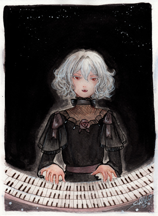
"Noble d'Apchier"
A little watercolor painting of Chloe,with the Zorn palette! I found out about this palette a while ago and I really wanted to try it out! (More on that below )
Chloe's hair is something I adore, it's gotta be one of my absolute favourite character designs ever,I love how swirly and fluffy it is,very fun to draw. I've drawn her normally before,I wanted to do one with her vampire eyes and fangs too. I decided to try to draw a white fuzzy rim around the foreground against the plain background,for a change,like in some of the VnC panels.
The Zorn palette,or Apelles Palette was a colour scheme used by Anders Zorn in the late Victorian/Early Edwardian era. It ,or something similar,might have been used by artists of old civilizations too, because it avoids the use of blue and green entirely: which would eliminate the need for rare pigments . It's essentially a colour mixing challenge,to draw the entire paintings with 4 pigments,2 basic colours: Ochre yellow, Vermillion,and Black and white,which can be mixed into different shades. It can be an excellent exercise and means for portrait painting
Modern artists use red instead of vermillion,but the essence is the same. So that's what I did too. I considered using vermillion,but I realised that it would introduce a lot of yellow tint, making the picture very warm. Which is usually something I prefer honestly,but not what I was going for here. Also,I need to consider the fact that I'm a watercolour artist,which is very different from the original intended palette. Zorn used oil paints,but other artists use it fine for gouache and acrylic too, however,that too is different from watercolor, because instead of mixing with white, I'll be diluting with water,which changes the composition of the palette considerably. So I went with these supplies: ochre yellow and red watercolor pencils (for me, basically watercolor pigments,I don't use them to draw,I grind and dissolve them in water),white and black watercolor tubes,and white ink. In addition: lineart with sepia,grey and black brush pens,which are well within the bounds of the palette
To be honest,I ended up not using the white paint tube at all,water makes more sense to me. I didn't use anything else though,and stuck with the original materials.And the results:
Does it work? Hell yeah. It's not perfect,but I'm happy with how she turned out
Was it restricting? That's kind of the point,to paint with some limitations
Was it hard? Honestly? No. Not at all. It's definitely very different from what I'm used to,I use a lot of colours both as is and mixed,but this was surprisingly easy. Perhaps because of my subject,which didn't have much colour to begin with
Do I recommend it? If you want a small challenge,or to experiment or practice colour mixing,definitely
Will I do it again ? Absolutely. I feel like I haven't utilised much of the potential of this palette. I ended up using mainly red and black, hardly any yellow at all. So I'd like to do something more colourful with this palette, perhaps a sunny painting of a gingerhead girl with flowers,and for this I'll probably use vermillion,not red
Anyways, that's all! If you read all this,thank you for your time!!
#chloe d'apchier#the case study of vanitas#vanitas no carte#VnC#my art#traditional art#zorn palette#vnc fanart#vanitas no shuki#jun mochizuki#case study of vanitas
277 notes
·
View notes
Photo


Took an old unfinished painting, redrew it, then finished it up. This shows my general process pretty well — Rough Sketch > Sketch > Rough Paint > Less Rough Paint > Final Paint.
The original composition (not shown here because it's old and bad) had the creature in a half-zombified state... and although that’s theoretically dope as hell, it didn’t really tell a story and (as a consequence) was kind of boring. “Local Commuting Monster Surprised By Meteor” ended up working better.
The background is simple — I made an initial lasso tool shape (liquified to give it a fish-eye lens look), then used a fuzzier graphite-textured airbrush with low flow to paint the bulk of the sky. The meteor was painted on top, with some Hard Light layers and regular paint on top to make it “feel” bright without getting too white. The creature brightened up significantly as I painted, because... well, a more “realistic” look for the lighting isn’t always the best route (as much as I like the darker look, in hindsight). As a consequence, the BG had to be mildly desaturated to prevent my eyes from bleeding out.
Waffled a bit on if it should stay portrait, or make it a more standard 4:3 size... ended up going with a 4:3 proportion midway through, as well as changing the background land to dark clouds. I painted it with about an inch of margin (you can see this in the last WIP) to give me wiggle room for displaying it. Sometimes I'll add notes on top of my painting when I'm down to the wire (in the last WIP again) to help remind me what I need to focus on. For optimum progression, I added the finished painting at the end — no idea if new Tumblr will loop it to the beginning.
Starseeker, 2023.
Used Photoshop for the initial rough sketch, redrew it in Procreate, then took that back to Photoshop to do the heavy lifting. OSX as always, with a Wacom Intuos 5 as my trusty tablet.
428 notes
·
View notes
Text
Faux-compositing Hazbin Hotel for more visual clarity
A while back I recolored a screenshot from the Hazbin Hotel pilot to make the overall palette look more cohesive. Here’s the original:

And here’s the result.

And I figure, hey, that was fun, and folks (myself included) seemed to learn from it. Why not make some more? If you subscribe to the “every frame a painting” philosophy, this is the post for you.
I’ve always had two criticisms regarding Hazbin’s colors:
1. There’s entirely too much red in the environment. I know it’s Hell, but this is really overbearing. There are ways to make the setting feel oppressive other than bombarding viewers’ eyes, y’know?
2. The background characters have so many disparate palettes that they don’t feel like they belong in the setting. This could’ve been avoided by giving the fans who designed the characters a master palette to use as a guideline. Here’s the one I used for my hellhound designs:

It contains colors derived from canon Helluva Boss characters, which makes the new ones feel like they fit in the same world rather than hailing from completely different shows. For the faux-composite above, I sampled colors from Charlie and the background, and used them to rework the surrounding characters. For other shots, though, I may use the hellhound palette as needed since Helluva Boss is set in the same universe.
Let’s get to it!
To start with, there’s a lot going on in this scene. We have a detailed foreground character, a detailed background, and a middle ground character caught between them. In the left side of the frame, it’s hard to read the wolfman’s silhouette against the background elements since their values are so similar. Meanwhile, the cowboy stands out fine for the most part, though his hat brim gets a bit lost in the trim of the building behind him. So basically I needed a way to make all three layers look distinct from one another.
I settled on cloaking most of the background in shadow and doing the same for the cowboy, except for rim lighting and a glow from his cigarette to highlight his face. The wolfman and cart full of bodies have minimal shading; enough to give them some dimension but not so much that they blend in with everything behind them.
We then have more background characters to deal with at the news station:


In these cases, I simply painted over the crowd with purple on a couple Multiply layers (same as my initial recolor of these folks), erasing bits here and there to suggest rim lighting and glowing eyes. Charlie’s silhouette stands out much more clearly now that the heightened value contrast has cemented her as the focus.
I tried a similar approach with the demons outside the TV store:

While there was never any doubt that Alastor was the focal point here, I felt the ancillary characters’ color schemes could be more unified, and that their shading could reflect the light sources surrounding them (mainly the TVs in front of them, and the fire surrounding the horned skull demon). I also felt the wall on the right was blending in too much with the background, so I threw on some shading to make it pop.
Now we get to Charlie’s phone call:

I found it odd that the stained glass in the doors was illuminated from the inside when the previous scenes showed us that the hotel was dark. We did see a check-in desk with functional lights, but it was located waaaay down the hall from these doors. Thus, the glass is now in shadow, with some added texture on the edges to suggest its thickness.
Charlie is now also covered in shadow to fit the gloomy mood of the scene, though the rim lighting and her unshaded eyes keep her separate from the background.
Finally, the skyscraper windows in the second screenshot were way too bright, which gave them a contrast that drew attention away from Charlie. It’s never a good sign when animation backgrounds upstage the characters. So I slapped some color on them and shaded that front row of buildings to boost the overall gloom factor.
Then, Alastor arrives:

Given the darkness of the previous scene in the same location, I figured it’d make sense to kill the lights in the awning for this one. And now that most of the hotel is in shadow, Charlie and Alastor stand out a lot more (especially Alastor’s hand, which was practically invisible against the red wall). It really helps that the saturated yellow of the awning is toned down so it won’t be such an eye trap any longer.
Alastor makes himself at home:

...And the hyper-detailed background threatens to swallow him up.
Look, guys- I get that you’re proud of your rendering skills and all, and it’s admirable that you put so much love and care into these layouts. But, y’know, we don’t have to see the whole thing, especially not at the cost of the final frame. The portraits and wallpaper are especially distracting, battling Alastor for visual dominance. A little shading ensures Alastor is the focus without obscuring the portraits completely. Let ‘em be fun Easter eggs fans can study when they pause the video, not the stars of the show.
Alastor then regards the two grumps on the couch:

There was a noticeable lack of shading in this scene (except the default shadows on what I’m guessing were 3D models), making everything look flat. With the help of my good friend the Multiply layer, I gave the background some dimension and brought the characters forward.
Vaggie warns Charlie that Alastor is bad news, and Charlie takes it into consideration:

Again, we have the issue of background portraits attempting to steal the characters’ thunder. In the second screenshot, look at how much those bright greens and cyans stick out like a sore thumb against the dusky pink of everything else. Was it really necessary to keep all the colors of that illustration exactly how they were for the final product?
To remedy this, I desaturated the portrait’s colors and skewed them towards red so the image would better fit the context of the scene. And parts of the picture frame next to it were blending into the wall, so I added some shading there to make it stand out more.
Sometimes, changes made to a confined area can make a world of difference:
I muted the bright greens of the balloon and the flag so their saturation wouldn’t dominate everything else in the scene (again, eye traps), and shaded the stuff behind Alastor so his side of the frame wouldn’t look so busy.
I used similar tactics for when Niffty enters the picture:

For the first screenshot, I plunged the left side of the background into darkness, shaded the center with mainly lighter colors, and left the right side alone since that’s where the light emanated from. This resulted in a sort of gradient effect in the shading, which let Alastor and Niffty pop out a lot more.
In the second screenshot, the vase on the right was a bit distracting in how detailed it was compared to its surroundings, and it was the only pink thing in the frame besides Niffty. I shaded it so it wouldn’t steal the spotlight without disappearing completely. There was also the matter of adding shadows to the rest of the environment, particularly the stretch of hearth the firelight doesn’t touch, and the skeletons on either side of the furnace’s opening. Just some little touches to help the world feel more solid.
Then we meet Husk, and things get tricky.


Husk’s bar was a challenge due to its plethora of light sources. The green rim lights on Husk and Alastor suggest the light’s coming from the green blackjack table, but then we also have light coming through the window, lights in the sockets of the skulls above the bar, a yellow glow from the top of the bar itself, and a faint green glow from the top edges of the wooden wall. And in the third screenshot, the window grabs a lot of attention since it’s almost smack in the center of the frame and it sports some pretty saturated colors.
I did my best to shade things in a believable manner without using too much of a single color. I’m happy with how the purple worked to tone down the window, though I might change the brightness of the blackjack table. It’s still pretty saturated and a bit distracting from Husk and Alastor, though at least they stand out from the wall a bit better.
Now for the part where things get PINK:
Like wow, SO much pink. Holy hell.
I layered some yellow over Charlie and Alastor’s faces, bodies, and limbs so they’d be more discernible from the background, with extra emphasis on their faces to show just how enraptured they are during this musical number. I even left some glow in the negative space between them, representing how connected they are in this moment. Two auras become one. Or something. (Look, I am by NO means a Charlastor shipper; I just think a little more creativity in the visuals of a dance scene could convey more energy and chemistry between the partners. Especially when everything on screen is this monochromatic, like damn.)
Anyway, Sir Pent is here.

That blue in the tunnel of his airship was WAY saturated, and while the reds and yellows barely managed to pop out against it, I thought I’d give them more of a fighting chance. The body of the ship is also more consistently shaded to make it feel 3D, and I added some rim lights to the tips of Pent’s hood so they’d stand out against the dark tunnel.
But Alastor’s eldritch horrors dispose of Pent in pretty short order:

The extremely light glow on the left side of this screenshot caused the hotel to compete with the tentacles for dominance. And once again, there was the matter of the skyscraper windows being so bright they drew too much attention to themselves. I colored these windows with the same orange as the sky behind them, cloaked the hotel in shadow, kept a yellowish glow around the characters, and darkened the evil spirits to make them pop out.
Finally, we get the characters’ reactions to what just occurred:


Figured I’d handle both the normal lighting and the “horror” lighting for this scene. The normal version’s pretty simple: Color in more skyscraper windows, eliminate that weird ray of light that seems to come from nowhere, darken the top of the sky for more contrast with the characters, add some rim lights to Alastor to make his form more clearly defined, and remove the pentagram planet-thingy that looked like it was awkwardly resting on Husk’s hat.
The horror lighting involved some of the same steps, but with more addition than subtraction. The glow from the tentacle demons now hits our characters, lending them a greater sense of volume. Light purple shadows on the gang in the back offset the yellow glow, and Alastor now sports reflections in his shaded areas. There’s no character animation in the transition between the terror and the levity, so if a person wanted to paint this stuff in After Effects, then fade out its opacity to reach the regular lighting, they easily could. Hell, you know what?

Do with this information what you will.
So what’s the takeaway here? I guess, in a nutshell: Don’t let your animation backgrounds upstage the characters. Don’t make them so intricate or busy or saturated that they hog the spotlight. They don’t need to wow the audience with how impressive they are; they just need to serve the story.
Will the Hazbin series learn from past mistakes (including those made in Helluva Boss)? Fingers crossed. As always, I hope y’all found this post insightful or enlightening in some way. See you in the next one!
209 notes
·
View notes
Text
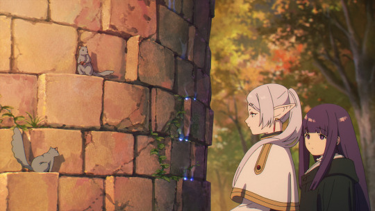
Frieren: Beyond Journey's End #1-4 - It was... Perfect


Episode 1 - The Journey's End
Screenplay: Tomohiro Suzuki
Storyboard: Keiichirou Saitou
Episode Director: Ayaka Tsuji
Animation Director: Reiko Nagasawa
Key Animators: Junko Abe, Shin Ogasawara, Ran Kamezawa, Jun Sekiguchi, Daiki Harashina, Kanata Yanagisawa, Shinichi Yoshikawa, Xujian Li, Odashi, Keisuke Kobayashi, Shinji Ootsuka, Hayato Kakita, Toshiyuki Satou, Ayaka Tsuji, Yoshiko Matsumura, Emi Yamazaki, Kanako Yoshida, Kerorira, Kou Yoshinari
Episode 2 - It Didn't Have to Be Magic...
Screenplay: Tomohiro Suzuki
Storyboard: Tomoya Kitagawa
Episode Director: Tomoya Kitagawa
Chief Animation Director: Reiko Nagasawa
Animation Director: Ayaka Minoshima
Key Animators: Junko Abe, Nobuhide Kariya, Toshiyuki Satou, Harumi Takagi, Daiki Tanaka, Masaho Hori, Yutaka Minowa, Kanata Yanagisawa, Xujian Li, Fuuko Abe, Kyousuke Ootori, Takahito Sakazume, Jura, Yuka Matsumura, Yukiko Watabe, Hayato Kakita, Hiroyuki Kobashi, Jun Sekiguchi, Airi Takahashi, Daiki Harashina, Ayaka Minoshima, Kouta Mori, Shinichi Yoshikawa, Aoi Ootani, Naoki Katou, Sanae Shitaya, Shinya Segawa, Zihan Liu
Episode 3 - Killing Magic
Screenplay: Tomohiro Suzuki
Storyboard: Daiki Harashina
Episode Director: Daiki Harashina
Chief Animation Director: Reiko Nagasawa
Animation Director: Daiki Harashina
Key Animators: Daiki Harashina, Junko Abe, Shin Ogasawara, Mai Toda, Kanata Yanagisawa, Daisuke Shibukawa, Kou Yoshinari, Fei Hung Donghua, Hanwen Ye, Tooru Iwazawa, Honami Takeuchi, Yoshiko Matsumura, Xujian Li, Yukiko Busa, Nonno
Episode 4 - The Land Where Souls Rest
Screenplay: Tomohiro Suzuki
Storyboard: Yoshiaki Kawajiri
Episode Director: Kento Matsui
Chief Animation Director: Reiko NagasawaAnimation Director: Ayaka Tsuji
Key Animators: Shin Ogasawara, Hiroyuki Kobashi, Toshiyuki Satou, Harumi Takagi, Rie Arakawa, Yuka Koiso, Masahiro Yufune, Pinqiao Hui, Norifumi Kugai, Ayaka Satou, Jun Sekiguchi, Miyuki Inoue, Shuuji Maruyama, Ryuuguu-san, Yenxin Fan
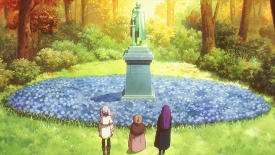
Last week was utter hell, with a new class, a new schedule, and my sleep going out of whack. I'm still trying to readjust, and let me explain why I'm mentioning all of this. Almost nothing would have motivated me to get out of my zone and type this post except for Frieren. Frieren is one of my favorite manga series. If you've talked to me about anime/manga before, you would know this. So, ever since it was announced, it has been one of my most anticipated series. To add to that, Keiichirou Saitou was announced as the director. He's a great example of an upcoming new-gen director who has excelled in everything he's been a part of. From the beautiful and abstract EDs he created for The Executioner and Her Way of Life or Boogiepop, to the mesmerizing, dreamlike episodes he directed for Sonny Boy, and the expressive, now very popular Bocchi the Rock. He was a perfect choice as a director for a series like this, and let me tell you, he delivered fully.
Just from a quick glance, you can see how the show looks. Everything is eye-catching, making it almost hard to focus on one particular element because they all just look so good, and no, it's not just the chromatic aberration causing the lack of focus. The various departments responsible for compositing, the background, and the overall color design have done an outstanding job, creating a beautiful and cohesive piece of art. Seeing someone you might consider a less experienced director pulling off such a complete and harmonious experience is incredible. In terms of design, the whole show is aesthetically pleasing. It's not the experimental work you saw in Sonny Boy; it's going in a totally different direction, like a beautiful painting that should be framed on a wall.
It works very well when paired with, you know, how Frieren is as a story. The fantasy world they are in isn't an extremely unique one. You've seen it before; it's fairly typical in that sense. But that's not truly the point. The main focus is showing the day-to-day or year-to-year life of this immortal elf girl, Frieren, and how she views time, how she remembers her past. It's not an incredibly grand adventure, but with the small lens we have on these characters, it feels like a cherished moment, something that should be captured in a photo or painting. It's beautiful in a very simple way. It's not a series made for extremely large moments, I think Frieren has always been focused on a simpler view of life, much like a painting. The smaller details of such a straightforward approach are highlighted so well. The trees in the environment, the squirrels just moving around—there's so much life in each scene. It really all comes together for me like a piece of art.
The consistency lasts through all four episodes, and the staff distribution also seems fairly good, so I expect this to continue throughout the two cours. The pacing itself is perfect. I've really enjoyed how the story has been adapted to animation so far. I believe that nowadays, many anime series have fallen into the pitfalls of adapting things too quickly to capture the interest of newer viewers early on. However, the series composition for Frieren here is excellent.
This writeup might have been shorter than most people were expecting considering how amazing the anime adaptation is and how much I love the source material, but what can really be said about except just praising? I feel like even if you don't like the source material, the anime's execution is almost undeniably good. Additionally, as I said this past week has not been kind to me so my energy is a bit drained, at first I was planning to be more specific in my write up and make points more adhering to the specifics of each episode, but I didn't really have time for that. However, I will do my best to cover every Frieren episode weekly from now on. Make no mistake this is going to be my favorite series from this year.


22 notes
·
View notes
Text

This is so crazy to me because that is like the one place where you just objectively can't put ai. It wouldn't work. There's no way to make it work. Like fuck them for trying to put it anywhere in the pipeline at all but storyboards are the last place you would ever want it. I'm a firm believer that no matter where you put AI tech in art it's at best going to give you something mediocre and difficult to work with. It's just too much of a black box with too few direct controls. But there are some applications where I can at least see the argument. Background painting for animation is an amazing and complex art form but I can understand how you could use AI to get something mediocre but serviceable by generating a full render based on a sketch. Inbetweening is tedious and while I'm sure AI wouldn't hold a candle to a human for subtle acting I can see where someday you might be able to create a better version of auto-tweening that could handle more complex timing. Hell, clean up and coloring are both slow fiddly tedious processes that would make sense to cut corners on. Again I think cutting any of those jobs is a lazy and poorly thought out idea that you'd only pull if you're creatively bankrupt and only in it for the money but I can see how it would actually save money while still actually making something that resembles a show you could watch. But storyboarding is the one thing that this kind of statistical model will never be able to do. Statistical learning models cannot comprehend things, they don't know what a story is. They can't even tell a knock knock joke let alone a compelling story because they have no way of remembering the events that have happened in the story already or understanding that the pixels and words that they are assembling even relate to the concept of an event. They mash phrases and colors into something that vaguely resembles other stuff that they've been told contains keywords. That's it.
But you expect me to believe you're going to get one to understand enough film language to tell a compelling story over a thousand separate images while consistently keeping the characters believably in the same space and recognizable? And it's gonna do that faster than a person doing thirty second sketches? Nah. I don't buy it.
The amount of bullshit you have to do to convince the black box to put the correct character on the left side of the screen facing the right direction in one image would already be more work than doing rough thumbnails of the whole scene. There is so much specific problem solving that has to go into making a storyboard. We have a hundred years of highly specific cultural baggage that defines how we interpret films. No generative statistical training model will ever be able to do that because they are just not remotely capable of understanding what they're making. They aren't and can't be conscious entities with the ability to interpret meaning, no matter how many objects they can recognize or words they can predict would be likely to follow other words. At best you'll wind up with a jumble of blobs that vaguely resemble the compositions of other films thrown together in an order that makes no sense and some poor worker who you've demoted to a revisionist position will have to sort through them and try to turn them into something that makes any sense and it's going to be slower and worse than if you'd just paid someone to do it right the first time.
If this is true and there are executives who think this is going to happen, they're gonna have a bad wakeup call when they realize their expensive machines aren't capable of more than the visual equivalent of word salad.
8 notes
·
View notes
Photo


A deeply uncomfortable compilation, or, good girls.
IMAGE IDS: A series of comic book panels showing Rose Wilson, Tara Markov, and Slade Wilson across various comic books.
The first two images, in row with each other, show Slade standing behind Tara and Rose respectively. The shot composition is very similar, with the girls closer to the camera in each. The first, with Tara, is from the Judas Contract arc in The New Teen Titans while the second, with Rose, is from Nightwing 1996, issue #112.
The third image shows five panels of Slade at Wintergreen’s grave in Teen Titans 2003. In a yellow text box, he thinks “I failed him like I did Grant. But you’d be amazed at the progress she’d made in such a short time. The weapon she’s become. It’s been a long time since I took anyone under my wing, since I felt that way. She reminds me so much of her. Beautiful, strong. And willing to do anything to prove herself to me. I know you never truly approved of that relationship, of Terra, but I assure you, Wintergreen -- this is for real. As real as that ever was. She will help me find Raven. She will help me deliver vengeance. Eye for an eye, old friend.” In the last panel, an off screen Rose says “The flight to Phoenix leaves in a few hours.”
The next two images, also in row next to each other, are similar but more in focus screenshots from the Judas Contract and Nightwing 1996, issue #112, respectively. In the Nightwing image, Slade tells an off screen figure “Teach her.”
The sixth image shows Slade holding Rose’s hand in the rain. His hand is gloved orange, hers is bare and shows paint pink painted nails. He says, “Good girl.”
The seventh image, also from Teen Titans 2003, shows two panels. The first has Cyborg and Robin (Tim Drake) talking in the foreground while a blurry Rose holds swords in the background. Robin says, “And you already know Rose Wilson,” to which Cyborg replies “What the hell is Slade’s daughter doing here?” The next panel is a close up on Rose’s face, showing her eyepatch. She smiles darkly as she says, “Oh, don’t worry, Cyborg, I’m not like Terra. I’m a good girl now.”
The eighth image is from the Judas Contract in New Teen Titans again. Slade asks Tara “Has being a Titan changed you? You’re not quite the sarcastic whelp you once were,” to which Tara replies, “You want to test me, hotshot?” They’re both out of costume and their faces are shown in profile as they face each other. Tara is wearing makeup and jewelry.
The final image, a panel from Deathstroke 2016, shows Tara and Rose looking towards something off screen on the right. Tara says, “He told me I reminded him of you. Which, if you think about it, is pretty gross...” Rose’s expression is surprised, preparing for a threat, while Tara looks uncomfortable and sad. The sound effect Vveeepp is repeated three times on the bottom right and the start of a yellow and red narration box is visible. End ID.
#tw incest#like not actually but#it's kind of there.#tara markov#rose wilson#slade wilson#anti slade wilson
61 notes
·
View notes
Text
Morning dew and dances
First date - tell me more, tell me more - Black velvet dress - Cloudy mornings and sweet bareness - Kiss me, you fool - Waiting in the wings - You're only falling now?
Words: 1161
Summary: time for round 2 ;)
Warnings: smut (18+)
Kelvin woke up to the throbbing headache of two jackhammers pounding the inside of skull again, feeling as if he had been hit by a truck. The sun shining through his window made him suspect that he probably slept through the whole morning. Fuck! The mission! A quick glance to his phone and the initial wave of panic ebbed away. He still had a few hours until he had to get ready to head back to the base. He rubbed his eyes, sighed relieved and focused on remembering what had happened last night. But the recollection process was a blinking error code on the blank background of his mind, like a fuzzy dream fading away at dawn. As he wiggled under the blanket, enjoying the softness of the sheets wrapped around him, he abruptly froze at the faint moans of his name, emerging next to him. For a moment, Kelvin's heart raced with a sudden jolt of fear. Who was next to him? What had he done last night? Please don't let it be someone I don't know! Oh hell, please don't let it be someone I do know! His mind was screaming at him in an anxious mantra. But as he turned his head, his fear vanished as quickly back into the abyss it crawled out from. You were lying naked next to him, still asleep, but obviously dreaming something related to him and judging by the sounds that left your lips, he was probably giving you a very special treatment in that dream. Kelvin felt a rush of love and lust wash over him as he gazed at the beautiful composition of your face, lust and sleep painted all over it like it was a living naughty expressionistic painting. You had only met last week, and since then, both of you voluntarily embarked on a thrilling ride on the emotional roller coaster that was your blooming love. What you shared was a profound connection on a soulical level that exploded into an intense, raw passion last night. You both sank beneath the weight of the carnal craving for each other's touch, your bodies entwined in a never-ending dance of desire. As Kelvin observed your fitful sleep, he couldn't help but think of the wild night you had spent together and if you were currently dreaming about it, getting fucked into oblivion by him all over again. Flashes of your naked bodies writhing in ecstasy paired with inquiring thoughts, growling dangerously low as his hand caressed your thigh. Your skin felt hot and soft underneath his fingertips. Kelvin leaned in to kiss your shoulder, and as he did, in a brief moment of a wicked idea forming in his mind, he moved his hand up your thigh, sliding slowly between your legs and he dragged two fingers through your folds. The sensation of the wetness that had already accumulated there educed a low-pitched groan from him as his hips bucked in needy anticipation. You stirred, eyes fluttering open. A smile spread on your lips, your eyes meeting his in a lustful gaze. You stretched out a hand, grabbing at the handsome soldier's and pulled him towards you, giving in to the tantalising temptation of his sweet lips and as you did press your lips on his, you realised his fingers on your clit, circling ever so slightly. Your other hand wandered to his, pushing it down and forcing his two fingers inside of you. You moaned into the kiss and Kelvin moved his body further against yours, rubbing his now hard member against your hips while thrusting his fingers deep inside you.
"Rob", you breathed hellishly sinful at him.
Kelvin erupted into ecstatic moans at the sound of his name, whispered exactly as his mind imagined it two days ago while he pleasured himself. He couldn't take it anymore, your slick folds, your soft skin on his dripping cock and the hazy tone of your voice flipped a switch in him. It was the feral desire awakening in him that blew all the sweetness of his usually gentle nature away. He growled like an animal, jumping between your legs, settling on his knees, his fingers dug into your hips and he pulled you towards him, ramming his cock inside of you. Him screaming out your name in the exact same moment his tip hit your sweet spot inside incapacitated any coherent thought you were still able to hold on to until now. Kelvin set a unforgiving pace, pounding harder into you at each thrust. One hand moved under your back, stabilising you as his upper body bent over, his mouth grazing your neck until it detected the perfect spot and he sank his teeth into your skin. The raw carnality of his bite sent you both other the edge and your brains were left struggling to process the waves of delish release washing over your bodies. Kelvin fell to the side, rolling on his back, panting heavily.
"I think I'll have a heart attack if we continue like this", he glimpsed at you, trying to catch your breath next to him.
"Admit it", you chuckled, "you're trying to take away my ability to walk so I won't run away while you're on your mission."
A wave of conflicting emotions hit him. He was bound to go on this mission in a few hours. He knew he had to leave, but every inch of his body wanted to stay here with you, preferably in bed all day, cuddling, kissing and talking about your future together. However, the reality sang a very different song and he hated the tune. He had to go and fulfill his contract, something he had signed up to do long before he met you and while he usually felt content with his work, he now wished he could kick his younger self for enlisting.
"Would you want to?", a sudden sadness was bubbling in his chest, "run away from me I mean."
You sat up and punched his chest.
"Don't be an idiot", you scolded him, "I'm fully aware we don't know each other that long yet, but I'd be a moron if I'd let you leave again, T-Bird", the pretense angry expression was torn down swiftly by the broad smile you couldn't hide any longer, "you go on that mission, I wait here and if you don't accidentally drop grenades where you shouldn't-"
"we'll be back together dancing naked on my bed?", he interrupted you playfully.
"Dancing? Good sir, you were screwing my brains out five minutes ago, I don't even know who I am anymore or where I live!", you huffed with a cackle.
Kelvin laughed heartily at your comment, taking your hand and squeezing it tightly.
"Would the unknown lady like to take a shower with me?"
"You bet she will, she needs to wash away the sweaty testaments of last nights dancing session before she needs to get ready for work as well."

Part 8 - Cannibalypse now
SotF masterlist
#sons of the forest#sotf#sons of the forest fanfictions#sotf fanfiction#kelvin#robert kelvin#sotf kelvin#sons of the forest kelvin#sons of the forest x reader#sotf x reader#kelvin x reader#kelvin x female reader#Kelvin x you#Kelvin can't get enough
34 notes
·
View notes
Text
Illustration processes are always so fun to look at ‘cause I never have the control to just do a rough on Procreate and stop at that (it’s also why I do sketches on GoodNotes now), yet I feel burnt out (?) by seriously rendering stuff even in greyscale…
It seems like a really useful thing to do a rough for composition, and then block in basic shapes, then background, then values/colour flats whichever order you prefer to go in, and then start painting to fine tune stuff & do effects (like how it goes in the one linked)
Typically I either run out of stamina after sketching or I sit and render the thing roughly on GoodNotes with colours. See, GoodNotes has no layer filters and has really limited brushes but it’s vector-based and you can change colours of strokes and it even has an erase highlighter only function, so I could easily test out different colour combinations or layer colours/values like it’s marker. That limit, I quite like, so I can focus more on composition and/or the character
Hahah but I think on Procreate (for paintings without imported sketch), at least for this one I blocked in rough shapes and values from the beginning along with the overall tone of the piece, and then I added more details and colours (pain. I get really nit picky when it comes to ambient lighting and colours especially for a study)

Look at this, man!! Look at it!!! Colouring/lighting is hell! Whole piece took me around 4 hours and probably half or more of those hours are on colours/lighting …GOD but it felt so good chasing for that breakthrough until everything finally looked right

Y’know what…this is actually not that bad, this alternate lighting. I just didn’t realize how the colours looked until I switched to a dark interface. Is this what Albedo means by touching up an old painting and enjoying it again? Oh…

Five months after and it turns out one of the many variations looked nicer?
#dusk rambles#art process#‘yet I feel burnt out (?) by seriously rendering stuff even in greyscale…’#that. and drawing in greyscale makes me depressed#though I could just change the BG to cream like the default in GoodNotes#art tips#primordial Albedo#subject two#Dorian#Kaeya#Diluc#Genshin impact#dusk analysis#art tutorial#colouring tutorial
9 notes
·
View notes
Text
Commission Information
Can also be found here if tumblr doesn't glitch it for the fifth time.
As said, Tumblr is glitching like hell. But! I need to get money for surgery and I feel weird about asking for money with nothing in return so...Commissions!
I do standard commissions, art nouveau style commissions, and a few different niche commissions like making doll-style versions of characters, doing outfit designs, and finishing old sketches or redoing old art you may like.
I also love bringing OCs to life!
Will Not Draw:
Gratuitous Gore, Furries (no shade, I’m just bad at them. Normal animals? Fine. Anthro animals? I’m so bad at it).
Preferred Fandoms (though I will also draw OCs and other fandoms)
Star Wars (Mandalorian Armour will get a $50 upcharge on painting, Clone Armour will get a $25 upcharge on painting)
Time Princess (Mobile Game)
Sailor Moon
Apothecary Diaries
Pokemon (pokemon count as animals in the extras section)
Vtubers (I just like drawing them)
Vocaloid
Princess Tutu
DC
Marvel (Ironman will get you a $50 upcharge of painting)
Information (USD) under the cut.
Standard Commissions
Headshot (single)
Sketch Only - $50
Clean Lines - $75
Painting - $150
Headshot (kissing)
Sketch Only - $75
Clean Lines - $100
Painting - $200
Waist Up (single)
Sketch - $75
Clean Lines - $125
Painting - $225
Waist Up (extra figures)
Sketch - Plus $50 per figure
Clean Lines - Plus $75 per figure
Painting - Plus $175 per figure
Full Body (single)
Sketch - $100-$150
Clean Lines - $225-$275
Painting - $350-$400
Full Body (extra figures)
Sketch - Plus $75 per figure
Clean Lines - Plus $150 per figure
Painting - Plus $200 per figure
Finish It! Commissions
These are commissions that are based on past sketches I never finished. If you’ve seen a sketch from me here or on twitter you’d like me to redo as a full art piece, please let me know. The rates for these are as follows:
Redo Sketch - $50 (optional)
Finishing (lining and rendering) - $150 for a single figure, another $50-$100 per extra figure based on complexity
Art Nouveau Commissions
These are commissions that are only finished, rendered pieces, but there are certain breakdowns and extras that you can add.
Initial Sketch - $50-$75 per figure
Background Sketch - $25
Art Nouveau Lining and Rendering
$200 for one character and the background, adding another figure would add another $100-$150 per figure
Final Touches
$25, this includes things like changing lineart colours and colour balancing, along with adding some texture to the piece
Extra Motifs
$10 per motif, things like adding a kind of flower into the composition, adding a plant, adding a weapon, basing the piece off a tarot card, or adding some other extra (like the wine in the Cody and Obi-Wan piece)
Extras for All Commissions
Holo Effects - $10
Animals - $75 for sketch to render, only as an extra. If an animal is the only figure in a piece or a major figure, it runs you the same as any other figure.
Dollified Commissions
Sketch (per character) - $25
Lined and Rendered (per character) - $50
Outfit Design Commissions
Sketch (per character) - $100
Rough Colours (initial colourway) - $150
Rough Colours (per additional colourway) - $50
Commission Perks
All commissions receive a web-quality PNG of their commission
If your commission total passes $200, you can pick one of the following to receive:
A two-hour private livestream (you can invite whoever you want) to watch me work on the sketch for your piece, make comments, ask questions, and make additional requests
A timelapse video of the creation of your piece
None of this applies to NSFW including artistic nudity. If you’re interested in a NSFW commission, please reach out in DMs.
5 notes
·
View notes
Text
Lore: KiriDeku Fantasy Zine
Happy birthday Deku-kun! May your romance with your unicorn bae still be blooming and thriving!
...Oh, none of y'all know what I'm talking about? Well, I'm talking about the AU I drew about for the Lore: KiriDeku Fantasy Zine (and wrote about--although all of those things can be seen for free here.)
I'm still very proud of these pieces! As of late, I've been forcing myself to do what I've always avoided doing--that is, incorporating the background design into the overall composition. Like, I've had the capability (separate from execution) but I preferred characters over backgrounds so I constantly shied away from it. But for this zine, which was the first for-profit one I ever got into, I wanted to put in all 200% and then some.
One part of this experience I will never forget though is how I learned the very hard way about CYMK profiles on Procreate on the iPad. That is, don't. Don't use them. It doesn't actually support that. It just has a RBG profile that estimates a CYMK profile. The big problem here is that you'll be working on Procreate, making pretty colors and stuff. But then you'll export it like me and it'll come out desaturated as hell. The final colors you see here was a lot of color adjustment I had to do on Clip Studio Paint afterwards and ohhhhhhhhhhh did I stress out a ton because I had a very strong vision for colors in this piece too!!
Anyway. I love these pieces and I hope to be doing more and more of these! Good practice makes good art, you know? I know I am capable of art like this, and I know I can get better... so I shouldn't avoid it!
Also also also I am proud of these because these are the first most serious pieces I ever completed on Procreate XD I don't know why I like to give myself challenges at the most inopportune times. I mean, again, I'm proud of my work, but hahaha, learning how to paint for the first time on Procreate with new brushes was sure a wild ride...
Last but not least, I think I will offer these as prints someday soon! More about it in a bigger post later!
#krdk#kirideku#kirishima x midoriya#fem deku#nixie deku#unicorn kirishima#bnha#mha#zine work#lore kirideku fantasy zine#procreate#digital paintings#mimithealpaca
8 notes
·
View notes
Note
What instruments do you play and what is your musical background? (How long have you been playing said instruments etc, how did you learn them) And any tips for aspiring composers?
i play the piano (in some middling capacity LOL), and i'm currently trying to learn how to play acoustic guitar (though it is a miserably slow process!).
in terms of musical background, general musical education in school aside, i'm pretty much self-taught - i don't know much music theory, nor can i read musical notation. but i do everything by ear, so i don't really need to know all these things B)
i started dabbling in music when i gained an interest in playing around with the piano my family has in their house back in like... 2013? 2014? and then i got picked up by my late music teacher in school to play in a band of rookies around the same time, though i'm a little fuzzy on the dates.
i played in the band for some 4-5 years, improving my piano skills and learning much about the music entertainment world. in the latter years of playing in this high schooler band, i picked up composition on the side, initially starting on silly little tools like Mario Paint Composer (silly famed NES game!) and later Advanced Mario Sequencer (this was my introduction to how soundfonts worked - i cobbled together a custom one myself once!). sometime in late 2018ish to early 2019ish i migrated to FL Studio 20, and have never looked back.
as for tips for aspiring composers... i swear i must've answered this somewhere already! but i guess repetition doesn't hurt. especially since this question has been in my askbox for ages LOL
i can surmise what i've learned in two lessons:
FIND OUT WHAT WORKS BEST FOR YOU! making music is not a linear single-file process by any means. almost everyone makes music in some different method and way. even when comparing myself to fellow composers, i find that our musicmaking processes differ greatly. don't be afraid to experiment with different digital audio workstations (DAWs), or various musicmaking programs. pick one, give it a shot - if it doesn't work, well, it is what it is. unorthodox ones are just as valid as mainstream ones! hell, i started out with Mario Paint Sequencer. that program looks like this! and yet people can make masterpieces with it. if you're looking for a good sort of middle-ground DAW, your best bet is probably SoundBridge - it's free, and it follows the general rules of other DAWs such as FL Studio or Ableton. there's also a few handy starting plugin tips in a previous post here!
KEEP GOING AT IT! musicmaking and composing are not easy processes. they often take time and persistence. but what i've found when working with the Deepwoken OST is, if you keep consistently chipping away at something, you eventually get good at it. set aside a certain amount of time each week for composing, - say, 1 hour? 2 hours? 30 minutes each day? up to you. and just Cook! don't worry about the end product, don't worry about the destination. get lost in the process of making. imagine you're making music for yourself, and not any audience. that, in my opinion, is when the best music is made. and like the lithuanian saying goes, "lašas po lašo ir akmenį pratašo" - or, "drop after drop, and water cuts stone". if you find the tools you're comfortable working with, and you keep working with them, you eventually get good at using them. B)
hope this helps!
#naktigonis.txt#anon ask#ask box#composition#composing#soundtrack#music tips#tips and tricks#personal
7 notes
·
View notes
Text
huzzah! 2023 art review!
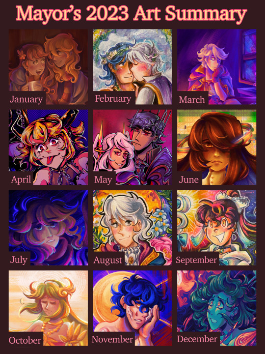
it’s almost the end of the year, wowzers! i always do one of these art review thingies since i always like looking back at the art ive made :> last year i posted the review on my other account and left it at there, but this year i want to actually review each month and notable pieces i made… just for fun!
this post is very much just for me lol, but i hope someone out there enjoys it. month-by-month review + previous year in reviews will be under the cut! 🩷
(also, shoutout to tumblr for going rouge and posting this way way earlier than i had scheduled 😍 luckily tumblr post editor is weirdly based and kept all my embedded links when i pasted it from the old one? hell yeah)
Jan: started off the year with a painting of my beloved ocs after ending last year with one! (and i will be talking about my older year in reviews, rest assured). this was my obligatory cute shared scarf art, and i wanted to try attempting to render something more involved like two characters and draping cloth. i don't think the result was too shabby, though this was before i discovered my favorite rendering brush for procreate, so in hindsight, it looks kinda flat and boring now. where's all the crunch? ah but anyway, starting a whole year with your art in a mid place compared to what you made later on is par for the course.
Feb: probably the month where i had the least art to put here, i remember scraping a little to find one. this was a chrobin piece i made in my sketchbook! nothing too noteworthy... i think i tried doing a slightly different approach to coloring with markers (applying the color before the lineart) and incorporating paint, but i remember this one giving me trouble. first of all, the size i drew this in was really small (it was in a small sketchbook and i decided to mask the margins with comparatively wide masking tape), and second of all the paper was absolutely NOT built for gouache, so it ended up a kind of wrinkly and muddy mess. i mean i'm still not the best with gouache now but still, not my best.
March: a redraw of a robin piece i made back when i was still on amino. i probably won't share the old versions because they're crap, so just trust me on the redraw part. anyway, the last iteration of the concept was in 2019 i think? and while i was proud of it for a while, its luster finally faded and i decided to try doing it again in procreate. this was when i discovered my love for the soft chalk brush in the jingsketch basics brush pack. for a while i've been using the hard render brush in that pack to render, but this one's texture and chalkiness totally changed the game. i was in love!! also tried to be a little more crazy and vibrant with how i applied the base colors, using saturated colors across the board. this process didn't consistently stick, but i think it yielded some neat results here. another hit from this month was my piece of grandmaster robin, since i'm really proud of the detail here!.
Apr: guys, april was MY MONTH! i remember making so much art in just a few weeks, something just clicked in my brain i guess. i chose my drawings of hagane rin and len since this was when i truly began to get comfy in my lineart era (after the grandmaster drawing). this month was full of detailed line drawings at that, but this one was what made me both enjoy the process a lot and do more of it. hell yeah. other hits: vocaloids at mcdonald's (i drew a background omg!!!), alice in ny fanart (just the euphoria of finally nailing a composition for this piece after struggling with it in november was great), and the end-world normopathy fanart (it's a line drawing, and a traditional one at that. i was happy with incorporating gold accents into my typically monochromatic style when it comes to my line-focused drawings as well as getting tamari's mechanical details nailed).
May: hell yeah. evil power couple time. this one was another line-art heavy one since i thought it fit the vibe. the softer colors in the background i feel like could have been executed a little better, but i do like how this came out, especially the armor (good god fe armor is a pain to render, but i think i've gotten better at it this year! middle school me would be so jealous). not much else to say here. Other hit this month would be my alice of human sacrifice fanart, another line-heavy traditional drawing. i think it turned out nice, especially for a crammed composition lol.
Jun: another end-world normopathy-centered fanart. i mentioned it in my og post but i was trying out a slightly different painting style where i did a black-and-white base first and then added colors as an overlay (also in the initial upload of the post i was so fucking meek about posting fanart of mariyam's alternate design teased at the end of the mv?? 😭 sorry about that, i've edited it out but it's still in early reblogs. kind of cringe on my part). i didn't end up committing to this consistently cuz the beginning process was kind of tedious (plus i'm too inept to pay close attention to values anyway), but laying down all the colors after the long rendering process was rewarding! it's a nice alternative with i get bored with my other method to yield basically the same-looking result lol. this month featured some more pieces that tried using this process, like the one with my oc alice, lucina and dark pit hanging out, and f!robin's resplendent design from feh.
Jul: ah yes my typical flavor of "improvised oc art that i invent new symbolism for on the fly that i apply meaning to after i'm finished". kinda just wanted to paint something again because i've been doing a lot of line drawings lately and to go back to my old painting process again. honestly, i mainly picked this one because i wanted more oc art and non-lineart drawings to be in this chart lol. art i made this month that i'm real proud of is this family pic of some young cryptonloids (i really like how the colors came out on this one!) and my birthday drawing for miku's sweet 16, which was originally completed this month. i opted out of considering it for my july art to avoid confusion. also also, this very whack pathological facade fanart (plus some doodles i didn't post) opened my eyes to the beautiful world of NOISE and HALFTONES and just slapping crazy textures onto my art like nobody's business. hell yeah.
Aug: ok this one is kind of another piece i picked to represent this month that isn't quite my favorite but i chose anyway for the sake of variety (in this case, i wanted more traditional pieces and non-vocaloid stuff). for once, i used my bigger sketchbook to make a big n detailed piece for my boy's new brave alt in feh (that game has zero significance to me outside of cool alt costumes for my faves). my actual fave from this month was young miku/meiko/kaito chillin in their house; i'm real proud of the background and lighting! but i still like this robin too ofc, big fan of how the colors came out ;3
Sep: another traditional drawing! felt compelled to draw kandy again, specifically her evil miitopia great sage incarnation :> this one was pretty standard in terms of process, and not much was really done to experiment. just wanted to draw something cool of my girl for my sketchbook. other fave from this month is this sketchy miku i did, i like how loose it came out and how the colors pop.
Oct: pretty palutena!~ i think i went into this trying to do something a little different with my painting process (i think it was to try incorporating more colors in the shading like the blue in the dress or more saturated colors near the focal point, but i can't remember LOL) or try rendering a more detailed character w/ a background (even if the background was pretty vague). i like this one! especially the color cohesion, it's pretty swag imo. other faves from this month was fanart i made for the song "orbit" since i also like how the color cohesion came out for this one, and the maid dress/crossover drawing i made for cringetober. no other words needed to explain why.
Nov: another digital painting! it's yet another ghost song, this time "uncanny". i really loved the aesthetic of this song, especially its bold colors and simplistic shapes, so i wanted to try capturing it in my style. i really love how the colors turned out on this, though i've yet to truly recreate what i like about this particular painting again? regardless, it's one of my faves, deserving of one of my favorite ghost songs. few other highlights from this month would be my obligatory purple robin drawing for the month, my sketchbook drawing of my luka design, and my fanart of utsu-p's song "ga". i like how i was able to do a couple of my different "styles"/processes this month rather than just sticking to just one. they all have their own feel to them that i like to play around with depending on the idea.
Dec: and finally, we're at the end. like july, we have another heavily improvised oc drawing with symbolism i came up with on the spot. that's just how i do things. anyway, this turned out really good in my opinion! i tried to stick to a color palette i saved in procreate a long time ago, and damn is it a fine palette. it helped me get a little loose with the colors and solely focus on creating a strong composition with colors and contrast rather than get hung up on sticking to typical color palettes. i also really like how i did the background by essentially using the liquify tool to swish all the colors around and then polished it a little on top. made for a really cool effect. other notable work would be the companion piece i made with my other oc that had a similar style since i liked the process of this one. there will probably be more as of when i'm drafting this (at the beginning of december) but i just wanna be finished w this post already bro
all around, very satisfied with this year. there was kind of a lot of song fanarts (something that i am somewhat guilty about because it feels like i'm unoriginal or something, but i swear it's cuz i'm really passionate about vocaloid music and need to act on what my braincells do when i listen to certain tracks), but overall i'm happy i was able to maintain some slight variety in the art i made this year through my chosen mediums and "styles" or processes i use.
this was the first year where i really wanted to have a fully rendered piece i'm proud of to represent every month. now, i wouldn't recommend this since forcing yourself to make art is not a good mindset to be in (sometimes, with how early i pushed some pieces out in certain months to get the monthly quota over with makes it seem like i'm getting paid to have a pretty year-in-review LOL). i was pretty lucky to not really have much burnout i guess?
~~~
ok now that all that boring stuff is out of the way, here’s my previous years! this is the sixth year i have made an art review chart.

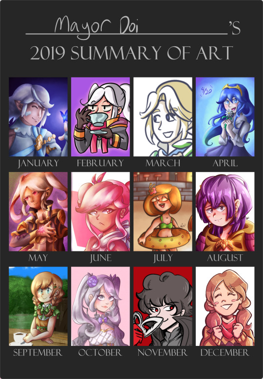
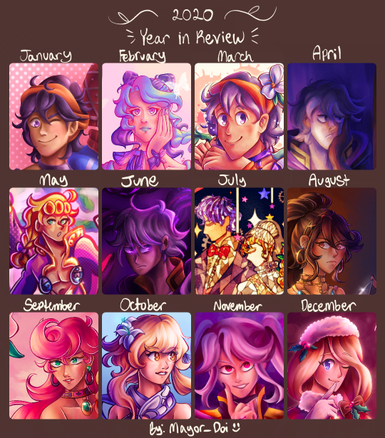

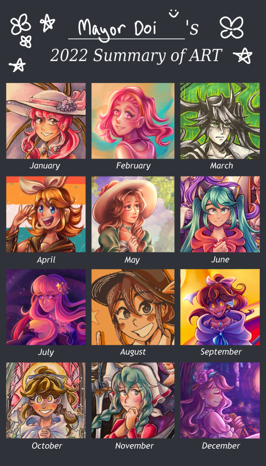
lightning round review time! (probably just gonna be more boring stuff)
2018: ok, so this was the year where my prime art hosting platform was… amino… specifically smash amino. as much as i could rant about how much i hate that place now, i cant deny that it got me creating a lot of stuff. also it was an actual date archive for my traditional art because i never got in the habit of dating my physical art 🙃 uh don’t mind the absolute horrid graphic design on this one. i grabbed a template which was probably saved from a bunch of other places from amino and… didn’t really know how the formatting was supposed to work. first of all, i edited this in picsart on my phone and the chart wasn’t transparent, and second of all i didn’t know you were supposed to crop only the main focus so it could fit and be a little more clear. hence why its such a visual eyesore. i've been meaning to remake it to make it a little less bad (once i get my hands on the traditional pieces again), but i guess its shoddiness adds to its charm, much like amino. but anyway, 2018 was a bit of a turning point year for me in the smash amino art biz. on amino, i mostly made copies of official artwork from smash (character renders and so forth), and this year i actually tried experimenting with my own original ideas and scenes (my copying roots were still around at this time tho, seen in the november drawing which is based on ssbu’s mural art. i mainly moved on to copying artwork from feh). this was also the year i got my ipad and finally got into making digital art. i didn’t have the knowledge of digital art that i have today obviously, so colors and lighting were usually on the plain side. i also hit my stride with making more ambitious traditional art that incorporated backgrounds and such, and they’re pieces i’m still really proud of!
2019: so, i actually made this chart some time in 2021 or 22 because i didnt make an actual chart in 2019 officially (i forgor). which bums me out because i deleted my amino account by then, so a lot of dates for traditional pieces were flushed down the toilet the one time i needed them. so, to compensate, i tried scraping any digital piece i could to fill in some spaces, which is why some are more underwhelming than others. but yeah since this isn’t fully accurate to my art progress that year, 2019 is a bit fuzzy. main thing of note that year is midway through i got really REEAALLY into fire emblem: three houses and drew a lot of art of the characters (not shown much on the chart because they were mostly sketches and whatnot). imo there’s not much improvement or stylistic changes from 2018 in this year to note. 2020 on the other hand…
2020: if it wasn’t clear, this was my jojo phase. i got into jojo at the end of 2019 and my downward spiral into jojo hell bled into 2020 :p as such, i made a lot of jojo art. and because i made a lot of jojo art, this was the year where my style shifted drastically. i feel like it’s a common phenomenon for artists getting a total stylistic makeover after getting into jojo. whether it’s to imitate araki’s style or just trying to accommodate the characters’… features, i ended up facing the same thing. gone were big round heads with tiny mouths and in were tree trunk necks and higher effort placed in learning anatomy, both for the full body and well as the face. it was around may of this year i got procreate and moved on from ibis paint for digital art. while i still have my personal hangups with procreate, im glad i ended up investing in it since it really just works for me!!
2021: around summer 2020 in peak pandemic mood, i decided to indulge in some nostalgia and listened to some old vocaloid tunes from my middle school days. and then i kept rediscovering more stuff, and then i ended up browsing producers' individual discographies, and uh yeah i am still suffering the consequences of my vocaloid renaissance to this day. while it wasn't prominent in the 2020 chart, it really started to leak its way into my art subjects in 2021. however, i still primarily stuck to my roots with fe/"smash"/jojo fanart. this year was mainly trying to find my style again i suppose? i had already learned the ropes of procreate, its limitations, and the options it has to aid with the art making process, so it was just a matter of flinging a bunch attempts at a ~style~ to see which one i liked the most. i did try finding a painting/rendering style a lot by way of copying (mainly guessing based on speedpaints) other artists' styles and process with digital painting which ended up growing into my own thing. i know they all sort of look the same, but march, april, and october of this year all had slightly different ways of doing all the shading n rendering for painting that i liked experimenting w/ in the future.
2022: by this point, i had fully gotten used to procreate and the methods i used to make art, and the vocaloid train had no signs of stopping. i think the main thing of note this year was that i was able to break out of the "5 million overlays of pink and purple color vomit" box my digital art was set it. while it used to amuse me when i first began abusing it in my art, i guess i just sort of grew out of it? it ended up making a lot of my art look homogeneous, and it took out the fun trial and error of picking the colors to match the atmosphere myself. i also tried to get more experimental with my compositions, mainly in trying to make them more dense with Stuff as well as finally get a little more comfortable with drawing backgrounds. besides those things however, i remember feeling my art progress was very stagnant this year, with not much noticeable change from january to december. perhaps i've gotten a bit comfortable with the state it's in. regardless, still a good year all around.
~~~
whew. THAT'S finally done with. if you made it to the end of this very me-centered ramble, congrats. i will probably make reblog additions in future years to continue this little saga. idk if i'll be as detailed as i was for the 2023 lineup, but we'll see.
#not art#year in review#year in review 2023#art review#fanart#mayors ocs#traditional art#digital art#long post#art#artists on instagram
6 notes
·
View notes
Last Seen Blogs
lore-olympus-nine-nine
#LO99
talentforlying
SINNERMAN.

kitemanx
Kiteman

furnitureonline-blog1
UK Furniture Stores Online

gabbydagoof
Gabriel Pomares !