#like its the fact that its both a symbolic thing and a show of deliberate care that he has for her.
Text
btw that post w the cat lying face down was born from me reading through albedo's character stories and that line that was like "sm sm most of his energy would be allocated to cleaning up klee's messes instead [of his work]"
#IT KILLED ME SO SO BAD BC THAT WAS THE MOMENT WHEN I REMEMBERED THAT HIS LAB OVERLOOSK DURINS SKELETON AND I PUT TOGETHER THE K/LEE AND DRIN#THING. AYUUGRGHGRHGRHGHGGHHH...#like its the fact that its both a symbolic thing and a show of deliberate care that he has for her.#because they really are family!!!
3 notes
·
View notes
Text
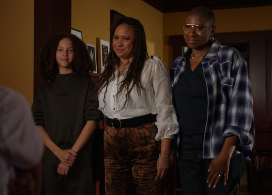
Costume Meta 7x05
Hello, Hey, how we all doing??
Ready for another super long meta post??
There is so much to talk about this week - admittedly mostly Buck and Eddie related, but there is also plenty going on for Hen and Karen as well.
No Bobby this week as we only see him in uniform, and only the one costume for Athena as well. I also want to say that I am not doing any of the costumes from the Madney wedding that we saw at the end of the epsiode - I want to give them the space they deserve and I will probably write a separate pre episode meta for those costumes specifically! All I will say is Maddie looks stunning, Buck in white - hello! and Eddie in a just a collar making him look like a pink priest - hilarious!
The rest is under the cut as always 😎
Let's start with some of the guest characters.
Alien Hand syndrome man continues to prove the check means bad things theme, which makes me happier than you can ever know!!
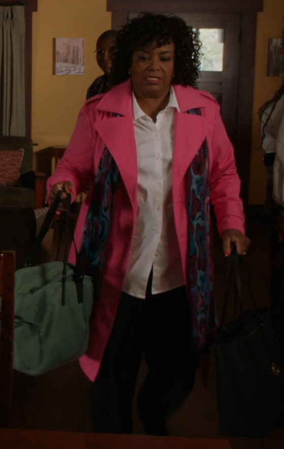
Then we have Deidra in her very bright pink coat. If you read my promo meta for this episode you will have read a fairly sizeable section at the end on my thinking about the use of pink in this season (going to make a separate post during this hiatus so its all in one place). All of the times we see it in this episode, play into (and I guess prove) my thinking. Deidra is acting with good intentions and while I don't think she's naive or innocent in the strictest sense of the word, she is perhaps continually being naive in thinking that not revealing Mara's past is the right way to go (don't come at me about child protection etc I am fully aware of what the real world laws state, but this story arc really highlights the fact that in trying to protect children who are at risk and in the system, they can also cause ongoing harm if things are not taken on a case by case basis - its a whole other essay that I am not getting into here).
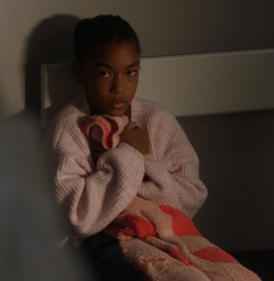
Then we have Mara herself who is never without pink - namely her pink blanket. The pink plays into the theme of innocence especially with Mara and while she may not be innocent of the act of maiming Denny, her innocence goes much deeper. Its meant as a very clear signpost of the innocence of childhood - that pink blanket and her clinging onto it is a symbol of her clinging onto her childhood, despite the fact that she has gone through a terrible loss and trauma. she is still a child and the show is clearly going to play into the idea that as she settles into the Wilson home and is able to work through the trauma, her need to cling onto her childhood in this way will diminish and we'll see her slowly become less attached to the blanket. We already have signs of progress with the colour journey her tops have been on - lavender, pink and then the turquoise one at the end. Lavender is also a colour associated with childishness or lethargy, pink the colour of innocence, and childhood. While turquoise is a colour of calmness and clarity. its signalling HenRen's breakthrough with Mara and that she's growing and beginning to feel secure.
Hen and Karen
Hen and Karen go on a real colour journey this week - I'm doing them together (along with Denny) because they very much work in tandem clothing wise (and also because I was running out of pictures again - whats new there!)
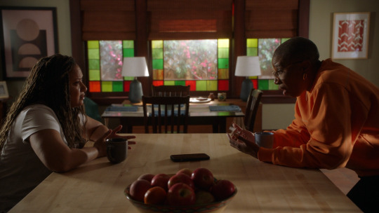
So first up we have Karen in this beautiful dip dye ombre dress in purple, pink and mauve. it also has this drip staining pattern which has deliberately been created during the dying process. The lavender at the top of the dress is representative of hope and serenity, this is Karen in a great place - about to expand her family and fulfil a dream. The pink as I've said is all about innocence and naivety - more innocence in this case - both the new baby being innocent and Hen and Karens innocent hopes for their future. The dark mauve at the bottom of the skirt - eating into the pink is such a choice - gathering storm clouds, foreshadowing the turmoil about to come - taking away the innocent hope. mauve can be standoffish and withdrawn, and in this context those are great descriptors for Mara and her struggles that Hen and Karen will need to help her work through.
Hen's in cyan blue trousers - which is a colour associated with clarity and balance. whilst the cream, black and blue jacket with stars on is the beginning point for a theme that runs through the Wilsons arc this week - black is a power colour, associated with many things, but for Hen and Karen in this arc it is very much about protection and strength. Here for hen it is mostly about protection - protecting this new baby they are about to take in. The cream is warmth and tranquility.
Hen is wearing check - foreshadowing the upcoming struggles with Mara. Karens bronze and black Jacquard trousers are a symbol of strength - bronze as a colour means strength and support, it's also a symbol of faithfulness. It's telling us that Karen will take the lead on supporting Mara and being strong for her.
We see a lot of white on Karen in this episode, white, like pink is a colour of innocence, but it is more associated with purity and balance. It is also a colour of neutral refelction. By this I mean that it amplifies other colours by providing a neutral background - allowing other colours to shine. I find this a really interesting thing when connected with Karen - it amplifies her strength and supportive nature when the Wilsons meet Mara.
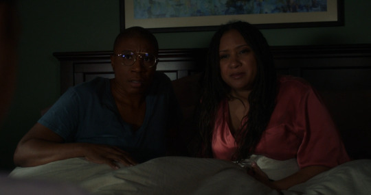
Hen adn Karen in bed are in dusty versions of blue and pink - Karen innocently tries to touch Mara and that is when the screaming starts. Putting Hen in blue is about relaying her trustworthiness and sets her up as a soothing and calming presence for Mara - hence the sleeping on the floor of her room!
At the hospital, We see Denny in red - he was wearing it when Mara woke the house up and its an indicator of what is about to befall them (in the same way Bobbys red in the cruise ship disaster adn Athenas red in relation to Harry, or Bucks back in s5 when Eddie broke down).
We again have Karen in white amplifying the other colour she is wearing, which in this instance is this buff/brown oversized sleeveless coat in teddy fleece. The brown is stability, dependability and responsibility - playing into the fact this episode really highlights Karen's position in the family as this stable rock which Hen and Denny lean on when they need support. Karen's unswerving and solid personality is once more being shown off. Its really a key thing for them to show as it feels like a set up for Mara and how she is going to bond and rely on Karen and that dependability as she unpacks her trauma.
The orange jumper is a really interesting choice. I do love the loose threads on the design of it - paying into the idea that Hen and Karen are at a loose end and unsure what to do going forward. But, the orange itself is generally an open minded colour, its energetic and its also a colour of transformation. These are all things we know are true of Hen and Karen and it hints at the fact that they will fin a way forward. Once again we have Karen in white amplifying Hen's orange and the energy and idea of transformation the colour brings.
Denim jacket and white tee. I love the distressed nature of this denim jacket and the way it plays into both scenes we see it in - playing into the distress Hen feels over finding out what Mara has gone through and how it explains why she has become non verbal and incredibly protective over her pink blanket.
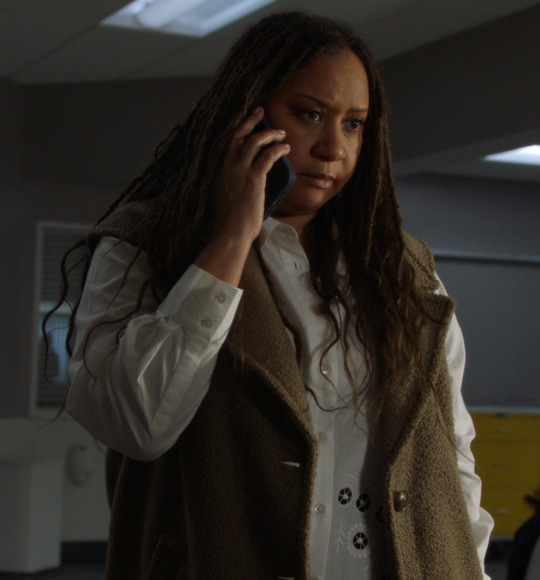
Again the white of amplification and purity. Hen has pure intentions and the white amplifies Karens black when they are at dispatch listening to the 911 call.
We also have the Karen necklace back - once more showing this ism't about Hen - its about Karen and their family.
Black on Karen for this scene is such a choice. Black is a power colour, it means strength and protection. Here it is showing Karens determination, as she gains understanding, to protect Mara and support her through her trauma - it is representative of Karen choosing to use the power she has been given through gaining information. The gold highlights hint at success.
I love these lavender pyjamas on Karen - lavender is a soothing and sleep inducing colour (along with its scent which is possibly where the association came from for the colour) along with a Japanese print of mountains and trees, which plays into the idea of serenity and peacefulness.
Hen in contrast is wearing fairly bright and bold black and green. The green is all about that growth and learning once more, the growth of Hen and Karen, learning more about the issues Mara faces and seeking a solution, but also the growth of their family. The black is a reflection of power - much in the same way Karen wearing black when they heard the 911 call Mara made, here it is Hen, representing the protection that Hen and Karen are offering Mara.
Athena in green - again with the mesh open weave knit - this may be a theme for her this season - potentially something to do with feeling caged or caging someone/something - especially children as both scenes we've seen it so far have been to do with young people and the law in some respect - ending up in the system - Harry through is crime and Mara through her parents death.
Chim
This dark bottle green with a fawn brown (what I think is a polo) shirt underneath is Chimneys only non uniform costume this week . This kind of dark green, is as always a signal of growth, but its also a colour of harmony, and right now - everything in Chim's world is harmonious.
Maddie
I don't thinkI've said it yet, but I am so happy to have Alayna back dressing Jennifer - I feel like we're really back on track with Maddie's costuming after last season where they somehow managed to make Maddie look terrible. The costuming overall last year was fine - not as good as Alayna's work, but it was for the most part good - except for Maddie where it was all over the place!
Anyway - Maddie in black here is very much about focussing the attention on Hen and Karen - like with CHimney's muted green, in tandem they are making the viewers eye focus on Hen and Karen - especially Karen - who is the brightest in the room.
Maddie wearing this sage green colour when Buck comes out to her is sheer perfection from my perspective - we, once more have the green of growth and renewal, the green of learning - Maddie learning more about her brother - this new thing that he is realising about himself and choosing to share with her (even if inadvertently). But this green is also sage green - sage as in the play on sage advice - which we see Maddie give him. Buck needs that good advice - he needs to hear that its ok, that he can take the time to figure himself out and that its ok that he's only just uncovered this aspect of himself and that it doesn't invalidate him being an ally up to this point!
Ok not going to lie - I got a little carried away from here on out - so sorry in advance for the rambling mess you're about to read!
Marisol
I'm doing Marisol in a weird order - because I wanted to talk about her date night outfit in tandem with Eddies - because its relevant. So we start of with virgin Mary Marisol! Honestly this outfit is just perfection from the costume department - they saw the brief and went to town and I love it. Its so good to see what they can do when they get to play!
One of the things I really love about this costume is the blue that they chose. Because that blue - that is Bucks blue! the virgin Mary blue is usually a much brighter royal blue. It really helps to place Marisol in parallel to Buck and we get the play on t he fact that Eddie seeing Marisol in this way changes everything for him, whilst later on, whilst Buck is in the same blue, he reassures him that nothing will change between them.
Look, I'm not going to lie, when I saw Marisol in blue and yellow for this scene I laughed because Blue and yellow (as I've gone on a million times about) means queer coding so to blatantly put Marisol in it - in a washed out form, and very much connecting her to Catholicism - genius move. It marks her out as a roadblock, but also puts her into the role of beard (unknowingly on her part) because Eddie is still in the midst of his repression, even if it is beginning to unravel now.
The black top with spaghetti straps is clearly a theme they're going with on Marisol, as are the ditsy prints. The yellow high waisted trousers are interesting because of the specific shade of yellow. Yes the whole communication theme still applies here -and we see it in action, but this shade of yellow is sallow and sickly (one of the reasons its called sickly yellow is because its the colour of a lot of medications!!) - this relationship and its restart are ill and that automatically means its going to struggle to survive.
It plays into the more negative meanings around the colour - uncertainty and idleness and cowardice. For me the cowardice aspect is an interesting one in relation to Eddie - he has behaved cowardly up to this point - hiding out and not having the conversations that need to be had, and even in this scene it is Marisol who takes the lead.
It's really giving us an indication of things Eddie needs to work on in regards to himself - and once more it comes down to communication. Communication has always been Eddies major flaw - that he isn't good at it, unless really really pushed into it - essentially under duress. The other thing with communication is that it plays really well into the catholic guilt aspect - this idea that growing up catholic has taught him to repress part of who he is - to go along with what is expected of him, but that it also taught him not to ask for what he needs, to not communicate. We see it in this episode with his inability to say no to Marisol (the whole hiding out at Bucks so he doesn't have to have sex speaks volumes) even down to suggesting there's a third type of guy - who just needs a minute. Because, while that might be true to a certain extent, the fact that he says this off the back of her expressing her distress and upset about how all guys are one of two things, speaks volumes - its not him saying this because that's how he actually feels, its partly him saying it because he is pushed into a position where he doesn't want to be the bad guy. its really not a good place to be restarting a relationship from.
We also have the ditsy print of doom in play again - like I've said before, ditsy print on Eddies girlfriends - never a good sign - its really playing into this idea of Eddie jumping in headfirst with gay abandon (pun intended) and then regretting his life choices. Shannon wore ditsy print a fair amount - especially in the I think I'm pregnant' and 'we should get a divorce' scenes. Ana wore ditsy print A LOT - she was wearing it when Eddie had his panic attack in the shop and at other key moments that marked the death knell for their relationship. And so this appearance of ditsy print here marks the same - the relationship is not long for this world
OK date night Marisol. The way this outfit played out more or less as I expected, She was very much an 'innocent' bystander in this scene (whilst also creating one corner of a triangle with Buck and Eddie) , and the ditsy print very much played into this. Like I said in my promo meta, both Shannon and Ana were costumed in ditsy print as well as in lots of pink!!!
The other aspect of this outfit that is making me laugh is the fact that the skirt is giving me 1980's/early 1990's teen vibes (not to out myself as old but trust me I had some just like this back then and I wouldn't be caught dead in it now as a grown woman!!) and the baby pink handbag looks like something an 8 year old would have to play dress up with - its all very childish and immature - naive one could say, and while it didn't play out quite how I was expecting, her being a novice nun, sure explains a lot of why she comes over as pretty immature.
The other aspect of this childish style we're seeing on her plays into Eddies narrative of looking for magic and trying to recreate what he had with Shannon. He's attracted to Marisol because she is immature and childish - it reminds him of what he had with Shannon when he was young, and when you're trying to recapture that, its easy to fall into the trap of thinking someone behaving in a naive manner is you finding what you'd been looking for. Eddies journey, along side his catholic guilt, is about learning that he cannot recapture or recreate that magic he had when he was young - that the love of youth - in all its innocence is not something that is sustainable or actually what he wants in the present.
Then we have Eddie in white. I spoke in the promo meta about how the white set him and Marisol as opposites and that remains true - very true on more than one level. What I especially love about it and something I could not have predicted is how it plays into the novice nun aspect of their story this episode - truly this show is a comedy! Because nuns wear black and white this is an obvious play on that, but it is also a play on the fact that Marisol is still a practicing catholic, whilst Eddie is very much not. The other aspect of this white is that of Eddies two non uniform costumes, it is the first one and we get this black and white play on religion - the black and white of nuns and priests - the black and white of being religious or not. Eddie never questions if he wants to become a practicing catholic again - he is lapsed and that is how he intends to stay.
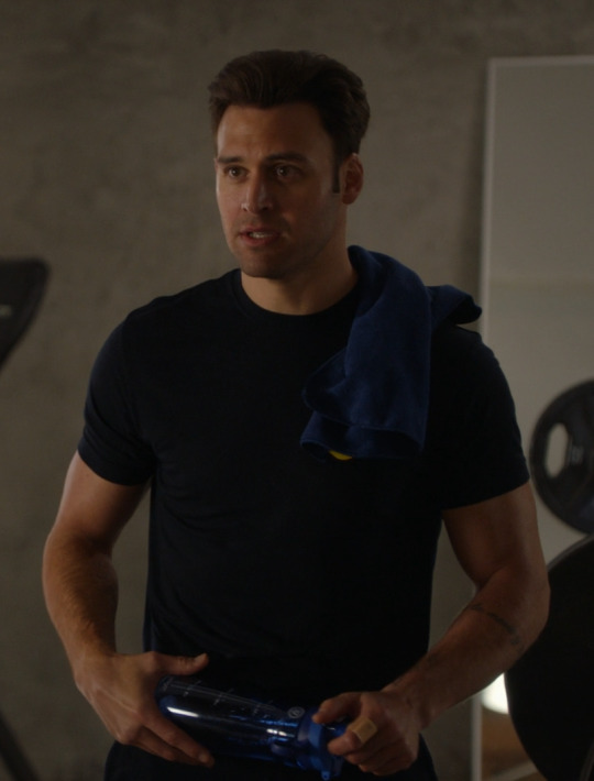
Eddie in uniform, with his green trainers, blue towel and water bottle. the blue towel and bottle play into the buck and Eddie blue green theming we see with them. But what is interesting is though is that Eddie is fulfilling all the colour theming on his own - he is both blue and green - to me this is about Eddies own struggles within himself as well as foreshadowing the Eddie Marisol break up down the line (green shoes suggest a road needs to be to walked before we get there) - it hints at Eddies internal struggles and implies that its will ultimately end in a break up a bit further down the line.
I also think it's only when in Uniform that Eddie can admit to his catholic guilt. Because we all know when Eddie is struggling with some form of emotional turmoil, he wears a black singlet - and he could've been wearing the same here, it would've been totally fitting with the situation - he is going through something emotionally and struggling with it.
But he's in his uniform. Part of it is to have him on a different level to Buck - they are both struggling with something in this scene. When we have previously had Buck and Eddie scenes like this one at work, the one dressed in uniform, tends to be the one offering advice to the one not in uniform. That isn't the case here. Part of it comes back to Buck not actually needing advice, but needing to reveal something about himself - to confess. Eddie is the one who needs advice.
This is a flipping of the traditional narrative for these scenes and is proof that even though Eddie might later tell Buck that nothing is going to change between them, that it has in fact already changed, it is just that neither of them are fully cognisant of that change at this moment in time. It is a key indicator to use the audience that this has happened before but that things are not going to play out the same way this time.
Put it this way - Eddie has form for doing something extreme with his relationships with women in the aftermath of Buck doing something dumb - its one of the manifestations of his repression. This time its asking Marisol to move in with him in the immediate aftermath of Buck going full green monster over Tommy.
Last time it was in the aftermath of Buck begins and then doubling down with Ana after the shooting when Buck had hooked up with Taylor and before that in the aftermath of Shannon's death and Buck suing the department he went and joined a fight club - but he has form. Its completely in character for him to pull this sort of a move. I know he says he's going with his gut but I argue he is in fact ignoring his gut - or at the very least confused about what his gut is telling him, because that would mean actually looking at why his gut reaction to Buck doing something dumb makes him do something dumb in turn connected to these women in his life.
Eddie in black - this is the same shirt as the white one - just the reverse colour - which is important. This shirt has several layered meanings to it. its about the reversal of what Eddie wants - from him being bubbly and excited about Marisol moving in, to the dread of her having moved in and wanting her to move out - his feelings go from white to black - light to dark - happy to unhappy and it all sums up the relaity of that relationship - while it was new and unserious, it was fun and light, when things got real - it becomes dark and oppressive.
I'll go into more detail about this shirt when I get to Bucks costume for this scene - because they are connected!
The other thing about this outfit is that the green trousers have been replaced with jeans. Now I see a couple of reasons for the wardrobe department doing this. Firstly is that it plays into the 'nothings is going to change between us' of it all. Its a visual indicator that in fact things have changed (along with Buck wearing a brighter shirt than we normally get in these buddie heart to hearts that take place in Bucks loft but more on that later) the Buck being bi and going on a date with Tommy of it all aside, this is the first time we've actively seen Eddie hiding out at Bucks to avoid his girlfriend - this was a barrier that had existed between them previously that has now been broken down. Then there is the fact that Eddie does go home to Marisol - and he couldn't be wearing green at that point because she was wearing blue and Eddie in green would've meant break up time - only the Marisol as a plot device arc isn't yet over (it will be soon I promise - all the costume signs are there!) so that couldn't happen.
Tommy
This dark olive green shirt that is almost brown. The brown undertones hint at the stability he represents while the green is hinting at his military past and once more paralleling him with Eddie. One of the things about green as a colour is that its not only a symbol of growth and renewal, but its also a colour of learning, and in an episode titled 'You don't know me' it feels like all the green is very much about education - learning about other people - and the growth that results from it. It feels especially important here for Tommy and Buck - that is after all what going on a date it all about - learning about one another and seeing if you're compatible.
The other fun thing about this green shirt is though that the green plays into the blue green colour theory when it comes to Buck and Eddie and their partners and the end of relationships. This one before its had chance to begin.
For Coffee we have a grey Henley and a blue zip front hoodie with a grey striped undertone to it (I am pretty sure this is actually a hoodie we've seen on Chimney but I can't remember when and I don't think it would be the very same one as pretty sure Lou would not be fitting into Kenneths clothes ever, but Chimney has definelty worn the same style!!). Again Henley's are an Eddie thing, so we once more have the parallel with Eddie being drawn.
The interesting thing here is that the grey blue is the same colour combo Buck wore on their first date attempt - the costume department played a lot with flipping colour in this episode, so to have it done here as well is really fun - the fact there is more grey than blue is also interesting. It's a neutral colour, it is seen as a colour of stability, but is also a colour of uncertainty. It really plays into that theme of uncertainty running through the Buck and Tommy arc. The blue hoodie is actually pretty important because we've had one of Buck and Tommy wearing something dark blue in every scene they've had together - usually the one on the back foot. Tommy in this scene is relatively neutral in terms of position for most of this scene - they are equals - but he is put onto the back foot by Buck asking him to be his date to Maddie and Chim's wedding.
Buck
Where to start with our beloved bi disaster!
I obviously spoke a fair amount about the date night shirt in my promo meta. The navy blue knit bowling shirt with these silver/grey close together pinstripes running down the front playing into the Buck wearing vertical stripes theme we've has running with him for at least the last 2 seasons.
What I said about false starts and this date absolutely played out - in the same way the sperm donation shirt represented a false start on that donation, this shirt also represents a false start on Bucks dating life as a bi man. The white trainers are also carrying on the theme of Bucks Journey towards happiness
What I find most interesting about this outfit though isn't colour theory related. its all about the fit of the clothes. Because these are ill fitting on Buck - not something we see from him very often - in fact I think the only time we see him in anything close to ill fitting to this extent is back in season 1 when he was figuring out who he was and if being a firefighter was the right for him and exploring relationships and what he was trying to find in that arena. The trousers are the most ill fitting of it all, but I'll come to the trousers later on as they are part o a wider Buck costume theme we have going on!
The shirt is a little roomie, but not overly so, it just stands out more because we're so used to his shirts fighting for their life, here this one is baggy and really helps to sell the idea of defeat, but also that h was trying on this new part of himself for size and that it doesn't quite fit. It's the only time this episode we see his clothes not fit him in this way and its a really small but expressive part of costuming that I love to see.

Then we have this blue broadcloth jacket over a white tee and with these plum/brown coloured trousers - they're a bit blink and you'll miss them so its hard to be sure what type of trouser they are, but I think they are essentially smart joggers - jersey material but trousers!
We all know that Buck in white means trouble, I'm putting him outing himself to his sister as the bad thing - along with the fact that the date didn't work out.
I'm really fascinated by the fact that we really seem to be leaning into navy blue and Buck being bi. Navy has always been a colour we've seen a lot of on Buck in general, but there is something about the fact we've seen him (or Tommy) wearing it in every single scene that is about his bisexuality. I'm talking from the kiss scene onwards, not anything before that as Buck wasn't aware of his bisexuality before the kiss. I can't wait to see if it continues!
The green shirt jacket is an interesting one. it obviously helps to play into the buck and Eddie blue green theory, but it does in a smaller way play into the blue green theming we see around Buck and Eddie and their relationships - specifically around issues arising. Both Buck and Eddie wear green when they break up with their significant others and while there is no break up here, there is a break of sorts. This was Buck about to try and tell his Best friend that he was actually out on a date with Tommy and that he's bi
symbol of growth - Buck went in with a goal - to tell Eddie he was on a date with Tommy, but changed tack when he saw Eddie needed to go through something - this is Buck growing as a person - not making something about him.
The other thing about this outfit is that its basically the same as the one Eddie wore at the airfield (even down to the badding of the trousers) - just in reverse - Eddie black trousers, black jacket, green top, and here Buck is black trousers, black top and green jacket - I find this fascinating as a metaphor for where the two of them are on their respective journeys.
Buck is now bi and out (he's told his sister) and has been on a date with a guy (regardless how successful it was - he cannot put it back into the box) - his growth is externalised and therefore expressed through the wearing of a green jacket. We get a lot of storytelling through the various Jackets Buck wears (we've seen him in over 35 at this point!)
While Eddie - who we could say was being taken on a date by Tommy - even if he didn't know it (because who flies someone to Vegas to a sold out fight if its not a date??) wearing a much brighter green that we've seen on him before now (pretty much all of his greens are more army green with a couple of exceptions - much darker greens akin to Bucks jacket in the below picture) - still in the army green wheelhouse, but much bolder. Eddie's queer status is still very much internalised - hence it being underneath the black jacket.
Buck coming out to Eddie from a costume perspective was a glorious parallel that I have already mentioned in the promo meta (I've run out of pictures so you'll have to go watch the scene yourself if you want to see what I mean). Its actually a bit deeper that I appreciated in that promo meta, but that is in part because at the time of writing the meta I wasn't 100% sure it was a coming out scene and I didn't get to see the way it was shot and how that also played into the paralleling.
Costume wise - I already spoke above about Eddies black shirt and how it is reversing him in the episode. But what I didn't mention is that fact that it parallels in colour terms, what he was wearing when Buck informed the firefam that Connor and Kameron were pregnant. Eddie wore a black marl henley - black with flecks of dark grey running through it, and Buck here is wearing a slightly darker blue version of the same top he wore in that same scene. He is standing in the same place at the counter of his kitchen, or sitting very close to the same position and we get similar camera angles. As a whole the parallel is very loud - Buck was happy and proud of something he had done and wanted to share it with his friends - wanted their approval. He was feeling good about himself and confident in his decision.
The biggest thing about the blue - this shade specifically is the way it play into the blue theme we saw last season with Buck - the theme that started in the 5x18 finale at Hen and Karens vow renewal, when he was free of Taylor and moving forward and essentially restarting his search for happiness. We saw it weave a thread through the entirety of season 6, being worn at key moments that played into that theme - after Lev died, at various points in the sperm donation arc, and a key points in the aftermath of his death and rebirth.
The successfully helping create life aspect of this is so interesting. It on a low key level plays into the you don’t find it you make it manifesto that’s been at the heart of bucks arc since s2. the whole year if yes was supposed to be about this very thing - about Buck creating the life he wants for himself - the sperm donation isn’t about the baby it’s about Buck and about him figuring out what he’s missing (which comes back to not only Thomas and Mitchell, but also Lev).
The other thing that ties into this theme is that Eddie isn't really changing but Buck is. Whenever we have a scene at the loft between Buck and Eddie Bucks costume and colour varies, but Eddies stays more or less the same. Bucks colour Palette for these scenes goes - dark grey in the you want to go for the title scene, then we have the grey blue on the balcony and now this much lighter blue. This is highlighting Bucks progression while Eddie who remains in his black shirt and that progression - while Eddie essentially remains steadfast - is key - it’s showing us that while buck is still doing dumb things, he is learning - he is listening to whatever Eddie is telling him - that he’s accepting Eddie’s absolution of his sins more and more - growing and understanding.
It’s building on his long running arc - his fear of being left behind, of not being important enough for people to stick around for - and showing us he’s increasingly understanding that that fear is unfounded - that he’s found his personal- the one who will stay and who is steadfast in that. That’s why we see Eddie unchanging in his black shirt green cargos while buck gets lighter - more unburdened by that fear.
Before you think all is lost on the Eddie front though, we are seeing change - the army green trousers are gone and have been replaced with jeans - perhaps, in the same way Bucks growth into his bisexuality began with his beginning to wear jeans again, Eddies own growth into his own queer identity also begins with jeans - moving him away from Eddie the soldier - fighting for others - being a rock for others and now into a position where he can do his own growing.
In the sperm donation arc, Buck was finally able to donate and was wearing that super pale mint green polo. we don't see the same with the outcome here at this point in the story (although the beige/mint green jacket from the bachelor party is making me👀👀👀 at this moment in time!) - we get this cream open weave linen shirt with black and terracotta and golden brown vertical stripes.
I love that they went with a shirt that has such an open weave - playing into the whole concept of Buck being open and embracing this newly revealed part of him that he's discovered. But what I love most about this shirt is the way it ties back into the Buck learning to accept himself and find his happiness.
Because this shirt is so similar to the one from 6x01 - when he decides he doesn't need a new couch, what he needs is to be ok on his own and with himself.

lets talk Buck and his trousers because the trousers are a whole thing this season and I am truly in love with the long game the wardrobe department have been playing on this one. They know that we have all been out here raising eyebrows at Bucks trousers for the past few seasons as they've gotten shorter and shorter and ill fitting. I know I've made comments in previous costume metas about the fact they must be doing something intentional with them being so short in the leg - that them doing this is giving the appearance of a child who is still in short trousers and isn't fully grown - hasn't moved on to wearing full length trousers yet.
Well it would seem I was right and thats exactly what they were doing, putting him in short trousers to show that he wasn't his fully formed self - that he was growing and learning and figuring things out. because - I've gone back through my spreadsheet and checked his trousers out for all of his scenes and there are only a handful where he has trousers on that are well fitted and the correct length. One of them is at the start of season 6 - at the end of the episode where he moves his armchair instead of getting a new couch - the one time in season 6 we see him most at peace with himself
I remarked in the 7x04 meta that we only saw Buck in his too short trousers in the one scene at the airfield, and from then on, he was was in jeans. Now the jeans are a mimicking thing - Buck hasn't worn stone wash jeans since Eddie appeared on the scene back at the start of season 2, so for him to start wearing them again as soon as he becomes jealous of Eddie and Tommy - and Tommy is wearing jeans - was pretty telling in its own right. It's Buck trying to get Eddies attention (not Tommys - Eddies) because, we do not see Eddie in jeans in 7x04 - but we do see Tommy in them - and in Bucks head he is loosing Eddies attention to a guy wearing stone wash jeans - so if he wears stonewash jeans then maybe he'll get Eddies attention back.
That obviously didn't work out how Buck thought it would, but it did lead to him figuring a new part of himself out.
We can see how his trousers are all now sitting at the correct length, I grabbed this still of the black ones, and you can see in the full length still from the date those are as well (even if they're too big more generally) but the others are all sitting at the correct length as well.
We also see the jeans back for his scene with Tommy - I truly am fascinated by the choice to put him back in stonewash jeans aafter so long as a theming choice for his bisexuality, I really am enjoying this more relaxed looking Buck from a costuming perspective - the journey we've been on with his costumes is great - the increasingly formal style thats just a little too small and tight we've seen over the seasons now slowly relaxing once more into something much more comfortable and well fitted - showing just how far he has truly come.
And thats me out for another week! Sorry it turned into another epic - it would seem `i cant stop myself! Not sure if this has come out longer than last weeks, I think it might've, but I can't be bothered to check! Thank you as always for reading this monster and I hope you enjoyed this deep dive into the costumes for 7x05. I'm off now to hyperfixate on Bucks bathroom door and get myself though this mini hiatus!
Tagged people below
@theladyyavilee @gracieryder @xxfiction-is-my-realityxx @bewilderedbuckley @spotsandsocks
@bewitchedbewilderedbisexual @rogerzsteven @wanderingwomanwondering @oneawkwardcookie @leothil @copyninjabuckley @shammers86 @crazyfangirlallert @missmagooglie @katyobsesses @radiation-run @gayandbifiremenofmine @bi-moonlight @crazyaboutotps @princesschez75 @alliaskisthepossibilityoflove @sherlocking-out-loud @satashiiwrites @lover-of-mine @yramesoruniverse @extasiswings @favouritealias @pop-kam
#kym costume meta#costume meta#911 costume meta#911 colour theory#eddie diaz#evan buckley#911 abc#hen wilsom#karen wilson#maddie buckley#chimney han#Tommy Kinard#long post#kym writes things#deep dive
150 notes
·
View notes
Text
one aspect of azula in the spirit temple i don't think i've seen anyone discuss (because it's largely conjecture) is the form the spirit takes when presenting itself as human to azula. back when book 2 of lok was airing, there were lots of theories circulating that azula had an unacknowledged cameo as the shaman who helped to heal korra in "beginnings." i've even commented on this theory in the past. now, while this hypothesis remained unconfirmed for years, it feels as if this comic is lending credence to that idea with its undeniable imagery. i think this comic is suggesting, however subtly, that the spirit is taking the form of azula's future self.

azula's hair is as crucial in this comic as it is throughout the show. it's been a while since her breakdown during sozin's comet, so her uneven bangs have grown to slightly below her eyes. the fact that she has done nothing to "fix" these loose strands recalls her introduction, wherein "one hair out of place" was enough to upset her for fear of not being perfect. through azula's disgrace, she has shed her perfectionism (born of ozai's abuse), but the state of her hair also illustrates how frazzled and disoriented she feels, and how in not caring about her own presentation here, just how debased she has been since her initial fall from grace.
now, notice who mirrors those overgrown strands of hair in their own presentation. the spirit reflects azula's inner turmoil, not only by projecting manifestations of her desires and anxieties, but externally as well. this spirit essentially functions as azula's mirror (shattered mirrors of course being a hugely significant symbol within azula's psychological landscape).
note who else is framed by these two loose strands of hair:

while this shaman in lok is hardly identical to the spirit's humanoid form in this comic, this crucial piece symbolism (retroactively employed, especially considering that the shaman's loose strands are smaller, perhaps indicating a calmer mindset if we extend the logic of what it signifies) feels like a deliberate allusion on the parts of the writers and illustrators of the comic. they clearly don't have the leeway to say what form azula's future will take (they can't even "redeem" her, since it could potentially interfere with avatar studio's plans for other projects down the line), but by addressing this largely baseless fan theory of yore, it feels like the comic is intimating that in the grand scheme of things, despite how abject her conditions (both external and internal) may be now, she's gonna turn out all right.
#this is probably the only lok fan theory that was floating around at the time that i dont fully hate#as opposed to theories of sokkas progeny or katara being relegated to aangs housewife or whatever. which obviously suck so bad#azula in the spirit temple#azula#id in alt text#analysis#i have a couple more posts left in me after this about the comic#but i think my prev post abt it and then this one covers most of what i wanted to say#though maybe i'll discuss the 'asylum' and zuko's figuring bc i've seen some cool posts abt that and i wanna insert my 2 cents#but idk. anyway . one must imagine azula happy
135 notes
·
View notes
Text
MILGRAM Best Song Tournament, Round 2, Match 3 MAGIC vs. MEME

Propaganda for both options under the cut!
Propaganda for MAGIC:
MAGIC MY BELOVED MAGIC!!! Its one of the best MVs in the entire series, even including T2. Magic is visually stunning and has some fantastic art direction but also is very clever in how it conveys its themes and ideas. Magic doesn't really hide anything from you, not really. It's all symbolic but it Tells You Things. It shows you the abuse, it shows you the cat. There's a fun little relationship going on here where, In Magic. Amane's pain and suffering isn't taken seriously by the people around her and the Audience we are discouraged to take it at face value due to the fictionalized nature of Magic. It's so cool. I'm so fond of the song as well, it's one of the best in the series purely cause of the Layers in it. The implications of this Inability to be good is seeped into Magic. Amane knows this isn't reality, Magic knows it's a show, she watches it at the end. And it's so Sad to me that even in her fictionalized happy world she Cannot be a good girl. It's a standard completely out of reach for her and that idea is just conveyed so well visually.
Im not even talking about the goddamn cat yet- the cat symbolism goes Deep. That cat is HER it has the same wounds Amane has in Purge March. I- I cant talk about the intertextuality of Purge March and Magic here this is Magic propaganda only- I- there's so much good stuff to Magic. I Re watched it over and over again. It has some the Best Writing and Visual Communication in Milgram and I will Die on this Hill.
---
shoutout to magic for having pretty props AND being vague as fuck about the crime! diversity win!
seriously though amane looks SO cute in it! the mv has such a pretty and colorful style and even with that it's able to show the horrors of what amane went through.
adding onto my last point. that scene where the cat is hyperventilating and you see the camera shaking???? that scene where the mascots find amane helping the cat and they're all standing over her? CHILLS. im repeating myself but the fact that they were able to portray the awful things amane went through in a genuinely emotional way while still keeping the cute cartoon look is soo impressive
there are SO many layers to itill the entire cartoony style making it look like a tv show… utilizing the cartoony effects and bright colors to show amane downplaying her own pain… the transformation after she gets punished barely changing anything to show just how manipulated she was from the start… ueueueue
ALSO ALSO ALSO THE SCENE AT THE END WITH AMANE STARING AT THE SCENE? OHHH ITS SO GOOD it adds such a feeling of dread and reminds you on top of this whole thing that all of this is truly horrifying! something is going on here!
this song is so catchy it gets stuck in my head CONSTANTLY
"Dear wise one, Am I worthy? Is it ok to spoil myself?" AMANE... UEUEUUEUE
the little ding sound effects in the instrumental?????
amanes voice is ADORABLE
THE INSTRUMENTAL IN THAT PART WHERE SHES HELPING THE CAT HAS THAT GODLY TYPE SOUND YOUD TYPICALLY ASSOCIATE WITH CHURCHES AND STUFF AND I DONT KNOW HOW TO EXPLAIN IT PROPERLY BUT JUST RELISTEN TO IT AND YOU WILL KNOW WHAT I MEAN. ITS SUCH A NEAT DETAIL
i could go on about this mv for days but i am not a theorist unfortunately. just. magic sweep
Propaganda for MEME:
"MeMe is fantastic because it plays off the audience’s assumptions about Mikoto as a character and tells a “double story”. There’s layers to it and it’s deliberately deceptive in the way it presents the events out of order. Even the instrumentals themselves tell a story. The shift from piano in the second chorus climax is so good - and the way they combine in the last chorus, plus the addition of a violin culminates the song perfectly."
---
"For propaganda: I love meme so much because even the music alone tells as whole story. It goes from heavy metal to calm to heavy metal to calm and that happens a few times and then there’s an epic and creepy intermission with an amazing guitar and a scary of sound of Mikoto’s heavy breathing. And then the psychedelic music and BAM the final chorus. The final chorus of meme just gives me the absolute chills. Like it’s the calmer chorus we see earlier but with epic symphonic metal and an amazing build up and climax like it’s perfectly encapsulates a story through music alone I just love it so much. Also it’s literally called meme lmao."
---
"I could go on about the motifs in MeMe - like identity loss, living and dying, dreaming etc. It's a song, more than with any other character, about the inner self and what hides from the surface. Of the fear that comes with one's identity and place in the world being challenged and crumbling. The intricate designs on the tarot cards have so much depth to them"
64 notes
·
View notes
Text
PT Outfit Breakdown: pt 3
This is part 3 of my series regarding my opinions on the phantom thieves' metaverse outfits, as prompted by a poll by @waywardsalt. As with the previous 2 parts, these are strictly my opinions on the designs (oriented towards what i'd change about them), I'd love some discussion but I will ignore you if you're an asshole.
Akechi - Ann - Sumire - Futaba - Yusuke - Akechi 2
Next up is Makoto, as she's my least favorite female thief's outfit by far and my second option for worst outfit.
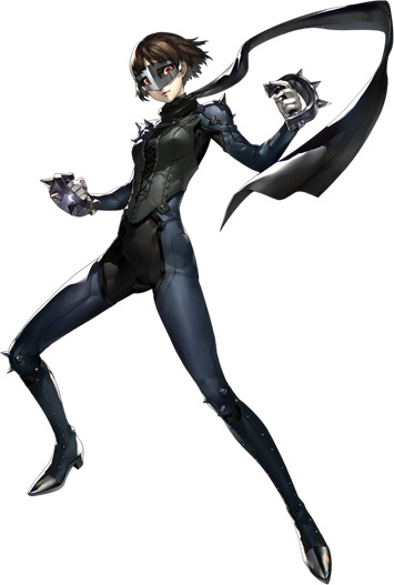
It must be said, much of my intense dislike for this outfit comes from the fact that Makoto just has so much potential to work with, and instead we ended up with this corseted monstrosity. I find it just as objectifying and sexualized as Ann's outfit, and firmly believe its overlooked only because 1) ann's arc is more egregious about this and thus takes most of the heat 2) makoto is presented as being more comfortable with the outfit from the onset of it appearing 3) it lacks the skin showing that most people immediately associate with sexualization, even if its skin tight and designed to specifically frame her ass and crotch.
The outfit seems to mostly be trying to pull on biker aesthetics, to match her persona, but I feel it doesn't do this very well outside of the obvious spikes. They could have also pulled pretty easily from Johanna's medieval and papal symbolism and history, which would have also nicely tied into her royalty-inspired code name, but they don't do this at all. Another possible source of inspiration could have been the sukeban, or the japanese girl gangs that arose in the 1960s and 1970s in response to bancho gang's refusal to accept girls in their ranks. This would have been an excellent tie in and contrast to her role as student council president, and created a deliberate juxtaposition with the over-sexualized idea of the Japanese schoolgirl and the way Kaneshiro threatened her and other female student's with prostitution if they didn't meet their deadlines. This isn't implied in game at all (as far as I'm aware) and is mostly wishful thinking on my part.
The first thing I would incorporate into this design is a jacket. I CANNOT believe they tried to pass her off as a biker character and didn't give her a jacket or vest of some sort, one of the major hallmarks of biker gangs. Either way, this outfit is entirely skin tight and desperately needs something to spice it up, and a jacket provides extra dimension and flair; I would personally prefer a leather jacket with patches, as again, that's the iconic biker look. Whether or not the corset is kept or removed I'm largely ambivalent to, as its one of the only medieval/papal themed elements, although I do think it looks extremely tacky.
I would definitely add knee and elbow pads, as those also lean into the biker aesthetic as well as emphasizing that she is a fighter. And for the LOVE OF GOD, give this girl some combat boots!!! She needs some damn curb stompers up on this bitch, not whatever weird little dress shoes she's got here. I do approve of the spikes on the knees and shoulders, those are 10/10.
While the scarf is kind of mid in my opinion, if you wanted to incorporate the sukeban look, you could change it to the sailor suit scarf or neckerchief, as they're iconic and easily recognizable. On the other hand, there's also the opportunity to incorporate the papal stole if you get creative about it. I've also always liked the idea of incorporating spikes into her braid headband, which has both rebel connotations and would mimic a halo or crown.
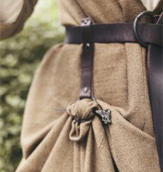
If you really want to mix it up, I'd really like to add a skirt to her outfit. A long skirt would billow nicely with action, create a juxtaposition between femininity and Makoto kicking shadow ass, and again adds some dimension. You could go pleated to invoke the sailor uniform skirt, or have it simple and pinned up the way medieval women would have to farm, similar to the photo below.
Overall, most of my beef with this costume comes from its sheer lack of originality and the fact that it blends together because the elements are all too dark and similar in color to stand out. By incorporating some of the rich potential of the elements associated with her character, this costume would become much more interesting and much more bearable. It's just so meh in its current state. I rank this one as 8th place out of 10 and an overall rating of 3/10.
#makoto niijima#persona 5#persona 5 queen#persona outfit critique series#i honestly think a lot of my dislike with makoto could be solved by removing the cop arc and letting her be more masculine#she'd be SUCH a great character as a butch lesbian PLEASE ATLUS
13 notes
·
View notes
Text
Last thing I want to talk about before the finale while I’m out here on my bullshit is vanilla vodka. I’m aware of how ridiculous that probably sounds but I couldn’t help but notice that, while alcohol comes up many times throughout the series, vanilla vodka specifically only is shown/mentioned twice, which makes me raise an eyebrow a bit. This is mainly because it’s also the only time they’ve specified a flavor of flavored alcohol, which does make it stand out a bit.
The first time vanilla vodka comes up is in s1 e3 in the middle of the reading of Trent’s article when that narration pauses for a moment to show Roy confronting Jamie about Nate as a way of demonstrating the effects of Ted’s coaching style that Trent was in the middle of talking about. [For the record, the line is: “His coaching style is subtle — it never hits you over the head — slowly growing until you can no longer ignore its presence.”] In the part with Roy going off on Jamie, he takes a sip of Jamie’s drink and makes the comment of “Vanilla vodka? Such a child,” before leaving. The second and only other time vanilla vodka is specifically featured like that is in the Amsterdam episode when Trent, after talking with Colin, goes out clubbing with him and Colin orders vanilla vodka from the bar, which Trent tries and doesn’t like.
Honestly, if it weren’t for the fact that the second time this comes up is with those two at that point in that episode, I would’ve just ignored this. However, something about having Trent come out to Colin and them bonding over being gay with Trent becoming like a mentor to him and then, coming off of that, having them go out and have a positive experience together with Colin comfortably being himself and all of that then has the aforementioned vanilla vodka thrown in, like an endcap to that whole thing, feels like a deliberate callback to s1 e3. This could serve to point out that Jamie and Roy are in fact super gay for each other but, like Colin, they aren’t comfortable acknowledging that yet and need a nudge like Colin got from Trent or perhaps it could be about Trent himself, the one common denominator between those two scenes.
If it is supposed to be indicating something about Trent, then I feel like whatever it’s pointing at would have to also feature Ted, since that’s who he was talking about in the first scene. So then, if these two scenes are linked and are meant to point to something involving both Ted and Trent, then I feel like the natural conclusion is that it’s meant to indicate that Trent isn’t just into men, he’s specifically interested in Ted. The other thing is that we are still talking about vanilla vodka as a symbol here, and I think it’s important to acknowledge that vanilla comes from a type of orchid, like saffron, and if you look up the meaning of orchids in flower language, they represent love, beauty, fertility, and virility. As far as a symbol in media to represent attraction, I’d say that’s pretty damn solid. Also, maybe this is a reach, but I do think it’s worth noting that it’s vanilla vodka, not any of the other million other vanilla flavored things out there, and that alcohol historically has been referred to as ‘spirits.’ If we go with this combination of symbolic meaning, then this vanilla vodka could actually be representative of a spirit filled with love and admiration of something beautiful.
The last thing I want to talk about with this ridiculous post is how Trent views Ted at both of those points in the season. In s1 e3, he went in skeptical and then spent a whole day with Ted, which changed his mind and gave him a far kinder view of the other man than anyone thought he would have. The article he writes is still kind of critical, but the entire second half is basically praising and expressing wonder at Ted. What we get in that episode is Trent Crimm being curious about and inspired by Ted and we see as some change is sparked, like this is the very beginning of the massive development we see from here out. In comparison, s3 e6 is basically showing sort of the end result of all that change Trent went through that was initially sparked by Ted. We see Trent being nothing but kind, helpful, and understanding, showing absolutely no interest in using anything at all from that episode in his writing even though that’s officially why he’s there, and it’s because of Ted. I think the vanilla vodka really serves most to mark the start and end of Trent’s individual character arc, which entirely centers around Ted, and perhaps also indicate that, while Trent himself has completed his own arc, there might be more to come regarding his relationship with Ted. And yeah, I know how wild that sounds lmao
#ted lasso#tedependent#tedtrent#ted x trent#ted lasso meta#tedtrent meta#tin foil hat#ted lasso theories
22 notes
·
View notes
Text
randall and hopkirk deceased as an extended metaphor for reactions to severe trauma
i think theres a lot to be said about martys death as like. a metaphor or symbolic of severe trauma. its a life altering event that fundamentally alters everyone involved. marty obviously. because hes dead. but what if we think about it in a less literal, more abstract way? i dont know. there are a few experiences for the characters in this show which regardless of how they were intended, resonate a lot. for the sake of argument im avoiding referring to the event as 'martys death' in order to generalise the experiences and make them less specific. martys death for the sake of this post is an event. any event. that changes the lives of the people it touches both subtly and tangibly
its a traumatic event which means that marty can no longer relate to or interact with other people . hes isolated and ostracised and numbed, literally. he's derealised and dissociated, hes out-of-body. the traumatic event has left him unable to engage physically with anyone or anything around him. the only physically 'real' thing to marty is himself - which we can see when he says to bugsy "you're solid!": he doesnt recognise them as both being incorporeal. to marty, it's the rest of the world that doesn't exist anymore, and him and bugsy (someone with shared trauma) are all that's left. he is Such an isolated character, as a direct result of the traumatic event. it's left him with the ability to detect 'bad vibes' (hypervigilance). and it's not something that can be reversed - now that it's happened, that's it, but even tho he is often unhappy and hypervigilant and anxious and wishes he could go back to how he was before, he still does find moments to be silly and have fun, and eventually also to find excitement and empowerment in his new state of being. because hes still a person, even if most people dont treat him as such. his trauma means that other people no longer recognise him as a person, and that's not their fault. the living arent deliberately ostracising marty: it's his trauma which has distinctly separated him from everyone else. it's left him silent and invisible and almost completely alienated. no matter how much he yells to people to warn that they're going to be murdered, or yells for help, nobody is paying attention to him.
for jeff, his best friend is dead. yea. but jeff stops grieving this loss. in a very parallel way to marty being frozen in time and unable to continue his life, jeff is also trapped.when jeff comes home after the funeral, we see the beginnings of his journey with grief, and its a grieving process that has been interrupted; a healing process gone wrong. now he can't move on; marty is a constant reminder to him. its no wonder jeff gets angry with marty, occasionally wants marty to leave. and while jeff might feel trapped by marty, and marty feel hurt by jeff not recognising how tragic death was for marty, neither of them are to blame. its a terrible situation - and the evil isnt in either of them or their reactions to it. marty might have trouble with boundaries and jeff might occasionally be callous. but theyre just two traumatised people. the evil is that marty was killed at all.
jeff knows that things can't ever be the same; he has the dual struggle of mourning the loss of a normal life and a normal friendship, and accepting the fact that this is normality for them now. marty is who he is, the traumatic event happened and can't be undone, and marty is still here and suffering and so so deserving of compassion. sometimes when marty is silly jeff smiles a little bit and he loves him so much and he remembers that he does; because a lot of the time, the struggle in the aftermath of that traumatic event makes him too wrung out and stressed and tired to remember that that's his best friend, his best friend is right there and needs jeff as much as jeff needs him, if not more so
jeff ALSO now can't relate normally to the people around him. in the second ever episode jeannie, one of his best friends, tricks him into a hold in a psychiatric clinic, based on nothing but a few instances of jeff behaving a little strangely, right after having been bereaved. jeff has to act normal at all times under difficult or even impossible circumstances; he has to maintain the illusion of normality even more than marty does, even while marty is yelling directly into his ear. while marty might perform and mimic a 'living' existence (sitting on furniture, which we know he doesnt need to do; speaking to people he knows cant hear him; not allowing jeff to touch him so that they can both maintain the fantasy of normality after trauma) but for Jeff the illusion is crucial to his safety
jeannie is the one we might think is ironically spared some of this, even though she and marty were married. shes not involved in marty's continued existence post-trauma in the same way jeff and marty are. they deliberately keep it from her to preserve her wellbeing and, in jeff's case at least, to ensure that her ability to move on with her life isn’t curtailed the way Jeffs and Martys have been. and jeannie is trying; but it's not the case - not yet. caught up in his own life, and marty caught up in his death, jeff sometimes forgets that jeannie lost her husband, recently. him saying "i thought you got over marty ages ago" when it's been less than a year seems like an absolutely deranged thing to say to a widow when you hear it out of context. but it has to be a moment for jeff to remember: he and marty have sacrificed the healing of the grieving process in favour of what they have now, in favour of continuing their friendship and being there for each other. but jeannie hasnt. jeannie is still going through it in all of its agony. jeannie is consistently vulnerable when it comes to marty; over and over again she is manipulated by people who take advantage of her grief. and it's easy to say well she's being silly or naive, but thats because the audience follow the show primarily through jeff and marty's eyes, not jeannies. The only person Jeannie could talk to about marty seems so altered by his grief that she doesnt feel she can even bring Marty up in conversation
we also see that jeannie has been isolated from other people because of the traumatic event. Jenny comes down to see her shortly afterwards; but crucially when we see jeannie among her friends of whom we see, she has many! She is alone in a crowd, just as Jeff and Marty are. At parties she is on her own. She’s in the corner, changed by her experience of finding her husband dead just outside their house. The people around her are amiable and friendly but they don’t understand. They don’t approach her; and they don’t listen when she expresses reluctance at being asked to join in an activity she finds deeply uncomfortable.
All three characters love each other so much; and as a direct result of the traumatic event, they still sometimes harm each other inadvertently. Jeff harms Jeannie by forgetting that she is still grieving; perhaps he even harms her by keeping huge secrets from her even if he does so under oath and the best of intentions. Jeff harms Marty by not telling him ahead of time that Jeannie is an alibi when they’re in bed together; he harms him by being insensitive to Marty’s limitations; he harms him by dismissing his fears and anxieties out of hand; he harms him by rejecting him and telling him to leave. Marty harms Jeff and Jeannie both, tragically, by his inability to let them go. He harms Jeff by neglecting to observe Jeff’s boundaries appropriately. He harms Jeannie, albeit without her knowledge, in his jealous urge to keep her from moving on and finding someone else, even if he doesn’t act on it. He does Jeannie a disservice occasionally by underestimating her, and so does Jeff. Jeannie harms Jeff by not trusting him, by tricking him and having him confined without ever speaking to him about her concerns. She harms Marty without meaning to when she half believes that sheldon is Marty, and by agreeing to help cecil exorcise Marty.
None of these things are deliberate; and I think all three characters can overcome this. They love each other enough. But they’re just people. They’re trying to navigate a life that has become strange to them.
i dont know. its 4am. i have many thoughts and this isnt nearly as clean or comprehensive as i would want it to be. Jeannie, Jeff and Marty are all traumatised and are muddling their way through the aftermath as best they can and they all need each other’s understanding and compassion.
#this is very silly i know#and im sure this isnt the Intended takeaway from this show#but by god its one im latching onto#essentially randall and hopkirk deceased as an extended metaphor for reactions to severe trauma#watch me be like ok but Marty did nothing wrong in my last paragraph lol#I don’t knowwww#Marty is literally a blorbo to me. a babyboy#randall and hopkirk deceased#rahd#Jeff Randall#marty hopkirk#Jeannie hopkirk#EDITING this to complete a sentence I just left off halfway thru#a lot of this doesn’t make grammatical sense lol#I was very tired and thinking very fast and I’m a fast typer but I’m a faster thinker#EDITING again bc i actually resent my own implication that marty has actively tried to prevent Jeff and Jeannie living without him#because he’s not intrusive in that way#like he DOES struggle with letting go of them which I think is a big part of being a ghost#that inability to let go of a life you once lived#but he doesn’t Actively try to stop them#he’s just very vocal about his feelings about it
10 notes
·
View notes
Note
Smoak, it's S2 canon: Newly released pics show Aleks with volcra scars and GOLD embroidery on his black kefta. He's basically declaring himself Alina's husband and king by wearing her Sun Summoner colors! Lol Also, the gold reminds me of that Japanese art form where broken things are put back together with gold and are considered more beautiful for it.
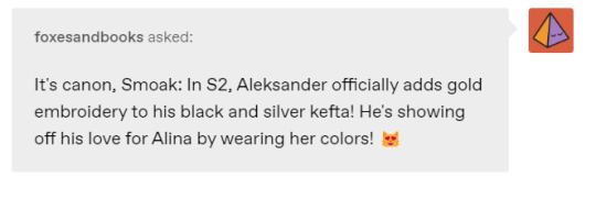
I just saw the new promo pics, I'm a bit late to the party as I've been busy getting ready for christmas, I have a very large family so its quite the mission lol. But yeah Aleks is such a simp for alina, with a love of matching outfits lol. In all seriousness though think it is really interesting that they've chosen to put gold in Aleks' Kefta and I have a few thoughts about it. For those who may not have seen it this is the image in question, spoiler alert obviously:
I made a post back when the teaser for season 2 came out (here) where I talked about how in some shots of the promo it looked like the threads on Aleks' kefta were turning gold in the candlelight:

and how I thought this represented how darklina have a little piece of the other within them now. I do think the above image pretty much confirms that the scenes in the promo are from the tether bond scenes because Aleks is clearly wearing a different kefta. Darklina haven't seen each other since the end of season 1 so Alina wouldn't know that Aleks has a new kefta with their shared colours, it makes sense that in the tether scenes she would see him in the same clothes he was wearing the last time they saw each other, an outfit familiar to her. But other than the added gold I did notice some other interesting differences between the two keftas.

The first thing that caught my eye was the buckles or rather the lack of them in Aleks' new look. In season 1, one of the more prominent features of his costume were those silver buckles that held his sigil of an eclipsed sun. To me these buckles gave the impression that he was very closed off, like locks on a cage, he was keeping things, secrets locked close to his chest. When you compare that with his season 2 look overall it looks alot more open, exposed. Those large metal buckles could also make you think of armour, whilst his season 2 look is alot more vulnerable. What is interesting about Aleks is that he always wears his kefta open, both in season 1 and 2. When you think about the fact that the keftas are a grisha's armour, their protection, this is very bold statement that Aleks is making. For every other grisha their Kefta isn't just their uniform but it functions as armour, it is bulletproof and will literally save their lives, no other grisha would ever dream of wearing their kefta open as it would leave them too vulnerable. But for Aleks his kefta is more symbolic, its there to identify him as grisha but when you think about it walking around with his kefta open all the time is a bit of a power move. It's him making it clear to all around him, he is so powerful that he doesn't need to worry about having a kefta for protection, bullets wouldn't hurt him anyway, its him saying no one can touch me. Aleks uses his kefta as a political tool to show his status and his power.
Another difference worth noting though is that his season 1 look is very put together and neat but also has a very luxurious look to it, the fabric looks very expensive and fine and the embroidery is very intricate and delicate. But his season 2 look in comparison is a little more unkempt, his hair looks more windswept and his beard is more grown out. His clothes themselves look more simplistic with the embroidery not being as detailed, but when it comes to the embroidery it stands out alot more than his season 1 kefta. I do think that adding the gold was a deliberate move on Aleks' part, I think again he is using his kefta to send a message. I think he is sending one to Alina, to remind her that they are linked to each other, as you said it is like he is declaring himself as someone who belongs with her, that they should rule as king and queen (or rather tsar and tsarina) together. But also I think he wants everyone who looks at him to also be reminded of the sun summoner. He wants people to make that connection between him and her, so that when they think of one they also automatically think of the other until eventually they will begin to see them as one entity almost. It is very similar to how and why he put Alina in the black and gold kefta for the presentation, he wants people to see them as a pair. He was very much making a statement when he put Alina in that kefta and he is once again making a statement by adding gold to his own Kefta.
But I also think this addition to his kefta is interesting not only in regards to Aleks' choice as a character but as a choice made by the producers and costumers. When I saw the picture I was excited but honestly also very surprised. The pessimist in me figured darklina were going to be very neglected in season 2 in favour for M*lina so I wasn't particularly looking forward to season 2 as I worried they weren't going to focus enough on the tether bond between darklina and that was going to be pushed to the back. However this choice of adding gold to Aleks' kefta gives me a little more hope that maybe they will do the bond justice. I don't think it is a coincidence that they've put that gold on his kefta, especially as I don't believe this is something that happens in the books, I don't recall the darkling ever wearing gold. So this I think was a very conscious decision made by the producers etc to draw and highlight that connection between darklina.
I also really love that connection you made between the new kefta and the japanese art form of mending broken pottery with gold, I believe its called kintsugi. I do think its also a very good metaphor for Aleks himself. He has been broken over and over again throughout the years, and not to be too sappy, but I do think Alina's light is what could help heal those broken pieces. They could help heal each other.
But there was another new costume that caught my eye and that was Alina's, check out these two images:
At first I thought alina was wearing two different dresses in these images but when you look closer you see that its actually the same dress. The flowers around the neckline are the same and the gold lining around the neckline too. However the colours look completely different. In the top image she looks to be wearing a blueish green dress with purple flowers. Yet in the second image she looks like she's wearing a black and red dress. Of course there is very different lighting in the two scenes but the other difference is that in the second image Alina is using her powers. It could be a complete coincidence and not have any significance at all but I find it really interesting that when using her powers the dress she is wearing seems to look black, Aleks' colour.
Book spoilers for those who haven't read them and so potential spoilers for season 2 but after linking them through the amplifier, even after Alina breaks free from Aleks' control, Aleks still has the ability to summon the sun and alina learns she has the ability to summon shadows. I do wonder if the producers etc have decided to try and reflect that in their costumes.
Anyway I have rambled on enough I think. Thank you for letting me know about the new pic @foxesandbooks. Its nice to finally have a release date to look forward to. Bring on March 16th I say.
#darklina#answered#aleksander morozova#alina starkov#shadow and bone season 2#s&b season 2 spoilers#shadow and bone season 2 spoilers
25 notes
·
View notes
Photo
Colors of personality, 03.2023
A series of 16 spray-painted paintings on a 20 x 20 cm board, each of them contains different artifacts symbolizing a given type of personality according to MBTI theory. Although we rarely think about it and take it for granted as part of the scenery of our lives, colors aren't neutral at all. They have a number of cultural meanings, the symbolism of colors was used in painting to express hidden messages, and most importantly, the colors we surround ourselves with affect our mood. Usually, we don't care why some colors feel peacefull, while others feel annoying. Subconsciously, we lean towards certain of them, not being able to say what lays behind our choices. The same applies to personality – in everyday life, hardly anyone reflects on why people behave in a certain way. We don't care why some of us are more alike than others. We often don't understand why we like some people and others annoy us. We're used to attribute the negative features to those, who seems irritating to us, not understanding that usually our assessment is purely subjective and results from a mismatch in terms of the way we consume energy, collect information about the world, make decisions or organize environment. Knowing how our mind works can help us choose our surroundings more consciously, as well as build understanding and empathy towards the world around us. The work can be presented in its entirety, but also in parts, consisting of several objects.
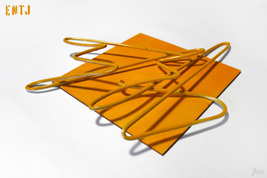
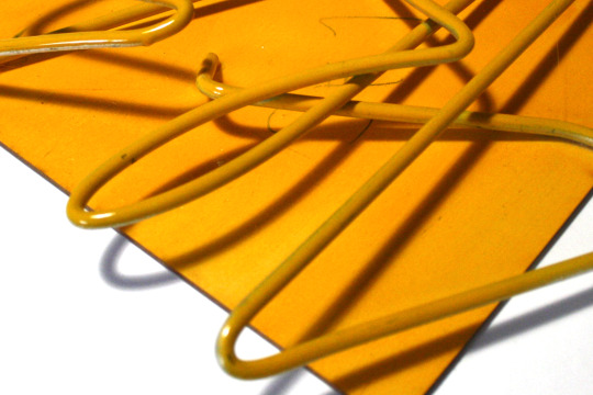
ENTJ (Te Ni Se Fi)
The ultra-minimalist composition composed only of wire symbolizes the strong, combative personality of ENTJ, equipped with strong convictions. The wire used in the artwork is the thickest of the metal elements of the series, impossible to bend with bare hands, just like ENTJs seem to be impossible to bend only with the help of other people's mental or physical strength – sophisticated shapes were given to it with a bender. The lack of breaks in the continuity of the wire, its holistic character indicates the specific character of ENTJs, who usually go through life witha a clearly marked out by themselves path, regardless of other people's assessments. Chaotic bends symbolize difficulties in expressing one's own emotions and, sometimes, also understanding other people's emotions, rationalizing feelings. Due to the fact that yellow is usually well noticeable, it's perfect to draw the attention of anyone nearby (a warning color both in nature and in urban space – warning road signs, reflective vests). It's the color of self-confident, brave people, the color that stimulates the brain and improves memory. On the other hand, it's also identified with mental disorders and madness, as well as jealousy. Yellow color is usually associated positively, but its excess in the environment can cause discomfort in some people.
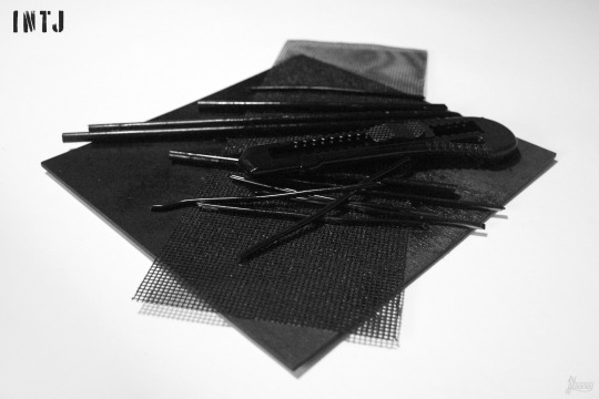

INTJ (Ni Te Fi Se)
The minimalist composition consists of only two diagonal directions - the grid lying at the very bottom indicates one of them, pieces of wire and knife the other. Despite this rather radical simplification, the pieces of wire are not arranged with exaggerated precision, they lie as if they were scattered rather than arranged, which indicates a concentration of this type of personality on principles, not details - despite their highly organized nature (J), INTJs like see the world from a broader perspective, sometimes they deliberately ignore details to follow a larger, fixed path (Ni). The metal mesh is a reference to the organized mental structure of this type of personality, the creation of a systematized network of connections between data collected from the environment (Ni), a passion for arranging things and creating minimalist, but aesthetically coherent compositions (Te). The plastic knife symbolizes the precision of the cut and the sharpness of the thoughts and words of INTJs, who are known for their sarcastic, sharp tongue. In combination with the wire cut into pieces, the knife shows an analytical, willing to cut/break down problems into smaller pieces in order to see the situation from all sides and propose an objective, holistic solution (Ni-Te). The combination of a knife and pieces of wire can also bring to mind the INTJ's often inconspicuous appearance and their stubbornness – could such an inconspicuous tool as a plastic knife be able to cut a metal wire with the right strength and motivation? Black and white have opposite cultural meanings – although both are perceived as elegant, they are also associated with the symbolism of death (in Western culture black is the funeral color, in Eastern culture it is white). Black can be warm or cold depending on the environment in which it is found, just as INTJs, who usually appear cold, distant and dark, become warm and caring to a small group of people who are really important to them.

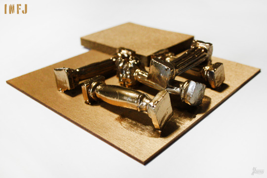
INFJ (Ni Fe Ti Se)
A minimalist artwork, composed of two types of elements (J) – an abrasive sponge and five antique columns, each of a different order (Doric, Corinthian, Ionic, Tuscan, Composite). The columns symbolize respect for history, traditions and human rituals (Fe) – despite their future-oriented (N) and introverted nature (I), INFJs often perform most of the minor everyday rituals established by the culture in which they are brought up, fitting in with the group to which they belong (Fe). Additional value is added by the fact that the columns are handmade, from clay – on the one hand, it is a reference to the INFJ’s respect for human work, on the other hand, it symbolizes the effort they put into the commitments they undertake, regardless of whether they concern their career or relationships with other people. At the same time, the abrasive sponge indicates a secretly hardy and rough character of this type – INFJs are considered generous and kind, but they are not weak and do not bend to every request or coercion; they can be rough when needed. The sponge also symbolizes the logic behind the INFJ’s behavior, their tendency to coolly analyze the facts (Ti), despite making decisions mainly based on feeling (Fe). Gold is synonymous with nobility and wealth, and in the case of INFJ also generosity to others (Fe). It’s also the color of royalty, associated with power and wealth. It can be associated with hedonism (Se).


ENFJ (Fe Ni Se Ti)
The dynamic composition, composed of metal elements connected with a string into elements that are incomprehensible, but having a certain code, is intended to illustrate the complicated process of ENFJ’s reasoning (Fe Ni). Sharp edges refer to the sharpness of thinking, but also to hidden stubbornness. Circles cut in metal, similarly spaced apart, refer to the need to control the environment and create it according to one’s own will, in a way that would be good for the group (Fe Se). It also indicates precision (Ti). Red is the color of strong emotions, whether love or anger, or hate, which refers to focusing on feelings and making decisions based on them (Fe). It’s also the color of blood, which is intended to symbolize the surprising stubbornness and toughness of the usually perceived as nice and soft ENFJ.

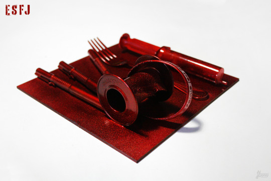
ESFJ (Fe Si Ne Ti)
The presence of a fork symbolizes generosity. A syringe and a bandage for dressings, identified with the health service, mean a willingness to help and a willingness to make sacrifices for others, on the rubber band stuck around it is written “it’s nice to help”. The fineliners refer to the surprisingly frequent artistic abilities of ESFJs, who usually place great value on the aesthetic qualities of things and have good taste. Red is the color of blood, passion and strong emotions, in the case of ESFJ it is a warm, metallic red, which is intended to emphasize the nature of this type ready to sacrifice for others at the expense of yourself. Blood may be a reference to one of the four personality types according to Hippocrates, the sanguine that seems to be most common among cheerful, extroverted ESFJs. Also metallic red is a warm color, opposite to ESTJ’s green.
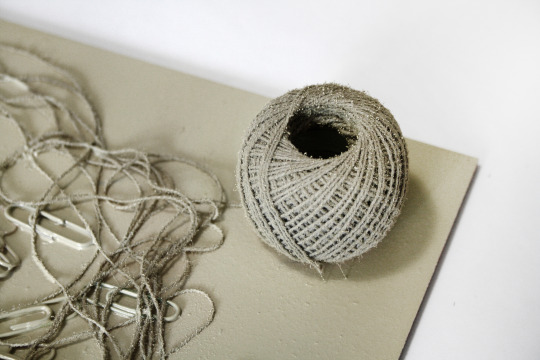
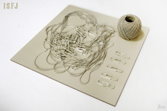
ISFJ (Si Fe Ti Ne)
The thread appears in two forms: in the center of the composition it’s chaotic and unraveled, in its corner the thread is arranged, rolled into a skein, which refers to the emotional, feeling-focused nature of ISFJ and acting according to what one feels (F/Fe). Paper clips thrown into the threadlike space symbolize clumps of metal that are hard to swallow for those who consider the ISFJ being week – because Fe is a function called by Jung rational (meaning that it not only perceives reality, but also evaluates it, submits it to judgment) usually nice and kind ISFJs can get their way and have very strong, unbreakable beliefs about a given topic, which they aren’t usually associated with. The paper clips arranged in one line in the corner of the composition symbolize order and a tendency to like routine, ease of finding oneself in situations and places that are hierarchical. Light beige is pleasing to the eye. It’s also a great base for other color accents, due to its delicacy and neutrality, it fits most colors.


ISTJ (Si Te Fi Ne)
The sparing composition, composed only of a metal plate and a few gloves, indicates a tendency to simplify and catalog information, to create clear divisions that don't take into account intermediate situations (Te). The gloves intertwined in a chaotic pose refer to the distance in interpersonal contacts and difficulties in opening up to other people (Fi), while following the usual etiquette, such as shaking hands or using polite expressions (Si) – the glove separates the hand from the hand of another person, it's also a symbol of elegance and many situations related to history/culture. In the early Middle Ages, gloves became part of the coronation and liturgical attire of kings and bishops, began to be considered a symbol of dignity and power. Throwing the glove is provoking someone to react, fight, compete, polemic – ISTJs who value peace (I) rarely enter into open confrontations, but they are never afraid of them, and when someone offends their internal value system (Fi) they're able to challenge him to a duel, defending their honor (or someone important to them) and knightly dignity. A metal plaque with cut-out symbols of the largest religious systems and atheism indicates the great respect that ISTJs have for tradition, and at the same time the difficulty of breaking away from them and the frequent reluctance to change the existing paradigms (Si). At the same time, copper, as a metal characterized by high plasticity and the only metal that is covered with verdigris (patina) over time, symbolizes that the seemingly unchanging, fierce in its views ISTJ also sometimes changes over time, especially if he sees logical explanations for change and novelty (Te).

ESTJ (Te Si Ne Fi)
Most of the elements of the composition are well organized, the whole space is filled, the composition seems to be static except for the element extending beyond the edge, which (as well as the crushed, quite chaotic in that organized composition tubes of glue) symbolizes the ESTJ’s tendency to break the rules, if ESTJ believes they are illogical and stupid. Tall, cylindrical elements refer to the multi-level nature of ESTJs, usually paradoxically portrayed as shallow and bossy – lying in fourth place Fi makes ESTJ people with a strong internal moral code and beliefs, who will do anything to fulfill their duties. Also despite a strong Te and leadership tendencies they’re also strongly connected with people whom they respect, their loved ones and willing to sacrifice a lot for them. Deep green is a natural, eye-friendly color that provides peace and a sense of comfort – the gigantic organizational skills of ESTJs provide their loved ones with a sense of security, being well taken care of, they are also salutary in the workspace. When they’re too high, ESTJ can stress people around them, but when they’re optimal, ESTJs bring to the space they find themselves in invigorating and necessary order.
ESTP (Se Ti Fe Ni)
The artwork is composed of depicting, realistic elements (S). The jaw cast pieces symbolize the five human senses, thus referring to the highly experience-focused nature of ESTP (Se). The detail of the casts indicates the ability to notice changes in reality that are elusive for other personality types – ESTP will easily notice subtle changes in the expression of the interlocutor's face or a changes in the interior design. Seemingly trivial office clips (because they are sometimes used by students of the art department to hold large sheets of paper to boards, and in their original purpose they are used, among others, to organize office work by fastening segregated documents together) symbolize a high sense of aesthetics which, although not usually associated with ESTP, often accompanies this type of personality. The arranged structure (T/Ti) is disturbed by an abstract metal element resembling a section of a network of connections, some incomprehensible structure (N/Ni). Bright green has an paradoxical meaning – in nature, bright colors serve to deter potential predators, inform about the venomousness of the individual equipped with them, while green itself is perceived as a soothing color, associated with life-giving vegetation. The shade of fluorescent green seems to not exist in nature, to be artificial and unnatural – at the same time it is intriguing and emanates with strength. Despite its apparent unnaturalness, green of this type occurs in nature in the form of, for example, uranium compounds or bioluminescence (which gives ESTP in this approach only additional, interesting meanings).

ISTP (Ti Se Ni Fe)
The minimalist composition symbolizes the sparing nature of ISTPs, for whom actions are usually more important than talking about emotions. The circular arrangement of the chain is interrupted by straight lines of plastic bands, indicating a tendency to break the rules and bravery (or sometimes recklesness). The chain and plastic bands refer to the ease of analyzing and solving problems of a technical and pragmatic nature. The materials they are made of refer to hardness and logic. White is the color of purity in Western culture, but in the East it is also a funeral color, which is intended to symbolize the dualistic nature of the ISTP.

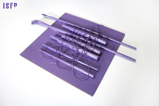
ISFP (Fi Se Ni Te)
Chisels and brushes refer to creative, non-standard solutions that generate ISFP (Ni Te). Their arrangement symbolizes a good aesthetic sense and attention to the appearance of things (Se). A soft tangle of threads thrown chaotically on top deliberately disturbs the arrangement, introducing features that escape control. In this way, he refers to the nature of ISFP focused on one’s own interior and emotions (Fi). Violet stimulates the imagination and creativity. It is also the color of the monarchy, the most difficult to obtain by natural methods, and therefore the most expensive. Light purple is often used in beauty products because of the calmness and sense of harmony it brings.
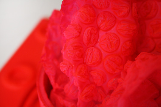
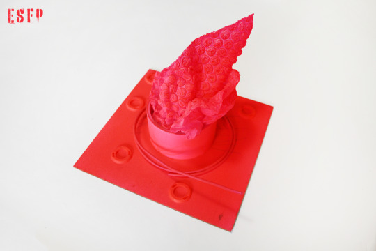
ESFP (Se Fi Te Ni)
The central arrangement of elements refers to the recognizable character of ESFP that brings a lot of movement to any environment. Chaotically arranged, small, round elements around the dominant suggest a tendency to disorganization (P). Bubble wrap is a symbol of fun and lightheartedness. A metal rod bent into a circle refers to the ability to logically analyze problems and solve them in a concrete way, which, although not identified with ESFP, lie dormant inside them (Te). Unnatural, bright, neon pink symbolizes the large amounts of energy. The choice of a warm color (opposite to ESTP) indicates concentration on emotions and feelings, and making decisions based on them (Fi).


ENFP (Ne Fi Te Si)
The asymmetric, diagonal, border-crossing composition symbolizes originality, originality, sympathy for novelty (N/Ne). Chaotically folded duct tape is a symbol of lack of organization, doing things at the last minute, which sometimes happens to ENFPs (P). At the same time, this element doesn’t dominate the composition, because despite the chaotic nature, ENFPs are conscientious people, who fulfill their duties very well. A large, triangular building composed of wooden elements, the dominant feature, is a reference to generating a large number of abstract ideas (Ne). Pink is an energetic and warm color, which is identified with love, trust and hope (F/Fi).
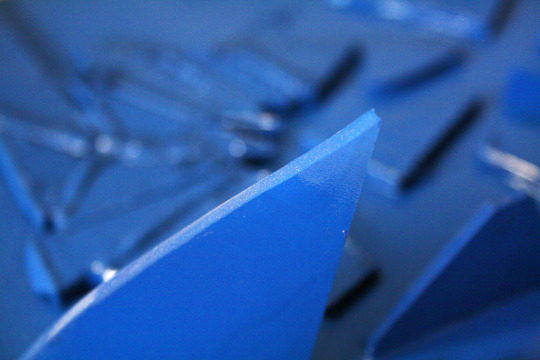
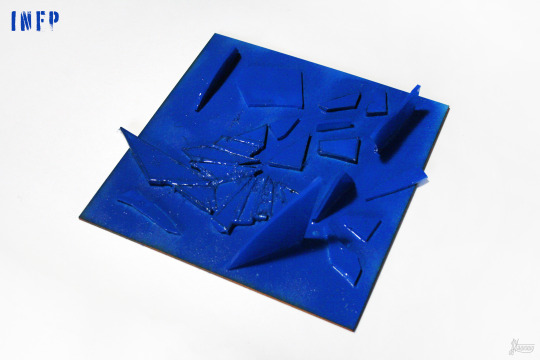
INFP (Fi Ne Si Te)
The composition, made of glass and partly demolished, indicates the quiet, but at the same time full of storms and storms nature of the INFP (I). The glass is delicate, it is easy to break, which symbolizes sensitivity to the world and other people (F/Fi). At the same time, broken pieces can be used to build something beautiful, which in turn refers to creativity and the ease of generating abstract ideas (N/Ne). Broken glass forms sharp edges that are sometimes easy to cut, as does the internally concrete, logical, result-oriented mind of the INFP (Y/Th). Blue is the color of peace and sadness. It is soothing and natural, pleasant to the eye (blue sea, ocean, sky), and staying in it reduces stress.
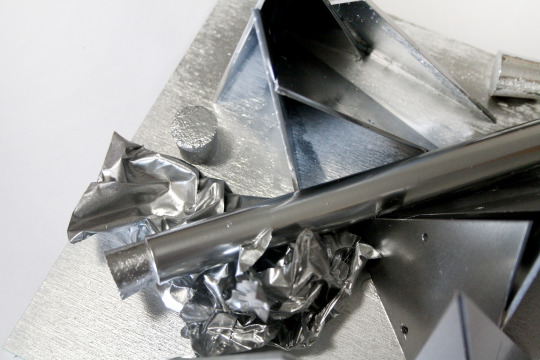
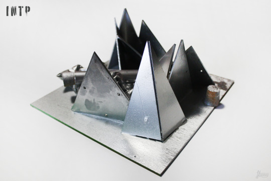
INTP (Ti Ne Si Fe)
Structures built of seemingly disorganized, triangular shapes symbolize sympathy and ease of understanding abstract concepts and theories. The test tube in the center of the composition is a symbol of an analytical, logical approach to solving problems (Ti), as is the silver color, which is associated with metal and also with coolness. The silver foil appeals to the intrinsically soft, secretly sensitive nature of the INTP.
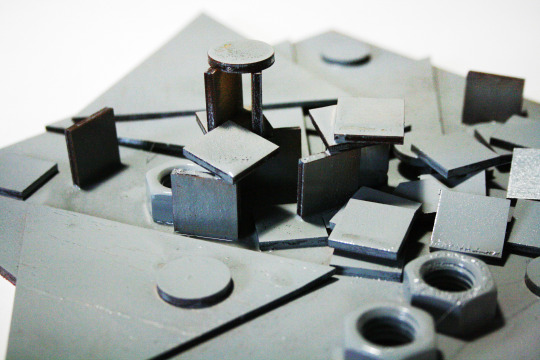

ENTP (Ne Ti Fe Si)
Geometric figures indicate the nature that likes and easily understands abstraction (N). The chaotic composition is intended to emphasise the dispersal and the ability to multitask (Ne), but the beginnings of a building can be found in it, which alludes to the ease of starting projects and combining seemingly unconnectable elements into structures (Ti). Metal caps symbolize a logical, mentally focused personality, not willing to talk about emotions unless it is their analysis (Ne Ti). Gray is a neutral color, it symbolizes the need for balance and calm without manifesting feelings outside. It’s sometimes the color of hidden emotions, improves communication and means opening to substantive, emotionless discussion.
#jstawowy#joanna stawowy#object#entj#intj#istj#estp#intp#infj#mbti#psychology#psychologia#art#sztuka#painting#malarstwo#personality#osobowość#myers briggs#colors#kolory#colours
18 notes
·
View notes
Text

Boris' Tattoos and their Meanings

LEFT ARM:

Skull with Barbed Wire Crown
Barbed wire is a common motif in prison tattoos signifying an individual being trapped in the most literal sense, as many prisons feature courtyards with fences lined with barbed wire. Skulls are common symbols in Russia and other European countries meant to represent "showing teeth" and being anti-authority. Crowns of thorns are often a type of religious symbolism referencing penance, hardship, and the desire for redemption through suffering. Crossing these motifs together, this tattoo likely symbolizes that Boris seeks redemption for what he has done while also feeling trapped during his time in incarceration - and that he resents authorities for imprisoning him because he did not think his actions were worth the punishment of jail time.
Russian Club of Thieves
A much more niche symbol, it has ties to organized crime in Russia dating back all the way to the time of the 1917 Bolshevik Revolution. Its usage has become more widespread in modern days but its meaning remains the same. A simplification of the traditional club symbol found on playing cards, the symbol literally means "thief." Exact details as to the kind of thief may vary, but the universal understanding of the term is that the individual donning this tattoo is a thief of some sort. It's far from his most liked symbol. Rather, it was more a symbol he had to pick up in order to blend in with his work.

Anchor
Another very common tattoo to receive, anchors can have many meanings. For sailors, it is a symbol that one has crossed the Atlantic Ocean. Often times, it is combined with a name to symbolize that said person is someone's anchor - as in, inspiration, motivator, or supporter. On its own, the anchor is often meant as a symbol meant to keep its bearer safe and grounded, especially as they travel. For Boris, the anchor was a symbol of hope and safe passage as he left Russia for the States.
Fly
Strange as it may sound, flies are often used in tattoo art to represent adaptability, persistence, and transformation. They can also represent the ability to multiply ventures, prosperity and endeavors and a fast rate. In short, flies are meant to represent adaptable nature and luck - something Boris figured he'd need both of considering how he was uprooting his entire life.

Coffin
Coffins are an interesting symbol for tattoos as they have multiple meanings. For some, they serve as a reminder of death. In prison culture, coffins are often a symbol that someone is dangerous, has murdered, and will murder. For others, coffins can be a symbol against murder. Still others use it as a representation of the fact that, in prison, one's entire identity is effectively stripped away and killed. For Boris, the coffin represents the fact that while he was incarcerated, it felt like the man he was died.
Fishhook
Yet another common tattoo received by many, a fishhook symbolizes faith, prosperity, strength, and determination. Like several other tattoos Boris has, the fishhook was something of a charm he got in hopes that it would mean his transition to America would be smooth and prosperous.
Razor Blade
Razor blades are another common tattoo with multiple meanings. Depending on the shape of the tattoo the meaning can be changed. Common meanings include:
Tenacity and Strength: It represents inner strength and tenacity and symbolizes the strength and fortitude to overcome obstacles. The blade’s sharpness symbolizes perseverance.
Transformation & transition: This Razor symbolizes transition, discarding the old and welcoming the new. It indicates the capacity to sever bad influences, habits, or attachments to evolve and start again.
Precision and Detail: They are are known for their accuracy. It emphasizes the necessity for the deliberate and precise activity to obtain desired results.
Paradoxical Nature: It reminds us that certain things in life are both tempting and dangerous, needing careful balance
Tragically, the razor blade can also be a symbol of self-harm and self-destruction, and the recovery process of such habits. In Boris' case, the razor blade is a bittersweet reminder of one of the lowest points in his life, in which he felt so desperate, trapped, and broken that he turned to self-harm and self-destruction to try and cope with his feelings.
LEFT ARM:

Spider
Spiders are incredibly common motifs in prison tattoos. Black widows are the most common, often representing that the person is a killer. Spiders on webs are often used to communicate to others that a person has been "trapped in the [prison] system." The spider crawling on the right shoulder is indicative of a thief. If the spider is crawling up the shoulder, the thief is still active. If the spider is crawling down, this means the thief is done with the criminal life. In Boris' case, he received the spider on his right shoulder facing downward to represent that he wanted to be done with the criminal life once he moved. Unfortunately, life had other plans.
12 Tally Marks
Tally marks can have a variety of different meanings. For prisoners or soldiers, they are often tattooed as a way of showing how many lives they have taken. In Boris’ case, the 12 tally marks represent the number of lives he took during his brief time as a soldier. However, they are not a sign of pride. They are a reminder of the guilt he felt and the penance he continues to pay for killing them.

Cathedral
Cathedrals, or Kremlins, represent time spent incarcerated and are iconic Russian prison tattoos. The more domes an inmate’s church has indicates the number of sentences or years they have served over their lifetime. These tattoos can be found anywhere on the body. In Boris' case, his tattoo contains five domes which correlates to the five years he spent incarcerated.
#muse headcanon : i know how people like you end up#( cm : boris alehin the other kidnapper )#tw self harm#tw death#tw murder#tw spiders#tw blade#tw insects
1 note
·
View note
Text
I have twice met the man who has just been crowned King Charles III, both times on occasions so unmemorable that I am certain he cannot possibly recall either one. I recall them very well, of course—where we were (once in London, once in Warsaw); what we wore (he, gray pinstripes; I, a black dress); what we said (nothing of consequence). That’s the essence of my relationship to the new king, and also the essence of all of our relationships with royalty. They know nothing whatsoever about us, but we remember absolutely everything about them.
Sometimes, in fact, we know an extraordinary amount about them. Without ever having tried especially hard, I know more details about the relationship between Charles and Queen Camilla than I know about, say, the relationship between my sister and my brother-in-law. Because their phones are tapped and the transcripts are then published, because their courtiers have an enormous incentive to leak gossip, because even their relatives have much to gain by talking and writing about them—because of all this, I know things about them almost by osmosis. Even if I don’t want to know the intimate details, I just do.
Not that this is their fault. Of course they can be criticized for failing to navigate the world of celebrity journalism and for their clumsy attempts to manipulate it. But they didn’t create it, and it isn’t a world they were ever going to inhabit comfortably. This royal family has been singularly unprepared to function as a national soap opera. In its modern incarnation, the British monarchy long succeeded because it was precisely the opposite, and the Windsors would have been happy to continue in that tradition.
All they have ever wanted, it seems, was to follow the rules laid out by the Victorian writer Walter Bagehot, whose influential book The English Constitution, published in 1867, argued that the ideal constitutional monarch is unknowable, unreachable. Their personality should be dull; their opinions kept to themselves. A queen is not friendly or relatable; a king is not someone with whom you would like to have a beer. The more he is perceived as a symbol—of the nation, of unity, of history—and the less he seems like an actual human being, the more effective he will be. “Its mystery is its life,” Bagehot wrote of the monarchy. “We must not let in daylight upon magic.”
The Windsors took this idea and ran with it. The late Queen’s rather rigid public persona, her careful avoidance of controversy, even her chilly (by modern standards) methods of raising her children—all of that seems to have been a deliberate attempt to fit into Bagehot’s definition. Throughout her life, she sought to preserve the mystery, to keep out the daylight. Then she taught Charles to do the same.
But during her reign the world changed. Slowly, the Royal Family agreed to do more public events, to have more contact with ordinary people, even to appear in some prime-time television specials (It’s a Royal Knockout, a kind of game show, was one notable failure). Charles, as Prince of Wales, devoted himself to sustainable farming, walkable towns, environmental causes. He was many years ahead of the curve—he made a speech denouncing the excessive use of plastics, and predicting damage to the environment, as far back as 1970—but got little credit for it. Instead, daylight was let in, the magic disappeared, and it’s not necessary to explain what happened next, because all of us know, whether we want to or not. Eventually we got to where we are now, an era of dueling interviews, staged photographs, and competing best-selling memoirs. And this is now the problem: If there is no magic about the monarch, then what possible constitutional purpose does he serve?
#current events#politics#british politics#monarchy#political philosophy#britain#england#charles iii#elizabeth ii
0 notes
Text
This is gonna be the hottest take I’ve written in a long while, so here we go:
“Falcon and the Winter Soldier” was the more conservative-leaning show when compared to “The Punisher”
It feels weird writing that out since, at the surface level, it feels like it should be the other way around. Remember back in 2017 when there was a lot of pushback on the Punisher TV series because it was seen as right-wing propaganda? A lot of people just saw “ex-military guy with machine gun” and immediately made the connection to the alt-right movement. It didn’t help that the alt-right loved the Punisher symbolism, especially the military and police.
Meanwhile, there’s “Falcon and the Winter Soldier”, which technically should’ve been the more anti-conservative series. MCU Steve Rogers was set up as being anti-authoritarian and we were getting a black Captain America, something that closed-minded people would classify as “woke-pandering”.
But if you go past that and actually look at both series’ content, it feels like there’s a clear divide between what people are seeing at the surface level versus what actually happens in the shows.
Yes, the Punisher features an ex-military guy who uses guns because he wants to take the law into his own hands. But the show also features:
1) The military industrial complex as the main villain of season 1 and Christian extremism as the main villain of season 2
2) The whole show was centered on criticism of the Iraq War/War on Terror and how the military treats its veterans. In fact, the criticism wasn’t even subtle since the main plot of season 1 was about how the corrupt CIA officer used the Iraq War for his own corrupt goals. Just switch out “drugs” with “oil” in the plot and you’ll get a good chunk of the anti-Bush criticisms during his presidency. (EDIT: I know he served in Afghanistan as well, I just wanted to focus on Iraq)
3) The secondary villain of season 1 was a far-right domestic terrorist (they even called him out as a terrorist). The secondary villain of season 2 was an Aryan Brotherhood white supremacist.
4) When you think about it, the Punisher only exists because he’s anti-U.S. government. He feels that the systems of America have failed the people by letting criminals and corruption run rampant, so he’s taking matters into his own hands. I’m just saying, it’s weird to characterize the Punisher as a conservative-friendly character when the character is basically saying, “Fuck America and all of its corruption”.
Now, let’s take a look at “Falcon and the Winter Soldier”:
1) Very pro-U.S. military. I mean, that’s a given since Sam and Bucky served in the military, but there’s a clear sense of jingoism throughout the series. Especially the opening fight scene.
2) Tried to redeem John Walker at the end (or at least, tried to show that he’s not that bad of a guy). Remember, Walker is supposed to be the dark, far-right version of Captain America. They deliberately changed that for the show for...reasons. It’s like Marvel was skittish to actually portray John like how he is in the comics. Or at least, they were skittish to portray a version of Captain America as a villain.
3) Despite all the bad things America did, the series’ ending message was that we could do better as a nation. That even though our history is unclean, we can do better because that’s what America does. Just saying, the show’s message that America is still awesome even with its flaws and wrongdoing feels like a conservative talking point.
4) The villains are anti-government anarchists that want a world without borders. Unlike Walker, they don’t get a chance at redemption. Out of all the Captain America villains that the series could’ve gone with, they went with the explicitly left-wing one.
5) Probably the most anti-American moment in the series would be Isaiah Bradley’s story since that was a direct criticism of the U.S. military. But everything turns out okay because Sam put Isaiah’s statue in the museum. No one is held accountable because that would mean the U.S. government would have to face accountability and we can’t have that in our patriotic TV series.
Okay, I’ll stop there. Just as a disclaimer, I’m not trying to change anyone’s minds about these shows, nor am I trying to say you should like or hate them. I just wanted to discuss how these shows and characters are perceived by the fandom.
#hot take#marvel#MCU#falcon and the winter soldier#the punisher#tfatws#fatws#punisher#netflix marvel#frank castle#sam wilson#bucky barnes#falcon#captain america#the winter soldier#steve rogers#netflix the punisher#isaiah bradley#jon bernthal#the defenders#marvel comics#falcon and winter solider series#daredevil
317 notes
·
View notes
Text
flashbacks
Thinking about the character establishing flashback since i have been noticing a lot in, well, mostly a certain subset of Japanese media but that might just be sampling bias.
Still, the more I encounter the more it seems that a lot of manga-adjacent storytelling has this curiously earnest, direct, perhaps you might say theatrical quality. Like, it doesn’t seem to hide its artifice, how the pieces are arranged to set up an emotional payload.
I think it’s most apparent in earlier works like Ashita no Joe. In the first episode of Dezaki’s anime adaptation (I haven’t read the manga), we are introduced to Joe, a drifter who’s good at punching, and Danpei, a former boxer and boxing trainer who has met with little success but fixates on Joe as a chance to live vicariously through success at sports..
Soon after establishing our characters and premise, Danpei intervenes to protect Joe from the yakuza, getting severely beaten up in the process. In Osamu Dezaki’s anime, the interactions in this scene are not at all interested in being naturalistic: everyone’s loudly declaiming their intent (“You’re my tomorrow! Tomorrow’s Joe!”), and cuts are generally short and very direct.
The next episode, as Danpei recovers in the hospital, we get an extended flashback in which we see the backstory that led him to this point, explaining his motivation with Joe. In a work like this, lines will be repeated such that they become a kind of recurring motif or catchphrase, and the whole cadence of dialogue has a kind of very deliberate ‘beat, answering beat’ feeling.

Nobody would talk like this, of course, but that isn’t a failing, any more than the fact that people don’t break out into song like they do in musicals.
I’ve seen similar devices deployed in a lot of other settings. and I guess my curiosity is in how best to deploy it. Especially since it seems to cut against the general sentiment I’ve received that artful writing should be indirect, heavily use elision and implication, write dialogue naturalistically, and avoid contrivance.
Kunihiko Ikuhara and his protégé Tomohiro Furukawa certainly seem fond of such flashbacks - and it’s worth noting both are highly influenced by Dezaki. we might note a couple of accompanying devices here. one major one is an object associated with a key character establishing moment which becomes symbolic of the relationship. take for example Karen and Hikari’s two hair pins in Revue Starlight:

Likewise, episode 7 is - in classic kishōtenketsu mode! - a full backstory episode changing our perception of Nana. (More on kishōtenketsu shortly since it’s a key piece of the puzzle.) Revue Starlight also showcases another very common element of this structure: a promise made years ago, often a minor thing but imbued with great significance since it becomes, once again, symbolic of those characters and their devotion.
Its predecessor Utena is built heavily around such flashbacks, at least in its first half. each duellist confronted by Utena will be introduced with an episode setting up their particular conflict before returning to the present where they fail to defeat Utena and the matter is resolved. Utena meanwhile is gradually given various flashbacks of her childhood where she fixated on the whole ‘prince’ ideal.
I recently started rewatching Attack on Titan after Thursday’s Animation Night, and the impetus of this post is seeing this device crop up there also. In episode 6 of Tetsurō Araki’s anime, we get a flashback to Mikasa’s childhood. Her parents are murdered, and she is kidnapped with the intent to sell her into sex slavery - those handy anime rapists who show up whenever someone needs some justified violence done to them I guess. A young Eren tracks down the kidnappers and stabs two of them, but a third one grabs him. Mikasa comes to a realisation, accompanied by a flashback within a flashback: essentially that the world is cruel and the strong will always prey on the weak unless stopped by force, accompanied by a montage of bugs eating other bugs. She stops crying and stabs the guy holding Eren.

Afterwards, Eren and his father offer to take her in, and Eren presents her with a scarf, which she wears ever since, a symbol of her devotion to him. We return to the present where Mikasa is a cold force of violence, reminiscing on these events.
This flashback serves several functions. It’s a direct statement of the themes of the work: a rather familiar meditation on power and ‘necessary’ violence, although more commonly found in the mouth of a villain (c.f. dracula) - honestly I have no idea why anybody was surprised to find out the author had nationalist politics lol. And in more immediate terms, it answers the crucial ‘why’ question - coming after Mikasa confronts a merchant endangering a group of civilians, it answers the question of why is Mikasa like this? - and sets up some dramatic irony: at this point it seems Eren is dead, but Mikasa is saying she can do anything as long as he’s at her side. Soon she’ll find out and we’ll see the fireworks.
So what exactly makes up a character? We may write down a great deal of stuff about visual design, habits and personality traits, but the crucial element as far as having a story is concerned is a desire or intention - the thing that pushes them to act. And, to me, a great mystery of life is where these motive forces come from. The character-establishing flashback serves as an illustrative case: a precise encapsulation of where a guiding principle forms.
Final Fantasy XIV actually makes this kind of flashback an explicit event in narrative. The main character has a power called the Echo, which causes them to receive sudden visions of the memories of people nearby, always at dramatically appropriate times. This is associated with certain visual and audio cues, and it allows the player character to relate information received in such flashbacks to the others. As such, FFXIV uses this storytelling device in just about every storlyine. (It doesn’t even always use the Echo; sometimes it just runs a flashback cutscene as is.)
The recent Shadowbringers and Endwalker expansions found some clever ways to make these kinds of flashbacks playable, without breaking from a linear story. In Shadowbringers, you visit an elaborate simulacrum of a past society created by the expansion’s villain, which serves to considerably flesh him out. In Endwalker, you actually time travel into the past and interact with the same characters (with a convenient memory wipe at the end!), and later, the arch-villain of the series has you fight through another constructed tour of her motivating experiences.

Another series heavily constructed around such flashbacks is Ranking of Kings. This series drops a tragic character backstory almost every episode, starting with the characters immediately around Bojji such as Kage, whose backstory is delivered as early as the second episode. (In fact, this flashback is moved forward in the anime compared to the manga!) These flashbacks are typically surprisingly dark for such a cute show: Kage’s flashback sees him survive a genocide followed by poverty and mistreatment, establishing his cynical attitude when he meets Bojji; his subsequent arc sees him become fiercely devoted to the kind prince who he initially sees as a total rube.
What’s fascinating about Ranking of Kings to me is that it goes out of its way to give basically all of its characters relatively sympathetic motivations: gradually we get to see the contours of a complex web of loyalties and obligations. Characters who at first seem simply cruel may turn out to be acting out of a warped kindness, characters who seem kind may be traitors, and a lot of the time a recontextualising reveal is followed by an extended flashback.
Another example is of course NieR Replicant/Gestalt. From playthrough B onwards, you are introduced to flashbacks concerning nearly every enemy explaining how they came to oppose you, and also for your own companions. This begins, naturally, with one of my favourite points in the game, Kainé’s prose section where we see her childhood with her grandmother. The remake adds a similar scene for Emil right after he blows up the Aerie, and the short stories in Grimoire NieR arguably add even more, each one seemingly designed to add more pathos to scenes in the game. Automata uses this device in a similar way, filling in the stories of characters like Simone and the King of the Forest.
(Both games also feature a significant flash forwards. This happens relatively early in Replicant (the first half with the younger Nier is never revisited) and quite late in Automata, but in both cases, the conflicts and relationships set up in the first half pay off in the second.)
All of these flashbacks serve as a new element which recontextualises what came before, which brings us to...
Kishōtenketsu
OK, so I said I’d go into the subject of kishōtenketsu, which is said by some commentators to be the underlying structure of the vast majority of Japanese storytelling. This divides a story into four beats: an introduction (起 ki), whose consequences are developed (承 shō), then a twist (転 ten) is introduced, and finally it is brought together by a conclusion (結 ketsu). This might be applied to fiction, but also to arguments in a debate or indeed jokes.
The universal applicability of anything is always questionable, and in Japan kishōtenketsu is applied sometimes to Western fairytales as well rather than being seen as some kind of unique national character: we might want to ask how far you’d have to push a story for it to be possible to not fit its elements into this rubric with a little effort. Still, it definitely seems to very naturally apply to examples like yonkoma manga, with the four panels typically mapping to the four stages.
The most distinctive step for me though is the ‘twist’, ten. In Western storytelling a ‘twist’ is usually applied to an ending: a new piece of information which causes us to reevaluate what we saw in the story so far, commonly used in horror (surprise: this character was really a ghost). This can sometimes be very effective, but I think its popularity waxes and wanes; a propensity for twist endings can become a joke as in the case of M Night Shyamalan. In these cases the ‘twist’ doesn’t really require explanation or further resolution: it’s obvious as soon as we see it what it means for the rest of the story and that’s usually where it leaves off.
In Wikipedia’s examples of kishōtenketsu, the ten generally serves as introducing a third, seemingly unrelated element which the conclusion then links to what came before. Here’s an example attributed to Confucian philosopher Sanyō Rai:
Ki Daughters of Itoya, in the Honmachi of Osaka.
Shō The elder daughter is sixteen and the younger one is fourteen.
Ten Throughout history, daimyōs killed the enemy with bows and arrows.
Ketsu The daughters of Itoya kill with their eyes.
The ten step at first seems like a non-sequitur, but then it’s brought back into relation with the other elements. by the conclusion.
Within fiction, we can see that this backstory flashback is arguably a fairly natural way to set up the ten step in an arc, and naturally often seems to come fairly late in the story: we take a brief break from the main flow of events in order to introduce a new element, and then when we return to the ‘present’ we’ll see how these past events are finally resolved.
The ‘twist’ isn’t necessarily going to be a non-sequitur here, but it may recontextualise what happened before and change our expectations for resolution. Let’s take Puella Magi Madoka Magica which follows a very clear kishōtenketsu structure: Homura enters the series as someone aloof and mysterious, acting with violence against Kyubey; the characters get gradually drawn into magical girl battles and realise that they’re getting exploited by Kyubey, and a large threat draws near; these might be assigned the ki and shō steps although they have their own smaller kishōtenketsu arcs within them.
Then, we get a whole episode flashback where we learn that Homura is a time traveller who keeps resetting the timeline in order to save Madoka, which completely changes our view of the story so far; this could be attributed the ten step. Finally we return to the present and find a resolution to the timeline in which Madoka uses the built up karma to change the rules of the universe, but abandons Homura in the process, the ketsu.
Kishōtenketsu is often called storytelling ‘without conflict’ or at least deemphasising conflict, but instead based on causality. For example, on tofugu Rudy Barrett writes this about kishōtenketsu:
Instead of having goals and subgoals that carry the plot from beginning to end, the classical Japanese story grammar is guided by a series of actions and reactions that lead a character to a thematically significant resolution. Causality, rather than conflict, is the vehicle in this type of storytelling. These stories move based on character actions (or often actions outside of the control of the characters) and the motivations are often irrelevant or not elaborated upon. Matsuyama posits that the lack of a goal structure is due to the traditional Buddhist value of eliminating worldly desires, which is in direct contrast with the very goal-oriented ideas of the West. Japanese protagonists tend to be unmotivated by an initial goal in the interest of making them more classically “good” in a Buddhist sense.
This seems... honestly seriously overstating the case to me; rather both seem to be more like interpretative frames than different types of story. Causality and conflict are both the basic ingredients of a story; it is possible to dispense with one or other of them but it’s a major restriction. And to say Japanese characters are usually unmotivated just doesn’t accord with much fiction I can think of, nor is it uniquely Japanese - c.f. the endless discussion of a passive hero awakened to adventure by an inciting incident caused by the villain.
So by the same token I disagree with this video, in which a youtube anime critic attempts to describe how Your Name (Animation Night 44) is a kishōtenketsu story based on causality rather than conflict, noting primarily that the major event - the meteor strike and the link across fate - is 'well outside’ the main characters’ control and can’t be prevented. It seems like a huge stretch though to suggest that there is no conflict as a result, and a misunderstanding of the nature of dramatic conflict. The film is full of conflict (which we could mostly put in the ‘person against nature’ and ‘person against society’ bins if we wanted): conflicts manifest whenever characters want things which are not easy to achieve, or characters have conflicting desires.
The characters wish first of all to figure out whose body they are swapping with, and then when the mystery reveals that they are actually linked across time (Taki lives several years after Mitsuha’s death) and there is to be a meteor strike that wipes out Mitsuha’s town, the second half of the film is concerned with their efforts to evacuate the town and rewrite the timeline against obstacles like Mitsuha’s overbearing dad.
To return to Madoka, there is a clear conflict between Madoka and Homura’s desires, with both wishing to sacrifice themselves to protect the other (and in Madoka’s case, magical girls at large). There is also the conflict of the magical girls vs. Kyubey, and the broader hostile world they find themselves in. And every character has their own driving conflict in their particular arc, all full of thwarted or misguided desires. It’s brimming with all the ‘classic’ conflicts: magical girl vs society, magical girl vs self, magical girl vs magical girl, and these conflicts are how the plot unfolds within the ‘causality’ of kishōtenketsu.
Nevertheless, the kishōtenketsu concept is hardly irrelevant: in its most basic form it reveals a pattern we can deploy to create a satisfying story. We introduce one thing, develop it a bit to get people invested, introduce a second thing, and then tie them together in a conclusion.
Back to flashbacks
Plenty of Japanese examples; what of the West? My lens will mostly be limited to animation,
A couple of examples of a similar mode of character-establishing flashback appear in Avatar: The Last Airbender. A key one, delivered in the second season, concerns Prince Zuko and Princess Azula: we see how their treatment as children set up their conflicts in the present. This helps change our view of Zuko from ‘antagonist’ to ‘deuteragonist’, and renders tragic his obsessive pursuit of Aang from the first season; not surprisingly, the concluding arc of the second season which pays off several of these flashback setups is considered one of the high points of the series.
The third season offers one of Katara’s childhood, and the death of her mother, leading to a question of whether she’d take revenge in the present, but this strand is fairly quickly dropped. (We might also see this season as a kind of failed implementation of kishōtenketsu: the Lion Turtle represents an unexpected new element, but rather than recontextualise what we’ve seen so far in a new light, it offers merely a convenient ‘out’ to the moral dilemma the show set up.)
A couple of more or less recent science fiction books, such as Ancillary Justice (Ann Leckie) and The Fifth Season (NK Jemisin, who I have beef with after the Helicopter Story incident, but her book does serve as a good example lol) have taken on a kind of two- or three-stranded structure. We’re introduced to a character in one period, and then a parallel story about the same character in a second period.
It may not immediately reveal that these are the same character (Jemisin’s book waits til the very end of the book to tie her three strands), but ultimately this structure serves a similar purpose: we see events play out and the motivation driving them side by side. By spreading out the motivating flashback across a whole book, it has a lot more space to breathe, and we also get the payoff of the final inciting incident (e.g. the death of Lieutenant Awn) and its consequence (Breq attempts to assassinate Anaander Mianaai). For both books, their sequels took on a much more straightforward linear structure, and I would say this might be part of the reason they were so much weaker.
So, suppose I want to deploy a character-establishing flashback... actually, looking at the stories I’ve written, it seems I’ve ended up doing this without really conceiving this as a definite technique. In chapter 3 of VECTOR, I establish CORAL’s motivation in this way; in Pocket Healer (soon to be finished?) I seem to have landed on the same two strand structure.
Actually I think a large proportion of my stories have that ‘introduce a premise, flashback, resolve’ approach at least somewhere in them? Funny to realise! I tend to write my stories a lot like film anyway, with frequent POV changes serving a similar role to a scene cut, and a wish to describe strongly impactful images for each ‘shot’. So perhaps the character-establishing flashback emerges as a kind of natural consequence of writing for a visual medium, or perhaps it’s just a certain familiarity with this device making it come naturally to me.
Still, what if I want to make it stronger? The key element is of course how strongly the flashback relates to the present events. We should leave the flashback with a new understanding and sense of impending tension to be resolved, and the information received in the flashback should continue to shape everything else we witness.
I could also probably stand to take advantage of the element of indirection. A promise or an exchange of a gift acts as an indirect (and visual!) way to talk about the relationships between two characters. There’s nothing wrong with keeping it simple - in fact, making it a simple gesture imbued with great meaning by context can do a great deal. We recently watched a backstory arc from The Ancient Magus’s Bride in which we met a wizard who had promised to return a book to a former crush; when he dies, he asks the protagonist to carry it through in his stead. The simple act of returning a book allows the recipient, now an old woman who’s clearly on her deathbed, to reflect on the whole relationship. Call it sentimental perhaps, but done well, this kind of device is undeniably effective (for many readers at least!).
I rarely give my stories much planning (mostly writing by intuition; for better or worse, this seems to best suit my adhd), but I think recognising such a device is perhaps valuable because I’ll know it’s in the mental ‘toolbox’ and I can deploy it consciously. And, I don’t know, it’s always interesting to see how storytelling devices evolve and cross-pollinate.
#fiction#anime#manga#writing#kishotenketsu#plot structure#ousama ranking#revue starlight#ashita no joe#ffxiv#kishōtenketsu
33 notes
·
View notes
Note
So I don't know if you've heard, but recently the writers did an AMA on reddit answering questions, one of which they stated that Jaune and Salem were not related, and that in hindsight they shouldn't have made their emblems so similar. I don't know if its just me, but doesn't it seem that recently many of their mistakes come down to that? Instead of looking back and realizing that something might look wrong, they go ahead with it anyway and be surprised when there is backlash?
I had heard about that and made a note to include it in my “The Girl in the Tower” recap. Given that the last ask I answered was about perceived laziness in writing, this is a good example of the kind of stuff I’m talking about. Putting a webseries together is hard as hell and it’s inevitable that everyone involved is going to make some mistakes. That’s just human nature and no one should be holding any creator up to some impossible standard. However, with that understanding in mind, there comes a time when we cross over from “Inevitable mistakes” into “It feels like you’re no longer putting in the necessary effort to try and avoid these mistakes in the first place.” At this point, RWBY has so many of those “Whoops, our bad” moments—and that’s just what the creators have publicly admitted to—that you have to wonder how they managed to continually reach that point in the first place. During the entire time they were designing, approving, and animating the symbol of Salem’s family, no one ever went, “Wait. That looks a lot like Jaune’s family symbol. You know, a major character we clearly want to be at the forefront of this story? Maybe we shouldn't draw a connection between them if we never intend to capitalize on it.” I feel like a lot of die-hard RWBY fans would come back with an excuse along the lines of different departments not always communicating with each other, or the writers not realizing that the fandom would read into the similarities, but it’s part of their job to do both those things. It’s an expectation that they’re in close contact with the animators, ensuring that whatever is visually put on screen matches up with their vision; it’s an expectation that they’ll put enough thought into their story to avoid such unwanted implications. And that is very much an expectation of the fandom. How many times have fans celebrated the presumed implications of certain details, upholding what they see as references to fairy tale allegories, or past events, as evidence that everything in RWBY has been planned from the start? We can’t in one breath praise RT for deliberately adding these significant details and then in the next shrug off the details that, it turns out, meant nothing at all. Either they’re treating their show with the care needed to justify the fans’ investment in similarities, rewarding the assumption that such details were put there deliberately… or they’re not. At this point, I’m firmly in camp “RT didn’t intend this, you’re giving them credit for a coincidental headcanon,” but the overall point is they should be putting in that effort. The fans should be rewarded for that faith. As a webseries that has reached this level of fame and adoration, becoming the foundation of a franchise that many fans are paying for and putting their hopes in for a fantastic conclusion, the writers should care enough to ensure that they’re not putting forth a subpar product. Instead, they’re continually demonstrating that lack of effort and then trying to shrug it off with a quick apology. “Sorry, we should have made sure that Salem and Jaune’s emblems weren’t so similar that they implied that they’re related somehow” and it’s like yeah, you should have... so why didn’t you? The first time the mistake it just a mistake. After eight years of mistakes though, you wonder if they’re ever going to do anything about these practices other than acknowledging them after the fact.
And I totally get how, on its own, this sounds like we’re taking one small issue and blowing it totally out of proportion. I get why so many fans are easily taken in by, “Can you believe the RWDEsters are bitching about a tiny background design 🙄?” takes that, conveniently, reduce these two paragraphs down to a single sentence. But the entire point here is that this isn’t really about Jaune and Salem’s design. It’s about how the problem of those designs exemplifies an issue that has haunted RWBY since the very start, but has grown even worse the last few years. How many times lately have we heard the writers blame misunderstandings on the animation team? It’s not our fault you thought Oscar punching Neo was stupid because we didn’t want a hallway that long. It’s not our fault you thought Blake slapping Sun was horrible because we didn’t want her to do that. It’s not our fault you thought we were queerbaiting with Qrow and Clover because we never expected Clover to wink at him. The writers continually act as if their inability to manage the team, look over their work, communicate clearly, etc. is somehow not their fault… when that’s just a basic expectation of publishing this story. If this Salem-Jaune issue existed in a better written series, yeah, they made a mistake. No big deal. That's inevitable. It’s RT’s unwillingness to make changes to avoid repeating those mistakes that’s the real problem here.
42 notes
·
View notes
Text
spike, angel, buffy & romanticism: part 3
part 1: “When you kiss me I want to die”: Angel and the high school seasons
part 2: “Love isn’t brains, children”: Enter Spike as the id
*
“Something effulgent”: Season five and the construction of Spike the romantic
Prior to becoming a romantic interest, Spike is everything I discussed in the last section. He is an id and a mirror for Buffy, he’s prone to both romantic exaggeration and cutting realism, and his liminality suggests ambiguity. But outside of “Lovers Walk”, the writing doesn’t actually delve too deeply into Spike’s nature as a romantic. If you stopped the canon at “Restless”, you’d probably think that Spike’s love for Drusilla was intriguing, but that the show hadn’t really gone anywhere with the implications of it, and for all you knew, that might not be an important part of his character anymore. So one of the most interesting things about season five to me, is that in this season in which the writers first consciously, deliberately decide to explore the sexual and romantic tension between Spike and Buffy, they also emphasize Spike’s romanticism more than ever. The choice to define Spike by his romanticism is a choice that follows naturally from everything established about his character, but it was also not an inevitable choice. Therefore, it’s a choice worth looking at in some detail.
Consider everything that “Fool For Love” establishes about Spike, especially the things that contradict what was supposedly canon at the time. It makes Drusilla his sire instead of Angel, meaning that he is sired by a romantic connection, and as a direct result of heartbreak. It makes him a poet living in the middle of the Victorian era, an age at odds with his previous ages of “barely 200” and “126”. Meaning that the writing specifically decides to ignore its canon in order to associate him with an era in which passions would have been repressed (rather than the Romantic era of the early 1800’s or the modern energy of the early 1900’s). Moreover, the episode reveals his entire aesthetic and personality to essentially be a construct. But most tellingly of all, it reveals him to be an idealist. Spike is not just a performance artist; he yearns for the “effulgent”, for something “glowing and glistening” that the “vulgarians” of the world don’t understand. In other words, he yearns for something bigger and more beautiful than life: something romantic. Later, he chases after “death, glory, and sod all else.” Spike may be a “fool for love”, who has a romantic view of romantic love specifically, but the episode is very clear about the fact that he is also a romantic more generally. When Drusilla turns him, she doesn’t tempt him by telling him she’ll love him forever. She tempts him by offering him “something…effulgent”. (Which, in typical Spike form, the episode immediately undercuts by having him say “ow” instead of swooning romantically). The fact that “Fool For Love”, Spike’s major backstory episode, is so determined to paint him as a romantic--and in particular, a disappointed, frustrated romantic--that it is willing to contradict canon to do so, tells you that this choice was important for framing Spike and his new, ongoing thematic role.
I’ve talked in the past about how season five is all about the tension between the mythical and the mortal--between big, grand, sweeping narratives, and the reality of being human. Buffy is the Slayer, but she’s also just a girl who loses her mother. Dawn is the key, but she’s also just a confused and hormonal fourteen-year-old. Willow is a powerful witch, but she also just wants her girlfriend to be okay. Glory is a god, but she’s also a human man named Ben, and finds herself increasingly weakened by his emotions. And Spike embodies this tension perfectly. He’s a soulless vampire with a lifetime of bloodshed behind him, but he’s also this silly, human man who wants to love and be loved. He wants big, grand things, but every time they are frustrated by a Victorian society, a rejection, a chip, a pratfall, or dying with an “ow”. Furthermore, his season five storyline is all about the tension between loving in an exalted, yet often selfish way, versus loving in a “real” or selfless way.
There was a fascinating piece a ways back that discussed how Spike’s attempts to woo Buffy in season five almost perfectly match the romantic narratives of Courtly Love. In the words of the author:
The term "Courtly Love" is used to describe a certain kind of relationship common in romantic medieval literature. The Knight/Lover finds himself desperately and piteously enamored of a divinely beautiful but unobtainable woman. After a period of distressed introspection, he offers himself as her faithful servant and goes forth to perform brave deeds in her honor. His desire to impress her and to be found worthy of her gradually transforms and ennobles him; his sufferings -- inner turmoil, doubts as to the lady's care of him, as well as physical travails -- ultimately lends him wisdom, patience, and virtue and his acts themselves worldly renown.
You can see for yourself how well that description fits Spike’s arc. He fixates on the torturous, abject nature of his love, and has it in his head that he can perform deeds and demonstrate virtue, and this will prove to Buffy that he is worthy of her. But despite Spike’s gradual ennobling over the course of the season, I think it would be a mistake to see the season as using the Courtly Love narrative uncritically, or even just ironically. The same way it would be a mistake to see season two as using the Gothic uncritically. Spike is as much Don Quixote as he is Lancelot. He is a character that deliberately tries to act out romantic tropes, giving the writing an opportunity to satirize those tropes, including the tropes of chivalric romance. In particular, the writing criticizes Spike’s (very chivalric) fixation on love as a personal agony, something that is more about pain--and specifically, his pain--than building a real relationship. Over and over in season five, he is forced to abandon these sorts of flattering romantic mindsets in favor of a more complicated reality.
So at first, Spike’s “deeds” tend to be shallow and vaguely transactional. He tries to help Buffy in “Checkpoint” even though she doesn’t want it (and insults her when she doesn’t appreciate it), he asks “what the hell does it take?” when Buffy is unimpressed by him not feeding on “bleeding disaster victims” in “Triangle”, he rants bitterly at a mannequin when Buffy fails to be grateful to him for taking her to Riley in “Into the Woods”, and he is angry and confused when Buffy is unmoved by his offer to stake Drusilla in “Crush”. While these attempts to symbolically reject his evilness are startling for a soulless vampire, and although Spike certainly feels like he is fundamentally altering himself for Buffy’s sake, none of it is based on understanding or supporting Buffy in a way that she would actually find substantial. Moreover, he lashes out when his gestures fail to win her attention or affection. He has an idea in his head of how their romantic scenes should play out, and reacts petulantly when reality fails to live up to it.
But these incidents of self-interested narrativizing are also continuously contrasted with scenes in which Spike reacts with real generosity, or is surprised when he realizes he’s touched something emotionally genuine. When Buffy seeks him out in “Checkpoint”, his mannerisms instantly change when he realizes she actually needs real help (“You’re the only one strong enough to protect them”), rather than the performed help he offered at the beginning of the episode. At the end of “Fool For Love” he’s struck dumb by Buffy’s grief, and his antagonistic posturing all evening melts away. He abandons his romantic vision of their erotic, life-and-death rivalry in favor of real, awkward emotional intimacy. In “Forever” he tries to anonymously leave flowers for Joyce, and reacts angrily when he’s denied—but this time not because he wanted something from Buffy. Simply because he wanted to do something meaningful.
This contradictory behavior comes to a head in “Intervention”, the episode in which Spike finally begins to understand the difference between real and transactional generosity. Up until that point, Spike has been reacting both selfishly and unselfishly, but he hasn’t been able to truly distinguish between them, which is why he keeps repeating the same mistakes. Although he touches something real at the end of “Fool For Love”, for instance, he goes on to rifle through Buffy’s intimates in the very next episode. And so “Intervention” has Spike go to extremes of fakeness and reality. He gives up on having the real Buffy, and seeks out an artificial substitute that lets him live out his cheesiest romance novel scripts. It’s important that the Buffybot isn’t just a sexbot, even if he does have sex with her. She’s a bot he plays out romantic scenarios with the way he played them with Harmony in “Crush”, allowing him to almost literally live within a fiction. But then he “gives up” on having Buffy in a way that’s actually real, by offering up his life. He lets himself be tortured, and potentially killed, for no other reason than that to do otherwise would cause Buffy pain. The focus is on her pain, not his. For the first time, he acts like the Knight he’s been trying to be all along. He performs a grand, heroic deed that causes the object of his affection to see him in a different light, and even grant him a kiss. Yet ironically, as part of learning the difference between real and fake, he ceases to press for Buffy’s reciprocation. Through the end of season five, Spike continues to act the selfless Knight, assisting Buffy in her heroism without asking for anything in return. Which culminates in his declaration that he knows Buffy “will never love him”, even after he’s promised her the deed of protecting Dawn, and even though she allows a kind of intimacy by letting him back in her house. He proves that he sees those gestures for what they are, rather than in a transactional light. The irony of the way Spike fulfills the narrative of chivalric romance, is that his ennobling involves letting aspects of that narrative go.
In a Courtly Love narrative, the object of the Knight’s affection is fundamentally pedestalized. The Knight himself might be flawed, but the woman he pines after is not. She is “divinely beautiful” and “unobtainable”, something above him and almost more than human. This is why it’s so comic that in Don Quixote, which was a direct satire of chivalric romance, Alonso Quixano’s “lady love” is a vulgar peasant farmgirl who has no idea who he is. (Think of the way Spike asks if Buffy is tough in “School Hard” or threatens to “take her apart” despite “how brilliant she is” in “The Initiative”, followed by scenes where Buffy is acting like the teenage girl she is. Or how Giles in “Checkpoint” says that Buffy has “acquired a remarkable focus” before cutting to Buffy yawning.). Although it’s true that Buffy is beautiful, and supernatural, and profoundly moral, she is also very human, and the writing is very concerned with that humanity. Season five in particular, as I’ve mentioned, is preoccupied with the duality of Buffy’s mythic and mortal nature. Thus it becomes significant that Buffy is assigned such a heightened role in Spike’s chivalric narrative. Just Spike is at once Lancelot and Don Quixote, Buffy is at once Achilles, Dulcinea, and a coming-of-age protagonist.
And part of the “lesson” of Spike’s arc is for him to see both sides of the roles they embody. One of my favorite things about the scene in Buffy’s house in “The Gift” is how adroitly it conveys the dualities of both Buffy and Spike with simple, but poetic imagery and language. Buffy stands above Spike on her steps, conveying her elevated role, and Spike honors the way her heroic status has inspired him by physically looking up to her as he explains that he expects nothing from her. But by expecting nothing from her, and promising to protect her sister, he also honors the fact that she is a real person with no obligation to him, and a younger sister she cares about more than anything. He also honors his own duality by at once making Knightly promises, and acknowledging that he sees through his former delusions: “I know that I’m a monster, but you treat me like a man.” In “Fool For Love” he tried to acknowledge the same duality of realism and romance, by declaring to Cecily that “I know I’m a bad poet, but I’m a good man.” But at the time, he was an innocent, whose desire to be seen, and whose romantic avoidance of “dark, ugly things”, left him unprepared to understand how Cecily really saw him (similar to Spike’s insistence in “Crush” that what he and Buffy have “isn’t pretty, but it’s real” just before Buffy locks him out). Spike is a character defined simultaneously by continuous disillusionment and dogged aspiration, which is why he makes perfect sense as a character to embody a season torn between the pain of being human, and the wonder of the gift of love.
Fittingly, the season ends with Spike’s most devastating loss of innocence of all. He fails to be the hero for Buffy or Dawn (note that Knightly language he uses on the tower: “I made a promise to a lady”), and he loses the woman he loves. He may have become more virtuous, but unlike in a chivalric romance, that virtue wins him neither Buffy, nor something flattering like “world reknown.” The climax of the “The Gift” is full of romance—a god, a troll hammer, a damsel on a tower, a heroic self-sacrifice, a vampire transformed into a Knight—but the end result is that Buffy is dead, in part because he wasn’t good enough, and all that he and the Scoobies can do is grieve. Stories got Spike nothing, even when reality finally lived up to them. It is a swan song to the myths of childhood, and on the other side of Glory’s portal, Spike and the other characters will have to confront a world where those myths have been left behind.
part 4: “But I can’t fool myself. Or Spike, for some reason.”: Buffy and Spike as a blended self
#romanticism series#s5#gen#buffy#spike#this section is deliberately focused on spike's arc#but not to worry#the next one focuses on buffy's side of things and the role of spike's arc in supporting buffy's in the last three seasons#they just needed their own sections to breathe#btvs
192 notes
·
View notes
Note
Hello! Feel free not to answer this question if it is in any way too much, but I've been wondering about something concerning the "western" mdzs fandom. Lately, i have seen multiple pieces of fanart that use what is clearly Christian symbolism and sometimes downright iconography in depicting the characters. I'm a european fan, but it still makes me vaguely uneasy. I know that these things are rarely easy to judge. I'm definitely not qualified to do so and was wondering if you have an opinion
Hi there! thank you for your patience and for the interesting question! I’ve been thinking about this since i received this ask because it?? idk, it’s difficult to answer, but it also touches on a a few things that I find really interesting.
the short answer: it’s complicated, and I also don’t know what I feel!
the longer answer:
i think that this question is particularly difficult to answer because of how deeply christianity is tied to the western art and literary canon. so much of what is considered great european art is christian art! If you just take a quick glance at wiki’s page on european art, you can see how inextricable christianity is, and how integral christian iconography has been in the history of european art. If you study western art history, you must study christian imagery and christian canon because it’s just impossible to engage with a lot of the work in a meaningful way without it. that’s just the reality of it.
Christianity, of course, also has a strong presence in european colonial and imperialist history and has been used as a tool of oppression against many peoples and nations, including China. I would be lying if I said I had a good relationship with Christianity--I have always faced it with a deep suspicion because I think it did some very, very real damage, not just to chinese people, but to many cultures and peoples around the world, and that’s not a trauma that can be easily brushed aside or reconciled with.
here is what is also true: my maternal grandmother was devoutly christian. my aunt is devoutly christian. my uncle’s family is devoutly christian. my favorite cousin is devoutly christian. when I attended my cousin’s wedding, he had both a traditional chinese ceremony (tea-serving, bride-fetching, ABSURDLY long reception), and also a christian ceremony in a church. christianity is a really important part of his life, just as it’s important to my uncle’s family, and as it was important to my grandmother. I don’t think it’s my right or place to label them as simply victims of a colonialist past--they’re real people with real agency and choice and beliefs. I think it would be disrespectful to act otherwise.
that doesn’t negate the harm that christianity has done--but it does complicate things. is it inherently a bad thing that they’re christian, due to the political history of the religion and their heritage? that’s... not a question I’m really interested in debating. the fact remains that they are christian, that they are chinese, and that they chose their religion.
so! now here we are with mdzs, a chinese piece of media that is clearly Not christian, but is quickly gaining popularity in euroamerican spaces. people are making fanart! people are making A LOT of fanart! and art is, by nature, intertextual. a lot of the most interesting art (imo) makes deliberate use of that! for example (cyan art nerdery time let’s go), Nikolai Ge’s What is Truth?

I love this painting! it’s notable for its unusual depiction of christ: shabby, unkempt, slouched, in shadow. if you look for other paintings of this scene, christ is usually dignified, elegant, beautiful, melancholy -- there’s something very humanizing and humbling about this depiction, specifically because of the way it contrasts the standard. it’s powerful because we as the audience are expected to be familiar with the iconography of this scene, the story behind it, and its place in the christian canon.
you can make similar comments about Gentileschi’s Judith vs Caravaggio’s, or Manet’s Olympia vs Ingres’ Grande Odalisque -- all of these paintings exist in relation to one another and also to the larger canon (i’m simplifying: you can’t just compare one to another directly in isolation etc etc.) Gauguin’s Jacob Wrestling the Angel is also especially interesting because of how its portrayal of its content contrasts to its predecessors!
or! because i’m really In It now, one of my favorite paintings in the world, Joan of Arc by Bastien-Lepage:
I just!!! gosh, idk, what’s most interesting to me in this painting is the way it seems to hover between movements: the hyperrealistic, neoclassical-esque take on the figure, but the impressionistic brushstrokes of the background AAA gosh i love it so much. it’s really beautiful if you ever get a chance to see it in person at the Met. i’m putting this here both because i personally just really like it and also as an example of how intertextuality isn’t just about content, but also about visual elements.
anyways, sorry most of this is 19thc, that was what i studied the most lol.
(a final note: if you want to read about a really interesting painting that sits in the midst of just a Lot of different works, check out the wiki page on Géricault’s Raft of the Medusa, specifically under “Interpretation and Legacy”)
this is all a really long-winded way of getting to this point: if you want to make allusory fanart of mdzs with regards to western art canon, you kind of have to go out of your way to avoid christian imagery/iconography, especially when that’s the lens through which a lot of really intensely emotional art was created. many of my favorite paintings are christian: Vrubel’s Demon, Seated, Perov’s Christ in the Garden of Gethsemane, Ge’s Conscience, Judas, Bastien-Lepage’s Joan of Arc, as shown above. that’s not to say there ISN’T plenty of non-christian art -- but christian art is very prominent and impossible to ignore.
so here are a few pieces of fanwork that I’ve seen that are very clearly making allusions to christian imagery:
1. this beautiful pietà nielan by tinynarwhals on twitter
2. a lovely jiang yanli as our lady of tears by @satuwilhelmiina
3. my second gif in this set here, which I will also show below:
i’m only going to talk about mine in depth because well, i know exactly what i was thinking when I put this gif together while I can’t speak for anyone else.
first: the two lines of the song that I wanted to use for lan xichen were “baby, I’m a fighter//in the robes of a saint” because i felt that they fit him very well. of course, just the word “saint” evokes catholicism, even if it’s become so entwined in the english language that it’s taken on a secular meaning as well.
second: when I saw this scene, my immediate thought was just “PIETÀ!!” because LOOK at that composition! lan xichen’s lap! nie mingjue lying perpendicular to it! the light blue/white/silver of lan xichen in contrast to the darker robes of both nie mingjue and meng yao! not just that, but the very cool triangular structure of the image is intensely striking, and Yes, i Do love that it simultaneously ALSO evokes deposition of christ vibes. (baxia as the cross.... god..... is that not the Tightest Shit) does this make meng yao joseph of arimathea? does it make him john the evangelist? both options are equally interesting, I think when viewed in relation to his roles in the story: as a spy in qishan and as nmj’s deputy. maybe he’s both.
anyways, did I do this intentionally? yes, though a lot of it is happy accident/discovered after the fact since I’m relying on CQL to have provided the image. i wanted to draw attention to all of that by superimposing that line over that image! (to be clear: I didn’t expect it to all come through because like. that’s ridiculous. the layers you’d have to go through to get from “pretty lxc gifset” --> “if we cast nie mingjue as a christ figure, what is the interesting commentary we could do on meng yao by casting him as either joseph of arimathea or john the evangelist” are like. ok ur gonna need to work a little harder than slapping a song lyric over an image to achieve an effect like that.)
the point of this is: yes, it’s intentionally christian, yes I did this, yes I am casting these very much non-christian characters into christian roles for this specific visual work -- is this okay?
I obviously thought it was because I made it. but would I feel the same about a work that was written doing something similar? probably not. I think that would make me quite uncomfortable in most situations. but there’s something about visual art that makes it slightly different that I have trouble articulating -- something about how the visual often seeks to illustrate parallels or ideas, whereas writing characters as a different religion can fundamentally change who those characters are, the world they inhabit, etc. in a more... invasive?? way. that’s still not quite right, but I genuinely am not sure how to explain what i mean! I hope the general idea comes across. ><
something else to think about is like, what are pieces I find acceptable and why?
what makes the pieces above that reference christian imagery different than this stunning nieyao piece by @cyandemise after klimt’s kiss? (warnings for like, dead bodies and vague body horror) like i ADORE this piece (PLEASE click for fullview it’s worth it for the quality). it’s incredibly beautiful and evocative and very obviously references a piece of european art. I have no problem with it. why? because it isn’t explicitly christian? it’s still deeply entrenched in western canon. klimt certainly made other pieces that were explicit christian references.
another piece I’d like to invite you all to consider is this incredible naruto fanart of sakura and ino beheading sasuke after caravaggio’s judith. (warnings for beheading, blood, etc. you know.) i also adore this piece! i think it’s very good both technically and conceptually. the reference that it makes has a real power when viewed in relation to the roles of the characters in their original story -- seeing the women that sasuke fucked over and treated so disrespectfully collaborating in his demise Says Something. this is also!! an explicitly christian reference made with non-christian japanese characters. is this okay? does it evoke the same discomfort as seeing mdzs characters being drawn with christian iconography? why or why not?
the point is, I don’t think there’s a neat answer, but I do think there are a lot of interesting issues surrounding cultural erasure/hegemony that are raised by this question. i don’t think there are easy resolutions to any of them either, but I think that it’s a good opportunity to reexamine our own discomfort and try and see where it comes from. all emotions are valid but not all are justified etc. so I try to ask, is it fair? do i apply my criticisms and standards equally? why or why not? does it do real harm, or do i just not like it? what makes one work okay and another not?
i’ve felt that there’s a real danger with the kind of like, deep moral scrutiny of recent years in quashing interesting work in the name of fear. this morality tends to be expressed in black and white, good and bad dichotomies that i really do think stymies meaningful conversation and progress. you’ll often see angry takes that boil down to things like, “POC good, queer people good, white people bad, christianity bad” etc. without a serious critical examination of the actual issues at hand. I feel that these are extraordinarily harmful simplifications that can lead to an increased insularity that isn’t necessarily good for anyone. there’s a fine line between asking people to stay in their lane and cultural gatekeeping sometimes, and I think that it’s something we should be mindful of when we’re engaging in conversations about cultural erasure, appropriation etc.
PERHAPS IT IS OBVIOUS that I have no idea where that line falls LMAO since after all that rambling I have given you basically nothing. but! I hope that you found it interesting at least, and that it gives you a bit more material to think on while you figure out where you stand ahaha.
was this just an excuse to show off cool (fan)art i like? maybe ¯\_(ツ)_/¯
(ko-fi)
#Anonymous#asks and replies#art#fanart#art history#christianity#mdzs#mdzs meta#meta#mine#mymeta#cyan gets too deep in the weeds#lmfao this post is a mess ive been staring at it for like a week and at this point im just gonna post it to the wall and keep moving asldfj#hope you enjoyed
317 notes
·
View notes
Last Seen Blogs

theuxlab
The UX Lab: Exploratory Phase
rasxec
RasXec

girls-inarmy
Girls_inarmy

shakil2
Untitled
kazuma-nyasogi
the great ace attorney dances forth!