#AND ALSO WHY THE PINK THERE'S NO PINK IN HER PONY DESIGN
Photo
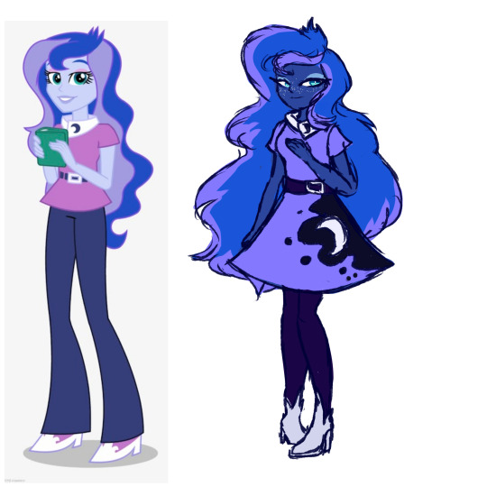
‘Tis not a perfect design but I fixed an atrocity today
#raveartts#mlp#my little pony#equestria girls#luna mlp#I hated the little hair spikes until I looked closer and realized they were meant to represent her crown and weren't just an arbitrary thing#her bell bottoms are so ugly and just aren't Luna#she deserves tights#girl why didn't they just color pick from luna's og palette it's so gross#I know the star freckles are unrealistic but cmon they could've gave her normal freckles????#all the other bitches have their cutie marks fully represented (usually on a skirt) but not Luna????#she gets a shitty collar that barely looks like her cutie mark#AND ALSO WHY THE PINK THERE'S NO PINK IN HER PONY DESIGN
122 notes
·
View notes
Text

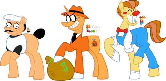

FINALLY!!! the VERY final refs for the ponified cast of pizza tower. everypony has the same name except for pizzahead, who's called pizzahoof. pizzahoof was also designed by @c0met-dr01d!! go check them out :]
under the cut is me rambling about their cutiemarks (or lack thereof) and other design choices
gustavo's cutiemark is a pizza with three mushroom toppings, because he's a chef, and earlier in pizza tower development, he was a gnome! this isn't the case anymore though, but i still like to think he is. that, and i just associate him with gnome forest, so it felt fitting. plus, i suppose it adds to the mario comparisons lmao
peppino's cutiemark is a pepperoni pizza alongside a pizzacutter. i know people are raising eyebrows at the pepperoni, but my excuse is... uhh, they're not actually pepperoni. it's like, some vegetarian alternative. probably made of flowers or some shit. the pizza is obvious, he's a chef and he cooka-da-pizza. the pizza cutter isn't just to hammer that in, but it's also a callback to the various times throughout pizza tower development where he used to have a pizza cutter buzz-saw! especially in pizza massacre
noise's cutiemark is a bomb with its fuse lit, because it represents his explosive personality and he often uses bombs. dude is wacky, unpredictable and can be a feral fucking thing. also something about acting, being a mascot or being in the showbiz somewhere in the mix. he has a tail, but it's just... in his suit. he's a dumbass
noisette's cutiemark is a ruby chocolate bar. she runs a cafe, and while she presumably has Really Weird Taste, i figured it would be a really cute fit for her. it's sweet, just like her! and pink. just like her!
fake peppino deliberately does not have a cutiemark. it's to add to the sense of "failed clone," where many aspects of peppino have been successfully recreated (body type, hair color, coat color, outfit, facial hair) but other small things have been muddled or changed by mistake (height, eyes not staying in their sockets, hair being more smooth looking, face shape). not to mention, he's made of dough, like his original clone counterpart. in the show, it's established that only ponies can have cutiemarks. while he looks like a pony, who's to say he really is one?
stick's cutiemark is that television hud you see when you have enough money to buy a boss gate in pizza tower. i chose this cause on top of being a tv, a reoccurring object throughout the game, it also has some modifications to make it more... stick-y. it has his hat and a propeller coming from the top, and if you know stick, that man likes to make shit, specifically to sell and make money. that's also why there's a money sign in the tv. stick has a tail stub but i never really draw it myself. he's completely bald. mind you, he still has his coat, but no mane, no tail. zilch. he's a bald motherfucker. also stick's magic color is green
pizzahoof also does not have a cutiemark. he's a fucking cheese pony, why would he need one? dude just exists to be silly and whimsical. giving him one i feel would go against his character of just being clownish, doing what he wants when he wants, regardless if it means others suffer because of him or not. also, he's MADE of CHEESE!!!
#ponified#pizza tower#mlpfim#peppino spaghetti#gustavo#the noise#noisette#fake peppino#mr stick#pizzahead#peppino#gustavo pizza tower#noise pizza tower#noisette pizza tower#pizzahoof#peppony#ponytower#mlp#my little pony#my little pony friendship is magic#sklart
546 notes
·
View notes
Text
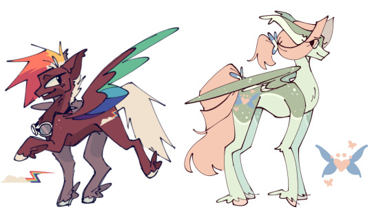
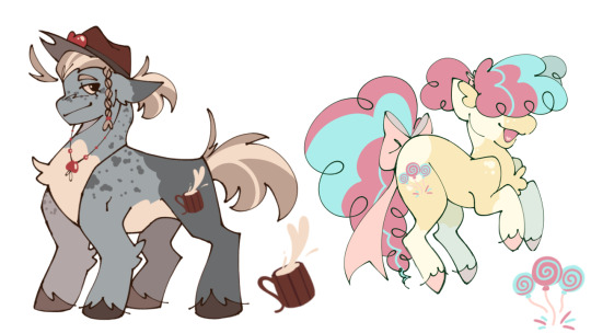
it might've taken me over 3 months, but i've finally finished my own designs for the mane 6
my main thought process for designing them was to use a color from the rainbow! i had to look up colors and their meanings to determine which color should go to which pony
rainbow dash is red because she's the most fierce and bold. sidenote: her mane and tail color is actually white but she finds that boring so she dyes it, not her tail because i didnt like how it looked there
fluttershy is green because of nature and animals, pretty basic i know lol. also her pelt pattern is supposed to look like a deer's
applejack is blue only because i felt orange would fit rarity better, and yellow and purple were going to the other two remaining girls, so apple got stuck with blue but i tried my best to make it work for her. i think blue also means like maturity or smth similar so it works out anyways
pinkie pie is yellow because she's like the embodiment of happiness and joy so it made sense (also i had to use the pink color cuz there is no yellow color for the font)
twilight is staying purple mainly because of her previous life surrounded by royalty and the such, and also because purple is a main color in a twilight sky - orange is secondary so thats why she now has orange too
and finally, rarity is orange because of her creativeness, especially when it comes to fashion design; i think her design is my personal favorite.
i also tried to come up with creative cutie mark designs and i think i passed. though, the only one that isnt super obvious what its trying to represent is probably twilight's. basically i was going for a six pointed star (each point representing each girl) then it comes together in the middle by the white part to symbolize they all need each other or smth like that
i might get around to celestia and luna because i feel like they'll be fun to redesign, and maybe even spike or the cmc
#sharkz artz#character design#mlp redesign#mlp fim#rainbow dash#fluttershy#applejack#pinkie pie#twilight sparkle#rarity
262 notes
·
View notes
Text
Lauren Faust originally imagined all her G1 childhood faves in a My Little Pony reboot. So why was Applejack the only one who made it in? We don't know for sure, but here is my theory.
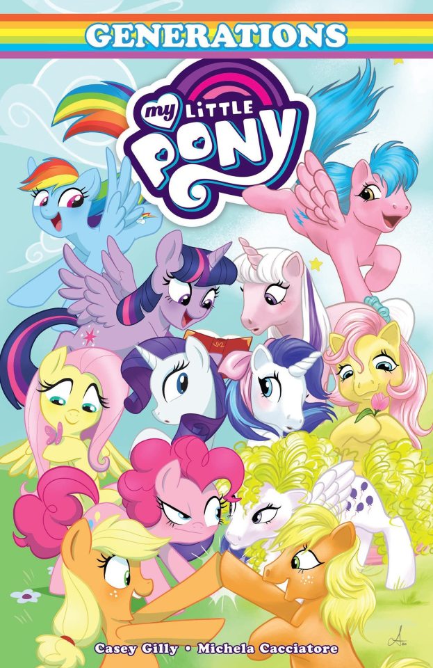
IMO Hasbro went into the MLP reboot wanting each main character to be a different color of the rainbow, similar to TMNT or Power Rangers. (Which is a big improvement over Core 7 G3 when THREE out of seven characters were pink.)
So let's look at the initial G1 crew:
Sparkler - blue
Twilight - pink
Surprise - white
Firefly - pink
Applejack - orange
Posey - yellow
Already we can see some pink is doubled up. But just wait.
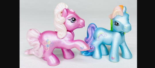
Pinkie Pie was THE face of G3 My Little Pony and Rainbow Dash was nearly as popular. Hasbro made big versions of these ponies, they made small versions of them, they made plush baby versions, and they were immortalized on birthday cards, balloons, ornaments, and other merch. I was so disappointed when I heard Pinkie Pie would be in G4 because I was tired of seeing her, ha ha.
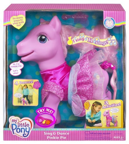
But Hasbro was not tired of selling merchandise of their most popular ponies, so I'm sure one of their first notes was "We absolutely need Pinkie Pie and Rainbow Dash in the new lineup."
Their personality changes wouldn't matter to Hasbro. What mattered was their marketability as toys / designs.
So Firefly, Twilight, and Sparkler were now out of the lineup, due to also being pink and blue.
Now we have:
Rainbow Dash - blue
Pinkie Pie - pink
Surprise - white
???
Applejack - orange
Posey - yellow
But, uh oh! Pinkie Pie and Surprise both have balloon symbols. So Surprise also must die leave.
IMO the names being trademarked / easily defendable was important to Hasbro, and they already had hundreds of G3 names / designs at their disposal. And also they needed a purple pony for this lineup.
So Twilight Twinkle (later renamed Twilight Sparkle) joined the crew and became a unicorn.

Rainbow Dash - blue
Pinkie Pie - pink
???
Twilight Twinkle / Sparkle - purple
Applejack - orange
Posey - yellow
G1 Glory's colors (white with purple hair) then replaced blue Sparkler. But wait!! Both Glory and Twilight Sparkle-Twinkle have stars on their rumps! So Rarity retained Sparkler's symbol of diamonds.
I don't know why they didn't use one of the G1 names, except perhaps that "Rarity the Unicorn" was already a Hasbro trademark, having been a G3 character.
Rainbow Dash - blue
Pinkie Pie - pink
Rarity - white
Twilight Sparkle - purple
Applejack - orange
Posey - yellow
So why was Posey changed to Fluttershy? In my opinion she was switched up quite late because the original plot of Dragonshy had her as an earth pony, which is why she was struggling to get up the mountain. (That's why they had to add the bit about Fluttershy's wings locking up from fear.)
In addition to wanting a variety of colors, I think Hasbro wanted two of each main pony species. Originally Pinkie Pie was slated to be a pegasus, but then she was switched to an earth pony. So Yellow Pony was shunted into a pegasus slot instead.
Basically, I think Posey got replaced with Fluttershy because it was thought that butterfly symbols were more befitting for a pegasus. Plus girls love animals and if they needed plots revolving around growing plants, they already had Applejack on deck.
So in the end Applejack was the only G1 pony who remained in G4, not because Hasbro had any special hold on her, but because she had a pretty unique name and she wasn't a repeated color.
Thanks for coming to my Ted Talk
178 notes
·
View notes
Text

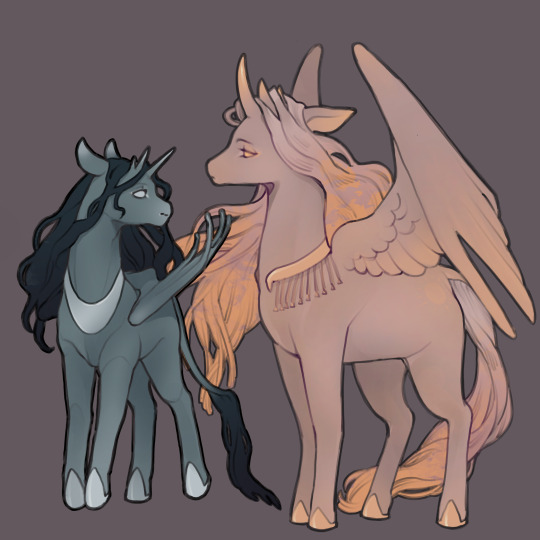
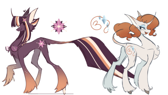
Redesigned the princesses for my au!
I took more creative liberties with these two than I did with the mane six, so here are some thoughts behind the design choices…
GENERAL:
I always loved the contrast between the two sisters and the other ponies on the show. The two felt super distinct and special, and I wanted to preserve that, which is why they’re more horse shaped than the others. I also gave them both triple horns to resemble crowns. Something something divine right to rule….in my au the princesses were born when the cycles of the natural world became dependent on pony magic, so I wanted to hint just how old they are by making them even more different from other horned ponies.
EYES:
Their eyes are just solid colors to show just how ✨magical✨ they are. They’re so brimming with it that their eyes just glow a little all the time. The blushing on their bodies is the same colors as their eyes because their blood is also silver and gold respectively xoxo
WINGS:
Luna gets bat wings because I love when the ponies get to have alternative wing styles, and I wanted to leave a physical mark on Luna from when she was Nightmare Moon and went to moon jail. I love her cute curled wing feathers a lot, but I’ll get to draw that with Cadence, so it isn’t a huge loss in my eyes. Celestia gets big ol wings because I like to think she’d be dramatic and gesture with her wings a lot + she spreads her wings a lot for ceremonious or important occasions. Maybe it’s to cast big shadows of her silhouette when she raises the sun, maybe it’s just because she’s silly like that, but either way, she feels like a big wing kinda pony.
MANE:
Luna is also physically a lot smaller and her mane is a little more limp than Celestia’s. While Celestia has a flowing, gold-tinged mane that ripples like rays of light, Luna’s mane takes on a more viscous texture. I wanted to give her some visual aspects that make her less “royal”, as a visual cue to her not being received as well by their subjects. Her appearing less perfect than Celestia is a big part of her story, and I also just like drawing dark hair.
COAT:
Now, for the reason Celestia is so pink: it’s not just because I love pink. It’s also because I wanted Luna’s and her coats to be inverted colors of one another. I thought it’d be fitting thematically for both of them…plus it meant I could make Celestia pink. Hasbro was right because I DO like pink ponies.
Bonus: Celestia’s decorative collar thingy is meant to resemble the sun and its rays, while Luna’s resembles the moon.
#mlp#mlp redesign#mlp fim#my art#digital art#my little pony#my litte pony friendship is magic#princess celestia#princess luna
122 notes
·
View notes
Text
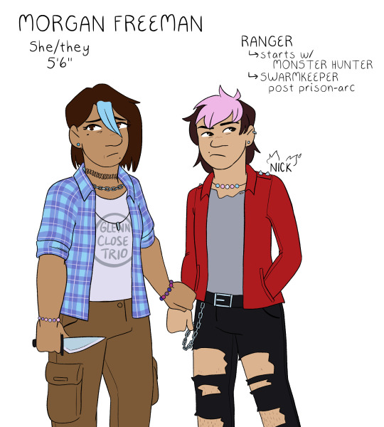

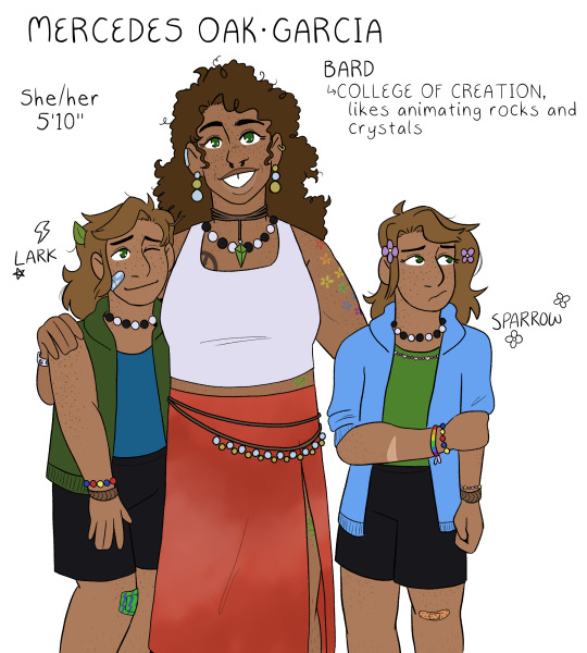
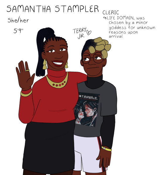
a return to the monsters and mommies au designs, this time properly lined and in color! :D posted in the middle of the night just like last time though because i have problems <3 there are some small changes to these designs, but for the most part i was pretty happy with them so this was mostly just to give myself a color reference for them all lol
gonna ramble about small decisions i made below the cut, but its not necessary at all to understanding the designs! just wanna dump my thoughts somewhere :P
for the most part, the kids' designs are the same as i do them for normal canon, but there are some small differences. i've never really done a proper reference for their kid designs either though, so i guess no one would even notice LOL
freeman family: well, firstly - nick's last name is freeman in this au LOL but its easier to refer to him as nick close so people know who i mean as opposed to nicholas foster. usually, i draw nick close with blue hair (i think he goes through a range of colors, but blue is my default), but i do this because he does it to honor morgan. since she is alive here, instead, his default is pink because thats his favorite color to dye it! morgan and nick both have various bead jewelry because i like to have the headcanon that morgan is really into pony bead jewelry; this is also why all of my nick and nicholas designs have the same trans pride necklace, morgan made it for him :] both nick and morgan wear glenn's old clothes, both of them are wearing his shirts in this piece. aaand morgan has subtle heterochromia as a reference to the split timeline! she always has it, it doesnt just magically happen or anything, but its just a small nod to that.
wilson family: its real important to me that grant got his dad's exact coloration except for his gray eyes, which are all carol. why is this important? i dunno! its just interesting to me. also, carol doesnt usually leave her top buttons undone, but upon entering the forgotten realms, she unbuttons it because otherwise her shirt will pop open while she's doing things (to be honest, as a person with a larger chest myself, her shirt probably still pops open but it does help-!). usually i draw grant with a gay pride necklace, but since he doesnt come out pre-forgotten realms in this au, i tragically had to drop it. i miss my rainbow grant. please come home, baby.
oak-garcia family: i always forget to do mercedes's tattoos in my sketches because tbh i never know exactly what to give her. but! but. this time i just went for it. these tattoos arent necessarily set in stone, but i think theyre cute. the tattoo hidden by her skirt is an oak leaf for henry :] her gem necklace is also the same color as his eyes! her skirt is supposed to be, like, tie-dye or maybe more bleach washed, but i dunno how to draw that so whatever. the twins are, like, 100% the same as usual, i just gave sparrow a pink bead necklace instead of the multi-colored necklace i use for my default canon design lol. also, i think i drew the twins slightly too tall here, which is funny because theyre the only ones who are notably shorter than their mom HDFJKGHK
stampler family: i struggled a lot with what colors to give samantha, because i wanted her to have a bright color palette but not anything garish or patterned. originally she was gonna have a white shirt, but then i realized that would make it so all the moms had white shirts and i just couldn't have that LOL so i ended up landing on red for her! it matches with terry junior, so i thought that'd be cute :] terry's design is probably the most different from my default for him? which still isn't a lot but i swapped his dark blue flannel for a black undershirt instead. i cannot explain why i did this. it just felt right in the moment. i gave him a sweet revenge shirt instead of the usual black parade shirt i give him because... well. if you know, you know. and finally, terry gets a little concert admission bracelet!! i always do that, but i just wanted to point it out because i think continuing to wear an admission bracelet for ages after a concert is a very teen thing to do. i always felt so cool doing that in high school hehe
#monsters and mommies au#dungeons and daddies#dndads#morgan freeman dndads#carol wilson#mercedes oak garcia#samantha stampler#nick close#grant wilson#lark oak garcia#sparrow oak garcia#terry jr stampler
198 notes
·
View notes
Text
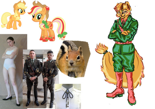
I’m back ya’ll with more art! I had all the characters designed for a while but didn’t get around to posting them. Now I’m going through sort of an art block. I’ve got lots of ideas for stuff but everything I draw is crap. So I thought I should catch up on my other stuff. Like talking about this squirrel design for Apple Jack. Now isn’t she cute!
I really like the colours on the powered up ponies. Though I did give her a different shade of pink I thought suited her better. I also gave her a bolo because southern. These uniforms aren’t supposed to be realistic. More like something they would wear in promo images. Lastly look at the little band I put in her tail. I should do something like that with other squirrels.
I made her a squirrel because they’re farmers and Apple Jack’s personality is farm. Nah. I don’t approve Apple Jack hate. I didn’t think of her all that much, when I watched MLP as a kid. Now as an adult (it feels so weird writing that) I find her relationship with her family quite interesting. She always puts herself last. Probably because she was parentified, by having to take care of Apple Bloom and the farm. One of these days I got to write an Apple Jack / Rainbow Dash fanfic. I think she contrasts well with Rainbow Dash’s selfishness.
In the Squirrel and Hedgehog universe she would be raised very patriotic. She would often be the voice of reason. Though she would butt heads with Pinkie Pie over leaving her family and Fluttershy for not wanting to serve her country.
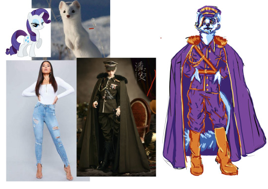
I don’t know why my ramble about the first character is always so long. Anyways. One of my best designs, Rarity! Originally I wanted to make her a mouse and reserve the weasels for the alicorns. But come on. Rarity deserved all the glam only reserved for high ranking military officers.
She was born into a royal family. Given a high ranking position in military since birth. Rainbow Dash had to earn her high rank through blood sweat and tears. With both of them having quite strong personalities they would of course hate each other. Rarity likes being in the military and bossing animals around. Though she can be a bit too much sometimes, she has a soft spot for mice. She doesn’t see them as her equals, but treats them better than many weasels.
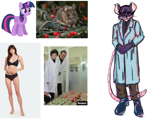
Lastly Twilling Sparkle! My best design. It’s the bangs and eyes. I specially didn’t put any highlights in them. The idea for her came from my IRL friend. She told me Twilight Sparkle should be a lab rat. Technically she’s a lab mouse but the joke still works! Once I get over this drawing problem I might do the honorary seventh members. Sunset Shimmer (probably a fox) and Starlight Glimmer (definitely a hedgehog).
Until now I haven’t thought of how Twilight became a scientist. She probably started as a regular soldier. Then one day they needed a lab assistant. She would prove to be quite good so the scientist decided to teach her the ways.
Now I guess I should mention my idea for this MLP Squirrel and Hedgehog fanfic. Basically the mane six would crash on a deserted island. They would have to throw away all their prejudices to survive. Proving friendship is magic. I should do some research how war prisoners are transported. And some research on military ranks too. I’m not sure who is captured. I thought it would be the weasel side considering there’s a scientist amongst them. But on the other paw how would a group of ordinary soldiers manage to catch such high ranking animals?
If you got any ideas for this story, please write to me.
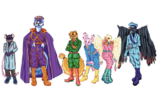
21 notes
·
View notes
Text
It's too bad that the 2021 Amazon/Sony Cinderella was such a mixed bag, because a version of Cinderella with the title character as a dressmaker and fashion designer could have been fantastic.
In Perrault's version of the tale, as the stepsisters plan what to wear to the ball, they turn to Cinderella for advice on everything, because she has "excellent notions" about fashion. Several adaptations that long predate the 2021 film – for example, the 1949 Russian film and its 1979 animated short remake – also make her a skilled seamstress, and have her sew her stepfamily's ballgowns. Disney's Cinderella shares this talent too, since she apparently made all the tiny clothes the mice and birds wear, she owns a book of dress designs, and she plans to fix up her mother's pink dress for the ball herself before her stepfamily keeps her too busy to do so.
Now, I'm sure Perrault and those adaptations just added these details to portray her as an ideal of femininity. But why not portray Cinderella's eye for fashion and skill at sewing as a special, unique talent and passion of hers? Why not portray her, like Rarity in My Little Pony: Friendship as Magic, as an artist whose medium just happens to be clothes? And why not let her use it as a means to try to earn her own living and escape from her stepfamily?
I think the problem with the 2021 musical is its ham-fisted emphasis on feminism, and the way it portrays sexism as Cinderella's obstacle, when a female dressmaker in a 19th century setting should have been nothing out of the ordinary. I think it might have worked better if her problem had been social class instead – if rather than people scorning her for trying to start a business because she's a woman, they scorned the idea that a poor, ragged "servant girl" thinks she can make beautiful dresses worthy of the rich. That would have fit much better with the tale's central "rags to riches" theme. But in my personal opinion, the core concept of a talented seamstress and fashion designer Cinderella, who dreams of opening her own dress shop and who designs her own ballgown, is a good one. Particularly because it has some basis in Perrault's tale and in earlier adaptations.
40 notes
·
View notes
Text

susannah redesign... again. same procedure as last time, my notes are below ⤵️

this is mainly a result of me reading the manga but i've really come to like how purple looks on susannah. i still stand by the older design i made but the green and the purple can coexist. they can be friends
my one palette-related problem (my other gripes were adressed in the last post) with her battlesuit is the white, also known as the elysiafication. i normall dont have a problem with white taking center stage on a design (i think HoHe is BEAUTIFUL), but it gets boring when every single battlesuit is the same. so i removed the white from her palette entirely, and replaced it with black and dark purple like her phosdjinn outfit in the manga.
i've also drawn her stature differently as i've explored susannah more as a character. she's sweet and a little shy, but not timid like seele used to be, so her design has a lot of straight lines with gentle curves, reflected in her face, hair, and clothes. susannah is also seen using bear claws to fight in the manga which is SO CUTE HELLO? HOYOVERSE WHY DIDNT YOU USE THIS. so i'm choosing to think of susannah as a meelee fighter who uses her upper body a lot, hence the broader shoulders. mourning the loss of a set of cutsey bear-themed gauntlets every day.
i did like the introduction of hot pink to her design in the game though, so i kept that. i think it adds a lot to her palette
and dont ask me about the hairstyle. i couldnt decide whether i liked my designs pigtail-buns or the original designs low pony so i did both. logic be damned shes got hella hair
#💥apocalypse art#honkai impact 3rd#hi3#susannah honkai impact#susannah manatt#honkai redesign#ive just been thinking about her a lot lately.. need more susannah plot relevance NOW
52 notes
·
View notes
Note
genuinely hate the way heaven and hell is set up in hazbin like. in all honesty. whats the point of using the dantes inferno layers of hell if you are only allowed to use the pride layer. for every sinner. why the fuck would that make sense. like. a serial killer would be in the like. idfk wrath or lust (bloodlust) layer. dantes inferno isnt even fucking canonical to the bible.
the angel designs are flat, their movements feel stilted to me, all the humans in heaven just have a color swapped monster design just like the sinners.
and no fucking shit people think alastar is fucking white, you only find out that he mixed race from somewhere else. i only found out through my friend that the guy is half black because he saw a video or something of her drawing alaster in his human form (this sounds aggressive, but i am not doing that towards you this is in total agreement wirh you)
also i think adam as an angel is stupid as shit from like the standpoint of someone who is interested in the bible in the way greek myth isnt "canonical"/is separate from greek gods
the designs look like theyre still a fucking pain to animate, and i do genuinely like a lot of the designs, i think angel dust is iconic and uh. the bat cat guy looks pretty cool, i think theyre more for like. comic books.
story feels flat and rushed, and very much like i'm watching a childrens show for adults, and i fucking hate adult shows that think putting sex, seears, blood and gore in their product is soooooo fucking mature and cool of them and its just boring and samey and it fucking sucks. if hazbin was nade by someone else i'm sufe the peoduct wouldve been handled so much better and treated the audience like adults
LITERALLY THIS THIS THIS!!!!
for the first part, of the lore. the lore gets so much more fucking confusing and lamer if you watch the spinoff helluva boss. they go into more detail & spend more time in the other layers for each episode, but theyre all so lame and predictable. the lust layer is pink and full of clubs & bars because. romance??? the greed layer is green and pretty much chicago, especially with the demon mobs (demon mobs Should sound more fun). the wrath ring is red/orange and like The Middle Western Desert that literally takes place during the Wild West from USAmerica. LIKE they made dantes inferno LAME!!! wheres the imagination??? was the best you could come up with for greed "chicago" and wrath "the wild west"???? come on
and the way heaven and hell are addressed is so much more confusing. like. the angels have a Moral code Not To Kill, even if theyre demons (in the episode the angel opposite of IMP are focused on, they lose their jobs when they indirectly kill a guy they weren't supposed to kill), which comes into direct conflict with what the angels Were ALREADY DOING IN HAZBIN???
itd be one thing if they were taking place apart from each other in the timeline, and we don't really know that ATM, but they're supposed to take place in the same universe, so they never really seem to make up their minds on what they wanna do with that???
AND LIKE the core concept of hazbin hotel is broken from the very worldbuilding the show is built on. no demon would ever wanna work on redeeming themselves by just going to a hotel, and even in cases when they do, its really just to sabotage each other, before they solve their problems like. my fucking little pony. i cant believe this was a show made for the same target group as bojack horseman or moral orel, it makes me sick
and this idea isnt broken either!!! it can work!!! the good place worked and improved on this idea In Strides and did it with much more maturity and respect for its audience than vivziepop could even do for two of her shows
like hazbin hotel & helluva boss could be improved upon, they just need Better Writers and a Stronger Vision for where the story could go. im not even being a hater Just Because (altho i am), i'm just really upset that this was the direction the show is seemingly going to with no stop. ive seen people that have looked up to vivziepop as inspiration and felt deeply betrayed when the story was shit, when the writing was horrible, its really disappointing to see. i think the only people left watching this are people who think what vivziepop is doing is good, even if she spends more than half her time online looking up her shows to try to fight back against any and all criticism
#ruby answers tag#max i 100% agree with you on all your points#this is something ive been thinking about making a video about forever#how were such horrible pilots so highly praised before the show even came out. howd vivziepop get on tv with hazbin hotel???#i really wanna do a video on this so badly not even in a cringe way but in an interest way... because this is So interesting...!#anyways sorry for the long post. i am angry with you i hate vivziepop 4ever...#flowerkidlove#long post (?)#hazbin hotel cw#helluva boss cw
18 notes
·
View notes
Text
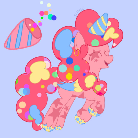
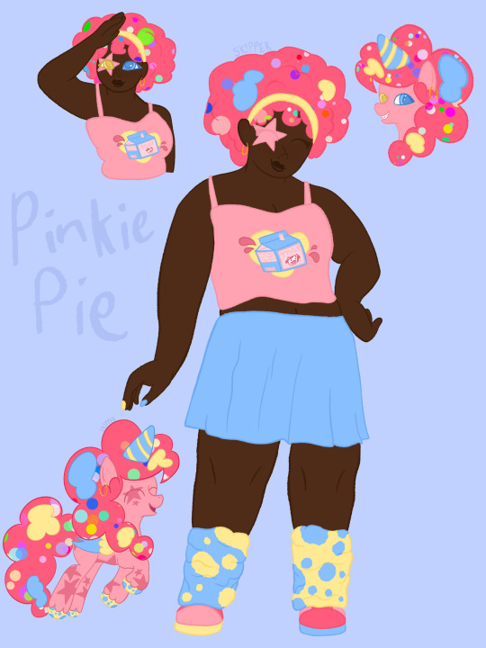
My Pinkie Pie human and pony redesign/AU!
For her pony redesign, I wanted to incorporate her bouncy/exciting personality more than her original design! Her mane has tons of confetti in it; whether it’s on purpose or just leftover from her parties is unknown! She also never takes off her party hat, she says it’s because life is one big party, so why not celebrate it all the time! She always carries secret party snacks and supplies in her mane, and no one has any idea how that even works. Her mane also naturally has patches of light blue and pastel yellow, which she absolutely loves! When she was younger, her parents wanted to dye her hair so she fit into the family more, but she refused every time! Similarly, her hooves are naturally the same colors! They’re also much rounder and less hard than other ponies’ hooves. Although it doesn’t have and detrimental health effects, it can cause her hooves to get sore more easily than others. She has a solution for when that happens though, to fly! If you didn’t know, Pinkie Pie was originally supposed to be a Pegasus in G4, but it was changed for unknown reasons. Besides that, I feel like Pegasus fits her much better than Earth Pony, much how like Fluttershy makes more sense as an Earth Pony rather than a Pegasus! Having wings helps tremendously with her party planning! She’s able to transport things much faster, and surprise parties are a breeze when you can fly over the pony that the party is for! Another thing about Pegasi is that it’s a recessive genetic trait! That is why her parents and siblings are all Earth Ponies. The same applies to Fluttershy! She got the dominant trait of no wings. Moving on, Pinkie’s ears are pierced and she loves to wear festive earrings when she gets the chance!! Her ears are very sensitive to the usual metals in earrings though (like nickel!), so she can’t wear the festive ones for very long. So when she’s not wearing something festive, you can spot her wearing her personal favorite pair of safe earrings!! She absolutely loves hoops, and would get colorful ones if she wasn’t allergic to them.
For Pinkie’s human design, I really wanted to incorporate her love of all things party! I especially wanted to incorporate it into her outfit! I feel like she definitely be into the 80’s, she thinks of it as the ultimate party decade, and she likes to dress similar to people back then! She often wears leg warmers and headbands, and sometimes even wears arm warmers! Her shirt has her favorite drink on it; strawberry milk! She imagines it comes from pink cows and won’t let anyone change her mind. I also thought it would be cute if she were a little mismatched to fit her chaotic personality! Her leg warmers and shoes are flip-flopped on each side, which gives her a very unique look! Her leg warmers are also modeled after her spotted hooves!
!!DISCLAIMER!!
The disclaimer for my art can be found in the pinned post on my page! (It should be called “My Twilight Sparkle human and pony redesign/AU!”)
#mlp#mlp fandom#mlp redesign#mlp au#mlp g4#mlp art#mlp fim#mlp friendship is magic#drawing#digital illustration#artwork#digital art#artists on tumblr#sketch#digital painting
9 notes
·
View notes
Text
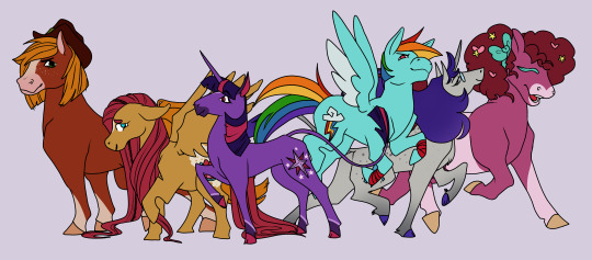
And now for something a little different...
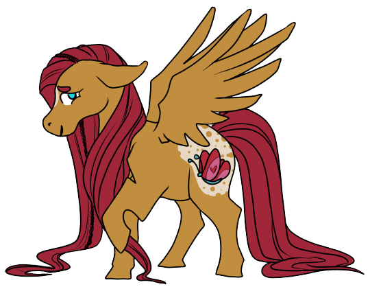
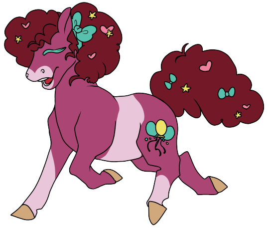
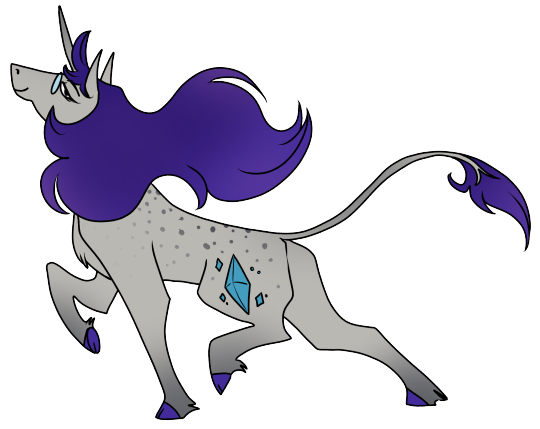
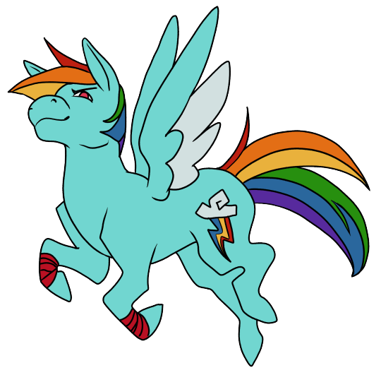
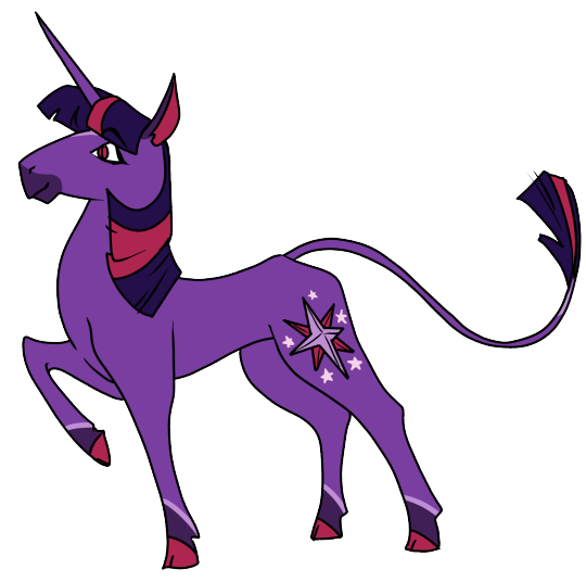
Further thoughts on these redesigns and my process below the cut.
Earth Ponies:
I wanted t make the earth ponies distinctly bigger than the pegasi and unicorns to give them something more to their lore. I never quite liked the idea that unicorns and pegasi got these special things (magic and flight) and that earth ponies were just somewhat normal or "default." I guess in fantasy terms, they're like orcs or half giant- other large fantasy races. I also decided they'd appear more like real world ponies, patterns and hooves and all. Of course, earth ponies can still be fun colors like Pinkie Pie here.
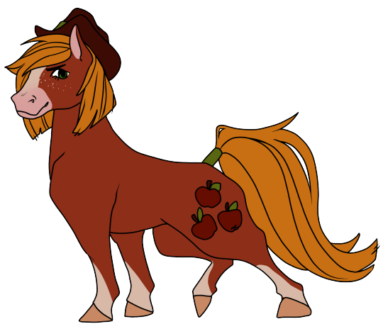
AJ in particular I wanted to make a bit ruddier. She's what Id call the most generic "horse looking" pony in the group, and that's very much intentional. I gave her a more athletic build to help with her farm work, and took off her hair band in favor of a short bob, and put a tie at the base of her tail to resemble an apple stem.
Pinkie, alternatively, got a chunky rounder design (You can't bake cake for all of your friends every day without giving the batter a taste test or ten haha) and threw various little ornaments and confetti into her hair that shoots out whenever she gets excited. I also brought the balloons in her cutie mark together to show that her parties are a way ths he brings PONIES together.
Pegasi:
In contrast to the earth ponies, I figured that pegasi would be a bit on the smaller side and their hooves are covered in a down fur like the rest of their bodies rather than being exposed, this helps them walk on clouds like the Canadian Lynx's furry paws do.
Fluttershy's eyes might look familiar to my Hawk and Dove followers. I just thought the "umbrella" eyelashes would fit her well and make her eyes look bigger without giving her the puppy dog look from the show. I also gave her bushy brows and I think her mane drags on the forest floor. Her bird friends probably take care to pull out the twigs and leaves that get wrapped in it for their own nests while she brushes other smaller animals in turn- a nice, quiet way to spend time with her animal friends at the end of the day. I also decided to simplify her cutie mark to better fit on her smaller body.
Rainbow Dash's mane, on the other hand, is cut shorter and I gave her some racing tape on her legs. Unlike Fluttershy, Rainbow preens her wings often to keep them in racing condition. It's like stretching before a jog, helping to take care of herself in the long run. Or, fly in this case.
Unicorns:
I am not immune to The Last Unicorn propaganda and neither are you. The medium size of the pony races, unicorns do have longer legs in comparison to their bodies than other ponies that end in cloven hooves from starting out in mountainous areas (as opposed to plain-dwelling earth ponies and sky-dwelling pegasi.) They also have prehensile tails and two common coat lengths (Long and short.)
Rarity is a long-haired unicorn, something a lot of unicorns wouldn't expect of a fashion pony. Many other designers with similar coats trim their hooves and coat down, but Rarity rocks her fluffy legs and chest and a lot of her designs sport flared skirts and pants to better show off and compliment her conditioned coat. This is also why I went against styling her mane, as I think she would be more inclined to let it flow as it chooses... after she goes through a rigorous treatment routine each morning and night, of course.
Twilight is a short-haired unicorn with a straighter mane and tail. I opted for a blunt end to her tail and I think she'd use it to dust her shelves and turn pages if she's using her magic for other things. I was initally worried the dark patterning on her mouth would look like a five o'clock shadow, but I still like how it brings her face together nad helps to draw attention to her glowing, pink eyes.
15 notes
·
View notes
Text
every day i wonder what happened during the design process of equestria girls for them to all come out the way they did. i can see where the skirts thing came from cause they wanted them to be undeniably girly i guess or whatever but. every other weird decision is just confusing
like fluttershys whole outfit, the shortish skirt but especially the tank top. maybe its meant to indicate that shes outdoors a lot with animals, but it completely betrays her shyness and tendency to try and hide herself
they kinda messed up big mac and shining armor? mostly shining armor. his jaw could slice metal. why he look like that
also i only realized while looking at the characters that. okay i was just going to say 'lol cheerilees hair is stupid its like 1 foot taller than her head, why didnt they just give her normal bangs wtf' and i still mean that but then i realized... they swapped her mane and fur colors for her human counterpart ??? so now her usually darker coat and light hair became dark hair and light skin ??
which leads me to the point about the skin colors being weird. like. i dont like how they lightened them up, i dont like how aj and big mac have human skin colors (i have to assume maybe they thought for them that the colors looked bad, or possibly even close to caricature territory, especially with big mac), and the way they outright lightened up the colors of at least 2 normally darker ponies? like i said, cheerilee, but also
luna. even back when i first saw the movie and adored it, i DID NOT like the princesses designs. how did they fuck up some of the best characters in the show, especially the ones that are the prettiest (imo).
i would say that of the 3, cadence is the most okay design (i know we dont see her in the first movie just roll with me here). its clearly her, she looks like her and has her vibe (visually), all around not bad. not necessarily my favorite, theres still something slightly off? but it doesnt rub me the wrong way
celestia... i dont like her vibe. who is she. shes light pink and she has hair spikeys that are meant to look like a crown but just made it look like she didnt brush her hair properly. she has celestias hair but her face does not read like celestia to me. she looks like an imposter. where is my mother
and finally. the pinnacle of the issues with the designs. luna.
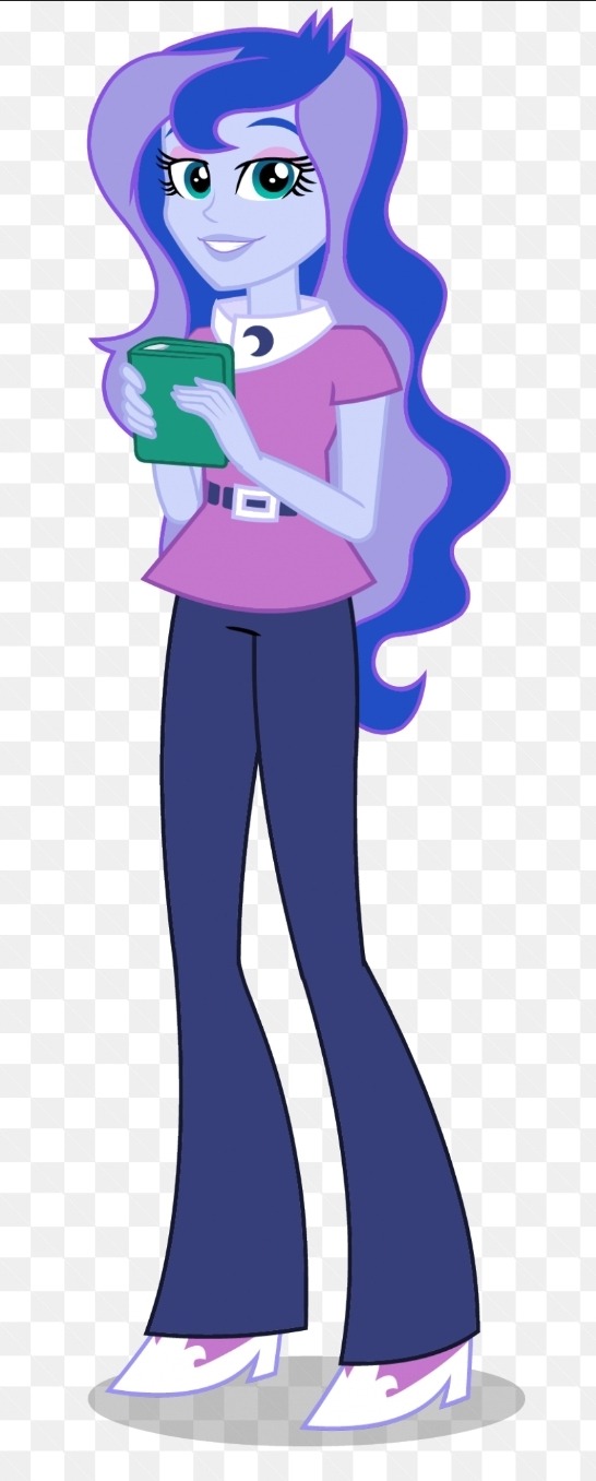
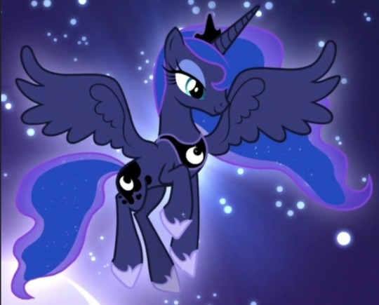
WHO IS SHE. THAT OUTFIT? NOT LUNA. THAT HAIR? YOU WOULDVE BEEN BETTER OFF JUST DOING A GRADIENT. OR PUTTING IN LITTLE STAR HAIR CLIPS. THAT FACE? THATS SOMEONES WINE MOM WHO SINGS EXTRA LOUD AT CHURCH. same critique about the hair spikeys as before. AND THE SKIN??? HELLO??? THE PRINCESS OF THE NIGHT GOT TURNED INTO PRINCESS OF MIDDAY. WHY.
the design of the show vs the movies is, i guess now literally, night and day. pony luna is so inspired and pretty and meant to invoke such regality, its very clear what her theme is, and she very much sticks out amongst the others, both in shape and details!
but the human version feels generic, she could easily be a background character (and she basically was), she feels unfinished, the colors on their own arent the worst but moreso feel insulting when compared to the original (i like the addition of pink/pinkish purple to the palette, but not so much to luna as a character. it just isnt her imo), she doesnt even look like an authority figure aside from obviously looking older than the other characters, let alone being someone meant to be somewhat equivalent to royalty. also again she was a minor character here but its like... her pony version has such a stone strong personality, both when shes freshly back from the moon and later on when shes more grounded and princess-like. human luna is just... generic teacher person. did human luna even ever experience significant isolation and feeling completely unseen by everyone she cared about? doubt it.
and yeah, they significantly lightened her skin ?? why ?? theres literally no reason to do that? she wouldnt look like a caricature unless you somehow chose the wrong colors (how possibly would you), and its not exactly impossible to draw characters with darker skin, again her pony form literally has a dark coat !! but also plenty of people have redesigned her human form to have the right skin color and they look great!! and in general obviously theres plenty of characters with dark skin, like... what was the reason they did that. it just feels gross.
dont cross me when it comes to luna dude i love her so much
anyway yeah its been over 10 years since EG first aired and i loved it back then and i still love it but i think a lot more about character designs now. mlp g4 is known for having these really pleasant and well put together designs with lovely colors (for the most part), its so weird how that gets easily messed up, like in g5, but also still in g4 itself(in the spinoffs and the main show lol)? wish i had the motivation to redesign them all lol, i probably will someday. please go look at redesigns theyre very lovely
#mlp#my post#long post#my little pony#equestria girls#in which i talk a lot. this was obviously an excuse to rant about the luna choices#luna was one of the first characters i ever related to dude dont fuck with me when it comes to her !!!!#i actually like the decision to keep the characters mostly whimsical colored as humans since its the colorful pony franchise#and it also means they ideally wouldnt be excluding or alienating anyone by having to choose canon human skin colors#but that second one really falls flat with the lightening and also aj is literally. human skin colored instead of orange#man can you imagine being paid to design human luna and you make her look like that. and somehow shes approved#it costs 0.00$ to not do that. or maybe it cost them money idk but like. i have to wonder if#if they ever made her look like herself in concept or she always looked like that#cause if she ever looked like herself in concept. why change her.#i could probably answer some of my own questions through google but. its late and im tired#its Free to make a dark skinned character and make them look good. it costs nothing. and its easy.
4 notes
·
View notes
Note
How the fuck is Pinkie Pie perfect proof on how to design a party character without being overtly detailed
It's just proof that a simple character design can go a long way. You can add as much colors, patterns, and clothing as you like but if the end result is an eyestain mismatch nightmare filled with needless details that confused viewers, you messed up.
Pinkie Pie's bright colors tells us she is a loud person, her hair being big and puffy tell us she is goofy, a free-spirted, and a fun person, and her cutie mark is a bunch of balloons, objects associated with parties and fun. Heck even her specific main colors of pink tell us about her personality. Pink in color language is sweetness, politeness, childhood, and charm.
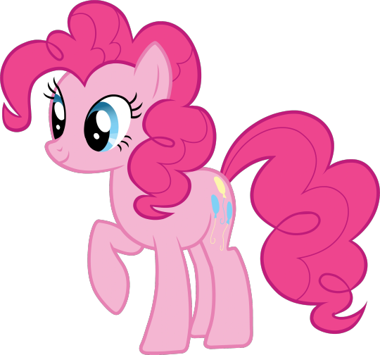
When designing a character, the priority isn't to shove as much details as you can but to easily convey the character's personality by one simple glance. It's why character designers focus on colors, shapes, and clothing because even though those thing seem minimal on their own if you put them all together, you can create a great character design that speaks volumes about the character. Also the main reason why character design is also tedious because if a color is too saturated and the clothing slightly doesn't fit the character, you can throw the design off and misportray your character.

This design for Pinkie's sister tell us she is a dry dull person. She only has cool and neutral colors to tell us she is less energetic than your average pony, her hair being straight tell us she's more formal and closed off than her sister who has big curls, and her eyes being half open tells us she's a calm person.
While Viv's Beelzebub..

This is not it. I like Bee's design on it's own but for the Queen of Gluttony, no. It's Viv's interpretation of a furry Kesha than Beelzebub.
The bright colors does let us know she is supposed to be an energetic and out-going person but everything else is confusing. The blacks on the limbs, the lava-lamp like stomach, and the blue part of the hair are all unnecessary. There is also some insect features as a nod towards Beelzebub's OG design but they're so tiny, you would miss it.
What Viv should have done to make this design easier to animate and stronger is emphasis only two main feature instead of giving every different idea for this design the same amount of importance, the honey hair, Hellhound-bug hybrid, lava-lamp stomach, stripes, and blacks. Another reason why people don't like the design because it's not Beelzebub when people first saw the EP, they didn't know she was suppose to be Beelzebub and I can't blame them.
What I think Viv should have done is emphasis the Hellhound-bug hybrid and honey hair. Those are the two things only unique to her design. Viv can limited the colors to be yellows, browns, and blacks. Not only will the color scheme help her stand out better and are more cohesive but also it's a hint to her bug side. Second, make the bug features bigger and obvious, Beelzebub's iconic look is being a bug. Viv's interpretation can still differ from the original version but she should add and make the bug motifs/feature bigger to make it obvious that it's Beelzebub. Third, only choose one fur pattern. There are so many fur patterns, none relating to each other to justify keeping them all in and making the animators' job harder. The pattern can be anything but in my opinion I think stripes are the best option because again to make the bug part of her obvious and her being a hellhound-bug hybrid can be a pun on her name, Queen Bee. Fourth, remove the spikey blue hair on her head and just make it the honey hair consistently though. Last, the clothing. The clothing is the better part of this design beside the tuff of fur appearing through her bra and shirt. But it's just Loona's clothes with a few minor changes. The clothes should have bee elements incorporated. Maybe a fur coat with fur around the neck, a skirt shape like a stringer, the honeycomb shaped, stripes, etc.
#If you give me an ask about character design I will make it into an essay#꧁rambles꧂#helluva boss critical#helluva critical#helluva boss criticism#➥Asks
43 notes
·
View notes
Note
So, how do you think the other supporting characters' (who have pony counterparts that is) outfits on Equestria Girls were with Celestia, Luna, the CMC, Cadance, Trixie, Starlight Glimmer, Big Mac, Lyra, Bon Bon, DJ Pon 3, Maud Pie, Zephyr Breeze, Cranky Doodle, Snips, Snails, Shining Armor, Photo Finish, Bulk Biceps, Granny Smith, Miss Cheerilee, Octavia Melody, Diamond Tiara, Silver Spoon, and Derpy?
Okay let's go down the line!
Celestia - I like this! It fits her tbh. I do laugh a little at how they tried to make the crown in her hair by giving her these little cowlicks.
Luna - I'm like 90% fine with Luna's outfit but I just. Why??? Why did they change her skin tone?? She's so light!! What happened??? Like I know some characters got a touch lighter compared to the pony's coats, but Luna's one of the ones who got it the worst
CMC - putting them together because honestly I like all their default outfits. I think maybe Applebloom's is a touch plain, but if that's my biggest criticism...
Cadence - Hers is.... alright. Like it looks good on her, but it's also a work uniform designed to match-but-stand-out from the Crystal Prep looks, so we don't see as much of Cadence herself in the design. I'm not sure what I'd put her in for something more casual.
Trixie - She is perfect 10/10. I love her main outfit, but I also 100% ADORE her look in Rainbow Rocks.
Starlight - I don't like this look. Don't get me wrong, it's a great outfit! Just not for Starlight. Like she's an ex-cult leader learning how to actually make friends why does she look like she's about to chill at a skatepark?
Big Mac - Almost perfect but why??? With the skintone again???? Like some people argue that they changed it to avoid a racism thing because 'red sk*n' is a slur against Native Americans but that's a stretch and doesn't make sense for many reasons.
Lyra - I do not like this one. The pink is a bit too clashing for a main color(I'd allow it for an accent/accessory but not the main shirt and boots) and wtf are those shorts?
Bon Bon - This one's cute! The white might be a touch too overwhelming, but it's still cute!
DJ Pon-3 - Perfection! I love her!
Maud - tbh they literally just took her pony counterpart's dress and it 100% vibes with her. Perfect no notes.
Zephyr - he looks absolutely awful but in a good way because it fits his character's vibes oh my GOD he's a loser. Like if you showed me him with no context, ofc my first guess would be 'couch-surfing stoner who eventually became a hairdresser'.
Cranky - his actual /face/ looks so weird because they're trying hard to bring in the donkey look, but his clothing choices match him well.
Snips - very generic but he looks like a typical kid of that age
Snails - a bit more personality compared to Snips, making him a touch more awkward, but still quite generic.
Shining Armor - no. Just. Idk. I feel like Cadence probably dressed him so he'd look nice for that meeting with Principal Cinch but she did it by raiding his dad's closet. I don't think he'd look too messy ofc, considering the Pony is a Guard Captain the Human is probably military or police, but what they gave him doesn't quite work and it shouldn't be something he wears casually.
Photo Finish - Like Maud, they just took her Pony Counterpart's dress and put it on a Human. So it 100% works and is designed to vibe with her.
Bulk - Absolutely on brand
Granny Smith - Her design itself is a bit off to me because her pony self is very thin but her human self is fat? It's weird. But the outfit itself is nice. Very 'granny' vibes.
Cheerilee - The design itself is weird because it's another one where they fucked with the colors, this time switching her hair and skintone? But the outfit is very cute and good to convey 'teacher' vibes. I think my biggest complaint (other than the color switch) is that there's not much to differentiate her as being a teacher instead of another student. (then again.... considering Big Mac is apparently still a student, maybe she is too?)
Octavia - See here's a character where 'nerd prep' works! Great design!
Diamond Tiara - yellow is not the right color for her. It's. It doesn't look right. It's too much. I like the outfit otherwise, just switch the yellow for maybe a blue or purple.
Silver Spoon - absolutely adorable no notes!
Derpy - Adorable. The colors seem a touch off, but it kinda vibes with her personality. Unfortunately she commits the penultimate sin of socks and sandals.
7 notes
·
View notes
Note
Hey Mocha! I had a few questions about the descendants and the elements, feel free to answer this privately but I thought I'd send them in here. I'll separate my two questions so that you can decide separately for each -
Question 1. What exactly is the timeline here for the og Mane 6 passing, and now their kids taking on their elements? Are there generations in between that havent been discussed?
I don't mind answering publicly! Consider this a sneak peek and a bit of a world-building explanation.
So since the Cinnaverse and by extension the Lemonverse are based in an AU of the original MLP cannon, some events are the same and cannon, while others are slightly different if they even exist at all.
Seasons 1-3 of MLP FIM are cannon to the universe, the difference is Equestria Girls does not happen in the Cinnaverse. (that is why I say the EQG designs of Cinna are considered non-cannon) If you subtract the entire events of EQG, the timeline goes from Season One to about Episode One of Season 5. That is where the slight differences start to happen. Starlight, rather than getting away, was defeated when she was introduced and redeemed throughout what would be "season 5", basically imagine the show's season 5, but include Starlight learning friendship lessons alongside the mane 6. Everything after that is more or less the same, but Starlight doesn't have her second era of villainy.
Her friends passed over about 100 years after MLP FIM's Final Season. Their direct children, (Little Cheese and any children the other mane 6 had) became the bearers of their parent's elements alongside Twilight. The important thing to remember is current day Cinna is 1,000 years removed from Twilight's original group of friends, (Including Starlight, The Student 6, CMC, etc.) Twilight's grief increased with every generation of descendants. The current Descendants, (Crystal Cord, Mascarpone Pie, Gem Mist, Opal Apple, and Lightning Flash) are not direct descendants of the mane 5 (Twilight removed because she has no children) They are descendants 1,000 generations down. That's why some of the races have been switched around, (Except for Apple Jack and Pinkie Pie's because they are historical earth pony families that didn't marry into other pony races) That's why Gem Mist is a Pegasus and Crystal and Lightning are Unicorns.
In short, the answer to your question is yes, many generations of previous descendants haven't been mentioned. But that is why Twilight's grief is so important. She's essentially Blue Diamond from Steven Universe, (Except she grieved for 1,000 years, not multiple thousands of years.) grieving over 5 Pink Diamonds that she hasn't fully accepted are gone. She can't, because she sees the Mane 5 in the descendants, no matter how many years they are removed from the originals. She's also been so consumed by her grief, that she doesn't realize that she's not actually the true element of magic anymore, her star student is rising to that mantle. (Luna Moonstone) She also doesn't realize that the current state of Equestria is currently a MASSIVE friendship problem that more elements have to be created to fix. 🍫
5 notes
·
View notes