#Blue Ultramarine blue Pigment
Text
visual stimming is by far the weirdest kind of stim on the brain. just going about life wanting to glue holographic pokémon cards directly onto my eyeballs every single day forever
#there’s no like. release.#looking at colors isn’t enough i need to inject ultramarine blue pigment straight into my veins#i could eat it i could live in it i could build a home together. with ultramarine#visual stim#stimming#adhd#and others
2K notes
·
View notes
Text
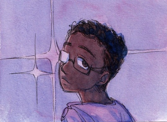
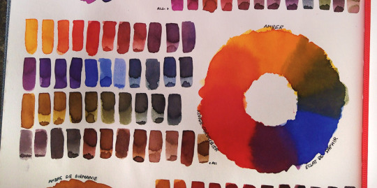
drawing lots of dramatic lias. shes going hauntinggirl mode
#art#traditional art#watercolour#oc art#ocs#oc group: lia crystal darling#oc: lia#i dont have any purple paints in my current watercolour set which is surprising because i am a big convenience colour guy#like im so lazy about mixing colours i'll fudge it with layering half the time#so i make purple with some permanent rose and an ultramarine#makes a beautiful vibrant purple as its a red toned blue and a blue toned red together#but also something about maybe the pigment densities? and/or maybe because the rose is a different brand from the ultramarine#and they have different formulas (the rose is w&n and the ultramarine is sennelier and i know sennelier has honey in there LOL)#but like when i mix them if i put in enough water as it dries the pigments bloom and slightly separate and pool in such like#beautiful and interesting ways#other paints will do that a bit but these two do it so wonderfully that i honestly probably never will get a purple LOL#i like my mixed purple too much kkjraelfjrklfedjfkda#so yeah ive been on a purple kick 1) because im in the lia zone and thats like her image colour HJKFDSJFD#BUT ALSO 2) im having too much fun with weird pigment shenanigans#that ultramarine blue deep just does whatever it wants. drags the permanent rose around with it. awesome
35 notes
·
View notes
Text
i should have like waited until i come back to life after an outing but i decided to open my watercolor palette and got sooo fucking frustrated at the tiny little pans algkslhkdlj
#fuck me!!!!!#they like wiggle around there but I can't sometimes get them out#also the paint blocks fell out i had to add water to secure them#i am not used to thisssss#and it wants to just close ln me???????#i'll get used to it but ..... wasn't this supposed tl be gpod quality lmao#i got it bc it is small and maybe slme day i will paint outside#but man.....#this ks nothing like the watercolor palette for kids algkdlj#my nails are so ruined now too#i'll bget used to it.#im already liking the high pigment tho!!!!!!#I'm trying a tutorial from a book#and i know im missing a shade i really need actually#i didn't check which shades this palette has bc i can just replace them when i want#i think i already have some swaps kn mind#i don't see myself using sap green very much#also i don't need 2 reds i think#also i don't think I'll use cerulean blue#i use a lot lf ultramarine tho so i might get another one of those#and i need burnt umber im in love with it idk why#I'll swap that whith the sap green#i like to mix my greens more tbh
1 note
·
View note
Photo
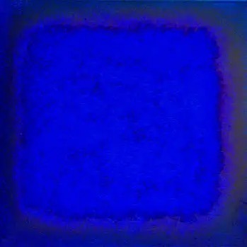
#ultramarine #blue #colorfieldpainting #fineart #contemoraryart #colorfieldart #saatchigallery @singulartofficial #singulart inspired by #yvesklein #oilpainting and #pigment on #canvas ready to hang #rtistiq #theartling #artmajeur https://www.instagram.com/p/CoSLtgYI4Yt/?igshid=NGJjMDIxMWI=
#ultramarine#blue#colorfieldpainting#fineart#contemoraryart#colorfieldart#saatchigallery#singulart#yvesklein#oilpainting#pigment#canvas#rtistiq#theartling#artmajeur
1 note
·
View note
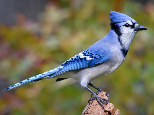
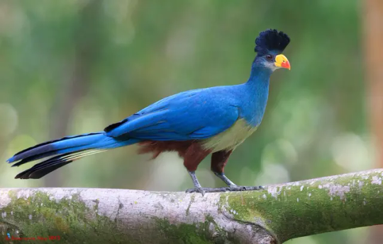
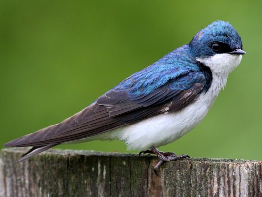
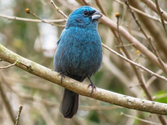
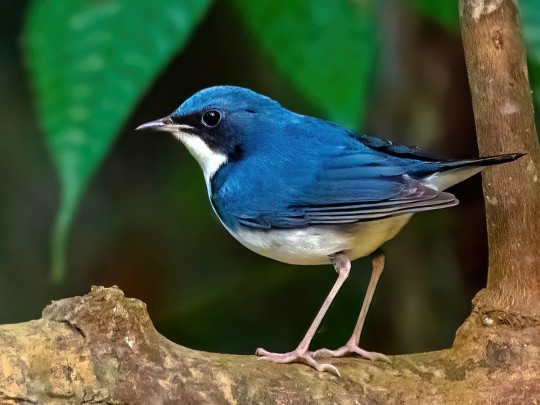
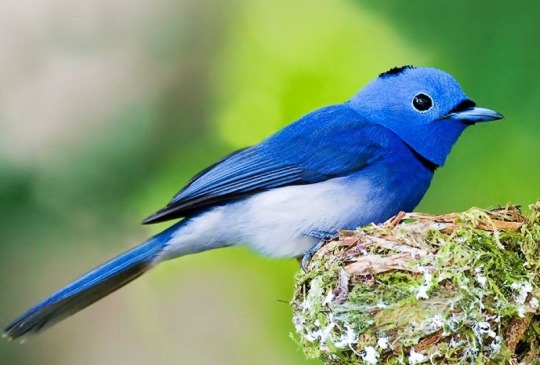
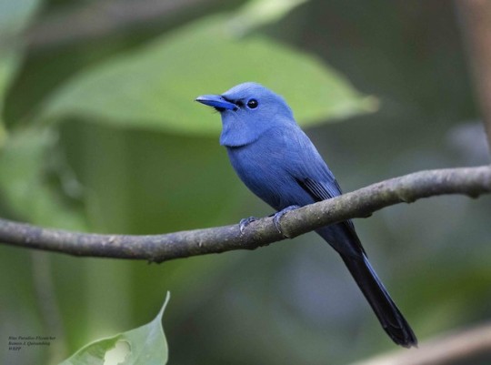
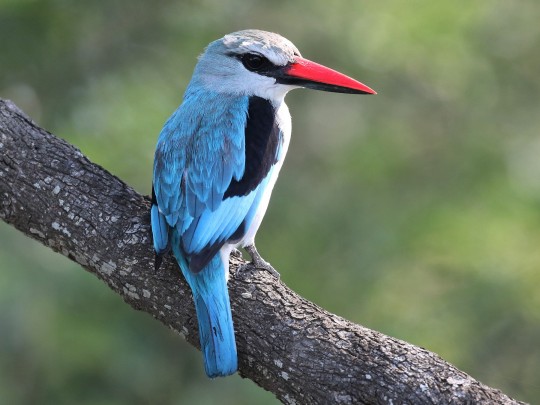
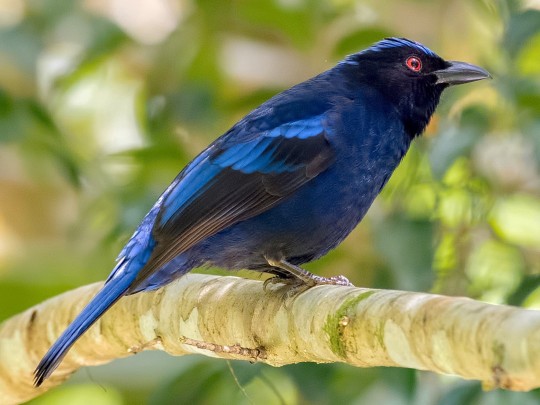
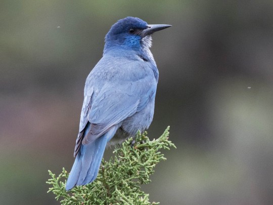
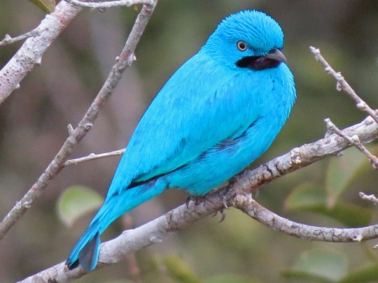
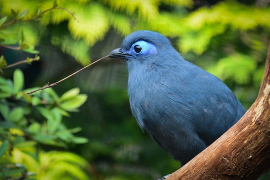
Text
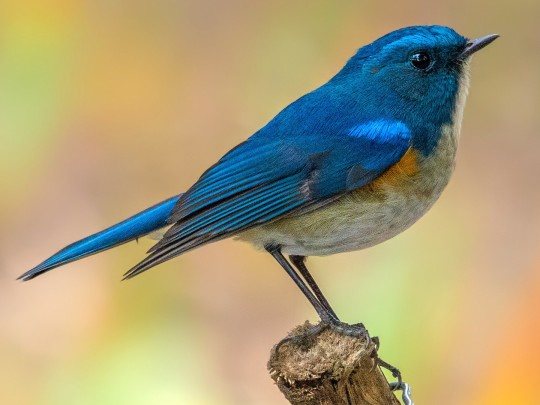
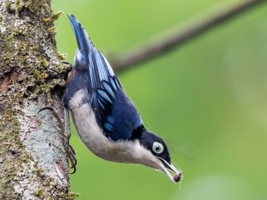
Blue Birds of Happiness
Blue is an extra-fun color for birds to be, because, as you may have heard, it is not created by a pigment. Blue feathers (and the blue scales on butterfly wings, and the blue irises of some humans) are structural, meaning that the color is created by the physical properties of the living tissue, which are arranged in such a way that they reflect the short wavelengths of blue light. Often this is paired with a dark pigment which absorbs other colors of light and makes the blue 'pop'. Look at all the tints and shades they can make!
Mountain bluebird

2. Himalayan bluetail
3. Blue nuthatch
4. Blue jay
5. Indigo bunting

6. Great blue turaco
7. Tree swallow
8. Ultramarine flycatcher

9. Hyacinth macaw

10. Glaucous-blue grosbeak
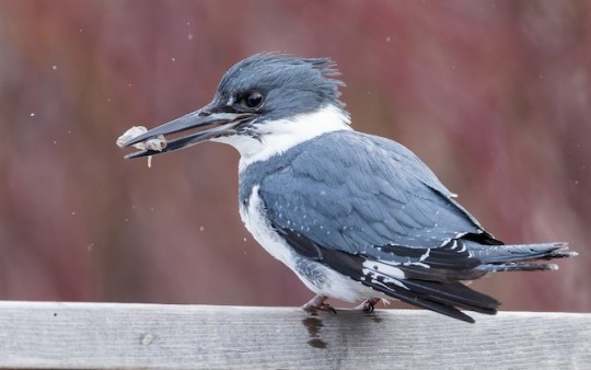
11. Belted kingfisher
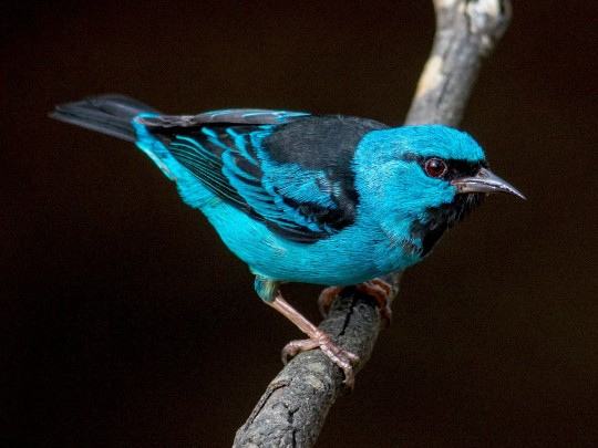
12. Blue dacnis
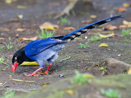
13. Taiwan blue-magpie
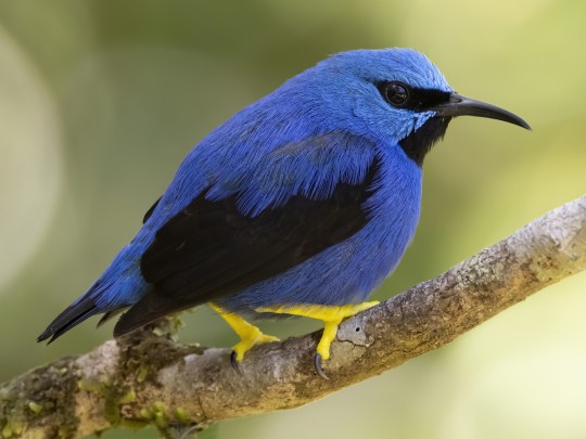
14. Shining honeycreeper
15. Siberian blue robin
16. Blue whistling-thrush
17. African blue flycatcher

18. White-throated magpie jay

19. Black-naped monarch
20. Blue paradise flycatcher
21. Cerulean warbler

22. Woodland kingfisher
23. Indian peafowl

24. Little blue heron

25. Philippine fairy-bluebird
26. Pinyon jay
27. Blackish-blue seedeater

28. Plum-throated cotinga
29. Deep-blue flowerpiercer

30. Blue coua
171 notes
·
View notes
Text

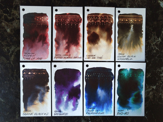
haritora feets - Roxy | watercolor sketch, pigments PBk11, PY184, PB29, PV19
I used VRChat to actually socialize! I followed @cavern-of-remembrance here on tumblr when I was first learning about VRC. Roxy’s VR self-portraits inspired me to take up photography in VRC, where I met other photographers! And there’s SO many similarly inspiring artists of all mediums I’ve been introduced to through her reblogs!
Talking about the tech of VR seems to be “the weather” of VRC conversations. Roxy uses a headset and additional hardware (HaritoraX) for full body tracking, so when we met I was like “oooo leggies!” A good icebreaker topic, I think?
When I was describing the hangout to a partner the next day, the words that came out to describe the additional hardware were “she’s got haritora feets”.
I think the vivid hue of her hair strikes me as very close to PB29/ultramarine blue, which made me want to paint it! So that was the base of the palette. The gradient stripe on the pants was so fun to paint!!
Thank you Roxy for showing this old possum some great VRC worlds and art!
#mx kit chimera#watercolor sketch#vrchat inspired art#autistic artist#furry art#anthro art#sketchbook
129 notes
·
View notes
Text
I'm going to start teaching my nephews some basic colour theory; they're 9 and 10 and really passionate artists, and I think a little knowledge now will help them push themselves a lot further.
I'm going to start with colour mixing. I really think that color mixing using paint is a valuable metaphor even if you are working digitally 99% of the time. who knows what my nephews will end up focusing on as they get older, but having the metaphor of mixing paint to achieve different colors and understand how colors relate to each other visually should be a really useful ground level structure in any ongoing learning they do with color theory.
so I've put together a watercolor palette using student grade non-toxic paints. we've got two reds, two yellows, two blues, and burnt sienna.

I'm going to include white gouache as well, so we can talk about tinting colors, and how colors appear different when they are diluted versus tinted. also, honestly when I was their age I think watercolor was really punishing, and just bringing in some white gouache gives them a chance to rework areas if they want to. I'm hoping this makes stuff a little less frustrating and helps them feel more empowered to keep fixing and pushing their work instead of just giving up.
I don't currently have a plan to have black paint in there right now, because I want us to focus on color mixing, but I wouldn't on principal prevent them from having a pan of black paint in future for their own time with the paint. I just think it might be distracting or confusing when I'd rather we focus on mixing neutrals with these colorful pigments.
I've got five Windsor and Newton Cotman brand pans - phthalo blue, lemon yellow, cadmium yellow hue, cadmium red medium hue, and burnt sienna; and the other two pans i filled with van Gogh brand tube paint - ultramarine deep and madder lake deep.
This gets me a decent spread of secondaries without confusing anything by introducing the CMY approach.
I think learning the CMY palette will be valuable too! but it made sense to me to start with palette that most resembled what they are likely to be learning in school in terms of subtractive color mixing. if they do learn about additive color mixing, they'll be working with the cmy palette with light, so I figure I'll let this be different at the moment.
I've included burnt sienna after weighing my options, because I think it's important for them to learn how to neutralize colors in a few different ways. burnt sienna and ultramarine blue are such a classic neutral formula, and such a great way to mix something that's nearly black, that it felt important to include. the fact that when you mix it with the phthalo blue you get a green instead of a neutral, I think that's a really great example of how color mixing can be surprising as well.
I'm working on a couple little example paintings to help them see the range that is possible with this palette, so here's one with greens and purples; I'll do one in neutrals overall and another maybe in oranges and teals.
I think for exercises we might want to work up to the colour wheel - maybe starting first with the basics of mxing using different rations to get different colours, and go from there.
If anyone has any advice on teaching this to 9 and 10 year olds, I'd love to hear it! I think they'll be excited to try something new and open up more possibilities for themselves as artists right now; beyond that I won't be particularly intense about it.
Also, do you remember when you learned paint mixing and basic colour theory? What were some moments that stood out to you or stuck in your mind forever?
57 notes
·
View notes
Note
Slides in for cursed Ultramarine facts.
Blue is an extremely difficult colour to manufacture for the purposes of colouring ceramite, particularly in the Imperium, where access to naturally occurring pigments is increasingly limited due to the poor state of most planetary ecosystems.
This is, as you might imagine, a problem when your entire chapter and a basically all of your successor chapters wear blue armour, and require that blue armour to be maintained and rebuilt and recoloured due to frequent battle damage. Even with Guilliman pulling political strings to get Ultramar preferential access to shipments and sources of blue dye, there are often long stretches of time where repaired or newly refurbished pieces of armour will be coloured a default metallic grey. This is wholly unavoidable due to the way the Imperium has operated, and continues to operate.
With one exception.
Very rarely, a migratory species of warp entity will embark on a crossing through Ultramar. It is impossible to predict when this will happen, and no one is wholly sure why, but every so often one of Guilliman's worlds will be party to a migration of small, butterfly-like creatures. They are a rich, ethereal blue, winging fairly close to the ground and leaving soft sapphire light trails in their wake. Many thousands of them move through at a time, appearing seemingly from nowhere and fading gently away less than ten minutes later. They are not known to be harmful in any way, and actually evoke powerful feelings of joy and wonder (directed at the creatures). This is suspected to be a defense mechanism to compensate for how fragile and eye-catching they are.
They are so fragile, in fact, that any kind of mildly forceful physical contact will cause them to burst apart in a shower of dust and viscera the same shade as their forms.
Unfortunately, this mixture seeps into metals and fabrics extremely well, colouring them blue at a molecular level permanently.
However, because they are not creatures of the physical world, and present for such a little time, striking them with weapons or attempting to use containment devices on them will fail, and they will simply phase through the contacting item or energy field. A direct blow from a being with a soul, however, will effectively slay them, though the emotional distress caused by destroying something that brings such joy is considerable.
Regardless, blue pigment is low, and time is short, so a migration of blue butterflies on any of Ultramar's planets is always accompanied by frantic droves of fully armoured marines careening through the glittering flight, sobbing, weeping openly as they smear the folorn remains of countless dead insects all over their armour. The feedback of sorrow at so many of their deaths is such that some marines will start screaming brokenly, the sounds mingling horribly as dozens of vox beads convey shared horror at such brutality.
They know what has to be done, however, and so the marines continue to rub pulped up butterflies into their pauldrons even as their helmets fill with tears.
#ask#warhammer 40k#warhammer 40000#space marines#Ultramarines#Adeptus Astartes#Roboute Guilliman#Space Marine
234 notes
·
View notes
Note
Hi hello, I love your art so much LIKE MY BROTHER. IT'S SO YUMMY, THE SHADOWS THE EXPRESSIONS, I love how you draw Timur , Felwinter and Osiris together 🙏 little bird with his two funky adoptive parents. I stare at your art like , I'm always ready and hyped to give traditional art another try ✨
If I was to go back, any tips for which watercolours to pick? I so far got only aniline colours.
Aah, thank you so much!! 😳💙
Hmmm, the thing is, I use fountain pen inks almost always for painting. I don't use watercolour much, so I can't really suggest anything in particular… I have a selection of colours from different brands, of course, I know quite a lot about pigments, and I like using watercolour from time to time to add some special effects to my works. For sketching outdoors it's also the easiest to use among all other paints, probably. But painting a whole artwork with it……… I try doing it sometimes, but every single time I end up thinking "God, I wish I used inks instead, I hate this so much, why is it so BLEURGH". I guess watercolour just isn't my medium 😂
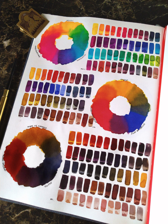
I can share my thinking process when building up a palette though, I use it with all mixable mediums I use, be it inks, watercolour, gouache, etc. I found it to be the most effective (and money-saving, lol) approach for me.
So what I want for my main mixing palette is to have 3 sets of primary trios. All colours also must be as smooth as possible, with no surprises or unwanted colour separation. For watercolour - not granulating ones.
(my camera tends to make all colours brighter and also fails to see the subtle difference between some shades, but you can still get the idea)
The first trio is extremely vivid, consisting of bright cool colours - lemon yellow, cyan, magenta-leaning pink. It gives you access to all the bright, open colours.

Second is the classic they teach in all art schools (probably, from what I've heard, I never went into one alkjdshfk) - sunshine yellow, bright warm red and ultramarine blue. This gives you a huge selection of warmer, natural colours, like all shades of golds, eggplant purples, olive greens, etc. It also allows some nice selection of wood browns.
Third is my personal favorite, the muted trio. You kinda can get similar colours from the previous trio, but I prefer having these separately, because of how often I use them all. It consists of golden ochre-leaning yellow, dark bloody red and dark indanthrone blue. It gives you the most beautiful browns, beiges, blacks and other rich, deep colours.

On top of that I also like to have at least one decent black (in my case it's Quink Black ink, I cannot live without it). And these 10 would be my essentials. Other colours I add to my mixing palette are basically shortcuts to the shades I find myself mixing the most - like a few browns and violets. There are also a few inks that I need for some very specific purposes - like, I have a very vivid cold magenta ink to mix a certain bright cold shade of the Void, and also a fluorescent orange for adding shiny Exo LED lights. And etc.
(Actually I'm currently in the process of re-organizing my main palette and also considering making a few small sets for painting some characters specifically)
I also have a separate selection of chromatographic inks, which can probably be compared to granulating watercolours… But not quite. A few examples:
Here I don't have any special notes or advices, just get the ink you like and enjoy it. Some of these I use so often that I always keep them in my main palette, and others I only get out for some special occasion. These are also mixable btw - I constantly add other ink in Quink Black to get different shades of it.
However, I must say that not all of the ~special effects~ inks are polite and well-behaved, some will agree to work only on some specific paper after a significant amount of coaxing, and others will straight out say "fuck you" at the most crucial moment, even if they worked perfectly just a moment ago.
Btw, when working with inks, I really recommend to put it into smaller bottles with a dropper, so you don't have to open the big bottle each time. It's both easier to use for you and much safer for inks!
ANYWAY, I hope this post was of some use for you 🌈
40 notes
·
View notes
Text
What Color is Ultramarine Blue?
Ultramarine blue is a vivid and deep blue color. It's often described as a rich and intense shade of blue, resembling the color of the lapis lazuli gemstone. The name "ultramarine" actually comes from the Latin words "ultra" (beyond) and "marinus" (sea), indicating that the pigment was originally derived from a rare and valuable blue mineral sourced from distant lands.
Was ultramarine blue expensive?
Yes, historically, ultramarine blue was one of the most expensive pigments used in art due to the labor-intensive process of extracting and preparing the pigment. The original source of ultramarine blue was the mineral lapis lazuli, which had to be mined primarily in Afghanistan. Extracting the vibrant blue pigment from lapis lazuli required meticulous grinding and purification, which made it a time-consuming and resource-intensive process.
Because of its rarity and the effort involved in its production, ultramarine blue was often reserved for use in the finest artworks and was considered a symbol of wealth and prestige. It was frequently used in religious paintings, particularly in depictions of the Virgin Mary's blue robe.
Over time, alternative synthetic methods for producing ultramarine blue were developed, which brought down the cost and made the pigment more accessible. Despite this, historically, ultramarine blue was indeed an expensive and prized color in the world of art.
Is ultramarine a purple blue?
No, ultramarine blue is not a purple-blue color; it is a true Ultramarine blue color with no significant purple undertones. It is a vivid and deep blue hue, often described as a rich and intense shade of blue, resembling the color of the lapis lazuli gemstone. The name "ultramarine" comes from the Latin words "ultra" (beyond) and "marinus" (sea), referring to the fact that the pigment was originally sourced from a rare blue mineral found beyond the sea.
Purple-blue colors would have more of a blend of blue and purple, leaning towards the purple side of the color spectrum. Ultramarine blue pigment is distinctively blue and does not have a strong presence of purple in its composition.
Visit at :- https://www.ultramarinebluepigments.com/
#Ultramarine Blue Colour#Ultramarine Blue Color#Blue Colour#Pigment Colour#Pigments Colour#Ultramarine Blue#Ultramarine Blue Pigment#Ultramarine Blue Pigments#SKU Pigments#SKU Pigments Limited#blue pigments#best ultramarine blue pigment#blue pigment#ultramarine blue manufacturer#ultramarine blue pigment manufacturer#ultramarine blue manufacturer in india
0 notes
Note
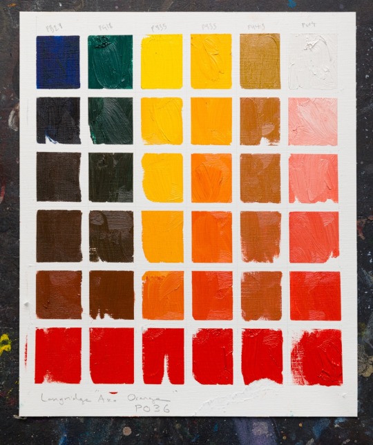
In your pallete post you say that if you want to build up your skills you could only use burnt umber and white :0? Is there a reason burnt umber would be better than pure black and white?
Hello anon, that is a GREAT question!
My short answer is that burnt umber is a very versatile and forgiving pigment to use, whereas black pigments [ivory black, mars black, etc] have less uses in colour mixing, are more difficult to handle, and can cause archival problems down the line, like cracking.

Further discussion and a commentary on this chart is under the readmore.
The colours mixed on the chart above were made with approximately the same amounts of paint as each other, to show how the different pigments interact.
The main thing to consider about black pigments is that they are NOT neutral in therms of hue, so if you try to darken a mix by adding black, the mix will also be pushed towards blue [for the purpose of paint mixing, we can think of black pigments as dark blue], which is usually not the colour direction intended by the artist.
A better alternative is to mix your own black colour using Burnt Umber and Ultramarine, which gives you more control over exactly what colour of black you want to make, be it more brown or more blue.
So if you are mixing your own black with burnt umber and ultramarine, the circumstance where an actual black pigment would be of use presents itself only when your subject is darker than what can be achieved via brown+blue. A similar situation to this one would be a circumstance where you need to paint something that is more blue green than ultramarine can produce, so its time to bring out the pthalo blue. These stronger pigments are sometimes called "Power Colours" and are used to supplement a limited palette.
The reason I recommend burnt umber as a beginner pigment is because it mixes well with other colours without overpowering them AND if you are just doing value studies with burnt umber and white, it's a much better time investment to learn the value scale in because burnt umber has way more applications in full colour painting than black does.
265 notes
·
View notes
Text
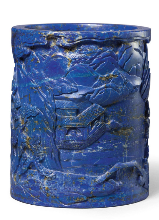
Brush pot made of lapis lazuli, Qianlong Dynasty
With its brilliant indigo colour pertaining to the heavenly celeste, the stone was often reserved for objects and accessories destined for use in ritual ceremonies. It was also a source of the ultramarine pigment in religious mural paintings. Scholar’s objects fashioned from this material are scarce, though a small number of carved mountains and table screens do exist. Symbolic of purity and rarity, lapis lazuli appears to have been named qingjinshi (blue gold stone) during the Qing dynasty. The aura of mystery that surrounded this stone may have been due to the virtually inaccessible location of its principle mines in the remote Badakshan region of northeast Afghanistan behind the Hindu Kush.
Sotheby's
50 notes
·
View notes
Text
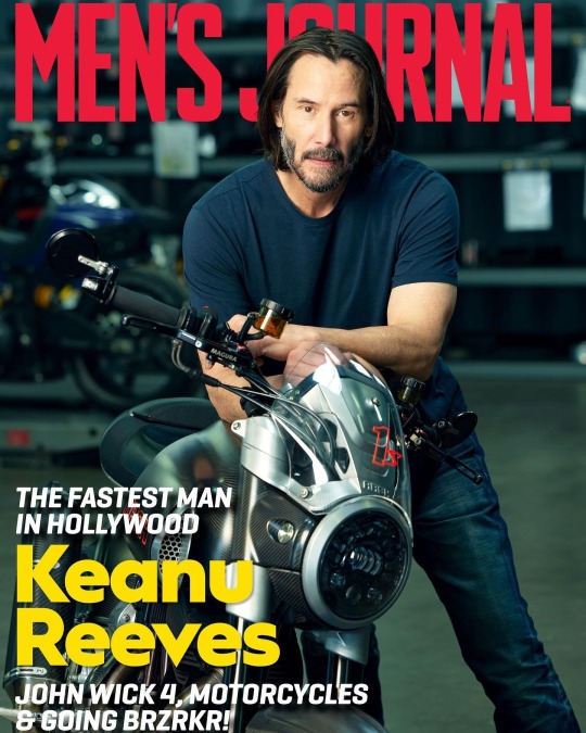
The Enduring Appeal of Keanu Reeves
He battles evildoers in 'John Wick 4,' manufactures two-wheel pieces of art, and is worshiped by the internet, but Keanu Reeves swears he's just a normal guy. And he’s got the scars to prove it.
Ky HendersonMar 15, 2023 9:00 AM EDT
It’s easy to look cool when you’re riding a motorcycle, but it’s hard to look cooler than Keanu Reeves on a brisk, sunny afternoon in Los Angeles. He rests his left hand on his thigh and steers with his right, which gooses the throttle as he weaves around slow drivers. He wears a form-fitting black canvas motorcycle jacket that accentuates how trim he is—even more fit than he appears on-screen—and a beat-up Shoei helmet. He leaves the visor up, choosing instead to shield his eyes with sunglasses the Terminator might wear to a Hamptons garden party. Reeves looks at home and at ease on a motorcycle. He looks cool.
At a gas station stop, he suggests switching bikes. We’re each riding cruisers made by Arch, the motorcycle company Reeves co-founded with designer Gard Hollinger in 2011. The company produces high-end, highly personalized production bikes; I’m on a 1s, the company’s new $100,000+ sport cruiser. Reeves is on an older model, KRGT-1, but it’s his personal Arch, a true one-of-a-kind. It's the only Arch ever painted YK Blue, a color Reeves and Hollinger commissioned based on the ultramarine pigment famously mixed by mid-century French artist Yves Klein. Reeves says all that’s left of the paint is in a tiny can stored somewhere at Arch in case the bike’s paint ever needs touch-ups.
Which it most certainly would if, let’s say, some idiot were to put the bike down in front of a horrified Reeves while riding down the Pacific Coast Highway. Thankfully, there’ll be no lowsides today. Although the bike is beefy, with a 2,032cc V-twin powerplant, it’s easy to maneuver and comfy as a BarcaLounger.
Keanu Reeves stands in motorcycle factory holding blue mug
Brian Bowen Smith
Reeves eventually leads us back to Arch’s factory building, which is nondescript from the outside but artfully decorated inside using shipping containers to separate working areas. Metal fabrication is done behind one; customer bikes are lined up in another with technicians hard at work. After Reeves dips outside for a cigarette—the 58-year-old both looks like a much younger man and smokes with the frequent abandon of one—he leads us to a small conference room.
“I like meeting people, but I’m a little reserved,” he warns as he settles into an office chair, looking far less comfortable than he did on a motorcycle. “How much of my private life do I want to talk about? I don’t know. Otherwise, let’s hang out.”
When Reeves was growing up in the Yorkville neighborhood of Toronto, he was consumed with existential thoughts. He discussed death a lot more than the average 11-year-old, for instance—but not because he wanted to die. He just wanted answers to big questions. Perhaps not entirely unrelated to his interest in mortality, he was also obsessed with the biker gangs that periodically motored into the neighborhood. It wasn't pods of dentists letting loose on weekends. It was leathers, patches, menace—the whole deal. And Reeves loved it.
“They looked exotic,” Reeves says. "They looked to me like they were free. Plus the bikes were cool and sounded great.”
Despite his childhood fascination, Reeves was in his early 20s before he first rode a motorcycle. It happened at a movie studio in Berlin—where else?—when he saw a woman on an off-road enduro bike in a parking lot. He approached her and asked if she’d teach him to ride, which she agreed to on the spot. (If you’re wondering why a woman would do that for a total stranger, search “Keanu Reeves in the 80s” in Google Images.)
Not long after he got back to Los Angeles, he bought a 1973 Mk2a Norton Commando, having long admired the classic brand. That bike currently sits in the Arch shop, which is notable for two reasons: One, few longtime riders are lucky enough to be able to hold onto their first bike. Two, over the years Reeves has…suffered some mishaps.
“Yeah, I’ve fallen off a few times,” he admits of the accidents he’s had on a variety of bikes. He takes a swig of water, then corrects himself. “Not ‘fallen off.’ Crashed. I’ve got a couple of hit-by-cars. A couple of going-too-fast. I’ve laid a couple of bikes down but I was riding in the winter, so that’s not really ‘crashing.’ That’s about it. The usual stuff.”
He’s broken ribs, knocked out teeth, sliced his leg open so deep that bone was visible. His most spectacular accident occurred in 1988, only a couple years after that day in Berlin. Reeves was riding alone at night in Malibu’s Topanga Canyon when he took one of the twisties too fast. By the time he came to a stop, he was lying on the pavement wondering if he was about to die. As you know, he didn’t—but he did fuck himself up pretty bad.
“I ruptured my spleen,” he says matter-of-factly. The widely reported version of the story goes that he needed the organ removed, but Reeves says it’s still intact. “They sutured it up and put a Band-Aid on.” He has a gnarly scar running vertically from his sternum down to his belly button, but in the right light it just ends up accentuating his abs because, well, he’s Keanu.
Reeves first met Hollinger through a mutual acquaintance about two decades after that crash, when Reeves wanted a custom sissy bar—basically, a backrest for a passenger—added to his 2005 Harley Davidson Dyna. Hollinger, who at that point was a relatively well-known, well-respected customizer with his own small LA shop, wasn’t interested.
“I knew I could build him the world’s most expensive sissy bar,” Hollinger says, “but I also knew it wouldn’t be satisfying for either of us.”
Instead, Hollinger spent the next five years completely reimagining the bike. He’d work in spurts, changing or adding something, then handing the bike back over to Reeves for months. By the time the bike was finished, Hollinger says, about the only parts of the original Dyna still remaining were the engine and the serial number on the chassis. Today that bike—a chromed-out ride fit for Mad Max—is displayed in the shop, the inspiration for what eventually became Arch.
Keanu Reeves on motorcycle wearing black canvas jacket and sunglasses
Brian Bowen Smith
Eventually being the key word. When, during the long process of modding the bike, Reeves first suggested to Hollinger that the two team up to start a motorcycle company, Hollinger didn’t have to think about his answer.
“I knew what a tough business it is, what a challenge it would be—and that it would not be a great investment,” Hollinger, now 63, says with a laugh. “It was a wonderful motorcycle I built and it was wonderful getting to know Keanu, but starting a motorcycle company sounded like a horrible idea.”
Reeves didn’t relent. As the pair became better friends—and as the motorcycle continued to take shape—they’d have long conversations about the realities of starting the company. Hollinger would show up to their discussions with pages of questions written on a legal pad, but what gradually eroded his hesitation was the thoughtfulness with which Reeves described the experience of riding a motorcycle.
Finally, nearly convinced, Hollinger asked Reeves to boil everything down to one reason why they should do something as seemingly crazy as starting a motorcycle company. The actor came up with it on the spot—a reason Hollinger immediately understood, which allowed him to envision the company and its worth as an opportunity to do something meaningful and long-lasting.
“Because,” Reeves told him, channeling the mortality-obsessed 11-year-old kid gawking at dudes on motorcycles, “we’re going to die.”
Related: 2023 Arch 1s Sport Cruiser Is the American (V-twin) Dream
There have been many jokes made over the years about Reeves being a dummy, but after spending about 8 seconds with the guy it’s obvious he’s keenly intelligent. I mention that I read lots of sci-fi and fantasy books as a kid, which prompts him to ask whether I have opinions on several titles, followed by recommendations to read several others.
Thing is, his idiosyncratic public persona—which is sort of like Ted (not Bill) if Ted were a little more shy and a much better dresser—isn’t an act. Reeves isn’t trying to fool his critics or fans. And he isn’t really putting on an act in an attempt to prevent people from knowing who he is. He’s just this very singular, introspective, likable person who happened to become a pop culture icon.
All of that said? He can be pretty goofy. His physical mannerisms are sometimes at odds with what he’s saying, like he’s being controlled by feuding puppeteers. He speaks haltingly, stopping and starting and stopping again, often all in the same sentence, as he considers what exactly he wants to say or, just as likely, what he doesn’t want to say. More than once over the course of an afternoon he giggles—yes, giggles—at something he says or thinks, placing his cupped hand over his mouth like a theatrical school child hiding laughter; the gesture is as strange as it is endearing. He's somehow both laconic and verbose, calm and keyed up.
Although Reeves has long been known as “The internet’s boyfriend,” he’s currently dating—sorry, internet—acclaimed visual artist Alexandra Grant. The pair first collaborated on the 2011 book Ode to Happiness after having known each other previously; in the following years they collaborated on other projects and co-founded the small book imprint X Artists’ Books. Their romantic relationship began about five years ago but only became public knowledge two years in, when they arrived at a red carpet event together.
When asked about Grant, Reeves leans back in his chair as though trying to put both metaphorical and literal distance between himself and the idea of discussing his personal life.
So, uh, maybe it’s best to make it about bikes: What’s Grant’s opinion of Reeves’ (occasionally injurious) motorcycle fixation?
“She used to have a motorcycle, so she’s fine with it,” Reeves says. Then he pauses, as he so often does, seemingly considering whether to say anything more. “She hasn’t ridden in a while.”
Despite his lifelong love of bikes, Reeves hasn’t ridden them much in his movies. There’s a brief scene in the landmark 1991 indie film My Own Private Idaho. There’s some riding in 1996’s Chain Reaction, including one scene in which he manages to outrun an exploding hydrogen reactor. He’s technically on a bike in John Wick 3 while battling bad guys, but that was all done while stationary in front of a green screen. He has no interest in shoehorning Arches into his movies, though a couple of Arches are featured in the futuristic 2020 video game Cyberpunk 2077, in which he also played a major role.
Reeves says there’s a brief motorcycle scene in the upcoming John Wick 4, a movie whose eventual existence might have been laughed at when the original film debuted. Despite the series’ current status as an unstoppable franchise juggernaut, it originally wasn’t even planned as a franchise—and it certainly didn’t appear destined to be one after John Wick received a somewhat tepid theatrical reception in 2014.
“It had some success in the theater, but it really became more popular in second viewings,” Reeves says. “So the studio asked if we wanted to do another one.”
Reeves does more than just kick unbelievable amounts of ass in the movies; he’s also had a hand in plotting out the sequels. The genesis of the third and fourth installments, he says, took place while he and director Chad Stahelski were on the road promoting the second and third movies, respectively.
“Generally, Chad and I cook ’em up while we’re doing press tours,” Reeves says. “We talk about what we’d do next if the current film does well. I’m like, ‘I want to ride a horse and do a horse chase!’ And Chad says, ‘Yeah, we can do it in Central Park!’”
Reeves says he doesn’t know what comes next for him, but John Wick 5 will almost certainly be an option—if he wants to do it. He’s currently developing a TV series, and maybe he’ll make the motorcycle road movie he’s long thought about making. He’ll also no doubt continue riding bikes and growing Arch because he loves doing both.
He says he may continue BRZRKR, the comic series he co-writes. He won’t stop helping others via his philanthropy (he declines to discuss other than to say it’s “in health and the arts”). And he’ll burnish his already-glowing reputation as, in his words, “a pretty respectful and considerate person,” because that’s how he likes to treat people.
“I’m just,” Reeves says as his mouth curls into a smirk and his arms shoot out in front of him as though he’s pleading to be believed, “a normal guy.”
via keanuworld
161 notes
·
View notes
Text


Recreating Van Gogh's colour palette with modern pigments, by Evie Hatch
Many of the colors Van Gogh exist still today (albeit now in synthesized forms), such as French Ultramarine Blue and Cadmium Yellow.
Several of the red and yellow pigments used by historical artists have been phased out today due to their high toxicity, such as Red Lead (which used lead) and Emerald Green (which used arsenic). The article by Evie Hatch examines and showcases modern, safer equivalents.
55 notes
·
View notes
Photo

my #blue #ultramarine #pigment #colorfieldpainting #fineart #saatchi_gallery #singulart #theartling #rtistiq #tricera https://www.instagram.com/p/CinZy7aoeYp/?igshid=NGJjMDIxMWI=
#blue#ultramarine#pigment#colorfieldpainting#fineart#saatchi_gallery#singulart#theartling#rtistiq#tricera
0 notes
Text
How I Paint Things - Part 2
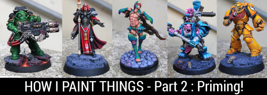
Part 1, all about working in subassemblies, is available here.
Priming minis can seem somewhat easy at first glance. You just spray, and you are done, right ?
Right ?

But any miniature painter with even a small bit of experience can tell you that things can go wrong real bad, real fast. And f-ing up your mini from step 1 is more frustrating than not finding the keys of a chastity belt !
Fortunately, there are quite a few tips, tricks, and good habits you can follow to mitigate that kind of bad experience. So let’s go over it.
Why prime to begin with ?
Priming can seem like a bother, but try painting over bare plastic, and you will understand real fast how not enjoyable an experience that is. It also makes for a less durable paint job overall, so don’t cheapen on that crucial part !
With which color should I prime ?
A surefire way to start a heated debate between miniature painters is to ask which color is best for priming (and if you want to start a century long war, ask chuds which color is best for priming female space marines!). Since I’m not here to settle any of those questions, I will simply list the pros and cons of each available options. That way, you can choose which fits you best.
There are basically 4 options :
Black primer :
Advantage : Even if you forgot to paint some parts of your mini, with a black primer, it will just look like the missing part is in the shadows. It’s especially useful on minis with some hard to reach parts, like inside of capes. With black primer, you can just prime and forget.
Disadvantage : If your scheme uses bright or pale colors, you will have a harder time basecoating and will need more layers to reach full opacity.
White primer :
Advantage : Perfect for bright or pale colors or with paint that cover like ass (yellow, some pink, some dark green, etc.). You will basically cut the basecoating time of those colors in half.
Disadvantage : Contrary to the black primer, if you forget to basecoat some hard to reach parts of your mini, it will stick like a sore thumb. Another disadvantage to keep in mind is that acrylic white paints in general are pretty finicky (it’s due to the white pigment being is « bigger » than other pigments, from what I understand), and there are more horror stories of botched white primer than black primer (texture when the primer dries, etc.), so it’s not the safest option.
Grey primer :
Advantage : Almost like white but less capricious or prone to bad texture.
Disadvantage : Slightly less drastic than with white paint, it can still stick out a bit if you forget part of your mini.
Specific colors primer :
By that, I’m talking about the primers dedicated to a particular color scheme, like Ultramarine blue if you paint smurfs.
Advantage : If you intend to paint loads of minis with a similar color scheme, those kinds of primers can be a real time saver, even if the hue isn’t exactly the one you want in the end.
Disadvantage : Same as for white and grey, with the caveat that it will look less jarring by being the same color as the dominant color of your color scheme.
Since that series is title « how i paint thing », I must say that personally, I prime almost every single one of my minis black, even when I paint bright or pale colors. Overall, I find the white primer making parts you forgot to basecoat stick out more of a pain than having to paint a few more layers over black to reach opacity. I would advise you to try both the black and white primer to experience it for yourself, you might have a different impression though
I won’t go over the zenithal priming method, I personally don’t use it, but basically you prime white and then spray some white primer from the top. Never found that method useful since I never use any contrast type paint.
Spray can or brush-on primer ?
Both are fine. A spray can is faster to apply than by brush, but by brush, you aren’t bound to the weather anytime you want to prime your minis, and you are almost guarantee to not have to deal with weird textures.
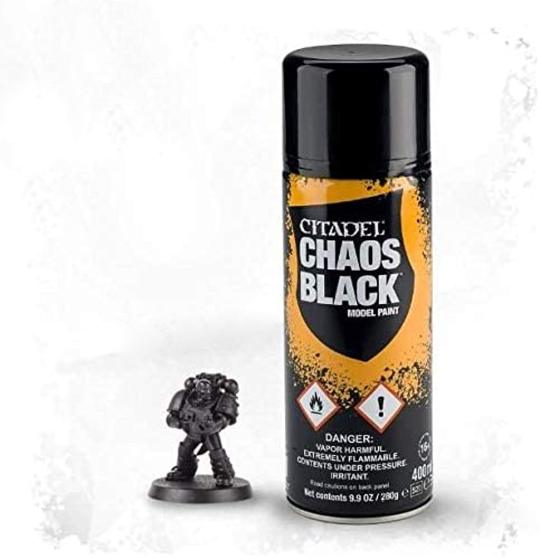
I personally mainly use the Chaos Black primer from Citadel which, while more costly than other brands, never got all weird on me.
As for the brush on primer, I use the one from Vallejo. It even comes in black, white, and grey !

Overall, I tend to use both spray cans and brush on primer in tandem. What I mean by that is that I try not to over prime my minis with the spray can to avoid speckles and weird textures, meaning some parts of my minis are sometimes not primed enough. I then simply correct things by brushing on additional and localized primer. That overall process isn’t very long and guarantee speed and effectiveness.
How-to use brush-on primer ?
Like standard paint, you apply a few coats. Two is generally more than enough with black primer, you don’t need to reach full opacity, what matters is having primer over every surface, even if it’s a bit thin. Then, let your primer cure 24h in a dry room before painting.
You can also use those primer in an airbrush (basically they are made exactly for that purpose to begin with) and you get all the advantages of the spray primer without most of the inconvenient. You still need to clean the airbrush though.
How-to use a spray can primer ?
It might seem pretty easy at first glance, but it’s probably the trickiest part of that whole priming process, seeing how finicky those spray cans can be.
Here are the key things to keep in mind to have the best chance of not messing up :
One, don’t cheapen on the shaking ! When the label says you must shake the can for 2mn, it’s for a reason. So work those arms and count the seconds sloooowly. When in doubt, shake a bit more. That way, you will both have a great priming experience AND huge biceps !
Two, always prime outside, not in your garage, even if it’s well ventilated, otherwise, you run the risk of intoxicating yourself with the fumes. Those are no joke, and the best way to mess up priming a mini is going into a coma.
Three, never prime when it rains. I will later explain a way you can circumvent humid and cold weather, but rain can truly mess up your work, so don’t even try (obvious, I know, but hey).
Four, always apply a first squeeze of the spray can on some piece of cardboard before doing it on your mini. That way, if the spray can do something weird (it can happen when the muzzle dry badly), you will know right away and won’t damage your precious minis.
Five, prime your minis in short bursts, not too close (15/20cm) and try to slowly rotate them (or move your hand) to catch all angles. Don’t forget to prime from the top and the bottom, it’s often the angles that get forgotten.
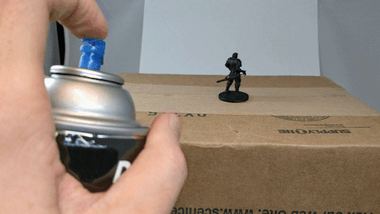
Six, don’t overprime ! A slight bit of grey isn’t a problem, as long as you have some « dust » of primer over it. It’s always easier to fix not enough primer than too much anyway.

(What too much priming does to a mofo !)
Seven, when you’ve finished priming, put your spray can upside down and squeeze the muzzle until no more paint comes out. That way, you will clean the muzzle and avoid having paint dry in it, making the spray can unusable.
Eight, always let your freshly primed mini dry in the driest room in your house. Humidity at that stage can mess with the priming. Ideally 24h.
Additional tips and tricks, especially if you want to prime when it freezes outside !
Probably the best tip I regularly use, and one that can allow you to prime with a spray can even in the dead of winter :
When cold outside, put the butt of your spray can into a bit of warm water (not hot, it should be around 25°C/30°C at most) for 10 minutes. It should put your spray can at it’s ideal temperature. Then, shake the can while staying indoors before rushing outside, priming as fast as you can, and going back inside. It works like a charm every time !
And one last bonus tip : beware almost finished spray cans ! 95% of my priming problems came during the last leg of one of my spray cans (speckles, or other textures). So, nowadays, I keep my almost finished spray can exclusively to prime bases (those tend to be more accepting of a bit of texture) and use as new a spray can as possible for the minis themselves.
Next part will be all about basecoating !
94 notes
·
View notes
Last Seen Blogs

your-money-future-blog
your money future

so-i-kind-of
supercool blog*

realitatvfm
Wendy J. Birdsong

zombieszone-blog
ZombiesZone

konrilove14
Unbetitelt