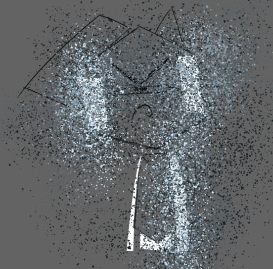
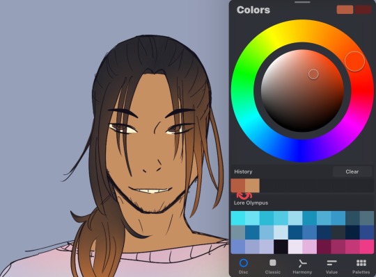
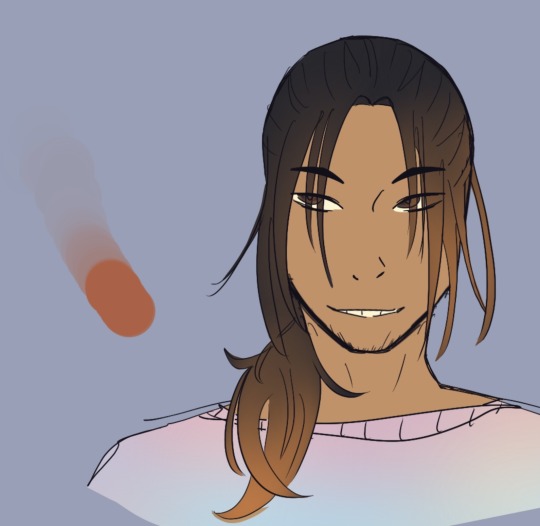
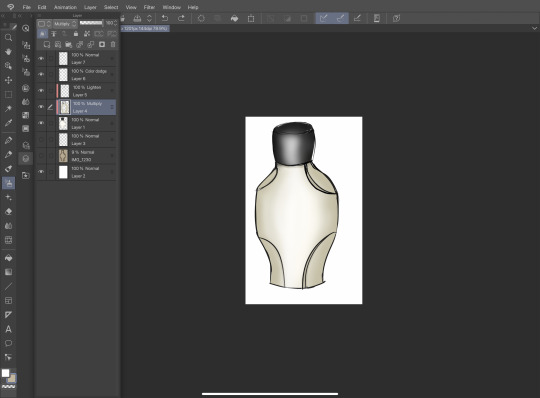
#I was experimenting with light effects using brush pens on this one
Text

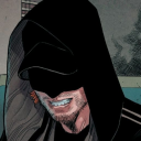
Here's a drawing that I did of Beleg, best friend in the Silmarillion, chilling in a tree on a summer's day with the little birdies (not shown)!
(If anyone wishes to dispute this, I can only point you to the line that broke my heart: "Thus ended Beleg Strongbow, truest of friends..." Tolkien himself said that in the Silmarillion! So there.)
(LIES. I can also admit that reasonable arguments could be made for the Best Friend Ever status of several other Silm characters)
(Notice that I very carefully said "in the Silmarillion," not "in the Tolkien legendarium." The historographer would not have been familiar with Samwise Gamgee.)
(Good thing - I have no idea which one is a better friend.)
(And who cares? I like good friends better than competition!)
(Oh, wait that quote said "truest" not "best." My logic resembles Swiss cheese.)
Fun/heartrending fact: On Holy Saturday a couple years ago, I thought I'd get in the mourning mood by reading the longest and saddest chapter in the Silmarillion... for the first time. Thus I first learned of Beleg and his shocking non-sequitur death. I cry over books all the time (okay, so only when they're sad or otherwise moving) but this was the only time I feared I would faint or throw up because of something in a book.
Anyway, this is my only fan art of him so far (no doubt there will be more, as he is now not only my second-favorite character in the Tolkien legendarium, but #2-3 of fictional characters from anywhere), and it's happy because he's such a happy guy, and I want to be happy thinking about him. :)
#fanart#my art#silmarillion#beleg#beleg cuthalion#beleg strongbow#trees and forests#Planner 10#I was experimenting with light effects using brush pens on this one#OH maybe the historographer met Sam later in Valinor!#I'm happy for the historographer#Even if he makes a decision on whether Beleg or Sam is the best friend#If anyone wanted to dispute the fact that little birdies are not shown#I'd be thrilled to have them pointed out!#I'm sure they're cute!
18 notes
·
View notes
Text
Let's Get You Hyped Up | Pick A Pile
Hello and welcome to this Pick A Pile! In here you'll find a few things that'll hype you up. I hope you guys enjoy and find this useful. Do make sure to leave comments down below on your experience! I do want to remind you all that this is a General Pick A Pile which means this is for a lot of people; therefore keep what resonates and leave what doesn't.
Masterlist > Questions > Paid Readings
Pick A Pile!
Pile 1:
You're a force to be reckoned with, a spark of potential waiting to ignite the world with your brilliance. Each day is a canvas, and you hold the brush. The universe has bestowed you with unique talents and dreams, and it's time to unleash them with unbridled passion. Remember, challenges are just stepping stones on the path to your success. Embrace them, conquer them, and let them mold you into the unstoppable individual you are meant to be.
You've already overcome obstacles that once seemed insurmountable, proving your resilience and determination. Your journey is a testament to your unwavering spirit. Visualize your goals, for that's the first step in manifesting them into reality. The world eagerly awaits the mark you'll leave upon it. Your story is one of inspiration, growth, and triumph. Believe in yourself, as others believe in you too. The energy you radiate is infectious, and your impact is boundless.
So go forth with confidence, head held high, and a heart full of determination. Every effort you put forth, every leap you take, is a leap towards greatness. You've got this!
Pile 2:
You're a dynamo of potential, a powerhouse of creativity just waiting to explode onto the scene. Every sunrise brings a fresh chance to seize the day and make it your own. Embrace the challenges that come your way, for they're the secret ingredients that shape your success story.
Life's journey is a rollercoaster of experiences, and you're fearlessly riding every twist and turn. Your ability to adapt and thrive in the face of uncertainty is awe-inspiring. Remember, you're not just a participant in life – you're the director, crafting your narrative with every decision you make.
Dream big and dream often, because those dreams are the blueprints of your destiny. As you forge your path, know that your enthusiasm is contagious and your potential limitless. Your actions have a ripple effect that extend far beyond your awareness, touching lives and igniting the flames of possibility in others.
So march ahead with unwavering confidence, a trailblazer towards your goals. With every stride you take, you're paving the way to the extraordinary. Believe in yourself, as others believe in you too. You're a beacon of light, illuminating the world with your radiance!
Pile 3:
You are a constellation of infinite possibilities, a symphony of potential waiting to be composed. Your uniqueness is a gift to the world, a mosaic of experiences that only you can bring to life. Every day is an opportunity to add a new chapter to your story, and you hold the pen. Embrace the unknown with excitement, for within it lies your next adventure.
Life's challenges are like the weights that sculpt a strong and resilient spirit. With each trial you face, you're refining your character and gaining the tools to conquer even greater feats. You've already shown your capability to adapt and overcome, proving time and again that you're not just a passenger in this journey – you're the driver.
Visualize your aspirations vividly, for the mind is a powerful magnet that attracts the future you desire. As you walk your path, remember that your enthusiasm is contagious, and your potential knows no bounds. The ripples of your actions extend far beyond what you can see, touching lives and inspiring others to chase their dreams.
So stride forward with courage, a trailblazer on the path to your aspirations. Every step you take, every dream you chase, brings you closer to the extraordinary life you're crafting. Believe in yourself, as others believe in you too. You're a shooting star, lighting up the universe with your brilliance!
#pap#pac#pick a card#pick a pile#pick a photo#pick an image#pick a number#pick a picture#spirituality#spiritual#divination#tarot#tarotoftheday#dailytarot#daily tarot#tarotblr#channeling#channeled message#channeled messages#tarot reading#hyping you up#baddie energy#love#self love#confidence#witchcraft#divine feminine#law of assumption#law of manifestation#law of attraction
794 notes
·
View notes
Text
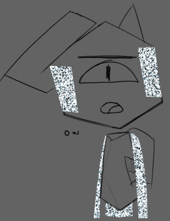
GOOD AFTERNOON FELLOW ROB ENJOYERS!!

DO YOU WANNA DRAW YOUR FAVORITE GUY? ARE YOU TIRED OF USING THE SAME THREE STOCK IMAGES FOR THAT PESKY STATIC BODY? WOULD YOU LIKE TO LEARN HOW TO ACHIEVE THE SAME EFFECT USING ONLY YOUR PEN AND LAYER EFFECTS?
WELL THEN BOY DO I HAVE A TUTORIAL FOR YOU!!!
IF YOU FOLLOW THE SIMPLE STEPS LAID OUT DOWN BELOW, YOU TOO CAN BECOME CLINICALLY INSANE LEVEL UP YOUR ART SKILLS BY LEARNING HOW TO MAKE REALISTIC STATIC IN THE DIGITAL MEDIUM!!
okay i'll stop yelling at you now. on with the tutorial!
Step One: Blocking!
this is usually part of the coloring process for me, so you'll need a mostly complete drawing to start out with.
now, draw out where you want the static to be with white. the average hard round brush will be good for this step, but you can use whatever you like! i for example prefer to use the polygon lasso tool to get more crisp edges (however this effect can also be achieved with the eraser tool).

for his arms and legs, just outline them in white and color them in.
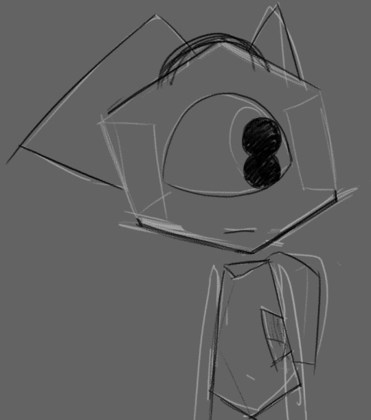
depending on the pose/perspective you might have to separate certain pieces into different layers. for example, here his left arm and lower torso are clipping through the line art
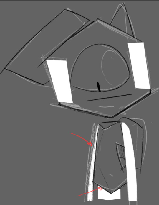
so we move them to be below the line art layer and boom! problem solved.

important note: you can not use another color for the blocking. the white base color is critical in achieving the most convincing static look!
Step Two: Brushes and Blues
now for this step, we will be using these four shades of blue-grey, as well as plain black and white. for your convenience, the hex codes are also included!

HEX: 1d2427
HEX: 4d5c65
HEX: 899eac
HEX: cce6f6
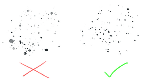
now go to the different brush presets for whatever program you're using. chances are, they'll have some variety of a paint-splatter brush (and if they don't, there's probably a way for you to download one or make your own).
the best kind to use is one where all of the particles are fully solid and not varying too much in opacity.
Step Three: Jackson Pollock That Shit!
now's the fun part! make a new layer and start layering the blues with your splatter brush in any order you like. just color vomit all over your canvas and don't worry about getting any of the particles outside of the base!
go back and re-layer any particular color as many times as you like until you're satisfied.
sometimes, all of this layering can result in loss of the original base color, like you can see here.

but don't worry! this can be fixed by tossing some white back into the mix.
once you're happy with that, go through and lightly sprinkle in some black. remember: a little is a lot! keep it subtle.
Step Four: Layer Effects!
this is where the magic happens! turn your blue splatter layer(s) into a clipping mask!

ka-boom! looks great, right? well, its about to get even better! go into your layer effects panel and select "Hard Light"
Step Five: Motion Blur
now, this step is optional depending on whether or not your program has more than one kind of blurring effect, but for the sake of the tutorial we'll pretend that it does.
find the motion blur panel and open it. set the angle to zero.
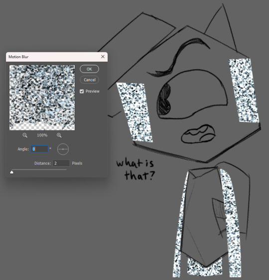
(ignore that i had my distance set to 2 here i just needed to have an example screenshot lol)
now crank that shit up!!
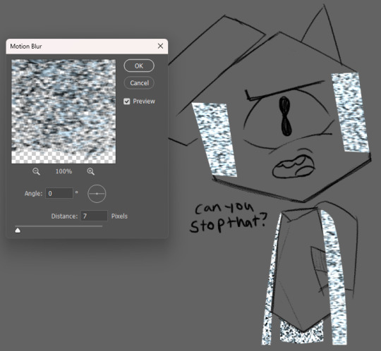
if your static layers had to be separated like in our example, make sure to do the same amount of blurring there as well. depending on your preferences, you can change the level of distance to highlight some kind of feeling. having it at 2 allows the viewer's eyes to rest on the darker colors, but having it at 7 brings out the brighter colors, calling attention to how annoyed he is with me right now.
depending on how you mix the different colors and level of blurring, you can get a lot of different variations in the static's look. feel free to experiment with it!
Step Six: Glow (optional)
unless you're drawing a dark/low-light setting, you can skip this part entirely. again, for the sake of the tutorial, lets pretend its dark!
now, since its supposed to be super dark here, i've selected the base layer for the static and deleted the black from it.
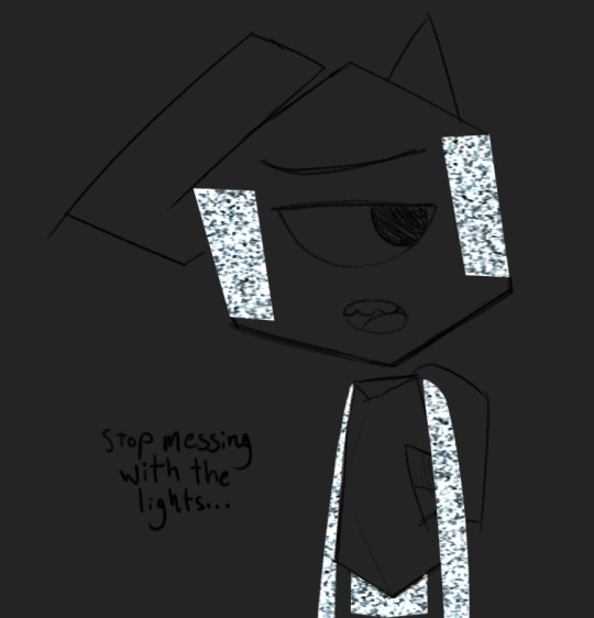
now for the fun part! make a new layer above the one we just made, then take the lightest blue color and cover the static with it! in the next step, this will become your glow!
i like to use a typical hard round brush and then apply a gaussian blur until i think it looks appropriately blurry, but you can also use your average pressure-opacity airbrush! both have their strengths, which you'll see in the next step!
for this step it helps to already have some knowledge of how light interacts with objects, but its not required! if you don't have a lot of prior experience, take this as an opportunity to practice! take it from me, making fan art of specific things is a great way to get good at drawing in general.
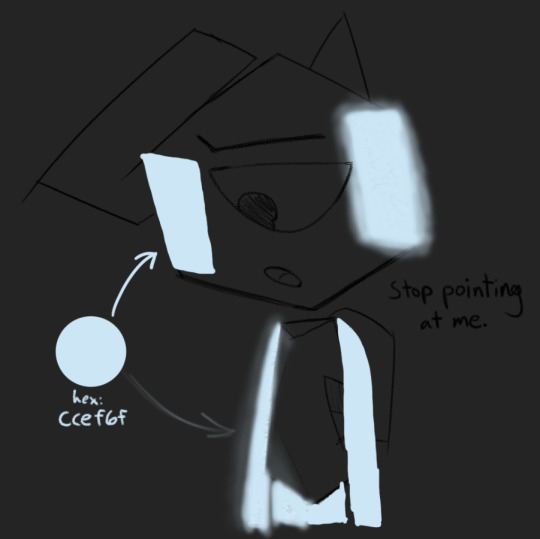
once we have an appropriate amount of glow and blur, we set the layer mode to Linear Light! your program might not have this layer mode, so try to find a mode that does something similar or is close enough

here you can see the strengths i mentioned before!
in the areas where i used the solid round brush + gaussian blur, i had a bit more control over how concentrated the light was at the center and how far it could spread, making it look more artificial/computerized.
meanwhile in the airbrushed areas, there's a very different vibe! on the right side where i applied the airbrush harshly in one stroke, it has a sort of cloudy look, but on the left where i applied it in multiple strokes, the varying opacities create a more painted aesthetic, which adds a lot of visual interest!
now we have arrived at the final step of this process! go to the current layer's opacity box and lower that sucker!

you should raise/lower this meter depending on how dark it is. Keep messing with it until it feels right. for our specific example(and more specifically the gaussian blur areas), a good opacity level is 73% !

and with that, we're done!
thank you for reading this! i had a fun time putting it together :)
before you go, please know that you don't have to follow every step of this to the letter!! feel free to break away from my methods and do your own experiments! mess with the hue of the static colors, use different brushes for the glow lighting, add variation in your particle sizes - go crazy with it!! half of art is experimentation and i wouldn't even have this process without it! :3
if you end up using this tutorial for Rob art on tumblr, please tag me in it!!! i would be absolutely overjoyed to see whatever you make :D (not a requirement though! either way, i'm very proud to have put this out into the world)
if you need help with any of these steps or the process in general, feel free to reach out in the replies of this post or in my ask box! i'd be happy to help out with whatever you need :3 thank you for reading this and i hope you have a wonderful day!
#at first i was just gonna use a normal box for this tutorial and then i got silly and self indulgent with it so its a lil comic thing now lo#art tutorial#static tutorial#my art#long post#tawog#tawog rob#rob tawog#the amazing world of gumball#tomothy rambles
79 notes
·
View notes
Note
any tips for starting on digital art? I've got a little wacom tablet and downloaded krita and I'm having fun but it feels like theres some kind of barrier that isnt letting me transfer traditional skills I've learnt over to digital
hey!! so i used to be exactly like this a ton of years back. my first time really getting serious with digital was around 2015, but i definitely remember how difficult it was transferring my traditional art skills to digital. here’s some advice :]
at first, although it will be difficult to get over that barrier, LOTS of practice will help you get into the groove of things again. going to digital art after being solely traditional changed my style a lot to begin with. with new mediums/programs, your art style is *bound* to change a little bit. at first i didn’t really like how my digital style looked, but i started to realize the more i drew, the more my art skills started to shine through. switching up mediums (ex: from traditional to digital) might even help you acquire a new art style that you might like :D
another thing! before i used a tablet for the first time back in 2022, i used to love just drawing with my finger on my phone and use pencil + paper. as soon as i started using a wacom tablet, the feeling was incredibly weird? though, i always liked to treat my tablet as its own pencil and paper.
trying to visualize this helped me immensely with traditional to digital. since you did traditional beforehand, i think starting off with a pen and tablet is a great gateway to starting digital art. pen+paper vs pen+tablet is almost identical to each other, the only thing being that the pen+tablet is more digital.
and! with digital, there is absolutely *no limits* to what you can put on your canvas. i highly implore you to experiment with as many brushes as you like, edit your art with effects, add textures, and go crazy with the shading and lighting. :) eventually you will definitely find a brush you’ll love, and from there things will feel much more comfortable to figure out.
again!! this takes a lot of practice and effort to really make your art skills shine through, and it will take a while to finally get used to it and make a piece you’re going to like. but eventually you might find yourself enjoying digital art, and i hope this advice guides you along that journey <3
————
(somewhat related but my switch from wacom tablet to ipad was SO rocky. it took ages for me to try and transfer my tablet skills to my ipad, and procreate felt uncomfortable for me to use. however, eventually i got over that barrier and now i use procreate and ipad as my main sources :] hopefully this helps inspire you)
(left: november-december 2022 vs right: november-december 2023!! one full year of using procreate!)
(the old ones had duller colors and less defined sharpness/lines. they look cool but i wasn’t proud of how dull they were. in the new ones, i feel like ive started gaining a mastery of the program and my art is now super vibrant again :] )

35 notes
·
View notes
Note
I see you're an Ibispaint user! What are your go-to brushes that you'd recommend?
I live by the philosophy that anything is achievable with a simple round brush if you're determined enough (and don't have pressure sensitivity on your tablet (and draw with your finger))
I mostly use the Hard Felt Tip Pen, both for sketching and coloring, because I just change the opacity on it depending on what I use it for. For the dragon drawings, I sometimes use some texture brushes like the Sputtering brush or the Watercolor brush, but I like to stick to 2 or 3 brushes where I can for simplicity and consistency's sake.
For art like Hiccup's Bday art, I use the Dip Pen for the lining and an airbrush for some lighting effects, but that's really the only difference. I always color with the Felt Tip, it feels like using a very saturated marker hehe
My best advice is to mess around with different brushes to find which one feels the best! Don't be afraid to tweak the opacity or experiment with the brush settings <3
10 notes
·
View notes
Text
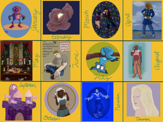
My art year in review!
I learned so much this year and made a ton of cool stuff! These are my favorites from each month, but it was so hard to choose. A lot of stuff didn't even get posted--I'll be sure to at least post the ones that made it to this list!
It's amazing to see how much I've changed and learned over this year, and to see the things that are emerging as part of "my style."
Here's to another year of delight, creation, connection and fun!
Some monthly reflections beneath the cut, but here's the highlights:
I participated in 3 art challenges, Artfight, OC-tober and Huevember.
I made fanart for the first time!
I created a piece I conceived of before I started drawing
Made some big breakthroughs in techniques and skills in April, July and November
January: My first branch into full character design, Rodd is the culmination of training on Hero Forge renders to make dnd portraits! I was doing this cool thing with neon rim lighting, I should bring that back!
February: I saw a piece on here with this amazing glowing effect, so I color picked it and experimented to figure out what relationship between the colors was making it do that! The answer was saturation. This rose is meant to be glowing from within, and I think I did a good job for my knowledge level at the time! As Chuck Tingle would tell us, it's beautiful because only I could have made it in that moment on the timeline.
March: I spent a million years on every detail of this one, it has at least 5 clipping overlay/saturation layers for lighting, multiple line work groups and I want to rework that background but! I never felt more accomplished than I did when I finished this one. I learned a lot, especially about things I could skip or simplify. And the symbolism really pops off ngl
April: I read Gideon the Ninth for the first time this month and I immediately needed to draw Jeannemary Chatur, Cavalier of the Fourth House, the worst teen to do it. She's the first fanart I ever made and posted! I also discovered a new pen tool with this one, which CHANGED THE GAME.
May: This one is an idea I had written down before I ever picked up the tablet and stylus. I thought I might commission someone to make it, the image of it came to me so clearly during our VTM session I just had to make it real somehow. Well I did it! This is one I will come back to redraw in like 5 years bc I love the concept so much. Also rife with symbolism and inside nods to the Low Kings.
June: I made a bunch of ref sheets in the run-up to Artfight in July. Caleb hadn't even been in my plans to upload, but I had time and inspiration! I will be uploading this and a few more of him <3
July: This is one of my faves from Artfight! This character is Blueberry, by way of OrchidEatsBread on artfight. I have still never played... rainworld? But I love me a slug cat. In July I drew a TON of people, it really drilled anatomy basics into me and how to get clothes looking like actual clothes a bit more. Also solidified some things I would consider "my style" at the moment, like no irises, and my approach to noses and mouths and fingers!
August: Another fanart for the Locked Tomb series, I never posted this!!! Will be rectifying that soon.
September: I got really into javascript and css this month, and I made this to be a landing page image on my neocities website XD I'll get back around to that eventually...
October: At the last minute, I discovered OC-tober and the prompts from @/bweirdart, a worthy follow up to the rush of Artfight two months previous. I developed so much stuff for the Low Kings, including this drawing/character, Amayah/Girl-Z, who has been a figment of my pintrest board for 2+ years.
Huevember: Chasing that OC-tober high, I found Huevember! I did not expect to actually do every day, but it proved to be an amazing exercise! I learned so, so much about color, discovered amazing new brushes and techniques and found I really enjoy working in those one day capsules! I loved a lot of the stuff that came out of this month, including my highest note post ever!!!, but this one is still my phone background and I'm maybe developing an OC world around it. We'll see what happens in 2024.
December: I got hit HARD with the writing bug this month, so this was my only choice for this month but I WOULDA CHOSEN IT ANYWAY. I unlocked something here that I'm really excited to visit again, in fact I'm working on a companion piece rn! This is also fanart btw, prepare for me to get even weirder about this guy in the coming months.
If you've read this far, thank you so much! I have so much fun writing these little reflections and making my posts on here.
xoxo, wren
4 notes
·
View notes
Note
Hey! You don't have to answer if you don't want to, of course, but I'm a little curious about some of the techniques you used for your recent s4m art! Is there a specific grain filter you're using? How do you get the slight blue line around the lineart? :o
hey, very happy to answer!! as with all Art Techniques this comes with the caveat of "experiment with the tools you have to find something that works well for you", but what I do is:
FOR THE GRAIN FILTER: This is literally just a combination of various clip studio default gouache paint brushes & the tone scraper, plus a free dot screentone pen I picked up, layered in various shades of Beige And Yellow And Brown until it looks right, then set to multiply and adjusted to between 70 and 90% opacity. don't do this. you absolutely don't need to do this. there are multiple free resources out there for paper textures you can put into your art that are already done for you. just do that instead
FOR THE BLUE LINES: when I do s4m art I generally add the "chromatic aberration" (the slight 3D effect with the blue and red lines); how I do that is doing the lineart normally, duplicating twice, doing the type of layer lock that lets you edit the lineart but not add new lines, recoloring one dark reddish-purple and the other bright light cyan, setting both to hard light mode, the reddish-purple to 70-80% opacity and cyan to 30%, then offset each so the red is slightly under and blue is slightly over the base lineart!
i hope that make sense!! for as cool an effect it is, it's relatively easy to do!
13 notes
·
View notes
Note
How do you do your shading/lighting? It's really pretty!
First: I lay out my flat colors!

Second: I choose what the shadows will be! I lean towards the red-orange shades, never choose straight black or grays for shadows on anything! (Unless your drawing is just black in white).
Third: The brush I use is called “Hard Brush” Under the Airbrush section on procreate! Even if you don’t have procreate, many programs have brushes that allow the same pen pressure and effect! As shown below, the more pressure I put the darker the color will be. If for some reason your program can’t do that then lowering the opacity of your brush can also have the same effect!
Fourth: I begin to put in the shadows where I think they’ll be, the fun part is I have no idea where the shadows will go. This is just for funzies~ But if you want to be accurate, look at references and mark where your light source(s) will be before adding shadows and/or lighting!
(don’t mind the middle image I used the selection tool which is why it has those line eUgH)
Fifth: I begin to blend everything using the smudge tool! If you do not have a smudge tool then an airbrush could work as well! It will just take a while longer <:3
Sixth: After smudging, it should look like this! Well that is if you want to shade like me, the ending product is whatever you feel happy with! <3

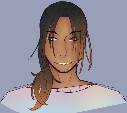
Lighting Time! Okay First: Pick the original skin tone, and choose a lighter color of it as shown here!

Second: Do exactly like with the shadows and add it wherever you want! I added it on the forehead, nose, above the lips and in the chin! Mainly because those areas tend to stick out more from the face so they’re out of the shadows. You may not see a difference at first from all the mixing and smudging but turn the layer on and off and you’ll see there is definitely a difference!
Final step: Merge all the colored layers together and use the airbrush tool to add a bit of spice to the drawing. I normally do this when the character/object is outside or not in a dark room. Since the characters face and hair has a lot of warm colors I’ll add a contrast like blue (cool colors) to make it pop more!
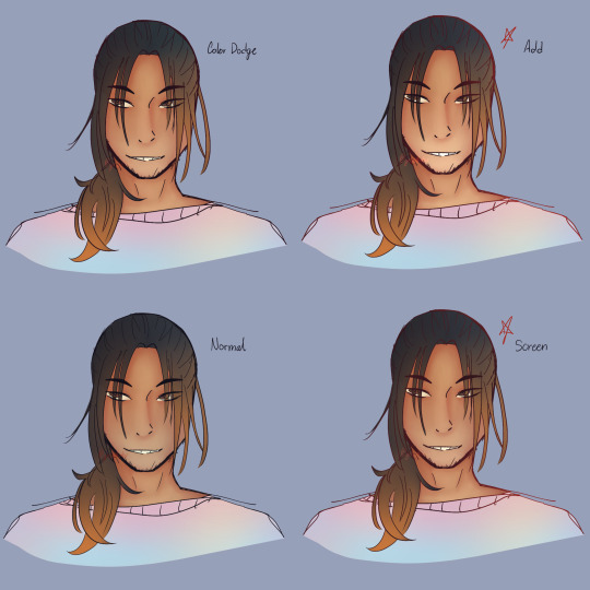
I’ve added my favorite modes to use; Color Dodge, Add, and Screen! I use them for lighting or special effects. I added the normal as well for you guys to see the difference. My personal favorites are Add and Screen, they show more.
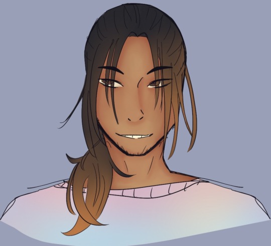
Now the final step for everything is the lineart! Add another layer and set it to clipping mask, use the airbrush tool and with whatever mode you want and whatever color you want (I personally love red) just go crazy and airbrush areas you think would make the drawing pop more!~ These last steps are my favorite part Hehe </3
Important Notes:
- When coloring make sure to divide the areas in different layers!! So example: Have skin color on one layer, hair color on a separate layer, clothing color on another layer, etc. It makes it easier for your future self to shade each area without having it all be on one layer and you struggling to only render the face and hair without it smudging the base colors!
- Never be afraid to shade darker or add a more lighter color!! In fact never be afraid when coloring or drawing (digitally that is) you could always just double tap the problem away if you don’t like it! Always experiment and remember it’s all about trusting the process and being patient!
- If you want more contrast on colors, normally, I follow the warm and cool color rule. Like I mentioned before; Red, Orange and Yellow are warm colors while Blue, Purple and Green are cool colors. So if you were to have a painting/drawing with a lot of warm colors add some cool colors as lighting or as background elements! It goes both ways.
- If this is your first time rendering in this style, then please know that it may not come out exactly right the first time. It took me a lot of practice with this style to get it right, I’m still learning and adapting new things! Be patient with yourself and keep practicing! You got this✨
#phew!#3:55 AM#worth it#i wish I had this when I first started learning#it’d make my life easier#if there is still something here you don’t understand#be it the modes or maybe a step you need more clarification on then PLEASE let me know!!#tutorials are so much fun hehe-#Also this is the ‘prototype’ for the human version of Honey Comb#lmao how does he look?#is he dilf enough-#man looking finer than a mother fucker#tutorials#gess box of cookies#honey comb#gess box of arts
11 notes
·
View notes
Text
I draw a pen doodle every day until I forget
Day 24: Rick Dias (Zeta Gundam)
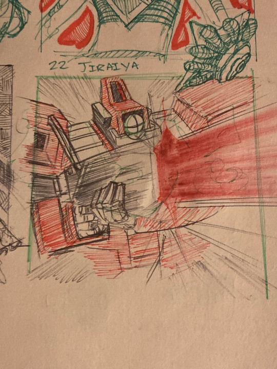
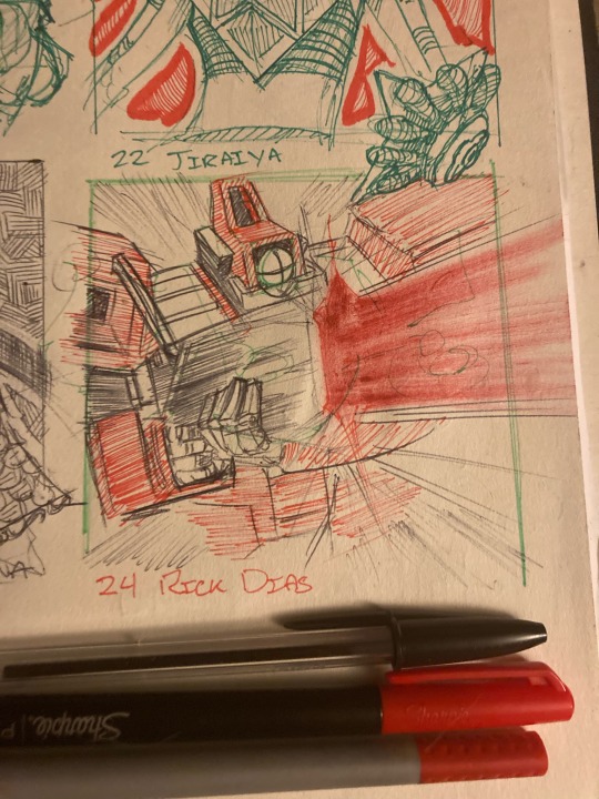
Today’s drawing was a quick, off-the-cuff Rick Dias! I feel bad blowing these guys up in the gundam Dynasty warriors game, they seem too cool to just get blown to bits by an Erupting Buring Finger. I’d love to get my hands on a model kit of one, but I need to find space to put one.
Drawing wise, I experimented a little more with the brush pens I found in my backpack. I found another red brush with almost no ink left, which made for a fun (if inaccurate) laser shot! The coloring on the rest of the drawing is a little sloppy, but I think it adds to the lighting effect of the laser beam.
I’ve been forgetting to post the pens I use, so I plan to fix that! I post the pens to show what colors I use, and what kind of pens I use, should anyone want to use my tools to outdo me. (If you do, send me a photo, I love seeing art!)
#pen and paper#drawing every day#drawing exercise#penandink#mobile suit gundam#zeta gundam#Rick Dias#quattro#quattro bajeena#char aznable#amuro ray
18 notes
·
View notes
Text
IDES1262 WEEK 5 STUDIO TUTORIAL - SKETCHING
This week we practiced developing drawings and learnt how to digitally render them.
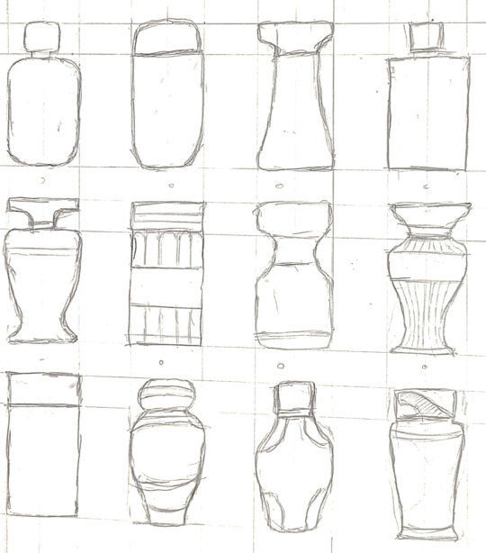
I drew 12 designs that fit the size requirements. Then, I experimented with different shading techniques such as cross-hatching with pencil and then with markers. The 3rd picture on the bottom row was done with 2 different marker colours and it looked really off. The designs adjacent to it were done with only 1 marker; the gradient here was achieved by brushing over repeatedly and adding “layers” for darker shades. I feel like I prefer using pencil cross-hatching because it is more forgiving.
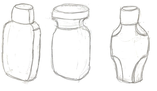
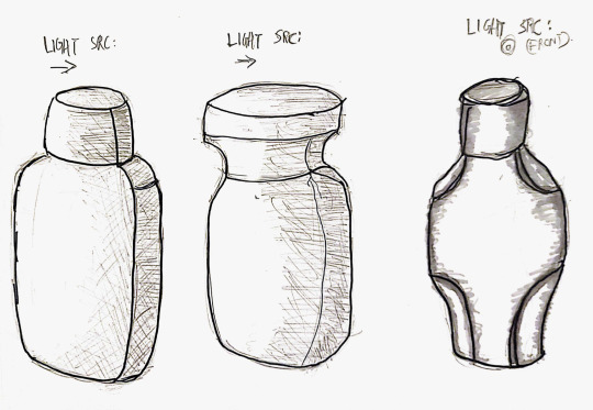
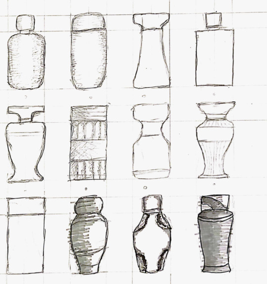
Here, I chose 3 of my initial designs to develop further. I applied pencil shading to the first 2 designs and marker for the 3rd one. After all, I still prefer pencil shading for its forgiveness and flexibility
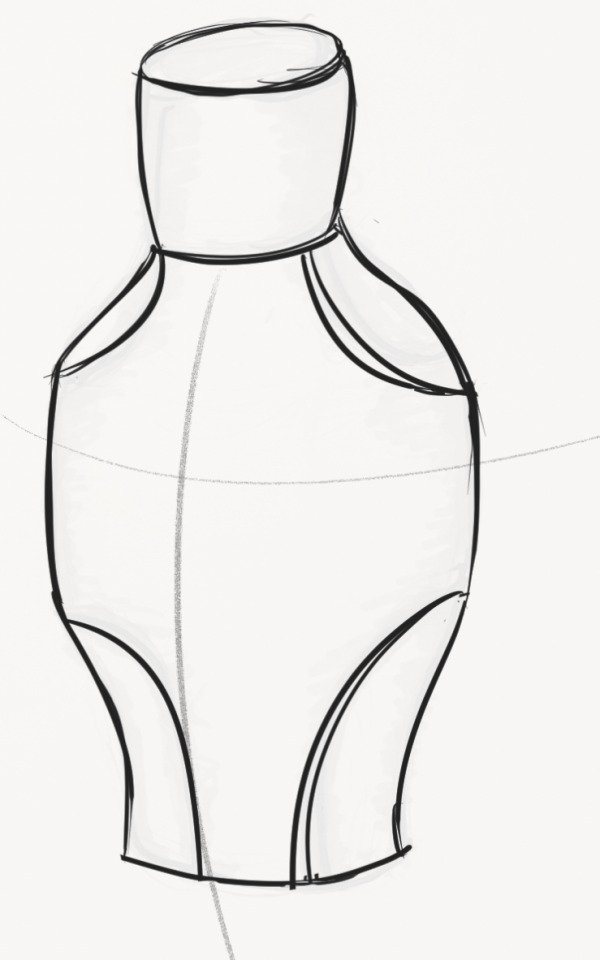
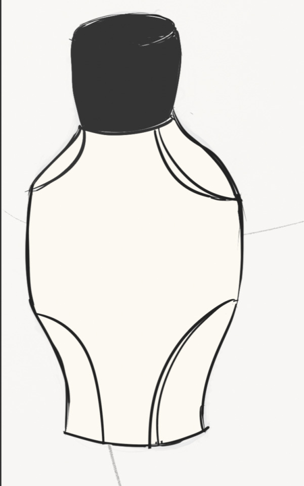
Finally, I feel like digital rendering is much more efficient because of the advanced tools that softwares have. For example, a multiply layer is good for adding darker shades, a lighten layer is good for adding lighter shades, and a colour dodge layer is good for adding glow effects. Doing things digitally is the most forgiving as I can undo mistakes!
Whilst my digital rendering does not look great (it reminds me of a mayonnaise bottle), I think these are a few ways to improve it further:
- use a lighter and thinner brush pen for the outlines to make it look less cartoon-ish.
- add more shades (both light and dark) to increase the realism.
- consider further detailing with a pen brush.
3 notes
·
View notes
Text
Review: Max Edwards newest bedroom pop single ‘Give It All Up’ explores the nuances of love and heartbreak within a scattered downbeat sound
Max Edwards is no stranger to us, an upcoming indie gem that debuted his first single in the midst of 2020. Through following songs like ‘This Is Where I Leave You’ and ‘We Could Be Lonely’, Max has only continued to garner new audiences and prove why he’s something special on the music scene. Now as we hit 2024, Max delivers his newest song ‘Give It All Up’, the first he’s ever done 100% of the writing, producing, and mixing on - and that careful consideration and crafting is very much clear.
Like always, Max isn’t afraid to keep it raw and personal, channeling some of his real-life experiences into a musical experience that many can likely relate to their own woes. That intimate nature is one that carries straight through to the sound, slowly dancing in a bedroom pop haze of smooth electric guitar plucks and Max’s floaty vocals entwined in sweet solitude. Together they’re dreamy and sincere, slow and tranquil but not distinctly sad, simply wallowing but with such a vibrant palette it’s like despite the aching you always know blue skies lie ahead. The chorus shift embraces gentle backing hums in layers, light twinkles in sound and a loose change to the staple riff with more of a lingering hesitation in the soundscape. Max’s every word is all the more mesmerising too, his slightly raspy delivery carrying through flecks of emotion in every bristle of pain. Everything about it is mesmerising, and yet just when you feel like you know what you’re in for, ‘Give It All Up’ changes entirely.
Finding itself in scattered electronic beats, more angsty spoken-sung vocals and whirring backing effects, ‘Give It All Up’ shifts towards an indie and alt-pop vision of sound - and it’s still just as gripping as ever. As attitude finds itself a little more central to the previous downbeat admissions, this change also allows for a mirroring of emotion that’s so much more than just what you’d expect, exploring every avenue of Max’s built-up thoughts and feelings.
Clearly exploring some kind of heartbreak and the tumultuous strain it’s placed on his life, Max hides nothing as he wears his heart on his sleeve and his story cathartically penned for all. Jumping in headfirst, one of the opening lines rings out ‘all we need’s a little holiday to forget the truth’, clearly seeking an escape from the reality he’s living through. Continuing ‘with one another we tend to lose’, the toxic nature of the partnership he’s in is made boldly clear, an admission that he knows better and yet cannot tear himself away. Questioning in the pre-chorus ‘if I take a little time away will I find myself to you?’ , the song still feels ladened in misplaced hope, expecting something to change in a situation that’s not worth the hassle. It’s hard not to relate as the chorus pours out with all of the good though, rose-tinted reflections like ‘lips that taste like candy when I kiss them’ make it harder to walk away, caught in the highs and brushing away the lows. What’s most interesting about ‘Give It All Up’ is how much there is to pick apart though, a narrative never expressed with complete clarity, leaving you to find your own meaning and understanding of Max’s every word. The limitation there is just as important, wanting his art to tell the story rather than plainly telling it himself, allowing for ‘Give It All Up’ to feel just that bit more raw.
Keep listening to ‘Give It All Up’ for yourself here, it’s worth it.
Written by: Tatiana Whybrow
Photo Credits: Unknown
// This coverage was supported and created via Musosoup, #SustainableCurator.
0 notes
Text
156 | April 19th, 2024
Writing Initiative #8
1. What have you learned about yourself doing this self-directed assignment?
This extends outside of what I have done in this class, but I have found that I enjoy techniques that feel "automatic," in the sense of surrealist automatism. In this regard, there is a gold mine of a book I had found entitled A Book of Surrealist Games by Alastair Brotchie. Within it is a collection of games that, more often than not, can be enjoyed without many initial resources. They are games, in the simplest sense, and many could likely be played in prison. However, all of the games are tied to the methodology of "automatism," which encourages continuous, unrefined and unfiltered thought, as opposed to concerns of the technical and the rational. It is automatic in the unconscious sense, and it can be felt when one no longer worries about whether something works or does not work, and utilizes pure instinct.
I very much consider myself a surrealist, as made somewhat apparent from my 4D piece. I think I avoided it for a while because, simply put, nobody seems to care about dreams or the unconscious. Whether they are significant in any way (with respect to explaining aspects of consciousness) is something that scholars have debated. However, I feel that what is of more importance is what they have to offer as pieces of visual inspiration for us as designers. Dreams are not exactly experiences that are made from nothing (they are said to use stimuli from the past, present, and future), but at the same time, they do feel as if they are. They are a topic as complex as that of memory, which is fitting because the latter also deals with the unconscious.
Of course, I think a bit of rationalization is needed when approaching surrealism in the modern day. In the same way that the ideal piece of writing blends and balances the objective with the subjective, graphic design must have a soul, albeit one that flows systematically, rather than rashly. The texture of a work's soul is always made apparent by the viewers have to it.
2. What did you find to be the most difficult aspect of your chosen assignment? Creativity? Research? Connecting design to research? Craft? Organizational skills? Time management? Something else entirely?
What I had mostly done throughout the term was experiment with different techniques, rather than work towards predetermined outcomes. That is, I had gone along with the wind, rather than set specific destinations. I think the former is only an effective approach up until the first 1-2 weeks. However, I had done it for around... 75% of the semester. The main reason it is problematic is because, at a certain point, I felt as though I had not created anything final. No, the fact was that I HAD not created anything final, despite having worked all the same.
So, in short, planning. Or rather, planning, in addition to going through the natural trial and error that comes with working towards set goals. I did have some trial and error with respect to those techniques (ie. dominoes and pipette/oil typeface) that did not quite see the light of day. However, the trial and error that comes with planning is different because one would be forced to find solutions, rather than go a different direction entirely. I much prefer this methodology for this reason, as problem-solving is crucial to graphic design (and something that I feel I was lacking in).
3. What did you enjoy about this opportunity?
Certainly getting my hands dirty for many of the techniques I used, especially for the reflective piece, which used more ink than any of the other ink-based outcomes and process works combined. Ink itself feels like a much better medium when it is done with traditional brushes and pens, rather than the sharpies and drawing pens we might be used to.
Secondly, there is the tool I used for my 4D, Spline. I knew of it beforehand, as I had been interested in a JavaScript library called Three.js, which makes importing 3D graphics into the web much "easier." From here, I then learned about Spline, which is a kind of code-free alternative to using Three.js. It is truly an amazing tool, and I can see myself using it much more in the foreseeable future, perhaps for a portfolio website or just for fun (as I have done in several posts, including the one above this). I would also recommend it to anyone else interested in modelling in 3D.
4. How would you rate your performance over the course of the semester?
If I had to rate it based on how prepared I feel for thesis, it would be pretty low because I feel that the research aspect was lacking. I was quite invested in research at the beginning, but realized that making things should come first, and research should serve as a means of filling in gaps of knowledge. Past the point of reading one text Aleida Assmann's article entitled Dialogic Memory, I did stop researching purely because I felt that I had gotten the concepts behind dialogic and monologic memory. However, this also meant that my knowledge would become quite constricted, as if I was limiting myself to a single place, in spite of there being a whole world outside of it.
In terms of production and physically making, I would rank myself higher in terms of getting out of my comfort zone. Mediums such as traditional ink and clay were ones I had barely touched before, and even using Spline warranted a great amount of troubleshooting and problem solving to ensure that the functional aspects were intact.
Writing was also a big part of my process, almost to the extent that it would be overwhelming to read everything in this blog. Assuming the 10 long-form (relatively speaking) self-imposed reflections and the 8 writing initiatives are 200 words at minimum, that is about 3600 words total at minimum. Around a 12 page, double-spaced essay's worth of words.
5. Hindsight is 20/20. What would you do differently, now that you've had this opportunity to work this way?
I had said it in the second question, but to reiterate and be more specific, I wish I had fully outlined and planned the outcomes from day one. I would not plan the intended meaning and/or conceptual reasoning, for this would likely change over time, but I would plan the mediums, materials, scale, interactivity, installation, etc. Essentially, I would try to envision how it would be set up on the final critique. However, I believe that foresight is only effective up until the point that it is used to define a goal. It is generally much harder to predict the possible technical difficulties, which is why I have tried to avoid it.
0 notes
Text
From Sketch to Masterpiece: Digital Painting Process Demystified
The constant evolution of technology is leaving its mark on the domain of art. When art is merged with technology, it takes the modern form of self-expression, that is digital painting. The Digital Painting Process is equally entertaining and interesting. Therefore, as an art enthusiast, you need to know how you can turn your generic sketch into a digital painting masterpiece.
What is Digital Painting?
In simple words, digital painting is a modern form of self-expression. Instead of a paint brush artists lay strokes on a computing device. Gadgets like tablets are used instead of canvases to give life to one's masterpieces. With the help of expert guidance under mentors like Subhankar, you can ascertain how you can mimic traditional art on your gadget.
Digital Painting found its inception a long time ago due to generic usage like logo designing. However, in today's world, this form of art is experiencing massive growth among the younger generation. Numerous skills can be developed through digital painting. That, in turn, can lead to the Path to Digital Painting Profession.
Digital Painting Process: Know About Digital Painting Software
Once you know how beneficial digital illustration can be for you, you will be able to effectively direct your painting workflow. However, before you jump into the idea of opting for a career as a Visual Development Artist, you need to ascertain the most suited software for your digital painting requirements. Following are a few of the software that can make your sketches into masterpieces -
1. Adobe Photoshop -
The most used and pivotal visual painting tool that benefits the Digital Painting Process will help you to illustrate seamlessly. The robust and straightforward system of this software offers artists flexibility in the creation of digital paintings.
2. Adobe Illustrator -
Art enthusiasts who wish to make a living from their skills should opt for this software. This advanced software allows the artist to alleviate their craft to the pinnacle. Artists can implement numerous skills through this tool and create unique digital illustrations.
3. Adobe Fresco -
As an artist, you must have a forte. Some prefer sketching, some prefer painting. If your forte is painting, then Adobe Fresco is your go-to software for digital painting. The painting tool accentuates the Digital Painting Process, which, in turn, will help artists make their paintings look real like a traditional painting.
4. Distal Mangha Software Drawing -
Manga Studio software is another top-tier option for creating illustrations and digital paintings. One of its standout features is the G pen tool, which offers exceptionally sharp lines with a sense of realism. Additionally, Manga Studio boasts a variety of advantageous tools and brushes. As a freelance illustrator, I appreciate its exclusive features that enhance both the power and enjoyment of the program.
5. Procreate -
If you are an artist who is also keen on gadgets, Procreate is the software that can make your digital painting experience better. Procreate is another affordable variant of Adobe Photoshop. This tool works best on iPads and allows artists to illustrate seamlessly.
Steps to Turn Sketches into a Digital Painting Masterpiece
With an effective step-by-step tutorial, artists can learn to make their free-hand sketches turn into noteworthy masterpieces. Following are the steps that an artist needs to follow -
Step1: Opting for the right gadget as your medium.
Step 2: Opt for a user-friendly device, solely dedicated to facilitating visual illustration.
Step 3: Selecting the right software according to your needs.
Step 4: Initiate with a sketch.
Step 5: Practice sketching and character designing.
Step 6: Design several layers of your sketch.
Step 7: Paint within the sketch.
Step 8: Be mindful of your color palate.
Step 9: Do not neglect to implement lighting and shadowing on your sketches.
Step 10: Upon completion review your work.
Know About the Growing Popularity of Digital Painting
Art enthusiasts often turn their passion into an occupation. Similarly, if you wish to earn a living from your digital painting skills, you need to know how it can be beneficial for you. The following are the importance of digital painting for professionals -
1. Advanced Content -
One of the most influential career options in today's digitized world is content development, which falls under digital marketing. If you wish to develop content, one of the best ways to improve it is the inclusion of digital art. Your illustrations will attract more target audiences, which will positively influence the Google ranking of your write-up.
2. User Engagement -
Once you master the Digital Painting Process, you can create influential content. With unique write-ups and attention-grabbing illustrations, the engagement of your content will experience exponential growth. Any beautifully woven write-up coupled with relatable illustration attracts the eagle eye of readers. That, in turn, will make your content unique and admired by readers.
3. Brand Building -
If you are on the verge of building your brand in the field of digital marketing, honing the skills of illustration will be beneficial. With the skills of graphic designing, you can design the logo of your brand, and you can make illustrations for your content. It will not only make your brand unique and impactful. But, it will also help you to save revenue that you might have spent on hiring professionals.
Digital Painting Career Advice by Subhankar
The Digital Painting Process can be a lot more lucid if artists can obtain proper mentorship under experienced tutors like Subhankar. The institution for training young artists at Shyamnagar will prepare students to hone their digital painting skills and guide them in making their passion turn into a stable career. Art enthusiasts can learn different intricacies of digital painting and use their skills to make their career unwavering.
Things you can expect at Mr. Shubhankar’s institute include:
At Mr. Subhankar's institute, students can expect a transformative learning experience.
Students will get personalized coaching for their future growth.
The curriculum seamlessly blends theoretical knowledge with practical applications,
Engaging workshops, and hands-on projects enhances the learning journey.
Students of eight to twenty years can join this institute and embrace a culture of innovation, mentorship, and academic brilliance.
Conclusion
If you are an artist who wishes to learn visual arts and understand the Digital Painting Process then opting for a patient mentor is your priority. Once you learn the nuances of visual arts, you can embark on your journey as a Digital Painting artist.
#mastering digital painting#professional digital painting tutor#digital painting techniques#digital art tools
1 note
·
View note
Text
Photoshop Skills
This module has been an ongoing journey of learning, especially when it comes to Photoshop. Along with all the other Creative Cloud apps, Photoshop is a valuable and versatile tool; once you get the hang of it, the world's your oyster! There are innumerable possibilities as to what can be accomplished and created.
A skill I learned which I used on my original moodboard was how to create a custom path/shape. This moodboard features two symmetrical archways standing side by side, and to incorporate these better into the piece I decided to add some shapes to create a flash of light into each. This brightened up the page, created some smooth, flowing lines, and also framed the models on the moodboard.
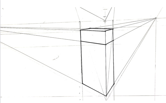
To start out, I used the rectangle tool and drew a rectangle.
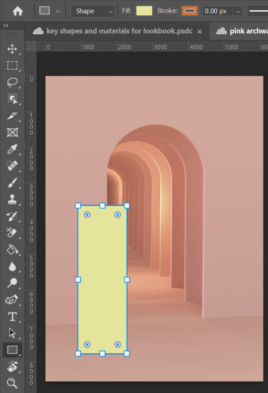
Then, clicking "P" on the keyboard takes you to the curvature pen tool. This tool lets you create, delete and move anchor points on a shape, shown below.
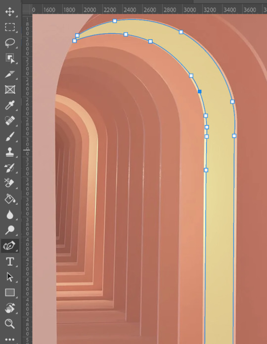
Each anchor point can be changed depending on whether you want to create sharp corners and straight lines, or smooth curves. Double-clicking on any anchor point will change the line at that point to either make it curved or straight. Below, the left hand side image shows what an anchor point looks like when it is pointy. the right hand side shows the same anchor point when it is double-clicked:
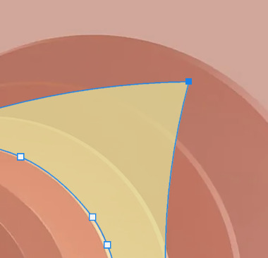
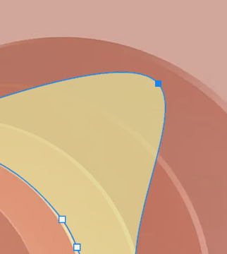
When I was happy with the shape, all that was left to do was make some minor tweaks to it, e.g. experimenting with the fill colour, opacity, and fx tools so it best fit the page. Finally, I duplicated the layer and flipped it horizontally in order to obtain a mirror image. I used this on the other archway, as I thought symmetry would be important on the moodboard to maintain balance.
The second skill, which is undoubtedly one of the key foundation skills of Photoshop, is cutting stuff out. Depending on what you're trying to cut out, there are different methods. If you want to simply crop an image into a square/rectangle, you can use the rectangular marquee tool.
Let's say I have to crop the below image so only the pink vase is visible:
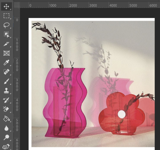
Firstly, go to the rectangular marquee tool, then drag a rectangle showing what part of the photo you would like to be visible:
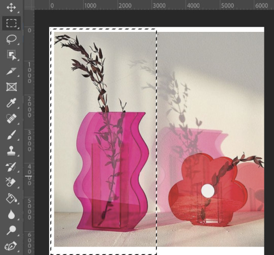
Pressing Ctrl-Shift-i inverses the selection, so anything outside of the rectangle selection you made will now be selected:
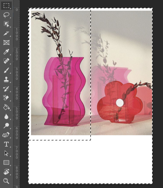
Press backspace to delete these areas, then Ctrl-D to deselect, which removes the marching ants from around the image.
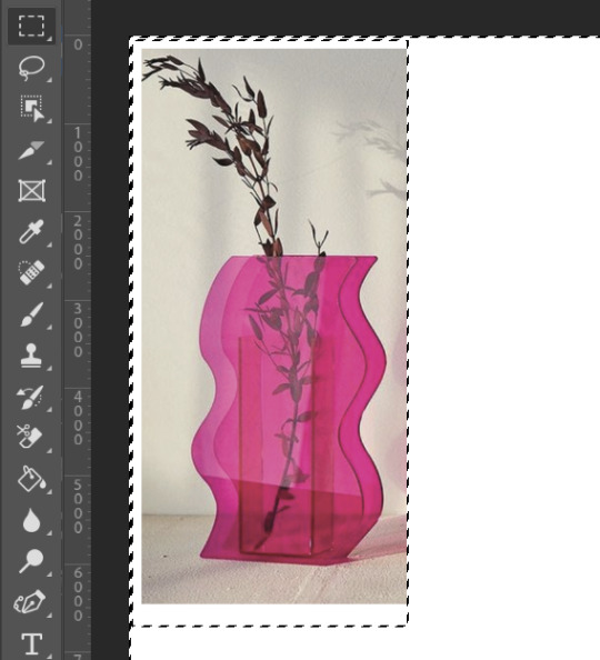
Then again, if I find yourself needing to crop something which is a more complex shape, I can use the "Select and Mask" method.
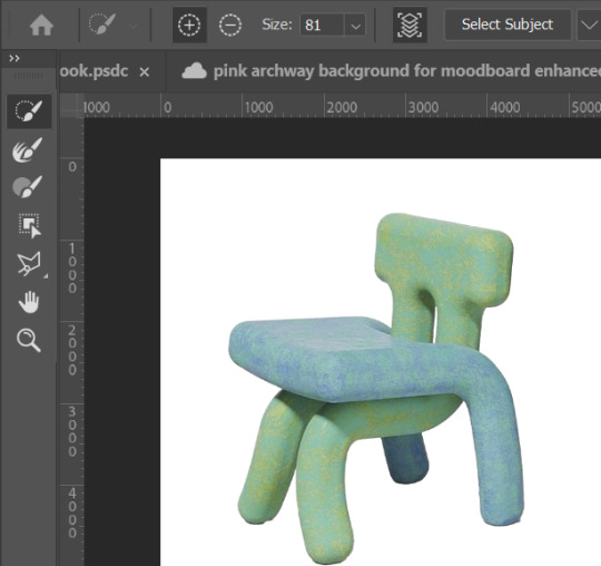
Here is a picture of one of muddycap's chairs (below):
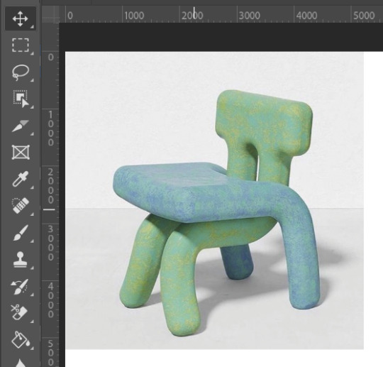
To cut out the chair and remove the white background from the image, first i will go to the "Select" drop down menu and then choose "Select and Mask", or alternatively I could press Alt+Ctrl+R as a quick shortcut.
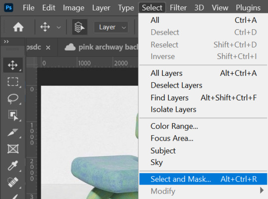
At this point, a "select subject" button with a drop down menu button beside it has appeared. It's important that you select the "Cloud" option in this drop down menu to get the most accurate and detailed results.
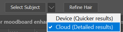
Simply click the button "Select Subject" and the Cloud processes the image, deciding which parts of it need to be removed.
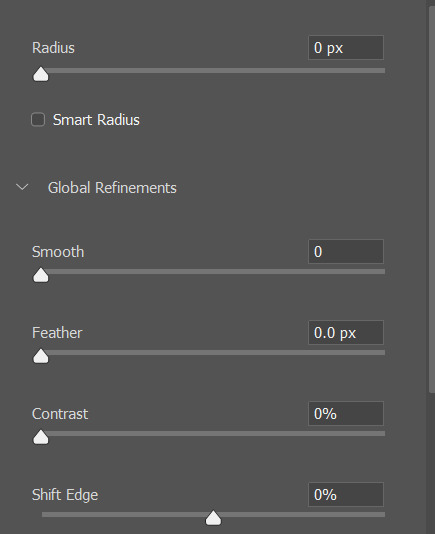
Lastly, I usually check over the selection before I click "OK" and go over any missed bits with the brush tool. There are sliders on the right such as "smooth", "radius" and "feathering" which i find to be useful when editing photos. The "radius" one is particularly useful when the edges of your item have a weird glow or are a different colour, and this tool works effectively at eliminating these issues.
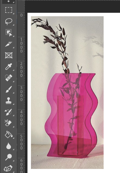
Shown below is the finished image, ready to be put onto a moodboard or collage.
Cutting images out is one thing in Photoshop which can either make or break your piece; if shapes are cut out precisely and correctly, your Photoshop creation will have clean and crisp leading lines, resulting in a higher quality finish to your work. It's all about the individual little details, which come together and set the tone for the final piece.
0 notes
Text
EMMELINE PANKHURST
The process of my portrait of Emmeline Pankhurst. I started out by sketching a rough outline of her using a H pencil as I didn’t want it to be too dark and unable to rub out. I struggled the most on the eyes for this part as I struggled to line them up and make them realistic. After that using a light wash of black watercolour I painted in the shadows of the face. At first I was going to do it all in pencil however on the photograph that I was copying the shadows were very light and smooth which I would have struggled with. Then I went in with my pencil to create darker tones. I started out with the cheeks which I found were the easiest part and then I moved onto the eyes. Once again I struggled with the eyes however once I added white pen for the highlights I found that it created a much more realistic effect. The biggest issue I found was the hair. Hair is something I have never really looked at so I had no experience with it. I started with the black water colour just like the face as it helped me create a base and was less daunting as it covered the white space up. I tried many techniques such as shading and single brush strokes and I found that combining them together created the best outcome. One thing I would like to improve on is the hair which is something I will do later on when finalising my sketchbook.
0 notes
Text
Download Clip Studio Paint keygen (license key) latest version TGJT№

💾 ►►► DOWNLOAD FILE 🔥🔥🔥
It provides you full command on text, lines, and word balloon and page layout. Clip Studio Paint Crack is AN economical and versatile program for making different types of digital art. It is an excellent successor to comic or Manga studio. And maybe an essential tool for making varied styles of manga, comic as well as cartoons. It has specialized options for adding superb details and colors to your work. You can get helpful clues and learn quickly to perform your creations. It has an outsized assortment of art, clips, animation, and many other objects. You can add by drag and drop to your drawings. Such as the user will add different kinds of dialogue balloons for adding conservations to comic books. Clip Studio Paint Crack is the latest and new software that manages creative stories. This software gives you full command on text, lines, and page layout. Clip Studio Paint Crack with special effects and the latest tones that make your work more exciting and more comfortable. Its look is professional that every user can make creative and beautiful drawings. Users can add many designs with the help of their tools and can add special and unique effects. Clip Studio Paint Crack has many options for adding textures, shadows, lights, and many other effects to your artwork. It has an assortment of art, clips, animation, and many other different objects. And the user can add by drag and drop to the drawings. Like you can add different varieties of dialogue balloons for adding conservations to comic books. Clip Studio Paint Crack is a useful program for the digital artist. Users can get clues and learn fastly to perform the creations. Clip Studio Paint Crack has an outsized assortment of art, clips, and animation. You can add by drag and drop to your drawing. Users will add many kinds of dialogue balloons for adding conservations to comic books. It offers functions for making amazing cartoons, animations, clip art, and much more. If a user is a professional artist or a new one. This software is straightforward to use. This software has new models, new homes, a menu, brushes, and many functions to make your things look incredible. It has a user-friendly and secure interface, which makes it very easy to use as compare to other software. I should recommend this software to you if you have any interest in the field of designing. Clip Studio Paint Keygen is very fast and quick that the user can import and export many files. Users can publish them in HD or High quality. It is the best experience for drawings and managing different images. Clip Studio Paint Key also increases the productivity of the user because of its new graphical interface. You can manage its many tools just from a single click. So, if the user wants to build trees, birds, and mountains in drawings, then the user can do it easily from a unique touch. Clip Studio Paint Key may be a comprehensive range program for making different digital art projects from begging part to finishing part. This software offers a complete art studio in digital devices for any creator. You can use it with their creative thinking in any approach you require with none limitation. You can pore and out for adding a unique level of detail to the painting or drawing. This software has all the tools for making many different types of comic or story strips and manga novels. Here are some features that you can find in Clip Studio Paint Crack. Pens, Pencils, Brushes, and different Tools. Many Brush Effects.
1 note
·
View note
Last Seen Blogs
nnay-naee
Achilles crybaby
francexz
F.rancesx

lovetoloveforyou
Naamloos

megthewitch27
Megzie

huntersurfer360
huntersurfer