#Semester 1
Text


Paranormal Star Review
Title: Semester One
Author: Mazzy J. March
Pages: 104
Rating:⭐⭐⭐(3/5)
Synopsis:Everything will work out. But that’s hard to believe when I can barely afford a hot, tiny apartment that reeks of whiskey and has a floor vibrating with music from the bar downstairs most nights. Not to mention the loud laughter and occasional rattle of the walls from brawls that make me check my door lock and huddle under the quilt my late mother made for me. The pub is frequented by rough types as well as people from the local university where I work for a pittance. Joe, short for Josephine, my landlady, has offered me a job downstairs, but so far I’ve held out. Unless something else comes up, I’m going to have to accept the offer, but I’m not sure I have the fortitude to deal with what I can barely tolerate at a distance. When my folks died, my sister and brother-in-law took me in, but they had things to work out in their marriage and were offered the opportunity of a lifetime. Move to Fiji and work mostly from home while living right on the beach. Sounded like a cure for divorce to me. When my sister looked at me with hope in her eyes, I did the only thing I could. Lie. I told them I had an opportunity of my own and needed to move across the country to pursue it. Convenient. Right? One night, a growl louder than my empty tummy snaps my attention to the window outside the classroom I’m mopping. I peek through the blinds to find a massive gray wolf with the bluest eyes staring right at me. A wolf in the heart of the city? The wolf’s form shimmers, muscles and bones twisting and reshaping into a man with those same eyes, and, when I come to a while later, there’s no sign of the animal or its aftermath. Skipping dinner must have been a mistake. So much for surviving on my own.
First And Last Sentence: Here
#paranormal romance#paranormal star reviews#booklr#bookblr#semester 1#mazzy j march#bookworm#recommandations#july 2023
2 notes
·
View notes
Text
Temporary Statement
For the project brief "temporary" I choose to base my work on the idea of temporary movements.
➱My initial idea was the journey through portals (fictional and non fictional). Observing how the human figure develop while going through such drastic changes. I first started by taking photos of people in various positions to make them appear in the photo more than once to make it look as if their teleporting through time using the panorama tool on my phone creating images from that.
➱Continuing from this primary research I accidentally captured a photo of my friend jumping through the air with the pano tool still functioning. The captured all images of the jump and allowed me to expand my research into movement. I focused on the movement of people and took photos of friends/family walking, running, jumping off high edges and basically recording fast sudden movements within the panorama setting to give a wave like structure. Throughout taking these photos I realized how difficult it was to capture the wave like structure of movement. As most images either were blurry or simply did not work. This is where I experienced a lot of failures in terms of gathering primary research but this allowed me to build patience and keep at it until the sufficient amount of research was gathered.
➱From these photos I then created sketch after sketch, which I brought with me into the various workshops such as:
∙The printing workshop: This was the first workshop where I had a clear image in my head of the results I wanted. I brought my images which I traced out then etched onto the surface of a piece of plastic which was to be printed. As i love contasting themes with one another i decided to add squares of colour another my pieces. This may seem "random" and "distarcting" (which i have been told) but they too have a meaning of their own. As the pieces depict movement the blocks of colour do not they are very much stationary and do not move which contasts greatly from the movement wave of the figure. From this print which was in black and white allowed me to think beyond and show movement by means of colour which brings me to my second workshop.
∙The Layer and colour Separation workshop: I used the exact same sketch from the previous workshop as I wanted to clearly contrast and differentiate between the use if colour and the absence of colour. After contrasting the two i decided the use of colour helped emphasize the movement and actions of figures. This is where i wanted to make the idea of colour a prominent theme in my project as I believe it creates almost a sort of optical illusion itself.
➱ Continuing on with the panorama photos it was made clear to me that they create very interesting and usual shapes. I decided to take a closer look at this by creating an oil pastel drawing of my favorite primary research panorama photos. I used brown card so the colour would be even more vibrant. The images and shapes created reminded me of an artist who created Calder Mobiles. A series of irregular shapes in various colours which hang and move freely from the ceiling.
➱Next I decided to move away from panoramas as i wanted to explore new ways of capturing movement. I began by taking photos of people on the normal camera. This created images which developed a blur of the figure as the action was carried out. I liked this idea but I did not want it to be blurry. I then explored with different settings on my phone to capture movement within one single shot I decided to try out slow shutter speed which we came across in the photography studio. This enabled me to capture each induvial stance in a clear photo I took how ever many photos were needed. This allowed me to capture serval photos all showing a different position to the figure and the action is carried out. This greatly differs from the panoramas I noticed as, the panoramas captured each movement in one photo and the slow shutter speed photos were serval different photos.
➱I then created sketches from these photos. This brought me many ideas in my workshops such as
∙Fabrication: This was my first 3D piece. I decided to layer my sketch on top of one another to give a cool effect in a unique way. From using the software Rhino to transferring it to the system to be created gave me a great insight into the production of 3D is carried out.
∙ Laser cutting: I sent my sketches of my slow shutter speed movements to the software on the computer. With the help of my tutor this allowed me to use the program and machine to work the laser cutter which cut into a thing piece of yellow acrylic of all my sketches.
∙Photography: Finally with my finished pieces I decided to take some photos using the lightbox. I have still incorporated the theme of clocks of colour, absence of colour and movement of figures in my photos of my finished acrylic pieces.
➱ After photographing my acrylic pieces I still thought these figures were really interesting and can provide more sketches in my project. For that reason I traced them out on top of one another over and over again using black and coloured ink. I like how this turned out as it creates another optical illusion but this time using stationary photos. The source that gives it this illusion is the presence of colour.
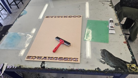
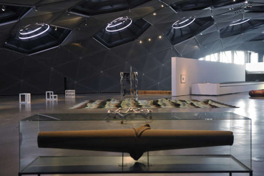
Exhibition Wall
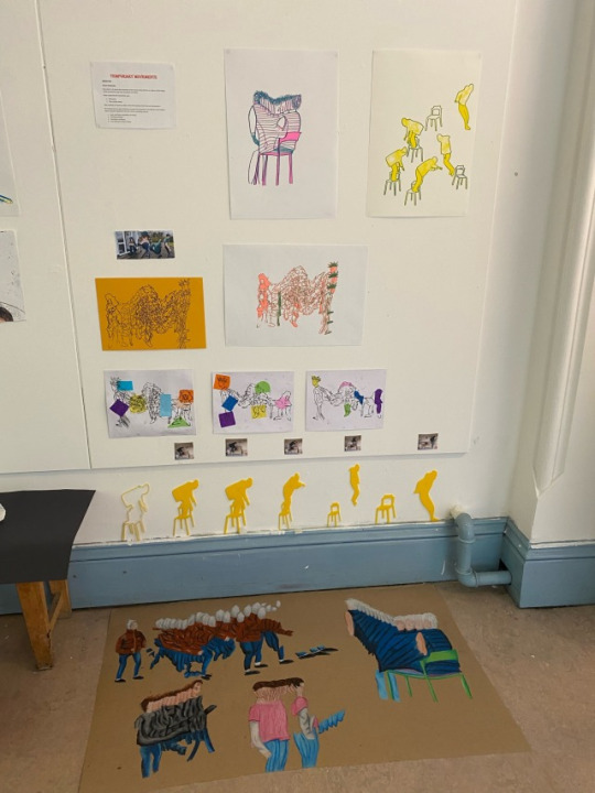
After speaking with Sarah she explained to me how less is more. Originally I had multiple images of the same pieces on the wall. Sarah explained there’s no need for this and some times we only need to see pieces once for it to be enough
I included some primary research photos such as my favorite wave like panorama picture and also my slow shutter speed movement photos
5 notes
·
View notes
Text
TEXT - ‘KNITTING AS A FEMINIST PROJECT?’ MAURA KELLY:
Maura Kelly - Women's Studies International Forum, "Knitting as a feminist project?" Volume 44, 2014, pp 133-144
Notes:
“As a site of feminist politics, knitting potentially represents a redefinition of a devalued and traditionally domestic feminine craft as empowering and creative”
“... Further, it potentially contributes to the construction of alternative mas and femme - promotes the creation of new feminist communities”
However - ? in what way can it represent something intentionally political?
Ethnographic research/stitch n bitch knitting groups / online knitting communities / as well as interviews with knitters “
“ I conclude that the meaning of knitting is context-specific and that the engagement with feminist politics by individual knitter and knitting communities in everyday life is limited” 132
“Writers and scholars identify knitting as a part of the contemporary feminist culture - argue that it is part of something bigger - (Baumgardner & Richards, 2000; Groeneveld, 2010; Minahan & Wolfram Cox, 2007; Myzelev, 2009; Pentney, 2008; Robertson, 2011; Stoller, 2003; Wills, 2007). Beth Ann Pentney (2008) // offer a continuum of feminist knitting practices that range from the appreciation of knitting as a domestic art and community building - “ 133
Pentney says that feminist projects have to be active and purposeful - done in the spirit of feminist goals of empowerment - not all knitting can or should be considered feminist in intent …”
“Scholars such as Pentney (2008) have argued that knitting provides an opportunity to reclaim a devalued feminine craft. “ 133
“One example of feminist knitted art is an exhibition titled Radical Lace & Subversive Knitting held at the Museum of Arts & Design in New York City held in 2007. Pentney suggests that feminist art and activism occupy one end of the continuum of feminist knitting practices” 134
“ One example of a “craftvisit project…” 134
“ ..pose a challenge to the options available to mastectomy patients and enable women to engage in creative self healing.” 134
“ A visible example of a group “craftivist project is a Canadian group called “The Revolutionary knitting Circle”.... “The group also participates in marches, rallies, and protests….” 134
“Yarn bomning - knit graffiti” - 134
“ Although not all knitted art is explicitly “political” and not all political knitted art is explicitly “feminist” , the use of knitting as a medium often results in messaged about gender reflected in the projects” - 134
- “...which the everyday practice knitting may be subversive…. Knitting offers opportunities for the creation of alternative femininites and masculininites….. Knitting groups can be locations for developing feminist communities and challenging the public/private divide.” - 134
“ …subverting (REDIFINITION) ideas about femininity by defining knitting as something that women do for pleasure rather than because it is expected or required.” 134
“In articulating knitting as a feminist practice, writers and scholars suggest that contemporary knitting is actively redefining or reclaiming a traditionally domestic feminine craft as empowering and creative” 135
“ An extreme version of alternative femininity offered by knitting is demonstrated by Debbie Stoller….editor of BUST magazine. Stoller presents a version of contemporary knitting clearly influenced by popular culture”
“There are some significant contradictions in Stoller’s conception of feminism…… sex positive lack feminist critique” - “It may be possible to reclaim the image of the sexualised body as part of a feminist prokect, but this sort of appropriation must be problematized.” - “discourse of choice..becomes intertwined with empowerment” 135
“ This version of feminism is consistent with the third wave articulation of ;girlie feminists’ who ‘reclaimed girl culture, which is made up of such formerly disparaged girl things as knitting, the colour pink, nail polish, and fun” (Baumgardner & Richards, 200:80). 135
“For male knitters…challenging traditional definitions of masculinity…. Just as some women seek to redefine knitting as part of an empowered femininity.. “ 135
“...knitting is part of the women’s domain” - 135
“Another way that knitting can be interpreted as a site of contestation that can contribute to a feminist project is in the opportunity for knitting groups to contribute to the creation of new feminist communities… These can be local groups - stitch n bitch - or online communities. These communities may or may not be explicitly feminist. - 135
“ Scholars argue that local knitting groups that meet in public have can challenge the public.private divide…Further, they may replicate some aspects of the consciousness raising groups associated with second wave feminism… Online knitting communities may serve as a site for building feminism communities or “cyber feminism” - 135 QTD. IN
“ ….described as “everyday activism or everyday feminism….as a tactic for social change, everyday feminism has been critiqued as weak, but offers the promise of an easily accessible and personally empowering way to engage with feminism.” qtd in 136
“I think the fact that it’s sometimes perceived as, you know, woman’s work, woman’s chore, kind of grannylike..People didn’t do it in public. And it wasn’t acceptiable for….thats changing,..very much feminist to me…” qtd in 138
“My research suggests that there is much variation in the degree to which indivisual knitters and knitting communities engage with feminist politics” ..” which includes examples ranging from knitting as an explicitly feminist activism and/or art to charity knitting and fundraising activities to the celebration of knitting as a domestic art and building community” 142
6 notes
·
View notes
Text
Getting there for Monday!
0 notes
Text
SUHU
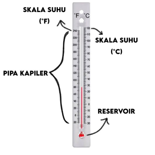
Suhu adalah besaran yang mengukur panas atau dinginnya suatu benda. Alat yang digunakan untuk mengukur suhu secara kuantitatif adalah termometer. Ada 3 (tiga) macam termometer, yaitu termometer zat cair, bimetal, dan kristal cair.
JENIS-JENIS TERMOMETER
ZAT CAIR
Termometer zat cair adalah jenis termometer yang menggunakan zat cair sebagai isian termometer. Zat cair yang biasa digunakan adalah raksa atau alkohol.
DIMANA CAIRAN INI TERLETAK?
Di dalam pipa kapiler dari kaca termometer dengan reservoir/labu dibawahnya untuk menyimpan cairan.
RAKSA
Raksa memiliki kelebihan mempunyai warna yang mengkilat dan cepat bereaksi terhadap perbedaan suhu, raksa dapat membeku pada suhu -38°C dan mendidih pada suhu lebih dari 350°C. Namun raksa juga memiliki kelemahan karena beracun sehingga berbahaya jika termometer pecah.
ALKOHOL
Alkohol dapat diberi pewarna merah atau biru, dan lebih aman digunakan dibanding raksa, rentang suhu tergantung jenis alkohol yang digunakan, contohnya:
• Toluen, dengan titik beku -90°C dan titik didih 100°C.
• Ethyl alchohol, dengan titik beku -110°C dan titik didih 100°C.
CONTOH JENIS TERMO ZAT CAIR
Contoh termometer zat cair adalah:
1) Termometer laboratorium, dengan rentang -10°C sampai 110°C
2) Termometer suhu badan, dengan rentang 35°C sampai 42°C
BIMETAL
Termometer bimetal adalah termometer yang menggunakan 2 (dua) logam yang berbeda kecepatan pemuaiannya digabungkan menjadi 1 (satu).
CONTOH
Misal, ketika besi dan tembaga yang telah digabung berada dalam suhu normal maka kedua logam itu dalam keadaan lurus, ketika dipanaskan maka kedua logam akan melengkung ke arah besi karena lambat pemuaiannya.
Sebaliknya, ketika didinginkan maka kedua logam akan melengkung ke arah tembaga karena cepat pemuaiannya. Source
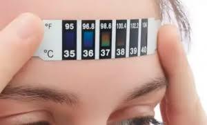
KRISTAL CAIR
Bisa juga disebut sebagai termometer kening atau dahi, termometer ini berbentuk lembaran plastik tipis yang ditempelkan di dahi, bila ditempelkan maka akan muncul warna di kolom tertentu, suhu akan ditentukan tergantung pada kolom yang berwarna.
SKALA SUHU
Ada 4 (empat) satuan/skala suhu yaitu Celcius (C), Fahrenheit (F), Kelvin (K), dan Reaumur (R). Celcius adalah skala suhu yang sering digunakan sehari-hari, sedangkan Kelvin adalah skala suhu SI (Sistem Internasional). Skala Kelvin tidak menggunakan "derajat", tetapi menggunakan nol mutlak. Tidak ada lagi energi panas yang dimiliki benda pada suhu 0 Kelvin.
Yang membuat semua skala ini berbeda adalah perbedaan titik beku dan titik didih dari setiap skala.
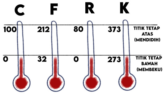
Titik tetap atas (didih) Celcius: 100
Titik tetap bawah (beku) Celcius: 0
Titik tetap atas (didih) Fahrenheit: 212
Titik tetap bawah (beku) Fahrenheit: 32
Titik tetap atas (didih) Reamur: 80
Titik tetap bawah (beku) Reamur: 0
Titik tetap atas (didih) Kelvin: 373
Titik tetap bawah (beku) Kelvin: 273
Perbandingan skala pada setiap suhu:
°C : °R : °F : K = 100 : 80 : 180 : 100
°C : °R : °F : K = 5 : 4 : 9 : 5
Dengan memperhatikan titik beku (dibandingkan mulai dari nol semua):
tC : tR : (tF - 32) : (tK - 273) = 5 : 4 : 9 : 5
Seluruh rumus konversi skala suhu:
C ➡️ R = tR = 4/5•tC
C ➡️ F = tF = 9/5•tC + 32
C ➡️ K = tK = tC + 273
R ➡️ C = tC = 5/4•tR
R ➡️ F = tF = 9/4•tR + 32
R ➡️ K = tK = 5/4•tR + 237
F ➡️ C = tC = 5/9•tF - 32
F ➡️ R = tR = 4/9•tF - 32
F ➡️ K = tK = 5/9•(tF - 32) + 273
K ➡️ C = tC = tK - 273
K ➡️ R = tR = 4/5•tK - 273
PERUBAHAN SUHU
PEMUAIAN DAN KOEFISIEN MUAI PANJANG ZAT PADAT
Pemuaian adalah perubahan dalam suatu benda ketika bereaksi dengan tinggi atau rendahnya suhu. Pemuaian dibagi menjadi 3, yaitu padat, cari, dan gas.
Pemuaian zat padat terjadi pada setiap bagian benda tersebut, yaitu panjang, lebar, dan tebal. Bimetal adalah contoh pemuaian zat padat, yang digunakan sebagai termometer.
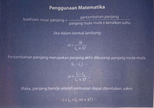
Koefisien muai panjang adalah sebuah bilangan yang menunjukkan pertambahan panjang pada suatu benda ketika suhu naik 1°C
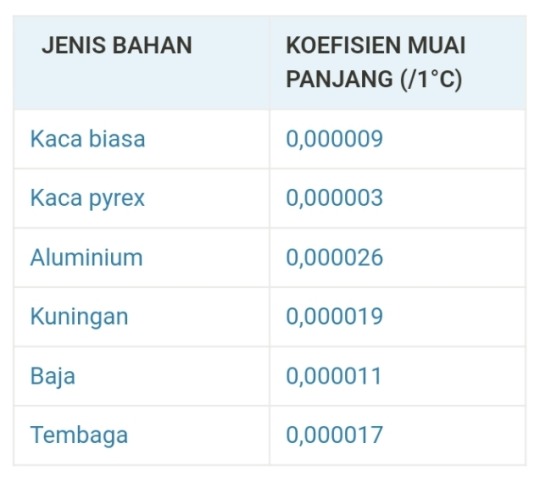
I'mtoolazytomakeitfromscratchok?
PEMUAIAN LUAS DAN VOLUME ZAT PADAT
Pemuaian yang terjadi pada dua benda disebut Pemuaian luas. Pemuaian jenis ini 2x lebih besar koefisiennya dibanding koefisien muai panjang. Pemuaian volume adalah pemuaian yang terjadi oleh benda berimensi tiga (memiliki panjang, lebar, dan tinggi), dan koefisiennya 3x lebih besar dibanding koefisien muai panjang.
PEMUAIAN ZAT CAIR DAN GAS
Pemuaian zat cair dan gas relatif lebih mudah dilihat dibandingkan pemuaian zat padat.
1 note
·
View note
Text

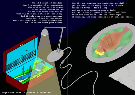
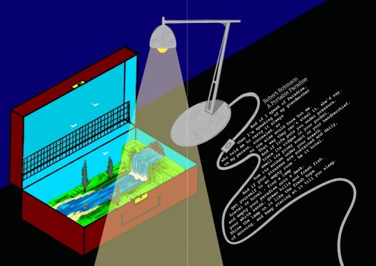
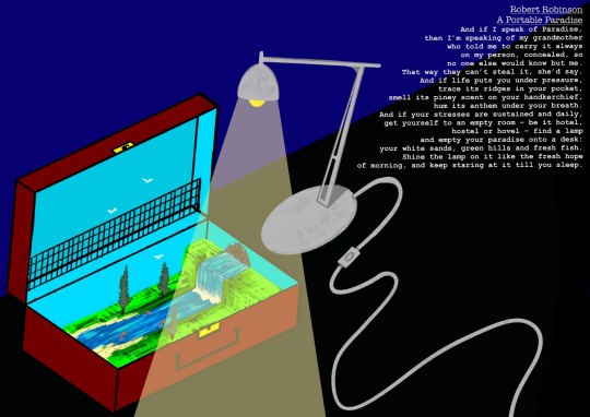
An illustrative spread based on the poem “A Portable Paradise” by Robert Robinson for National Poetry Day. I wanted to explore drawing in a more isometric based way and play around with the way the text and the illustration work together on the page. At one point there was even a fish involved but I decided to remove it as I felt it added little to the composition and was distracting.
1 note
·
View note


Text
University tip !
Before you start university / college, make a note of all websites / companies that need your university email or your student address
When the time comes, you’ll have a list of addresses ready (email and physical) that need changing, saving you a LOT of time and frustration

#tips#university#college#college tips#2023#semester 1#summer holiday#studyspo#study blog#studyblr#study tips#life#life hacks#life tips
1 note
·
View note
Text
alhamdulillah. lagi 2 paper minggu ni. harap boleh score allahumma aamiin!
0 notes
Text
Getting off this musty bus, it’s suspension begging for mercy over every bump and change in speed, would be a blessing.
“Tomorrow, Valentina.”
-Semester 1, Mazzy j March
3 notes
·
View notes
Text
app/logo research and design
I knew I needed to design an application icon for my game, so I looked at examples from my moodboard as a starting point.
some of these games I own across multiple platforms or just one copy, so I can see there’s a difference in how they are adapted for each device. most of the desktop and mobile icons have less space to work with and are represented through something the game is well known for (or is straight up the game’s logo as seen with starbound). the switch icons are able to utilise much more space, so they are able to display a section of box art.
desktop icons:
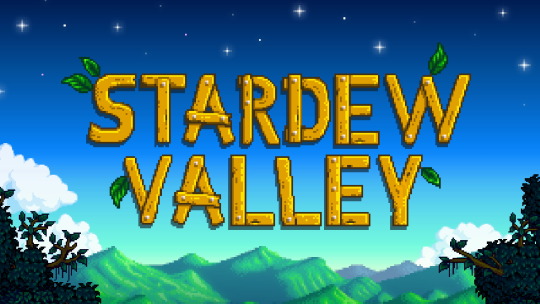
(stardew valley, this icon has a background on mobile)
(starbound)

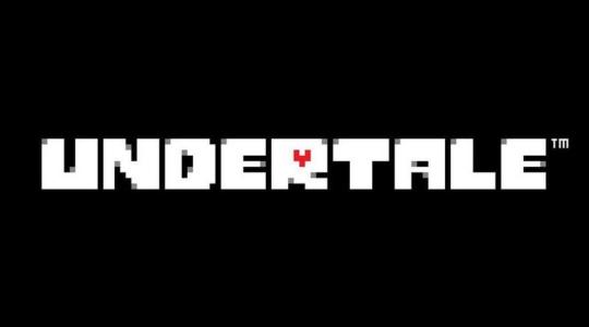
(undertale)

nintendo switch icons:
for my game, I want it to be available on devices that families are most likely have which are mobile devices (phone and tablets), as well as laptops. some households might have gaming devices, so I’ll design an icon for both applications.
I decided on something that was much more legible and shorter than the previous name, giving my project a mini rebrand. to go with my tone of voice, I chose orange to represent informality, as often time bright colours are seen as such.
0 notes
Text
Mid-year Assessment Installation
July 2022
Artist statement:
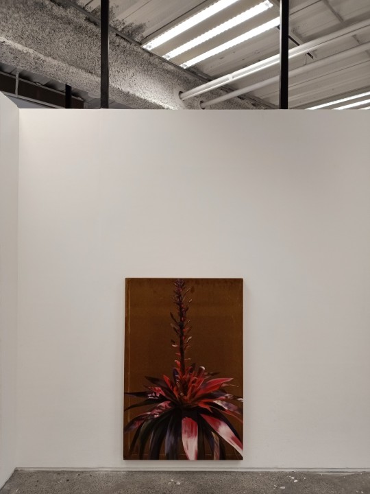
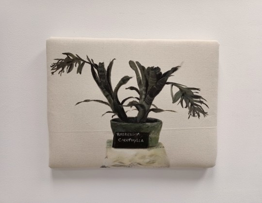
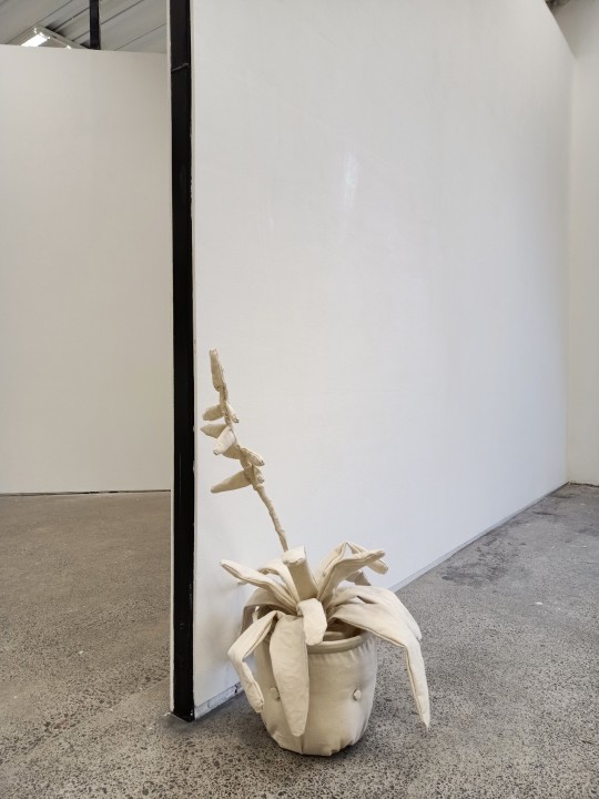
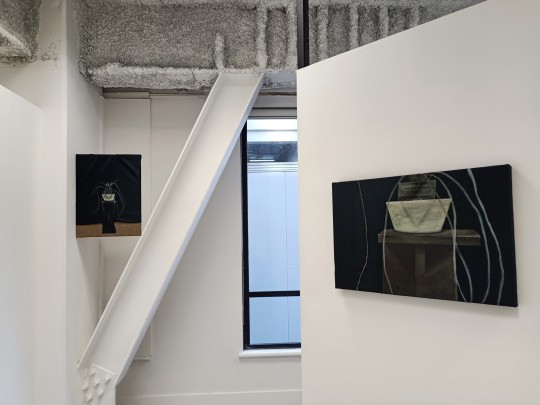
Placed on a pedestal and seated on a white doily, an imported bromeliad sits for its first portrait upon arrival in Aotearoa. A draping black curtain frames the dangling leaves, accentuating the plants foreign features that garden enthusiasts had not seen yet in this country. Such curiosity founded the Bromeliad Society of New Zealand (BSNZ) in 1962, which still today actively aims to ‘encourage the cultivation and study of bromeliads grown indoors or outdoors’. Proceeded by several decades of local propagation, the physical features of each new type of bromeliad inspires names like ‘Red Heaven,’ ‘Lollyshop Liquorice,’ and ‘Royal Wine,’ and are now a common feature in modern gardens across the country.
These artworks explore how bromeliads have interacted with Aotearoa whenua and tangata since their introduction. The decorative nature of their planting, display and naming frames the bromeliad within an objecthood outside the bush environment in which it naturally thrives. Far from the American soil it originated from, they are planted in often synthetically curated landscapes. This installation aims to observe the bromeliad as an idea toward and away from the landscape, the middle ground inbetween bush and garden as it relates to Aotearoa whenua. As with Geoff Park’s Theatre Country in which he describes a “quest for an explanation of the landscape in which I lived” I am also interested in exploring “the tensions of ‘landscape’ and ‘whenua’” that he outlines there.

0 notes
Text
FURTHER ANTI-FORM RESEARCH:
“ANTI/FORM” EXHIBITION:
Sculptures from the MUMOK Collection:
05.02.-15.05.2011 10:00-18:00 Curated by: Peter Pakesch.
Duration: Feb 5 - May 15, 2011
John Chamberlain, "Trixie Dee", 1963
Photo © VBK, Vienna 2011; MUMOK, Museum Moderner Kunst Stiftung Ludwig Wien, formerly Hahn Collection, Cologne exhibition "Anti/Form. Sculptures from the MUMOK Collection" 05.02.-15.05.2011 - Above.
“The term “anti-form” in the 1960s represented the abandonment of the traditional concept of art and sculpture. It was a radical challenge that opened doors to new aesthetic worlds, and was followed in the 1980s and 1990s by a further wave of novel sculptures whose influence is still perceptible today. Our Anti/Form exhibition illustrates by means of significant examples from the large MUMOK collection in Vienna the way the concept of sculpture was developed and redefined. Works of completely different artists from several decades show how a radical gesture became a new paradigm with an idiom of its own. What initially bordered on the outrageous in the context of Robert Morris’s Anti-Form manifesto and Harald Szeemann’s exhibition When Attitudes Become Form is now an important basic foundation for an increasingly globalised art” (Anti/Form).

Robert Morris, "Untitled", 1974
Foto © VBK, Wien 2011; MUMOK, Museum Moderner Kunst Stiftung Ludwig Wien
Exhibition view
Photo: Nicolas Lackner, Universalmuseum Joanneum - above.
Artists:
Carl Andre
Miroslaw Balka
Pier Paolo Calzolari
John Chamberlain
Jimmie Durham
Mike Kelley
Michael Kienzer
Sol LeWitt
Richard Long
Mario Merz
Robert Morris
Bruce Nauman
Meret Oppenheim
Jessica Stockholder
Franz West
Christopher Williams
Erwin Wurm
Heimo Zobernig
https://www.museum-joanneum.at/en/kunsthaus-graz/exhibitions/exhibitions/events/event/1380/anti-form-2
https://www.oxfordreference.com/view/10.1093/oi/authority.20110803095416829 ->
“A term, originating in the late 1960s, applied to certain types of works that react against traditional forms, materials, and methods of artistic creation—*Arte Povera, Land art, some kinds of Conceptual art, and the early ‘provisional, non-fixed, elastic’ sculptures of Richard Serra, for example. Robert Morris, who wrote an article entitled ‘Anti-Form’ in the April 1968 issue of Artforum, defined the term as an ‘attempt to contradict one's taste’. The nature of the material means that the form itself is no longer exactly fixed or determined. This is also central to the work of certain Kinetic artists such as Lygia Clark and Mira Schendel.”
4 notes
·
View notes
Text
I just keep thinking about a silly little like one-shot scenario of sometime during the course of Neil and Andrew being at Palmetto there being a graduation requirement where Neil has to be a TA for one of the like lower level math courses, or a teacher asks him to be a TA since he had such an excellent grasp on the subject material.
And per most colleges in the United States of America there are a lot of classes you have to take just for your General Education.
Guess who had been putting off taking his Gen-Ed for Math?
Andrew Minyard.
Guess who is signed up for Neil's class since he just let his advisor pick it for him?
Andrew Minyard.
Guess who hears his classmates giggling about his boyfriend and talking about going to Neil's office hours to try and get a date with one of their schools campus hotties?
Andrew Minyard.
Andrew never misses a class and certainly never an office hour. He doesn't need to ask Neil anything but he is always there. He has no doubt that Neil would fail to recognize any attempt to flirt with him and that Neil only has eyes for him. It is more that Neil is so unaware of people's attraction to him that he sometimes doesn't realize when people are going too far.
It was already bad enough that he had to give his phone number out to everyone in the class in case they had questions. Plenty of people reaching out with questions that DID NOT PERTAIN TO STATS 1000.
Andrew walks out of the Stats class with an A+ with extra credit and his own offer to be a TA but declines.
#Just a silly little thought of a 5+1 that I might do someday#If I ever get through all my BOUNTIFUL AUs#or maybe on the side for fun as I write those#IDK#Just remembering my TA days#Longest semester of my LIFE#AFTG#Andreil#Also like#If anyone wants to write this#pls tell me about it
541 notes
·
View notes
Text
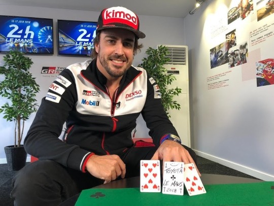
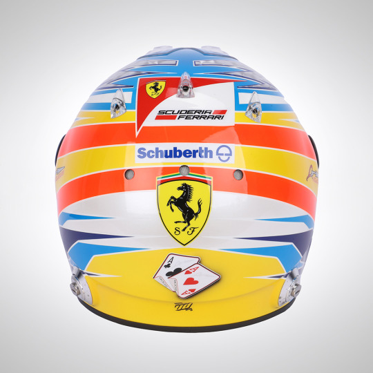
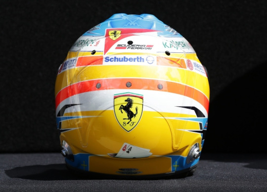
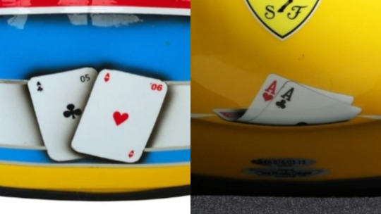
Fernando Alonso & His Relationship With Cards
I'm sure we're all familar with the cards on the back of Fernando's Vegas GP helmet by now, but did you know his relationship with cards goes a lot deeper?
I. Magic Tricks
You've probably seen or heard someone at least mention Fernando's propensity for card tricks. As far as I can tell he was doing them(publically) as far back as 2003 all the way to as recently as 2018. Even once performing a card trick, with a condom and a teddy bear(!??!?!??!!), in front of Valentino Rossi who said "How was that possible?"(x)
But how did this start? According to James Allen, "Fernando admits to having been heavily influenced by his grandfather, a mercurial figure, who taught him magic and card tricks, still one of his passions away from the race track."(x) And I'm not sure the validity of this one, because I couldn't find an actual source, but apparently he once said: "My parents are responsible for the two things I like doing most - driving and magic tricks. They bought me my first go-kart and a magician's kit."
In several interviews he described it as his hobby off track, and that he loved learning new tricks and surprising others in the garage with them! So clearly cards are pretty important to him both as a hobby but also to who he is as a person since they've been with him just as long as racing has.
II. Card Symbolism in His Helmets
This is the reason I originally made this post, but I thought I should also explain the origins of his card fascination first. As I said, we probably all remember the cards on the back of his helmet in Vegas, but did you know that wasn't the first time he had cards on the back of his helmet?
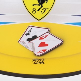
From 2008-2013, he used to have a pair of cards on the back of his helmets. The symbolisms of the cards themselves as well as the evolution of their design is really fascinating to me! Even more so with the recent development of the card choice in 2023.
Fernando said he wanted to reference his two titles in some way on the back of his helmet and after his friend sent him several ideas, he decided on having two cards(an ace of clubs and an ace of hearts, sometimes pictured with 05 and 06 on them as well), saying: "I picked the cloverleaf [the ace of clubs - Ed] to give me luck, but the only pity is that it doesn't have four leaves!"(X)
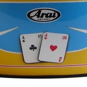
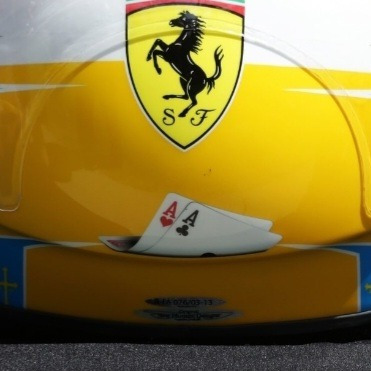
2008.


Here's the very first appearance of the cards! They're displayed flat, with the 05 and 06 clearly visible
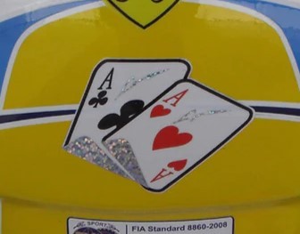
2009.

Very similar to 2008, but with a slightly different design, and they're maybe a bit more straight with less shadow?
2010.

This is the first major change! I was sad they didn't have the years on them anymore, but then I realized they're sparkly to match with his signature lightning bolts on the top of the helmet!!
2011.
Honestly I'm still somewhat unsure if this is the actual 2011 helmet? It's pretty difficult to find clear photos of the back of helmets from older seasons. It's easiest to find them on replica sites or auction sites so I'm not 100%? But anyways, I like that this has the championship years on the underside of the cards
2012.
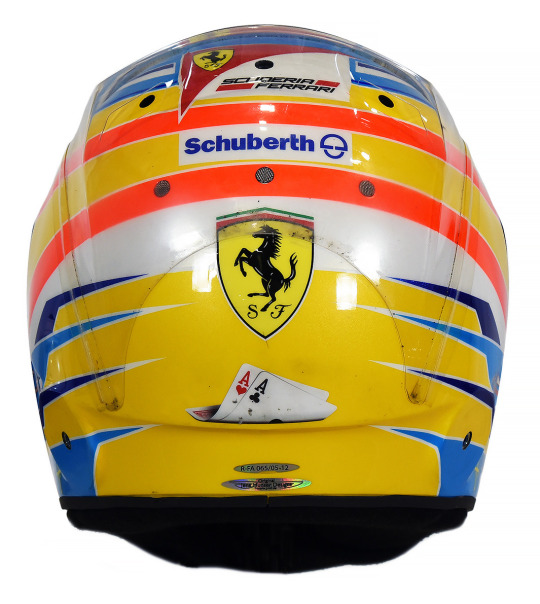

This is when I started getting weirdly emotional about the helmets. Do you see how they've progressed from being a centerpoint to being curled up and sad at the bottom of the helmet? Not listing the year anymore??
2013.
Same thoughts as 2012. And after this season, they cease to exist (just like his ferrari chair in the garage, WOAH CALLBACK), until cards make a reeappearance in his Vegas helmet, albeit in a different form
2013 Monaco(Honorable Mention):
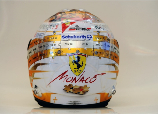
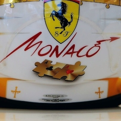
For some reason 2013 helmets were easier to find proper pictures of, so I happened to witness this absolute beauty. The creativity of this helmet genuinely blows me away??? Wanting to keep the card motif, but making sure to incorporate it into the rest of the puzzle piece design?? Mwah! There was another special 2013 helmet but they didn't change the cards at all so I really applaud this one
2023 Las Vegas(The Return of The King):
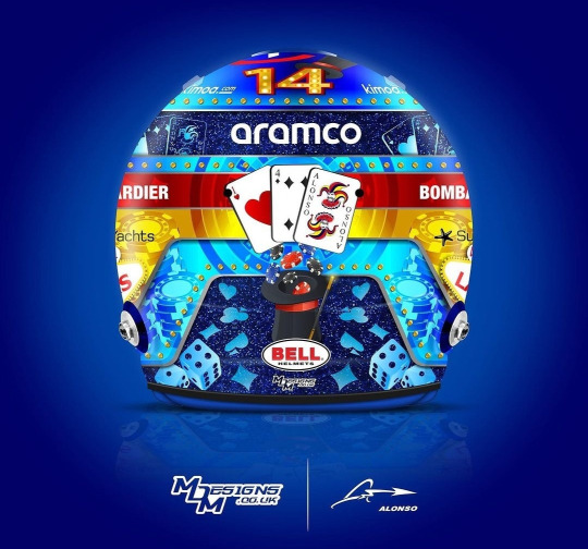
The magnificent return! But look! The cards are different cards! Instead of being two aces, it's now an ace of hearts, a four of hearts(his driver number of course!) and, the, now iconic, representation of himself as a Joker. I literally could not believe my eyes when this helmet was released and I saw the Joker card, what a fucking silly old man....I really wonder if he felt nostalgic having cards on his helmet again or if he didn't think about it all and was just like, "ah cards because Vegas!!!"
III. Why Does This Matter?
*The rest of the post was factual, this is moreso my personal thoughts on the symbolism of the cards/designs
This post spawned from me recently watching the 2010 Bahrain gp and noticing "hey wait a minute...are those CARDS ON THE BACK OF HIS HELMET!?" It's a really tiny detail that's unfortunately covered up by the HANS device pretty much whenever he's wearing the helmet, so it's really difficult to spot! But I became fascinated with the fact that he had cards on his helmet before that recent helmet, and now here we are!
There's something to me about how the design of the cards evolves over the course of six seasons from the cards being front and center to being smaller, more folded up and closer to the bottom of the helmet. As I said, the 2012-2013 ones genuinely made me depressed because it feels, symbolically, like his hopes for getting another Ace are becoming more and more unlikely and falling away until they eventually fall falt and fade away entirely after 2013 and disappear for basically a decade.
But when they return? They're not the same cards! Instead of representing Fernando's championships, they now represent him as a person, displaying his driver number and his persona of being a Joker!! Though I do think it's interesting he happened to keep the Ace of Hearts, even though he talked more about the Ace of Clubs before. I'm not sure it's actually this deep in reality, but I like to think that it's him not letting his championships(and the lack thereof) define him, but rather letting who he is as a person shine and be the centerpoint instead! But on a sadder note, as @suzuki-ecstar said to me, maybe the Aces aren't there anymore because he's lost all hope for a chance at a third Ace entirely :(

#yes its finals week and im up to my eyes in coursework but instead decided to spend like 5 hours researching and writing this post#nah bcs i actually genuinely put more work into this then I think I have all semester dsfjdskjg#that thing about him using a condom and teddy bear in a magic trick genuinely had me crying with laugher. actual tears rolling down my face#<- HOW!?!? WHAT WAS THE TRICK?? its literally inconceivable to me what he did. oh if only there were pics UGH#anyways!! this post was a lot of fun to make!! i really really love the symbolism and design of helmets so this was a rly fun project#and i also went down a lot of rabbitholes while make this and saw many very weird articles from yore#i feel like i make an equal amnt of deranged posts abt seb and nando but i dont know why nando is gifted w all my well researched projects#<- i.e. chair post. that was the same level of research as this one but at least this one i could find actual sources about....#idk theres smth about the extremely long history of nando's history that evokes research posts like this KLAJSLSKDJ#theres just so much that i dont think I ever really see people discussing! so i must create.#haha what was that joke tag i wanted to make abt my researched posts? I think:#normal posts that catie normally makes in a normal fashion#<- one day ill go back and actually tag posts w that. bcs the amtn of research compared to my actual schoolwork is so unwell#fernando alonso#fa14#f1#formula 1#catie.rambling.txt#we do a little bit of f1
282 notes
·
View notes
Last Seen Blogs

ruhizuhara
Beauty Trends

alice-angel12x
Falling Pegasus

kylea-k
Kylea

archiveofspace
Archive of Space

pichichustudios
Pichichuchu Studio