#breaking format
Text
broke: coryxkenshin is in the fnaf movie
woke: matpat is in the fnaf movie
bespoke: kellen goff is in the fnaf movie
#breaking format#but oh my god#the way i screamed when i saw him credited for foxys song#its even listed on his btva page im losing my mind#for context#he plays funtime freddy glamrock freddy and the daycare attendant(s)#voice acting#voice actors#shared voice actors#kellen goff#five nights at freddy's#fnaf#fnaf movie#five nights at freddy's movie#also excuse the dated meme format i just never let it go lol
40 notes
·
View notes
Text
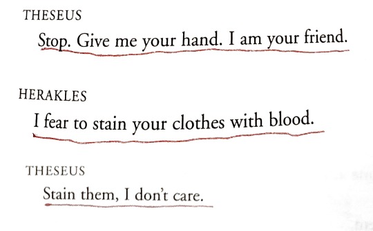
[ID: A page of a play. It reads as follows, "Theseus: Stop. Give me your hand. I am your friend. / Herakles: I fear to stain your clothes with blood. / Theseus: Stain them, I don't care." End text.]
Herakles - Euripides (Tr. Anne Carson)
#on my own.#sorry the formatting on this is weird theres a page break bleh#anne carson#euripides#quotes#herakles#theseus#herakles&theseus#i just thought ab this play again and god… like a little boat being towed along by a big boat……#quoteblr#wordblr#euripides was rlly into this huh. w/ orestes & pylades ‘not to me not if its you’ like. he was rlly into this specific dynamic
67K notes
·
View notes
Text
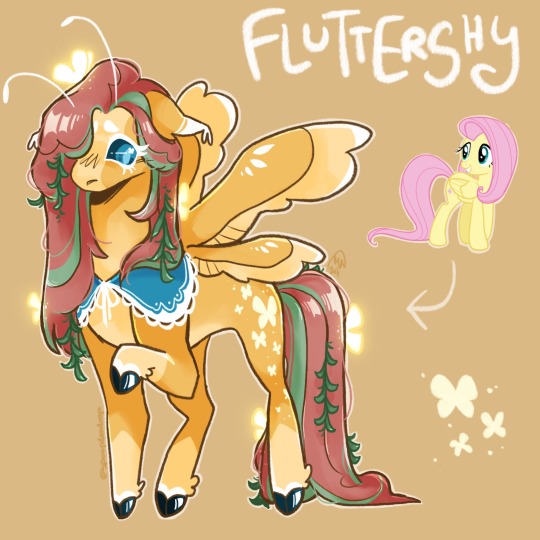
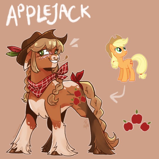
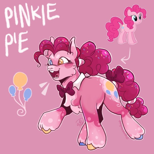
WYD WHEN MY GANG PULL UP !!!
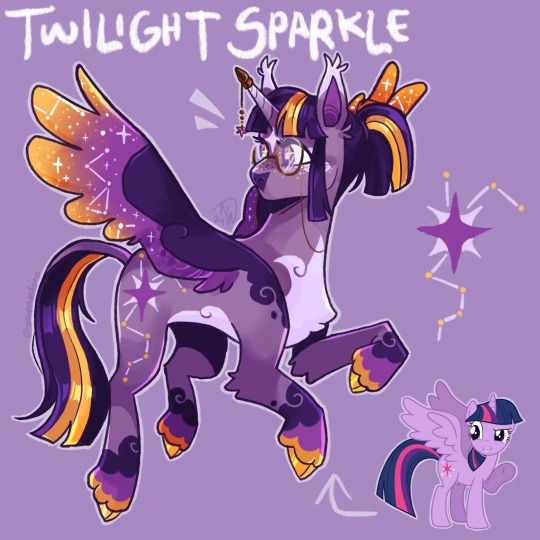
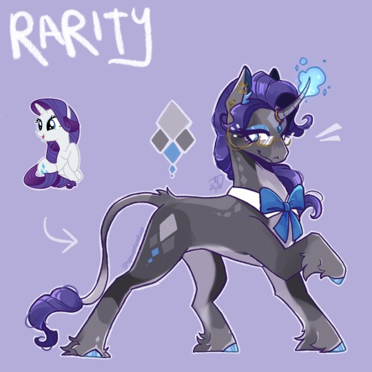
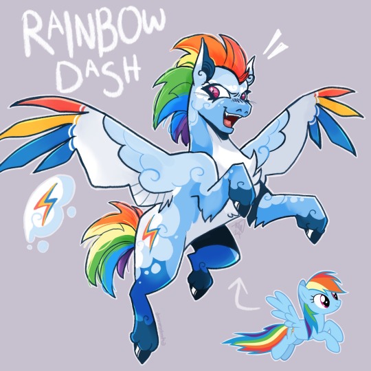
#mlp#my art#sorry mlp jumpscare 😭😭 took a quick break for a bit to do some mlp redesigns bc theyre fun and i was sad#my little pony#mlpfim#my little pony: friendship is magic#mlp redesign#mlp fanart#idk if tumblr likes this kinda stuff its more of a twt thing but sjfhdbf#we ball#twilight sparkle#twilight sparkle fanart#rarity#rarity fanart#rainbow dash#rainbow dash fanart#fluttershy#fluttershy fanart#applejack#applejack fanart#pinkie pie#pinkie pie fanart#i havent actually watched the show in a billion years everyone else was just doing it and it looked like the best thing ever#AND IT WAS. i had a blast#might do celestia n luna if im feeling up to it but probably not rgrjsbfgjsnv we’ll see#SORRY THE formatting feels so uneven but whateva#again. we ball
3K notes
·
View notes
Text

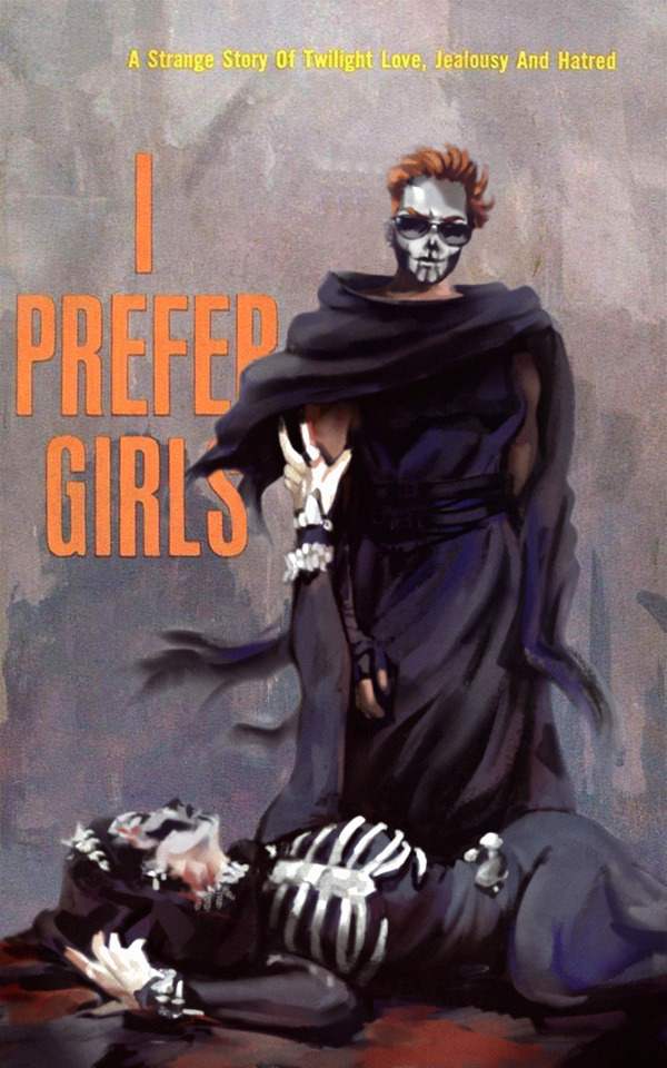
(a meme)
#breaking form for the gays#art meme#format from x bird app#art#my art#raegunblast#gideon the ninth#tlt#the locked tomb#gideon nav#harrowhark nonagesimus#i prefer girls
5K notes
·
View notes
Note
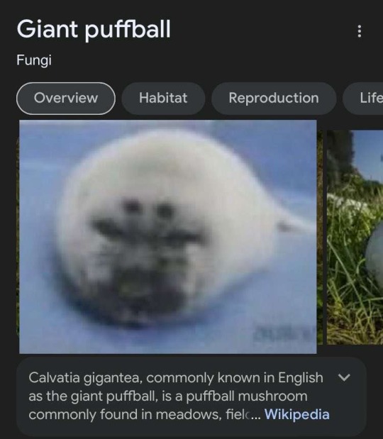
Today's Seal IsWait. Hold on actually look at the actual fungus. Thats crazy


1K notes
·
View notes
Text
why Aurora's art is genius
It's break for me, and I've been meaning to sit down and read the Aurora webcomic (https://comicaurora.com/, @comicaurora on Tumblr) for quite a bit. So I did that over the last few days.
And… y'know. I can't actually say "I should've read this earlier," because otherwise I would've been up at 2:30-3am when I had responsibilities in the morning and I couldn't have properly enjoyed it, but. Holy shit guys THIS COMIC.
I intended to just do a generalized "hello this is all the things I love about this story," and I wrote a paragraph or two about art style. …and then another. And another. And I realized I needed to actually reference things so I would stop being too vague. I was reading the comic on my tablet or phone, because I wanted to stay curled up in my chair, but I type at a big monitor and so I saw more details… aaaaaand it turned into its own giant-ass post.
SO. Enjoy a few thousand words of me nerding out about this insanely cool art style and how fucking gorgeous this comic is? (There are screenshots, I promise it isn't just a wall of text.) In my defense, I just spent two semesters in graphic design classes focusing on the Adobe Suite, so… I get to be a nerd about pretty things…???
All positive feedback btw! No downers here. <3
---
I cannot emphasize enough how much I love the beautiful, simple stylistic method of drawing characters and figures. It is absolutely stunning and effortless and utterly graceful—it is so hard to capture the sheer beauty and fluidity of the human form in such a fashion. Even a simple outline of a character feels dynamic! It's gorgeous!
Though I do have a love-hate relationship with this, because my artistic side looks at that lovely simplicity, goes "I CAN DO THAT!" and then I sit down and go to the paper and realize that no, in fact, I cannot do that yet, because that simplicity is born of a hell of a lot of practice and understanding of bodies and actually is really hard to do. It's a very developed style that only looks simple because the artist knows what they're doing. The human body is hard to pull off, and this comic does so beautifully and makes it look effortless.
Also: line weight line weight line weight. It's especially important in simplified shapes and figures like this, and hoo boy is it used excellently. It's especially apparent the newer the pages get—I love watching that improvement over time—but with simpler figures and lines, you get nice light lines to emphasize both smaller details, like in the draping of clothing and the curls of hair—which, hello, yes—and thicker lines to emphasize bigger and more important details and silhouettes. It's the sort of thing that's essential to most illustrations, but I wanted to make a note of it because it's so vital to this art style.
THE USE OF LAYER BLENDING MODES OH MY GODS. (...uhhh, apologies to the people who don't know what that means, it's a digital art program thing? This article explains it for beginners.)
Bear with me, I just finished my second Photoshop course, I spent months and months working on projects with this shit so I see the genius use of Screen and/or its siblings (of which there are many—if I say "Screen" here, assume I mean the entire umbrella of Screen blending modes and possibly Overlay) and go nuts, but seriously it's so clever and also fucking gorgeous:
Firstly: the use of screened-on sound effect words over an action? A "CRACK" written over a branch and then put on Screen in glowy green so that it's subtle enough that it doesn't disrupt the visual flow, but still sticks out enough to make itself heard? Little "scritches" that are transparent where they're laid on without outlines to emphasize the sound without disrupting the underlying image? FUCK YES. I haven't seen this done literally anywhere else—granted, I haven't read a massive amount of comics, but I've read enough—and it is so clever and I adore it. Examples:


Secondly: The beautiful lighting effects. The curling leaves, all the magic, the various glowing eyes, the fog, the way it's all so vividly colored but doesn't burn your eyeballs out—a balance that's way harder to achieve than you'd think—and the soft glows around them, eeeee it's so pretty so pretty SO PRETTY. Not sure if some of these are Outer/Inner Glow/Shadow layer effects or if it's entirely hand-drawn, but major kudos either way; I can see the beautiful use of blending modes and I SALUTE YOUR GENIUS.
I keep looking at some of this stuff and go "is that a layer effect or is it done by hand?" Because you can make some similar things with the Satin layer effect in Photoshop (I don't know if other programs have this? I'm gonna have to find out since I won't have access to PS for much longer ;-;) that resembles some of the swirly inner bits on some of the lit effects, but I'm not sure if it is that or not. Or you could mask over textures? There's... many ways to do it.
If done by hand: oh my gods the patience, how. If done with layer effects: really clever work that knows how to stop said effects from looking wonky, because ugh those things get temperamental. If done with a layer of texture that's been masked over: very, very good masking work. No matter the method, pretty shimmers and swirly bits inside the bigger pretty swirls!
Next: The way color contrast is used! I will never be over the glowy green-on-black Primordial Life vibes when Alinua gets dropped into that… unconscious space?? with Life, for example, and the sharp contrast of vines and crack and branches and leaves against pitch black is just visually stunning. The way the roots sink into the ground and the three-dimensional sensation of it is particularly badass here:

Friggin. How does this imply depth like that. HOW. IT'S SO FREAKING COOL.
A huge point here is also color language and use! Everybody has their own particular shade, generally matching their eyes, magic, and personality, and I adore how this is used to make it clear who's talking or who's doing an action. That was especially apparent to me with Dainix and Falst in the caves—their colors are both fairly warm, but quite distinct, and I love how this clarifies who's doing what in panels with a lot of action from both of them. There is a particular bit that stuck out to me, so I dug up the panels (see this page and the following one https://comicaurora.com/aurora/1-20-30/):

(Gods it looks even prettier now that I put it against a plain background. Also, appreciation to Falst for managing a bridal-carry midair, damn.)
The way that their colors MERGE here! And the immense attention to detail in doing so—Dainix is higher up than Falst is in the first panel, so Dainix's orange fades into Falst's orange at the base. The next panel has gold up top and orange on bottom; we can't really tell in that panel where each of them are, but that's carried over to the next panel—

—where we now see that Falst's position is raised above Dainix's due to the way he's carrying him. (Points for continuity!) And, of course, we see the little "huffs" flowing from orange to yellow over their heads (where Dainix's head is higher than Falst's) to merge the sound of their breathing, which is absurdly clever because it emphasizes to the viewer how we hear two sets of huffing overlaying each other, not one. Absolutely brilliant.
(A few other notes of appreciation to that panel: beautiful glows around them, the sparks, the jagged silhouette of the spider legs, the lovely colors that have no right to make the area around a spider corpse that pretty, the excellent texturing on the cave walls plus perspective, the way Falst's movements imply Dainix's hefty weight, the natural posing of the characters, their on-point expressions that convey exactly how fuckin terrifying everything is right now, the slight glows to their eyes, and also they're just handsome boys <3)
Next up: Rain!!!! So well done! It's subtle enough that it never ever disrupts the impact of the focal point, but evident enough you can tell! And more importantly: THE MIST OFF THE CHARACTERS. Rain does this irl, it has that little vapor that comes off you and makes that little misty effect that plays with lighting, it's so cool-looking and here it's used to such pretty effect!
One of the panel captions says something about it blurring out all the injuries on the characters but like THAT AIN'T TOO BIG OF A PROBLEM when it gets across the environmental vibes, and also that'd be how it would look in real life too so like… outside viewer's angle is the same as the characters', mostly? my point is: that's the environment!!! that's the vibes, that's the feel! It gets it across and it does so in the most pretty way possible!
And another thing re: rain, the use of it to establish perspective, particularly in panels like this—

—where we can tell we're looking down at Tynan due to the perspective on the rain and where it's pointing. Excellent. (Also, kudos for looking down and emphasizing how Tynan's losing his advantage—lovely use of visual storytelling.)
Additionally, the misting here:

We see it most heavily in the leftmost panel, where it's quite foggy as you would expect in a rainstorm, especially in an environment with a lot of heat, but it's also lightly powdered on in the following two panels and tends to follow light sources, which makes complete sense given how light bounces off particles in the air.
A major point of strength in these too is a thorough understanding of lighting, like rim lighting, the various hues and shades, and an intricate understanding of how light bounces off surfaces even when they're in shadow (we'll see a faint glow in spots where characters are half in shadow, but that's how it would work in real life, because of how light bounces around).
Bringing some of these points together: the fluidity of the lines in magic, and the way simple glowing lines are used to emphasize motion and the magic itself, is deeply clever. I'm basically pulling at random from panels and there's definitely even better examples, but here's one (see this page https://comicaurora.com/aurora/1-16-33/):

First panel, listed in numbers because these build on each other:
The tension of the lines in Tess's magic here. This works on a couple levels: first, the way she's holding her fists, as if she's pulling a rope taut.
The way there's one primary line, emphasizing the rope feeling, accompanied by smaller ones.
The additional lines starbursting around her hands, to indicate the energy crackling in her hands and how she's doing a good bit more than just holding it. (That combined with the fists suggests some tension to the magic, too.) Also the variations in brightness, a feature you'll find in actual lightning. :D Additional kudos for how the lightning sparks and breaks off the metal of the sword.
A handful of miscellaneous notes on the second panel:
The reflection of the flames in Erin's typically dark blue eyes (which bears a remarkable resemblance to Dainix, incidentally—almost a thematic sort of parallel given Erin's using the same magic Dainix specializes in?)
The flowing of fabric in the wind and associated variation in the lineart
The way Erin's tattoos interact with the fire he's pulling to his hand
The way the rain overlays some of the fainter areas of fire (attention! to! detail! hell yeah!)
I could go on. I won't because this is a lot of writing already.
Third panel gets paragraphs, not bullets:
Erin's giant-ass "FWOOM" of fire there, and the way the outline of the word is puffy-edged and gradated to feel almost three-dimensional, plus once again using Screen or a variation on it so that the stars show up in the background. All this against that stunning plume of fire, which ripples and sparks so gorgeously, and the ending "om" of the onomatopoeia is emphasized incredibly brightly against that, adding to the punch of it and making the plume feel even brighter.
Also, once again, rain helping establish perspective, especially in how it's very angular in the left side of the panel and then slowly becomes more like a point to the right to indicate it's falling directly down on the viewer. Add in the bright, beautiful glow effects, fainter but no less important black lines beneath them to emphasize the sky and smoke and the like, and the stunningly beautiful lighting and gradated glows surrounding Erin plus the lightning jagging up at him from below, and you get one hell of an impactful panel right there. (And there is definitely more in there I could break down, this is just a lot already.)
And in general: The colors in this? Incredible. The blues and purples and oranges and golds compliment so well, and it's all so rich.
Like, seriously, just throughout the whole comic, the use of gradients, blending modes, color balance and hues, all the things, all the things, it makes for the most beautiful effects and glows and such a rich environment. There's a very distinct style to this comic in its simplified backgrounds (which I recognize are done partly because it's way easier and also backgrounds are so time-consuming dear gods but lemme say this) and vivid, smoothly drawn characters; the simplicity lets them come to the front and gives room for those beautiful, richly saturated focal points, letting the stylized designs of the magic and characters shine. The use of distinct silhouettes is insanely good. Honestly, complex backgrounds might run the risk of making everything too visually busy in this case. It's just, augh, so GORGEOUS.
Another bit, take a look at this page (https://comicaurora.com/aurora/1-15-28/):

It's not quite as evident here as it is in the next page, but this one does some other fun things so I'm grabbing it. Points:
Once again, using different colors to represent different character actions. The "WHAM" of Kendal hitting the ground is caused by Dainix's force, so it's orange (and kudos for doubling the word over to add a shake effect). But we see blue layered underneath, which could be an environmental choice, but might also be because it's Kendal, whose color is blue.
And speaking off, take a look at the right-most panel on top, where Kendal grabs the spear: his motion is, again, illustrated in bright blue, versus the atmospheric screened-on orange lines that point toward him around the whole panel (I'm sure these have a name, I think they might be more of a manga thing though and the only experience I have in manga is reading a bit of Fullmetal Alchemist). Those lines emphasize the weight of the spear being shoved at him, and their color tells us Dainix is responsible for it.
One of my all-time favorite effects in this comic is the way cracks manifest across Dainix's body to represent when he starts to lose control; it is utterly gorgeous and wonderfully thematic. These are more evident in the page before and after this one, but you get a decent idea here. I love the way they glow softly, the way the fire juuuust flickers through at the start and then becomes more evident over time, and the cracks feel so realistic, like his skin is made of pottery. Additional points for how fire begins to creep into his hair.
A small detail that's generally consistent across the comic, but which I want to make note of here because you can see it pretty well: Kendal's eyes glow about the same as the jewel in his sword, mirroring his connection to said sword and calling back to how the jewel became Vash's eye temporarily and thus was once Kendal's eye. You can always see this connection (though there might be some spots where this also changes in a symbolic manner; I went through it quickly on the first time around, so I'll pay more attention when I inevitably reread this), where Kendal's always got that little shine of blue in his eyes the same as the jewel. It's a beautiful visual parallel that encourages the reader to subconsciously link them together, especially since the lines used to illustrate character movements typically mirror their eye color. It's an extension of Kendal.
Did I mention how ABSOLUTELY BEAUTIFUL the colors in this are?
Also, the mythological/legend-type scenes are illustrated in familiar style often used for that type of story, a simple and heavily symbolic two-dimensional cave-painting-like look. They are absolutely beautiful on many levels, employing simple, lovely gradients, slightly rougher and thicker lineart that is nonetheless smoothly beautiful, and working with clear silhouettes (a major strength of this art style, but also a strength in the comic overall). But in particular, I wanted to call attention to a particular thing (see this page https://comicaurora.com/aurora/1-12-4/):

The flowing symbolic lineart surrounding each character. This is actually quite consistent across characters—see also Life's typical lines and how they curl:

What's particularly interesting here is how these symbols are often similar, but not the same. Vash's lines are always smooth, clean curls, often playing off each other and echoing one another like ripples in a pond. You'd think they'd look too similar to Life's—but they don't. Life's curl like vines, and they remain connected; where one curve might echo another but exist entirely detached from each other in Vash's, Life's lines still remain wound together, because vines are continuous and don't float around. :P
Tahraim's are less continuous, often breaking up with significantly smaller bits and pieces floating around like—of course—sparks, and come to sharper points. These are also constants: we see the vines repeated over and over in Alinua's dreams of Life, and the echoing ripples of Vash are consistent wherever we encounter him. Kendal's dream of the ghost citizens of the city of Vash in the last few chapters is filled with these rippling, echoing patterns, to beautiful effect (https://comicaurora.com/aurora/1-20-14/):

They ripple and spiral, often in long, sinuous curves, with smooth elegance. It reminds me a great deal of images of space and sine waves and the like. This establishes a definite feel to these different characters and their magic. And the thing is, that's not something that had to be done—the colors are good at emphasizing who's who. But it was done, and it adds a whole other dimension to the story. Whenever you're in a deity's domain, you know whose it is no matter the color.
Regarding that shape language, I wanted to make another note, too—Vash is sometimes described as chaotic and doing what he likes, which is interesting to me, because smooth, elegant curves and the color blue aren't generally associated with chaos. So while Vash might behave like that on the surface, I'm guessing he's got a lot more going on underneath; he's probably much more intentional in his actions than you'd think at a glance, and he is certainly quite caring with his city. The other thing is that this suits Kendal perfectly. He's a paragon character; he is kind, virtuous, and self-sacrificing, and often we see him aiming to calm others and keep them safe. Blue is such a good color for him. There is… probably more to this, but I'm not deep enough in yet to say.
And here's the thing: I'm only scratching the surface. There is so much more here I'm not covering (color palettes! outfits! character design! environment! the deities! so much more!) and a lot more I can't cover, because I don't have the experience; this is me as a hobbyist artist who happened to take a couple design classes because I wanted to. The art style to this comic is so clever and creative and beautiful, though, I just had to go off about it. <3
...brownie points for getting all the way down here? Have a cookie.
#aurora comic#aurora webcomic#comicaurora#art analysis#...I hope those are the right tags???#new fandom new tagging practices to learn ig#much thanks for something to read while I try to rest my wrists. carpal tunnel BAD. (ignore that I wrote this I've got braces ok it's fine)#anyway! I HAVE. MANY MORE THOUGHTS. ON THE STORY ITSELF. THIS LOVELY STORY#also a collection of reactions to a chunk of the comic before I hit the point where I was too busy reading to write anything down#idk how to format those tho#...yeet them into one post...???#eh I usually don't go off this much these days but this seems like a smaller tight-knit fandom so... might as well help build it?#and I have a little more time thanks to break so#oh yes also shoutout to my insanely awesome professor for teaching me all the technical stuff from this he is LOVELY#made an incredibly complex program into something comprehensible <3#synapse talks
743 notes
·
View notes
Text

no way they broke bad 😨
#breaking bad#breaking bad fanart#brba#brba fanart#jesse brba#jesse breaking bad#jesse pinkman#jesse pinkman fanart#walter white#walter white fanart#saul goodman#saul goodman fanart#jimmy mcgill#jimmy mcgill fanart#trans jesse pinkman#my favorite internet funny format#saw a post literally last night on here of the same thing but with jesse n jane and i swear i made this like a week ago on my own volition#that one objectively made more sense for the original format but i do not care 😎#please stop getting mad at me for calling saul a communist i know hes not a communist guys its a joke guys please#my art
4K notes
·
View notes
Text
so im sure everyones fully well aware of the magic 8 ball site fob is using to promote a contest to win some tickets to see them in nashville. the little 8ball widget theyve got in browser is also modeled on the physical 8ball that they had in the vip merch packages for tourdust's first leg, which is cool! but of particular note is the way that, to fill out the contest form, you have to pick your favorite fall out boy songs. and the sheer breadth of what is allowed is...interesting? it's not cohesive by any means, but it is really wild the selection of songs they have here because not all of them are fob songs. in fact, quite a few of them aren't.
i went directly to the source code and got a full list of all possible songs that you could input (which you can check for yourself by right-clicking and selecting "view source"). i'm going to list them here for archival purposes, with a few notes/explanations cause some of these are WILD.
there are 187 songs total listed.
bolded songs indicate songs that are demos or never received an official release
italicized songs are songs by other bands
underlined songs indicate songs that are covers
songs with an asterisk beside them (*) indicate they are from patrick's solo catalogue. two asterisks (**) are for pete's.
additional commentary by me will be [in brackets]
20 Dollar Nose Bleed
27
7 Minutes in Heaven (Atavan Halen)
7-9 Legendary
A Little Less Sixteen Candles, a Little More "Touch Me"
A Nice Myth [one of the earliest fall out boy demos, found on their first ep, and only the casette version at that]
Allie*
Alone Together
Alpha Dog
America's Suitehearts
American Beauty/American Psycho (song)
American Made
Art of Keeping Up Disappearances
As Long as I Know I'm Getting Paid*
Austin, We Have a Problem
Baby Annihilation
Bad Side of 25*
Bang the Doldrums
Beat It
Big Hype*
Bishops Knife Trick
Bob Dylan
Bounce [this is a song that came out on then-Decaydance labelmates The Cab's debut record, Whisper War, which patrick produced. he has writing credit and also is credited with background vocals (and also shows up in the music video)]
Caffeine Cold
Calm Before the Storm
Centuries
Champagne for My Real Friends, Real Pain for My Sham Friends
Champion
Check Your Phone**
Chicago is So Two Years Ago
Church
City in a Garden
Coast (It's Gonna Get Better)*
Coffee's for Closers
Cryptozoology*
Cute Girls*
Cyanide** [this is a nothing,nowhere song that pete did some spoken word parts and backing vocals on]
Dance Miserable*
Dance, Dance
Dead on Arrival
Dear Future Self (Hands Up)
Death Valley
Deep Blue Love* [song patrick did for the indie short film "spell"]
Demigods
Disloyal Order of Water Buffaloes
Don't You Know Who I Think I Am?
Electric Touch [the (in?)famous taylor swift song patrick featured on]
Eternal Summer
Everybody Wants Somebody*
Explode*
Fake Out
Fame Less than Infamy
Favorite Record
Fellowship of the Nerd [this is an alternate title for world's not waiting, as far as i can tell]
Flu Game
Flu Game [yes flu game is listed twice for some reason]
Footprints in the Snow [demo from the Llamania ep]
Fourth of July
From Now on We Are Enemies
G.I.N.A.S.F.S.
Get Busy Living or Get Busy Dying (Do Your Part to Save the Scene and Stop Going to Shows)
Ghostbusters (I'm Not Afraid)
Golden
Grand Theft Autumn/Where Is Your Boy
Greed*
Grenade Jumper
Grow Up and Be Kids [this song is on The Cab's sophomore album Symphony Soldier, which release after they left decaydance. nonetheless, pete does have some writing credits on it. give it a listen and you'll hear for yourself in the first 10 seconds or so]
Growing Up
Hand Crushed by a Mallet [this is a remix of the 100gecs song of the same name; patrick did some vocals for it]
Hand of God
Have I Got a Gift for You* [song patrick did for the horror movie black friday]
Headfirst Slide into Cooperstown on a Bad Bet
Heartbreak Feels So Good
Heaven's Gate
Heaven, Iowa
Hold Me Like a Grudge
Hold Me Tight or Don't
Homesick at Space Camp
Honorable Mention
Hot to the Touch, Cold on the Inside
Hum Hallelujah
I Am My Own Muse
I Don't Care
I Got Nothing, But You Got Something [this is the one that really perplexes me. there's no evidence of this song actually existing, other than an unverified genius post and an article on a single fandom wiki. it is inexplicably listed here despite its very existence being questionable at best.]
I Slept with Someone in Fall Out Boy and All I Got Was This Stupid Song Written About Me
I Wanna Dance with Somebody (Who Loves Me)
I'm Like a Lawyer with the Way I'm Always Trying to Get You Off (Me & You)
I've Been Waiting [this is technically a lil peep song with fall out boy as a feature]
I've Got a Dark Alley and a Bad Idea That Says You Should Shut Your Mouth (Summer Song)
I've Got All This Ringing in My Ears and None on My Fingers
Immortals
Irresistible
It's Hard to Say 'I Do', When I Don't
It's Not a Side Effect of the Cocaine, I Am Thinking It Must Be Love
Jet Pack Blues
Just One Yesterday
Lake Effect Kid (song)
Lake Shore Drive [this is a song patrick covered on the piano at wrigley, first night of tourdust]
Love from the Other Side
Love Will Tear Us Apart
Love, Selfish Love*
Love, Sex, Death
Lullabye
Mad at Nothing*
Miss Missing You
Moving Pictures
My Heart Is the Worst Kind of Weapon
My Songs Know What You Did in the Dark (Light Em Up)
New Dreams [this is a bonus track on pax am days, a naked rayguns cover]
Nobody Puts Baby in the Corner
Novocaine
Of All the Gin Joints in All the World
One of Those Nights [another song from the cab's whisper war. this one has patrick doing vocals very prominently]
Open Happiness [this was a huge collaborative piece done for a coca cola commercial. patrick was on it along with big names like cee lo green, janelle monae, and labelmates travie mccoy and brendon urie]
Our Lawyer Made Us Change the Name of This Song So We Wouldn't Get Sued
Parker Lewis Can't Lose (But I'm Gonna Give It My Best Shot)
Past Life [llamania ep]
Pavlove
People Never Done a Good Thing*
Porcelain*
Pretty in Punk
Rat a Tat
Reinventing the Wheel to Run Myself Over
Roxanne
Run Dry (X Heart X Fingers)*
San Diego [this is a blink-182 song that patrick did some writing for]
Saturday
Saturday Night Again*
Save Rock and Roll (song)
Sending Postcards from a Plane Crash (Wish You Were Here)
She's My Winona
Short, Fast, and Loud
Snitches and Talkers Get Stitches and Walkers
So Good Right Now
So Much (For) Stardust (song)
So Sick [this is a song patrick has exclusively covered live, so it's a fascinating inclusion]
Sober [another blink-182 song patrick did some writing for]
Sophomore Slump or Comeback of the Year
Star 67
Stay Frosty Royal Milk Tea
Sugar, We're Goin Down
Summer Days (song) [this is a martin garrix song patrick lent some vocals to]
Sunshine Riptide
Super Fade
Switchblades and Infidelity
Tell That Mick He Just Made My List of Things to Do Today
The "I" In Lie*
The (After) Life of the Party
The (Shipped) Gold Standard
The Carpal Tunnel of Love
The Kids Aren't Alright
The Kintsugi Kid (Ten Years)
The Last of the Real Ones
The Mighty Fall
The Music or the Misery
The Patron Saint of Liars and Fakes
The Phoenix
The Pink Seashell
The Pros and Cons of Breathing
The Take Over, the Breaks Over
The World's Not Waiting (For Five Tired Boys in a Broken Down Van)
This Ain't a Scene, It's an Arms Race
This City*
Thnks fr th Mmrs (song) [for some reason the site specifies song here, despite that not being necessary. the only other times this distinction is relevant is when songs share a title with their albums, i.e. save rock and roll]
Thriller
Tiffany Blews
Twin Skeleton's (Hotel in NYC)
Uma Thurman
Untitled 1 (Colorado Song)
Untitled 2 (Jakus Song) [both of these are recently released tttyg era demos]
W.A.M.S.
We Didn't Start the Fire
We Don’t Take Hits, We Write Them [this is a song that famously was only ever performed live. we don't have a studio recording or even a demo, as only live versions exist]
We Were Doomed from the Start (The King is Dead)
West Coast Smoker
What a Catch, Donnie
What a Time To Be Alive
What's This?
When I Made You Cry*
Where Did the Party Go
Wilson (Expensive Mistakes)
Wrong Side of Paradise [llamania ep]
XO
You're Crashing, But You're No Wave
Young and Menace
Young Volcanoes
Yule Shoot Your Eye Out
in conclusion i have no idea who compiled this list. it doesn't include every song patrick and pete have ever touched (notice the lack of gym class heroes, cobra starship, and hush sound discography) but it has a really weird selection of songs. i mean, blink songs patrick wrote on?? its bizarre.
anyway do you think if we mass request swing me by the rafters they'll have to do it
#fall out boy#tourdust#*making poasts#trying to format this conventionally BROKE THE POST so i did my best#i burned my grilt cheese typing all this up pls appreciate it#the weird break in the middle is cause otherwise it wouldnt post. mea culpa.
434 notes
·
View notes
Text
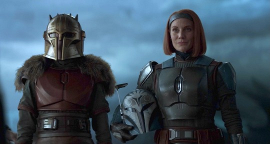
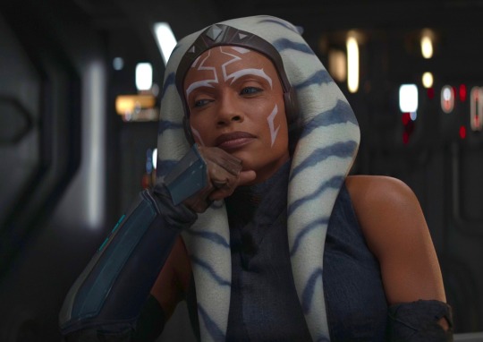

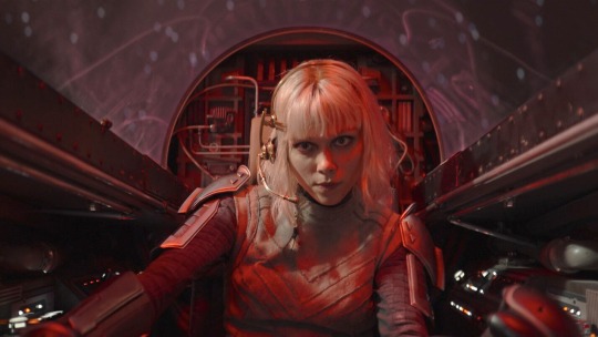
Ah yes my favorite Star Wars lesbians
#i want to put Fennec in here but then it will break the format damn it#the armorer#Bo-katan Kryze#Ahsoka Tano#Sabine wren#shin Hati#Star Wars#star wars lesbians
569 notes
·
View notes
Text
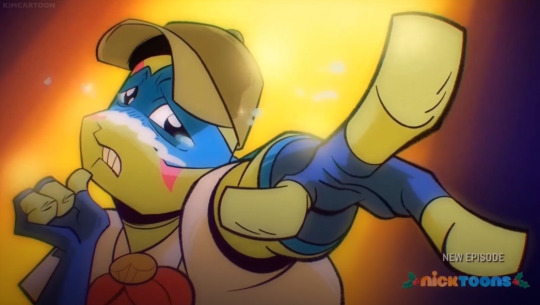
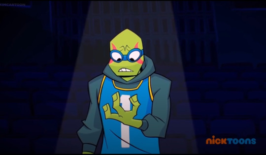
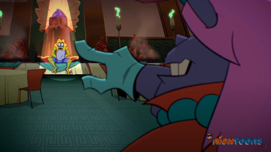
The Spotlight Effect
Maybe someone else has pointed this out before but I'd still like to talk about it!! Something really interesting to me about Leo (rottmnt) as a character is his inherent charisma, and how he draws in people with grand and dramatic speeches. Visually this is shown by something I like to call the "spotlight effect".
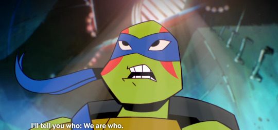
Season 1 Episode 2 "Origami Tsunami"
Originally the mentioned effect was used as a bit/gag. Here Leo is trying to hype up the boys to go on a junior-level "safe" hero adventure, and does succeed in getting them excited. Throughout the episode he's shown to drag them place to place, one inspirational speech after the other.
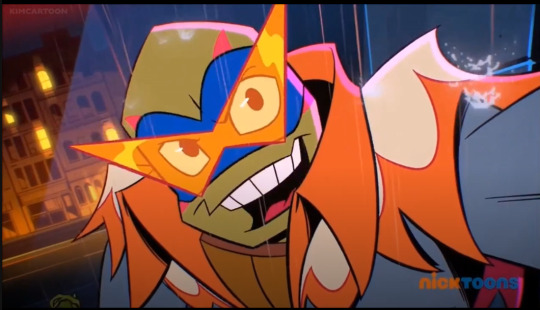
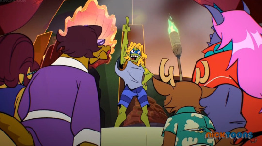
Season 2 Episode 1 "Many Unhappy Returns"
In season 2 we see this effect return. In "Many Unhappy Returns", in which Leo is initially a figure of comedic relief to ease tension in the return of the Shredder. This backfires a little bit, as it mostly annoys his family despite good intentions (which are not clearly communicated). It's not until he proves that he's taking this situation seriously--and ramping the team up with another one of his on-point speeches about everyone's strength of character--that he becomes a point of inspiration. The scene above takes place after Raph questions Leo, who in turn responds with "trust me".
Season 2 Episode 2 "Todd Scouts"
Again we see the "spotlight effect" used as a gag; however, there is still an interesting point here made in this scene. Leo calls himself something along the lines of the master at apologies, and something I believe that contributes to the effectiveness of such apologies is that charisma that draws people in. Which is shown visually for us via this effect!!
Season 2 Episode 5 "Air Turtle"
Another apology of Leo's after his dismissive and competitive behavior when playing basketball with his brothers. It also serves as a motivation point in this episode, for them to go against the mysticly beefed up basketball players.
Season 2 Episode 9 "Bad Hair Day"
I'm tentatively counting this as part of the phenomenon I've pointed out because while Leo is Put under the spotlight as a potential suspect to the thieving in this episode, Leo takes full advantage of it to wrap people around his finger. The hair doesn't not help either.
--
And now for one of the most Blatant and emotionally impacting examples.
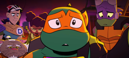
The Rise Movie, the moment when they think their brother is lost, and when Leo begins to finally start listening to his team.

He unites them under his hope and confidence. I mentioned in this post that Raph is their center of responsibility, well in comparison Leo would be their center of inspiration. His competitiveness rubs off on his brothers (encouraging to put their all in the silliest of things), his playful encouragement keeps the baby of the team from being too babied, and his speeches tie everyone together to one goal. Hope is a ninja's greatest weapon, and while he may not realize it until Casey Jr. quotes that famous phrase, he's been using it this entire time.
#rottmnt#rise of the tmnt#tmnt#teenage mutant ninja turtles#rise of the teenage mutant ninja turtles#rottmnt leo#rottmnt leonardo#character analysis#long post#critter talks#sorry for the low quality screenshots#still figuring this whole posting thing out#anyway there might be more scenes i missed#will also try and id the screenshots later when im more familiar with breaking that down in a long post format#anyway leo's a good boy#and i hate him <3#rottmnt movie
417 notes
·
View notes
Text

some of y’all would melt down in this situation‼️
#the terror amc#the terror#james fitzjames#the franklin expedition#ik this format is old. give me a break i have black mould poisoning
343 notes
·
View notes
Text
reading animorphs sequentially instead of in whatever random order you can get your hands on them is such a trip because you can see these kids getting progressively better at war and worse at being happy, you can see how traumatic events from one book echo into the next ones but never quite get dealt with because these kids have no real way to take care of their mental health, you can see their relationships deepening but simultaneously gaining friction and faultlines as they learn just how far they'd go for each other but also how far they'd go in general...
obviously this series was meant to be episodic in nature, and i actually think that might be the better way to first encounter it, but the arc of the series in publication order is extremely well-crafted
#though im having to take a break#i just read 16 and like. In the context of Jake's endgame it has me so fucked up#i mean it's a lot in itself especially since he doesnt really deal with any of what happened#but also like. him genuinely not knowing if he thinks fenestre killing hosts to get their yeerks is okay ot not?#its a bad turning point for him but also still so much better than where he ends up and im too sad#animorphs#tbh im very [miles studying beter meme] about this#its so good at establishing character and themes#and laying down plot hooks for later#in a format i really dont think about much#Semi-episodic book series arent really a thing anymore are they?
446 notes
·
View notes
Text
i made this like a month ago I guess I should post it
#open mick night#breaking bad#brba#jesse pinkman#aaron paul#i can't stop using this joke format. i saw a mural of a shark drinking beer the other night and i was like Jesse's Shirt:
283 notes
·
View notes
Text
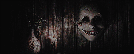
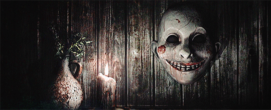

THE EVIL WITHIN
Loading Screens
#the evil within#tew#tewedit#psycho break#gamingedit#videogameedit#dailygaming#vgedit#psychobreakedit#my gifs#i'm going to do all of them#but it is going to take me a minute i think#because i know there's over 10 and i've only got i think 4 recorded so far? and i'm doing this as I playthrough so like#also that mask is one of my favorite things from this game#they aren't gonna be right after each other#might use the same psd and definitely the same text formatting for them all#honestly all the masks but like#it's aesthetic#i've drawn it wayyyyy too many times
251 notes
·
View notes
Text

so it’s. it’s like. man this is so hard without my laptop.
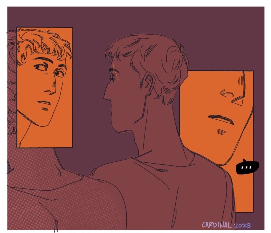
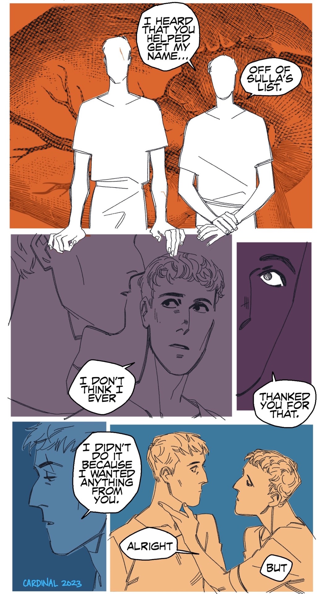
alright so Crassus is a weird guy, existentially. There’s a tendency to speculate, assign, and insert him into whatever places are conspiratorial and shadowy because he fits into those narrative places with ease. My personal favorite (aside from all of it) is the idea that he may have pulled strings wrt to Sulla and Caesar’s conflict to help get Caesar out of it.
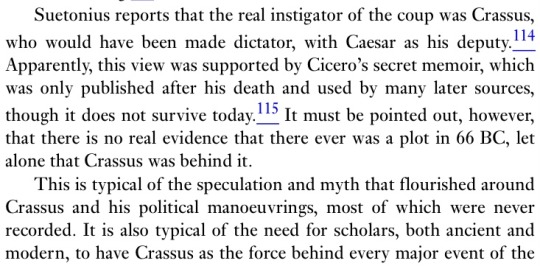
The Defeat of Rome: Crassus, Carrhae and the Invasion of the East, Gareth C. Sampson
In the universe that exists in my head, he definitely had a hand in it, but he didn’t really intend for Caesar to figure out he played a part in it, but Caesar’s good at puzzles, and noticing someone goes both ways. Binding someone to yourself goes both ways.
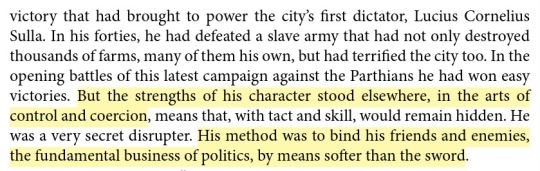
Crassus: The First Tycoon, Peter Stothard
This scene takes place sometime relatively soon after Sulla’s death. Crassus has complicated feelings about it, Caesar less so. Veni, vidi, vici, baby!
Here’s a bonus thing that I keep thinking about with them.
The Roman Revolution, Ronald Syme
like, utang na loob. and it is DEEP between them.
#this is actually an old first draft script from a much longer Caesar/Crassus arc I’ve been writing#To go along with the Pompey/Crassus one#Accidentally it’s turned into a whole arc bc why not do the Caesar/Pompey civil war break up while I’m at it#anyway formatting all of this on my iPad was a nightmare no more comics that I have to split up for posting until I get a laptop#tris homines#roman republic tag#komiks tag#drawing tag#there’s a modern gangster AU version of this scene where Crassus and Caesar fuck on the floor in front of Sulla’s funeral portrait#Pompey is there too bc I finally remembered how I was tagging my tris homines live blog and found#The quote comparing the three to some kind of transgressive incestuous relationship. Thank u at my past self for live-blogging that#anyway this was relegated to first draft pits bc Crassus needs to have more bite about it but I wanted to draw them kissing. So.#(Waving a flag) get it caesar#(Bite as in sharp teeth and edges you could cut yourself on if you aren’t careful. Which is why Caesar is Always Very Careful#Pompey’s the opposite about it but I’ll get to those comics. Soon…….hopefully……………..)#gaius julius caesar#marcus licinius crassus
295 notes
·
View notes


Last Seen Blogs

sunongsas
love is nothing else but you
aan-xochk
Xochatzin

mikethetrans-blog
Untitled
michoacanaa
michoacana
espinas3
Final Stage! 【espinas3】