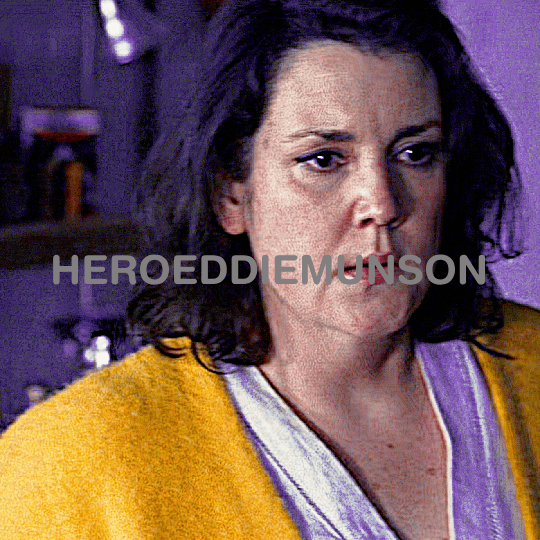
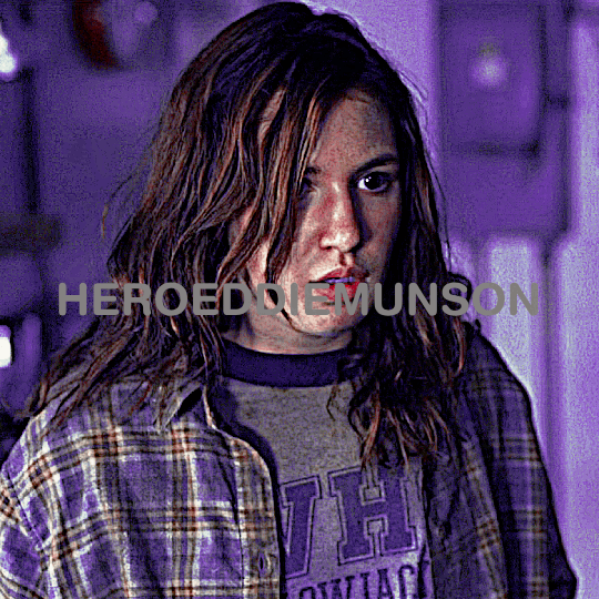
#how do they have the same psd on them
Text
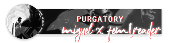
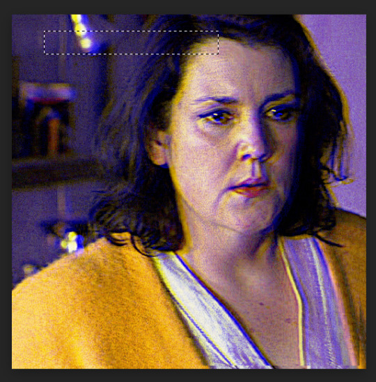
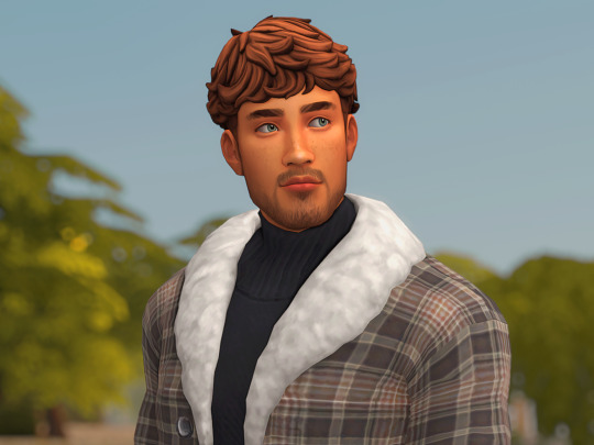
˚₊· ͟͟͞͞➳❥ miguel x spidey!fem!reader. CONTENT WARNINGS: 18+ !!! NO SPOILERS !!!! splashes of angst. unprotected sex. creampie. cervix fucking. WORD COUNT: 1.8K PSD CREDIT!!! MINORS/AGELESS BLOGS DNI !!!!!!!( ꐦꉺωꉺ)つ
@miguelism @pompomegranate come get ya mans !!!!!
PART TWO HERE !!!!!!!!!!!!!!!!!!!!!!

You can still see him here.
It’s not real and it never will be– not again, anyways.
“March 13th.”
How long are you going to keep doing this? Your jaw tenses. Here we go again.
The argument is a solo act; there’s no one to talk to here but you. So naturally, you run the same trite script until it comes to the same inevitable conclusion: giving in to the self-indulgence.
The bad thing’s already happened. You lost Miguel– well, more like he lost you. You’re the one trapped in this purgatorial vortex. The space that lies between every what if, the border of every possibility.
And it’s so fucking lonely.
So it’s ironic that your multiverse jumping wristband is good for anything but its intended use. It mocks you, its amber projections burning red when you even so much as try to go home. Not to your original timeline– to HQ.
To him.
But you know that will never happen so you make do with what you have: the memories stored on your gadget, the device looking worse for wear with jagged claw marks running down its sides, disappearing into the scarred flesh that lies beneath it.
He didn’t mean to hurt you. You know that.
You wish you could tell him.
You (metaphorically) furiously fan away that cloud of remembrance. You’re already stuck, no need to dwell on the last time your heart was ripped out. You lie back, resting against nothing but floating amongst everything. Limbo sure is weird.
Arm resting over your stomach, you train your eyes on the happier time playing out from the screen on your wrist. It’s not perfect; the vision cracks, sometimes glitches in reds and greens before going back to normal. It’s getting worse.
There you go again! We’re trying to have a good time here.
Right. Right.
Sorry.
Focus.
You take a deep breath, chest rising and falling steadily.
Focus.
You close your eyes and when you reopen them, fix them on the screen that shows you strutting in Miguel’s domain, it’s like you’re there.
It’s like you’re back home.
“You gotta eat, you know.” Tossing a paper bag way up high, it doesn’t surprise you that he catches it with lightning fast reflexes, even with his back turned to you. “And if you don’t, I’ll make ‘em take empanadas off the menu.”
He’s still. Only sound coming from him is the rustling of the bag. At least there’s that, you think as you approach the floating platform. “Don’t make me come up there!” You holler, though you only get your own echo in return.
Shit. He’s in a mood.
Throat flexing with a thick swallow, you decide to go up anyways– you sure don’t want to wait for him to come to you. Thing’s slow as hell.
Webs whipping from your wrist, you fashion a slingshot apparatus to propel you yards into the air. Nothing beats the rush of a flight, even now as you descend into what could be a particularly thorny situation with a particularly grumpy man.
But he’s your particularly grumpy man.
“Hey,” Your voice starts softly, “Everything–”
He turns around, stopping you in the middle of what was going to be your magnum opus of pep talks to show he’s got a mouthful of doughy goodness that keeps him from talking. And when he swallows, there’s a damn smirk waiting for you to kiss.
You don’t fall for it, at least not now but god do you want to. But first…
“Asshole!”
“You just jumped to conclusions.” Another bite of the savory empanada just to tick you off. You’re so cute when you’re annoyed, even if it’s all in good fun. Your cheeks puff up and your nose scrunches when your eyebrows furrow. He’ll kiss you if you won’t.
“Oh, real mature. Hiding behind–”
In a flash, the empanada goes back in the bag and in red glowing binds gets fastened to the side of his computer mainframe, freeing up his hands to pull you close. A little too roughly, but you melt into his big frame regardless, lips pursing against his and giggling when you can taste meat and spice.
“How romantic.” You mutter and he laughs.
God, his laugh. Nobody heard it too often– nobody but you, that is.
When Miguel was with you, it’s as if you two were in a world of your own. A timeline of your own. Where past transgressions and terrible happenings were nonexistent. Where he could be him, the man he was supposed to be: sweet, charming, and kind. And where you could love him like he deserved.
Is someone else filling that role now?
Great! You’re thinking too much again. Stop fucking this up!
“June 27th!” You blurt, warped back to reality when your thoughts strayed too far from the projection.
The picture’s changed now. You’re home, your residence littered with reminders of Miguel. It’s empty, but not for long. The front door slams open and you and Miguel come pouring in, him taking the lead as the two of you blindly navigate the foyer with your lips locked and hands gripping each other for dear life.
Your cheeks in real time burn. Maybe you shouldn’t stay for this memory.
Oh, don’t be such a prude. It’s literally you! The little voice in your head chastises and honestly… You can’t argue with that.
“M-Miguel, I don’t– I don’t have– I’m not on–”
“Shut up.” A tempered hiss is pressed to your lips, thick digits coming to frame your face as he pushes you further into the space you’ve come to share together. “Or I’ll change my mind about filling you up.”
You can’t argue with that.
“Say it.” His growling crests your ears, breath hot and fangs out just moments later when his pelvis is flush against yours, cock buried to the base in your sopping wet pussy. You swear he’ll drip drool on you at this point, the man driven to the brink of his sanity by the way your cunt hugs him so tight. It’s like you want to milk him for all he’s worth.
Your hands paw helplessly at his chest, all your energy zapped as your eyes roll back under the curtain of fluttering fluffy eyelashes. “F-Fuck Miguel– f-fill me up!”
“Keep going.” His voice is low, rich and dark.
The fat head of his cock presses up against your sensitive bundle of clitoral nerves, slamming hard when you whimper and cry for him, “Right there, right there!” You start to babble, the words freely flowing from your kiss-bruised lips because your brain is long gone, “F-Fuck me, need your cum– need you, need you, Miguel! Please don’t stop, please!”
“Yeah? Can’t feel whole without my cock? Need it?” His tone seeped in pride, he loves seeing you unravel for him like this. “I’m givin’ it to you baby, right where you need it. You feel that? Your little pussy crying for me, so fucking wet. Fuck, you’re so good. Good for me.” He’s kissing you now, sloppy and panting into your mouth before his tongue ravishes yours and swallows every moan you give him.
Your legs locked around his waist still bounce, hips raised off the bed by Miguel’s brutish clutch so he can bully more of himself into you, harder and faster. Your lower body limply follows his every move, takes every slam and thrust all the while wet squelches fill the room. Your vision finally coming back, you see his nostrils flare and his eyes glazed over with a beastly kind of lust. It’s enough to make your bones shiver.
You can’t help but let your gaze rest there, even as he fucks you within an inch of your life, always so fervent with his thrusting as he stuffs you full, but you just can’t get over this view: his pectoral muscles flexing when you tighten up around him in just the right way, the way sweat gathers on his brow before trickling down his sharp jawline, and the way his lips stay agape because if he’s not groaning, he’s growling.
“That’s it, mi vida. Doin’ so good. Pussy takin’ me all the way in. Shit– I’m addicted. Might just fuck you raw every time. Want that?” One hand comes to your face, thumb just barely squishing your cheek and making you pout. “Say it.”
“Y-Yes, yes! Please Miguel!” Tear drops glimmering in the corners of your eyes, you plead for him, “C-Cum inside me, I’m getting close!” Every sense of yours is on fire, everything burning bright for him and only him. Always for him.
And you see a similar inferno explode in his narrowed eyes just then and it’s immediate, the way he unhooks your legs from his waist and bends them aaaalllllll the way back until your knees are violently knocking against the mattress, his lumbering body taking yours in the mating press he so adores.
Because he gets to fill you to the brim. Bump and grind against your cervix until even that soft nodule is his. He’s staking his claim, making you his as the soles of his feet dig deep into the sheets, his toned limbs caging your bouncing body until you’re nothing but a squealing little mess for him to clean up.
His balls slap firmly and roughly against your folds, sticky webs of cum starting and breaking each time he snaps his hips. Your walls tremble around him, gushing out more of your essence every time. You’re just about undone. He can feel it.
But so is he, his already thick cock pulsating with another rush of blood as the coil in his stomach heats up. He puts all his weight into you, onto you the last couple thrusts – he knows you can take it – so he can kiss you. So he can taste you.
“‘M cumming, c-cumming…” Your words are muffled and tired, eyes wheeling back as your orgasm hits you hard and heavy, Miguel following soon after with plenty of cum to fill your pretty pussy up with and an animalistic series of grunts as his cock twitches and throbs inside you. It’s thick and so much, too much so that the opaque matter starts to pool out when his hard shaft finally leaves you, giving your featherlight folds another heaping layer of viscosity.
“‘Tch– it’s comin’ out already.” He huffs, though with a bit of a laugh. “Can’t have that.” So his fingers gather what’s remaining and slip into your cunt before he pops another kiss to your parted lips, nipping just a teeny bit on the bottom half to get you to squeal one last time for him.
And that’s how the video ends. That’s how you finish, having followed along with lithe fingers rubbing your aching clit and one or two at any time plunged and crooked inside you, but it’s not the same.
It’ll never be the same.
#miguel o'hara x you#miguel x you#miguel o'hara x reader#miguel x reader#miguel smut#miguel o'hara smut#atsv x reader#atsv x you#spiderman x you#spiderman x reader#.˚₊ ੈ ʚ 📝 ɞ ₊˚. ꒰ marie writes! ꒱#.˚₊ ੈ ʚ 🍰 ɞ ₊˚. ꒰ a little treat for miguel. ꒱
1K notes
·
View notes
Text
question for digital artists because i started wondering about this while moving my 40,000 art files between hard drives.
i really want to know because for 99% of my art, I keep the csp file of the finished drawing, plus a PNG version of the art. and I'm realizing how much space that takes up because I have doubles of Literally Everything in every folder. so now I'm wondering if people do it differently or the same way.
(it might obviously be drastically different based on different art programs and ways to do art. The layer thing for one isn't relevant at all for a program with no layers.)
435 notes
·
View notes
Text

FALLING LETTERS ANIMATION tutorial
hello! @kimmomi asked for a tutorial on how i made the letters "fall" in this gifset and so i figured i would make it and post here! this effect isn't hard to achieve but it might get a little tedious if you have a lot of letters.
note: you will need photoshop with a timeline!
STEP ONE: create your base gif! be mindful of number of frames in your gif. the number of frames doesn't really matter here, altho the longer the gif the better the effect. i'd say try to limit it to 60-70 frames, depending on how big your final gif will be.
STEP TWO: make your text the way you want it to look. this effect is basically the last step of your gif making process. (i will be using the typography from my set as an example as i already have that psd saved)
this is what my typography looks like now.

STEP THREE: i would recommend that the word at the bottom be the word that "falls". for me that is forever.
now, you will have to duplicate the "forever" layer and make your non-copy forever invisible.
what you will want to do now is delete all the letters but the first one in the duplicated layer. for me that is f. then you just duplicate the f layer and write your second letter instead of it, in my case o. you will have to do this for all letters. also as you do that make sure to move them a bit away from each other.

now, what helps to align those letters where they start off, is making your non-copy layer to be visible again.

after you've aligned your letters, make the non-copy layer invisible again.
STEP FOUR: so now we come to a bit of a tedious part.
what you will do now is move the playhead (blue timeline arrow) a bit further from the beginning of the gif (this allows for the text to stay still a bit before it starts "falling") and click on the first letter.
next step is to click on the little arrow next to your letter and clicking on the stopwatch next to Transform.

then, you will take the playhead and drag it to the end of the gif where you will start with transforming your letter with Free Transform tool (shortcut ctrl+T on windows). and what you will do is, while in Free Transform mode, drag your letter to the bottom of your gif while also rotating it a bit. when you're happy with your placement of the letter, hit enter. see below gif for how i did it.

you will have to do this for every letter, but make sure to rotate some in the other direction. also make sure that the beginning of the stopwatch mark is the same for every letter.
and that is basically it! after you transform every letter, you can go and save your gif.
this is my final result:

for some extra dramatic look, you can duplicate your initial layer with the whole word on it, drag it above all layers, clear layer style and add a stroke and make sure its FIll is at 0% where you will get the outline text that stays behind.

i hope this was helpful and understandable. if you have any questions, feel free to send me an ask or dm me <33
#usergif#completeresources#allresources#gif tutorial#ps help#userkimchi#uservivaldi#userraffa#tusermona#userelio#usercats#tuserheidi#usershreyu#userhallie#userroza#userdean#userisaiah#thingschanged#tusercasey#usertj#userwwz
519 notes
·
View notes
Text
TILE TRANSITION TUTORIAL
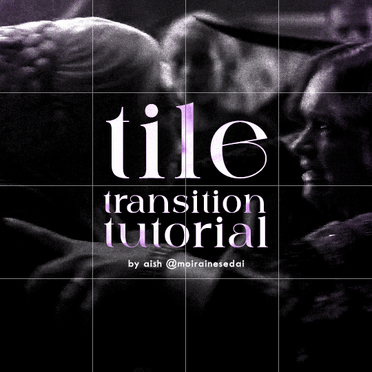
a couple of people have asked me for a tutorial on how I did the penultimate gif in this set, so here goes! this is my first tutorial, so please feel free to reach out with further questions if anything's unclear.
note: this tutorial assumes you know the basics of gifmaking, can create the base gifs, and are familiar with timeline mode.
STEP ONE: create the base gifs! I'd recommend staying between 25-40 frames for each gif, since the transitions we'll use later tend to increase gif sizes. these are the ones I'll be using for this tutorial:


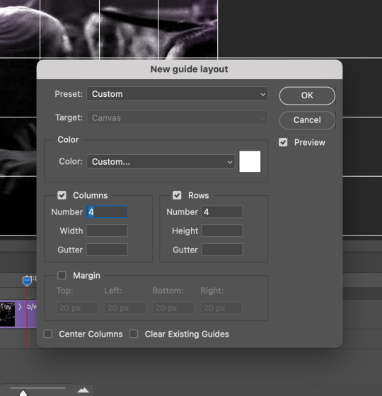
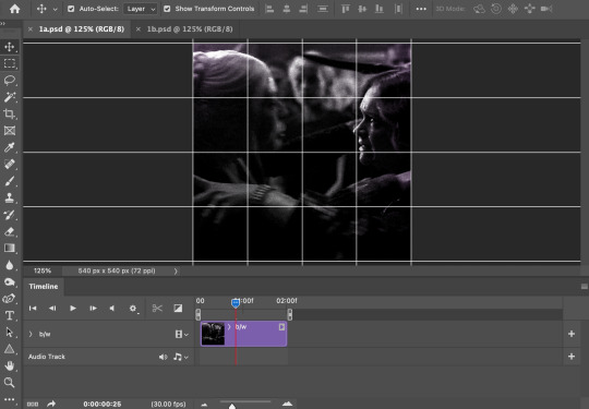
STEP TWO: create the guide layouts for both base gifs. for this panel, I chose a 4x4 grid — I would recommend keeping the number of "tiles" low because it can get tedious, but have a minimum of 9 (3x3 grid).

now your canvas should look like this:
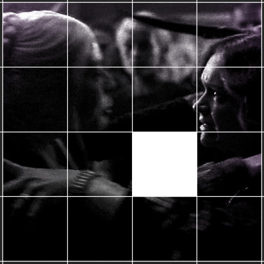
STEP THREE: create the tiles. this is where the going gets rough; there might be easier ways to do this that I couldn't think of 😭 if there are any please send me an ask!
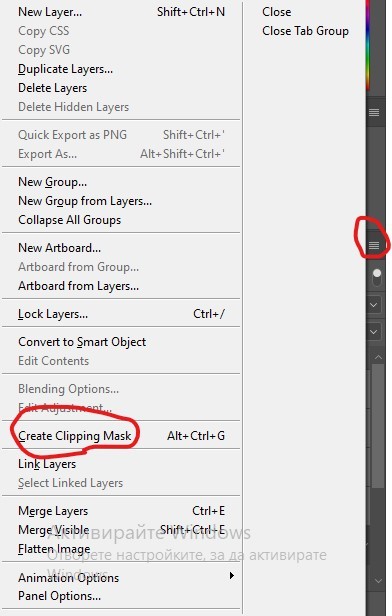
essentially, in this step we'll cut up the base gifs into smaller squares so that each tile can be manipulated separately when we put both gifs together. to do this, first create a square using the rectangle tool and the guides. then duplicate the base gif, move it above the square, apply a clipping mask, and then convert the clipped gif and square (selected in the image below) into one smart object.

ALTERNATELY: you could duplicate the original base gif and use layer masks to isolate tiles. create a layer mask for the duplicated gif layer and, with the layer mask selected, drag your mouse over a square (using the guide layout) and press delete. then press ctrl/cmd + i to invert the layer mask so that the gif only shows in the square of your choosing.
now repeat until you've got the entire gif in tiles, and do the same for the other gif!
since the transition effect is achieved by staggering the crossfades for each tile of the final gif, you can cheat by having multiple tiles "flip" at a time, ideally no more than four. this means you need to cut the base gif up into fewer pieces. to do this, simply draw multiple squares instead of one and then merge the shapes, before duplicating and clipping the gif onto them.
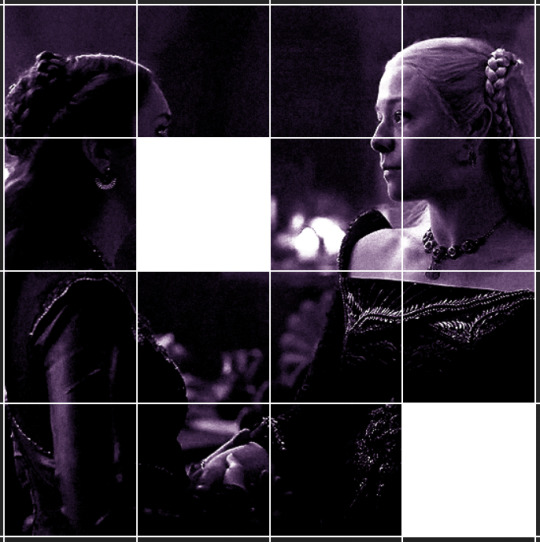
if you do this, it's essential to remember that you have to divide both gifs up in the exact same way. each piece of the b/w gif has to correspond to a piece of the purple gif!
this is what the layers look like for each gif once I'm done:

I have them lettered so that it'll be easier to match them up in the next step.
STEP FOUR: this is the complicated bit that took me two days to figure out. I'll do my best to explain but don't hesitate to reach out if something isn't clear!
to begin, open up a new psd and import both base gifs into it. (remember to click "create video timeline" and ensure that your gifs are all in order before proceeding.)
now, the trickiest part about this transition is ensuring that all the little tiles sync up so that the larger gif is coherent. so first we'll create some markers (just empty layers) to ensure that everything lines up as it should.
— marker 1: at about halfway through the first gif (b/w in this case)
— marker 2: at about a quarter of the gif length
— marker 3: close to the end of the gifs
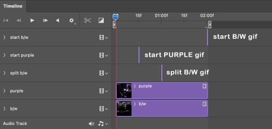
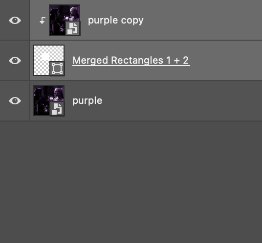
at this point we're ready to start bringing in the tiles. I'm going to delete the base gifs from this new psd just to keep things cleaner!
first thing to do is import my b/w tile. move the timeline slider over to marker 1 and split the first gif. (if it helps, rename the split gifs and add (start) and (end) to the two halves.) then, move the (end) half to the beginning of the timeline, and the (start) half to line up with marker 3.
the purple tile is easier to manage. simply import it into the psd and line it up with marker 2.
your timeline should now look like this:
notice the overlap between the gifs at their beginnings and ends — this is where you'll be able to cascade the tiles flipping, so it helps to have a significant amount of overlap.
crop the three gifs for this tile as you see fit! since this is the first tile I want to flip from b/w to purple, I'll crop gif 1a (end) all the way to the current position of the timeline slider (red line with blue tip) and leave the beginning of gif 2a uncropped. for the flip from purple to b/w, I'll crop both gifs a bit.
once that's done, drag all three gifs onto the same level in timeline so they form a video group. your timeline should look something like this:

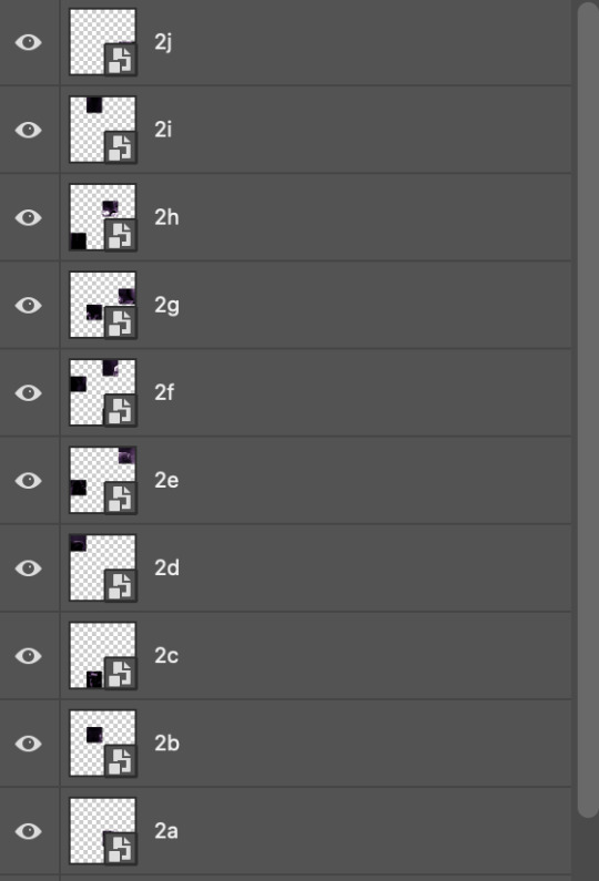
now you just repeat the process for all the other tiles! as long as you made sure that all the tiles in one gif correspond with tiles in the other gif in step three, this should be a fairly painless process. make sure to crop the starts/ends of the gifs separately so that they don't all flip together.
this is what my layers look once I've done all the tiles:
and the gif!
STEP FIVE: transitions! click on the half-white square (top right of the left column in the timeline, beside the scissors) and select the crossfade transition, then drag it between two gifs in a video group. it should create a two-triangle symbol and shorten the overall length of the video group.

apply the transition to all the tile flips, ensuring that the duration of all transitions is constant. this can sometimes be tricky because ps likes to change the duration of each transition, so right click on the transition symbol and manually change all your transition durations to be the same.
your layers should now look something like this:
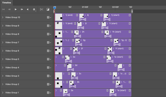
STEP SIX: draw the grid. bring back the guide layout from step two and using the line tool (I like 2px thickness), trace the grid. adjust opacity as you see fit (50-80% is usually a good idea), so that the canvas looks like this:
STEP SEVEN: export and celebrate! you're done!
I hope this tutorial made sense and was easy to follow, and happy giffing! my inbox is always open for any questions <3
#tutorial#ps help#ps tutorial#userace#alielook#userabs#usercats#userhella#userfaiths#tuserabbie#usershreyu#usertreena#tuserlucie#uservivaldi#usertj#usergiu#userroza
611 notes
·
View notes
Text
Carian Stroll
“Tell Blaidd, and Iji…I love them.”
Before this piece, I had been wanting for a long time to create my own piece of Elden Ring fanart featuring Ranni. I had tried several sketches unsuccessfully, just wasn’t particularly feeling the ideas I had sketched up until that point.
One day of usual internet scrolling, I stumbled upon this gorgeous piece of art by Shimomura Kanzan.
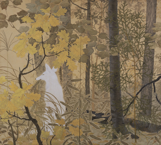
I knew immediately I wanted to do something like this for my Elden Ring fanart. In fact, if you look at this piece, there is tons of inspiration that I drew from the original artwork, such as the style of the yellow leaves and the main subject matter being a prominent silhouette of the brightest value, placed at approximately the bottom third of the image.
The main character is cleverly shrouded amidst various layers of trees and foliage, giving us the impression that we're peeking into candid moment of their life. In the case of the fox, we caught it during a mid-day snack. In the case of Ranni and her party, we caught them in a leisurely stroll, while Iji outfits the dreaded Fingercreepers with their iconic rings.
I wasn't sure if I wanted to capture a happy moment, but Ranni goes as far as to ask us to deliver to Iji and Blaidd the message that she loves them dearly as her quest draws near its end. I would imagine they all must have had fun moments together as a family. Hey, maybe even the hands liked to be around them?
The process
youtube
I started this on my iPad using the procreate app. Sadly the full process is not captured on video, as I switched to Photoshop for the rendering phase of the illustration. This video is a fun window into my chaotic process and how I iterate on the fly on the same canvas. I probably wouldn't do that in a professional setting where you often need to have color keys and iterations to be reviewed and analyzed. I like to I cut myself some slack when doing personal art to keep things fun.
Trying and failing some more
This illustration was not a straightforward path. I haven’t been very diligent about personal art, and at some point I started deviating too much from my reference by adding too many levels of depth to the background and suffocating the piece. I got into a weird loop where I would randomly open the PSD, play around with the values, pushing Iji to the back, then bringing him back, cranking all the levers on Ranni, etc., decide it would look horrible, then begrudgingly determine I’d never complete this image and go on with my life.
As artists we likely have unfinished work sitting everywhere, be it in our sketchbooks, canvases, or hard drives. But it’s a different kind of sting when you feel like you can’t even nail the fundamentals.
Anyway, so a couple weeks ago, I decided to give it another go, but this time I would get rid of all the unnecessary stuff, even stuff that I had been trying to render for ages. I would not hold on to anything, I would try and recapture what drew me to Kanzan's beautiful painting to begin with.

After it became a matter of pushing and pulling pixels until the image was finished!
That’s about it. I didn’t go crazy in depth but lately I’ve been enjoying reading into artists’ processes and I’d be remiss to not share my own thought process also.
Thank you for viewing!
#elden ring#lunar princess ranni#blaidd the half wolf#war counselor iji#illustration#artists on tumblr#fromsoftware#digital art#video game#fanart#Youtube
571 notes
·
View notes
Text
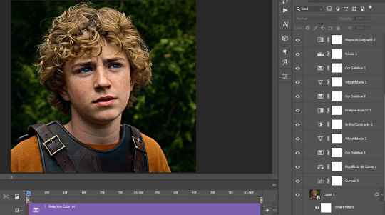
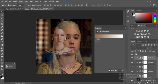
The silent art of gif making
The gif above has 32 layers plus 6 that aren't shown because this is part of a larger edit. I wanted to share it to give everyone a glimpse of the art of gif making and how long it usually takes for me to make something like this. This one took me about an hour and a half but only because I couldn't get the shade of blue right.
I use Adobe Photoshop 2021 and my computer doesn't have a large memory space (I don't know what to call it) so usually most of psds get deleted because I'm too lazy to get a hard drive. It doesn't really bother me that much because I like the art so when it's done, it's done. Off to somewhere else it goes.
Here are the layers:

Everything is neat and organized in folders because I like it that way. I prefer to edit it in timeline but others edit each frame. There's a layer not shown (Layer 4 is not visible) and it's the vector art. Here it is:
Now it is visible. I don't plan to make this a tutorial, but if you're interested I'd love to share a few tricks about it. I'm pretty new to the colors in gifmaking but the rest is simple to understand. Here, I just want to show how much work it takes to make it.
I opened Group 2 and here's the base gif. I already sharpened and sized it correctly but that's about it. Let's open the base coloring next.
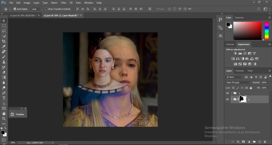
Yay! Now it looks pretty! The edits are in Portuguese but it doesn't matter. There's a silent art of adding layers depending on how you want the gif to look but you get used to it. The order matters and you can add multiple layers of the same thing (for eg. multiple layers of levels or curves or exposure).
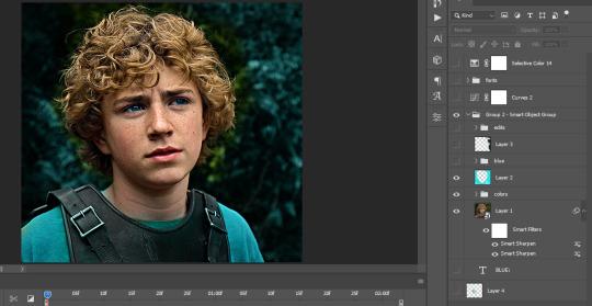
This was pretty much my first experiment with coloring so I don't know what I'm doing (this happens a lot with any art form but gifmaking exceeds in DIYing your way to the finished product) but I didn't want to mess up his hair, that's why the blue color is like that. Blue is easy to work with because there's little on the skin (different from red and yellow but that's color theory). I painted the layers like that and put it on screen, now let's correct how the rest looks.
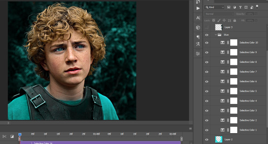
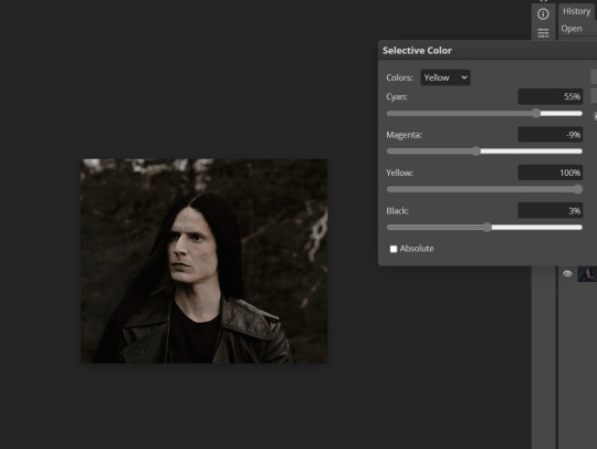
I was stuck trying to get the right teal shade of blue so yes, those are 10 layers of selective color mostly on cyan blue. We fixed his hair (yay!) we could've probably fixed the blue on his neck too but I was lazy. This is close to what I wanted so let's roll with that.
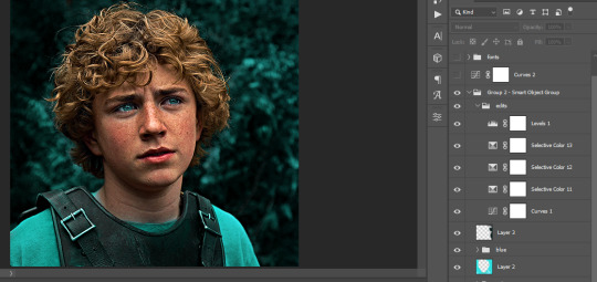
BUT I wanted his freckles to show, so let's edit a little bit more. Now his hair is more vibrant and his skin has red tones, which accentuates the blues and his eyes (exactly what I wanted!). That lost Layer 2 was me trying to fix some shadows in the background but in the end, it didn't make such a difference.
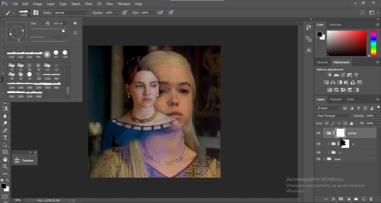
This was part of an edit, so let's add the graphics and also edit them so they're the right shade of blue and the correct size. A few gradient maps and a dozen font tests later, it appears to be done! Here it is:
Please reblog gifsets on tumblr. We gifmakers really enjoy doing what we do (otherwise we wouldn't be here) but it takes so long, you wouldn't imagine. Tumblr is the main website used for gif making and honestly, we have nowhere to go but share our art here. This was only to show how long it takes but if you're new and want to get into the art of gif making, there are a lot of really cool resource blogs in here. And my ask box is always open! Sending gifmakers all my love.
#gif making#gif tutorial#resources#completeresources#y'know what that post yesterday got me into this#i love creativity so i send all my love to gifmakers#this is HARD#my tutorials#tutorials
251 notes
·
View notes
Note
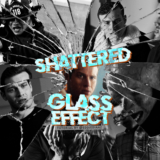
alie! I absolutely adore this mirrorball x buck set that you made last year! (/post/701462848238403584/) (also I can't believe it's been a year, like seriously what is time?) I was wondering how you did the shattered glass effect in the first gif? in particular how you made the black and white gifs appear distorted within the glass if that makes sense? thank you!!!
ahhh thank you so much renee! literally what is time lol, this gifset is still one of my faves that i made. the shattered glass effect is mostly just a lot of layer masks to be honest hahaha. i'm so glad i still have the psd, so here's how i did it under the cut~
(this tutorial assumes you know how to put multiple gifs in the same canvas and are familiar with layer groups and masks)
I. PREPARATION
first things first, create an empty canvas of your desired size. mine was 540x540 px.
then, you need to find a cracked glass texture. if i remember correctly i simply googled something like "broken glass png", "cracked glass png", because i wanted something already transparent.
(a texture that's something like black lines over a white background definitely works too, you'll just have to put that layer's blending mode to darken or multiply.)
here's the png i used (and a download link for best quality):
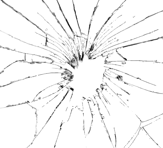
and after positioning it into my canvas.

II. CREATING MAIN SECTIONS FOR GIFS
so basically when i did is i sectioned parts of the texture for each gif that i wanted to put. following the texture's lines, i zoomed in and carefuly drew a first shape along the lines with the polygon tool. you can also put a color fill layer behind the cracked glass layer so it's easier to see, like i did.
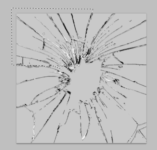
once you have your shape selected, click on the folder icon (1), then on the layer mask icon (2). it should give you a nice masked group to put gifs in hehe
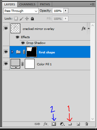
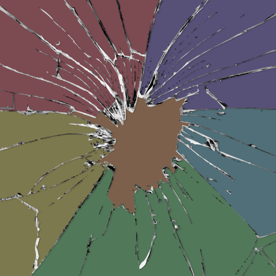
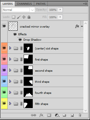
then i repeated the process until i had all of my desired shapes. i've put some color layers so it's easier to see, but here are my 6 main shapes and how my layer groups look like so far:
III. GIFFING TIME
after screencaping and making all 6 gifs required for each section, you need to put all of them in the same canvas. i simply put one smart object gif layer in each group created earlier. then, i resized and rotated each gif to fit its group (by hitting ctrl + T while selecting the gif layer), as you can see with the gif labeled 6x02 in the layers preview. for the coloring, i went simple with black and white for most of them.
once i have all six gifs sharpened, colored, and placed in each shape group, the gif looks like this. the broken glass texture does most of the work to be honest:


obviously the center gif doesn't have any kind of effect, it's just colored as usual, so i'm not gonna go over it. it's just one gif layer in a masked group.
IV. SUBSECTIONS FOR DISRTORTED EFFECT
okay so for the distorted effect it's even more layer masks! basically i created more smaller sections within each main shapes already, still following the cracked glass texture's lines with the polygon tool and put them in individual masked groups like i did in the second step. here's how i ended up dividing each main sections:
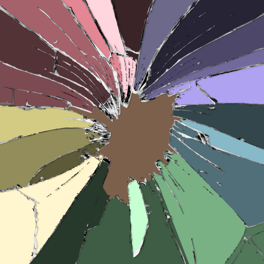
yep, each color here is a different masked group, for example the 2nd and 3rd shape sections:
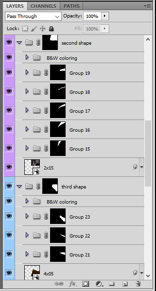
for each main shape section, you want to duplicate your gif layer the same amount of times as you have subsections within that shape. so if the main shape has 5 smaller subsections, i want 5 layers of that same gif. just make sure to not change its duration or position yet, and make sure the coloring layers/group stays on top of the groups in its shape section. then, simply put one gif layer duplicate in each group. example of my layers for the second shape so far:
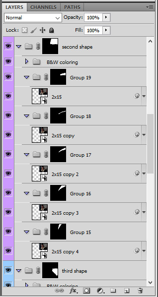
then just repeat this until all subsections have its own gif layer.
V. DISTORTED EFFECT
this is the best part! and it's really easy. basically you want to slightly move each subsection by a few pixels, so they're in a slightly different position than the ones next to it.
to do so, select one of the gif layers and with the arrows on your keyboard, move it left or right, and even up or down if it looks good. i do this for all duplicated gif layers, making sure it looks like they're all slightly offset. focus on the cracked glass overlay's lines while nudging the gif layers, it's easy to see how the shapes break when you move them. for example here:
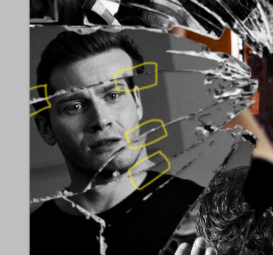
this is really just all trial and error, you just need to move each subsection gif layer by a few pixels with the keyboard arrows until it looks good to you.
here's my result once i've done this for all (23!!) subsections:
VI. FINAL TOUCHES
i don't think i did much else to this before typography besides adding a bit of contrast overall and a thin drop shadow to the cracked layer texture on top of everything. if you have a transparent png this definitely helps to give a bit more dimension to the effect. so here's the final result:
i hope that was clear enough hehe :D
#alie replies#tutorial#photoshop#resource#*ps help#completeresrouces#allresources#userhella#userabs#userkarolina#userdena#tuserheidi#usercats#userrainbow#userbunneis#usersmia#tuserabbie#usertreena#usernik#swearphil
369 notes
·
View notes
Photo

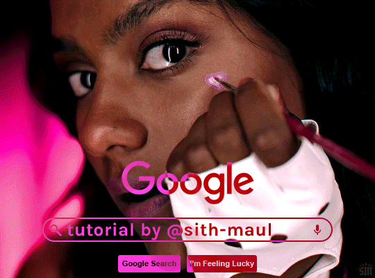
PHOTOPEA GLITCH TRANSITION TUTORIAL by kai @heroeddiemunson
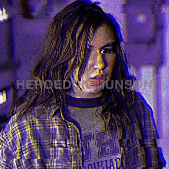
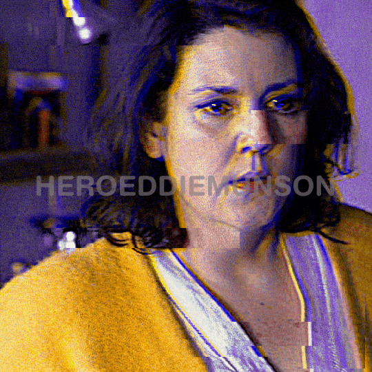
howdy! so i’ve recently come to realize that i haven’t come across any tutorials for creating a glitch transition on photopea. as someone who has done this transition many times in photopea, i figured that i should create a tutorial to show how i personally do this effect!
what you need:
photopea (basically photoshop in your browser, completely free!)
basic giffing knowledge, because i won’t cover it in this tutorial (other tutorials: tutorial by @benoitblanc, tutorial by @ashleysolsen)
i also recommend watching this youtube video for a real time visual of what i’m going to be describing in this tutorial. this video is what taught me how to do this glitch effect, so if how i’m describing it is at all confusing, check out the video to see it in action!
without further ado, make sure you save your psds regularly and let’s begin the tutorial :)
step one: making your gifs
before we do anything, you have to first make the gifs that you are going to doing the glitch in between. for the sake of this tutorial, i will be transitioning between two gifs, but this tutorial works for however many gifs you want to glitch between for your edit. here are my two gifs that i will be transitioning between:

i highly recommend keeping these individual gifs small in their frame count to make sure your final gif doesn’t go over tumblr’s size limit. the gifs i am working with are both 22 frames; you dont have to make the gifs have the same amount of frames, but i do it because i think it looks cleaner.
with your two gifs, edit them however you would like. if you have a specific order you’d like the gifs to look/a way that your finished product will look like (ex: black and white with a transition to fully colored), then you should color them accordingly. here are what my gifs look like after fully editing them:
once you’re happy with your editing, go to file > export as > GIF and save your gifs. now that we have our gifs to transition between, let’s make our canvas!
step two: making your gifs’ canvas
now that we have the gifs we’re going to be transitioning between, we need to make a “canvas”, or place where we put these two gifs in order to transition between them. so, going to file > new…, create a new canvas. here are the specifications for my canvas (size of your canvas may vary, depending on your cropping for your gifs):

the background for this canvas doesn’t really matter like it does when you’re blending two gifs, but i still made my canvas’s background black because it contrasts the brightness of the gifs i’m placing onto it.
with your canvas now created after clicking “Create”, open up the two gifs that you will be transitioning between. right click the gif’s folder in the layers panel on the right, and select duplicate into… and choose the canvas you just created. once your gifs have been duplicated into the canvas, your layer panel should look something like this:

if you didn’t duplicate your gifs in order, arrange your gifs however you want them to appear. from here, we can now get to the purpose of the tutorial, creating the glitch effect!
step three: creating the glitch effect
generally, with any transition effect, i like to make my gifs seem like they are endlessly looping. while this is a little more work when it comes to giffing, i do think it gives the gifs a nice polish and doesn’t make it feel like there’s a harsh transition between the gif’s looping cycle.
click the eye next to your top most gif(s) in order to make it invisible, as we will worry about it later. scroll down to the layer titled “_a_frm0,50”, right click, and select “duplicate layer”. this should create a new layer, “_a_frm0,50 copy”, on top of the original layer. double click on the copy, and you should see this pop up:
below the fill slider, you should see something titled “channel” with three checkboxes with R, G, and B next to each checkbox. you can uncheck any one of these checkboxes for a different effect; unchecking the R box creates the stereotypical red/blue glitch effect, unchecking the G box creates a green/pink glitch effect, and unchecking the B box creates a blue/yellow glitch effect. for my transition, i have chosen to go with the blue/yellow glitch effect by unchecking the B box. however, you can play around with whatever effect you prefer for your gif.
once you have chosen what checkbox to uncheck, click “OK”. with the “_a_frm0,50 copy” still selected, make sure you have the move tool selected (the curser at the top of the left toolbar), and choose the direction you want your glitch to go and move the layer using the arrow keys on your keyboard. it can move as much or as little as you want, whatever looks good to you! i chose to move this first layer 10 clicks to the left and 5 clicks up, which creates this effect for my first layer:
which looks cool, right? now, you could stop here with the glitch effect, but me being me, i’m extra, so i’m going to include the next half-step that you don’t have to follow unless you want to.
step 3.5: the glitch effect, advanced
with “_a_frm0,50 copy” still selected, go to the left toolbar and find the rectangle select tool (right under the move tool from before). this part is a bit tedious, but i like the results, so i feel that the work is worth it.
using the rectangle select tool, make a shape around part of the layer, and then go back to your toolbar and select the move tool again so we can move the selected section. do you remember how many clicks you used to move your layer and in what direction it goes in? well, now, do the opposite; since i moved 10 clicks to the left and 5 clicks up, my selected section needs to go 10 clicks right and 5 clicks down. below is what this looks like before and after moving the selected area:
once you’re happy with the moved selection, go to the top bar and go to select > deselect so that you are no longer selecting the section you just moved. repeat this step however many times you like; i tend to do this about 5 times for each layer of varying sizes/lengths to allow variety. here is what the final product looks like for this first layer:
and viola! your fully glitched layer one. now we can move on with the rest of the tutorial.
step three, continued: creating the glitch effect
now that you have finished this layer, make sure you have selected both frames “_a_frm0,50” and “_a_frm0,50 copy” by left clicking while holding down CTRL on your keyboard. with both layers selected, right click and choose the “merge layers” option in the popup; this ensures that the glitch effect that you have created stays as one frame.
now we get to do this many more times! make your next layer, “_a_frm1,50”, visible by clicking the little box next to it in the layer panel, and repeat the before steps. i personally alternate between what direction my glitches go in to add more variety and interest for my gifs. so, for example, with my “_a_frm0,50” frame, i moved it 10 clicks to the left and 5 clicks up; this means, for “_a_frm1,50”, i’m going to move it 10 clicks to the right and 5 clicks down, so on and so forth.
i do this for the first 3 frame layers and the last 3 frame layers for both gifs. when your gifs are finished with their individual gif transitions, they should (individually) look like this:
and together, they should look something like this:
and that’s the hard part done! congratulations, you just made a glitch transition!
step four: finishing touches
now, this entire step is optional, as if you already did stuff like add text to the individual gifs you are using this transition with, you’re probably already done. however, if you’re like me and you’re making a gif where the text remains stationary on top as the gif itself transitions underneath, take this time now to do so.
i will also note that if you want your gif transition to match with the rest of your gifs, you can do that in this layer. for example, i want the blue in the transition to be purple like in the rest of my gif; to accomplish this, i will use a combination of a hue/saturation layer and a selective color layer to make the blue be purple (which does change the purple a little from how it was originally, but i don’t mind). i would put these layers on top of both of my gif layers so that the transition layers in both gifs get the same coloring. doing so creates this effect:

(that isn’t a step that’s required by any means (nor do i do it all the time), but in case you wanted to do that, now you know!)
now that i am fully happy with how the gif looks, i will add my finalized text and end up with this as my final product:
now, if you run into the problem of your gif being a little too large for tumblr’s size limit (for example, my finished gif was 10.7MB, and the limit for 540x540 gifs is 10MB) and don’t want to redo all of the process of doing the glitch effect after deleting some frames, i recommend using ezgif’s gif optimizer. it helps shrink the size of your gif without costing you the quality of your gifs. :) i dont normally recommend that for other types of gifs where it’s easier to delete frames, but in this case i know that deleting frames and having to recreate the glitch effect may be annoying!
other than that, this is the end of the tutorial — congrats, you know how to make a glitch transition in photopea! good for you! :) if you ever need any help with photopea, or have a request for how i have done an effect, please feel free to shoot me an ask and i’ll do my best to explain or make another tutorial to help!
#photopea tutorial#photopea gif tutorial#gif tutorial#glitch transition tutorial#photopea#dailyresources#allresources#completeresources#usergif#userars#tusergeo#userlace#tusersai#mystuff#mytutorials#eyestrain#pulsing lights
386 notes
·
View notes
Text
tutorial contents:
1 ‣ gshade & photoshop actions
2 ‣ template or cropping & colouring
3 ‣ notifs & pop-ups
okay hi! i have a really old editing tutorial from back in january that i've been linking people to, but it's pretty outdated by now. i also keep getting anons asking about the same things, which is fine, but i always have to go searching for the post explaining it, so having it all in one place will be a lot more convenient lol
i use a ☠ copy of photoshop cc 2017 to edit my screenshots, however the majority of everything i'm doing also works on photopea
photopea is an online version of photoshop that's 100% free and works very well! i can't recommend it enough, it's fantastic
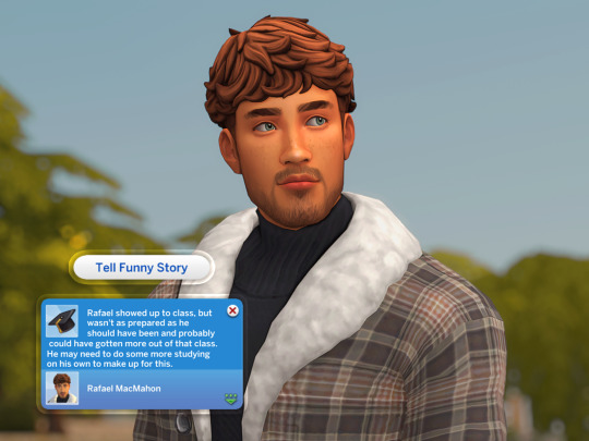
first things first, you're going to need some screenshots to edit. for the sake of this tutorial i'll be working with this one of raffy:
in all honesty, gshade will do most of the work for you. of course it's not needed, but i definitely don't think i could live without it! in this screenshot i used sunset n' vinyl by nesurii
when opening the screenshot, the first thing i do is run it through 2 photoshop actions:
butter action by early-grape
smooth sharp (no topaz) by poolbrop
to add actions in photoshop go:
windows > actions > the 4 lines at the upper right corner of the newly opened window > load actions > your downloads folder > open up the .atn files!
if you're using photopea, as far as i'm aware you can't use photoshop actions, but i've found that 'filter > stylize > oil paint' and 'filter > sharpen > smart sharpen' have a very similar effect when using the right settings. try these:
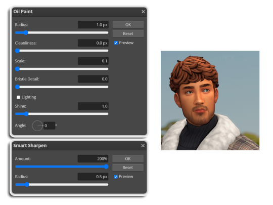
i like these two actions because they smooth everything out nicely, but keep it sharp at the same time! i always run butter before i run smooth sharp, however butter may leave you with 2 layers. make sure to merge these layers before running smooth sharp to achieve the full effect.
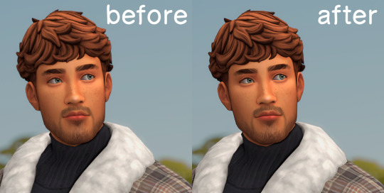
here's a before and after (of the photoshop action):
from here you can move on to step 2
before anything else i want to share the template that i use to make editing a lot faster. you don't need to use it but it's definitely made things a lot easier for me! it's a .psd file and will work perfectly in photopea
download (simfileshare)
if you're using the template you can skip right on to the next section, as it's already cropped to the right size and has the colouring folder included. just drag your screenshot into it and resize to fit the height.
if you're not using it, crop your edited screenshot to:
1707 width x 1280 height
then adjust the colours to your liking. it always varies slightly depending on the picture but my regular process for each screenshot would be:
up the saturation by 8%
up the lightness by 3%
up the contrast by 12%
all of this can be done by looking in the 'images > adjustments' tab
you should end up with something similar to this!
if you want to add a moodlet or social interaction or anything similar, it's all the same process. what you'll need is a screenshot of it straight from the game. i just press the 'c' key to capture them! i'll be working with these two:
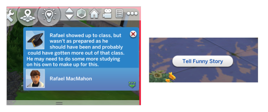
for the blue notification i'm going to select it using the box select tool. try to get it as exact as possible. one you have it selected
for photoshop users:
click on the 'select and mask...' option located at the top
adjust the global refinements at the side as follows:
smooth: 70
feather: 0.0px
contrast: 50%
shift edge: 0%
for photopea users:
go to select > modify > smooth
set it to 15
select 'ok' and press 'ctrl + c' to copy it, then 'ctrl + v' to paste it into your screenshot. adjust the size and position and you should end up with something like this:
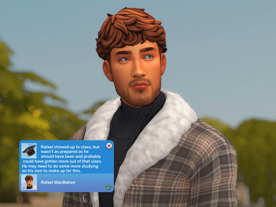
next you want to add the transparent border around the notification. if you're using my editing template, right click on the reference notif in the layers tab and select 'copy layer style' (photopea > 'layer style > copy'). from there you can paste that layer style onto your own notif through the layers tab.
if you're not using the template, here's how to set it up on photoshop:
right click your notification layer and select 'blending options'
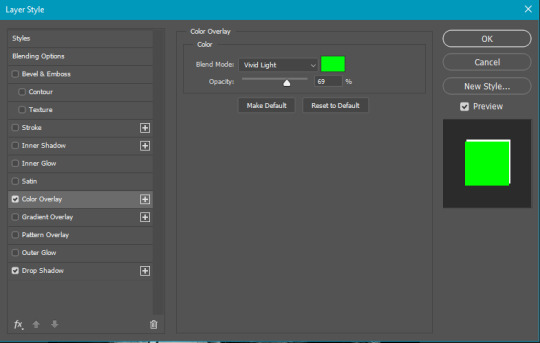
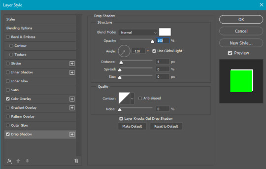
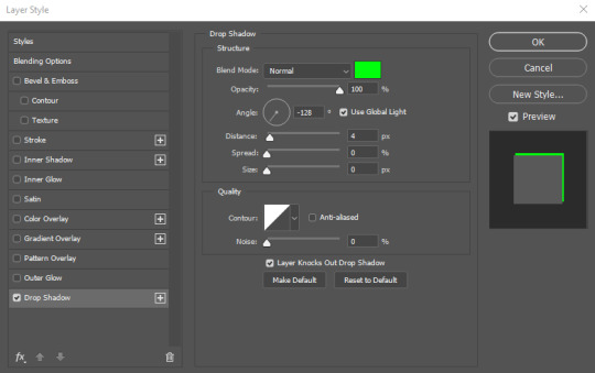
under styles, tick the checkboxes for stroke and drop shadow
input these settings:
on photopea, it should be more or less the same. repeat the exact same process with the social menu option, but instead of selecting it with the box select tool, use the magic select tool. in the end you should end out with this!
from here you're finished! thanks for reading! go to file and export as png
if you've got questions never hesitate to ask, just make sure to read the faq in my pinned. i might edit this post soon to include the gen intro traits and aspirations bit, but this is all for now. hope it helps, my editing process post has been in need of a revamp for a very long time. i haven't proof-read this so apologies for any mistakes!
#ts4#sims 4#ts4 tutorial#5 anons in my inbox asking the same question after not reading my faq#this ones for you#3 anons in my inbox asking about cas pics#ones coming for you soon#okay maybe not soon but sometime#all my free time has been eaten up#i signed up for extra saturday morning classes and not having a lie in is sucking the life out of me lmao#when i'm busy i just wanna play video games and when i get the chance#to play games i just wanna sleep#its a vicious cycle#i'm currently playing resident evil biohazard tho#enjoying it very very much#i've only got 2 and 3 left to play and i've played every mainstream re game 💪💪#it was a very fun journey! i played them all within this year#long post
1K notes
·
View notes
Text
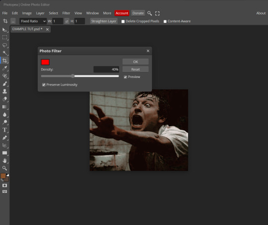
PHOTOPEA TUTORIAL / PHOTO FILTER FOR SKIN TONES:
a tutorial on HOW TO BRING OUT SKIN TONES if an image is 'too gray' (faded) or has too much of one (likely over saturated) color!
this technique can easily be applied to icons that already have a border ! just put your focus on the base image / icon ! this works on relatively anything, including poc and non-poc.
WHAT YOU WILL NEED: photopea...and your desired your base image(for example, i'll be showcasing inconsistent or otherwise dark/faded scene lighting, like twilight and saw).
DISCLAIMER: not all lighting/images are the same, nor are psd colorings. while some colorings may be designed to bring out reds/yellows(which is the filters we'll be using in this specific example), others may mute them and you may have to improvise with whatever color the psd you're using is designed to focus on. this is just a general idea, you will have to explore as you see fit. it's all going to depend on your personal taste !
by the end of this, you should be able to manage results like this !
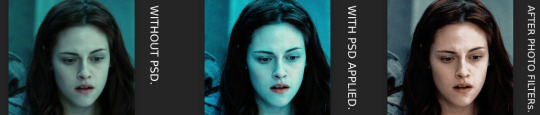
cool, huh?....anyway, on with the mechanics !
EXAMPLES:

[ BEFORE PSD ] [ SYNOPSIS ]
#01 / LEFT IMAGE ABOVE: too much green, becomes muted with psd and doesn't show variety.
#02 / RIGHT IMAGE ABOVE: the colors are very faded in this scene, and the pink focused psd in question made the image seem gray. we will start with EXAMPLE #01.
i will be using the same PSD on both, a custom psd i made and focuses on reds/pinks.

as you'll see above the PSD has now been applied...but now it's kinda boring :// (there's nothing wrong if you don't mind how it is above, everyone's got their aesthetic choice—HOWEVER, we're aiming to add skin tone...)
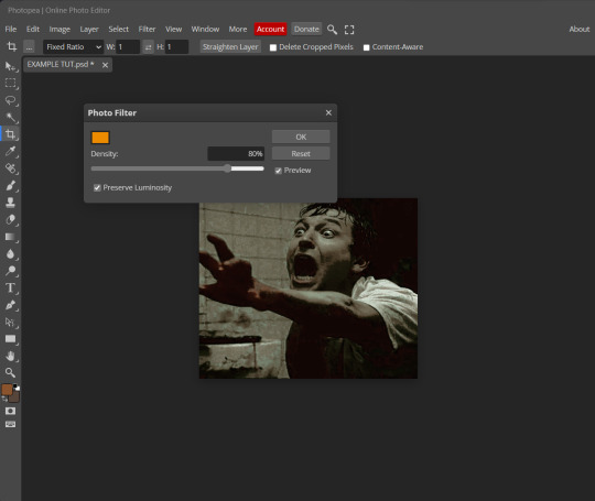
once you have your image open, you'll want to go to image>adjustments>photo filter; i went ahead highlighted it in yellow for easy finding !

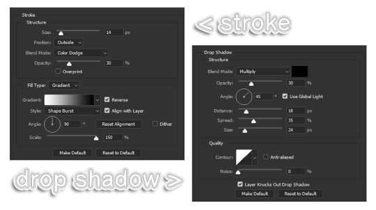
since this psd DOESN'T mute reds/yellows, (and those are usually the base of most/general skin tone combinations) i applied both a yellow and red filter. now, these colors i'll be using in this example, because they're in my default colors on the photo filter option—you can totally choose lighter or darker variants of these colors, or like i said, a different color altogether based on how the PSD you're using works. the toggle setting doesn't have to be exact to this example either—this is just what worked best on this image combined with the chosen PSD ! // RIGHT IMAGE IS THE FINAL RESULT AFTER APPLYING THE RED FILTER AFTER THE YELLOW.
repetition

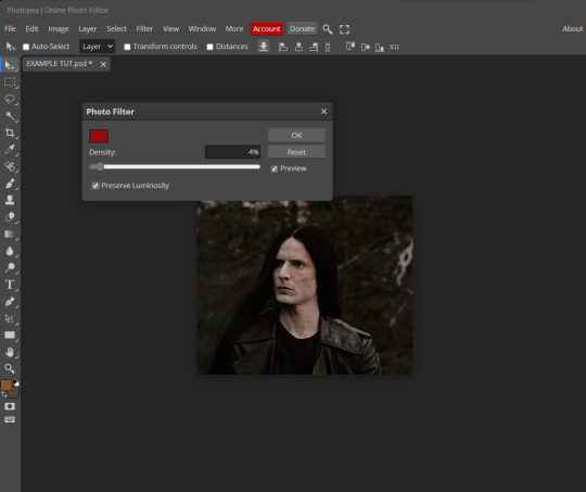
this scene in particular is very faded, and the red feels a little blotchy/over saturated here...so i'll show you an EXTRA STEP you can use ! in saying this, you don't have to do exactly this; you can even choose to go ahead with selective color to fix your image, without doing the filters, if you find that suitable. but i'll be showing you the magic of selective color to balance out the red toned overlay.
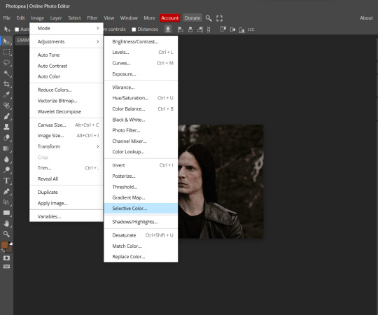
same concept as before, just a different selection: image>adjustments>selective color. think of selective colors as "balancing" the colors.
it does have a toggle selection for each color, which is super helpful, including diminishing or adding white highlights.
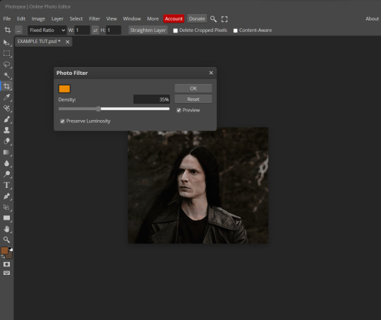
given the PSD colors, naturally, i'll be focusing on yellow and red.

it's now got a general skin tone and red is not as blotchy !
[ FINAL RESULTS / CONSISTENCY WITH PSD APPLIED ]

this is a great hack i use quite a bit, it's great for maintaining consistency in your icons when the lighting is working against you...hope this was comprehensible and helpful, happy editing !
#FREE TO REBLOG !#leech's tutorials: photopea.#rp community#icon tutorial#rp icon tutorial#psd tutorial#roleplay coloring#roleplay help#roleplay resources#roleplay community#roleplay graphics#coloring psd#psds#icon psd#psd#roleplay psd#rp graphics#rp psd#rp resources#tutorial#editing tutorial#rpc tutorial#long post /#editing resources
176 notes
·
View notes
Photo
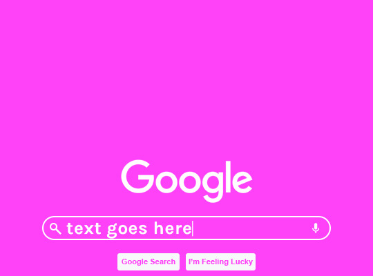
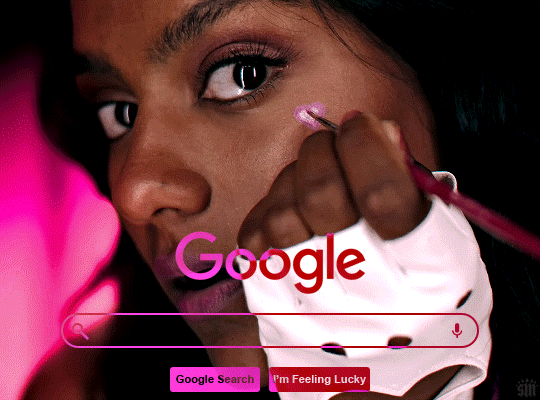
HOW TO: Make an Animated Google Search Overlay
A few people have asked how I did the effect in my pinned post and this set. So, in this tutorial, I’ll show you how to do this typing animation and give you a download to a template I made for the overlay! Disclaimer: This tutorial uses Video Timeline and assumes you have a basic understanding of gif-making in Photoshop.
PHASE 1: THE BASE GIF
I’m not going to show how I made this gif, but if you need any tips on basic gif-making, I have my full gif tutorial here. Instead, here are some tips for making a gif with this effect:
1.1 – Make your gif 540px width, especially if you’re using my template. My gif is 540x400.
1.2 – Use more frames. If you have a lot of characters in your search bar text, you’ll want to make a longer gif (i.e. one with more frames). The gif I made above was only 50-ish frames, so I doubled them and reversed the duplicates so it would play like a boomerang. That gif is a total of 98 frames 😅
1.3 – Have a “feature color” aka choose one color to make pop and make it the same as the overlay. Also, lots of contrast is especially ideal when you have an overlay set to Difference/Exclusion. (Check out the color tutorials on @usergif if you need help making your colors pop!)
PHASE 2: THE OVERLAY
2.1 – Download my template if you’re doing this layout
I made this template myself, so all I ask is that you don’t claim it as your own and that you give me proper credit if you decide to use it! Get the PSD with the transparent background here!
2.2 – Download the font Karla (optional)
The font I used for the search bar is Karla, a Google Font. It’s not THE Google Font, but I like the way it looks — which is more important to me than accuracy for this part. Here’s the Google Font link.
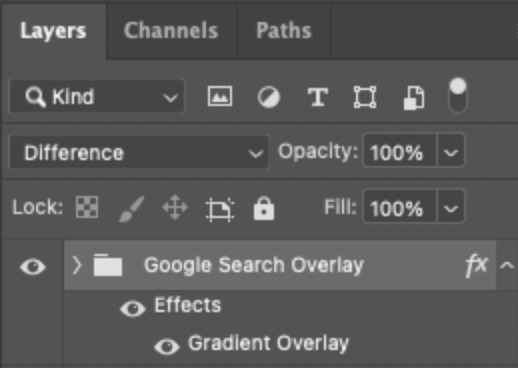
2.3 – Import the overlay
You can either drag the whole folder onto your gif from tab to tab or right-click the folder, select Duplicate Group, and select your gif as the destination document. Just make sure this overlay group is above your base gif!
2.4 – Set the overlay blending options
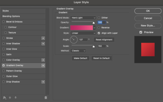
If you’re using my .psd, all the settings are already in place! If not, to get the metallic color effect, simply set the overlay to Difference:
Then, add a gradient overlay that matches your base gif feature color. Here are my settings:
PHASE 3: THE TYPING ANIMATION
*Anakin Skywalker voice* This is where the tedious stuff fun begins...
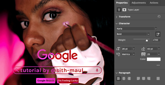
3.1 – Add your full text
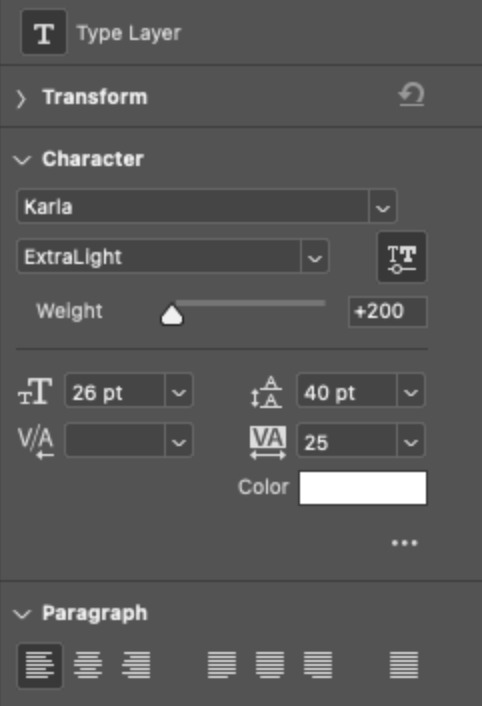
Create a text layer with the full text you want in the search bar! Here are my text settings:
— Font: Karla Bold
— Size: 26 pt
— Letter Spacing: 25
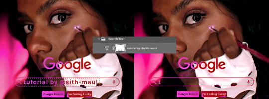
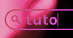
3.2 – Create a layer mask
This is how we’re going to create the typing effect without typing a new layer each time. You can add a layer mask to your text layer, use the Marquee tool to create a box around all but the first letter of your text, then fill the box with black to erase it. Now, all you can see is the first letter ‘t’
Btw the reason we wouldn’t use keyframes for something like this is because we want each letter to appear in a flash, not with a smooth, sliding reveal like a fade transition.
3.3 – UNLINK THE LAYER MASK
This is super important so you can freely move the layer mask with each letter. Just click that chain so it disappears!

3.4 – Trim the text clip SEVERAL times
When I say several times... I’m not joking lmao:

Btw, you can click these images to view them at full size and zoom! Now, this part is a little tricky for me to break down into steps, but here are some key tips:
TIP A – Trim, Move Layer Mask, Repeat
To make it as easy as possible on yourself, the best method is this:
— Start with your original text layer (pre-trim) with the layer mask only exposing 1 letter
— Move the playhead (red vertical line with the blue arrow) to the spot you want to trim (see Tip B) and click the scissor icon to split the clip
— On the copied layer, move the layer mask (white box in the layer panel) to the right to expose another letter. Make sure your layer mask is unlinked (See Step 3.3)! You can see my layer mask moving by the dotted lines in the gif below.
— Move the playhead the same amount of spaces as before and trim again: you should now have the original trimmed clip (first letter) and a second trimmed clip (second letter)
— Repeat until you’ve done all the letters AND the spaces
TIP B – Make your trimmed clips about 0.03 seconds long.
I’ve found this works well for me, especially because I’m working in Video Timeline. It reduces the amount of duplicate frames I get because, for whatever reason, Timeline pauses every 0.03 seconds (at least for me when I click the forward button).
In the section above the pink line (image below), you can see I started with my full text clip. Then, under the pink line, you can see how I used the scissor/trim tool to clip them each to a duration of 00:03.

↑ Note: That screenshot is zoomed into the Timeline 100%. The other screenshots are zoomed out which is why the clips look bigger here.
TIP C – Your text shouldn’t start at the very beginning.
Give yourself some space to let the cursor blink a few times, just like when you pause while typing on a computer. Where you start your typing animation is up to you! In the image below, you can see the first small purple block starts about 1.06 seconds into the gif:

TIP D – Backspace
I’m sure you’ve probably figured this out already, but to get the backspace effect I have in my gif, you just move the layer mask to the left to cover the letters you want to “delete.” Then once they appear “deleted,” just edit your next text layer clip with the new word you want to replace it with! (In my gif, I deleted “nik” and replaced it with “@sith-maul.”)
Here’s what the gif looks like without the blinking cursor animation:
Now that’s all explained, you basically do a similar thing with the blinking cursor! But no layer masks are involved :)
PHASE 4: THE TEXT CURSOR ANIMATION
4.1 – Create a text layer with just a vertical line like this one → |
I’m using the same Karla typeface as before, but thinner. Here are the settings:
— Font: Karla ExtraLight
— Size: 26 pt
4.2 – Trim, Move, Repeat (Letter Version)
This step will be super easy because each cursor clip that follows a letter will be the exact same duration as the letters you’ve already done: 0.03 seconds long. Take a look:
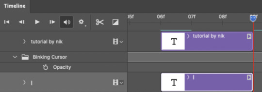
For each letter you reveal, move the text cursor so it’s slightly to the right of the letter, like this:
Do this for all the letters and even the spaces!
4.3 – Trim, Move, Repeat (Blinking Version)
This type of text cursor is slightly different because:
— These clips are “slower.” The reason is that the Letter Version cursor goes too fast for the Blinking Version. So I doubled the duration of the blinking cursor to 0.06 seconds!
— There are spaces between these clips that are the same duration as the clips themselves: 0.06 seconds.
— This text cursor starts at the very beginning of the gif and continues after the text is finished “typing,” directly after the last Letter Version cursor.
Just add however many blinking cursors you want to the beginning and end of your gif, skipping over the parts where you already did the Letter Version!
Here’s how it looks in the Timeline at the beginning of my gif:

Here’s how it looks in the Timeline at the end of my gif (note: it continues directly after the last Letter Version cursor):
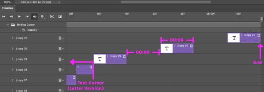
Here’s how the blinking cursor would look at the same speed (0.03) as the letter version:

Here’s how the blinking cursor looks at double the duration (0.06):

PHASE 5: EXPORT
That’s it!! Just convert from Timeline back to Frames and export your gif! As always, I recommend checking your frames when you convert from Video Timeline back to Frame Animation — just in case you may have gotten any duplicate frames. Again, if you want to know more about that process, my full gif tutorial is here!
And ta-da, here’s the final gif!

And that’s it! I really hope this makes sense because I’m not really sure it does 😅 But if you have any specific questions, my ask box and DMs are open! <3
Also, check out these gorgeous recreations of this effect from @steverobin (Keke Palmer set) and @jakeyp (Jake Peralta set)!
#gif tutorial#completeresources#allresources#userelio#userannalise#usershreyu#useryoshi#useralison#uservalentina#userkosmos#usernums#tuserkay#userk8#tuserabbie#uservivaldi#userstar#usersole#resource*#gfx*#google*#this tutorial is long overdue oops lol
2K notes
·
View notes
Note
could you please do a tutorial of your game of thrones 'so much for stardust' gifs where it has the ripped paper textures? it's so pretty, and i'd like to learn how to do one with just the texture in the middle and two gifs on either side, like half and half and just having a rip in the middle. it's so cool how you did a gif in the middle though so i wanted to ask as well! all of them are so cool looking. you are extremely talented. if you don't want to though i understand :) thank you
TORN PAPER EFFECT + BLENDING TUTORIAL
thank you so much for your sweet words, dearest anon and i'm sorry it took so long to answer but it's here now so i'll try my best to explain <3
disclamer: this is the first tutorial i ever made, it's very screenshot heavy and it assumes the basic knowledge of ps and gifmaking. if there's something you don't understand, don't hesitate to ask <3 so, let's get to it!
1. PREPARING THE BASE
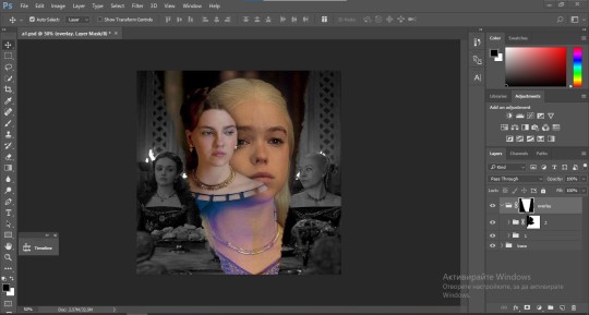
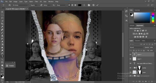
As you can see in this shot there's a lot of space between Rhaenyra and Alicent and that makes it perfect for the ripped paper overlay without hiding much of the base gif. So the first thing i did was to crop it like this:
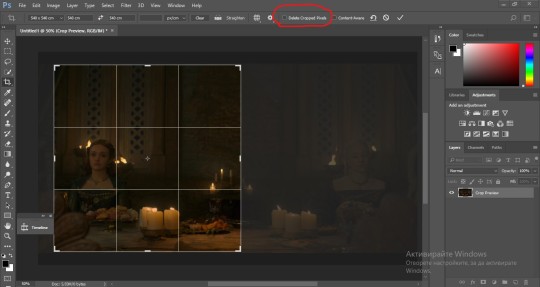
Also you want to make sure that the highlighted box (delete cropped pixels) is unchecked! After taking the usual steps for the animation (creating frames from layers, reversing the frames, setting frame delay) you continue with the video timeline and convert your frames into a smart object.
psa: if you don't have the motivation or the time to play around with coloring here are some psds i recommend: 1, 2; as for the sharpening i think this one is the best.
now that you have your smart object sharpened and colored what you want to do next is drag it to the end of the canvas and duplicate it. after that you move the copy on the other end like the original and make sure it's under the coloring layers, like this:
After that you have to create layer masks (the highlighted icon above) for both smart object and the copy and change the blending option of the copy to screen or lighten (whatever looks best!). So this is how it looks now:
pls ignore that there are no layer masks on the smart objects i just added them after changing the blending rip </3
Now, as you see both gifs are like fighting eachother for their rightful place on the canvas. (fgfgfdf) To fix that you have to use a soft round brush to delete the parts you don't want. (feel free to play around with the brush however you want to get the result you want!) Here's my result:
2. THE OVERLAY
Now for the both gifs you want to use for the ripped paper effect you pretty much apply the same steps as the ones you did with the gifs for the base. Here are the two gifs i chose:
Before blending both gifs however you want to create a clipping mask for each of the smart objects coloring layers, like this:
And now you're ready to blend both gifs together! You choose the group with one of the gifs and change the blending again to screen or lighten and place the said group on top of the other. So this is how it looks now:
optional: if you feel like the base gif doesn't pop out enough you can always add a gradient map on one of both gifs and play around with the opacity and the color you think fits best.
Then you add a layer mask on the overlay gif group and again play around with the brush to delete what you don't want. So this is the final result:
ps - don't repeat my mistake by placing the group with the layer mask under the other group. it should be on top and the blending option should be lighten or screen.
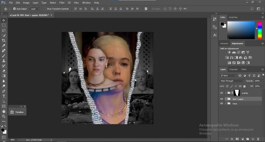
After blending both gifs together, you're ready to place them on the base. So first thing you want to do first is place both groups of each gif in one single group together. Then you duplicate the said group in the psd of the base gif and create a layer mask. This is how it should looks:
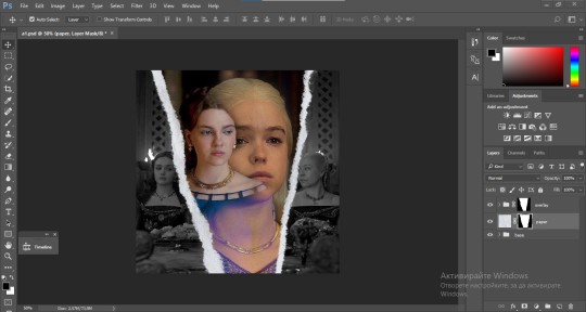
Now, in order to create the ripped paper effect, you'll have to download a ripped paper brush pack. This is the one i use. After loading the brushes in ps (if you don't know how here is explained) you're ready to begin! Change the size and angle however you'd like to make it look how you want. And if you want you can move the overlay gif by choosing both groups in case you aren't happy with the adjustment. This is how it looks like so far:
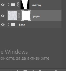
We're almost done! Now you have to find a paper texture, (i got mine from google) place it between both groups of your gifs and create a layer mask, like so:
What you have to do here is pretty much the same thing you did with the overlay gifs. Still, make sure there's enough space for the text you want to write in. However, if you think that the space isn't enough you can just delete a bit more of the overlay gifs. Here's mine:
3. THE TEXT
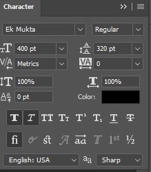
You're finally ready to type out the text you want! If you're having troubles with choosing the right font and size, here are my text settings:
You can always play around with the angle and if your text is too small, zoom in so you can place it just how you like it. And since i'm a bit lazy to deal with it later, i choose to add the highlight color while it's still zoomed. You just have to add an layer above the text and use a soft round brush with opacity from 70-75% and flow from 15-18%.
For the repeated text you want to make sure you create a big space for writing so it can contain the whole space of the torn paper. Also, write where the text will be seen only and use the tab button to skip the space where the gif is. This is how it looks:
Once you're done with writing the repeated text, you want to select all the character layers and the highlight layer and move them under the overlay gif and on top of the paper, like this:
With the layers still selected and in order to contain the text within the paper the last thing you want to do is create a clipping mask. And that's It. You're done! This is the final result:
#allresources#dailyresources#usergif#chaoticresources#gifmakerresource#hisources#onlyresources#alielook#usermaguire#userrobin#usernik#userpat#userbells#gif tutorial#ps help
61 notes
·
View notes
Text
gif pack maker question game! 💕
I've seen a few of these float around for gif/edit makers and some questions apply to us, but I figured I'd make one specifically for gif pack makers! Feel free to send me some or just reblog and get some questions asked yourself! If you think of any other good questions, leave them in the replies and I'll try to add them in the future!
What is your favorite gif pack to date?
Which FC have you made the most gifs of?
What is the largest pack you've ever made?
What is the smallest pack you've ever made?
Who is your favorite gif pack maker? If that's too hard, top 3!
Which gif pack do you think is underrated (should have gotten more attention)?
Which gif pack are you close to deleting?
Have you ever deleted a gif pack?
How did you get started making gif packs?
Post your favorite gif of one of your current projects (or one from each!)
What scenes are the worst to color?
Which scenes are your favorite to color?
What was the worst show you've had to color?
Which show had the best lighting/was the easiest for you to cover?
Would you ever remake a gif pack? If so, which one(s)?
Would you ever do a gif pack collab? (ie, you split a season or movie of the same fc and gif half)
Which gifs do you think are ESSENTIAL for a pack?
Which gifs do you think should never leave the cutting room floor?
Do you have any current projects you want to talk about?
What are you most looking forward to gifing this year? Any upcoming movies or shows?
Do you usually gif a whole pack at once, or split up packs across various days (or weeks, or months... or years...)
What is your favorite expression to gif? Smiles, laughs, incredulous looks, etc
What FC do you wish had more footage for you to gif?
Which gif pack do you regret making? Why?
Any pet peeves when it comes to gifing?
Frames to Layers or Screencaps? Or do you use a different import method?
Frames or Video timeline?
Watermarks or no watermarks? Any reason why?
What is your favorite or standard gif size for packs? Any particular reason why?
Do you save your psds? If so, do you save one per scene and edit it or do you save one for each gif?
Do you save your .gif files after posting them?
What is a gif pack you've seen recently that you think deserves praise?
Are you someone who likes to take suggestions or do you just gif what you feel inspired to make?
Black and white gifs. Worth it?
Free choice! Ask whatever you'd like!
#rpc#rpt#rph#gpntalk#gif pack#if this ends up clogging the gif pack tag tho lmk and I'll remove the tag!#please feel free to reblog WITHOUT sending me an ask#but if you reblog from someone else please do try to send one to them!
61 notes
·
View notes
Note
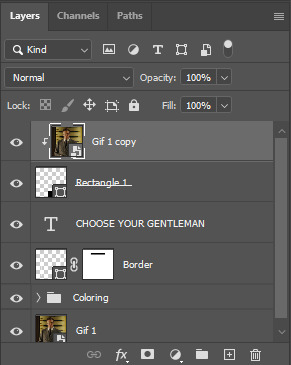
Hi, I love your blog and your edits. I was wondering if you could do a tutorial on how you combine multiple gifs into one in the first gif of yours MIKELOGAN’s 5K FOLLOWER CELEBRATION || GET TO KNOW ME MEMEFAVORITE ACTORS [2/10]Colin Firth (September 10, 1960) set? Thank you for reading this and helping me.
thank you so much, that's so kind!! this is the post in question (which was inspired by this gorgeous set) and i'll break down how to do it step by step below the cut!
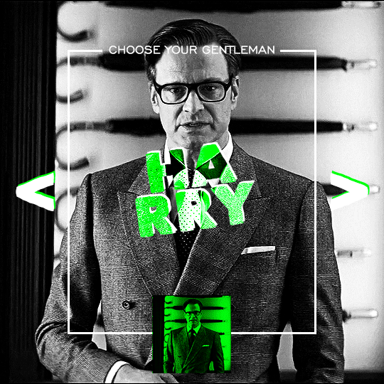
i ended up saving this gif as a psd because i remember it taking me so long and being really frustrating, i just wasn't sure why. for reference, i posted that set back in september, just over four months ago. looking at the psd, i can see just how far i've grown as a gifmaker bc that thing is a hot mess. i made it about 3x more complicated than it needed to be, so let's do this the right way lol
note: i was still using 0.07 frame rate at this point. i have since switched to 0.05 for smoother, quicker gifs.
what we're going to do is create all of these gifs separately and put them together at the end. in total, there are 6 individual gifs. let's start with harry.
i gif by importing video frames to layers, but if you prefer to screencap, load those in instead. because this ends up being a pretty large gif, both in size and length, i kept it to 20 frames per clip.
once you're satisfied with the frames you've chosen, crop your canvas to 540px x 540px. this is what i'm left with
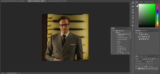
this is when i sharpen my gifs. everyone's process is a little different. i created my own sharpening action, which converts my frames to video timeline and then sharpens.
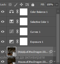
the next step is to color your gif. if you're going for the overall look in mine, here were my layers:
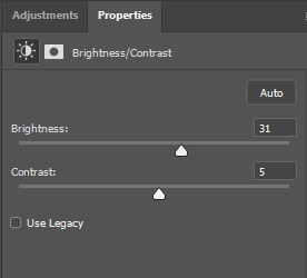
a brightness/contrast layer with brightness set to 31 and contrast to 5. this will depend on the scene you're working with

a levels layer using the black and white eyedroppers. the top one is your black eyedropper. to use it, click it and select the blackest part of your gif. do the same with the white eyedropper and select the lightest part of your gif. you may need to play around with selecting different points depending on your scene and the original coloring
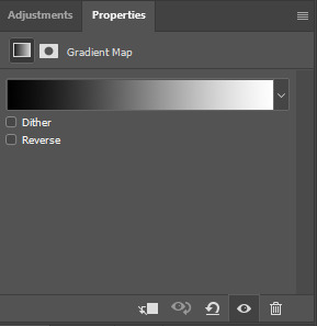
finally, a simple black & white gradient map layer on top
now we're going to add the thin rectangular border in the middle of the gif. i use the rectangle shape tool for this (press U on your keyboard) and these are my settings (x and y coordinates don't matter):

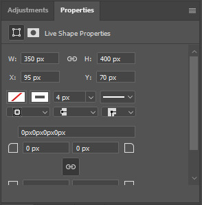
to center it perfectly, i use ctrl+T and drag it until it snaps into place with both the vertical and horizontal guides.
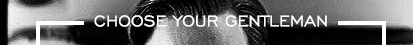
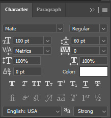
next, let's add the "choose your gentleman" text that goes at the top of the border. here is the font i chose and its settings:

once again, press ctrl+t and drag this to the vertical center of your gif and to the center of the top of the border. you should feel and see it snap into place. this is what we have now:
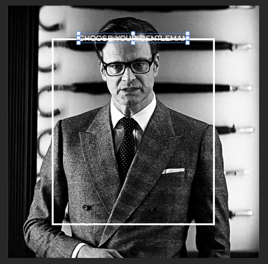
now, we're going to use a layer mask on the border so we can read the text. select the rectangle layer and click the layer mask button
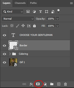
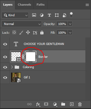
with the layer mask selected (as shown in the second image), use the rectangular marquee tool (M on your keyboard) to draw a rectangle around your text, taking care to keep it just a little larger
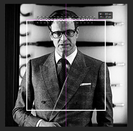
as you can see, you'll know when you're perfectly centered through your text layer and vertically on the entire canvas. select your brush tool without deselecting this rectangle (B on your keyboard) and paint the selection with a black brush. this masks that part of the border!

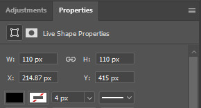
let's add the small square gif that goes at the bottom of the border now. i think the easiest way of doing this is to use the rectangular shape tool (U) again. the size of this gif is 110x110, so create a black square of that size with no stroke. Use ctrl+T to drag it to the center of the bottom of the border (the x and y coordinates don't matter):
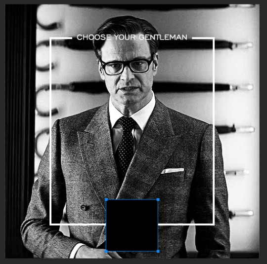
now duplicate your original gif layer (ctrl+J) and drag it to the top of the layer panel. right click on it and create clipping mask. this will make it so the gif only appears within the confines of the square we just created. resize your gif by using ctrl+T and, making sure the proportions are locked, drag the corners to the edges of the square.
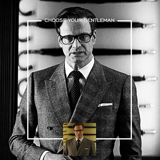
this gif is not colored at all as we only duplicated the gif itself and not the coloring layers. i duplicated those as well and dragged them on top of our small gif, but it's important to make sure those are using the clipping mask as well. you can click this on the properties layer of each adjustment layer to make sure they do.
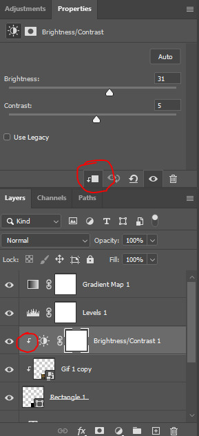
you'll know you've been successful when you see the small arrow next to each of your coloring layers. this keeps them from affecting the coloring of the larger, main gif.
we're going to change the gradient map adjustment layer from black & white to black & lime green (or the color of your choosing). click on that layer and then on the map. this will bring up the gradient editor. click on the small white color stop at the far right end of the gradient and then on the color picker, choose a new color.

the hex code i used for the lime green is #00ff0c
our last steps are the angle brackets on either side of the gif and harry's name in the center. here are the settings i used for those (angle brackets on the left and harry on the right):
the layer styles for harry's name (double click on the text layer to call up this menu OR right click > blending options):
and for the angle brackets:
by now, you know how to utilize ctrl+T to move these layers where you'd like them. harry's name is centered horizontally and vertically and rotated at a bit of an angle and the angle brackets are centered horizontally and i just eyeballed where to put them in relation to the space between the border and the edge of the gif.
this is the complete first gif. what i would do for your own sanity since you have two more of these two create is 1) save it as a psd just in case something crashes and 2) don't convert it to a smart object until you have all 3 gifs completed and are ready to put them together.
the nice part about having the first one done is you've ultimately done the hard part. create your two other gifs, but you'll be using at least roughly the same coloring and all the same text, just with the colors adjusted, so you can drag those layers from your completed first gif to your others as you work on them.
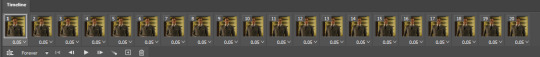
once you have all 3 gifs completed and still on 3 separate canvases (and saved as psds bc this is adobe friggin photoshop and shit breaks all the time), convert all layers on all the gifs to smart objects. this will simplify the final gif and make things much easier.
then, bring gif #2 and gif #3 both onto gif #1's canvas. this is what it will look like at first on the timeline and in your layer panel:
(full disclosure, i'm not making the other two lmao, i'm lazy and i already did it once in a way harder way 😂)
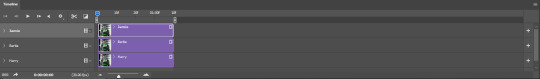
to get the gifs to play after one another rather than simultaneously, you just have to drag them after one another on the timeline!
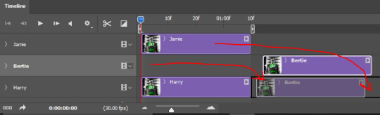
a little bit hard to show the actual process, but you're just clicking the bertie layer and dragging it down to harry's line after the harry layer. then do the same with the jamie layer, dragging it down to the harry layer after bertie. when you're done, it should look like this:
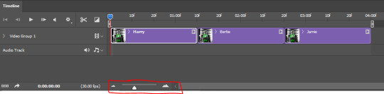
btw, the little slider i circled is what enlarges or shrinks the timeline view, so if you need to see something broken down a bit more/slower, drag it to the right. if you need to zoom out, drag it to the left.
and that's it! export and save your gif!
if you have any questions or anything is at all unclear about this, please let me know! i'm happy to help!
#answered#Anonymous#gif tutorial#my tutorials#gifmakerresource#completeresources#dailyresources#LISTEN. the way i did this 4 months ago was SO FUCKED#i made it SO SO much harder than it needed to be#you know what that is? growth.
89 notes
·
View notes
Note
Hi!
I was just wondering if you have a tutorial on how you created this effect in your gifset, it's something I'd like to try but have no idea where to start. Your set is so pretty! Any helps appreciated x
https://www.tumblr.com/tawaifeddiediaz/712911415428743168/ill-take-you-with-me-then-well-both-die-you?source=share
Hey Nonnie, thank you! This is super late, but I don't actually have the psd for this set anymore (I delete them as soon as I post them), so we're just gonna wing it with a gif I made the other day. I think this ask is about the text, but if it's anything else, just drop me another line and I'll get to it when I can!
I'm pretty sure I got this tutorial from the wonderful @eddiediaaz but I then turned it into Lazy Girl Hours :)) anywho, here we go!
We’ll be making this gif:

This tutorial assumes basic knowledge of gif-making, Photoshop, and coloring. I’ve only described the typography tutorial in this, but you can reach out if you have any questions.
Tutorial under the cut:
Couple things to note beforehand:
There is a lot of trial and error involved when doing any sort of effect, and this is no exception! You might have to play around with the colors and the settings before you find something that looks good and readable and that fits your set!
This text effect works better on big gifs (540px width).
For this, I find that a simple font works better than a fully-cursive one, but play around with what you like. The boxes may need some adjusting if you use a font with too many tall or tail letters (i.e. text where all the letters aren't on one uniform line - that's why capital letters work so well.)
Movement works really well with effects like these, but again, it depends on your gif + readability. If you have a blended gif, it may take a little more trial and error.
I work in frame animation for all my text effects, but this works just as well in timeline as well.
We’re going to start with this gif:
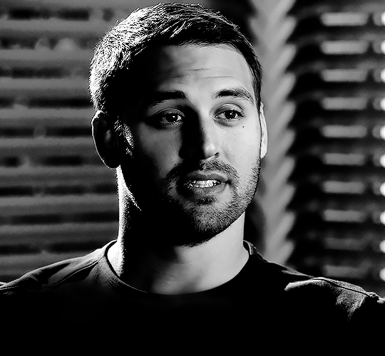
First, I like to put my text on the gif. You can obviously move this around later so don't worry too much about how it looks right now.
The dialogue is "Just don't feel it." "Feel" is one of those Big Words for this quote, so I'm going to emphasize it with cursive text.
I am using Moon for the sans serif text, and Santa Fe Spring for the cursive text. Keep both of these in white for now:
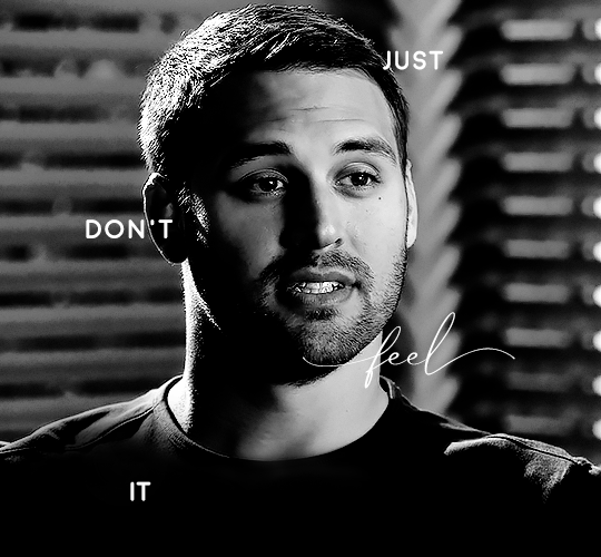
Next, we're going to use the rectangular marquee tool to draw our rectangles around the capital letters (we're not touching the cursive text right now). I just eyeball this, and then try to center it as much as possible.
(The rectangular marquee tool has a keyboard shortcut of M, and it's the second tool in that little toolbar on the left of most people's Photoshop.)
This is what that'll look like:
Next, we're going to go down to the icons at the bottom right of the layers panel and select the half-black half-white circle > Color Fill.... You should get a color dialogue box. Choose your color - I'm using #8d0000. Then, we're going to move that layer below the corresponding text layer, and set its blending mode to Difference. This is what that looks like (click the image for better quality):
I'm going to repeat that with the other two boxes as well, using the same color. The boxes will look different with the Difference blending mode because of the shadows underneath.
For example, the box with "it" looks like a solid red square because it's against a completely black background, while the other two have some blue shading to them since there are some highlights behind them.
This is what my gif looks like now:
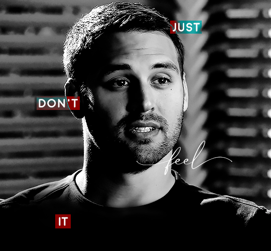
Next, I like to go The Lazy Girl™ route and put all three color-fill layers into one group underneath all the text layers. This just lets me edit the drop shadow of all three of them at the same time.
Right-click the group and open up the Blending Options. In Drop Shadow, these are the settings I'm using. The drop shadow color is #0c6477:
(Note: uncheck "Use Global Light" especially if you're working in frame animation to make sure all the drop shadow has the same angle on all frames.)
This is what my gif looks like now:
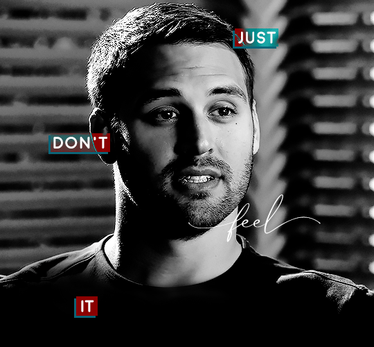
Now that we've finished that, time to move on to the cursive text.
I usually match the cursive text to the palette of the rest of the text, and since the drop shadow is our "accent" color, so to speak, I'm going to use a lighter version of that color. I am also going to add a drop shadow for readability.
The color I used for the text is #acfffe and I actually ended up adding two drop shadows, just because I needed something subtle that doesn't overwhelm the text, especially since it's a delicate font. Here are the settings for both layers:
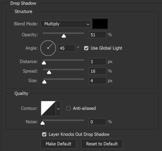
And here's what my gif looks like now:
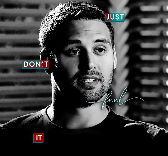
Now, before we move on to the lines, just check the adjustment of all these text layers, see if there's anything you want to change. It's easier to change now than after the lines are added, since you'll most likely have to redraw them if you move the boxes after the fact.
To draw the lines, we're going to use the Line Tool. I just freehand all of this, and I try to go from center to center of the boxes when I can. It all depends on your angles.
My lines are 2px thick, but you can change these depending on your preference. Here's what mine look like right now:

We're going to do the same lazy hack that we did for the color fill, and put all three line layers into a group. Move this group below the text layer and the color fill layers. The reason for this is so that the lines look like they're coming seamlessly from the box, rather than from on top of them or something.
Then, set the group to opacity 50%. I like more subtle, simple looks in my gifs, so I don't like super high opacities.
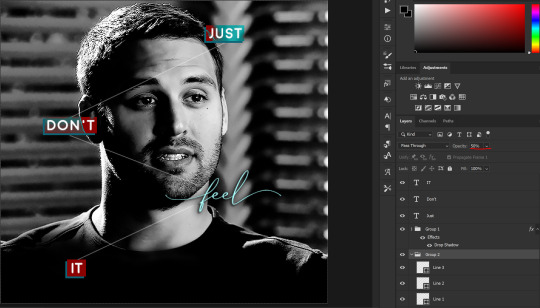
And that's it! This is our final gif:
Some final notes:
Absolutely play around with the blending modes of the color fill layers for this effect. These two gifs are the exact same color we've been using, just two different blending modes. You can see how drastically different they look. The first one is Linear Dodge (Add) and the second one is Vivid Light:
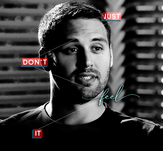
It can change how your gif looks in a BIG way, so play around with it, see what you like, especially if you don't really like the "two toned" thing going on.
Sometimes, I also like playing with the width and height of the text in the font settings, making it shorter and wider, or making it taller and more compact. You can play with the letter spacing as well. The world is your oyster, etc etc.
One other thing I've started doing is erasing the lines with a big brush, just to fade them from his face a little, like this:

To do that, use a layer mask on the line layer folder, and a brush that's 0% hardness, and at least 200px big. For this gif, I also changed the opacity of the lines back to 100% so the fading effect is a little more pronounced:
(this gif isn't the best example for this, but oh well. Anywho, hope this helps, Nonnie! Let me know if you have any questions.
Enjoy!
#zee's tutorials#tutorials#gif tutorial#photoshop tutorial#resources#dailyresources#completeresources#itsphotoshop#allresources#dailypsd#userisha#userdahlias#alielook#userabs#tuserheidi#userelio#userjaelyn#userisaiah#usermorgan#usergert#zee answers#im so pissed at myself for losing the tutorial the first time like you do not know how mad i am right now#i didn't even do anything tumblr just hates us all
187 notes
·
View notes
Note
Hey!! I just wanted to say that your recent speak now gif set is sooo stunning. I was wondering how you managed to create that cassette tape effect if it isn’t any trouble? It’s really so pretty.
Have a great day! ✨
ahhh thank you so so much! first of all, i cannot take any credit for this effect, as it was greatly inspired by this amazing yellowjacket gifset by @thewintersoldier!!
but here's how i recreated the effect, from a cassette png (found on pngwing here), to this animated cassette effect (as seen in my speak now set):
psst: i usually always create in photoshop cs5, but for this effect you need a recent version of photoshop because it's using transform keyframes (i think cs5 doesn't let you do that, or i just don't know how to lol). i used cc 2019 for this.
sorry if this is lengthy or has too much or too little details haha, but i hope it's comprehensible! english is not my first language so i also apologize in advance for any mistakes!
I. PREPARING THE CASSETTE
so, starting with the png here:
i removing everything i didn't want on the cassette png with the brush tool by just drawing the right color over the unwanted text. for the color, i then went to image > adjustments > hue/saturation and in the red tab, i played with the hue slider to get that purple color. finally, i added some text to my liking, and this is what i ended up with:
(not necessary but: i also selected the white lines on each side with the magic wand tool because i wanted these lines to be transparent. once your selection is done, go right click > layer via cut. it will create a new layer of the cutout you just made. you just need to disable or delete the layer to make the selection (lines) transparent.)
at this point you want to have only 2 layers: the revamped cassette and the text layer. you can remove the text layer actually, and just add the title back at the end, as it is not necessary for this effect. i just like to have the visual.
if you have multiple layers, you need to select all of them (except the song title layer), right click on the png layer and click on merge layers. this will create one layer with all the editing you made on the cassette. if you think you will need to edit this later though, i would save the file as a psd before merging the layers.
II. THE EFFECT
okay, so now that you have your cassette, make sure your video timeline is activated, not frame animation, and you are ready to go.
first, you want to create a perfect circle shape around one of the reel with the elliptical marquee tool (hold shift while dragging the circle). make sure it covers the entire area that will later be rotated. make sure this circle is perfectly centered around the reel or otherwise the animation will be a bit lopsided.
then right click on this selection and go "layer via copy". this will create a layer of only that circle selection. important step: right click on that new layer and go "convert to smart object". the layer should look like that, i've renamed mine:
now if you go to your timeline and open that new smart object layer, you will see that you have 3 keyframe options. we only need the transform one.
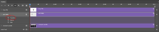
go to the start of the timeline and activate the transform animation by clicking on the stopwatch button. a keyframe will be created automatically.
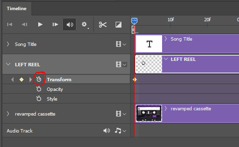
to create the actual animation, move the position of the cursor on the timeline further, i put mine at the 01:00f mark so it's easier to create the right timing.
then what you want to do is select the reel smart object layer and hit ctrl + T. a box will appear and this is how you will make the reel rotate.
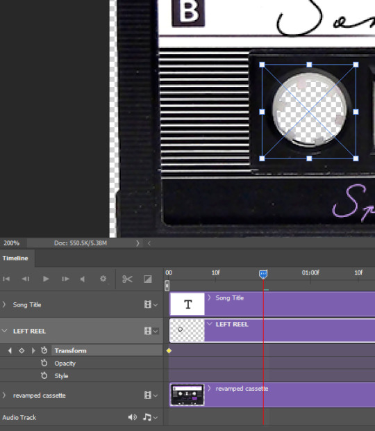
to rotate the reel shape, move your cursor near the blue box on your canvas and drag it until you have rotated the shape halfway through and hit enter. another keyframe will be created and if you play your animation, the reel should rotate on itself for half a turn

move your position on the timeline to 02:00f and do the same thing: select the left reel smart object, hit ctrl + T, rotate for another half turn, and hit enter. this third keyframe should be the last one needed for the animation and you should have a full animated rotation of the reel.
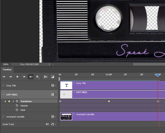
play your animation, and adjust the speed to your liking by dragging the keyframes on the timeline (but make sure they stay within the same distance from each other). the closer the keyframes are, the faster the animation are, and the further they are, the slower it'll be.
then you can just trim the smart object to your animation's length, and duplicate (right click the smart object > duplicate layer) this layer the amount of times needed (i find this less finicky than duplicating keyframes), and placing them one after the other. three full turns should be enough. this is what my timeline looks like right now:
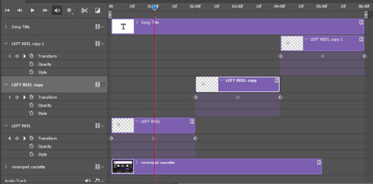
and my animation for the left side looks like this:
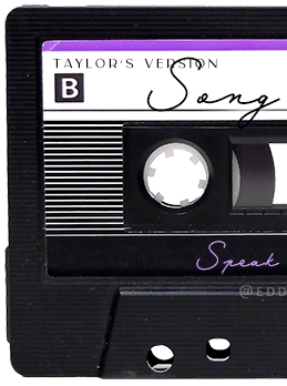
as you can see, we can see the little "dents" peeking through behind the animation. we don't want that! to remove it, select the revamped cassette layer (that should be under the reel smart object), and create another perfect circle around it with the marquee tool. this time make sure it's smaller than the previous one, it just needs to cover these dents.
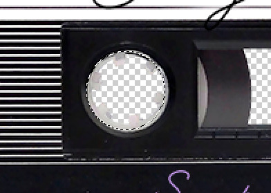
then right click on this selection on your canvas and go "layer via cut". this will create a new layer with that selection, and all you need to do is to disable it. this is removing the information in that circle.
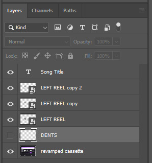
once you are happy and the animation works, you can just delete that cut layer. now the animation is done and looks like this:

III. SECOND ANIMATION
one you have done it on the left side, you just gotta do the same thing on the right side. you can also try duplicating it, but i found it finicky for some reason (or maybe i'm just not used to the controls of this 2019 photoshop version?).
this is what i have once i've done the same thing on the right reel:
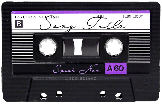
once i am happy with the speed and everything, i want to have only one layer so it's easier to use on gifs. first, i will save this animation as a psd file, in case i want to reuse it. then i am removing the song title layer and will be flattening everything and creating frames from this animation. to do so i am using the "save" action from here.
i'm not sure why it does that, but it's creating a couple of frames where the reels are a bit offset from their position everytime there's a full circle done, so i just delete these 5-6 frames. you can also change the speed here, but by default it should be 0.05.
once you are happy with it, just turn these frames into a smart object with the video timeline again (convert frame animation to video timeline and select all the frame layers > right click > convert to smart object)
now you have a smart object that is ready to be used anywhere!
IV. FINAL TOUCHES
for my particular speak now gifset, i have multiple layers of the animated cassette on each gif:
1, bottom one - cassette layer set to the blending mode "hard light" and set to opacity 86%:
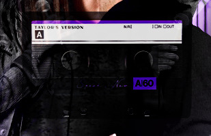
2, middle - this same cassette layer set to hard light, but with the opacity at 100%, AND with a layer mask so it's only applied to the animated reels (i wanted them to show up more):
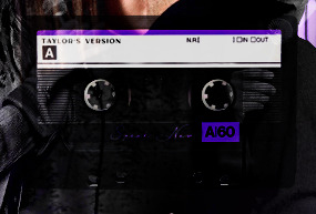
3, top one - and finally a third layer with another layer mask because i wanted the white label and speak now area to be less see through. it's set to the normal blending mode and the opacity is at 75%

and then i just added the song title on top at 100% opacity and normal blending mode, and added some drop shadows, and tada!
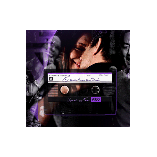
there we have it, i hope this was helpful <3
#alie replies#Anonymous#photoshop#tutorial#*ps help#completeresources#allresources#resourcemarket#userrobin#userraffa#userpjo#usertreena#tuservaleria#tuserheidi#userdean#userrainbow#usersalty#userzaynab#usernik#swearphil
360 notes
·
View notes
Last Seen Blogs