#i also used this as a rendering/colouring study but its very much not the focus
Text
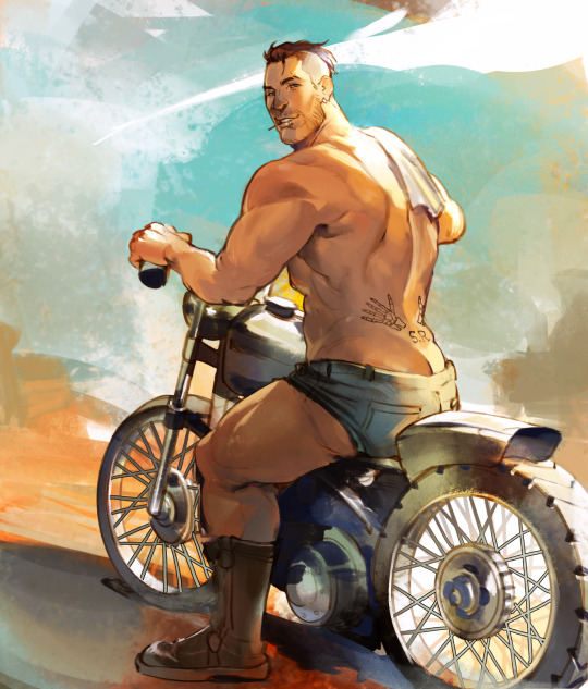
that bike's not the only thing getting ridden tonight
(this was inspired by this photoset which promptly filled my head with all sorts of mechanic au ideas😵💫)
#i also used this as a rendering/colouring study but its very much not the focus#hoping tumblr gods dont smite me for this#he's wearing shorts guys#everything's fine#john soap mactavish#simon ghost riley#ghostsoap#giragi art
4K notes
·
View notes
Text
Week 8 - Digital Iteration
This week's tutorial was really interesting and entertaining. One of my personal hobbies is digital rendering (mainly in Blender), but it was really nice to go out of my comfort zone to a program I have only ever used once before. When I opened 3ds Max for the first time, I noticed how similar the interface looked to Maya. Being Autodesk programs natively, it made sense, but it was nice to have some element of familiarity.
During my year 10 and 11 high school holidays I completed a Cert IV in digital design for games and film. That coursed used Maya and Unreal Engine 4, so I had a bit of experience with the interface and principles of polygon modelling. However, 3ds max was probably one of the popular programs which I had the least experience with; so it was still a hugely informative and insightful process trying to adapt my knowledge between programs.
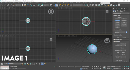
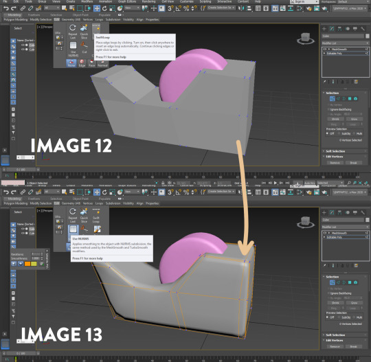
I started with the primitives menu, and imported a sphere into the workspace. I initially found myself struggling with the interface. There are a lot of options and features which are not necessary when learning the basics of a program. When starting to learn any 3d program, I often find myself spoiled for choice, and perhaps even too overwhelmed. I was very glad when the tutorial suggested hiding some superfluous menus from view, as I felt that it really cleared up the screen. After aligning the views (Image 1), I experimented with the modifiers tab.
The modifiers in 3ds max were really interesting to play around with. Working with meshes can sometimes be a tedious and particular process, but it was really enjoyable creating something with no end goal in mind. I liked how using a squeeze modifier (Image 2) could generate an egg shape with the sphere primitive, and how the melt, twist and wave modifiers (Images 3, 4 and 5) could be pushed to the mesh extremes. When working with a mesh, the topology is important to the quality of the final form. As the entire object is constructed of tris and quads, the way they are situated on the model, and their resolution play an important role in what you see. For example, the more I increased the twist modifier, the more I could see the vertices sticking out of the shape. It goes to show that unless the resolution is increased, there are limitations to the modifiers usage, as they can 'break' your model.


The modifiers in 3ds Max are very different to the ones in blender, I definitely feel like in any 3D program, anything you can create in one is attainable in the other; however 3ds max has a lot of mesh deformation modifiers out of the box. Although I thought these created really interesting and abstract shapes which I certainly enjoyed, I realised that I couldn't think of many instances where I would use some of the modifiers on a real project, but I think they are really valuable for niche tasks.
My favourite part about the exercise was learning poly modelling in 3ds Max. Poly modelling is a core part of most 3d modelling programs; and the skills are usually transferrable between. There are some really fantastic modelling tools in 3ds max which make the process of modelling enjoyable. I had a look around my desk for some quick and interesting forms I could make, and started with a really simple apple using the sphere I had in the viewport. I utilised the 'soft select' (Image 6) feature to move many verts at once, to create the top and bottom crease in the apple where the stem travels. To create the stem, I used the cylinder primitive and used the taper/bend modifier to create a curved and natural form (Image 7).


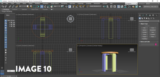
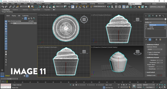
Next, I used the cylinder primitive and used the scale and extrusion feature to get the barrel of a pen. To create the tip of the pen I target welded the vertices together to get the point. I created a new cube primitive to create the clip on the pen, and extruded it (Image 8); also creating a bevelled edge to round it out slightly. Using the same techniques, I also made a stool from my room (Image 9). I really wanted to experiment with as many features as I could in these exercises, so with each 'sketch' I tried to focus on a tool I hadn't used before - as it felt like the best way to improve (Image 10). Still getting comfortable with the Poly Modelling in 3ds max, I also made a cupcake (Image 11) from the basic cylinder primitive to try and improve my modelling quality and speed; making simple extrusions, scaling the rings in, rotating them to get the icing layers. I played around with NURMS subdivision on the mesh to smooth it out, and was really happy with the results.

Finally, I wanted to use all the skills in conjunction, as well as using a tool which really sped up the workflow. I knew from Blender and Maya that loop cuts sped up the process, but I could not find them in 3ds max. After researching the issue on different forums, I found that it went under a different name; Swift loop Though it was very basic problem solving, it goes to show that these skills and programs have transferrable knowledge; and doing a simple search of your problem can lead to new ways of solving them. Swift loop was really useful in creating a loop cut between two parallel edges; adding more geometry for manipulation. When creating the tape dispenser, I noticed that the subdivision was rounding the model out too much, to the point where it no longer registered as a tape dispenser. So I used the swift loop feature to create loop cuts close to the bordering edges to reduce the interpolation between the curve (Images 12 and 13). This taught me that the subdivision modifiers aren't just something that can be added to a model to instantly make it look better; they require some manipulation and editing to get the desired effect.
I found 3ds max challenging but really interesting and insightful. As I am familiar with other programs of similar nature, it took me a while to get out of my own head; using shortcuts and hotkeys from the other programs and wondering why it wouldn't work. Overall, I think that its really rewarding to pick up another program, as it expands my skills and approach to modelling. If I were to redo this activity, I think I would try and make some more complex forms now that I have gotten more comfortable with 3ds Max; perhaps moving onto a product or more complex object. I am really looking forward to creating the bottle concepts in 3ds max next week, as I believe it will be another chance to improve my skills.
Thoughts on the Pre-Class activity - Andrew Simpson case Study
I believe that digital modelling and physical models have a closer relationship than people think. Form and Materials are an important part of perception, but there are qualities of both physical and digital modelling provide when compared to one another. Digital models allow for material iteration, simulation and rendering. Physical models allow for the physical contact, and interaction with the end user. When Andrew discusses the importance of materiality, it drives home the necessity of experimentation and versatility in design. The idea of new materials informed new processes in his decision making process, and it lead to different material types being explored.
I found Andrew's discussion on model fidelity really insightful. I perceive high and low fidelity models to represent how close the model is to a refined product. Whilst a high fidelity model would be fantastic to show clients or to use in renders, low fidelity models are required to quickly iterate on concepts and ideas to test the boundaries of the product e.g. material, form, colour. High fidelity models are more refined, and have more time put into them, to explore how the end product will feel for the user.
High fidelity and low fidelity models are both important, and when Andrew talks about the non-uniform relationship of the two in his process, it shows that design is not a linear process; rather a circular one driven by prototyping and feedback. If a high fidelity model still doesn't feel right, faster, low fidelity models can be made testing a range of new ideas; to be taken through the process of design once again.
9 notes
·
View notes
Text
Writings from Offline {Ep.3}
Advertisement Review
The Saravana Stores’ advertisement for the Diwali Season, was the most recent version of ads that followed the long tradition of hilarious ads from the store. It has come up with unoriginal but creative ideas to engage with the common folk. The advertisement makes the viewer subconsciously indulge in its proposition. From the actor, who is the owner himself, to the song and the setting used, everything is carefully constructed to please the audience; explicitly and implicitly making them buy into the idea that they are selling. Which is why it’s logic and knowledge that has gone into the making of the ad should be defended; its irrelevance, not so much.
The irrelevance would be the fact that the ad did very little, in my opinion, to actively endorse the product that it was selling. The tonal balance was off. The plot, that didn’t exactly exist, seemed to suggest the episode in the life of a glorious leader; the central character surrounded by people of all ages who rejoice him, much like Diwali, to which he almost becomes a metaphor to.
There are girls, a sign of validation in the patriarchal society, who are always cast in close proximity to the supposed hero. Towards the end the hero sports a moustache too, an obvious sign of success, masculinity and dominance, and the whole family comes together to celebrate him. This cliché de facto trope of Indian commercial cinema now becomes a familiar subject that the audience can latch on to.
Another familiar strand in woven into the narrative with the upbeat jingle which seems to be inspired by a millennial Tamil song. With easy diction and emphasis on “colour”, “family” and “home”, it even slightly hints on the glory of working hard and tries to moralize the viewers with the motivational message. The mixing of the Tamil and English serves the purpose of portraying modernity and humor eventually becoming pop culture themselves.
As Yamuna Kachri elucidates in her article, the mixing of the native and the foreign language exoticizes the language itself and adds light heartedness to the content.
“…the mixed lyrics that illustrate the playfulness accompanying the convergence of multilingual ingredients.”
She also says that this trend is popular among the middle class and upper-class families, a wide group to whom this ad in study is targeted to too.
“…amuse the audience and exploit for this purpose the meanings that the intersection of multiple languages of India make possible.”
” … portray upper-middleclass or upper-class families, the use of English in dialogs and songs has increased.”
The music, the happy drum beat, that accompanies the song sets the mood for celebration. The energy of the music is captured by the camera too. The events rapidly succeed each other and the cuts are quick; a technique used to render energy and excitement. This strategy keeps the audience engaged and focused, it doesn’t bore them out.
The engagement is strengthened with the excitement and the joy which are clearly observable in the choice of colour. The dresses are bright to the point of being gaudy and the background is a romantic French café. The advertisement now becomes more engaging to the audience, who closely associate the idea of foreign to progress and the idea of an alluring land that is painted in movie songs. The clothing of the models and dancers, in dresses resembling that of an airhostess and sailors and the frequent costume changes circuitously advocate the same idea, thus drawing on the banal framework of songs.
The foreign elements represented are countered by the inclusion of popular culture propagated by Kollywood films. The towel flipping scene is a characteristic feature of actor Rajinikanth, a pop culture phenomenon, that makes the ad relatable. The moustache is also used for a similar purpose because of its coupling with power, tradition and success. By doing this the ad rings intertextuality and according to the article titled, “What are television advertisements really trying to tell us? A postmodern perspective”, the postmodern age ads sell intertextuality to sell their products. By connecting the emotions of a viewer to the ad, the marketers are able to manipulate the consumers to change their needs to buying the product.
“When a text is read, consciously or unconsciously readers place it in wider frames of reference of language and knowledge, cross-fertilizing a particular reading with other discourses drawn from their own socially, culturally and historically situated experiences.”
The representations that connect with pop culture help the viewer make connections to their own experiences and thus makes the goal of the advertisement approachable to the reader.
“…meaning is activated by the participation of its audience, whose interpretations reflect their own experiences, social situation and concerns.”
By honoring the pop culture that the target audience relate with, the advertisement sells well among the people because it touches the same sentiments.
The advertisement, being pastiche, therefore tries to draw the audience towards it - the object clearly, the relationship that the company desires with the audience. Being well established for a long while now, the company has little responsibility to inform the customers. Its aim is to relate to the audience and the present generation. By combing intertextuality and humor, it elevates the best things about the culture that existed before it. It glorifies the pop culture prevalent and draws inspiration from it to support itself. The use of Rajini’s style would be welcome among the audience. The use of a Tanglish (Tamil and English) song would be relatable to the youth who know both the languages and able to appreciate the mixing.
This is where we get to the explanation for the bad casting, bad acting and bad lip syncing. While most ads strive to achieve perfection, this ad, contrarily, trades off quality for connection. The idea, as I understand is that, the owner has stepped down from his position of wealth and fame to interact with his customers. Though people laugh at the ad and make troll videos and memes on him, they are unconsciously buying into the idea of entertainment that he sells. Humor in advertisements serves a very important purpose according to the article “Impact of humorous advertisements on customers’ behavior”
“The reason why humor has been widely used in advertising is due to its power of create liking towards the advertisement by from the consumer.”
This directs us to the argument of why this ad is bad. An advertisement is expected to sell the product and give customers information on the products. These is a display of the variety of dresses and jewelry available but the ad doesn’t seem to draw attention to the product or it’s aspects. The variety of dresses worn by the dancers and the models can be considered to be the display of the merchandise but there is no mention of price or features of the products. No sales or discounts are intimated. The ad does almost nothing for its primary task at hand. It seems its sole purpose is to advertise the owner and to serve his recognition among the public.
This exclusive focus on the ‘hero’ diverts the audience from the product and leads it down another lane. The ad becomes a phenomenon and ‘trends’ in social media. It becomes popular using the novelty factor. If this is what the team worked on, then they seem to have done a good job. But as an ad it has not reached any mark. Yet in some way, by having an unusual mixture of humor, intertextuality, cast and music in a way that no one has ever attempted, the ad has now become a pop culture phenomenon and truly won’t be forgotten.
References:
1. Stella Proctor, Ioanna Papasolomou-Doukakis, Tony Proctor; What are television advertisements really trying to tell us? A postmodern perspective; Journal of Consumer Behaviour Vol. 1, 3, 246-255; 16th July, 2001
2. Yamuna Kachru; Mixers lyricing in Hinglish: blending and fusion in Indian pop culture; World Englishes, Vol. 25, No. 2, pp. 223–233; 2006
3. Dharmesh Motwani, Khushbu Agarwal; Impact of humorous advertisements on customers’ behaviour; International Journal of Advanced Research in Management and Social Sciences; October 2013
3 notes
·
View notes
Text
firewhisky on ice, sunset and vine
you’ve ruined my life by not being mine
Chapter 4 --- previous chapter --- next chapter
Harry Potter fics Masterlist
Acceptable. A fucking A in Herbology class, all thanks to the idiot Death Eater on a secret mission that refused to proofread his essay on Niffler’s Fancy. What the hell was Niffler’s Fancy?
Blaise was livid, murderous, on a path to righteous vengeance.
It was the last round of examination of November, meaning that in less than a month their first section of the year would wrap up. Grades were already decided then, and he could not, for all the Work and Effort Salazar Slytherin had put into building the Chamber of Secrets, have anything lower than Outstanding. He’d allow himself a single Exceeds Expectations in Herbology, but never an Acceptable. That didn’t ‘threw a wrench in his plans’, as Pansy had mockingly said that morning; it utterly ruined his future career and he would not, for the life of him, let a stupid plant destroy everything he had worked hard for.
In the past, he had always managed fine in the class, even with some difficulties: who was he to understand whether the green leaves were ripe enough for a change of pots and why should he care, after all. If it was up to him, the pots would be charmed to automatically know those kinds of things, yet Professor Sprout refused his suggestion. Actually docked Slytherin of 5 points, which he then got back in Transfiguration.
In the past, he could count on a best friend who was as competitive as he was, to help him focus and study something he truly hated, that read through his essays and corrected the very few mistakes and that let him sometimes borrow his own work. It wasn’t cheating, it was collaboration. A currency that was well used in the Slytherin common room. It wasn’t as if Draco didn’t receive his share: au contraire, he rarely did Transfiguration on his own, always aided by Blaise, who, in turn, shared his own work.
That was a fool-proof way to succeed.
But of course Draco Fucking Malfoy had to mess up yet another thing and utterly wreak Blaise’s carefully thought plans.
He had to find a solution, as soon as possible. He had to get at least O on the next essay on the effects of Lumos Solem on the Devil’s Snare, otherwise he could easily kiss goodbye to his nearly perfect grades. He could easily ace the charm part of his composition, for obvious reasons, and probably would’ve managed to get an E rather easily, but he simply couldn’t allow the opportunity to slip.
He had to get an O, no matter the cost.
Which was why Blaise Zabini, renowned Sixth Year Slytherin, Pureblood, Heartthrob, Genius and overall Perfect in Every Way, remained seated on his chair in the greenhouse they currently used for their studies, glaring at his roll of parchment that had failed him once again and checking with the corner of his eyes the quickly emptying room. To anyone, he looked as if he was just packing up slowly, with a bored expression on his face.
In actuality, he was waiting. Waiting for Neville Longbottom to stop being a perfect assistant and leave the room so he could corner the Gryffindor and make his offer. Did he really have to fucking rearrange all the plants on the west side of the room and to colour coordinate the entire glove section right at the moment?
Blaise was desperate, that much was true, but he had his limits: if the bloody plant-head wasn’t done in the next two seconds, he’d accept his fate. Or so he told himself, until said boy moved to grab his seat to fix his bag, springing Blaise to hasten his own process and quickly leave the room before the other boy.
Once he was out of the door, he checked the corridor. While he wasn’t doing inherently illegal per se, he was still one of the best and most prominent Slytherins, and he definitely couldn’t be seen border-lining begging for help from Schlongbottom of all the people. Even Granger might’ve been a better choice at this point, and only because she was the best at everything.
Taking a deep breath, he rehearsed once more his offer in his head, conscious that he had to sound convincing and stern, while also seeming approaching and focused. He had calculated everything: the words, the pace, the stance.
“Excuse me?” came a deep voice from behind him, startling him out of his mind. He had spaced out in the moment of need and was blocking the door to the greenhouse, with a very timidly looking Longbottom staring sheepishly at him.
“How in the actual fuck is he managing to be hot and cute at the same time?” Blaise’s mind took shortcut, shifting its gears into a totally different direction than the one meant at the beginning.
He was speechless. His great offer forgotten, he was looking up at the dorky Gryffindor with what he hoped was a puzzled expression and not a starstruck one. It had become his Achille’s Heel: during their Transfiguration classes, Blaise had found his mind wander towards the other boy, whenever Professor McGonagall wasn’t talking; in the Great Hall, he would turn around and see him with his group of Gryffindors and he’d be rendered baffled by his bright laugh, or, in several occasions when he didn’t have full control over his brain, he’d actually look for Longbottom, whether by scanning over the crowds to see his head or by being in places where he might be as well, even if those were more on the ‘accidental encounter’ side. He had once remained stuck in the library, looking for a book, cause he had caught a glimpse of the Gryffindor studying with a muggle pencil on his bottom lip. Needless to say, he didn’t do many productive and public things that day.
Suddenly, one of his mother’s rules made him remember who he was and what his mission was: ‘Rule number sixteen: do not, under any circumstances, act foolishly around the person you like.’ And so he tried not to.
“Longbottom” he began with a cold and distant voice, trying not to seem nervous but slowly boiling inside, “I would like to make you an offer.”
“Zabini” the other boy said, instantly frying Blaise’s brain as he fixed his bag on his shoulder and moved to lean against the doorframe, “[ic1] what makes you think I would even consider accepting?” That was very much not part of the plan. He wasn’t prepared for Longbottom to talk back with such confidence and all his blood rushed downwards, leaving his brain and making him forget his façade. He was once more dumbly staring, mouth slightly agape as he tried to recompose himself as quickly as possible.
He cleared his throat once, to mask his discomfort, before proudly announcing: “It would be extremely beneficial for both of us.”
Once again, bloody Longbottom did something that wasn’t scripted in Blaise’s plan: he rose up a questioning eyebrow[ic2] , looking him up and down and studying him silently for a few heartbeats. It was a furnace under his robes and he was positive he might combust any moment. Longbottom didn’t flirt with anyone, for crying out loud, so Blaise didn’t have a single way to tell if he was being mistaken in his assumption or not! He also was not aware of the other boy’s sexuality, therefore the territory was not only risky in terms of rejection but also in terms of safety. “Rule number four: don’t put yourself in dangerous positions.”
Eventually, the Gryffindor spoke again, sounding interested but casual at the same time: “Well, if that’s the case, do tell, why me?” he asked with a sly smirk on his face, sight that sent another rush of blood down Blaise’s pants. It clearly had to be meant to be an innuendo. Had to.
Yet Blaise choose to play on the safe side, just that once, because he still was not sure about anything and he desperately needed all the help he could get. “Also, tutoring each other means we’ll work really close and who knows what’s gonna happen in time. Keep it in your pants, Zabini, and finish what you started!”
He bit the inside of his cheek and nervously glanced around the empty corridor, before turning once more towards that freaking tall and slightly ripped plant-head and said: “It pains me to admit it, but you’re the best at Herbology in this gods forsaken school and Salazar help me, if I don’t pass this class with at least an E I’ll burn the ministry to the ground.”
Longbottom seemed to be taken aback by that: either Blaise’s honesty shocked him or he had indeed seen other paths those first sentences lead to. Not too bad, they’d have the time to explore those after the Devil’s Snare essay. Which he had to ace flawlessly, he reminded himself, trying not to get distracted by the hand the Gryffindor had brought behind his neck to scratch it.
“Why not directly the school?” he asked suddenly.
“We have another year to attend here and the ministry is a shitty place” came the easy answer, truthful and honest. Hogwarts was not a bad place and the Ministry could stand a renovation, both in terms of building and furniture, and as organization as well. Especially with the new developments, that place was now filled up with vicious rats.
“Gotta agree on that” Longbottom admitted, undoubtedly having his own ghosts regarding the place after his and his friends’ little escapade to the Department of Mysteries. “But you said it’d be mutually beneficial? I can’t see how” he continued, a curious gleam in his eyes sparkling.
That was a topic Blaise had practiced over and over, and he was comfortable with it: “It’s really easy. I noticed you are, for a lack of a better word, a little lacklustre when it comes to Transfiguration and I’d thought I’d offer my services in exchange for your help with those stupid plants.” He did derail off track at the end, mainly because the shame of having an A still burnt him and also due to the fact that plans were, indeed, rather stupid.
Longbottom moved quickly into a defensive stance, “Plants are not stupid. Think of how many you use daily, sounds stupid to you?” he asked with a sudden aggressiveness on his tone that Blaise had never heard from him and couldn’t particularly say he minded. “You haven’t really talked much with him outside of immediate necessity. Stop thinking with your dick!”
He quickly tried to return on his original path, claiming: “We have different priorities, I love Transfiguration and you like pretty green leaves.”
“They’re not just green!” Longbottom muttered in a quiet voice, sounding entirely too adorable for Blaise’s brain to handle. Coughing and hoping his cheeks weren’t reddening, he tried to regain his composure after having turned in a very metaphorical mush at the scene in front of him.
“You can think about my offer, but I’d like to know before next week” he said, waving a dismissal hand and moving to walk away towards the staircases for his next class. He was almost near the library when he heard Longbottom talk, “We have a Transfiguration revision on Friday, don’t we?” Turning, Blaise nodded slightly at the approaching boy. “That would be correct, Longbottom.”
“Well then, Zabini,” he said, either accidentally or purposefully dropping his voice an octave and utterly destroying any futile attempt of Blaise’s to focus on anything afterwards, “I guess I’ll see you tomorrow after History of Magic in the empty classroom two doors after the Charms corridor.” Blaise was rooted on the spot as the Gryffindor adjusted once more his bag and slowly walked away from him.
Almost as in an afterthought, he tilted his head backwards and stated pointedly: “Wouldn’t want anyone seeing me study with a snake. Is the feeling mutual?” He finished his sentence with what Blaise assumed was a wink, yet with only half a face showing it was impossible to tell.
He remained there, uselessly dumbfounded even after the other boy had left, for Merlin knew how long, trying to remember how to function.
Blaise was so incredibly screwed and briefly wondered if he had made a mistake.
BONUS
Neville: “Ginny I did as you suggested and appeared confident and shit and I felt so powerful and does that make me gay?”
Ginny: “No, Nev, we agreed you like both boys and girls.”
Neville: “Yeah but I like Blaise”
Ginny: “A SLYTHERIN? IN THIS ECONOMY?”
Luna “It’s more likely than you’d think”
Ginny: “Not now Luna. What you’re gonna do?”
Neville: “Idk but he told me he’d help me study so I’m not gonna waste the opportunity, I’ll flirt when there are no books around us cause otherwise I’ll end up with a Troll in Transfiguration”
Luna: “A Troll in Transfiguration is always better than a Troll in the Dungeons.”
#bleville#blaise zabini#neville longbottom#neville x blaise#blaise is a dumb bottom around neville#harry potter#hp#harry potter and the halfblood prince#hphbp#pomona sprite#herbology#herbology classroom#fanfiction#ao3#ao3 link#my favourite half italian wizard#pining#innuendos#mutual#jkrowling#funny
2 notes
·
View notes
Text
Brain Drain

Ah yes, hello. It is once again time to drain these brains of mine.
A couple of more thoughts on this ‘Morning Pages’ process. Firstly, I’ve decided to take the Artist’s Way wording to heart and think of this as a non-negotiable exercise and, at least for the time being, I am going to do the full 1500 words as a block before I move onto anything else in my day. I’m still going to take the approach of retroactively editing them before I sleep in order to be more formatted, but the main body of text will be done first as, based on yesterday, I think this will focus me far more than spreading the writing out.
Secondly, the more I think about it the more experimental I realise this entire process is for me. It’s probably best thought of as a heavily modified and specified version of the ‘Artist’s Way’ approach, as one of the stipulations offered up by Julia Cameron is that these are to be for your eyes and your eyes alone - even then going so far as to suggest that these should be sealed away in an envelope so that even the practitioner does not read them.
So in that sense I am both taking a more documentative, methodical approach to the process and I am altering the formula by hosting these in a public forum. I understand that privacy helps to remove any filtering one may do but I also believe that the potential for these to be read comes with its own benefits. To that end this feels like an experiment of being creatively candid in public which is simulatenously exciting and daunting given that it runs so counter to the common approach of creating behind closed doors. I’d love to explore these ideas further as this journal progresses and see how my relationship with creativity changes due to these factors.
So, I guess I’ll start by taking the measure of my day, as I am very much enjoying the ‘touching base’ element of these Morning Pages. I definitely feel a lot more blocked than I did yesterday, and it seems as though there’s somewhat of a hump to get over when I do these within the first 500 words or so before I get into a state of flow with it - this was true of yesterday also. Maybe that is one of the possible benefits of this exercise, that 'ramping-up-to-flow’ stage is one I likely experience whenever I sit down to create and the Brain Drain may be a way of me overcoming that before I come to do any of the actual creative work of my day.
It seems as though forcing myself to do all 1500 words yesterday put me into the same sort of flow-state I gain from working on a really successful piece of music, and then today I am once again reset back into that familiar place of being 'blocked’, which even now I am slowly working through and unpicking purely by writing these words.
Looking back on previous creative work this would seem to make an awful lot of sense. How much more demotivating it is to have to wake up and untease the same blocked feeling each morning on projects that I care deeply about and am heavily invested in than it is to instead get that part of the process out of the way on an off the cuff exercise like Brain Drain each morning. Maybe attempting to ease such a block through the work we care about is where all feelings of 'I’ve lost it’ and 'this project is hard now. Therefore how much better it must be to work through those blocks in a format that we’re not quite so invested in.
Even right now there is a part of me that is very much resisting this process. It is an anxiety that masks itself as restlessness and tells me to 'go and watch a film, Aaron. Why put yourself through something so hard?’.
As it is the creative enemy I have decided to call this my personal Antagonizer.
Other thoughts of the Antagonizer, or the 'me’ that feels uncomfortable and uncreative:
- 'Go and make a milkshake Aaron. Don’t do this. It’s 30 degrees outside today. You really need to just cool down.’
- 'Get up and walk around. You really need to release some of this tension that you’re feeling.’
- 'Go and talk to a family member. Telling them about what you want to write would be much easier than simply writing it’.
That’s right Antagonizer, I WILL use your criticism in order to help me hit this wordcount. Checkmate.
Yesterday has taught me that past this feeling is where enjoyment and flow lie if I can only push through it. I imagine some days will be significantly harder than others, and I imagine that I will even have days where 1500 words won’t begin to scratch the surface of this block, but I would so much rather try to push through this block writing whatever comes to mind over-and-above pushing through this block attempting to create whatever passes for a masterpiece in my world.
On to next steps then. I would like to select a new artist to listen to today as I get on with other work. This would also be a good opportunity to show off a little of how I organise my inspiration, despite how embarrassingly over-elaborate it is.
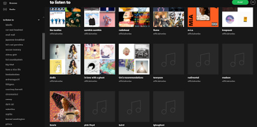
On Spotify I keep a folder of artists who I’m either interest in, inspired by, are important pieces of musical history, examples of current artists who are doing what they do incredibly successfully, or artists that I feel would be generally useful to experience. For each artist, I will create a playlist, and in each playlist, I will save that artist’s entire discography chronologically. I will then slowly work my way through each of the artist’s discographies, deleting what I’ve listened to and categorising songs that jump out to me either in terms of whether I love, like, or dislike them, the emotional qualities that I want to emulate in my own music, or the technical qualities that stand out as exemplary within each song. This allows me to simultaneously build a picture of what my musical tastes are, keep an accurate record of my listening history, and create song palettes for different emotional qualities that I wish to put into my own work.

(Above: the technical qualities of music that I have categorised. This forms up a reference library that I can use to further refine these qualities when I’m working on my own music)Here are the criteria I use to define each of these categories.
Idea: the concept behind a piece.
Narrative: the story told.
Lyrics: how ideas are expressed through words.
Mood: the emotionality of a piece.
Expression: how ideas are framed and delivered through the articulation of the music.
Musicality: the use of harmony, rhythm, and theory to communicate those ideas.
Rhythm: the measure, speed, flow, and cadence of a piece.
Timbre: the overall texture, tone, and sonic palette of a piece.
Structure: the flow of a piece over time.
Mix: how the timbre has been arranged as an ensemble.
Master: how the piece has been polished.
Delivery: the title, artwork, context, presentation, and moving image that contain the piece.

(Above: the emotional qualities of music that I have categorised as a reference library for how artists that I look up to achieve specific emotional qualities in their work).
These are decidedly more abstract and are generally more subject to the songs themselves that are being added.
For reference, here’s the current list of artists who’s work I want to study, all at various stages of listened to, completed, or not listened to at all:
- Labelle
- Car Seat Headrest
- Snail Mail
- Japanese Breakfast
- Let’s Eat Grandma
- Soccer Mommy
- LCD Soundsystem
- Big Thief
- Have a Nice Life
- Beebadoobee
- Animanaguchi
- 100gecs
- Courtney Barnett
- Chromonicci
- Owsey
- Dark Cat
- Valentine
- SOPHIE
- Kamasi Washington
- Prince
- Aurora
- Massive Attack
- Haywyre
- Maths Time Joy
- Counting Crows
- Jack Strauber
- Blossom Calderone
- Goldfrapp
- Janelle Monae
- Meteorologist
- Easyfun
- Saint Lewis
- Julian Gray
- Jade Cicada
- Blake Skowron
- 92Elm
- Maxime
- Stereo Cube
- Chuck Sutton
- Gemi
- Queen
- Laxcity
- Duumu
- Oh Wonder
- Galamatias
- Umru
- Underscores
- Brockhampton
- Fleece
- i Monster
- Deaton Chris Anthony
- Amy Winehouse
- The Beatles
- Sumthin Sumthin
- Radiohead
- Flume
- Knapsack
- Dodie
Here are the artists who’s discographies I have completed via this approach:
- Sidney Gish
- M.I.A
- In Love With a Ghost
- Bowie
- Pink Floyd
- Baird
- Rudimental
- Iglooghost
- Madeon
- Porter Robinson
- 100gecs
I use a similar system alongside this over on Pinterest for visual work in order to better inform my visual style and aesthetic sensibilities. Here is how I define my visual observation:
Interior & Exterior, the space of dwelling.
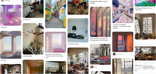
Colour, of which idiosyncrasy and primary colours are a main focus.

Tone, subtler than colour. An intangible quality communicated by shifting hues and gradiated layers.
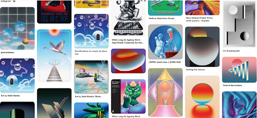
Mood, the way an image feels.

Looks, clothes, & apparel: personal artistic image and identity.

Desolation, a quality not currently present in my own work, but one that I often observe and love within other work, as well as in storytelling and other environments.
Layout, the way things are arranged in relation to one another within a space.
Idea, the concept behind a thing.
Texture, the tactile quality of visual elements.

Form, the shape and bounds of a thing.
Presentation, the context a thing is placed within.
Render, the quality imparted by computer generated imagery.
Type, how words are displayed.

Pattern, the use of repetition.

As you can see, how I define sound and visual art share a fairly common language between them.
Anyway, I divert. I’m going to select SOPHIE as the next discography to tear through and I am also going to continue working through the UE4 Beginner learning path, though before either of these I have some university paperwork/admin stuff to finish so I’d best crack on with that.
Toodles!
1 note
·
View note
Text
Painted Flaws - Colossus/Piotr Rasputin x villian!Reader
Part 1
A/N: i’m dead (in a good way) from writing this. Hope you enjoy from the bottom of my heart. A lot more to come! (this is also my first colossus smut uwu)
Word count: 4.8k
Warnings: smut, n s f w
Summary: You’re a villian with a moral grey area. You meet Piotr at an art exhibit, but both of you are there for completely different reasons. Though the attraction was inevitable, will it be enough? A growing passionate love wrought with secrecy, both of you try to move through this maze. But when the ball drops, what will you choose?
They all looked as pretentious as they were.
Prancing around, pretending to understand the art around them. As if they weren’t deliberately being conned by massive price inflation of seemingly valuable pieces. A bunch of rich snobs who could do better things with the money than hang it on their fucking wall in their private mansion and villas and– okay calm down. That’s not the priority here. You just have to look for the supplier, and make sure she gets the message.
You strode along the long hallways in your lace black long-sleeved, knee-length dress; complete with a cream clutch and pastel beige heels, and you undoubtedly got your fair share of stares from men and women alike. You didn’t look like the models on T.V., but you had your own allure that rendered you irresistible – much to your annoyance. On a normal day, you would prefer to dress a lot more like a hobo, just to keep yourself as much in the background as possible.
But on days like this, with these high-standing people, you had to put your best, charismatic-self out. And that means getting ogled at, but whatever.
You kept your eyes on every inch of the party, looking out for exit points and persons of interest. You had to judge every person you came into contact with, and for the most part they were all your standard issue snobs, with only a selective few who were genuinely interested in the art and artists. The other high-level celebrities were just there to hype up the party. It was a big event – but for you, it was important for an extremely different reason.
The supplier for today would make or break all future plans of The Hand, and it was pertinent for you to get the meeting set up with her.
After a few more moments of wandering, you spot a lady in a wheelchair, looking to be in her mid-40s with hair greying off at the edges; dressed in an elegant outfit of her own. Though she looked fragile, beneath that act lay an evil in its own right. The lady in question was your ‘’supplier’’, at least, that’s what you were told to call her ever since the beginning. You casually move towards her, but before you could make your presence known, two huge men in black suits, eyes covered by black visors, block your path. You stare them down, before showing them your business card – as if this wasn’t the thousandth time you’ve met with her. They inspect it and allow you past them, as you finally approach the lady.
‘’You look lovely, darling’’
You take her hand and kiss it, as is custom with her. ‘’I always look my best for the job. I can say the same about you.’’
She laughs heartily, ‘’Flattery will get you everywhere, love.’’ She motions for you to lean in, and you do.
‘’Tell me now, what is the important message I was supposed to receive?’’
‘’I’m sorry, I am not allowed to tell you here. But we have arranged for you to meet the Boss at midnight at a more private section of the gallery. If you wouldn’t mind, I could bring you to the room that we have arranged for you for the night. I’ve seen the place, and I can assure you that you will not be disappointed. May I bring you there personally?’’
‘‘Of course, darling. If that’s what you need to do.’’ She obliges.
You move to push her wheelchair, and before you do, you ask if she allows you to do so. She waves a hand granting permission. You slowly wheel her to the room, letting her take in the surrounding of the gallery and tell you about her long trip to New York, before allowing her to settle down in her private suite.
Once she was taken care of, you had the rest of the day, and you certainly did not want to spend it around these snobs. You walk along the string of the lesser coveted art pieces, bored out of your mind, when you hear a voice quip up from the end of the hallway. A large man was standing with a lady with short, styled hair by his side. They looked like they could siblings, from what you could tell.
They seemed very out of place in this gallery, though. He was a tall and brawny man, but he wasn’t dressed like a body guard, or a rich snobby collector – which raised some alarms.
Could he be a spy?
He’s wearing a navy-blue turtleneck with medium-khaki pants. He looked fashionable enough to seem like the artistic kind, but much too dressed down to be part of the target audience for this event. He was also at least 6 ft. tall, and you decided that those strong curves peeking out from under the sleeve fabric were definitely something worth investigating.
‘’Look NTW! This piece was made by one of the artists that inspired me when I first came to America. The use of colours is absolutely astound– ‘’ the man explains before he’s cut off.
The teenage girl next to him yawns. ‘’I’m sorry, Colossus. I’m just not an art person.’’
‘’Da. That is alright. You may go back to the mansion if this is not something you like. I just wanted for you to try something new, instead of being stuck inside all day.’’
‘’I think I’m going to go find Yukio, maybe she’ll be more interested in this than I am.’’ The girl pats him on the back and bids him farewell, walking past you to the exit.
You stride over towards the mysterious man, as he studies the details of the painting in front of him – even making sure to read the inscription on the plaques.
‘’I have never seen you around here before. Are you new?’’ You open. He jumps a little at your presence. He takes you in for a moment, his eyes wide. You smile and tilt your head at him, jolting him back to the conversation.
‘’Uh yes. I saw the sign outside about an art exhibit… and bought some tickets.’’ He responds in a thick accent – clearly Russian.
‘’You might have wandered too far from that particular art exhibit, my friend.’’ You point out. ‘’This one’s a little more of a… private event’’
‘’Oh, I am so sorry. I did not– ‘’
You laugh. ‘’Hey, it’s alright. If I’m being honest, out of everyone here, I think you probably deserve to be here the most. The rest of them… just look for prestige. Reputation is what matters to them, no matter how good the work might be. They might pretend to admire the work, but it’s all a game of who knows who.’’ You lament. He looks at you intently, curious about your thoughts of the art world.
You laugh again. ‘’I’m so sorry! It’s only been seconds since we’ve met and I’m already venting. Tell ya what, handsome. Since you had to listen to me be all negative about something you love, I’ll put your name on the guestlist, and you can spend the rest of the day admiring the artwork how it’s intended to be. The showcase ends tomorrow at 2am, so you can take your time and come back tomorrow as well.’’
‘’Oh no, I didn’t mind listening to you… I also think there are some things worth fixing in the community. But that is… very kind of you to put me on the guestlist. May I know your name?’’
‘’Y/N. Y/N Y/L/N. And yours?’’
‘’Piotr. Piotr Rasputin.’’ He puts out a hand to you. You go for a handshake, and revel at how big his hands were.
‘’Nice to meet you, Piotr. Well, I have some time on my hands. Maybe I could show you around? I would love to hear your perspective on certain works as well. Would that be alright with you?’’
‘’To have a beautiful lady offer to escort me around this wonderful gallery, I would be a foolish man to say no.’’ He remarks. You giggle as you loop an arm around his.
You spend the rest of the day sticking close to him. You talk to him about art, all its intricacies and your general disdain for the insincere – before enquiring more about himself. Piotr tells you about how different things are here and talks about his time as a farm boy and how he’s always been interested in painting and drawing. The time passes far too quickly for either of your liking – before a tall, brawny man in an expensive-looking suit approaches you, with urgency in his steps. Piotr tenses, and moves to stand between you and the man, but you hold him back gently with a hand to his shoulder.
‘’It’s alright, Piotr. This is an associate of mine.’’ You tell him, turning to the tall man. ‘’Do you have any updates for me?’’ You ask, your face stoic and devoid of all the emotion that you freely showed when you were with Piotr, who watches your change in demeanor with intrigue.
The man moves close to your ear and whispers something, before a look of disappointment crosses your face.
‘’I’m so sorry, Piotr. I’m going to have to cut our private tour short. But you are welcome to enjoy yourself for the rest of your evening. It was a pleasure talking to you.’’ You say before shifting to make your way to the problem.
‘’Wait!’’ A hand reaches out to grasp you, stopping you in your tracks. ‘’I apologise if I was too rough, but… will I see you again?’’
You give him a sad smile. ‘’Maybe.’’ You could tell he was crestfallen – as he let go of your hand – at your response. But you had no time to be thinking about prospective relationships at the moment, especially not when your job was on the line. He was sweet. And amazing company. But it wouldn’t be worth your time if you weren’t going to pursue him in the long run. He probably deserves better anyway.
After making a few calls, it turned out that the problem was that your Boss was caught up with a different matter, and because of that the meeting was postponed to midnight the next day; which only meant there was a whole day for you to focus on other areas of work. In the meantime, you ran some errands outside the gallery and returned the next day to make sure everything was going smoothly.
It had been a long day of checks and monitoring around the gallery, but your mind kept wandering to the man you met yesterday. Was he here today? You check your watch. It was already 11:50pm. You push your thoughts of the man away, and make your way to the meeting venue to ensure last minute checks.
As you walk down the long hallway, you spot a familiar figure – it was Piotr – studying the same artwork that he did the day before. From the back, you could tell he was dressed up for the venue this time around.
You wanted to approach him, but decided that would only serve to distract you. You got your priorities straight before making your way to the meeting.
Everything went according to plan, and you finally exit the room an hour later and out into the main room. You look around, your eyes searching for the familiar build of the man whose face shows up whenever you had the time to daydream. His piercing blue eyes, crinkling as he laughs heartily at a joke you made, or wide-eyed at your explanations of how certain industries work.
You realized that unlike all the other sleazebags you were exposed to, he never once touched you without permission or tried to cop a feel, but would always apologise if he felt he was pushing it.
But, alas, he was no where to be found. You escort the remaining visitors out of the gallery as a security guard comes up to you.
‘’Thank you for the assistance, I think there is one more person who is still around the ‘Hues’ exhibition. He said he was waiting for someone so I left him alone. Not sure if he’s still around though.’’
‘’I’ll handle it. You go ahead and take off’’ You smile at the guard. He gives you a nod before wandering off.
Your heart quickened at the words of the guard, and your feet took off toward that particular exhibit.
Please be there. Please be there.
The words ring through your head – you felt as if life was giving you another chance. Your heels clink furiously on the floor, in sync with the thumping of your heart through your chest, as you gained ground towards the exhibit. Everything felt so terribly loud, and you felt like he was going to slip through your hands if you didn’t catch up to him on time – and thinking about it made your heart pump faster still.
You look at your watch – 1:12AM. There was no way he was still here. You stop abruptly at the doorway to the Hues exhibit, and your hopes start to fall. You try to regain your composure, when you look up in front of you.
And there he was, in the dimly lit section of the gallery, taking in the sight of one of your most favourite pieces. A deep relief washes over you, as you let out all your tension in a sigh.
He looks at the painting for a long time, eyes wide in awe, before leaning down closer – hands in his pockets – to read the inscription.
The piece is one with a black background that slowly fades into lighter hues of grey then white, littered with smaller strokes of all the possible colours, but only in one of shade of each. The strokes form a spiral through to the medium grey in the middle – which ends off with a short vertical line of gold, and a horizontal line of silver – both of the same length – all of which came together to make it look like a telescope. It was a masterpiece in its own right – and you personally knew the artist behind the work.
‘’That’s a one-of-a-kind piece.’’ You say as you gracefully make your way into the smaller section of the gallery – meant for the best of the best works – as the sound of your stilettos against the marble flooring echoed through the room, catching Piotr’s attention; his head swivels around to catch your gaze, as you come to a stop next to him.
‘’It is… most beautiful.’’ He says, looking at you. You turn your head to him and smile.
‘’It’s nice to see you again, Piotr. What brings you here at 1am in the morning? And dressed to the nines, might I add. You look even better than you did yesterday.’’ You remark, as he gives you a shy smile in return – the blush on his cheeks stark against skin. You can’t help but want to eat him up. But before he responds, an ideas pops into your head.
‘’C’mon, I want to show you something,’’ you grab his wrist and tug him along behind you. You guide him up the steps behind the curtains at the very end of the room that has a ‘’restricted access’’ sign prominently hung on it.
‘’Are you sure we are allowed back here?’’ Piotr whispers to you, lowering himself to make sure that you could hear him. You laugh in response, but continue tugging him deeper into the studio.
Once you arrive at your destination, you walk over to the far wall and flip a heavy switch with a loud chunk. Lights buzz open to reveal an art studio with high ceilings and exquisite furnishing – fit for only, one could imagine, the ‘’royals’’ of the art world.
Beyond the small lounging area, there is a huge floor-to-ceiling length window which overlooks onto the front entrance of the art gallery, placed adjacent to a small area with tall shelves that also reached the ceiling. They held every colour you could ever imagine. Further into the room there were smaller windows, all made to adjustable to ensure that the lighting was always constant in the room. These windows faced the canvases and easels that were in the room – which were placed in a circular arrangement facing away from each other.
‘’This all looks so… fancy. And professional. Does this studio belong to you?’’ Piotr asks, awe-struck as he runs his hand along all the cases containing all the different paint colours.
‘’No. I’m not an artist, but I remember you told me yesterday that you were. This belongs to the painter of the piece you were looking at from before. And this– ‘’ you wave an arm as if to present the room to him– ‘’is where all the magic happens.’’ You say proudly, perched on the edge of the sofa. You look up to see Piotr, who’s now walking towards you. He looks like he has something to ask you. You tilt your head – your heart beat picks up again – and you straighten up to show that you’re listening. ‘’Got something on your mind, Piotr?’’
He gets close to you, and all of a sudden, his face is against yours, noses brushing past, as you melt under him – his lips eagerly meeting yours. You stand up to deepen the kiss, as his hand holds one side of your face.
He pulls away abruptly, but still looking at you with hooded eyes – the intensity of his gaze absolutely driving you wild.
‘’I am sorry to be so forward. But I… I could not stop thinking about you.’’ He breathes heavy.
‘’Me neither.’’
You let your palms run over his chest before tugging at his black tie, pulling him back into a kiss.
A few moments pass and you push him back, breaking the kiss abruptly. You stare at him, your eyes needy, as you walk towards him. You push him a little more and he relents, until his back is against the wall.
You push against him, your lips meeting his with an insatiable hunger – the warmth of your lips follow, inching down to his neck as his face lifts up to allow your presence; sucking and nibbling, leaving loving bruises in your wake. You unbutton his shirt, one by one – untucking it from his pants – leaving his bare chest exposed. You lift your face back up to kiss him. He pulls your face closer to deepen the kiss still; your tongues, impatient, gently get a taste of each other.
Your hands wander over every perfect line of his physique as you kiss – yearning to feel every part of him against you – as they finally loop around his neck to bring your body closer to his. He lowers his hands to your waist, holding you close, before slowly letting them trail down – grazing over your ass and gently caressing it. The sudden action causing you to moan against him.
Your hand moves down to his crotch – feeling up his stiff member through the fabric. You hear a sharp inhale from him, as you rub your palm up and down against his hard on. A shaky breath escapes him.
You gently push yourself away, and shift to get down on your knees – before Piotr’s hands hold up your shoulders, stopping you from moving down.
‘’I… would prefer to take you out to dinner first…’’ He says, somewhat sheepishly. You smirk at him. What a sweetheart.
You lean in close to him. ‘’Tell ya what big guy,’’ you say slowly, painstakingly trail a finger down his chest, ‘’we can do dinner after this. How’s that sound?’’ You whisper slowly into his ear. If he wasn’t on edge before, he sure as hell was now.
He puts his hands back down to his side, as you move to your intended position. You unzip his pants, his length springing up as you tease his cock; pumping it from base to tip, as you bring it out in all its glory.
Suddenly, the lights go out, engulfing the room with a dull blue glow, courtesy of the windows. Piotr jumps a little at that and looks up around him – clearly tense.
‘’Hey, don’t worry. They’re automatic lights with sensors.’’ You reassured him. ‘’Besides, we’re not gonna need so much light now, are we?’’
You get to work, holding his cock in your hand, and licking up its length. Once at his tip, you let your saliva pool in your mouth, before bringing his dick close – getting it nice and fully wet with your tongue, your saliva covering every inch of him. You tease his head, swirling over it with your tongue before using the pad of your thumb to swipe over his slit. ‘’Bozhe moi…’’ Piotr hisses in response, which tells you everything you need to know.
You open your mouth wide, and slowly take him in. You were only halfway down his shaft before he hit the back of your mouth. You slowly retract before going in again. And again. And again. Piotr’s breathing hard and raspy, peppered with stifled moans as your mouth moves up and down – your hand trailing behind, as your grip tightens and untightens – stimulating him to no end.
He brings a hand to your head, following your pace, then urging you forward into a quicker rhythm. You wanted to take all of him in, and knew that he wanted that too. You gaped wider to allow more of his length into you. He let out an exasperated breath in response, his head up; eyes closed, facing heavenward in a silent prayer.
His cock was now past the back, and inside your throat. You knew how to keep a gag reflex down, and it was especially helpful in this situation.
You quickened your rhythm, moving up and down his length with ease – releasing him from your mouth at one instance with a loud ‘pop’ and giving him a few strokes with your hand – before going right back into it. You pressed your tongue against his cock at each move. He hisses at the sensations, following them immediately with moans, before suddenly pushing his dick into you in a swift motion – as you take him in deep – but he quickly pulls out. You hold onto his cock with a hand, and let his release pump into your mouth, tongue out and flared to get every drop of him. You lick his head of residual cum – and once it’s over – he moves to get his composure in check, and is dressed up in seconds.
You lick your lips and swallow, before you give Piotr a satisfied smile.
All of a sudden, he kneels before you, both of you now at eye-level. You look at him quizzically.
‘’It is not in my nature to let myself be pleasured and not return the favour. Please. Allow me.’’ He asks, a different kind of need in his voice. Your lips curve into a smile.
‘’If you insist.’’
He sits down with his back against the wall, and pulls you onto his lap, letting your head rest against his shoulder. He hitches up your dress, before running his finger down the fabric of your panties. He places a hand under you as he gently pries your legs open, slowly running it up and down your inner thigh in the process. Your face scrunches up as you feel the growing arousal in your core. He brings his lips next to your ear, a string of Russian escaping him in a heavy breath.
‘’I don’t know what you’re saying, but keep saying it.’’ You whine as he starts putting pressure all around your sensitive spots – two fingers moving up and down over your entrance.
‘’I said… Just relax for me, I will take care of you.’’ He quickens his motions, before placing his finger directly over your clit. He presses down, and a deep moan emerges from you against his ear. He continues, circling over it – pressing down every time he hits full circle. You try your best to contain your pleasure, but with no such luck. Your grasp at his free arm to ease off the pressure and put a hand over your mouth to stifle your moans.
He realises he’s found your most pleasurable spot, focusing entirely on the bundle of nerves that’s driving you insane – with each movement of his finger eliciting moans of alternating pitch. You bite your lip before your head tilts back abruptly, mouth open wide, threatening to release a much-too-loud indication of pleasure. Piotr quickly brings a hand over your mouth, as you moan into it, dampening the sounds of utter pleasure coming out from your mouth. He slows down his actions, but doesn’t let up. He moves his finger closer to your core, shifting your panties aside to gain access, before pushing in slowly.
One… two fingers in, as he pulses into your pussy – which had been aching for this very moment. You were already wet all over. Panties soaked, but he’s still at it.
A little bit of you flows down your thighs, and onto the fabric of his pants. But he didn’t seem to mind. He pushes deeper into you before adding one more finger – now three – while using his other hand to stimulate your clit, edging you into climax. You use your hand to shield your mouth – you knew you were close, and didn’t want a repeat of what happened before. ‘’Piotr…’’ you whine, ‘’I’m so close, baby. Take me home.’’
‘’kak pozhelayete.’’ (As you wish) he breathes into your ear.
He picks up speed, drawing circles onto your clit with just the right amount of pressure that makes you squirm on his lap – his fingers still moving in and out inside you. You twist your upper body to face him and draw him into a deep, fiery kiss, just as the orgasm found you.
The sweet sensation of release flows down your core, as you throw your head back onto Piotr’s shoulder, holding on tightly to his arm as the climax takes over you. He holds you still with a hand around your waist, as your body trembles through the sensation, and removes his fingers from inside you.
Heavy pants fall from your mouth, as you turn around to face him, straddling over his lap.
‘’That was… I’m sorry if it was…‘’ He begins.
You interrupt him with a kiss, softly placing a hand on his cheek, hooking the other arm over his neck – keeping him close. He instinctively brings his hands up to your waist.
‘’Don’t be sorry, babe. I enjoyed it… enjoyed you.’’ You say as you pull away from the kiss.
You gaze into each other, as time stood still around you, with only the dancing lights from the headlights of cars and streetlamps from outside world to illuminate the moment in its familiar dull blue glow.
For the first time, you notice just how serene his blue eyes look – and the dim lighting did nothing to impede their beauty. What was more bewitching was the person they belonged to – you could feel the warmth that this man exuded, and it made you feel magnetised to him; like you didn’t want this moment to end. This was bad. You weren’t meant to have anyone for the long term – one night, one timers were more suited to your lifestyle, but you didn’t know if you wanted to let go of a man like him.
‘’When can I see you again?’’
His deep, raspy voice breaks the train of your thoughts, and now you’re here again in this moment.
‘’Oh, um… yeah I…’’ You preemptively look at your watch. ‘’Let’s get you out of here first.’’
You walk him back to the entrance of the art gallery. Debating whether it would be worth the trouble to move forward with him. You think about your Boss, and a deep hatred is lit within you.
Piotr’s eyes linger over you, as you both make your way out onto the driveway. It was a cold night, and just as you bring your hands up to brace yourself from the cold, Piotr immediately put his jacket – (when did he take it off?) – over you. With that one action, you had your mind made up for you.
You smile tenderly at him. ‘’Piotr?’’
‘’Yes?’’ All his attention was on you at this moment. A rush of adrenaline pushes through him as he awaits your next words.
‘’I’m free next weekend. Is that alright? I’ll give you my phone number, and we can work out the details later.’’
‘’That sounds perfect, Y/N.’’
Just as he responds, you hear the sound of gravel popping, followed by a pulling screech, as a cab arrives at the driveway. He holds your gaze for a moment, moving to open the door. You pull him back and give him a kiss on the cheek, before walking briskly away from the driveway; leaving Piotr to watch as your figure disappears back into the gallery.
#Colossus x reader#piotr rasputin x reader#marvel fanfiction#x men fanfiction#colossus#piotr rasputin
162 notes
·
View notes
Text
Kokology Test - Self Analysis
Take a Kokology test to connect with your inner self and delve into the deepest depths of your psyche.
Gaining self-knowledge is central to your spiritual journey.
Knowing how your subconscious mind processes information allows you to see the filters that exist within your mind and how they affect your thought and behavior patterns.
You might have taken online personality tests and quizzes before and been disappointed with the results.
If you have, I recommend trying a Kokology test and seeing the results for yourself.
You will be pleasantly surprised!
What Is Kokology?
Kokology is the study of Kokoro, which is Japanese for “mind” or “spirit”.
The idea is this:
By using guided daydreaming and meditation you can expose your inner thinking to your conscious mind, and in so doing reveal the condition of your psyche.
They are intended for two people to test together, with one person serving as the narrator/interpreter and the other being the one who is taking the test.
However, you can also test on your own.
The most famous test – and one that is perfect for beginners – is the Kokology Cube Test.
Kokology Cube Test
The Kokology Cube Test asks you to draw a scene step-by-step.
The drawing you render by the end of the exercise will reveal the status of your inner mind.
Are you ready to delve into your psyche? Get your pen and paper ready draw what you see as you follow the steps below:
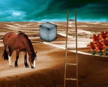
Step 1: A Cube In The Desert
Imagine you are in a desert. You are alone, and there is nothing around you – except for sand, sun, and a single cube.
Focus on the cube. Think about the position of it, its size, and if it is moving. Ask yourself what it is the cube made of.
Step 2: A Ladder Appears
Now imagine there is a ladder in the scene. Switch your focus to it.
Think about the position of the ladder, where it lies and how it does so.
Also think about the age of it and what it is made of, as well as how long it has been exposed to the elements.
Step 3: The Horse
Now you see a horse. Place it in the scene.
Think about the movement of the horse, its mood and demeanour.
Is it an old stallion or a young mare? Long or short mane?
What colour is it?
Step 4: A Flowering
Now you notice some flowers springing up into the scene.
Where are they in relation to the other objects? How many flowers are there, and what type?
Are they healthy and growing, or wilting and dying? Packed close together, or spaced out?
Step 5: And The Heavens Open
Finally, you see a storm. Move your focus to it.
Is the storm far away or has it already arrived? Is it closing in or moving away?
Think about the severity of it, how dark the clouds are, and if thunder and lightning are rumbling within.
Kokology Cube Test Interpretation
Interpreting your Kokology Cube Test drawing is a job that is best undertaken with a friend, but it’s also okay to do it on your own as long as you are honest with yourself during it.
Cube
Look at the cube. It represents your ego.
If it is large then it represents a confident person with a strong, healthy ego – though too large and it could suggest arrogance or self-importance.
If it is partially buried, then you are a planner by nature, preferring to work out a plan of action before taking it.
However, if it is laid on top of the sand or floating above it, then you have a more dynamic, adaptable approach.
If it is moving, then you are a lateral thinker.
Ladder
Now the ladder. It represents your friends.
If the ladder is leaning on the cube, then you have a powerful connection with your friends, and you like to rely on them for support.
If it is not, then you prefer independence and don’t want to rely on anyone else.
If the ladder is above the cube, then you look up to your friends. Below and your friends see you as an authority figure.
If they are at the same height then you are on equal footing.
If the ladder is long, then you like to have a large circle of friends.
If it is short, then you prefer a closer relationship with a smaller group of friends.
Horse
The horse represents your ideal partner.
A muscular workhorse represents someone hard-working and reliable, whereas a prettier horse represents someone who takes care of their appearance.
The distance between the horse and the cube represents how close you are to meeting your ideal partner.
If the horse is partially hidden behind it, then your perfect partner is already in your life.
Flowers
The flowers represent your children.
A large number of flowers means that you would like lots of children. If they are sparse, then you might only want one or none at all.
If they are close to the cube, then you value your relationship with your children very much.
Further away and they are not the central part of your life.
Storm
The thunderstorm represents the fears in your life.
If the storm is in the distance, then you are not worrying much at all. If it is closer and approaching, then anxiety is close to you right now.
If it is directly overhead, then you are being overwhelmed by your fears and anxieties.
If there is a lot of thunder and lightning, then you are facing a fear that you feel unprepared to face, whereas if it is quieter then you are ready to face this conflict.
Much love to all... go in peace my beautiful friends ❤❤❤
6 notes
·
View notes
Text
Conversation with David Panos about The Searchers
The Searchers by David Panos is at Hollybush Gardens, 1-2 Warner Yard London EC1R 5EY, 12 January – 9 February 2019

There is something chattering. Alongside a triptych a small screen displays the rhythmic loop of hands typing, contorting, touching, holding. A movement in which the artifice strains between shuddering and juddering. Machinic GIFs seem to frame an event which may or may not have taken place. Their motions appear to combine an endless neurotic repetition and a totally adrenal pumped and pumping tension, anticipating confrontation.
JBR: How do the heavily stylised triptych of screens in ‘The Searchers’ relate to the GIF-like loops created out of conventionally-shot street footage?
DP: I think of the three screens as something like the ‘unconscious’ of these nervous gestures. I’m interested in how video compositing can conjure up impossible or interior spaces, perhaps in a way similar to painting. Perhaps these semi-abstract images can somehow evoke how bodies are shot through with subterranean currents—the strange world of exchange and desire that lies under the surface of reality or physical experience. Of course abstractions don't really ‘inhabit’ bodies and you can’t depict metaphysics, but Paul Klee had this idea about an aesthetic ‘interworld’, that painting could somehow reveal invisible aspects of reality through poetic distortion. Digital video and especially 3D graphics tend to be the opposite of painting—highly regimented and sat within a very preset Euclidean space. I guess I’ve been trying to wrestle with how these programs can be misused to produce interesting images—how images of figures can be abstracted by them but retain some of their twitchy aliveness.
JBR: This raises a question about the difference between the control of your media and the situation of total control in contemporary cinematic image making.
DP: Under the new regimes of video making, the software often feels like it controls you. Early analogue video art was a sensuous space of flows and currents, and artists like the Vasulkas were able to build their own video cameras and mixers to allow them to create whole new images—in effect new ways of seeing. Today that kind of utopian or avant-garde idea that video can make surprising new orders of images is dead—it’s almost impossible for artists to open up a complex program like Cinema 4D and make it do something else. Those softwares were produced through huge capital investment funding hundreds of developers. But I’m still interested in engaging with digital and 3D video, trying to wrestle with it to try and get it to do something interesting—I guess because the way that it pictures the world says something about the world at the moment—and somehow it feels that one needs to work in relation to the heightened state of commodification and abstraction these programs represent. So I try and misuse the software or do things by hand as much as possible, and rather than programming and rendering I manipulate things in real time.
JBR: So in some way the collective and divided labour that goes into producing the latest cinematic commodities also has a doubled effect: firstly technique is revealed as the opposite of some kind of freedom, and at the same time this has an effect both on how the cinematic object is treated and how it appears. To be represented objects have to be surrounded by the new 3D capture technology, and at the same time it laminates the images in a reflected glossiness that bespeaks both the technology and the disappearance of the labour that has gone into creating it.
DP: I’m definitely interested in the images produced by the newest image technologies—especially as they go beyond lens-based capture. One of the screens in the triptych uses volumetric capturing— basically 3D scanning for moving image. The ‘camera’ perspective we experience as the viewer is non-existent, and as we travel into these virtual, impossible perspectives it creates the effect of these hollowed out, corroded bodies. This connects to a recurring motif of ‘hollowing out’ that appears in the video and sculpture I’ve been making recently. And I have a recurring obsession with the hollowing out of reality caused by the new regime of commodities whose production has become cut to the bone, so emptied of their material integrity that they’re almost just symbols of themselves. So in my show ‘The Dark Pool’ (Hollybush Gardens, 2014) I made sculptural assemblages with Ikea tables and shelves, which when you cut them open are hollow and papery. Or in ‘Time Crystals’ (Pumphouse Gallery, 2017) I worked with clothes made in the image of the past from Primark and H&M that are so low-grade that they can barely stand washing. We are increasingly surrounded by objects, all of which have—through contemporary processes of hyper-rationalisation and production—been slowly emptied of material quality. Yet they have the resemblance of luxury or historical goods. This is a real kind of spectral reality we inhabit.
I wonder to myself about how the unconscious might haunt us in these days when commodities have become hollow. Might it be like Benjamin’s notion of the optical unconscious, in which through the photographic still the everyday is brought into a new focus, not in order to see what is behind the veil of semblance, but to see—and reclaim for art—the veiling in a newly-won clarity.
DP: Yes, I see these new technologies as similar, but am interested in how they don't just change impact perception but also movement. The veiled moving figures in ‘The Searchers' are a strange byproduct of digital video compositing. I was looking to produce highly abstract linear depictions of bodies reduced to fleshy lines, similar to those in the show and I discovered that the best way to create these abstract images was to cover the face and hands of performers when you film them to hide the obvious silhouettes of hands and faces. But asking performers to do this inadvertently produced a very peculiar movement—the strange veiled choreography that you see in the show. I found this footage of the covered performers (which was supposed to be a stepping stone to a more digitally mediated image, and never actually seen) really suggestive— the dancers seem to be seeking out different temporary forms and they have a curious classical or religious quality or sometimes evoke a contemporary state of emergency. Or they just look like absurd ghosts.
JBR: In the last hundred years, when people have talked about ghosts the one thing they don’t want to think about is how children consider ghosts, as figures covered in a white sheet, in a stupid tangible way. Ghosts—as traumatic memories—have become more serious and less playful. Ghosts mean dwelling on the unfinished business of the past, or apprehending some shard of history left unredeemed that now revisits us. Not only has no one been allowed to be a child with regard to ghosts, but also ghosts are not for materialists either. All the white sheets are banished. One of the things about Marx when he talks about phantoms—or at least phantasmagorias—is much closer to thinking about, well, pieces of linen and how you clothe someone, and what happens with a coat worked up out of once living, now dead labour that seems more animate than the human who wears it.
DP: Yes, I’ve been very interested in Marx’s phantasmagorias. I reprinted Keston Sutherland’s brilliant essay on how Marx uses the term ‘Gallerte’ or ‘gelatine’ to describe abstract labour for a recent show. Sutherland highlights a vitalism in Marx’s metaphysics that I’m very drawn to. For the last few years I’ve been working primarily with dancers and physical performers and trying to somehow make work about the weird fleshy world of objects and how they’re shot through with frozen labour. I love how he describes the ‘wooden brain’ of the table as commodity and how he describes it ‘dancing’—I always wanted to make an animatronic dancing table.
JBR: There is also a sort of joyfulness about that. The phantasmagoria isn’t just scary but childish. Of course you are haunted by commodities, of course they are terrifying, of course they are worked up out of the suffering and collective labour of a billion bodies working both in concert and yet alienated from each other. People’s worked up death is made into value, and they all have unfinished business. But commodities are also funny and they bumble around; you find them in your house and play with them.
DP: Well my last body of work was all about dancing and how fashion commodities are bound up with joy and memory, but this show has come out much bleaker. It’s about how bodies are searching out something else in a time of crisis. It’s ended up reflecting a sense of lack and longing and general feeling of anxiety in the air. That said I am always drawn to images that are quite bright, colourful and ‘pop’ and maybe a bit banal—everyday moments of dead time and secret gestures.
JBR: Yes, but they are not so banal. In dealing with tangible everyday things we are close to time and motion studies, but not just in terms of the stupid questions they ask of how people work efficiently. Rather this raises questions of what sort of material should be used so that something slips or doesn’t slip—or how things move with each other or against each other—what we end up doing with our bodies or what we end up putting on our bodies. Your view into this is very sympathetic: much art dealing in cut-up bodies appears more violent, whereas the ruins of your abstractions in the stylised triptych seem almost caring.
DP: Well I’m glad you say that. Although this show is quite dark I also have a bit of a problem with a strain of nihilist melancholy that pervades a lot of art at the moment. It gives off a sense of being subsumed by capitalism and modern technology and seeing no way out. I hope my work always has a certain tension or energy that points to another possible world. But I’m not interested in making academic statements with the work about theory or politics. I want it to gesture in a much more intuitive, rhythmic, formal way like music. I had always made music and a few years back started to realise that I needed to make video with the same sense of formal freedom. The big change in my practice was to move from making images using cinematic language to working with simultaneous registers of images on multiple screens that produce rhythmic or affective structures and can propose without text or language.
JBR: The presentation of these works relies on an intervention into the time of the video. If there is a haunting here its power appears in the doubled domain of repetition, which points both backwards towards a past that must be compulsively revisited, and forwards in convulsive anticipatory energy. The presentation of the show troubles cinematic time, in which not only is linear time replaced by cycles, but also new types of simultaneity within the cinematic reality can be established between loops of different velocities.
DP: Film theorists talk about the way ‘post-cinematic’ contemporary blockbusters are made from images knitted together out of a mixture of live action, green-screen work, and 3D animation. I’ve been thinking how my recent work tries to explode that—keep each element separate but simultaneous. So I use ‘live’ images, green-screened compositing and CGI across a show but never brought together into a naturalised image—sort of like a Brechtian approach to post-cinema. The show is somehow an exploded frame of a contemporary film with each layer somehow indicating different levels of lived abstractions, each abstraction peeling back the surface further.
JBR: This raises crucial questions of order, and the notion that abstraction is something that ‘comes after’ reality, or is applied to reality, rather than being primary to its production.
DP: Yes good point. I think that’s why I’m interested in multiple screens visible simultaneously. The linear time of conventional editing is always about unveiling whereas in the show everything is available at the same time on the same level to some extent. This kind of multi-screen, multi-layered approach to me is an attempt at contemporary ‘realism’ in our times of high abstraction. That said it’s strange to me that so many artworks and games using CGI these days end up echoing a kind of ‘naturalist’ realist pictorialism from the early 19th Century—because that’s what is given in the software engines and in the gaming-post-cinema complex they’re trying to reference. Everything is perfectly in perspective and figures and landscapes are designed to be at least pseudo ‘realistic’. I guess that’s why you hear people talking about the digital sublime or see art that explores the Romanticism of these ‘gaming’ images.
JBR: But the effort to make a naturalistic picture is—as it was in the 19th century—already not the same as realism. Realism should never just mean realistic representation, but instead the incursion of reality into the work. For the realists of the mid-19th century that meant a preoccupation with motivations and material forces. But today it is even more clear that any type of naturalism in the work can only serve to mask similar preoccupations, allowing work to screen itself off from reality.
DP: In terms of an anti-naturalism I’m also interested in the pictorial space of medieval painting that breaks the laws of perspective or post-war painting that hovered between figuration and abstraction. I recently returned to Francis Bacon who I was the first artist I was into when I was a teenage goth and who I’d written off as an adolescent obsession. But revisiting Bacon I realised that my work is highly influenced by him, and reflects the same desire to capture human energy in a concentrated, abstracted way. I want to use ‘cold’ digital abstraction to create a heightened sense of the physical but not in the same way as motion capture which always seems to smooth off and denature movement. So the graph-like image in the centre of the triptych (Les Fantômes) in this show twitches with the physicality of a human body in a very subtle but palpable way. It looks like CGI but isn’t and has this concentrated human life force rippling through it.
If in this space and time of loops of the exploded unstill still, we find ourselves again stuck in this shuddering and juddering, I can’t help but ask what its gesture really is. How does the past it holds gesture towards the future? And what does this mean for our reality and interventions into it.
JBR: The green-screen video is very cold. The ruined 3D version is very tender.
DP: That's funny you say that. People always associate ‘dirty’ or ‘poor’ images with warmth and find my green-screen images very cold. But in the green-screened video these bodies are performing a very tender dance—searching out each other, trying to connect, but also trying to become objects, or having to constantly reconfigure themselves and never settling.
JBR: And yet with this you have a certain conceit built into the drapes you use: one that is in a totally reflective drape, and one in a drape that is slightly too close to the colour of the greenscreen background. Even within these thin props there seems to be something like a psychological description or diagnosis. And as much as there is an attempt to conjoin two bodies in a mutual darkness, each seems thrown back by its own especially modern stigma. The two figures seem to portray the incompatibility of the two poles established by veiled forms of the world of commodities: one is hidden by a veil that only reflects back to the viewer, disappearing behind what can only be the viewer’s own narcissism and their gratification in themselves, which they have mistaken for interest in an object or a person, while the other clumsily shows itself at the very moment that it might want to seem camouflaged against a background that is already designed to disappear. It forces you to recognise the object or person that seems to want to become inconspicuous. And stashed in that incompatibility of how we find ourselves cloaked or clothed is a certain unhappiness. This is not a happy show. Or at least it is a gesturally unsettled and unsettling one.
DP: I was consciously thinking of the theories of gesture that emerged during the crisis years of the early 20th century. The impact of the economic and political on bodies. And I wanted the work to reflect this sense of crisis. But a lot of the melancholy in the show is personal. It's been a hard year. But to be honest I’m not that aligned to those who feel that the current moment is the worst of all possible times. There’s a left/liberal hysteria about the current moment (perhaps the same hysteria that is fuelling the rise of right-wing populist ideas) that somehow nothing could be worse than now, that everything is simply terrible. But I feel that this moment is a moment of contestation, which is tough but at least means having arguments about the way the world should be, which seems better than the strange technocratic slumber of the past 25 years. Austerity has been horrifying and I realise that I’ve been relatively shielded from its effects, but the sight of the post-political elites being ejected from the stage of history is hopeful to me, and people seem to forget that the feeling of the rise of the right has been also met with a much broader audience for the left or more left-wing ideas than have been previously allowed to impact public discussion. That said, I do think we’re experiencing the dog-end of a long-term economic decline and this sense of emptying out is producing phantasms and horrors and creating a sense of palpable dread. I started to feel that the images I was making for ‘The Searchers’ engaged with this.
David Panos (b. 1971 in Athens, Greece) lives and works in London, UK. A selection of solo and group exhibitions include Pumphouse Gallery, Wandsworth, London, 2017 (solo); Sculpture on Screen. The Very Impress of the Object, Gulbenkian Museum, Lisbon, Portugal [Kirschner & Panos], 2017; Nemocentric, Charim Galerie, Vienna, 2016; Atlas [De Las Ruinas] De Europa, Centro Centro, Madrid, 2016; The Dark Pool, Albert Baronian, Brussels, (solo), 2015; The Dark Pool, Galeria Marta Cervera, Madrid, 2015; Whose Subject Am I?, Kunstverein Fur Die Rheinlande Und Westfalen, Düsseldorf, 2015; The Dark Pool, Hollybush Gardens, London, (solo), 2014; A Machine Needs Instructions as a Garden Needs Discipline, MARCO Vigo, 2014; Ultimate Substance, B3 Biennale des bewegten Blides, Nassauischer Kunstverein, Wiesbaden, (Kirschner & Panos solo), 2013; Ultimate Substance, CentrePasquArt, Biel, (Kirschner & Panos solo), 2013; Ultimate Substance, Extra City, Antwerp, (Kirschner & Panos solo), 2013; The Magic of the State, Lisson Gallery, London, 2013; HELL AS, Palais de Tokyo, Paris, 2013.
3 notes
·
View notes
Text
How my astronomy data from the Lovell telescope was used to create an immersive light and sound show
by Rene Breton

Translating the signals. Chirs Foster, Author provided
As a scientist, I was recently involved in bringing my work to the big screen. This was not a Hollywood sci-fi blockbuster but “big screen” in the literal sense: an art production about science that used the Lovell radio telescope, a 3,200-ton steel behemoth supporting of a 76-metre wide dish, to generate and show audio-visual art that drew on scientific data.
I have been involved with numerous public engagement opportunities over the years: giving public lectures, visiting students in schools, interacting on social media, being interviewed about new discoveries. There is however another form of public engagement that I have come to experience in the past year, which I would probably never have considered if not for the fact that it came knocking at my door: connecting with an artist developing a piece inspired by the scientific work that my colleagues and I do.
This is quite a contrast for astronomers working at the Jodrell Bank Observatory, given that a lot of our focus is normally devoted to activities such as connecting our telescope to various networks of radio dishes in order to produce ultra-sharp images of the sky or monitoring the clockwork rotation of rapidly spinning, ultra-dense exploded stellar leftovers known as pulsars. In a way though, it is perhaps not unexpected that sooner or later someone would draw inspiration from the rich history of astronomical breakthroughs accomplished using the telescope.
It pretty much started with an email – the modern door knock – from my colleague Tim O'Brien asking if I would discuss my research with an artist who had been commissioned to create an art experience which would be projected onto the Lovell radio telescope as part of the bluedot festival at the observatory. My immediate answer was yes; who would turn down the opportunity to see their work projected on a structure the area of 20 standard IMAX screens?
Art meets science
The original feeling that drove me to get involved is the same that pushes me to get up every morning to study our universe: curiosity. The unsettling difference is that with the art project it feels like I am the one under scrutiny. I am not the subject – my data is – but there is this a strange relationship that I develop with data over time. A kind of intimacy.
After all, I may spend anywhere between a couple of months to, in some cases, multiple years, working on the same set of data: processing, analysis, modelling them, and then redoing it all over. So if someone is interested in my research in order to produce art, I have an immense trepidation to discover what the artist will do with my data.
youtube
Hidden in Plain Sight by Addie Wagenknecht on the Lovell telescope, commissioned by Abandon Normal Devices.
Astrophysics, like many other branches of science, lies at the cutting edge of what is called big data. We collect huge amount of data and the relevant information manifests itself as a very subtle signal buried in it. In my case my science focuses on pulsars, which illuminate the sky like (extremely faint) cosmic lighthouses. In that sense, Hidden in Plain Sight, by artist Addie Wagenknecht, is the perfect epitome of our day-to-day research challenges.
The artwork sits at the crossroad with science as Wagenknecht uses machine learning – using artificial intelligence to try and classify and interpret data on its own – in order to turn our data into art. The visual style could be described as a mosaic of irregular polygons that resembles modern dazzle camouflage. While it initially gave an impression of randomness, it gradually evolved into a more ordered rhythm of patterns varying in sized, shape and intensity.
Additionally we collaborated with Simon Jackson, an acoustic designer at engineering firm Arup to produce an immersive three-dimensional soundscape. The composition was informed and generated from data sets we shared. It rendered feelings of distance/proximity through direction of sound travel and variations in brightness/colours with frequency modulations.
Together, the sound and images translated the complexity and anomalies that signals gather on the journey to us.

Artist Addie Wagenknecht at work with the data from the Lovell Telescope, Jodrell Bank Observatory at bluedot festival. Chris Foster, Author provided
Data as performance
The fascinating discovery that I’ve made working with artists is that they don’t directly try to communicate my results like I would normally do in other engagement activities. Instead, the process is a more involved experience in which they attempt to extract the essence of the research in order to turn it into an audiovisual emotion.
In 2017 I collaborated with Tokyo-based artist Daito Manabe, who focused his attention on sourcing live data from the Lovell telescope in order to turn the cosmic whispers it detected into sound and images. This was an interesting twist as the telescope acted both as projection medium and art material. The process involved in feeding data to the art installation closely followed the same steps employed to produce science, with the major difference arising in way the numbers are interpreted.

Imprint of lights passing in front of the telescope. Chris Foster, Author provided
The amazing aspect of being part of these projects is that the two artists I have worked with so far did not only soak up as much of science knowledge as they could, but they were also primarily interested in understanding the actual data that I work with at various stages of the research process. They ended up using the data directly as a way of performing their art.

The science vs art dialogue is a modest contribution on my part, but somehow, I cannot help and reflect on the interaction between former Jodrell Bank director, Sir Bernard Lovell, and engineering prodigy Sir Charles Husband, which led to the master piece – both scientifically and artistically – now named after the former: the Lovell telescope.
About The Author:
Rene Breton, Reader in Astrophysics, University of Manchester
This article was originally published on The Conversation, a Sci Fi Generation content partner.
22 notes
·
View notes
Text
Potential Films to Explore
In this post, I’m writing up my initial ideas for the Narrative Research project: exploring three potential films to look at and the subject material they offer before reaching a conclusion.
1. Megamind (2010)


My first candidate is Dreamworks’ Megamind, an American 3D computer-animated film following the story of a super-smart alien super villain, who actually beats the superhero! With complete control over Metro City, Megamind eventually finds out that he has no purpose without his much-loved enemy Metro Man. He constructs a new superhero to serve as an artificial nemesis, but when this plan horribly backfires and results in an all-powerful supervillain instead, Megamind attempts to set things straight and discovers his newfound role as a superhero.
This film gives me the chance to discuss a range of interesting narrative structures, including the Rebirth plot type by Christopher Booker. Whilst I could explore the film in relation to Booker’s plot type, and how the film subverts or follows his described structure - I’m more inspired by the idea of a villain’s journey. Taking an interesting spin on Campbell’s mono myth, Megamind presents a flat-out villain at the beginning of the film who, after learning a few valuable life lessons, becomes a hero. I feel like it would be interesting to analyse how the film’s narrative subverts ideas of the Hero’s Journey and effectively exaggerates and stretches each step: instead of beginning the narrative as an everyday person, they are a morally evil character. Hence, the protagonist needs to undergo more growth and development than your run-of-the-mill Hero’s Journey story.
This is also quite interesting in terms of social change; Megamind follows the life of a super villain - someone who isn’t morally good, noble or righteous. It’s an engaging spin from Dreamworks, and instantly subverts the cliches of regular superhero flicks. The film could also allow me to discuss the third question, looking at the film as an engine for social change and how it presents ambiguous morals. Towards the end of the film, Megamind realises his new-found role as a hero - commuinicating to the audience that they, too, can do the right thing (even if they weren’t that good in the first place).
As a whole, Megamind represents an interesting choice for this project. The brief asks us to analyse the narrative of our film, and I feel like the idea of a villain embarking on his own Hero’s Journey towards redemption is an engaging plot to analyse.
2. Anomalisa (2015)


A film that makes the audience forget they are even watching an animation, Anomalisa is a brilliant and emotional character drama written and directed by Charlie Kaufman. The film explores what it means to be human, in a way that truly understands the complexity of the human experience and personal connections between people and does so expertly through animated puppets. We follow a lonely business man who perceives everyone he meets as identical, and boring. This is, at least, until he meets a unique woman in a Cincinnati hotel.
This film allows me to discuss the fourth question, exploring how the medium of stop motion animation is a core and essential part of the film - and essentially defines the film’s narrative. It’s important that we discuss the film’s approach to animation as well as the plot, so this would be an interesting pick. Not only is this a film that I personally love, there is also plenty of room for meaninglful critical analysis: in comparison to Megamind, Anomalisa deals with much more complex and meaningful ideas and themes such as self-absorption, loneliness and anxiety. Kaufman is able to present an unnerving study of the human experience through stop motion puppets, in which a mental breakdown and flash of anxiety is portrayed by the puppet’s mouthpiece and voice malfunctioning. Anomalisa benefits from eerily creepy imagery that could only be achieved through a masterful and unsettlingly detailed use of stop motion animation. I could explore why this narrative needed to be told through a stop motion lense.
3. Spider-Man: Into the Spider-Verse
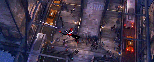
My last film pick for this narrative research essay is the recent Spider-Man: Into the Spider-Verse. A marvel of computer-generated animation, the film follows Brooklyn teenager Miles Morales, as he picks up the mantle of Spider-Man after being bitten by a similar radioactive arachnid that once bit Peter Parker. Soon, Miles realises that he’s not the only Spidey out there, and forms a team to battle the hulking Kingpin, an evil business-turned-mad-man who has the power to open portals to other dimensions in a tragic attempt to bring his loved ones back from the dead.
This, to me, is the most interesting choice. Whilst I’m engaged by the introspection of Anomalisa and the villain-turned-hero aspect of Megamind, it’s Spider-Man: Into the Spider-Verse that I keep coming back to. A dazzling, fluid animated feature film with a hand-drawn comic book touch, this pick gives me the opportunity to discuss all of the potential questions. It’s a film that’s able to encapsulate the essence of a comic book to the big screen in a way that no other live-action feature can, with a groundbreaking new visual style that manages to replicate the look and texture of a comic book panel. The animation is fluid, snappy and pops on screen: just as a film featuring Spider-Man should do.
For my response to this project, I plan to focus on a specific question outlined here but also discuss other aspects of the film as a way to construct a well-rounded, considered analysis of the film.
What I’m personally inspired by about Into the Spider-Verse is it’s complete understanding of Spider-Man’s character: the film effectively examines what it means to be hero, and so embodies the ideas of the Hero’s Journey very nicely. I could easily analyse the narrative with close reference to the Hero’s Journey, and even explore the idea of a story’s purpose too.
The film has made a huge cultural impact, and is praised by both critics and fans alike: it’s a successful movie with a powerful message that the film expertly uses to its advantages: ‘anyone can wear the mask’. It’s this new idea of a universality to the Spider-Man character that allows me to discuss the third question with some real weight: how Into the Spider-Verse has used its universe-bending narrative as a vehicle for social change, teaching its all-ages audience that anyone can be Spider-Man, not just Peter Parker. There’s definitely some good analysis material here, and I could easily tie it in with the film’s total understanding of everything the character of Spider-Man represents.
Aside from this, Into the Spider-Verse is praised for it’s groundbreaking new visual style, a love and appreciation for the comic style of old that’s hand-drawn into every frame. And it’s not just how every shot of the film looks and feels like a comic book through hand-rendered graphic pointillism to evoke the poppy art style of classic superhero fare, it’s the film’s snappy approach to computer generated animation that makes the movie shine. There’s nothing that really feels like Into the Spider-Verse, and that’s because the creatives behind the film took over two years to establish the look of the film. They wanted something fresh, new and exciting - and that’s what they got. With a slightly lower frame rate than most other films, Into the Spider-Verse feels like a set of continuous moving panels in a way that bursts with energy and plain…fun. Comic-book onomatopoeia springs up throughout the film, and Mile’s thoughts pop up through narration bubbles and boxes. It’s a film with spectacular visuals that pop off the screen, a mix of graphic tones, vivid colours and snappy animation that makes for a great essay subject choice.

Finally, this film represents the epitome of the super-hero movie in both storytelling, characters and visual style - and this is something that I’ve briefly mentioned already on this blog. I’ve discussed how superhero movies could be argued as the ‘new fairytales of cinema’, and this is a theory that I’m actually really interested by. Into the Spider-Verse not only represents a culturally-relevant candidate, but also an opportunity to explore the idea of a modern fairytale in depth too.
In this post, I’ve written up my initial thoughts on the project - exploring some potential candidates for the Narrative Research essay and settled on a conclusion on my film choice: Spider-Man: Into the Spider-Verse. This was something I realised fairly early on in the project, just because of my passion for the film and it’s brilliant approach to animation, but here I wanted to evidence a few ideas and alternative analytical directions before settling onto my chosen animated narrative.
Next week, I will begin collecting research sources for my essay exploring Spider-Man: Into the Spider-Verse (through online videos, books and any other media of discussion) and decide on an essay question. I’ve got a basic idea of the themes and concepts I want to discuss with this essay, but I need to have more of a focus and central question to begin the research process.
1 note
·
View note
Photo
Epochal Territories Shoot #1 - 14/11/2020
Getting back into the swing of creating can be rather difficult when one doesn’t necessarily know where they are going. This is partly where I found myself when starting my MA, because I wasn’t all too sure where I was going to take my work and what would be appropriate for postgraduate study. Yet, there were a number of things that I knew for definite which was returning back to my older work of documenting urban landscapes and trying go evoke feelings of alienation, estrangement and the dichotomy of hypermodernity.
Epochal Territories is really a gestalt of our fast paced, instant gratifying and estranging society, which aims to deconstruct these notions and investigate how these banal and bleak landscapes can convey these feelings. This all goes back to researching Karl Marx and his theory of alienation, and its multifaceted aspects:
Product of Labour
Activity of Labour
One’s Own Self
Alienation from Others
Marx’s theory of alienation spans from these four aspects, which including being alienated from production, activity, oneself and others. For the purpose of my project, the final two are more centred around what I am conveying, which is the alienation from myself, as well as the people around me.
My own alienation stems from how I view the world: my weltanschauung. From my own personal views, I see the world through the lens with a certain causticity, where everything becomes rather estranging, whether that is how people use social media, using social media at all, the way we act, what we eat, how we travel, how we make money, what money is and how the world operates. What my photographs try to convey is this feeling of alienation. The way I can describe my work is the feeling of being stuck in traffic or seeing that the train is getting more and more delayed - the feeling of complete disappointment, malaise, listlessness and ennui.

Where we live is incredibly important. Our homes and where we live is where we spend a lot of time, building bonds, creating families and living our lives. Yet, looking inward towards the home is a different experience, especially when your home is on the brink of demolition to make way for brand new, upmarket houses in an attempt to gentrify a dilapidated and crime ridden low social class area.
The Talbot Gardens estate is just that kind of place. Situated in Barne Barton, Plymouth, Talbot Gardens is home to a number of multi-storey flats and apartments. The estate was largely built to house the large number of Naval workers for Devonport in the 1960′s, but as the numbers of workers dwindled, the estate was handed over to Plymouth City Council, and the Devon and Cornwall Housing Association. These buildings - even for me - are rather ugly and completely dilapidated and certainly a reminder of another time. The concrete is extremely dull, covered in water marks and remnants of people’s homes lays in the street, such as the fridge and bed above. The area did feel rather unsafe, with some local occupants of the buildings glaring as I wandered around the ghostly estate.
There was a certain spectrality of the estate, knowing it was going to be demolished in coming years in addition to the lack of noise of people. The weather as abysmal, with rain beating down on the concrete paths and the wind whipping up a fine mist of rain. The only cover to be had was the entrance to the flats, which contained a number of wooden doors akin to what you would find on a shed or an outhouse. The entrance did however sometimes act as a wind tunnel, firing a jet of cold, wet wind through the walkway.
Shooting the Talbot Gardens estate was fairly straight forward, and oddly enough for me shot digitally. I am trying to keep costs down and shoot film as little as possible, if not at all purely because of the costs. I don’t want to not shoot it, so I am trying to keep film usage to a minimum. I shot entirely on my Canon 5D and the wonderfully cheap and cheerful Yongnuo 35mm F2, which I have had a love/hate relationship with because it has been idiosyncratic in the past. Yet, since wearing glasses, I have a newfound respect for the lens as I can see properly how it renders the image, and it does it rather well! It is also a way for me to get used to the 35mm focal length. I am a stickler for a 50mm only way of shooting, but 35mm just is that little bit wider to incorporate more of the surroundings, and features a wider depth of field when stopped down.
Something I have wanted to do is shoot a project entirely in black and white, which is sometimes easier said than done. I feel that B&W is a lot harder to shoot, as not everything can work. It has a way of rendering a space timeless, and focusing more on the form rather than the reality of the place. This was seamless to do, as I have the ability to create colour presets on the 5D, despite it being 13 years old. I wanted a very specific look to my B&W, as I am not a fan of heavy contrast and weak dynamic range. For this, I created a preset in the camera to have low contrast, slightly more sharpness and the addition of an internal replication of a green filter to bring out some more shadow detail.

The B&W preset was initially a fluke, because I set the parameters to what I thought would be correct. Low and behold, they were exactly what I was looking for. The only issue is that when shooting RAW, the image is automatically colour but has to be converted when post-processing. This is easy to do simply by reducing the saturation to zero which reverts it back to B&W.
I always know when a shoot is going well when I can feel a level of alienation within a space. I knew I didn’t belong in this area, and that it was, in it’s entirety, out of place. I felt as if I shouldn’t have been there, and time seemed out of joint. There was something askew about wandering around a housing estate which is going to be demolished to make way for brand new homes which would be entirely out of reach to the general population of the occupants of the current Talbot Gardens. I get the feeling that the people who live here are of a lower social and economic class compared to what would be coming in the next number of years, which seems to come across as an eradication of lower class workers and benefit claimants.
On the opposite side of the estate is a row of new houses, as well two boarded up areas where a building used to stand before an arson attack, and where a play park used to be. There was something odd about these barricaded areas hiding these anonymous areas, filled with dirt and tiles. The mountains of earth tower over the barricades, and are over shadowed by the new builds looming in the background. These in themselves are out of place, because they don’t fit with the surrounding run-down aesthetic, but offer an insight to what the area will eventually look like. The crest turning to the left acts as a compositional piece that flows from the bottom and leads to the middle of the scene, with the houses acting as the middle point. I am trying to compose the photographs in a similar fashion, with the point of focus being from a similar point and keeping the composition consistent across the board.

Something intrigued me about the boat on the trailer, and acted as a perfect model to be situated in the middle of the frame, with the surrounding ephemera encompassing the rest of the scene. The completely bare trees add to the spectrality of the estate, acting rather ghostly in the frame. I feel that with the trees in full bloom wouldn’t be the same compared to them being bare in the winter drawl.
My favourite photograph from this shoot is an entrance to the previously mentioned barricaded anonymous spaces. The gates are badly put together, barely matching up and attached to the walls by threads. Behind the gate is a pile of interior tiles - many of which were fine - in addition to a number of other collective pieces of detritus. You can see the other mound of earth on the left of the image, which shows how much it towers of the walls. These mounds of earth are in fact made from the ground around where the building(s) were, which on closer inspection contain pieces of the property such as bricks, drywall and insulation. Once bundled together, they become mountains of earth and collective house bits.

A touch to the side of the previous image, looks towards the estate once again, but still includes the precarious gates and features an empty trailer which presumably would hold another motorboat. Something I like about this image is how the estate isn’t the main focus, but instead of the car park in the foreground, with the surrounding trees and the estate being slowly included in the background. I also like the tones of the B&W preset that I created, with the high dynamic range and a nice selection of greys and low contrast.

After the estate, I made my way down towards the River Tamar near the Tamar Bridge and the Royal Albert Bridge. I found this area rather odd, because only a stones throw away is Cornwall and you can walk underneath both of the famous bridges. Amongst the wealth of fishing vessels is a small play park which has a set of swings and a sit on digger which is operated by ones hands. I found the empty swings to be somewhat ominous, and rather out of place being only a few feet from the river bank, albeit protected by a wall and some fencing.
A coda. The first shoot of the newly named Epochal Territories was in my eyes a success. I have created some photographs that I thoroughly enjoy and gained some insight into what I want to create, and how I want to create it. Shooting digitally in a setting that wasn’t commercial was also odd to undertake, because I am used to shooting my personal project work on film. But saying that, I did enjoy using the 5D for something that isn’t for work, and with my glasses can appreciate more that this now ancient full frame DSLR can do - I am amazed at how good the 5D MKi can do now that I can see properly. It was also good to discover a new location, which is exactly what I need for this project. Something I tend to do is replicate shots and reuse locations which I don’t want to do, and with this project I would like to explore more places in Plymouth with either unknown places, or places that I haven’t visited in a long time.
Bibliography
Asher Horowitz (no date). [Online]. Available at http://www.yorku.ca/horowitz/courses/lectures/35_marx_alienation.html. [Accessed on 21/12/2020]
0 notes
Text
Section 1 Artist sketchbook
Gerhard Ritcher-
Gerhard Richter was born in Dresden on 9th February 1932, the first child of Horst and Hildegard Richter. A daughter, Gisela, followed four years later. They were in many respects an average middle-class family: Horst worked as a teacher at a secondary school in Dresden and Hildegard was a bookseller who liked to play the piano. In an interview with Robert Storr, Richter described his early family life as "simple, orderly, structured – mother playing the piano and father earning money." In 1935, Horst accepted a teaching position at a school in Reichenau, a town which today is known as Bogatynia in Poland, at the time located in the German province, Saxony. Settling in Reichenau was a drastic change for the family, which was accustomed to the vivid cultural life of the larger Dresden.3 Yet, it was also a move that would keep the family largely safe from the coming war. In the late 1930s, Horst was conscripted into the German army, captured by Allied forces, and detained as a prisoner of war until Germany's defeat. In 1946, he was released and returned to his family, who had again relocated, this time to Waltersdorf, a village on the Czech border., The post-war years caused difficulties for the Richter family, as for many others. Horst’s return was not that of a war-hero. Commenting on this period in later life, Richter reflected: "Horst shared most father's fate at the time nobody wanted them." In an interview from 2004, he added: "We were so alienated that we didn't know how to deal with each other." Horst’s former membership of the National Socialist Party, which all teachers had been obliged to join under the Nazi regime, made it difficult for him to return to teaching. He eventually ended up working in a textile mill nearby in Zittau, before finding a post as an administrator of a distance learning program for an educational institution in Dresden. Richter has remarked on his early years with a mixture of fondness and frustration, sadness and excitement. He reminisced about the house in which he was born, on Grossenhainer Strasse in Dresden: "it was not far from the original Circus Sarrasani building, whereas a young boy – I could see the elephant stalls through the cellar windows. I remember my great-grandmother's sewing box, made of armadillo skin, and a man falling from a ladder – something that, according to my parents, only I had seen." Not much is documented about Richter's time in Reichenau, but he has talked about his experiences of Waltersdorf: "we had moved to a new village, and automatically I was an outsider. I couldn't speak the dialect and so on." In 1942, because he turned 10 years old, Richter was required to join the ‘Pimpfen’, a mandatory organisation for children that prepared them for the Hitler Youth. Later, Richter attended grammar school in Zittau but eventually dropped out. He has been described as "a highly gifted child but notoriously bad in school, " with Dietmar Elger noting that "he even got poor grades in a drawing." He ended up attending a vocational school instead, studying stenography, bookkeeping, and Russian.
While too young to be drafted into the German army during the Second World War, the war nonetheless had a deep impact on Richter. The family experienced economic hardship and personal loss: Hildegard's brothers, Rudi and Alfred, and sister, Marianne, all died as a consequence of the war. "It was sad when my mother's brothers fell in battle. First the one, then the other. I'll never forget how the women screamed," Richter recalls. Marianne, who suffered from mental health problems, was starved to death in a psychiatric clinic.
Even though Waltersdorf was spared the extensive bombing that nearby Dresden was exposed to, it was not sheltered. Speaking to Jan-Thorn Prikker, Richter has said: "the retreating German soldiers, the convoys, the low-flying Russian planes shooting at refugees, the trenches, the weapons lying around everywhere, artillery, broken down cars. Then the invasion of the Russians ransacking, rapes, a huge camp where us kids sometimes got barley soup." As a child, the military had fascinated Richter: "When the soldiers came through the village, I went up to them and wanted to join them." He explained to Storr: "when you're twelve years old you're too little to understand all that ideological hocus- pocus." Richter remembers playing in the woods and trenches with his friends, shooting with forgotten rifles which they found lying around: "I thought it was great. I was fascinated, like all kids." The bombings of Dresden made an enduring impression on Richter: "in the night, everyone came out onto the street of our village 100 kilometers away. Dresden was being bombed, "now, at this moment!" Following the Potsdam agreement at the end of the war, the area in which Richter lived fell under Soviet control. The Second World War profoundly changed the face of the country that Richter had been born into, which had a lasting effect on Richter's education and later artistic practice.

Sternbild
Star picture, 1969
Self Portrait, Three Times, 24 .1. 90
1990
Abstract Painting(726)
1990
Abstract Painting (726) 1990 is a large-scale diptych by the German artist Gerhard Richter, comprising two joined sections of canvas and characterised by shimmering horizontal forms. As the title implies, there are no clear representational elements depicted in the painting, but within its thick layers of colour – especially prominent are white, red and a rusty orange – there is the suggestion of an original image that has become blurred. The work is also marked by several scratches, mostly vertical, that Richter has made through the paint.
Abstract painting No. 439
For many years Richter used photographs as a source for his figurative works. In the mid-1970s he began to incorporate photography into the process of making abstract paintings. This work was made by photographing one of his smaller compositions (Oil Sketch No. 432/11), which he then projected onto a large canvas, and then traced in charcoal. He completed the larger painting with conventional brushes and oil paint, working the surface into a smooth state of finish which suggests the glossy surface of a photograph.

‘St John’
1988
St John belongs to a series called the ‘London Paintings’, each named after one of the chapels of Westminster Abbey. The titles are not meant to be descriptive but refer merely to associations connected with the artist’s visits to London. Since 1980 Richter has made his abstract paintings by manipulating spatulas of different lengths, loaded with paint, across areas of the canvas. New layers of colour cover earlier ones. Richter’s inability to control the precise distribution of paint allows a degree of chance to determine the paintings’ final appearance.

Mund (Mouth)(Brigitte Bardot's Lips) (1963)
Mund is one of Richter's first paintings completed from a photograph. The painting is sexually suggestive, depicting Brigitte Bardot's open mouth adorned with red lipstick. Blurred flesh tones hint at Richter's painting process, beginning with a realist rendering and incorporating rollers, squeegees, and dry-brush techniques to mask the surface. The work suggests the artist viewing reality from a detached perspective, as he resists any moment of a clear focus on the overall image.

1024 Farben(1024 Colors) (1973)
Richter employs a systematic approach to the canvas in his color-chart-based painting 1024 Farben (1024 Colors). Superficially reminiscent of the neo-Dadaist, the 1950s "Hard Edge" abstraction of Ellsworth Kelly, Richter chooses here to systematically paint squares of colors based on the predetermined structure of the color wheel. The only intervention of the artist in an otherwise mechanical process seems to be his control of the scale of the canvas itself, the artist's having arranged the colour combinations via reference to a logical, predetermined schema.
Richter has similarly applied his paint as before, manipulating the paint with a squeegee when the paint is very newly applied, hence its fluid character. Richter does not maintain a horizontal direction as he glides his squeegee across the surface, rather he plays with it.
Ritcher was a brilliant artist I personally love his work with the overlaying of paint on the photos are amazing and eye catching it makes the work rallying interesting and a different viewing of it.
“To talk about paintings is not only difficult but perhaps pointless too. You can only express in words what words are capable of expressing-- what language can communicate. Painting has nothing to do with that.”
― Gerhard Richter
Neo Sauch
Born in 1960, Neo Rauch is the son of Hanno Rauch and Helga Wand, who both studied art at the Hochschule für Grafik und Buchkunst Leipzig. Tragically, Rauch's parents died together in a train accident when their newborn son was only four weeks old, and Rauch necessarily spent much of his life growing up with his grandparents in Aschersleben, a town that forms part of the Salzlandkreis district in Germany. Rauch grew up during the construction of the Berlin Wall and thus lived his formative years in what was then regarded as East Germany, and undoubtedly influential experience leading him to stay forever clear of making art for propaganda or under the service of politics. For to do so would obscure opening up free dialogue in art, with politics intent on the portrayal of only one rigid message.
Rauch's passion for art began at a young age. As a child, his peers were interested in sports and playing cards whilst he recalls a natural interest in literature, culture, and drawing; this disparity of interests often made him feel lonely. Rauch remembers the importance of a day when he was 12 years old and discovered a book containing reproductions of Salvador Dalí's work on his grandfather's bookshelf. Further citing the early building blocks of his career, Rauch talks of the great opportunity that he saw in the art to be able to transfer the mode of play into professionalism; any other option was simply "out of question"
Early Training and Work
Between 1981 and 1986, Rauch studied at Hochschule für Grafik und Buchkunst Leipzig (the very same school that his parents had attended) under the professors Arno Rink and Bernhard Heisig. It was from there that Rauch emerged as a prominent figure in the "New Leipzig School", a title for a movement that surfaced post-reunification in 1990 in an attempt to unite a group of artists who seemed loyal to painting figurative scenes of East German life. However, this was a label given by critics and historians and none of the artists associated with the term subscribed to it or deemed it useful. Rauch's work in particular always remained distinct from the dominant Social Realism of East Germany, and the Neo-Expressionist styles of the West. Even in his early work, he had developed a unique poetic narrative style and assertively refused to subscribe to any movement or moment in history.In an interview with Zeit.de, Rauch recalled when he first personally met his influential friend and teacher, Arno Rink. Rauch stated that Rink had an appearance akin to writer Thomas Mann combined with an attitude that demanded respect. Reminding the young artist of the demands expected whilst enlisted in the National People's Army (the national service that all young men still undertake in Germany), Rauch said that Rink's attitude was one that he understood and was happy to answer with respect. During his studies, Rauch cites that he admired Rink's precision of detail and a sense of magic within his colour palette.
During this time, in 1985, Rauch married his fellow artist and representative of the "New Leipzig School", Rosa Loy. In various interviews, Rauch discusses the couple's dynamic as two working artists, stating that they do not view each other as competition and are both proud of each other's success, jokingly elaborating upon their frequent chess games where Loy always wins whilst simultaneously knitting and listening to music with one earphone.
Between 1986 and 1990, Rauch chose to further his education by continuing to study for his Masters at the Hochschule für Grafik und Buchkunst Leipzig. The 1980s was a crucial phase in Rauch's life, as it was in the University environment that he began to feel like less of an outsider. It was also at the Hochschule für Grafik und Buchkunst that Rauch met Judy Lybke, a life-long friend who also became the founder of EIGEN+ART gallery, Rauch's gallerist, and instrumental in his commercial success.
In 1989, the Berlin Wall collapsed, and in 1990, Rauch and Loy's son was born, the latter of which events Rauch described as "The greatest change in my life...That's when I crossed over into greater responsibility, but at the same time it offered me the chance to embrace child-play once again". Between the years 1993 and 1998, Rauch decided to further his practice as an artist by working as an assistant for his teachers, Arno Rink and Sighard Gille at Leipziger Akademie. During this time Rauch had already started to exhibit his own work but he initially achieved little success and attracted no interest. In 1993, Rauch had his first solo show at EIGEN + ART in Leipzig, recalling it as a "commercial disaster" likely because video and installation were very popular at the time.
Waiting for the Barbarians
2007
Waiting for the Barbarians is a 2007 painting by the German artist Neo Rauch. To the right in the picture is a carnival where a minotaur is cheered on a stage, while to the left another minotaur is about to be burned at the stake. The picture also includes several other people and creatures.
Tal
1999
Tal is a 1999 painting by the German artist Neo Rauch. It depicts two men in boxing shorts and shoes who fight each other with long sticks. In the foreground is a red, wooden manger with the word "Tal", which is German for the valley.
die große störung
1999

Reactionary Situation
2002
Reactionary Situation is a 2002 painting by the German artist Neo Rauch. It depicts a rural landscape with poplars, a dilapidated manor house, a little girl, a man working the ground with a stick, a man praying on his knees before a floating windmill and a colourful rifle mounted on the ground
Rauch work is very abstract bold and very trippy looking. Mostly set in the army time with war and cutouts of other items that don't fit in with the theme but it goes and makes sense with how it flows and use bold colours and and using blues and browns as the shadow and and depth in it.
0 notes
Text
Sunlight Makes You Skinny & Blue Light Makes You Fat: 11 Ways To Biohack Light To Optimize Your Body & Brain.
Many people consider light to be, well, light!
After all, light is just a wave of energy that signifies the absence of darkness, right? Fact is, light has a profound impact on human biology, for better or worse. In my last article on sleep, you learned plenty about the effects of artificial light and blue light on circadian rhythm and sleep, and in other articles, I’ve filled you in on biohacks such as photobiomodulation, near infrared, far infrared, UVA and UVB, including: How Modern Lighting Can Destroy Your Sleep, Your Eyes & Your Health, The Ultimate Guide To Biohacking Your Testosterone, How To Use Low Level Light Therapy and Intranasal Light Therapy For Athletic Performance, Cognitive Enhancement & More. & What’s The Healthiest Way To Tan
But the effects of light go far beyond its potential for positively hacking sleep or enhancing recovery, especially when it comes to the potential for artificial light to damage your overall wellness. The negative health impact of artificial light sources on endocrine and cellular levels in humans includes the risk of cataracts, blindness, age-related macular degeneration, mitochondrial dysfunction, metabolic disorders, disrupted circadian biology and sleep, cancer, heart disease and more.
For example, multiple recent studies have reported that exposure to artificial light can cause negative health effects, such as breast cancer, circadian phase disruption and sleep disorders. One 2015 study reviewed 85 scientific articles and showed that outdoor artificial lights (e.g. street lamps, outdoor porch lights, etc.) are a risk factor for breast cancer and that indoor artificial light intensity elevated this risk. This same study also showed that exposure to artificial bright light during nighttime suppresses melatonin secretion and increases sleep onset latency and increases alertness and that the circadian misalignment caused by artificial light exposure can have significant negative effects on psychological, cardiovascular and metabolic functions.
One perfect example of the effects of modern light on human biology is that of LED (light-emitting diode), which is rapidly replacing compact fluorescent (CFL) bulb, primarily because LEDs do not contain mercury like CFLs and they’re far more energy efficient. LED lighting is used in aviation lighting, automotive headlamps, emergency vehicle lighting, advertising, traffic signals, camera flashes, and general lighting. Large-area LED displays are also used in stadiums, dynamic decorative displays, and dynamic message signs on freeways. But LED’s pose significant environmental risks and toxicity hazards due to their high amount of arsenic, copper, nickel, lead, iron, and silver.
But LED’s can also cause severe retinal damage to the photoreceptors in your eye and have even been shown to induce necrosis (cell death!) in eye tissue. The American Medical Association even put out an official statement warning of the health and safety issues associated with white LED street lamps. Things get even worse once dimming and color changing features are introduced into LED lighting, which is a common lighting feature in modern “smart homes”.
The reason for this is that LED lamps are a form of digital lighting (in contrast, the incandescent light bulbs and halogens light bulbs you’ll learn about momentarily are analog thermal light sources). In a color changing system that allows you to adjust the dim or color of the lights, there are typically three different LED sources: red, green and blue. The intensity of these three sources has to be changed to achieve different colors, and this feature must be controlled digitally via a mechanism called pulse-width modulation. This means the LEDs rapidly alternate between switching to full intensity and then switching off over and over again, resulting in a lighting phenomenon called “flicker”, something I recently discovered during my Building Biology analysis occurs quite a bit even in my own biologically friendly home (influencing me to make some of the lighting changes you’ll read about later in this article) and something that I’ve also learned quite a bit about from my friend Dr. Joe Mercola.
Get The Low Carb Athlete - 100% Free!Eliminate fatigue and unlock the secrets of low-carb success. Sign up now for instant access to the book!<![CDATA[ #_form_64_ font-size:14px; line-height:1.6; font-family:arial, helvetica, sans-serif; margin:0; #_form_64_ * outline:0; ._form_hide display:none; visibility:hidden; ._form_show display:block; visibility:visible; #_form_64_._form-top top:0; #_form_64_._form-bottom bottom:0; #_form_64_._form-left left:0; #_form_64_._form-right right:0; #_form_64_ input[type="text"],#_form_64_ input[type="date"],#_form_64_ textarea padding:6px; height:auto; border:#979797 1px solid; border-radius:4px; color:#000 !important; font-size:13px; -webkit-box-sizing:border-box; -moz-box-sizing:border-box; box-sizing:border-box; #_form_64_ textarea resize:none; #_form_64_ ._submit -webkit-appearance:none; cursor:pointer; font-family:arial, sans-serif; font-size:14px; text-align:center; background:#eb7000 !important; border:0 !important; color:#fff !important; padding:10px !important; #_form_64_ ._close-icon cursor:pointer; background-image:url('https://d226aj4ao1t61q.cloudfront.net/esfkyjh1u_forms-close-dark.png'); background-repeat:no-repeat; background-size:14.2px 14.2px; position:absolute; display:block; top:11px; right:9px; overflow:hidden; width:16.2px; height:16.2px; #_form_64_ ._close-icon:before position:relative; #_form_64_ ._form-body margin-bottom:30px; #_form_64_ ._form-image-left width:150px; float:left; #_form_64_ ._form-content-right margin-left:164px; #_form_64_ ._form-branding color:#fff; font-size:10px; clear:both; text-align:left; margin-top:30px; font-weight:100; #_form_64_ ._form-branding ._logo display:block; width:130px; height:14px; margin-top:6px; background-image:url('https://d226aj4ao1t61q.cloudfront.net/hh9ujqgv5_aclogo_li.png'); background-size:130px auto; background-repeat:no-repeat; #_form_64_ ._form-label,#_form_64_ ._form_element ._form-label font-weight:bold; margin-bottom:5px; display:block; #_form_64_._dark ._form-branding color:#333; #_form_64_._dark ._form-branding ._logo background-image:url('https://d226aj4ao1t61q.cloudfront.net/jftq2c8s_aclogo_dk.png'); #_form_64_ ._form_element position:relative; margin-bottom:10px; font-size:0; max-width:100%; #_form_64_ ._form_element * font-size:14px; #_form_64_ ._form_element._clear clear:both; width:100%; float:none; #_form_64_ ._form_element._clear:after clear:left; #_form_64_ ._form_element input[type="text"],#_form_64_ ._form_element input[type="date"],#_form_64_ ._form_element select,#_form_64_ ._form_element textarea:not(.g-recaptcha-response) display:block; width:100%; -webkit-box-sizing:border-box; -moz-box-sizing:border-box; box-sizing:border-box; #_form_64_ ._field-wrapper position:relative; #_form_64_ ._inline-style float:left; #_form_64_ ._inline-style input[type="text"] width:150px; #_form_64_ ._inline-style:not(._clear) + ._inline-style:not(._clear) margin-left:20px; #_form_64_ ._form_element img._form-image max-width:100%; #_form_64_ ._clear-element clear:left; #_form_64_ ._full_width width:100%; #_form_64_ ._form_full_field display:block; width:100%; margin-bottom:10px; #_form_64_ input[type="text"]._has_error,#_form_64_ textarea._has_error border:#f37c7b 1px solid; #_form_64_ input[type="checkbox"]._has_error outline:#f37c7b 1px solid; #_form_64_ ._error display:block; position:absolute; font-size:13px; z-index:10000001; #_form_64_ ._error._above padding-bottom:4px; top:-41px; right:0; #_form_64_ ._error._below padding-top:4px; top:100%; right:0; #_form_64_ ._error._above ._error-arrow bottom:0; right:15px; border-left:5px solid transparent; border-right:5px solid transparent; border-top:5px solid #f37c7b; #_form_64_ ._error._below ._error-arrow top:0; right:15px; border-left:5px solid transparent; border-right:5px solid transparent; border-bottom:5px solid #f37c7b; #_form_64_ ._error-inner padding:8px 12px; background-color:#f37c7b; font-size:13px; font-family:arial, sans-serif; color:#fff; text-align:center; text-decoration:none; -webkit-border-radius:4px; -moz-border-radius:4px; border-radius:4px; #_form_64_ ._error-inner._form_error margin-bottom:5px; text-align:left; #_form_64_ ._button-wrapper ._error-inner._form_error position:static; #_form_64_ ._error-inner._no_arrow margin-bottom:10px; #_form_64_ ._error-arrow position:absolute; width:0; height:0; #_form_64_ ._error-html margin-bottom:10px; .pika-single z-index:10000001 !important; @media all and (min-width:320px) and (max-width:667px) ::-webkit-scrollbar display:none; #_form_64_ margin:0; width:100%; min-width:100%; max-width:100%; box-sizing:border-box; #_form_64_ * -webkit-box-sizing:border-box; -moz-box-sizing:border-box; box-sizing:border-box; font-size:1em; #_form_64_ ._form-content margin:0; width:100%; #_form_64_ ._form-inner display:block; min-width:100%; #_form_64_ ._form-title,#_form_64_ ._inline-style margin-top:0; margin-right:0; margin-left:0; #_form_64_ ._form-title font-size:1.2em; #_form_64_ ._form_element margin:0 0 20px; padding:0; width:100%; #_form_64_ ._form-element,#_form_64_ ._inline-style,#_form_64_ input[type="text"],#_form_64_ label,#_form_64_ p,#_form_64_ textarea:not(.g-recaptcha-response) float:none; display:block; width:100%; #_form_64_ ._row._checkbox-radio label display:inline; #_form_64_ ._row,#_form_64_ p,#_form_64_ label margin-bottom:0.7em; width:100%; #_form_64_ ._row input[type="checkbox"],#_form_64_ ._row input[type="radio"] margin:0 !important; vertical-align:middle !important; #_form_64_ ._row input[type="checkbox"] + span label display:inline; #_form_64_ ._row span label margin:0 !important; width:initial !important; vertical-align:middle !important; #_form_64_ ._form-image max-width:100%; height:auto !important; #_form_64_ input[type="text"] padding-left:10px; padding-right:10px; font-size:16px; line-height:1.3em; -webkit-appearance:none; #_form_64_ input[type="radio"],#_form_64_ input[type="checkbox"] display:inline-block; width:1.3em; height:1.3em; font-size:1em; margin:0 0.3em 0 0; vertical-align:baseline; #_form_64_ button[type="submit"] padding:20px; font-size:1.5em; #_form_64_ ._inline-style margin:20px 0 0 !important; #_form_64_ position:relative; text-align:left; margin:0px 0px; padding:20px; -webkit-box-sizing:border-box; -moz-box-sizing:border-box; box-sizing:border-box; *zoom:1; background:transparent !important; border:0px solid #b0b0b0 !important; width:300px; -moz-border-radius:0px !important; -webkit-border-radius:0px !important; border-radius:0px !important; color:#000 !important; #_form_64_ ._form-title font-size:22px; line-height:22px; font-weight:600; margin-bottom:0; #_form_64_:before,#_form_64_:after content:" "; display:table; #_form_64_:after clear:both; #_form_64_._inline-style width:auto; display:inline-block; #_form_64_._inline-style input[type="text"],#_form_64_._inline-style input[type="date"] padding:10px 12px; #_form_64_._inline-style button._inline-style position:relative; top:27px; #_form_64_._inline-style p margin:0; #_form_64_._inline-style ._button-wrapper position:relative; margin:27px 12.5px 0 20px; #_form_64_ ._form-thank-you position:relative; left:0; right:0; text-align:center; font-size:18px; @media all and (min-width:320px) and (max-width:667px) #_form_64_._inline-form._inline-style ._inline-style._button-wrapper margin-top:20px !important; margin-left:0 !important; #_form_64_ ._form_10 text-align:center !important; #_form_64_ ._x20518276 label,#_form_64_ ._field10 label text-align:left; #_form_64_ ._form_31 width:100% !important; ]]>
Even though it appears to your naked eye that the LEDs really aren’t changing color or intensity that much, your retina perceives this flicker, and you can often observe this phenomenon if you use an older camera, or a device called a “flicker detector” to record an LED light in your house or an LED backlit computer monitor. Unfortunately, this trick doesn’t work with newer cameras and smartphones, which have a built-in algorithm that detect the flicker frequency and automatically change the shutter speed to improve the recording quality. However, I’ve found that by switching my iPhone to slow-motion video recording, I can often detect flicker in a monitor or light. Ultimately, the problem is this: research has shown that this flicker can irreparably damage the photoreceptor cells in the eye’s retina, resulting in issues such as headaches, poor eyesight, brain fog, lack of focus, increased risk of cataracts and sleep disruptions.
Unfortunately, energy saving lamps such as compact fluorescent lamps (CFLs) can also cause similar issues and can induce oxidative stress damage that affects not only the eyes but also sensitive photoreceptors on many other areas of the skin, along with endocrine and hormonal damage.
But light can be good too and in fact, the therapeutic use of full spectrum light – also known as “photobiology” – offers many surprising health benefits. For example, in the 1700’s, scientist-inventor Andreas Gärtner, built the first phototherapeutical device, which was a foldable hollow mirror he could use to concentrate sunlight onto the aching joints of patients. A gold leaf on the mirror absorbed UV radiation from sunlight, then transformed this light into near-infrared and red wavelengths very similar to those used in modern times by people who use infrared saunas to manage joint pain. , which is beneficial because it can penetrate deeply into the tissue. In the 1800’s, a General Augustus Pleasonton published the book “Influence of the Blue Ray of the Sunlight“, in which he describes “Influence Of The Blue Ray of Sunlight and Blue Colour Of The Sky In Developing Animal And Vegetable Life And In Restoring Health From Acute And Chronic Disorders To Humans And Domestic Animals”. In the late 1870’s, Dr. Edwin Dwight Babbitt published his book, “Principles of Light and Color“, reporting on research in which he used colored light on different parts of the human body to elicit therapeutic results. In 1897, Indian physician Dinshah Ghadiali used chromotherapy in the form of indigo-colored light as a treatment for gastric inflammation and colitis, and late 19th century Niels Ryberg Finsen of Denmark, who was awarded the Nobel Prize for Physiology in 1903, used red light to treat smallpox, and other light spectrums to address chronic disease such as tuberculosis. In the decades following, Finsen phototherapy became more developed as a cutting-edge therapeutic intervention in modern medicine, including the groundbreaking book “Light Therapeutics” by Dr. John Harvey Kellogg and work by Dr. Oscar Bernhard, a Swiss surgeon who used heliotherapy (sun therapy) during surgeries.
Light can drastically affect our metabolism too. For example, the master fuel sensor in our cells called mTOR (“mammalian target of rapamycin”) facilitates protein synthesis and growth while inhibiting internal recycling of used or damaged cells. Plants and humans grow more in the summertime because there is not only more food abundance but usually more natural light too, which can activate mTOR. But your body needs a darkness – a winter, so to speak. The master fuel sensor in the winter, and in darkness, is AMP-0activated protein kinase (AMPK) which optimizes energy efficiency and stimulates recycling of cellular materials. This cycle happens during the night. Now, consider what happens if you are in a constant stage of light: your hormones and metabolism shift towards constant mTOR activation growth and anabolism – which is generally associated, when in excess, with issues such as cancer and shortened lifespan. On the flipside, by introducing periods of darkness (along with, ideally, fasting), you strike a balance between constant anabolism with zero cellular cleanup and smart catabolism with adequate time for natural cell turnover.
So how can you mitigate the damage of the wrong kind of light and maximize the benefits of the right kind of light? You’re about to find out, along with how sunlight makes you skinny, blue light makes you fat and 11 ways to optimize light in your home and office environment.
11 Ways To Biohack Light To Optimize Your Body & Brain.
#1: Choose Your Lighting Carefully.
One way to ensure you are purchasing a healthier lightbulb is to look at at a value on the light label or box called the Color Rendering Index (CRI). CRI is a quantitative measure of the ability of a light source to reveal the colors of various objects accurately in comparison with an ideal or natural light source. For example, sunlight, incandescent light bulbs and candles all have a CRI of 100. When purchasing LED, look for an R9 (full red spectrum) CRI of close to 97, which is the highest CRI you are likely going to be able to find and can get you as close as possible to natural light. You also need to look at the color temperature of the light, which is the temperature of the light expressed in Kelvin (K) degrees. For example, the sun has a physical color temperature of 5,500 K, and a correlated color temperature (how the light source appears to the human eye, of about 2,700K. So although many LED’s have a color temperature of up to 6,500K, an ideal LED choice would be an LED with a color temperature as close as possible to 2,700K (in comparison, most incandescent lamps have a maximum color temperature of 3,000 K, since the light filament would melt if the temperature were any higher).
You can also consider the use of “biological LED”. For example, the company “Lighting Science” produces a line of biological bulbs that give off light meant to complement the circadian rhythm, not disrupt it. The light that emanates from Lighting Science’s Sleepy Baby bulb, for example, does not interfere with melatonin production, the hormone that helps you and your baby sleep, and is designed to be as close to candlelight as possible. In contrast, their GoodDay spectrum of light is engineered to provide light energy largely missing from conventional LED, fluorescent and incandescent sources, specifically providing a rich white illumination with high color rendering inspired by morning sunlight that supports alertness, mood and performance. Unfortunately, while these light bulbs are a decent option for “customizing” certain areas of your home to have high or low amounts of blue light depending on whether that area of the home is a “waking” area (e.g. office, gym, garage) vs. a “sleeping” area (e.g. bedroom, master bathroom, etc.), they still do produce a significant amount of flicker based on both my own testing and the testing of the building biologist I hired to audit my home.
For the ultimate solution, although it can be more expensive and far less energy efficient, I recommend switching as many lightbulbs in your home and office as possible to A) the old-school style of clear incandescent bulbs, preferably without any coating (which changes the beneficial wavelengths) B) a candlelight-style organic light emitting diode (OLED), which is a human-friendly type of lighting because it is blue-hazard-free and has a low correlated color temperature (CCT) illumination, which means the candlelight style is deprived of high-energy blue radiation, and it can be used for a much longer duration than normal LED’s without causing retinal damage.
If you decide to go with incandescent, many incandescents are not clear, but instead coated with white to make them more aesthetically pleasing. Steer clear of these, and instead choose a 2,700 K incandescent light bulb or a low-voltage halogen lamp. The one benefit of the latter is that low-voltage halogen lights are very energy efficient compared to a standard incandescent lamp. However, most halogens operate on an alternating current (AC), which generates a large amount of dirty electricity, so you must use a direct current (DC) transformer with them. The problem is that to do this, you need an inverter switching power supply to convert AC to DC, and this can cause high voltage transients (dirty electricity) and relatively high electrical fields, both of which were measured by my friend Dr. Mercola when he tried to pull this off. So the only way to make a halogen lighting solution work is to go off-grid and switch your entire house to all DC power, or to use solar panels with no AC inverter installed, and used the solar power battery to run the halogens. I suspect this is too much trouble for most folks, and because of that, a limited use of biological LED along with either low-temperature incandescent bulbs or blue-hazard-free candlelight OLED lighting appears to be the best option.
#2: Get Morning Sun
Unless you’re trying to send your body a message that it “isn’t morning yet” to shift your circadian rhythm forward (see my last big article on sleep), you should actually expose yourself to as much natural sunlight as possible first thing in the morning. In fact, the more sun you get in the morning, the more melatonin you make at night. A morning, fasted walk in the sunshine is one of the best ways to optimize your overall health, and the full spectrum of UVA, UVB and near and far infrared from sunlight can also mitigate some of the damage of artificial light the rest of the day.
Interestingly, based on research by my friend Dr. Chris Masterjohn, it turns out that if you are deficient in the fat-soluble vitamins A and D, your photoreceptors become less sensitive and the strategy of getting adequate sunlight becomes less effective – so be sure to implement everything that makes sunlight able to charge your internal battery, including not only a diet rich in healthy fats, but also high in minerals, clean, pure water and frequent skin contact with the planet Earth. This is also yet another reason I am a fan of daily use the SuperEssentials brand of fish oil: not only does it have high amounts of Vitamin A and D added to it from purified fish liver oil, but it also contains a full milligram of astaxanthin, which can protect photoreceptors from oxidative damage generated by artificial light!
#3: Use Blue Light Blockers.
Seven years ago, in an attempt to minimize the slight headache and eye discomfort I often experienced after spending long periods of daytime work on my computer, I purchased my first pair of “biohacked” glasses from a company called Gunnar. While these glasses significantly reduced my exposure to monitor flicker and even allowed me to wander through malls and grocery stores without being bothered as much by the harsh artificial lighting, blue light blocking technology has come a long way since then. For example, many companies, such as Amber (code: GREENFIELD), Felix and Swannies (code: BEN10), now produce untinted, anti-glare glasses that can block the higher range of the blue light spectrum, and other brands, such as Spektrum, produce slightly tinted glasses that reduce even more of the blue light spectrum. Gunnar and Swannies now make yellow-tinted glasses that block most blue light, and Ra (code: BEN 10), Uvex and True Dark make orange and red-tinted glasses that block all blue light. I personally wear clear or yellow lenses for daytime computer work, nighttime dinners out or driving at night, then switch to the more effective but far less attractive orange or red lenses for the evening at home. If you want to get very specific with blocking the most harmful wavelengths of light, you should check that the glasses block the spectrum of 400-485nm (The Ra glasses are an example of a lens that blocks that specific spectrum).
#4: Avoid Artificial Light Not Only At Night, But In The Morning Too.
You’ll often hear that you should be careful with isolated and concentrated sources of blue light at night, but this rule applies to the morning too. Especially until you’ve gotten out into the sunlight, you should avoid artificial light as much as possible in the morning, particularly by limiting harsh, concentrated sources of blue light such as artificial home and office lighting or bright screens, and by instead opening curtains to allow as much natural light into the home and office as possible. In addition, you’ll often find me wearing blue light blocking glasses for the first couple hours of the morning, and avoid turning on the kitchen lights, bedroom lights, etc. unless absolutely necessary (trust me: making a big cup of hot coffee in the dark isn’t a good idea).
#5: Use Red Light In The Evening.
For the bedroom, consider red incandescent bulbs, particularly in the light fixtures near the bed. Candles are also an excellent option for both the bedroom and the dinner table, although you must choose fragrance-free, natural palm or beeswax candles, since many modern candles are riddled with paraffin, soy, toxic dyes and fragrances. If your phone or e-reader has the option, always switch it to night mode or, better yet, red light mode in the evening. Here’s exactly how to do”The Hidden Smartphone Red Screen Trick”.
#6: Install IrisTech On All Monitors.
I first became aware of IrisTech software when I interviewed a 20-year-old, brilliant Bulgarian computer programmer named Daniel Georgiev on my podcast. Daniel invented a special piece of software that goes far beyond the blue-light blocking computer software called “F.lux” that many people are already familiar with. IrisTech controls the brightness of the monitor with the help of your computer’s video card, allows you to have adequate brightness without monitor flicker, reduces the color temperature of your monitor, optimizes screen pulsations to reduce eye strain, adjusts the brightness of your screen to the light around you, and even automatically adjusts your computer monitor’s settings based on the sun’s position wherever you happen to be in the world. It has settings for pre-sleep, reading, programming, movies and many others, and even allows you to receive pop-up reminders for activities such as eye exercises and stretching. Click here to get IrisTech.
#7: Use An Anti-Glare Computer Monitor.
Fancy, modern LCD monitors are not flicker-free, even though many people think they are because they don’t seem to appear as harsh as older computer monitors. These LCD monitors originally started out by using something called CCFL (cold cathode fluorescent lamps) as a backlight source for the monitor, but in recent years manufacturers have shifted to using LEDs (light emitting diodes). If you have one of those thin monitors, then you probably have an LCD monitor with LED, and if you are unsure, you can check the model number on the backside of the monitor and Google it. Due to the way brightness is controlled on LED backlights, it produces the same LED light flicker you’ve already learned about. The monitor I use is an Eizo FlexScan EV series, which regulates brightness and makes flicker unperceivable, without any drawbacks such as compromised color stability.
It allows you to lower the typical factory preset color temperature setting of 6,500 K down to the more natural 2,700K and also has a “Paper Mode” feature, which produces long reddish wavelengths and reduces the amount of blue light from the monitor. The Eizo monitors also have a non-glare screen, which reduces eye fatigue by dissipating reflective light that otherwise makes the screen difficult to view.
#8: Use Light-blocking Tape Or Stickers.
Even if you are blocking light from reaching your eyes at night by using blue light blocking glasses, a sleep mask, black-out curtains, etc., you still need to be cognizant of items in your bedroom that produce LED lights, such as televisions, clocks, power strips or computer chargers. This is because even if your eyes are covered, your skin has photoreceptors that can detect all these sources of light. Even if you have mitigated all light sources in your own bedroom, walking into any hotel room at night presents you with a veritable Christmas tree-like lighting experience. at hotels. Fortunately, you can easily purchase simple and affordable light blocking pieces of tape, such as “LightDims” that are specially designed, removable tiny covers which act like sunglasses for irritating LEDs on electronics. They can dim or completely cover unwanted LED glare or flare in any room. You simply peel off a sticker and apply it to your electronics, keeping them functional while dimming annoying LEDs to a comfortable or completely unnoticeable level. If you ever feel like you are being bombarded with LED’s or external sources of light in any room – even when you feel like you’ve already shut everything off, these stickers work perfectly.
OK, I’m going to stop for a second and go down a rabbit hole here: why on earth would you want to limit the amount of light that your skin is exposed to? Frankly, because your skin is an eye.
See, in the animal kingdom, light-sensing photoreceptors that go far beyond the eyes are actually quite prevalent. Most of the photoreceptors scientists have found outside the eyes are usually located in the brain or the nerves (or in insects, on the antennae).
But a number of different photoreceptors have been found on animal skin too, particularly in active color-changing cells or skin organs called chromatophores. You likely know these better as the black, brown or brightly colored spots on fish, crabs, frogs, octopus and squid. In many cases, animals can control these chromatophores for camouflage (to match the color and pattern of a background) or to produce colorful signals for either aggression or attracting a mate.
But aside those photoreceptors utilized for camouflage or mate attraction, what in the world is the purpose of all the other photoreceptors? It appears that they help to maintain a normal circadian rhythm, even without precise knowledge of a light source’s location in space or time. These circadian rhythms include the timing of daily cycles of alertness, sleep and wake, mood, appetite, hormone regulation and body temperature. In some animals, they have a quite different task: magnetoreception, which is the ability to detect the Earth’s magnetic field for the purposes of finding direction – an underlying mechanism for orientation in, for example, birds, bees and cockroaches.
But it turns out that people have nonvisual photoreceptors too. With the discovery of light-sensitive retinal cells in addition to rods and cones in mammalian retinas, it has become obvious that humans must use some sort of nonvisual pathway for at least some of the control of behavior and function. For example, pupil size and circadian rhythms vary with changing light, even in functionally blind humans who have lost all rods and cones due to genetic disorders. Recent research with rodents at Johns Hopkins University suggests that these nonvisual pathways can even regulate mood and learning ability.
It turns out that these photoreceptors in humans go far beyond the eyes and that, just like animals, they are found in our skin, subcutaneous fat, central nervous system and host of other areas in our body. Because the human skin is exposed to a wide range of light wavelengths, one recent study investigated whether opsins, the light-activated photoreceptors that mediate photoreception in the eye, are expressed in the skin to potentially serve as “photosensors”. They showed that four major opsins are indeed expressed in two major human skin cell types: melanocytes and keratinocytes and that these opsins are capable of initiating light-induced signaling pathways to the rest of the body.
Another recent study at Johns Hopkins University discovered melanopsin inside blood vessels. Melanopsin is another one of the photoreceptors used in retinal nonvisual photoreception. The researchers found that this light-sensitive protein can regulate blood vessel contraction and relaxation, and can also be damaged by exposure to blue light. Interestingly, melanopsin tends to be much weaker and more susceptible to this damage when fat-soluble Vitamins A and D are deficient.
Another recent finding backs up the fact that it is not only light falling on our eyes which determine our “circadian rhythms” – the body’s internal clock. In this study, it was shown that shining a bright light on the skin (in this case, behind the knees) has the same effect as shining light on the retina when it comes to regulating our 24-hour circadian clock. Scientists suggest that one reason that humans have circadian rhythm photoreceptor on their skin is that when light falls on blood vessels near the skin, it increases the concentration of nitric oxide in the blood, which can significantly shift the circadian clock. This should be especially important to you when you learn this: blue light can penetrate skin as deep as blood vessels, which means that artificial light on your skin can directly affect your circadian rhythm.
Then there’s a photoreceptor protein called “neuropsin”, which is primarily found in the retina but is also located in the skin and is another of the light-sensitive pigments that have been found to help run the body’s master clock. Neuropsin responds to UV-A and violet light, while melanopsin seems more sensitive to blue and red light. This may partially explain why going out into the sun during the day (which activates neuropsin) may work so well for regulating your circadian rhythm.
Finally, it seems that these photoreceptors strongly interact with hormone production and fat burning too. In one study, researchers put some fat cells under lamps giving off visible light that simulated the sun for four hours and kept other samples in the dark. After two weeks, the fat cell groups showed remarkable differences, including fewer lipid droplets (these are the organelles that store fat), compared the cells that didn’t get any light. This means that exposure to adequate sunlight (on both the skin and the eyes) could actually cause your cells to store less fat – and based on a number of compelling studies, artificial light (especially blue light) may have the complete opposite effect!
If you want to take a deep dive into how profoundly light can interact with the skin, you should check out work of my former podcast guest Dr. Jack Kruse, who even talks about how light exposure to the eyes and the skin affects your carbohydrate sensitivity, thyroid activity, hormone production and much more.
Fascinating, eh? Alright, back to the light-hacking tips…
#9: Use Driftbox For Your TV.
The Driftbox is a small box that you plug into your TV. It removes a percentage of blue light from the content you watch, and allows you to view the TV screen at night with far less artificial light exposure. You can set how much blue you want to take out. For example, you can set it to remove 50% (or any percentage in increments of 10%) of all blue light over a period of one hour (that way, the transition is seamless and virtually unnoticeable if you’re watching a movie at night).
#10: Don’t Overuse Sunglasses.
Unless I’m trying to avoid snow blindness from a day of snowboarding on a glaring bright white slope or I’m at a windy beach getting sand blown in my face, you’ll rarely find me sporting sunglasses. Why? Our bodies are designed to be able to perfectly cope with sunlight. The retina in your eyes actually registers how bright it is, then secretes specific hormones to keep you safe from the sun. Specifically, sunlight stimulates your pituitary glands, via the optic nerve, to produce a hormone that triggers the melanocytes in your skin to produce more melanin, which allows you to tan and offers some protection from excess UV radiation. When you wear sunglasses, less sunlight reaches the optic nerve, and thus less protective melanin is made and the higher the risk of a carcinogenic and uncomfortable sunburn. However: if you don’t happen to have a set of blue light blocking glasses handy, there can be an advantage to “wearing sunglasses at night”, especially while driving: car headlamps are notorious sources of concentrated blue light from LED!
#11: Use Photobiomodulation Daily.
Photobiomodulation therapy involves using light of all wavelengths, including visible light, ultraviolet and red near-, mid- and far-infrared wavelengths to combat the effects of artificial light and to also elicit some surprising research-proven health benefits for the entire body. For example, blue light therapy has been shown to be good at relieving joint pain, although it can be harsh on the eyes and the circadian rhythm if you overdo it. Red light has a host of research proving it’s efficacy for relieving inflammation, balancing blood sugar, lowering fat deposition, improving macular degeneration, assisting with melatonin production, increasing blood flow to the brain, building stem cells in bone marrow, and even enhancing kidney and thyroid function. Perhaps most surprisingly, Olympic athletes are now using red light therapy devices as a performance-enhancing aid to increase time to exhaustion. One of the most commonly used wavelengths of light in photobiomodulation is near-infrared, which begins at about 750 nanometers (nm) and goes all the way into 1,200 nm. In the lower range, near-infrared penetrates beneath the skin, and at the high range, deep into the body, resulting in a significant release of nitric oxide and stimulation of mitochondrial pathways that assist with ATP production. Far-infrared is another spectrum frequently used in photobiomodulation, especially in the form of heat lamps or infrared saunas. It is absorbed by the water in your body, which is why it cannot penetrate as deeply as near infrared, but also has significant healing effects on the body, especially if you are well hydrated on some form of “structured water” while using it (read Gerald Pollack’s book “The Fourth Phase of Water” for more on this).
A word of warning: there appears to be a “Goldilocks effect” when it comes to photobiomodulation: most photobiomodulation devices use a power density that is between 10 and 20 milliwatts per square centimeter. That is the equivalent light dose of 1 joule per 100 seconds, and since approximately 10 joules is considered to be a therapeutic dose of light, you really don’t need to use photobiomodulation for much more than 20 minutes per day (depending on the power of the device you use and your distance from the device). In addition, all light emits a frequency, and it appears that the ideal frequency is 10-40 hertz – with higher frequencies potentially causing a negative biological effect. I personally use a photobiomodulation panel of clinical-grade red and near-infrared light called a JOOVV (placed near the standup desk in my office) for 20 minutes per day, along with a head-worn device called a “Vielight” (code: GREENFIELD) for 25 minutes every other day, and finally, a far infrared sauna for 30 minutes three times per week.
Summary
Ultimately, you should now realize how profound an impact light has on your biology, why sunlight can regulate hormones and metabolism to allow you to stay lean and healthy, while artificial light can do the opposite, and the best way to “use light” to your metabolic advantage. I hope this has been helpful to you. Do you have questions, thoughts or feedback for me on any of these light hacking tips you’ve discovered? Leave your comments below and one of us will reply!
Ask Ben a Podcast Question

Source: https://bengreenfieldfitness.com/article/biohacking-articles/best-lighting-home-office/
0 notes
Text
Final Documentation and Reflection

Concept:
ARven is a proposed platform created as a marketing tool that houses Augmented Reality designs that we have produced for clients. To start with, ARven specializes in business and loyalty cards, bringing the digital and physical worlds together to create a unique experience that speaks true to our client’s brand. Our artefact is an augmented reality loyalty card for our client YIBEI Lemontea.

Business cards are still very much valued today in 2019, having varying significance around the world (Durham, 2019), business cards have remained the most effective way to create a more personal exchange of information in a quick manner. (Jackson, 2019).
Loyalty Cards have proven to be a very easy and effective way to cultivate returning customers whilst also often enabling a business to gather data in a more passive manner. (Valeanu, 2015).
Both are still very relevant and are used very often within businesses in the world, even with technology advancing. What ARven aims to use various techniques to create designs that will express client’s brands while also setting it apart from various marketing gimmicks that do not hold attention for long. We have done this by corresponding with our client ‘YIBEI’ and designing a product that will easily give a customer the information they want but also offer exclusive deals that would only be implemented on the card itself. This will keep people coming back to the app instead of being just a gimmick. This strategy has been implemented with other famous companies such as McDonald’s and Burger King, where they offer app exclusive deals so that people return to the app, creating returning customers.
Our choice to keep our artefact be based from a physical item (a physical card), comes from the personal connection that someone has when they can link something physical to an experience. For example, the reason people connect better in a face to face meeting rather than digital and the reason why most prefer to read solid books rather than eBooks. It also stems from the customs that surround the handling of a business card in various countries such as Japan. (Durham, 2019).
In a saturated world where every businessperson and their business are fighting for their opportunity to stand out of the crowd, ARven aims to provide a unique experience that will set their business or loyalty card apart from others. Adopting the AIDA model (Awareness, Interest, Desire, Action) our designs aim to provide value to our client’s brand. (Business Case Studies.)
Context:
Marketing is the basis of every business, extending out in many various ways, drawing in customers with different strategies. With the paradigm shift of marketing becoming a social engineering tool, driven with the advancement of technology pushing audiences online while pushing from ‘hard’ techniques towards ‘soft’ ones. (Lies, 2019).
With the world of marketing become more saturated, it takes more and more to be noticed. The world of augmented reality is a growing one with many areas using AR in new and exciting ways. There have been some amazing uses of AR in the marketing world such as Disney’s AR colouring book (Buckler, 2018), but we feel like ARven has the potential to become a more personal and unique to each brand, person and business, emulating the traditional feeling of a business card while opening a world of potential within a small physical artefact. As marketing grows and evolves, its strategies change with it, and with the move from outbound marketing into inbound marketing (being four times more likely to cite success (Parmelee, 2018)), opportunity has opened up to where we are able to integrate an outbound method with inbound methods to develop a product that could influence the evolution of business cards.
In relation to the market, at the time being, ARven sits in the field with other applications and platforms such as Linkedin’s Cardmunch in terms of dealing with business cards, although the aim of Cardmunch was to digitalise the information on the business cards therefore rendering the business card itself redundant after digitalised. ARvens aim is not to make the business card itself redundant but to give more value to the way we interact with these cards.
ARven sits in with other apps such as SnapCard which specialises in augmented reality within business media through what they are calling SnapCodes. This proves to be similar to what ARven intends to achieve although their focus is aimed more towards the digital with less attention pulled towards the physical. SnapCard can create business cards as well but they use a single format of a SnapCode which I feel limits the personal touch of a business card and limits how much a brand can express themselves through the physical. ARven aims to design unique designs for our clients which we feel will set us apart from SnapCard as well as our focus on keeping the importance on physical aspects of an exchange as well.
A platform that has the potential to become a massive player in the world of AR business and loyalty cards is Snapchat. Snapchat is probably the largest influencer in terms of augmented reality in the industry today (Saleem, 2019). At the moment they do not specialize in the same field as ARven but with the development of their ‘Lens Studio’ where creators can develop their own environments tailored for snapchat, Snapchat has become an AR platform that is limited by the imagination of its users.
Common questions that arose when addressing the public included;
Will the app house my loyalty card information, such as my progress in the loyalty program? Why don’t we just use QR codes and Why do we still have the physical card?
In relation to the housing card information, we do have plans to incorporate that into the design in the future. This would be most relevant within our loyalty card designs and would involve incorporating a user-based system into ARven and design a new UI and UX to display the information. Doing this would also give more value and incentive for businesses to use ARven because it will become a more fleshed out loyalty program, enabling access to customer information.
QR codes are widely used and are effective for the purposes that they have been intended for but when using it in terms of design or representing a brand, we feel that it doesn’t portray a brand effectively. As explained above, other companies have variations of a QR code to bring up various links and designs and as we explained, our design can provide a more indicative representation of a company.
Something that we feel is an important aspect of our project is the fact that we see that there I still a lot of value in a physical artefact. As I explained earlier there is something to be said about the connections and connotations within the interaction of handing something to someone and the ability to feel and touch something, that proves the value that we see. Although we do see that there is room to refine this aspect of our design because there also many benefits to removing the physical such as issues that retain to waste but we find it important that we express our stance on the issue and hold strong to it.
ARven has the long-term goal of expanding into a shared open platform where other creators can hold their designs. This will set us apart from other platforms while also being a way to encourage the use of AR and help the platform grow through a community. This is achievable but we are limited by how fast and efficiently we can grow the platform. Growth will require us to continually recruit new clients and then develop their unique designs at a rate in which we can sustain. To ease this limitation, we would have to bring aboard a larger team than only two but even that would run into its own sustainability problems due to budgets. At the moment ARven is only on android but we are aiming on bringing it to IOS systems as well. Another limitation is making sure that ARven follows the AIDA model because stats show that although the general public’s app usage is at an all-time high, they are not downloading apps and there is a barrier threshold to overcome where the platform/app provides more value to not only gain an audience but to keep an audience. (Knight, 2019).
Overall ARven has been a pleasure to work on as a team, the work for semester 1 was split into Shane providing research, context, concept and reasoning with Austin controlling the production of the artefact. This worked for this semester but moving forward Shane will have to move more into the production side as we build the platform. Still more research and user testing will have to be done to refine the concept into a stronger platform but a lot of the work going forward will be building more card designs building a database for a larger platform.
With the right interest and passion and with technology becoming more advanced, we feel that ARven is very capable of growing into the open platform that we are working towards.
References:
Buckler. L. (2018, July 5). 7 Examples that Prove How Powerful AR Is in Marketing. [Article]. Retrieved from: https://martech.zone/augmented-reality-marketing-examples/
Business Case Studies. How the role of marketing drives business forwards, A Portakabin case study. [Article]. Retrieved from: http://businesscasestudies.co.uk/portakabin/how-the-role-of-marketing-drives-business-forwards/introduction.html
CardMunch https://www.crunchbase.com/organization/cardmunch#section-overview
Durham. J. (2019, April 9). Business Card Etiquette in Various Countries. Worketiquette.co.uk. [Article]. Retrieved from: http://www.worketiquette.co.uk/business-card-etiquette-in-various-countries.html
Jackson. A. (2019, February 13). 8 Reasons Why Business Cards Are Still Important. Designhill. [Article]. Retrieved from: https://www.designhill.com/design-blog/reasons-why-business-cards-are-still-important/
Knight. A. (2019, March 31). The Data Behind Why Apps Fail. [Essay]. Retrieved from: https://austinknight.com/writing/the-data-behind-why-apps-fail
Lies. J. (2019). Marketing Intelligence and Big Data: Digital Marketing Techniques on their Way to Becoming Social Engineering Techniques in Marketing. International Journal of Interactive Multimedia and Artificial Intelligence, (5), 134. Retrieved from: https://doi-org.ezproxy.aut.ac.nz/10.9781/ijimai.2019.05.002
Parmelee. A. (2018, January 5). The Effective Marketing Strategies You Need to Know for 2019. iMPACT. [Article]. Retrieved from: https://www.impactbnd.com/blog/the-effective-marketing-strategies-you-need-to-know-for-2018
Saleem. S. (2019, March 8). Augmented Reality Marketing - Ecommerce Future is here! Cloudways.com. https://www.cloudways.com/blog/augmented-reality-in-marketing/
SnapCard https://www.snapcard.id/en/
Valeanu. A. (2015, June 3). 20 Free and Premium Loyalty Card Templates Design. Designmodo. [Article]. Retrieved from: https://designmodo.com/loyalty-cards/
0 notes
Text
Making Histories
Bernard Buffet
Buffet’s portraits have always been hugely prevalent in my discipline; his signature exaggerated dark eyebrows and eyelashes are consistently translated into my paintings, lino prints and photography. The solemn aura consistent in each of his paintings is something that also always resonated with my own work which is often based around mental illness and a sense of confusion or lack of ownership of self. Buffet is undoubtably the first painter that I ever really connected with and the undeniable impact his work has had on my own will likely always remain.
Suzanne Césaire
In addition to her important literary essays, her role as editor of Tropiques can be regarded as an equally significant (if often overlooked) contribution to Caribbean literature. Tropiques was the most influential francophone Caribbean journal of its time and is widely acknowledged for the foundational role it played in the development of Martiniquan literature. Césaire played both an intellectual and administrative role in the journal’s success, the journal established a dialogue with surrealism both as a means of cultural liberation and as a means to obscure political messages for the censors. In her contributions, Suzanne Césaire heavily reappropriated colonial stereotypes such as the ‘cannibal’ and the ‘lazy negro’ as provocations for both coloniser and colonised to re-examine deeply internalised (self)perceptions.
Leonor Fini
Alike Césaire, Fini has been frequently forgotten in mainstream education despite her large contribution associated with the Surrealist movement. Fini’s self-portraits and mythological paintings focused on eroticism and dreams; “Paintings, like dreams, have a life of their own and I have always painted very much the way I dream,” she once said. Fini’s eccentric lifestyle of cross dressing, carrying on homosexual relationships, and eating dinner with her 23 cats, continued throughout the decades. She notably designed the costumes for Federico Fellini’s film 8 ½ in 1963, and was the subject of many photographs and poems during her lifetime.
Der Blaue Reiter
Der Blaue Reiter was a German expressionist group originating in Munich in 1909. A number of avant-garde artists living in Munich had founded the ‘Neue Kunstler Vereiningung’, or New Artist Association. The most important of these were Wassily Kandinsky Franz Marc. In 1911 Kandinsky and Marc broke with the rest of the Neue Kunstler Vereiningung and in December that year held in Munich the first exhibition of Der Blaue Reiter. This particular painting by Kandinsky relates to my work through the use of colour, to him, copying from nature stifled artistic expression. Kandinsky's thoughts on colour were similar to Johann Wolfgang von Goethe's belief that different colours can convey certain emotions. The warm colours - red, yellow, and orange - are usually considered lively colours that can sometimes be harsh. The cool colours - green, blue, and purple - are considered more peaceful and subdued. Kandinsky was especially fond of blue. In my paintings the ‘subdued’ and ‘harsh’ connotations of colour are parallel to each other, suggesting a conflict in technique where Kandinsky’s piece’s between 1914-1921 embody the large scale turmoil as Germany declared war on Russia.
Sigmar polke
The painting “Modern Art”, an angst-stripped remake of Ab-Ex, both amuses and unsettles. In terms of style it includes every standard ingredient of abstract painting — vigorous gestures, contemplated shapes, a splash of deep texture, a spiralled flourish — but absent of all the conceptual substance of any self-respecting abstraction. Though aesthetically pleasing in style, it could be argued that the artist hardly needed to have added the white margin and caption at the bottom; it’s already pure textbook material. The same critiquing could become apparent in my own work, have I been subtle enough in my comparisons and challengings? The concept of challenging contemporary techniques are common themes in our work and influenced some of my preconceived ‘abstract mark making’. However, with its nod to 20th century abstraction seeming at once nostalgic and sarcastic, the influence of the Nazi reign where all forms of abstraction were deemed degenerate could be being commentated on. This puts my work in a very different, much lighter angle.
Georges Seurat
Georges Seurat is prominently remembered as the pioneer of the Neo-Impressionist technique commonly known as Divisionism, or Pointillism, an approach associated with a softly flickering surface of small dots or strokes of colour. Seurat combined a traditional approach, based on his academic training, with a study of modern techniques, such as Impressionism. His work also derived from contemporary ideas of quasi-scientific theories about colour and expression. Seurat was inspired by a desire to abandon Impressionism's preoccupation with the fleeting moment, and instead to render what he regarded as the essential and unchanging in life. Nevertheless, he borrowed many of his approaches from Impressionism, from his love of modern subject matter and scenes of urban leisure, to his desire to avoid depicting only the apparent colour of depicted objects and instead to try to capture all the colours that interacted to produce their appearance.
Patrick Caulfield
Patrick Caulfield was an English painter and printmaker associated with the Pop Art movement, known for bold images created in a strikingly graphic style. Employing references to Photorealism, his paintings are characterized by their flat planes of colour and cartoonish black outlines, creating an uncomfortable ambiguity between the real and the illusionary. At the Tate I was predominantly drawn to Patrick Caulfield’s work; his paintings explore alternative ways of picturing the world. ‘After Lunch’ was one of his earliest works to combine different styles of representation. In this case, what appears to be a photomural of the ‘Château de Chillon’ hanging in a restaurant is depicted with high-focus realism, contrasting with the cartoon-like black-outlined imagery and fields of saturated colour of its surroundings. Caulfield deliberately makes the relationship between these varying representational methods uneasy and ambiguous, so that the picture appears more real than the everyday world around it.
Harris Glenn Milstead
Milstead "the most beautiful woman in the world, almost" is better known by his stage name ‘Divine’ and is an icon amongst the LGBT community, Divine has always been a prevalent influence in my life as a gay woman but is currently influencing my artwork more than ever. Divine, was an American actor, singer, and drag queen closely associated with the independent filmmaker John Waters usually performed female roles in cinematic and theatrical productions, and adopted a female drag persona for his music career. The characters Divine portrayed present femininity in a way that’s powerful and vulgar in contrast to the frequent connotations of sex with absolutely no depth of character. This possessive vulgarity being the centre piece of artwork is what my photomontage pieces are heavily focussed on.
Erich Heckel
Erich Heckel was a German artist and founding member of the influential German Expressionist group Die Brücke. His angular woodcuts and paintings described both the chromatic world and the inner emotions of the artist. In Die Brücke’s studies toward a modern, expressionistic art, the group regularly sketched, painted, and printed images of two young neighborhood girls they used as models, one of whom, "Franzi," Erich Heckel depicts here. The artists' desire for freedom of expression was mirrored in the free movement and relative lack of inhibition of their young muses. In Heckel's woodcut Seated Nude (Fränzi), Franzi's pose and slight grin indicate a lack of shame about her nakedness, while her small, immature body provides a visual analog for the artist's angularity and simplification of form. Rendered in stark, unmodulated white, her nudity contrasts with the red and green background tones. Not only has Heckel’s simplified technique inspired my own mark making when regarding lino prints, the representation of women in his work provided an alternate depiction that intrigued me with its candid nature.
Robert Mapplethorpe
Mapplethorpe is one of the many brilliant creative minds that were lost in the 80’s due to complication with Aids, the American photographer’s work altered perceptions and pushed boundaries in relation to the male gaze upon the male body. Charting his personal involvement in New York’s gay scene, Robert Mapplethorpe’s photographs demonstrated a compelling perspective on the underground queer culture of the 1970s and 1980s. Mapplethorpe speculated that if he had been born in an earlier era, he might have been a sculptor rather than a photographer. In his chosen medium, he underscored the powerful physical presence of his models. With an obsessive attention to detail, he choreographed their statuesque poses and used studio lights to trace the contours of their bodies. His subjects are shot through with dramatic tension and eroticism no matter how benign the scene. A body is never just a body; even so, the classical sensibility that structures these scenes is tempered by a palpable sexual intensity and with the same attention to detail as his most seemingly tame images of tulips. Mapplethorpe is important to me as an LGBT icon but also as a large influencer over my desire to depict vulgarity in droll domestic scenes, the sense of ownership of self is so prevalent in his images serving a subtle commentary on the lack of control these figures really had; a message I want to remind viewers of.
1 note
·
View note
Text
I first discovered the process of animation when I was about 7 years old. My school gave my year group a lesson using a program called 2animate and at the end of the day, when everyone had left I was still in the classroom at the PC. I was just engrossed in the couple seconds worth of moving images that I had created and couldn't pull myself away from the screen. The teachers noticed this and my parents bought me a copy of the software which quickly started to consume all my time at home. Ever since then I've been fascinated by motion and the way things move and I was especially fond of animal run cycles. In recent years 3D animation has really caught my eye and more specifically photoreal CGI. Being convinced that something totally impossible was actually filmed and not just added with software in post truly fascinates me. In this video I'll be discussing lighting and compositing. These are a couple aspects of the VFX pipeline that I have only recently started to understand the importance of and some of the skills required to find a job in these areas of the industry. I also will use the techniques I learn about to try and create my own VFX composition.
The first job that I'd like to address is that of the VFX supervisor. One of the key roles of the VFX supervisor is to ensure that the filmmakers have an appropriate set up while recording the initial photography to save time and money or so that it won't require weeks of prep/paint afterwards in the rotoscoping or retouch departments before advancing further down the pipeline. What interests me most about this position though is the lighting reference they take care of. When filming a shot that will contain VFX a matte grey ball and a shiny chrome ball is commonly used. The grey ball is used to help the cgi artist understand the light direction, intensity, temperature and to gauge how harsh the shadows should be. To achieve this the artist would recreate the matte ball in cg and by comparing it with the image of the real one try to replicate the lighting conditions in the software with those that were present on set during filming. Once correct the light would then be applied to the model. The chrome ball however is used to understand how reflections are picked up on certain materials such as the shiny metal on a vehicle or something similar. It is also replicated in cg and is used to align what is known as an environment light or HDRI. This is basically a 360 degree photo that encompasses the 3D scene to give the models realistic reflection and lighting. The VFX supervisor decides where the balls should be placed and whether or not to move them during filming based on differences in light around the set. Some claim that it's old fashioned but from what I've seen many directors still prefer to use these quick and easy methods of lighting reference. A Macbeth chart usually accompanies the two spheres but this is used as reference for consistent colour correction rather than for lighting.
One of the best movies I can think of that shows brilliant use of lighting was the first Transformers movie. Scenes like this where you'll notice in the fog the light being blocked by Bumblebee, very cool stuff. Or how in this scene not only is the environment being reflected off Optimus but also Sam and Mikaela are reflected here. I couldn't find information on how they did this scene specifically but usually when you needa subject like people for example in a reflection they are usually filmed from the required angle or are actually modelled, textured and animated. This method can produce much better results if done well but is much more costly and time consuming. I also like how the animators matched the movement of Optimus's legs to move behind Sam exactly as he blocks the light. Little things like this are often planned by the vfx supervisors sometimes even at the time of filming to make things in post easier.
During my research I came across Erik Winquist, a VFX supervisor who I found particularly inspiring. He graduated Ringling College of Art and Design with a degree in computer animation and started his career in 1998 when he was hired as an assistant animator at Pacific Data Images. Fast forward a few years and he's working at Weta Digital and has been involved in the making of huge films such as The Lord of the Rings: The Two Towers, War for the Planet of the Apes, Peter Jackson's King Kong, Avatar and many more. He claims that every show is completely different from the last and as a result a lot of problem solving is required, especially when you have no idea how you're going to accomplish an end goal at the outset. Erik says he and his team are constantly jumping in and out of Maya and always have a Nuke session open for one thing or another. This brings me onto my next point, compositing.
Compositing in its simplest form is combining multiple assets that were created seperately into one scene to make it seem like it was all shot together. One of the challenges a compositor must deal with is the tracking of the clean plate. This is so that the digital camera within the animation software is moving around the model in a way that matches the tracker footage. There are a number of softwares that can be used to track a camera through 3D space, After Effects, SynthEyes and 3DEqualizer just to name a few. I'm going to focus primarily on Nuke though later in the video since it was mentioned by Erik Winquist and is easily accessible.
I was encouraged to try and utilise the knowledge and techniques that I've been researching and give 3D compositing a shot myself. If I take the necessary steps it should allow me to bridge the gap between 3d animation and the real world.
So first thing I did was take a simple video with as little shake or movement as I could manage so that Nuke would be able to track it easily. The software tracks specific points on the footage and uses the data to calculate a 3D space and the movements of a camera through this space.
This is a character I created who's supposed to be made from a material with similar properties to diamond or glass. I chose him to be my Guinea pig in this particular experiment because I thought his transparency would react with lights in interesting ways. Within Maya I created square lights above the model in the same formation as those within the room I filmed in to make the lighting as accurate as I could. Despite this you'll never really be able to perfectly replicate the lighting conditions without recreating the environment within Maya to simulate how the light actually bounces around the setting.
Unfortunately I wasn't able to capture a great quality environment light. HDRI stands for high dynamic range image and is basically an image that shows a greater range in luminance levels compared to a standard image by reducing the loss of detail in the highlights and shadows. This is often achieved by creating a blend of several images that were taken at different exposures. I only had my phone and an app I downloaded to help create the image so it didn't turn out great. Not that this matters much though since I'm just using this as an opportunity to learn more about VFX processes and on top of that I didn't know how to correctly apply the hdri image to the scene and I encountered quite a few render problems while trying to work around this. In the end I decided to just render out what I had and this is the result. Unfortunately as you can see the model doesn't look convincingly embedded with the image. I assume this is partly due to the absence of environment lighting or the lack of scratches and imperfections on the model that you would expect to see on a real object which would otherwise reflect light differently. I actually think biggest reason though is the noise levels of the plate versus that of the clean model. The contrast really ruins it for me. At the end of the day though I got to experiment with some new software and while I don't yet have access to all the necessary tools that are required to create the convincing VFX shots I'm after I still think it was a decent first attempt. I'm excited for next semester to learn more about compositing.
Now what to possibly do with all these newfound skills? While researching career paths I tried to stay away from the hugely successful, international companies like Weta Digital or ILM and look for smaller, more local and UK based companies. I came across a company called Milk which I'd never actually heard of but was suprised to discover that they're an award-winning independent vfx company based in London that have worked on TV shows and movies such as Doctor Who, The Martian and The Chronicles of Narnia to name a few. They are currently advertising a lot of available roles at the studio, one of which being compositors. Some of the qualifications they list to become a compositor include a good working knowledge of Nuke, a degree in related fields of film, communications and art, and ideally at least two years experience in feature films. Some interesting statistics about the industry include Closer to home still is the company...
I've often thought about how an independent career away from a studio might play out. There were several guest speakers who came in to talk to the animation department over the semester about possible roads to go down when searching a career. At the moment not many interested me but the one that stood out was James Beavers. He created a YouTube channel mainly focused on gaming with over 2.5 million subscribers. What's interesting though is he studied the animation course at Northumbria university as well and has gone on to create this really sucessful channel. Owning a popular YouTube channel has always been something I thought was pretty cool and it made me think of alternative career paths that I could go down. Another YouTube channel that I'm fond of is Corridor. They have actually taught me a considerable amount of what I know about VFX and they make videos like this, similar to what I could one day produce with the knowledge and skills I develop.
0 notes
Last Seen Blogs
tygertyger137
ta meta ta phusicka

southsidestory
southsidestory

iandunbrcch
𝔣𝔞𝔱𝔢 𝔩𝔦𝔳𝔢𝔰 ⊶ 𝕀 𝔸 ℕ

bajablastflavoredsaxreed
busting it down silly style

spoofamoofa
Honey