#if not ace then why same color scheme
Text
Crowley is Neige’s Father Theory (+ actual Neige backstory speculation)
You know, I was planning to make this an April Fools theory. I remember finding this headcanon about a year ago, and I’ve always thought it was a funny and cute headcanon to think about.
BUT THEN my hubby @snakevsnis utterly insulted my dignity and pride (kindly said the theory was my most outlandish yet) and I’ve decided to take this seriously. Not playing games anymore, I will collect every bit of flimsy evidence for this ᕦ(ò_óˇ)ᕤ

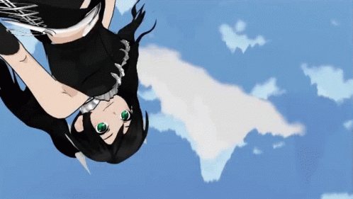
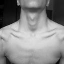
This all started out when I saw a closeup of Neige’s eyes to be honest haha 🤣🤣🤣 Why do they look like that?! What’s with that odd glow? All the characters eyes, especially in card art, are quite striking. But I’ve noticed that Fae eyes in particular have a tendency for a stronger glow or just overall more detailed eyes.
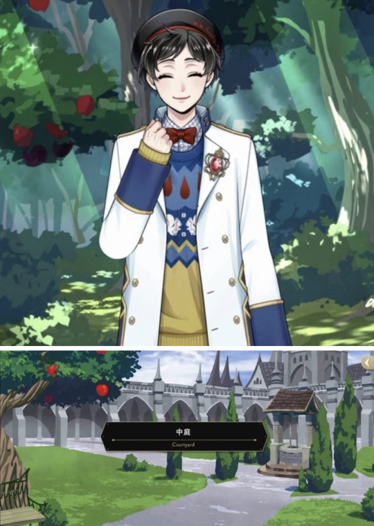
But anyway: dark hair, pale skin (this can apply to half the cast but SHH let me be annoying ahxhdbs) If you want to consider Disney’s Snow White, she has “lips red as the rose, hair black as ebony, and skin white as snow”, which we can keep in mind in terms of similarities🤪

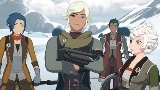
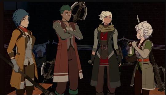
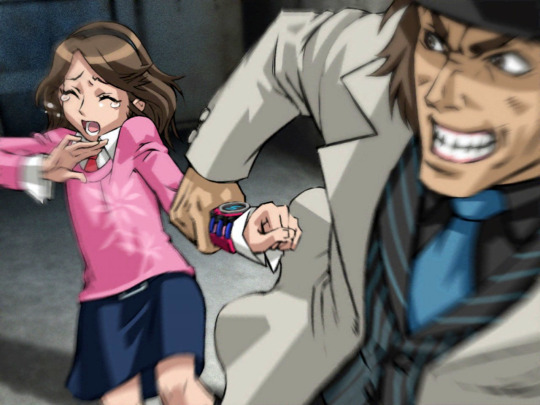
People have always mentioned Crowley’s strange connections to Pomefiore and the Evil Queen- perhaps suggesting that he is twisted from the Evil Queen’s crow. Perhaps this, OR THIS IS ALL ACTUALLY A CONNECTION TO NEIGE.
The courtyard apple trees, the mirrors, the wishing well. Aside from the mirrors, all of these feel very reminiscent of Snow White, NOT the Evil Queen. The wishing well was indeed part of the Evil Queen’s castle, but it is Snow White who sings to it to make her wish. Crowley is very protective of the apple trees as well, and seems to honor them greatly. Neige’s first introduction through the commercial LITERALLY has the apple trees in the background as well!!

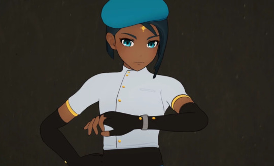
We also cannot forget his stupid vacation outfit (affectionate), which depicts a crow resting on an apple, and the background is riddled with flowers that look suspiciously like the ones from Snow White’s grave. And now with this uniquely yellow fit that no one expected Crowley to wear, Crowley technically shares the same exact color scheme that Neige (and this Snow White) does: yellow, blue, and red. In his vacation outfit, Crowley even ditches black as his main color and wears white instead.
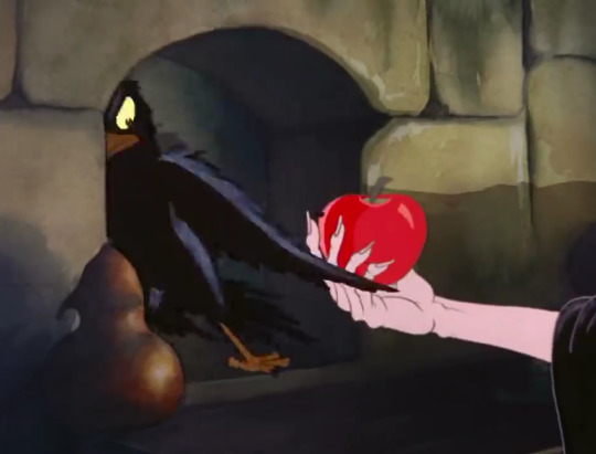
Because what’s interesting about the Evil Queen’s crow is that the crow does not play a prominent role like Maleficent’s Diablo does. In fact, the crow almost seems afraid of the Evil Queen’s plans, shying away from the apple and afraid of her wicked transformations. In Twisted Wonderland terms, couldn’t that partially make Crowley more sympathetic towards Neige?
I also think it’s funny that Neige probably has the closest reference to a Disney character name, because “Neige” means Snow, and “Blanche” means White in French.His name literally translates to Snow White, and OF COURSE Crowley would name a child so directly after one of these historical figures 😭😭😭
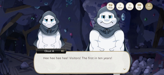
And here’s where my theory gets even more crackish AJDNHDE, but when Crowley transforms into a ghost in the prologue, he notable has the cape of the ghosts in the Dwarfs Mine. The Dwarfs Mine we visited in the prologue is NOT the actual one used in Snow White- instead being a very convincing replica in honor to the Fairest Queen. But even so, there is a cottage that’s exactly the same as the dwarves cottage in Snow White. The ghosts from the prologue say that Ace, Deuce, and Yuu are the first visitors in “ten years.”
Ten years? Neige is around 17 or 18 years old, and his vague backstory heavily implies he’s been abandoned from his birth parents since a young age. So what if- hear me out- Neige for some reason was left behind in the Dwarfs Mine area when he was around 6 or 7 years old, entrusted to the ghosts before he met with his RSA dwarves?!
But let’s also take an actually serious look in Neige’s backstory. Neige’s backstory is shockingly vague, despite being the rival for Vil in Book 5. Book 6 seems to imply that Rook and Vil know more about what Neige went through, but it’s strangely cut off.
Neige has apparently been living with the dwarves and taking care of themselves on their own since a young age. We don’t know yet how dwarves age in Twisted Wonderland- Yuu remarks that they resemble Fae because of their pointed ears, and they may indeed be a type of a Fae. But even if they had the lifespan of Fae like Lilia, the dwarves are also school-age kids. And considering the lack of knowledge regarding Fae in TWST society in general, I wouldn’t be surprised if there were discriminatory laws preventing the dwarves being considered actual adults even if they were far older. The VDC competition shows how all the human audiences consider the dwarves to be cute children- likely even elementary-aged children.
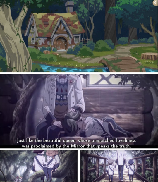
I feel like this further validates the idea that Neige and the dwarves actually lived in the abandoned cottage in the Dwarves Mine- since it was a completely abandoned area, they were able to take the space without worrying over their young ages. The cottage looked abandoned in both Vargas Camp and the prologue because Neige and the dwarves are currently living at RSA. Additionally, in the Book 5 trailer, there were interesting shots of Neige and the dwarves at a bridge, a bench, and a forest. It felt overall very reminiscent of the cottage we see at the Dwarves Mine, so I wouldn’t be surprised if Neige and his friends actually occupied this space before
But with this in mind, how DID Neige secure a filming job or even attend the same middle school as Neige if he had no parental guardians or adult assistance in the first place? Again, I highly doubt that humans would ever seriously consider the dwarves to be Neige’s guardian on the small chance they’re older than Neige, for the same discriminatory implications that I mentioned above.
If Crowley was Neige’s father, I’m sure he managed to pull some strings in the background even if Neige was left behind for some unknown reason. Much like Diaval in the live-action Maleficent, Neige was essentially the Aurora that Crowley was taking care of from afar. Going back to Crowley’s vacation outfit, the crow resting on the apple reminds me a lot of Diaval in his bird form looking over Aurora in her cradle. I’m sure Neige has strong magic power of his own, but I find it interesting that he ended up at RSA despite most of his focus growing up was between his job and chores at home. Perhaps Crowley couldn’t get him into NRC, but did put in a good word for him with Ambrose and eased the application process for Neige
I also feel like Neige would indeed have stronger magic BECAUSE he’d be half-Fae like Sebek. His glowing eyes is the only physical indicator of his Fae heritage, but he also has the magic to boost.
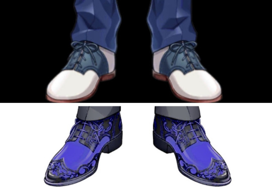
And the most unserious note to wrap up this crack theory, they even have a similar taste in shoes because what is this 😭😭😭
This is all to say that I um. May or may not have been working on a chaptered fic for a long while now based on this premise of Crowley being Neige’s father so 😭😭😭 yeah. Um. Look forward to or dread that 🤣🤣🤣
(I will steal your kitchen sink if anyone says this is more convincing from my also crack Malleus and Crowley theories PLEASE 🤣🤣🤣 /j)
#twisted wonderland#twst#twst theory#dire crowley#twst dire crowley#twst Crowley#twst neige#twst neige leblanche#neige leblanche#twst crack theory#twst headcanon#kallistopost
154 notes
·
View notes
Text
Rayday's Swap AU ~ Alastor
Second design of today! I probably won't make/post more for a bit as I made most of my Angel Dust design- and this entire one pretty much in one sitting.
More information about the design + "sprites" under the cut

No staff - I thought that the staff microphone wouldn't fit a futuristic Alastor, so instead I gave him a headset with a microphone
Symbol on headset - While it might just look like an R, I actually took inspiration from the Bluetooth logo, taking 2 runes and combining them.
In this case it was A and R. Why those letters? Cuz Alastor and radio/red.
Wiring/radio on his chest - I thought he needed more technology attached to him as Vox had his TV head to drive home the tech theme.
FM 96 - FM is a type of radio frequency ( the other being AM, and FM apparently being the better one. ) I chose the number 96 cuz it's a frequency it can pick up, and also cuz it's quite literally the opposite of 96 in terms of the sex position. ( Fits well with Alastor being asexual )
On that note: Ace swap Alastor? I decided to keep him as asexual, although specifically demisexual ( sex repulsed until sexual attraction for him is gained for a specific person. ) Why? Cuz I personally am a one-sided RadioStatic enjoyer.
Will Alastor know he's ace in this AU? It's still a no. He just assumes it's the norm.
Why not make him TV based - TV is technically already going out of style. Now it's more about social medias, podcasts, and/or streaming services.
Which is why I decided to just keep his radio themes, rather than switch to a TV themed one. A TV themed swap would be valid too imo, just not my personal take.
Also, I got car repair ads on YT right after looking up car radio references on Google. We really live in a dystopia smh.
Hairstyle - It's sort of hard to see, but he has a ponytail now cuz I said so. After I decided on that I realized it also kinda helps with keeping his hair somewhat out of the wiring on the back of his neck, so that's neat.
Horn antennae - I simply thought it'd be a great way to take the antennae thing on Vox's hat and ad it into Alastor.
How futuristic is Alastor in terms of his tech? - I know his design gives sort of mixed signals, but part of it is also just so he looks cool.
Coolness is sometimes a valid excuse.
Coat - The coat is sort of a mix between Alastor's and Vox's in terms of shape. It both has the V cut ( which realistically helps with movement/walking, ) but also maintains Alastor's coat-shape rather than giving him a penguin tail tuxedo like Vox sort of has.
Star buttons(?) on his coat sleeves - I just thought it'd be cute. Also cuz he's a media/radio star ofc.
No visible tail - I thought about it and ultimately decided against it. He still has one, don't get me wrong, but if Alastor has a personality similar to Vox, that'd mean he would want to ( try and ) keep his image in check.
A cute lil' deer tail would probably make it hard(er) to be taken seriously.
Height - Vox and Alastor has the same height which is about 7 ft, but even then Alastor retains his height as all my swaps do.
Color scheme - Alastor's color scheme is more noticeably influenced by Vox's. I tried my best to swap the red and blue though, with some exceptions ( like the bowtie ) in order to make it more coherent in my opinion.
Here's his design without the background

#hazbin hotel swap au#hazbin hotel#hazbin alastor#hazbin hotel fanart#rayday's swap au#hazbin hotel swap alastor
93 notes
·
View notes
Text
dating piper mclean would include

• we know that girlie is LOADED so be prepared to be spoiled and showered with gifts.
• while piper doesn't like flaunting her wealth, if she sees that you have your eye on something she'll immediately buy it for you. no questions asked. you don't even need to say anything.
• piper has a soft spot for when you play with her hair; running your fingers through her choppy locks and especially when you braid it. when you gently scratch her scalp while brushing your nails through her hair, she gets lost in her own little world.
• piper has a habit of linking arms with you!! like, wherever you go, the two of you are literally inseparable. she also sees it as a way to declare your relationship, because she's proud to be with you and has nothing to hide! <33 she's also a hand swinger fr.
• piper isn't afraid to show you off if you're okay with it. like she's in a beautiful, loving relationship, why wouldn't she??
• you guys have matching bracelets!! nothing fancy, just a bunch of multi-colored beads on a string, but she loves them so much. sometimes you dedicate dates to making these bracelets just because it's one of her favorite pastimes.
• she has ones with your name written on the beads, a couple with the titles of the albums you listen to together, as well as ones with your preferred color schemes. just anything to remind her of you. <33
• her collection is so big that they now stack up to her forearms. maybe it's becoming a problem.
• girlie is also definitely the big spoon when you guys are cuddling unless she had a bad day.
• you know that picture of your crush doing your make up while sitting on your lap? THATS YOU AND HER.
• you’re doing her makeup while she’s looking up at you.
• you can make her blush just by looking at her.
• when the two of you go out on dates you sit on the same side.
• the two of definitely share a closet, where she steals all of your oversized clothing.
• NICKNAMES GALORE: darling, babe, sweetie, honey, etc.
• PETNAMES IN FRENCH >>>> OMGG. her most used ones are "mon amour" meaning "my love", "ma chérie" meaning "my dear/my darling", or just "chérie" and yes she is very much aware of the effect she has on you. <33 speaking of, she 100% helps you ace all your french exams. such a good gf.
• she tells you all about her family history. piper loves how your eyes light up with genuine curiosity. with you, she feels more appreciated. she'll tell you all about the culture, customs, and even show you a few traditional songs of her heritage.
• piper knows she has a good singing voice, but she still feels self-conscious whenever she showcases it in front of others. but when it comes to you? she'll sing all you want, since she feels a huge sense of comfort whenever you're around. whether it's through cuddles or other means, it's in your arms that she feels the most at peace.
• she's a big fan of pda. loves kissing you on your cheeks, forehead, and lips. holds your hand 24/7 and loves to rest her head on your shoulder when she's tired. loves when you hug her from behind.
• she swoons when you make a playlist dedicated to songs that remind of you of her and songs that fit your relationship with her.
• the two of you definitely do all of those tiktok couple trends together like the lipstick one and the picture in the wallet one.
• the two of you take candid photos of one another and love doing photo booths together.
• you both have a polaroid of the two of you in your phone cases and your wallets.
• if you don't have a lot of siblings in your cabin, she definitely sneaks into your bed to snuggle with you.
• she definitely wakes you up into the middle of the night just to ask you if you'll still love her if she was a worm or if you love her romantically or platonically.
• she will bite you to show her love and affection for you.
• if you’re not a vegetarian, you floss and brush your teeth before kissing her. (which she thinks is the sweetest thing ever!!)
• girlie is SO in love with you and would do anything for you.
#percy jackon and the olympians#heroes of olympus#pjo#hoo#pjo hoo toa#pjo tv show#piper mclean#piper mclean x reader#pjo fandom#pjo disney+#pjo x reader#pjo series#hoo series#hoo fandom#hoo girls x reader#riordanverse
61 notes
·
View notes
Text
If one more person calls Athena's design bad I'm gonna have a brain aneurism I actually can't with you people.
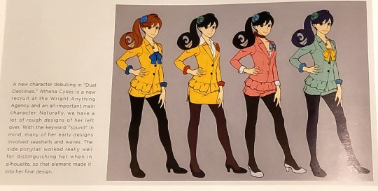
In the Dual Destinies artbook, it is stated that Athena was specifically designed to have a more manga/anime influenced appearance, and I think they accomplished that with flying colors.
She doesn't look the same as Phoenix and Apollo, but that was never their intention at all. Whether you LIKE the direction they went with her design is of course, entirely subjective, but you cannot call it a failure of a design.
BUT ANYWAY I'm about to justify many design elements that I've seen people criticize.
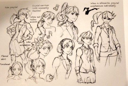
The side ponytail. ONE THAT I'VE SEEN MANY PEOPLE DISOWN FOR... Seemingly no reason? Either way it's clearly stated here that the side ponytail was used to make her silhouette more distinguishable.


Her more futuristic elements were also VERY MUCH INTENTIONAL- Not to mention they are quite literally justified within the game, with Athena having been raised in a robotics lab at the space center, and having a very heavy technology motif, especially with widget.
I've also seen people complain about her boots, to which I say I think they do a good job matching the rest of her color scheme as well as furthering the futuristic/manga vibe they were going for.

As you can see, both the boots and the side ponytail were prevalent in a lot of these early designs, and they also played around with the idea of her ponytail resembling a music note.

As you can see, the overly futuristic vibe was always there, and she was never intended to just LOOK like an ordinary lawyer- And honestly, I'm glad they did something like this to distinguish Athena from both Apollo and Phoenix.
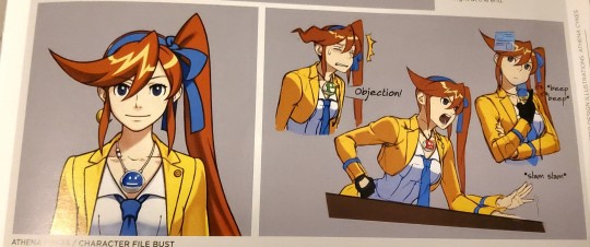
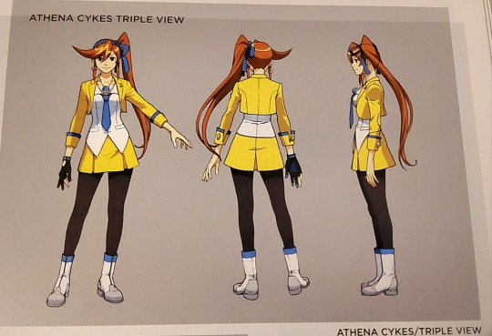
Her wearing primarily yellow helps to tie her in, but she also stands out in her own way, which makes sense, since neither Apollo or Phoenix were designed to reflect their backstories or specific themes.
Phoenix was literally designed to be a lawyer, and Apollo was literally designed to be another Phoenix (no offense, I love Apollo and his design haha).
Not to mention they do a good job sticking to the few distinct colors they chose for her, bright yellow, blue, and white. Which reflect her personality perfectly- Like, you get what she's all about the second she comes on screen.
I guess this is why the claims that she is over designed seem to piss me off to no end. AGAIN- She is definitely more detailed than Phoenix and Apollo, and is definitely a departure from the style of the series, but that doesn't make the design cluttered or bad.
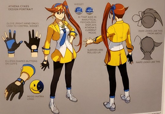
NOT TO MENTION- Athena was the first protagonist to be specifically designed to become a 3d model. And it makes sense that they would utilize that medium in a way for her design DIFFERENTLY than those of her 2d predecessors- So again, the extra detail makes sense.
SO ANYWAYS- Long story short, got really sick of people echoing opinions about Athena's design being bad, so I wanted to educated anyone reading on why I personally think that she is the best designed protagonist in the ace attorney series- And her design is deserving of a lot more love.
#ace attorney#athena cykes#dual destinies artbook#dual destinies#concept art#justice for athena cykes#aa5
318 notes
·
View notes
Text
Replies
Alright, let’s talk about Kalim (related to the latest comic), new official stuff, Idia being annoying and Lilia being possessive over Silver! And some other stuff, I think…
Anonymous asked:
So you seen the latest chapter of 7 ENG. If you do, any particular thoughts on two certain individuals with helmets.
We haven't watched ch7 at all yet, Anon. There are certain spoilers that are unavoidable, but since we didn't watch the story itself, we can't really say anything. We also don’t follow ENG updates, more on that in a reply below.
hipsterteller asked:
the only dorm leader who didn't overblot and same time the only sunshine
Yep, that’s our Kalim! He’s just here to have a good time :)
Anonymous asked:
Kalim, the only housewarden not to overblot.
Jamil, the only vice housewarden to overblot.
Aren’t they just perfect for each other? 🥰
Anonymous asked:
Good thing Jamil is not part of it...actually, I think he already did before the meeting.
I guess it depends on whether Kalim has asked him about how he is doing or not this day 🤔 Check on your friend, Kalim!
Anonymous asked:
Kalim (walking to his room): Oh, wow! That housewarden meeting was wild! Six people overblotting all at the same time... What are the odds of that?? I sure am glad to be finally back to the peaceful familiarity of my dorm, where I can rest after such a stressful day!
Scarabia student: Housewarden, please! Come quick-
Kalim (still walking): We're not doing this today :)
LOL sorry, Kalim, you have no choice but to deal with this, Jamil is clearly not dealing with this well on his own. Oh wait. Kalim probably shouldn’t intervene, he’ll just make things worse lol
asteampvnk asked:
Love your newest drawing. Although, to be fair, with how much Kalim gaslights himself that everything’s fine I half expect him to overblot.
I don’t know, to be honest it’s still very difficult for me to picture Kalim overblotting over anything other than Jamil getting seriously hurt because of him, but maybe it’s Kalim’s gaslighting that’s so powerful that it completely skewers my perception of his overblot chances…
Anonymous asked:
I don't know why, but I find Kalim's eyes so cute the way you draw in the latest comic.
Thank you so so much, Anon!! ❤️
Anonymous asked:
Ryuichi and Katsu, you guys probably only play the EN Version of Twist but i wanted to ask if you guys had heard of the new JPN Event 'Red Carpet in the Shaftlands'! Have you seen the new cards and outfits? Especially Vil and Azul look very handsome!
Hi Anon! We don’t play the EN version, or any version for that matter; we just watch the main story + events on youtube. We also prefer fan translations over the official ones :) This isn’t what you asked about, but I thought I’d mention that. So yeah, we did hear about the new event! Even though we don’t have time to watch events these days, we’ll probably and hopefully get to it eventually; so I have really high hopes for this one! I already said it the other day, but: show us Eric Venue god damn it >:(
As for the cards…
Anonymous asked:
HAVE YOU SEEN THE NEW OUTFITS FOR ACE, JAMIL, AND AZUL!?!? I NEVER THOUGHT AZUL WOULD LOOK SO GOOD IN THAT COLOR SCHEME!
AZUL LOOKS LIKE A MEAN RICH AUNTIE, ACE LOOKS LIKE THAT ONE DOUCHE FROM A RICH FAMILY THAT ALWAYS ASKS FOR MONEY (AND HIS RICH AUNTIE DOESN’T GIVE HIM SHIT), JAMIL LOOKS LIKE THE MEANEST GIRL IN A HIGH SCHOOL MOVIE FROM 90-00S, AND IT LOOKS GREAT!!
Azul does look good, although I am a bit conflicted about his hairstyle: I can’t quite figure out whether I like it or am just okay with it; but even if it’s the latter, I’m always excited to see new hairstyles. And this shape of glasses looks so stupidly good on him! He is indeed very handsome, this style of clothing suits him a lot.
Vil is gorgeous, I can’t even yell about him anymore. The richest mom in Hollywood.
Ace looks very good; Jamil does unimaginable things to my psyche, I can’t quite put it into words. I think the colour scheme of the new outfits suits him the most, but I might just be biased.
Anonymous asked:
Ryu they released the choreography of absolutely beautiful, did you see???? Im soso normal about it LOOK AT MY WIFE SPITTING BARS AND LOOKING ALL CUTE I watched it so many times already i was pacing around my room for an hour
I honestly can’t believe they did, this is so nice of them?? Now people can actually perform the dance themselves, this is so cool.
Jamil’s rap is one of my favourite parts of the song (original, I know), so it’s great to actually see him shine. But also? Also?
Epel short.
Anonymous asked:
I’m so sorry but in reference to the ask about Idia getting into a verbal sparring match with someone: imagine they’re both getting ruder and nastier and then, they somehow end up in bed together????
YES this is basically how we write Sebek/Idia LOL But also Azul/Idia to be honest, these two argue and get annoyed with each other a lot…
This is one of our favourite tropes in general, and with Idia it suits him to perfectly lol He always ends up verbally sparring with someone and getting someone heated over the argument, it’s like he’s begging for it (absolutely unintentionally though).
Anonymous asked:
Your art is really wonderful! (I love how you draw Lilia.) Sililia is a bit of guilty pleasure for me as well. I think you mentioned in a previous post about yanderes that Lilia’s trying not to get attached to anyone at this point in his life. So, if someone else were to hit on Silver or tried to woo him, would he reluctantly accept it? Or would he instantly act possessive once he sees someone moving in on his?
Thank you so much, Anon!! I am very happy you like our Lilia and that you enjoy his relationship with Silver <3
I think I talked about it in one of our previous LiliSil posts, but I’ll reiterate: in theory, Lilia would absolutely encourage Silver to spend time with someone else, even if this is just a little high school fling and not something serious. He does want Silver to socialise more and to have a lot of people around him, because unfortunately Lilia won’t be around forever, and he isn’t cruel to the point of wanting Silver to be loyal to him even after his death. That would just ruin the young one’s life forever, wouldn’t that be a waste?
But in actuality, I think Lilia would still get somewhat jealous and possessive if Silver found someone for himself. Lilia might try to rationalise it by thinking that he just doesn’t want any rascal to hurt Silver’s feelings, he might even enjoy acting like a strict dad for a short while, but he’ll very soon realise that he is just being super jealous and doesn’t want to share Silver with anyone lol It might be easier for him is Silver starts dating Sebek, at least Sebek knows his place… in Lilia’s eyes, at least.
Anonymous asked:
*looks at violet art*
*looks at Idia art*
Now we need a universe where those two meet each other because I swear some alternate universe thing is happening here.
I absolutely should’ve replied to this one as soon as we got it, sorry for fucking up the chronology of this whole thing, for some reason I just couldn’t shut up about Idia and Violet LOL
Ah, these two. Artsy goth Idia and Otaku tech-nerd Gregory.
Honestly, I wonder how these two would interact. The easiest thing would be to assume that they’ll just sit in their own corners doing their own thing because neither of them is particularly chatty. Also, at first it seems like despite their similarities, they are the opposites of each other, because of the whole arts vs tech thing… but in actuality, Idia is one of the most artistic people in NRC?? With good taste and outside-the-box creative thinking?? Considering how much he loves a good design and how even Vil praised the ceremonial gear he made for Ortho. As someone who likes anime and stuff, he is definitely a connoisseur of art lol
So yeah, it’d be funny to think about them getting weird vibes from each other from the start, maybe seeing some of their own “bad” qualities and being annoyed by them, getting weird uncanny-valley feeling, but ultimately ending up creating something together. I just want them to create something together…
Although…both of them are such individualists, they might have creative disagreements and do their own things separately from each other. God damn it boys you were supposed to have fun interactions!
21 notes
·
View notes
Text
Nitpick November Day Five! Let's talk about the Happy Huntress uniforms.
So, I don't remember exactly where I heard it, but I'm pretty confident it's true; The Happy Huntresses introduced in V7 were meant to parallel but be contrasts to the Ace Ops also introduced in V7. I could make an entire post about the ways that I think that failed that are a little more important than their uniforms like Robyn being a politician and them stealing from government works projects rather than like them stealing from Jacques Schnee and how I would've done the Robin Hood allusion differently etcetera etcetera, but those aren't nitpicks.
But specifically with the uniforms, I'm gonna nitpick the hell out of that. Because one of the ways that the Happy Huntresses could've so easily been used to contrast the Ace Ops is their clothes. We as the audience are meant to see the Ace Ops as stiff, order followers who act within the confines of Atlas and Ironwood, and we're meant to view the Happy Huntresses instead as the cool, rebellious non-conforming good badge carrying law enforcement officers that only follow their own rules (which again is an entirely different problem that's much bigger than a nitpick.) But if we're going to see the Ace Ops as stiff and confined and the Happy Huntresses instead represent freedom and expression... Why are their outfits so matchy? The Happy Huntresses should dress however they want, wield cool creative weapons, express themselves through their clothes and emblems if they even have emblems! Even though the Ace Ops all keep to an Atlas color scheme, their outfits are otherwise just as personalized if not more personalized than the Happy Huntress outfits are. Apparently Ironwood is like "No, it doesn't matter if Marrow is wearing a long sleeved coat, Harriet, of course you should wear a tank-top shirt and white shorts with dark blue chaps if you want to," but the Happy Huntresses were like "If our jackets aren't almost the exact same except in different dulled down colors, we won't look like a team." I'll also point out that making the Ace Ops a group of five (something that goes against the norm of teams as we've seen in RWBY) and only making four important HH members (though there is one more member named Crimson that's offscreen according to the Wiki,) is also slightly weird to me. Like, shouldn't Robyn's team be the one not adhering to strict arbitrary unnecessary rules like how many people are usually put on a team, while the Ace Ops are the ones who are adhering to those guidelines? I read on the wiki once that the Ace Ops being comprised of five people was 'a clue' that Ironwood wasn't good because he wasn't adhering to the four-person team thing, and I'm just like...
It's a nitpick, but really, why do the Happy Huntresses have any sort of uniform? If I was trying to play the Ace Ops as stiff and controlled and the Happy Huntresses as contrasting that, I'd start by giving the Ace Ops all one unchanging across the board uniform and making the Happy Huntresses an explosion of different styles and cool color schemes with no set aesthetic or uniforms at all. It seems obvious! Why couldn't one of them be more subdued and grayscale and one of them is like colorful punk and one of them is more cutesy vintage and one of them dresses in like... Idk, seventies inspired glam, or vampire looking goth stuff, or grunge or biker or anything interesting and not conforming?
This might just be me personally too, but I have an easier time getting attached to and caring about side characters when they look like they have a lot of personality. Like don't get me wrong, May specifically has a great personality that shines through even without some kind of iconic look. But compare this
To this
There's a reason people loved Neo from her very first appearance before we even knew anything about her, and it's because we could get so much character from just this shot
Not to mention
So much character can be gleaned by style (and attitude.) I do not understand the choice to make characters that are meant to be significant and thematic like the Happy Huntresses and then putting them all in dulled down samey uniforms with all the same weapon.
42 notes
·
View notes
Text
Sometimes a little shaken, a little stirred
(ace finds a dress in marco's room, and boy howdy does he discover how horny he can be about a man in a dress. maybe lightly genderqueer/gendergray marco?) (dedicating this one to @xamaxenta AND @mangyraccooon)
Their relationship is still new-barely a month since Ace bucked up and kissed Marco during a party-when Ace finds The Dress in Marco's quarters.
It's tucked into the back of the man's wardrobe, hanger squashed against a far wall, hidden inside a garment bag, and obscured by the few suits Marco owns ("for weddings" he claims). It's long-probably reaches down to his ankles or even to the floor-sleeveless to the point of scooping the straps, and a front jewel neckline that sits above the collarbones but the back is open with a loose plunge so deep Ace wonders if it would show a hint of ass. The skirt, from the waistline down (even around the plunging back), puffs out with a number of ruffled layers that look like they'd swish attractively in motion-either in a walk, a dance, or in combat.
It's also such a stunning sapphire blue with shimmery gold trim stitching on the edge of every seam and ruffly layer in the skirt, Ace knows within an instant that it cannot belong to anyone other than Marco. There's no chance it belongs to Izou (though he might have something to do with it existing at all), no chance is belonged to Mala at some point (they're of a similar frame to Marco if a few inches shorter), there's no way in hell he's holding on to it for one of the nurses. It's Marco's dress for sure.
He just doesn't know why Marco has it. It's a question he'll have to ask, but the newness of their relationship makes him hesitate. What if asking upsets Marco? What if the dress is a momento of some kind from a previous lover? Or a mission from years ago? Or possibly something that used to belong to someone he knew that is now gone?
As he puts the dress back where he found it, he dismisses that last possibility. The dress is just too perfectly suited to Marco to have belonged to someone else, unless they have the exact same taste in color schemes as the man.
Unfortunately, even after he's put the thing back away-hidden in the back of the wardrobe behind suits and under it's garment bag-he can't help picturing Marco in it. The neckline would be tight on his collarbones, hell the whole bust would probably be tight enough to squeeze the man's chest. The scooped straps would emphasize his bust and pectorals and while Ace has been driven to distraction by Marco's extremely muscled chest (thank you bird wings that need hard working shoulders and pecs!) on a normal day, a dress like that would almost make them look like breasts. He imagines one of Marco's lazy, heated stares that sometimes pop up at the end of dinner over the top of a sight like that and has to leave Marco's quarters to cool off-the air growing literally smokey around him.
Then he imagines the dress from behind. Marco's back is sculpted-all well trained, hard working muscles that support his wings and arms when he partially transforms. That open plunging back would practically put the knobs of Marco's spine on display and perfectly frame every line where those muscles attach with shadows and suggestion. He can't quite picture where the bottom of the plunge would land (somewhere around the tailbone?), but that perverted (and extremely grateful) part of his brain can only say "easy access."
Then the ruffled, layered skirt. The gold trim and stitching of every layer shimmered in what little light there was in Marco's room with every minute shift of the fabric (and what soft, silky fabric it is!). It was eye catching, practically demanded you look at the long expanse of his lower body in fact. Marco has fantastic legs despite his top-heavy appearance-thin but no less muscled than his shoulders and chest and back, his fruit forcing the muscled to compact instead of giving it room to bulk out a little (no bird has beefy legs, especially not the phoenix who's deceptively monstrous strength hides under sticks and feathers the colors of jewels). Ace imagines that every shift of weight, every cocked hip, every tiny movement would make those ruffled layers fan out and make the gold catch the light in a liquidy shimmer. He tries thinking of Marco half transformed in the dress and his mouth goes dry-wings fanned out to either side the exact color of the sky, talons flaring out from under those rivers of sapphire fabric and gold, Marco's cocky and playful grin sitting over the top--
Ace makes himself refocus. He wasn't even supposed to be looking in the man's wardrobe and they've only just started getting physical with each other. He'll bide his time, and ask about The Dress later.
8 notes
·
View notes
Text
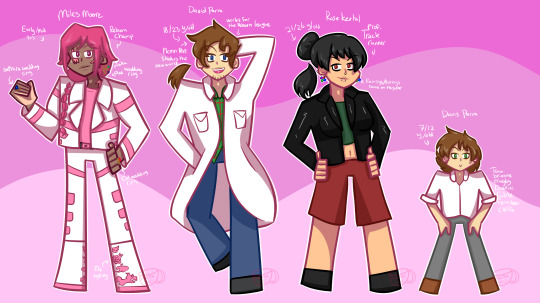
Future!Miles and his siblings. Around 5 to 10 years in the future!
I actually finished this almost a month ago but I wanted to post this along with his future e4/partners and Lin design but I figured I'd post it now and the others later when I feel like finishing them.
More info:
Miles:
He is the champion of reborn obviously, the only one who have gotten close to beating him are Fern, Shelly, Cal, Saphira and Adrienn (Although that was only once and then never again.)
He's in his early to mid 30's.
He is married to Cal, Saphira, Ace and Taka! He proposed to Cal and Saphira, while both Taka and Ace proposed to him.
The ring on his right hand (Ruby stone) is the wedding ring from Cal.
The ring on his left hand (Sapphire stone) is the wedding ring from Saphira.
The ring hanging from his right ear (Emerald stone) is the wedding ring from Taka.
The ring hanging from his right ear which is intertwined with the Taka's ring (Amethyst stone) is the wedding ring from Ace.
He first married Cal, The Saphira and then Taka and Ace at the same time, they were already married to each other at that point which is why their rings are intertwined.
Laura is the one who inspired him to grow his hair out even more.
His boots has type designs based on his e4 members.
Still has the same color scheme as before besides his belt.
This design is close to his second appearance design but with more details.
David:
He is the pokemon professor of the reborn region, he studies the new world! He also helps Adrienn and Miles with new trainers who come to the region and does other stuff.
18-23 years old.
Still best friends with Noel.
Inspired to grow his hair out like his big brother.
Teaches at Onyx's trainer school sometimes.
Was the top student at Onyx's trainer school, he also graduated there.
Realized he's aromantic.
His outfit is pretty much the same from when he was a child but his shirt colors are inverted and he now wears a lab coat.
Rose:
World famous athlete (Track runner)
21-26 years old
Travels the world when competing in sports.
Still very close with Charlotte and Aya.
Is no longer as lonely and angry, she's also confident now.
Her outfit is now much more comfier and easy to wear, but still has a leather jacket.
Davis:
7-12 years old
Enjoys hanging out with Blake and Heather in the orphanage.
Thanks to Shelly enjoys a lot of reading.
He's got a full team of six nfe pokemon, all gifted to him by his family/friends.
Brionne (Miles)
Magby (Cal)
Dratini (Saphira)
Gible (Taka)
Fenniken (Ace)
Cleffa (Noel)
Miles and Davis live in the Belrose mansion with Miles's partners and Charlotte, Laura and Bennett. Rose technically lives there too, but due to a lot of traveling both in the reborn region and outside of it she tends to sleep in hotels/pokemon centers.
David used to live there with them, but David moved to Lower Peridot Ward to live closer to the Grand Hall for his job there.
13 notes
·
View notes
Note
Do you have any headcanons about how the different tribes celebrate pride month? Sorry if you have already done headcanons for this before.
No I actually haven’t done this before! To be honest I feel like gay and trans dragons are just naturally accepted in the dragon world and they’ve never really been questioned, the most controsvery the topic ever had was a Queen stepping down because he transitioned to male and didn’t want to be Queen anymore unless he could rule and be called King but I do think some tribes have some lgbt related traditions i can share! ( sorry if this answer is kinda lame, I just think the only things dragons hate each other about is dragon xenophobia and ableism because thats the only form of discrimination shown in the books )
Mudwings: While I disagree that Mudwings don’t take care of dragonets like it’s said in the books and I personally think the village raises the Mudwing dragonet, Mudwings have a generally aro/ace society, of course this doesn’t mean Mudwings aren’t allowed to fall in love and of course some Mudwings reproduce but romance isn’t like very common. There’s never been a second queen or a king by the Mudwing Queen’s side in history because Mudwings generally don’t distinguish romantic and platonic relationships. Which is often why most Mudwings are hit with giant culture shock visiting other tribes. Basically Mudwings are just like: we are all pals and friendly to dragons we like and if we don’t like you fuck you
Seawings: I like to think Seawing Queens historically are the most gay like I have no clue why I just have a distinct vibe and gut feeling that during mot Seawing Queen eras there were 1 or moresecond queens who were just their wives. I have no clue why I think this either, it’s just kinda a thing that’s an unknown trend in the sea kingdom.
Skywings: Skywing names typically tend to be more gendered and because of this, Skywings who come out as trans have a ceremony in which their wings are painted with the colors of a sunrise, and their parents or guardians give them a new name that matches up with their gender identity. Although some trans Skywings like the name they were given at hatching/it’s not really a gendered name so they just dick around with pretty colored wings for like an hour, although this ceremony will also take place if a Skywing is getting their name changed for any reason.
Sandwings: I don’t have any headcanons for them sorry :((
Icewings: Mfs really can be the trans flag. Like pink? Blue? White? All Trans flag colors that Icewings can be. In conclusion all Icewings are trans fuck you /j
Rainwings: “Okay okay so you are a dude who likes dudes? Okay??? Go get me a pineapple we need you to help us make fruit smoothies with the homies, unless you have like a new boyfriend to show us get to work”
Nightwings: While not entirely pride related I like to think a rainbow in the wof universe represents all the tribes, so as a peace treaty with the other tribes one day the Nightwings showed up painted rainbow and everyone was like “okay yeah peace but that paint job is horrible hire someone new and come back”
Silkwings: I know lgbt flags wouldn’t technically exist in this world because like they don’t have the same history we do but Silkwings weave flags no questions asked ( also, Silkwings can basically be any lgbt flag in color scheme except flags with black in them? Gay as hell all silkwings lgbt fr /j )
Hivewings: Jewel Hive definitely does Drag like I know Dragons probably wouldn’t have drag because they don’t have the same form of exaggerated feminity humans do for Drag ( or masculinity drag kings i love you ) but fuck you they do they’re extra ( also I know drag isnt always lgbt but its so connected to our history I thought I would include )
Leafwings: Leafwings don’t care who you smooch or don’t smooch or what gender you are beat up that dragon eating plant and get back to work
143 notes
·
View notes
Text
The Journey of The Tarot Haiku
III: The Empress - Creativity
I had previously talked about what art software I used to create my digital illustrations for the book, and now I would like to share my actual process of creating the illustrations.
Even in the early stages, when I was contemplating the fact that writing two poems for all 78 Tarot cards would mean a minimum of 156 poems, I thought to myself, I don't necessarily want to limit myself to just the cards. Why not round it out and include a poem about each of the Suits as I introduce them? Why not include the number system that had been so beneficial to my own understanding in general? However, at that point I realized that it might not be best to represent these concepts with the cards themselves. I could have, of course, used the cards for the numbers - it might have been interesting to line up all the aces, twos, threes, etc. to show how the numbers are expressed in the Minor Arcana. But for poems representing the individual Suits, what card should I pick? And what card would best represent the Major Arcana? Or reversals, or the matter of context? The idea of using cards for all of these and having them repeat throughout didn't feel quite right to me.
At any rate, I would have to design a cover for the book, so if I was going to do that, why not see if I can make some simple but effective illustrations for some of the content as well?
This was my first time doing vector art, which was a bit of a challenge, but I was surprised to discover that it wasn't really difficult so much as a little fiddly. It was crucial that it be vector art, because it is based on mathematical calculation of the curvatures, and no matter what size you enlarge it to, it will stay crisp and clean. I had no idea what size the final product might be, and so I wanted to ensure that even when resized, the images would look nice.
I very quickly settled on a color scheme: there is something elegant and magical to me about a deep ocher gold accented by black and white. I wanted to keep the cover simple to begin with: my resources were limited (not stunning photography and editing for me), and it is self-published, so why not allow it to look like a single person made it with everything they had? It's true! So I set out to create some vector illustrations with my color palette all set.
The number system was discussed in a previous post, and it was a no-brainer to use dots and lines to construct the shapes. I made a new file, used the same dimensions and fitted all of them carefully within the same sized space. Some of them look larger than others, which is the price you pay when you are drawing shapes that are less bulky than a square.
Then came the Court Personalities, which were all modeled after individual Court Carts (the Page of Swords, Knight of Cups, Queen of Wands and King of Pentacles, respectively), and to keep the illustrations mostly a lighter color, I made the clothes golden and the faces black to show that the rank is what stays consistent, and the individuals themselves may be any of the Suits. I then designed the Suits and drew their symbols, mostly free style, keeping them simple.
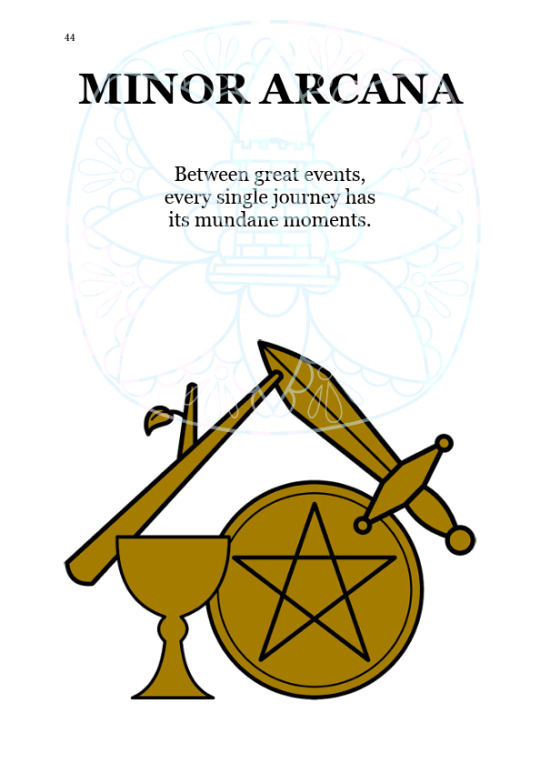
By far my favorite was the illustration I did for the Major Arcana, and had I not settled on the cover looking like a simple card back, I might have used this as the cover illustration:
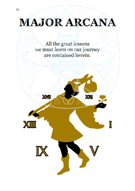
That is all for now! I hope you enjoyed these, and thank you for reading!
Buy the ebook
Buy the paperback
Buy the hardcover
6 notes
·
View notes
Text
Homosexual Ranks Ugliest 999 CGs
Listen 999 has really great looking character models and animations, and I do think the majority of the cgs look quite nice. But girlie girlie GIRLIE some of these don’t even deserve to be in the pits of heaven with how absolutely DISGUSTING they are! So I’m here to tell it like it is 😤
9
Not only was this moment highly uncomfortable to watch, it was literally uncomfortable to watch because this picture is so damn ugly. Junpei looks comically large in comparison to Akane. It feels like they drew him normal sized but then they were like “but wait! How will gamers know hes a big strong man if we don’t INCREASE HIS GIRTH???!!” It also looks like they just photoshopped Akane in there. Plus his hood looks like shit I hate it
8
Again Akane looks photoshopped in and she looks really small. At this point you realize that junpei’s outfit has the worst color scheme and it unfortunately makes him look stupid in every scene
7
Kanny sleeves are giving miles edgeworth. Ace’s teeth are giving hungry hungry hippo
6

For some reason Junpei looks like a human version of Alvin Chipmunk. I can’t explain it. And Lotus boobs go WHOOSH like girlie be careful going up those stairs those things are gonna explode like the ninth man!!!!
5
Absolutely homophobic to draw Aoi this way. Who let this happen. Who gave him that face. I would like to have a word with them
4
So i think Junpeis expression is good here but SEVEN HELLO???? Why does his head shaped like that???
3

This is a hate crime. I am being attacked. I am in the hospital bleeding out. Lotus’s boobs 2, electric boobaloo. Has this artist ever seen titties???? THEY DONT DO THAT
2
This is the same image as 8 but with Aoi instead so I guess girlie IS photoshopped! But nah absolutely not absolutely HEINOUS the way this man looks. I don’t believe that is his hair i think it’s just a continuation of his skin flailing around. His ears could crush me to death. His eyebrows are GONE WHERE ARE THEY. His eyes are WHITE WHY ARE THEY WHITE THIS IS UNNATURAL. Worst of all though, the biggest crime ever committed is his fingers. Yaoi hands undercooked sausage edition. Fingernails the size of Texas. Girth of an oak tree. Abomination, absolutely disgusting
1

I would’ve put this as 2 but no I think it deserves the worst rank because it is truly despicable how much this game forces me to look at this image. It’s like oh boy the best parts of the game are happening let’s keep this image up for 20 minutes! Where do I even start tearing this woman apart? The hair, the eyes, the pose, the clothes, the boobs. It’s all so awkward looking, so fuck-ugly that I’m impressed. I have no words
#zero escape#999#I’ve needed to say this for a long time#i cant be silent any longer#this is brought to you by me having awful nightmares for the last 5 days and being sleep deprived!
30 notes
·
View notes
Text
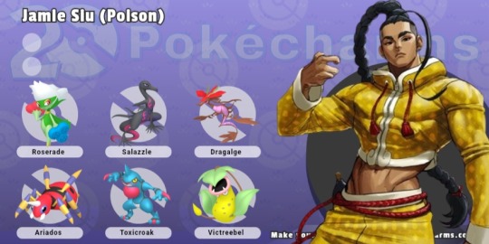
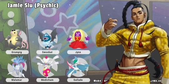
Rolled again, ended up with pokemon team for a Mr Jamie Siu! I couldn't decide whether to make him a poison or psychic type specialist, so I figured, why not both?
He's also got a little Spinda companion, but that's more of a pet than a battler.
For the poison team, I went generally with cooler ones, making Roserade his ace since they're both dancers. Dragalge is his oldest mon tho, it was a gift from the dragon brothers who inspired him to fight. Salazzle just has that same flair, Ariados matches his color scheme, and Toxicroak could be a sparring partner. Victreebell is the same shape as that gourd he carries his tea in.
For his Psychic team, I couldn't resist giving him a shiny Grumpig, both to match his dancing and his yellow colors. Swoobat is actually a nod to the monster AU in which he's a vampire, Jynx is another dancer, Malamar doubles up on the dark and psychic dual typing, and Medicham and Gallade just have the ✨️vibes✨️ (also don't try to tell me he wouldnt make a huge show out of mega evolution).
3 notes
·
View notes
Note
if you’re still answering/if you would like to answer any of these! 💛🦚🏳️⚧️🌈
thank you!!! i am absolutely still answering (i'm fighting with my wip and its got fucking HANDS)
💛 - Who or what made you realize you were queer?
I knew I was bi as soon as I learned it was a thing, when I was like, 13 and on the internet for the first time. like, "you can like BOTH???" and then i figured something was up with my gender in high school but i didn't really figure it out until quarantine and i was spending a lot of time by myself. but there wasn't an isolated incident for that so much as a long and annoying journey asdlkfjaklsd
🦚 - Are there any queer books/shows/etc. that you would suggest?
Okay. Hear me out. Because I'm going to recommend Pushing Daisies which is not explicitly queer in any way there are no canon queer characters. HOWEVER the whole thing is easily read (and likely intened to be) a queer allegory, and was written by Bryan Fuller (same guy who did Hannibal!), who is a gay man. The premise is Ned is a piemaker who has the ability to reanimate the dead (with three simple rules, one of which being if you touch a dead person a second time, they die for good) and he ends up reanimating his childhood best friend/crush Chuck (whose real name is Charlotte). Meaning they can never touch again and have to get creative with their relationship! That's kinda the underlying ongoing plot, with each episode focusing on Ned, Chuck, and Ned's private investigator friend, Emerson Cod, solving murders using Ned's gift. ITS A GREAT SHOW EVERYONE SHOULD WATCH IT AND I'M PISSED IT ONLY GOT TWO SEASONS. (also Ned is very ace coded imo)
🏳️⚧️ - What Flag do you think has the best color scheme?
The bi flag honestly, I love that sumbitch. Pink, purple, and blue? Iconic, loud and beautiful. But special shout out to the gilbert baker rainbow flag with sex and magic on it bc those two colours make the rainbow soooo much better
🌈 - What's a Queer Identity, Experience or a piece of History you feel deserves more recognition?
I wish I had a better answer to this, I really need to do more research on queer history and read more experiences. But I do wish there was more focus on gender EUPHORIA as opposed to dysphoria. I never really had dysphoria which is part of why it took so long for me to figure shit out, but I got really happy and excited when people id'ed me as a guy or used masculine terms and he/him pronouns for me! Would love to see more focus on that side of the trans experience :)
send me a pride emoji!
5 notes
·
View notes
Note
bab mang fox chi nard gold
Lin I hate you /j
By ‘bab’ I’m assuming you mean Baby, to which I have literally no solid headcanons— maybe Demigirl ace lesbian? But idk- she’s too plot relevant for me to get silly with her lol (also too humanoid- not fun enough /hj)
Mang I assume = Mangle
To which I say: transneufemme polygender genderfluid xenogender xenogenderfluid girlboything :) ya know- the vibes! Also uses She/he/they/it/xe/lobe/brain/🧠 pronouns :) also pan, also has the Autism, ADHD, BPD, psychosis/schizophrenia and PTSD (also is partially blind and has balance issues because of the… ya know… also probably has grip issues and maybe hypermobility) also his endo head is a separate person who can think for themselves and has its own consciousness (though probably shares the gender and disorders and shit with mangle)
(Also- in my lil monster au in my brain- they’re a shapeshifter with the restriction of keeping her color scheme, the endo head and the fact that they’re a fox- but the arrangement of it’s body, organs, skeleton, fur, etc can be shifted and changed at will, the endoskeleton looks like striped metallic tentacles/tendrils wrapped around silvery bones and the endo head is a metallic grey skull with a few red veins and an eye still attached)
Assuming you mean regular foxy when you say ‘fox’
Pirategender cis man lol, uses he/it and maybe she? Either poly(sexual/romantic) or bi, probably prefers masculinity and androgyny over femininity, has Autism, ADHD, psychosis, BPD and is a triple amputee (both legs below the knee and left hand). His eyepatch is fully for aesthetics- there’s nothing wrong with its eye lol
(For my monster au thing he’s just an anthro fox covered in badly healed scarring— idk what to tell you- that’s an anthropomorphic pirate fox??)
Again- assuming you just mean basic chica (and not the other more fun chicas >_>)
Classic chica is absolutely transfemme Demigirl (or maybe demigender girlthing (gender neutral)) and demisexual lesbian- also AuDHD and PICA
Also I feel the need to show you the ‘extras’ part of my notes app hcs lol
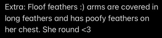
She round <3 Floof feathers :)
Also:

Assuming by nard you mean fucking ennard lol
I’m gonna be honest— I never got that attached to sister location— so idk- ennard is genderqueer and genderfluid (and probably fluidflux) and either aroace repulsed or pan lol, idk- autistic and full of rage.
Idk if you mean gold as in golden Bonnie or golden Freddy but I’ll assume Freddy
Uuuhhhh again idk… yeah I’ve got literally nothing… idk why I never thought of golden Freddy headcanons???? I think it’s the same situation as Baby where they’re too plot relevant for me to be silly and have fun lol
2 notes
·
View notes
Text
This is only my second bookbinding project and I learned a lot as I went along. Maybe one day I will do a standard 8.5 x 5.5 book, but today is not that day. I really wanted to showcase EverythingButColdFire’s fics for Fanfiction Writers Appreciation Day. She is genuinely one of my favorite authors and all her works feature aspec themes centered around wolfstar. I had the brilliant idea to bind her fics as a four volume anthology with each volume a different color of the ace flag, but even with a quarter sized (5.5” x 4.25”) layout there was only enough to fill two books. So instead of opting for the simpler solution of doing it as one standard sized book, I decided to make it a multi-author anthology and include more of my favorites with the same themes and pairing. I think this set might just be the favorite thing I own at this point. I love it so much!
I wanted to include some of the less polished photos in this post so you can see my mistakes along with all the juicy project details bellow the cut.
General
Vol. 1: 30,059 Words / 6.5 x 4.25 Layout / 192 pgs
Vol. 2: 29,612 Words / 6.5 x 4.25 Layout / 192 pgs
Vol. 3: 28,657 Words / 6.5 x 4.25 Layout / 192 pgs
Vol. 4: 28,657 Words / 6.5 x 4.25 Layout / 192 pgs
Spine Font: ILShakeFest
Title & Body Font: Garmond
Programs used: InDesign, BookletCreator, Illustrator, and Cricut Design Space
Materials
Text Paper: Staples Pastel Multipurpose Paper, 20 lbs., 8.5” x 11”, Cream
End Papers: Paper Place Cover Paper in Wine, Ash, and Black; For the white I just used some paper I had lying around
Cover Paper: Anittaart Black marbling wall art and abstract paper, StudioRobertWu Grey Fine Hand Marbled Paper 18” x 24” for Bookbinding or Paper Crafting (bouquet), Whaline 24Pcs Marble Pattern Paper Pack, MarblingArtStuff Hand Marbled Paper
Book Cloth: Kona Quilt Cotton Fabric Solids in Berry and White, Sew Classic Solid Cotton Fabric in Black and Grey, Lite Ez Steam Ii 12X9 5 Count
Mull: Super (Mull, Crash, Tarlatan) Fabric
Thread: French Linen Thread
Glue: Jade 403 PVA Adhesive, Methyl cellulose
Headband: Offray 5/8”x21’ Grosgrain Solid Ribbon in pewter, black, white, & purple
Book Board: 4 ply chipboard
Needle: Sewing Needles - #18 Darner
Titling/Decoration: Cricut 12” x 48” Vinyl Transfer Tape, Cricut 12” x 48” Premium Glossy Permanent Vinyl, Craft Smart Acrylic Paint in Metallic Gold
Brushes: Wide Colour Shaper - Firm Flat, 2”, Various small brushes

Methods
Starting with the idea that the books would mimic the colors of the ace pride flag when they were sitting on the shelf, I began to look for marbled papers that fit the color scheme. I decided to go for a very classic look with a cloth spine and corners and marbled paper cover. I modeled my design after some late 19th century bindings. I also took inspiration from my set of The Spiderwick Chronicles basing the layout size from it and incorporating a continuous design across the spines.
For the typeset I kept things very simple. I choose Garmond as the font for everything, using small caps and italics to differentiate the typography. In my first typeset I included all the meta info from AO3 in my copyright page but since each book in the anthology features multiple fics I decided to put that info in an appendix and reworked my copyright page. I think formating it in a pyramid shape adds a bit of fun and whimsy and I really like it. I also included a table of contents up front for this one with fic summaries so I can pursue through the different fics as I wish without flipping through the entire thing. The last thing I did was write an introduction giving context as to why I choose these fics and the meaning of it to me. An intro is very fitting for an anthology but it might be something I consider doing for other fics I bind as well. It was a very self reflective exercise and helps preserve some of the fandom history.
Since I picked such a unique layout size I had to have my text paper cut to the correct size. I took it to a local print shop which charged me $5 USD and had me in and out within five minuets.
I printed at home with my Canon iP8720. It has no problem printing at all kinds of crazy sizes, but it is a manual duplex so I print one signature at a time to mitigate printing mistakes. Last time I printed a fic I ended up using a lot of cyan and magenta ink even though the text was black and white, I tried checking the black and white box before printing this time but it didn’t seem to help. However, when my cyan and magenta cartridges ran out I kept printing and there was no drop in quality so I think next time I will take them out before I start printing or replace them with empty cartridges to save on ink. All four volumes ended up being 192 pgs (with some filler pages included in the back of some) so I opted to do 8 signatures with 6 sheets each. Having at least 6 sheets per signature helped keep the swell low enough for my square back case binding.
I worked smarter not harder this time by making a jig out of some card-stock for punching holes. I cut the card-stock to the same size as my text block then measured and punched the holes. Then I insert it into the center fold of each signature and punched the holes again. A couple holes ended up off-center when I wasn’t being careful which was mostly fine, but did result in some unevenness after sowing if you look very closely.
Since I was doing 6 text blocks at once I used my hardback National Geographics as a gravity book press. I used the method of alternating the direction of every other signature to distribute the swell evenly.
After consulting Levy (Salty Tech Books) and Des (Celestial Sphere Press) I decided to use a French Link without tapes given that the text block was less than an inch thick and I wasn’t doing any rounding. I think the French Link is very sexy and it had the benefit of me not needing a sewing frame so I could do them all on my couch while re-watching Attack on Titian. The results were fantastic though my hands were sore the next day after doing 4 books plus authors’ copies.
I tried to do my headbands the same way as my last project i.e. folding the ribbon over a peice of string and gluing it. But the glue wouldn’t stay (possibly because this ribbon is synthetic) so instead I glued the ribbon and folded it over a piece of scrap card stock. I still had to hold it down for a minuet or two for the glue to dry but it worked.
Moving on to the casing, my original intent was to use the foil iron-on from Cricut for decoration and lettering. My friend’s roommate has a Cricut Maker and was generous enough to let me use it. But once I started weeding I quickly realized many of my design elements were too small and would get pulled up with the larger pieces. It was much easier to pull up the small pieces leaving behind the larger ones, so I moved on to plan B. I picked up the cheapest Cricut brand vinyl I could find which I used to make a stencil sticker for my design. It worked out much better thought it would though it still took some patience and practice to weed around some of those rounded letters. I used the Cricut transfer tape to apply the stencil which was critical, though I think a generic brand would have worked just as well if not better here because I really didn’t need such a strong adhesive.
I ordered DecoArt Extreme Sheen Paint in 24K Gold but it was not what I was expecting at all. It seemed to have more of a glitter effect than the metallic finish I wanted. I ended up using an old bottle of Craft Smart Acrylic Paint in Metallic Gold which I had in my hoard. The paint is probably a decade old and had separated. I did try remixing the pigment and binder but wasn’t very successful so I did a test swatch with just the pigment and was very please with the results. I also ordered Liquitex Professional Effects Fabric Medium and experimented with mixing it with both acrylics. The purpose of the fabric medium is to reduce the chances of cracking and peeling, help with durability, and keep the paint soft and flexible as it dries so that it moves with the fabric. Essentially it turns regular acrylic paint into fabric paint. It is not supposed to effect the color of the pigment, but I found that the Liquitex made both acrylic bases much lighter and decided not to use it. I did have some problems with my titles bleeding when too much of the separated binder got mixed in with my pigment and I ended up redoing those ones completely, but if I got a good chunk of pigment with little to no binder it applied very well and the effect was fantastic. I heat set the paint with an iron using some scrap fabric as a barrier and ironing each section for 10-30 seconds.
When working with the cover papers there were a few quirks. The black marble had the pigment rub off on my fingers a lot and I had to be careful not to get it on my other materials. It did get smudged onto my text block a bit in the end but it is probably not noticeable to the causal observer. I also had it tear a little bit as I was gluing but I was able to repair the tear fairly easily. The gray paper from StudioRobertWu did wrinkle a little bit but I think that is just from my own inexperience and the wrinkles blended in fairly well and flattened out after drying. I used 100% PVA to apply the cover papers and applied the glue directly to the paper using a Wide Colour Shaper to apply a thin layer. Applying the glue to the paper first is meant to help reduce wrinkles as the moisture from the glue makes the paper swell and expand so if I had applied it to the book board first then the paper would swell after it was placed creating wrinkles.
The biggest problem I had when doing the casing was that when I removed my adhesive stencils for the double line details on the front and back, the adhesive would always damage the cover paper. I used several work around to mitigate the damage but I would not recommend this method for anything other than book cloth.
Casing was the most stressful part of the whole process for me. But by the end I think I worked out a system that works for me. First I glued down the mull with some methyl cellulose (thanks Six!), then I applied a mixture or half PVA half methyl cellulose to the back of the end paper with my colour shaper. I held up the back board of the casing and aligned the end paper as best I could and stuck a sheet of wax paper in the fold before shutting the book after a few seconds I would open it back up and apply the glue mixture to the other face, put another sheet of wax paper in the crease, and shut the book again. I ended up with varying results but I attribute that to a need for more practice.
Overall I am very happy with how the books turned out and while I made plenty of mistakes I know those will decrease with experience.
15 notes
·
View notes
Text
FAN THEORY THURSDAY – Why Does Megamind Wear Black?

No, your eyes do not deceive you! This is today’s second Megamind fan theory post! After skipping last week due to illness—as explained in the previous blog article—I’ve decided to make up for lost time by writing and publishing two Fan Theory Thursdays! You’re welcome! LOL!
If you haven't seen it yet, you can read today's first Fan Theory post, concerning why Megamind didn't notice Hal was a terrible choice for a here, HERE.
Although Minion threatens to sew everything out of super-itchy 1970’s polyester every time I say this, here it is anyway: SPOILER WARNING!
As you can see, this fan theory topic was suggested to me by a fellow Megamind fan. Thank you very much to Big-Dick-Garfield for asking about this! Keep being epic!
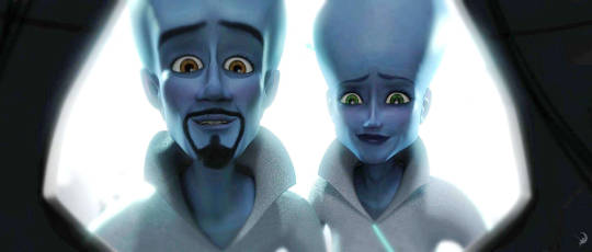
Like many imagined sci-fi races, Megamind’s people seemed to have something like a cultural uniform, in this case form-fitting, high-collared white with blue accents. Furthermore, the blue man likely knows it. Despite having been days old, he is clearly able to recall his early life as he recounts the destruction of his home world at the beginning of the film. And yet he chose to reject this evident norm of his original society, opting for black instead. Is there something significant about that color choice? Let’s find out!
At first glance, the answer may appear simple: Metroman dresses in white and Megamind dons black as befits a hero and a villain. It’s quite possible, however, that there is more to it than that. Is it possible that there is some basis for Big-Dick-Garfield’s suggestion that this was a rejection of the overall goodness and light in Megamind’s home world? Does he feel he is the opposite of his demonstratively upstanding parents? And are there clues in the original film that might help us discern an answer?
Let me begin by saying that I love this supposition. It’s creative, interesting, and insightful. While researching this question, I did find some solid information concerning why the former supervillain chose his color scheme. Here’s what we know for certain.
In the DVD commentary as well as an interview with Jason Schleifer, who headed up all character animation in the film, the creators clearly state that Megamind’s style and persona were both inspired by heavy metal singer Alice Cooper while Metroman’s character design was significantly influenced by Elvis Presley. (For a more in-depth look at Megamind’s persona, feel free to read Who is the Real Megamind Part Two.) Once considered, it makes sense. A few things both performing artists are known for include larger-than-life stage presences, over-the-top costumes, and massive performances. Indeed, according to Schleifer, both aliens “play the good guy/bad guy game to the crowd like rock stars.” Similar to their musical counterparts, Megamind and Metroman have big personalities, attention-grabbing personas, and knacks for putting on a great show. Clearly, this inspiration for their character designs goes more than skin deep, if you will, and that’s important because it indicates that there may be more than one reason for our favorite blue genius to wear black.

Firstly, consider the significance of Megamind choosing the aforementioned rock star as a basis for his look along with the specific music he blares during battles—a playlist that includes bands such as Guns n’ Roses and AC/DC. It’s not difficult to deduce that our favorite villain-turned-hero is clearly a Punk Goth Metal Head. Secondly, let’s compare American society’s views concerning each of the previously-mentioned musical artists. While Elvis was an edgy and controversial sex symbol during the 1950’s and 60’s, by the time the film Megamind was made he had become synonymous with older generations and straight-laced conservatives. Many among that same demographic, however, still viewed Alice Cooper as shocking, negative, and even “demonic.” This likely parallels with the images both characters, within their own world, were trying to project. Being the local hero, Metroman wanted to portray himself as a hometown Good Guy while his nemesis was purposefully aiming to stun, offend, and even frighten. Both his hard-rocking Gothic tastes and desire to unsettle those around him are major reasons why Megamind might don black leather and spikes.
That doesn’t mean that these are the only explanations, however. If you’ve read posts like What’s Hidden in the Animation and Are There More Hidden Details, you already know that the DreamWorks’ animation team put a lot of thought and attention into subtle-but-significant minutiae. As such, it seems highly doubtful that the choice to clothe both Metroman and Megamind’s parents in white was accidental. Indeed, the color does seem to symbolize goodness in the film, as Megamind, upon taking up the role of Defender of Metro City, is swathed in a white cape by his love interest, Roxanne. It is therefore likely that the choice to clothe the blue man’s mother and father in the same hue may have been the animators’ way of clearly indicating these were truly good people.

So is there room to suppose that the former villain’s choice of black clothing represented his rejection of goodness and acceptance of his perceived place as its evil counterpart? Yes, there is. It’s a viable fan theory. Unfortunately, it’s also one for which I have been unable to find any solid proof.
Why do I say that? There is one particular line in the movie, occurring when Megamind has taken over the city and settled himself in the mayor’s office, which calls this idea into question. When the blue genius says that he wishes his parents could witness his success, Minion responds with: “I’m sure they’re smiling down from evil heaven, Sir.” Evil heaven is significant. Keep in mind that the self-proclaimed Criminal Mastermind believed he was, as he stated near the beginning of the film, “destined to be a supervillain.” This means that he believed he was innately evil, his very nature so powerfully predisposed toward badness that it was unavoidable. Given both this and his conviction that his beloved parents had found some sort of odd evil paradise, it seems extremely unlikely that he believed his family had been good.
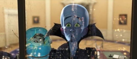
There is one more point which ought to be considered. While quite a few fans are not exactly enthralled with the short film Megamind: The Button of Doom—and admittedly there are a few aspects of it that make me cringe a little as well—it is nonetheless considered canon. In that piece, we see Megamind initially dressing himself in a white super-suit built to imitate Metroman’s abilities—essentially trying to become his predecessor rather than his own brand of Defender—but by the end we see him returning to his familiar black uniform and using his previously “evil” inventions to do good. Thus the blue man embraced his own unique style of heroism.
Furthermore, we see that the city has installed a searchlight displaying a blacked-out version of the blue man’s logo, similar to the Bat-Signal. It’s seriously doubtful that the choice was made on a mere whim, and indeed, there are some marked similarities between Batman and Megamind. Neither possess superpowers; instead, they each rely upon advanced technology, awesome gadgets, and intelligence. Both are heroes who wear black clothing—the hems of their cloaks are even similar—and, given the sort of fear Megamind was seen to inspire during the original movie, it’s likely that both, although decidedly Good Guys, strike terror into evildoers. All of that, combined with the fact that the original film was a spoof on DC comic books and Batman is, of course, a DC superhero, renders it likely that this was a very deliberate choice foreshadowing what sort of Defender Megamind will be. Thus, the idea that white equals good while black equals evil is turned on its head.

So, did Megamind choose to wear black as a reflection of the evil he felt was in his very core? It’s possible, but it’s also possible that his Gothic Rocker look simply matches his personal style. Beyond this, it seems that the blue man may continue wearing black as a hero, reaffirming one of the movie’s major themes: being different does not make a person bad. The rejection supposition is certainly interesting, and one of the marvelous things about fan theories is that we can all choose which ones we wish to believe, but, as I’ve said before, there is no firm evidence that it might be canon. And that might not be such a bad thing; I don’t know about you, but after watching Megamind finally learn to embrace his identity and work toward being the best version of himself possible, I would hate to see him thinking that he has to change his style and tastes in order to fit the role of hero. Let’s hope we all see our favorite blue alien still wearing black leather and spikes in the upcoming series!
#megamind#megamind movie#clothes#colors#megamind's uniform#megamind's outfit#megamind's clothes#why does megamind wear black#wear black#megamind fan theory#megamind fan theories#fan theory thursday#fan theory#fan theories#meta#deep dive#fanon#megamind fandom#theories
15 notes
·
View notes
Last Seen Blogs

thelittlesuicidethings-blog
Sem título

fernanda-gonzalez
TusSentimientosMeImportan

evgad
EVGAD Jewellery
a-strange-familiar
♡you can let it go♡
indiretando
Indiretando