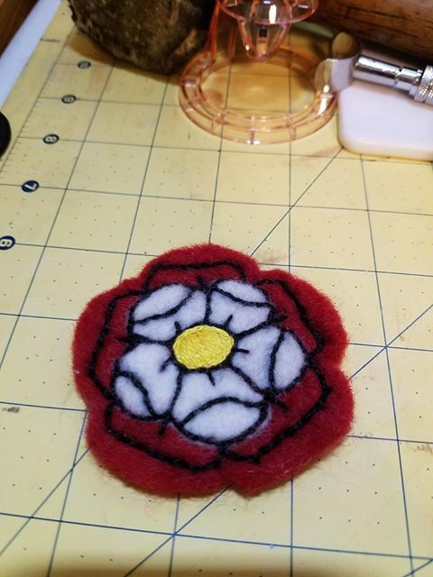
#its so awesome its brush nib
Text
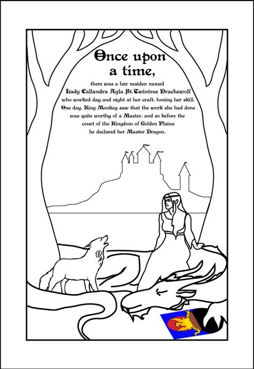
progression of ne adding stuff over and over LOL
#art#graffiti#type#lettering#word art#uib#unidentifiedbunny#i always use this one marker#its so awesome its brush nib#higgins black magic pen
1 note
·
View note
Note
hi! I was wondering what you used for your silver doodles? (Paper, markers, etc?) love your art :)
AHH!! i used a LOT of different pens on that page, let me give you the rundown (i assume you mean this one)
first were all of my currently inked fountain pens - i have a few that i havent filled for a while just b/c theyre a pain
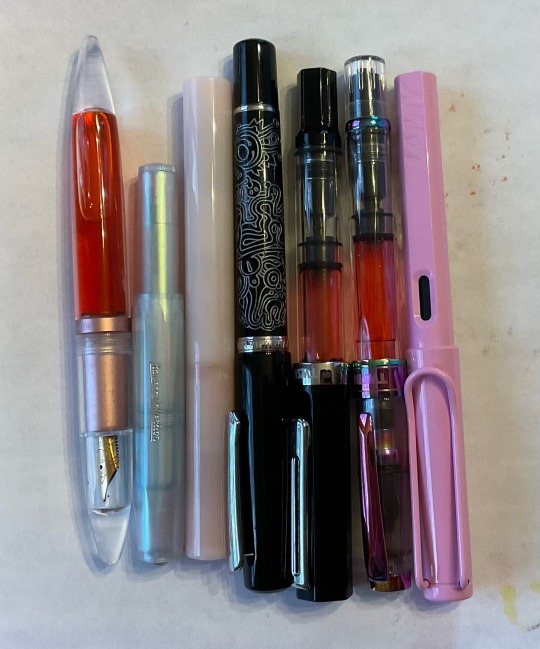
left to right: moonman m2 inked with sailor manyo sakura, kaweco sport in limited edition iridescent pearl inked with j herbin diabolo menthe, moonman n6 inked with j herbin corail des tropiques, nahvalur original in peter draws artist edition silver inked with sailor manyo sakura, twsbi eco inked with pilot iroshizuku hana-ikada, twsbi diamond 580 in special edition iris inked with pilot iroshizuku hana-ikada, and a lamy safari in special edition light rose inked with diamine soft mint! all nibs are fine except for the twsbi eco, it has a bold nib
i also used the tombow fudenosuke brush pen, a red pilot g2, and a couple other random black pens i had laying around (cant remember the specific ones)
for the markers, i use copics because i am unfortunately that bitch, SOWWY. i recommend buying cheaper alcohol markers like ohuhu or touchfive/touchnew instead. the generic michaels brand ones are prone to dye crystalization so i cant recommend them
the paper is just shitty sketchbook paper, i think its literally strathmore Sketch(tm) paper, the one with the yellow cover. i have to put a piece of paper between the pages to make sure markers dont bleed thru, but it surprisingly handles fountain pens really well. also im just guessing because my friend gave the sketchbook to me as a graduation gift and she ripped the cover off to hide how much (or more accurately, little) she paid for it :P im still friends with her shes awesome
28 notes
·
View notes
Note
I was wondering what kind of program do you use for your art? Also your brushes if its not too much to ask
I use Procreate usually. The default brushes are great also but for a while now I've been using some brushes a friend sent me and switch them around sporadically. He doesn't remember where he got them though, sorry.
My favourites of the default library brushes are the ones in the Calligraphy section (Brush Pen and Script).
The program makes it very easy to adjust your brushes also, so you might not even need new ones! I didn't go out looking for new ones, my friend sent them to me without me asking cause he likes them.
If you really want new brushes badly, TrueGritTextureSupply has a lot of awesome (paid) brushes for Procreate, PS, Clip Studio, etc (I'm in love with The Rusty Nib pack but can't justify buying it lmao)
11 notes
·
View notes
Note
HAHAHAHA Every Turk Family has one of those names and unironically mine does too 🫡 Tell your mother thank you she is a very lovely lady
I know all of the artists you listed below because my dad blasts them on the radio everytime we go out... I call it old people music but hey I never said it was bad, they're awesome and I might have memorised some of the artist's songs from how much I listen to them... Barış Manço is a classic without a doubt! Fun fact my parents were able to go to his concert and got a signed picture with him I will always envy how lucky they were 😭 I love how women in the industry made the most iconic songs I hear them often in weddings too! Or clubs, even though I only went to one once I'm not very fond of them...
My questions were do you have any tips or inspiration with how you draw! I love your art and artstyle and it's honestly what I've been trying to achieve for a while, I can't believe I'm learning how to draw men because of a silly lawyer show it's a disease...
(We are just having a conversation at this point) (I feel like those people who speak out loud in public) (I hope you and anyone who's reading this is having a good day :) be kind to yourself and others everyone)
OH MY GOD i envy them too😭😭 also omg that sounds like heaven to me. the other day i went out partying and i felt sooo out of place because i only knew like 3 songs. omg it was so so bad.
hmmm tips and inspiration…. my number 1 tip would definitely be to look at a lot of other artists you like and analyze what exactly you like. and then try to emulate that in your own work. i try to look for inspiration everywhere - artists online, traditional artists, old masters, 3d artists, even theatre and poetry, etc. - doesnt mean that i am equally inspired by them all (because all these things at once sound so scary and big but they really arent!) but rather, i try to be open for anything and that helps me find inspiration :)
ill try to explain my thoughts more under the cut because this got long:
for me for example, so far i only posted some art i made that was lined (which, i would say makes up maybe half of the art i draw - i mostly sketch and recently have been building up the courage to paint more) and one of my inspirations is meltow. i think if you go over and check out their art youll definitely see it lol. but also i love the clean look some comics have and my friends tell me my art looks like it belongs in a comic which, i guess yeah :) when it comes to colors and composition i LOVE this artists works. i still have a lot to learn and just looking at their works inspires me so much!!!
i will say i have ALWAYS struggled with lineart. its probably the worst thing in the world to me because it never feels right!!! i like lining on paper with harsh inks and stiff ink nibs that allow for like. very little variety in line weight, but i havent done that in over 3 years (i hope i can get back to that). but yes, something about lineart makes me feel so icky when i use any brush that reacts to the pressure you put on your tablet LOL i just hate it. ugh. i havent been able to work it out.
it was only in 2020 i think that i decided to try it out with a thick brush with some texture and no pen pressure. that probably was the first time i got actual lineart that (at the time) i liked done. and then later on, discovering that other artists are able to achieve beautiful drawings with similar brushes AND that lining with a very simple brush can feel so satisfying helped me evolve a lot! until 2022, i actually wasnt able to give my art the kind of finished look that i wanted. so what people consider my style is really just born out of my limits and working with them. that obviously doesnt mean that i dont try to challenge myself as much as i can. i do and i think everyone should! thats what makes art so fun
if theres any good advice i can give to a beginner itd probaaaaably be. okay this is difficult and i feel like im not really qualified for this. as a hobbyist much less so because a lot of the knowledge and skills i acquired was through an intuitive process (i could never stick with habits such as regular studies or warmups or whatever is meant to be good for you) which definitely isnt the most “productive” way but i mean it doesnt have to be. its just a hobby! you dont have to perfect art. but yes, i would definitely say dont stop drawing. youll always be your harshest critic and at the beginning, and especially if you begin at an older age because youve been training your eye your whole life but your drawing skills for only a relatively short time you will notice a lot of mistakes. and youll think you wont achieve the image you have in your head. and maybe you wont (because youll always strive for more and youll never really be satisfied as an artist bla bla) for a while. but you have to keep drawing! try out different strategies, find out how other artists draw, watch speedpaints, try out different papers and pencils, try everything that makes it more fun and keep going! it will all pay off!!
in my eyes theres also no point in saying “i should wait till im better to draw this idea i have” because if inspiration strikes you you should use that. even though i still sometimes catch myself thinking like that. you can always redraw things later on!! if theres anything that will keep you drawing you should use that! like getting into shows and games that make me want to draw helps a ton LOL people are not joking when they say getting obsessed with one character is the quickest way to improve. i 100% agree!!! if you saw my first nachos you wouldnt even recognize him. not kidding
wow this got long. thank you for the questions though!! i hope some of my rambling can help you. feel free to talk to me whenever!
2 notes
·
View notes
Note
hey jude do u have a good reccomendation for a black fine point pen,. urmthe only stationary nerd i know thank u king
omg its been a while since i talked abt stationary on here lol… ok so idk if ur looking for like… a felt tip or like a metal or plastic nib so im gonna go for both!
In terms of felt tips: I’ve tried a lot for art, not a fan of most of them ive realized lol!! i think im just.. not a fan of monoliners! but i know other ppl swear by them! I know theyre a bit pricier, but the copic multiliners are really really good! Im not saying u have to buy the sp ones (aka the refillable ones) since those can retail for like 9-12 dollars, but the disposable ones are probably the only multiliners i like lol!! they retail for around 3.50, or you can get a set of every size for 25ish. They’re waterproof and markerproof, which is awesome for artmaking! The next one id reccomend is the prismacolor fineliners.. I dont use most of them but i use the chisel constantly for sketching and tbh its the only good chisel tip pen ive found! I found them online for just under 3 dollars each, so pretty good price! They say theyre markerproof but tbh i dont buy it ngl i let a inked peice sit overnight before applying markers and it smudged a lot. So, know that going in. I also know my older sibling who does more uncolored ink based fine art instead of illustration swears by microns but i dont rlly like them ngl!!
And in terms of metal tips: I really really really really really love the pilot hi tec c pens. theyre like my baby and also one of the most highly renowned pens in the stationary world. Theres several lines and varients of these, but i just use the standard. i just rlly like sketching with these… the scratchy feeling reminds me a lot of inking using gpen nibs lol…. but its still a nice monoline! Also, if you want a slightly thicker fineliner that isnt felt tip or metal tip- the micron pn is a plastic nib pen and i honestly like this one a good amount! Having a plastic nib is rlly nice since you dont have to worry abt pressing too hard and ruining the nib! And these are both fairly inexpensive- the hi tec c retailing for around 3.50 and the Micron Pn around 2.50. I just tried to pick pens that are easy to find, if you have an art store around you you should be able to find most of these irl but if not always reccomend jetpens or blick for cheap prices- thats where i always go lol!! on top of that- pretty sure jetpens has a fineliner sampler! These are good for trying new things, i will say ive tried both of their brush pens samplers and its how i found a lot of my fave brush pens <3 but also it looks like they have samplers for standard, oil based, and waterbased fineliners as well as a few differnt color themes (including off black… which.. ngl has been an obsession of mine since my dad bought me a set of off black pens in fourth grade and i couldnt stop drawing with them) But dont mind my ramblings. If you like any of my recs, there are several more in depth articles abt each of these pens you can find easily if you want more details like ink formula. I always like to look at guides that have eraser and water tests to test the ink bleeding, feathering, and resistance. I always appriciate ppl asking me abt my special interests <3 my stationary one has faded into a general art supplies one but i still am full of knowledge abt each! ^_^ (also since i started digital art its become even more abt digital brushes… i know a lot omg) ty again!! ^_^
4 notes
·
View notes
Photo

So...because I realized recently that I do draw a lot with markers now (even though they’re kinda simple in terms of pictures), I figured I’d treat myself to the Uhuru brush markers because I kinda liked using them for the skin. I also looked, and it looked kinda like the colors between the brush and the nib markers were...different enough that I wouldn’t feel bad abandoning the nib markers, because there were some colors in there that I could potentially use. And imagine my surprise when they were actually part of the Prime Day deal yesterday! Naturally, I went ahead and bought them.
I wasn’t expecting to receive them until Saturday, so I was rather pleased that they actually came today! So of course I had to test them out.
Of course, I needed a test subject. There are my standards - Sailor Aeolus, Aerona, and hell, even Kai now (or any of my main characters, really). But I felt like I’ve drawn them to death at this point. Sooo....had the brilliant idea to use one of @callistochan87‘s characters! The selection was fairly easy. I didn’t want to use Christine, Eric, or Shelby so I could save them for *cough* a present or something, so that left...Konnie and Julia!
Which...makes sense. I hardly ever draw them. And Julia allows for me to color darker skin, which, with my skin tone markers, I love doing. ;P
I love love how Julia turned out. Her hair! It’s amazing! And I managed to draw/color it so that you can sorta tell what’s going on? Konnie is awesome as well (except I accidentally forgot to add in the shine before coloring her hair, because of the way I did Julia’s hair, whoops). I sort of had to guess on their bottom halves, but since this was summer wear, I figured shorts would work. I hope. I kinda like Konnie with the gym shorts/capris combo, since it seems to suit her character.
Since I had the markers, I figured I’d also go ahead and color the collab piece @callistochan87 drew for me to color...last year? Ouch. To be fair, I realized my folly right after she did it, because I was really intimidated by coloring the plaid. And I waited so long that this version doesn’t exist anymore, lol. So what I did was sort of...hybridize them? Sort of? Just...kinda did whatever with them. Such that Gabby is in her new colors of yellow and pink, and Kai isn’t wearing plaid.
I was a tiny bit worried about coloring with markers on the paper, but it was actually better than the paper I currently use! I had fun with it. It might not be any fancy or anything like that, but its colored now, and since I used markers, it looks soo much better than if I had used pencil! But at least I don’t have to feel bad about allowing it to sit, even if I didn’t really do anything with it (like she did).
All the marker art. :D
#traditional art#markers#my characters#other people's characters#celestial souls#earthia#konnie#julia#kai#gabby#collab
3 notes
·
View notes
Text
“Where are you Dragonfly?” Olaf called out, laughing.
Beatrice crept slowly up behind him, leaping from where she was crouched on the stair railing and slamming into him hard, the two collapsing to the ground in a pile of giggles, “I’m right here, silly!”
“Hey!” Olaf chuckled, spinning around and pinning her to the floor, “Respect your elders!”
Shaking her head, Beatrice kicked her legs up and flipped them over, “Stop calling yourself my elder! I’m turning nine in a week and a half.”
“And I turned nine three weeks ago, which makes me your elder!” Olaf stood up, extending a hand to her.
“Come on Firefly,” Beatrice jumped up beside him, tugging him along behind her, "I’m gonna get in trouble if I don’t get some piano practice in today.”
“Aren’t we supposed to be practicing our scene for the play? That’s why we’re here,” He gestured around the theatre.
She shrugged, “Well we’re already not practicing that, and you know that we’ll have it all down anyway. We always do. Besides,” She batted her eyelashes at him, “You’re the best piano player I know. Come help me.”
“Flattery will get you everywhere,” Olaf followed with a grin, “It’s why we’re best friends.”
“Who says we’re best friends?” Beatrice teased, hopping up onto the stair railing and balancing carefully.
Olaf stared up at her, wrapping his arms over his stomach, and twisting the little firefly ring that she had made him, “Bea?”
“I’m just kidding,” She jumped back down, pulling him close to her, “You know that you’re my best friend.”
And as the children made their way to the piano, Olaf wrapped an arm around her and looked at her earnestly, trying to keep his tone light, “Do you think that we’ll be best friends forever?”
Beatrice continued to plunk at the piano keys with one hand, but she entangled the other hand with his, squeezing tightly, “I know we will.”
~~~~~~~~~~~~~~~~~~~~~~~~~~~~~~~~~~~~~~~~~~~~~~~~~~~~~~~~~~~~~
“Dragonfly, Dragonfly, come in Dragonfly,” Olaf was speaking into his wrist, using his watch as a pretend spy communicator.
“Shh,” Beatrice appeared by his side, whispering to her, and then she lifted her own wrist to use as her own spy communicator, “Here, Firefly, what’s your detail?”
He looked around suspiciously and then leaned towards her, “Snake Boy and Gay Baby are near the right position for us to trap them.”
Beatrice rolled her eyes, “Those aren’t their code names.”
“They are for me,” Olaf chuckled, “Anyway, that’s not the point! Now,do you think you can lead them to the right spot without getting caught?”
“Of course I can! Who do you think you’re talking to?” Beatrice scoffed, flipping her hair over her shoulder, “Who’s idea was it to sneak them into the theatre to play spies in the first place? I’m a genius, you know that.”
“You’re like twelve.”
“I’m fourteen, you bitch!” She smacked him hard on the arm, but laughed and dropped her voice, remembering that she had to be quiet, “You know that we’re the same age.”
Olaf shrugged, “We all know that I’m not the smart one,” And then he brushed back the strands of hair that had fallen back into her face, “Actually, fourteen suits you. Seems like a nice age for you to be. But you should try tying your hair up, like B & L do. It must make you half blind.”
Beatrice laughed, “Doesn’t really seem like my thing. I only tie it up for shows. But you’re right, I should find a way to keep it out of my face a little better. Maybe I should cut it short.”
“But then what can I drag you around with?” Olaf gave her hair a playful tug, “No, actually, I’m sure that would look nice. You always look nice, Bea.”
Beatrice smirked, “But not as nice as K, right?”
“That doesn’t count,” Olaf tried to ignore the blush that was beginning to spread over his features, “There’s a huge difference between you looking nice and K looking nice.”
“Why?”
“Because K is a girl! And you’re, uh,” He broke off, shrinking under her glare, “You’re Beatrice! I know you’re a girl, I get it, but you’re not a girl girl like Kit is. You’re my best friend. You shoved my face into a mud pit once because I took a grape without asking. I broke your nose on accident when we were supposed to do a stage kiss because I got too nervous and smacked you. You’re not, I mean, it’s not the-”
“I know,” Beatrice laughed, giving him a quick peck on the cheek, “I get it, you’ve got a crush, and I’m not gonna stop teasing you about it, because that’s a best friend’s job. Now, I’m going to lead them to the piano, and you get ready to slam it shut.”
Their mission of trapping their friends in the piano actually went fairly well, the two children trying their absolute hardest to win this game of spies.
The issue?
Beatrice got locked inside the piano along with them.
Olaf had slammed the piano shut, locking it, and turned to high five his teammate, “Beatrice? Where are you?”
“Goddammit,” A muffled voice complained, “They pulled me in with them!”
Cackling, Olaf sunk to the ground, “Are you serious? Oh my god!”
“Does this mean we win too?” M asked, his voice also muffled.
“No,” B calmly tapped on the piano, wondering if he could play from the inside, “We only have one member of their team, and they’ve got too members of us. And anyway, I don’t think someone really counts as a hostage if they’re stranded along with the people that claim to be their captors.”
“Who cares?” Beatrice knocked hard on the lid of the piano, “Let us out, you big Firefly dummy! God, we’re so bad at taking hostages.”
“I’ll just have to practice abducting people,” Olaf laughed some more, “I’ll let you out in a minute, but first, I have got to take a picture of this.”
“I want a copy!” M called out.
~~~~~~~~~~~~~~~~~~~~~~~~~~~~~~~~~~~~~~~~~~~~~~~~~~~~~~~~~~~~~
“Hey Dragonfly,” Olaf appeared, out of the shadows, next to Beatrice, “How are you?”
“I’m pretty good,” Beatrice swept her hair back, “But how are you? What’s going on? Is everything okay?”
“Everything’s great,” Olaf broke out in a grin, wanting to grab her and hug her as tightly as possible, but instead he pulled the box of darts out from behind his back and handed it to her, “You wanna play?”
She beamed, accepting them and looking gleefully into the box, “God, I’ve missed this place, missed this stage. Do you remember how excited we were when they put the dart board backstage? Do you remember how much time we spent playing here?”
“I do,” He took one of the darts himself, weighing it in his hands for a moment before throwing it at the board, veering just to the left of a bullseye, “That’s why I wanted to be here, to ask you what I have to ask you.”
Beatrice threw one herself, hitting the bullseye easily and smiling at the low and appreciative whistle that Olaf gave her, going quickly to retrieve the darts they’d thrown, “And what, exactly, is it that you have to ask me?”
“Well,” He bounced on the balls of his feet, and then paused, “Actually, I have a gift for you first,” He reached into his back pocket and pulled out a smaller box, handing it to her gently. She examined the box, reading the scrawls of silly things they’d said to each other over the years that he had written on the sides, and she opened it to see the most beautiful dart she had ever laid eyes on. It was small, the end incredibly sharp, but it was also inlaid with gems, and fine wings branches out from either side. “It’s a dragonfly,” She breathed, running her fingers over it carefully. “Check this out,” Olaf took it from her gently and pressed one of the gems that sat in the middle of the wings, and as he pushed it, the wings-which were in an up position-flapped downwards, and the head of the dart withdrew inwards, the nib of a pen coming out in its place, “Isn’t that awesome? It’s supposed to be a play on the saying ‘The pen is mightier than the sword,’ because, y’know, it’s kinda both. I mean I know a dart and a sword aren’t the same thing, but it’s still just-“ “I love it,” Beatrice cut off his rambling, looking up at him with a gleam in her eyes, “I love it so much. Thank you, O. Firefly. Thank you.” Olaf puffed his chest out proudly, “Well, y’know, just doing what has to be done. Now,” He softened again, his face growing anxious once more, “Listen, Beatrice, K and I have been together for a long time, and I just, I really love her, so much more than I thought you could really be in love with a person. So I asked her to marry me.” Beatrice covered her mouth with her hands, feeling herself start to tear up at the thought of two of her favorite people in the world getting married, “That’s so amazing! Oh, I’m so proud of you!” “Thank you,” He shook his head a little, chuckling, “I’m still having trouble believing that we’re really engaged. But that beings me to my question. Beatrice Baudelaire,” He dropped to one knee, holding out the tiny firefly ring that she had given him when he had turned nine, her promise that they’d be friends forever, that he now wore on a necklace chain around his neck as it had grown too small for his fingers, “Will you be my best man?” Almost shrieking, she took the ring from his hand and looped its string around her neck happily, “Of course I will! I can’t believe this, I mean,” She paused to giggle, “I’m not even a man, but somehow I’m still the best one! Why didn’t you ask J?” Olaf shrugged, pulling her into a tight hug, “I love J, you know that, but he’s not my best friend in the world. Not like you. And besides, K already best me to the punch. She asked him to give her away. Pressing the gem on her new dart pen carefully, Beatrice threw the dragonfly and watched as it seemed to fly across the room to the board, “Well, that sucks for him. I’ll be the best best man who ever was.” “God, you’re so good at that,” Olaf muttered as he watched the dart hit squarely on the bullseye, “Anyway, I know you will. And just so you know, you don’t have to wear a suit or anything, just because you’re the best man. I mean, you can if you want, you can wear anything you want. I just want you to know there’s no obligations.” “What If I want to wear dragonfly wings?” Beatrice’s eyes sparkled, “Dragonfly wings that really fly.” “I’d love that,” Olaf turned and examined the poster behind them, “Hey, have you seen this?” “What is it?” He peeled the audition announcement off the wall and handed it to her, “There are auditions for La Forza Del Destino this weekend. You should audition! We never get to see each other anymore, and we haven’t been able to be in this theatre in forever. I would love to come watch you in it.” “You should audition too!” Beatrice showed him the audition slots open, “We could go back to back.” “I’d love to, but that may have to wait for the next play. I need to avoid as much bad luck as I can until after I get married,” He smiled warmly at her, “But I’d be right there, every night, cheering you on. I bet my parents would come too, you know they adore you. You really should audition.” Beatrice wrapped herself into a hug with her best friend, trying to ignore the great sense of sadness and doom that was flooding through her, “You know what? Maybe I will.”
#ASOUE#a series of unfortunate events#sugar bowl gen#sugar bowl generation#Beatrice baudelaire#Beatrice#baudelaire#Count Olaf#Olaf#dragonfly#firefly#darts#poison darts#la forza del destino#Jacques Snicket#Kit Snicket#Bertrand#Bertrand baudelaire#Montgomery#Montgomery Montgomery#locked in the piano#they’re in the piano#how do you know that#I took the picture#b#o#j#k#m#l
61 notes
·
View notes
Text
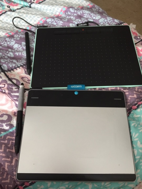
// woohoo just got my new wacom [top black] and its already made some incrediable differences compared to its predecessor the pen and touch tablet when Wacom brought out the touch sensor which in all honesty was a god damn nightmare.
The silver is my old one which gave in last night. It kept turning itself on and off and then stopped responding to the computer all together. I’ve had it for maybe about 5 or more years and its gotten me through all of my artworks. To say the least its been great having it.
The biggest differences besides size is that the new 2018 one is a medium size were as the older one is the small. The new one also has bluetooth which means i nolonger have to worry about using the damn wireless connector which honestly that was great but jesus did it take forever to get enough battery for the tablet to last long enough.
Also the pen is like...omg so much better then the old one. The old one has like 2k or less of pressure sensitive and the new one has 4k pressure sensitive. The pen on the new one also feels a lil more natural as well, its smoother and just glides where as the old one it always felt a lil slippery and just all over the shop and it was like drawing on a piece of metal sheet but the new one feels like I’m drawing on actual paper. Plus the spare little pen nibs that I got with the new one while the old one when I got it...well I had to buy nibs for it. I should also mention the old one has an ‘eraser’ kinda sensor button on the end of the pen and the new one dosn’t have this which is AWESOME!! because honestly the amount of times I’d sit the old one down and the pen was sitting maybe 10cm away, if ever the end was close enough it would cause interference with my desktop mouse. At times I was close to tossing my laptop across the room only to realize what the problem was.
Price wise the new one is about $298 au which is a pretty penny yes but so worth it plus the free software downloads too.
The old one was roughly $150 but I think I scored it for $140 at a con as it was coming close to the end of the day and it was legit the last one they had.
Tbh the new one is going to be sooo cool. I’ll also be giving corel softwares a go because Paint tool sai is great and all but it lacks a lot when it comes to different brushes and although I could make and use custom brushes, the sad thing about my sai is that it seems to just delete the brushes after I close the program so...yeah. But hey I’m happy and this means more art from me :)
4 notes
·
View notes
Photo
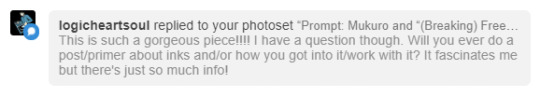
@logicheartsoul Thank you so much for the kind words ^^ And certainly - thank you for your interest and for asking! I love working with ink so I’m happy to talk about it :D
How I got into it
It's only been in the last maybe five or so years that I've actually started to pay more attention to art supplies. In the case of ink, it really started with fountain pens. Long story short, one of my professors was really into them and let me try one of his vintage pens, and I was vaguely interested. Then my best friend really got into them, and I tagged along to a fountain pen show (shoutout to Scriptus Toronto!!). From there it was a slow burn over a period of months from “this is neat” to “WOWWW OKAY I GUESS I’M REALLY INTO THIS NOW”. It was a (relatively, for me) quick entry once I discovered the online fountain pen community. These people are incredibly passionate, highly articulate, and best of all, document EVERYTHING. I found the ink reviews especially spectacular and that’s probably what hooked me the most.
A few other things that helped in the appeal factor:
I have a tendency to grip writing implements excessively hard and exert a lot of unnecessary pressure when writing or drawing with more conventional pens (ballpoints etc.) A number of people mentioned that fountain pens helped them to alleviate this because generally you don’t need/want to apply pressure when using them. I’ve found it has helped.
I've always been interested in forms that combine words and images, and this merges literary and artistic worlds in a very clear way.
I’ve been on a long personal journey of wanting to incorporate much more Chinese/Taiwanese/East Asian heritage and cultural traditions into my work. Thus, I've been gravitating towards things emphasizing brush, ink, water, elements of calligraphy and... not sure if spontaneity is the word I want, but things that help me overthink less when I draw, and get better at letting go.
How I work with ink
My (main) tools
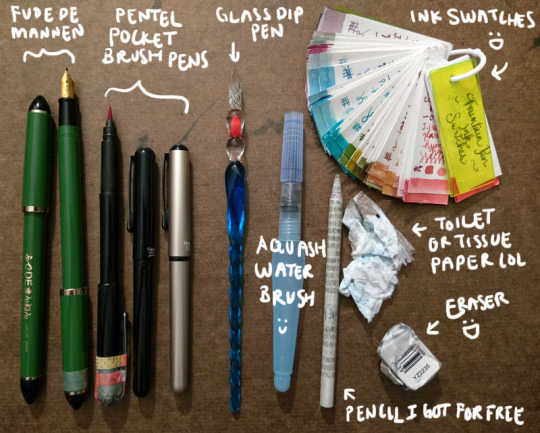
Fude de mannen: This is basically a fountain pen that mimics a brush for Asian calligraphy. It has a bent nib that enables you to change stroke thickness by varying your hand angle. I love this pen so much I got a second one so I could have a different colour; the washi tape helps me tell which one it is. You can see more of it in the video interview I did with PindotPress.
Brush pen: A pen that is a brush. lol. A number of companies make them; I use the Pentel Pocket Brush because it's the first one I tried and I liked it a lot. It's smooth, has great line variation, and the tip has yet to fail me. (Although the cap started falling apart, hence all the tape on my first one lol.) I currently have three: one for permanent black, one for permanent red, and one because I couldn’t resist buying a coloured version of the pen (I have Diamine Earl Grey in it right now).
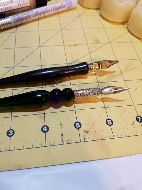
Glass dip pen: These dip pens are pretty but what is super awesome is that they are super easy and fast to clean. I can quickly switch between multiple colours of bottled inks. The grooves in the nib hold ink, so you need to slightly turn the pen as you go to access all the ink. You can also get a wider stroke by slanting the pen and using the side of the glass nib. It's not that easy to control your lines, but I actually like this because it creates a lot of happy accidents. And “oops well damn" accidents, but like I said I’m trying to cultivate the whole “learn to let go" mindset.
Waterbrush: Basically a brush that carries its own water reservoir. I’ve used a few different brands but I find I like the Pentel Aquash small the best. Some people fill them with ink like a brush pen, but I’ve not really done that. (I did it once with a different brand that was harder to open/refill and I got mad.) I use it to paint with the inks.
Pencil I got for free: Unless I really am just doodling, I usually draw base pencils of some sort, even if it’s just a very rough, light sketch or a quick thumbnail on another sheet of paper. Every so often I get an inquiry asking what special kind of pencil I use, but I’m afraid they’re just normal pencils rolled with recycled newsprint. I got free samples like a million years ago and I have been using them forever. (I think I’m finally down to my last three.)
Eraser: I’ve been trying a few different ones but it takes me forever to work through an eraser. You want it to be able to pick up the lines without requiring you to scrub and take the ink too or destroying the fibres of your paper. This one actually works pretty well. If you’re really curious you can see the non-destroyed packaging here! lol
Toilet or tissue paper: Something to pick up the water. This is my "undo button” in real life when I’m painting/using the waterbrush. Also I drown everything with water so it’s very important.
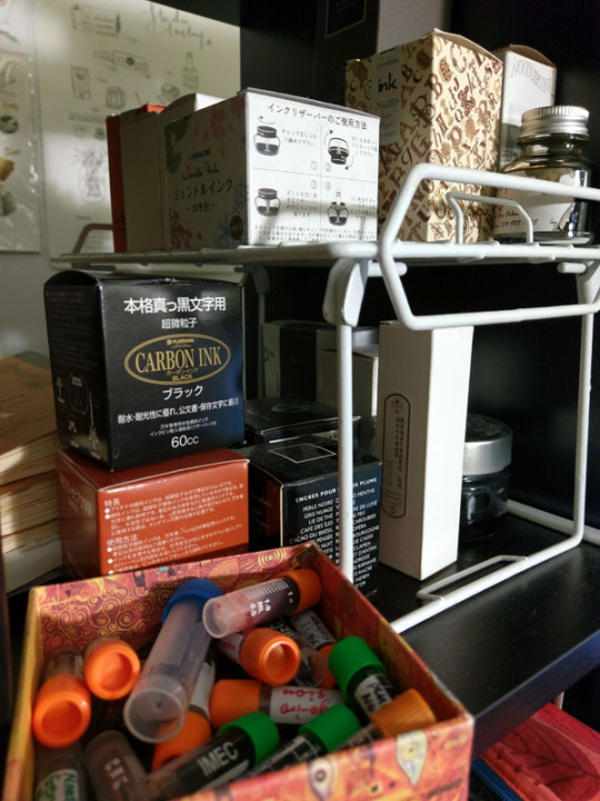
Ink swatches: Every time I get a new ink I make a sample and add it here. It’s great for colour palettes and when I’m looking at other inks and trying to decide whether to get it or not (e.g., is it different from everything I already have? My definition of “different” is very generous...). I don’t actually have all these inks; some were samples from friends. I’ve found I tend to gravitate towards very complex, nuanced neutrals. (This sounds so sophisticated but when you see them all it once it's like. Oh. Apparently I like shades of grey, brown, and other hard to classify "muddy" or in-between colours lmao. But more on that in a bit.) Lately I've been getting glittery inks because they're fun and they add a magical dimension to the physical piece.
Here is my current selection of inks - on the shelf to the immediate left of my laptop and my head as I am typing this right now. The box at the bottom left is all the samples.
My approach
In my mind, I broadly classify my approach into two categories: “dry” and “wet”.
"Dry" - ink only, no water. I have pretty unsteady hands and hate "inking" - if we think of inking as an exercise in achieving a "clean", controlled line drawing with consistent line width/stroke thickness, neatness, etc. So I love pens that support me in what I think of as controlled loss of control - wide variations in brush width and stroke character. Brush pens and fude de mannen pens are perfect for this. They have lines that offer a wide range of dynamic, organic, and textural opportunity. My Inktober illustrations fall into this category. A few examples below, followed by links to the full set.
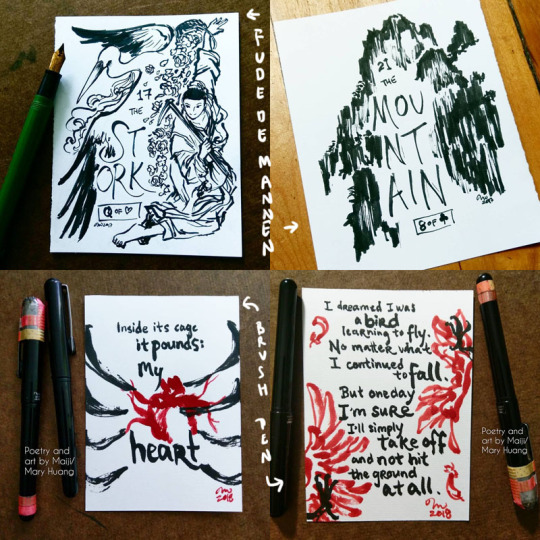
Inktober 2017 - fude de mannen
Inktober 2018 - brush pen
"Wet" - Basically I blob water around. Depending on when I do it (before, with/during, after the application of the ink), you can get different results. The water causes the ink to bleed, semi-watercolour-like, and can be used for shading, environmental effects etc. For obvious reasons, this works best with non-waterproof inks (which the vast majority of fountain pen inks are), but you can do this even with waterproof inks. Just let the ink hit water before it has a chance to soak into the paper and you can get cool effects :D. And you can also do it with other pens too, not just fountain pen inks. Examples:
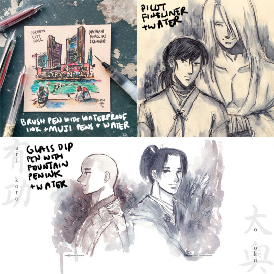
Tiles of Toronto urban sketch series
Raizen and Hokushin doodles
Arikoto from Ooku
As you might imagine, this is really great for on-the-go drawings, because you just need a pen (or a couple of pens) and a waterbrush.
The “wet” approach is also where the very complex inks that look "boring" (greys, taupes etc.) are just complete magic. When the dye elements separate, other colours emerge, and you get really wonderful textural effects and rings of colour where the ink pools and dries. Diamine Earl Grey is a colour I've mentioned several times that I LOOOVE because it separates into blues, browns, purples, even pinkish tones. It's a gorgeous ink. You can see some examples and closeups here.
Another colour that does this really powerfully is Sailor Rikyucha. It’s a dark tea brown-green that separates very easily into pale blue-greens and more and has amazing tonal and textural qualities. The Tendril Wreath illustration here really shows this.
For the most part I look at things I like and then experiment to figure out what happens. After working with the same tools for a while, you get a sense of how the different elements might react and respond naturally. The Genjimonogatari series employs both dry and wet extensively and is an example of the experimenting and playing I’m doing - I keep finding new aspects to the inks I thought I knew, and making “interesting” mistakes. And trying to fix them as I go with varying levels of success, haha. But I’m always learning!
One more thing about this hobby
I feel compelled to finish with some talk about the pure aesthetic appeal, or the MULTIPLE LEVELS OF FUN I get out of these inks. Not just the colour, not just how the ink behaves, but... the name of the ink as well! Some inks do this more effectively than others. Similar to how the presentation of a dish is part of the experience, the name of an ink adds so much to my enjoyment of it. My least favourite ink names are [standard adjective]+[standard colour name]. My favourite ones are really convoluted with literary and poetic references, I just love them hahaha. Asian fountain pen inks I find tend to do this especially well - partly because of how much you can pack into how few syllables, I suppose. It makes me sad that a lot of sites don’t include the original names, often referencing them with just a number, though I understand it is difficult to translate. But I learn a lot with these names as a starting point! For example, Zhenjing, which I mentioned recently in the Kurama “Light” illustration, took a bit of back and forth with my parents to look up the source and then to interpret the complex line of poetry. It was a fun and fascinating exercise.
A great name can’t save an ink I don’t like, but a good name elevates an ink I do like even more, and it can be really inspiring for making stuff. For example, take Pen BBS Mirrorflower Watermoon. I adore the colour of this ink - it's a very subtle grey-pale green with silver flakes. I used it heavily in the Hokushin fanart “Northern Deity” (you can see it here with photos of the sparkly).
The name is actually highly recognizable if you're familiar with classic East Asian literature/poetry. I read it out loud to my parents with no context other than "this is the name of one of my favourite ink colours" while they were eating dinner and they both said at the same time, "I know this! DREAM OF THE RED CHAMBER!" lmao. It's a very Buddhist idiom or phrase referring to the illusory nature of things, likening it to the reflection of a flower in a mirror or the reflection of the moon in water.
I hope this was interesting and helpful! ^^
#art supplies#logicheartsoul#replies#reply#fountain pen ink#ink#waterbrush#brush pen#fude de mannen#art by Maiji/Mary Huang#how I work#process
21 notes
·
View notes
Text
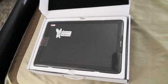
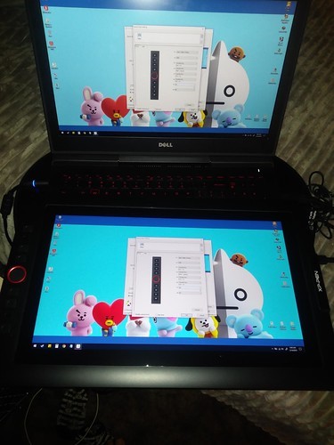
XP-Pen Artist 15.6 Pro Drawing tablet with Screen Review
XP-Pen Artist 15.6 Pro Drawing tablet with Screen Review

I'm a artist who is getting into digital art because I really liked drawing , but wanted something better, both with hardware as well as software. I considered the iPad Pro but feared the price and that iOS would ultimately frustrate and limit me. The Wacom Cintiq 16 is also more expensive. Ultimately I decided on the 15.6 Pro.
XP-Pen Artist 15.6 Pro is the newer model of the Artist 15.6 , but with pen tilt Support , The tilt function ensures that the accuracy of the pen remains the same when tilted, offering a real and natural drawing experience.
Artist 15.6 Pro has been used 120% sRGB in the device to give you more vivid, clear and sharp color quality that also enhances the accuracy of any image.
It has greatly improved on parallax, New optical bonding process that greatly reduces parallax , becuse of new Technology their has No Air Gap.
Compared to the Artist 15.6,the Artist 15.6 Pro features 8 fully customizable shortcut keys and 1 Red Roller Wheel which puts more customization options at your fingertips to suit you preferred work style, allowing you to capture and express your ideas easier and faster for optimized workflow.
Specifications:
Display Size: 15.6″
Aspect Ratio: 16:9
Shortcut Keys: 8
Roller Wheel: 1
Pen: P05R Battery-free Pen
Pen Pressure: 8192 levels
Tilt: 60 degrees
Report Rate: ≧200 RPS
Display Resolution:1920 (H)*1080(V) pixels
Display Color Gamut:120%sRGB
Resolution:5080 LPI
Visual Angle:178°
Input Device:USB
Reading Height:10mm
Response Rate: 25ms
More details: https://www.storexppen.com/buy/artist-15_6pro.html

Package Contents:
XP-Pen Artist 15.6 Pro tablet
XP-Pen P06 battery-free pen
Pen case
Combined cable
USB type-A extension cable (for power)
USB power adapter
Outlet adapters for international power outlets
HDMI to Mini-DisplayPort adapter
Pen nib replacements x8
Anti-fouling glove
Screen cleaning cloth
User manual
Warranty policy and warranty card
Design
XP-PEN Artist 15.6 Pro has 3 buttons along the side which are for power, brightness up, and brightness down. The tablet comes with a pre-applied screen protector which has a very minimal amount of texture.
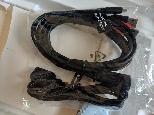
The boxing and packaging is very nice and rather professional looking. There is just one cable for multiple ports(splits from one to three with the one cable as seen in the picture).
The power button will glow with a dark blue light to indicate that the tablet is powered on.
It’s very nice that tablet comes with a stand but it’s not adjustable.
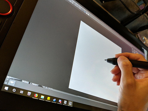
The IPS Screen
The tablet has a 15.6-inch IPS display with full HD resolution (1,920 x 1,080) . It has pairs a superb color accuracy of 120% sRGB 16.7 million colorswith 178 degrees of visual angle.
The screen is awesome, clarity and colors look nice. Using the default plastic nib works great on this new surface, and feels more like a traditional pencil on paper to me.
The screen has a textured matte film over it this is to give your pen more grip and improve control when drawing.
Artist15.6 Pro adopting full-laminated technology, seamlessly combines the glass and the screen, to create a distraction-free working environment that's also easy on the eyes.
If you push hard on the screen it makes some waves, not very noticeable.
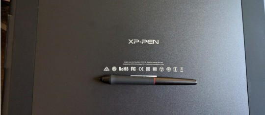
The Stylus(Pen)
With the pressure of 8192 levels, 5080 LPI and 10mm sensing height- the pen is very sleek and makes your drawing natural on the screen as it intensely senses and analyzes every movement.
Stylus (P05R) supports 60 degrees of tilt function, allowing it to easily and quickly sense the gesture movement of the stylus to ensure accurate imitation of a real tilting brush effect.it’s a battery-free device, even with large complex Photoshop brushes or sculpting with high res stamps in 3D, is minimal to the point of non-existence.
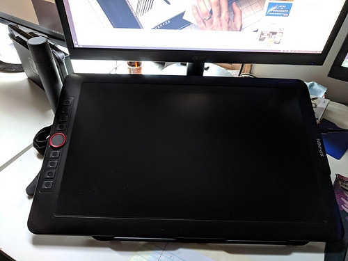
The Roller wheel and 8 express buttons
There are 8 programmable buttons and a Roller wheel. the innovative Red Dial interface breaks through the traditional pen display design for optimal efficiency.
These can be used at the fingertips, can be scrolled, zoomed in, etc.
The buttons are amazing, the round ring in the middle, The scroll wheel can be programmed to control three different parameters (such as zoom, brush size, etc). And the customize-able physical buttons have nice tactile feel.
The buttons are completely customize-able to whatever hot key you want, and with the conjunction with custom on screen buttons, you'll be able to work comfortably without a keyboard..... at least with programs that are designed to be simple for tablets, like Sketchbook or Painter. Even with these keys, I don't think you can get away using Photoshop, or zbrush etc. I think some programs are just too frustrating without a keyboard.
I wish the middle of the wheel was a button but serves no purpose.
The drivers
The driver download is done through their site online.
The XP-Pen tablet drivers are extremely easy to install. Just go download the latest version directly from XP-Pen’s site and remove all other tablet drivers you have on your computer before installing it.
The XP-Pen driver is a simple one page driver with all the important settings in just one window. Here you can set the pen buttons and pen pressure, and choose which monitor the tablet maps to.
I did not need to change any of the default settings as the tablet worked very well with the defaults. I also did not need to calibrate the pen because the cursor properly appeared directly under the pen by default (which surprisingly isn’t the case for some tablets).
To date, the drivers have worked fine with the programs I use most: Adobe Photoshop and Clip Studio Paint.

Drawing Experience
Artist 15.6 Pro was fantastic. It was also very portable so I could bring it with me to libraries and give demonstrations.
On Photoshop , the program recognizes stylus tilt. This allowing you to vary opacity with pressure, but line thickness with pressure tilt. It took me a good hour to get used to using it, it's a bit different than using a real pencil, but I now love it. The line weights, and the look of the pencil lines, makes it feel more like traditional pencil and paper.
Conclusion
XP-Pen Artist 15.6 Pro is an ideal choice among professional artists who love drawing and painting. This device is the best way to step into the digital canvas world. Now you don’t have to worry about colors, brushes, sheets, and pencil anymore, just pick this piece, keep it in your bag and move ahead to the world of art.
They have designed a protector that seems to fit into the premium product space in terms of functionality while keeping the cost to a minimum for beginning artists.
Although this is a bargain of $400, but I am very satisfied with its performance.
Overall, I'm very satisfied with my purchase, and I highly recommend it to anyone looking for a mid-range pen display tablet.
In case you don’t want Pen tilt function, or want to save few bucks and get the Screen drawing tablet for cheaper, it may worth it to check out the previous Artist 15.6 model. Which have similar features, like the 8192 level of pressure sensitivity, the HD screen. And the pro pen with 8 replacement nibs.
If you want to learn more about the Artist 15.6 Pro, check out the link below:https://www.storexppen.com/buy/artist-15_6pro.html
1 note
·
View note
Text
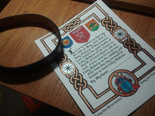
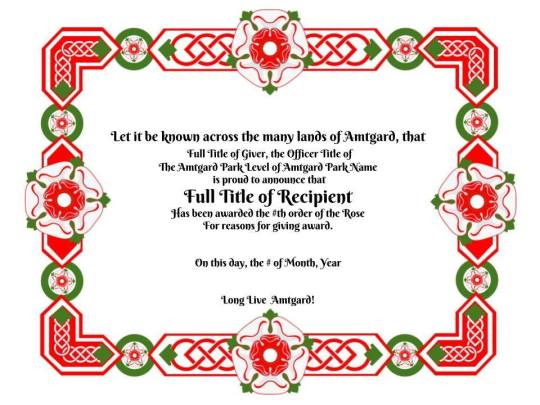
A Step by Step Guide to Make Handmade Awards for Amtgard (At Least How I Do It)
I enjoy making awards for Amtgard, and I’ve been doing it since I started playing back in 2001. Here is a few awards that I’ve made over the years, after doing a cursory glance at my facebook photos.
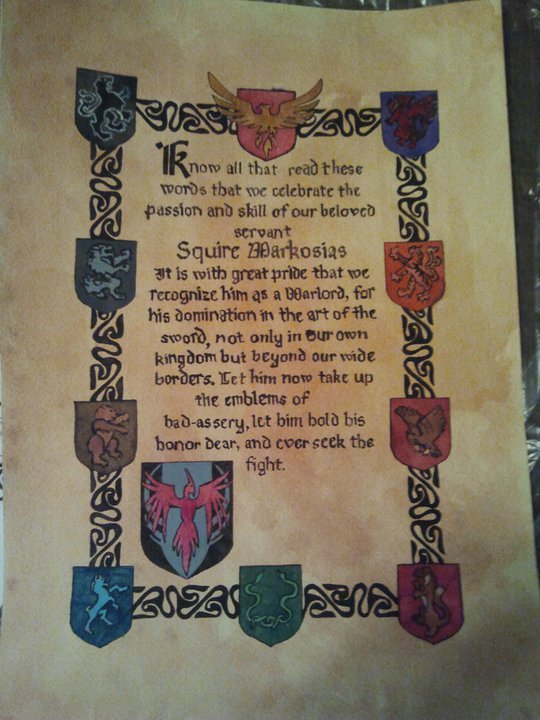
(Warlord Title, gouache on cold press watercolor paper)
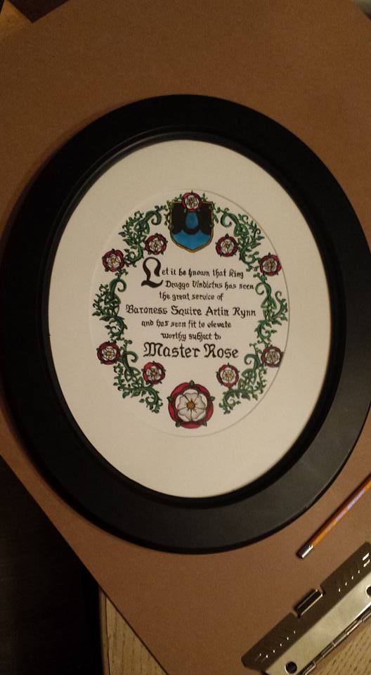
(Master Rose, gouache on cold press watercolor paper)
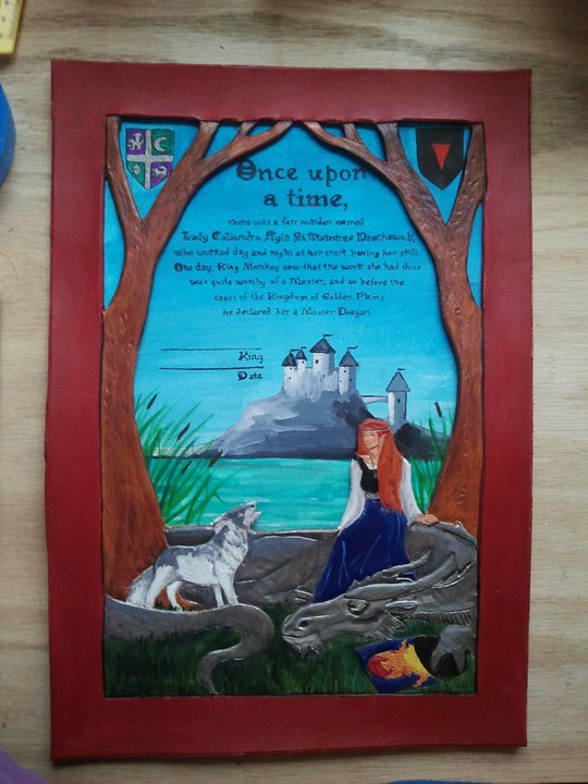
(Master Dragon, mixed media, leather and gouche on watercolor paper)
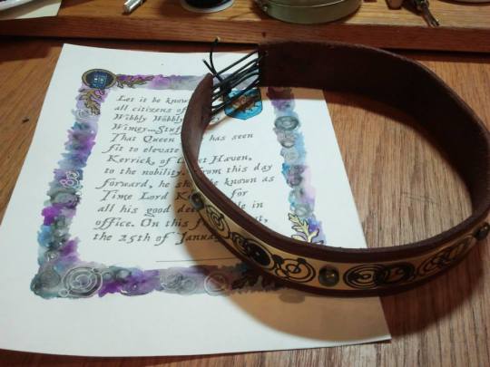
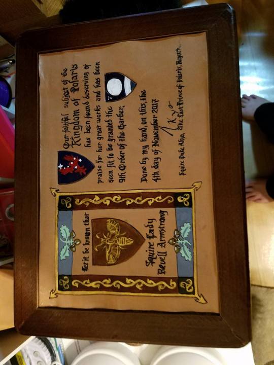
(Time Lord Title, digital and watercolor on cold press watercolor paper, run through a printer and hand painted, and a circlet, leather with metal, and drawn on designs with a sharpie)
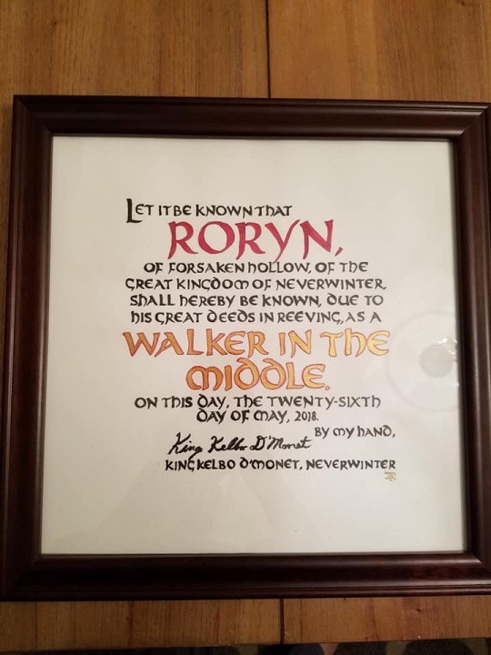
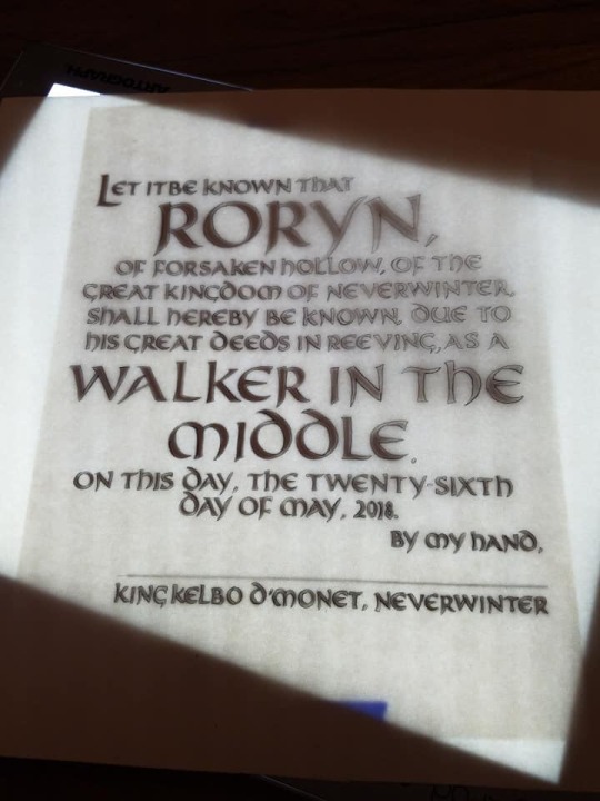
(Walker in the Middle, gouache on hot press watercolor paper)
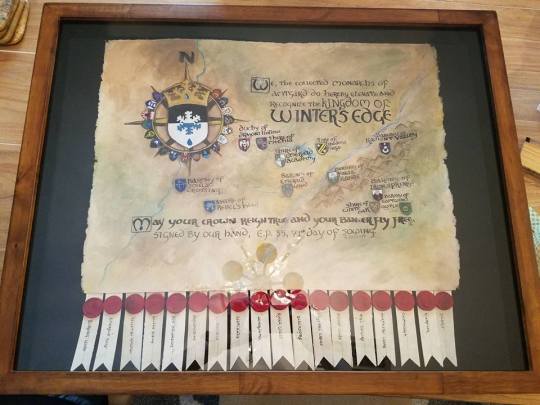
(Winter’s Edge Kingdom Elevation Scroll, gouache on hot press watercolor paper, plastic clay kingdom seals in a shadow box)
Lord Title, digital and acrylic, on cold press watercolor paper run through a printer)
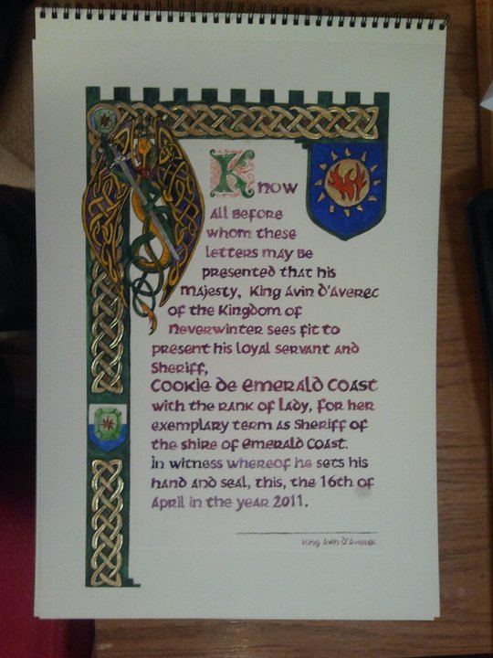
(Lady Title, gouache on cold press watercolor paper)
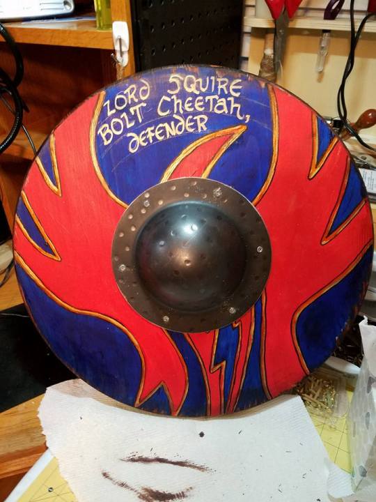
(Defender Title, acrylic on wood, designed to resemble a shield, I erased those lines later)
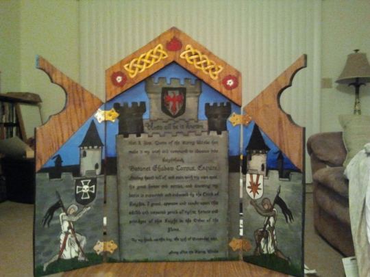
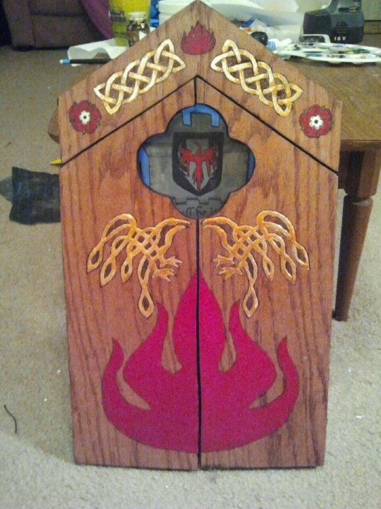
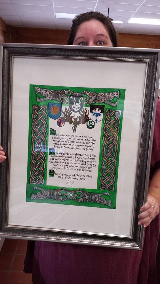
(Flame Knighthood Triptych, it opens and closes)
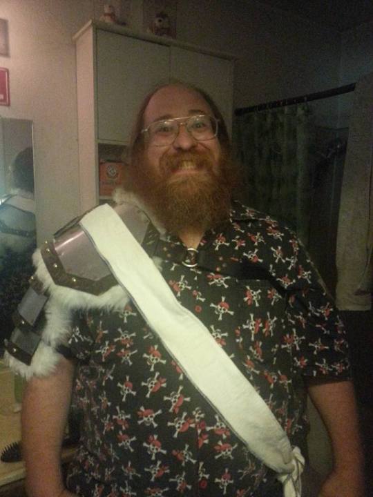
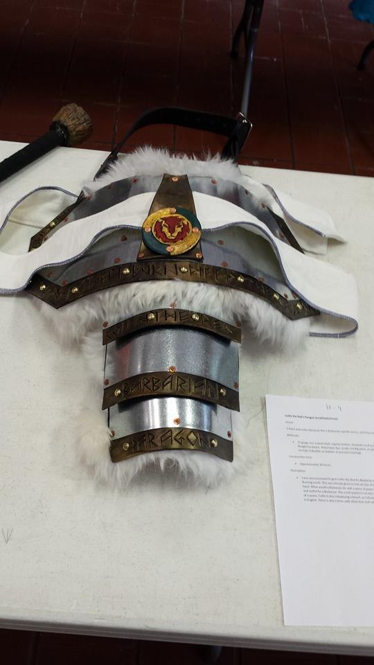
(Yes, this last one is an award itself, for a Paragon Barbarian, the text is cut into the leather along the edges.)
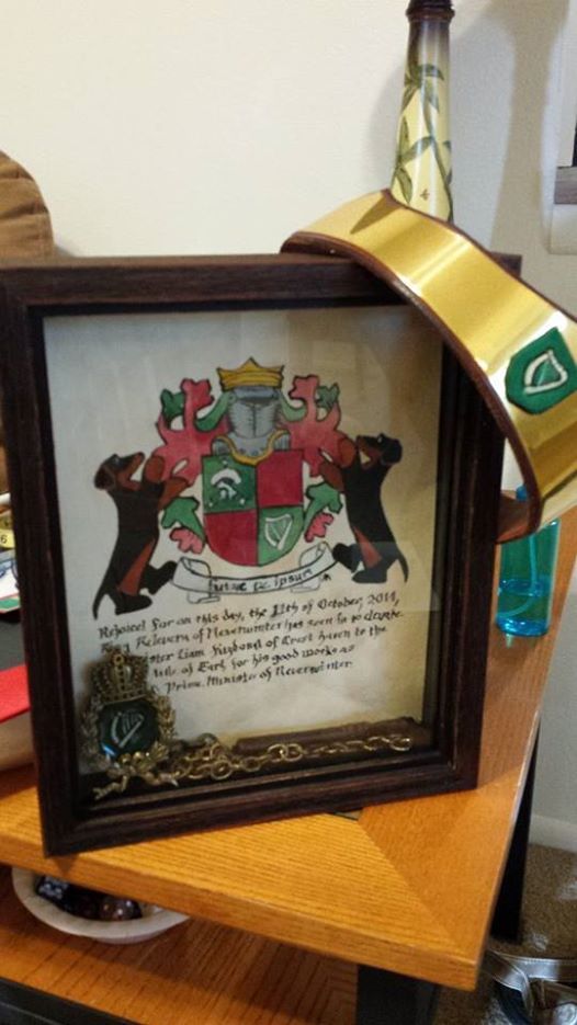
(Earl Title, gouache on watercolor paper, leather and brass circlet)
(9th garber, a sewing basket with a leather inset scroll in eco flow waterstain dye and acrylic)
(Serpent Knighting Scroll, gouache on cold press watercolor paper)
I like to try new techniques, from paper to leather to metal to wood.I also have designed countless digital awards, but that is for another post.
I’d like to teach you how to make awesome handmade awards to help your corner of amtgard be more awesome in recognition of so many amtgarders who have dedicated so much to the game, that deserve to be recognized. You too can do this, and cheaply. The following is a step by step guide in how I do it for paper awards.
Preface: My Personal Goal for Awards
I’ve been doing this a long time. And for me, as an artisan and scribe, the ultimate goal is this:
To make them cry.
I want everyone who receives an award I make them to cry. Ugly cry, in front of everyone in court. It’s how I show my love. So if I make you cry, I love you! And think you deserve an awesome handmade award gift, made by me, TO MAKE YOU CRY.
Its how I stay young.
Step One: The Commission
The first step in designing awards is finding out if there are awards that need to be made. Contact your local park or kingdom monarchy and offer your services, at whatever level you are comfortable with. Personally, I like to make 8+ level awards, titles, masterhoods, knighthoods and kingdom elevation scrolls. I feel like those are the things that should be special and handmade. However, your mileage may vary, depending where you are, I happen to live close to my kingdom, and how comfortable you are making awards. If this is a new thing for you, start small if you want to.
Talk to your monarchy, see if they need anything made, and try to ask them as quick as you can, so they are thinking about it. Because nothing sucks more than an award that was commissioned three days before an event.
This is where you want to start thinking about the specifics of the award. Do you want to give them a hand painted award? A part digital, part handmade award? Something outside the normal means of what you would consider an award, like the shield defender title, or the armor/sash of the paragon barbarian, or the sewing basket 9th garber I’ve made? Think outside the box, and try something new, if you’ve done this before. This award should be special to the person receiving it, if it can be.
Sometimes I don’t really know the person I’m making the award for. When that happens, the first place you should go is the amtwiki and find things about that person, if they have heraldry, what park they belong to, and the park’s heraldry, what kingdom they belong to, and that kingdom’s heraldry. What kind of persona they play, if they do play one. It would be awkward to make a ninja based award when they play a pirate, is what I’m saying. Find out what they like, and build from there.
Step Two: The Materials and Tools
What are you going to make this award out of? What tools do you need? Here is some examples of things that you want to think about, a quick rundown for paper awards, but really, if you can manipulate it, you can probably make an award out of it
Material:
(When working with watercolor, watercolor pencils, or gouache)
I prefer hot press watercolor paper if I am working in gouache. This paper is very similar to cold press, except it is much smoother, harder to source locally, and more expensive. But it is, for me, hands down the best paper I can find locally. I haven’t seen pads of it at stores like Michaels or Joanns, but you can find it in single large sheets at hobby lobby. Or if you are lucky like me and live in an art school city. Amazon always has everything, as well. Arches is a good brand.
Cold press watercolor paper is a rougher feel, but much more affordable and readily available.
You can also cut down either of these papers and run them through your printer, if you prefer to design your award digitally, and then have your calligraphy be done by the computer, and you can simply let it dry, then color in your design in whatever paint/colored pencil, etc, you choose.
Leather:
I admit I love working in leather for awards, I love how Eco Flow Waterstain flows though a dip pen onto leather. It just...feels good. You can work with leather dyes and acrylics in leather, and experiment with tooling and pyrography and layering, as I did with the Master Dragon, above, as well.
Wood:
Wood is good if you want to do something more structural, like the triptych and the shield I have done above. Ideal for pyropraphy (woodburning) and acrylic. Make sure you sand and clean the piece before you paint.
Other:
I haven’t used these materials for awards, but I’ve had ideas to build on them, maybe this list will inspire you: Plasterboard, you can carve into it to create a relief sculpture. Tile, I’m sort of in love with the geometric tessellation of arabic design, and would love to create something with this in mind, especially in tile...if I had a tile saw handy.
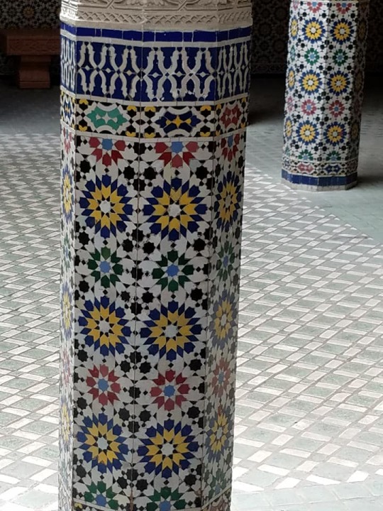
(Epcot, Morocco Pavilion)
Stone, I would love to have the tools to work in stone, something like this, perhaps:
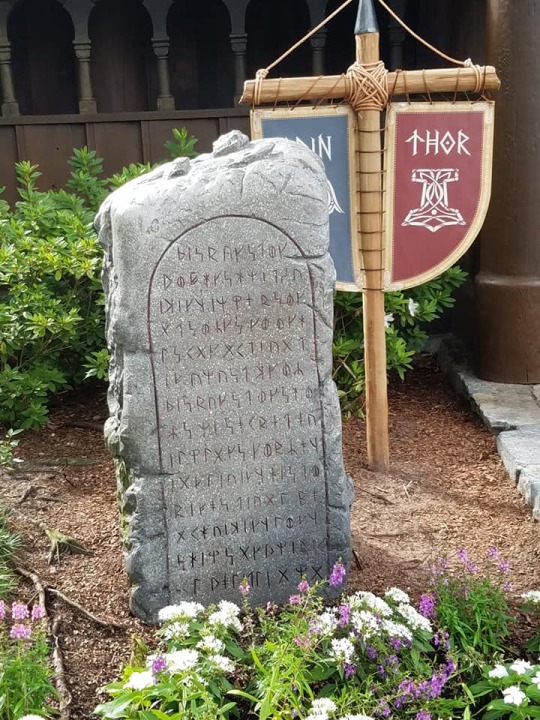
(Epcot, Norway Pavilion)
Felt, I have played with the idea of wet felting and needle felting, combined with embroidery to create a wearable scroll. One day.
The Medium:
You can work in almost anything. Pencil, watercolor pencil, pastel, oil pastel, fabric paint, acrylic, watercolor, oil paint, gouache, tempura, pyrography, really, the mediums are endless.
Right now, I like gouache. It has the best qualities of both watercolor and acrylics. You can paint light on top of dark, which is, just a miracle, really.
I love using gold in my work, or any metalics, really. I have some special ways to create that effect, from special paints to a calligraphy pen, to mini-fig paints.
Tools:
Brushes by the bunch. I just keep buying them when I inevitably leave one in acrylic too long, or don’t wash it well enough.
Dip pen, which is my favorite. Especially with gouache. Like all things here, practice first. You can get a variety of different nibs.
For paper awards I tend to use a big drawing board that I use painters tape to secure my paper to, and block out the space around the design so I don’t smudge pencil, or paint, in that area.
Step Three: Layout
You have your commission, you have your materials and tools gathered, now to put it all together in a cohesive way. I do a quick drawing of the layout, so I know what I am doing for the next step. Need ideas on how to arrange your award?
Here is Linden’s awards.
Here is about 90 ideas on my pinterest board.
Here is an example of a layout from an award I made:
This is the first draft, the basic idea of how the award should be set up. You don’t need specifics yet. Just an idea. Don’t use good paper at this point, just some scratch to work out the details.
Step Four: The Text
This is the part that is hardest for me. I tend to find text by doing a google image search of sca and amtgard awards, and using that as a base. Sometimes its just easier to ask a friend for help with this part.
Now is also when you want to figure out your “hand” or what font you want to use. Practice! I use a dip pen and, lets be honest here, my calligraphy sucks, I tend to find a good font on my computer and emulate that. There are some good books you can use if you want to go more historical.
A good award will have the basics:
Who is giving the award,
Who is getting the award,
WHY they are getting the award,
The date the award is to be given,
A signature for the person giving the award.
Fancy it up to your flavor level.
Here is also a neat thing to add into your award:
http://www.electricsamurai.com/ad/ the date of the award given in amtgard dates.
Step Five: The Cartoon
Here is where you work out the details. I spend my work life as a graphic artist, so I am much more comfortable scanning and manipulating my artwork on the computer, and it all depends on the piece, if I use photoshop, illustrator, or indesign. Here is that same image above scanned in and text added, and designed. This was done in illustrator. You can use whatever tools you prefer, digital or not. This should be your second draft, not on good paper.
This is my cartoon, and it’s ready to be printed out to size, and transferred to my good paper. If using digital means to create your cartoon, and the finished piece is going to be larger than your printer can handle, I highly recommend this website:
http://www.blockposters.com/
You can upload your design and have it print in however large you want, in 8.5 x 11 in pieces of paper. All you have to do is tape them together.
Step Six: Transferring to the Good Paper
Now is the time to get cracking. You have your good paper, you have your cartoon, you have your text. Now to transfer it. You can do it it many ways, from as simple as taping your cartoon to a sunny window and taping your good paper over it, and tracing lightly with a pencil, to using a lightbox (I prefer this) to taping your cartoon over your good paper and sandwiching in a piece of graphite paper in between and tracing. You can even use a projector to help you trace your design.
(I like the lightbox best)
Get your image onto your good paper.
Step Seven: Painting
So, despite being a graphic artist, I was not trained to paint. Airbrush, sure, but not painting. I left that to my friends who liked to smoke in the oil painting classroom in college. I just use whatever paint I am working in, and color in the lines with either a paintbrush or dip pen, and then fill it out. It’s very much like paint by numbers for me. I try to do multiple layers, with my mediums, then darks, then highlights. Whatever works best for you.
Step Eight: Calligraphy
Practice this. Over and over and over. Or....cheat, and fill it in with paint, outlining and then filling in the blanks.
Step Nine: Sign it!
I sign every piece on the back of the frame or paper, with a <3 Alona TwoTrees, but I also tend to use my signet, usually done in gold, on the front right bottom corner.

I think they are neat.
Also, if it is difficult to have the giver of this award sign it, ask for a copy of their signature, and fake it for them. Makes it easier at court.
Step Ten: Finishing Touches
Frame your pieces. Seriously. It’s a cheap and easy way to make your award pop. You can get frames at any dollar store that are 8.5 x 11 in. It’s a dollar, and it makes it so much cooler. OR head to your local thrift store and buy a frame in the art section.
Step Eleven: Give it Away and Drink in the Tears
Make them cry. Stay young.
31 notes
·
View notes
Text
His Brightest Star Was You - a missing Wish!Realm scene
AN: This wouldn’t leave my brain so I had to write it. For @acrobat-elle who I love a lot. I’ve been wanting to write you something forever and this is a gift for keeping it real about this episode and just generally being awesome and lovely. I hope you like it darling.
Word Count: 1198
ON AO3
_____
Even if the man sprawled, open mouthed and snoring on the bed before her was only barely recognizable, a grim shadow of the man she knew, Emma took comfort in the fact that his home was for the most part unchanged. He always took impeccable care of his ship, even if the same couldn’t always be said of himself.
There were new books lining the mantle, a few things replaced or slightly off from the Jolly she knew, but the feel of the vessel, the warmth and care shown on the spotlessly clean deck, in the tidy and efficient cabin, everything arranged just so, was exactly the same.
Emma laid his sword carefully on the table, and looked around, finally feeling some measure of peace in the day’s recent chaos. The palace she had called home here wasn’t a world she knew, the years of growing up there, of her marriage, and raising her son in the endless echoing corridors, elaborate balls and parties, were familiar in the way dreams are, intangible, fleeting, curling and fading around the edges with every moment after the dawn.
This ship however, she knew this ship.
She had lain sated and warm on those sheets. Had made love on it’s decks under the stars and the light of the moon. Had laughed, and eaten with a man this Killian would never have the chance to be, at the very table his sword now sat upon. Grilled cheese and onion rings pilfered from his plate were more real than any feast from this life she had never really lived. Smiles as he growled out his praise over her piracy, kissing her with food greased lips as laughing punishment, were more potent and tangible than any kiss received from a husband who lived only in false memory.
Her heart wrenched as she traced his face, weather worn and lined from years of hard living. Years of loveless failed purpose in every crease and wrinkle. His eyes though, his eyes were still that beautiful blue. No twisted wish could dim those eyes.
Emma set to work, undressing him with care, his form still and sleeping. She removed the dirty coat, squashing the urge to throw it into the sea, discarded the stained linen shirt, the curling twisting scarves. She removed them all, methodically and reverently. She couldn’t just leave him like this. He may not be the man she loved, but the echo of him was still there, a path thankfully untaken in another life mapped out in the unfamiliar scars and tattoos on his chest and torso.
She summoned the copper hip bath from the galley, filled it with hot water, scented it with conjured oils, and set to work. Her work was mindless and tedious, the only sounds in the cabin his harsh measured breaths, the trickle of water as she bathed him, the scratch and rasp of the cloth on his skin. She lingered over his hand, still firm and sure, and carefully removed his rings, setting them on the mantle.
She traced his brow, more prominent than the one she knew, the curve of his jaw, less defined and angular, but no less dashing. The water and candlelight played tricks with the shadows, his former handsomeness appearing like a specter on his face as the flame flickered, filling in the lines, darkening his beard, sharpening his features, blurring the years of neglect. It was just an illusion though, the next guttering flare of the light casting his true form in sharp relief.
She washed his hair, nails scrapping at his scalp, remembering his appreciative moans in similar circumstances. She’d always loved his hair, falling across his forehead with a wonderful playful boyishness, curling enticingly at his collar when he’d let it go too long, a chaotic beautiful mess that had now gone lank and gray. She bathed it in the oil, slowly working it through each strand, until it looked almost black in the light, and rinsed it over and over with the warm scented water.
She carefully trimmed the ends with a small pair of scissors that were still in the same spot on his basin, ever a creature of habit even here, and gave form to his dishevelment, structure to the neglected chaos. She brushed and brushed as it dried, until it shone silver and straight against the tan of his hardened skin.
Next came his beard, so coarse and wild, so different than the soft well trimmed scruff she had pressed her palm against a hundred times. She lathered him in cream with the bristled brush from his shaving kit, dusty from neglect, carefully smoothing it over the planes and angles of his face.
Each scrape of the straight blade, sharpened to a razors edge on the same stone that had seen many a sword, honed on a thick leather strap, took away years, decades even. His skin was smoother here, protected from the harsh elements and an even harsher life under all that wild growth. Slowly the years melted away as she carefully scraped the blade down, his jaw growing more pronounced without its thick, unkempt covering.
She dressed him again, her magic aiding her work, clean black leather and stark white linen, embracing him in golden light as it moved over his body, his necklace prominent against the silver hair of his chest.
She laid a more familiar leather jacket on the back of his chair, her eyes burning when she saw it, just the same as ever, folded carefully in a chest, tucked away like so many unwanted memories. She whisked the old decrepit one away with a flick of her wrist, glad to see it gone, and imagined him pulling this one on instead, strong and confident, the leather panels sweeping out behind him as he went off into the world to conquer his demons.
She cleaned up, putting everything back exactly as she had found it, the copper tub emptied and whisked back to the galley, the scissors back in their spot on the basin.
And then she wrote.
She had never been much of a writer, preferring the colors and hues of paint on paper when it came to creative endeavors, but this story she knew down to her very soul. She poured it out onto yellowed parchment, wove the tale with every scratch of nib, every dip into black ink. She told the tale of an ugly duckling turned into a swan, of a princess and her pirate, of a true love blessed by the gods themselves. She told the tale of a man who changed despite the darkness, a hero revealed through his sacrifices made for love, of vengeance forgotten for a life well lived.
She told their story, the most beautiful story she had ever known, the ink marred by falling tears, the lines smudged by shaking hands as she folded it, pressing a red lipped kiss to corner, and laid it carefully on mantle.
Emma hoped he would read it when she was gone, back to the the man he would never get to be. Emma hoped he would read it, and know his story wasn’t over yet.
#cs ff#cs one shot#cs canon divergence#captain swan#cs au ff#my writing#his brightest star was you#my fanfic
201 notes
·
View notes
Text
10 THINGS I’VE LEARNED FROM MAKING ART
1) Great craftsmanship does not make you a great artist.
It is not uncommon now to find large scale works by internationally renowned artists in museums that are entirely produced by other people. Ai Weiwei’s room full of hand-painted ceramic sunflower seeds or any one of Jeff Koons’ well-fabricated sculptures are prime examples. I’m not here to criticize or encourage this approach to art-making, but what I’d just like to point out that this is an important clue to what it ultimately takes to make a great work of art: the idea.
Idea is key to becoming a great artist. Otherwise, the best you can ever hope to become is a fantastic craftsman (or draftsman). This is not a bad thing if it is what you really want to do. But know that that means that you will spend your life being hired to make work for other artists, or build tables for furniture designers, or make clothes for fashion designers, or render buildings for architects, or draw comics and storyboards for companies. Again, this is not a bad thing. Not at all! But it does not make you an artist. What it does make you is a fantastic craftsman. If that is what you want to be, then do not let me or anyone else talk you out of it. If, however, you’d like to become an artist, then you’re gonna have to work on your ideas.
Ideally, the best kind of artist is he/she who is a master of great craft and of great ideas.
2) A great idea can never be great without purpose.
Purpose is what really makes any great idea great. Without purpose, chances are… your idea probably won’t really be that great. Alan Moore’s WATCHMEN is more than a “superhero comic,” not just because it takes us deep into the "real lives" of superheroes as they inevitably fall from grace, but because –and perhaps more importantly– it offers a critique of power and capitalism. THE GRAVEYARD BOOK by Neil Gaiman is ultimately about growing up. Herman Melville’s MOBY-DICK; OR, THE WHALE offers a study on obsession. While the best works of art are usually layered with meaning, the very best have a core purpose around which everything revolves. What separates, say, Banksy from most other street-artists out there is the purpose behind his work, more so than style or whatever else. Even great abstract works such as Mondrian's COMPOSITION II had purpose: balance. This same purpose would be evident in some Bauhaus works such as the sculptures of László Moholy-Nagy.
When embarking on the journey of making a work of art, think not of style, technique, or any cool tricks and gimmicks you’re eager to employ before dreaming up its purpose. Because purpose will dictate everything else.
3) Avoid making things for the money.
I, of course, have made many things for the money over the years. And I almost regret them all. Mainly because I realize that it took away from time I could’ve put into projects not for the money. This is not to say that one shouldn’t make money from his/her work. On the contrary, the more money the merrier, but that shouldn’t be the motive for one’s engagement in a project. The motive should be something else: a burning nagging desire. The money, however –if it were to exist– should be no more than a pleasant byproduct. Because no matter how much money you make, or how much recognition you think you may get by simple association with the project at hand, if it isn’t something you really want to do, chances are you will end up being incredibly unsatisfied.
Even if early on in your “career” you are tempted to do something for the money only temporarily until you have enough to do your own thing? Don’t. If you’re doing it solely for the money, don’t do it, because it is very likely that you will find yourself caught up in a cycle that depends on the regular flow of money generated by that sort of project with little chance or opportunity to do anything else. At least for a very long time, probably much longer than you will ever anticipate. And when all that time is gone doing things you –deep down inside– really didn’t care for, you will very much regret it. Because here’s the thing: Our most valuable resource is time. It isn’t energy or money or material. It is time, because time is fast fleeting whether any of us like it or not. Let’s make it a point to do with it what we really want to do, whatever that may be.
4) Think not, and speak not, in terms of career.
Careers are for bankers. We are artists. And as artists, the only work-related thinking that should be occupying our brains at any given time should revolve solely around the project(s) we are working on. Anything else will serve to be a distraction from said project. A distraction from said project will likely make the project suffer. Apply that to all the projects you work on, and guess what? You will end up with a career comprised of mediocre projects.
Leaving career-thinking to the bankers and putting all your thought into the project at hand means that your chances of ending up with a career of awesome projects will be far more likely.
5) Good artists copy. Great artists steal.
Picasso said that. I’ve met many artists over the years who would often use the second half of Picasso’s quote as an excuse for doing poor copies of other people’s art. It really is a great quote, but I don’t think enough artists read into it enough. You see, stealing something entails taking something and making it your own. It isn’t borrowing, it is stealing. And stealing well means making what you stole unrecognizable from the source. Copying, on the other hand, means that the original can still very much be seen in the copy, and thus can be identified as a mere copy. Stealing is extremely important for artists to do. Picasso stole from African masks. He didn’t copy African masks. That would only result in a number of paintings of African masks. What he did do was steal from African masks. The result was paintings not of African masks, but rather of Picasso’s surroundings, while employing aesthetics drawn from African masks. You can see it clearly in comics too. Make no mistake, there would be no Frank Miller without Neal Adams. Heck, there wouldn’t even be a Sienkiewicz without Neal Adams. There really wouldn’t be a Mignola without Miller, and there wouldn’t be an Oeming without Mignola. And there really wouldn’t be any of those skillful bastards without Kirby.
One thing you might want to consider doing is, if you like someone’s work, look at the source material that inspired him/her. So, if you like Neil Gaiman, it may be a good idea to look at ancient mythology and old folklore. If you like Quentin Tarantino, read some Elmore Leonard and complement that with the films of Sergio Leone. Obsessed with Warren Ellis? Then Christ, I dunno, check out Umberto Eco, Bruce Sterling and William Gibson. Crazy about Ancient Greece? Look at Ancient Egypt. And so on.
6) Build it and they will come.
El Seed did an amazing mural project in one of the most impoverished and discriminated neighborhoods in Cairo which involved painting on 50 different buildings. In so doing, he avoided all the usual excuses one might come up with that would keep him from doing the project. Things like the hassle of getting permits or how to fund it. Instead, he flew to Cairo, went to the neighborhood, and proposed his idea to all the residents in all 50 buildings. With their approval came the volunteers necessary for execution. With the approval and volunteers, he was able to get funding.
I think that if El Seed had taken the usual route, i.e. attempting to propose his idea to arts organizations, or attempting to approach the city municipality, chances are the project would not have become the reality that it is today. Build it and they will come.
7) Never use computers to fake the effects of analogue tools.
It’s becoming more prevalent than ever to see artists using computers to fake the effects of analogue tools. Thing is though, computers are horrible at being paint-brushes or watercolors. What’s really good at being a paint-brush is an actual paint-brush. What’s really good at being watercolors? Actual watercolors. That is not to say that computers shouldn’t be used in making art. Computers are fantastic precision tools. No other tool can be more precise than a computer, and that is probably the one advantage they have over any other tool. Probably the advantage that should be put to use if ever a computer was to be used. But don’t use a computer where it has a disadvantage, and the greatest disadvantage a computer has is in its attempts to emulate the effects of pencil, ink, and paint on actual non-virtual surfaces.
8) If it leaves a mark, it works.
I remember at a young age reading HOW TO DRAW COMICS THE MARVEL WAY, and being introduced to a number of tools on one of the first few pages. Tools that I hadn’t ever seen before. Namely India ink and inking brushes. I would later see those same tools mentioned in more writings on comics from such greats as Will Eisner and Dave Sim. While I’ve learned that mastering the use of brushes and nibs is important, I’ve also learned that they aren't absolutely necessary to creating great comix. David Mazuchelli employed –to great effect– what he referred to as a “dumb line” for BATMAN: YEAR ONE (where all the lines are essentially the same thickness). Bryan Lee O’Malley inked and lettered LOST AT SEA with a Sharpie, which helped make it feel like one of the most intimate books I’ve ever read. Brecht Evans didn’t use ink at all in THE WRONG PLACE, and the book is entirely illustrated in watercolored shapes. One of the most striking and hyper-realistic works of art I’ve seen is a massive floor to ceiling drawing by Juan Francisco Casas made entirely with a blue ballpoint pen.
Remember that there’s no one way or one set of tools to do anything at all. If it leaves a mark, it works. More important to consider is what kind of mark is needed for that particular work to have the look and feel it needs.
The above, of course, pertains to physical marks. The other and possibly more important type of mark to think about is the psychological mark. If your work of art leaves a psychological mark on the viewer, then it works. It could be a positive mark or a negative mark. It could make them feel happy or sad or confused or angry or inspired. It could make them feel anything but it has to make them feel something. If your work makes the viewer feel nothing whatsoever, then I’m afraid you’re in trouble.
9) Comix, I’ve come to discover, are less a synergy of prose and illustration and more a combination of poetry and graphic design.
By thinking of comix as prose and illustration, the best you’ll ever end up with is a kind of storyboard. Thinking of comix as poetry and graphic design on the other hand, will allow you to take true advantage of the medium’s potential. You will think of your pages in terms of rhythm and balance and metaphor and end up with something far more remarkable than a storyboard.
On a related note: the page is the unit, not the panel. I see a lot of comix that are difficult to look at because the artist put so much detail in each and every panel, making the page look like a collection of stills from an animated movie rather than a comicbook. Our panels are not meant to look like animation stills because –simply put– we do not look at one single panel at a time. We see the entire page, and as such, the entire page should have a comfortable balance and harmony to it. To do this, it is important to understand the principles of graphic design and apply it to the page. It is the design that should dictate the illustration, and not the other way around.
10) Obscurity does not translate to failure.
When Alan Moore and David Lloyd were making V FOR VENDETTA, they were doing it through a short-lived obscure UK-based magazine called WARRIOR. A far cry from the global cultural landmark it became 20 years later. Before MEMENTO, Christopher Nolan made a movie called FOLLOWING that very few people had heard of. And before that he embarked on filming a feature he never completed, before doing a few shorts that never got any attention at all. Nietzsche’s work only became known in the years following his death. Herman Melville died in utter obscurity, but now it is difficult to walk into a bookshop without coming across a copy of MOBY-DICK. Most artists in any field are obscure for the vast majority of their lives, if not for the entirety of their lives. If what you’re making now remains completely obscure for some time, rest assured that that is normal. Take solace in the possibility that the obscurity of your work today may possibly mean that your work is well ahead of its time, which is something many of us can only ever dream of.
Good luck and godspeed,
Ganzeer
Los Angeles, CA
April 23, 2016
0 notes
Text
Stylefile Marker Review
Stylefile Marker Review
Just over a month or so ago, I was allowed the opportunity to review these incredible, German based, Stylefile Markers. As we all know, especially in the art world, you can bet your hands on anything designed and or manufactured in Germany, being of incredibly high standards, so I was very excited to be given this opportunity.
As I have mentioned in my YouTube review of the Stylefile Markers, I try my best when reviewing a product to keep the review completely about that company and not mention other companies. I will however, be releasing a series videos specifically comparing similar products, but when it comes to markers, so many people, myself included, consciously or subconsciously compare to the most widely renowned Japanese markers used by so many manga and anime illustrators.
within the past few years, so many cheap versions of the Japanese illustrator markers have flooded the market, most of which not even coming close, however, the last year has seen that market change so dramatically, of which I have reviewed some excellent alternative markers. The Stylefile Markers however, as a collection and I will explain the collection in this review, deliver exceptional quality and a uniqueness I've never seen before in any marker brand.
Also with the Stylefile Markers, I completed my first ever speed drawing of the Marvel character "Black Panther" and I can say that the Stylefile markers and their fantastic range of nibs made the result of the drawing, as good as it is. To see the speed drawing you can see it here.
(adsbygoogle = window.adsbygoogle || []).push({});
Stylefile Markers
As I have mentioned, the Stylefile markers are a German based company and if you take a look on their web site, in the gallery section, you will notice that, although not exclusively, a lot of amazing graffiti artists have taken to the Stylefile marker, in fact, if you read the history of the company, you will discover that the concept of the Stylefile marker was born from the professional graffiti world. Stylefile started out around 2009 and since then have been evolving ever since, introducing more innovative approaches to marker art. I have to say, I have fallen in love with these incredible markers and let me show you why.
Types Of Stylefile Markers
There are three different types of Stylefile markers available at the minute and as I have mentioned, as a collection, as a collaboration between all three styles of marker, Stylefile make creating your art such an amazing experience. It is also important to mention that these markers are also Alcohol based as I know some people are sensitive to such markers, however, I must say that there is very little to no odour from the markers, although I fully understand that some people are just more sensitive than others to this type of medium.
The Classic
The first of the markers is the Classic, the classic sports a black, round barrel, the marker is dual tipped with each end cap displaying the colour of the ink in the marker. As well as the end caps being the same colour as the ink, both caps have the name of the pigment written on them as well as a numerical code, representing the colour should you need to either replace the marker individually, or purchase a refill.
Along the barrel of the marker, toward the end caps, a large dot and small dot have been painted on the barrel, helping the artists to visually identify which cap reveals the chisel nib and which the fine bullet nib with the large dot representing the chisel nib. The small dot represents the fine bullet nib, however, there is also a thin light grey band between the cap and the barrel, adding another visual guide to which nib is covered by the cap. A lot of marker artists will contest to the fact that on many occasions, they will have had to take of both caps in order to locate the desired nib, but with these easy to identify markings, Stylefile has removed this headache.
The nibs on the Stylefile Classic is of a classic nature and perhaps nibs you have seen in other markers, however, the quality of the nib is also a major factor and Stylefile have sourced the highest quality nibs. I have only been using my Stylefile markers for approximately a month and a half, in this short period of time I have used the markers extensively, as you may also be able to see in the speed drawing of Marvel's "Black Panther" I created.
(adsbygoogle = window.adsbygoogle || []).push({});
Stylefile Brush Marker
Next up is the Stylefile Brush Marker, now the brush marker seems to be the most popular type of nib that marker artists are looking for and Stylefile do not fall short. As with the Stylefile Classic, the Brush marker sports a light grey barrel, also displaying the same large and small dots close to the end caps for ease of identifying the nib types. As with the Classic, rather than a light grey band, the Brush sports a black band between the barrel and cap as another identifying feature of the brush tip. So the large dot indicates the chisel nib and the small dot, along with the black band, identifies the brush nib.
Again, as with the Classic, the lids on the Brush marker are the same colour as the ink within the marker, again making it incredibly easy to select the colours you want at a glance. Looking a little bit closer, you will also see that both lids are marked with the colour name and a numerical code representing the pigment should you need to order a replacement marker or refill.
The Stylefile Brush tip is an excellent tip, with a level of flexibility allowing for a plethora of marks to be made. Also, in some of my other marker reviews, people have contacted me months later and told me that the nib on their particular marker has either lost it's point or frayed. As previously mentioned, I have been using the Stylefile markers extensively for a month and a half now and the Stylefile Brush tip has kept its shape perfectly, no fraying and ink flow has remained as rich and free flowing as the day I first used them.
Stylefile Brush Marker Skin tone's
I was incredibly fortunate that Stylefile sent me a wonderful 12 set of Brush Tip Skin Tones which as you can see from the images below, this set in itself is such a valuable set to have in your arsenal.
(adsbygoogle = window.adsbygoogle || []).push({});
Stylefile Allround Marker
The Stylefile Allround is the third marker in the Stylefile range and also the newest to the lineup, but in my opinion, the Stylefile Allround is what really sets this brand among the other so many marker companies. I have never seen another marker out there, with the same nibs that the Allround sports.
As with the Classic and the Brush, the barrel is round and dark grey in colour, making all three Stylefile markers really easy to distinguish between one an other. The Allround also has the same markings to help identify which nib is under the lid. So, on to the nibs and what makes them so unique and why I feel, that as a collection, the Stylefile markers are the finest on the market.
The large dot on the Classic and Brush markers represents a chisel nib, but not in the Allround, this time the large dot identifies a nib I have never seen anywhere before, never mind in a marker. I really don't know how to describe it, so the best thing to do is show you the nib.
The other nib on the Allround is yet another nib I have not seen on a marker but it is one heck of a nib and one that really helped me with the Black Panther drawing I done. Actually, the reason I chose the Black Panther drawing was because, Stylefile sent to me a set of 12 Neutral Greys and in the set of 48 Brush markers, there was 12 Neutral Grey Brush markers. I felt Marvel's, "Black Panther" drawing would allow me to demonstrate the range of amazing nibs and just how well the Stylefile markers all work together.
As you can see from the image above, the Stylefile Allround nib is along the same lines as a fine liner, but with all the power of an artist grade marker at the helm. The Allround as I mentioned is one of Stylefile's newer markers to the range and as things stand, the Allround does not have the same vast selection of colours the other two have. This may be the way things will stay or perhaps more colours will be introduced to the range at a later date. Regardless, the Allround is an outstanding marker and one I will be saving my money to get some of the colour sets.
Stylefile Over All Features
So I have spoke about some of the individual features of the markers, but altogether, Stylefile have really pushed the boat out to make this marker stand out among the many markers clambering to reach the top spot. to be honest though, I don't think Stylefile are interested in entering some race to be top choice marker for illustrators and artists a like, I feel Stylefile confidently let their product do the talking and stand alone with a unique art product for artists and illustrators of all walks to love adore and pine for.
The first thing I noticed about the Stylefile markers was the incredible ease of removing the lids. So many markers have really stiff lids to remove and it is almost a tug or war game to remove them, this is not the case with all three of the Stylefile Markers.
Although the barrels of the Stylefile markers are round, on all the lids there is a small fin preventing the barrel from rolling off your work surface. Stylefile have also made identifying all three different markers really easy with their very different barrel colours
Stylefile Sets
The best way to find out about the sets and pricing is to visit Stylefile's awesome web site, they have a section on there, with a map of the world and the distributers of the Stylefile markers. Simply click on your country and a list of stores will be provided of where you can purchase the markers in that particular country.
For the Classic Marker, sets of 6, 12, 24, 36, 48 and 72, there is also a 120 Display set along with a huge 756 display case for retailers to purchased, complete with markers.
The Brush Marker sets are the same as the Classic, 6, 12 , 24, 36, 48 and 72 as well as the retailer display sets which I have to say look absolutely amazing. I say retailer display sets, anyone can purchase them really as they are available on Amazon as well as the Stylefile web site.
The Allround as I have mentioned are the new kid to the lineup, they have a 12 set of Neutral Greys, 12 set called Main Set a and a 12 set Main Set B. Both A and B sets are colours.
As well as the sets, I have mentioned throughout the review that the markers can be purchased individually in Open Stock which is fantastic, however, Stylefile have also started with 25ml refills bottles, which in themselves look amazing.
Stylefile Sketch Pads
Of course, Stylefile don't just stop with the outstanding markers, they also provide the perfect surface to use these beauties on. When Stylefile sent the markers to me, I almost threw out the box after removing the markers, but I knew it was too heavy to be an empty box. So I removed all the packing paper to protect the markers and much to my delight found an A3 Stylefile Marker Sketch Pad. However, they also have hard back pads which look amazing, I haven't used them yet, hence I say yet as I can assure you, this will not be the last review you hear from me and this amazing company Stylefile. I plan of purchasing the colour range of the Allround, the Cool and Warm Greys in the Brush and a hard back Sketch pad and if my funds can stretch I will purchase an empty Stylefile storage shelf which I will of course review and add to my growing art storage reviews.
Conclusion
I know this is perhaps a bit of a long review, however, when you think about it, this review covers three individual markers that just so happen to be from the same company. I won't ramble on and so will just say I loved these markers. Their lay down and coverage was beautiful, the colours in the markers rich and the unique nibs, as a collection, allow marker artists to tackle any work their heart desire, no matter how detailed. I love the Stylefile Marker and highly highly highly recommend this marker to any marker artist out there. Don't forget, to see the Stylefile marker in action, please check out my "Black Panther" speed drawing on my YouTube channel.
#Stylefile#Stylefile Markers#Artist Markers#Marvels Black Panther#Black Panther#Stylefile Brush Marker#Stylefile Classic Marker#Stylefile Allround Marker#Stylefile Refills
0 notes
Video
youtube
CEL - Cook Eat Live - Swedish Cinnamon Buns
Published on Mar 12, 2017
CEL - Cook Eat Live - Swedish Cinnamon Buns
Hello my friends
Welcome to my channel
Today we make super tasty Swedish Cinnamon Buns
Also known as Swedish Cinnamon Rolls
👨🍳🍳🥘👩🍳🖖
Lets see our ingredients first - More Info https://docs.google.com/document/d/1B...
* Dough ingredients *
600 gr flour
90 gr sugar
130 gr butter
250 ml milk
Egg
Half teaspoon salt
30 gr fresh yeast
10 gr cardamom
* Paste ingredients *
200 gr almond paste
70 gr brown sugar
150 gr butter
15 gr vanilla sugar
35 gr cinnamon
* Syrup & Garnish ingredients *
95 gr sugar
120 ml water
1 tablespoon honey
4-5 tablespoon nib sugar
Egg
👨🍳🍳🥘👩🍳🖖
Lets start!
Put a small pot to high heat
Add the sugar
Add the water
Shake the pot a bit
Boil until the sugar will melt
Take the pot out of the heat and let it cool
Add the honey
Mix
Put the flour in your kitchen machine
Start the machine in its low speed
Sugar
Cardamom
Salt
Yeast
Milk
Egg
Add butter slowly
Let the machine work until the dough is ready
Depending on the machine it may take up to 5 mins
Work the dough for couple mins by hands
Cover the dough with a towel for 20 mins
In a bowl add the following
Almond paste in small pieces
Brown sugar
Vanilla sugar
Cinnamon
Butter
Mix by hand until they will become paste
You can use a spatula to finish it
Spread the dough by rolling it on all sides
It should be around 50 cm x 40 cm
Spread the paste on the whole surface
Fold the dough in the middle
Flatten the dough a bit more
Cut it in half
Rotate the two pieces
If the dough will change shape press it to make it right again
With a pizza cutter, cut in stripes of 1-1,5 cm
Grab the end points of the stripes and shake a bit
This way the stripes will get longer
Roll the stripes in a snail shell shape and put the tip in the bottom
On a baking sheet place a baking paper
Place the Cinnamon Buns by leaving 2-3 cm distance from each other
Cover for 20 mins
Whip the egg
With a brush, paste the egg on the Cinnamon Buns
Dust the nib sugar
Bake at 190 ºC (374 ºF) for 11-13 mins (or until they will get golden brown)
With a brush, add the syrup
So, my friends… Our Swedish Cinnamon Buns are ready
Lets taste
I’m telling you guys
Awesome
You must make it at home
So nice, so tasty and so soft
So, my friends… If you like our video, please click below!
Facebook https://www.facebook.com/profile.php?...
Twitter https://twitter.com/CEL_CookEatLive
YouTube https://www.youtube.com/channel/UCHvK...
Coop https://www.coop.se/
Hemköp https://www.hemkop.se/
ICA http://www.ica.se/
LiDL http://www.lidl.se/
WiLLY:S https://www.willys.se/
Ingredients List https://docs.google.com/document/d/1B...
0 notes
Text
Wacom MobileStudio Pro 13 Review
I got to try out the new Wacom MobileStudio Pro for a little while back in October of 2016, but now that I’ve been using it for some real work, it’s time for a full review. I’ll start off right away with letting you know that if your career has anything to do with visual creativity, this is the tool you need. Notice I said tool instead of tablet. That’s because the Wacom MobileStudio Pro is almost entirely designed for creating all the things that everyone else uses in their daily lives. This tablet PC is made for professionals. The “Pro” in this tablet’s name isn’t just tacked on to make it sound better like some other electronic gadget manufacturers do. It is genuinely deserving of the “Pro” moniker.
This tablet isn’t for people who play cartoony games that everyone loves to play on their iPads, it’s for people who create those games. This tablet isn’t for handing to your kids to watch an animated movie in the back seat on a long drive, it’s for the people who create those animated movies. It’s not for taking selfie videos with cute cartoon filter overlays, it’s for the people who design those filters.
If you’re a comic book artist, architect, 3D texture artist, video editor, story board artist, sculptor, fashion designer, animator, engineer, photographer, retoucher, graphic designer, illustrator, or a student trying to learn any of those disciplines, the Wacom MobileStudio Pro is what you’re looking for.
It sounds like the Wacom MobileStudio Pro is a lot like Microsoft’s Surface Pro 4 or Surface Studio, both of which are drewl-worthy products aimed at creative professionals as well. Keep reading to find out why the MobileStudio Pro is a much better choice for digital artists. With all this praise right up front in the intro paragraph, some of you might be ready to find the order button on Wacom’s website, but despite all the power of Wacom’s MobileStudio Pro, there are a few drawbacks that you’ll want to know about, too.
youtube
Specs
The version in this review is the DTHW 1320H model which has the 13.3″
screen, Intel Core i7 CPU, Intel Iris Graphics 550, 512Gb SSD, 16Gb of RAM, and the Intel RealSense 3D model scanning hardware. The is number 4 out of 6 on the scale from cheapest to most expensive in terms of your model choices for the Wacom MobileStudio Pro. If you want to spend less money, the cheapest model has a 13.3″ screen, Core i5 processor with 4Gb RAM, 64Gb SSD, and a regular 8Mp camera. If you want even more power & want to spend more money, there are two models of the larger Wacom MobileStudio Pro 16 which include NVIDIA Quadro GPU hardware. The top of the line model has a Core i7 processor, Nvidia Quadro M1000M 4Gb GPU, 512 Gb SSD, 16Gb RAM, and Intel RealSense 3D scanning camera. Also, the larger 16″ models have 8 programmable hardware buttons in the bezel as opposed to 6 in the smaller 13″ model.
Screen and Pen
If you’re thinking about the Wacom MobileStudio Pro, the biggest selling point is going to be its screen and pen interface. I was fully converted when I first got a Wacom graphics tablet back in the mid 90’s and today using a mouse or trackpad to interact with a computer feels like using a hammer to put together a watch (especially when it comes to design work). The pen-to-screen interface gives you a direct connection for manipulating computer controls. It’s not disconnected like a mouse or trackpad. Furthermore, you can build motor-memory since the location where you place the pen tip is always going to have the same relationship to the dimensions of the screen you’re looking at. That’s never true with a mouse or trackpad so often you’ve got to spend a couple seconds looking at the screen and moving the pointer around to figure out where it is. With a Wacom pen, you place it and it’s there. I can even do this without looking at the screen and have accurate cursor control.
A touch screen also gives you direct interactivity with graphic user interface controls, but fingers are big. Each finger is going to cover from 100-300^2 pixels worth of data and buttons need to be that big to be activated. That’s a huge waste of space and a huge crutch for efficiency.
The Wacom MobileStudio Pro 13 includes the new Wacom Pro Pen 2 and its digitizer supports 8,000 levels of pressure sensitivity, plus pen tilt sensitivity, and pixel level pointing accuracy. You may remember in my Surface Pro 3 review where I compared the pressure sensitivity to the Surface Pro 2 which used Wacom’s digitizer technology as opposed to Microsoft’s new N-Trig based digitizer technology. I said that the Surface Pro 3’s 256 levels of pressure sensitivity wasn’t noticeably different from the Surface Pro 2’s 1024 levels of pressure sensitivity. The Surface Pro 2 used some of Wacom’s older & cheaper digitizer tech, and I have to say that the digitizer tech in the MobileStudio Pro 13 is far superior! Noticeably far superior!
Wacom’s Pro Pen 2 doesn’t require batteries at all. It has two buttons on the side and an eraser. Yes, the buttons are customizable too though they need to be within an inch of the screen to function (no auto-launching OneNote from afar like the Surface Pro 3 can do). It also includes interchangeable pen nibs if you want to change the feel a bit or you wear one out. The pen is so comfortable to hold. The buttons are easy to feel and find. The pen feels like the perfect weight. It makes the Surface Pen feel clunky and cold.
Putting the pen to the screen feels like coming home. The display is so close to the surface, it’s almost like you’re touching the pixels directly. If you look really really closely, yes there’s a bit of space between the top layer and the pixels, but in normal use it’s going to feel like you’re drawing directly to the software’s graphical user interface. The accuracy is excellent as well. Older pen computers often don’t place the pointer quite as precisely on the screen as you would want. Many have digitizers that calculate the positioning in clumps and that’s why some will have a jiggle to the line strokes if you move the pen too slowly. The Wacom MobileStudio Pro actually has pixel-level positioning accuracy and it is awesome. You can hold the pen still on the screen, move it as slightly as you possibly can, and you’ll see the cursor move one pixel in that direction. You are not going to get this level of precision control on any other pen computing device. What about
the corners, you say? Yes, it’s true there is often fall-off of pen accuracy in the corners of the display for many pen digitizers. Wacom solves this by extending the digitizer beyond the display area and deep into the bezel. That brush cursor or pointer is going to remain pixel accurate all along the edges.
Your pointer appears on the screen when the pen tip gets to a little less than an inch from the surface of the screen. At that point, the touch screen is disabled and you can rest your hand on the screen for a stable platform. If your touch screen is not responding to your fingers, that might be why. This range is a lot greater than the vertical range before palm rejection in Microsoft Surface N-Trig technology and that means you’re less likely to invoke touch screen actions accidentally.
The exterior layer of the screen is actually a matte material too. This is much better than those glossy glass screens that you see on things like the Microsoft Surface devices, iPad Pro, Macbook Pro, etc. The matte material doesn’t give off nearly as much glare, which can interfere with your ability to see your work properly. Often you see professional photographers with Macbook Pros covered in a black hood to reduce the glare on those terribly shiny screens. This doesn’t require that kind of work-around as much. The matte finish also reduces the fingerprint grease problem. Yes, you’re still going to get fingerprint grease on the screen when you touch it, but the interference and notice-ability is greatly reduced compared to a glossy glass screen. By the way, you get a nice screen cleaning cloth in the box.
The screen actually subtly flexes when you apply pressure. You might think that would be a durability problem, but bendable things are less breakable. So I’m imagining this won’t shatter as easily as a glass screen. It also feels much more natural to interact with and that’s a huge plus. If you’ve used a Microsoft Surface Pro/Book/Studio or an iPad Pro with Apple Pencil… yeah, they have great pressure sensitivity and you can write on the screen and accurately control the thickness of the stroke, but it still feels like plastic on glass. The Surface Pen variable texture nibs help improve that feeling to some degree, but the Wacom MobileStudio Pro brings the feeling of drawing on a computer to a higher level. It doesn’t feel exactly like writing with a pencil on paper, but the matte screen texture, the flexing, and the practically perfect pen easily offer the best pen interface on the market.
While a precise pen interface is very important to anyone in the visual creative fields, so is color accuracy. The Wacom MobileStudio Pro’s screen does not disappoint. It actually supports 96% of the Adobe RGB 1998 color gamut. That’s a much wider color gamut than the usual sRGB that most computer screens display. Most photographers and print designers are going to want to use this color gamut. For video, the new color gamut standard is heading towards DCI-P3 which extends more into the reds & purple ranges while Adobe RGB extends into the greens & blues. Unfortunately, the Wacom MobileStudio Pro does not have a quick-action button for switching between color gamuts like the Microsoft Surface Studio does.
Hardware & Tactile Buttons
We’ll start with the big silver-rimmed hardware buttons in the side bezel. On the 13″ model, you have 6 flat black buttons while on the 16″ model, you have 8. There’s also a 4 way circular button in the middle that also has a center button and the circle is touch sensitive for scrolling through functions. One some models, the center button within the circle doubles as a fingerprint scanner compatible with Windows Hello. The fingerprint scanner didn’t work at all on my first MobileStudio Pro. Windows 10 kept waiting for a finger appear, but the scanner just wasn’t sensing anything. A replacement MobileStudio Pro fixed that minor issue.
At first I thought that these would be a usability issue since none of these buttons are labelled and I had no clue what any of them would do. However, the Wacom MobileStudio Pro is a device for professionals and as it turns out the unlabelled buttons are much more powerful than first glance. They are all customizable! And the capabilities that you can program into these buttons is practically limitless. You’ll see a lot more info about this below in the software section, so keep reading.
In terms of tactile usability, these hardware buttons are very good. You can see the center button has a small nub on it so that you can easily find it without using your eyes.
The side edges of the tablet PC house some other buttons. Here you see the power switch. It’s not a button that you press but a spring loaded switch that you hold down to power on or off. This slight complexity to the switch makes it difficult to accidentally put the tablet to sleep mode while you’re working, and that’s a very good thing.
On one end of this edge there’s a volume toggle button and another spring-loaded switch. This switch toggles the screen rotation lock on and off. Also notice that all of these buttons on the edge are in a concave recessed area. This makes it difficult to accidentally press them while you’re holding the tablet, and again that’s a very good thing.
Still on this same edge, we’ve also got a 3.5mm audio port, and a full-sized SD card slot. Having the full-sized SD card slot here is fantastic since you can easily start working with photos or videos just shot on a high-end camera without any dongles or adapters.
On the opposite edge you’ve got 3 USB-C ports for peripherals and charging along with a Kensington Security slot for locking the device down. In the above photo, I have the included pen holder mounted inside the Kensington Security slot. Most laptops and tablets that have USB-C ports these days only have one, so it’s great to have 3 here. Everyone says it’s going to be the new standard, but personally I don’t think USB-C is nearly as forward-thinking as it should have been. There are no full USB-A ports on the device and that’s unfortunate since USB-A is still very widely used. You’ll need a USB-A to USB-C adapter (or three) to use most peripherals. The long top & bottom edges simply taper smoothly to a rounded edge. You can also see the 5 Megapixel front-facing HD camera in the middle of the bezel above.
The pen holder is surprisingly well designed. It can hold the pen either vertically for easy access while you’re working, or the pen can be attached horizontally parallel to the edge of the tablet for transport.
On the back you’ll see two big rubber ledges on the sides. Both of these have a tilted lip to them that raises off the back. This lip is inset from the edges so there’s a bit of space there, and the rubber acts as a little foot to set the tablet flat on a table. What’s really genius about this rubber lip is that it also hides vents for the fans. The raised lip keeps the fan airflow going out the sides while it’s sitting on a table and the fact that theses are slightly inset from the edges of the device means your hands aren’t going to cover the vents if you’re holding it. There’s no heat in the middle of the back either, so you can safely keep it on your lap while you draw.
You can also see two big slots on the back here with four screws. Those are for mounting the tablet to a stand that will let you set it up on your desk and tilt it at different angles. Wacom will have a special stand sold separately that should be available in February of 2017.
Also on the back of this model is an Intel RealSense 8 Megapixel 3D scanner and camera. Only two of the MobileStudio Pro models include this 3D scanner while the others have a normal 8 Mp camera. You’ll read more about how this works a little further down the page.
The pen also comes with a heavy duty protective case. The flat end slides out and there’s form-fit padding to hold the Pro Pen 2 securely. On the flat end there’s also a cap that contains replacement pen tips and part of the sliding mechanism has a hole that you can use to remove the pen tip.
Incidentally, Wacom does not include a special keyboard for the MobileStudio Pro. There’s no detachable keyboard case option either. They do make a wireless keyboard for the older Cintiq Companion, but there’s nothing particularly special about it. You can use any Windows-compatible keyboard that you may already have or might like to buy (that includes pretty much all keyboards, even Mac keyboards). Above you see it works fine with Microsoft’s Universal folding keyboard connected via Bluetooth. Wired keyboards would need either a USB-C interface or a USB-C adapter/port-expander.
Software
First of all, the Wacom MobileStudio Pro runs Windows 10 as the operating system. The four most-expensive models come with Windows 10 Professional while the two least-expensive models come with Windows 10 Home edition. Windows 10 is really the only choice for a high-end pen-computer with a touch screen. MacOS has pretty poor support for touch interaction and Apple doesn’t allow anyone else to license the operating system for use on 3rd party hardware anyway. You might be able to “hackintosh” macOS onto the MobileStudio Pro if you’ve got the skills, but Windows 10 has a much better tablet UI and much better handwriting recognition so I wouldn’t recommend that. It’s not really worth it and there isn’t any real advantage.
By default, the MobileStudio Pro loads Windows 10’s desktop mode even though there’s no keyboard or mouse attached. That’s good for people who are familiar with the Windows 95 through Windows 7 style user interface, but personally I highly recommend switching into the Windows 10 tablet mode UI using the quick action center in the bottom right corner button. It’s much more touch-friendly and enables some nice snapping and application closing gestures. I even set the bottom taskbar to auto-hide to make more room for the real programs.
For the most part, the MobileStudio Pro includes generic Windows 10 with no bloatware. There are some default games pinned to the start menu, but those are easy to uninstall. There’s also an “Intel RealSense Camera Calibration Notifier that loads on startup, and if you’re in Tablet Mode, that shows as a big blank white window which is pretty annoying and useless. I disabled it by going to the Task Manager > Startup tab > selecting and and pressing disable. Wacom also included a Wacom Desktop Center app, Wacom control panel, and a first-run experience to introduce you to everything. This is where it gets pretty interesting and if you’ve used professional Wacom pen tablets or pen displays in the past, you probably already know what you’re in for.
Above is the Wacom welcome screen which introduces you to the “ExpressKeys” hardware buttons in the bezel as well as setting up a Wacom Account (not necessary) and calibrating the screen digitizer. It’s not hugely necessary to run the calibration since it’s pretty accurate out of the box, but people often hold the pen differently so it’s good to get it set up for the way you work.
The Wacom Desktop software is basically a dashboard with links to the Wacom Driver control panel, but it also has an interface for checking for driver updates as well as a method of backing up all of your custom settings. That’s going to be important because as you’ll see below, there is a lot that you can do in terms of customizing the Wacom driver software.
Here’s the real meat of Wacom’s software and it is extremely robust. Just about everything imaginable is customizable here. The first row at the top allows you to select which device you’re customizing. I only have the MobileStudio Pro 13 listed here, but if I had another Wacom device like a Cintiq pen display or an Intuos pen tablet plugged in, then it would show there. The 2nd row lists the tools associated with that device. The Wacom MobileStudio Pro has a series of tactile hardware function buttons, so that’s listed first, then touch is listed second, and “Pro Pen 2” is listed third. Selecting one of those will change the options below it for further customization. The third row is labelled “Application” and this is where you can customize the preferences and behavior based on which application is in the foreground. Yes, seriously. The little plus button on the right side of that row is where you can add whichever applications you want. Generally it’s easiest to add the preferences here based on running applications, but you can dig into the file system and select a specific executable if you need to.
So we’ve got customizable settings for the hardware buttons in the bezel, the touch screen gestures, and the pen with its pressure/tilt sensitive tip & eraser plus its dual hardware buttons… AND all of those can be further altered based on which program you’re working with. That’s pretty big, but how customizable are these functions? They are very customizable.
First you’ve got the hardware buttons in the bezel. They’re called “ExpressKeys” in the Wacom software. By default, these are generally assigned to modifier keys such as Alt, Ctrl, Shift, Spacebar, etc. The top button defaults to “Settings” which shows an overlay on the screen pointing out and labeling the functions you currently have assigned to each button. This is extremely useful if you’ve forgotten what you assigned to which button, but if you want to assign that settings button to something else, of course you can do that. By the way, it is possible to press more than one button at the same time, for example when you need to do Ctrl + Alt + Shift to invoke a modification for whatever tool you’re currently using.
The Touch Ring is next. That’s the big circle in the bezel and rubbing your finger around it in a clockwise or counter-clockwise motion will invoke whatever functions you want to assign to those gestures. The ring also has up/down/left/right buttons that can be pressed in order to change the touch ring’s functions on the go. In the above image, you can see that if I press the top of the touch ring, that will set it to scroll/zoom, the right side sets it to cycle between layers, the bottom sets it to change the brush size, and the left side sets it to rotation. All of those default functions don’t work the same way in all programs, so you’ll want to customize them based on your most-used software.
For example, my RAW photo organizational tool of choice is Adobe Bridge, so I customized one of the touch ring functions to increase or decrease the rating level depending on whether I rubbed it clockwise or counterclockwise. The default “speed” for this was too high, so I easily changed the interaction to a slower speed so that I could very accurately set rating levels on selected photos without having a keyboard attached and without having to open menus.
There’s also an “On Screen Controls” tab in the functions section, and this is pretty excellent as well. Basically you can set whatever you want, be it the pen’s hardware button, a bezel button, or a touch gesture… to invoke a radial menu on the screen. And yes, you guessed it, the radial menu can have buttons for whatever you want it to do, and you can make it have different buttons for whichever program you’re using.
That’s not all folks. You can also create any number of custom touch-screen panels with whatever buttons you want to create. Each of those panels can be activated using any of the other custom options in the Wacom Tablet Properties dialog box as well (and that’s a lot).
Next is the touch screen gestures. Naturally, you can disable this completely if you want to use only the system or application built-in touch screen gestures, but you can also add a few gestures here that aren’t commonly used in other programs. Above you can see a listing of all the touch screen gestures that are customizable. The “three finger swipe left/right to navigate” and “four finger swipe left/right to switch applications” gestures can only be enabled or disabled, while all of the others can be completely customized to activate whatever command you want. Again, the default functions are available in all applications until you add another application to the application listing in the 3rd row. Then with that application icon selected in the Wacom Tablet Properties dialog, you can choose completely different touch gesture functions for when that particular application is in use in the foreground. So for example, maybe you’ve written a script for InDesign CC that
converts all text to outlines. You can assign a keyboard shortcut to that script in InDesign, and then assign the “Five Fingers Swipe Down” gesture to that keyboard shortcut when InDesign is active in order to run that script very easily. By the way, if you don’t have a keyboard connected, you can use the “Standard Layout” on-screen keyboard to specify or activate keyboard shortcuts (enabled in the keyboard settings).
The Pro Pen 2 customization options allow you to fine tune the pressure sensitivity as well as customize the two hardware buttons on the pen. There are sliders for most functions, but if you want more granular control over the tip feel, the “customize” button above will give you a pressure sensitivity curve graph. Again, all of this is customizable on both a system-wide and application-specific level.
3D Scanning Camera
Two of the high-end Wacom MobileStudio Pro models include an Intel RealSense 3D camera sensor on the back and they include a 1 year license for Artec Pro 3D model scanning software. This is high-end 3D scanning software that you’d normally use with dedicated handheld 3D scanners like the Eva or Space Spider to create 3D models of things like Arnold Schwarzenegger for Terminator movies, but the software also works with Kinect for Windows and, of course, the Intel Sense 3D camera built into certain Wacom MobileStudio Pro models.
Unfortunately, it is very difficult to get usable results from scanning 3D objects with the Intel Sense 3D camera set-up. It only works on objects between about the size of a basketball up to about the size of a couch. Anything with detail or gaps that are too small (baseball sized?), won’t render very well. You have to get the lighting just right, too. You might be able to get a nice model of relief sculptures on a wall, but a 360 degree view of a model is very tough to scan with this hardware.
The scanner does however automatically add RGB color texture mapping to the 3D object, which again requires your lighting to be just right. It’s not going to be a highly detailed image map though. The results might be good enough for a video game background that nobody’s going to look too closely at, but it’s hard to imagine what else this 3D scanner would be useful for.
Incidentally, the 1 year free subscription to Artec Pro 3D Ultimate Edition should activate automatically when you install the trial on a Wacom MobileStudio Pro who’s serial number indicates that it includes the Intel RealSense 3D camera hardware. This worked perfectly on my first MobileStudio Pro, but it did not recognize the hardware on the 2nd one, so Artec tech support had to enable a 1 year subscription manually.
Personally, I don’t think cameras belong on the back of tablets at all so if Wacom decides to do away with the camera completely on future versions, I don’t think anyone will mind. I know many people even put tape over the front facing cameras on their laptops too. Using a standalone camera or a dedicated 3D scanner would be a much better tool for the job.
Pro Graphics Software
The Wacom MobileStudio Pro doesn’t come with any professional graphics production software, but it’s clearly designed for use with many of them. Most of the default express key and touch ring functions are really made for Adobe Photoshop. So I installed a good number of my favorite graphics, photography, video, and 3D software to see how it worked and to actually use it for some content creation.
Firstly, just about all of the Adobe Creative Cloud 2017 applications work beautifully. GPU acceleration is flawless in Photoshop, Premiere Pro, Illustrator, Bridge, and Lightroom on the Wacom MobileStudio Pro 13’s Intel Iris 550 GPU. Adobe AfterEffects CC 2017 uses the GPU with OpenGL, but it cannot use the GPU for Ray-tracing. If you’re using AfterEffects, you’ll probably want a CUDA compatible GPU and for that, you’ll need the more-expensive Wacom MobileStudio Pro 16 which includes an NVIDIA Quadro M600M 2Gb GPU or a M1000M 4Gb GPU.
In terms of touch screen features, Adobe has made some huge improvements in the last few years to the touch support in many of their high-end Creative Cloud programs. Lightroom now has touch support that works pretty nicely for scrolling, panning, zooming, though you’ll still need the pen for some precision controls. InDesign and Illustrator both include their own full-touch workspaces which have a completely different UI design from the normal workspaces, although they do have many limitations due to their simplicity. Premiere Pro has some great touch gesture options integrated with the various panels. You can scrub playback in the Project panel for selected videos in thumbnail view, you can set in/out points, drag/drop, and even pinch to change the timeline view scale. Photoshop supports multi-touch zoom & panning as well, and they’ve got a new touch panel for modifier keys (though you won’t need that with the MobileStudio’s Express Keys). Of course, Photoshop supports tilt
sensitive controls in the brushes as well as the pressure sensitive control it has supported via Wacom drivers for decades. Incidentally, the Adobe Character Animator CC 2017 Preview does not currently work with any of the hardware cameras on the Wacom MobileStudio Pro 13 at this time, so watch out for that if you like to do real-time character animation.
Capture One is not touch friendly in terms of UI design, but multi-touch panning & zooming works beautifully, as does the Wacom Pro Pen 2 and wow… my photographs look great on this screen!
Corel Painter 2017 is another program that really shines on the Wacome MobileStudio Pro. I’ve been using this paint simulation software since it was Fractal Design Painter 4 back in the mid 1990’s, and it is extremely comprehensive. It’s got some a lot of excruciatingly complicated natural media simulation tools that interact with your chosen paper textures, wet/dry status, brush tilt angle, pressure, bearing, etc. Corel Painter’s multi-touch panning & zooming could use some speed optimization, but the Wacom Pro Pen support is excellent. This program is very powerful though, so it’s easy to get some lag to happen with a complicated brush and a high resolution canvas.
3D animation software like Maya 3D, Lightwave 3D, ZBrush, etc. run pretty nicely, but programs like these are heavily dependent on keyboard shortcuts so the customizable express keys in the bezel may not be enough. The pen works beautifully however, and if you’re a Zbrush user, you’ll especially love the 8000 levels of pressure sensitivity support.
Wacom Link
So far you’ve read about how extremely powerful the Wacom MobileStudio Pro can be as a visual creative tool on its own and it is very powerful, but what if you’ve got a desktop workstation in your office that is just rediculously powerful? As it turns you, you can plug the MobileStudio Pro into another computer and use it as a pen display just like the other normal Cintiq Pen Displays that Wacom makes. You’ll need an accessory called the Wacom Link to do this though. Basically it has two ports on one side that get wired into your big computer, and one port on the other side that plugs into one of the MobileStudio’s USB-C ports. The accessory includes a USB-A cable to go to your PC/Mac, a Mini-DisplayPort to go to your PC/Mac’s GPU card, and a USB-C cable to go to the MobileStudio Pro.
This can come in very handy if you spend most of your time in an office in front of a powerful desktop computer. A few things you need to know however, you will need the Wacom software drivers installed on the PC or Mac that you’re plugging the Mobile Studio into. You’ll also need to plug the Wacom Link USB-C port into the center USB-C port on the MobileStudio Pro. Apparently that one is enabled for the special Pen Display conversion feature.
Incidentally, the Wacom Link also goes the other way, meaning you can plug the MiniDisplay port directly into an external Display if you want your Wacom MobileStudio Pro to drive another monitor. Unfortunately, the Wacom Link is not able to provide electrical power to the MobileStudio Pro at the same time. So you’ll need to connect one of the other USB-C ports on the MobileStudio to the AC adapter and plug that into an electrical outlet. By the way, the SD card reader in the MobileStudio Pro becomes readable on the desktop PC or Mac when connected via the Wacom Link. The MobileStudio Pro’s internet storage does not show up as another drive, but that’s understandable. Being able to access the SD card is still very useful.
Yes, the Wacom Link works fine with a Mac. Wacom’s drivers handle all the pen input capabilities and the MobileStudio Pro’s Express Keys, Touch Ring, and custom on-screen panels are all configurable here.
The Wacom drivers even add a little bit of touch screen support to a connected Mac. Don’t expect to move windows around, launch apps, or access menus with your finger though. You’ll need the pen for that.
You’ll have to tweak the resolution on the Wacom MobileStudio Pro when connected to a Mac as a secondary display too. By default everything shows up extremely tiny. The Mac OS automatic scaling features don’t seem to work very well either.
Of course the Wacom Link works on Windows 7, 8, and 10 as well. I connected it to my HP Z440 Workstation which has quite a few processing advantages over the MobileStudio Pro on it’s own, but obviously it’s not as portable. It took some work to get everything running though. The first 3 USB ports that I plugged the MobileStudio Pro’s Wacom Link into didn’t recognize the hardware quite right. The first 2 didn’t recognize it at all and the 3rd recognized the Express Keys but not the touch screen or pen digitizer. The 4th USB port I tried had everything working perfectly. I’m not sure if this is because I’ve used other Wacom hardware on those other USB ports in the past and didn’t clean out those drivers completely or I have some other USB host driver issues.
When you have the MobileStudio Pro plugged into a desktop PC, the Wacom Tablet Properties on the desktop also show a “Toggle Display” settings tab. You can set the “Toggle Display” command to just about any of the shortcuts, gestures, and hardware keys that are customizable on the Wacom MobileStudio Pro and the settings tab allows you to configure exactly how that behaves. One option toggles between using having the pen control only one display and then both displays via a stretched out pan. This option feels weird because it changes the aspect ratio of the pen digitizer to span two displays. It’s also strange that on my version it toggles between the desktop display and both displays, which is opposite of what I’d expect. I’d want the Wacom MobileStudio display to have a full 1 to 1 relationship. The second option toggles between each display, meaning that the pen can only control one full display at a time. This seems ideal to me, but it also makes it
difficult to move windows between monitors. I wish the Windows 10 “Task View” had multiple monitors listed at the bottom like it does virtual desktops so you could very easily drag/drop windows onto different monitors instead of having to drag windows across the whole screen. Personally I’ve been using the Wacom Link and MobileStudio Pro as a duplicated display instead of an extended display. Yes, some would say that defeats the purpose of having two displays, but in my opinion in beats the learning curve awkwardness of the “toggle display” command in the Wacom software.
Interestingly, via Wacom Link there’s a special display control for specifying the color space and other settings for the MobileStudio while connected as a Pen Display.
Using a Windows 10 desktop tower with the MobileStudio Pro attached via the Wacom Link accessory is the same as if you were using the MobileStudio Pro as a stand-alone tablet. All of the same touch screen gestures work, Windows 10’s touch apps work the same, even the ink input panel shows up. The only difference is that you now have the full power of whatever high-end processors, tons of RAM, and many terabytes of storage you’ve packed into that desktop workstation. I really wish the backup/restore for customized settings would work between devices so that all my Express Keys were the same though!
Battery Life
Yep, this is one spot where the Wacom MobileStudio Pro needs a lot of improvements. With very light use, you could probably get it to last up to 6 hours, but really we’re talking about maybe 3 hours. All of this high-end hardware really eats up the battery, so be prepared to pack the charger or bring a big external battery or buy two MobileStudio Pros. Average phone USB-C chargers don’t work, by the way. You’ll need the big beefy USB-C charger that comes with it.
I really wish this could have had a user-removable battery. It seems like Wacom thought of everything to make this a genuinely useful tool for creative professionals, but its utility is decreased by its short battery life and when that internal battery starts to wear out, it’s going to be even worse. The ability to carry a spare battery and pop it into the tablet as soon as the first battery died would have been a great option.
Pricing and Availability
The Wacom MobileStudio Pro 13 and MobileStudio Pro 16 were released in the fall of 2016, but you may find that some models are still hard to come by. Keep an eye on the Wacom Online Store, Amazon, and high-end photography videography stores like B&H Photo and Adorama.
The DTHW1320T has an Intel Core i5 processor, 64Gb SSD, and 4Gb RAM for about $1500. The DTHW1320L has an Intel Core i5 processor, 128Gb SSD, and 8GB RAM for about $1800. The DTHW1320M has an Intel Core i7 processor with 256Gb SSD and 8Gb RAM for $2000. The DTHW1320H has an Intel Core i7 processor with 512Gb SSD, 16Gb RAM, and the Intel RealSense 3D scanner camera for $2500.
The larger 16″ versions are available in 2 pricing options. The DTHW1620M has an Intel Core i5 processor with NVIDIA Quadro M600M GPU, 256Gb SSD, and 8Gb RAM for $2400. The DTHW1620H has an Intel Core i7 processor with NVIDIA Quadro M1000M GPU, 512Gb SSD, and 16Gb RAM for $3000.
The Wacom Link accessory for plugging the MobileStudio Pro into a desktop computer costs an extra $70 and can be found on the Wacom online store.
Conclusion
There are some good reasons that this review of the Wacom MobileStudio Pro 13 didn’t get published as soon as the tablet was released. First of all, this is a real digital creative’s tool and its extensive set of features requires some time to learn and really understand. Secondly, the first model I got had a couple minor defects. The fingerprint scanner didn’t work and its center USB-C port didn’t work with the Wacom Link hardware. If you look at the reviews on Amazon, you might see some other minor defects noticed by early adopters. For example, some of the hardware buttons may not have activated properly. The dedicated stand still isn’t available either, so there may be some things Wacom is working on. The second device I got fixed all of the fingerprint scanner and Wacom Link problems, but the free year of Artec Studio Ultimate Edition didn’t activate properly. That was fixed pretty easily by Artec tech support though.
The 3D scanner software and fingerprint reader aren’t really integral to what the Wacom MobileStudio Pro is made for though. The real reason for buying a Wacom MobileStudio Pro is its amazing pen interface and screen along with the ability to plug into a high-end workstation while you’re in the office, and throw it in a bag when you’re on the go. The extremely customizable software combined with the hardware express keys interface is another huge selling point. Wacom’s method of making the hardware keys, touch ring, and screen gestures capable of activating any keyboard shortcut in any program is far superior than what Microsoft has done with the Surface Studio and Surface Dial which requires each software developer to add specific controls to the dial. With Wacom’s touch ring (etc.), all I have to do is tell it which keyboard shortcuts to run. Most professional programs have customizable keyboard shortcuts, so the possibilities are really endless. Apple’s
MacBook Pro touch bar has the same limitations whereas each developer needs to actively add support. Wacom’s hardware & touch software already supports everything.
The amazing pen interface, gorgeous screen, and immensely customizable software interface are probably enough to make this tablet worth the price of admission, but for an extra $70, you can plug it into a tower PC (or Mac) and give that premium pen & touch interface an extra boost of let’s say… 44 Intel vPro Xenon cores, a terabyte of RAM, multiple 12Gb GPU’s, or whatever else you want to throw at it.
The Wacom MobileStudio Pro is truely the most professional quality tablet computer on the market today.
Source link
0 notes
Last Seen Blogs

gtatrips
GTA TRIPS

siberianwellness2020tenk
Unbetitelt

artsykidwolf-2000
Local Zelda Nerd
dwpproject-blog
Minimize the risk!