#sometimes it's just stylized anatomy
Text
ok idk how to word this properly, but sometimes it's not "bad" comic art, sometimes it's just an artstyle you're allowed to dislike
#sometimes it's just stylized shading#sometimes it's just stylized anatomy#and yes sometimes a lot of the times it is influenced by misogyny and racism and other isms#but i think there's nuance to it and i keep seeing people “fixing” bad comic art but they just make it#idk more homogeneous??#idk i think maybe we should sometimes let art be ugly#also i can't help but notice that nobody is trying to “fix” belen ortega's plastic cutout same face dolls#just do a redraw bro#show us how you would do it fully#bahiara rambles
1 note
·
View note
Text
The man truly can’t take a genuine compliment 🙄
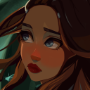
#my art stuff#digital art#baldur's gate 3#bg3#astarion#astarion ancunin#this is part of a series I like to call “I’m never settling on a singular detailed artstyle”#I have no consistency in drawing realistic people/characters other than my shapy cartoon style#but I truly don’t get enough opportunity to properly shade anything with art in that style-!!! it always looks weird to me-!!!!!#I think some rude lil worm in my brain is wriggling around telling me it’s a futile attempt at still doing realism#cus I’m one of those “gifted” artists that grew up promising his parents he’ll end up among the big names or whatever#constantly training to become better at art but with realism oil paintings as the goal#you know how it is 😔#I wanna shade my lil funky designs but they never feel good enough to really put energy into or whatever so I compromise with stuff -#- like this where I try to draw characters more accurately while still stylizing them and shading them however I feel like it#which is great and all but I should really learn to give my more relaxed and less perfectionist art a chance#I deserve to enjoy the process and the result without working myself dead#it’s so much easier and rewarding to copy cartoon styles - stylizing realism makes me too anxious of doing it “wrong”#at least cartoon styles give me a goal to reach or a reference to strive towards#man I really should just cut myself some slack altogether#either way - this man is a flustered mess and he’s embarrassed about being called adorable in public or something#being teased in an affectionate way about his sweeter side and stuff#don’t ask why he’s shirtless - anatomy is just a lot more fun for me to draw sometimes#tasteful nudity and all that is extremely gorgeous to me#i need to practice anatomy more cus I just kinda did some shit and went with it this time with a BIT of consideration for muscle structure
48 notes
·
View notes
Note
Just wanted to mention this to someone who does art and get their opinion on it:
Sometimes I see some artists do redraws of their old artworks or characters and think "Wow, uh... their older art looks better." Sometimes it's only mildly better, but other times it's vastly better. Like the Upgrade, Go Back! meme.
I understand that art skills are supposed to develop and change, hopefully for the better, but sometimes it just feels like they got... worse? Somehow? Idk. Maybe it's because they were copying another artist's style while finding their own, and it's their own style that doesn't vibe with me? Just curious what your thoughts are about this.
Also, your art has consistently been great, so this isn't directed at you.
I do see this on occasion yeah! usually (in my experience anyway) its because people take a sharp turn towards a stylization that either isn't to your or most people's tastes, or that they don't understand or are still developing. switching up how you stylize your art is like starting over in a sense, you're changing from what you have practice with and that's always going to cause you to revert some as you have to re-learn things you understood in your previous style. i had a pretty big style shift in 2014 when i took up the basis for how my art looks now, and i remember feeling like some of the stuff i was drawing might have looked better if i was using my older style instead. that's something artists just have to push through and figure out, and they'll likely come out of it a better artist than they were before. constructive critiques are a good way for them to figure out why their art might not be as "good" as it used to be, if they're open for those.
art is not always a linear journey, and i would also say things like passion and motivation have a part in it too. feeling inspired sparks you to make something the best it can be, if you're not feeling it (and esp if that feeling lasts for a long time) it'll leave you making decisions you otherwise would not have let fly, and that can result in worse art. and some of it is just personal preference! it's not that their art is better or worse, it's just different now, and maybe that doesn't vibe with you the same way their old stuff did. and that's fine 👍
(thank you! :3 i admittedly struggle a bit with Not Feeling It sometimes like i just described, so it's nice to know people still enjoy what i make when that feeling hits.)
#ask#anonymous#anon#art talk#or occasionally its because they let the h-rny take over and um. they get Grotesque about it whhjbdfdfg#i saw someone post a before and after fanart pic of tasque manager on twitter and everyone was like omg you've improved so much!#and they were all talking about. the older piece. because the newer one had some Proportions that werent even sexy they were just uhhhhhhhh#deviantart would be impressed. lets say#and just generally some of the other anatomy and rendering got way wonkier and broken from the earlier one too. it was strange#the weird thing is the older one was also a lil spicy/exaggerated but it was like tasteful and the anatomy was solid and it had some good#coloring and rendering choices etc etc. idk thats always the first example i think of because there were so many comments#pointing out - inadvertently - that the new art was Worse. but i do see it sometimes. i also think of um#there is some notorious artist whos style suddenly got really transphobically stylized. and racist#you'd think it was a troll but it was real. and most of their older art was actually p good is the weird fuckin thing !!!!!!!!!!!!!!!!!#why'd you kneecap yourself like that bro. i dug around a bit and the artist was rcdart#i feel like most of the examples i've seen of this are COMICALLY bad. like the artist got brain damage#anyway thats a novels worth of text but tldr yeah it do be like that sometimes. rip
41 notes
·
View notes
Note
I just wanted to say I think your art style is awesome! I was wondering if you had any tutorials on how you draw anatomy in your style (hips and legs especially)? Sorry if there's already one posted and I just didn't see it 🥲. Happy New Year :>
thanks for the kind words. i tend to draw people pretty stylized and then some so a good bit of artistic licence gets used. these tips are just what i use so feel free to take them with a grain of salt. with anatomy in particular you can kind of talk in circles because human/animal bodies are that complex so ill just zone in on the points you specified. here's a little image with a bunch of pointers:

the above image condenses a lot of the points I'd make, but basically the key parts are to start with the bare essentials and build up that complexity. using a line of action is a good way to get a quick, rough start. you draw a line out in the general direction of the pose and do your best to adhere to it to give the pose a sense of flow.
you can also draw smaller, thumbnail versions that throw a lot of caution to the wind but capture the basic energy of what you're going for. even having a tiny little stick figure version of your idea can make for a good guideline of where to take it forward.
when it comes to actual limbs, you wanna consider how they integrate and work together, kind of like how chains do. you can see on some of the parts of pear i've drawn out these wireframes to kind of portray how the mass of her legs works in a three dimensional space. for aspects like the waist/hips, i use that X technique i highlight above a lot, particularly for the lower torso. a lot of the times, even when drawing a character totally naked, imagining them wearing things like skintight underwear can help a lot to guide you in the right direction.
its also a good idea to consider things like gravity and weight to a degree. humans are essentially big meat sacks and gravity is always pulling down on that, but theres all kinds of aspects that effect that, such as character build or clothing. pear technically isn't naked in this, but i've tried to imagine her as such and take that into account.
if you are drawing digitally, don't be afraid to take advantage of the convenience you get with that workflow. you can retry and iterate on things a lot faster that pen and paper, and do things that aren't really feasible at all when it comes to editing and modifying your existing work. things like resizing certain bodyparts, instantly flipping the canvas, or using selection tools to completely adjust the positions of parts of your drawing. to give you an example heres a timelapse with all the little edits i made just to this demo drawing:

you don't have to use these techniques linearly, either. sometimes ill have a really solid idea for a piece in my head, and go back to basics with certain elements if they’re not coming out right or i just want to brush them up a bit more. some of the tutorial-y parts i added in i didn't actually use during the drawing but often do use so they're there just for demonstration. not every drawing i do starts as building blocks or a really basic version, often ill just start with a face and build it out from there.
i always encourage liberally using references (this can include yourself) and trying out stuff like life drawing or looking at things like existing photographs of real people/places/things if you can, the more you use learning material the better you'll draw up a mental inventory in your head that you can rely on more and more. some of these tips are things i've learned from other artists over the years (the chin one especially i remember seeing a tutorial about lol), so this is a lot of knowledge i've amassed from other sources over time myself. there are plenty of times ill use all sorts of reference material and its all in service of arriving at the final destination as smoothly as possible. learn by doing, as they say. hope this helps!
620 notes
·
View notes
Text

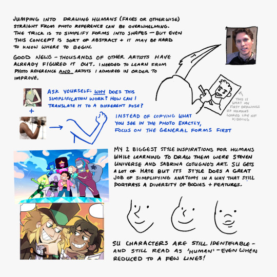

A set of very conceptual notes I drafted a while back for someone asking for advice on learning to draw humans. I'm entirely self-taught so this is less of a tutorial and more of a very rambling set of general principles I follow and ideas that helped while I was learning. I figured I'd post it in case anyone else could get use out of it!
I also recommend checking out:
Drawing East Asian Faces by Chuwenjie
How to Think When you Draw (lots of good tutorials in this series)
Pose reference sites such as Adorkastock
Transcript and some elaboration under the cut:
Img 1 - Drawing a face
The two most important elements (at least for me) when drawing a face are the outline of the cheek/jaw and the nose*. I often start with a circle to indicate the round part of the skull, then add a straight like and a 'V' to one side [to create the side of the face and the jaw].
The nose creates an easy template for the rest of the face's features to follow (eyebrows at the top of the nose bridge, eyes towards the center of the bridge, ear lines up to eye) and the placement/direction and overlap with other features is a very simple way to indicate dimension.
[A sketch of a face that has been adjusted by moving its parts to create 3 different angles. The following text is underneath:]
-Different 3/4th views can be created just by adjusting the position of and amount of overlap between the facial features.
- The top of the ear usually lines up with the corner of the eye. Think of how glasses are designed [specifically, how the arms run from the eyeline to the ear]
[I go on a tangent in these next few paragraphs]
*One thing I see many artists do - not just beginners - is learn how to draw A Person. As in, one singular person with one set of bodily proportions and one set of facial features. It's an issue that runs a bit deeper than 'same face syndrome' because sometimes these artists can draw more than one face, they're just not very representative of [the diversity present across] real people.
Part of the reason I'm talking more about how to think about approaches to drawing - rather than showing specific how-to's - is because there is no one correct or right way to draw a person. The sooner you allow yourself to explore variety - fat people, old people, people of color, people with [conventionally] 'unattractive' features - the easier it'll be! Artists often draw their own features honestly and without [harmful] caricature, so it's always a good idea to look at art made by the kinds of people you're trying to draw if you're ever unsure about how to handle something.
In general, it's far more important to learn how to interpret a variety of forms than to learn how to replicate the Platonic Ideal of the Human Body.
Img 2 - Stuff that helped me
Jumping into drawing humans (faces or otherwise) straight from photo reference can be overwhelming. The trick is to simplify forms into shapes - but even this concept is sort of abstract and it may be hard to know where to begin.
Good news - Thousands of other artists have already figured it out. [When starting out] I needed to learn from photo reference AND artists I admired in order to improve.
[When looking at stylization you are inspired by] ask yourself: WHY does this simplification work? How can I translate it into a different pose? Instead of copying what you see in a photo reference exactly, try to focus on the general forms first.
My two biggest style inspirations for humans while learning to draw them were Steven Universe and Sabrina Cotugno's art. SU gets a lot of hate [in this instance I was specifically referring to a time on tumblr when the art was knocked for 'losing quality'] but its style does a great job of simplifying anatomy in a way that still portrays a diversity of bodies + features.
[Extremely simplified drawings of Lapis, Steven, and Amethyst]
SU characters are still identifiable- and still read as 'human' - even when reduced to just a few lines!
Img 3 - Things I keep in mind while drawing side profiles
- Eyebrows + eyes close to the 'edge' of the face
- Forehead needs enough room for a brain
- Eye is > shaped from the sides
- Mouth kinda halfway [between the nose and the chin] but closer to the nose
- Skin/fat exists under the jaw [and connects to the neck]
- neck is about one half the width of the whole head
- the back of the skull always sticks out a bit further than you might expect
- Sometimes less is more - contours exist on every face, but drawing them in may make your character seem much older than they're supposed to be. However, it's a good idea to use them when you *want* your character to look old!
These are very general notes- every face is different and has different proportions [and playing around with them creates unique and interesting character designs]
#2023#may 2023#i realized this is pretty nonsensical while transcribing it LOL#feel free to send asks if anything is unclear#but again im not any sort of professional
569 notes
·
View notes
Note
How did you get so good at drawing such expressive bodies/faces??? tell me your secrets!! (But srsly your skills are amazing)
AAAA THANK YOU!!
I think my initial inspiration was about 10-11 years ago watching Adventure Time and finding Rebecca Sugar’s boards. Sometimes I get a little frustrated because she gets so much more notoriety than the other very very amazing AT boarders, but….. her expressions man…. she was always able to convey so much with SO LITTLE. (SU’s expressions are on another level of course, but I think AT’s are just so impressive to me because they’re dot eyes)
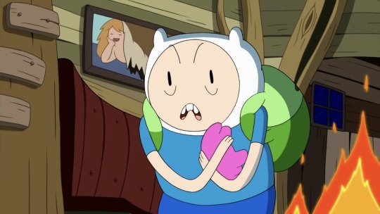
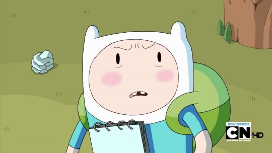

But the thing is!! I’m also a fan of deadpan. Which AT also does very well. It’s tempting to want to do BIG, extreme expressions at every moment, especially in comedic comics, but you really don’t need to. I find that characters often feel more expressive if you reel it in more often. That way, when you DO have bigger expressions, they FEEL bigger!
for example, a panel where the contrast between big and subtle expressions sells the contrast:
I don’t really,,,, know exactly what I do that works, ?? I kind of just like, think of the emotion I wanna convey, make the expression, think about what my face feels feels like, and try to convey that. Using a mirror helps!! You’ll feel a little stupid but it’s funny.
some misc expression tips:
Definitely prioritize eyebrows, eyes, and mouths!
Noses aren’t as important BUT flared nostril can totally sell an expression, so it depends!
Remember that your upper jaw is stationary, and your lower jaw can move, and then your lips and cheeks can move all around that!
Just subtly changing the placement of eyelids and location/size of irises can completely change an expression
Don’t be afraid to make your characters look weird or stupid.
Don’t reinvent the wheel! Take reference from different media you like that stylize expressions in different ways, and find what works for you. I take a lot of inspiration from AtLA
Again, NUANCE! Like, when most people are sad, they do their very best to try NOT to cry. People hold things in. Sometimes what characters don’t say can speak louder than what they do.
some expressions I’ve done that have varying levels of nuance:

Also framing!! You can use the composition to help project how the character feels:
As for body language!
Having a better sense of three-dimensional form and anatomy isn’t necessary, but it sure helps a lot
Hands!! I have adhd and my family is italian so I use my hands a lot when I talk. But even still, most people don’t just leave their hands hanging loosely by their sides. People cross their arms and fidget with their zippers and put their hands in pockets.
Head, neck, and shoulders. If you can master the foreshortening of these overlapping shapes at most angles, you will be very powerful
Hips & feet!!!!! People RARELY stand straight with both feet flat on the ground with even balance. Most people will shift their weight to one hip, leaving one leg looser and at an angle. It also helps to practice perspective, because people also rarely stand with their heels lined up side by side. One leg may get kicked foreward or loosely bent backwards. I sometimes cross my legs when I stand.

Ultimately, if you want more lifelike expressions and poses, study from life!! Don’t worry about your drawing being “good” or “bad”, instead think about what can make it successful. Ask yourself, “is this conveying the expression I want to convey?” and if it’s not, figure out what you need to change to get it there.
#gsgshdjf I hope this helps sometimes I don’t know what to say other than ‘idk I just do it’#my art#photos#art help
3K notes
·
View notes
Note
Your reindeer designs give me such childish joy I can't wait to see the rest. What's your process (aka any advice) for designing from scratch with something like just a name or concept?
Redbubble (buy reindeer swag) || Patreon (see all early!) || Ko-fi
See more free tutorials!
You can see my process unfold in real time by joining any tier of my patreon discord. Which doesn't even have to go through patreon! If you want, you can just pay me $20 and let you in for a year (and then lose track and probably keep you anyway)
Here's a preview using comet! (nevermind the preview thing I wrote you a whole lecture lol)
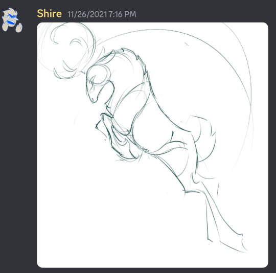
initial sketches in 2021:

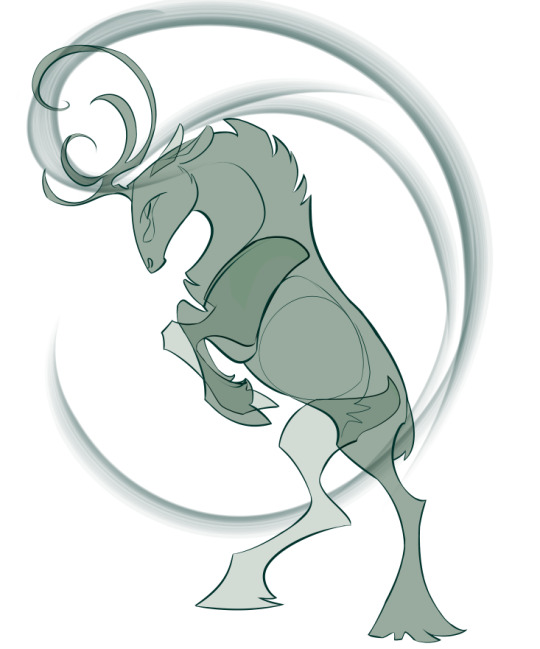
Revisited in 2022 and 2023
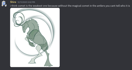
I was constantly asking which design was the weakest, why, and how to fix it. Whenever I tested without the magical comet behind it, people could only guess who comet was by process of elimination.
I didn't want to rely on throwing icons into the design. I wanted each one to communicate through shape and silhouette alone. It would be like drawing a little cherub with a bow and arrow floating along with cupid. If you have to include a nametag to communicate, your design can be improved.
So I tried a few different strategies to say "comet" before I realized I could twist the antlers into any shape I wanted. I was worried I would have to discard the drawing and restart from scratch! Which is what I did for rudolph about 6 times before I had a breakthrough.
Then I gave my patrons a brief lesson in antlers to explain where and why I was placing the tines. When I stray from the caribou structure, I do so knowingly in order to achieve something that cannot be achieved within the caribou shape, like dancer's tutu. Know the rules before you break them. My goal is to make animal nerds (myself chief among them) happy when they see species-specific anatomy instead of cop outs.


I tried a few things before figuring out antlers could become comet


Another thing that often caribou have is an unsymmetrical "spork" that comes forward off only one antler. I figured this out by looking at hundreds of reindeer pictures and saving them to my reference folder. A few of my designs have this, that's what the little spiral is in the final comet antler design.
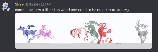
When I put comet in my lineup, I realized that the antlers I drew were way more stylized, chunky, and "tribal" than the others. I had already changed the proportions on one of my designs to match, so then I had to hack away at the basic comet rack to make it look natural.


I already knew that comet's colors would be easy because a basic reindeer already Has the big comet on the shoulder. But here's a peak at all the reindeer images I posted for my patrons to look at.
As you can see below, I chose reindeer markings for all my designs instead of other deer or animals. Even vixen is tied to actually possible reindeer patterns rather than copy-pasting a fox. Almost all of my designs have light-colored anklets on dark colored legs, which is very common with caribou of any color. This is the sort of thing no one tells you; you have to observe it yourself.


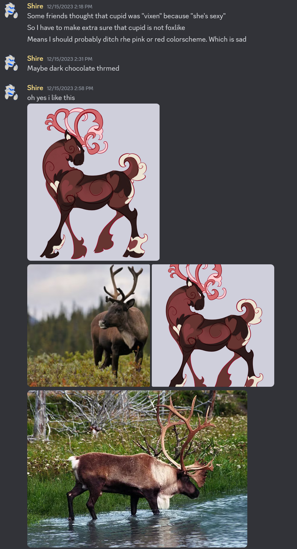
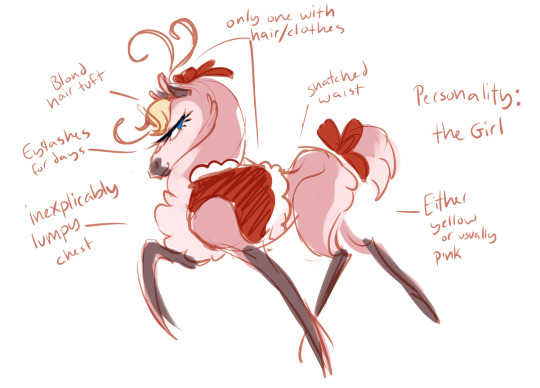
Ft cupid's early design! I was continually testing out my reindeer silhouettes and colors on new people, taking their feedback, and fixing what wasn't clicking.
I know I could have made vixen sexy and curvy to play into a recognizable trope, but I really wanted them to be scary and fox-like. Sometimes you gotta do what you want and not what you think will appeal to audiences. Reindeer Days is a purposeful exercise in audience resonance. Most of my art is 100% me and what I feel like doing with no regards to anyone else. So it was a fun challenge!
My patrons also got to see me making fun of corporate designs for recognizably/cliches at the expense of literally anything good
One of these is going to get a lot more "that must be vixen!" results from people who aren't constantly thinking about animal colors, markings, hunting strategies, and teeth.
And one rocks.
Vixen changed the least from the initial 2021 concept!
A Vixen is a female fox. In english slang, it means a cunning, fierce human woman, and sometimes sexually attractive or promiscuous. Quite often an insult to someone because she won't date you!
But to me, a vixen is an animal. A predator.
When designing to reference something, I like to hit it at multiple angles, referencing obscure trivia about something to delight and educate. This is done by researching a topic deeply, far below surface level and beyond what you think you need to make your design. Or in my case its just knowing a bunch of animal trivia already.
After researching/dredging your knowledge, sit there and Think. Don't draw anything. Come up with several ideas and then throw them all in at once for the ultimate trivia design.
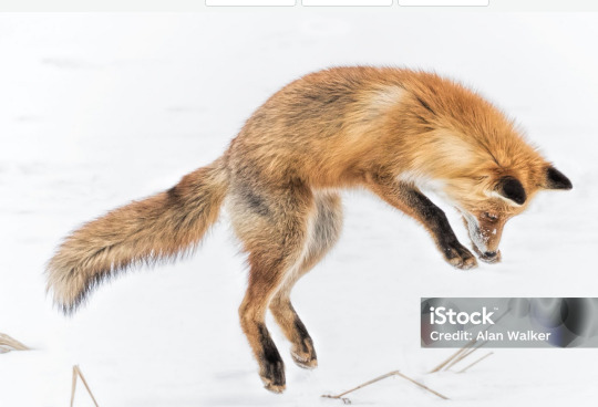
Trivia about red foxes:
They have Long bushy tails
They have teeth that include large sharp canines, flat incisors, triangular premolars, and chunky molars with points on them that slide scissor-like with the molars above to cut meat via chewing
They hunt rodents in burrows under the snow by jumping into the air, arcing, and slamming down with their face through the snow
They are orange
They have a dark vertical stripe on their snout
They have black legs, with the backs and bottoms being orange


Translated into the design:
Pose based on a fox jumping, about to land in the snow
Antlers twisted to resemble teeth
Long (for a reindeer) bushy tail
black mark on snout

Some adjustment to the pose to be at the top of the arc and flow better.
Tinkering with the design to make it recognizable but not 100% copypasta fox
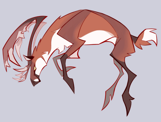


I was finally happy with a design that absolutely showed "fox" while still being creative and plausibly caribou shaped. This would absolutely communicate who it is! I thought!
The most obvious one of the bunch! After all, everyone knows what a vixen is!

Nope! No they do not
Want to be part of the design process, help me with WIPs months before everyone else, see exclusive doodles every day, and join a funky little community?
(you also get to see photos of my dog)
Connect your discord to your patreon and join any tier to automatically get added to the server. Not a fan of patreon or monthly subscriptions? message me here, on ko-fi, or via email (shirecorn.art@ gmail.com) and ask if you can pay $20 to get put in the server for at least a year and longer if we work it out later!
This was supposed to be a preview to get you to pay me but instead I wrote an entire lecture for free because I can't help myself.
Want to thank me for the free info? Tag me when you use what you learned! Comment and give feedback! If I could pay rent with attention I would never need anything else in life.
You can also thank me by tipping my ko-fi! I use it to buy pens since I die if I have caffeine. But could you imagine??
#shire screams#shire draws#art tips#art tutorial#character design#character design tutorial#tutorial#behind the scenes#design tutorial#design tips#reindeer days#ask#ramble machine
227 notes
·
View notes
Note
What advice would you give beginner artists?
it's fine to want to do more stylized art, but nothing will help you improve quickly like studying from life. even if you want to draw very stylized figures, life drawing is still going to help you understand how the human body works and then you can build your stylization off of that understanding. I also recommend studying specifically things you're looking to improve--if you feel like your poses aren't dynamic, ask your model to do some quick (1-2 min) dynamic poses and work on getting the gesture down. if you're looking for anatomy, ask for longer, more static poses and really study the contours of the body. this also applies for portraiture and character art--my expressions and facial structure improved like CRAZY when i started doing portrait studies from life! (note: i know live model sessions aren't accessible for everyone. i'm a huge advocate for nude models, if you can find a studio nearby that's affordable to you that offers sessions, that's the best you're gonna get. however, there are sites that will give you photos of nude models to draw from, too, or you can even just ask friends or family to pose for you when they aren't busy, that's what i did before i started getting model sessions from my school!)
materials are not everything but sometimes a good material can make a difference. it's important to know what's worth it and what isn't for your skill level. invest in some decent-quality supplies or a good art program, but understand that you're still going to need to work to understand your materials and use them to their fullest potential. (if you're a digital artist buy csp. trust me on this. get it on sale. it will change your life. also do not fucking use photoshop)
tracing is ok. listen to me. TRACING. IS. OK. tracing is how you learn. don't trace other people's art and pass it off as your own, obviously, but there is literally no problem with tracing real-life reference photos. I routinely trace references for backgrounds and the like. there is no reason for you to kill yourself trying to make complex perspective and shit up from your head when you can very easily just overlay a photo and get what you need.
in that same vein, USE REFERENCE PHOTOS. find pics online or take pics of yourself and USE THEM to see how your poses work. it makes it SO SO SO much easier. the understanding that you need to create a pose out of nowhere will come with time but you're not going to get that skill unless you have a foundation of understanding how the real human body works, and the easiest way to get that understanding is by copying photos of real people.
last but not least, there's generally a sort of 'rulebook' that new artists are expected to go by, especially online, when it comes to digital art. when i was first learning, it was all about lineart and cell shading, two things that I didn't really like. Nowadays it seems to be all about rendering. the single most important thing i can tell you is if it sucks you don't have to do it. if you hate lineart just color your sketches. if you hate shading don't shade, or find a different way to shade that you enjoy more. if rendering is annoying or difficult for you DON'T BOTHER!! art is supposed to be fun. if part of your process is annoying or upsetting to you, cut it the fuck out. don't torture yourself just to do art the "right" way. i guarantee your art will look better when you're having fun making it anyway!
#asks#ALSO don't go in expecting to monetize your social media presence/go viral as an artist. make art for YOU and make what you want to make.#if your art has passion behind it then attention will come naturally!
328 notes
·
View notes
Text
ok yall I’m tempted to make like a comprehensive How To drawing tutorial sometime, but I gotta know which part y’all want some info on the most. Just so I can know which aspects to go into more detail on.
Also this is gonna be focused on a stylized art style so if you want to know how to uh realistically draw any of these you’re out of luck lmao.
#polls but not#art tutorial#I’ve gotten a lot of people asking for advice and I’m like !!! I gotta make one big post to really cover all my bases
114 notes
·
View notes
Note
hi so you make like such fluid drawings and your anatomy + faces + stylization are all fantastic, and i was just wondering how you got your art to that point? my technique rn is just doing photo studies and sketches from real life, but i was wondering if you have any specific practices that youve done a lot and/or just anything else that youve found helpful :3
i think the speed of drawing can help, when i did life drawing in uni we barely did a pose for long than 5min, (once a term maybe we got 10min) the majority of the poses we did were 20sec - 1min.
this can teach you to make every single line count and fluidity comes with speed, its much easier to draw a nice looking curve with a flick of your wrist than spending 2-5seconds drawing the same line and if you practice the flick and practice speed, you'll be able to accurately guide it much better.
the speed can help you really notice the important bits to show whan you're drawing sometime, limiting yourself like that means you don't get bogged down in the details.
as for likeness, this ask answers all i really have to say, it's just a lot of reference images and practice :)
401 notes
·
View notes
Text


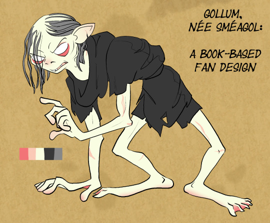


I feel weird giving out unprompted permission statements because I'm making a big assumption that anyone's going to want to use my work. That said I also know people do like to build on other people's art and can't always work up the nerve to ask, so: Anyone is free to use this design if they want to for any reason- I don't own this character anyway. (Although I am hopeful that you do not, you know, monetize it, because i cant do that and if you do that its not fair ;_; ) Feel free to remix, improve, use as basic inspiration, etc. I would appreciate a tag/mention if you use it so I can see what you did!
This design has evolved a little since I first started drawing it, and I will see people reblogging the original design notes and think 'oh no! those are out of date and I don't have new/accurate ones!'
Reblogging the old one is still an honor- and the first take on a design just sometimes has a different appeal because it's less refined and more chaotic (especially with a character that should be chaotic), so I suspect some people will just prefer the older drawings & they'll still get shared, which is great! But I felt as if the project was a little bit incomplete without an update, since I think I've reached the point where if you see that old post & then come to my blog and look at my current content, there's a noticeable difference.
Also I kind of like making design notes.
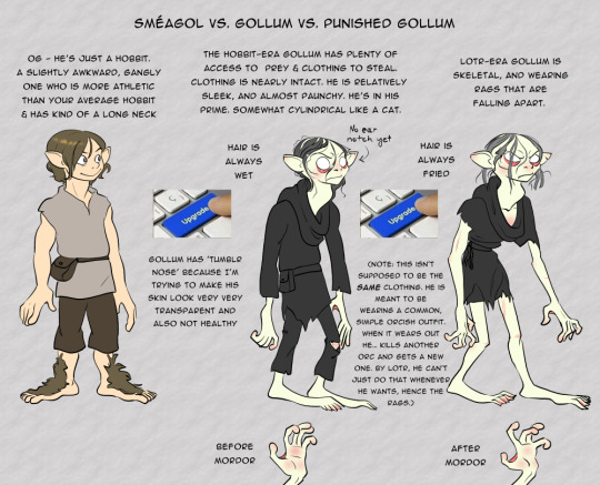
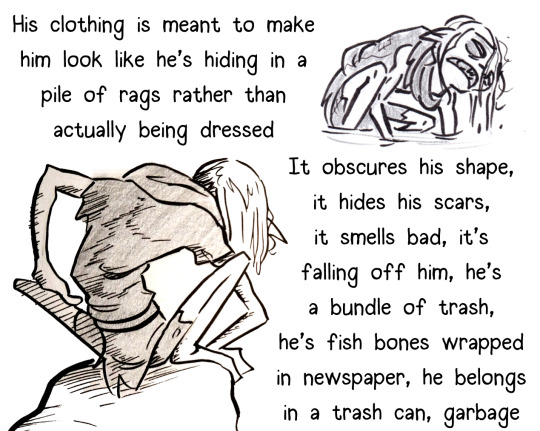
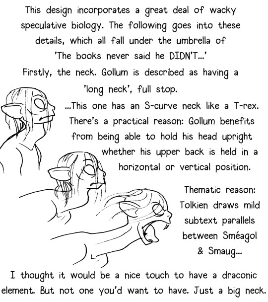
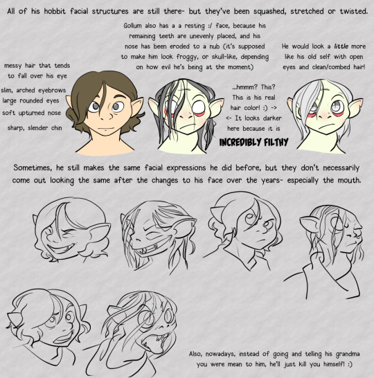
If anyone's wondering why things changed, the answer's really simple- 90% of it is just the result of him settling into having more consistent anatomy and facial structure so that I can keep him looking accurate across different angles and poses. If you look at the old drawings you may notice that Gollum has an inconsistently shaped squishy head. That's fine for a concept post but doesn't work as well for maintaining him across different comic panels or in an animatic, at least not the way I work.
In the same vein, while my art is still & will always be heavily stylized, I started giving him more structured semi-sorta-realistic anatomy so that he wouldn't look entirely out of place next to less bizarre-looking characters such as Aragorn. (I feel that's also helpful in nudging Gollum into the uncanny valley where he ought to be, rather than leaving him so abstractified that there's a risk you won't see anything wrong with him having noodle arms.)
He also acquired the new-style 'garbage bag' outfit because I found a reference in LOTR to his arms and legs being bare/exposed (it's in one of my favorite passages, the 'an eagle would think Gollum was dead if it came by right now' passage in The Two Towers):
Not even an eagle poised against the sun would have marked the hobbits sitting there, under the weight of doom, silent, not moving, shrouded in their thin grey cloaks. For a moment he might have paused to consider Gollum, a tiny figure sprawling on the ground: there perhaps lay the famished skeleton of some child of Men, its ragged garment still clinging to it, its long arms and legs almost bone-white and bone-thin: no flesh worth a peck.
#long post#blobart#lotr#lotr gollum#lotr fan redesign#i really do love that passage because it says so much and implies more#sam and frodo are sitting there invisible because they are being protected by the gift of love and honor galadriel gave them#gollum who has been busting his butt to hide all of his life#issplatted out there like a frog entirely exposed. he has nowhere to hide and no protection- not even proper clothing#and even a carrion bird would think he was 1) dead 2) of no value#...and then we have tolkien drawing the allusion to a starved/abandoned child#it's eerie and deeply empathetic at the same time#It's also funny. why would there be an eagle here pondering gollum#same energy as 'a fox wondered why these hobbits were bobbling around in the woods' and then the fox disappears forever#also same energy as 'there was a thrush nearby. bilbo was in such a bad mood that he tried to kill it'#body horror#eye horror#unsanitary/#bones?....#tw: gollum#there#I will be doing a morning reblog of this because i only do this once every two years so postblock it if once was enough
318 notes
·
View notes
Note
First off, your art is so freaking cute. I can't even really place what I like about it, it just makes me happy to look at it. Second, I have two questions. Number one, is there a reason why sometimes you draw them with nostrils and sometimes you don't? I think it's really cute either way, but the nostrils are more realistic, 'cause you know, they have nostrils. They can smell. And it just looks so cute on them, agh. Number two, would you be fine if we redrew and/or coloured your art? Some of these panels are screaming at me. The inspiration is flowing. Stupid dumdum turtles giving me stupid dumb brain rot.
Thank you!! :D
For your first question:
The reason was because I learned how to draw mostly from copying life and anatomy textbooks, so going into drawing stylized characters was a little confusing at first. I couldn’t exactly figure their expressions out, so the nose helped me visualize their snout in a 3D way! I still add it on occasion if I’m pushing their expressions to be more animalistic or grounded, the same way I sometimes add glove seams or scales on close ups. I generally stopped adding noses in every drawing as I got comfortable so I could keep a little closer to the show’s look :)
For your second question:
Of course, as long as you @ me and give the proper credit! I love seeing people get inspired and excited by my art :D and its always wonderful to see others artwork in turn! The creativity of all the artists here brings me much joy
Stupid dumdum turtles have got us all on that same brain rot, I’m afraid lol
72 notes
·
View notes
Note
I have been into studying animals for basically my whole life. Not a day goes by where I don't pour through books and documentaries relating to them, and I am especially in love with their anatomy. Becauseof my knowledge,to me, 3D animals always felt weird for some reason, They never seemed animal. I don't know how to explain it but they always feel off. I pour hours and hours into making up species and trying to figure out how to make them seem animal even if they don't exist. Even Disney with their million dollar budgets couldn't get this. I concluded that it's just impossible to make something cgi feel 100% animal. But you??? Just??? Did it??? I literally have chills. They look like actual creatures. I don't know what you did or how you cracked the code but I am just in awe, I feel like I've stumbled upon some kind of hidden treasure trove. Honestly and genuinely with every animal loving bone in my body your stuff is the most impressive I've seen and I applaud you for it.
Wow, I think it's an honor to hear this! :D I don't consider myself that good, heh, but thank you very much! 💙
As an animal art lover, I think I understand what you mean! I think this because people are less aware of all the details of animals, and tend to be less picky and less attentive to their features and expressions. But if you know animals well, you can notice many small details that make them seem weird or unnatural. This is true for me too - any animal I try to draw or model will most likely be really weird and look a bit like a Vaeraf, because I'm too used to them :D
But speaking of my characters and art, this (as well as many other questions and comments) made me think about my perception of animals and my characters, so I decided to share my thoughts. I hope you don't mind! ^^ The fact that my characters are perceived as animals, with all the nuances of such perception and attitude, is a rather complex topic for me to think about.
I don't know if it matters, but I believe so - I don't see my characters as animals - meaning wildlife, because for me Vaerafes are hardly more wild animals than humans, while Tkhorm is a Varlaf, a kind of fantasy spirit, a mystical creature. I understand why other people perceive them as animals and that's ok, technically we are all animals, but often this leads to a certain impersonal perception of them, seeing them as just cool creatures, "things" to pet or be afraid of, or with a focus on biology and anatomy. But I see my characters as persons, as people in fact, with their own personality, sometimes quite complex thinking, personal dilemmas and philosophy, which simply belong to another species, even if their species is non-human, fictional and fantasy. Their movements, their expressions, their appearance, even their anatomy and species - all this is part of them as persons, of who they are.
Real animals, especially complex and intelligent ones, also have all this in their own way, they aren't just biological objects.
Also, I don't work with characters because I create species, but I learn about species because my characters happen to belong to that species, so I need to learn at least a little about their nature to understand them as persons. I learn, allowing them to live their lives inside my head and tell me their story, their life. It doesn't matter if it's something realistic, fantasy, or crazy and cartoonish chaos - that sometimes happens too. (and now I suddenly realized that I actually never even really wanted my characters to be some kind of fictional species, but it just turned out to be so, because no real animal suits them, heh!)
And knowing my characters as individuals and persons, I can say that I still have a lot of work to do, really a lot, maybe even more than I have already done :D
The problem with Disney movies, if I take the 3D Lion King as an example, is that they were never animals. They were never even meant to be animals. They are slightly stylized - too little to be anthropomorphic and humanly expressive, but enough to seem "wrong" for realistic animals. And since the behavior and expressions of the real animals don't work for their story and the interactions between the characters, they seem weird and even less expressive than real animals. I believe this is not a problem of artists and budget, but of the concept as a whole, including the story that didn't intend for its characters to actually be realistic animals.
Whereas realistic animals… well, they are difficult to use them for a beautiful movie for a wide audience. Although there are such things as, for example, "Prehistoric Planet". These are dinosaurs, but they are animals too, so I think they can be considered 3D animals being animals, heh! :D Plus, they're just really beautiful and well made. I would recommend watching this to all 3D animal lovers c:
(Sorry for such a long post, but this is a really catchy and interesting topic for me ^^')
150 notes
·
View notes
Note
Hello. So I have a genuine, honest question as someone who isn't an artist. I saw you made a post about AI art floating around Tumblr lately. How does one differentiate between AI-created art vs. ACTUAL art? Some things have been easier to notice than others (ie: YouTube videos and like, moodboards and the opening to Secret Invasions) but for art specifically, are there any key things to look out for that make it obvious it's AI generated? I do not support AI in any fashion but in this day and age I do find it increasingly more difficult to tell the difference between something that was created by AI vs. created by an actual person.
Hi anon! So, heads up this might be a bit long of a post but I wanted to point out some things that I don't see frequently mentioned in other posts about A.I stuff.
First things first: Look at their other 'art' pieces. If they have a generally consistent style, a consistent type of work (Realism vs ink art for example), characters you see more than once and from different angles, character sheets, etc. You're going to notice if someone suddenly switches from little ink doodles to fully colored and realistically rendered 'art'. Now, this doesn't mean everyone switching styles or mediums is A.I, but it means to take a closer look if you notice something vastly different than their usual stuff. More A.I. clues below!
For things to look for, there's a lot of different clues but generally you're going to notice a certain new car shine to everything. Everything will be a little too clean, even if the style they are ripping off is sketchy. Sketches will have crosshatching that doesn't really make sense or random lines in a place that an artist probably would not put there. That being said, here's some examples where that isn't as noticeable:
Here you've got your usual body/anatomy problems. (Plus some elements I'll talk about later as well. This one's got it all!)

Glitchy foot, glitchy hands. glitchy eyes. Strange proportions for legs that don't exactly fit a stylization, but more of an glitch. Now, of course an artist can draw 'glitchy' things like this either by accident or intentionally, but you really only see these types of things in A.I vs actual art of a similar style. Realism artists are generally not adding extra fingers or varying sized fingers, they're not rendering the foot to only have too many toes, missing toes, and the foot also... sort of part shoe. Unless art artist is otherwise intentionally including these elements, it's generally a clear cut example of A.I stuff. (For example: Different body types and disabilities exist, and there are people with different shaped hands, shorter/longer fingers etc. But you will also usually find some kind of info with the post about the person/character that will tell you about them that can clue you in on if it's A.I vs real art.) If the artists are drawing in a style with 'exaggerated' anatomy, you can almost always see that as a persistent and intentional STYLE in their art. If they aren't, this is something you'll really notice in A.I vs realism. It can be especially true with people who fully render realistic art because it's not in line with the style, and the relevant elements of rendering art this way. Artists who do realistic rendering at this level generally know their anatomy very well, and are going for realism in all elements of the art. Some stuff like the exaggerated long legs in women are kind of everywhere, but the hands, the foot, the lopsided winky eyes (I don't know how to describe it) are not things a professional artist rendering realistic art would generally do. It's just not in line with the style, or the ability/skill that the artist has worked on. (Again, unless completely intentionally and in line with the person/character.)
For 'real' life items like the tables below, you've really just got to ask yourself: Is this physically possible? Do all the elements make sense and actually work together in a real way?
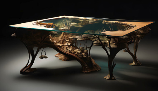

Sometime it's hard to know if you don't have any experience with, for example, acrylic and wood table making. But there are things that just don't work in real life, and there are things that maybe someone can do, but even in the provided examples it just doesn't make sense to do. For example, the little 'tree' hanging from the bottom of the left table. Would that be possible? Probably. Would someone do that? Probably not. If you're really stumped, sometimes just looking up videos of people making that type of thing can give you a better idea of what actually works together, how it's made, etc.
Here's something that really helps when you're really struggling and zooming in for every detail: TANGENTS

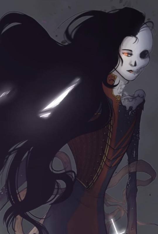
Ok, so tangents in art are when you're drawing a thing, like hair, and it's lining up with a different object to the point where the visual line continues from one part of art to another and it looks really unrealistic/weird. Most artists figure out how to avoid this on their own just from noticing it and feeling uncomfortable with how it looks, while others learn via the internet etc. It can happen in anyone's art at any skill level, but the amount that it happens in A.I stuff is HUGE. It's almost every single image, and you can really notice it in places where something overlaps like hair or, from the above image with the money: there's two bills that just kind of bleed together. From the same image, you can also see how her hair bleeds into the wrinkles of her jacket in an unnatural way. Comparatively, you can see in the Hela art I did below that there are overlapping elements like the hair and the ribbons behind it that do not mesh or bleed together.
Something else to look at:
Symmetrical elements that don't work right.
So, this is kind of getting harder to see depending on what they're generating as a subject matter and the style they are using. As always, there is a disclaimer for this. Art does not always have perfect symmetrical elements in it.
For example: in the real world, this dude's coat would have more clean symmetrical elements. As it is a sketchy doodle, they're there but they're not 100% symmetrical. With a LOT of A.I stuff, you'll notice that something meant to be mirrored on the other side of the clothing, room design, etc. is actually completly wonky/incorrect or not even there at all.

For example, in this A.I we have missmatching elements on both sides. Not only in things that could be designed to be asymmetrical, but also things that 100% should be mirrored. The left side under the buckle on the shoulder has a diamond shape. The right has a weird spikey thing. The little leaf pattern on the gold lapel area appears to be just blobs on the right side. The left shoulder area has a button and additional little detail under the buckle area. It is not there on the right side. And, again, some of this can be intentional with real art. Her arm bands could be intentionally different, for example. But elements that clearly should be reflected on the other side and are very clearly not are generally a good clue that it's A.I.
A few last moment things to look out for:
Styles that are recognizable someone else's whole thing. Example: The monstrosity that someone just generated that is supposedly Calvin and Hobbs. It's pretty easy to tell because it looks like shit right now, but generally if someone is ripping off a distinct style of someone famous, it's probably A.I or at least worth double checking.
Did they suddenly start doing ______? This could be anything, backgrounds, drawing horses, full color, etc. But if they're suddenly, overnight just BOOM they're 'drawing' in a whole other style, it's suddenly really rendered, and/or there's no 'growing pains'/work shown that they've started working on drawing the thing they never drew before... It's time to take a closer look.
Last but not least, look for the language they use around the stuff they're putting out. A.I people are often... a certain type. They use a lot of that NFT bro lingo that can tip you off. The tags might be all over the place for styles, or tagging certain famous artist's styles, etc. They also can be a bit more blatant in the tags and just outright tag A.I or NFTs somewhere in there. And, in the end, if you really can't tell and you really love the thing and want to share it: Ask an artist. Or just don't share it.
Thanks for reading, and I hope this is helpful in some way!
#How to tell if it's AI#How to recognize AI#Art vs Ai#Long post#nice anon#I mean I have to be honest a lot of it is also like#white guys generating indiginous and asian people like they're working for fucking nat geo but in that extra mastibatory way#a LOT of incel shit out there#a LOT of 'if I was Elon Musk my apartment would look like this#but also the entire cottage core tag is exploding with AI shit#It's a mess#The best and worst way to handle this is to kind of assume whatever you're into is going to have at least one looser making AI in it#the worst because it sucks that it's everywhere already#and sometimes you have to block someone you liked and thought was cool#but best because being aware and active helps yourself and others
77 notes
·
View notes
Note
ever got worried how people would think you regressed in your art just because u put your energy into making it into a style that suits you or someone bitching about anatomy and how that isnt realistic proportions when ur goal isnt realistic proportions at all. idk ive just seen people take something clearly nsfw art into outside and try to critique it when that specific thing is clearly just for the horny and not to be the best Artistique person out there
idk its just bothering me just ignore this if its weirding u out too much lol but i do wanna know youre opinion of it
well worry is a little too far but I do think about it sometimes yeah. For me the thing is that I just don’t enjoy realistically rendering everything anymore as I used to so I can see why people would see it as a regression especially since it’s combined with doing kink stuff now but I’m also way more comfortable with my art than before. Like I KNOW that this hasn’t made my art worse or anything even if it might to some outside people. I’ve learned a lot about, as you mentioned too, stylizing properly in a way that I like, having more confident brush strokes, just showing character interactions etc etc so…. idk I’m fine with accepting that my stuff just doesn’t appeal to the wide mass anymore content- or style wise but who cares cuz like…. when did that ever do me a favor☝️
#blakemail#also this may sound questionable to some but I don’t really care about my art being “the best” anymore#I like my art as a tool for me to talk about characters. I do make it appeal to me of course which is why I spend like#3 hours to make faces unwonky sometimes still but thats still#for the character. does this make sense? As in I’m not doing this for my art to look amazing and have improvement every piece
25 notes
·
View notes
Text

Thanks for the ask, @strrwbrrryjam ! i'm flattered that you think I do a good job of that, because I'm still learning! (and I also struggle heavily with proportions. I have to resize my heads and arms so, so much...)
I'm afraid I don't have any secrets. I think the answer is to just practice, over and over again. But specifically, this is what I try to focus on as I'm learning:
references
quick practices - 30 second to 5 minute studies that help with getting a full scope of the shape and energy of the body, not meant to be perfect
studies - deep dives into certain anatomical structures (videos linked below)
Below the cut is how I use references go from this to this:

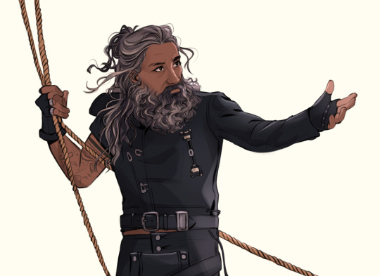
References:
Use a bunch of references! Pictures you take, stock images, from shows--practice real people. Even if your style is heavily stylized, it all starts from an understanding of anatomy.
How I Use a Reference When I Struggle With Proportions:
The first step I take while looking at a reference is to just draw a very loose sketch with a line of action that goes then entire length of the piece, and I try to section it out. I find if I don't think about the body as a whole, and just start drawing a head, the head will be way bigger than the rest of the image. So my first step is just really boxy and basic, just to get all appendages on paper. My first pass could look like this:
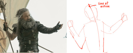
Okay, not bad. But the right arm is going way too far down--the forearm is really long. The head is too big for the style I want, and the left arm is at a 90 degree angle, unlike the picture. But, I have the general scope of everything on the page, so it's easier to adjust and look at the full picture!
Then, I try to focus on landmarks. I look at where certain body parts fall in the reference. For instance, Blackbeard's right elbow doesn't reach his belt, so his elbow shouldn't be near his waist. I can tell that his left arm is closer to being straight than at a right angle, and I can see that his head isn't as big on his shoulders as I have. I can also look at the negative space and see that the gaps between his right arm need to be smaller. So my next pass might look like this:
(I don't usually draw on the reference image, and I just "draw" the lines in my mind, but the for sake of things...)
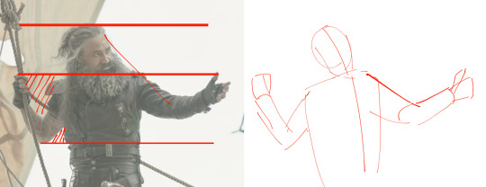
Now it's looking a bit closer!
The next is the harder part. It's making things shapes, and is closer to the lineart stage. I try to follow curves, separate the chest from the torso, get the angle of the shoulders and head, etc. I have some video links at the end that explain this step much more in def.
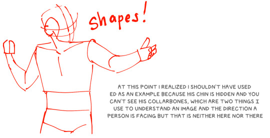
You may notice that the head angle is a bit different than the image, and the shoulders are a bit lower. Sometimes, following a reference image completely either doesn't fit your style or, in some cases, the more accurate drawing following a reference can actually look "wrong" (anatomically) when drawn. Figure out what works best for you, and for the message you're trying to get across in the piece!
[sliiiight flashing in timelapse]
And here is the final timelapse, with a little refining and polishing of the anatomy. Not everything is completely accurate to the reference image, but I've created a believable image in the likeness.
I hope this helped! This was a quick and dirty post of something I'm still learning. Here are some youtube tutorial artists, resources, and books that I use to learn!
Youtube:
-ModerndayJames has lots of videos on creating shapes and understanding anatomy, and placing people in perspective. He has a lot of free videos, and then some cheap ones on gumroad that go more into it.
-Proko has lots of videos on anatomy!
Practice Resources:
-Pose Maniacs - figures in different poses. You can move the camera around to see different angles.
-QuickPoses has images for figure drawing and quick gesture drawing! You can even have different timers.
Books:
Morpho Series. There used to be the one on "Fat and Skin Folds" that was a free PDF download that was on tumblr for a while, but I don't believe the books are that expensive.
Taco's Books, published by Lezhin. This is heavily anime styled, but talks a lot about anatomy, and is a great resource!
#art tutorial#asks#mytutoirals#myart#proportions#turns out you can't add videos to asks and if you try it makes the post uneditable#so i couldn't answer your ask directly. hope you see it sorry!#anatomy tutorials
56 notes
·
View notes
Last Seen Blogs

dancingorchidsoapworks
Untitled

salitterct
Salitter

bloodofbaldur
12 Dancing Princesses

groomingbyjarred
JPTHABARBER
umweiss
Weiss