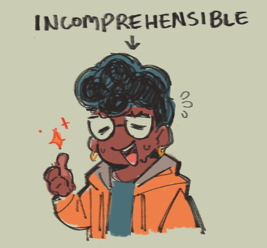
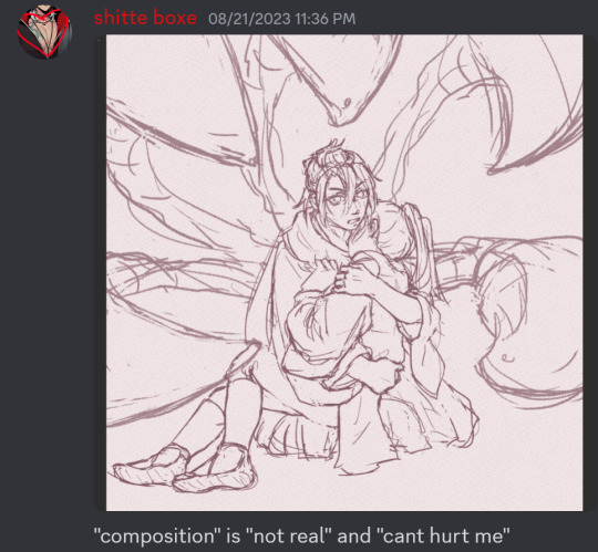
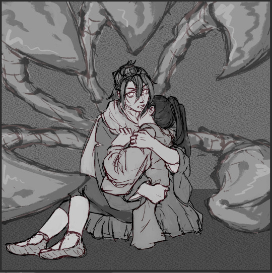
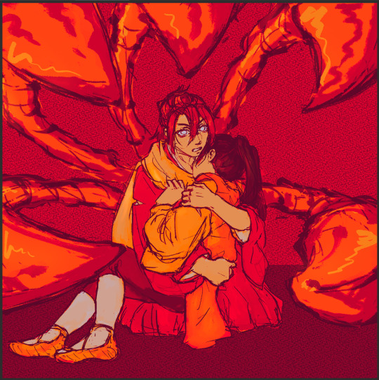
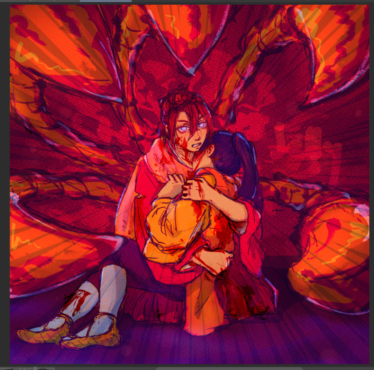
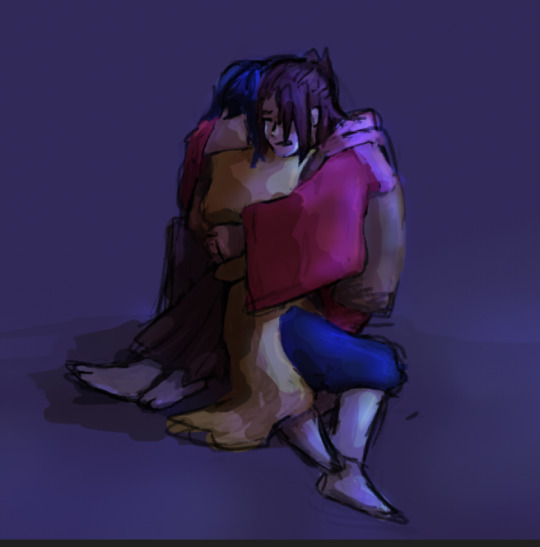
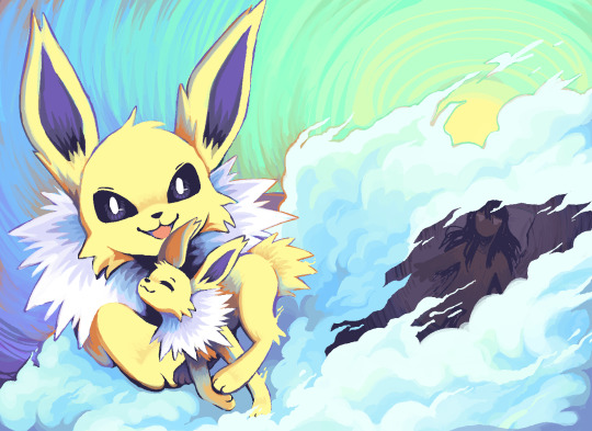
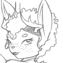
#started from grayscale worked my way up to color
Text
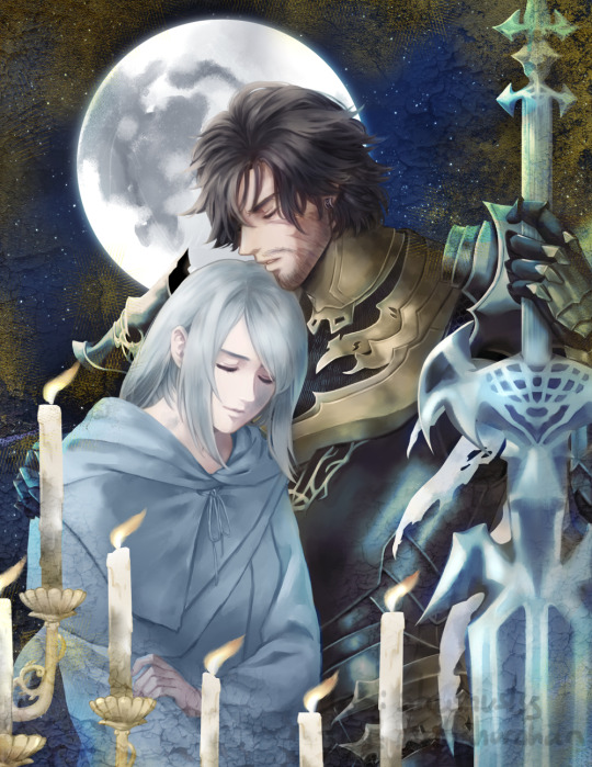
Kiss Me Goodbye
--Buck-Tick
#final fantasy 16#clive rosfield#jill warrick#ffxvi#ff16#started from grayscale worked my way up to color#painful process lol#cliji
109 notes
·
View notes
Note
Hey seiishin, I'm a beginner artist and i was hoping you could give a full tutorial on how you color?
hello! this is a bit of a hard question to answer since i dont think giving a tutorial of how i colour without learning any foundational colour concepts first would be very beneficial, so i'll try to give you some basic tips on picking colours instead since this is a very VERY expansive topic and im simply not the kind of person that can pass on that knowledge very well especially since im not the best at it lol
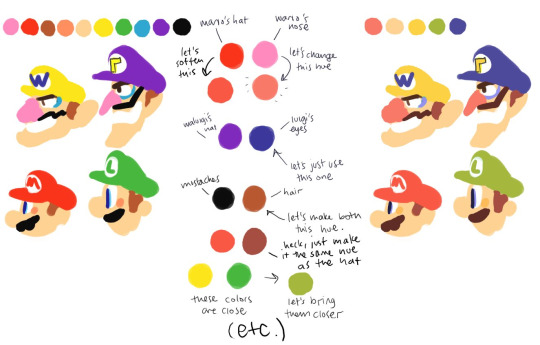
when im picking colours for my drawings, i try my best to "unify" the colour pallet so that it seems more cohesive, this tip from ggdg sums it up pretty well i think
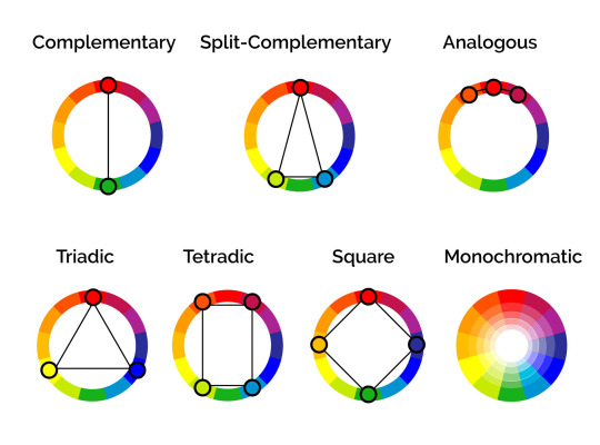
other than that, i usually try to pick colours that generally look good together based on different colour harmony concepts, like these!
i'll try and show you an example with something i'm working on right now. you'll notice i didn't colour pick tinkaton's colours from its art and went for a warmer pink and saturated the blues of the hammer a little.
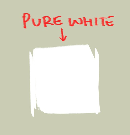
you'll also notice the canvases i draw on are NEVER pure white. this isnt to say pure white is something that can never be used but white is a colour that usually influenced by surrounding colours, so pure white in most pallets just wont look right. so its not usually a colour i would use as a backdrop if youre trying to pick good colours for your art. but again, there's always exceptions and this isnt a hard rule. here's pure white compared to the colour my canvases usually start with
another thing i should touch on briefly is colour relativity and the importance of value and saturation.
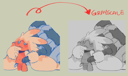
value is SUPER SUPER important for making sure all the colours in your art stand out from each other and read clearly. as you can see here, most of the values here stand apart from each other, and i can see that i probably need to adjust the darkness of the light blue in comparison to the pink hair tips, though the lineart separates them well enough already i think. this is also a good way tocheck you havent made any dark skinned characters too light. values are important guys!
hot tip: put a layer of pure black on top of your art and set that layer to "colour" and BOOM! you can see the values of your art in grayscale.
and i'll also briefly touch on colour relativity. because we percieve colours relative to each other, we usually read a colour as something its not when its surrounded by certain other colours. let's take a look at my background drawings in the cover i did for the shuichi saihara zine:
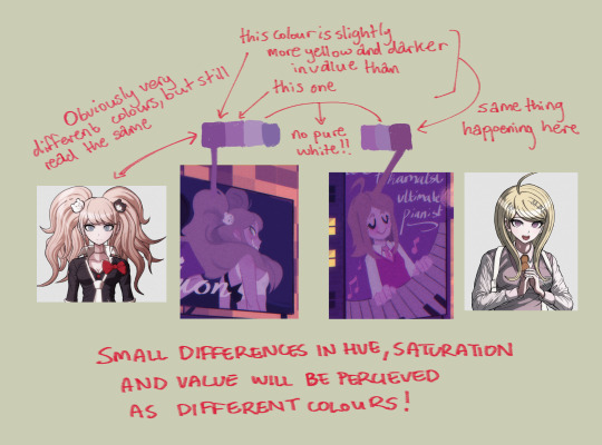
though i only used a bunch of different purples, when all of them are perceived in relation to each other, a warmer purple can look like blonde hair amongst all the other purples!
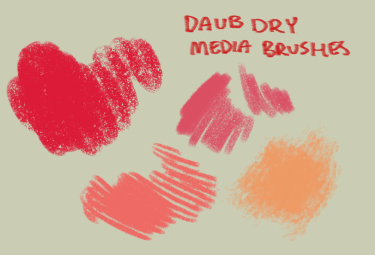
as for the brushes i use while colouring, i like textured brushes! i bought these so i cant share them for free but im sure there are many free alternatives out there
anyway, sorry if this isnt exactly what you wanted, but there are TONS of people out there that have worded this better than i ever could, i would suggest looking up some youtube vids on colour theory, but i hope these little tips are useful enough!
2K notes
·
View notes
Note
hi! not exactly a request but i do wanna ask, whats your process when you're rendering more paint like art? (if that makes sense, English isnt my first language so apologies hdskhsjdbd) i really love how you use the colors and im curious how you do it :0
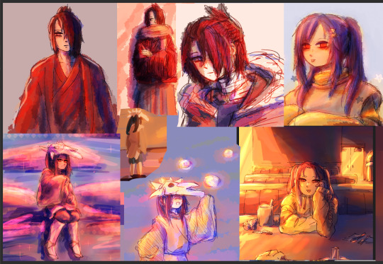
i’ve been meaning to answer this one for a while so here’s how i painted miku in today’s post (put under the read more because yeah prepare for a long post
i’d also like to preface this by saying that i never follow a set way of doing things, so in terms of what my personal process is like, these are only broad strokes of what i do! sometimes i’ll combine or skip parts entirely, depending on how i feel. also, this is not a tutorial, just how i do things, so please don’t treat it like one :’D this will read like the ‘how to draw an owl’ picture if you do
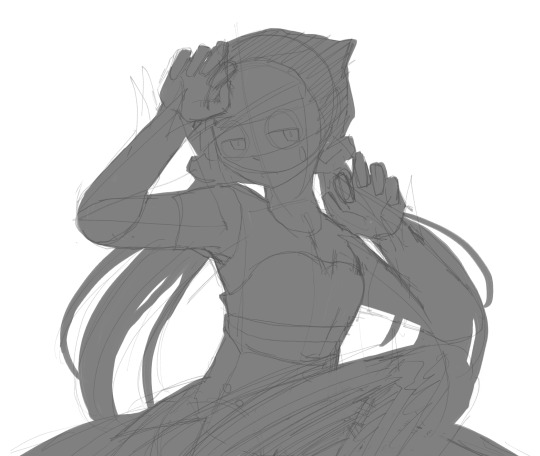
first, like every artist, i sketch. more specifically, i’m getting an idea of what i want to paint later on. this could be how a scene is set up or in this case, how a character is posed. here i’m not concerned about details or getting everything perfectly, i’m only planning how the thing will be composed. maybe a lot of canvas size changing, or adjusting what miku’s doing (note how busted miku’s right hand looks from all the transforming!) however, i still have to be concerned with how clear the sketch will be to future me, because the sketch won’t be any good if i can’t read what miku’s doing

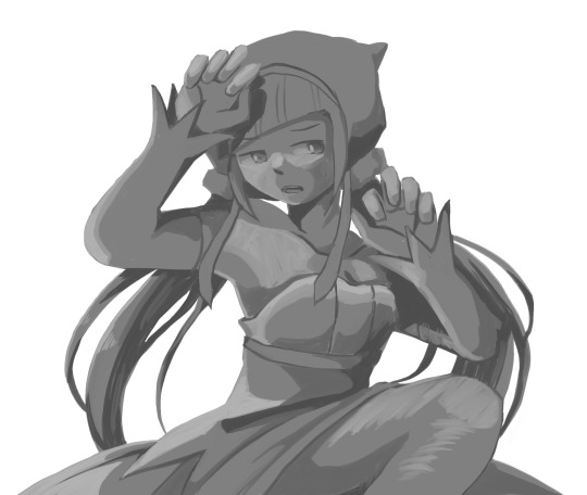
after that, i lay down a flat gray under the sketch, mainly focusing on giving miku a clear silhouette. this is also a good time to make adjustments to the composition on the fly if i suddenly feel like something can be improved upon, like shortening miku’s left arm from the sketch!
after painting a flat silhouette, i start shading in grayscale, focusing only on lighting. i usually do it in two passes, one for the lightest and darkest tones i’ll use (not black and white) and then a second for midtones to blend them better with the base gray but i forgot to screenshot the result of the first pass 🗿 nevertheless, here is where i can start adding some amount of details. i’m not including any extra accessories yet, just focusing on the base design of the outfit and the character herself (for anyone wanting to draw characters from That Gacha Game, this is how i personally make the process more bearable for myself.) i still use the dark gray to separate where certain details (like the facial features and fingers) begin and end, mainly to make colouring more bearable later.
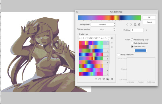
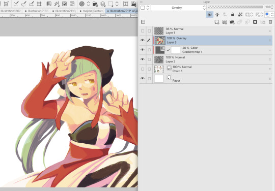
now here’s where i get the Good Colours. it’s a cheat lol. i put a gradient map layer over the grayscale painting so that there’s a little bit of color to start. some gradient maps can be applied as is, some need the layer settings adjusted to make it look good. this one, for example, is a (free) gradient map set from the csp assets store that needs you to set the layer opacity to 20% and to set the blending mode to color to achieve this result. in general, i tend to pick which gradient map i want to use based on vibes, or basically whether i want the work to be warmer or cooler, colour-wise. but this does do quite a bit of lifting for the colors in my stuff.
and then, finally, i add the colours. i add flat base colours in an overlay layer. at this stage, i’ve made the character silhouette clear enough that i don’t need to refer to the sketch anymore for what miku looks like. also, the gradient map layer does its magic by making the shading a bit more vibrant than it would’ve been without it. after that i paint over with a new layer to add details like the lace.
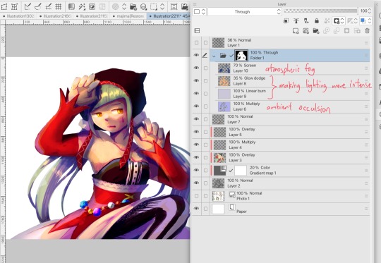
and then i put some extra shading on top. basically this is where the ‘better lighting’ happens. again, this isn’t a tutorial, so i’m not here to say what each part of the lighting is, but i’ve labeled which layers do which job. in other works where the lighting within a scene is more defined (from a window, from a small crack in the walls, etc) the glow dodge layer may be more opaque and sharper, but since this isn’t a work with that, the lighting was applied using an airbrush. the linear burn layer is also there to make the whole thing darker so the glow dodge doesn’t end up oversaturating miku. i also usually match the lights to the vibe i want, and use a complementary color for the shadows. so here you can see i have warm colors on the glow dodge layer, but light purple on both the linear burn and multiply layer.
and that’s it for the character—here’s a gif showing how each layer adds to miku! (sorry it’s so toasty)

as for the background, depending on the complexity, it may go through a similar process, or if i can settle with flat image backgrounds, i just go for that. it’s ok to use external image materials. i didn’t have a background in mind for this miku in specific, so i got some default csp materials and threw together something
and that’s about a rough overview of what my process for more finished works looks like! again, art is a fluid process so i never specifically stick to certain steps all the time, and you shouldn’t either. i can probably answer why i’d pick this colour over another in one particular work, but it’s something that kinda has to be learned on a grander scale. i think everyone can already feel what colors work with what atmosphere or what setting, even if they can’t immediately explain why. colors and composition do take some level of experimentation to find what works best!
126 notes
·
View notes
Note
eep sorry if youve been asked this, but when u go abt drawing bgs for ur comics, do u look up references or use imagination, and how do u practice drawing bgs for storyboards rather than illustrations? im rlly not sure where to start, and i feel like a lot of advice focuses on rendering bgs rather than it feeling ~lived in~ or actively being used or augh not sure how to say!!
hhhh ok this is something I am also still in the process of trying to figure out, and I am not a professional storyboard artist so I will attempt to answer to the best of my ability.
when it comes to storyboards, the amount of detail bgs will have during the boards phase will depend largely on both the studio AND the specific production. some 3D shows will have a render of a commonly used room the board artists can angle around for their shots. Adventure Time boards tended to be pretty loose, while the Owl House boards are EXCEPTIONALLY clean. DTVA seems to have bgs created in a several step process, and I'm not exactly sure of the timeline, but I know they have vis dev artists that do more illustrative, conceptual drawings to get the vibe, then the board artists draw out what general angles will actually be used, then layout artists/bg designers who actually go in and DRAW those bgs and add in all the little details, and THEN the colorist comes in and...colors it. I don't think every studio distributes the work in this same way. Not every studio is going to want board artists to draw clean backgrounds, but MOST will get pissed if you refuse to draw them at all djfhgdjf
If you want some tips about adding small details, this has some really useful advice.
I don't add lighting or grayscale values to my comics unless it's important to the tone/clarity, and I think that's generally the case with boards too (at least for TV, I don't know as much about boarding for feature). Here's some advice about adding lighting.

^ here's a bg I put a little more effort into than usual. I referenced some images of thrift shops I pulled up on duck duck go, some of my own memories of thrift shops I've been to, and even went on the shiftythrifting tumblr. This was just a silly comic I knew I'd be posting on tumblr rather than a serious board, so it didn't matter to me if it was perfectly clean or not. some of the shapes are... vague. and loose. but who cares sdjhfjd I think (?) it conveys the concept that this is a thrift shop.
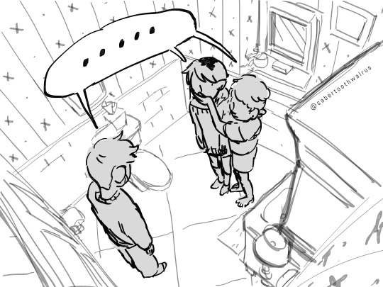
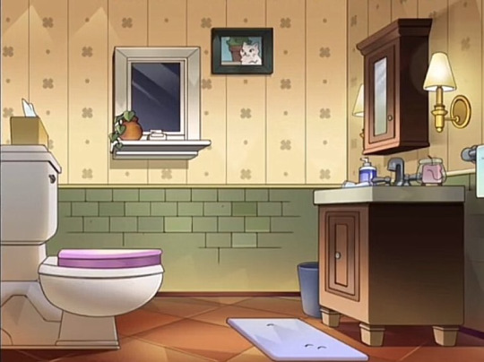
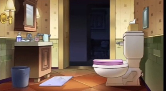
^ for THIS comic I wanted imply hunter crowded them in the bathroom to "talk in private" which felt like a very 16 year old thing to do + there were already some nifty references of the Noceda's bathroom. and listen I know it's not perfect. I didn't draw ANY perspective guides, did more trial and error than I probably needed to, the cabinet is WAY too high. (even in the original, why is this bathroom so spacious???? why is the toilet so far from the wall where the toilet paper is???) but even with all the mistakes, it doesn't matter! no one probably noticed while watching. you see it so briefly, and your attention is still focused on the characters.
I'd say the main thing when drawing bgs for storyboarding & comics is to focus on Perspective and Composition above all else. It's ok to be loose, but make sure you still have Clarity. Be mindful of proportion ("how big is this character in comparison to the objects around them?") and angles ("if this is a low angle, shouldn't I be seeing the ceiling/sky?") etc etc because even if you know you won't be drawing it perfectly, it helps to still have it in mind.
410 notes
·
View notes
Note
I love how you capture gojo through your artwork and the way you paint! You’re my favorite gojo artist. How do you pick your color palettes and how color your art from grayscale? I’m trying to change my rendering techniques but am struggling big time. Do you have any tips? 💜💜💜
sorry this was a tough ask to answer i know its old😭
so what i can recommend is to first: have a folder of pieces you like the color palette of and study how the colors are laid out. try to tie your observations back to color theory as well.
next the best hacks i learned were the hsb and gradient tools. some ppl may consider gradients a cheat but hey if it works it works. hsb allows you to slap any color as ur best guess and then keep adjusting until it hits The Spot.
you can also use the curve tool at the very end (or during if you want, it’s your journey) to make final tweaks to contrast and saturation. Sometimes i just go wild on it to see if anything cool happens.
to go from gray scale to color you want to learn the color blending layers and what they do. But most important I recommend learning what Overlay can do for you and your loved ones.
Color blending layers are how you apply color.
When working with overlay in a grayscale to color setting you want to remember that your base is literally 100% desaturated. So the color you apply over that needs to be as saturated as possible! Try to stick to bright saturated colors for the most part and avoid dark and desaturated colors on the overlay layer unless working in shadows (dark) or highlights (desaturated).
Tbh I think practice a lot even if its a struggle. Don’t give up. And you don’t have to get there immediately. what i did in the beginning was heavily rely on gradients and color blending. As i got more comfortable with the color blending layers I started doing my rendering in an off red pinkish color. This was easier for me than direct transition to grayscale because the bit of color allowed me to color parts like skin with less struggle.
experiment!! i only talked about overlay bc in my understanding its what’s used by most grayscale artists. but literally every color blending layer has something to offer and you should take the time to find what works for you.
#ask#also i didnt mention this but dont use color picker for coloring anymore#use………*leans in v close* the smudge tool
30 notes
·
View notes
Note
SOULMATES AU W/ AKECHI DHWKBH,LDKH3LCKWHQ,3J
author-chan~ please give me some hc of akechi in soulmates au
or you can post this and have one of ur anons give some cute ideas to send u
>////< pretty plsss
HMMMMMMM i am going to make this as a part of my ramblings series, since this is more of an open discussion or sumn . .therefore theres no structure to this whole post and i apologize </3 but if you want me to make an official headcanons version of this, feel free to send another ask!
NOW FIRST LETS TALK ABOUT HOW THE SOULMATES ARE CONNECTED... i've seen alot of versions of the soulmates trope such as: having a tattoo of the first thing your soulmate says to you, red string trope, seeing colors trope, dreams trope...
personally . . my absolute favorite is the colors one . . . SO I WILL GO WITH THAT FOR MY IDEA
okok but what if. . . WHAT IF . .. the soulmates also passes on to the personas . . . like as i have mentioned before loki has a wife named sigyn.. . . WELL robin hood has a lover named marian so . . . ASDASDASD i am not suggesting s/o to be a wildcard (or to be strictly female, we have characters like brown from p1 having a persona of the opposite gender, and p3 femc having a genderbent orpheus), but im just saying both of akechi's personas technically have a partner so .. . just an interesting thought ehehehehehe
I would like to believe that Goro was a cheerful child, and I feel like he was very excited to see his soulmate. But as life goes on, his view on soulmates altogether soured. Goro has seen how his mother's soulmate treated her, and his scum-of-the-earth father would gladly discard his soulmate just for power, so Goro sees soulmates as a weakness more than anything. He wishes his world to be forever grayscale.
However, as he continues mingling with the leader of the Phantom Thieves, he eventually met everyone else, including you. The first time, it was a speck of color. If he was not paying attention he would have missed it. But he swears he started seeing the color of his coffee for a few seconds, and when he blinked it was gone again. Back to his monochrome world.
And he swears for the first time, he became afraid.
I feel like Goro would put up walls around you, and a door, and some locks, and a gate, and an electric fence. Basically he is just very secretive and evasive when it comes to you. If ever there was a moment where the both of you were left alone, he would quickly shut down any ideas of you starting a conversation. Every time it happens, you were disappointed. Every time he does it, he feels his heart break a little.
When he sees your Persona for the first time... He feels a lot of things. Guilt, anger, sadness... Guilt because you were stuck with him, anger because it felt like the world was making fun of him, and sadness because... he fears he will let you down, or end up like his father sent from hell. Of course, if you gave him a chance, Goro would do his absolutely best. But he feels like his family line is a big jinx, so he decides that for your happiness he will not pursue you.
But you just had to be persistent, huh?
And slowly, the world started becoming colorful. It was like your warmth was seeping through the cracks of his barely-working heart, and he shouldn't want this, but he does. He wants to one day be able to wake up, and the first he sees is your bright smile. He wants to leave work, and you'll stop him on his way out because he forgot his lunch. He wants to go home and hear you greeting him as he puts away his shoes. He wants the late-night talks, the long walks on the park, the cuddle sessions on the couch, the play dates, the jazz dates....
But when has Goro Akechi ever gotten what he wanted?
#akiology talks#GUYS WHAT ARE YOUR THOUGHTS#IM SORRY THIS IS A MESS </3#goro x reader#goro akechi#goro akechi x reader
36 notes
·
View notes
Note
I'm loving all these side stories exploring the DHD universe! Each one so far has been pretty great. I love alrick and his story very much, but it's fun to get to see and focus on these other characters too. Pearl was entertaining and I'm excited to see what's up with Plague
Your art is also always such a treat. I was just thinking to myself today that I kind of wanted to study the way you use background art. The grayscale filtered photos spaced out between white space without feeling empty is really hard to pull off, but I think you do so very well.
While Alrick is the main protagonist, you are right that we need to see other characters, too. It avoids stories being repetitive and gives readers a chance to mirror characters against each other; when character X is like this, and character Y is the opposite, they underline each character's traits. Whether it's their values, looks, age, gender, sex, job, living situation, dreams, fears, past, future etc. We learn about ourselves in relation to others so this same goes to characters, too.
Characters being surrounded by other characters also reveal new things from each other. Miranda can't really talk about how being a Death-Head's girlfriend affects her and the relationship with her coworkers but she can speak about it with Alrick. Joon is very lively and Miranda is super supportive of Joon, but only Alrick will understand how it is to work as a Death-Head. Plague is an ass for everyone but doesn't speak back to Kahamet (so he knows his place). Alrick is considering others but through Dio we see what happens when Alrick (or anyone) considers others above the Death-Head rules.
Also, the easiest way to expand the world or theme is to see it from other character's perspective, from their neighborhood so to say. Alrick doesn't seem to be working as a Death-Head to collect payments but Grimm does and uses this right of his without hesitation or remorse. Ama and Awa view Death-Head work as a luxury service whereas Dio does his dirty job and doesn't view the job as anything to do with luxury. Grimm enjoys being a faction leader, Plague doesn't want it. Lou-Lou is horrified with Death-Heads, Miranda lives and sleeps with one. Society views Death-Heads and their deals as something horrific, but for Pearl meeting Grimm via her deal was a lottery win. Mr. Singer loses his teeth as a payment, Cure loses her life. Rena doesn't make deals but Grimm does and can only do it because Algoth busts his ass off to give Grimm room for deals.
..
If you ever come up with something with studying my art, please, let me know! We're blind to our own work, can't see them the same way as outsiders too. I think one reason why the space doesn't feel so empty is the colored speech bubbles, which are connected to each character. I think the result would be more hollow if all speech bubbles where just blank white. The characters take more space with their colored speech bubbles. (I originally started this as I hated drawing speech lines to right character. If they are individually character color coded, then it's a lot easier to do speech bubbles!)
Why I went to comics without background was due two things. First, I didn't want to draw them. I don't enjoy them. I hate it. I don't enjoy at all thinking about compositions, perspectives, hues or values, nor about panel placements. Been there, done that, hated every minute of it. I don't want to spend my precious limited free time and limited resources on things I hate. My emphasis is on the characters and the comic is drawn in a way that it doesn't have to put emphasis on the things I hate, like panel placements and directing viewers gaze.
Second thing is that rules in art are human made. Sure, some things do make the viewing more pleasant and carry your story - I went to an art school - but many of the rules you don't need. If you are famous, you're even praised for breaking them!
I had that almost rioting epiphany when I was in the art school. I happened to see from TV news how in the modern art museums, there was a new exhibition by an American painter. He was famous for painting portraits and hanging them upside down. The curator of the exhibition was explaining with shining eyes how amazing this method is! How amazing it is that this painter challenges the viewer by hanging the paintings upside down! How revolutionary!
I thought "He gets praised for hanging paintings upside down, but if I did the same anywhere, even in the art school, I would be scolded for a cheap trick or be even called downright an idiot. So, why it is allowed to him and not for me?"
As I hate injustice like this, I've made my mind to fuck around and find out when it comes to my own art, and remember; if what I do was done by someone famous, it would be praised as something exceptional. If it's allowed to someone, then damned I be, I'm going to take that right for myself, too!
26 notes
·
View notes
Note
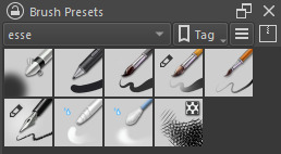
I love your art so much! Do you have any of your brushes for sale, or any tutorials, especially on colour?
Hi!! Thank you so much! 💕
Honestly, my go-to brushes are all procreate brushes with slight adjustments (like stabilization, etc.) my personal preference is brushes that kind of mimic graphite pencils. The best thing you can do is find a brush that suits you & get very comfortable using it! Specific brushes won’t necessarily improve your work, it’s all about practice! (But yes, a nice brush does help!)
I do have a video on my favourite brushes:
I’ve never really made any tutorials, but I’m happy to try and relay what I know and what I’ve learned so far!
Colours are a big part of illustration! I could probably ramble on for hours, honestly—in any case, it’s always helpful to know fundamentals of colour theory. Once you learn and apply it, it becomes intuitive! I’m gonna stick to RGB colours because CMYK is it’s own thing (printing!)
There’s a handful of basic terms like hue (pure colours), shade (adding black to a colour), tint (adding white to a colour), tone (adding gray to a colour) and also opacity (transparency) that help us understand and define the complexity of colours.

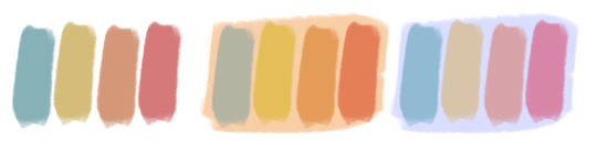
My colour choices are more often than not a gut feeling—but that does come from practice! There’s loads of colour palettes available online like this one, but if you wanna come up with your own, there’s some neat ways to do that using a colour wheel! Colours can broken down into primary, secondary and tertiary colours. We can also categorize them as warm or cold. With this we can make colour schemes!
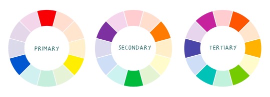
Some basic schemes!
Complimentary: two colours, opposites on the colour wheel
Analogous: three colours side-by-side
Triadic: three colours that form a triangle, evenly spaced
Monochromatic: using one colour (using different shades)
(Bonus) Monochromatic with accent colour : using one colour as a foundation and having an accent colour (similar to analogous, but one colour is used for a majority of the piece while the accent colour is used sparingly)

It’s also important to keep in mind that values (a colour’s range from dark to light) will look different on different colours. Sometimes, you’ll put two colours together and think “huh, something about this feels off” and it turns out, the colours just happen to be very close in value and melt together. Switching your piece to grayscale just to check on your values every so often can help with contrast and muddiness! A light tone on a darker tone will look brighter than it really is. Colours can also influence each other and trick your eyes.

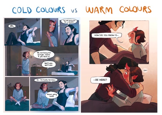
Environment is also a big part of choosing your colours for a piece. Determining what the setting is important! A sunset will make a drawing warmer, while a scene set in the night will usually have colder tones. Using only local colours (true colours, like green grass or blue sky) vs non-local colours (atmospheric perspective, accent colors that give depth, etc) can help enhance your drawing too. Don't be afraid of artistic interpretation!
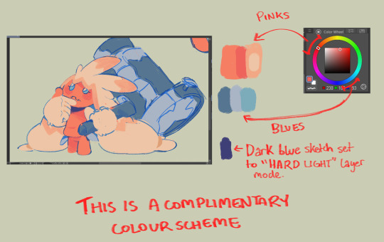
Also, there’s always the option to use gradient maps (at least on procreate & photoshop but I’m sure it’s available in csp and other programs) where you draw in grayscale & apply a gradient map. The gradient map basically applies a color to every value (e.g all the shadows become blue and the highlights become orange) it can look really nice (and help out if colours just aren’t working that day yk)

Another thing, when I’m drawing (and this is specific to me!) I tend to start with pretty desaturated colours. Once my illustration is done, I’ll duplicate & merge my layers to do colour edits. Most programs give you the option to play with curves or colour balance—menus that allow you to play around with the hue of the shadows, midtones and highlights. I tend to make my shadows more cyan-blue, my midtones a little warmer and my highlights warmer as well. Of course, this depends on the mood of the piece, whether it’s warm or cold, lighter or darker, etc!
You can always make adjustment layers on top of your work; a low opacity yellow, magenta or blue (or anything your heart desires) overlay to tie all the colours together.
I hope this helps a bit!! Happy to answer more questions to the best of my knowledge :^)
99 notes
·
View notes
Text
A little fic about my Spidersona Spider-Flower and her love interest Spider Noir :D enjoy!
⚠️WARNING: MENTION OF DEATH⚠️
Monopetal
Spider-Flower(OC) x Spider Noir
Summary: Noir feels comfortable enough around Spider-Flower
"Is this purple?"
"Yes, this is purple." Solana said with a chuckle. She had brought Noir some lavender from her world to help him with the color. As a flower, she knew there were different shades of any color, and she made it her mission to help him learn. She watched as Noir examined the purple plant, his greyscale fingers gently touching the tiny flowers. This act made Solana's petals spread further open than usual, her version of blushing. Would he caress her own petals that way? Would he be gentle like that with her stem? Would he look upon her with the same fascination as-
"Flower? Flower, are you alright?" Noir's voice cut through her thoughts, making her petals stick out in shock as the eyes on her mask widened.
"Huh-what-uh-" She started before letting out a cough and nodding. "Yeah, I'm good, why?"
"Well, I asked you a question, and you didn't answer." He told her. Her petals began to close in on themselves as embarrassment filled her.
"Oh! Sorry about that. What was your question?"
"I was asking which shade of purple is this. I know we've been covering a lot of different shades and wanted to know which one this was." Noir said, his voice sounding like a melody to Solana's ears. Or rather, whatever was equivalent to that in a flower.
"Oh, it's the same name as the flower. Lavender." Solana told him brightly, her voice echoing a little louder. She doesn't have a mouth, so her voice mostly emits from her and echoes softly. The echo changes with her tone, giving it a stronger or weaker effect.
"Was the color named first or the flower?" He asks, looking at her quizzically. Solana chuckled a bit nervously. She wasn't as smart as the other Spiders in the Society. She was a flower mutated by her radioactive spider, so she didn't have that smart brain the majority of Spiders had. She couldn't even read or write.
"I think the flower?" She tried, picking at the vines that made up her arm. She was currently in her human-size form.
"Mhm." Noir hummed in thought, going back to inspecting the flower. Solana watched him, taking in every feature of him as if she was taking it in for the first time all over again. His lack of color fascinated her. It made her want to paint him herself. Not that it was possible, anything that got on Noir's person would inevitably lose its color and retain his grayscale hue. It fascinated Solana how holding something doesn't get affected, but as soon as it's on his body, the colors fade away. She couldn't help but wonder how it worked exactly.
"Y-You're a little too close there, Petal." Noir said, facing her. Solana's mask's eyes widened as she quickly sat back down in her nearly vacated seat.
"Sorry!" Her echoed voice warbled slightly as her petals began to close in on her. She could hear Noir give a chuckle in response. She got even more embarrassed. How could she be so stupid not to realize what she was doing?!
"If you wanted to see my face, Petal, all you had to do was ask."
"Wh-what?! Oh, no, Noir, really-" Solana's petals opened up in a frenzy.
"It's quite alright, I don't mind." He assured her. He had long since put the lavender down. "I've been wanting to show you anyway."
"You have?" Solana squeaked out. If flowers could blush, she'd be brighter than the sun! Well…as if she wasn't already.
"I have. I don't trust many people to see my face, you see? But…I thought you were as trustworthy as it gets." He confided. Solana's fake heart skipped a beat. How was that possible? She didn't know, but she sure felt it.
"I am? Do you really think so?" Solana's hopes soared. After ages of spending time with Noir and imagining what that surely handsome face would look like, she was finally going to see it! The vines that made up her body shivered in delight.
"I do think so." He said, taking off his hat and fiddling with it in his hands. Solana was sure her mask's eyes were open bigger than they've ever been before.
She watched with bated breath as Noir gently set down his hat and brought his hand up to his mask, wrapping his fingers underneath the thin fabric and showing a sliver of flawless, light gray skin. If Solana could gulp, she would. Her sight was locked onto the small bit of his neck she could see. Noir seemed to hesitate, his mask's eyes narrowing slightly in thought. Solana thought to say something, but the words died in her throat as he continued to lift his mask up. More of his neck showed. Then his chin. His lips were next, holding an awkwardly cute smile. If Solana had a heart, it would be hammering against her chest. Noir stopped for a moment.
"Ready, Petal?" He asked gently, lips moving along with his words. Solana couldn't stare anywhere else but his lips. She could only nod. So, with a faster pace, Noir took his mask fully off his face and looked at his flower friend with an expectant face.
Solana could feel herself wilt.
There in front of her was the same face she failed to save. The same face she failed to protect. The same face who pleaded for her help. The same face she purposely let die.
The face of Peter Parker.
A deep ringing overcame Solana's hearing as panic bubbled up in her. The world around her began to tilt. She stumbled as she started to quickly move away from Noir, making the poor man frown.
"Solana, are you alright?" Noir asked softly, his eyebrows drawing in tightly in a worried expression. Words died in Solana's throat as she stared in fear.
"Peter…" She breathed out.
"Yes, that's my name." He said with a light tone, an attempt to ease her worries. Noir attempted to reach out to Solana but only succeeded in making the poor flower scuttle backward and falling off the bench they sat at. Solana let out a grunt but didn't let it phase her as she stumbled to her feet. Peter-no-Noir looked pained. After who knows how long, Solana finally got her wish to see Noir's face, and it was nothing but hurt and confusion.
“Petal, Doll, are you alright there?” Noir asked with worry set deeply in his tone. Solana only continued to back away before finally speaking.
“Please, just stay away.” She said as Noir's face completely fell. He watched her thwip away on her web of vines, leaving him in absolute distraught and regret.
If you'd like to be tagged/untagged let me know!
Tags: @symmetricalkazekage @crocs-blogs @arithestrawberry @eveandtheturtles @obi-mom-kenobi @thelaundrybitch
#m1dnyt3 w0lf#m1dnyt3 w0lf fanfic#spider noir#spider man: across the spider verse#across the spiderverse#atsv fanfiction#atsv noir#spider noir x oc#oc x canon#angst#character death
7 notes
·
View notes
Note
What are your thoughts when you see mutuals of yours using AI in their binds? I'm not defending afb at all, I think what they did and their attitude is vile, but why don't a lot of binders on instagram hold the same attitude towards AI and programs like midjourney? From my understanding, it's the same concept. It's still theft. These programs steal from artists without permission for the AI database. I've even seen someone using AI to edit a piece (avendell's art from grayscale to colored), which is as horrible as editing someone's typeset. I guess I'm just frustrated as an artist when I see such pretty books only to find out AI was used in the endpapers or dustjacket, and then see their friends cheering them on in the comments :/ It is so harmful to the art community, yet I feel like I can't speak up because many binders support it. I'd appreciate your thoughts on this though as a fellow artist
Hi! This is a very interesting ask and something I have been pondering for some time now but never really had the chance to put into words, so I will try me best to do it here :)
Disclaimer: those are my thoughts and observations about AI being used in book binds since I started binding almost 6 months ago. Please keep in mind this is just how * I * personally have decided to deal with my mutual using AI for their binds. I am not telling anyone that they should do or feel the same way as I do, each person has their own way to handle it.
Short answer: Have spoken up about this before, which you can find in a post here and also on my IG story, there is a highlight called “no AI”. This is mostly from when I first started binding. I think my tone there is a bit more aggressive because there were just a lot of penned-up frustrations LOL, but most of the things I said there I still stand by them.
Long answer under cut:
I’m an artist and have been drawing for 13 years now, and mostly hang out in the creative / artist sphere of the fandom sides online. Most artists do not support AI, and it has been incredibly frustrating to see how AI has just made life so much harder, from getting accused of using AI even though no AI is used, to seeing companies hiring artists who have also made a switch to AI and also support it, to Etsy sellers selling AI art on mugs and what not.
I was in the exact same spot as you when I was doing my social media research on how to get started with bookbinding, and spent a lot of time scrolling through other binders instagram accounts to see what they have made. I am in awe of what they can make because like every craft, it takes money and time and practice to get really good at it and I have seen so so so so many pretty books, but then also quite shocked at how most binders view on AI art differs so much from the art community. AI is used for typesets and endpapers and dust jacket, and scrolling through the comment sections, there was no one speaking out against AI art (or some did and got snarky replies or comments were straight deleted). This did discourage me at first from taking up a new hobby and being an active part of the community. I should add here though that no one has to make their hobby public and post everything they make. Personally, for me, I don’t have any IRL friends to talk about bookbinding or, and I’m also an introvert, so meeting and making new friends online to chat about hobbies is the best way for me to go. Also I just like sharing my work, I’ve put so many hours and time into it, why shouldn’t I get to show it off.
In the end, I have decided to make a book-binding account and be part of the fun and honestly, I don’t regret it. Everyone is super welcoming and will help you with any questions you have, I have made many great new friends and exchanged a few binds with people from across the pond.
And yes, some of those friends and mutual binders use AI for their book binds, I’ve had discussions with them about it, where everyone gave their input and thoughts on the topic in a respectful, mature, and civil conversation. Opinions are split on the topic in the binding community, this is what I have observed and gathered from my binding journey so far:
some people don’t know much about AI art or how it works, hence they decide not to touch it.
Some didn’t know how AI worked, dabbled with it, read up on and decided not to use it anymore.
Some have done extensive research on it with arguments from both artists and tech side, and then made a decision based on that
Some see MJ as another tool like Canva to make graphics or whatever for your bind.
Many binders use AI for their binds, because no money is made from it. It is (mostly) personal use, either for themselves or to gift away to friends.
One should always be transparent about whether MJ (midjourney) was used in their binds or not, to give people the choice to decide if they want to interact and support something with something that uses AI or not
Not all artists reply DM requests for permission to use their art for personal binds, or the art style / concept they have in their mind exists, so they resort to MJ as a quick solution
Not everyone has the money to commission artists, and especially for commissioned book binds, the prices for commercial art are not something everyone can afford.
The gist I got from the instagram binders (I don’t want to muddle them with AFB binders), is that they will try to use artist’s art with permission as much as they can, but roadblocks like the ones mentioned above happen and make them resort to MJ
Some artists do no want to be associated with AI at all so when they see that binders have used MJ for their binds before, they will not permit them to use their art
Some artists have spoken out against AI and talked with binders about the AI, but still take commissions / collab / trade with binders that have MJ works on their account
I see more artists permitting binders to use their art for binds than rejecting the request even though some of those binders used MJ in their binds. I do believe that most artists do a quick social media check and see what exactly their work is being used for before answering
Some binders are not fully active on IG anymore because they see so many AI being used
Many binders are still supporting artists in different ways such as subscribing to their patreon, donating to their ko-fi, buy their merch, share their art etc.
If given the chance, many binders would also love to collaborate with artists on a bind together - I’ve had several reach out to me and express their interest in collaborating together which I think is great.
About Avendell’s art being colored via AI: there is one known binder on IG that edits art without artist’s permission and we all do not like them LMFAO. All the binders I have hang out and spoken to respect artist’s boundaries and would not use their art or edit it without their permission.
The points above-mentioned are not me trying to justify and defend the binders that use MJ/AI, it is just me listing up my observations and things I have read and heard from binders that use AI.
I can’t fault artists for charging xxx amount for commissions because they have to make a living and pay bills too, but you also can’t condemn binders for not having the spare funds to commission artists because they also have bills to pay and groceries to buy.
So on the one hand, if I put myself in the binder's shoes, I do understand the appeal of MJ and understand to a certain extent why they use MJ for their personal works, no money is made etc etc etc. On the other hand, it’s AI/MJ and as an artist myself it is frustrating to see AI on my dashboard and until there is a more ethical way to use AI, the law has updated on the usage and the artists whose work were used to train the machines without their consent, I will not support AI.
AI art aside; binding books - especially a whole fanfic from scratch - requires so many other skills and labors put into making a book that also takes a long time and money invested to get better at. There is so much love and creativity put into a bind, and it amazes me what people can come up with that you most likely will never see in any mass production because it is a one-of-a-kind book. There are binders who have spent money purchasing stock image and font license for their personal binds, and will make sure they are respecting fanfic authors wishes and boundaries. For that, they have my admiration and respect and support and I am very happy to be still part of the community. I don’t think I need to get into how disrespectful the AFB Admin’s tone is in the overall post on top of them seemingly flipping off every one that is trying to have a civil conversation on the topic of sharing typesets without permission, editing art and straight up hold a best-copy-contest in a “”Private”” group that accepts pretty much any application and has over 6k members.
I don’t support AI, but I am very grateful that I have been welcomed very openly into a new community even though I have expressed freely in my public instagram account and on discord servers my disdain for AI. If I see my friends and mutual doing a bind where MJ is used, I simply don’t interact with the post, will not comment and share it in my stories, and move on. I personally don’t have the energy to comment and educate binders in comment sections for using MJ. I am friends with binders that use MJ, despite our different views on it, I have also blocked binders on insta because I do not agree with some of the things they said about AI and artists. And if binders do not want to interact with me because I don’t wanna support binds with AI - or artists do not want to talk to me anymore because I am friends and mutuals with MJ users, that’s fine too. I don't wanna get too caught up in the us (artist) against AI war, I wanna enjoy my new hobby and make pretty books.
I have been trying to incorporate more art that I draw myself into my binds and sharing WIPs and timelapses of the process, and I do hope that in some way this may help other binders also want to give digital art a go.
At the end of the day, it’s up to each individual both binders and artists how they wanna deal with MJ being used on binds and how they are gonna interact with it. I’ve decided for myself that I do not want to let my view completely stop me from enjoying what has been a wonderful community experience so far.
7 notes
·
View notes
Text
Me Infodumping about The Black Cube
Warning ahead! All this info is from memory and this post may or may not be super duper long! There are no images because I aint screenshotting all of that at 9:35 PM, so if you don't like long posts then do not read! If you're cool, then that's great! Thanks for sticking around! Hope you enjoy your stay.
Anywhizzle, down to business.
SO! One of my favorite episodes from Wander Over Yonder is titled The Black Cube, and it's about the guy literally called Cube of Darkness. He's straight up just a floating black cube that can eat souls for breakfast. Unfortunately, he lost his villain permit and led a life of a minimum wage Starbucks employee in a world far too similar to our own!
There are so many elements of this episode that strike me as realistic and intriguing all at once and so I am gonna go on and on about it all!
For starters, there's the world itself. Everything surrounding Cube is very gray and bleak, everything looking like modern life in the city of Boston. Trust me, I live very close to the city of Boston and the setting in this episode is way too familiar to me it looks exactly the same. Not only does it look depressing, it is depressing. Everyone here is fucking depressed and sad and alone. I mean, I am exaggerating a little bit, but just imagine real life and you have the character trait for everyone here.
Now, this episode is all about a day in the life of Cube. He lives here. In this bleak, depressing, grayscale world. And due to his color and his background, he fits right in! Well... Sort of. You see, Cube has no hands. And because of this, he's been relentlessly bullied and has a continuous streak of bad luck, despite his ability to LITERALLY SUCK OUT PEOPLE'S SOULS??????????????? It makes sense but at the same time it doesn't. So because of all this, Cube is seen as just your average joe, the guy who has all the bad luck in the world and can't seem to see the good in anything. I mean, fair, his landlord literally yells in his face about the rent and his boss at work doesn't treat him fairly.
I actually wanna touch on that! Nobody treats Cube very well! Nobody likes him, which is also kinda understandable since he was previously a super powerful villain, but they can all see that he's trying to become better! And yet... No change happens. Every day is the same.
Also. Mans has no hands. Kinda important things to have if you wanna live in Boston of all places.
Everything finally starts looking up for Cube only when Wander appears, and from here on out we can constantly see Cube start to embrace the more mediocre parts of himself that others despise greatly! He isn't so sad anymore, isn't as depressed as the others, but nobody really cares.
I- Uh...
i dunno how to continue this actually
LISTEN I STARTED THIS 2 DAYS AGO OKAY IM RUNNING OUT OF THINGS TO SAY
I do have a ton more to say but idk how to put it into words OR WRITING so we'll just leave it at this until I get back into the swing of things. Will reblog with a part 2! Because I have a lot to say!
Special thanks to @faecaptainofdreams and @wanderfan2000 for literally just existing and being great mutuals so far and also for encouraging me to infodump! It was more WanderFan's doing but Fae contributed by teasing their current project surrounding Wander's and Screwball's past so PLEASE GO CHECK OUT BOTH OF THEIR BLOGS PLEASE AND THANK YOUUUUU
Also thanks for reading cuz part 2 will be a nightmare trust me :3
#I ran out of things to say real quick lmfao#Was gonna write out a super long post but then it got super duper late and I got really really tired and then all my motivation just-#-up and died on me lol. Dunno where it went. Checked Hell and it wasn't there so idk where it could be#Motivation. If your reading this. CLEAN YOUR ROOM!!!!!!!#tumbleweed#wordz
13 notes
·
View notes
Text
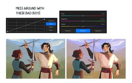
part 2 of this ask
📝Process for hurt mezu drawing
here are the steps i dug out of an art server's wips channel lol
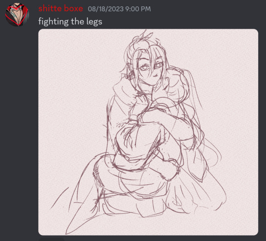
1. initial sketch
2. refine sketch. thats lines now babey. (omitted "the sleeves are KILLING ME WAHHH" stage that led to this)
3. grayscale, to use with gradient map (this is a more polished grayscale than I started with, i dug the working file out to get better images)
4. find nice gradient map (ended up being the same one I'd used for the piece i made right before. the goal is to make what's essentially an underpainting, not to color the whole thing with one map)
5. tweak and add colors that arent in the map with hard light layers & also sneak in a layer for special effect and atmospheric/ scenic perspective while you're at it
6. shading & more finishing effects. pretty much all of the shading was done with hard light layers! the only non-hard light layers I used for the shading were the particle effect layers & like one faint glow layer to fix some values. blood was done with linear burn
✨Inspiration for hurt mezu drawing
the coloring method (grayscale -> saturated gradient map underpainting -> additive color adjustments) is something I tried out with the piece i'd made right before (the one where gozu is holding mezu from behind) & turned out really well, so I wanted to keep going with it
I also wanted to draw them angstily again because it'd been a very long time. like half a year at least. angsting them is very enriching for my soul so I try to do it regularly, this one was overdue
subconsciously referenced the poses in the initial sketch from this old thing (feb 2021). i love doing this. all my for-fun works recycle old elements in some way. my favorite game is "what old art reminds me of what im doing rn" im so good at digging stuff out of my archives for it. everyone loves when i do this
the gangi-kozou panel also
i went through a "shade in bold red-orange & dark blue with hard light layers" phase in like..april/may of 2021. i still like that stuff a lot so I wanted to revisit it
💚Things you like about hurt mezu drawing
repasting the link there but the sixth image in the process is essentially the final so you can just look at that
the colors are nice!! I'm real happy with using more saturated colors n I think the warm vs cool balance works really well
the sleeves (man being dramatic on the sand meme)
no like fr look at the 2021 piece's kimono sleeves vs the one I just did 2.5 years later. so satisfying
Gozu's expression came out nice
i think the claws and flash lines successfully added Emphasis to Gozu's expression & the piece overall
the poses … the drama …. the brush textures are also good
⏳Things you’d do differently with hurt mezu drawing
add in a liiitle more contrast...aka use a wider range of values. Some lighter lights and darker darks. I miss my 2021 hard neon lighting
a bit more distinction between the characters and the background also
the composition isn't bad but it could be better. Should've thought more about the way the eye would flow around the image in the drafting stage (solid b&w color block thumbnails are good for this)
Moar Sparkles. (I put a solid amount of large & low opacity light bubbles in there & some finer brighter dots especially around the claw stems, but I think more clusters of tiny bright lights on the characters themselves would've gone hard)
💌Some favourite feedback on art
as the wise man Austin Kleon once said: keep a "praise file" of all the positive feedback you get (if you've never read "Steal Like an Artist," you must). so. i am prepared for this question hold on
tastes like sugar glass
multiple people have told me my art is soft & dreamlike
jayce you reblogged my touchstarved art with nice tags on april 10th ive got that saved love uou
umm theres a lot...anytime someone keysmashes or feels emotional because of my art i get happy ,,, lys messaged me about the hurt mezu piece that made me happy also,,,,,there is so much joy in the world
#shitboxposting#asks#shitbox drawn#JM SORRY I FEEL LIKE THE FORMATTING ISNT EASY TO READ NO MATTER WHAT I DO....AUGH#all my class work with actual conecptual meaning is monochrome what am i doing...man.......#i need to post more art and i also need to make more art. aghhh. boots up ultrakill and magical drop again#im actually Not sure how im going to afford the next few years of my life 😭😭 a bitch gotta have time to do fuck all but i need money..!!!!#whatever its fine. i have time to do fuck all right Now and thats what matters
5 notes
·
View notes
Text
I beat Splatoon 3: Side Order

I hate Splatoon multiplayer. I'm not great at it, and it gets me very heated, so I essentially avoid it after the first couple months, I make myself a character, all good to go.
I LOVE Splatoon singleplayer. So so so so so so much. Splatoon is essentially a singleplayer experience for me, and I am ok and content with that. I also love roguelikes! So when the DLC is a roguelike (with best idols as the feature), it's peak. Ignore the fact it took me a while to beat it that's how ADHD works. Anyways, I have a format that I think I've made now, so I'm going to do said format
Gameplay
Roguelike :)))))) I love these! I already said this! There's not much to say other than it certainly is a tower where I get more upgrades and create silly broken builds and I love that! Drone and Lucky Combo was my favorite cause I could just make inkstrike and special and bomb spam and nobody could stand a chance against me, it was super fun. Roller was my favorite weapon for this reason too (I also beat the tower with roller first so that might be part of it). The game def takes a few runs to really get going but like, I can't hold that against it?? That's what the genre is. You start to unlock shit and it starts to ramp up and that's the fun. I got frustrated at times on certain levels, and especially the rigorous ones on earlier runs get very very exhausting (I had to take a lot of breathers cause my hands would get sore), but that's not really like... a bad thing. I expect this genre to make me work. When I was going through with all of the different weapons, it was nice that each felt different enough, especially with the color biases, to make each run for 100% fresh (HA) feeling.
Murch was NOT cooking with his loadout though how the fuck does that dude play irl it took me so much fire speed up chips and changing his whole loadout to make that feel ANY good
Characters
Pearl and Marina :)))))))) They're my favorite idols. They're the best ones. I get more of them and even more Marina backstory and I'm not upset about it. Dedf1sh/Acht was a really cool addition and I'm glad they're expanding on characters that were previously just musicians. I found their whole shtick of "Thank god you're here Eight otherwise these two might just start making out in front of me and I can't handle that". It was funny. Order was a very cool force, and even as Smollusk with his stwupid wittle baby voice (DISCLAIMER: I ENJOYED IT) was a neat little character, just a program doing what it's supposed to do.
Story
The best part of this DLC's story is its worldbuilding and continuity from the last DLC expansion from 2. Seeing them acknowledge the Octoling society exodus, AND all of the sanitized people??? That's super cool! Marina showing off more of the skill they talk about constantly with her creating this whole program and working to fight against it is awesome. I appreciate how they tied the gameplay being constant runs into the story, each complete run giving you more and more details on what created Order, why everything is the way it is. Of course, that is also what makes it a little frustrating at the start, because you want to see the story but you have to play the game more to really get it going. It's what happens, so like, whatever, but I do wish for the story's sake alone I could have sped my progress up A LITTLE (the solution is to git gud).
Music
It's fucking Splatoon. Of course the music is peak. I loved the empty sounding songs, the evil printer techno, the super hype club beats while you are dying, it's hype! My favorite song was Parallel Canon :)
Everything Else
Part of the reason I love Splatoon is the ocean theming, I love sea creatures. I thought it was really cool how they made irl dying coral reefs into the theme, combining it with the digital and technology aspect of grayscaling, it's such a cool combination of theming that only Splatoon can do. Speaking of, the attention to detail in this DLC (and really the series as a whole) is INCREDIBLE. The app icons, the programs Marina using being actually recognizable as real programs, the demonstrations showing off character with the silly little anime eyes, there's just so much to look at in every point. The text and writing has also always been a strength of Splatoon, and Side Order just continues to deliver. I loved all the enemy names being musical terms, the puns are always great, the extra dialogue in the menus as you unlock and kill enemies, and even Overlorder's title changing as you do more runs??? It's so cool and it all gives you more motivation to continue to play more. This game is a charming joy with one of the most unique settings I've seen, and the DLC just gives me more of what I love.
10/10. Continued supply of Splatoon and Roguelike goodness with a jelle-ton of charm (I'm funny!)
4 notes
·
View notes
Note
What's your drawing process? (program, brushes, layers, ect)
alright i can finally answer this now that i'm on my computer and have my art program open lol
i use krita! i've been using it for 7 years now and the sheer amount of hotkeys i use is so embedded into my brain and muscle memory, i don't think i could use any other art software unless it controls exactly the same at this point (sorry this is the millionth time you guys have seen this doodle i did it's just still what i have open. i never closed out of krita after finishing it LOL)

i think my process is honestly pretty standard for digital art when it comes to most things, i do a sketch (not pictured here but i usually sketch in black and then just lower the opacity of the sketch layer), either clean that up or do lines on top on a different layer, flat color underneath, then use a mix of layer settings on new layers to apply light and shadow if relevant. multiply and overlay my beloved
might be obvious from my brush palette over here, but i am really simplistic when it comes to brushes... i rarely have to venture outside of this group. lately i've been using the slightly rougher brush in the bottom left for lining for the sake of some texture but almost all my art is made with these brushes alone, even my more rendered and detailed stuff. iirc these are all default krita brushes lol (not pictured is when i occasionally swap to the pixel brush for pixel stuff)
sometimes i do experiment though, like this piece i did months ago was done entirely with a translucent pixel brush on a single layer LMAO
funny thing to note as well is even in my rendered stuff with a lot of layers i never name my layers so i'm constantly switching layers on and off to find the right one like a dumbass. i should really start naming my layers fdsjioojsdf. oh and highly recommend double checking work for values by putting a saturation layer set to full grayscale above everything and flipping it on to see the piece without color sometimes... i do that a lot
feel free to ask if you had any other questions about how i actually... draw? the way this question was worded made me go in a more "how i interact with my art program" direction and not how i actually draw if that makes sense but i'm not sure if that was actually your intention
6 notes
·
View notes
Text
What Happened?
So... it's been like a year and a half.
The long and short of it is pretty simple tbh.
The first comic didn't turn out at all how I wanted. I had high hopes and big ambitions, and I'd already spent a year planning, and I didn't want my interest to wane, so I charged into it, doing some stuff I wasn't used to, and it didn't go as planned.
I didn't spend as long on the backgrounds as I should have. The coloring was weird, because I was determined to do the comic in color (I should have gone with a complex grayscale in retrospect). The pacing felt rushed and kind of clunky. I honestly wasn't super happy with most of it except for like 1 background and a handful of panels.
Honestly, I think I rushed it because I really wanted to get it out. I was trying really hard to follow the advice of "just do it," but in all honestly, I think I should have spent more time actually considering that comic and planning it.
Then I started working on the second comic.
I had a plan. I knew how I wanted it to go. I wanted to get into a rhythm of one comic a month. I refused to post it page by page because I really dislike reading comics that way, and I got it into my head that I had to follow these rules regarding "engagement" and "content" and kinda garbage stuff not really suited for someone who just does this as a hobby and not a career.
I was rushing again, and by the time I began lining the 3rd page (out of 12-14), I knew I'd messed up.
The line width was wrong, but the idea of redoing it all was too much. I'd also made the mistake of choosing a very clean line art that took a lot of time, and maybe that did make it easier to color fill, but it wasn't my style and not my preference, and it didn't really make me happy to look at.
Then Tears of the Kingdom was getting more news, and more than anything, it was all the negativity from the fandom surrounding the game before it'd even released that started draining on me. I felt like the joy was slowly getting sucked out of me. I was getting anxious, especially since this was a sequel to a game I'd really enjoyed, a game that had made me fall in love with the series again and had brought me a lot of joy.
I was stressed out by how long the second comic was taking. I wasn't enjoying the process. Everything in the fandom and surrounding TOTK was comic out so negative. And I was suffering a lot for it.
I lost a lot of steam for LoZ and Linked By Time really fast.
Then an old fandom reentered by life, brought me some dopamine, and I kind of dipped.
So here we are. A year and a half later with one comic, some designs, and several doodles under our belt.
Do I still care about this project?
Oh yeah, definitely. I had a lot of plans for this, and I became really fond of my versions of these guys.
What now?
Honestly... probably going to make a separate post for that. I have some thoughts.
For now, that's the long and short of it. Nothing really exciting or interesting. Just a bunch of stress and anxiety tbh.
3 notes
·
View notes
Text
Since some people seemed interested, here are some music vids I'd love to make if I ever get the chance to start animating again (under a read more cause there's a lot of them):
Lithium//Evenescence- edgy Snowfrost PMV about her crimes. The vid would follow her actions from the beginning of Snowfrost's Fate all the way to her death at the end of Moon Rise. I would probably give cats edgy 2008-esque designs to go with it, because I'm crazy about that kinda thing. (This is the one I want to do the most tbh. I've already got a script made. If I could pass it on to someone so they could make this PMV real I would. I'd literally make all the designs for it too, probably even storyboard it)
We Are One//song from The Lion King 2- AMV featuring Wolfheart singing to Moonpaw. It'd probably be very colorful and have a lot of movement and would be a killer to animate. Their relationship is important and I like things that can show it
One Lonely Visitor//Chevelle- PMV about Jaybird and her relationship with her sister Snowfrost, taking place from Snowfrost's Fate up to Jaybird's death near the end of Moon Rise (another one I really really want made. This one also has a script created for it)
Pardon Me// He is We- This one would be a AMV/PMV mix; it would be about Snowfrost and Wolfheart's feelings for each other, which slowly fade over time. The vid would start out lighthearted, maybe colored in pastels, then become metaphorically and literally darker as the song progresses. Eventually it would depict Snowfrost having delusional thoughts about Wolfheart, about getting him back, or possibly making him another of her victims
Look What You Made Me Do// Taylor Swift- ok listen. I am not a fan of Taylor Swift, especially not this song. But after listening to it multiple times a day on the radio at work years back, back when SOTM was being plotted, I started imaging Situations to cope with it. And this song ended up perfectly fitting Nightshade's story in my head. So this would be a PMV about that. (Can't elaborate what that story is cause its major spoilers, you'll just have to wait and see.) This would be a vid I'd make by the time half of, if not all of, Moon Fall becomes published
Ghost// Saint Asonia- probaby a PMV/AMV mix including all the point of view characters in Signs of the Moon, and how they handle being a prophecy kid/having an omen hanging over their heads. It would probably be heavily focused on how these cats look to or turn away from Starclan for it as well. There would be a lot of action/movement/colors during moments when the music swells and especially during the bridge of the song (did I ever mention this is one of my favorite songs ever?)
Poor Unfortunate Souls//song from The Little Mermaid (animated version)- AMV/PMV of Hazepaw being visited by the ghost he's led to believe is Sea Breeze who's trying to help him
Pet//A Perfect Circle- AMV about the future POV Possumpaw and how he deals with his manipulative mother and asshole brother. The whole thing might be in black and white with the only color coming from cats' eyes and blood/tears. I have to think about Possumpaw's story more before I come up with specific details about what goes on in the video. I have a couple of ideas tho
Blue Lips//Regina Spektor- Swiftcloud AMV/PMV mix highlighting all of Moon Rise cause I think it'd be neat. The whole thing would be in grayscale with some details colored in blue
Brutus//The Buttress- Another PMV starring Nightshade. This one specifically is about her relationship with her mentor, Wolfheart. How much she looked up to him at first, then slowly came to hate him and seek his downfall
Lemon Boy//Cave Town- PMV about Urchinpaw and Hazepaw's budding friendship. The story would probably be told through Urchin's POV
Criminal//Britney Spears- PMV featuring Cloudypaw (a major character in Moon Fall) and her fatal attraction towards Nightshade's son, Weaslepaw
Behind Blue Eyes// Limp Bizkit- another PMV about Snowfrost and her story, told from more "sympathetic" pov because we support womens wrongs <3 this vid would show a lot more of the isolation and loneliness Snowfrost feels especially as she goes down her murderous path
How to Save a Life//The Fray- AMV with Tigerpaw/lily and Moonpaw/face regarding Moonpaw's cross clan friendship with Hazepaw/storm. The vid would be in Tiger's POV, showing her concern for her friend. Throughout you can see Tigerpaw's dislike and mistrust of Hazepaw while Moonpaw remains blind to his flaws. The disagreement puts a strain on the friendship which will also be shown thru the vid
Hellfire//song from The Hunchback of Notredom- AMV featuring Darkpelt who sings about his emotions pertaining to Nightshade (can't elaborate much because spoilers, but the tl;dr is he has a massive crush on her and does Night's bidding because of it, but he hates it as it goes against Starclan)
Vitamin R (Leading Us Along)// Chevelle- an AMV/PMV mix focused on Whisperpaw and her relationship with her family + dealing with her secret "ability"
Genius Next Door//Regina Spektor- another PMV about Swiftcloud. This time its her during Moon Fall, watching her kits grow and make choices, while her clan falls into chaos once more due to plot events I can't reveal atm
Warbringer: Jaina (Daughter of the Sea)//song from World of Warcraft- I have 2 different PMV ideas for this one. One is of Snowfrost's time at the beginning of her Super Edition, where she's dealing with her punishment of a Warriorpaw Ceremony and her growing feelings of anger during it. The other idea is a depiction of Sea Breeze's story
Werewolf// Motionless In White- Werewolf! Hazepaw AU. Idk how else to explain this one. I'd have to show the script for others to understand what it's about (its a WIP). This would be a Halloween video
Sally's Song// cover by Amy Lee- a PMV of Moonpaw singing about Hazepaw, with frames showing their relationship
#warrior cats ocs#can you tell I like edgy rock music and disney musicals or#also this list is ever growing cause I always come up with new ideas#I'll start a new post once I think of more#also when I say “start animating again” I do mean it. I used to animate using flipnotes and posted on hatena#theres an archive out there n I have my vids on it if anyone is interested in seeing em. although they're from 2012-2013#so the art is bad lol. but Im still proud of them#I miss animating. I'll try n get back into it when I get a new and powerful enough pc#for now all these amvs will remain dreams#sotm video ideas#viti shoosh
5 notes
·
View notes
Last Seen Blogs

blogpunyanisa
Nisa
katanabeatspaper
Can you match my resolve?

jingae4u-blog
B L U E B E R R Y C U N T
blah-blah-ximenha
♛ Blah! ♛
caliyopemerph
~Sweet Serenity ~