#talented fanartists
Text

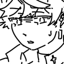
When i first read this amazing fic on ao3 “over the treshold” by @fushiglow i immediately knew i wanted to at least draw this scene and one other scene that i will do later on
I hold this fic dear to my heart now and can’t wait to read the next chapters. Fushiglow, i hope you like my interpretation of this scene.
Went for greyscale in this cause I feel it fits the vibe well.
Here is briefly what the fic is about if you are interested in modern AU slowburn satosugu fics
“larger than life K-pop idol, Satoru, approaches introverted record producer, Getō Suguru, to collaborate on his debut Japanese-language studio album. They both get more out of the experience than expected — for better and for worse.”
#jujutsu kaisen#fanart#fanartist#geto suguru#satosugu#jujutsu kaisen fanart#gojo satoru#modern au#music producer!geto#idol!gojo#writer is an amazing talent#this fic is too good to put into words#fic recs#threshold fic
160 notes
·
View notes
Text
Cultural Practice: Movie Aang’s Tattoos
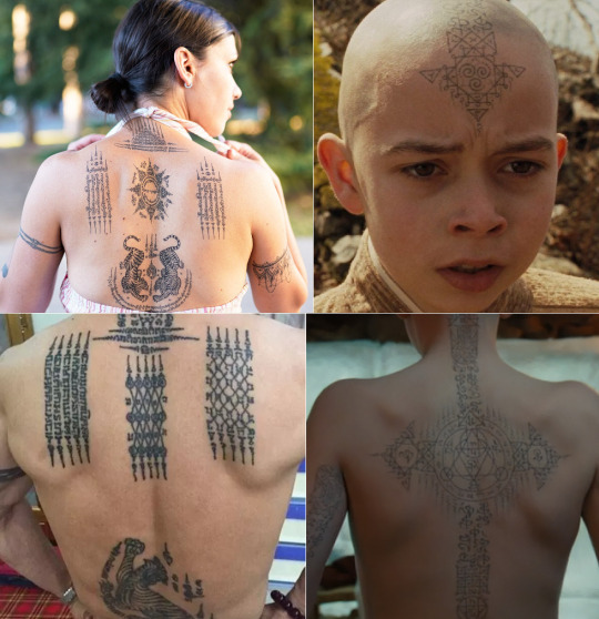
Judging by some of the fanart I’ve seen, Aang’s elaborate Air Nomad tattoos are probably the only aspect of The Last Airbender movie that was positively received by the fandom.
The design of these tattoos were inspired by yantra tattoos from Southeast Asia. Yantra (यन्त्र) are sacred geometric designs utilized in many Indian religions. In Southeast Asia, yantra designs are paired with lines of Buddhist psalms, as the markings are believed to grant protection and good fortune to the recipient. These tattoos are traditionally done by monks with metal needles.
As a design concept, I think the decision to give Aang yantra-like tattoos was a clever touch. It’s a subtle way of telling the audience that the Air Nomads are similar to Buddhist monks. However, I must say that I’m not a big fan of the back tattoo. The design at the center of it looks more like a European alchemical sigil than a yantra and the cross imagery feels very out of place. But I will admit that the overall design still looks pretty cool.
If you’re interested in learning more about Yantra tattoos, known as Sak Yant (สักยันต์) in Thai, click here. If you ever wanted to write a scene or draw a comic detailing the process and cultural beliefs behind Air Nomad tattooing, Sak Yant tradition would be a good source of inspiration.
Like what I’m doing? Tips always appreciated, never expected. ^_^
https://ko-fi.com/atlaculture
#atla#Avatar The Last Airbender#avatar#Air Nomads#cultural practices#if any talented fanartists out there are interested in re-designing Aang's arrow tats to be more yantra-like#please message or tag me with the end result#I'd love to see it!
900 notes
·
View notes
Text
Tangentially related to some of the discussion i posted earlier but quiet literally the first RW Art Month i participated I did it completely on whim like, one day before it started. And I mostly did it because I hadn't drawn a ton of rain world and wanted to draw more. Fandom presence was a lot smaller than and I was one of a handful of artists who did the entire thing. Fast forward and I still do Art Month and I've gotten to work with VC directly.
But it was quite literally something I decided to do completely on whim that set the ball rolling, and for something a lil more niche and certainly with a lot more dev/fandom art involvement than most. It's really random how and why you might get noticed more than usual, especially with the "toss it into the search and hope it pays out' mechanism of Socmed
#t.extpost#and im hardly the fanciest art month artist out there so it wasnt even about being a jaw droppingly talented artist or whatever#and while artmonth for rw is still given a huge focus its also a much much bigger thing now with a much bigger number of participants#which is cool! its awesome how many people i saw do most if not all of last art month! and VC is really good about not just repping the#most popular artists or fanciest pieces#but theres So Much More there now and while its great for finding artists its also impossible to get Everyone in there you know?#Although they absolutely try#And this is like. one of the most fanartist involved devs ive ever seen in terms of both celebrating the art their fans make and actively#bringing those fans in to contribute#and its /still/ hard to get going just because thats how Posting is#i used to be more of a hk artist which is both a huge fandom and riddled with stunning artists but theres So Many#and niche fandoms are niche so youre more likely to connect with people but less likely to see a ton of engagement regularly -#probably best example i have for that was being briefly fixated on patapon.#Its just messy to try and find the hack that sets you up#just have fun and jump around and make what you like#get a sense of feeling for your style and some people will stick around for that vs. strictly the subject matter#others will look up the thing you switched too and some wont engage#you cant really control it#so have fun and draw that thing you randomly thought about at 2 am that doesnt match your blog#draw for that forgotten rpg you liked when you were 15 or draw for the 70 player max steam game you played for this week#you never really know what will happen#but its not really worth worrying about what will happen either
35 notes
·
View notes
Text

DID SOMEBODY SAY PROJECT VOLTAGE TIER LIST...I just had to participate and make my own!!
Honestly I really like all the designs, I just feel that some of them are more well-executed than others? All the ones in the meh tier are good too they just feel too plain to me. You know me I like outfit designs with a LOT of detail and the colors/style are BORING
Also I've gotten too spoiled by fanmade Project Voltage designs that some of the canon ones pale in comparison to the fanmade ones,,
#Ground Miku is probably my favorite FAVORITE tho.#Idk why my brain just goes 'IT'S SAND PLANET MIKU' even tho they look nothing alike lol#Anyway yeah one of my favorite Pokemon artists did a Steel Miku with Bronzong that is SO SO SO FUCKING COOL#They also did a grass one with Ogerpon. And it's SO goddamn cute.#Fanartists are so talented. People who can perfectly replicate the Pokemon art style are so talented.#I'm actually VERY tempted to do a Project Voltage Miku with one of my fave mons#Piplup probably. Bc she's my trademark Pokemon.#Pokemon#Project Voltage#Shima speaks#Hatsune Miku#Vocaloid#Tier list
81 notes
·
View notes
Text
Just wanna take a moment to say that I love love love all the Cats fanart I've been seeing on my dash recently. Y'all are so awesome and your fanart is just so beautiful and lovely and just hits right.
#cats musical#cats the musical#cats 1998#jellicle cats#cats the musical fandom#indy rambles about cats fanartists#and fanart#our fandom is so talented
55 notes
·
View notes
Text
wowie I sure do love opening the magnus protocol tag and the first thing im greeted to is untagged ai art !!!! cannot wait for all the beautiful fanart on here to be replaced with soulless art made from a prompt!!!
#the magnus protocol#ai art /neg#but really though there are so many talented fanartists on here and it sucks so goddamn bad that they are being over shadowed by blatant ai
11 notes
·
View notes
Text
Art 😉
More like this
9 notes
·
View notes
Text
The fact that young people ACTUALLY still get jobs in places like the animation or film industry is astounding to me. I cannot imagine how a young person can get a job like that any other way aside from sheer luck.
12 notes
·
View notes
Text
having recently hurled myself headfirst into the Sandman/Dreamling side of tumblr, so far my favorite thing is when someone drops an amazing new fanart and I immediately see it sixteen times in a row because all my new fandom follows also all follow each other and the whole lot of us share about three braincells and one singular attention span
#in related news I am absolutely in awe of the Sandman fanartists out there#y’all are seriously so talented and you are doing god’s work#the sandman#dreamling#I can’t believe it’s 2022 and I am having this much fun in online fandom on tumblr dot com
153 notes
·
View notes
Text
THIS IS A SUBJECTIVE OPINION, MY SUBJECTIVE OPINION AS AN ARTIST AND CHARACTER DESIGNER. IT IS FINE IF WE DO NOT AGREE.
Ok you can continue
I'm sorry I need to be a hater for a second though it goes against my nature but hh has some of the absolute worst character and scenery design I have ever seen in my entire life and you have been tricked into thinking it is cool because it uses bright colours and bombastic shapes to cover the fact it's actually boring.
It's not bland, but it is boring.
Every single screenshot or gif I have seen makes me go crosseye'd, the characters blur into the background because there is no fucking proper saturation difference. I thought the new white and red cheeked character was literally just the first character but with a haircut and style change. Every single character has a copy-pasted shape there is no actual variation in body type or face shape outside of superficial changes. You have Triangle or Triangle with Tits.
You would have to tie me down clockwork orange style to get me to actually watch it. Maybe the story is good and the characters are cool or whatever! I don't know! I haven't watched it and you can't make me!
The characters apparently have aesthetics and theming but I honestly couldn't tell you what it was because there is so much going on in the designs that it's impossible to tell. One of the first rules of character design is that you should be able to get a feel for a character from the silhouette alone! But you can't do that here because their silhouette's are all so similar! The shape language for everyone is the fucking same! It's infuriating!!
I understand stylisation and personal choice but if you cannot draw diverse designs because it doesn't fit "your style" it is your failing as an artist and you are putting a limitation on yourself, it's like shooting your own foot!
I honestly think V would benefit from going back to basics and re-learning figure drawing and colour theory but from everything I've heard she can't handle any form of constructive criticism, which is once again like shooting yourself in the foot. Artists need to be able to take criticism and advice from other artists in order to grow, an artist that believes themselves above criticism is incapable of growth and will stagnate.
If you are an artist and have gotten this far I am begging you, remember to practice your silhouettes and don't blow off colour theory. Please... please learn about values [colour edition] if you don't your art will become a muddy messy and unless that is what you're going for you really don't want it to be like that
THIS IS MY SUBJECTIVE OPINION AS A TRAINED ARTIST, I HAVE A DEGREE, I AM ALLOWED TO CRITICIZE OTHER ARTISTS IT IS WHAT ARTISTS DO. BY PUBLISHING HER WORK V HAS PUT HERSELF IN THE PUBLIC FORUM AND THEREFORE IT IS SOCIALLY ACCEPTABLE FOR ME TO EXPRESS MY OPINION. IF YOU DISAGREE THAT IS FINE, BUT THIS IS NOT AN INVITATION FOR DEBATE.
#bird chatter#long post#i ain't tagging shit i already summoned enough snakes just writing this#Some of the fanartists for it are really good though like extremely talented#which is part of what boggles my mind because some of them are fucking better than the creator#hell MOST of them in my subjective opinion
14 notes
·
View notes
Text
Bird App recap of the day:
HAPPY BIRTHDAY KRISTINA EDITION 💖

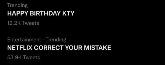
we had SEVERAL phrases trending, I think five in total but I only managed to catch four. At its peak ‘HAPPY BDAY KTY’ was trending at no.3 world wide 🌍


Warrior Nun was written about in TIME (top) and GQ (bottom quote) as well as in several other publications

And Tristán Ulloa tweeted this at Kristina
and BONUS:
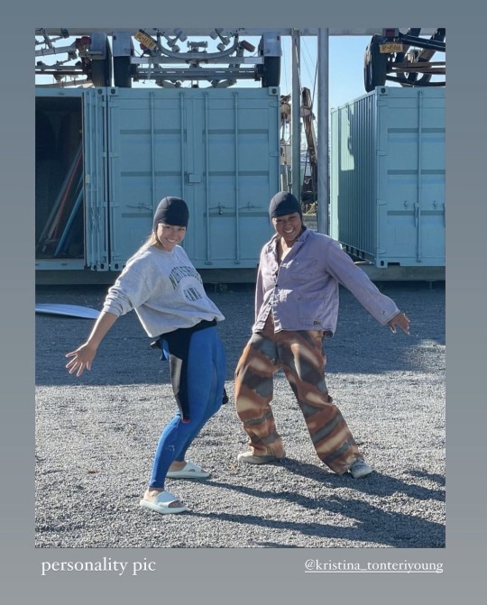

all shared by KTY today ✨
#anyway i should go to sleep#but i wanted these to exist somewhere#for posterity or whatever#sending Kristina all the best birthday vibes#she was apparently still answering cameos today ON HER BIRTHDAY#anyway i’m wishing her all the happiness and also some relaxation bc girl is working non-stop#also!!!! looking forward to the Simon interview this Sunday#also also looking forward to Tristán’s interview for the OCS newsletter#esp bc one of the editors of it noticed that i had thanked him on one of my posts and asked if i had any questions for him#that was pretty cool#i get like mini-starstruck on the daily now when my fav fanartists and fanfic authors like my comments or interact w me#i say this a lot but: the talent here is INSANE#Warrior Nun#Save Warrior Nun#Kristina Tonteri-Young#KTY#Avatrice
89 notes
·
View notes
Text
Well, if it isn’t the consequences-
(a bunch of MLP fanart and text-posts appearing on my dash)
of my actions-
(me liking a bunch of the ‘the bride and the ugly ass groom’ posts even though I’ve never scene the show)
#it’s like a part of my dash’s ecosystem now#MLP fanartists are really talented though#the bride and the ugly ass groom
4 notes
·
View notes
Text
every time i see art of taylor and her "phases" throughout worm all side by side together i always get emotional. like idk i hope im not alone in this but seeing her transition throughout the story always gets to me
11 notes
·
View notes
Text
something so special to me about anime boyifiying common white woman straight ya romfan characters. get babygirlified you fucking loser

#yeah this is about a series ive never read before and have watched several video essays on#what about it. i will never willingly read a piece by a cishet white woman about cishet white people sorry#however i do find pleasure in woobifying them#tamlin#tamlin fanart#pro tamlin#acotar fanart#i think these are the right tags im not sure#theres a lotta discourse for a series so plain so . idk man crossing my fingers and hoping not to get harrassed ig#also. i think fanartists in this fandom WHILE TALENTED are boring. PLEASE youre drawing pointy eared humans whats the POINT of this being#a romfan story if there are no otherworldly traits??????? good lord go watch some dnd sessions or something#🌗 art tag
29 notes
·
View notes
Text
i have like 50 reblogs queued god i missed the art this fandom made sm
7 notes
·
View notes
Text
I didn't think a green finnish man would be what will make me regret dropping drawing in hs, but alas here we are
#rio rambles#the urge to draw is there but the ability very much isn't there anymore lmao#I love how much talented fanartists this fandom has tho#y'all are so good
6 notes
·
View notes
Last Seen Blogs
artisticsoul13
Artistic Soul
puppys-tiny-space
tny preschool kid
yunnshui
残月
proud-lathyrus
Ain't That A Bitch?
theramblingonesie
The Rambling Onesie