#girl i feel like a cloud
Text
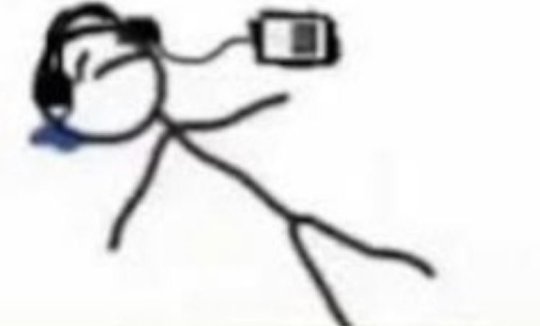
ngl guys i am absolutely out of it rn
#i’ve been sick!!!! for a week!!!! and it’s getting to me!!!!!!!#like the sick brain fog + all the fucking medicine i’m taking#girl i feel like a cloud#and yet i’m still at work!!!!#im wearing a mask tho i’m not an animal#but i don’t wanna be here but capitalism is a bitch and i’m not doing my job properly <33#i keep dropping shit
8 notes
·
View notes
Text
that fuzzy/floaty feeling i get when i regress >>>>>>
#i dont feel it every time i wanna regress but its like sinking into a warm cloud when i do#when i first started regressing i felt it really intensely and i swear that feeling gets addicting#sfw age regression#sfw agere#sfw agere blog#age regression#sfw age dreamer#sfw little blog#agere girl#sfw baby regression#sfw babyre#sfw babyspace#sfw toddler regression#sfw toddlerre
471 notes
·
View notes
Text
Sephiroth and Genesis were the original toxic yaoi
Dyne and Barret were the original doomed yaoi
#ff7#final fantasy 7#ffvii#final fantasy vii#ff7 og#crisis core#dyne ff7#barret wallace#sephiroth#sephiroth crescent#genesis rhapsodos#i said what i said#the girls who get it get it#though i feel like y'all aren't ready for this truth#orginal as in timeline#if we're talking about the order the games came out#sephiroth and cloud are the ogs
27 notes
·
View notes
Note
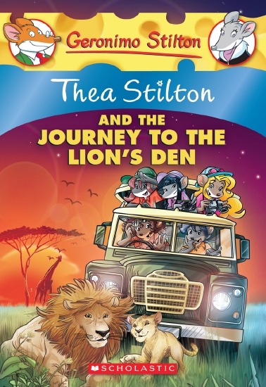
The art style of Cloud Castle is absolute ass bro why are their eyes so big
Idk man it just looks.... off
I wish they brought back the og art style like Blue Scarab Hunt because that was gorgeous
Well if you’re referring to the book's artstyle as a whole, then calm down buddy the illustrations as a whole are pretty good all things considered (believe me some of the illustrations in the later books are waaaaayyyyy iffier)
But if you are referring to Danilo Barozzi’s illustrations in the book then uhhhhh… yeah I don’t blame you, I didn’t like the big anime irises either, she didn’t cook with this one,,,
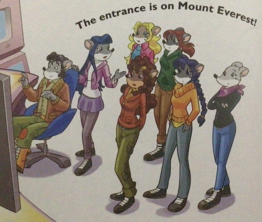
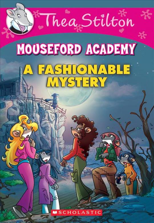
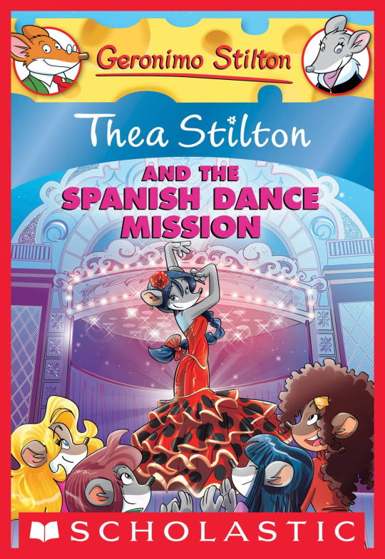
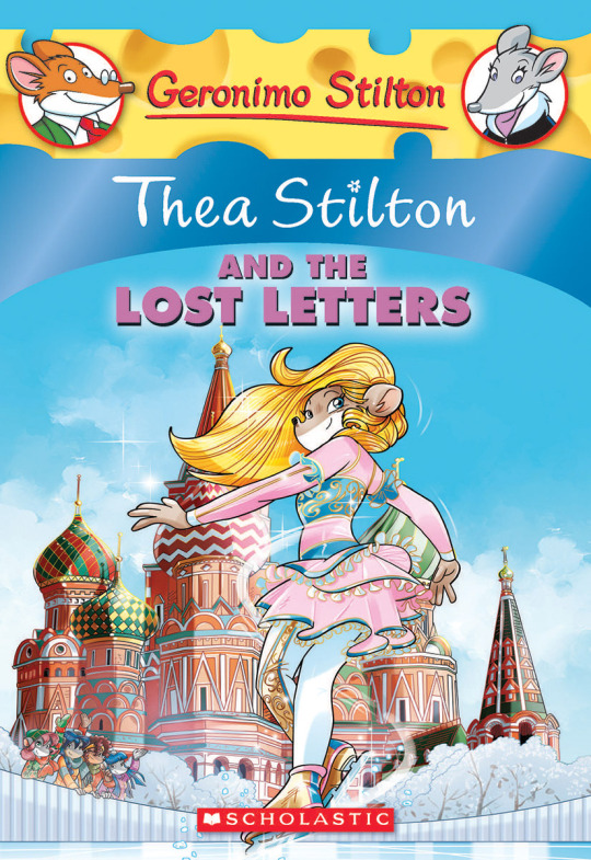
The interesting thing is Barozzi also did pieces for Secret of the Snow and those looked fine (she did well enough that I have to squint to determine which ones were done by her). My guess is either she did a lot of the illustrations for the latter half of SotS and we just got used to it, or it’s because the artstyle of special editions 2 and 3 were more… experimental? Books 4 onwards developed a very specific… look for the artstyle that adhered very closely to the main book illustrations of Spanish Dance Mission onwards, thus the illustrators had to follow suit, resulting in whatever looks off to look especially off.
(Even with this set of pictures, I’m only about 70% sure these are Barozzi’s because of how alike yet different the styles are from each other in the book. The first one could be Barozzi’s, but it could also be Giuseppe Facciotto’s, since he also did illustrations for SotS and his stylization means he sometimes puts the eyes really close to each other in a way that’s weird but still makes sense somehow.)
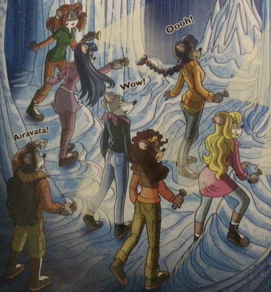
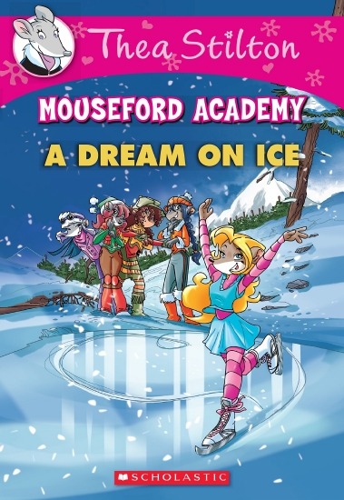
On the contrary, books 2 and 3 (and I would probably even include book 1 there) had a more experimental look to the illustrations, which seems to be based more on (and this is just a theory of mine) Giuseppe Facciotto’s iconic work for the covers of Mouseford Academy books 2-12, 14, 15 and 17 in the English books (he did waaayyy more covers for the Italian Mouseford books— he was basically the cover guy for the Mouseford books for a WHILE) as well as the books from Spanish Dance Mission to Lost Letters. If you’re wondering why those covers go as hard as they do, then now you know why.
(These aren’t all of Facciotto’s works for the covers we know in English but you can see that he popped off <3)
But yeah as you can see with special editions 2 and 3, the art direction seems to be heavily inspired by Facciotto’s artstyle.
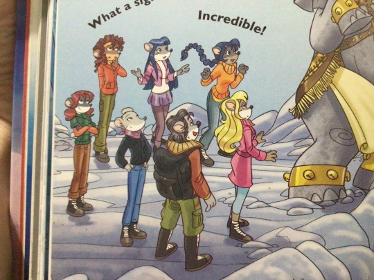
However, when Barbara Pellizzari’s works became the aesthetic poster child of the books’ brand, that was reflected in the illustrations and how their aesthetic changed, as seen in the main books and how they look currently, special editions 4-9, and the Treasure Seekers trilogy.
This new profile thing of the girls? This was done by Pellizzari (coloring was done by Flavio Ferron), and thus it became the main reference for how the girls look in the book’s illustrations.
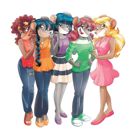
And it’s not just in the general direction to the artists for how to draw the Thea Sisters, but also in the direction given to the colorists. Alessandro Muscillo was the colorist for the special edition books since book 1 and the Treasure Seekers trilogy, and you can see that the direction for the style varied through books 1-3, like maybe direction was experimenting with the mood the illustrations were to convey, beginning with the cartoony and bright colors of book 1, easing into the more grounded and layered palettes of books 2 and 3
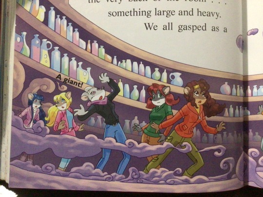
Then book 4 was when they transitioned to using digital art /j
I jest, but seriously book 4 was the debut of the coloring style we end up keeping for the rest of the special editions and for all of Treasure Seekers, which is very… bright :D
(I would show more picture examples but I manually took pictures of my physical copies for the Cloud Castle and SotS illustrations and gwuh I’m too lazy to grab my entire collection just to take pictures,,)
Bright as in like… the colors are very defined and saturated. I dunno how to describe it, but when you see it, you get what I mean. It’s very bright and pretty and colorful and it stands out. There are still variations that happen on occasion (Star Fairies in particular uses a good dose of airbrush for the lighting and shadow effects, and Crystal Fairies looks like someone had a bit of fun using sparkle brushes), but other than that, it’s very bright. I don’t hate it, but I do acknowledge that yeah, if I was introduced to the series when it had fully transitioned to the new style, I never would’ve gotten into the series in the first place, because the older books had something that didn’t make it feel specifically catered to girls. The colors were bright, but not too bright. Colorful, but unified. They weren’t that complicated, and they didn’t have to be because the colorists (plural, there were at least 3 per book once upon a time) were popping the hell off with the colors they were given. But y’know, the newer books’ consistent style did give me a good spot to practice drawing mouse furries so I’m not complaining too much about the newer style, haha.
(Tiny baby E’s (it’s literally from 2020 what’re you on about mate) her first mouse Violet drawing using Barbara Pellizzari’s artstyle in Treasure Seekers 1 as an anatomy guide!!)
With that said tho, yeah I miss the old books -m- dunno if it’d fit the aesthetic of the special editions but m a n we could’ve had it and it probably would’ve looked cool
Also the illustrations go way harder in the older books, like Prince's Emerald? I've talked about Prince's Emerald and how it goes hard before, and I still stand by it and say that it does in fact still go hard
Maybe it won't fit the uh splash of color they gave the hardcovers, but imagine they grabbed Giulia Basile's coloring work for the graphic novels and used that as sort've a basis for the coloring style of the hardcovers. Not exactly the same-- would probably still add a touch of whimsical watercolor and/or paint to the very cel-shaded style, but we could've had something pretty dope -m-
Anyway that's my ramble simultaneously defending the hardcovers' artstyle and reminiscing on what could've been haha
#geronimo stilton#thea stilton#thea sisters#questions with e#rambles#the style of the older books is gorgeous but the main thing I'm wondering is can it pull off fantastical whimsy#that's the main thing i dunno if it can do (i would love to be proven wrong tho)#the style is so grounded that i'm wondering if it can pull off what the hardcovers needed it to do#which is convey the otherworldly fantastical thrill of exploring the fantasy worlds (which uh the newer books were able to do but#my main gripe is that fantasy and reality are near indistinguishable in vibes coloring-wise#sure there are sparkles and stuff is more saturated but the girls' dorm in book 4 still has the same-ish feel of the land of clouds#i dunno what it is. the bright colors just feel mundane somehow and don't take a shift when returning to reality)#looked at my books again and i think it might be the fact that the later books have no grounding color?#compare book 3 to book 5 and you'll see it the most distinctly methinks#the newer coloring style doesn't have a color that grounds the illustrations' palettes and thus everything's always bright 100% of the time#the girls' colors are always at their most saturated#like they're always under broad daylight in terms of lighting#it's not eyebleeding or anything but they don't look affected by the lighting in the setting they're currently in#and the result is it looks.... meh?#we get so used to the bright colors that they end up looking meh somehow#i'm not an art expert by any means this is just my observations as someone with a little too much brainrot
35 notes
·
View notes
Text
cloud main quest: wow! after a full day at this wacky amusement park full of dance-offs, low poly fighting sims, and silly spooky haunted hotel, i’m ready to take a quick nap so i can enjoy a nice evening off in the funnest place on the planet and maybe even go on a little date with someone special
zack subplot:

#ffvii rebirth#ffvii rebirth spoilers#final fantasy vii#the way you hear zack’s voice as cloud is falling asleep and it transitions into the darkest timeline where like everyone is dead and dying#third(?) zack scene i think it was#Super bleak interlude for the gold saucer#also i know barret’s backstory was different in the original#he was much more at fault for the things that happened than he was in this version#didn’t like those changes#the end of that quest line when barret is sobbing did get me though#REALLY enjoyed gongaga even if the shoehorned line from the original where cloud calls zack a loser felt like it didn’t fit anymore#cloud isn’t the best with feelings but he’s not the kind of person who calls your dead boyfriend a loser for not writing you because he was.#dead.#cissnei girl you could have cleared things up for everyone if you just opened your mouth
30 notes
·
View notes
Text
girls being nice to me gets me higher than ecstasy ever could
#SORRY for the corny post but this is how i truly feel not waxing poetic here like literally it does#i just met the cool girl i keep talking about & IT WAS SÅ FREAKEING ÅSUM ^_^_^_^_^_^ YAY#HAPPY HAPPY JOY JOY HAPPY HAPPY JOY#OK sorry for screaming But i really am very excited...#turns out she is autistic & we discussed our neuroses while eating & ugh she is just as cool as i thought she was#always tell people you think have Swag that you noticed it on them see how it worked for me#i was so scared of spilling my spaghettis but turns out that was exactly what i needed to do to be friends ^_^ YAY#we went to a lot of different libraries together & i got a small old eyeless bunny plush from the event we went to caus i felt bad for it#i even showed her my pony art & i told her about my cringe interest (that music event i like...♯RealOnesKnow )#& she thought it was COOL.& i felt like it was really genuine & she talked about reading BL LOL we discussed fujos together#we even talked about finding moids ugly#it was so awesome she was so cool & Nice To Me... i feel like i am on CUMULONIMBUS ( cloud 9 ) ^_^_^_^_^_^#talking to her in person was so much better than online OMG now i wish i really was friends with you muties IRL#i wish you a Girl Friend experience just like this to those who post about wanting them i really do#also the reason why i even like my Music Event so much is because the first time i watched it was with a bunch of women#& i had so much fun & they were so nice to me i keep returning & now that Event means so much to me & I LOVE IT sorry (NOT)#i know this sounds like tumblrina fiction i would not believe it either IDK what to say to make it sound legitimate 0_0 like it is so crazy#to me as well IDK i can barely get over it & IDK if i really want to so um well YAY ^_^ AIMU SO HEPI :DDD
25 notes
·
View notes
Text
oh I love how Baby Cosette's song from the french musical is faithful to the Brick moment where she longs for the doll in the shop window!
The song is called 'La poupée dans la vitrine'. Here are the lyrics:

And here's my own quick and literal translation:
It's a doll in the window
Who's looking at me and growing bored
I think she's looking for a mother
And I'd like her to be my daughter.
In a house full of toys
Where little girls my age
Sew clothing for their dolls
And never do the cleaning.
I will dress her up in lace,
She'll have skirts of silk.
I would like my daughter to be the most beautiful
And for her to be proud
For her to be very proud of me.
It's a doll in the window
I'm looking at her and she's calling me
If only I knew how to write
I would ask Father Christmas for her.
#she just wants something to love 😭#castle on a cloud is about daydreaming an escape and wishing to feel safe which obviously is still extremely valid#but in the book cosette wants something to cling to so bad. she finds like a spare rag or something and pretends its a doll#bc she wants one so bad#and there's this stunning doll in the store window that she's just enraptured by#and i love that this song captures that#i think it says a lot about her that this little girl who is so mistreated and unloved not only wishes she could be loved#but she also desperately wants TO love#and the lyrics where she wishes the doll could be proud of her. i just.#💔#cosette#les mis#les mis musical#les mis adaptations#les miserables#les misérables#the brick#analysis#les mis français#sylvie's own nonsense
31 notes
·
View notes
Text
im so scared this spiritual medium dm'ed me on insta n said she wants to tell me smth about me ♡ i said sure n she said that there is a lot of negative energy surrounding me n that i should protect myself :(
#she was so specific too :(#m so scared cause i've been feelin like there's a dark cloud over our home lately!! ☁️#smth just feels so uncomfy n unsettling lately idk what ♡😭💕#i hope this passes soon n everything goes back to normal again ♡🌷#liana's diary ♡#girlblogging#girlblogger#coquette girl#just girly posts#just girly things#girlhood#girly#girly girl#girly stuff#psychic#psychic readings#coquette dollete#pink coquette#coqeutte#coqette#coquette#dolletecore#dollette#dollete aesthetic#dollcore#dollete style#princesscore#pink pilates princess#pink pilates girl#pink pilates aesthetic
10 notes
·
View notes
Text
jing yuan working with blade and kafka to unlock dan hengs memories and his true form.... dan heng stressing that hes not his previous incarnation, that hes a different person.... jing yuan telling him that the only way he can just forget about the past and the crime he committed as dan feng is by helping him right now.... them working together... jing yuan saying they still work well together.... dan heng seeming uncomfortable by it......
#girl im not okay#there is so much history. he is a different person.#but he looks the same.#how do u move on.#especially jing yuan. he seems to be the only one out of the quintet who stayed on xianzhou#he stayed witht he cloud knights. he became the general.#blade is actively hunting down his past. dan heng is trying to outrun his past bc he wants to look toward the future#jing yuan...... seems stagnant in comparison#and what about the other two?? jingliu and baiheng??#baiheng seems to have joined the nameless at some point. jingliu was exiled. goddddd#i feel like sitting at the bottom of the ocean. just. sit on the ocean bed. just sit there.
29 notes
·
View notes
Text
The tat would’ve looked great without the rising sun design in the background. People really need to start doing research on things before they get them marked onto their bodies for life… but even the woman in the qrt had mentioned that a client had reached out to her inquiring about getting the symbol tattooed onto her and that she didn’t really care about the history behind it. She just wanted it anyway (probably for aesthetics.)
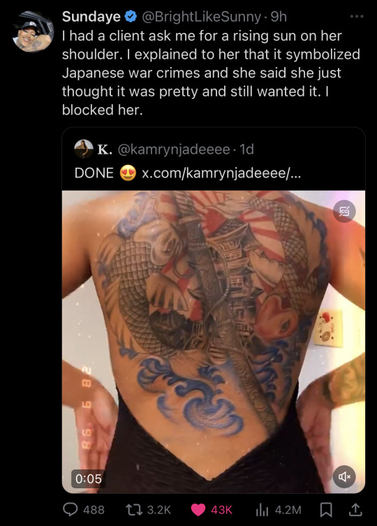
#the girl could’ve asked for some clouds or something to fill up the space in the background#maybe trees? idk#anything but this#rambling#I think you ought to have enough integrity as an artist to be able to turn people#away#you might not be able to change their minds but oh well that’s not your job#would you feel comfortable tattooing a#swastika or a confederate flag on someone for the money???#I get that the original meaning behind the swastika#wasn’t anything bad but you can usually tell why a certain kind of person walking into your shop would want that on their bodies too if#I’m being real 🗿 like
8 notes
·
View notes
Text
I'm up to Corel Prison part of Final Fantasy VII Rebirth which means I've lost Barret from my party temporarily (and if you have played through you will probably know what has triggered these thoughts)
But oh boy am I becoming more painfully aware by the moment that the rest of the party currently is three (petite) girls, a (constantly-confused looking) twink, and two cats.
Barret please hurry up and come back! Also Cid please show up soon! And Vincent! We need the non Easy Target looking party members.
#Final Fantasy#Final Fantasy VII#FFVII#Final Fantasy VII Rebirth#Ramblings of the goddess#Like I had a moment in Corel proper#where the camera panned to the party minus Barret#where I think forced perspetive had Cloud shorter than the girls#that made me start to realise#but Corel Prison cemented it#Maybe if people stopped calling Cloud Pretty Boy#it would help me not feel this way so much#aerith gainsborough#tifa lockhart#yuffie kisaragi#Cloud Strife
17 notes
·
View notes
Text
Lately I've been thinking about how tik tok has some odd views on friendship. Lots of people complain about not wanting to burden themselves with anyone else's problems and whatnot (in relation to friends sharing their issues, and asking for help and/or support) and like I get it to an extent sure, but it feels so individualistic, egotistical, self centered even.
To me it's like wanting all the fun of having a friend but without the responsibility of caring for them and their well being in any way other than superficially. Like, the moment someone wants to get real for a minute, needs help and is not all fun and games anymore they're suddenly being disrespectful, they're not caring for your peace and are instantly a bad friend like ?????????????
#and I'm ofc aware most ppls don't think this way and that a lot of this discourse comes from a place of hurt and projection yes#but it doesn't make it any less jarring to me#saw a girl get mad at her friend bc friend was talking about dealing with body image issues#girl said friend was low key shading her and basically saying girl should feel bad and inadequate#???????????????#the mental gimnastics my guy#im having an old man yells at cloud moment i feel like lol#non sims#dl#ramble
8 notes
·
View notes
Text
love how right after having beau, brandi and skip got pregnant got AGAIN and he straight up died right after 🙄 hes so fake for that
#chat#brandi i could treat u betterrrrrrrrrrrrrrrrr#IK SIMS TIME IS FASTER BUT ITS SO.#THEY NEED TO STOP FUCKIN OR WRAP IT UP FR.#well i mean. not now. bc hes not around BUT.#i think brandi loves her children sooo much but if she could go back she wouldnt have kids so early.#i think shes one of those girls whos always wanted to have a family/baby since she was young and getting pregnant at such a young age +#with a person she really liked clouded her mind to the reality of her situation until it was too late 😭#i also think her being an only child really added to wanting to have a baby bc even tho i feel she was popular in school and had a lot of#friends at one point i think shes one of those ppl that really wanted to have a sister lmao#skippy#brandi boo
20 notes
·
View notes
Text
me sobbing as i stick yet another plot item for eyrie to keep in the inventory constantly
#it a nymeian Lily since I did some side quest stuff#but that brings the count up to like. six items?#the lucent flowers + somh al blooms#the final ShB trial EX item + the larimar#the mashable worms + the nymeian lily#okay okay! the lucent flowers are the closest we have to elpis flowers and they’re from the EW beast tribe quests#and the somh al blooms make me cry too bc of the EW beast tribe#the quote w the EX item makes me cry so that has to stay#otherwise I would Feel So Bad#the larimar is from an Ishgard sidequest w this homeless pick pocket girl who freezes to death#and you’re asked to take her belongings to the sea of clouds to have a better resting place#the larimar was given to them after as a piece saved before thieves could ransack her body#thus eyrie keeps it with them to remember the child by#Mashable worms are more funny ooc bc they are worms made just to be mashed into food#and having a pocket with three worms inside of it is amusing to me#the nymian lilies were after the EW alliance raids#I also have funny orbs in eyrie’s inventory from a side quest that got axed after eureka orthos#it was an optional quest you could do for relic stuff iirc#It got shafted but I think I got extra dialogue when talked to the eureka orthos npc bc I did that weird quest once#it have an orb from labyrinth of the#*labyrinth of the ancients and syrcus tower#THE ORBS WERE USED TO GET AETHER OIL FOR ANIMA WEAPONS#I got desperate once for aether oil sjsjdjd#did the quest once and then. gave up bc it wasn’t worth it#I did pick it up once more and got partway through#and just left it once patch 6.3 came out#and now I’m never giving up the quest sjsjdjd#YOU CANNOT TAKE ME PEARLS FROM ME SQUARE#owen plays ffxiv
9 notes
·
View notes
Text
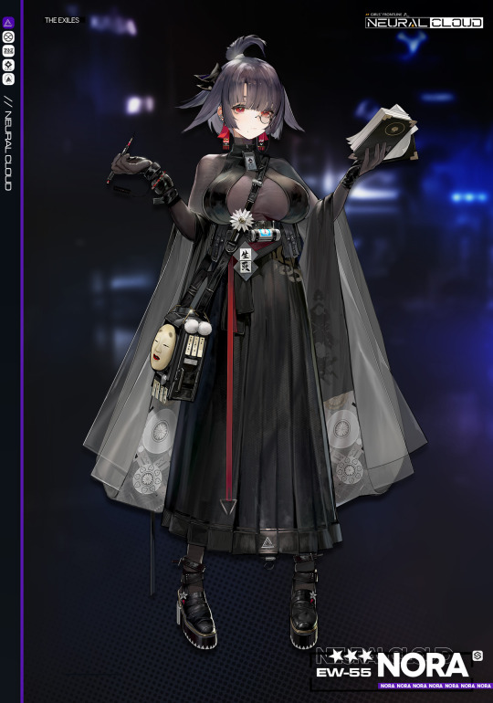


[Doll Archive] //:_Nora
VOICE I Mai Fuchigami
CAREERI Playwright
The EW-55 is a writer Doll by Cyber Media, primarily intended for
narrative design and scriptwriting. In order to address isues with Doll-produced prose, such as dullness and a lack of congruency, the EW-55 is specially equipped with an information procesing system possessing a degree of randomness, allowing the EW-55 a chance to generate new ideas from any received information, thus simulating the process of "inspiration" experienced by human writers.
As a Doll screenwriter, Nora's works spanned the fields of film, television, literature, games and many others. In order to give her the chance to collect more material for future work. Nora's studio decided to enter her into Project Neural Cloud.
"I'm Nora, though that's a pen name. Idle chatter aside, I'd like a quiet environment... My deadline is approaching and I haven't written a thing yet."
#I feel like there's commentary on chatgpt somewhere in here...#but I don't feel like going off in the tags on a non-personal blog#Nora#neural cloud#project neural cloud#pnc#girls' frontline#gfl#anime games#gacha games#mobile games#roguelikes
17 notes
·
View notes
Text
'i want strong female characters!' play touhou
'i want masculine female characters!' play touhou
'i want trans female characters!' play touhou
'i want well written female characters!' play touhou
#thats a post i made!#sorry if this sounds harsh but like. genuinely your problems would be fixed if you played touhou#for those uninformed touhou's cast is almost entirely women/girls.#there's like 2 guys in the games one being a turtle and the other is a sentient cloud.#there's also genderless characters in the first games.#and yes some of the girls are trans. but trans or not all are amazing characters#with great designs music and concepts.#you can find the games on steam to be bought but also. elsewhere thats all i can say#and yes as you can guess: since all the characters are female the lesbian possibilities are endless.#only one has clearly romantic feelings for another girl but a good bunch can easily be seen as being together#just play touhou if you want to find more good female characters. youll def find ones you like
7 notes
·
View notes
Last Seen Blogs

comunadia
Ergonaut

min-yoongi-yah-blog
On Hiatus

wedgie429
All Things Wedgie

bluegreenwallpaperr
yearning

vogliosemplicementeandarmen-blog
Lasciatemi. Voglio morire