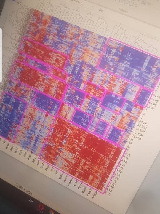
#heatmap
Text


#heat map#heatmap#heatmaps#manicure#nail blog#nails#mani#xxl nails#cute nails#nail pics#pretty nails#long nails#beauty#nail faves#@hollywiththegoodnails
57 notes
·
View notes
Text

#weirdcore#oddcore#dreamcore#unreality#dereality#liminal spaces#liminal space#liminal#liminal aesthetic#fake liminal#nostalgia#nostalgic#nostalgiacore#heatmap#2001:outside#2001:day#2001:nature#2001:grass#2001:sky#2001:road#2001:unintentional_wc
47 notes
·
View notes
Text


5 notes
·
View notes
Text
June 8-heatwave (az előző. Gif verzió, az mp4 glitchel, persze már alapból glitchy, na ok)
#June8#heatwave#heatmap#artists on tumblr#ivo3d#gif#media artist#loop#visual#techno#ivo3d.com#glitch art#glitch#madewithnotch#realtime
7 notes
·
View notes
Text


Stone Island SS17 Ice-Knit Jumper |
Double knit sweater constructed with a top layer of "exclusive thermo-sensitive yarn that drastically changes color when exposed to cold," and a pure wool inner.
#stone island#stone island thermal knit#stone island heat knit#heat sweater#heatmap#thermo sensitive#future fashion#concretesuits#stone island ss17#stoneisland#massimo osti
20 notes
·
View notes
Text
A map of abortion access in a post-Roe America.

32 notes
·
View notes
Text
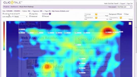
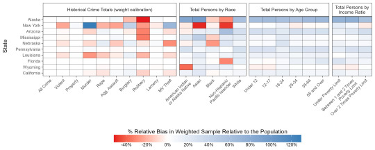
Leveraging Heatmaps for Strategic Website Optimization
The strategic use of “heatmaps” has become integral to website optimization, propelling your digital strategy toward ultimate success. As part of a multifaceted toolkit alongside Google Analytics, A/B testing, and conversion funnel analysis, heatmaps provide insightful data on user interaction patterns, guiding you in creating a user-centric website design and experience.
Heatmaps serve as a visualization mechanism, translating complex data into easily understandable representations. They help discern where visitors’ attention gravitates when landing on your site and determine the probability of clicks on various webpage areas. Such insights become pivotal when deciding the strategic positioning of crucial links and the elements requiring linking on your site.
A specific category of a heatmap, known as the “mouse movement” heatmap, mirrors the path traced by a visitor’s mouse across your webpage. This type of heatmap holds special significance for internet marketers, offering a data-backed approach to pinpointing optimal placement for promotional information and advertisements. It should be noted, however, that quality often comes at a price in the realm of heatmap tools. Free offerings often fail to deliver the detailed insights you need, making premium, paid tools a wise investment.
I personally recommend Crazy Egg or Contentsquare for comprehensive heatmap reports. Despite being a paid tools, both offer a well-balanced blend of affordability and quality, making them a reliable choice for businesses and individual users.
Utilizing heatmaps isn’t merely a passing trend; it’s essential to strategic decision-making in content creation and website design. A heatmap is a diagnostic tool unveiling a wealth of insights into how visitors navigate your web pages. These insights can significantly enhance your website’s engagement, steering the user journey down the conversion funnel more efficiently. Example below.

A deeper dive into the heatmap territory introduces another valuable tool called ‘scroll mapping’. Scroll maps are an extension of heatmaps that offer insightful details about how far down users are scrolling on your web pages. This is crucial to understand, as it highlights the ‘fold’ – the point at which users must start scrolling to see more. Data from scroll maps can reveal whether crucial content or calls to action are being missed because they’re placed too far down the page. In fact, the ‘hottest’ areas of a scroll map often signify the most engaging or attention-grabbing parts of your page. Incorporating scroll map data into your design strategy can enhance your content positioning and overall website usability, ultimately improving engagement and conversion rates. Tools like Crazy Egg or Contentsquare offer robust scroll mapping features, further enriching your understanding of user behavior and website interaction.
Understanding your visitors’ behavior is key to successful website optimization. Heatmaps are the compass guiding you toward informed, user-centric design decisions. So, don’t underestimate the power of a well-analyzed heatmap; it could be the linchpin in your website’s success story.
5 notes
·
View notes
Text
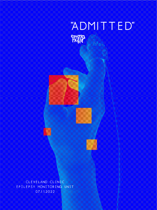
Admitted, by Emma Hulet
#emmahulet#admitted#admit card#hospital#epilepsy#digital art#graphicdesign#graphic art#original photography blog#heatmap#posterdesign#poster
13 notes
·
View notes
Text
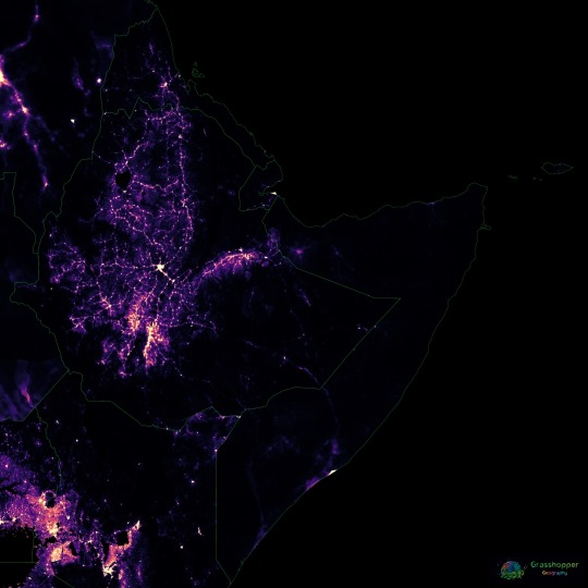
Population density heatmap of the Horn of Africa
Read more and buy prints here.
Ko-fi | RedBubble | Etsy (digital prints)
#Africa#Horn of Africa#HoA#Ethiopia#Somalia#Kenya#Eritrea#Djibouti#constellations#map#population#population map#heatmap#geography#cartography#Maps Reimagined
1 note
·
View note
Text
5 Amazing Ways to Use Heat maps Software
Advertisers can now quantify almost anything, giving us a remarkable capacity and access to various methods of measuring and improving the performance of your marketing efforts. However, we can become overly focused on metrics that look great on paper but don’t provide as much information as we believe, such as page clicks and page views. A high percentage of website traffic can demonstrate the quality of your headline or product description, but it does not reveal the entire story of how your website visitors navigate your website or how precisely they interact with the page.
Fortunately, a data visualization tool can show you which areas of your website generate the most engagement and which do not. They’re called heat maps, and they can provide you with the information and knowledge you need to optimize your website copy, user experience, and conversion rate optimization in order to maximize your revenue. This article will provide an overview of various types of heat-maps as well as for instructions on how to create and analyze them. You will also learn about 5 amazing ways to use heat-maps to improve every aspect of your customer journey in an interesting and proactive manner.

What is a heat map?
A heat map, also known as a heatmap, is a powerful data visualization technique that displays the intensity of a specific subject as colour in two dimensions. The difference in colour can be shown by hue or intensity, giving the observer clear visual cues on how the subject in question is clustered or how it changes over time. In reality, heat maps are classified into two types: cluster heat maps and spatial heat maps. A cluster heat map displays magnitudes in a matrix with fixed cell size and rows and columns representing discrete phenomena and categories. Furthermore, the sorting of rows and columns is deliberate and somewhat arbitrary in order to suggest clusters or depict them as discovered through statistical analysis. The actual cell size is arbitrary but large enough to be visible.
A short history of heat maps
Heat maps first appeared in two-dimensional displays of data matrix values. Small dark grey, often black, squares represented larger values, while lighter squares represented smaller values. In 1973, Robert Ling proposed connecting cluster trees to the rows and columns of a data matrix. When he used overstruck printer characters to represent various shades of grey, he used one character width per pixel. In 1994, Leland Wilkinson created the first computer program (SYSTAT) to generate cluster heat maps with high-resolution colour graphics. Cormac Kinney, a software designer, trademarked the term “heat map” in 1991 to describe a 2D display depicting financial market data. The company that acquired Kinney’s invention in 2003 unintentionally allowed the trademark to lapse. Today, the term heat map is used for various different types and methods of data visualization but the one that we will put our focus on is website heatmaps and the heatmap software that is used to create them.
2 notes
·
View notes
Text
Audio track: Fso-002-2022-04-maks-neuracid
#fso#Neuracid#snippet#ivo3d#artists on tumblr#media artist#visual#techno#ivo3d.com#heatmap#realtime#videoart#glitch video#glitch art#glitch
3 notes
·
View notes
Link
Plerdy Website Heatmap Review
0 notes
Link
0 notes
Text
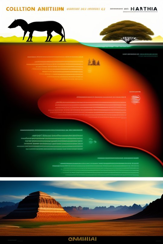
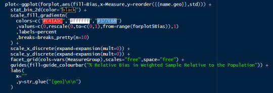
Elevate your Data Visualization Skills with ChatGPT
(Images made by author with DALL·E)
Data visualization is a powerful way to convey insights from raw data. Python’s robust visualization libraries make it possible to create informative charts. However, creating impactful visualizations with these tools can be time-consuming and challenging. This is where chatbots like ChatGPT become invaluable. In this post, we will illustrate how ChatGPT can…
View On WordPress
#anaconda#Boxplot#ChatGPT#Correlation matrix#data analyst#Data visualization#Heatmap#line plot#matplotlib#Python#Scatter plot#seaborn
1 note
·
View note
Last Seen Blogs

nycmistressblunt
Mistress Blunt

teacher-with-bad-handwriting
Teacher with Bad Handwriting

2young2pope
he's the pope but young

evelinerossi
Eveline Rossi

brassiussimp
simp go brr