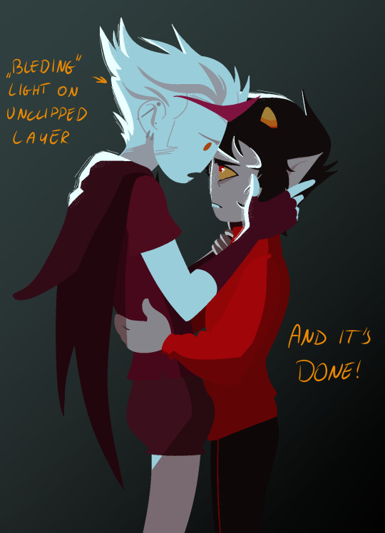
#i also dont usually do highlights i only shade
Text

Aadit Aadit Aadit Aadit Aa-
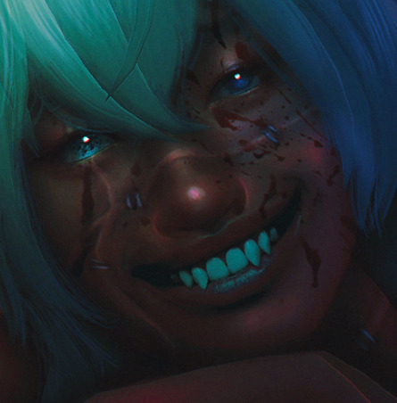
#fandom#my time at portia#mtap aadit#i dont draw suggestive stuff super often but this was just calling me to draw it#this took me multiple days#this is my first time doing body hair and shading like this#i hope it looks okay#i have a version where the shading is more saturated but i figured that might be too much for tumblr#i also dont usually do highlights i only shade#at most i do rimlights if it calls for it#but this was a whole lotta new stuff for me
7 notes
·
View notes
Note
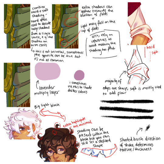
your shading is AMAZING specially when its conveying organic forms..... do you have any tips for people who dont know wrf going on (with shading)
ok so HI. hi. my old tutorial pisses me off so i will make a new one
i made a guy whose sole purpose is to be shaded so dont worry he likes it. and his name. his name will be mr. Boob. mr boob does not have to be blue
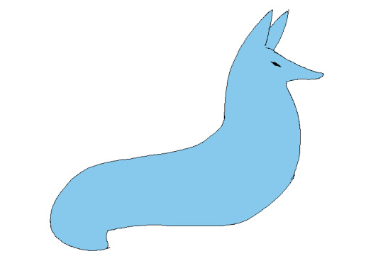
theres probably way better explanations of how to do it but unfortunately trying to "emulate" shading does ask you to somewhat understand ur character in a 3d way. like what would the 2d shape be if you "sliced" it? mr boob is made of so many circles. his tail also does a kind of weird perspective foreshortening thing because its pointing at you. is this being conveyed
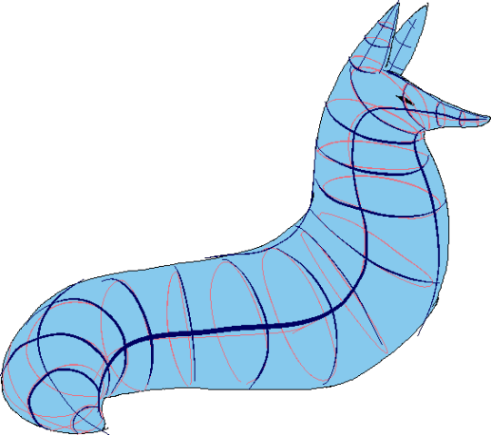
you obviuously dont have to draw a horrendous grid on your characters skin to do this . BUT it helps you put down (or at least envision) the lines of the form shading :
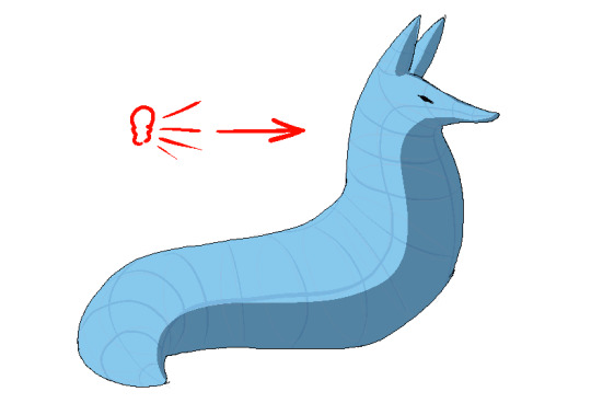
dont worry about cast shadows or the shading color because this is FORM SHADOW time only. think about what surfaces of the character are obviously facing away from the light source and put down the "separation line" of the shading based on that. thr most important thing is that youre trying to separate light from dark
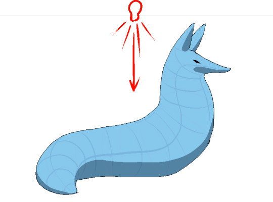
im going to pick the first one for cast shadows bc it will be the most obvious to me
ok so. his ears and snout are blocking other surfaces of his body from the light, which means a shadow is cast!!!! bam. i saw someone describe cast shadows as what the light's pov "can't see." his entire body is putting down a cast shadow on the ground too

im impatient so i blended the form shadows now. its usually the easiest to just NOT blend cast shadows as a way of conveying that they are still cast shadows. but you can still blend them if you want to show "distance" between the obstruction and the surface its blocking. but its just a way of saying form and cast shadows should not be treated the same even if their softness coincides
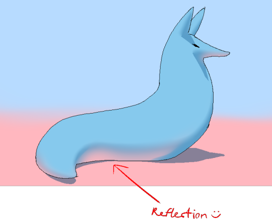
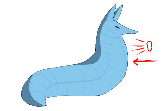
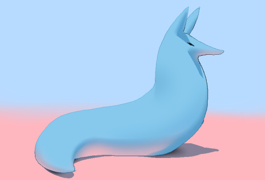
im going to lump reflection and ambient light together because theyre like. similar. reflections dont just happen in mirrors
since the sky is blue, making the ambient lighting, i tinged mr. boobs existing shadow to be a bit blue. (*this is kind of important because it can help you decide a shading color, which should USUALLY be based on the environment) (unless your character is just in the transparent void then it doesnt matter)
since the ground is pink, i made pink light bounce off of him. pointed and labelled. i dont rlly know how to go more in depth than that

contact shadows are literally shadows formed from direct-touching contact. very little light can reach in there, even from how reflections disperse, which means youre free to use the darkest color available (black). in this case mr. boob is making contact with the floor. because he is sitting on the floor.
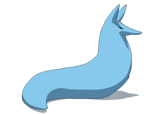
i touched him up a bit and wow!!!!!!!!!! look at mr. boob!!! he is so beautifully sculpted.
and one more thing
thats right. i made mr boob PINK. hes fucking ruined now. just kidding i would never say that to him
what im trying to convey here (its the easiest with really light colors) is a transitional color. this can also show subsurface scattering depending on how you use it which is fun to look at. the mistake i made on my last tutorial was "Just pick a warm saturated color!" which is really wrong in examples like Blue mr boob. because it would be weird to use a warm color to transition from blue to blue.
if you have a character that isn't bright enough then obviously the shadows wont be as visible. its BEST to bring more attention to highlights and reflections to reveal the form a bit. they play the biggest role with darker colors
thats all i can think of. fun things to look up:
structuralization + contour lines + foreshortening etc. 3d lingo
form shadows
cast shadows
ambient light
contact shadows
subsurface scattering
im also just speaking out of my ass otherwise. i didnt look up any of these terms until the end now im inferring and hoping i got them right
and remember every time you shade mr boob will be rooting for you
2K notes
·
View notes
Text
Tutorial: How I Render Accents
PART 2: COLORS
I usually do not recommend 'pixel hunting' aka going over your work with a fine tooth comb and picking out stray pixels to erase. However, for setting up a proper base layer for accents it is imperative to do so.
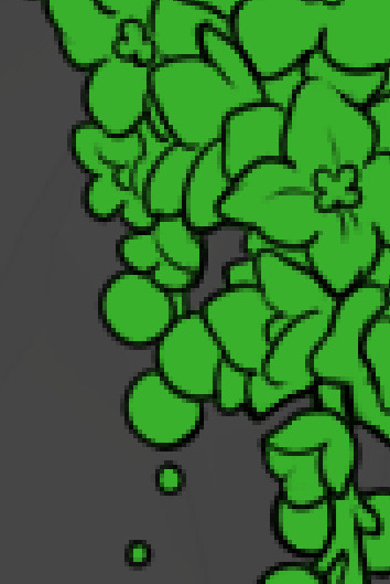
To explain my method of color blocking: I select everything outside of the lines, invert that selection, then fill in. This does a more accurate job than going into each and every section and filling them all in individually, and is also significantly faster. Only downside is small sections like above where you can see bits of the green (which I use bright green against a dark grey background to contrast the base color, lines, and background) poking out, as well as the inner section where it filled in a spot I did not want filled in. Getting all of this right in this stage will make your life easier as you go. (It's also the method I use to color block all my work, even beyond accents)
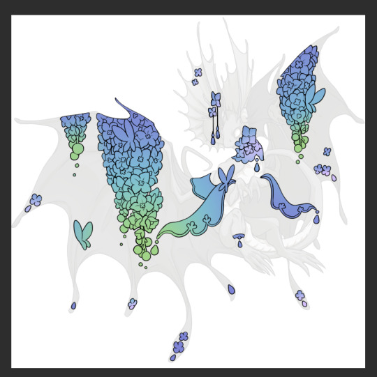
Now this where my style of rendering color may come off intimidating and, tbh it might be. I do gradients first and then I color over them with "normal" blend layers. I typically don't use multiply layers unless I'm shading something that has a lot of textures. If this scares you, it's okay I'll keep walking you through it. Here, my gradient goes from a pastel but deep periwinkle, to a soft more cyan blue, then to a lighter pastel green. Skipping steps and going from the periwinkle to green will give it a different look. There's also hints of a pinkish tone as an accent color.
So as I said, these additional layers are done with regular "normal" blend mode layers. I've placed one in between the butterfly line art and the line art for the rest of the flowers, and then an additional layer under everything else. This allows me to create a glow effect specifically around the butterflies, and then specifically under the flowers. Going back and forth with the proper amount of opacity (by using the airbrush transparently) helps to make it glow but not be Too Loud. Also checking it against a dark background can help to check for spots where it spills past the borders, as well as really gauge how Bright it is. I've also color matched the butterflies with the flower pits and the bulbs. This adds extra cohesion and makes them all look uniform but different enough with the gradients.

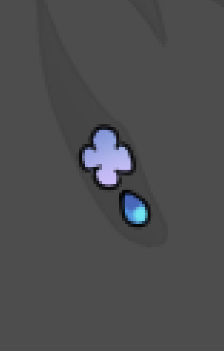

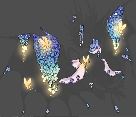
The stages of how I render gems/dew drops. Take the base color, make it a bit darker and less saturated (as well as changing the hue a bit depending on what the default color is. For yellows I go more orange/red, for blues I go more purple or even pink. It depends), add a small drop light at the bottom thats a fairly saturated version of the base color, and then a stark white/ near white highlight. That's it. Don't over complicate it, it will not matter when it gets shrunk down. Note that I do not use multiply/overlay/screen layers for these types of things as it adds too much bulk to the files and doing it manually helps to strengthen your color theory skills.
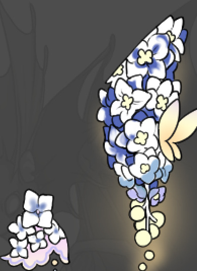
For shading and rendering, again, I create a "normal" layer and simply. Draw over what exists. Color picking and hand blending allow me to create the exact shades and effects that I want that multiply/screen/overlay layers may not be able to achieve. (which isn't to say I dont use them! i just don't use them for the main meat and potato part of my coloring) All of what is shown here is also achieved with the CSP asset SOIPEN (which can be found for free in the asset store)

another example. The one on the right is showing how the layer looks without the gradient base layer under it. All of this is rendered by hand. I also specifically put a highlight color around where the butterfly is sitting to give a better illusion that it is properly sitting on the flowers rather than just in front of them.
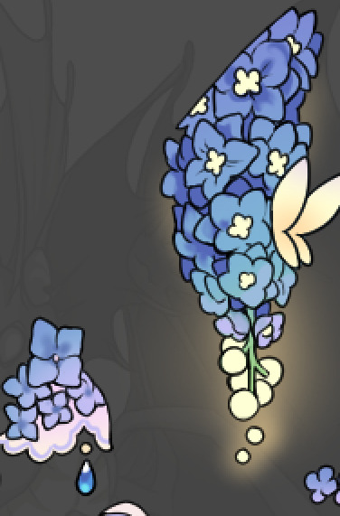
Next is changing the color of the lines, if needed. A method i'll use is I color just the sections I want (on a separate clipping layer) then lock that layer's alpha setting to them add in a gradient. It's a small and subtle effect that adds more depth without doing a lot of effort. (work smarter not harder)
Now we get to the Polish Layers!
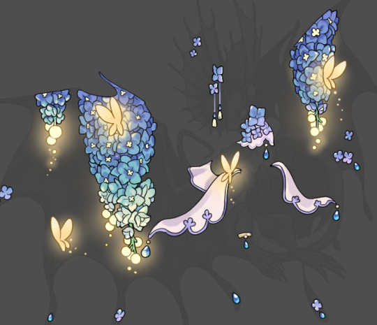
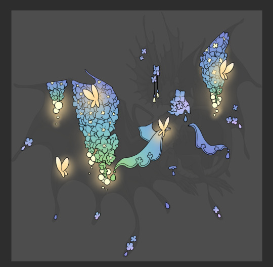
first image is how it looks as a base. second image is with an overlay layer applied. I've used some dark purples and mid tone desaturated greens to push the values a bit further (especially evident on the top left wing) Third image is with a screen layer applied, highlighting the inner most part of the flowers and adding some additional bounce light.
An important thing to note about making accents vs making full coverage skins: OPACITY AND LAYER TYPES MATTER OVER TRANSPARENT SPOTS. What I mean by this is that if you use a soft, light grey to shade with a multiply layer, don't clip it to anything, and have it go outside the lines - that will no longer appear as a 'shadow' when it comes to the final result. Instead you will have a section of soft light grey that is simply laid on top of whatever the image under it is. The same applies for overlay/screen/add layers and so on. If i use a very dark color on a screen layer (to give a soft highlight) and airbrush it over a bunch of stuff and don't clip it, it will end up with this horrible dark splotch over everything that isn't opaque. To this end, mastering normal layers is imperative to having well rendered and convincing accents.
Another thing of note: when it comes to sparkles/small details, note how 'large' the sparkles behind the butterflies are. They seem a bit chunky, yeah?
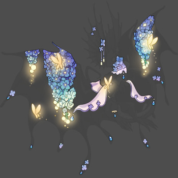
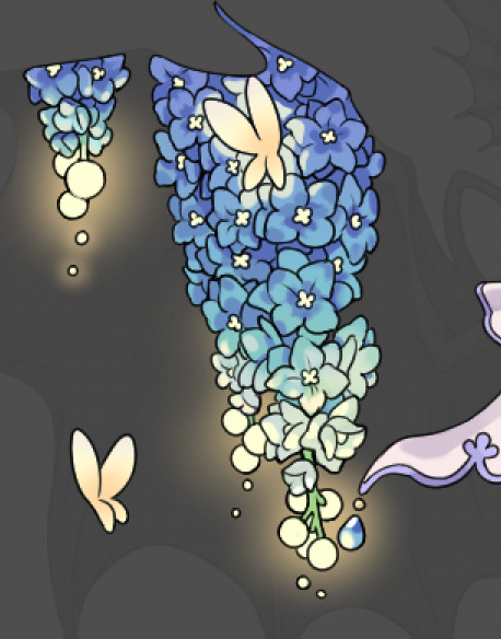
this is what they look like at proper size. If anything, I could have gone larger on the small metal beads connecting the dew drop jewels to the lace.
Another trick I also like to do is this:

a slight hint of transparency! It's just enough to let the dragon's lines underneath show through but not enough to be super noticable. I like to do this a lot when it comes to sparkly and magical effects.
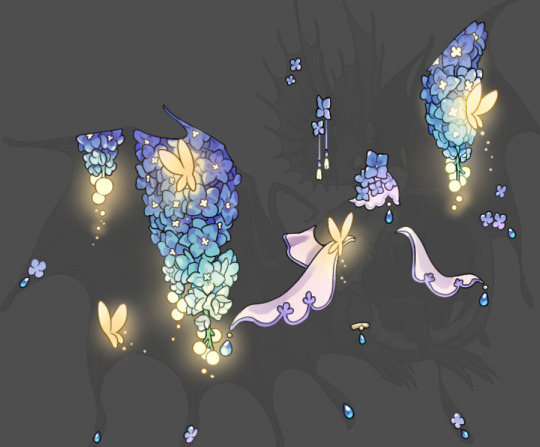
Next is the worst part of all: destroying all that beautiful hard work with the shadow and line art layers! (sobbing)
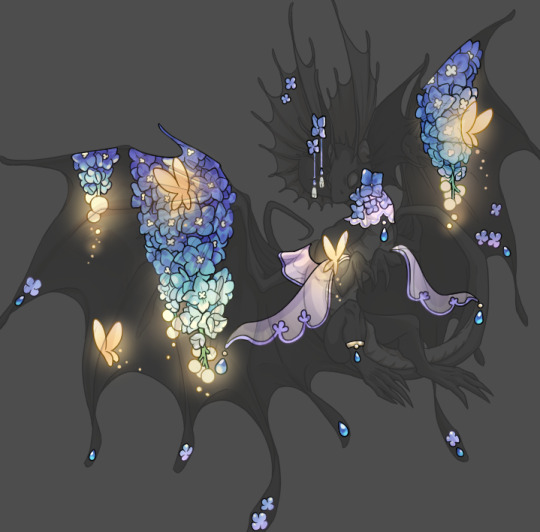
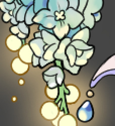
This stage always agonizes me. This is my first pass of the shadow/line layers and let's hope it's dark enough.
But yeah that's a start to finish look at how I create my accents. Unfortunately a lot it devolves into needing to know, yknow, line weight and silhouette importance, color theory and the ways that drawing applications actually apply color to a png vs how its rendered in app. All of these things impact the finesse of the accent, and are things you do have to learn gradually over time, but hopefully this has given yall some additional insight and perhaps some helpful tips.
And this should also explain why I get so mad when people go 'hey can I get this accent in another color' no! no you literally can't!
130 notes
·
View notes
Text

ngl im not like, lineless art specialist, honestly i went lineless fairly recently (like lets say may 2023 when i started drawing art for homestuck), before that i was making art with lineart only, so take my process with a grain of salt lmfao but i hope it clears out some things!
lets dissect the recent dirkkri art ive made:
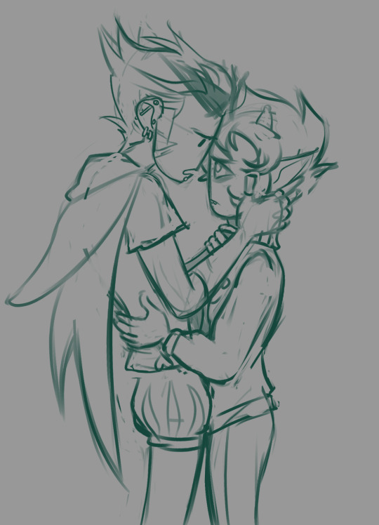
i start out with sketch, as you usually do. depending on how im feeling or how complex the pose/background is, i make it more or less detailed. for more basic poses i might even stick to a simple gesture drawing and go straight into laying out the colors, it really varies a lot. it might even change in the further process, like how i moved dirks shades from his head to be sticking out slightly from behind his arm, clipped to his shirt, because i didnt like how busy the area around the faces looked
one advice i can give is to not spend too much time on the sketch. its job is to guide the laying out of flat colors and thats it! dont make it too fancy, dont get lost in the details - you can add those later on when youre doing the flats. its fine if the sketch is messy, youll fix it in later stages of the process!
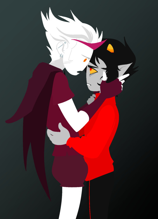
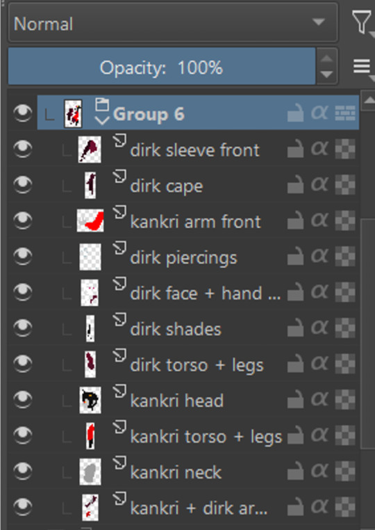
next i do the flat colors! i tackle it one thing at a time - for example with dirks head i started on separate layers with the general shape of his face, then added his facial features, then i drew the hair, then added his neck, the crown, and lastly his piercings. i then merged them all together - you dont need to leave it all separate, best way is to group things together and merge so you dont get lost with all the layers (like how kankris arm on the front is one layer including his sweater sleeve and his hand).
i highly recommend naming your layers - im a little on and off with it myself, but seriously it makes your life easier later on when you spot a mistake and have to shuffle through bazilion layers to find it lmfao, especially when your drawing includes multiple things that overlay on top of each other like in this example. dont be like me and take a second to name them asksks
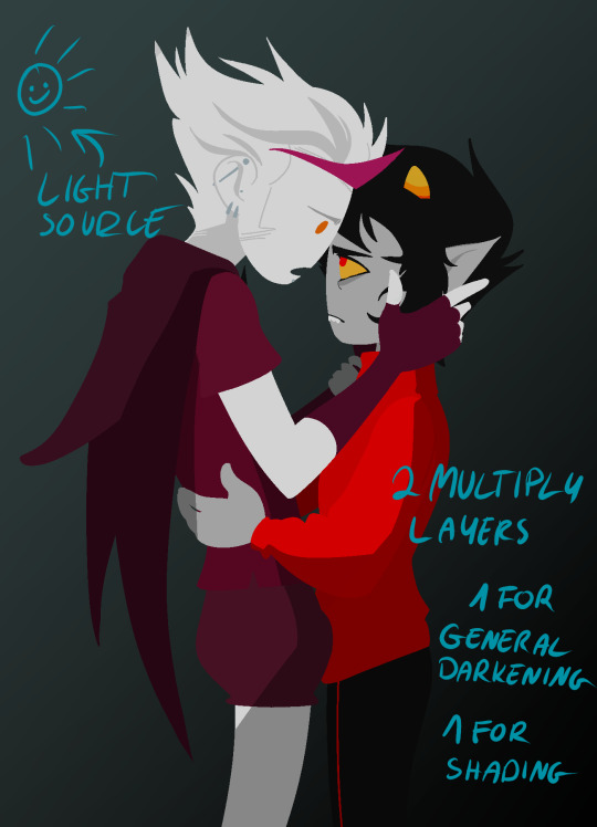
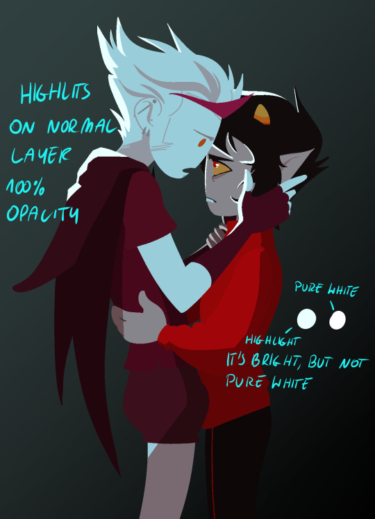
next to the rendering! i sometimes completely ditch this one, just leaving the flats as they are, but when i want a drawing to have more oomph i have some more steps to the process. its pretty simple - shadow, gradient map and highlight layer on clipping masks connected to the flats. in this one i used light gray for shadows (first layer to generally darken the drawing, second for defining shadows). same with highlights - one color.
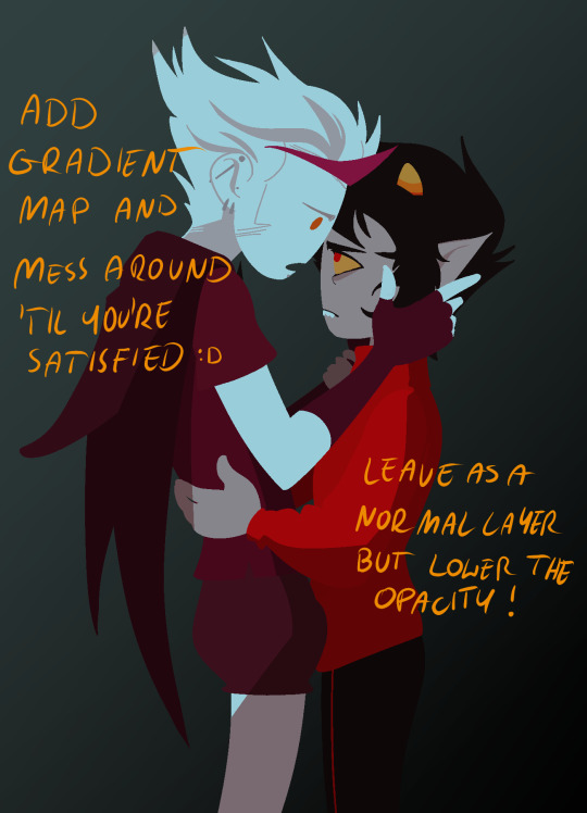
the real star of the show is the gradient map, seriously, its a goddamn miracle worker. in krita you can add one by clicking on the plus sign to add a new layer and choose "add filter layer", then in the menu open the "map" category and here should be the option of adding gradient map. you can do it on your flats, but its destructive, and on a separate layer you can always change it if you dont like it later on. mess with the colors and tadah! it now looks fancy as shit and makes people think you know color theory!

last but not least you can add some bleeding light on a separate layer that isnt clipped to the flats to give it more dreamy appearence! i also added an example of how my layers looked in a group at the end of the drawing process.
and thats it! hope it helps, and have fun drawing!
#ask#drawing process#lineless art#art tips#art process#digital art#hope its at least somehow understandable im really sleepy rn#god i hope i didnt make any spelling mistakes LMFAO#artists on tumblr
62 notes
·
View notes
Note
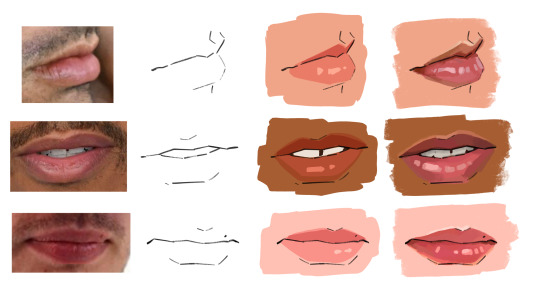
how do u paint lips on men. like the coloring. i'm trying to draw a man with like big-medium lips and i dont know what color to use or how to shape them,,
HELLO i lips are such a fun thing to paint especially imo, so im so excited to help w this....
I'll put the reference images here too just to aide in showing how i translate everything into artwork. First off, before you paint the lips, you have to draw them. I typically only will draw the most defined lines of the lips. Keeping the linework very simple helps the lips not look overworked, and specifically for men, i think it helps them look less like lipstick or something!
When I am doing my "simple" coloring, i typically will just pick a blush/pinky color, and draw the lip shape on a multiply layer, and adjust that opacity till it looks good. I'll usually add some simple shadows and shine as well! When painting, I go a little more in depth with my coloring, but i generally follow a very similar shading style, usually a darker top lip, lighter, pinker bottom lip (but everyone is different! so check your refs!) I have found that you shouldn't be afraid of color, lips, even on men, are typically quite bright! But stick to more pink tones than into red. I always like to do these sort of squarish shapes when i highlight lips, as it helps to suggest their texture without adding unnecessary detail. Also who doesn't love a nice shiny lip! Also dont forget the skin highlight across the top lip, when painting a face (especially if that person has facial hair) that highlight will provide a great sense of depth that often goes forgotten!
124 notes
·
View notes
Note
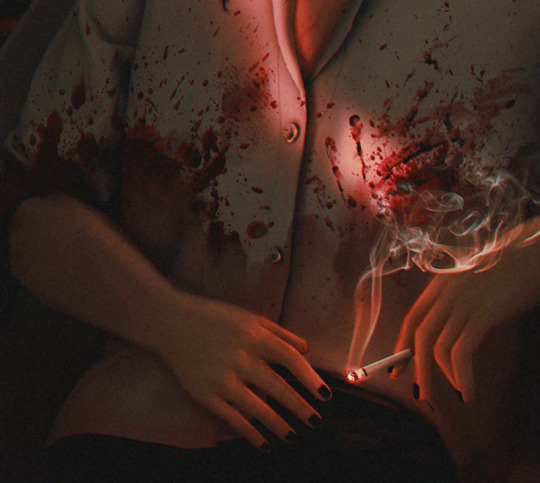
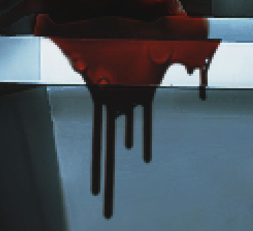
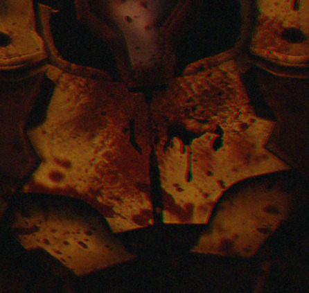
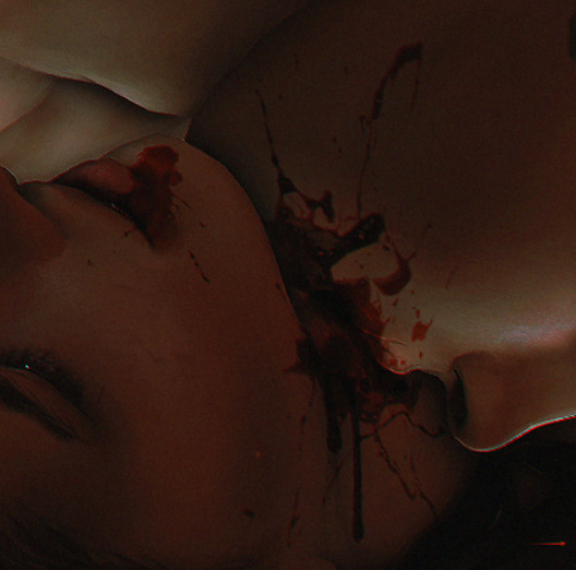
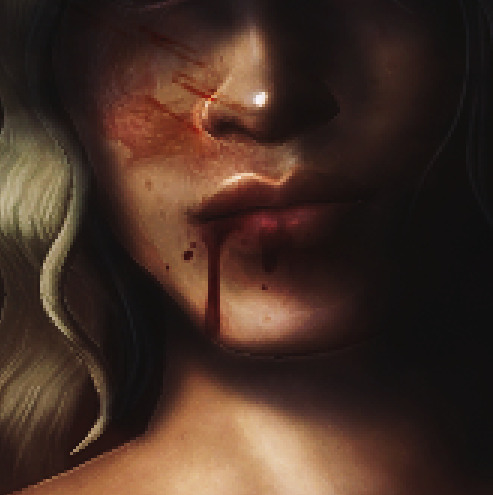
hiii joseph. If this is annoying or a bother, please tell me to stfu, but I was wondering if you have any tips for drawing blood? I know you've done it on a couple of your edits and it always looks so good, and I'm in a position now where I need to for an edit, and I have no idea where to start. Thanks!! 💖
hii im so sorry iw as like waiting for an opportunity to make this a whole tutorial but then i forgot about it RIP i'll just talk at u if thats ok. i might add actual process pictures later
so firstly when drawing blood u have to consider three things:
how much blood is there/where did the blood come from
how long has the blood been there/has it been smudged or altered in some way
what material is the blood currently on
the answer to these questions informs how the blood is going to look. a fresh arterial spray on skin and clothes is going to look a LOT different than a pool of it thats been on a hardwood floor for a few hours/days. i would recommend looking up references if u have the stomach for it but if not u can still watch like shows/movies so its not actually for real. if thats still too much then idk u dont have any business trying to make a bloody edit at all sorry SFDGHJK. google images will do u a world of good but uhhhh im gonna be real i have a login to a website that stockpiles real crime scene photos for forensic and crime (??) students which i usually head to but im not comfortable sharing that LMAO. i swear google images is still fine though
i usually just copy almost exactly what im seeing on the screen so the method varies a lot but its mostly various shades of dull red drawn on several multiply layers. erasing using a low opacity brush helps for like ?? layering?? blood doesn't dry uniformly, some parts will be darker than others etc. in a lot of lightings blood will just look straight up black. if thats the case i usually manually add a bit of solid red to act like a highlight. also u dont have to get too precise with it a bit of a suggested smudge can go a long way
i have a few examples of some of my drawings of blood here im going to just explain in the alt text what caused the blood/affected the blood so it looks the way it does
blood drawn on fabric:


blood drawn on solid surfaces:


blood drawn on skin:

i also use these blood overlays (only some of them will show over clothes rip): 1 2 3
#bloodtw#while getting example pics i realised i use blood like. a LOT. sue me if its not the sexiest bodily fluid like-#ask#reply#morrigan-sims#tutorial
15 notes
·
View notes
Note
Ok you got me interested in your world. Is it like Wings of Fire or nah? Please talk about the different kinds of dragons and how they work!! I'm invested xD
So there's bird dragons, fish dragons, hybrids, (i assume) normal dragons??? What more??? Tell me. Everything. >:]
im so glad that you asked!!
so there are regular dragons, sea/fish dragons, sky/bird dragons and also volcano dragons!!
-the regular dragons are like what you would expect from dragons, they can be any colour and they have scales. they can have spikes, a sail, or fur going down their backs.
-the sea dragons dont have wings. They have a webbed spine along their backs and also webbed frills under their horns. They have a fish like tail, they also have gills, sea dragons live underwater and they dont often come onto land, and if they do its usually the beach. they can breathe air perfectly fine though.
there is also a rare type of sea dragon that is much larger than the other sea dragons, they have massive strong fins instead of legs and very long necks. Theses kinds of sea dragons sometimes hatch in the sea dragon royal family.
-the sky dragons have feathers instead of scales and they have beaks that are shaped similarly to a dragon's snout. they have long feathers going down their backs. they are larger than regular dragons and sea dragons. they have feathered wings that are like bird wings and they also have legs that are like bird legs.
-the volcano dragons are a lot like regular dragons however they are slightly bigger, they have very hard scales that are fireproof and they can breathe very hot flames. Also their wings point down onto the floor beside their backs when in resting position, however regular dragons wings point upwards towards the sky in a resting position. Volcano dragons can only be shades of red, orange, yellow, black, brown and gray however regular, sea, and sky dragons can be any colour.
so that's basically it!! thanks for asking!! i love getting asks so much its literally like the highlight of my day
5 notes
·
View notes
Note
saw you were looking for crit on your arcana oc and thought i’d weigh in as someone who also struggled with recreating the arcana style. the first thing that stuck out to me as being different from the arcana style was the brushes you used, your lineweight and the shading.
the arcana game uses a pretty distinct brush set which was once available by a user called like savenkey or something?? you might be able to find the brush set just by looking around online but it definitely comes in handy when getting that slightly textured & tapered linework. as it currently stands, your lines are quite thin, made of a pretty smooth brush, can be a teensy bit wobbly in some places and dont have any tapering towards the ends. to make this close to the arcana style i’d recommend upping the thickness a little bit (if you’re struggling with space between pixels just bump up the canvas size a bit) and increasing the amount of stabilisation. the tapering could potentially be done by hand (ie erasing the ends of lines to make them thinner) but it’s super time consuming so i’d recommend just using the arcana lineart brush (on a side note, if you don’t manage to find the set but are still interested i could try work out how to send them over?). another thing to note when drawing lineart is that the arcana game uses a lot of sharp edges, especially around the elbows, jawlines and fabric folds, don’t be afraid to thicken those approaching edges up, just to create a spike where the two lines intersect
as for the shading, the whole brush thing also comes into play as the arcana style shading brush has a bit of roughness and is on a slight angle, that’s what creates these areas on the in-game sprites. i can also see you’ve begun to alternate between hard and soft shaded edges but i think a few harder, more definitive edges would help it look closer to in-game art. the arcana shading is also all done in a pale lavender colour on a multiply layer. it looks like you’ve done it on the face but it’s also the case for the rest of the body and clothes too & really helps make that distinctive arcana vibe. it can definitely be difficult shading curly hair and i also struggle with it, but curly haired ingame characters (especially those with shorter hair) do still have big blocks of highlights, doing one big swathe across the side of the skull would better mimic the style, with additional smaller highlights (sometimes less is more) to denote extra curls
and then a few extra details that might come in handy:
- the arcana game uses a textured overlay over their characters’ images, i don’t know if this is the exact one they use but it definitely works! slap it over your character as a clipping mask with the overlay layer filter (you might need to lighten or darken the grey to ensure it doesn’t mess with your characters colours too much) and then just drop the opacity to wherever you think looks best
- (as far as i’m aware) all arcana characters have fingernails drawn on, adding some to your character (whether they’re painted or not) might be a nice touch
- no matter how small or thin, generally all smaller details like tassels/string ties/jewellery or other metal details are all given lineart and coloured, the details are such a pain in the arse to draw but it definitely makes the final look worth it imo
- i’m not 100% sure how you’ve drawn on the blue details but in-game, they’re usually drawn using a screen layer with slightly lowered opacity over both the colour and lineart, and some of the edges are slightly shaded out

however, as far as art style mimicry goes i can’t recommend bast_art13’s tutorials enough, i’m not entirely sure if they’re still active in the community either (i was mainly active in 2020 and have only just started crawling back in💀) but their tutorials are still up on tumblr i think (somewhere). they really break down how the arcana artists draw faces/facial features and explain recurring stylistic choices, for example, how metal is shaded
anyway! that was a lot and i do want to say that you’ve made a really brilliant effort, the style is really difficult to emulate and the way you’ve drawn your oc is really nice!! you did so well, especially when seeing the improvement between this one and your previous drawing. and ofc it’s needless to say i’m a stranger on the internet, take what i say with a pinch of salt or just completely ignore the bits you think are stupid if you want ! it’s a perfectly acceptable response to unwanted pieces of criticism :]
while i’m here i also want to say that i’m obsessed with ur valdemar fanart + you’re doing the lords work with the amount of content you make for them. with that aside, good luck on your future drawings in the arcana style!! i’m sure you’ll do great & apologies if my handwriting was unreadable! also if you have any further questions feel free to ask :3
ohhhhh thank you! this is all very helpful and I'm grateful you took the time out of your day to share with me what you've learned, I'll definitely be taking this to heart for my future efforts
#this response seems so short compared to what you wrote RAHHHHH i dont mean for it to be i just dont have much to add#just picture me nodding and 🤔ing and such intently as i read this#asks#sco07ut#arcana spam#apprentice finn#helpful
5 notes
·
View notes
Note
Remember that art you did that was just Nine and Sonic high fiving (except it were only hands)
Did you use any special brushes?????????? Or just what brushes did you use in general please dont gate keep 🙏🙏🙏🙏
Might as well just answer these asks in tandem because 1 that is literally one of the nicest things anyone has ever said to me?? You mean I have an artstyle?? that it is tangible??? That its good enough for someone to want to copy it, hello????? [Positive, extremely extremely positive, crying tears of joy positive]
And 2 I am so fucking sorry (but also maybe good news for you since you're looking to copy) if you were expecting some epik brushes or techniques, because I literally just use the basic pen, pencil, airbrush and mix2 brushes (plus the eraser ofc) in Fire Alpaca. Like dedass just the first one, no change in the settings nothing. Just these guys here with me against the world.

I do attempt to sometimes use different brushes for sketching but then always return back to basics
My art process is pretty much just scratch something with the pen (sketch that I clean out as I go, we don't do lineart in this house sir) slap on some colors, then put down shadows with the pencil, blend with the mix brush, realize the shadows make no sense once looking back at the light source, erase some parts and repeat until the shadows do kind of make sense
Like its just this for endless hours but it's also the only part of drawing that I genuinely enjoy x)
From time to time I also remember that the airbrush exists and I can use it now without the threat of it blowing up my computer, which is why the shading (well, the highlights) on the high five actually looks good (also cuz I had a clear reference picture, that does wonders) plus a pro-tip, when drawing a certain thing that glows, its easier to put the solid color of the glow down and than gaussian blurring the whole layer instead of fighting with the airbrush
True magic however, hides in messing around with the opacity and layer blender settings, I usually spend most of my time in there flipping between the options lmao. The starter basics would be Add for an extra pop in the highlights. Multiply for darker shadows, or used similarly as Overlay and that is if you can't be bothered changing the color of the shadow over multiple colors of the piece. Soft and hard light for tamer results of add and multiply. And than Messing around with Difference and Exclusion was also how I got the funky colors on my previous drawing, but that stuff is funky
So yea, no special brushes, just the bare basics and mixing them together!!
#I think. This is like an answer most artists will give#I always see so many people asking artists about their brushes#only for the artist to just go ''oh I just use this basic one for the program I have''#Not that it's wrong to ask ofc!!#I too wonder just what brush it is that makes the line look just ever so scratchy but not too much#that gives a really nice texture to the lineart#I will find it one day I'm sure#also other majority of artists actually have a special brush they made (??) but my ahh could never#raw-dogging this with the basics 💪💪#again this ask has made my day#well#midnight#but like yaaay I am finally good at art!!#at long last#i inspire people :]#it sparks joy#the silly ask box#art tips#me does arts
4 notes
·
View notes
Note
hii piper i have an interview question 🎤 because of your fashion interest
do you like wearing makeup? if yes how do usually do it?
YEYS ACFUSLLYLY I HAVE A LITTLE MAKEUP ROUTINE ok so normally i put blush first i dont use foundation or concealer because i dont have them... ANWYAYS the blush i use is from flower knows its shade 3 in the strawberry rococo collection THE DESIGN IS SO PRETTY
ANWYAYS normally i focus on eye makeup because i wear mask so the eyeshadow palettes i use are cherry love in shade 1 from flower knows (you will notice pattern) (I GOT SO MUCH MAKEUP FOR CHRISTMAS HAHSHSHSHSH) and strawberry rococo five color palette in shade 2 I MOSTLY USE THE CHERRY ONE TBH but i only use warm colors for my eyeshadow because i think it just looks better PLUS I LOVE PINK AND I LOVE PUTTING SPARKLES SO
sometimes i put mascara but most of the time i dont because idk i dont feel like it BUT MOSTLY i just skip to eyeliner I USE BEOWN EYELINER the one i use says . nyx retractable eyeliner WAIT NYX??? holyly shit he made my fucking makeup ANYWAYS idk why it says its waterproof its not
THEN NORMALLY I DO HIGHLIGHTS rhe highlighter i use is wet n wild in 319B i normally put it on my eye corner (i forgot what its called) my nose (the bridge and the tip) and the top of my cheeks ALSO REMMEBER TO BLEND OR IT CAN LOOK REALLY BAD..
UMM I ALSO USE THIS LIQUID GLITTER THINGY it just says elf on the container thingy idk BUT ITS A GOLD SHADE
ummm normally i just use chapstick the one i have says eos on it and its strawberry flavor but sometimes if fancy occasion i use lipstick it says clinique on it its a pretty coral shade but idk the name...
HELAPSODKDKF THANK YOU FOR ASKING LILIANNN
11 notes
·
View notes
Photo
Since I’m still stuck at work and cant do anything, I thought it would be fun to post my drawing process for my semi-serious style, using the latest fanart I did with Edd and Edu but only featuring Edd :3c Maybe one day I’ll make a speedpaint but thats not today.
If you’re curious, one by one below the line + me talking about the process (as best I can)
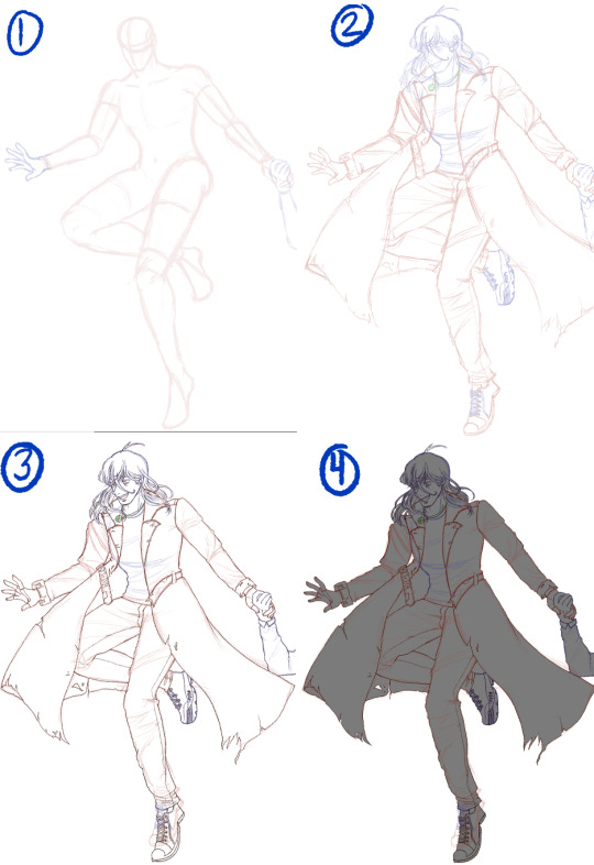
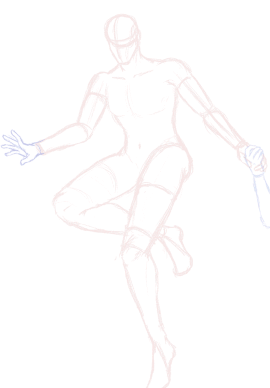
1. Preliminary sketch. These are my roughs, this is the start after I had my brainstorm and planning phase. I’ve found all my references and did the pose myself as well so I know what it feels like and if its bodily possible.
2. Clean sketch. This is where I loosely put in all the nitty-gritty, where the folds are, details of the hair, etc etc. I change the pencil colour so I can differentiate certain parts.
3. Line art. Like it says on the tin, but for my semi-serious style I tend to avoid lining folds because I prefer to paint them in this style.
4. Grey out. I need this layer so that I don’t get blinded/confused when I lay down the colours,
5. Flats. So all the colours needed, usually when I draw backgrounds they would also depend on the lighting, so I would colorize them if needed, but for standalones I just put in the basic colours.
6. Soft shadows. I tend to use multiply layers for this step, but sometimes I also do normal layers, in case I feel as though the colour should be more relative to its surroundings since multiply wont let me do that. It all depends on how I want the shadows to feel on the piece, but when I’m lazy I just do multiply (lol). Soft shadows also include the colour on the planes of the face, so = yellow for forehead, red for middle, blue for the lower part aka jaw area. Of course also the reds on the skin in other areas like elbows and knees, but since Edd is fully clothed, its just the tip and inner part of his ear, and the tips of his fingers.
7. Hard shadows and minor highlights. For my style, I gear more towards a watercolour style kind of shading, so I follow that principle when I decide where to put and how to render my shadows. Typically I have at minimum 4 layers for this type of hard shadow shading. The minor highlights here are just the lights in the pupil, and a soft large airbrush going over the spaces where shadows cant reach.
8. Missing details and overlay highlights. Near the end I put in all the little details I missed, so in here its Edd’s 5 o’clock shadow, and some scuffs and scrapes on his clothing and shoes. The overlay highlights are super subtle but make the drawing feel a bit more alive, for me at least, these highlights are the ones on the “bumps” of the clothing folds, and the hair highlights.
9. Hard highlights and atmospheric lights. The finale! This is where I just put in the brighter, harder, highlights in places they should be, and then clip a Luminosity/Overlay layer on top of the entire drawing, using a large soft brush I go over the drawing to put a bit more brightness into it.
And there! Thats how I render in my semi-serious artstyle. But...eh, dont be fooled, I know this step by step makes it look like I would jump around all the parts of the drawing and render things equally, sadly thats far from the truth. My perfectionism flares up badly and it often leads to me obsessing over a singular part before moving on, so the process would look more like this:
yeah......
19 notes
·
View notes
Note
your colors are always sooo good :0 got any tips?
thank u v much !!
and ermmmm i think if ur someone like me who has a very difficult time committing to art things and is a bit insecure abt colors, drawing with anti-aliasing turned off is rly helpful, since u can change any of the colors very easily by using the bucket fill (tolerance set to 0 and anti-aliasing turned off, itll fill only that specific color area. plus if u want it to fill every area with that color u can turn off "apply to connected pixels only") if u wanna make adjustements whatnot
color theory wise i have a LOT of thoughts since im quite the unprofessional art-loving mess - but its 4am so i dont feel like making an entire essay (and also i dont rly think my thoughts or advice r very helpful anyway), so ill keep it short (my tips r not beginner friendly im sorry for that):
ill typically have flat colors be saturated, while shading colors desaturated
do not underestimate greys, its extremely flexible and can look like a variety of colors depending on the pallet around it
^^ these parts of the color wheel r my bff as someone who uses warm tones/red extremely often. often when i use a color i dont actually use the obvious "correct" tone, but rather smth slightly off (like making my reds be a bit on the orange side, my blues just gray, greens r a desaturated/dark yellow, etc etc)
i never use pure white, ill dabble in pure black sometimes (for sketching esp) cause it looks pretty nice as a contrast, but since i find it easier to use darker colors i dislike using pure white and u will like never see me purposefully use it unless its for a highlight or on mspaint lol
the way i usually start out deciding the pallet will be derivative of how light/colorful the darkest is or how dark/colorful the lightest color is. the main middleground color (usually for me thats a strong red) is probablymore important than both of those though, and what i tend to make the background
personally i absolutely suck at using filters/gradient maps and dont actually know how to use them to my full advantage, but do NOT be afraid to use them !!! use them all u want!! and honestly? its a talent of its own to know how to use the right filters/gradient maps/etc. ur not lesser of an artist or cheating when using these, they r viable tools at ur disposal !
ty for the question even if my response wasnt great !!
15 notes
·
View notes
Note
weirdly specific asks: 2, 3, 7, 14 (because we love reminding folks to drink water), 19, 25, 28, 30 (Would you ever choose to be immortal, why/not?)
2: thoughts on veganism?
i have had thoughts on veganism but my ultimate position is that it's not rlly my business
BUT i do think it's something that can only really exist in a world that had an industrial revolution. but also sort of exists as a reaction to it as far as meat products go? it's ironic when people want to go deep with it and claim it's The Way To Be when biologically we are omnivores and therefore need to be very specific with our diets, using grocery store shelf options, if we want to cut out animal byproduct altogether. like i don't think you can be vegan living ~off the grid~ or in literally any survival situation lol.
on the other hand a lot of people are vegan because it's the moral thing to be, as far as consumption habits go. you could argue that if you want to consume morally... well you really can't! ALBEIT in this case the focus is on animal cruelty in an industrial context, rather than a goal towards Overall "moral" consumption under capitalism
and btw i'm not like, 'critical' of veganism (nor should anyone be because who give a shit. truly. it's just a personal dietary choice) there's just aspects of irony to the mostly fringe internet vegans i'm referring to. and people who attempt to guilt a general audience out of their current eating habits.
(i also think there IS a moral way to consume animal byproduct-- like, for example, raising chickens in your backyard and harvesting their eggs... or buying eggs from someone else who raises them that way. not everything is buying from corporations operating thanks to inhumane chicken mills)
3. a specific color that gives you the ick?
there are so many colors in the world and i love most of them :) ..

but i'd have to say like, this general pukey highlighter greenish yellow. OR extremely bright yellow on walls. im so sorry. yes colors look better next to others and im not trying to be a yellow hater i promise. my lockscreen is art with a (different) shade of yellow as the background
7. what animal do you look forward to seeing when you visit an aquarium?
omg well i'd have to say the octopus and jellyfish :) I LOVE JELLYFISH and just realized i had a dream about them last night. i get to see them in the gulf sometimes which if they are ouch kind is not so fun but we often get the ones without stingers. like moon jellyfish
14. do you think you're dehydrated?
i don't think so, i'm usually sensitive to the feeling of being thirsty and generally go out of my way to make sure i have water all the time :) but i was putting off drinking water just now for a while so thank u
19. the veggie you dislike the most?
honestly i am absolutely a veggie lover so i had to think about this for a while until i remembered that i dont really like radishes. a rare exception tho
25. would you say you have good taste in music?
yes ^_^
28. last meal on earth?
omg. this is the most difficult question cus how do i choose!!! also im hungry and should sleep so im just thinking longingly about chicken chimichangas now. i'm sure if i thought about it longer i'd come up with something else but i WAIT HOMEMADE TACOS WITH SOURCREAM LIME DRESSING. ok done
30. free question: would you choose to be immortal?
ahh yes the question with the most endless list of pros and cons! on one hand, i'd like to think i'd handle having to be permanently ambivalent (considering the extreme temporary state of everything that comes with being immortal). i'd be curious to see where humanity goes from here, but if things go to shit like a lot of us think it will then im stuck with that!!!! :( and ive got technical questions as well. like if something globally catastrophic happened and everyone Died would i be the only one left for, like, eternity...?? does it last for the entire life of the universe? i dont think ive ever heard anyone ask that before? like do i end up chilling in the vacuum of space watching the last brown dwarf die off at the end of the universe??
so. all that said my answer is no i think. unless i get to sleep for a veryyyy long time like how a vampire does. but probably not so no </3
#im sorry many of these answers are long like the vegan one. i was trying to cut it down but i cant. chronically just writing annoyingly long#answers to asks#thank u for sending these this was fun <3 especially for coming up with a question of your own!! feels like a sleepover#answered
3 notes
·
View notes
Note
thoughts on the queens having hair that’s color-matched to their queen color? in the SK production, 4 of the queens already have color-matched hair (blonde for aragon, green streaks for boleyn, red/maroon for cleves, and ofc the pink howard pony) but i think it could work really well for seymour and parr as well with white/blue streaks and also support the “pop” style
I think that aside from Howard thats one of the things that works better on a case by case scenario. Aragon and Cleves are the queens where we get colored hair more often and it is definitely not the norm. In one production you can have and Aragon with full bleached tips, another with only highlights and a third with her natural hair color. And once you see the full look the color at least to me usually feels right (not counting cruises in here because their hair choices come from a different place). Cleves is the same, it is just as likely that someone will have their own color or red highlights, or red tips, or red braids. It is whatever looked right for them.
South Korea is a very interesting case as it is the first production in a country where hair trends don't match mainstream western hair trends. So things were chosen in a very particular context. As usual I am not as familiar with SK beauty trends/standards as I am with western, only vaguely familiar with Kpop tbh.
손승연 (Son Seung-yeon) already had bleached hair and waves so she is just wearing her normal hair styled for Aragon, but 이아름솔 (Lee Arum-soul) got her hair bleached and wears it straight. That style matches her usual style and adds the blonde thats common for aragon in a style that wouldn't be odd to see in a Kpop singer. And the color being lighter than most Aragon blondes matches the bleached shades you would see in SK more than the highlight shades seein in the west.
Also it is definitely not a coincidence that SK is where the green hair for boleyn made a comeback and not anywhere else. SIx visually references pop stars and currently if any do colored hair it will be just the tips as howard or the entire hair (usually with a wig). In SK having some brightly colored hair wefts in the bottom that show with movement is not rare for pop stars. So I don't think green hair boleyn will become a thing, maybe the green spacebuns make a comeback but wouldn't be surprised if it stays only natural color
Seymour and Parr go back to characterization. In the show they are written as the mature/relaxed/down to earth ones. Brightly colored hair doesn't really match that persona. So I dont think white or blue would work, but highlights might work.
5 notes
·
View notes
Text
"Weirdly Specific Artist Ask Game" but i got tagged in it so i am gonna answer all of them 'cause theyre fun
questions by @/i-like-eyes
thanks for the tag @king-chook!! ^^
1. Art programs you have but don't use
i thiiink i have a license for clip studio paint that came with my old wacom tablet but i never rly used it. also used to have krita installed for the longest time but just always felt off to me idk why. don't currently have it installed anymore tho
2. Is it easier to draw someone facing left or right (or forward even)
to their right is a bit easier i think. not smth i consciously notice, mostly i'm just thinking abt when im doodling on the margins of stuff they usually are looking to the left of the page
3. What ideas come from when you were little
uhhh idk tbh, i dont think much of my art draws from that
4. Fav character/subject that's a bitch to draw
cityscapes !!! i love cities they r so pretty and cool looking but goddamn theyre so hard to draw
5. Estimate of how much of your art you post online vs. the art you keep for yourself
80-20? i post everything that i finish. basically the only stuff that doesnt get posted is sketches i give up on
6. Anything that might inspire you subconsciously (i.e. this horse wasn't supposed to look like the Last Unicorn but I see it)
hmmmm not that i can think of rn...
7. A medium of art you don't work in but appreciate
watercolour !! i've tried it a few times and Struggled but i love seeing ppl's work in it
8. What's an old project idea that you've lost interest in
so many animatics ..................... also many comic ideas ..................... i get so many ideas that i just never start on or start and only do a little before losing the hyperfocus/fixation and just Cannot continue them. it sucks
9. What are your file name conventions
usually the character name, maybe a bit of description of what theyre doing... idk not much of a convention to it
10. Favorite piece of clothing to draw
hmm i like jackets :)
11. Do you listen to anything while drawing? If so, what
yes, usually music. sometimes random youtube videos like stream highlights or video essays.
12. Easiest part of body to draw
uhhh hair? maybe idk. hard question bc it varied a lot depending on what kinda style and just. sometimes smth is hard in a particular drawing then easy later idk
13. A creator who you admire but whose work isn't your thing
i cant think of anything i will edit it in if i think of anyone
14. Any favorite motifs
in my drawings i dont feel like i use any much. mostly i pull motifs from whatever im doing fanart of lol. in music, i like religious motifs (but not like. ones abt christ or bible stories, rather heaven, hell, god/divinity, angels)
15. *Where* do you draw (don't drop your ip address this just means do you doodle at a park or smth)
at home pretty much exclusively. in bed lol
16. Something you are good at but don't really have fun doing
idk i feel like the stuff im better at is the stuff i like bc i practice it more for fun lol
17. Do you eat/drink when drawing? if so, what
not usually
18. An estimate of how much art supplies you've broken
surprisingly little. mostly bc i do more digital art lol
19. Favorite inanimate objects to draw (food, nature, etc.)
weapons and nature. especially ice for nature
20. Something everyone else finds hard to draw but you enjoy
i cant think of anything ill add it if i do
21. Art styles nothing like your own but you like anyways
i love rougher styles, like ones with a lot of visible brushstrokes and bold lines and shit. so cool. idk how to make it look good lol i dont have the confidence in my lines for it
22. What physical exercises do you do before drawing, if any
none... probably i should change that
23. Do you use different layer modes
yeah, often i use a multiple layer for shading then a variety to colour adjust at the end
24. Do your references include stock images
sometimes
25. Something your art has been compared to that you were NOT inspired by
cant think of any
26. What's a piece that got a wildly different interpretation from what you intended
there was this poem i wrote about capitalism and how shit it is and someone thought it was abt interpersonal relationships/smth along the lines of a breakup. i rly didnt mind it tho i thought it was cool bc the emotion was not far off, the sense of betrayal and abandonment. just a very very different subject
27. Do you warm up before getting to the good stuff? If so, what is it you draw to warm up with
no lol
28. Any art events you have participated in the past (like zines)
i ran a zine (digital only) for the dimension 20 zine jam! and also made art+writing for others in that :D also was part of a polygon yt fanzine a while back
29. Media you love, but doesn't inspire you artistically
spider-man (not the MCU, mostly tasm and a few of the comics)
30. What piece of yours do you think is underrated
IS IT BAD TO SAY A PIECE THAT GOT QUITE A BIT OF POSITIVE ATTENTION ?? maybe
i rly like the cj comic i did i am genuinely so goddamn happy with the result so . even tho it did very well by the standards for the fandom its for and my current follower base it is underrated
alternatively this one https://www.tumblr.com/pathos-p/704380503765221377/tridential-sovereignty?source=share bc it didnt get all that much attention on any social media site but i think its cool !!
(mostly only using recent ones bc i dont wanna dig back further esp onto my old twt acct, too much work lol)
2 notes
·
View notes
Text
Skyrim sweetfx for lens flare

#Skyrim sweetfx for lens flare mod
#Skyrim sweetfx for lens flare mods
#Skyrim sweetfx for lens flare tv
They needs to be rewriten with ACTUAL research of what they do and how they supposed to do it Reshade and SweetFX (even it suffers from tones of useless shaders with wrong implementation of configuration, but less) just bloated by broken shaders like this. Shader contributors should be more responsible for what they do and should not trow in every fancy shader they found wiithout real understanding of it. In almost every game and not option to turn all of this off and use correct colors instead. This gives people bad taste for graphics, and when hell lot of skyrim and gtav owners flooding internets with "cool looking" shots of crap with ruined colors, marketing devisions of companies takes thatĪs trend and pushing it to development division (sometime devs doing this dumb thing on their own) and then we get crap like lens flares, lens dirtt, 50 shades of grey, vignette and totally messed up colors but most of them just packed in as some fancy effects that wrongly implemented, does not serve their purpose and simply ruining colors.īut ofcourse internet kids turning all that crap on and thinking that 50 shades of grey they get in result are uber realistic graphics and super cool shaders that makes their bad looking game kinda "good".Īnd they dont really know what good is, as well as people who implemented such shaders in reshade disribution, people just trust that fancy shader is making something good by default.
#Skyrim sweetfx for lens flare tv
Mosto of those shaders supposed to solve color problem like banding, incorrect gamma, some of them adapted for tv with color range 16-235 and supposed to operate in that mode, other not supposed to be applied to RGBĪnd intended to be used with other color spaces. If you think you’ve found a bug please report it by leaving a comment or sending me a pm.Īll credits to Boris Vorontsov (ENBSeries) and CeeJay (SweetFX).Ĭlick on the PERMS button above to view permissions.Does anyone think this is desired and good looking result?īlacks and white are totally destroyed and whole picture is desaturated and dimmed as hell, this is not how filmic tonemap results should look, this is how /archives/75Īnd thats just one example of many - HPD, Watchdog tonemap (which is also form of filmic tonemap) are ruined, Reinhard applied to RGB instead of only luminance, Skyrim tonemap totally broken, spherical and so on The following effects do not work and using them may fail silently or throw compiler errors:Īny configuration that uses the depth buffer, for example: #define Ascii_input_image 2 // 1 = Color buffer, 2 = Depth buffer. Some effects are not currently working (see below). configs and all shader code) are untouched and behave exactly as they would under ReShade ĮNBSeries detects file changes and automatically updates while game is running I only wrote a new Sweet.fx file to integrate SweetFX’s shader library into ENBSeries Īll other files (eg. Same way you’ve always done it, by editing/replacing SweetFX_settings.txt Verify that EnablePostPassShader is checked and switch the technique to SweetFX on the parameters window. Launch the game and open ENBSeries menu (default shortcut is Shift+Enter) Open enbeffectpostpass.fx and add the following at the end: #include “Sweet.fx”
#Skyrim sweetfx for lens flare mod
How to add SweetFX functionality to an existing ENBSeries install:Ĭopy Sweet.fx file and SweetFX folder from this mod into folder where enbeffectpostpass.fx is located (usually at the game’s root or inside enbseries folder) toggles effect on/off and opens ENBSeries menu. (OPTIONAL) Configure enblocal.ini to suit your system Performance hit is low (between 1-3 fps) on my modest rig (GTX 670).Ĭopy the files from this mod into game folder ĭownload ENBSeries for Fallout 4 v0.287 and copy d3d11.dll and d3dcompiler_46e.dll into game folder Shadows are deeper but never crushed and highlights vibrant but not washed out. It’s essentially vanilla with enhanced contrast, slight color treatment and a bit of grain/vignette. The included preset is rather simple and constrained. Best of all, it doesn’t change the HUD and it’s captured by Steam screenshots!
#Skyrim sweetfx for lens flare mods
Can be used to improve the deployment of visual mods that use both libraries and may also help those who (like myself) have experienced poor performance using ReShade. This is both my personal preset and a resource for modders.Īllows the use of most SweetFX 2.0 filters from within the ENBSeries environment without the need for additional injectors.
0 notes
Last Seen Blogs
elenaalblog-blog
ЗооИмперия ВерЛен
thiashazzywriting
Welcome To My Writing Life
lieutenantratte
Old Man Appreciation Station

gagandeepsblog
ਰੱਬ ਰਾਖਾ 🙏❤

tantalyshop
tantalyshop