#idk im pretty positive
Text
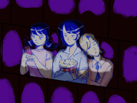
Day #78: Movie-goers
#miraculous ladybug#feligami#kagami tsurugi#felix graham de vanily#felix fathom#marinette dupain cheng#ml spoilers#<- well#feligaminette#<- LMFAO#anyways. did anyone else watch that ''''''movie'''''''#the only nice thing i have to say abt it was tht it was very pretty. gorgeous gowns etc etc#in terms of storytelling pacing plot and dialogue........... it sure had those things !#i really just do not understand what went wrong bc all those elements usually work fine in the show itself. like#idk other than visuals that was extremely messy. not funny not smart like it felt like a cheap copy of the characters...#AND OF COURSE. NO KAGAMI. ANYWHERE#automatic 0/10. chloes design was sooo cute though :)#see me trying to be positive. idk just saying i would not have made the movie like that. personally.#felt like so much wasted potential#IM REALLY TRYING TO LIKE IT TOO LIKE I LOVE MIRACULOUS SO MUCH THTS WHY IT FEELS LIKE SUCH A DISAPPOINTMENT.......#anyways. if u havent seen the movie sorry. u can pretend theyre watching barbie or something
166 notes
·
View notes
Text
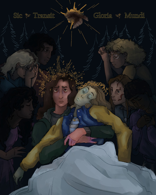
There was a promise in our stride
But we changed courses, headfirst into the unknown
#yellowjackets#yellowjackets spoilers#shauna shipman#jackie taylor#shaunajackie#fanart#doodl#thar she blows! the shaunajackie pieta!#and ill go ahead and put all the little deets in the tags so yall can skip m if ya want#SO#title from ep 10#shauna is on the mary position cuz mary is the dramatic one here but also randomly pregnant(at first)#and jackie on jesus cuz they Eat The Body#you could i guess also draw some comparisons between jackie's death and the crucifixion but idk that needs more unpacking#related to that im sure yall will say that jackie has the crown of thorns but noooo! i modelled it after her doomcoming headpiece >:)#which conveniently looked like it#the ref I used was bouguereau's pieta#which has an angel at the top and i tried to put laura lee there but perspective aaaaaaa#so laura lee bird is all you will get unfortunately#otherwise the placement is pretty random#mari was gonna be there but she didnt make the cut
212 notes
·
View notes
Text
do y'all ever think that like. We are pioneers. We're the first generation to really have queer media here, for us to see and connect with. idk just a thought
#i both envy the next generation and don't#because theyre going to get to fully grow up with these masterpieces#but with us we all got to be there to laugh and cry about these groundbreaking moments happening#for the first time in media#like#thats pretty special#idk im feeling positive right now#i love my little gay shows#good omens#wwdits#ofmd#sherlock#gay#queer#mlm#lgbtqia#loki
114 notes
·
View notes
Text
back on my zelda thoughts
idk about you but i got sick of zelda running after people with big sorrowful puppy eyes begging them to listen to her(they wont) or to help link in totk pretty fast
#ganondoodles talks#totk spoilers#i just can stop thinking about how dirty she got done#she can be a tragic character without being constantly sad and scared#dare i say she contributed more positive to the game when she was a dragon#the only scenes she didnt look super sad was pretty much when talking about link at the teacup memory bc .. you know she actually knows him#and where shes essentially forced to decide to half kill herself in order to do literally anything for her own time#now that im thinking about it how the heck did anything on the tutorial even work with her giving her powers to you#and you sending the master sword to her#just feels like they scrambled to somehow get you her pwoers and the mastersword to her#some random bubbles of time magic idk lol#if the game went different#wouldnt it have been cool if those had been caused by zelda learning how to reastablish a connection to her own time#creating those weird time bubbles#and through the course of the game you find more and they let you interact with her more and more as shes learning how to use her powers#until at some point she finds a way to return herself#maybe even her spirit as a companion for a time before she gains control of it further#you know so she can actually at least TALK to you#giving her time powers out of nowehre and then not doing anything with it exept send her back in time somehow and time reverse a dagger#like what#wouldnt it just have made more sense when at first she did it unknowningly and then learned how to use it herself#and then .... well travel back again#ham fisted way to introduce a neat lil game gimmick i guess#and nothing more bc how dare she do anything on her own except .. sacrifice herself lol#i guess its meant ot be uwu tragic bc sonia got fridged too quickly for zelda to learn from her or whatever#which is why i said she learns on her own#idk man this game is driving me nuts
109 notes
·
View notes
Note
Bro the askers treat spamton so much better on that askblog.
While over here we send him drawings of his joints and tell him "go puppet boy go!"
Honestly I love seeing the difference.
LOLLL they do… and maybe a little bit of that is my fault based on the ones i choose because im really picky with the ones i do answer (being nice to him, in this case) because there are SO many people who are trying to make him feel better, but ultimately they always bring up something or other to remind him of the shit he’s gone or is going through..
..Like,, “so you know how youre always failing and you’re uh… maybe alone with the (physical) things you’re going through? Yeah? Well ive failed too. Sometimes. Hope you feel better after i just reminded you!” Kind of stuff. Obviously im very much exaggerating what people say but YIPPPEESS its like they’re trying to get him to cry or something. I appreciate their efforts and how much the care but damn i dont think that they’re thinking about how that’d sound to him, especially since his immediate thought towards things like that is that its ingenuine.
I think less of Loki’s audience wants to see him suffer. A lot of mine do. LMAO. The difference /is/ funny.
#ignore the rambling aha i just started writing and kept going#but goddamn#some of them are like SUPER long too#and idk what to do with them because like… they dont need to be super long to work#its sweet that they care though#i think my specific choice in which ones get answered in that kind of context have shaped the ones i get#which is nice because i actually have a good few to work with right now#also so glad that at least some of you recognize that the reaction he had was toward the mention of his appearance#not sure if you’ve fully figured it out though#im actually itching to animate him crying his eyes out for no damn reason#because i dont think i have drawn him crying.. im deprived/j#hes like pretty much consistently on the brink of sobbing lmaoo#but he HATES crying in front of anyone so I havent had him do it.. yet….#yet….#theres a lot i really want to do but i cant yet based on the position we’re at
21 notes
·
View notes
Text
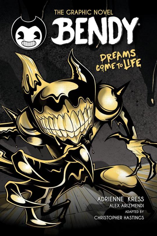
Wow, so umm... This looks bad, not only is it inaccurate due to using the wrong ink demon design [unless this is confirmation BATIM Ink Demon has been outright retconned... Which would make me pissed enough to make a new post just about THAT] but from an art standpoint this is just... Confusing and poorly done.
I wouldn't care if this was fanart, of course you should support young, indie artists... But for a Graphic Novel making sure your cover doesn't look like something Butch Hartman shat out in an afternoon is kind of important. Remember they're going to be asking us to give money to them to read this. The artist likely won't see any of that money and neither do the authors most of the time, not to mention this art screams of the artist being underpaid and overworked.
Like they Had to get something on someone's desk and their boss said 'good enough'. A concept Joey Drew Studios is very familiar with considering the allegations of poor working environments that Kindly Beast. Not to mention Mike Mood admitting in a Reddit AMA that they did in fact rush projects like Showdown Bandit. [Which they sold at full price]

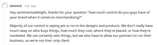
He also says they can in fact say no or yes to designs involving their IP. Either Mike or Meatly had to say yes to this cover, according to his own damn words.
And do you really think this company in particular would care enough about its fanbase to not sell them garbage? They have done exactly that on several occasions. It's not like they care particularly about art either, considering their previous use of AI Art. There was no apology or even posts addressing it... Instead, they just rushed out an archives update to their game to get people to stop talking about it... Even forgetting an entire character in it. Again
This company is [or at least SHOULD BE] on thin ice when it comes to being suspected of misleading their fans or rushing out crappy products to them.
So with all that context in mind, I'm gonna talk about why this cover sucks ass.
The light sources are all over the place? Why does it look like someone put maces or knight armor on his shoulders but it's just flesh?? It looks both gross and weird [not in a good way either]
To explain more I'm going on a rant below but sadly this seems to have been confirmed to not just be a rough pass but the final cover and man... I am not excited about this graphic novel just at all. This felt like it really drained any possibility of it turning out good for me and I already had expectations low.
Okay first point, the light sources?? And there is no consistency here with the shadows or lighting, it looks like there's a hundred light sources all at once but none of them are even consistent!
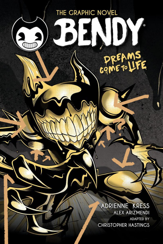
the arrows here represent all the different light sources I can make out and yet the the shadow clearly implies there's only one. I understand wanting to use highlights to give the character a more clear shape but then just give him one or two lights behind him or in front of him? No matter how u follow the light sources, the highlights make no sense and the shadows make even less sense.
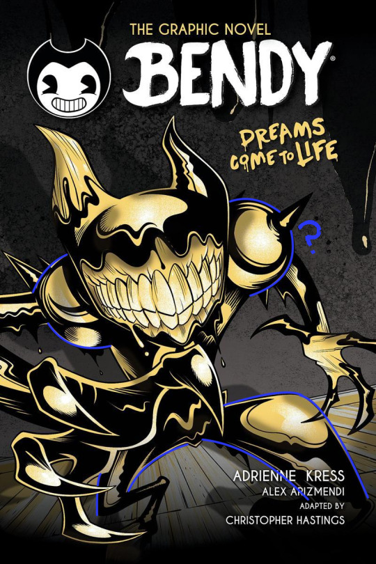
Why are the shoulders like that? Like on the legs it's a little understandable, at least those are clearly very heavily affected by perspective, for me I think they are so exaggerated it makes it look like one of the legs is either huge or one is small but that's maybe subjective.
However, the shoulders are unjustifiable, what happened there, what did they do??
I could pick on so much more honestly, how the color choices of piss yellow with no other colors being used, and the harsh pitch black being used for every part of his body is weird. How it looks straight out of Butch Hartman's recent crappy art. But to put bluntly bad start! Also what the HELL is going on with this background??
Seems once again the Bendy team is fine with sending out stuff thinking it's "Good Enough" for Bendy fans and honestly the people trying to tell me to "Be Grateful" for this are just proving that no matter how many times you betray your audience some of em will defend you!
Which is sad tbh. If anything we should be putting MORE pressure on the Bendy team to do better. Cause we deserve better than this, honestly we do. There are amazing artists in the bendy community who could do so much better for a cover. They've employed their fan artists before... Wouldn't it be great to do that for such a lore important book? The book that gives us the identity of one of the main characters in BATIM? The character you spend the entirety of Chapter 4 fighting to save? Not to mention will give several major characters their human designs?
But I guess this is... Good enough...
#ramblez#batim#batdr#bendy and the ink machine#bendy and the dark revival#sorry I've been on a positivity streak with bendy I know but I have to be honest and being honest I think this sucks lol#Im sure plenty of people Disagree and while I would argue this is more objective than subjective people will ignore me if they want to#maybe Im just a hater idk#but I do know one thing I sure do hate this and Im pretty sure Ill hate this novel and its designs#but maybe I wont ya never know#anyways if they do retcon batim ink demon I will make a post abt how much I dislike batdrs ink demon design#and why I think all the people saying its better than the og seriously arent understanding#what made batims ink demon good or character design in general tbh#to put bluntly just bc something is popular opinion DOES NOT make it right or a good idea design wise#not everyone is qualified to be a character designer and thats just good advice in general tbh#anyways yeah thats it sorry im being mean today </3#I simply think corporations shouldnt be able to rush out crappy products to their fans and get paid for it but ig thats a hot take now#but esp with how bad that updated employee handbook was too and it still had stolen renders from fans in it...#yeah I dont think theyve learned a damn thing
24 notes
·
View notes
Text
Holy shit I just realized that my dreams have a version of PotO (Broadway version) where the Phantom just fuckin shoots Raoul in his box and it apparently happens not long after Masquerade? Like in place of the Red Death scene they all go into the theatre and Raoul is in box 5 alone for some reason and Erik just. Shoots the poor guy with a period-typical pistol and disappears. Raoul recovers eventually but its like the turning point of the story yk.
#also Philippe is in it!!!!!#hes the one that finds Raoul and takes care of him afterwards :)#also i have reoccurring dreams about being part(?) of a local theatre priduction of it#my position in the musical changes sometimes but the Raoul Getting Shot part is canon#to the degree where I noticed it was coming up and was confused when it didn't#turns out they wanted to try pushing it back a bit and I Did Not Vibe With That#most of the time im either a background actor or set design but once im pretty sure I was Raoul?#which was cool :)#bc in Dream Fashion the actors actually looked like my headcanons for the characters#so i got to be hadley fraser lol#i distinctly remember being on the set crew and getting excited when they got to Masquerade#bc it meant my favorite part was coming up lol#like i feel bad for Raoul bc hes my blorbo but the Tension! the Drama!#might fuck around and write about it idk#poto#phantom of the opera#rip Raoul you deserve better but Damn That Character Arc
18 notes
·
View notes
Note
If you jouned a 7 sin thrmed group what sin qould you beee?
i'd be the brand new 8th sin: this thing

#ask#anon#answering seriously. uhhh between... lust. sloth. and envy.#had to ask a friend their thoughts and they said envy. their reason was ''boobs'' which. yknow what true.#but then i feel that also falls into lust but. beats me.#i do constantly yearn. yearning. for pretty men. wanting boobs. such and such.#but idk if yearning can be compared with envy.#plus those same points i feel also falls under lust. oh well.#i say sloth from a personal perspective but. i dont think thats a positive view to have for myself.#i think it ranges from person to person who talks to me and knows me.#hard to really select one of the seven sins for yourself i think. im not sure i can make that call. but its one of those three i feel.#also thats a greater hog badger. for reference sake.#absolute thing of the earth#anyway thank you for the ask anon. idk if i really answered your question. maybe the thing has a better answer.
21 notes
·
View notes
Text
Figuwhump: Day Two
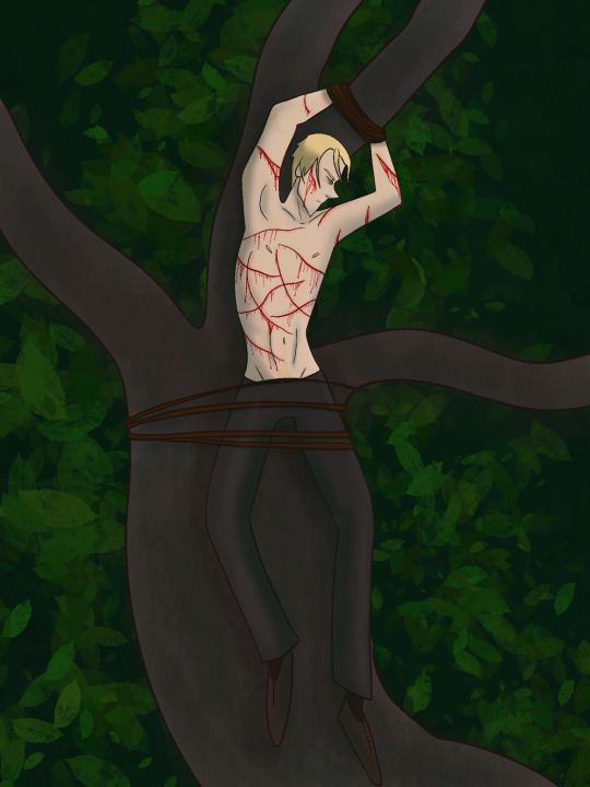
@all the anons who are thirsty for Uriah: come get your rat bastard
(For more information, check out @figuwhump 's pinned post!)
#look idk if i can write from his pov cause he's an actual POS and im not sure i -want- to get in his head#but yeah yeah i like bringing powerful characters to their lowest point so i get the appeal#this is what i meant about him having pretty privilege smh#/lh#uriah fox#whump art#whumpy art#figuwhump#tw blood#tied up#stress position#partial nudity#villain whumpee#<<like ACTUAL villain#whumper turned whumpee
51 notes
·
View notes
Text
A message for protectors/caretakers/gatekeepers/similar roles in systems:
Remember to do something for yourself once in a while, if you can! Front for something fun, or buy something just for yourself, or something like that. You deserve to enjoy yourself, even if your role is mostly helping others in the system be safe and happy.
Also, you're great, and you're doing an amazing job. Shoutout to protector/caretaker/gatekeeper type roles, and similar things. You're so important for your system, and you do so much, make sure to at least give yourself a pat on the back once in a while!
#plurality#system stuff#pro endo#endo safe#plural positivity#parable speaks#noah#('s post)#post inspired by the fact that i went uhh. 4? years without doing anything for myself. pretty much ever#and i burnt out eventually and now idk if i'll ever be like. the same as i was before again#take care of yourselves when you get the chance to okay? its important#im fine btw. im like. getting better i think. in some ways at least
139 notes
·
View notes
Text
Call me the protagonist of Black Box Warrior the way CBT don't seem effective
#like its not explicitly stated but I'm pretty sure thats the type opf therapy my psychologist does#and it kinda doesnt do shit#like it could help if i started like. ten years ago lmao#but at this point im too tired and depressed and borderline suicidal for positive thinking to help#guh#idk maybe i need to find a different therapist. tho it would have to be oustide of my town cause I'm not sure if there are any godd here#so thats not possible right now hfbdbfbsb#will wood#blackboxwarrior#bee buzz
14 notes
·
View notes
Text
The Twitter migration and now the reddit migration is so funny because seeing Twitter users have to be explained tumblr like babies and reddit users trying to adopt tumblr like old people trying to get along with their millennial/Gen z coworker is so funny.
I hope you all stay for a long time and make the site even weirder.
#196#r/curatedtumblr#sorry guys if youre reading this#i love seeing all of you#you make me giggle and honestly im glad you guys are all staying pretty positive right now#for anyone who is super new to the site i hope you enjoy the weird heritage posts you mightve seen <3#hope you guys join a fandom or two and avoid the discourse or whatever the fuck idk what yall were like on redshit.cum
38 notes
·
View notes
Text
ive been shaking for two days straigh now with it varying between like very tiny little tremors in my fingers to i cant put the key in the keyhole on scratch my face because i keep missing the spot so. ouough? hasn't really affected my ability to draw i think but im concerned
#im not stressed or particularly exhausted or anything so idk#rn im taking the stance of its either always been like this and im hyperaware of it now for a random reason#or im overreacting#and that itt :p#also i played dream team i have positive and negative thoughts but basically i think the game is fun but nothing epic that ill miss#once my free month of apple arcade runs out lmfao#very happy to be able to play with with a controller because it being on a touchscreen is absolute hell on earth like 100% of enjoyment#taken away in an instant#and then i saw i could connect a controller and suddenly it was a pretty good game#mad about the music
10 notes
·
View notes
Text
There's this nearly 4 hour movie I've been meaning to watch for a while and I was like "ah maybe ill watch it tonight hehe 🥰" and then I remember...quali is at 9 🫠
#i actually despise abu dhabi being the seaosn closer ngl#basically since Japan the race time has suited my timezone pretty well#1 am. 1 pm. 3 pm. 4 pm. 12 pm. 1 am.#<- like look at that. look at they absolutely delicious schedule#every race for the past 2 months has been at an ideal time and ive really settled into it#wow you mean i can sleep in on weekends and actually wnjoy the schedule!? oh boy!#and then they put fucking ad at the end which is at 8 am. who wants to wake up that early on a sunday#it would be fine if it was earlier in the season bcs during the middle i got pretty used to waking up before 9 bcs all the European races#but to have this one at thw end is literally horrible#its really down to timezones but fuck it really does bother me#bcs wow youve made me have zero desire to watch the season closer! thanks!!#id sooooo much rather brazil be the season closer still#like whh do you have to completely switch timezones right at the very end. its terrible#i think ill do waht i did last season and take a bit of a nap beforehand#it makes it much worse that this on a holiday wknd too. yeah bcs i rly wanna spend the last two days of my break waking up in the morning#sry im being ultra salty rn but i really dont wanna wake up for it but i hate missing race events UGHHHHHH#last yr i literally fell asleep during the first lap of AD 😭#yeah im concerned abt if nando will retain p4 or not but...waking up before 8 am...??#yeah idk i just rly dislike this scheduling#i actually kinda like AD as a track but its position in the season makes me resent it#catie.rambling.txt
15 notes
·
View notes
Note
angebinah
valid
#pikasks#projmoon#i canot do much else with this ! godspeed ✌#um ummmm obligatory tagramble- im not actually much of a ship guy ! hashtag aspec momence yanno#and again i need t do my research again but this ones pretty sweet and i donot mind it :] (slash positive)#one of th few that ive seen done right; especially for those characters specifically (<- highly highly picky w their resident blorbos)#my current resident view of those two is another 'idk what they have going on but its Something.'#aka 'wouldnt call this romantic; but theyre a very Two Of Them dynamic'. ineed to play w it more.#again- not gonna speak widely for them bc i need t research- but i think theyd both benefit from hanging out together :]#also ilike them. yay <3
8 notes
·
View notes
Note
SORRY IF THIS IS OUT OF NOWHERE BUT I listened to A Hundred Million Suns like you recc’ed in my tags a bit ago, and u we’re right it does have good songs :D but WHY IS THE LIGHTNING STRIKE 14 MINUTES 💀 anyways I wanted to let u know I listened to it and liked ur recommendation so ty :3
- @sheepie-self-ships 🦇
YAYYY it's one of my fav albums from when I was in highschool :D !!! (tourist history by two door cinema club is another good one that I've been relistening to LOL)
SBDHDJL FOR REAL THAT ONE SONG IS SO LONG, i wish they'd split it up into its three separate-ish parts because it was rough using a CD player to skip to certain parts dhdjdkl, but tbh the only part i usually listen to nowadays is this first part ⤵️
youtube
(linking it for anyone who is curious) it feels like the sort of song where u lay in the dark and stare at the ceiling while listening fhdhdkl
THANK U FOR LETTING ME KNOW U ENJOYED IT I'm so glad :] YIPPEE !!!
#im always scared of recommending things or just in general saying stuff to ppl so DBDHDJL#its always nice to hear back from ppl in a positive way (which is pretty much always when i do interact/recommend LOL idk why im so scared)#but YEAH this is rly nice thank u !! im so glad u enjoyed :3#also that album has the line ''cool your beans my son'' somewhere in it which never fails to make me laugh a little DJDKSL#asked and answered#dandy.cmd
6 notes
·
View notes
Last Seen Blogs

spprkle
Untitled
theonceandfutureking-arthur
Magnus-Bellum

maiabbastanzatua-blog
Mai Abbastanza

hekcle
*gremlin noises*

21t19o05s
Untitled