#or about x height and legibility
Text
Sometimes I wish that memes about comic sans translated into an actual increased awareness of typography because it’s one of my favorite things and I wanna talk to people about it, but I’m that xkcd comic about experts and chemical formulas and nobody knows what I’m talking about :(
#let’s talk about how the first ever typefaces#actually had multiple slight variations of each letter#because Gutenberg was trying to essentially forge handwritten manuscript books#or how incredibly late in the game sans serif typefaces became a thing#or about x height and legibility#or the way type designed to be legible at tiny sizes#often makes the coolest super blown up funky display type
20 notes
·
View notes
Note
Hear me out- hear me out here-
Easily flustered reader tries to ask out Lev Haiba (and fails miserably, reader literally walked up to him and then gave up) so reader just slides a note to him and refuses to acknowledge said note the entire time because they’re afraid of rejection
Guys am I the only one that is gay for Lev
Clumsy Confession
Pairing: Lev Haiba x gn!reader
Words: 590
Warnings: none!
A/N: hi!! I'm really sorry for not appearing these past few months while having my requests opened! I will try to write everything you've requested as soon as possible🥹
In the bustling halls of Fukurōdani Academy, where the sound of bouncing volleyballs echoed like a symphony, there was a figure that stood out among the crowd. Lev Haiba, with his towering height and striking presence, commanded attention wherever he went. And today, he found himself the unwitting target of a shy, easily flustered admirer.
Y/n, filled with a whirlwind of emotions, had harbored a secret crush on Lev for what felt like an eternity. They were not one for bold gestures or confident confessions, instead opting to admire him from afar, stealing glances whenever they could muster the courage.
But today was different. Today, fueled by a sudden surge of determination, y/n decided it was time to finally act on their feelings. With shaky hands and a racing heart, they approached Lev as he stood near the gymnasium doors, a small group of teammates surrounding him.
"Hey, Lev," y/n managed to squeak out, their voice barely audible above the chatter of the hallway.
Lev turned towards them, his golden eyes sparkling with curiosity. "Oh, hey there! What's up?"
Y/n felt a blush creep onto their cheeks, their nerves threatening to overwhelm them. But they pushed through, determined to see this through to the end.
"I, um, I was wondering if, uh…" They stumbled over their words, unable to form a coherent sentence in the presence of the object of their affection.
Lev tilted his head, a puzzled expression crossing his face. "Is something wrong?"
y/n's heart pounded in their chest, their palms growing clammy with anxiety. They couldn't do it. They couldn't bring themselves to confess their feelings to him face to face.
Without another word, they turned on their heel and fled, leaving Lev standing there with a bemused expression.
Confusion clouded Lev's features as he watched y/n’s retreating figure. He couldn't understand what had just happened, but one thing was for certain – they had left something behind.
Curiosity getting the better of him, Lev bent down and picked up the small slip of paper that had fallen to the ground. It was a note, hastily scrawled handwriting barely legible.
For a moment, Lev hesitated, unsure if he should read it. But curiosity won out, and he unfolded the note, his eyes scanning the words written upon it.
"Dear Lev," it read, "I've admired you from afar for so long, but I've never been able to find the courage to tell you how I feel. I know this is probably weird, but I just wanted you to know that someone out there thinks you're amazing. Even if you never feel the same way about me, I'll still be cheering you on from the sidelines."
A warmth spread through Lev's chest as he read the heartfelt words. He couldn't help but smile, touched by the sincerity of the confession.
With a newfound determination, Lev tucked the note into his pocket, vowing to find the mysterious admirer and thank them properly.
Meanwhile, y/n lurked in the shadows, their cheeks burning with embarrassment. They had done it – they had finally confessed their feelings to Lev, albeit in the most awkward way possible.
But as they watched him read the note with a smile on his face, a sense of relief washed over them. Maybe, just maybe, their clumsy confession hadn't been such a failure after all.
And as Lev looked up from the note, his eyes met theirs across the crowded hallway, a knowing smile playing at the corners of his lips.
Maybe there was hope for them yet.
.
.
.
#haikyuu#haikyuu x reader#haikyuu x male reader#haikyuu fanfinc#lev#lev haiba#lev x reader#lev x male reader#lev fanfic#anime#anime fanfic#anime x reader#anime x male reader#lev fluff#haikyuu fluff#anime fluff
62 notes
·
View notes
Note
There's been a bunch of asks about various display type styles, lets hear about your opinions on fonts for body text!
Ooo good question. They're not as eye catching...but makes it all work yknow?
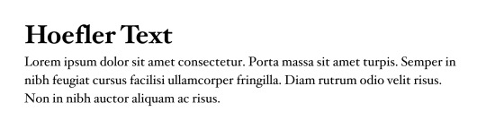
When I worked in publishing, I basically relied on Hoefler Text 99% of the time. It's just sweet and clean, nice round bodies and balanced x-heights... looks great on newsprint
For Sans... it's probably Whitney? or, not to be basic, Helvetica? Whitney is just a LITTLE quirky, it suits web really well but still has a bit of bookishness to it. The most subtle of angled terminals... And I'm kind of in to this recent wave of web brutalism that's all about committing to Helvetica and going absolutely bonkers about it... Hard choice!

Honestly I'm less picky about these individually. I prefer superfamilies and having a lot of options, and I'll look at the spacing to make sure I'm not ending up with a lot of weird rivers/widows/legibility issues... but otherwise it's just a matter of suiting the display.
#honestly I don't really get to think too much on these anymore#now that I'm basically chained to 1 font for work#but it's definitely a vibes thing#moss.txt#typography
44 notes
·
View notes
Text

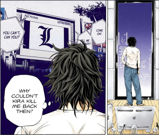

Death Note: colourised version.(x)
Interesting (and funny!) progression in L's design.
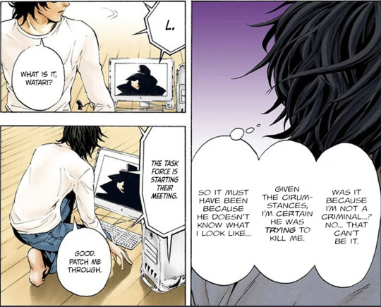
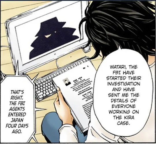
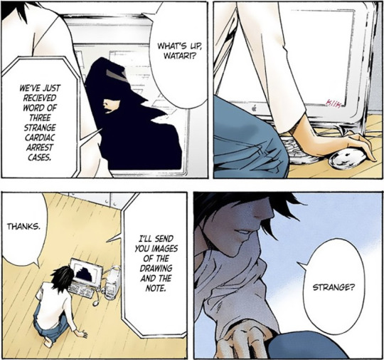
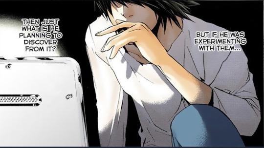
It's very noticeable across Chapters 2, 3, 4, 5, 6, 7, 8, 9 and 10 how Obata was still experimenting with L's visuals and trying to understand what would be the best traits to stick with. When we're introduced to L in Chapter 11, his design is mostly set in stone, though
First!L was actually more expressive in anger and frustration; he's also classically handsome, closer to Light in appearance and demeanour despite some obvious quirks such as being barefoot or working with his desktop on the floor of a room, as well as always wearing the same white shirt and baggy blue jeans.
It should be noted that Obata also mentioned how he tried to make L unattractive. He also mentioned how it would foil the character to display all of L's quirks at once, as no one would take him serious.
There are small details in these panels that differ wildly from the way L is introduced to the Task Force later on, namely:
How L stands straight when at full height, whereas his iconic slouch is a future addition to help contrast his appearance to that of Light's, making L stand out like a sore thumb when compared to the prim and proper Kira. Mind, he can still stand up straight, but seems to choose not to — perhaps out of laziness;
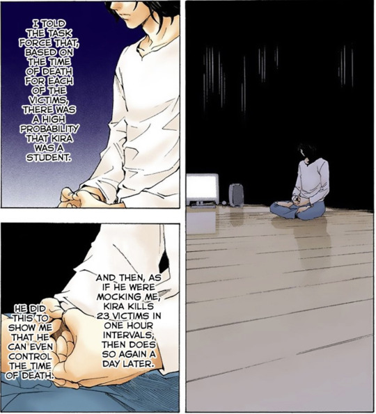
L is seen doing meditation exercises to calm down. We can infer the following:
a) that this is also an early addition that got scrapped off
b) OR that L does, in fact, meditate but given the stress of the Kira case and how he's constantly in the presence of the Task Force and Light 24/7, he had to forgo any techniques that calm him down — leaving only the excessive consumptions of sweets to keep him focused and sharp;
His hair is drawn with far less detail than in later chapters, where it resembles stubborn raven wings. First!L has spiky hair with waves or very soft curls;


As the story progresses up until L's face is revealed, the design is more definitive and closer to the Final!L.

Little by little, we are also shown some of L's quirks such as his oral fixation, which by this stage is just a hand striking a thoughtful gesture — as opposed to his thumb or index finger hooking on his mouth.


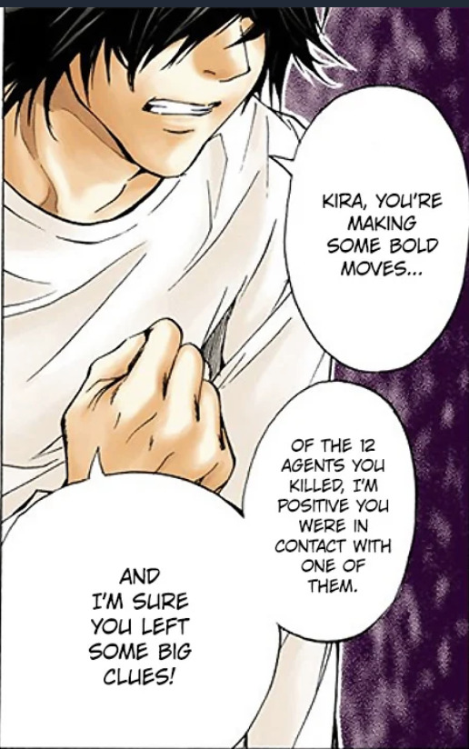
Also worth noting that either by virtue of an early design or simply due to being by himself, L is far more expressive in anger and frustration at this stage than later on. The listlessness subtly displayed here is much more pronounced after L reveals his face.
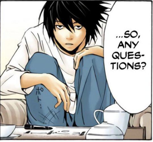
After Chapter 11 L starts perching like an eagle on furniture. I wonder if this is a behaviour that he exacerbated for the Kira case; we know that, in AN: LABB, the character Beyond Birthday, despite never having met L, did have an idea of how he would be and purposely exaggerated some of his quirks.
Eventually, L's eyebrows make a disappearing act. They reappear every now and then.

I always considered this progression in design to be fairly amusing. We're talking about visuals here — not writing, as that remains fairly consistent throughout the story.
L becomes almost comical, but therein lies how dangerous he is as he's able to trick his adversary and lull them into a false sense of security by looking much more fragile and goofy than he really is.

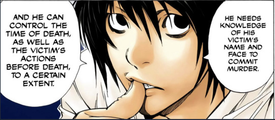

This is also the first time we see how L picks up things delicately using only the tips of his fingers. Honestly, how someone can write like that and still come out with legible handwriting is beyond me.
He's also not used to working with others in person. That shows here very well, as L gets frustrated at the constant distractions and input from the others. He's trying to be a team player, though!
22 notes
·
View notes
Text
Stressing About Finals
Shouta Aizawa/Eraserhead x gn!reader (familial/Dadzawa)
Warnings: brief mention of family abandonment (it's like one sentence, so take with that what you will)
Word Count: 845
ao3 link to fic
Masterlist
It was definitely after midnight when Aizawa woke up. He couldn't tell why he woke up at first. He ran through a check list in his head, making sure he didn't have to patrol tonight and didn't have any work to grade.
No and no.
So, what was bugging him all of a sudden like a sixth sense, itching the back of his skull like a song name he couldn't remember?
He sighed as he crawled out of bed, grabbing a small bottle of eye drops from his nightstand and using them so his eyes weren't so dry. He walked down the hall with quiet feet, peeking around the corner into the living room. It was empty, that was good.
Then, he heard it. It was hard to miss in the dead silence of the house, even he wasn't sure how he had missed it before. He turned to your door, and silently opened it to peek inside.
Aizawa had taken you in after your parents made it obvious they didn't want anything to do with you anymore. You were already in his class, so it was already like you were his child, if he could call 1-A his kids in the first place. He tried to be the best dad he could be; he pushed you to do your absolute best while still knowing when to back off. Overall, he was a good dad.
He was already beating himself up for not having noticed your muffled sobs the instant he woke up. At least on a subconscious level he had, he gave himself that much as praise.
You sat your desk, back hunched and shaking as you silenced your crying. You hadn't noticed him yet.
He quietly opened the door a bit wider, enough to slip inside and get to your side. He crouched down, now slightly below your height. The moment his hand touched your back carefully, you jumped.
"Oh, sorry, Aizawa, I didn't mean to wake you," you said quietly in the softest voice he'd ever heard. He didn't miss the way your voice shook.
"It's okay, (Y/N)," he assured. "You could have gotten me."
You stayed quiet. Perhaps you didn't want him to know, but he knew now, and he wanted to help. It was his job, as both a teacher and a guardian.
"What's wrong?"
The question hung in the air for a while. He let you mull over your thoughts, collect yourself. In the mean time, he stood up and guided you over to your bed to sit down. When he glanced at your desk, he noticed the open English and Math textbooks and notebooks, half-legible notes all over the place.
Shouta sat down beside you, allowing you to initiate contact if you wanted it. He wasn't big on physical assurance, but he didn't close himself off to it at this moment; you looked like you needed it. And when you leaned over and rested your head on his chest, he was happy to help by wrapping his arm around your shoulder and ground you in this moment.
"Is it finals?" he asked quietly, already knowing the answer. Your nod only confirmed his suspicions. "Hmm. I know it might not mean much, but your skills with your quirk are exceptional. There's no doubt you'll pass my final.
"As for English and Math," he continued, noticing the hitch in your breath, "staying up late and forcing information into your head won't help any. I understand you want to pass, and your determination is admirable, but this self-destructive method will only hinder you later on.
"If you want to study, then get some sleep. You still have a day before your English final, and two before Math. I'm sure Mic will review in class today, and you can ask questions on what you're unsure about.
"I'll help you with your math."
His lecture was a little long-winded, but it gave you time to settle down. It seemed to work as he could no longer feel you shaking or hear your breathing hitch in your throat.
"Won't that be playing favorites?" your quiet voice asked. You were worried he would be giving you too much help, going against his promise to his class that he wouldn't play favorites with any of his students.
"Not necessarily. As a teacher, I am more than allowed to assist you. And as your guardian, it's my job to take care of your mental health. If helping you study does that, then I'll help."
He looked down at you, eyes dry from unknowingly staring at the opposite wall. He could see you smiling, eyes watery and cheeks stained.
"Thank you."
He nodded, humming. He let go of you, standing up and tucking you into bed. Once you were all settled in, he pressed a kiss to your forehead and turned off your desk lamp. As he walked out the door, he heard your voice again. He couldn't stop his smile for the rest of the night as he laid back in bed and slept...
"Goodnight, dad."
#fanfic#fanfiction#shouta aizawa#eraserhead#dadzawa#familial#fluff#my hero acedamia#boku no hero academia#gender neutral reader#gn reader#x gn reader#light angst
177 notes
·
View notes
Text
PEOPLE I'D LIKE TO GET TO KNOW BETTER!
• Alias/Name: Chitter
• Birthday: January 6
• Zodiac Sign: Capricorn
• Height: 5'9" (175.26 cm)
• Hobbies: Writing, crocheting, reading, drawing, DnD, and video games.
• Favorite Color: Blue/silver/purple. A three-way tie.
• Favorite Book: Beauty, Sophie's World, His Dark Materials series, X-Men AoA comic line.
• Last Film/TV Show: Technically, Dimension 20's Fantasy High: Junior Year, but if you really want to split hairs I watched X-Men 97 earlier that same day.
• Recent Reads: Mother Thing, Tiny Nightmares, and several fan fiction chapters.
• Inspiration: Marvel comics, cheesy horror films, and people watching.
• Story behind URL: Take a wild guess.
• Fun Fact about me: In middle school, I taught myself to write with my feet because I saw a story on the news about a girl who lost both her arms in a tragic accident. (I guess I thought that I could lose my arms too?) My writing is legible but not good.
• Tagged by: @blackwingsbluedings
• Tagging: You, of course.
2 notes
·
View notes
Text
Book the Third—The Track of a Storm
[X] Chapter VII. A Knock at the Door
“I have saved him.” It was not another of the dreams in which he had often come back; he was really here. And yet his wife trembled, and a vague but heavy fear was upon her.
All the air round was so thick and dark, the people were so passionately revengeful and fitful, the innocent were so constantly put to death on vague suspicion and black malice, it was so impossible to forget that many as blameless as her husband and as dear to others as he was to her, every day shared the fate from which he had been clutched, that her heart could not be as lightened of its load as she felt it ought to be. The shadows of the wintry afternoon were beginning to fall, and even now the dreadful carts were rolling through the streets. Her mind pursued them, looking for him among the Condemned; and then she clung closer to his real presence and trembled more.
Her father, cheering her, showed a compassionate superiority to this woman’s weakness, which was wonderful to see. No garret, no shoemaking, no One Hundred and Five, North Tower, now! He had accomplished the task he had set himself, his promise was redeemed, he had saved Charles. Let them all lean upon him.
Their housekeeping was of a very frugal kind: not only because that was the safest way of life, involving the least offence to the people, but because they were not rich, and Charles, throughout his imprisonment, had had to pay heavily for his bad food, and for his guard, and towards the living of the poorer prisoners. Partly on this account, and partly to avoid a domestic spy, they kept no servant; the citizen and citizeness who acted as porters at the courtyard gate, rendered them occasional service; and Jerry (almost wholly transferred to them by Mr. Lorry) had become their daily retainer, and had his bed there every night.
It was an ordinance of the Republic One and Indivisible of Liberty, Equality, Fraternity, or Death, that on the door or doorpost of every house, the name of every inmate must be legibly inscribed in letters of a certain size, at a certain convenient height from the ground. Mr. Jerry Cruncher’s name, therefore, duly embellished the doorpost down below; and, as the afternoon shadows deepened, the owner of that name himself appeared, from overlooking a painter whom Doctor Manette had employed to add to the list the name of Charles Evrémonde, called Darnay.
In the universal fear and distrust that darkened the time, all the usual harmless ways of life were changed. In the Doctor’s little household, as in very many others, the articles of daily consumption that were wanted were purchased every evening, in small quantities and at various small shops. To avoid attracting notice, and to give as little occasion as possible for talk and envy, was the general desire.
For some months past, Miss Pross and Mr. Cruncher had discharged the office of purveyors; the former carrying the money; the latter, the basket. Every afternoon at about the time when the public lamps were lighted, they fared forth on this duty, and made and brought home such purchases as were needful. Although Miss Pross, through her long association with a French family, might have known as much of their language as of her own, if she had had a mind, she had no mind in that direction; consequently she knew no more of that “nonsense” (as she was pleased to call it) than Mr. Cruncher did. So her manner of marketing was to plump a noun-substantive at the head of a shopkeeper without any introduction in the nature of an article, and, if it happened not to be the name of the thing she wanted, to look round for that thing, lay hold of it, and hold on by it until the bargain was concluded. She always made a bargain for it, by holding up, as a statement of its just price, one finger less than the merchant held up, whatever his number might be.
“Now, Mr. Cruncher,” said Miss Pross, whose eyes were red with felicity; “if you are ready, I am.”
Jerry hoarsely professed himself at Miss Pross’s service. He had worn all his rust off long ago, but nothing would file his spiky head down.
“There’s all manner of things wanted,” said Miss Pross, “and we shall have a precious time of it. We want wine, among the rest. Nice toasts these Redheads will be drinking, wherever we buy it.”
“It will be much the same to your knowledge, miss, I should think,” retorted Jerry, “whether they drink your health or the Old Un’s.”
“Who’s he?” said Miss Pross.
Mr. Cruncher, with some diffidence, explained himself as meaning “Old Nick’s.”
“Ha!” said Miss Pross, “it doesn’t need an interpreter to explain the meaning of these creatures. They have but one, and it’s Midnight Murder, and Mischief.”
“Hush, dear! Pray, pray, be cautious!” cried Lucie.
“Yes, yes, yes, I’ll be cautious,” said Miss Pross; “but I may say among ourselves, that I do hope there will be no oniony and tobaccoey smotherings in the form of embracings all round, going on in the streets. Now, Ladybird, never you stir from that fire till I come back! Take care of the dear husband you have recovered, and don’t move your pretty head from his shoulder as you have it now, till you see me again! May I ask a question, Doctor Manette, before I go?”
“I think you may take that liberty,” the Doctor answered, smiling.
“For gracious sake, don’t talk about Liberty; we have quite enough of that,” said Miss Pross.
“Hush, dear! Again?” Lucie remonstrated.
“Well, my sweet,” said Miss Pross, nodding her head emphatically, “the short and the long of it is, that I am a subject of His Most Gracious Majesty King George the Third;” Miss Pross curtseyed at the name; “and as such, my maxim is, Confound their politics, Frustrate their knavish tricks, On him our hopes we fix, God save the King!”
Mr. Cruncher, in an access of loyalty, growlingly repeated the words after Miss Pross, like somebody at church.
“I am glad you have so much of the Englishman in you, though I wish you had never taken that cold in your voice,” said Miss Pross, approvingly. “But the question, Doctor Manette. Is there”—it was the good creature’s way to affect to make light of anything that was a great anxiety with them all, and to come at it in this chance manner—“is there any prospect yet, of our getting out of this place?”
“I fear not yet. It would be dangerous for Charles yet.”
“Heigh-ho-hum!” said Miss Pross, cheerfully repressing a sigh as she glanced at her darling’s golden hair in the light of the fire, “then we must have patience and wait: that’s all. We must hold up our heads and fight low, as my brother Solomon used to say. Now, Mr. Cruncher!—Don’t you move, Ladybird!”
They went out, leaving Lucie, and her husband, her father, and the child, by a bright fire. Mr. Lorry was expected back presently from the Banking House. Miss Pross had lighted the lamp, but had put it aside in a corner, that they might enjoy the fire-light undisturbed. Little Lucie sat by her grandfather with her hands clasped through his arm: and he, in a tone not rising much above a whisper, began to tell her a story of a great and powerful Fairy who had opened a prison-wall and let out a captive who had once done the Fairy a service. All was subdued and quiet, and Lucie was more at ease than she had been.
“What is that?” she cried, all at once.
“My dear!” said her father, stopping in his story, and laying his hand on hers, “command yourself. What a disordered state you are in! The least thing—nothing—startles you! You, your father’s daughter!”
“I thought, my father,” said Lucie, excusing herself, with a pale face and in a faltering voice, “that I heard strange feet upon the stairs.”
“My love, the staircase is as still as Death.”
As he said the word, a blow was struck upon the door.
“Oh father, father. What can this be! Hide Charles. Save him!”
“My child,” said the Doctor, rising, and laying his hand upon her shoulder, “I have saved him. What weakness is this, my dear! Let me go to the door.”
He took the lamp in his hand, crossed the two intervening outer rooms, and opened it. A rude clattering of feet over the floor, and four rough men in red caps, armed with sabres and pistols, entered the room.
“The Citizen Evrémonde, called Darnay,” said the first.
“Who seeks him?” answered Darnay.
“I seek him. We seek him. I know you, Evrémonde; I saw you before the Tribunal to-day. You are again the prisoner of the Republic.”
The four surrounded him, where he stood with his wife and child clinging to him.
“Tell me how and why am I again a prisoner?”
“It is enough that you return straight to the Conciergerie, and will know to-morrow. You are summoned for to-morrow.”
Doctor Manette, whom this visitation had so turned into stone, that he stood with the lamp in his hand, as if he were a statue made to hold it, moved after these words were spoken, put the lamp down, and confronting the speaker, and taking him, not ungently, by the loose front of his red woollen shirt, said:
“You know him, you have said. Do you know me?”
“Yes, I know you, Citizen Doctor.”
“We all know you, Citizen Doctor,” said the other three.
He looked abstractedly from one to another, and said, in a lower voice, after a pause:
“Will you answer his question to me then? How does this happen?”
“Citizen Doctor,” said the first, reluctantly, “he has been denounced to the Section of Saint Antoine. This citizen,” pointing out the second who had entered, “is from Saint Antoine.”
The citizen here indicated nodded his head, and added:
“He is accused by Saint Antoine.”
“Of what?” asked the Doctor.
“Citizen Doctor,” said the first, with his former reluctance, “ask no more. If the Republic demands sacrifices from you, without doubt you as a good patriot will be happy to make them. The Republic goes before all. The People is supreme. Evrémonde, we are pressed.”
“One word,” the Doctor entreated. “Will you tell me who denounced him?”
“It is against rule,” answered the first; “but you can ask Him of Saint Antoine here.”
The Doctor turned his eyes upon that man. Who moved uneasily on his feet, rubbed his beard a little, and at length said:
“Well! Truly it is against rule. But he is denounced—and gravely—by the Citizen and Citizeness Defarge. And by one other.”
“What other?”
“Do you ask, Citizen Doctor?”
“Yes.”
“Then,” said he of Saint Antoine, with a strange look, “you will be answered to-morrow. Now, I am dumb!”
3 notes
·
View notes
Text
Tuesday 23 May 1837
6 35
1
had A- a little while at 7 – fine morning F48 ½° now at 7 50 – Read the 1st 48pp. of Africa (Edinburgh cabinet library ii) till 8 35 then out at the Lodge and with Charles and James Howarth and lad (Smith) putting the Godley gate near to Greenwoods’ cottage – back to breakfast at 9 – dawdling about till off in the carriage with A- about 10 ¾ - left her at Whitehall – she going forwards to Leeds to bring back little Mary, and I returned with Robert Mann + 5 to get up great holly in Charles Howarths’ little field next Pump lane – brought in Robert Mann to dinner at 1 or a minute or 2 before – gave the other men ½ time – making a push to get all done ([?]) – had Baldwin the slater –paid him £5 in a/c of the Stump X Inn – and on hearing that Mr. Husband would measure off the hay shed here, said he needed not trouble himself – I had had it measured – B- satisfied so paid him writing the
SH:7/ML/E/20/0065
myself for 47 ½ yards at 8d. including laths and nails = £1.11.8 – then wrote the above of today till 1 ½ and then out again – at the Lodge – with Robert and co. in Charles Howarth’s field getting up the holly – it divided into 2 fine large ones – planted this evening (from 6 to 8) in Greenwoods’ field on the height turning over the Lodge – between 4 and 5 (about 5) fortunately took Mr. G- to see the new wash-house and brewhouse begun this morning by 2 of the masons as set out by Mr. G- and Booth ten days ago – G- did not like the effect of it would have stopt the men – B- to be here in the morning – with G- this morning and afternoon planning the opening of the Lodge gates by machinery underground communicating with the room upstairs in the Lodge – backwards and forwards in and out the whole day - Mr. G- and I came in at 6 ½ and dined in 35 minutes and then out again at the Lodge till after 8 the men staying till then, as long as they could well see – made coffee at 9 – skimmed over the London paper – the H-x guardian came tonight – 1st time I think on a Tuesday – note from A- in pencil tonight – hardly legible by candle light – said she had sent me my watch by George – George knows nothing about it – all for me was left in the front pocket and the watch not there! can it be lost? is it possible? Poor Sibbella! my heart aches at the mere thought of such a loss – I would not trust the watch at Nicholsons the linen draper to take to London – and can it now and thus be lost? Mr. Gray to here again the 15th or rather Tuesday 20th of next month – terms ten guineas a week fine day – F47° now at 11 20 pm came upstairs about 10 ¾ - wrote the last 14 lines and had George up about the watch – Charles and James Howarth and lad Smith here all the day – in the afternoon set the glen bridge-gate posts – Ingham and his 2 sons William and Solomon here all the day puddling a little more at the cistern in the laundry court and walling up gaps and gateways in the paddock – Mark Hepworth and 2 horses here all day – brought hollies from my SW- field in the morning and ditto from Charles H-‘s field in the afternoon, and rag from Hipperholme quarry in the intervals – had Mr. SW- just before A- set off this morning – about the road to Hardcastles wood – the field underneath it on this side = about an acre SW- values it at £100 – to ask H- if he will sell it all – or 6 yards wide of road off it at the far end – making memoranda etc till 12-
2 notes
·
View notes
Text
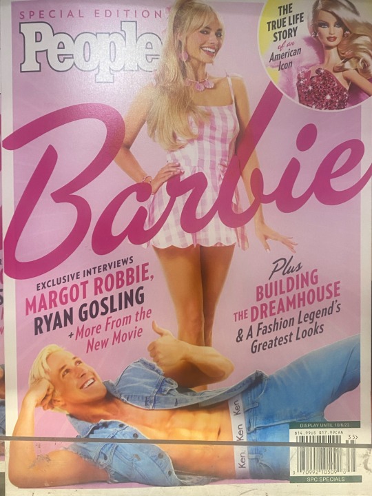
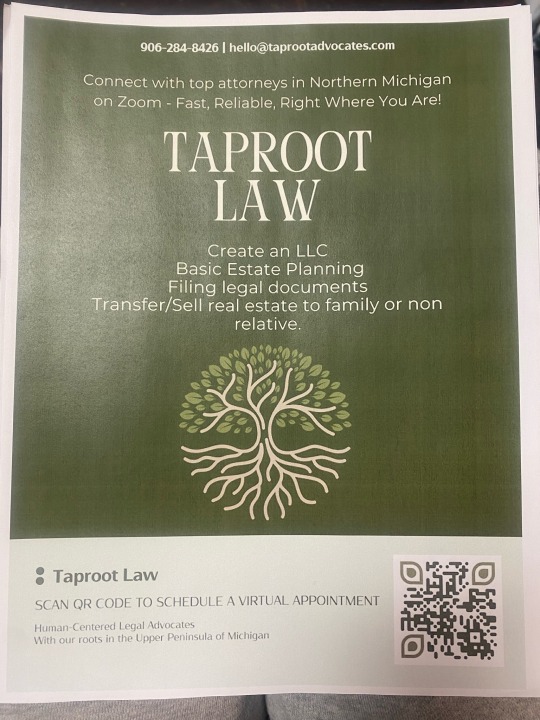
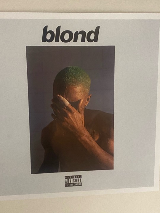

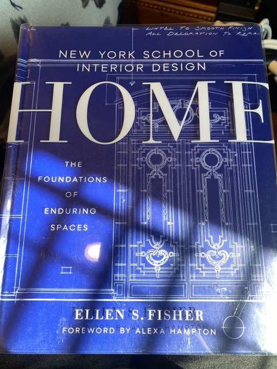

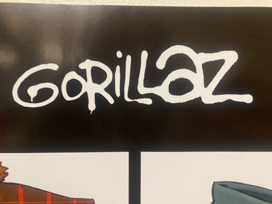
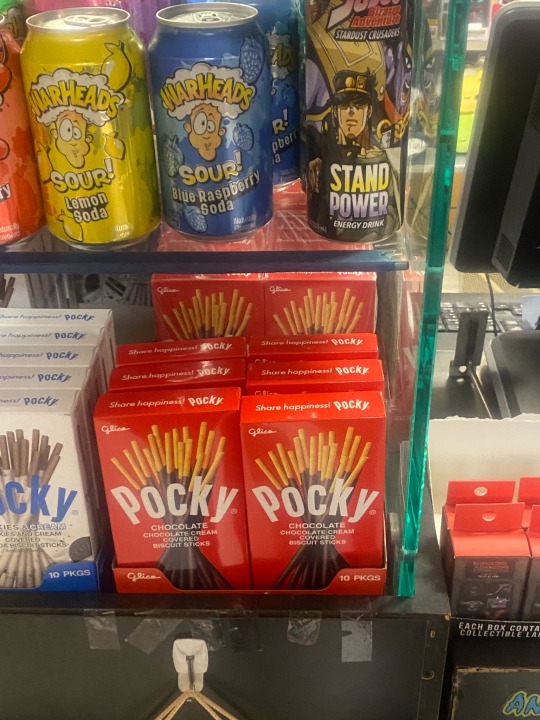
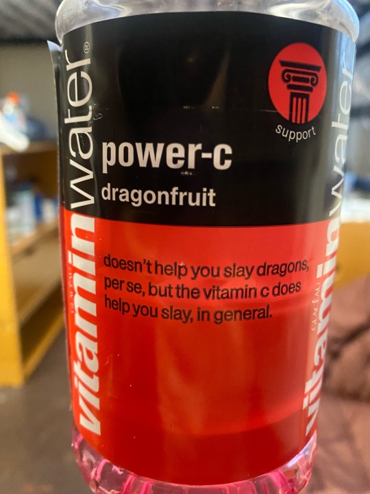
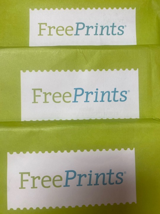
Image #1 Exploring rhythm in publication design with this shot from a special edition Barbie magazine. The repetitive use of font across the page, featuring headlines like 'Exclusive Interviews and Fashion Legends Greatest Looks, creates a rhythmic flow, guiding the reader's eye through the content. Inspired by Bauhaus principles, this layout captures the essence of dynamic visual rhythm.
Image #2 Demonstrating typographic hierarchy in a flyer design for "Taproot Law." By enlarging and bolding the company name, "Taproot Law," and emphasizing contact information with bold text, hierarchy is established, guiding the viewer's attention to the most important elements. This technique echoes principles discussed in our readings, effectively organizing information for clarity and visual impact.
Image #3 Observing typography's anatomy with a close up of my poster titled "blond.'" Highlighting a letter with an ascender, l this image showcases the vertical stroke extending above the x height, exemplifying typographic anatomy. This visual element adds elegance and balance to the composition, echoing design principles explored in our lectures.
Image #4 Capturing typographic diversity in signage at MSU's Football Practice Complex. This image features letters with descenders, seen in words like ''Football" and ''Field,'' where portions of the characters extend below the baseline. Such typographic elements add visual interest and aid readability, reflecting the importance of typography in environmental design as discussed in our course materials.
Image #5 Exploring letterforms with a textbook cover from the New York School of Design titled ''HOME.'' In this image, the letter ''O'' in ''HOME'' serves as a counter, the enclosed space within a letter. By utilizing the ''O'' as a visual element, this design exemplifies the interplay between positive and negative space, as discussed in our readings, contributing to the overall aesthetic appeal and readability of the cover.
Image #6 Unveiling typographic elements in a GRANGER banner near MSU construction. This image showcases the letter ''A'' with a crossbar. The use of crossbars adds visual structure and balance to the typography, aligning with principles of clarity and legibility emphasized in our coursework.
Image #7 Examining font characteristics with the poster for ''GORILLAZ.'' This font exemplifies a large x height, as seen in the comparatively short ascenders, contributing to its bold and legible appearance. The prominent x height enhances readability, making it suitable for captivating the viewer's attention in various design contexts.
Image #8 Analyzing font characteristics in the packaging of ''Pocky.'' The font used on the packaging demonstrates a small x-height, evident in the comparatively large ascenders. This font choice enhances the product's playful and whimsical appearance, aligning with the branding's intent to convey a sense of fun and enjoyment.
Image #9 Reflecting on modernist design principles with the Vitamin Water bottle featuring Dragon Fruit flavor. The clean lines, minimalistic typography, and well organized layout convey a sense of modernist aesthetics. Each element, from colors to typography, appears purposefully placed, contributing to the overall harmonious and balanced design.
Image #10 Examining font connotations in Free Prints packaging, notably featuring Comic Sans. The use of Comic Sans, known for its casual and informal demeanor, suggests a friendly and approachable tone. This font choice may aim to convey a sense of accessibility and ease, resonating with the brand's mission to make printing accessible to all. However, it also raises questions about appropriateness and design integrity within the context of professional communication.
0 notes
Text
Project 1: Music Festival Design System
Week 3 - Typographic Design: Form and Communication by Rob Carter
Chapter 2: The Anatomy of Typography


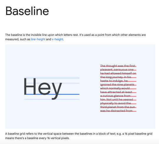
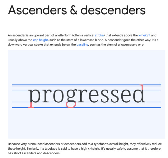
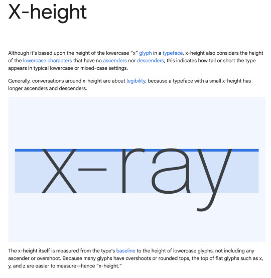
Some of the earliest typography was constructed from a basic grid structure. They also followed a structure to unify them. This structure was composed of the beard line, baseline, x-height, meanline, and capline.
Beard line: lowest line where descenders hit
Baseline: line that all letters rest on
X-height: the distance of the letter form from baseline to meanline
Meanline: line that the top off all letters hits
Capline: highest line where ascenders hit
Within the guide, there are several names used to denote the “anatomy” of letters, or the different terms for their characteristics. This includes the apex, arm, ascender, bowl, counter, crossbar, descender, ear, eye, fillet, hairline, leg, link, loop, serifs, shoulder, spine, spur, stem, stroke, tail, and terminal.
These two guides allow for style liberties. Type is able to be manipulated by changing proportions of the letter’s height, weight, width, stress, and posture in relation to each other. When all of the letters are of the same proportion, it creates a visual unity. This is what we call the typographic font. These fonts have gone through stylistic phases throughout history starting with Old Style, Italic, Transitional, Modern, Egyptian, Grotesque, Neo-grotesque, Humanist, and Geometric.
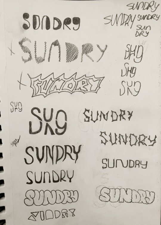
The main focal element of the poster design for this project is the name. This means that the font/style has to be visually striking, memorable, and fit the theme. Remembering the different elements of typography and how they affect mood is very helpful for this. I want to create an intricate design that is still legible and has the feel of the theme I chose. To do this, I would like to create a font with a thinner weight, capital letters, and embellishments as design liberties. I sketched many different type styles and then digitized a few of the better ones to see what they would look like if they were more polished. After I did this I then chose a few that I really liked and I am now working on redeveloping and refining them. I am also beginning to think about what I want the poster design to be. I have been taking photos of the course of this project that I can hopefully use and manipulate to fit the style.
0 notes
Text


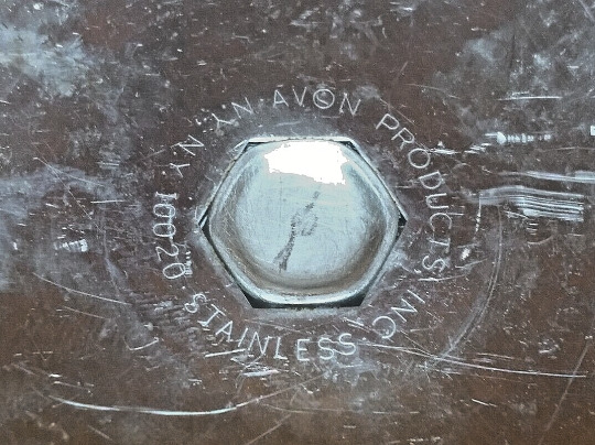


Vtg 1970s Danish Modern Stainless Steel Candle Holder MCM Style Avon.Triangular Stainless Steel Candlestick Holder AVON VINTAGE MCM 1970'S 3.25 X 1.5 (GENERAL WIDTH AND HEIGHT AT CANDLE HOLDER TOP).INTERESTING PIECE. IT REMINDS ME OF THE STAR TREK INSIGNIA ON THEIR SHIRTS. IT IS INSCRIBED WITH: AVON PRODUCTS INC. , STAINLESS, N.Y. N.Y. 10020. CLEARLY LEGIBLE ON BASE. SEE PICTURES.GREAT CLASSIC MID-CENTURY MODERN TYPE PIECE (Danish modern is a style of minimalist furniture and housewares from Denmark associated with the Danish design movement).
IT IS ABOUT 50 YEARS OLD--HAS SOME SCRATCHES, BUT THE STEEL IS THICK, NO RUST, AND WILL PROBABLY LAST FOREVER. 2 BEVELED TRIANGLES ARE SEALED TOGETHER BACK TO BACK, WITH CANDLE HOLDER ON UPPER MIDDLE.
GREAT CLASSIC PIECE. I AM INCLUDING A CANDLE--BECAUSE YOU SHOULD BE ABLE TO USE A CANDLE HOLDER THE SECOND YOU GET IT!
#DAWNETTSEMPORIUM, #BEAUTIFULMERMAIDQUEEN, #SHAUNALYNNSFOOD.
0 notes
Text


Rationale
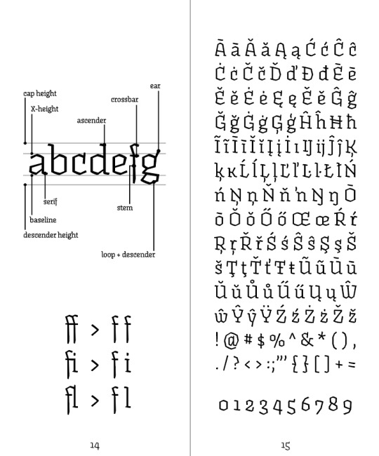
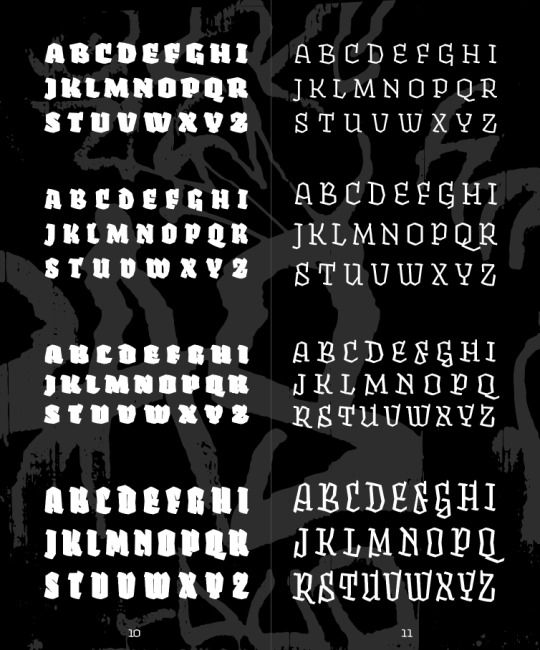
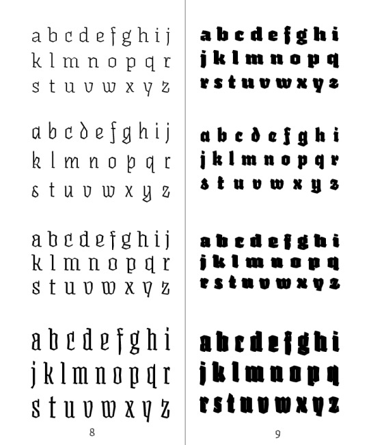
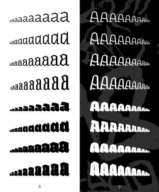
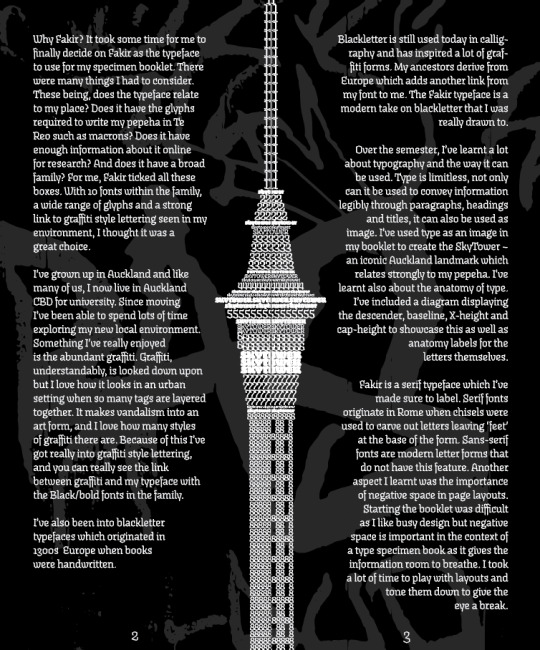
Why Fakir? It took some time for me to finally decide on Fakir as the typeface to use for my specimen booklet. There were many things I had to consider. These being, does the typeface relate to my place? Does it have the glyphs required to write my pepeha in Te Reo such as macrons? Does it have enough information about it online for research? And does it have a broad family? For me, Fakir ticked all these boxes. With 10 fonts within the family, a wide range of glyphs and a strong link to graffiti style lettering seen in my environment, I thought it was a great choice. I’ve grown up in Auckland and like many of us, I now live in Auckland CBD for university. Since moving I’ve been able to spend lots of time exploring my new local environment. Something I’ve really enjoyed is the abundant graffiti. Graffiti, understandably, is looked down upon but I love how it looks in an urban setting when so many tags are layered together. It makes vandalism into an art form, and I love how many styles of graffiti there are. Because of this I’ve got really into graffiti style lettering, and you can really see the link between graffiti and my typeface with the Black/bold fonts in the family. I’ve also been into blackletter typefaces which originated in 1300s Europe when books were handwritten. Blackletter is still used today in calligraphy and has inspired a lot of graffiti forms. My ancestors derive from Europe which adds another link from my font to me. The Fakir typeface is a modern take on blackletter that I was really drawn to.
Over the semester, I’ve learnt a lot about typography and the way it can be used. Type is limitless, not only can it be used to convey information legibly through paragraphs, headings and titles, it can also be used as image. I’ve used type as an image in my booklet to create the SkyTower – an iconic Auckland landmark which relates strongly to my pepeha. I’ve learnt also about the anatomy of type. I’ve included a diagram displaying the descender, baseline, X-height and cap-height to showcase this as well as anatomy labels for the letters themselves. Fakir is a serif typeface which I’ve made sure to label. Serif fonts originate in Rome when chisels were used to carve out letters leaving ‘feet’ at the base of the form. Sans-serif fonts are modern letter forms that do not have this feature. Another aspect I learnt was the importance of negative space in page layouts. Starting the booklet was difficult as I like busy design but negative space is important in the context of a type specimen book as it gives the information room to breathe. I took a lot of time to play with layouts and tone them down to give the eye a break.
0 notes
Photo


Week 3 - 21/10/22
https://fonts.google.com/knowledge/glossary#a-d
I researched typography terms that make up a typeface to gain some better knowledge into how to make a successful legible typeface. I looked at google fonts for this insight and viewed their glossary terms and explanations of them
Serifs and terminals are additions to the end of a stroke. Although they can help gain cohesiveness and style in a typeface, I don’t think I want to use them in mine as I personally prefer sans serif fonts, and I want to design one I will like myself.
I need to consider when designing ascender height, descender height, the baseline and the x height. By giving my letters an exaggerated x height it will shorten the ascenders and descenders and vice versa, so this will be something to keep in mind. As I wont be designing capital letters I shouldn’t need to worry about Cap height.
0 notes
Text
GRAD 502 - Week 3.2
What are experimental typeface?
Experimental typefaces are generally of the display family, and have an unexpected look or interaction, such as animation, different x-heights, or a general disregard of the rules of letterform shape and spacing.
These text styles include quirky lines, colours, and letterforms.
They have flair and plenty of personality.
It’s a delicate balance between typography as art and typography to convey a message.
Using Experimental typefaces
It’s important to consider if your typeface is appropriate for your audience or topic, the value of readability versus creative value, and the overall relationship to your topic as a whole.
Here’s how you can make experimental typefaces work for your project:
Use a typeface that feels like it goes with your topic + objective
- My campaign is for the kid so I think have to my typeface is attractive to children sight so should be cute, big, readable, colourful? I think so. Well, Nunito is round shape with readable typeface so my plan is make some my own typeface with nunito.
Create a messaging match : a colour font typically feels fun and light. Does that go with your content and tone? The same is true of any experimental typeface. Type in the words in the font you plan to use. What emotions or meaning come to you when you see it for the first time? Does that fit the goal of your messaging?
- Nunito is a well balanced sans serif typeface superfamily with 2 versions. There have two version for the round and non-round shape typeface named Nunito Sans.
- Nunito is readable and round cute shape own my opinion so I think is really good for the kids project, also I got recommend from my friend for the kid typeface.
- My plan is making new own typeface for attract kid’s sight. (Realate with some road safety)
Pair an experimental typeface with a simpler, more legible font that reiterates key messaging. Before conducting any type of design experiment, it is important to think about how it will resonate with your core audience + overall messaging.
- I’ll made new typeface mix with the Nunito and road safety, traffic sight, traffic light things.
0 notes
Text
Understanding Typography
Typography expresses hierarchy and brand presence.
Type Properties
The typeface is a collection of letters. While each letter is unique, certain shapes are shared across all letters - the typeface represents shared patterns across a collection of letters.
Typefaces are selected for their style, legibility and readability, and are most effective when following certain fundamental principles of typographic design.
Type Anatomy
Boundries:
Baseline - The imaginary horizontal line upon which the majority of the characters in a typeface sit
Capline - The imaginary horizontal line upon the tops of the uppercase letters
Meanline - The height of lowercase letters
X-height - The height of the body of the lowercase letters excluding ascenders/ descenders
Letterform Parts:
Apex - The peak of an uppercase A
Arm - The horizontal portion of the letterform, one or both ends of which are unattached to the vertical portion(s)
Ascender - The portion of a lowercase letterform that ascends above the x-height
Beak - The projection that extends from the end points of an uppercase L,T, E
Bowl - A curved portion that encloses a counter
Bracket - The curve that connects the serif to the stem/ stroke
Counter - The negative space of a letterform (partially or fully closed)
Crossbar - The horizontal part of a letterform that connects (like the middle line of H)
CrossStroke - The horizontal part of a letterform that intersects the vertical part
Descender - The portion of a lowercase letterform that descends below the baseline
Ear - The small decorative projection from the upper right side of a lowercsase g
Eye - The enclosed portion of a lowercase e
Hairline - The thinest line of a typeface
Leg - The lower, angled stroke of a k
Link - The part of a lowercase g that connects the loop to the bowl
Loop - The curved part of a lowercase g
Serif - Small decorative lines added to the letterforms stems/ spine
Spine - The main portion of S that curves from left to right
Spur - The projection that extends from the end point of a curved portion (smalled than a serif)
Stem - The main vertical portion
Stroke - The main diagonal portion
Tail - The stroke/ loop at the end of a letterform
Terminal - The end or termination of a sten/ stroke with no serif
Typography
A letter object is defined as a character, or a symbol that represents a sound in speech. Each character and letter combinations are unique, and have their own rules.
Typeface - the overall design of letters
Font - a complete set
Serif letterforms - have structural extensions/tails
Fonts have distiguishable shapes and visual structures
The greater the x-height, the larger the text will appear.
When metal type was first made each character took up a certain amount of space (measure in points - called point size [pt]) and has space between each letter (leading).
Letter spacing inserts white space between letter to ensure they are clear to be read (inter-character space). This is also referred to as tracking — it affects the entire line of type.
Typography is known as an invisible form, with most typefaces created with consideration to how the letters flow into words.
Ligetures - when one letterform is created from two original letterforms due to clashes.
“Good typography is about visualising language through the arrangement, composition and choice of type.”
0 notes
Last Seen Blogs