#re drawn with the newer art style is
Text
I absolutely loved this chapter! Seeing all these events through kumas eyes was heart breaking. He been known that luffy is that mf™️
Happy 2023 everyone, as op fans we have certainly been blessed✨️ this year.

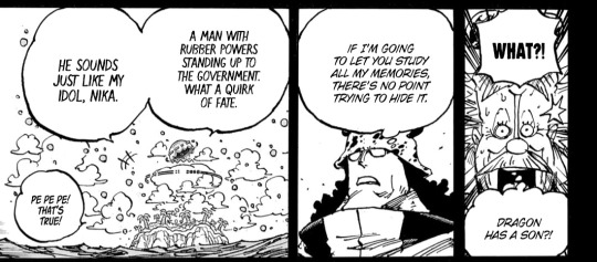


#one piece#op 1102#one piece 1102#op spoilers#one piece spoilers#op manga#bro#this chapter was amazing#eiichiro oda#monkey d. luffy#one piece manga#also seeing all these events#re drawn with the newer art style is#chefs kiss 🤌🤌#not that i dont love the old style#i love op in every font
42 notes
·
View notes
Text
I kinda want to articulate why the D3 armor in QC feels weird to me.
A lot of these "throwback" armors do have differences to their actual designs, even the D2/64 ones in Eternal (Obviously because inconsistencies in designs aren't new to Doom but D3 was a game with more elaborate 3D models compared to others with sprites, few promo art and even low poly models like Q3A).
But D3 feels weird and i think it's because D3 had a specific art direction while in QC, it comes off as making it adhere to some of 2016's art style elements.
Maybe that's way: It's not just the looks themselves but it reminds me of a mindset that comes off as "fixing D3 means making it adhere to 2016/Eternal".
When in reality it should mean "making D3 a better D3 or at least make it respect/handle itself a bit better while being its own thing".
Because anyone who already dislikes D3 and prefers 2016/Eternal could just keep with those and get more of them.
D3 is its own flavor and it also comes off as misunderstood even by itself.
I keep saying D3 and "Slayer games" are like 2 sides of the Doom coin or seperate, opposite branches in the "Doom tree".
But maybe that mindset requires to admit "here's how 2016/Eternal still differ from old Doom" when some people prefer to think of them as being closer to the originals (Part of why i like that MatthewMatosis went "it's not like the classics but that's okay, they're still good and the old ones still get stuff").
If anything, admitting that modern Doom differs from old Doom can lead to so much more:
On one hand, finding many ways to explore classic Doom like how to better translate Doomguy's face to 3D.
But also, welcome newer, even if riskier things that could suit Doom in a way despite being alienating at first (Even if a boundry could be drawn like "don't turn demons into aliens").
Part of why 2016 and Eternal shouldn't be seen as "remakes" of D1 and 2 because they're clearly their own games (and also, D1/2 don't need "remakes" but you could have modern games with their own material that just vaguely parallel them?).
At the very least, this "D3 armor" being different could be seen as a "variation" of the D3 armor like how Eternal has a different take on the Praetor suit.
So imagine if a "Doom 3 sequel" had a design like the QC D3 armor but different/new enough while a "true" D3 armor is an unlockable skin (Plus, helmet on/off option).
Looking back, even MetaDoom uses this design and that's the mod i hype up as "ultimate Doom tribute, not even id themselves could do stuff like this".
And again, D3 fixing could mean a lot:
A proper re-release that does what BFG Edition and others should've done instead.
Maybe one more expansion that just tweaks the gameplay a bit (while leaving some flaws in base game but with settings/options) and does specific stuff like using the obscure power ups.
Its own "Hell on Earth" follow up that the D4 project should've been.
Anything but a "remake", because "remaking" D3 could lead to what i fear would happen like "making it for people that already dislike D3's concept alone".
4 notes
·
View notes
Note
1, 2, 3, 4, 8, 10, 11, 12, 13, 16, 20, 21, 29, 30 (So sorry for the question dump!)
1. Autodesk Sketchbook Express when I first got my tablet. Photoshop Elements and Paint Tool SAI I don’t use for regular drawing anymore; but they still get irregular use for other purposes (image edits and drawings for academic works; i.e. flowcharts for programming).
On a similar note, while I use Clip Studio Paint for practically all of my regular drawing nowadays, I did use that program years ago for a short animation; before going to try and learn Opentoonz. I would like to return to it at least once, for a colored animation; since I’m still trying to get over OpenToonz’ learning curve.
2. It’s not something I really think of much, but I guess I draw characters facing right more often that I do drawing them facing left.
3. This is a stretch / loose interpretation. But even though I haven’t drawn / posted any new ones as of late. I would say my videogame level maps / level design draw their roots from my earliest (traditional) drawings when I was younger, which were maps of highway / interstates. I sometimes still think about doing a true “throwback piece” to those days and draw a new highway map.
4. I would really like to get back to drawing more detailed environments like I used to do when I first started getting into digital art. But I have trouble getting started in any meaningful way; and the newer landscapes I do are still simpler compared to my earlier stuff. I imagine part of the problem is that my earlier, more detailed landscapes were traditional drawings on paper, so maybe I was more willing to spend more time filling in/adding blanks compared to digital? I’m still trying to work it out.
8. I have a bunch of art and videogame concepts / projects I have that are perpetual shelf occupants, stuff that I might go back and tinker with, others that go untouched for years. Some are lucky to get rescued and either finished or reworked to finally see the light of day. I imagine at some point I’m going to have to essentially “clean out the closet” and decide what stays or goes.
10. Tall boots! They’ve kinda always been a mainstay for me.
11. It varies between music and podcasts (which are typically movie reviews). Right now I think I’ve hit a regular track where if I’m trying to draw something new or develop a concept; I listen to music for inspiration (which varies a lot—videogame instrumentals, jazz, R&B, alternative, piano instrumentals, mashups, etc.). If I have a concrete art idea that I just need to develop into a finished product (i.e. doing construction, coloring, etc.).
12. I don’t think I have any, since I keep trying to vary my approach in constructing bodies. Each of them tend to be somewhat difficult for me, at least in terms of getting the proportions right. I suppose drawing arms and legs are what I have the easiest time with.
13. I don’t really have any that comes to mind. There’s probably some, I could certainly name particular genres or studios; but not individual creators.
16. I’m not sure, admittedly. I guess that I would probably be pretty good with fanart (and likely would be more popular than I currently and historically have been). It’s not so much I don’t like drawing fanart, than it is that it’s mainly not been my focus. It’s something that I’ve previously said that I’ve been hoping to rectify in recent years, hopefully this year.
20. Honestly, I don’t know what I (used to) draw that would be considered difficult. I guess drawing level design would probably be up there; at least in the sense of it probably being difficult to plan out, or figure out a way to try and make it engaging or interesting. Like I said earlier, my interest for drawing highways I imagine was a prelude to drawing maps/course design. My parents like to say that I should have become an architect.
21. Highly detailed aesthetics for character designs and environments, usually of a realistic style. Although I try to shuffle my aesthetics around regularly, I’d say I usually do hit a limit with my art where it’s either at least stylized and/or simple to some degree.
29. Not sure. I guess the closest thing I can say to answer this question is that there’s a bunch of things I like and/or outright love, but I don’t regularly create fanart of. (As I said previously, I normally don’t draw much fanart in general, and I’d like to try and change that this year.)
30. There have been some pieces I’ve done that I’m proud of, mainly because I put extra touches of flourish on and/or think are probably among my best (recent) works; but I can’t say they have gotten any notable attention (especially here on tumblr, which as of late gets less traction compared to Twitter and sometimes deviantArt). A recent piece I feel has been overlooked a bit is included below (original post to it here); but here are links to some other pieces from last year I feel were overlooked here on this site.

2 notes
·
View notes
Text
One Piece Anime Wano Arc Episodes 890
One Piece Anime: Wano Arc, Episodes 890
This honestly is less going to be a review and more of a commentary as I watch through the anime's rendition of the Wano arc. I've honestly never really watched too much of the One Pieceanime, mostly just looking up the highlights of the arcs I read in the manga. I did watch the filler episodes and most of the movies, as I've talked about at length recently. And everyone tells me that the anime has some rather terrible pacing, particularly around the time of Dressrossa, which is apparently pretty padded out. But then I heard the absolute opposite for Wano, where the anime has received a new art-style and one hell of a fancy makeover. And I thought... hey, I'm on a One Piece kick this year, clearly, so yeah, I think I'm going to give this a shot.
The Wano arc, I think, is one that works a lot better because it has the reverse problem of a lot of One Piece arcs -- there are a lot of moments in Act One of the manga's version of the story that the writer clearly purposefully threw in a couple of off-screened moments that the anime could expand into full action scenes. I already know that Sanji versus Page One is fully animated in the anime, and scenes like Big Mom vs. Kaido or Zoro vs. Basil Hawkins are extended a lot more than the couple of panels we had in the manga. And Wano's got a lot of supporting characters, some of which actually get swept under the rug when I first read through the manga chapters weekly. So yeah, having bright colours and voices and music is going to make this a much more fun experience!
Anyway, here goes my collection of random notes and commentary. Be aware that there will be MANGA SPOILERS, as I will point out a couple of things here and there about stuff I notice that's foreshadowing or whatever:
* Marco's blue-and-yellow phoenix form looks so, so much more vibrant and pops out compared to anything else in the series in colour, huh? I think out of any other character, Marco is extra-memorable in animated format.
* That said, basically half this episode is just a recap of the Paramount War. I mean, I haven't seen the Paramount War in full animated format, so it's nice to hear Whitebeard and Ace and Marco speak some of their more famous lines there. But on the other hand, it's also it's kind of one of the more-criticized parts of the One Piece anime that any time they could pad out an episode with scenes from a previously-produced episode, they will.
* We actually get to see the Grudge/Payback War in the anime! I think this is less of a showcase of events that actually happened and more of a symbolic one, but hey, we get to see Blackbeard doing some sky-quakes and black holes and Marco turning phoenix. It just shows the Whitebeard division commanders getting sucked into a giant Dragon-Ball-esque spirit bomb Black Hole. Actually pretty neat!
* Jozu has both arms in that vision. Whether it's an error or a spoiler or if he has a prosthetic a la Akainu in Film: Z, we'll see eventually.
* This episode also has a bit of a recap of the revelations about Wano from the Zou arc, but it's a lot shorter and feels a lot more relevant to the upcoming arc.
* Brook actually expresses some interest on Vivi, apparently having heard of her from the others. I've always liked this from the filler episodes, of the newer Straw Hats slowly learning about prior adventures. Brook being Brook, of course, a panty joke was tossed in.
* The Japanese-art style water waves look so pretty when animated!
* The random octopus that makes Japanese kabuki theater (?) sounds is another thing that works so much better in the anime. I've always thought it felt a bit forced and random in the manga version.
* The high-tempo music when the Sunny sails into the koi waves is very, very fun!
* Ah, yes, the very first chapter of Wano in the manga shows off a bunch of carps jumping up a waterfall. You know, considering the whole legend that a carp that jumps over the waterfall transforms into a dragon... i.e., a fish that is also a dragon...
* The first one that's properly and almost fully drawn in the new Wano art style! And it looks gorgeous.
* Also a new theme song! I've never paid that much attention to theme songs in anime, but I definitely like "One Dream One Wish" more than "We're the Super Powers". Shame that, as with most anime, the opening sort of spoils, like, half of the things that happens in the arc.
* Speaking of great background music... the tempo of that opening instrumental that Komurasaki plays on shamisen is pretty catchy, especially with that octopus going iyooo~ in the background. It also makes for very fun background music for Zoro's rampage at the end of the episode.
* Anime Wano is so freaking colourful. The rooftops, the kimonos, the hair... I think I remembered reading that Oda made it a point to subvert the fact that everyone in feudal Japan had black hair by explicitly doing the opposite -- black hair is the exception rather than the norm in Wano. Fun!
* The frog on Usopp's hat is a real frog! I always thought it was just a hat! It's adorable! The wiki tells me it's called Gama Pyonnosuke. It's an adorable friend! Forget Carrot or Kin'emon or Yamato, Gama Pyonnosuke for next Straw Hat!
* The biggest expansion here is that we actually follow Zoro around as he wanders around the city until he gets arrested by the corrupt magistrate. And Zoro actually bumps into the man-slayer and corrupt magistrate, actually explaining why he recognizes the specific scent of blood during the whole seppuku court.
* And then we get around a minute of Zoro fighting the magistrate guards with the seppuku knife and good ol' fisticuffs, something that I didn't think I needed, but is certainly very fun to watch!
* This new animation studio loves the angled zoom-in into eyes, and I highly approve. I think we had that like at least three times when Zoro decides to get dangerous.
* I never quite realized that if Luffy hadn't been interrupted by the octopus and washed up next to the Thousand Sunny, the poor ship would be literally left to its own devices. You'd think after losing Merry, the Straw Hats would be more careful with their ships...
* Zoro gets to slash the magistrates up even more! It's a single Tatsu Maki, but god damn what a pretty Tatsu Maki. The shot of his feet kicking and breaking the wooden floor, the black aura around his blades, the way that the dragon aura appears behind him, the demonic red eyes as Zoro slams down from the sky, and the shots of the surrounding terrain being cut up into cubes... pretty awesome!
* Luffy dodging the bullet from the random Beast Pirate goon with Observation Haki and the gomu-gomu-long-range-bitchslap has always been cool in the manga, and this episode makes it even cooler. Those glowing eyes! This is going to be the whole commentary, isn't it? Just me commenting on the scenes I find to be really cool?
* Luffy's Conqueror Haki against the giant baboon is another very cool one. From the expression to the delivery of the line to the sound effect... Luffy's expression is actually pretty cool and borderline scary as he beats up the second goon. No wonder Tama went straight into "This is the I surrender pose!"
* Also added in the anime is a vignette of Franky, Robin and Usopp seeing the news of Zorojuro becoming a wanted criminal. Again, not entirely necessary to know the story, but actually scenes that I don't mind being shown to us. Particularly that scene of Usopp utterly bullshitting an officer.
* Luffy pets Komachiyo with his rubber arms. Komachiyo is a good boy. This is the most important scene.
* Did the manga show Luffy hiding the Sunny and letting it anchor in a cave? I don't remember it. I know that before the flashback and the raid we see the Sunny there, but it's nice to actually show Luffy not being so callous with the Sunny.
* They got a pretty good voice actress for Tama that really makes her pretty adorable! So many times these kid guest star characters end up being annoying if they don't get a good voice, but between the voice-acting and the expressions, she's pretty fun!
* Also, I think this is going to be something I repeat a couple of times, but both Tama and Tenguyama are so much more visually interesting with their full colour palettes.
* Oh, right, Drake was the one that ransacked Tama's village. Wonder if that'll actually come up later on in the story...
* Okay, thanks to the anime, it's really going to drill to me that it's pronounced 'Diez Drake' and not 'Eks Drake'.
* I'm pretty sure everyone noticed it, but Ace learned to weave hats in Wano! That's how he became buddies with Oars Junior! I didn't notice it until just now!
* (Episode is the Cidre Guild filler arc that ties in to Stampede.)
* What is Tenguyama waiting for? It's probably Oden or his retainers, but I don't think he's part of the samurai that was recruited by Kin'emon's group. Maybe he just missed the big recruitment drive, but that's weird. I wonder what role he's going to play in the arc...
* There is a random metal guitar riff when Luffy sees the Nidai Kitetsu. And a glow of Observation Haki on Luffy's eyes. That's a small detail, but very cool! He also uses Observation when Hawkins arrives later on. I love the little trail of glowing red that streams out of his pupils when he activates it.
* Tenguyama's sword has a very cool leaf-based handguard! Never noticed that.
* Speaking of cool Observation Haki effects, Zoro's apparently activates when he senses sake. Appropriate!
* I know it's me repeating this over and over, and we'll get so many cooler scenes later on, but Zoro casually launching that Phoenix Cannon to blow up the two random raptor-riders when he saves Tsuru? Such a simple scene but still so cool. Also very cool is the very brief slo-mo as Zoro re-angles the pathway of his slice when cutting down the second random goon.
* Unlike most of the other things, I've always noticed that Basil Hawkins has a very cool Koma-deer mount. It looks even cooler in motion!
* This is perhaps one of the more extended scenes, since it features... fight scenes! In the manga, I think this lasted... maybe half a chapter? Less? A couple of page spreads? It's not just the Hawkins fight, either, Luffy's 'swordfighting' with Nidai Kitetsu also gets extended. Luffy's a bit more successful in using the sword to block and parry here.
* Luffy's voice actor really makes the 'de gozaru' sound really funny.
* I 100% missed Tsuru the first time I read through this chapter since we only see part of her in a single panel before her full-body debut after the Hawkins fight, and it's a lot less likely that you'll make that mistake in the anime.
* Some 'elite' goons show up here, including a guy that uses his ponytail as a whip against Zoro, and a dude that makes fissures with a hammer that fights Luffy. Probably feels a bit more filler-y compared to the rest of the action scenes, but that's honestly nitpicking.
* Zoro launching a Phoenix Cannon that slashes Hawkins's face is very cool.
* Hawkins' little straw dolls gets an extended scene of it crawling out of his arm. It's so creepy, I love it.
* Hawkins' giant straw demon StandBankaigets an very cool summoning animation and it's so creepy. The skies darkens and everything. Most importantly, it makes noises! Again, I love it.
* Luffy and Zoro vs. Hawkins! It's extended beyond just the simple 'dodge, then one-shot-slash' that it was in the manga. I really like Hawkins and his creepy-ass Straw Stand, so I am a huge fan of this. We get a couple of nice juxtaposition shots of Hawkins and the straw monster. Also Zoro goes shirtless in the fight. That's an important detail!
* I really, really love how Zoro is having a gritted-teeth expression as he fights the giant straw demon; the straw demon is going gakakakakakakaka like a lunatic... then we cut to Hawkins who has a deadpan, bored expression as he swings his sword in the distance.
* The animators really like to let the straw monster use the nails entwined to the tips of its fingers. That's fun! Zoro backhand-blocking the nails from hitting Luffy and Tama? That's cool!
* Zoro does Ichi-Gorilla-Ni-Gorilla at one point, and totally slices and 'kills' Hawkins a bunch of times.
* Also, speaking of pretty, glowing-eyes motion shots, Zoro using Nigiri: Toro Samon? Yeah. The cut itself is cool, but the zoom-in on Zoro's eyes as he does so? I'm sorry, I have a weakness for that kind of shot, it appears.
* To extend the fight so that it's not just a single exchange of blows, Komachiyo gets knocked to the ground so that Zoro and the straw demon can actually fight for a bit.
* Also shots I have a weakness to? DBZ-style 'aftermath of a powerful move'. This one isn't too over-the-top, but the slash extending into the sky and the shockwave rippling out from where Zoro slices the strawman thing is cool.
* We actually see the scene of Okiku being harassed by Urashima in chronological order, and Urashima scares off a customer. Also, the implied scene of Zoro scaring off Urashima is actually shown here.
* This episode kind of extends the scenes in Tsuru's shop a bit more. Not the most exciting thing, but it does really help to build up Tama, Tsuru and Kiku.
* ...wait, Tsuru's shop just displays the Kozuki crest very, very evidently on its door awning. If simply speaking the Kozuki name alone is a punishable crime, how did they get away with that?
* Zoro trying to get Luffy to adopt a Wano-ized name is extra-funny in the anime!
* Speaking of extended fight scenes, Batman gets to shoot alotmore arrows at Luffy and Zoro. It's kind of over-the-top on Batman's part, if we're being honest, even if Zoro and Luffy very easily dispatches of them.
* The anime does give Batman the ability to control his arrows via sonic waves or something, but he lasted for a much, much longer time than he really should have.
* Batman fucking blocks Luffy's Busoshoku-empowered punch! He most definitely doesn't do it in the manga, and sure, knocking Luffy down with sonic waves? I buy that. Blocking Luffy and causing a small explosion in the air? ...I'm pretty sure just some random Gifter isn't supposed to be able to do that. Unless they're thinking of the other Batman?
* They make the initial shot of Holdem answering the phone with the lion face pretty intimidating!
* Holdem's lion beating their shared balls is still one of the weirdest jokes in the manga.
* Some really nice face shots in this one, from Tama to Holdem to the lion to Luffy's group.
* A pretty obvious extended filler is Urashima bullying other sumo wrestlers. Urashima is kind of a dipshit, so it's not a particularly enjoyable filler for me.
* Zoro gets to sumo-wrestle with one of Urashima's goons! This one, on the other hand, is pretty fun. We also get a little added bit where Zoro smirks after remembering Kiku's earlier insistence that she's a samurai, so it's less of a 'he doesn't give a shit' and more 'he wants to see what Kiku's skill is' or something.
* Luffy vs. Urashima is prolonged a bit in here, obviously. Not as entertaining as fighting Hawkins or even Batman, but okay, sure. Lots of grunting and growling in this one. Urashima cheats a bit more, Luffy has to use Armament Haki at one point... really don't think Urashima's someone that you should bother using hardening on, Luffy.
* The kabuki-style delivery of "I'm going to be the king of pirates" is very well done.
* Poor Tama! Holdem's a jackass.
* We actually get to see Urashima crashing into Holdem's house, in yet another obvious 'hey, anime team, this is something for you to animate' scene from the manga.
* Law gets an extended scene with seeing the sick Bepo, including a Room/Scan showcase and Bepo looking cute and Law being unable to keep being angry at him.
* The fight against the pirates and samurai in Bakura Town gets extended a fair bit in this episode. Luffy throws Nidai Kitetsu's scabbard around again, repeating the thing he did before.
* This episode noticeably has a bunch of brief flashbacks to previous episodes. Anime episodes do this all the time to easily eat up like, ten or fifteen seconds of runtime. But I felt this one was particularly noticeable since it's to the previous episode which we already had a recap segment of before the episode begun.
* Ball-de-boo!
* We get an adorable crayon drawing memory when Luffy remembers Zunisha one-shotting Jack's fleet.
* Luffy and Zoro's synchronized neck-crick is pretty fun. Also fun is their super-speed when they simultaneously rescue Tama and steal the food barge. The question is, where is this super-speed when they were bamboozled by Batman and Gazelleman?
* Unlike the anime, Holdem is able to turn his sword into a flaming segmented sword. It's like Zabimaru from Bleach, but on fire!
* We get an extra scene of a random goon holding Kiku hostage and Zoro locking eyes with her and saying "I'm not going to help you", knowing full well she's pretending to be a damsel in distress.
* Speed also gets to do something here! She gets to shoot Armament Haki'd arrows at Zoro and Kiku! In the manga she doesn't do anything while this is happening.
* REDDO HAAAAAWK!
* God damn that's a very satisfying Red Hawk. Such a pretty-looking one! This was the scene that a friend showed me that got me excited to sit down and watch the Wano arc in anime format. From Holdem shooting a lion's fire (how does that work?) and engulfing Luffy, to Tama's yelling, to the zoom-in to Luffy's angry eyes, to the orb of flame dissipating, the zoom-in to Luffy's angry face, the impact, the music... it's just Luffy beating up Holdem, who means jack-all in the grand scheme of things, but what a badass Red Hawk.
And I think that's a neat place to stop off, with the initial Hawkins-Urashima-Holdem opening prologue to Wano done with. I'm not sure how often I'll update this little watch-along series, but I certainly am enjoying myself!
2 notes
·
View notes
Text
Mystic Messenger - Interior Decorating Preferences (Living With MC)
— Zen —

Being a famous stage actor unfortunately doesn’t lead to heaps of cash, so even after establishing his career, Zen stayed in his garden unit for several years. You and him made the best of the place for as long as you could - brightening up the dankness with cheery lighting, making sure everything was clean - but eventually the tiny, cheap apartment wore out its welcome and the two of you decided that enough moldy air was enough.
Your new place was larger, newer, and located in a better neighborhood. Rent was more than twice the amount, which sometimes puts a strain on the books, and Zen also had to rent a separate parking space for his bike. But it was just a cheerier place. Both you and Zen began feeling the effects of a better ventilated, better lit home, and it energizes the both of you. The extra money was worth it.
While moving, Zen decided to dump most of his old furniture, keeping only the flatscreen and a table or a lamp. The new apartment was decorated with new couches and cushions, cabinets, mirrors, curtains and rugs. Zen had a surprisingly nuanced taste for interior decorating, and sought out decor with modern, smooth metal and muted grey colors.
Before, Zen lived with a mishap match of cheap furniture that clashed with each other and gathered dust as the years went by. Now, with a new place, you and Zen took the opportunity to really turn the apartment into a home.
He loved keeping the house brightly lit. Curtains were almost always drawn to let in the natural sun, and there were multiple lamps in every room to brighten up every corner. Sometimes, if a production was generous enough, Zen was allowed to take home one of the props as a gift. So the apartment was eventually decorated with several unique pieces, all mementos from his work.
He loves seeing the splashes of color dotting his brightly lit home, especially if you’re there to enjoy it with him.
— Yoosung —

It takes a while to move out of the dorms. He finishes his degree two years into you dating him, but before that point he had very little space to live in. His dorm didn’t have a kitchenette nor a shower, though luckily he didn’t have to deal with a roommate.
Any decorations he had were haphazard and cheap - a character mug for his pencil holder, a bedding set from Target, and other things typical for a full-time college student. His furniture belonged to the dorm, and there was quite a bit of clutter scattered around. Whenever you came over to visit, you would trip over things like random plastic figurines from vending machines.
After graduating, he moves back with his parents like many young people in Asia. But he really wanted a place of his own as soon as possible, mostly due to your influence. He didn’t want to awkwardly balance his family life with your availability. So after saving up from his internships, he found his first legit apartment to rent.
It was small, old, and the best he could find on such a small income. But it wasn’t bad, per se. Just needed some sprucing up. So that’s what he decided to do; actual decor, now, instead of cheap junk. Furniture from IKEA, legit bedding and curtains. It was important that you saw him as a budding adult, instead of some college kid.
He always loved bright colors and cheery imagery. Some of it kinda clashed, if you were totally honest. But he loved how it gave his home a slightly artsy twist.
And he still enjoyed his character merch, just not as vigorously as he did before. His desk was no longer covered in old acrylic keychains and plastic charms, but the tissue box on the dresser was decorated with characters from one of his favorite animes.
Above all, he loved how his space wasn’t an embarrassment to show you, anymore. Quite the opposite, in fact. Every corner held evidence of how much he’s grown. And you were there to share it with him.
— Jaehee —

Before you came into the picture, her apartment was kinda threadbare. She spent so little of her time there, she couldn’t really decorate the space to her liking. Although her work at C&R earned her an impressive paycheck, you couldn’t see any real evidence of it amongst her home.
Except for her technology, which she was happy to splurge on. A large plasma TV, the latest Kureig model, a snazzy smartspeaker. Plus, her furniture was brand-name. If it wasn’t for Jaehee herself living there, you could almost believe this apartment was some sort of photoshoot studio - perfectly decorated and sterile.
After leaving C&R and starting a cafe with you, she finally had time to really invest in her home. And she took it by storm, not just buying tasteful wall art and coordinated throw rugs, but also contracting people to install new granite to the kitchen countertop and re-modeling the entire bathroom.
She and you had a real eye when it came to decor. It took an entire day set aside to tour furniture stores when it came time to buy new floor lamps, or accent tables. You compared prices on your phone, she agonized over color swatches and metal finishes.
And she switches up things pretty rapidly. She’ll buy these chic polished metal salt-and-pepper shakers for the kitchen, and two months later she’ll decide they’re too plain so she’ll bring home a dyed blue glass set, only to eventually think they’re too tacky.
All the colors are warm, sometimes dim and cozy, sometimes brightly lit. Antique gold and brass in the kitchen, warm pearls in the bathrooms, buttercup yellow decorating the bedsheets.
No longer was her apartment an oppressive, lonely place that money couldn’t fix. She had a home now; under her feet, and also within you.
— Jumin —

Now, the images of Mystic Messenger don’t give us the full tour of Jumin’s skyline penthouse studio, but if they did we’d all be shook. ‘Cause his place is no fucking joke, its literally one of the top ten most expensive homes of South Korea.
It’s located atop an 85-floor skyscraper, and takes up the entire floor with a 20,000 square feet span. It boasts four bathrooms, two kitchens, three separate lounge areas, and crazy expensive architecture. That vertical fish tank next to his Wyoming-size king bed is only the beginning of the luxury that surrounds this man’s abode.
Even after months of living with him, Jumin surprises you by pointing out some decadent part of the apartment you had missed. Like the jacuzzi settings on one of the bathtubs, or how the massive span of windows can be tinted using a remote. He had lived the life of a millionaire for so long, he got used to these sorts of things.
You, on the other hand, are constantly charmed and even overwhelmed by the decadence. Half the wine in his personal cellar cost more than your college tuition. You couldn’t help but just, lap up this ridiculous palace, at times. It was really something to wake up to carved marble tiles, crystal lamps, and designer furniture every day.
When you moved in, Jumin soon began considering buying a larger place, because to him the massive studio was ‘too small for two people’ and you had to quickly stop him before he bought a literal estate. True, the interior decorating had already been carefully furnished with only Jumin as the sole resident in mind, but bit by bit, your personal touches began gracing his home.
Like your closet became your closet, both lounges were slowly re-decorated with your own personal tastes in color and decor, your little knick-knacks found their way upon bookshelves and countertops, Jumin’s luxury dishware now included your favorite decorated mugs and cute kitten ramen bowl.
And those touches are what finally made Jumin feel like his apartment was a home. All the luxury in the world couldn’t buy this coziness.
— Saeyoung —

The man is a dirty, rowdy boy who pays almost no attention to maintaining his habitat. That doesn’t mean he doesn’t have an aesthetic, though. He buys the top-of-the-line technology with colored LED lights and polished marble surfaces. There’s so much color surrounding his bunker, you can almost forget you’re twenty feet underground.
Seriously, sometimes it’s like a rave. His triple-door smartscreen fridge is lit with deep blue blacklights, his bathroom mirror is backlit with a chrome rainbow spectrum that shifts colors, the ceiling light of his bedroom is this big circular fixture that mimics different planets with a push of a remote.
But he only pays attention to decor he’s interested in. So when it comes to his couches, his dining table, his bedframe? He just outsourced it to designer brands and picked the most generic, modern-style ones they had. To keep it even more simple, it’s all a boring black color. And many of it is part of the same collection - you noticed that the dining chairs, the coffee table, and the barstools are all the same design.
And no, he’s doesn’t clean after himself. He really doesn’t have the heart nor time to, especially before meeting you. So there’s food crumbs in the crack of his office chair, loose clothing in random places on the floor and tossed over chairs, and product bottles thrown haphazardly amongst the bathroom.
When you came into the picture and saved him from the agency, his work racketed down by a huge margin. No more working 52 hours at a stretch without sleep, no more entire weeks spent fearing for his life if he didn’t finish a job. This left more time and energy to step it up a bit and stop being such a slob. Mostly for your sake, if he was being honest.
Almost all of the fancy tricked up stuff in his apartment was his own doing. And once he had more free time, there was even more of it. So enjoy your voice-activated desk lamp with bluetooth and 30 different color settings, that was just an afternoon project and he’s got something even better for the two of your’s anniversary!
— Saeran —
Unlike his brother, Saeran actually values cleanliness and a good living space. Partially due to his bad immune system and how a clean environment can make a big difference in his health, and partially because that’s just the kind of guy he is. He had his own room in Mint Eye, which was tastefully decorated under his own hand with antiques and art statement pieces. Decorating his room was one of the few opportunities he had to express himself.
Once he escaped Mint Eye and began living with you, it took many months to regain some assemblance of a normal daily life, and one of the first steps was to retrofit his living space into a safe, encouraging home.
With your help, the two of you planned out everything with the intention of creating a haven of sorts. He still wanted his antique aesthetic and romantic colors, but now there was technology that encouraged communication with the outside world. Now, the curtains were pulled to reveal an exciting, open world right on the doorstep.
The antique interior complimented his flowers very well. ‘Cause flowers and plants are a constant fixture in the home. Sometimes, its cut flowers arranged in a Regency-era glass vase, but mostly they’re potted flowering plants. Huge ones in the living room, or tiny ones on accent shelves, or the several window planters you and he maintained with love and care.
As he regained his confidence, the apartment showed his progress. He began going out to buy things on his own, without needing you to accompany him. And the things he brought back were sometimes ... weird, but oddly charming, like a mounted authentic Viking drinking horn, or a framed poster of a map from a fantasy video game.
He just ... enjoyed these odd things. His life was so free now, which meant he could go out and be weird and enjoy these weird things without anything holding him back. You proudly displayed all of these trophies, all evidence of Saeran’s healing.
— Jihyun —

It’s canon that Jihyun’s apartment in-game was mostly fitted to Rika’s wishes, not his own. We don’t really see it, but if the photo panned out more we’d see pale, birchwood accents and light linen fabric. Everything bright, and lit with white lights. Almost all of it Rika’s influence.
When he and you found a new apartment, Jihyun wanted to take this opportunity to establish himself more, this time. So instead of that pure, untouched look, he added more color in washes of warm leathers, brushed metal, and natural lighting.
It was worldly, for lack of a better term. Lots of mementos from his time traveling, all adding dimension to the living space. A woven Navajo basket from New Mexico, a large print replica of a page from the Book Of Kells, a bronze modern art sculpture from an emerging Indian artist.
And the furniture themselves were uniquely artistic, too. Jihyun one day brought home new earthy-brown decorative cushions, bought from a company that produced textiles dyed using food waste scrap. He went to a warehouse auction for authentic, obscure antiques, and graced the living room with a richly red bubinga-wood rocking chair from 1950′s Germany.
Funnily enough, as graceful of a man he is, he can sometimes be a bit too tacky in his choice for decor. He tried to argue for fake exposed-brick wallpaper as an accent wall, which you had to shoot down. More than once, he showed you a new art piece about to be sold at a new gala that he wanted to go bid for, and the particular piece was just ... too esoteric or even gaudy to be displayed.
Jihyun just loved to feel like he could be himself. And he loved how you encouraged this new life of his. An actual home, now, free from his family or Rika. True love can only blossom under freedom, and that’s what this home represented for him.
#mystic messenger imagines#mysme imagines#mystic messenger#zen mysme#yoosung kim#jaehee kang#jumin han#saeyoung choi#saeran choi#jihyun kim
98 notes
·
View notes
Photo

When it comes to isekai manga (manga where the protagonist gets transferred to a different time or place and sometimes inhabits a different body) I tend to stray away from them. This is because most isekai manga are also harem manga with male characters being surrounded by female characters with unrealistic anatomical proportions. I love manga, but in recent years I just can’t bring myself to read stories with those kinds of art styles. I’ve been seeing more reverse harem isekai lately, but I don’t find those much better. I find it too unbelievable for one person to have more than two love interests (and I also have my problems with two love interests).
A Gentle Noble’s Vacation Recommendation flips these expectations on its head though. The main character is a male and his harem consists of men! I know there are light novel isekai like this out there, but this is the first manga I’ve seen with the concept. The cover looked cute and since I’m a fan of boys love I decided that despite it being isekai the idea was different enough to check out, and I’m glad I did since I really enjoyed it!
Lizel is our protagonist and is the one who finds himself outside of their time. This isekai is a little different from others I’ve read though. Lizel already comes from a world full of magic, and the world he finds himself in is so similar to his own it takes a while for him to discover that he really is in a different world. Since he is still in his original body it gives away that he’s a noble and he has no trouble convincing people to help him out. He hires Gil, a skilled B-rank adventurer, to be his tour guide, guard, and confidant. Viewing this unusual situation as a vacation he decides to join a guild and become an adventurer. As he starts taking on quests he meets many men who have their own expertise they can offer Lizel.
Even though the plot was fairly basic it was still interesting to read about. Simple plots can be entertaining, even more so when you fall in love with the characters. I’m not sure what the greater plot will be yet, but I have my ideas and I’m looking forward to seeing what’ll unfold. I know that this is based off of a light novel so I hope that gets translated too. I like to read all versions of a story, and from my experience light novels are usually way ahead of the manga. I know the manga only has two volumes right now but I don’t know about the light novels. Either way, I would totally pick up the light novel if it got translated.
I am a huge fan of both Lizel and Gil. Lizel is a super chill person who takes everything in stride. He’s cunning, cute, and charismatic. Gil is your typical silent but deadly deuteragonist who stands in the back and glowers at everyone. He’s averse to working with others but finds himself drawn to Lizel. Their relationship was super cute and did give off romantic vibes. I’m holding off on calling them queer though because this is a typical tactic mangaka’s use to draw in readers, and from what I’ve heard the original creator did say their relationship was more than friends but less than lovers. I really hope I’m wrong though and their relationship becomes romantic.
On top of Lizel and Gil there are other notable recurring characters. You have your super energetic character named Aign, your small but scary character that has a soft side around certain people named Studd, and your easily flustered character named Judge. You don’t learn much about either of these three, but I loved Lizel’s interactions with them. Hopefully we’ll get to learn more about at least one of them in the next volume.
The art style is the modern manga style. The character designs are wonderful and match the character’s personalities perfectly. For this artist’s first published comic I’m impressed! It just goes to remind me of how many talented artists there are out in the world. I know Tokyopop has been great in licensing many manga by newer artists so I hope they continue that trend!
A Gentle Noble’s Vacation Recommendation is not your typical isekai. You have a male protagonist with a male harem. The plot feels unique enough to stand out in this oversaturated genre and the characters are both lovable and memorable. I’m hoping this will turn out to be boys love, but for the time being it hasn’t been confirmed. Even Tokyopop’s website doesn’t have boys love listed as one of the genres, so just a fair warning for people picking it up with those expectations. Highly recommend to anyone who likes isekai or is looking for a quick manga series to read.
#book review#manga review#a gentle noble's vacation recommendation#tokyopop#book reviews#manga reviews#booklr#a mild noble's vacation suggestion#2020 reads#my reviews
12 notes
·
View notes
Note
🔥 Star Fox Command
command deserves more credit than it gets
now, this could just be me basing this off my outsider perspective as a newer fan. i never grew up with command, i was 6 when it came out, i had a d.s., but i never got it. i was too busy playing style savvy, cooking mama, and trying to re do the same 2 levels on sonic rush
ANYWAYS but, when i read fanfics, especially older ones, i still see that "COMMAND SUCKS" mantra everywhere. but when i read (older) fanfics or look at fanart....
i see more influence from command than anywhere else.
ppl praising how much they love star wolf but assault never rlly gave us those interactions between the three of them. command did.
ppl saying they don't like the art style for command but when i see art i see them drawn in that style.
ppl saying they don't like the endings but then use those endings in their fics in order to make smth they want happen, such as falox (such as the racing ending or even the kursed ending).
ppl write panther referring to himself in the third person.
peppy being the general during the events of a fic.
ppl say they don't like how there's multiple endings bc there's no true canon one yet they pick and choose the ending they like the best and roll with it, when that's the point of there being multiple endings
again, this is all older stuff i've seen, but along with that...


i like most of the sprites used in the game. i think they're cute!!!! also even to this day i'll still see the sf team drawn in ways that remind me of command whether they were intentional or not by the artist, especially with falco.
probably bc the designs for fox and falco and wolf in brawl, were based off of command. not assault. command.

and ppl LOVE smash bros

so you know what they draw?

these versions. wolf is the exception now bc his snout is much longer like in zero, but fox and falco in ultimate still have their command faces.
also command is as cheesy as star fox gets and i fucking love it


#starfox#star fox#star wolf#star fox command#unpopular opinion meme#ask meme#saffronic#saff tag#rose answers#ily 💕💗💕
36 notes
·
View notes
Text

Hello I was wondering if you can look at this and see how I can improve it? (You don’t really have to.)
It was a redesign of a fairly old oc and now even the redesign is also kind of old.
Yeah, I totally get that, lol. Hi, Mod Bright here! There’s not a lot to actually cover here but I’ll try my best to give some good advice.
(Also, for future reference, please please please don’t add literally every single tag to the tags when submitting. :’) )
Let’s get to it!
Name: (unbroken) Coal Kat (broken) “She”
Is there any reason they don’t still refer to her as Coal Kat? Is it because people have forgotten her original name?
Species: female cat
I don’t think you need to clarify that she’s a female cat, there’s not much of a difference between male and female cats anyhow. :P
If you wanna get specific, I’d say ‘Black Cat’ instead of ‘Female Cat’ because it’s more descriptive!
Original use: one of the drummers of an animatronic parade them band.
I’m assuming that means she was first in an animatronic parade, then in a band? You might wanna clarify this part! I think the concept is neat, though. :)
“History” : “She” was one of those animatronics that could go from pizza place to pizza place. It was one of those “experimental” type of bands, having double of the usual amounts of animatronics (which was 5, during the time it was made).
Okay, pog. So let me rewrite this to see if I understand: “She” was an animatronic drummer built to be a part of an experimental traveling band, one which would visit various restaurants and had double the usual number of animatronics. During the time she was made, the usual number of animatronics per restaurant was 4-5 (so, kind of FNAF2-ish era?). Because of this, her band was very large, at about 8-10 members.
I hope this is about right! In general, I think this is a really cool concept, it just needs a little clarifying/elaborating on! I’d especially add a little bit about how they’re transported. Like, are they rented out to these different restaurants as special event characters? Do they just kinda show up when the company wants them to, without any fanfare? Did the kids enjoy them? I dunno, I think it would be neat to talk a little about how the parade/band was treated in their prime.
It was also extremely expensive for not only the restaurants but also the company that made them as well. This caused them to scraped the idea with in a few months, getting rid of most of animatronics or using them for parts to make better ones. [This makes sense!] “She” was one of the few that still function to this day, well as a broken animatronic can function.
Why is “She” one of the few who still functions? From looking at the design, they definitely took some parts off of her (probably to repurpose). Or maybe she’s just deteriorating? Either way, another spot where you might wanna clarify what’s going on.
Finally, gonna give a little bit of design critique and suggestions while I’m here!
Starting with compliments: I love what you’ve got going here, I’m not sure if it’s your art style for her to be drawn without a mouth but I think that’s really neat and kind of intriguing design-wise! Also, in general, I really love the textures you used for this piece- it looks really visually appealing, and with some more polish I think this could be a really cool way of stylizing your art. I also really like the idea of some of her suit parts being re-purposed but not the endoskeleton parts, I don’t know why though haha.
As for my nitpicks…Unless the drum strap is glued to the back of her neck, I don’t think it’s a good idea for the drum strap to be broken. …‘Cause like. It’ll just fall off like that from the drum’s weight. To fix this I’d either keep the strap itself intact or make it clear that the strap is somehow attached to her neck/the shoulders of her suit!
I’m not going to comment any more on your art style because the art here is already very stylized and you’ve already said it’s an old piece, but I’d love to see some newer art of yours to see how you’ve improved!
Finally, here’s a kinda text-heavy redesign with some design ideas I got from typing all this up. Feel free to use or not! I don’t mind.

Like I said, there’s a lot of text here, so...if you find it difficult to read, lemme know and I’ll transcribe it for you!
Otherwise, I hope this helped you out with ideas!!
-Mod Bright
5 notes
·
View notes
Text
Superior Spider-Man #17-19, 23, 27-32 and Superior Team-Up #5, #7 Thoughts...Sorta
Because of the 2099 event coming up I have ambitions (and lord knows if I will succeed) of re-reading the 2099 centric stories published in the 2010s, chiefly Peter David’s Spider-Man 2099 solo-books. I never actually finished reading that stuff nor did I finish writing posts for each issue/arc but I’m willing to try again.
It’s been so long though and now the stuff has been collected I thought it’d be best to not simply pick up where I left off but both refresh my memory and be more of a completionist about it.
Hence I decided to skim the Superior issues featuring Miguel O’Hara and to a lesser extent Alchemax with a mind towards the scenes featuring both. This is both to save me time (no pun intended) and because you know...fuck Superior.
As such this is far from comprehensive and I’m likely missing information but for the sake of completion I’m making these posts.
So first of all I’m not going to overly critique the inherent concept of Superior, Otto’s characterization, or anyone else’s characterization (sans 2099 relevant characters); especially as they relate to the Superior concept. It’s shit. I’ve said that endlessly before. If you are chomping at the bit to hear specifics regarding these issues then all I shall say is Slott writes Otto as cartoonish with Saturday Morning style villain dialogue whilst Yost in Team-Up, just like virtually EVERY writer sans Slott to handle the character, did better.
NO ONE hearing Otto talk as Spider-Man should be fooled into thinking he’s the real Spider-Man because he doesn’t sound anything like he did before he changed his outfit, started using more violent methods, employed supervillains as part of his Superior Six, had 4 metal arms come out of his back and had a hold gang of henchmen at his beck and call. But in spite of that at least Yost’s dialogue was more nuanced. Whilst it sounds like something Otto would say it also sounds like the Peter Parker Spider-Man merely skewed. He’s more condescending, egotistical and bluntly insulting than Peter ever was but he also doesn’t sound like a middle aged man from a 1960s comic book.
This brings us to the dialogue in general in fact. As a fan of the MC2 universe and older comics I ENJOY older style dialogue...in MC2 stories or older comics. The MC2 universe was it’s own off to the side sandbox that was deliberately trying to evoke the Silver Age, but it could break from that when appropriate. And older comics were just written by the standards of the time. Slott though his dialogue was written if anything in a more antiquated style than what the MC2 usually went for. Seriously all he’d need is to throw in some old fashioned words and social attitudes and it’d be ripped from the 1960s.
In a mainstream, main universe set title the dialogue style should be reflective of the times, whilst obviously avoiding the bad stuff regarding modern dialogue. One of my frustrations with many modern comics is that characters will speak outloud because modern standards dictate that thought balloons for anyone who isn’t the lead character of the story are bad for some asinine reason. On that front I do give Slott credit as he avoids this. He has no problem giving any character he wants internal thoughts and even still makes the lead, Otto, stand out as he has thought captions not thought balloons like everyone else. It’s just literally the word choices he makes that’s the problem. It’s inorganic even by comic book standards and is overly exposition laden. This is where editorial boxes or the recap pages could help out by getting that exposition out of the way. But instead we need to explain a story from over 20 issues earlier twice across 2 issues or alternatively just take it on faith the reader remembers the stories.
It doesn’t help that he inconsistently will use the third person narrator once in a blue moon.
The dialogue also impacts upon the characterization because frankly Miguel and Tyler Stone are...off...
In fact a lot of the characters besides Otto feel rather bland and samey because they are just actors in the plot that is being told and nothing more. Miguel is distinct for little reason beyond his use of future slang. Now I’ve only read the first trade of Spider-Man 2099 so maybe some of these terms pop up later but if Slott invented ‘bithead’ and ‘jammit’ it’s cause for cringe. The larger issue though is that Miguel’s status quo is set up by Slott but not his you know...personality. Okay in fairness he gets across Miguel has a little bit more edge to him than the regular Spider-Man and is not as prone to the same kind of humour in battle. But the latter is likely less Slott getting the character and more him just writing him pretty generically. The sarcasm, the arrogance, the sardonic aspect of Miguel is totally absent.
This is a problem if you were a 2099 fan showing up to see your fav or if this was intended as set up for a spin-off which it absolutely was. I mean shouldn’t set up for a spin-off character give you an impression of their personality. Shouldn’t you want to follow the character as opposed to the admittedly interesting situation the character is in?
But that’s Slott all over. He’s awful on characters 99% of the time but he’s good on concepts 50% of the time. The initial 2099 arc is a great microcosm of this.
Miguel wants to avert Alchemax’s evil influence in the future but we are merely TOLD that it is evil but see little evidence to corroborate that. He is willing to destroy himself, his grandfather and his family lineage to do that but then he has a change of heart. The set up for that change of heart is briefly presented and we smash cut to after it has already happened, we see none of the internal gears turning to demonstrate his mind changing, not even a quick panel of his eyes narrowing or his brow furrowing.
O the flipside (again no pun intended) though I genuinely adore the idea that Liz Allan and Norman Osborn in effect founded Alchemax and the involvement of Tiberius Stone and the conundrum of Miguel needing to protect him. In fact Tiberius comes off as one of the more interesting characters in this. I liked how he deduced his own relevance to the future and was just a sleazy asshole.
Another thing compromising the introduction of Miguel is his presentation.
The arc is rather bewildering because it introduces functionally an alternate version of the original Spider-Man 2099 but also takes it on faith you already know about Spider-Man 2099 in the first place.
Which frankly wasn’t a reasonable presumption.
Like okay sure people know OF Spider-Man 2099 because if you are a comic book or Spider-Man fan long enough your pick up there was a future version of him sooner or later, it’s just plain osmosis. And he’d been featured in two video games in the then recent past.
But not everyone plays video games, watches Let’s Plays, or would have read comics from 20 years ago, especially considering the 2099 stories haven’t even been collected in trade yet. Hell the last time A version of Spidey 2099 appeared it was in 2009 and was a distinctly different version altogether.
So Miguel’s reintroduction should’ve been handled differently, the first shot of him in action should have been the Stegman splash page not him preparing to leap off into action, we should’ve seen his supervision in action instead of just being told about it, we should’ve had his other abilities demonstrated to us. I mean I know what they are and how they work for the most part but how would someone who’s a new/unfamiliar fan have a clue?
Perhaps the worst example of this is the fact that Slott’s stories, both in the initial 2099 arc and later, reference Miguel and Peter meeting before. There is no further exposition, there is no editorial caption referring to when this occurred (in the initial arc anyway), you are just supposed to accept this has happened before. That is until Superior #32 but more on that in a moment.
But even for new readers this is bewildering. Newer fans might in their head’s wonder if this is referencing the Edge of Time or the Shattered Dimensions video games, which it definitely isn’t because those are clearly not canon to Peter Parker. Older fans like myself might immediately jump to the Spider-Man Meets Spider-Man 2099 one shot from the mid 1990s. But that’s never explicitly referred to until Superior #32 which was published not just after Superior wrapped up but in fact after Miguel’s solo-book had been launched!
More confusingly IIRC the one shot factors into the original 2099 series so it shouldn’t apply to this alternate version of Miguel and indeed the marvel.wiki lists the one shot as featuring the original Miguel NOT the one starring in these stories. Much like Spider-Girl #10 Slott decided to canonize something he had no business canonizing.
Anyway one final little criticism I have of these stories in terms of writing is that Miguel helped create Spider Slayers using future technology (why would you fuck up the timeline like that??????) and he was able to deduce Otto wasn’t the true Spider-Man. How the fuck can a guy from the future who met Peter Parker ONCE and very briefly tell Superior Spidey is an imposter but Aunt May, Kaine and Mary Jane can’t?
Because contrivance thy name is Slott.
Let’s briefly discuss Superior Team up and Superior #32.
Miguel’s involvement is essentially meaningless in the former and he’s absent from the latter but credit where credit is due Slott did give us a fun little jaunt through the 2099 future...which is not the setting of Miguel O’Hara’s solo book so you know...that was kind of pointless beyond setting up Spider-Worst (not my joke but it’s appropriate). I have little else to say on the issue beyond that seeing more murdered Spider-Heroes sickens me.
Finally let’s talk art.
These books were drawn by Ryan Stegman (Superior #17-19), Marco Checchetto (Superior Team-Up), Humberto Ramos (Superior #23) and Giuseppe Camuncoli (Superior #27.NOW, #28-31).
Ramos is Ramos which is to say anatomically offensive though seeing him briefly draw Miguel wasn’t too bad. Camuncoli was better but I’ve never liked his style. True he got better but still not great.
Stegman meanwhile I think was good. Now this is 2013 Stegman. His RYV, Venom and Absolute Carnage work runs rings around his work back then and before that. It’s very stylized but it’s still good. In fact the stylized look of it works for the concept behind the series. Characters look darker, edgier, in a way uglier and somewhat caricatured which fits in a series about a villain. His double page spread for Miguel though looks awesome, one of the all time great images of the character.
Checchetto meanwhile was the stand out. His work just look gorgeous to look at but it was still evoking a darker aesthetic it fit the idea of a book about a villain very, very well.
Not much to say about these issues. I am debating if I’m going to make a similar multi-issue post when I skim through the Miguel parts of Spider-Verse since I never posted about them back when it was happening, but we will see.
So I recommend reading these?
No. No I do not. I recommend flipping to the pages of Miguel in costume and looking at the art but that’s it.
#Spider-Man 2099#2099 Thoughts#Miguel O'Hara#Peter Parker#otto octavius#Dan Slott#superior spider-man#Doc Ock#doctor octopus#Ryan Stegman#Chris Yost#Spider-Verse#marco checchetto#Giuseppe Camuncoli#Marvel 2099
11 notes
·
View notes
Text
Logo design and branding trends for 2020
June 28, 2020
Logo design and branding trends for 2020

You have a brand new year 2020. With the dawn of the New Year, you have attractive sets of logo designs and branding themes. The logo designs fabulously unfold a mix of yesteryear themes with the brand new ones. You will be learning about some of the world’s best logo designs. Plus, the online guide also covers some of the fascinating branding trends for 2020. Let us move on to unveil each one of them:
A look at some of the world-famous logo designs for 2020:
3D gradients
3D gradients is a trend that is evolving with the latest 3D technology indeed. You can evolve and merge the latest 3D gradient to fit into the smartphone society. What is your understanding of the term ‘gradients?’
Gradients is an impressive way of converting a sober looking logo design into a flashy spectrum of hues. This can add energy, dynamism and value to your e-firm or virtual enterprise. Logo designers are therefore exploring the depths behind adding gradients. This way, you can lend a stunning 3D effect to your logo designs. You can look for tapered gradients. These are ones that start off from their fulcrum or center point going all the way to touch upon the contrasting set of shades. 3D gradient logos are tough to print but look fabulous on screens. Use gradients to create stunning 3D effects, shadows and depth like never before.
Throw-back logo designs
Expect to see the resurgence of throw back designs of logos that were used way back in the ‘80s. You can add unique aesthetics to the ‘80s based logo designs. For this, you must add a lot of chrome, neon and pixels to the logo prints. The glowing pocket rectangles can further add to the nostalgic effect of these designs. You can bring about the color in an unimaginable manner.
Plus, the throw-back logos add to the cool and retro effects too. Say for instance, you want to start a Music shop, why not include the image of a cassette rolling into action? Cassette collections and vintage arcade cabinet logos are becoming more and more popular. Joystick logos are also in trend for 2020.
Hand-drawn logos
Imperfection is the norm for today’s era. Hand-drawn logs are therefore comparable to ones that look raw and imperfect. But these logos lend a perfect touch to the originality of the firms depicting the same. These are more like sketched out pics with asymmetry lines, uneven patches, contour shading, pencil sketching, handwritten signatures and cross-hatching.
The logos are cool enough to gain momentum among web users who would love resonating with your firm. They can also associate you with the niche of products or services you plan bringing about. Raw and imperfect logos are getting grittier and brands continue to embrace the trend. These logos are chic, organic and home-grown too.
Logos with ultra-thin lines
For 2020, designers are bringing about newer innovations especially in the field of logo designing. Caricaturing the most unique logo designs act as the biggest USP for someone to strike the business with you for the very first time. This particular trend revolves around creating logos with ultra thin lines. You can make the lines spherical, square shaped or even rectangular.
These logos depict attention to detail, look complex and give web users with an ethereal feel too. These thin lines also lend a mysterious feel to the logo designs making them sleek and abstract. You can pull off these designs, with the limitless designing tools, the internet brings across the table.
1930’s vintage models
Old is gold. When you resonate yourself with the old school world, there are definitely elements of charm, grace and nostalgia added to the whole thing. Caricatures or printed vintage cartoons are logo designs, the ultra modern firms are looking at. These designs are simple, expressive and adorable, creating a positive appeal among brands and designers too.
You can have beer bottles, vintage cars and vintage styled guns, to add to the fab effect. In 2020, you can expect more of vintage inspired designs. These can be customized and can associate your audiences on a deeper emotional level.
Multi-layered and overlapping logos
In 2020 designers are striving hard to bring color, depth and meaning to logo designing. You discover multi-layered and overlapping designs wherein shapes and colors will be simple. While you have more layers, highlighters, shadows and overlapping hues to play with. This way, brands are able to communicate with their audiences even better. You can use shading and semi transparent backgrounds to create subtle and posh effects on logo designing.
Animations with more attention to detail
Logo designers are working around animated themes like never before. In 2020, you will be witnessing brands create logos by clubbing 2D and 3D animation effects. These logos can look complex and rhetoric in nature. The animations also depict moving parts in a noticeable manner. The logo creators are making use of the sophisticated technology to bring to your doorstep with more elaborate and artistic animation logos. They aim to take the web-viewers on their unique journey and then convey the story of the brand. 2020 makes animated logos, impressive enough to work on multiple platforms.
Typography with a difference
2020 is going to be a fascinating year for evolving logo designs. Logos revolve around elevated texts for words. This way, they bring the logo images to life. Hence, you can expect to see logos with funky and daring text fonts. These represent personalities as vivid as the brands themselves.
These are the top 8 logo designs for 2020. Now, helping you delve into branding themes for 2020.
Branding helps you position yourself at the markets. You can invoke these cool themes for branding and marketing purposes. You have almost everything covered in branding. It includes product logos, social media presence, website appeal, packaging and much more. Hence, you must take your branding campaigns seriously. Your clients and customers are going to love you when you portray your branding in a visually compelling manner.
Here are some of the astounding branding trends for the year 2020:
Look for warm toned gradients
Gradients do not need introduction. They are used for logo designing, product display and branding too. You can look for warm toned neon gradients. Can you imagine how the revamped Mozilla Firefox looks like? Feisty themes on branding heat up the flame. Go for neon textured gradients that look uber, fresh and provide you with the over-the-top vibes. Warm toned neon tones lend a warm and a refreshing appeal to your website too. So, why not go for it? You can take a beautiful portrait of a sunset and channel that into your brand persona.
Use metallic shades to portray materials
You can use vivid metallic shades to portray the niche of products and services you wish to sell. Monochromatic metallic shades unveil magic to the visual appeal of your website. Try camouflaging the branding trend with attractive quotes, caricatures and artistic designing. Monochromatic shades, like metallic black, white and silver can also add crispness and clarity to your webpage.
For 2020, metallic shades are cool, bold and modern. Again, what do you think adds brand value when you add metallic hues? You make your brand sparkle as you use a minimalist setting. Therefore, you add an aesthetic feel to your brand new web page. Say for instance, adding a dash of metallic to a black and white logo can really elevate the entire branding theme. Vibrant metallic colors also include shades like gold, dark platinum, lustrous rose gold and copper. You can use these shades on business cards, invite envelopes and even across packaging materials. You can seamlessly use these shades for your digital spaces too. Using metallic hues add to the luxury and decor of your web page. Hence, this is a fascinating branding trend for 2020.
Free-spirited typography
Break free from the stereotyped fonts and sizes of letters. Try using unique characters and unusual shapes while portraying your brand name. This way, you can make your brand stand out from the crowd. Say, you use a ‘beast mode’ style, you feel as if someone is screaming at you at the very glancing of it. This idea works well with brands who want to distinguish themselves and feel elevated too. If you want to portray a cool design for a Casual Friday theme, you can select the letter fonts accordingly.
Re-defined line Art
This is a branding trend for 2020 that definitely deserves a special mention after all. Think of adult coloring books. You have a black and white picture where color gradients can be inserted into. That is exactly how the branding technique has been themed.
Along with a black and white figure drawing, you have cool elements added to it. These include an interesting scenery, multi-dimensional concepts and a tattoo look-alike aesthetics. You also have the theme coupled with a DIY feel to it. Plus, you have a nostalgic charm added to the whole thing. Redefined line art is definitely one of the most exciting branding trends for 2020.
Add a dash of optimism for your brand designs
You can add sunny themes or happy-go-lucky vibes to the entire concept behind branding. Think of an ad covering summer collections or winter collections on fashion apparels. You have the online store filled with colorful yellows, oranges, saffron, goldenrod, etc. These sunny yellows and oranges add perfect elements to lifting the persona of your brands indeed. These are youthful and uplifting brand designs, you will be looking at in 2020.
You get these cool and feel-good shades camouflaged with simple and playful tones. This branding technique is definitely a fresh theme to wake up the youthful vibes and happiness quotient of your brand. The brand designs therefore portray warm and cheerful shades among firms wanting to make a statement out there. You can also add trendy background wallpapers, colorful graphics and youth loving fonts.
Visual storytelling
A good branding theme is beyond the creation of an iconic logo and packaging. You would want to convey an interesting story of your brand! How do you envelop the idea? You find printed and digital spaces opting for visual-intensive branding themes.
You have The Charley’s Choice website portraying a ‘How It Works’ theme. The idea is completely whimsical indeed. For a visual storytelling theme on branding, you add elements of humor, eye-catching photo visuals and great advertising. You can also reveal your brand story via printable. You can look for designing an artistic landing page too.
Earthy designs
Think of going green, taking to a vegan lifestyle, fighting against climate change and putting a full stop to plastic. These are themes that protect the Earth and your environment. Many brands are conceptualizing the idea via their branding themes too. Companies promoting a fleet of eco-friendly products can come up with brand designs and earthy tones, closer to nature. Add woodsy browns, low-saturated greens and autumn friendly shades to depict your products using vintage inspired designs. This way, your brand can look aesthetically appealing. You can take hands-on to using white typography upon these sophisticated hues.
You can camouflage the trend with natural packaging. You can also custom design products using hand-drawn plant illustrations. You therefore have a nature evoking theme that is too hard to resist. Food companies are already using the technique on a mass scale.
These are the top most branding themes and ideas for the year 2020. You can customize designs so that you help your business grow. You can add value to your consumers, business clients, suppliers and others who would want to reach out to you. A good logo design and a fabulous branding theme can take your business platform to penultimate heights.
About Us
For your daily dose of technological updates get connected to Mango Digital via https://mangodigital.solutions/ For every tech hangover, there is a Mangoer. Mango Consulting is one of the leading web design & development companies in the UK. We specialize in the field of mobile app development, content writing, IT support, digital marketing at very much affordable prices.
0 notes
Photo

Art by Sayuu @ Gaiaonline
Let me start off by saying that couples are hard to draw... period. It’s not easy drawing one character, but now you have two intertwining characters!
1. The reason why this piece looks awkward is because the human head cannot turn that much from its body. If you look at the model, it is not a complete profile-view. Her eyes may seem like a profile-view, but if you look at her mouth area, you can tell that it’s a hard 3/4 view with an upward angle.
The face is a round surface (I know it’s weird to hear this, but it’s not something we are very aware of) and there are many subtlety. For most artists, we have three modes: front view, three-quarter view, and profile view (also known as side view). I drew a 3/4 view to match with the body.
2. The body goes outwards... hmm, think of the body as a box and in that box, boobs are in the middle. The sides are straight (unless you’re like obese and have a lot of extra bulging out in places...) and curves with the rest of the body. There seems to be weird curves within something that should be straight (ish) unless her top is super tight on her!
Anyways! It’s okay to take liberties and change up the pose reference as you see fit~ her arm looked a little stale, so I changed it up to a more tender loving pose of her hand on top of his. Of course, the angle is SO DIFFICULT to get correct. Hands are hard, there is no argument on that. Speaking of hands, his hands could use a little sizing up. They’re slightly too small compared to his body........ I don’t want to talk too much about hands because it’s a very complex subject and it’s just something that requires more studying and practicing on.
Oh, and I made the boobs rounder -- cuz that’s my specialty. Drawing bewbs.
3. This time, I kept your head pose as it is. The focus this time is the lack of forehead. Do you see it now after I pointed that out? owo Her hair line started too soon and it caused her head to look disproportional.
4. The braid looked a little unnatural to me... it also caused the image to look a little flat, so by moving it slightly outwards, it gives the illusion that the character is more filled out.
5. There was nothing wrong with the boobs you’ve drawn... I just like them rounder XD;; I would have started to talk about the sides, but I realized I would be repeating myself -- so this number was cut short.
6. Alright, last one~ using the nose as my anchor, I split his face up accordingly to how it should be laid out. Now, this is very important, there are MANY ways to draw a face and there are many styles!! This is just my way, my style. It does not mean you were wrong or that you drew it wrong. This is simply what I am seeing and how I would fix it type of feedback.
To match her face, his face was squished in comparison. So in order to fix it, I did a quick splitting that does have an exact science in How-to-Draw books... but on here, I just winged it from experience. The two circles are where the eyes are should be. They could be a little lower and still be okay. Part of me was trying to match the face-vibe of the other one that you’ve re-vamp’d. This first piece is harder to give feedback on because I can see you working out some of the problems already in the newer piece that you had done. Not to mention this is becoming a really long feedback..... u__u;;;
I hope I did a good job in explaining, but if anything is unclear, please don’t hesitate to ask!! There is so much potential in this piece~ yes, you’re struggling, but that’s part of the learning process! I can see your mind working out these problems like “how should I draw this?” and “what should I do here?” I can also see that you were able to identify a few and attempted to fix it~ it’s very apparent in the face, his and hers were much better in the second one! Not to the mention the more detailed braided hair! c: You’re working so hard, and I hope that these feedback will help in some problem solving. <333
I had a blast with this, and it only took me a month and a half to get back to you on it >x>;;;;; -runs away-
0 notes
Text
“Up Close and Personal - That’s What Sharing Music is All About.” An Interview with Dennis Taylor
An Interview With Dennis Taylor, North Country Primitive, 20th April 2015
New age music is a much maligned beast. By and large, it has still to receive the critical reappraisal given to other styles and genres that developed in the 1970s. Maybe this is because its peak followed the year zero swagger of punk, and its expansive, meditative soundscape was the diametric opposite of punk’s short, sharp shock; or maybe because it was seen as the final swansong of the old hippies and baby boomers – mellow music for mellow people; or maybe because at its most soporific, it always contained within it the risk of moving a little too close to elevator music. Of course, such sweeping statements are patently unfair – the new age movement contained within its ranks many questing, exploratory musicians who were willing to incorporate the influences of Indian and world music, folk and minimalist composition into their sonic palettes. And by the early 80s, the new age movement was the natural home – in many ways, the only home - for fingerstyle guitarists influenced by Fahey, Kottke, Basho and the Takoma school of players.
Whilst John Fahey noisily denounced any attempts to include him as part of the new age movement, Robbie Basho found a home on Windham Hill, the leading new age label. The label’s founder, William Ackerman, was a fingerstyle guitarist whose debut album, In Search of the Turtle’s Navel, slyly acknowledges Fahey’s influence in its title. By the early 80s, American Primitive guitar was part of the new age pantheon, even if, as another Takoma alumnus, Peter Lang, has observed, the style was too folk for new age and too new age for folk. In any case, you only need to listen to the 2008 Numero Group compilation, Wayfaring Strangers: Guitar Soli, where many of the featured artist were associated with or influenced by Windham Hill, to understand that the new age movement, or at the very least the acoustic guitar aspect of it, is ripe for re-evaluation.
All of which brings us to Dennis Taylor, whose sole album, 1983’s Dayspring, was released on CD for the first time earlier this year by Grass Top Recording, who have also brought us new editions of two of Robbie Basho’s later albums, as well as showcasing contemporary players with their roots in the American Primitive tradition. Dennis is unabashedly a graduate of the new age movement and over the years his music has incorporated many of the diverse strands that make up the new age sound, which is, after all, less a genre and more a statement of intent – he has incorporated fingerstyle guitar, wind synths, looping, Indian classical music and world fusion into his oeuvre. Dayspring, however, is a solo acoustic guitar album, and although it is clearly at one with the new age, it is also steeped in the Takoma tradition Dennis had been drawn to at the start of the 70s.
Dennis’s musical journey began in typical fashion for many young Americans growing up in the late 50s and early 60s, even in such far-flung corners of the States as small town Nebraska. “Like a lot of kids my age,” he recalls, “I first became aware of the guitar through the singing cowboys on TV and the early rock ‘n’ rollers. The Everly Brothers, with their twin acoustics, come to mind. I also saw Johnny Cash at my first big time concert when I was 8 years old. I think it was about that time that I asked my folks for a guitar and lessons.” By the time he was entering his teenage years, The Beach Boys and The Beatles were riding high, and he was caught up in the swell of excitement they generated. He adds, “I also had a love of pop guitar instrumentals, which meant The Ventures and surf guitar music were big for me. My friend and I taught ourselves to play with the help of a record and book set, Play Guitar with The Ventures. We learned the popular surf guitar tunes and moved on from there to starting a band and learning the rock songs of the era. I was also taking drum lessons, so I started in the band on drums, but then switched to rhythm guitar when we got a drummer with a full drum set. My main function throughout most of the eight years we had the band was lead vocalist. Instrumentally, I switched between guitar and bass, as members came and went.”

By the time Dennis was starting college, he was developing what was to become an enduring interest in acoustic guitar. “I became aware of the acoustic side of artists like Bob Dylan, Neil Young, Paul Simon, Crosby, Stills and Nash and the newer artists like James Taylor and Cat Stevens. So by now, I was splitting my time between playing electric music with the rock band and acoustic rock with my trio or sometimes solo.”
A pivotal moment came when he became involved in sing-a-longs at a local church youth group. He remembers, “It was there that an older friend taught me the basic ‘Travis-picking’ that got me started on fingerstyle guitar, although at this stage it was still as an accompaniment to vocals. I also had started listening to the acoustic guitar soloists I had discovered at a local record store, the Takoma guitarists - John Fahey, Leo Kottke and Robbie Basho. I learned a couple of their instrumental songs and started writing my own first guitar instrumental, the song that evolved into Reflection of the Dayspring. But mostly I was still writing singer-songwriter acoustic music with vocals.”
His rock band, The People, had folded by the time Dennis finished college. By now, he was married and had a child on the way. In order make enough of a living to support his new family, he began to seek restaurant gigs as a solo singer and guitarist, whilst playing in Top 40 club bands and teaching guitar at a local music store. “As it was, the only real steady money to be made was by going on the road with a band every weekend. I ended up doing that full time for the next few years. At the same time, I continued to pursue my acoustic music on the side and did occasional park and downtown outdoor concerts, keeping a hand in on the acoustic side, both solo and with a couple of friends.”
Life on the road became increasingly incompatible with family life. ”I quit the road band business in the mid-late 70s to be able to stay at home. I tried to do this by taking on guitar students at home and also teaching and working at music store. By now, I was seriously writing solo guitar instrumentals and I was starting to get enough original guitar pieces to perform solo at a few coffeehouses and concerts.”
Around this time, Dennis and his family moved out of the city for a quieter life in a small Nebraskan town, where he continued to teach guitar and work in a music store. It was whilst living in this community that several of the pieces that found their way onto Dayspring first emerged. “We had a small artist’s community,” Dennis recalls, “And I lived right across the street from a good friend, Ernie Ochsner, who was a visual artist. He was painting giant murals for a local museum and other landscape pieces, as he was getting pretty well known across the country through art shows and such. Ernie and I would hang out every day in his studio on the third floor of a downtown building in the town square - he would paint, while I would play the guitar. Many of the early Dayspring pieces evolved from those sessions. Before I moved back to Lincoln, I played my first official solo guitar concerts at the local art museum and the following year, I played my guitar pieces live on the radio for the first time.”
By 1979, following a spell developing his fretless bass chops with a jazz-rock band and by now living back in Lincoln and still working at a music store, Dennis joined The Spencer Ward Quintet, a band playing a hybrid of jazz fusion, world music, folk and semi-classical music. “It was all original music, written primarily by the leader, who was a nylon-string guitarist. The band consisted of classical guitar, vibes, flute, violin and drums. I sat in with them on fretless bass and convinced them that it would really fill out the sound of the music. At the same time, I was still pursuing my now all-instrumental solo guitar music, doing solo guitar gigs in many of the same clubs in Lincoln where the band would play. I was also still doing park concerts and outdoor downtown lunchtime concerts as a solo guitarist.”
The bandleader had visited Portland, Oregon in the Pacific Northwest, where some of the local musicians convinced him that their acoustic/electric fusion would find an appreciative audience. As they had already built a large and loyal following in Lincoln, the move seemed like the next logical step in the band’s evolution. “The band moved to Oregon in the spring of 1980. A couple of months later, in the summer, I joined them out there, but I was uncomfortable with the big city aspect. The other members all had day jobs, but so far, gigs were not happening. I made a quick decision to move down to Eugene, Oregon, a small college town that was more the size of city I was used to. As it turned out, there were a lot good musicians in Eugene, but work was very scarce, both musically and even for day jobs. Within a few months, my money had run out and I was not even close to gaining any kind of musical foothold. So, I packed up and headed back to Lincoln, a place where I had already established my self as a solo guitarist through clubs concerts and doing live radio at a local station. I came home to Nebraska determined to not get distracted musically again from my solo guitar work and to make a record of my solo guitar music before I turned 30 years old.”
“I started putting the music of Dayspring together, started teaching guitar at a music store again, played my solo gigs and also took the opportunity to put a jazz piano trio together with two friends, with me on fretless bass, working a lot of the same clubs and concerts I was playing as an acoustic guitarist.”

Encouraged by Terry Moore, the owner of Dirt Cheap Records, the foremost independent record store in Lincoln, Dennis went into the studio to record Dayspring. “Terry was an alternative icon in Lincoln,” he recalls. “He had also helped to start and mostly funded our local whole food co-op store and KZUM, our listener-owned, volunteer programmed radio station. He so loved and believed in the music I was doing for Dayspring, that after it was recorded and I had got to the point where I’d decided to release it independently, he offered to pay for a small pressing of LPs himself, which I would repay through sales. As it turned out, I was able to pay for the records on my own, but he helped promote Dayspring through his record shop and in fact had me do a release debut by playing live all afternoon in the front window of the store - a truly fun event for everyone!”
Spectrum, the studio Dennis used, turned out to be owned by musicians he knew from his garage band days, one of whom, his childhood friend Tommy Alesio, engineered the recordings. “They’d just opened the studio and because they were competing with the older established studios, their rates were very reasonable. I believe it was something like $30 an hour for recording, mixing and master tapes. Since I was doing a fairly simple project recording-wise and I was totally ready by the time I got into the studio, we were able to do the whole record in one session, mostly first takes. Once the session was set up, I had rehearsed and polished the songs at home non-stop for weeks, using my home cassette recorder to make sure the songs were ready to record, with the arrangements and song orders pretty much planned out. In the studio, we basically set up the mikes and let the tape roll. It was a long day, but we got the songs down in just one long afternoon session. The total cost was $150 and I had ready to press quarter-inch master tapes.”
Initially, Dennis attempted to get his music out by following the tried and tested route of sending a demo to the record company he felt was most likely to want to produce the album; in this case, William Ackerman’s Windham Hill, which by this time was the pre-eminent record label for new age and solo acoustic guitar releases. However, as he recalls, “It took several months for Windham to receive the tape, then it was lost for a while, then it was found, then it was listened to. I wasn’t that patient or that hopeful after reading about the glut of demos they had been receiving – up to 200 a month.”
Dennis decided the way forward was to put the album out himself in a limited local edition, with the help of How to Make and Sell Your Own Record, an illustrated step-by-step guide from Guitar Player Magazine. “I got so impatient, not getting a response on my demo tape, that by the time I finally got a ‘thanks, but no thanks and good luck’ letter back from Windham Hill, it was August of 1983, my own pressing had arrived five months earlier and was already selling in the local record stores and playing on local radio. I’m glad I didn’t wait to hear back before I went ahead on my own!”
Dennis called upon the talents of his friends in Lincoln to bring the album to fruition. The photos for the album cover were shot at a local park concert by his friend Lisa Paulsen, who was a photographer for the University newspaper. Another friend, Lauren Weisberg-Norris, worked as a commercial artist and took Dennis’s basic layout ideas for the cover and made them camera ready. He also took note of the experience of local musician friends who had pressed records of their bands. “I looked into the cost of using the same standard national pressing plants they had used. I was not happy with what I saw. Most of those plants were very expensive, wanted at least a thousand copies to get a decent price and the vinyl they were using was that cheap, thin, floppy vinyl: snap, crackle and pop. This was not at all what I wanted. I had audiophile pressings from Germany and Japan in my own record collection and I knew what good, quiet, heavy vinyl sounded like.”

Poring through the small ads in the back of music magazines, he came across a tiny advert for a small pressing plant in Cheyenne, Wyoming, Rocky Mt. Recording. “I thought, what the heck and I gave them a call. They were really nice people and they were really excited about the idea. Even better, their prices were half what the nationals wanted, with a very small minimum of 300 records. So I said sure, send me some samples. The album cover artwork sample was a little antiquated and hokey looking, but the cardboard quality was good. My artwork was camera ready, so no worries there. The music they sent was local country bands and not all that impressive musically, but the quality of the vinyl… heavy, virgin vinyl, like I hadn’t seen since the sixties. It seemed about three times the weight of what the other pressing plants were putting out and it was quiet, like a good audiophile pressing. Their little pressing machines were from the sixties. I had found my answer. The whole ticket for the 300 records, covers and even cardboard mailers and shipping was going to be $794.75. I would be bringing the whole project in for around $950.”
“The couple that ran the pressing plant loved my high quality masters and the artwork,” Dennis continues. “They said, ‘The tapes sounded so good, we didn’t have to do anything with them!’ They were used to local country bands in Cheyenne bringing cassette tapes, usually recorded live at a bar and then wanting the Rocky Mt. folks to make hit sounding records out of them.”
He reflects: “Comparatively, it’s a breeze to put out your own music these days, but of course there are also many more people with that easy access, so it’s a flooded market. A guy playing solo acoustic guitar, while there were quite a few of us, at least nationwide, was still a fairly unique entity in the recording world back in the early 80s. You just had to somehow get that music out there to the people who loved it. And for me that was on a local level, without huge life changing investments and with lots of immediate feedback from the fans of the music. For me, that was a better way to go.”
The local reaction to Dayspring led to an unexpected new venture for Dennis. “Shortly after it was released, I walked into a Radio Shack to buy a part for a speaker. As I was writing the cheque, the cashier’s eyes got big and he asked me, ‘Are you the Dennis Taylor? The guitar player?’ 'Uh, yeah. I guess so.’ 'Wow! I play your record on my radio show all the time!’ He then asked me to come and play live on the show, Green Fields, which featured new age and jazz-fusion music. After I played, my new friend, Clyde Adams, who was also a drummer and like me was into Indian classical and fusion music, asked me if I wanted to come back and co-host the weekly program. I ended up doing this for the next six years. We were the only program in Lincoln at the time playing those kinds of music and the show was very well received.”
Around the same time, Dennis was also working on a local public access TV talk show, for which he had provided the theme music. The director, Doug Boyd, invited him to play some live performances of the Dayspring music for public access viewing. “I said sure, so using our same crew, we created two half hour programmes, Dennis Taylor Guitar Solos I & II. At the time, these were the only public access programs that were all music and no talk, the opposite of most of what was on the air on that channel. The shows were so popular, that they ran almost daily from 1984 to 1988. All of these things, along with downtown gigs, my yearly park concerts, various appearances at the University of Nebraska and sales at local record stores helped the original pressing of Dayspring to sell out locally in just the first few years. I couldn’t afford to repress the album, so essentially it became a limited edition. I was one of only two solo acoustic guitarists in the Lincoln and Omaha area that I know of, along with my friend Chris Griffith, who was pretty strictly a non-writer and a Leo Kottke 12-string disciple. It was pretty much me if you wanted that kind of music either for your club or park concert or wedding or whatever.”
The reception to Dayspring locally and the steady rise in stock of new age music nationally left Dennis with high hopes. “Being invited to the steady onslaught of Windham Hill and other new age artists coming to perform in Lincoln and Omaha, it seemed like the golden era for our kind of music had come. In our small group of musician, DJs, store owners and so on, we started to feel like we were definitely the happening thing in music. We thought that with the flood of national recognition, with major labels jumping on the bandwagon and signing new age artists and the emergence of the new age Grammy and even our local rock and oldies station, KLMS, switching to a new age and smooth jazz format, our time had come. That we were about to become the new rock 'n’ roll - the mainstream pop music. I became the go-to guy for downtown outdoor concerts, park concerts, the new separate quiet new age and folk area at annual Holmes Lake 4th of July event…a safe distance away from the main stage, where the classic rock acts were playing.”
As early as 1984, Dennis had intended to make a follow up to Dayspring. His idea was to expand the scope of the music – 6 & 12 string guitar pieces with the addition of fretless bass and tabla and percussion. He even started demoing new material, but the project never came to fruition. In the late 80s, he started working on a solo guitar album made up of a few new pieces and some of the Dayspring material slowed down to a meditative level. This project was abandoned when he concluded he didn’t really like the results of changing the mood of the Dayspring pieces.
Meanwhile, by the mid 80s, in order to make ends meet Dennis returned to playing in top 40 house bands churning out the classic rock anthems of the day, despite not being particularly attached to what was happening in the rock and pop worlds. In terms of his own musical interests, he had dived head-first into the new age. He explains, “I had already made my personal leap from popular music to what I liked to call un-pop music by the mid 70s. On the electric side, jazz-fusion… Takoma and Indian and world-based acoustic fusion on the acoustic side. When the 80s hit, I discovered labels like Windham Hill, Narada and Private Music and I jumped into the new age movement with both feet. I’d found the music that I most resonated with of all the genres I had been involved in or listened to up to then, whilst also maintaining a kinship with the funkier and less experimental end of jazz-fusion. I was in a world where new age was really starting to happen on a local level, with myself and a friend doing a new age and jazz fusion weekly radio program and my old rock band mate and childhood friend, opening a new age record and bookstore and doing a Hearts of Space type radio show on our local NPR affiliated University radio station.”
The high watermark of the new age began to recede by the start of the 90s. The major labels had oversold the movement: they had come to realise that the new age artists were generally not going to sell at the levels of major pop acts and had started dropping those artists from their labels. What remained, however, was a solid niche audience, both nationally and locally, which for a while kept Dennis and his musical fellow travellers working a few times a year at local concerts. He recalls, “In the end, the park and downtown concerts started to drop off. By a stroke of luck for my tabla playing musical partner, Dave Novak and myself, we came across the owners of the two Indian restaurants, one in Lincoln and then a second one that opened a couple years later in Omaha. Those owners loved the new age world fusion music Dave and I were doing and felt it was exactly right for the ambience of their 'classy’ dining establishments. It ended up that we were playing every Sunday in one restaurant or the other from 1992 until the Omaha restaurant changed hands and ended live music in 2003. Then it went back to once a month at the one in Lincoln until they ended live music at the end of 2013.”

He continues: “I actually did some live recordings at the restaurant, although these were not concise album-type pieces. Our job there was to stretch out and jam for three hours and many of the pieces stretched to ten, fifteen or twenty minutes each. Also whenever it was with Dave, he was miked, which allowed all the restaurant noise to come into the recordings. We joked about Kenny the Bartender doing his famous ice dump solo at the exact moment when the music got very quiet and meditative. Or the inevitable singing baby who would go on and on and never stop!”
From the mid 90s, Dennis began pursuing a new direction in his writing and instrumentation, acquiring a keyboard synthesizer/sequencer workstation, electronic hand drums, a midi-bass guitar synth controller and an electronic wind synth. The result of this new palette of sounds was a short series of concerts of pre-programmed synthesizer pieces around 1996-1997, where he used the bass synth controller for the melody and improvised element of the performances. When an inheritance from his parents meant he was finally able to give up the top 40 house band gig at the turn of the century, Dennis began to focus on melding his older acoustic guitar and tabla based approach with the newer electronic sounds he had been experimenting with. This in turn led him into the writing of new songs, using the acoustic guitar as the centre-point, but augmented with electronics and fretless bass, using live looping and on some pieces, Dave Novak’s tablas and percussion.
In 2006, the same Doug Boyd who had directed Dennis Taylor Guitar Solos I & II was asked to produce a feature length documentary of a five year Lincoln Arts Council programme he had been filming. He turned to Dennis to write and perform the soundtrack for the film, which was premiered at Lincoln University Movie Theatre in January 2007. Stories of Home paired twelve families in Lincoln with twelve visual artists, who created artworks based on each family’s story. Denis explains: “It involved families who had come to Lincoln from Africa, Vietnam and Mexico; a Native American family; a woman who had grown up in cattle country and was now marketing vegetarian desserts; a lesbian couple and a family that had escaped Iraq. All of them were families with a background story different to the usual home-grown families in Lincoln. I did the soundtrack with acoustic guitar, wind synth and electronic hand drum and recorded it in my home studio. The project was intended to be a model for other city’s arts councils, bringing diverse peoples together by sharing there personal stories of home and getting to know each other on a one to one basis, through art and music. It was a project I am incredibly proud to have been a part of.”
Dennis admits he was getting ready to call time on the more complex approach he had been taking to music making. “Around 2011-2012, I got the strong urge to quit doing the new set up. There was always a lot of preparation involved. I constantly felt like mission control - time to push this button, time to step on this pedal, time to switch to this instrument. I decided to just go back to where I started – live acoustic guitar, with or without Dave on tabla and percussion, as the occasion required. It was so relaxing, after all that experimentation and brain work, to just be able to float away in the sound of the acoustic guitar for the evening. And although people liked the new music, some of the fans and friends from the Dayspring era used to say 'That’s really nice, but do you still play the guitar?’ Or in the guitar and looping era, 'Do you still play any of the old guitar songs?’ Don’t get me wrong. A lot of people loved the combination of the guitar and looped instruments - it was not all that electronic. The wind synth was mainly used for melodies and improvisations, with very close to real sounding flute, sax, oboe and cello samples and the electronic hand drums were mainly used to get ethnic drum and percussion sounds. The Handsonic drum pads - essentially advanced steering wheel tapping - gave me access to nearly 600 wind and drums samples, without having to spend the many years Dave had spent learning real tabla technique. With all the sounds I wanted, several lifetimes of learning would have been needed to learn the real instrumental techniques for each instrument. Anyway, I eventually put those aside, except for the rare occasion, and went back to the simplicity of getting lost in the sound of the acoustic guitar.”
With Dennis rediscovering his solo guitar approach of thirty years before, the series of fortunate events leading to the reissue of Dayspring were as serendipitous as any new age musician worth his salt could desire. Record collector Michael Klausman found an old vinyl copy of the album in a record store in Denver and loved it. Dennis takes up the story: “I had no idea Dayspring had travelled out of state, other than to friends and family. Michael contacted me via Facebook for permission to post about it and use some of the Soundcloud clips I’d put up the previous year for the 30th Anniversary of its release. He told some friends about the album, who told some more friends, who brought it the attention of Kyle Fosburgh, guitarist and owner of Grass-Tops Recording in Minneapolis. Just two days after Michael posted about the record, Kyle contacted me wanting to know if I would be interested in having him release the album on CD. That happened the last week in July 2014 and it has now been reissued in a new deluxe package, remastered from the 1981 master tapes in high-resolution digital for CD and download. The tapes had been stored in my closet, sealed in vinyl bags, since 1981! The album was released on March 3rd this year. It really is a miracle rediscovery for me and my music.”
He continues, “Coincidently, my friend Benjy, from Lincoln group The Millions, messaged me that his nephew in Brooklyn was a big fan of my record and he knew someone there who would be interested in reissuing it! What a weekend! I had already started negotiations with Kyle at Grass-Tops and was very happy with what we were working out, so I had to say to Benjy, 'Man, had you told me this a few days ago, I would been on my knees bowing to you for such incredible news, but as it is, I’m already in negotiations to do just that with a company in Minneapolis, so I’m going to have go with that offer.’ Benjy was cool with that and very happy for me.”
It seems the relationship with Grass-Tops is far from over. “Nothing is set in stone, but Kyle and I have discussed the possibility of making a new record. At the time it we discussed it, we were both pretty excited about doing the simplest thing first - a solo guitar follow-up to Dayspring. It would focus more on the quieter, newer pieces I’ve written since then, and would tentatively be entitled Nightfall. Dayspring was a brighter, daytime type of record – Nightfall would be its late evening companion. There are no solid plans as yet, but what swayed me towards a solo guitar album, after all these years of promising a new record, was a combination of my recent rediscovery of the joys of the solo guitar as a complete entity in itself and the chance to give the fans what I’ve been promising them since Dayspring came out - more of the same thing they came for in the first place.”
He adds, “We’ve also had lots of requests from our vinyl-oriented fans for a new vinyl edition of Dayspring. There is also the possibly a DVD of my two half-hour solo guitar concerts that I taped for access television back in 1983-84, Dennis Taylor - Guitar Solos I & II: Music from the Dayspring Album. Kyle has copies of those shows, which I transferred to DVD from the old, almost gone, big videotape masters 10 years ago with great fragile babying of the old tapes. With weeks of meticulous work the shows were saved pretty much intact, with good quality video and decent quality sound. Anyway, these are all tentative future plans at this time.”
Dennis has given some thought to the place where Dayspring sits in his musical journey. “It’s an odd time trip for me, listening to this record by this 28 year old guy, thirty some years ago. I’ve noticed that my writing style hasn’t really changed that much over the years – melodically and harmonically, at least. I’ve changed more rhythmically - away from the 4/4 double-thumbing style of Fahey and Kottke and more towards the 6/8 ambient, floating style of classical North Indian music or the softer, jazzier styles of Ralph Towner, Pat Metheny and the European ECM jazz guys. The Windham Hill/new age guitar styles of Will Ackerman, Alex de Grassi and Michael Hedges had an impact on me, too. Dayspring was actually sort of a transitional record for me. The older songs were more in that traditional, folky style and the new songs were more influenced by Windham Hill guitarists, acoustic fusion like Oregon, Shakti and Ancient Future and the minimalist music of Steve Reich and Philip Glass.”
Reflecting back on his life in music so far, Dennis is contented with how things have turned out. “I never really tried for the big time with the record or with my career. From my road band days, I didn’t particularly like endless driving and staying in big cities. I was much more comfortable at home, working on a local level where I actually knew the people who loved and appreciated the music and were happy to come see me play and buy my record at a coffeehouse or a restaurant or a park concert. I really don’t think it gets any better than that. The artist and the listener on a real person, one-to-one basis. That’s really what the music is all about to me - that one-to-one communication. I’ve said before, but music cuts through all the crap and brings people together in a meaningful way. And it’s so much easier and enjoyable for all involved when you can do that on a small, personal level.”
He emphasises his perspective with an example. “In 1973, at our local auditorium, opening for Fleetwood Mac and Wishbone Ash, I sat on that big stage, the stage where I had seen most of my heroes perform, the stage that was my childhood dream to play a big-time concert on. I sat on that stage and when the lights went down, all I could see of the 3,000 people out there were the few that were hanging on the stage and all I could hear was the sound of my own voice and guitar whooshing through the huge auditorium. It was the most isolated sensation I had ever felt in my life, as if I was on some faraway planet playing into an empty void in space. It was a once in a lifetime experience that I’ll always remember fondly and a childhood dream come true, but give me the small audience and the personal sharing of the music every time. I knew that after that first night - and I was only twenty years old then. Forty years have gone by and I’ve never regretted not trying to go big-time once. Up close and personal - that’s what sharing music is all about.”

A big thank you to Dennis Taylor for the time, energy and enthusiasm he put into this interview. Dayspring is available now from Grass-Tops Recording.
0 notes
Text
Week 13 - New Media
The Digital Aesthetic
Eskilson (2012, p. 391) introduces the Digital Aesthetic as a “technology informed style” that imagines a world of smooth forms and unbroken surfaces. He traces its beginnings to the work of Wolfgang Weingart and April Greiman in the 1980s, though, based on the examples of their work on pages 346-349, one concludes that the inspirations were more idealistic than representational. Weingart’s work bears strong imprints of the Swiss style though Eskilson credits him with an openness to pushing its limits (p. 346). April Greiman’s work appears to me more related to Constructivism and even Dadaism, but we are told that she experimented with a synthesis of digital and hand-drawn elements as far back as the mid-1970s with an intent to elevate and celebrate the technical, computer-generated elements in the same way that the Machine Aesthetic of the 1920s sought to show appreciation of industrialized production. While I don’t see a lot of the smooth, polished machine shapes that characterized what Eskilson (2012, p. 161) describes as “machine idealism” in Greiman’s work, I can credit her with re-popularizing the concept. There is a clear progression from the Purist ideal of beautiful, mass-produced goods and Platonic mechanical forms after World War I and the Digital Aesthetic inspired by science fiction video games and technology that imagines a eutopia made possible by a parallel existence in an idealized virtual environment known as cyberspace. (I have to differ here with Eskilson’s (2012, p. 391) characterization of William Gibson as a technological utopianist. Gibson does conceptualize “cyberspace” for the first time as a “place” where different norms and expectations might govern human interactions, but it is not what most people would describe as utopian. I recall a bleak inner-city vibe that is more a testament to human adaptability than to futuristic perfection.)
So, if the Digital Aesthetic can still be seen as a manifestation of contemporary design, I should be able to find plentiful examples of reductive-yet-stylish, colorful-yet-texture-less images reminiscent of early video games “in which varying surfaces have the same indistinguishable, flat, featureless quality (Eskilson, 2012, p.392) and possibly celebrating the potential of technology. But.an informal survey of contemporary graphics on recent book and magazine covers casts some shade on the primacy of digital optimism. Among the new fiction books on display at my local library I could find none with cover art that employed the particular combination of elements one would associate with the Digital Aesthetic. (I excluded the new Science Fiction from my survey, since the Digital Aesthetic has long been obligatory in this genre.) I did have more success finding examples on posters and the covers of magazines, including a striking poster for the Nelson Institute Earth Day Conference that transforms an imagined aerial view of a solar farm into an modern impressionist rendering of an integrated circuit and the cover of Muse (April, 2019) which imitates a close-up of a $100 bill zoomed in so far that the image has fragmented into elemental squares like the pixel art of Eboy (Eskilson, 2012 p. 394). Perhaps the Digital Aesthetic, like New Media can best be understood as a constantly evolving ideal. Inevitably, a design movement that became dominant in the 1990s will give way to something newer and more urgent, only to be later revived as historicist or nostalgic, and what replaces it will draw on what is now just visible on the horizon, augmented reality, perhaps or some conceptualization of the Internet of Things. By the time it can be seen, something else will be poised to take its place.
Eskilson, S. J. (2012). Graphic design: a new history. New Haven: Yale University Press.
13th Annual Nelson Institute Earth Day Conference, Monona Terrace Community and Convention Center, Madison, WI
This speaks to me as contemporary Digital Aesthetic
(2019, April). Muse, Volume 23, No. 4.
A modern take on Pixel Art.
(2019, April 7). New York Times Book Review, Vol. 124, No.14.
Flat, texture-less planes of color, celebration of technology.

(2019, April 15). IBD Weekly, Vol. 36, No.1.
Bold colors, texture-less surfaces, a focus on technology, if not a celebration.
(2019, April). Popular Mechanics, Vol. 196, No. 2.
I like the way this cover blends elements of the Digital Aesthetic like kineticism and a celebration of technology with a style more reminiscent of 1950′s pulp science fiction. It is a microcosm of design style cycle. What is new will be old, and then it will be new.
0 notes
Note
What are your favorite aspects of the 1st two gens?
This mostly applies to gen 1 I guess, but the monochromatic world and the un-detailed overworld sprites really lent itself to the imagination. I don’t know if it makes a lick of sense to anyone who grew up with full colored, detailed graphics in their games, but when I walked into a new area in Pokemon Red, I had a very specific scene painted in my head based on the sprites in the screen, as well as the tone set by the music. I was a little underwhelmed by Fire Red and Leaf Green because there was no way they could live up to the scenery that I had in mind when playing the originals. Like… what the hell do you mean route 11 isn’t a sprawling, golden brown field of wheat?
I’m also really fond of the goofy looking Red/Blue sprites.
And speaking of the music, I just like the chiptune soundtrack a lot more than the rest of the series music. I’ve always kind of liked chiptunes. I think older video games having much more limited sound chips forced them to make much more catchy and memortable tunes, wheras most of the other games soundtracks are kind of a blur to me save for a handful of tracks.
And I’ve said this so many times, but the art style of gen 1 was what drew me to the series to begin with. The water colored look was super rad, and as it turns out, the international Red and Blue artwork actually had more personality to it on purpose, as the original artwork for red and green used really standard poses, but all the pokemon got re-drawn in new, more dynamic poses for their blue version release. I also personally like the human character designs more. The hair and clothing in the newer games is just too out there sometimes.
I also think the anime was at it’s best early on, possibly due to localization adding in some wonderful jokes and puns… but there was also slapstick elements, the characters were really rude and sassy but not to a degree that made them unlikeable, there was weird stuff like the Island of the Giant Pokemon, the whole Sabrina arc, the Ghost of Maiden’s Peak, ect. I didn’t care of Ash wasn’t a great battler or he didn’t catch everything he saw because the show was still fun.
I wan’t to be clear that i’m not an elitist or anything. I still think the main games past gen 2 are good ( even if I haven’t finished Sun and Moon ), I won’t say the same thing about the anime because I just don’t like past the indigo league. But I do understand why people don’t like gen 1 or 2 anymore, and I do get that a lot of fans do like the newer anime.
Thanks for the ask!
14 notes
·
View notes
Text
"Up Close and Personal - That's What Sharing Music is All About.” An Interview with Dennis Taylor
An Interview With Dennis Taylor, North Country Primitive, 20th April 2015
New age music is a much maligned beast. By and large, it has still to receive the critical reappraisal given to other styles and genres that developed in the 1970s. Maybe this is because its peak followed the year zero swagger of punk, and its expansive, meditative soundscape was the diametric opposite of punk’s short, sharp shock; or maybe because it was seen as the final swansong of the old hippies and baby boomers – mellow music for mellow people; or maybe because at its most soporific, it always contained within it the risk of moving a little too close to elevator music. Of course, such sweeping statements are patently unfair – the new age movement contained within its ranks many questing, exploratory musicians who were willing to incorporate the influences of Indian and world music, folk and minimalist composition into their sonic palettes. And by the early 80s, the new age movement was the natural home – in many ways, the only home - for fingerstyle guitarists influenced by Fahey, Kottke, Basho and the Takoma school of players.
Whilst John Fahey noisily denounced any attempts to include him as part of the new age movement, Robbie Basho found a home on Windham Hill, the leading new age label. The label’s founder, William Ackerman, was a fingerstyle guitarist whose debut album, In Search of the Turtle’s Navel, slyly acknowledges Fahey’s influence in its title. By the early 80s, American Primitive guitar was part of the new age pantheon, even if, as another Takoma alumnus, Peter Lang, has observed, the style was too folk for new age and too new age for folk. In any case, you only need to listen to the 2008 Numero Group compilation, Wayfaring Strangers: Guitar Soli, where many of the featured artist were associated with or influenced by Windham Hill, to understand that the new age movement, or at the very least the acoustic guitar aspect of it, is ripe for re-evaluation.
All of which brings us to Dennis Taylor, whose sole album, 1983’s Dayspring, was released on CD for the first time earlier this year by Grass Top Recording, who have also brought us new editions of two of Robbie Basho’s later albums, as well as showcasing contemporary players with their roots in the American Primitive tradition. Dennis is unabashedly a graduate of the new age movement and over the years his music has incorporated many of the diverse strands that make up the new age sound, which is, after all, less a genre and more a statement of intent – he has incorporated fingerstyle guitar, wind synths, looping, Indian classical music and world fusion into his oeuvre. Dayspring, however, is a solo acoustic guitar album, and although it is clearly at one with the new age, it is also steeped in the Takoma tradition Dennis had been drawn to at the start of the 70s.
Dennis’s musical journey began in typical fashion for many young Americans growing up in the late 50s and early 60s, even in such far-flung corners of the States as small town Nebraska. “Like a lot of kids my age,” he recalls, “I first became aware of the guitar through the singing cowboys on TV and the early rock ‘n’ rollers. The Everly Brothers, with their twin acoustics, come to mind. I also saw Johnny Cash at my first big time concert when I was 8 years old. I think it was about that time that I asked my folks for a guitar and lessons.” By the time he was entering his teenage years, The Beach Boys and The Beatles were riding high, and he was caught up in the swell of excitement they generated. He adds, “I also had a love of pop guitar instrumentals, which meant The Ventures and surf guitar music were big for me. My friend and I taught ourselves to play with the help of a record and book set, Play Guitar with The Ventures. We learned the popular surf guitar tunes and moved on from there to starting a band and learning the rock songs of the era. I was also taking drum lessons, so I started in the band on drums, but then switched to rhythm guitar when we got a drummer with a full drum set. My main function throughout most of the eight years we had the band was lead vocalist. Instrumentally, I switched between guitar and bass, as members came and went.”
By the time Dennis was starting college, he was developing what was to become an enduring interest in acoustic guitar. “I became aware of the acoustic side of artists like Bob Dylan, Neil Young, Paul Simon, Crosby, Stills and Nash and the newer artists like James Taylor and Cat Stevens. So by now, I was splitting my time between playing electric music with the rock band and acoustic rock with my trio or sometimes solo.”
A pivotal moment came when he became involved in sing-a-longs at a local church youth group. He remembers, “It was there that an older friend taught me the basic ‘Travis-picking’ that got me started on fingerstyle guitar, although at this stage it was still as an accompaniment to vocals. I also had started listening to the acoustic guitar soloists I had discovered at a local record store, the Takoma guitarists - John Fahey, Leo Kottke and Robbie Basho. I learned a couple of their instrumental songs and started writing my own first guitar instrumental, the song that evolved into Reflection of the Dayspring. But mostly I was still writing singer-songwriter acoustic music with vocals.”
His rock band, The People, had folded by the time Dennis finished college. By now, he was married and had a child on the way. In order make enough of a living to support his new family, he began to seek restaurant gigs as a solo singer and guitarist, whilst playing in Top 40 club bands and teaching guitar at a local music store. “As it was, the only real steady money to be made was by going on the road with a band every weekend. I ended up doing that full time for the next few years. At the same time, I continued to pursue my acoustic music on the side and did occasional park and downtown outdoor concerts, keeping a hand in on the acoustic side, both solo and with a couple of friends.”
Life on the road became increasingly incompatible with family life. ”I quit the road band business in the mid-late 70s to be able to stay at home. I tried to do this by taking on guitar students at home and also teaching and working at music store. By now, I was seriously writing solo guitar instrumentals and I was starting to get enough original guitar pieces to perform solo at a few coffeehouses and concerts.”
Around this time, Dennis and his family moved out of the city for a quieter life in a small Nebraskan town, where he continued to teach guitar and work in a music store. It was whilst living in this community that several of the pieces that found their way onto Dayspring first emerged. “We had a small artist’s community,” Dennis recalls, “And I lived right across the street from a good friend, Ernie Ochsner, who was a visual artist. He was painting giant murals for a local museum and other landscape pieces, as he was getting pretty well known across the country through art shows and such. Ernie and I would hang out every day in his studio on the third floor of a downtown building in the town square - he would paint, while I would play the guitar. Many of the early Dayspring pieces evolved from those sessions. Before I moved back to Lincoln, I played my first official solo guitar concerts at the local art museum and the following year, I played my guitar pieces live on the radio for the first time.”
By 1979, following a spell developing his fretless bass chops with a jazz-rock band and by now living back in Lincoln and still working at a music store, Dennis joined The Spencer Ward Quintet, a band playing a hybrid of jazz fusion, world music, folk and semi-classical music. “It was all original music, written primarily by the leader, who was a nylon-string guitarist. The band consisted of classical guitar, vibes, flute, violin and drums. I sat in with them on fretless bass and convinced them that it would really fill out the sound of the music. At the same time, I was still pursuing my now all-instrumental solo guitar music, doing solo guitar gigs in many of the same clubs in Lincoln where the band would play. I was also still doing park concerts and outdoor downtown lunchtime concerts as a solo guitarist.”
The bandleader had visited Portland, Oregon in the Pacific Northwest, where some of the local musicians convinced him that their acoustic/electric fusion would find an appreciative audience. As they had already built a large and loyal following in Lincoln, the move seemed like the next logical step in the band’s evolution. “The band moved to Oregon in the spring of 1980. A couple of months later, in the summer, I joined them out there, but I was uncomfortable with the big city aspect. The other members all had day jobs, but so far, gigs were not happening. I made a quick decision to move down to Eugene, Oregon, a small college town that was more the size of city I was used to. As it turned out, there were a lot good musicians in Eugene, but work was very scarce, both musically and even for day jobs. Within a few months, my money had run out and I was not even close to gaining any kind of musical foothold. So, I packed up and headed back to Lincoln, a place where I had already established my self as a solo guitarist through clubs concerts and doing live radio at a local station. I came home to Nebraska determined to not get distracted musically again from my solo guitar work and to make a record of my solo guitar music before I turned 30 years old.”
“I started putting the music of Dayspring together, started teaching guitar at a music store again, played my solo gigs and also took the opportunity to put a jazz piano trio together with two friends, with me on fretless bass, working a lot of the same clubs and concerts I was playing as an acoustic guitarist.”
Encouraged by Terry Moore, the owner of Dirt Cheap Records, the foremost independent record store in Lincoln, Dennis went into the studio to record Dayspring. “Terry was an alternative icon in Lincoln,” he recalls. “He had also helped to start and mostly funded our local whole food co-op store and KZUM, our listener-owned, volunteer programmed radio station. He so loved and believed in the music I was doing for Dayspring, that after it was recorded and I had got to the point where I’d decided to release it independently, he offered to pay for a small pressing of LPs himself, which I would repay through sales. As it turned out, I was able to pay for the records on my own, but he helped promote Dayspring through his record shop and in fact had me do a release debut by playing live all afternoon in the front window of the store - a truly fun event for everyone!”
Spectrum, the studio Dennis used, turned out to be owned by musicians he knew from his garage band days, one of whom, his childhood friend Tommy Alesio, engineered the recordings. “They’d just opened the studio and because they were competing with the older established studios, their rates were very reasonable. I believe it was something like $30 an hour for recording, mixing and master tapes. Since I was doing a fairly simple project recording-wise and I was totally ready by the time I got into the studio, we were able to do the whole record in one session, mostly first takes. Once the session was set up, I had rehearsed and polished the songs at home non-stop for weeks, using my home cassette recorder to make sure the songs were ready to record, with the arrangements and song orders pretty much planned out. In the studio, we basically set up the mikes and let the tape roll. It was a long day, but we got the songs down in just one long afternoon session. The total cost was $150 and I had ready to press quarter-inch master tapes.”
Initially, Dennis attempted to get his music out by following the tried and tested route of sending a demo to the record company he felt was most likely to want to produce the album; in this case, William Ackerman’s Windham Hill, which by this time was the pre-eminent record label for new age and solo acoustic guitar releases. However, as he recalls, “It took several months for Windham to receive the tape, then it was lost for a while, then it was found, then it was listened to. I wasn’t that patient or that hopeful after reading about the glut of demos they had been receiving – up to 200 a month.”
Dennis decided the way forward was to put the album out himself in a limited local edition, with the help of How to Make and Sell Your Own Record, an illustrated step-by-step guide from Guitar Player Magazine. “I got so impatient, not getting a response on my demo tape, that by the time I finally got a ‘thanks, but no thanks and good luck’ letter back from Windham Hill, it was August of 1983, my own pressing had arrived five months earlier and was already selling in the local record stores and playing on local radio. I’m glad I didn’t wait to hear back before I went ahead on my own!”
Dennis called upon the talents of his friends in Lincoln to bring the album to fruition. The photos for the album cover were shot at a local park concert by his friend Lisa Paulsen, who was a photographer for the University newspaper. Another friend, Lauren Weisberg-Norris, worked as a commercial artist and took Dennis’s basic layout ideas for the cover and made them camera ready. He also took note of the experience of local musician friends who had pressed records of their bands. “I looked into the cost of using the same standard national pressing plants they had used. I was not happy with what I saw. Most of those plants were very expensive, wanted at least a thousand copies to get a decent price and the vinyl they were using was that cheap, thin, floppy vinyl: snap, crackle and pop. This was not at all what I wanted. I had audiophile pressings from Germany and Japan in my own record collection and I knew what good, quiet, heavy vinyl sounded like.”
Poring through the small ads in the back of music magazines, he came across a tiny advert for a small pressing plant in Cheyenne, Wyoming, Rocky Mt. Recording. “I thought, what the heck and I gave them a call. They were really nice people and they were really excited about the idea. Even better, their prices were half what the nationals wanted, with a very small minimum of 300 records. So I said sure, send me some samples. The album cover artwork sample was a little antiquated and hokey looking, but the cardboard quality was good. My artwork was camera ready, so no worries there. The music they sent was local country bands and not all that impressive musically, but the quality of the vinyl… heavy, virgin vinyl, like I hadn’t seen since the sixties. It seemed about three times the weight of what the other pressing plants were putting out and it was quiet, like a good audiophile pressing. Their little pressing machines were from the sixties. I had found my answer. The whole ticket for the 300 records, covers and even cardboard mailers and shipping was going to be $794.75. I would be bringing the whole project in for around $950.”
“The couple that ran the pressing plant loved my high quality masters and the artwork,” Dennis continues. “They said, ‘The tapes sounded so good, we didn’t have to do anything with them!’ They were used to local country bands in Cheyenne bringing cassette tapes, usually recorded live at a bar and then wanting the Rocky Mt. folks to make hit sounding records out of them.”
He reflects: “Comparatively, it’s a breeze to put out your own music these days, but of course there are also many more people with that easy access, so it’s a flooded market. A guy playing solo acoustic guitar, while there were quite a few of us, at least nationwide, was still a fairly unique entity in the recording world back in the early 80s. You just had to somehow get that music out there to the people who loved it. And for me that was on a local level, without huge life changing investments and with lots of immediate feedback from the fans of the music. For me, that was a better way to go.”
The local reaction to Dayspring led to an unexpected new venture for Dennis. “Shortly after it was released, I walked into a Radio Shack to buy a part for a speaker. As I was writing the cheque, the cashier’s eyes got big and he asked me, 'Are you the Dennis Taylor? The guitar player?’ 'Uh, yeah. I guess so.’ 'Wow! I play your record on my radio show all the time!’ He then asked me to come and play live on the show, Green Fields, which featured new age and jazz-fusion music. After I played, my new friend, Clyde Adams, who was also a drummer and like me was into Indian classical and fusion music, asked me if I wanted to come back and co-host the weekly program. I ended up doing this for the next six years. We were the only program in Lincoln at the time playing those kinds of music and the show was very well received.”
Around the same time, Dennis was also working on a local public access TV talk show, for which he had provided the theme music. The director, Doug Boyd, invited him to play some live performances of the Dayspring music for public access viewing. “I said sure, so using our same crew, we created two half hour programmes, Dennis Taylor Guitar Solos I & II. At the time, these were the only public access programs that were all music and no talk, the opposite of most of what was on the air on that channel. The shows were so popular, that they ran almost daily from 1984 to 1988. All of these things, along with downtown gigs, my yearly park concerts, various appearances at the University of Nebraska and sales at local record stores helped the original pressing of Dayspring to sell out locally in just the first few years. I couldn’t afford to repress the album, so essentially it became a limited edition. I was one of only two solo acoustic guitarists in the Lincoln and Omaha area that I know of, along with my friend Chris Griffith, who was pretty strictly a non-writer and a Leo Kottke 12-string disciple. It was pretty much me if you wanted that kind of music either for your club or park concert or wedding or whatever.”
The reception to Dayspring locally and the steady rise in stock of new age music nationally left Dennis with high hopes. “Being invited to the steady onslaught of Windham Hill and other new age artists coming to perform in Lincoln and Omaha, it seemed like the golden era for our kind of music had come. In our small group of musician, DJs, store owners and so on, we started to feel like we were definitely the happening thing in music. We thought that with the flood of national recognition, with major labels jumping on the bandwagon and signing new age artists and the emergence of the new age Grammy and even our local rock and oldies station, KLMS, switching to a new age and smooth jazz format, our time had come. That we were about to become the new rock 'n’ roll - the mainstream pop music. I became the go-to guy for downtown outdoor concerts, park concerts, the new separate quiet new age and folk area at annual Holmes Lake 4th of July event…a safe distance away from the main stage, where the classic rock acts were playing.”
As early as 1984, Dennis had intended to make a follow up to Dayspring. His idea was to expand the scope of the music – 6 & 12 string guitar pieces with the addition of fretless bass and tabla and percussion. He even started demoing new material, but the project never came to fruition. In the late 80s, he started working on a solo guitar album made up of a few new pieces and some of the Dayspring material slowed down to a meditative level. This project was abandoned when he concluded he didn’t really like the results of changing the mood of the Dayspring pieces.
Meanwhile, by the mid 80s, in order to make ends meet Dennis returned to playing in top 40 house bands churning out the classic rock anthems of the day, despite not being particularly attached to what was happening in the rock and pop worlds. In terms of his own musical interests, he had dived head-first into the new age. He explains, “I had already made my personal leap from popular music to what I liked to call un-pop music by the mid 70s. On the electric side, jazz-fusion… Takoma and Indian and world-based acoustic fusion on the acoustic side. When the 80s hit, I discovered labels like Windham Hill, Narada and Private Music and I jumped into the new age movement with both feet. I’d found the music that I most resonated with of all the genres I had been involved in or listened to up to then, whilst also maintaining a kinship with the funkier and less experimental end of jazz-fusion. I was in a world where new age was really starting to happen on a local level, with myself and a friend doing a new age and jazz fusion weekly radio program and my old rock band mate and childhood friend, opening a new age record and bookstore and doing a Hearts of Space type radio show on our local NPR affiliated University radio station.”
The high watermark of the new age began to recede by the start of the 90s. The major labels had oversold the movement: they had come to realise that the new age artists were generally not going to sell at the levels of major pop acts and had started dropping those artists from their labels. What remained, however, was a solid niche audience, both nationally and locally, which for a while kept Dennis and his musical fellow travellers working a few times a year at local concerts. He recalls, “In the end, the park and downtown concerts started to drop off. By a stroke of luck for my tabla playing musical partner, Dave Novak and myself, we came across the owners of the two Indian restaurants, one in Lincoln and then a second one that opened a couple years later in Omaha. Those owners loved the new age world fusion music Dave and I were doing and felt it was exactly right for the ambience of their 'classy’ dining establishments. It ended up that we were playing every Sunday in one restaurant or the other from 1992 until the Omaha restaurant changed hands and ended live music in 2003. Then it went back to once a month at the one in Lincoln until they ended live music at the end of 2013.”
He continues: “I actually did some live recordings at the restaurant, although these were not concise album-type pieces. Our job there was to stretch out and jam for three hours and many of the pieces stretched to ten, fifteen or twenty minutes each. Also whenever it was with Dave, he was miked, which allowed all the restaurant noise to come into the recordings. We joked about Kenny the Bartender doing his famous ice dump solo at the exact moment when the music got very quiet and meditative. Or the inevitable singing baby who would go on and on and never stop!”
From the mid 90s, Dennis began pursuing a new direction in his writing and instrumentation, acquiring a keyboard synthesizer/sequencer workstation, electronic hand drums, a midi-bass guitar synth controller and an electronic wind synth. The result of this new palette of sounds was a short series of concerts of pre-programmed synthesizer pieces around 1996-1997, where he used the bass synth controller for the melody and improvised element of the performances. When an inheritance from his parents meant he was finally able to give up the top 40 house band gig at the turn of the century, Dennis began to focus on melding his older acoustic guitar and tabla based approach with the newer electronic sounds he had been experimenting with. This in turn led him into the writing of new songs, using the acoustic guitar as the centre-point, but augmented with electronics and fretless bass, using live looping and on some pieces, Dave Novak’s tablas and percussion.
In 2006, the same Doug Boyd who had directed Dennis Taylor Guitar Solos I & II was asked to produce a feature length documentary of a five year Lincoln Arts Council programme he had been filming. He turned to Dennis to write and perform the soundtrack for the film, which was premiered at Lincoln University Movie Theatre in January 2007. Stories of Home paired twelve families in Lincoln with twelve visual artists, who created artworks based on each family’s story. Denis explains: “It involved families who had come to Lincoln from Africa, Vietnam and Mexico; a Native American family; a woman who had grown up in cattle country and was now marketing vegetarian desserts; a lesbian couple and a family that had escaped Iraq. All of them were families with a background story different to the usual home-grown families in Lincoln. I did the soundtrack with acoustic guitar, wind synth and electronic hand drum and recorded it in my home studio. The project was intended to be a model for other city’s arts councils, bringing diverse peoples together by sharing there personal stories of home and getting to know each other on a one to one basis, through art and music. It was a project I am incredibly proud to have been a part of.”
Dennis admits he was getting ready to call time on the more complex approach he had been taking to music making. “Around 2011-2012, I got the strong urge to quit doing the new set up. There was always a lot of preparation involved. I constantly felt like mission control - time to push this button, time to step on this pedal, time to switch to this instrument. I decided to just go back to where I started – live acoustic guitar, with or without Dave on tabla and percussion, as the occasion required. It was so relaxing, after all that experimentation and brain work, to just be able to float away in the sound of the acoustic guitar for the evening. And although people liked the new music, some of the fans and friends from the Dayspring era used to say 'That’s really nice, but do you still play the guitar?’ Or in the guitar and looping era, 'Do you still play any of the old guitar songs?’ Don’t get me wrong. A lot of people loved the combination of the guitar and looped instruments - it was not all that electronic. The wind synth was mainly used for melodies and improvisations, with very close to real sounding flute, sax, oboe and cello samples and the electronic hand drums were mainly used to get ethnic drum and percussion sounds. The Handsonic drum pads - essentially advanced steering wheel tapping - gave me access to nearly 600 wind and drums samples, without having to spend the many years Dave had spent learning real tabla technique. With all the sounds I wanted, several lifetimes of learning would have been needed to learn the real instrumental techniques for each instrument. Anyway, I eventually put those aside, except for the rare occasion, and went back to the simplicity of getting lost in the sound of the acoustic guitar.”
With Dennis rediscovering his solo guitar approach of thirty years before, the series of fortunate events leading to the reissue of Dayspring were as serendipitous as any new age musician worth his salt could desire. Record collector Michael Klausman found an old vinyl copy of the album in a record store in Denver and loved it. Dennis takes up the story: “I had no idea Dayspring had travelled out of state, other than to friends and family. Michael contacted me via Facebook for permission to post about it and use some of the Soundcloud clips I’d put up the previous year for the 30th Anniversary of its release. He told some friends about the album, who told some more friends, who brought it the attention of Kyle Fosburgh, guitarist and owner of Grass-Tops Recording in Minneapolis. Just two days after Michael posted about the record, Kyle contacted me wanting to know if I would be interested in having him release the album on CD. That happened the last week in July 2014 and it has now been reissued in a new deluxe package, remastered from the 1981 master tapes in high-resolution digital for CD and download. The tapes had been stored in my closet, sealed in vinyl bags, since 1981! The album was released on March 3rd this year. It really is a miracle rediscovery for me and my music.”
He continues, “Coincidently, my friend Benjy, from Lincoln group The Millions, messaged me that his nephew in Brooklyn was a big fan of my record and he knew someone there who would be interested in reissuing it! What a weekend! I had already started negotiations with Kyle at Grass-Tops and was very happy with what we were working out, so I had to say to Benjy, 'Man, had you told me this a few days ago, I would been on my knees bowing to you for such incredible news, but as it is, I’m already in negotiations to do just that with a company in Minneapolis, so I’m going to have go with that offer.’ Benjy was cool with that and very happy for me.”
It seems the relationship with Grass-Tops is far from over. “Nothing is set in stone, but Kyle and I have discussed the possibility of making a new record. At the time it we discussed it, we were both pretty excited about doing the simplest thing first - a solo guitar follow-up to Dayspring. It would focus more on the quieter, newer pieces I’ve written since then, and would tentatively be entitled Nightfall. Dayspring was a brighter, daytime type of record – Nightfall would be its late evening companion. There are no solid plans as yet, but what swayed me towards a solo guitar album, after all these years of promising a new record, was a combination of my recent rediscovery of the joys of the solo guitar as a complete entity in itself and the chance to give the fans what I’ve been promising them since Dayspring came out - more of the same thing they came for in the first place.”
He adds, “We’ve also had lots of requests from our vinyl-oriented fans for a new vinyl edition of Dayspring. There is also the possibly a DVD of my two half-hour solo guitar concerts that I taped for access television back in 1983-84, Dennis Taylor - Guitar Solos I & II: Music from the Dayspring Album. Kyle has copies of those shows, which I transferred to DVD from the old, almost gone, big videotape masters 10 years ago with great fragile babying of the old tapes. With weeks of meticulous work the shows were saved pretty much intact, with good quality video and decent quality sound. Anyway, these are all tentative future plans at this time.”
Dennis has given some thought to the place where Dayspring sits in his musical journey. “It’s an odd time trip for me, listening to this record by this 28 year old guy, thirty some years ago. I’ve noticed that my writing style hasn’t really changed that much over the years – melodically and harmonically, at least. I’ve changed more rhythmically - away from the 4/4 double-thumbing style of Fahey and Kottke and more towards the 6/8 ambient, floating style of classical North Indian music or the softer, jazzier styles of Ralph Towner, Pat Metheny and the European ECM jazz guys. The Windham Hill/new age guitar styles of Will Ackerman, Alex de Grassi and Michael Hedges had an impact on me, too. Dayspring was actually sort of a transitional record for me. The older songs were more in that traditional, folky style and the new songs were more influenced by Windham Hill guitarists, acoustic fusion like Oregon, Shakti and Ancient Future and the minimalist music of Steve Reich and Philip Glass.”
Reflecting back on his life in music so far, Dennis is contented with how things have turned out. “I never really tried for the big time with the record or with my career. From my road band days, I didn’t particularly like endless driving and staying in big cities. I was much more comfortable at home, working on a local level where I actually knew the people who loved and appreciated the music and were happy to come see me play and buy my record at a coffeehouse or a restaurant or a park concert. I really don’t think it gets any better than that. The artist and the listener on a real person, one-to-one basis. That’s really what the music is all about to me - that one-to-one communication. I’ve said before, but music cuts through all the crap and brings people together in a meaningful way. And it’s so much easier and enjoyable for all involved when you can do that on a small, personal level.”
He emphasises his perspective with an example. “In 1973, at our local auditorium, opening for Fleetwood Mac and Wishbone Ash, I sat on that big stage, the stage where I had seen most of my heroes perform, the stage that was my childhood dream to play a big-time concert on. I sat on that stage and when the lights went down, all I could see of the 3,000 people out there were the few that were hanging on the stage and all I could hear was the sound of my own voice and guitar whooshing through the huge auditorium. It was the most isolated sensation I had ever felt in my life, as if I was on some faraway planet playing into an empty void in space. It was a once in a lifetime experience that I’ll always remember fondly and a childhood dream come true, but give me the small audience and the personal sharing of the music every time. I knew that after that first night - and I was only twenty years old then. Forty years have gone by and I’ve never regretted not trying to go big-time once. Up close and personal - that’s what sharing music is all about.”
A big thank you to Dennis Taylor for the time, energy and enthusiasm he put into this interview. Dayspring is available now from Grass-Tops Recording.
1 note
·
View note
Text
Stylization: My Take
You know what I like? Art styles that take advantage of the supposed "disadvantage" of coloring outside of lines. Idk, I seem to have a liking for styles that often away from the norm and have a visual element that's unusual. I mean, it seems like black shading is considered a taboo for some, but honestly, some people who do shade with black end up coming out with some of the most dynamic and graphic styles :V. Of course, realistically, you wouldn't shade with black, but most styles themselves don't reflect reality 100% anyways, so I don't see the big deal with that. Yes, yes. I get it. "NEVER SHADE WITH BLACK." But it's kinda hard to tell that to someone who actually pulls it off, and is able to create aesthetically pleasing artwork with that method. Same thing with letting your flat colors flow outside of the linework. It would be hard to tell someone that if they used something like watercolor paints. Watercolor paints are often hard to control, especially if using the "water-water technique." (Or whatever it's called.) I mean, you tilt your paper one way, the color literally flows all to that one direction. Now of course realism is important. It gives you a lot of insight on how things from reality works. Drawing from life is important, BUT THAT DOESN'T MEAN YOU HAVE TO REPLICATE WHAT'S IN FRONT OF YOU DETAIL, BY DETAIL. That just means you recreate what's in front of you with the best of your ability with the best of your skills in order to let those skills grow. If you're in a coffee shop with just a pen, and you're only there for say... 10 minutes... I don't think you, as an artist, would be able to create a hyper-realistic rendition of the interior of the coffee shop. Doing that within such a short time, let alone just a pen, would be exquisitely difficult. If you're on a train and you see people, most people simply sketch them from life, but they don't 100% replicate them onto paper. Think of it as a.... More visually appealing way of taking notes. Life in essence, is your best teacher. Stylization on the other hand comes from a mixture of shortcuts, mentally Incorporated details, and sometimes over-exaggerations in which comes from breaking the rules you're already aware of. That stylization is what gives a modern-day artist their own unique mark in the artist community. That's why many make it important to have your own unique take on stylization, and apply that onto a piece of paper, or canvas, or computer screen. If people see your style, in which is unique, people could just know you were the one who made it. A replication of someone's style will never look 100% the same, simply because a replication of a style most of the time will never be exact. This is because authenticity is established once a style is born. However, a style could be built from other styles merged together. That's how most styles are born actually, and as generations of artists pass on, more styles will pop up. New styles pop up because new ideas will be brought in, and new ages of unique art will be brought upon in the world. It's happened for generations. From the beginning of humanity, there have been art within the interiors of caves. Our ancient ancestors used literal rocks and stones as their art tools. There could also be a re-discovery of ancient inspiration as well. The Renaissance is a prime example. Humanists had emphasized the idea of allowing re-founded Greek and Roman documents, literature, etc, to merge in with the current Christian ideologies at the time. A new age of artistic expression was born through the inspiration of works older than even the Anglo-Saxons. Inspiration could come from even the oldest of things, and could bring upon newer things, in which was influenced by the oldest of oldest of masters. Who knows, Contemporary might make a big come back for art 500 years from now, and infused with futuristic ideologies, could once again, create a new age for the arts. Art is something that won't die. Majority of humanity has a sense of creativity in which anyone of those people can hone and produce things from. The interesting thing about the trends during these times, is that most of it, despite it reflecting reality or not, was stylized in one way or another. If none of it could be classified as stylized, then how would we be able to tell the difference between eras of art? Styles in most cases are also trends that follow, but those trends have multiple branch offs, those branch offs being individual artists with their own identity. During the Pop Art era, Andy Warhol and Roy Lichtenstein were two that followed the trend of creating art that everyone could enjoy as a response to abstract expressionism. However, both of their styles are completely different. One sort of invented the common tropes of Onomatopoeia being incorporated into comic books, meanwhile the other used a large multitude of resources to create an insanely diverse collection of art pieces. All of these things were based around things that essentially broke the original rules of realism. Sometimes it isn't even how a piece is drawn out, sometimes a style comes from the stories that resonates from the pieces of that one specific artist, or potential messages. Think of Francisco Goya. With realism alone, it's hard to create your own unique standing in a world that serves to be so bland. You, an artist with their own identity, is what makes the world not so bland. The question is, does art genuinely follow any rules? Is there really any rule jotted down that says you aren't allowed to shade with black or let your colors flow outside of linework? Think about it.
13 notes
·
View notes
Last Seen Blogs

baianosdamel-blog
Baianos da Mel

photobakuaz
PhotoBakuAz

leoncpm
León - Lifestyle Blogger

beemovieerotica
bzzz

itsmeizumine
izumine's