#sometimes i try to make palette layers
Note
Sutcliffian scribblings in 'Steady Steady' + 'Wanderlust'; Eagle lads if you've met them yet or Frontier Wolf fellows if you haven't!

'a wolf amid the dog-pack'
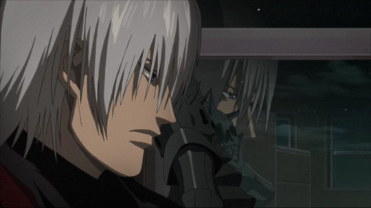
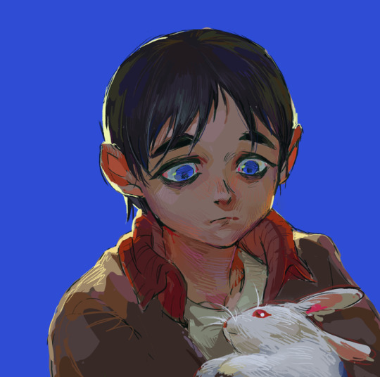
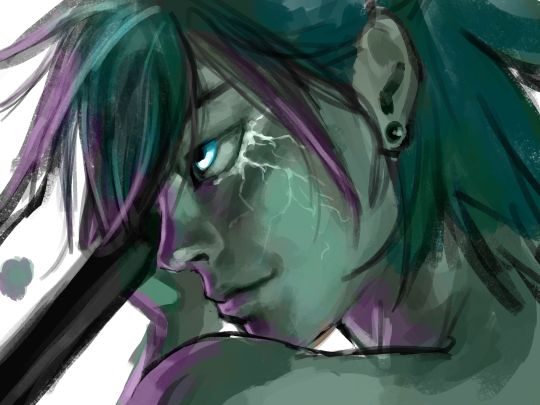
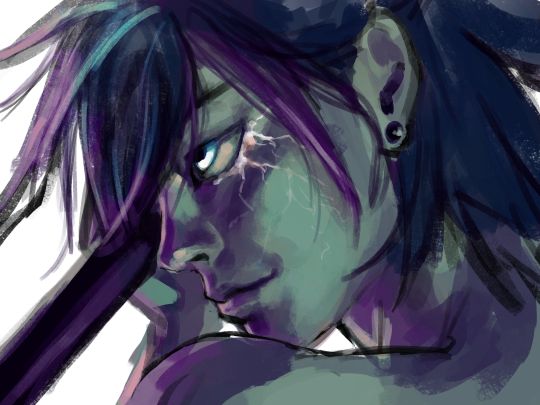
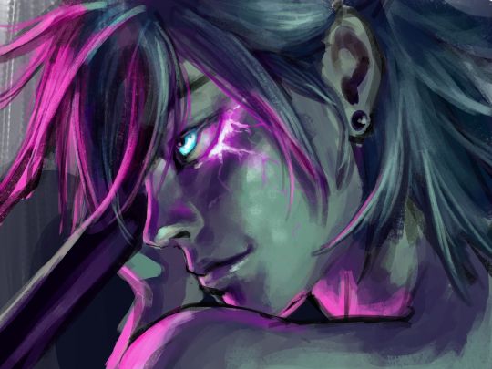
#em draws stuff#the eagle of the ninth#slightly belated summer of sutcliff#HI I know this isn't precisely who you asked for but I have spent the last several weeks Trying And Failing My Best#at drawing marcus and esca and alexios#just can't make their faces look right which is terrible because I love them very dearly and need to art about it#so today you get what you get and what you get is guern#in my heart he is also a lad#also couldn't decide on one of the two palettes so I used Both!#this was a very nice and relaxing drawing to my surprise#just about half an hour of painting all on one layer... very much not my norm but pleasant all the same!#aaaaaaanyway I read some fun discussion recently about the line I've paraphrased here and oh how the brain goes brrrr#thank you for this one because painting it legitimately did help me resettle inside my skin a little bit#had an incident yesterday where I was made to question if I have every made any legitimately Meaningful Art ever in my life#and after a bit of reckoning the answer to that is No#but that doesn't have to be what I'm doing right now and sometimes you can just paint some dogs and be okay#and that is what I will do for the time being
24 notes
·
View notes
Text

@kernyen-xo /
Cheaply.
Watercolor sets made by Crayola. Acrylics made by Crayola. The brushes these kits come with are frustrating, cheap brushes are typically $3-5 each. You can spend as much as you want on a brush, the cheap ones are surprisingly good. This is extremely common advice, this isn't just from me.
When you find "ah I like this" go with a student grade of whichever you prefer. Or both! I find watercolor frustrating. I find acrylic doesn't look graphic as much as I want. I fell in love with a paint called gouache because it is very flat, layers nicely.
I would not start with oil paint. It is expensive, requires a lot of special care to keep you safe. Fumes, cleaning agents, etc. Fall in love with painting, then if you want, give oil a try. Be prepared for days (weeks, months, literally) for paint to dry. This isn't to scare you off it -- it's great -- but I wouldn't start here.
Oil has tremendous variety of things you can do with it.
Watercolor is ethereal.
Acrylic has great graphic qualities, lots of range.
I like gouache because it looks almost animated (there is a reason for that, it was/is used in animation background sometimes). It's tricky and tempermental.
Paint by numbers kits if you don't draw. Maybe even if you do and just want to dive into painting.
Mixed media sketchbooks. Lets you experiment a lot, cheaply. The big thing about sketchbook paper is it comes in a few forms -- very cheap (newsprint) and takes dry media (pencils, etc.) well, cheap (mixed media, lets you experiment quickly and a lot), and expensive (hot press has no texture, cold press has a texture).
Painting needs something that can get wet and not fall apart.
Start with a cheap mixed media sketchbook and see how you like it. Move on from there.
Ton of videos across lots of social media and much content. Has the advantage of multiple perspectives, you don't get trapped in "I think this is crap" or "This is the best" versus your thoughts.
Start cheaply.
Art stores and product manufacturers exist to make money. This is a neutral statement. The point is they are a store, they will sell you whatever you think you need, whether you need it or not.
Conversely!
Some things that are not universally useful but sold in art stores are great labor savers. Some people look down at disposable palette paper, others need the flexibility because they have a hard time washing palettes... etc.
Start cheaply. Look at hardware stores, lots of duplicate functions in items.
I come from a background of digital art and a lifetime of business where "ah where the BONES ARE WE GOING TO FIND MONEY FOR--"
Have fun.
Get in deep and frustrated and then drink the frustration (but not the paint water) because you realize you're frustrated because you can FEEL how it should look but you can't get there yet.
The journey is amazing.
I've started looking at the mountain of business problems I have been sorting through for the last few years.
"Okay. How is this supply chain issue with stationery compared to a painting I want to do of the piranha plants of Super Mario Brothers?"
This is literally something I asked myself.
It took me out of the problem (supply chain issue, boxes, our office size, the number of stationery items I want to design) and forced me to look at it as a painting (structure, where does it stay simple, where does it get complex -- what makes sense -- ah, PDF downloads).
Paint.
Learn by doing.
Start cheaply.
Keep going. Build up.
1K notes
·
View notes
Text
The making of painted stones
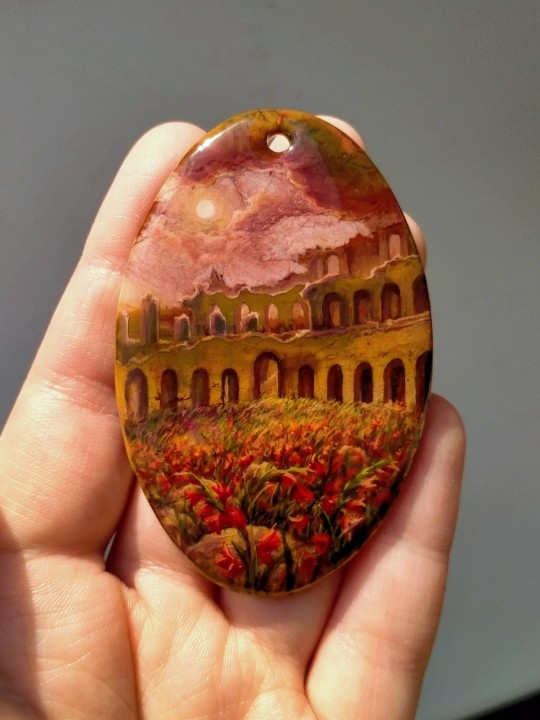
Well, a few times I was asked to show the process of miniature paintings on stones, and here is my first attempt to capture and explain it. Warning - I only have my phone's camera at my disposal, so the quality is not very good.
Firstly - an idea for the image. Every stone has something in its pattern that can be a starting point for developing an imagery. The stone I picked for this one is a beautiful Picasso jasper, and in this case I was looking for a stone for a specific idea I've already had in mind. Spontaneous improvisation dictated by the stone's pattern is also great but I decided to pick something more definitive for better illustrating the process.
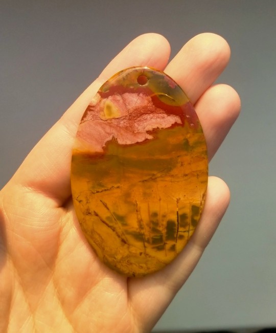
This jasper's pattern already has outlines that can be developed into a landscape without painting it over too much. I don't like it when stones are just mindlessly covered by slapping a random image on it, ignoring the colours, textures and patterns.
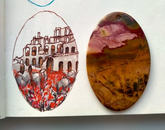
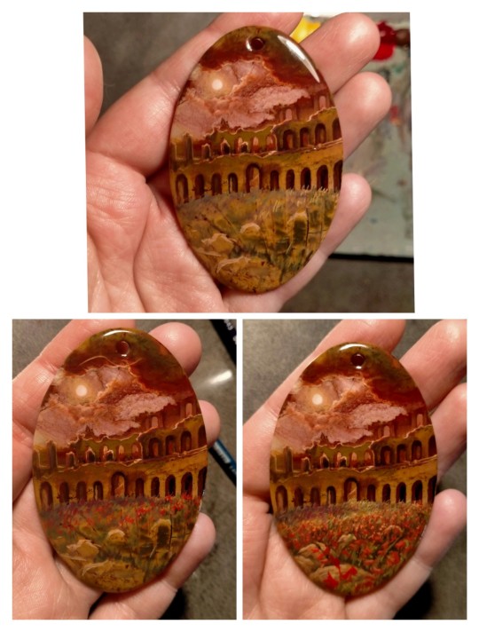
Here's the idea - ruins of an amphitheatre overgrown with red gladioluses. I know, I know, but I'm very interested in the initial mystical sacrificial background of gladiators. So here it is, arena covered in red, swords in the sand, but it's finally quiet.
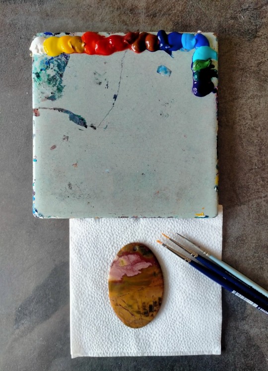
Before we start, a stone must be varnished - minerals are porous, and lacquer smoothes its surface. I paint with tempera - most artists who work in lacquer miniatures use oils, but tempera allows quicker process, which is important for me. I'm autistic and my executive dysfunction makes working with oils difficult - my sudden bursts of activity won't match with drying timings and such. So, tempera for me.
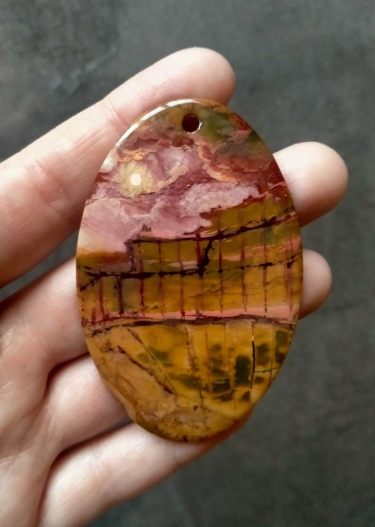
Starting with sketching the outlines of the ruins and painting our light source, the sun and red clouds. I'm trying to work with a palette that the stone already has and make the painting as harmonious as possible.
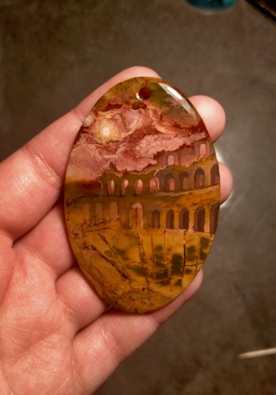
Erasing auxiliary lines as we continue.
Done with the first layer - the walls and the sky. After the paint dries, I apply varnish (I use Novol clearcoat, car varnish - it's very durable). There can be as many layers as you need.
Now - the flowers and details.
After the painting is finished, it'll need several layers of varnish. And some fine sandpaper (1500) in-between the finishing layers for better grip.
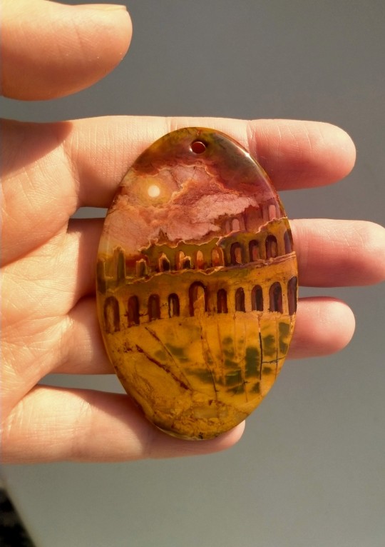
And here it is! time to think abou a necklace for this one.
I'm not sure how useful I can be and what aspects you would like to know, so feel free to ask. I'm not sure I can make a good enough video with my current phone, so this'll have to wait. I tried to skip all the musings about ideas and finding stories, but whatever. And the time needed for work - I don't know. There was a month-long pause in the making of this one, due to a couple of emergencies that knocked me down for some time, and it's not easy for me in general due to my mental state - sometimes I can make a painting in two days, sometimes it takes years, nothing is certain with me, especially now. But well, here's what I do.
#miniature#painted stones#rock painting#painted rocks#minerals#picasso jasper#jasper#amphitheatre#arena#gladiators#gladiolus#gladioluses#flowers#ruins#roman ruins#ancient rome#sky#my art
658 notes
·
View notes
Note
Sorry if you’ve answered this before, but I really love how your illustrations have such a cohesive color palette, how do you pick your colors to have a certain theme without looking monochromatic?
(In your breakdown on the saloon/western BP illustration, you mentioned that the overall color was reddish brown so you added blue to the main group to set them apart. But like how did you decide on which reddish brown colors to use for the flats?)
Thank you!! Your art is really expressive and the colors always work so well in the illustration. I’m always in awe of your pics
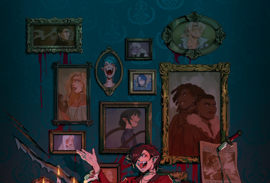
That’s an excellent question! My drawings actually start out pretty monochromatic because I tend to put most of my effort into the lighting and shading part to help differentiate where I want people to look.
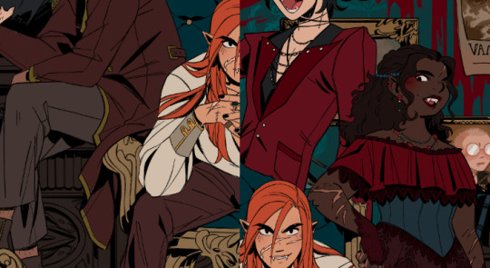
For all of my pieces, I want my characters to be in focus. So no matter what, I always have to keep their main colors in mind and make sure their outfits and the background don’t clash with them (Kain’s red hair tends to be a problem, pft).
For my flats, I generally work with two main colors that tend to contrast each other and then I mix a lot of neutrals around them. (Sometimes the main colors are in the light and shading itself, but I’ll just focus on the flats!).
Sometimes, I will change the hue of their colors. So while Kain has bright orange hair, I will dull it down if it overwhelms the piece or doesn’t fit with the tone - like I did for the cowboy drawing - but never so much that it no longer looks like him.
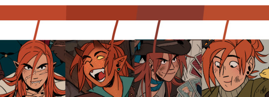
With the cowboy drawing as an example, if I strip it down to my flats, it instantly becomes very dull and monochromatic. I really enjoy working with these colors because they’re easy on the eyes (or my eyes specifically) and I can see the difference in subtle hues a lot better than if they were very high in contrast. I like working with subtleties when I want background characters to become a single unit but still be separated as individual people.
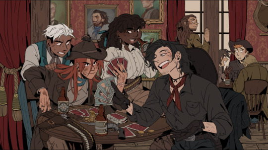
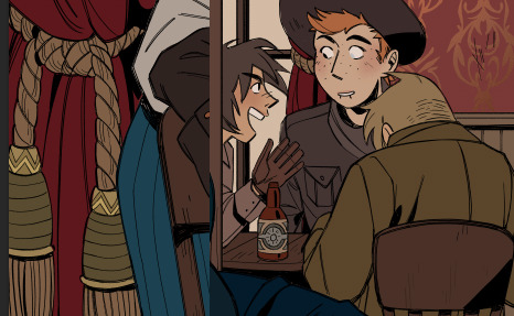
When I picked the colors for the background, I wanted to separate the characters from the walls. Therefore, I kept the walls red and gold, and the characters brown - they’re still within the same warm-colored family, but they’re far enough away from each other that they don’t become one with each other. I also like to not have clothes from different characters blend together, so overlapping colours can't be the same. I made one coat lighter than the other, the glove warmer than the dark jacket, and so on.
(their coats are also in the same realm as the green/gold colour of the details for the curtains and the frames on the walls)
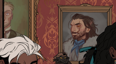
For the paintings I actually chose to put a bit of blue and green in to help create some interest for the main characters and keep your eyes around that area, as it matches the blue they’re wearing, just a whole lot darker. It also makes them pop just enough so they look interesting against the wall, but not enough to overshadow the main characters
I know, because of the way I work with layers, that when I add my overlays, I automatically brighten and saturate the colors a lot. It’s a lot easier for me to saturate something “dull” and move it into all kinds of hues than saturating something already high in contrast and then trying to force it into a new color theme.
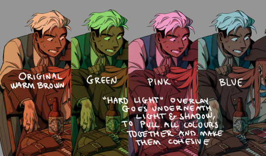
But because of this, I usually have to go back and change the colors I work with constantly while the overlays are on. Since the overlays don’t know what sort of materials they’re laying on top of, everything gets lighter and washed out, so dark skin tones, hair, and clothes have to be corrected one by one afterward. If I were to remove the overlays after I corrected it to make it feel like a dark blue outfit on Raki, it’s basically just a black void now; but with the overlay, it’s a dark blue outfit. Before that, he simple blended in with the background too much and he didn’t feel like he was a part of the group either.
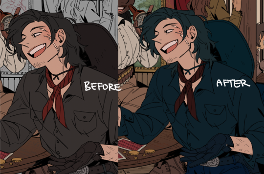
I always try to put down colors how I imagine they’re going to look like, unaffected by light, but I’m also naturally drawn toward more earthy and warm tones, so all of my color choices will tend to lean that way.
Here’s another example of main colours vs. neutrals; the main colours are red and green/turquoise, with dark browns and greys to encapsulate them, and gold for accents or to make certain things pop (the chair, Dakon’s dark coat, etc.).
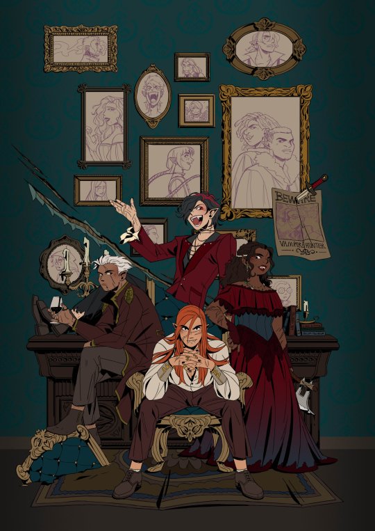
I never want them all to wear the exact same color, but I want them to feel connected and be in the same 'colour family,' so Dakon and Kain have nearly the same dark red/brown, and Christie and Raki have nearly the same 'bright'/red.
The blacks and browns, I’ve kept warm as well, so they stay within that realm of red. I also make sure that none of them are too close to Kain’s hair since he’s in the middle of the piece, and I want your eyes to be drawn toward the middle, and his orange hair helps with that.
The paintings I basically do not care too much about, as long as each individual painting has a single dominating colour. I mute them down with a darker overlay and ensure they don’t have strong shadows and light, so they get pushed to the background, so despite being a bunch of different colours, each painting feels like a solid color and they’re still cast in the same light as the rest of the piece, so they feel like they belong in the same room.
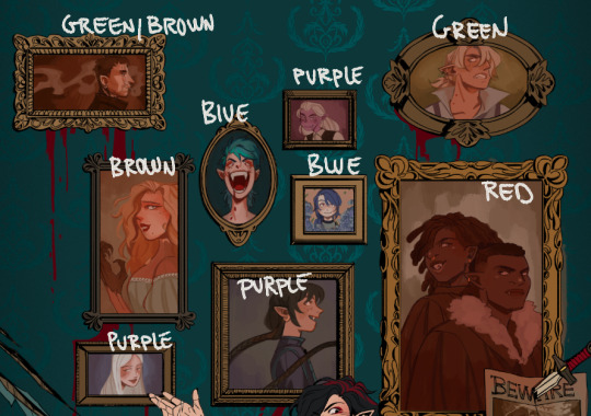
I try to help move the eye around the piece as well, so I keep the big painting sort of in the same realm of red and brown as the main characters, because it’s so big it shouldn’t dominate with a new color and force interest toward it. The blue/purple ones melt in with the background as they’re close to the turquoise background, but without disappearing, the yellow ones work sort of like the gold accents and blend in with the frames, and the green paintings at the top give the illusion of a monochrome fade, so everything gets more eerie and green as the image goes up - there’s also a subtle green fade that affects the gold accents from the top down, to enhance that effect.
This is just a few examples, if there are any pieces in particular you were thinking of, and it’s neither of these, just let me know, and I can break those down as well!
Thank you for the question; I hope I answered it somewhat, and thank you for the kind words! <3
318 notes
·
View notes
Text
How I draw: Silver Metallic Buttons for Sims 2 Textures
As we all know, Sims 2 doesn't really appreciate large file sizes/dimensions for it's textures, so sometimes you have work very closely with the individual pixels. Here is how I draw buttons. Video is sped up so don't feel like you need to draw as fast as me!
Side note: this tutorial is created on the basis that you already know how to use the basic functions of Sims BodyShop to extract the texture file. There's plenty of tutorials out there explaining that so please don't ask me to clarify on that part. Anyway, on to the buttons...↓↓↓
What you need:
A PC
Digital Drawing app (like Photoshop, Krita etc)
A Graphics Tablet with pen - you could try this with a mouse but I wouldn't recommend!
And obviously Sims 2/Sims 2 BodyShop
First off, create a new layer - we don't want this button permanently stuck to our base texture. Then I get a standard hard edge brush (I use Krita as my drawing software, so just use whatever hard brush is available in your preferred software/app). Because I'm making relatively small buttons, I make my brush 7.09px in size. Select a mid to light grey colour as the base. Make a single circle.
Then decrease the brush size to be nice and small. As a comparison to my 7.09px circle, I decrease to 0.01px for this next step. Choose a slightly darker grey colour and lightly sketch in a 'semi-circular line' about 3/4 of the way around just in from the edge of the circle. By lightly sketching - and not pressing down hard, you'll get varying tones on each pixel to represent different reflections on the 'metal'.
Next choose a darker grey again, and lightly sketch around the similar area as the last colour, but don't be too fussy on hitting the same pixels - we want varying tonal values for our shadows.
Then choose white and lightly sketch the 'catch light' part of the button. This doesn't need to be right in the centre, in fact it's better if it's off to the side, or towards the top more. We're not always facing directly towards a light source so this creates a more realistic lighting effect. You'll see me select the same mid to light base grey I used just to lightly dust over the edges of the white area to soften it a tiny bit (only do this if your white edge is a little to crisp).
After that I go back and forth between a few different tones of grey to lightly sketch over the parts we haven't really drawn on yet. This just helps create some gradual shading that enhances the 'roundness' of our very flat, very 2D button texture.
Once you're happy with the shadowing (remember it looks somewhat janky this close up, but you can always zoom out to see if the button looks more smooth when further away), you can then make another layer, and drag it below your newly made button layer in the layer menu. Select a soft edge brush and increase the size to slightly wider than your buttons overall size (I chose 9.14px compared to my 7.09px button)
Choose black from the colour wheel/palette and lightly build up the shadow underneath the button, gradually increasing size and opacity until desired tone. If the colour of the 'garment' in this texture is light then keep the shadow to a minimum, if it's dark then the shadow needs to be deep enough to show up.
Zoom out and inspect how this button looks further out. If you're satisfied, then merge the button and shadow layers together, copy/paste it as many times as needed for the garment you're texturing and Voila! You made buttons for a Sims 2 Texture!!
Feel free to ask any questions below - I'm definitely no professional, especially in creating tutorials so I'm more than happy to clarify if something didn't make sense.
#sims tutorial#digital drawing#retexture#drawing tutorial#ts2#the sims 2#digital art tips#lraerosesims#lraerosesims-tutorials
86 notes
·
View notes
Note
Thoughts on character and costume?
I really love how the respective characters have different colour palettes, silhouettes but in particular material/textures to their costuming.
Fang Duobing is a little princess so he gets pale pastels, fancy ornamentation and transparent gauzy fabrics which I find so cute, he’s not just rich he’s *expensive* and *pretty* it’s pretty funny that he matches the actual princess in the red leaves mountain case
DFS gets your wide shoulder bad guy rich deep colours with thick layers and lots of metal detailing but it veers towards grand instead of pretty. Hot topic young DFS is leather and studs lmao. Brocade and fur & shit.
LLH is a linen boi and he almost never has any metal on him, we all know his natural material hair ornament meta etc. Interestingly, he does share some colour palette and fabric overlap with FDB, we se him with his tits out transparent outer layer sometimes. No structure all flowy silhouette
someone on here made a post abt their differing sleeve styles but I can’t find it!
I wanted to gush but also do u have any extra costume thoughts + how they relate to one another? You have a great knack for finding good photos of the show too 😅
Thanks for the ask, @lei-llustrations , and I love your analysis of the outfits! I'm so sorry it took me forever to respond! I had grand plans for a full essay analyzing DFS's costumes, and then I ran out of spoons for doing that. (The short version of the point I was going to prove is that his a-Fei outfits have elements of what seem to be his favorite details from his fancier alliance leader outfits, so it seemed like evidence of LLH trying to make up for making him be in disguise and without his power. I'm thinking of the maroon-red one with studs in the sleeves in particular, but there are echoes of his preferences in the other ones, too.)
Since I'll never actually respond if I wait to put that meta together, here's a shorter one, with my thoughts on DFS's official Alliance Leader robes (screenshot taken from ep 40, when delivering the wangchuan flower).
LLH and FDB both call him Di mengzhu in the wangchuan flower scene, because he's clearly dressed in a way that makes this an Official Visit. I find it fascinating that he wears his alliance leader outfit instead of his grey, maroon, and gold outfit that he wears for non-alliance matters (aka. the wedding room outfit, which he also wears for such Xiangyi-related purposes as the reunion duel that doesn't happen and grieving for him in the middle of the night). After all, he's giving LLH a gift to save his life and issuing him a friendly anniversary honeymoon challenge, so you'd think that would call for his dating outfit, not his official garb.
BUT! What if he's using his official Alliance Leader regalia as a way of saying that not only a-Fei/Lao Di, but also Di Mengzhu and the Jinyuan Alliance want him to live? It's more than just essentially creating Peace Treaty version 2.0, and trying to get life back to what could have been if SGD and JLQ hadn't ruined everything: their people at peace, and the two of them meeting for friendly duels rather than death matches. Yes, only LLH and FDB are there to witness it, but by showing up in his Official Capacity, he's also correcting all the narratives about the enmity between himself and Li Xiangyi, and in giving him the flower, he's officially declaring that Di Mengzhu wants Li Lianhua to heal and have his strength and power back more than he wants to gain martial arts power himself.
This is a HUGE deal. DFS formed the Jinyuan Alliance as a way of climbing the ranks of the jianghu, because his goal was to gain strength so he'd never be helpless or forced to do someone's bidding again. And yet, he wears the outfit that symbolizes that striving and his place at the top of it to GIVE AWAY THE FLOWER THAT WOULD CEMENT HIS PLACE AT THE TOP OF THE JIANGHU. He wants Li Lianhua to not just live but also to regain the strength SGD and JLQ stole from him, which would mean that Li Xiangyi would quite possibly defeat him, and he would welcome that, because it's not about self-protection anymore: now, what he wants more than anything else, is for Li Xiangyi/Lianhua to live.
If that's not enough of an emotional gut punch, try this: Di Feisheng told Li Xiangyi at the start of the show that swordsmen shouldn't have weaknesses. Di Feisheng has only really had two "weaknesses" (vulnerabilities might be more accurate): his desiring the wangchuan flower (which led to SGD and JLQ incapacitating him) and Li Lianhua. It feels like a monumental shift to me that, at the end of the show, Di Feisheng hands one weakness to the man who is the other: essentially, he is announcing to the world that nothing is more important to him than Li Lianhua's recovery, and he doesn't care who knows it.
It also feels very pertinent that his official outfit is wedding red, and he's essentially showing up in his fanciest remaining outfit to offer Li Lianhua his heart on a platter priceless magical flower in a box the way someone might show up at the house of their beloved with boxes and boxes of betrothal gifts. Not that DFS explained that or LLH picked up on it, because that would involve better communication skills than either of them had.
#mysterious lotus casebook#mlc meta#lianhua lou#lhl#asks answered#Di Feisheng#Li Lianhua#Fang Duobing#costumes#feihua#dihua
122 notes
·
View notes
Text
Curtain Calls | Sam Kiszka

Sam Kiszka x F! Reader
Word Count: 3.1k
Warnings: Fluff, Smut, Oral Sex (F! and M! Receiving), Unprotected Sex (WRAP IT UP PLEASE), Cockwarming
Masterlist
Want to join my taglist? Fill this form out!
Author’s Note: Hello my lovelies!! Here it is, the highly awaited request! Inspired by this anon, as well as having this moment included by this lovely anon. Also sorry if its poorly edited :(
Everyone was scattering around the hallways, the show was in approximately 45 minutes. Josh and Danny had already gotten their makeup done, and ready for the show. Jake had you touch up his eyeliner, and straighten out his new suit.
“Where is your brother Samuel?” You shook your head, Sam always got ready last minute. Even when it came to makeup, you were always yelling at him for being late for his makeup session.
“Probably snoozing with Rosie in the greenroom.” Jake shrugged, chuckling softly.
“Ugh…” Your feet began dragging you near his greenroom, knocking loudly. “Samuel Francis Kiszka, get your ass in the dressing room.”
Hearing a groan from the other side, “I’m coming Y/N.”
You huffed making your way to your station, everything was already set up to put his makeup on. And you had hoped he was smart enough to put his suit on, since by the time you would finish with him he would only have a few minutes till they had to be on stage.
Surely enough you hear footsteps making way to you, turning around your met by the handsome brunette. And he was indeed wearing his suit.
“Wow, you actually listened for once…” You clicked your tongue.
“What’s that supposed to mean?” Sam sat in the chair looking at you.
“Sam I’ve been working on tour with you these past two months, how are you still forgetting to show up early enough.” You started to prime his eyes, before getting the eyeshadow palette in your hands.
“I’m sorry, I'm just still new to all of this.” He slouched a bit.
“Sit upright, I need to make this look perfect.” You poked his shoulder.
“Yes ma’am.” He smirked at you, in response you roll your eyes.
Sam always did have the younger sibling personality that everyone would talk about. Sometimes you found it utterly annoying but deep down, you found it cute about him. But he was in fact an adult, who just liked to have his childish fun antics.
The relationship between the two of you this tour had been wonderful. Anytime there was a small break between shows, he’d take you around the cities or small towns to show you his favorite places. He even had you join him on a small vacation to the Carolina’s with Rosie.
You tried to get out of it, but he was consistent with getting you to join him. And you figured if you said no, you felt that would’ve changed your relationship and made work awkward. The only reason you didn’t particularly want to go, was simply that you had feelings for Sam.
There had always been casual flirting between the two of you. But nothing more than that, in fact the one time in the green room the two of you had fallen asleep on the couch and were woken up by Jenny. She was another makeup artist for the guys, she mostly worked with Josh and Danny but you would help assist her.
Ever since then, Sam and you have talked more. Sending recipes to one another, he even taught you how to make pickles. Sam was just a kind hearted man, that you truly didn’t know how to express your feelings to him.
“So, are we going with what we’ve been doing? Or are we taking a new approach tonight?” You looked through your palette and the liquid eyeshadow you had.
“The usual…” He said softly, taking a sip of his Topo-Chico.
“You know, I really think we can get more creative…” You smiled softly, applying a layer of the glittery liquid eye shadow to put on his lids.
“You’re the mastermind here… Not me.” He chuckled softly.
“Maybe in the next show we’ll try something new. If you’re up for it that is.” You smiled at him softly.
“Yeah, I think I’d like that.” He smiled softly his cheeks turning a rosy tone.
You giggled softly, grabbing a palette, taking a brush and dapping it into the silver shadow. You gently apply it to his eyelids, dragging it out, blending it softly into the underlayer.
“You’re really good at this ya know?” He kept his lids closed, fearing you would scold him for opening them while you worked on his look.
“I’d hope, I didn’t go to beauty school for nothing.” You giggled softly, grabbing another silver shadow packing it onto his lid.
Earning a chuckle from him, “Hard work pays off.”
You smiled softly, finishing the rest of his eye makeup. “Should I add rhinestones?” You pulled away from his face grabbing the pack of rhinestones.
“Yeah, might as well. Can’t out-do Josh though.” He smiled softly looking in the mirror at your work.
“Josh creates his own look before even having Jenny or I do his makeup.” You giggled softly, applying makeup glue to the rhinestones applying them gently to his cheekbone.
“He likes to be prepared, I guess.” He chuckles, you smiled back to him finishing up his look with about 15 minutes left till they hit the stage.
“Well, what do you think?” You asked as you cleaned up your workspace.
He stood up, looking at himself in the mirror. “It looks great, as always Y/N.” He smiled, turning towards you, his stare focusing towards your tits.
“Sam… my eyes are up here.” You snapped your fingers at him.
“You wore that top purposely. I know you took your sweatshirt off before I came in here. Don’t act all innocent. You wanted me to stare at your tits, didn’t you?” He chuckled softly.
He knew you all too well, you always wore a light sweatshirt no matter what. Sue me is what you thought to yourself. You couldn’t deny the attraction you had towards Sam. In fact your feelings had only gotten stronger towards him after the small trip you took with him.
“No… I just got hot.”
“Uh huh… I’m sure that’s what it is.” Sam drags his finger up your thigh, moving it slowly towards your center. The one day you chose to wear a skirt to work, and he pulls that stunt.
You stop him, grabbing his wrist “You at least gotta kiss me first.”
“Say less.” Sam straightens himself, putting both hands on the side of you, pressing you up against the counter, trapping you in.
“I was-“
“Look at you stuttering angel. Don’t get nervous now.” He smirked at you.
Sam looks deep into your eyes, leaning forward. You move your head a bit. “Playing hard to get are we? Or is that you retreating because you’re scared you might like it.”
Sam goes to move away but not before you pull him in tightly for a kiss. He places a hand on your waist pulling you closer to him deepening the kiss.
That is when you hear a knock, disrupting the kiss. The two of you break apart from one another.
“5 minutes till show!” Richard yelled through the door.
“Fuck…” Sam sighed softly, resting his forehead against yours.
“You should probably go, don’t want to be late to the stage.” You giggled softly.
“Josh already was, what would the difference be if I was.” He laughed softly.
“The difference is he is vocals, and can at least sing off stage. Whereas you play the bass and should be on the stage already.” You shoved him lightly to get him towards the door.
“Don’t think this is over…” He rubbed your cheek softly with his thumb.
“I’ll be on the sides cheering for ya Sammy.” You blushed.
He smiled, pecking your lips softly before making way out of the room. You sighed softly, shaking your head. Did that really just happen?
You cleaned up your workstation, getting everything packed up to be set on the trucks before making way to the side stage to catch the next song after the opening.
The guys weren’t kidding when they said they liked to blow shit up. The shows were always electrifying and exciting. Keeping the fans on their toes for what was next. Sam running back and forth between keys and bass.
It was absolutely amazing to see them live their dreams, and of course you were to. When you had been asked to be a part of Greta’s team you were absolutely thrilled after seeing Josh’s looks for the Dreams In Gold tour, not only that Jenny had put in a request for you to be a part of the team. She had liked your technique in makeup.
After an exhilarating show, you make your way back to Sam’s dressing room with makeup remover and cleaning cloths to remove Sam’s makeup after his show. He always had you helping him as he claims he doesn’t really know what to use, or what skin care products to apply afterwards.
But you lately have been finding it to become an excuse for him to spend more time with you. And after what happened earlier this evening, there was no denying it now.
Sam came into the room, locking the door behind him pressing you against the counter immediately pressing his lips against yours.
You were taken back a bit, but wrapped your arms around his neck kissing him back hungrily. It was like you were both starved and deprived of one another.
Tangling your hands in his hair, you tugged slightly earning a groan from him. Letting you slip your tongue into his mouth, exploring it for a bit not until you felt Sam’s hard-on pressing against your thigh. Earning a moan from you. He was lengthy, and average in girth from what you could feel.
“Sammy…” You whisper against his lips, panting softly.
“Angel, please…” He said with honey in his voice.
“Don’t stop…” You blushed, kissing him again, as he reaches to pull your top off. Lifting it over your head, breaking the kiss just for a moment. He then returns back to kissing you, while groping your breasts with his hands.
Moaning into the kiss, you feel his dick throbbing against your thigh. He wanted this just as much as you did. You began to palm him through his pants, he bucked his hips forward from your touch. Causing you to giggle softly.
“Eager aren’t we?”
“I’ve been dreaming of this ever since that trip…” He muttered under his breath.
“Then I guess all this pent up sexual frustration will make this worth the while.” You smiled softly, as his hands wrapped around you back to unclasp your bra.
He ran his hands over your shoulder and down to your breasts again, massaging the one with his hand and taking the other into his mouth. He licked over the mound of your hardened nipple, sucking and biting softly. Earning nothing but words of pleasure from you.
“Sam…” His name falls off of your tongue like sugar.
He looks up at you with his brown eyes, pupils blown lust filled. You bite your lip from the sight, as he removes his mouth using his other hand to pinch your nipple softly.
“What baby…” He smiled softly.
“I need more…” You tilt your head back slowly.
“Don’t worry, I’ll take care of you angel…” He smiled, kissing your lips softly. Moving you towards the couch in the room.
Once the back of your knees hit the couch you, Sam stood above you smiling down at you softly.
“You better remove those pants, I don’t think you want to be questioned on how they got dirty…” You giggled softly tugging lightly at his satin pants.
“They get dry cleaned anyways…” He chuckled lightly, removing his pants, leaving him in his briefs. His cock strained against the fabric. You felt your breath hitch in your throat from the sight.
Sam knelt down in front of you, moving his hand over your center. You had soaked through your panties already, practically pooling in them. He ran his fingers across collecting some of the arousal.
“You already made such a mess… Should I help clean it up?” He looked up at you, placing his hand on the hem lining of your panties.
You nodded your head fervently, “Please…”
He smirked, pulling them off of you, putting it with the rest of the discarded clothes. He placed your legs above his shoulder’s his face coming close to your center. You could feel him breathing against your thighs, causing goosebumps to rise.
Sam began kissing the insides of your thighs, biting softly leaving marks behind. Your head lolled back, as he licked a strip up your center. Causing a whine to slip from your lips. He continued to lick slowly, and languidly.
Your hips bucked forward against his face, causing his nose to brush against your clit. Making another noise slip past your lips. He held your thighs tightly, getting to work quickly. He flicked his eyes up at you watching the faces you made as he ate you out. He slipped two fingers inside tightening around him, as you were already close to the brim of your first orgasm.
He started to pay more attention to your clit, sucking and licking it more than before. Earning pornagraphic sounds from you, trying to keep your voice to a minimum as to not alert anyone potentially walking by the room. You felt the band start to break.
The next head nuzzle Sam made, had been the pushing point of your orgasm. Spews of, Oh fuck, Sammy… leaving your lips as he calmed you from your high. Your legs tremble above his shoulders as he slips away placing them down.
He looked back up at you, your arousal covered his lips. “Come here, taste yourself.” You met his face kissing his lips roughly. He kissed you back, biting your lip softly.
“Tastes like sugar…” He smirked against your lips.
“Sit…” You stood up looking at him.
Sam nodded, taking a seat on the couch. You knelt before him pulling his boxers down his legs, throwing them with your pile of clothes. His dick sprung up, hitting his abdomen. He was painfully hard, throbbing and some pre-cum spilling from the tip.
You moved your hands up his thighs slowly, and wrapped your one hand around him pumping him slowly. His mouth agape, letting out a quiet groan. “Y/N…”
“Don’t worry Sammy, I’ll make you feel good.” You blushed softly.
He nodded his head, caressing your cheek with his hand acknowledging you to continue. And so you do, licking the tip slowly teasing him. He shuddered underneath you, giggling softly. You wrap your mouth around him, inching your way down as you take him in. Careful not to make yourself gag, he let out another groan.
You moved your hand downwards to Sam's balls, gently cupping your hand around them, moving them around in your hand. He huffed, his head rolling back.
“Fuck angel…” He closed his eyes, feeling you work on him.
You hummed as you continued to bob your head, swirling your tongue around his shaft. Earning praises from him as you continued your little moves, getting him closer to release.
That’s when he tapped your cheek with his fingers. “Not yet, I want to fuck that pretty cunt.”
You removed your mouth from him, a string of saliva as you continued to pump him with your hand. You straddle his waist lining yourself up with him.
“Don’t worry, I’m on the pill.” You smiled softly at him, before sinking down on his length. Gasping as he bottoms out in you.
“Like fucking velvet…” He grunts, grabbing your waist softly.
After adjusting to his length, you started to ride him slowly. Wrapping your hands around his neck, he moved his face towards your breasts paying close attention to them as you started to gain some momentum.
He latched his mouth onto your right breast, licking and sucking on your nipple. Biting softly, earning moans from you. Starting to rotate your hips in figure eights, Sam starts to moan the vibrations against your breast making you wetter.
“Shit, Sam…”
He removed his mouth from your breast, cupping your face with his one hand. “Come on baby… I know you're close.”
You nodded, starting to bounce more on his cock. Everytime you would come down, he’d meet you with a particularly hard thrust, sending you over the moon.
Sam then held your waist tighter, picking up the pace by thrusting faster and harder into you. You pressed flush against his chest, running your hands into his hair pulling slightly as pornagraphic sounds left your mouth.
You felt yourself getting closer, and by Sam’s breathing you could tell he was near as well.
“I’m so close…” You moaned into his ear quietly.
“Let go… I'm almost there. I want to feel you all around me…” He groaned softly, rubbing circles on your clit.
Within the next minute you went into overdrive. Praises flew from your mouth as you clenched around him, seeing colors as you came. “Sam…” Your head rolled back.
“That’s it baby…” He moaned softly, within a couple more thrusts that became faltered and slow. He was spilling his release into you.
The two of you sat there on the couch, chests pressed against one another. Sweaty, and panting as you both came down from your high.
“That was…”
“Exhilarating…”
You giggled softly, kissing his cheek.
“Oh, Sam… Your makeup...” You went to move, but he kept his grip on your waist keeping you from moving.
“Sam.” You looked at him.
“Just let me stay inside a little longer. You feel like home.”
As He softens inside of you. And you can’t say no to such a pretty face, so you obliged.
With his strength, that surprised you he had stood up holding you not slipping out of you. Moving over to the chair where you had the makeup wipes and remover to clean his face.
“There, now you can take care of me.” He chuckled softly.
You blushed and started to remove the makeup off of his face while you sat there as his little cock warmer….
After cleaning him up, you moved off of him, wincing from the loss of him.
“Come on, let’s shower. I’m tired.” You motioned to him.
He stood up, following you to the shower off the right of the room. Then you heard pounding on the door.
“Next time, can you do that in the goddamn hotel!” A crew member yelled.
You and Sam looked at each other busting into fits of laughter. You blushed slightly from embarrassment.
“Well… I guess we’ll have to work on that pretty girl.” He pulled you into the bathroom, shutting the door behind the two of you, pulling you in for another kiss.
.
.
.
Finished
Taglist-
@lyndszee @fkfearandliveyourlegend @starcatcherry @hi-hi-hello11 @myleftsock @thunderstomp-and-tequila @sinsofstardust @holybananafuck @thecoldwind @gretasfallingsky @laneygvf @sacredthefran
#greta van fleet#gvf#greta van smut#gvf smut#sammy kiszka#sam x reader#sam kiszka fluff#sam kiszka x y/n#sam kiszka x reader#sam kiszka smut#sam kiszka#sam gvf
156 notes
·
View notes
Text
SO! You've seen these little things I do sometimes and you want to know the process!

It's genuinely super simple, so here goes! Apologies by the way if anything is unclear or glossed over. A lot of this is personal taste and such so I hope this can be a nice boost to create something!

RESOURCES AND THINGS TO KNOW!
To preface this little guide already assumes you have basic knowledge of color distribution, lineless art, or breaking up art into proper layers for later processing! I am also assuming that your art program has access to scatter brushes and tiling textures. Personally I use Clip Studio Paint, but this can work on other apps. Anyways, here are some good sites for this:
EZGIF - Free, easy gif maker for assembling any kind of gif*! It also has stuff like converting those damn WEBP's back into png.
*PLEASE KNOW THAT YOU CANNOT MAKE GIFS THAT ARE PARTIALLY TRANSPARENT. YOU MUST USE A SOLID COLOR UNDER ANY PART THAT IS OVER BARE CANVAS
Transparent Textures - Free to use source for HQ transparent textures that tile! Amazing for finding a paper texture for these if you commit to the paper doll look. Best results for textures that are in white or black!
So! You have a finished, prepared piece that you want to glitterfy. Well I'm not covering that right now so you can scroll down to That part if you came just for the glitter. This next section is for...
PREPARING THE PAPER DOLL
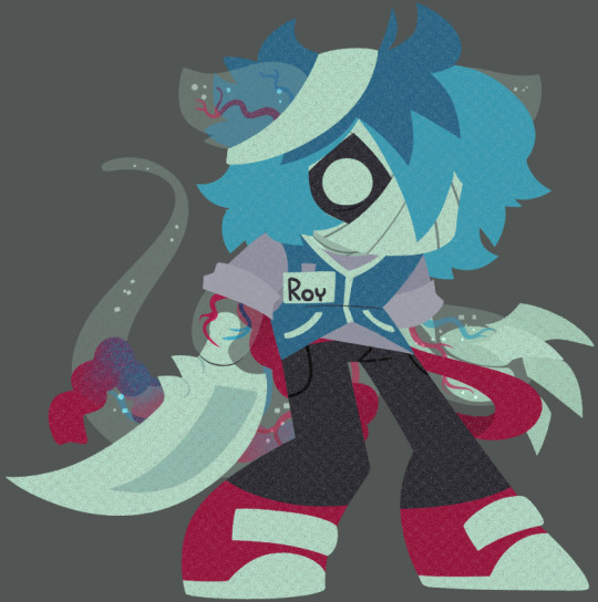
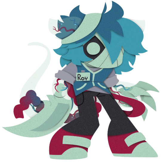
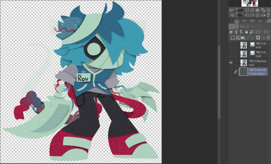
To start, your piece should already be separated into respective layers in any order you'd like! We're about to use a ton of clipping masks so Make sure you know your program before starting! So, as my example we have my oc Roy, resized to around... 1500x1500 or the nearest equivalent Smaller is better because it brings out the texture! He looks a little ah...Flat, though right now?

I'm using this guy for a couple different reasons! Those being:
Roy has translucent bodyparts! Just so you will know what to do with characters who are translucent! I'll get to this in a moment so sit tight
He has a clear, defined, and distinct palette that is easy to pick a color to slap the glitter on! This is important because I personally find balance to be the most appealing part of the finished art.
He also just has a lot of doohickeys on his design.
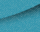
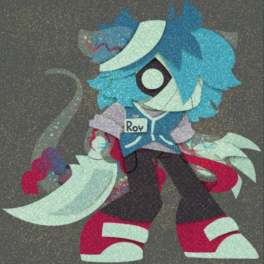
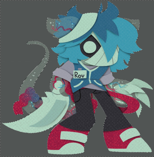
This is where you need your transparent texture! You can use any kind of texture and I encourage experimentation and such, but I personally use a simple paper texture. What we are going to do is go through and clip our imported and tiled texture to each applicable layer! (Make sure to just Copy and Paste the layer you do NOT need to repeatedly go through this menu...)
And... When you are done, you should have something like this:
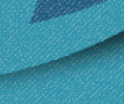
"But why don't I just clip the texture to the entire piece through a folder? Why go through the hassle of clipping to each individual layer?"
Well that's because of the next step, where we will be adding the shadows. If we don't clip each individual layer, your shadows will look like this example on the left which sort of just ruins the 3D effect and kinda just looks icky, as opposed to this, which is nicer and smoother.
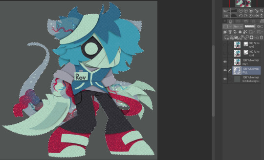
Now I'm no lighting wiz! In fact I'm rather mediocre at best but some general tips for adding the shadows:
Try to keep your shadows going all in one direction mostly! It gives the effect of one light source and generally just looks better than if you shaded around ALL edges everywhere.
Try to only shade where there are parts overlapping that need the dimension! Overdoing it can make the piece look odd. It's especially helpful to separate any details like different shades of hair, layers of hair, etc so that you can put as much volume as you want.
Once the shadows are all added in you should have something that looks like this:
Which looks good! Now I'd sometimes stop here if I can't pinpoint how I'd like the glitter to sit or if I think the piece just doesn't need it, but we're moving on to the big important steps!
ADDING GLITTER
This part is entirely up to your taste! But I'll describe how I do my glitter stuff. Firstly I start out by identifying which color I want to pop out. For Roy here I chose the red parts! For your character it may be different. Experimentation is key!
This is also, however where you need that scatter brush I mentioned earlier. Personally I just use the default CSP spray brush, but again go wild!
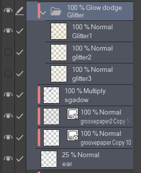
Make a folder above your piece, set its blending mode to glow dodge (or add, or add glow depending on what options you have), and create three layers inside of this folder. Setting the folder to clip is optional right now but will be needed later.

Then, fill each glitter layer with your choice of particle in whatever color looks good! Yes, you can do gradients and other stuff on the particles too! World's your oyster.
^ Unclipped example of a glitter layer.
Glitter tips for the early 2000's webcore enthusiast:
Use different strokes and patterns for the glitter distribution! This helps it animate better by moving around. For example this time I went diagonally for the first, horizontally for the second, and then in loose circles for the third. Particle density and stuff is also completely up to you.
Use a color that would pop against the intended area! For Roy I used an orange-ish yellow since it compliments both blue and red.
So now we have the layers! This is where clipping is our best friend once again! You're just going to go in and clip the glitter to whatever layers you want it on. Entire folder, not just one of the layers!
Once that's all done, go through and toggle the respective glitter layer for the frame, saving individual copies when done. You should end up with 3 identical images with different glitter distribution.
"BUT WAIT! JONES, THE TRANSLUCENCY!!" I hear you call! Yes, this is where we handle that! If your character is NOT translucent, you can scroll past this section.
Open up your frames all in one canvas, stacked on top of eachother (no jittering or slight displacement! ON TOP of eachother!)
Our layout should look something like this...Note how the translucent parts are rather hard to see, well if you took your frames and put them in EZgif, they'd be gone entirely! That's because you physically cannot have a partially translucent gif due to technology limitations. So an easy little cleanup thing I did was:
1. SELECT THE CANVAS AROUND THE CHARACTER WITH THE MAGIC WAND TOOL. Do not have any expansion settings on or it probably won't look right in the end.
Make sure you do not miss any gaps! I personally missed the gap between the arm, leg, and lanyard and I had to redo this next step...
2. SELECT -> INVERT SELECTION

3. FILL SELECTION WITH THE DESIRED COLOR. IT MUST BE OPAQUE. I personally picked this cloudy gray color.
You can now save individual frames of your character with the fill so that they don't go bald when you move on to the next step! Again, you should have 3 frames.
FINISHING UP
This is nice and easy. Upload your three frames into EZGIF and wait for it to process. It'll look like this if you're in the right place.
Once things have loaded, make sure to change the settings to the following:
FRAME DELAY: 0 (this is how fast the frames move.)
DON'T STACK FRAMES: ENABLED
You can play around with this but I generally leave everything else alone because you don't need it. Just hit the make a gif button and you're all done!

Aaaand that's it! If you've read this far...Firstly thank you for dealing with my rambliness and horrible explanation skills. Secondly, I hope that this can come in handy for anyone interested! Would love to see if anyone puts this to use. n_n
#tutorial#art tutorial#art tips#art#flashing lights#i dont know what other things to add. ummm#bookmark#<- for myself later so i can find this if i need to#long post
364 notes
·
View notes
Text
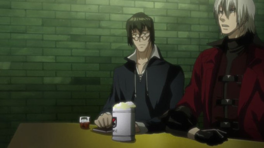
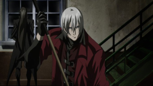
Dante and his deeper layers I've noticed in the 2007 anime
I originally meant for this to be a WAY bigger dig/analysis, as I want to go episode by episode...but I decided to minimize it for now because this anime gives me brainworms so often, lmao.
So, lets get into this light dig of added bits for Dante's character from the anime and just how neat the anime is on what it covers.
Early on in the anime, there's parts of the anime where Patty unknowingly berates Dante about having a picture of his "girlfriend" on his desk, not knowing its actually his mother. Same episode, she talks to Dante about her own mother, and how much she wishes to meet her, after being orphaned for unknown reasons (We learn why later but you know).
And BOTH times, Dante doesn't respond, save for a quiet distant stares off into space or seemingly ignoring her. For the first case, he very much likely excuses it with the fact that she's just not aware of the truth of the picture but not outright scolding her over it.
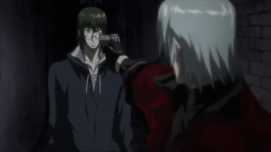
Like...he doesn't snap or correct her or anything. He just remains quiet. And we know how much Dante loved his mom (his color palette even matches hers for gods' sake) and how he got when facing Trish in DMC1 (which this takes place after). Shows just how those events really changed him afterwards. Especially since this is also after he thought he killed Vergil with his own hands...which the anime VERY MUCH shows the depression he has. He's in it deep for alot of it.
Back to the second part of the Patty thing though, as much as he pretends he isn't listening or doesn't care, he very much WAS listening to her, as later in that episode, he easily figures out where she went (into a trap where a demon disguised itself as her mother to lure her) due to the poster she was gazing at which reminded her of her mother, and the discussion they had right before she ran off.
Like, this man may be the way he is and PRETEND he isn't paying attention to people sometimes, but like...no, when its important, he VERY MUCH is. Speaking of which...episode 3.
This is one of the fun parallel episodes where the situation reflects a part of Dante's life...such as when a demon falls in love with a human, who was originally supposed to serve his master. Obviously, a parallel to Sparda and Eva's relationship, Dante's parents.
Even when its found out that the guy is the target dante's supposed to be after, Dante literally takes time to hear him out and question him over his love for a human woman. Dante's the result of such a relationship, so it makes sense he'd stop to listen.
In the end, he decides to go against killing this demon, despite what his client wanted. He sees firsthand and knows that this is actually a couple in love. Like...he gets it. For obvious reasons, but he also MADE SURE it was a true love relationship. Pretty wholesome actually.
An obvious one if you've seen the instruments and jukebox in his office, but episode 6 adds on that Dante 'gets' music and how it can touch/relate to people. I think its a cute additional touch. :' )
I wanna dig into this episode more eventually, but its obviously music themed. And Dante hangs out as a bodyguard for some fellow music enjoyers. Just one of those nice further looks on the general work Dante does, which this anime does a great job in doing.
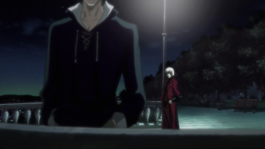
Episode 7 onward is where shit gets deep into more parallels and just the kind of guy Dante is, while going through it this whole series. Helping a spirit get laid to rest by pulling a prison break and rescuing her brother (Episode 7)...
Having his status as the son of sparda ending up getting someone originally close to him (Supposedly anyway, its implied that Dante grew up with this guy and was raised by the same mother figure...which Dante denies, but we know how he can be, and he was likely trying to protect him in a way) hurt and said person thrusting hate on him for it as that was why a whole village got burned down...and the guy originally believed and had genuine faith that it wasn't Dante's fault (Episode 8)...
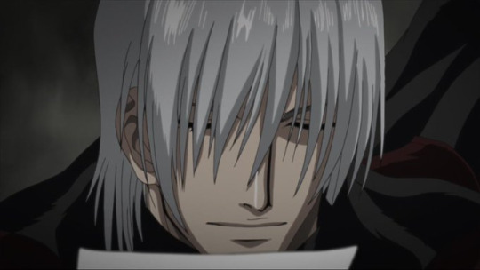
Meeting students (who are brothers, one older and one younger) of his father, arguably bonding with one of them and having to put both down in the end (Episode 10), which can be seen as a cruel parallel to himself and Vergil...(And even going through the effort of respectfully setting a grave site together for them)
And the final episodes, 11 and 12, are the conclusion of the whole arc that was built up in the background...but its also a show of Dante and Patty's relationship becoming so close as she goes to personally save him after he was impaled by the big bad. Its a pay off for the growing bits of them spending time together from episode 1, and later a neat easter egg nod in DMC5 where Patty calls to invite him to her birthday party, showing they still very much keep in touch. (And the novel Before the Nightmare goes more into why, exactly, he actually didn't want to go, but we'll dive more into that later one day).
I'll likely more deeply elaborate about the anime one day, but like...there's a reason why its such a gem in the series. Short, but did great with the episodes it had. A treat for those who want to see more layers for Dante. Its so SO good.
Like you may or may not like the 'slice of life' parts, but its necessary for what they were going for, I think. I know I skipped a few things, but I hope I got the big highlights atleast. Go check out the first anime, its a pretty damn solid ride.
#devil may cry#dmc#This was abit chunky so this gets a read more#but man I love the 2007 anime SO MUCH#One of the best things this series has tbh#I'm glad it exists#leo's DMC analysis
99 notes
·
View notes
Note
Hii,
I'm having big difficulty with digital coloring T-T Are there perhaps any tips u can give me pls? Ur so good at it
Hii! (˃ ⌑ ˂ഃ ) I'm so glad u come to me for help! Umm well I'm not that confident about my skills and techniques, but here's everything I've learned over the years
Also, bc I'm gonna do demonstration and detailed analysis, this will be the only time I make tutorial on coloring, I spent 5 hours making it, and I hope you guys are okay with it :3
( and sorry if I nag a lot(´ . .̫ . `) and forgive me of my poor english)
1. Preparation:
first u gotta analyze the image you want to achieve, if it has background, what environment will it be, indoor or outdoor? what time of the day is it? Do u need it to be stylized or realistic?
When your idea is finalized it's time to gather references, I'd recommend using tools like PureRef to make a ref sheet bc it can be set to always on top layer, it's easier to reference this way.
If you're going for a realistical color design, search for photos close to what you desire, especially film screenshots. Also I'd suggest that u start to take reference photos yourself, bc search on Google leads u to ai sometimes,
and those are no good (´ . .̫ . `)
(For surreal color designs I'll elaborate on the next chapter~)
(here's my all in one big ass ref sheet for sp projects
bc I'm lazy(´ . .̫ . `))
I suggest u make different ref pages for different illustrations.
2. Set Tones :

(I find this color wheel on the internet, we'll be using this for demonstration)
Now u have a ref sheet, hurray! It's time to set the tone!
Most of the time u want a consistent tone for the image, like, I wanna go for a green overall tone, I'd fill my cavas with a green background color. Then decide what other colors goes good with it.
here's how it works:
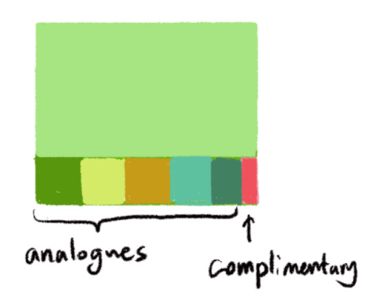
For coherent overall tone, most colors tend to be in places near your main tone. as seen in the color wheel, pick colors adjacent to it's position. We call these analogues.
A small porpotion of colors on the opposite side of your main tone can be used to break the continuety, just like in music, you purposely add stuff to make it less repetitive. It's called complimentary.The most contrasted two colors on the wheel.
I use these two tricks a lot, as seen in both these two paintings:
(I put the small orange/red dots near the edge even though it's not there, to emphasize the concept of light against the overall blue tone.)

(to make Butters stand out against the environment I give him an orange bucket and a more saturated skin tone :3 )
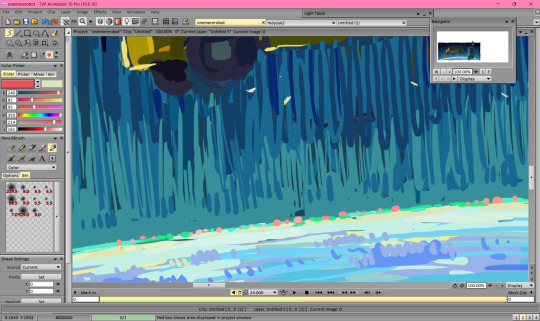
For extreme stylized tones, I'd suggest just go wild! experement and use colors straight out of instinct, use whatever that is on the colorwheel. Use a lot of contrast!

(for e.g, this piece about that stan and whales I've doodled, it's an imaginary space, so no realife coloring rules applied.)
Oh oh and um try thumbnailing different sets of colors! Make more designs in case u change ur mind-
Also you can find color palettes other artists summarized online, they'd be quite helpful. And when you're improving you'll have palettes of your own!
3. Analysis n Theories:
Now onto theories-

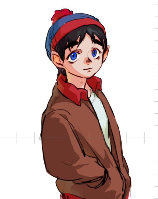
I'll just use this sketch as an example, it's easier to demonstrate - (thank u Stan_(:зゝ∠)_)
(this is gonna be the longest part pls bear with me´_>`)
First is base color, without lighting this is what most objects are. Imagine things like they're in south park, just paper cutouts, without being affected by any light.
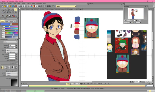
If I use color straight from the show, he's base color would be like this. It goes well with the show's design, but I need to adjust it a bit when putting him in a 3d scenario.
tips: considering the overall tone from chapter 2 while doing this would help a lot. U can tweak the base color before you deal with lighting, for a better effect.

(for coherent tone, some adjustments are made, mainly reducing the overall saturation.)
Then is lighting, normally 2-3 sets of them. Let's do it layer by layer.
Main light source. If it's an outdoor scene, most likely the sun. And for indoor, a lamp, your room's light, or tv screen etc.
When there's one light, it cast one shadow, as seen in my demo, I assume it comes from the sun, it's higher than Stan and on the right side, and cast a 45°shadow to the left side.

In this step u don't want to overthink, just do one plain shadow, follow the structure of the objects you'r painting. You can find a lot of anatomy refs online.
Secondary light source. It can be used to elevate the mood, and in some cases creates a stunning silhouette.
Since he's in an outdoor scene, my secondary light might come from behind, could be sunlight reflected by a smooth object or sth.

tips: You can use rim light as in some cases. I do that when I don't know what to paint for background.
(this one consists of a warm rim light, to add a slight sacred feeling, and a vague light from somewhere to the left and above him, I make it a cold light source to cool down the skintone for a melancholic mood )
(it's my personal habit of adding tons of these, bc I love subsurface scattering!(it appears when your skin is in front of the light, like my hand here) I find them helpful if you want to indicate intimacy or vulnerability)
Another type of light u can add is environment lights, it comes from various objects around your character, it's a bit complicated, but we can do that later.
Okay, next step,we're gonna use the shadow we just created on our base color, u have different ways to do it.
The quickest one is just put your shadow layer on top of the base,and set the layer property to multiply , grain extract or sub.

This is similar to anime cel shading, add some highlight to the eyes, some variety on the skin tone (for lip, cheek and nose), then you're done! I used to do this when I color the animation, but for illustration I think it might be too simple. I'll show you how I do that when illustrating next.
So, 'member all the shadows we did after base color? Now we need to actually paint them.
In natural environment, your color for shadow should be more sturated than the light, if not affected by environment light and reflections. That's why I lowered the saturation for base color.
So here's the skin color, to find a shadow color for it, tune up saturation and tune down the light.

But this might be just a bit boring, and actual light have color, so either make it a bit warmer or cooler depending on the color of your main light source.
The sun is quite warm, so I'll be tweak it a bit toward red.

(ah, much better!)
Now apply the same method for everything. Pay close attetion to some details:

(the shadows of eye structure is like this, bc the lens is transparent.)
(do a dark shadow in the center of the head to make silky smooth hair, also make the edge of your shadow area sharp.)

(for dry and curly hair, the shadow pattern would be gradiented with small bumps, think about snowball, or cloud.)

Okay, now we finished the first layer of shadow and light!
Now, for secondary light, I chose a reflected sunlight, thus it'd be yellowish. and since it's reflected, a less saturated color
Now apply that logic to everything, remember to use strokes or a softer brush for the subtle lighting.
And don't forget about hair highlight and subdivision scattering!(for the ears mainly, u can add some under the nose aswell)
Another trick is that u can duplicate the line and Gaussian blur it lightly, then set layer to Burn or soft light

(Here's your nostalgic filter!!Neat!)
You can either stop at this step or go in for more detail. But you might need to know about the structures if u wanna do that.
Here's a site I visit for human anatomy:
We'll go back to face again. My habit is just abandon the line and merge all layer at this moment (It's not a good habit so I won't suggest u to do the same.)
Basically what you'll need to do here is to assume more environmental color reflected on to your character, like a bluish light coming from the sky. Also the inside of collar may recieve a warm tone from the skin, etc.
When you do the strokes, remember it goes along the direction of the structure, the length and density will create a sort of rythm, and showing the texture of things. Like, for the hat I'll use shorter and wider, bc it's made of wool.
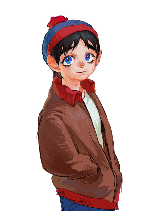
Here's the outcome! It still needs some improvement, but very close to a finished work.
Some times I add a layer of noise texture to it, I guess you can do that easier on the phone.
4. Brushes n Textures
Oh um, this is actually a part I especiallly have no confident in,,,,, bc I'm not a big fan of using comlicated brushes or blending brushes. Usually I paint with TVPaint animation, for I also do animation and it's simplicity made me unable to be distracted by fancier techniques, I only use these two brushes:
(the basic clear edge round brush)
(and this pencil brush that can also spray paint)
Most of the time I find these enough for my works.
I'd suggest using Procreate, Krita, Photoshop and othe tool for more complicated brush use~
You can learn from some artists I mentioned in the next chapter for brush techniques~
5. Learning habits
So um another thing I'd do in my free time is just browsing Artstation and Pixiv, and if I find a good painting I'd analyze it, using the theories from chapter 3 and 4.
Here are some digital artists I like:
Gop gap, Tommy Kim, Krenz, Qqingyi
And some traditional artists I like are:
John Singer Sargent, Andrew Wyeth, Chirico, Alex Colville, Edward Hopper, Wu Guanzhong.
I hope this tutorial I make will be able to help~
Wish u the best of luck!
44 notes
·
View notes
Note
do you happen to have any tips on coloring comics? i often find myself getting frustrated and overwhelmed by everything i have to do, and it almost amazes me how other artists seem to handle it fairly well lol. divulge your secrets?
hello! i have a post about how I color here!
it can get really overwhelming, there's a LOT to consider when coloring a comic page. top things that make it easier for me are
filling in all the important characters and details with one flat shade (usually grey tones for me) so that I can clip my colors to it without worrying about staying in the lines. I do this as I go, as soon as the linework in a panel is finished it gets filled.
making color palettes for every character! I use clip studio paint, which has a color set function. every character, and sometimes important props or settings, gets their own set. when I do colors for an update I go color set by color set, meaning that if I'm starting with Loft, I'll color every instance of him across the update before I move on to the next character. Once every character has flats, I'll color the backgrounds and any new props that don't have a palette yet.
i say this all the time but. lasso fill. lasso fill. lasso fill
creating auto-actions for my shade and light layers! again a CSP thing but photoshop and Im sure other programs have it too. It doesn't do any of the actual drawing for me, it just creates all the layers at the click of a button. it cuts down on how many repetitive actions you have to do just to set up your file
number one thing is breaking the work up into manageable chunks. I think of everything as one phase in a pipeline that gets me towards the finish line, rather than a huge amount of work that needs to be done all at once. however, if I get really stuck on one phase, rather than wasting a bunch of time I try to remind myself to move onto something easier for a moment even if its out of order. So like, if I'm really struggling to get the linework done on one panel, I'll take a break for a bit and put colors down on a different panel. By the time I go back I've usually worked out what I was stuck on.
32 notes
·
View notes
Note
Do you have any tips for someone who is trying a more realistic aproach for their art style? your painting and lighting are so good that I had to ask 🤠
Thank you!
So this question is actually pretty hard to answer, mostly because I still consider myself a beginner/hobbyist, and I'm pretty sure a lot of my technique comes from the ~5 years of classical art training I received in middle school and high school, and that's so fuzzy I can't tell what's intuition or muscle memory! I can go over some of my workflow/thoughts though and hopefully some of it is useful!
The first thing is that for realism, You. Need. References. It is impossible to replicate the level of detail in a realistic painting without a reference. I usually pick a reference, try to draw that reference exactly, and once I have the proportions correct, I'll change it to match the character/scene I'm drawing (move an arm, tilt the head, add a hand, make the eyes bigger, add anime hair etc. haha). Over time you'll get more comfortable moving away from a specific reference and piecing together a bunch of references into something more unique.
Here is an example of a recent post that was fairly simple. I take the reference image (link to reference here) and try to match it, and then I change it to match the character details, in this case, Kashimo.

As for the lighting, when I first started, my colors were a mess! I already know basic color theory which helps, but it didn't help enough haha. What I think helped me learn the quickest was color picking - in krita you can select a color directly from an imported reference figure. So I'd find a reference that I really liked the lighting on, and color picked from it while paying attention to the actual color I was grabbing (how warm it was, gray it was, what the typical skin tones were, etc).
Later on as I started to learn what types of color palettes I really liked working with, I'd open the reference photo in Krita and tweak the image's contrast and sometimes completely change the lighting and colors. However, at some point I started using it as a crutch and my skills stagnated, so you need to be careful! However, now I've progressed to the point of doing a painting in black and white and adding the colors later (with no color picking!), sometimes even without a reference for the color. This was a slow and painful process, so don't expect things to make sense overnight!
Also, don't forget that you don't have to make the colors perfect in one shot. Usually I'll color things using a color layer with minimal detail and basic color tone (Itadori's hair is soft pink, his hoodie is bright red, etc), and then create shadows and lighting with multiply and overlay layers (blues and purples for night, etc.). Eventually I'll build up the color and merge all the layers together, and then add details in full color. I can color pick from other parts of the painting to maintain consistency. Then to finish things off, I almost always tweak the colors and contrast using filter layers.
Here is an example from that same Kashimo painting, going from black and white to full colors using color, multiply, and overlay layers, and then ending with full color details.

As a side note, starting out in black and white can make things so much easier. When you're only worried about values, you can really focus on shadow depth and the shapes of things. It's so much easier to explore rendering when you're not trying to do color on top of everything! Don't try to do everything at once.
The rendering style I use is based heavily on trying to replicate the feeling of actual oil painting. I use the (free!) art program Krita, and my favorite, most used brush is from a free pack I downloaded from deviant art (here). I use the brush called R T Masked4 (shown below) for basically 90% of any painting I do. I use about 4 brushes total on a typical painting (R T Masked4, that same brush but tweaked to be narrower for hair details, a smudge brush that I discovered maybe 10 days ago that I'm now obsessed with, and sometimes a scratchy brush for additional texture).

One last thing - don't be afraid to use tracing! Block in a reference photo to get the head and shoulders in the right place!! Trace a few hands to see how it feels!!! Obviously don't trace somebody's art and present it as your own, and it should only be rough approximations of shapes so you learn how to break down the body into parts. Otherwise, it won't be helpful at all. I only use photographs for tracing, including pictures I've taken of myself. One of the more helpful things I'll do is free hand my drawing and try to make it match the reference as closely as possible. Then, on a separate layer, I'll trace the reference photo (again, no details, just general positioning/shapes), and compare it to my original drawing. I can immediately see the issues, and I'll use the liquify tool to get things in the right place. I've learned that my horizontal spacing is usually pretty good, but I struggle with vertical spacing, especially on faces. So now I triple check my work for those specific things!
This kinda turned into a book, I'm sorry! I hope some of this is helpful and doesn't sound like the 10:30pm ramblings of someone who didn't get enough sleep haha.
77 notes
·
View notes
Note
Seeing your art literally makes my day and inspires me to draw violentine art 🫂
Also, any useful resources for artists? Your coloring is so good!

abubububu aaa that makes me so happy to hear!!! thank you,,

coloring tips specifically? hmm here are a couple links to some videos on light and color and shadow stuff that does a good job explaining the way i approach those things. i dont always get super detailed with it but knowing how it all works will help you make your own creative choices
ive gotten kinda lazy with my coloring the last year or so. i started using blending modes to shade with instead of trying to do all the color logistics myself so now i can just throw down the true color flats and go. but the layer modes do a good job simulating light and shadow so it works enough for me aha
i use overlay layers for light and multiply layers for shadow pretty much, with the occasional glow layer for harder lights. plus sometimes either an overlay (day) or multiply (night) layer fill with the BG color to bring the flats into harmony with the BG before shading if it needs it. used a pin light layer for a night piece recently and i like how it looks (more saturated night look). just mess around with the layer modes until you like it honestly aha. but i try to use as few layers as possible since i dont want it to look over done or anything. intersecting overlay and multiply layers helps to give that saturated effect around where light meets shadow. you can see it pretty easily here (flats > multiply/shadow > overlay/light (+glow in the eyes))

its just the overlay layer painted on part of the multiply layer. warm light cool shadow (or cool light warm shadow depending on the scene). i keep the ambient light thats in the shadow cool (no overlay) to imply it as indirect from the primary light source
UHH thats really it honestly for my coloring process. i also try to use a limited palette. i look for all the colors characters share and try to pull them from the same swatch as much as i can. it helps to keep things feeling in harmony. same with using colors for light and shadow that already exist in the BG
other random tips always include DOING STUDIES AND USING REFERENCES!!!! i know studies can be sooo boring but they really do help. and even just doing a few of them can help tremendously. make it fun draw your faves instead but at least do it using some references youll improve so fast. style is all about how you interpret the world, so look at the world and try to learn from it :)
34 notes
·
View notes
Note
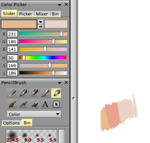
what's your process for coloring like? the look of that elendira is so textured and interesting, i can't figure out how you do it
AA THANK YOUU ^__^ !! textures & brushwork are my favorite things abt my art, so im happy you find it interesting hehe . its SOO cool to look at & so much fun to draw imo
i prefer to color by building in layers , if that makes sense 🤔!! hundreds of them !! such that i'm always drawing on Top of previous layers, working from big & messy blocks of color to, eventually, small and refined blocks of color until it feels processed enough. as a result, i rarely ever erase (!!) and i rarely ever draw lineart aside from the initial sketch
a rough, patchy textured brush is key here, as it'll give you dimension and variability w/ your colors. i recommend "Brush and various sets of fountain pen style (万年筆風ブラシと色々セット)" on Clip Studio (ID: 1679706) !! :3

im terrible with explanations though, so i'm going to show a step by step of that elendira drawing if you dont mind :3
sketch layer !! because i mostly render through color alone, i try to make this as close to the finished thing as possible . ^__^ i hateee drawing the same thing over and over and like the expressivity and movement of my sketches anyways , so the more i can preserve at this step, the better. if u were to look at a side by side of my sketches and finished pieces, youd notice a lot of those og lines are present in the final drawing :3

2. flats !! pretty self explanatory, but the solid background gives me an idea of where the figure begins & ends while the colors themselves help distinguish whats what . i stick to ambient lighting @ this point because im usually not sure what i want to do with the overall palette or lighting yet . having two tones (ex, dark and light in her hair or dark and light on her skin) can also help in identifying key features early on that u wanna preserve. as you build layer by layer, sometimes these areas will remain untouched and i think it makes for a rly lovely feel at the end

3. start blocking !!! to be totally honest with you, i dont really know what i do here HAHAHA. like i just scribble the shit out of it, usually focusing on what i might want to do with lighting (ex: grey areas to accentuate folds in her costume). i think i like to start "erasing" the sketch where possible by coloring on top of it .. like if you look at her hat or her arm , you can tell i'm starting to get a sense of the shapes i like vs the ones i dont. it's at this point that the final image starts to emerge in my mind , like im gradually pulling her from a tarpit of scribbles until shes recognizable lol. chipping away at the marble until i can free her. tbh.

4. keep blockingg...when u think u are done , block some more . as you can probably see, the brushwork becomes more intentional as i add more shape, with specific focus on line weight. this is also where the patchiness of that textured brush comes in - notice how none of the colors seem totally uniform (ex: the red cross or the original sketchlines for her waist). you can see bits and pieces of the layers underneath pushing through and i really like that !! ^__^ its very fun and sketchy to me, so i try to keep them around. those areas are also great to colorpick from, because it'll give you "new" colors to work w/ that are already part of your palette.

5. GRADIENTS & GRADIENT MAPS !! TONE CURVE !! COLOR PICKER !! this is the best stage tbh. flatten your image so its all on one layer and just go crazy with all the color settings in ur program. add gradient layers and set them to darken, or overlay, or subtract, orrr. lighten or dodge glow or divide or soft/hard light.! OR!! edit the hue, saturation, luminosity and contrast.and then color pick from these edits, block even more on top of ur image, flatten, color edit again, etc. etc. until u feel satisfied.
ANYWAYSS . i hope that makes sense @__@ sry i wrote this out and deleted it like 23 times trying to make it make More sense but thats what ive got HAHA i hope its useful though :3 !
#SRY I STRUGGLED 2 EXPLAIN THIS#dude its like my brain bcomes stuffed w/ cotton anytime i try 2 write#i hope it makes sense tho..#it also probably sounds so redundant to make new layer one after the other for just a few brushstrokes#but those brushes i linked have a multiply property so if you draw on top of prev lines they'll create dark patches#and so if im working over a large area ill generally need like . 5 layers each with one brushstroke :sob: if that makes sense#this one had . 84 i think. total. layers i mean. the merylvash one had 300+ HAHAH so it rly depends#like YEAAH i could just use a normal brush but i really like the way this looks#andd sometimes the multiply function works really well or will give me the proper shadow tone im looking for#anywas.wanywaysn anyways#asktag#anonymous#long post
58 notes
·
View notes
Text
sleeping beauty
a/N: i hate the word huskily
summary: painting the woman of his dreams feels like a fairytale
warning: smutty ish at the end... kinda... sorta - aka lottie thinks she's written some very vanilla smut

"Thank you, Miss Elliot. I shall have it finished by the end of the month."
Y/N stood up from the chair she'd been sitting on for the last three hours, hands clasped in her lap, face calm. "Thank you, Mr Nichols. I look forward to seeing it."
She grabbed her shawl from the back of the chair and draped it over her arms, walking out the room. The Royal Academy was a beautiful building. Y/N walked down the corridor, looking around in awe, wishing she could spend more time here.
Y/N walked past an open door, peering inside as she passed. She skipped to a halt and looked back inside, double-checking what she thought she'd seen.
Benedict Bridgerton had his back to the main door, his jacket abandoned on the chair behind him as he painted a background onto a canvas. He was absorbed in his work, clearly oblivious to everything else around him.
Y/N had spent a lot of time with Benedict over recent months. They had walked around galleries and museums together, promenaded through the park - she had even been invited over to Bridgerton House for dinner.
But this was the first time she was seeing him as Benedict and not Mr Bridgerton. His walls were down and he looked... happy.
Y/N reached over and knocked gently on the door. Benedict turned, his paintbrush still up against the canvas, and looked at the door. His eyes widened and he almost dropped his palette in his hastened attempt to get up.
"Miss Elliot, I am so sorry, I did not -"
"Do not apologise, Mr Bridgerton," Y/N said, chuckling as he tried to make himself appear more presentable. "I was merely passing by."
"You've been here?"
Y/N nodded, walking into the room, folding her shawl over her arms. "I am having my portrait done by Mr Nichols. My mother insisted."
Benedict nodded, laughing softly. "Mr Nichols is an excellent artist."
Y/N hummed, tilting her head slightly, approaching Benedict. "I think we both know there is someone else I would rather have, Mr Bridgerton." She stopped in front of his canvas. "If you do not mind me asking... what exactly are you doing?"
"Oh, I am just starting a new painting," he said, turning to face his canvas. "This is just a base layer before I start the actual thing - it's a colour wash. Gives it a base that isn't white. It helps make the colours look more natural."
Y/N nodded. She glanced down at the stool next to him. "Is that a book of fairytales?"
"Hmm, what? Oh, yes." Benedict sighed, smiling. "My little sister Hyacinth -"
"Mr Bridgerton, I do know who Hyacinth is, I have been to dinner -"
"Yes, of course, my apologies. Hyacinth asked me to do her some paintings inspired by the stories in the book. Anthony and I read them to her a lot back when it came out - we still do sometimes."
Y/N gently picked up the book - which was evidently well loved. She carefully opened it, flicking through the pages and admiring the drawings within. "Which is her favourite?"
"It depends who is reading," Benedict answered, leaning over Y/N's shoulder. "If it is Anthony, it is Little Snow White. If it's me it is Cinderella. But her absolute favourite - no matter who is reading - is Little Briar Rose. Why I do not know."
Y/N laughed to herself. "So, is that the one you are painting, then?"
"Well, trying to," Benedict replied, taking the book from her. "I have. studied the drawings in here for hours and yet I cannot quite figure out the composition. What I really need is a model but unfortunately Isabella - our usual model - is away for the next few months. I am a bit stuck."
Y/N was silent for a moment, clearly thinking. "I do not know if this is at all wise..."
"But?"
"Why don't I model for you?" She suggested. At Benedict's raised eyebrows she sighed. "I know it is not proper but I would enjoy it. As long as I do not have to take my clothes off and that door remains open, we should be fine."
"I do believe Briar Rose remains fully clothed throughout, Miss Elliot, you are quite safe."
Y/N smiled. "There we go, then. Besides, I adore Hyacinth. We all know I would do anything for her."
Benedict chuckled, tucking the book down again. "And that is precisely the issue, Miss Elliot - everyone would do anything for her."
"Ok, then, tell me what to do."
Y/N stood there as Benedict looked at her, his eyes narrowed slightly in thought. He abruptly walked away, over to a large crate sat in the far corner of the room. Benedict rummaged through it and eventually pulled out several large pieces of fabric. He put them on the floor next to his easel and then grabbed a wooden rectangle block, lifting it up onto the small rectangular platform in the centre of the room.
He stared at it for a minute and then jumped off the platform and grabbed another box, pushing it up against the other one.
Y/N watched with a fascinated expression as Benedict rushed around, throwing cushions and fabric over the boxes, and placing odd items in the background.
Benedict stopped for a moment, looking at his work. He then turned to Y/N and held out a piece of dark blue velvet. Y/N took it, brushing her fingers over the soft material.
"Put that one over your shoulders," Benedict said, pulling her shawl off her arms, "and then this one on top."
Y/N obliged, wrapping herself in the dark velvet, letting it fold over her arms. Benedict then took the lighter blue shawl she had been wearing and put it over the top, the colours contrasting one another perfectly.
"I assume I am to lie down?" Y/N asked, looking at the makeshift bed.
Benedict nodded, taking her hand. He led her up to the podium and to the makeshift bed. Y/N sat down on the edge and carefully laid down, not wanting to knock any cushions off.
She looked up at Benedict, waiting for him to move. "I am your model, Mr Bridgerton," she said softly as he stared at her, "you can touch and move me."
"Are you sure?"
"Of course. I wouldn't have agreed to this otherwise."
Benedict took a step forwards and heistated. He crouched down beside Y/N and took her arm, his fingers wrapping around the fabric of the makeshift shawl. Y/N inhaled suddenly as she felt him take her arm but kept her composure as he moved her left arm, placing it gently on her stomach.
"Would it help if I closed my eyes?" She suggested, turning her head so that she was looking up at the ceiling.
"Please."
Y/N glanced at Benedict and then shut her eyes, nestling her head into the cushions. She could feel Benedict moving around her and she found herself trying not to breathe too loudly, for some bizarre reason.
She flinched with surprise as Benedict grabbed her legs and carefully moved them closer to the middle of the bed, grabbing the edge of her dress and straightening out, his fingers brushing her calf. He then moved the velvet as well- Y/N could feel it tugging on her arm as he pulled it onto the floor.
"Can you let your arm hang for a moment?" He asked quietly from somewhere to her right.
Y/N let her right arm go limp and allowed it to fall off the edge of the bed, hanging in mid-air. The velvet fell with it and she felt Benedict's fingers brush the inside of her wrist as he manoeuvred it around until it sat just right.
"Do you want me to take my hair down?" Y/N asked, glancing up at him as he fiddled with cushions.
Benedict turned to face her, smiling softly. "If you don't mind."
Y/N leant her head forward and roughly pulled on the pins and combs holding her hair together. Benedict came over and she felt his fingers brush hers again as he helped untangle her hair, letting it loose.
"Feel free to mess with it," Y/N told him, lying back down, trying not to move too much.
She shivered as Benedict combed through her hair with his fingers, spreading it out over the cushions and over her shoulders. Every time his hand brushed against her bare skin, her breath caught in her throat and goosebumps decorated her skin.
His hands gently pushed her chin up and he turned her head to the side, brushing against her cheekbones.
"Ok," Benedict said, his breath tickling the bare skin of her neck. "Do not move an inch."
Y/N smiled gently. "I do not dare, Mr Bridgerton."
She watched as benedict jumped off the platform and rushed over to his canvas, sitting down in front of it. He glanced over at her as he picked up his pencil and then back at the canvas.
The sound of a pencil against canvas was a rather soothing sound. That mixed with the smell of paint made Y/N feel at ease in a way nothing else truly could.
"So, why is Mr Nichols painting your portrait?" Benedict asked, his voice slow, showing how much he was concentrating.
"My mother wanted it done before I marry and am no longer Miss Elliot," Y/N said quietly. "She wanted one more of me as her daughter and not as a wife."
"Has someone proposed, then?"
"No." Y/N tried not to move her head as she looked over at Benedict. "But we all know who will."
Benedict smiled. "Apparently so." He paused his sketching and peered around the canvas. "Close your eyes for me."
Y/N chuckled quietly but obliged, closing her eyes and staying as still as she could. As he worked, Benedict began to hum quietly. Y/N couldn't work out what exactly he was humming but the sound began to lull her to sleep.
Benedict glanced over at Y/N, pausing for a moment, flexing his hand. He could tell she'd fallen asleep - her breathing had evened out and her body looked more relaxed than it had ten minutes before. Benedict smiled to himself as he looked at her - he knew she was beautiful but there was something about how she was that made her even more so.
The peaceful expression on her face. The way her chest rose and fell as she slept. He did have to admit that she looked like something out of a fairytale.
Benedict finished his sketch and immediately picked up his paint brush, wanting to get as much done as he could before he had to inevitably wake Y/N up and escort her home.
Almost two hours later, Benedict was happy with how much progress he had made. He knew he'd be able to finish the rest of it off later on either at home or in his studio.
He set his palette down and stood up, quietly approaching the platform. Benedict crouched down beside Y/N and gently shook her shoulder. His breath was stolen from him as she slowly opened her eyes and blinked, the confusion fading away as she realised it was him. God, she was beautiful.
"You did not do it right," Y/N said softly, looking up at him.
Benedict frowned. "What did I not do?"
"If I remember correctly, she is woken up by a kiss."
Benedict pressed his lips together as he smiled. "Is that so? Well, I do fear that would be improper of me, Miss Elliot."
"I do believe we can make an exception," Y/N told him. "After all, I am not going to marry anyone else, am I?"
"Are you proposing?"
"I will if you do this right," Y/N replied, her voice a whisper. "Go on."
Benedict shook his head at her antics but stood up, stepping back from the platform. Y/N closed her eyes again and Benedict walked up to her. He knelt down on one knee and gently moved Y/N's hair behind her ear, running his knuckles along her cheek and down her jawline. He leant forward and pressed his lips against hers.
Y/N's eyes fluttered open and she looked at him, a smile growing on her face. "Perfect."
"I am glad," Benedict whispered huskily. He was inches away from her and everything inside him wanted to climb on top of her. "There is another part of the story."
"Oh? Which is?"
"After the prince wakes Briar Rose up, they get married and have two children together."
"You honestly think I am putting this body through two children?!"
Benedict burst out laughing, tilting his head forward. Shaking his head, he said, "that is not what I meant."
"I know what you meant," Y/N told him.
"Unfortunately, I am a gentleman."
"Fortunately," Y/N countered, "you are already on one knee."
Benedict glanced down and belatedly realised that he was. He looked back up at Y/N. "Well, then, my sleeping beauty. Will you marry me?"
"You already know the answer, my prince."
Y/N pushed herself up and put her hands around Benedict's neck, catching his lips with hers. She pulled him down towards her and Benedict didn't resist. He swung one leg over her body and straddled Y/N, his hands on either side of her shoulders.
Y/N leant up into him, pressing her stomach against his as she kissed him, unwilling to let go. But she had to - mainly because she was running out of air.
"Are you sure?" Benedict asked, panting slightly.
Y/N ran her fingers through his hair, tugging on it slightly. Benedict closed his eyes, trying not to moan as the small action sent fire through his belly.
"Of course I am," Y/N said, brushing her lips against his. "I would not still be lying here if I wasn't."
"The door is locked."
"Excellent."
"It is late. No one else will hear."
Y/N smiled against his lips. "Even better."
Benedict pressed himself against Y/N, forcing her back down onto the cushions. His hands reached behind her and he began unhooking her dress, tugging it off her shoulders and down to her waist. Y/N pushed herself up and Benedict pulled it all the way off, throwing it to the floor.
It was the first time he'd seen her in just her undergarments. And as much as he wanted to rip them off, he knew he had to savour each moment.
"One day," he whispered into her ear as his right hand danced up her thigh, "I'll draw you in nothing but these."
Y/N arched into him as his hand got higher. She dug her nails into his shoulder, burying her head in his chest. "That day better be our wedding night."
Benedict laughed, ducking his head into her shoulder. His hand moved higher still, drifting just below her stomach. Y/N groaned, closing her eyes as she gripped his shirt tightly.
"I'm sure," Benedict muttered, delving inside her and savouring the noise that came out of her with a chuckle, "that can be arranged."
#benedict bridgerton#bridgerton#bridgerton x reader#benedict bridgerton imagine#bridgerton imagines#bridgerton imagine#benedict bridgerton x reader
664 notes
·
View notes
Note
Sovonight,
Your art is so beautiful! I was wondering if you have a method for choosing what colors you use in your art. I always struggle with getting my colors to look good together.
I'd really appreciate it if you have any advice (and time to explain ahaha). If not, that's okay!
Have a lovely day!
~Anon
yeah ofc! here are 3 things i do:
on days where i don't want to spend time picking a palette from scratch, i'll just reuse a palette from a past file (like i did here). if i happen to need different lighting from the original palette, i'll achieve that with layer modes. but the more different the goal is from the starting point, the more adjustment layers are required to get there, and at some point it's just easier to get the palette right on the base layers in the first place. so if i have a new specific lighting situation in mind from the start, i'll usually just create a new palette, and i do this with or without a reference photo.
when i use a reference, i almost never use the reference photo's colors exactly. not only are ref photo colors hard to pick accurately from to begin with (since the high level of detail in photos means that even adjacent pixels can vary widely), but matching a ref photo's colors exactly usually ends up looking lackluster and kind of underwhelming. so rather than trying to match the reference colors themselves, i choose colors that invoke my impression of the reference overall. i might choose colors solely by eye, or i might pick colors directly from the reference to start with and then adjust the colors individually from there, or i'll adjust the colors directly on the reference and then pick colors off the adjusted reference (i actually did that here). they're just slightly different ways to get to the same point, but i find that some days i need that slight deviation in the process in order for the colors to click for me.
when i'm colorpicking without a reference, i usually find it helpful to first fill the entire canvas with a color that isn't white/black/grey. i usually have a general idea of what the light situation is (daylight, evening, firelight, etc) and choose one color based off that for the background. from that point it's just a matter of using your color theory intuition / guess-and-check to choose the right colors for the lighting situation. i'll usually make my best guess on the color wheel, put it on the canvas, go "wow that looks really wrong," and then ctrl+u (hue/saturation/luminosity) to adjust the color to fit. a tip for making guesses is to start with the color you want to see when it's in the context of the canvas (say i have a dark nighttime scene that's pretty blue, and i want to color in a yellow flower, i would start with the shade of yellow i want on the color wheel) and then think about how the lighting affects it (i would drag the yellow somewhat towards blue on the color wheel, so that the actual color leans green, and i'd darken and desaturate it quite a bit since it's a dark nighttime scene). sometimes i also apply layer modes to "mix" colors and then just merge those layers onto the base layer to make it the new base color. like if i know i need the color to be darker and more blue, i might add a multiply layer with blue instead of doing the equivalent on the color wheel. if i need to brighten, i might use overlay or glow, and if i need to increase saturation in general i'll use linear light.
#i know it can be unclear without visuals but i knew if i waited to make examples i would never end up answering T_T#but thank you i'm glad you like my art! ^^#sovo answers#art tips
31 notes
·
View notes
Last Seen Blogs

holycherry784-blog
HOLYMOLY
underthecherryblossumsiwill-blog
A Sword-Maiden
gaybitchfx
inactive

diminie-s-jagiya
Untitled