#theme background example
Text
I would actually kind of like the “becomes a doctor and takes over Leslie’s clinic” story…for Damian.
NOT because I think it would be ~ethical~ or idk whatever-the-fuck.
I just really love the concept of Damian having this “I HAVE A BIG IMPORTANT DESTINY” backstory/lineage/bloodline …
…SON OF THE BAT, and all that jazz…
But when he connects with Gotham and the people in it—because Batman should be connected to the people he’s protecting—Damian realizes that he doesn’t actually WANT “his” destiny.
And it’s not about rejecting Batman or his father or his mother or anything like that, but instead about taking what he’s learned and what they’ve given him and shaping it to fit himself.
#Damian Wayne#meta I guess?#obviously no judgment for the people who like Batman!Damian—he’s just not for me.#i mean my dream Damian series is a pretty much entirely ‘mundane’ combo of noir and slice-of-life…#…to contrast his epic background with the regular fucking people that he’s taken on protecting by becoming a Gotham vigilante.#i think also one of the elements would be commenting on the Bats’ (and Bruce in particular) Control Freak tendencies…#and the theme that you really can’t ‘control’ life.#for example: an element of drama could be that Damian checks in with people during patrol/during cases but…#he still has to go to school and do normal life stuff. (or normal for him.)#so during the *day*—maybe one of his ‘people he is friendly with’ has some mundane bad thing happen to them and dies.#like idk maybe an old lady friend has a heart attack and dies.#what do you do when there isn’t an enemy to fight?#just ‘move on’? isn’t the whole reason they do what they do predicated on his father NOT accepting that he should ‘just move on’?#anyway there would also be metacommentary about the nature of comics and that…#…you don’t really have control about what happens after your series or after your run.#or even what happens to a character YOU create.
462 notes
·
View notes
Text
saw a post earlier that was like "i have a theory that fanfic is more literary analysis than creative writing" and i was like. i know exactly what you mean but thats not what im doing. love and light to you but i am doing a different thing than that
#analysis headcanonning and writing fanfic are all entirely different pastimes to me#this person: transformative work is really just about expanding and delving in to the text :)#me: maybe to You#ive just been thinking about this a lot lately like whats present in the text and how i play with whats present there when i step away with#it and start telling my own story#bc with very few exceptions what i like to make is big canon divergences or something centered on a background character and i explore+#themes present in the OG in new context. but im not trying to write those themes the way theyd be written in the OG.#i think if u tried to tell me that any of my asoiaf fiction was actually analysis of themes *as#george* i would kill you with a rock#i like what George does with theme btw not actually criticizing him here. but thats not what im doing. im doing something else.#**edited to clarify re what i like to make. i meant those two examples just as examples not the totality#to generalize a bit? its stuff that would be out of place in the OG narrative#howevwr if you question my characterization choices be prepared for me to show up at your house with an itemized list of canon support and#in depth reasoning on where it came from and why i made that choice#and then be prepared to be killed with a rock also.
9 notes
·
View notes
Text
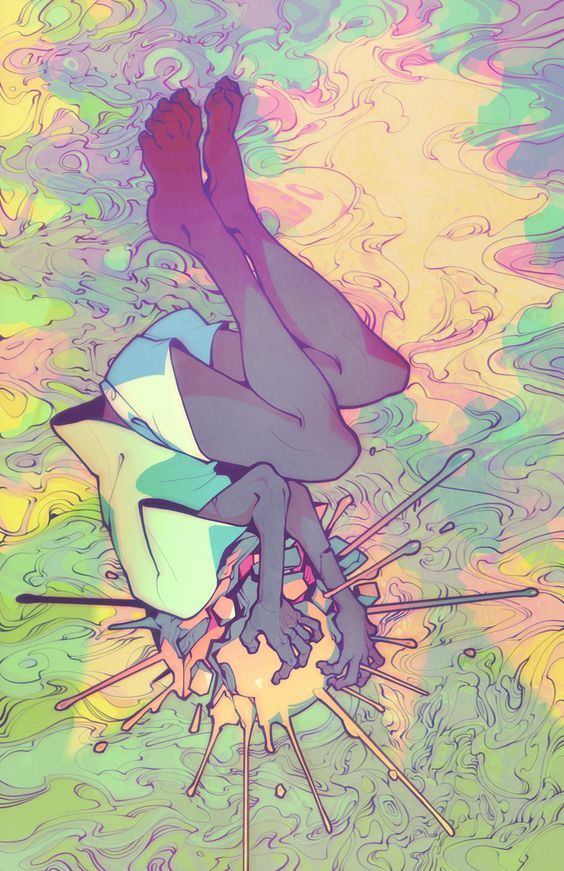
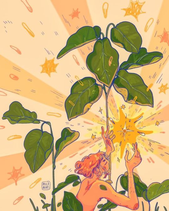
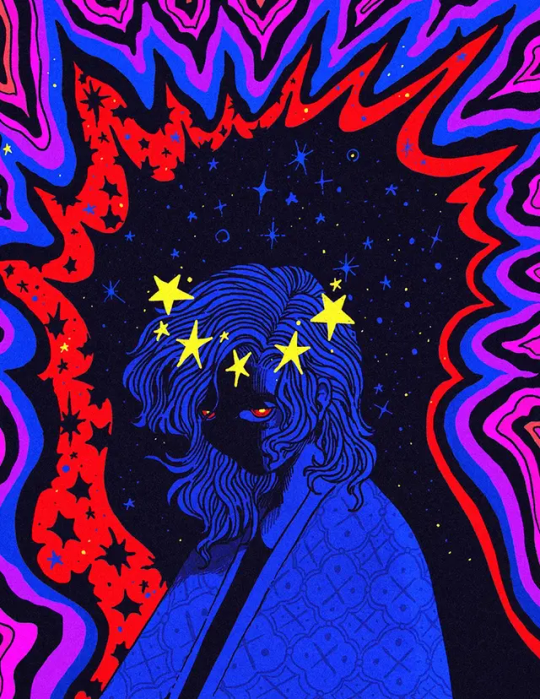
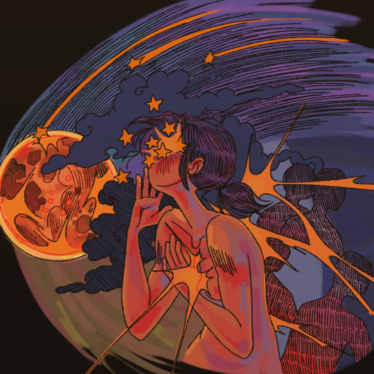
hey quick question, does anyone know if this kind of style has a name? ive been seeing it a lot the past couple years and i really enjoy it so wondering if it has a name
sources: x - x - x - x
#characterized by like. star imagery‚ fairly simple yet detailed designs#bright colours‚ emphasis on hands?#nature themes as well#often very like. emotional?#idk i love this style#no reblogs because i just posted these as examples. go to the sources !#art#the second one is such a favourite of mine.. i have a print of it and it was my phone background for a while#a lot of undertale fanart is in this style lol
5 notes
·
View notes
Text
javascript tumblr stuff
hmmmmmm think tumblr had a recent update where they disabled javascript on blog pages (blog themes are fine?? i think??). kind of a bummer for me bc i was using some scripts to get stuff like tabs and fa icons on character pages hehehe. BUT you can request an exception from support to allow you to use javascript again, which is what i did (waiting on a reply)! i dunno how many people still use tumblr’s blog customization features like that (its honestly one of my favorite things about the site), but yeah just fyi!!
#text#more boring technically stuff lmao#this is the kinda stuff i get excited to talk about#im dont know enough about web layout to make my own themes and pages from scratch yet#but i love messing around with other people's themes and such hehehe#like the current theme im using has been somewhat modified#like theres the obvious stuff like the spamtons flying around#but i also changed up how it handled the background. idk you gotta look at the original code to really see it heheh#and i THINK there was something i changed with the font in some sections i cant remember#and then the 'spamton au masterpage' was edited as well from its base code hehehe#but thats an example of a page getting screwed due to lack of scripts. youll probably notice none of the buttons have icons in them#yeah there was a script to import icons to use lmao
69 notes
·
View notes
Text
There are readings that are more supported than others, there are themes and foreshadowing, there is criticism, there is authorial intent... but sometimes a disagreement about a piece of media just isn't about "media literacy". Sometimes someone will interpret things differently than you because they are a different person with different personal taste, life experience, and beliefs
This is obvious. Sorry. I just saw one too many "the text objectively agrees with me, media literacy is dead" statements about things that were not at all that clear-cut today.
For ongoing series in particular, I am always braced for the moment this can turn into "getting blisteringly mad when it turns out the text did not actually agree with me and betrays my expectations by doing something different"
What I'm saying is I need to stay off twitter
#remibloggue#sometimes the other person understands the story and its goals just fine. and you still never want to see their takes ever again#especially with complex stories that are about many different things at once#sometimes. you disagree with the text. or cannot understand it for reasons that are not about analytical skills but rather life experience#sometimes you are preoccupied with particular themes and disinterested in others#sometimes despite being very familiar with stories in general you are unfamiliar with particular genre conventions#sometimes you are missing cultural context or other background knowledge. etc. etc.#ART IS COMMUNICATION AND COMMUNICATION CAN BE FRAUGHT#FOR EXAMPLE. WHEN YOU READ SOMEONE'S BAD POSTS
5 notes
·
View notes
Text

neocities guide - why you should build your own html website
do you miss the charm of the 90s/00s web where sites had actual personality instead of the same minimalistic theme? are you feeling drained by social media and the constant corporate monopoly of your data and time? do you want to be excited about the internet again?
try neocities!!
what is neocities?
neocities is a free hosting website that lets you build your own html website from scratch, with total creative control. in their own words:
"we are tired of living in an online world where people are isolated from each other on boring, generic social networks that don't let us truly express ourselves. it's time we took back our personalities from these sterilized, lifeless, monetized, data mined, monitored addiction machines and let our creativity flourish again."
why should I make my own website?
web3 has been overtaken by capitalism & conformity. websites that once were meant to be fun online social spaces now exist solely to steal your data and sell you things. it sucks!!
building a personal site is a great way to express yourself and take control of your online experience.
what would I even put on a website?
the best part about making your own site is that you can do literally whatever the hell you want! focus on a specific subject or make it a wild collection of all your interests. share your art! make a shrine for one of your interests! post a picture of every bird you see when you step outside! make a collection of your favorite blinkies! the world is your oyster !!
here are some cool example sites to inspire you:
recently updated neocities sites | it can be fun to just look through these and browse people's content!
space bar | local interstellar dive bar
creature feature | halloween & monsters
big gulp supreme
peanutbuttaz | personal site
dragodiluna
linwood | personal site
patho grove | personal site
getting started: neocities/html guide
sound interesting? here are some guides to help you get started, especially if you aren't familiar with html/css
sadgrl.online webmastery | a fantastic resource for getting started with html & web revival. also has a layout builder that you can use to start with in case starting from scratch is too intimidating
web design in 4 minutes | good for learning coding basics
w3schools | html tutorials
templaterr | demo & html for basic web elements
eggramen test pages | css page templates to get started with
sadgrl background tiles | bg tiles
rivendell background tiles | more free bg tiles
fun stuff to add to your site
want your site to be cool? here's some fun stuff that i've found
blinkies-cafe | fantastic blinkie maker! (run by @transbro & @graphics-cafe)
gificities | internet archive of 90s/00s web gifs
internet bumper stickers | web bumper stickers
momg | gif gallery
99 gif shop | 3d gifs
123 guestbook | add a guestbook for people to leave messages
cbox | add a live chat box
moon phases | track the phases of the moon
gifypet | a little clickable page pet
adopt a shroom | mushroom page pet
tamaNOTchi | virtual pet
crossword puzzle | daily crossword
imood | track your mood
neko | cute cat that chases your mouse
pollcode | custom poll maker
website hit counter | track how many visitors you have
web revival manifestos & communities
also, there's actually a pretty cool community of people out there who want to bring joy back to the web!
melonland project | web project/community celebrating individual & joyful online experiences. Also has an online forum
melonland intro to web revival | what is web revival?
melonking manifesto |
status cafe | share your current status
nightfall city | online community
onio.cafe | leave a message and enjoy the ambiance
sadgrl internet manifesto |
yesterweb internet manifesto | sadly defunct, still a great resource
reclaiming online social spaces | great manifesto on cultivating your online experience
in conclusion
i want everyone to make a neocities site because it's fun af and i love seeing everyone's weird personal sites that they made outside of the control of capitalism :)
say hi to me on neocities

#neocities#old web#webcore#old internet#web revival#indie web#html#website#recource#guide#can you tell that i've gotten REALLY into neocities this month!!!!!#but its so FUN i love seeing everyones weird af websites#its amazing#i love celebrating the old web#ANYWAYS MAKE A NEOCITIES HERES A GUIDE#i haven't touched html in like a decade#and i've been having a great time relearning#:)#share your sites with me!!!!!!#oh and share resources if you have them!
72K notes
·
View notes
Text
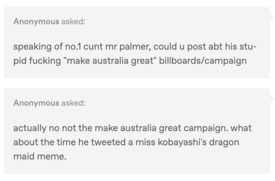
So a bit of background first for our international followers: Clive Palmer is one of Australia's many mining billionaires who like to meddle in our country's politics, and as such he is utterly despised by all of Australia.
Picture for context:
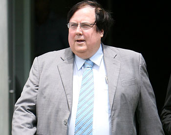
He is most commonly known online by the title "Fatty McFuckhead", (problematic as it may be) because he tried to sue a youtuber for $500,000 for calling him that - and he lost. So the name stuck.

Up until his most recent foray into parliament, the legally certified Fuckhead was best known for his batshit business ventures, such as attempting to build "The Titanic 2" (failed) and trying to build a dinosaur theme park (also failed, but at least nobody got eaten by a T-Rex in this one).
For a very long time Clive played the role of sugar daddy to Australia's largest conservative party, the ironically named Liberal Party, until they had a falling out in 2012 after Clive claimed there was too much money influencing politics (lol), at which point he started his own party, days after saying he totally quit and wasn't fired and he only left because he didn't want to be a distraction.
His initial run at parliament was actually kinda successful, with Palmer's group winning 4 seats, plus a member from the "Motoring Enthusiasts Party" joined them too after accidentally getting elected and not knowing what the fuck to do.
Despite this initial success however, Palmer's party (which ran on basically no platform other than "I'm rich") hit an iceberg (titanic 2 achieved) and seven elected state and federal politicians quit within the first year.
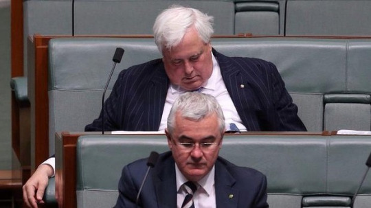
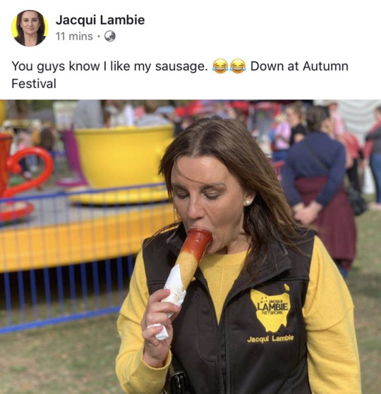
By the time the next federal election rolled around, only one Palmer party candidate was still running for re-election. The most successful of this group - Jaquie Lambie - quit to sit as an independant and is still in parliament today.
Here she is with a painting of herself strangling Clive (she sells signed copies of this)

And here the senator is posting about liking sausage:
Anyway, we're getting to the point: which is the yellow posters. By the 2016 election, just two years after forming, the party was in complete freefall. It won just 0.01% of the vote at their second election, and it was announced shortly after that Clive was quitting politics and the party was being shut down. Australia breathed a sigh of relief.
It was, of course, short lived.
Clive, in desperate need of attention, restarted the party for the 2019 election, fielding candidates in every seat and spending $60 million in advertising in an attempt to win votes.
Every single candidate lost.
It was in this campaign however that Australia really started to fall out of love with Palmer, because most of that $60 million went towards putting up the world's least compelling marketing billboards on almost every single free space in the country.
For a good six months this was basically the only thing you would see in Australia if you went outside:
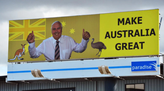
Clearly Graphic design is his passion. And yes, the genius did just straight up try and copy Trump's homework while changing a few words, hoping nobody would notice.
Very quickly these all got vandalised and it seemed the ad companies didn't care enough to replace them.
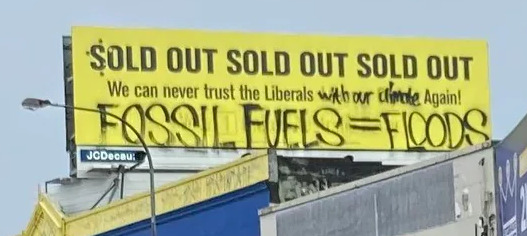
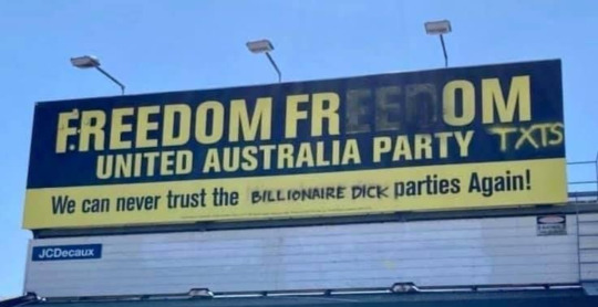
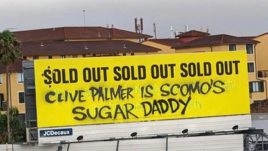
We could go on posting examples, there are thousands, but the best is definitely the one Ikea put up shortly after Clive lost the election:

In 2022, Clive's party contested the election AGAIN, this time also opting to send millions on spam text messages to every person in Australia begging for people to vote for him, as well as buying almost every youtube ad for a year, at the cost of $100 million.
He won a whopping one seat.
During this election Clive ran on an anti-lockdown, anti-vax platform with the slogan "freedom, freedom, freedom". That message, however, was slightly undermined when his goons, dressed in 'Freedom!' shirts, made national news for trying to beat up a protester who turned up at a rally dressed as an annoying text message, shouting "pay your workers" at Clive.
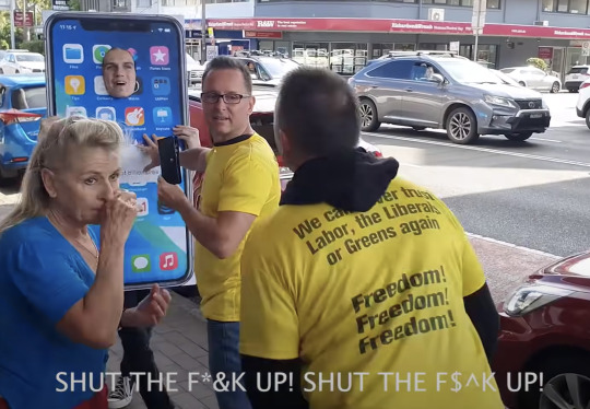
As if that wasn't bad enough, at another rally Clive knocked himself unconscious while trying to jump up on stage, and then a few weeks later was rushed to hospital with covid, while his anti-vax ads were still in regular rotation on TV, at which point it was also leaked to the press that Palmer had been alledgedly trying to buy Hitler's car.
Utterly humiliated, the party deregistered again shortly after the election.
Can't wait until he runs again in 2025.
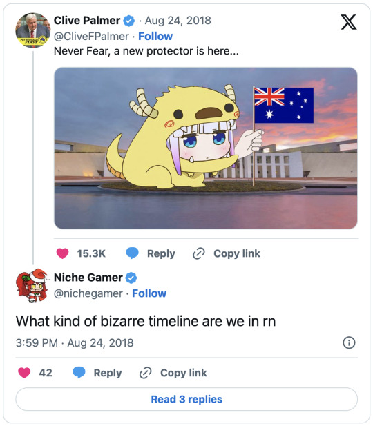
Anyway, on the other "Clive tweeting Miss Kobayashi's Dragon" thing, we have no idea what that means but here's a screencap:
5K notes
·
View notes
Text
My Favorite Cheap Art Trick: Gradient Maps and Blending Modes
i get questions on occasion regarding my coloring process, so i thought i would do a bit of a write up on my "secret technique." i don't think it really is that much of a secret, but i hope it can be helpful to someone. to that end:

this is one of my favorite tags ive ever gotten on my art. i think of it often. the pieces in question are all monochrome - sort of.
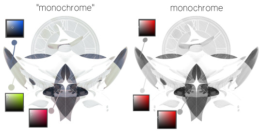
the left version is the final version, the right version is technically the original. in the final version, to me, the blues are pretty stark, while the greens and magentas are less so. there is some color theory thing going on here that i dont have a good cerebral understanding of and i wont pretend otherwise. i think i watched a youtube video on it once but it went in one ear and out the other. i just pick whatever colors look nicest based on whatever vibe im going for.

this one is more subtle, i think. can you tell the difference? there's nothing wrong with 100% greyscale art, but i like the depth that adding just a hint of color can bring.
i'll note that the examples i'll be using in this post all began as purely greyscale, but this is a process i use for just about every piece of art i make, including the full color ones. i'll use the recent mithrun art i made to demonstrate. additionally, i use clip studio paint, but the general concept should be transferable to other art programs.

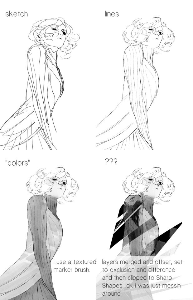
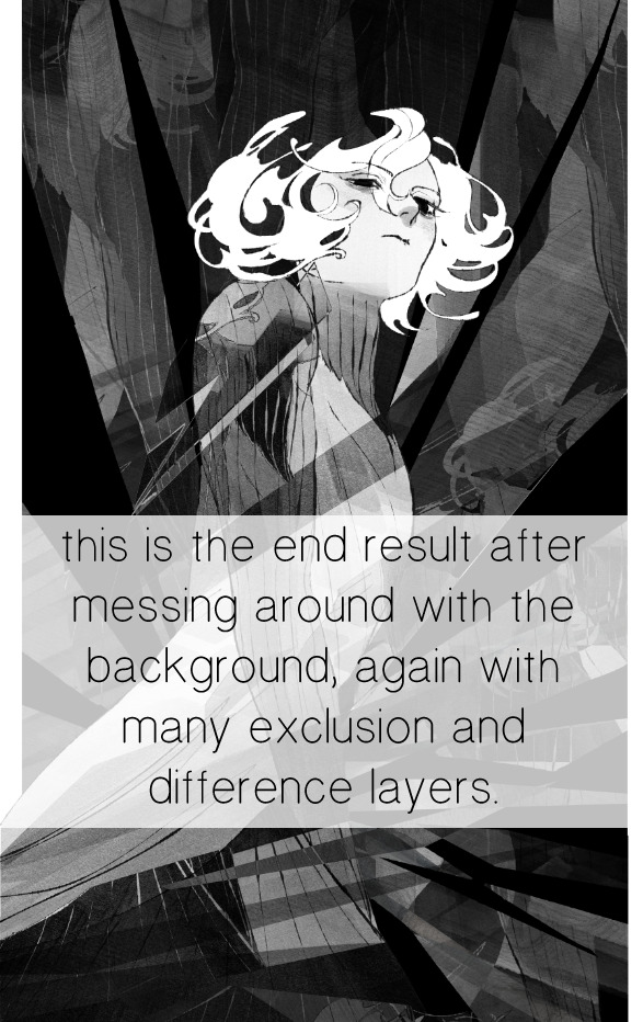
for fun let's just start with Making The Picture. i've been thinking of making this writeup for a while and had it in mind while drawing this piece. beyond that, i didn't really have much of a plan for this outside of "mithrun looks down and hair goes woosh." i also really like all of the vertical lines in the canary uniform so i wanted to include those too but like. gone a little hog wild. that is the extent of my "concept." i do not remember why i had the thought of integrating a shattered mirror type of theme. i think i wanted to distract a bit from the awkward pose and cover it up some LOL but anyway. this lack of planning or thought will come into play later.
note 1: the textured marker brush i specifically use is the "bordered light marker" from daub. it is one of my favorite brushes in the history of forever and the daub mega brush pack is one of the best purchases ive ever made. highly recommend!!!
note 2: "what do you mean by exclusion and difference?" they are layer blending modes and not important to the overall lesson of this post but for transparency i wanted to say how i got these "effects." anyway!
with the background figured out, this is the point at which i generally merge all of my layers, duplicate said merged layer, and Then i begin experimenting with gradient maps. what are gradient maps?
the basic gist is that gradient maps replace the colors of an image based on their value.

so, with this particular gradient map, black will be replaced with that orangey red tone, white will be replaced with the seafoamy green tone, etc. this particular gradient map i'm using as an example is very bright and saturated, but the colors can be literally anything.
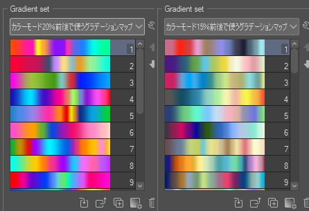
these two sets are the ones i use most. they can be downloaded for free here and here if you have csp. there are many gradient map sets out there. and you can make your own!
you can apply a gradient map directly onto a specific layer in csp by going to edit>tonal correction>gradient map. to apply one indirectly, you can use a correction layer through layer>new correction layer>gradient map. honestly, correction layers are probably the better way to go, because you can adjust your gradient map whenever you want after creating the layer, whereas if you directly apply a gradient map to a layer thats like. it. it's done. if you want to make changes to the applied gradient map, you have to undo it and then reapply it. i don't use correction layers because i am old and stuck in my ways, but it's good to know what your options are.

this is what a correction layer looks like. it sits on top and applies the gradient map to the layers underneath it, so you can also change the layers beneath however and whenever you want. you can adjust the gradient map by double clicking the layer. there are also correction layers for tone curves, brightness/contrast, etc. many such useful things in this program.
let's see how mithrun looks when we apply that first gradient map we looked at.

gadzooks. apologies for eyestrain. we have turned mithrun into a neon hellscape, which might work for some pieces, but not this one. we can fix that by changing the layer blending mode, aka this laundry list of words:

some of them are self explanatory, like darken and lighten, while some of them i genuinely don't understand how they are meant to work and couldn't explain them to you, even if i do use them. i'm sure someone out there has written out an explanation for each and every one of them, but i've learned primarily by clicking on them to see what they do.
for the topic of this post, the blending mode of interest is soft light. so let's take hotline miamithrun and change the layer blending mode to soft light.

here it is at 100% opacity. this is the point at which i'd like to explain why i like using textured brushes so much - it makes it very easy to get subtle color variation when i use this Secret Technique. look at the striation in the upper right background! so tasty. however, to me, these colors are still a bit "much." so let's lower the opacity.
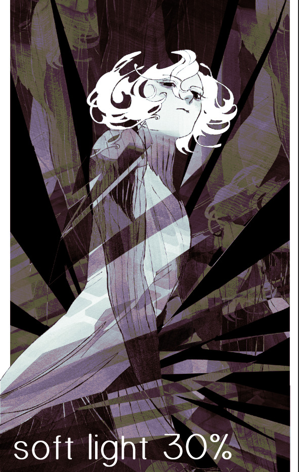
i think thats a lot nicer to look at, personally, but i dont really like these colors together. how about we try some other ones?
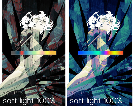
i like both of these a lot more. the palettes give the piece different vibes, at which point i have to ask myself: What Are The Vibes, Actually? well, to be honest i didn't really have a great answer because again, i didn't plan this out very much at all. however. i knew in my heart that there was too much color contrast going on and it was detracting from the two other contrasts in here: the light and dark values and the sharp and soft shapes. i wanted mithrun's head to be the main focal point. for a different illustration, colors like this might work great, but this is not that hypothetical illustration, so let's bring the opacity down again.
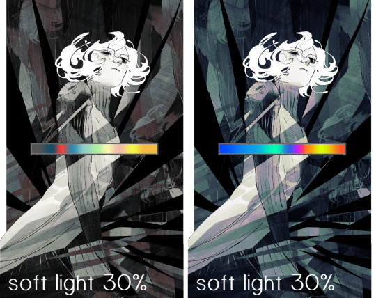
yippee!! that's getting closer to what my heart wants. for fun, let's see what this looks like if we change the blending mode to color.
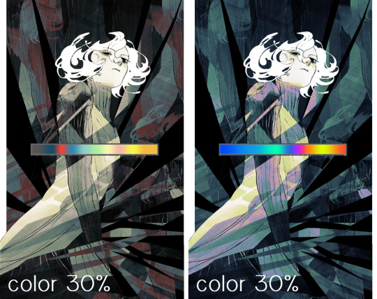
i do like how these look but in the end they do not align with my heart. oh well. fun to experiment with though! good to keep in mind for a different piece, maybe! i often change blending modes just to see what happens, and sometimes it works, sometimes it doesn't. i very much cannot stress enough that much of my artistic process is clicking buttons i only sort of understand. for fun.
i ended up choosing the gradient map on the right because i liked that it was close to the actual canary uniform colors (sorta). it's at an even lower opacity though because there was Still too much color for my dear heart.
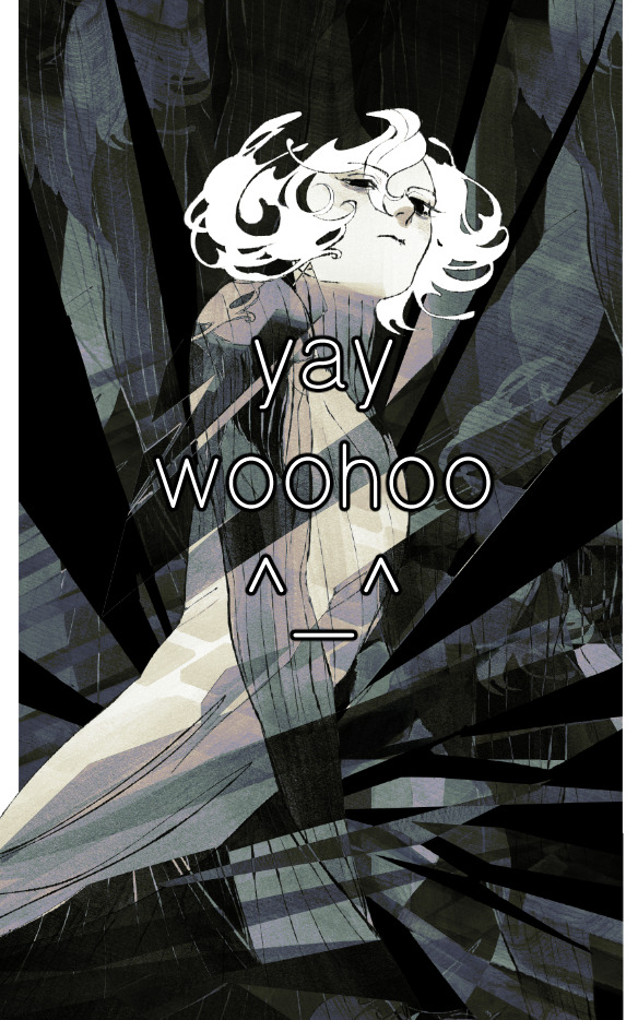
the actual process for this looks like me setting my merged layer to soft light at around 20% opacity and then clicking every single gradient map in my collection and seeing which one Works. sometimes i will do this multiple times and have multiple soft light and/or color layers combined.
typically at this point i merge everything again and do minor contrast adjustments using tone curves, which is another tool i find very fun to play around with. then for this piece in particular i did some finishing touches and decided that the white border was distracting so i cropped it. and then it's done!!! yay!!!!!
this process is a very simple and "fast" way to add more depth and visual interest to a piece without being overbearing. well, it's fast if you aren't indecisive like me, or if you are better at planning.

let's do another comparison. personally i feel that the hint of color on the left version makes mithrun look just a bit more unwell (this is a positive thing) and it makes the contrast on his arm a lot more pleasing to look at. someone who understands color theory better than i do might have more to say on the specifics, but that's honestly all i got.
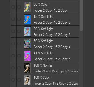
just dont look at my layers too hard. ok?
1K notes
·
View notes
Text
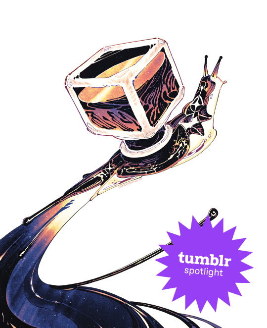
Creator Spotlight: @camberdraws
Hello! My name is Camber (any pronouns), and I’m a mixed media illustrator located in the southwestern United States. I love drawing everything, but I have a special interest in depicting strange creatures and environments, often accompanied by abstract imagery and mark-making. Professionally, I’ve worked creating concept art and 2D assets for museum exhibits, but currently, I am engaged full-time as a software developer and make standalone illustrations in my free time. I’ve been posting art on Tumblr since I was a teenager, and the site has been very welcoming towards my work to this very day!
Check out Camber’s interview below!
Did you originally have a background in art? If not, how did you start?
I’ve had an interest in drawing since I was barely sentient, but at thirteen years old I decided to become “serious” about art. I was all about reading tutorials and doing a ton of studies. I would tote my heavy instructional art books to school every single day (my poor back!) Despite all this, I decided to forgo art school in favor of a bachelor’s degree in Computer Science at my local college. Alongside my major, I received a minor in Art Studio with a specialization in fine art, which totally changed my views on creating artwork and drastically changed my style.
How has your style developed over the years?
As mentioned previously, my style did a 180 after I studied under some very skilled fine art professors! As a kid, my drawings were very realism-heavy and inspired by video game concept art. I mostly worked digitally, too. During college, I was thrown for a loop when we were instructed to do strange things like, for example, make a bunch of marks on paper using pastel, WITHOUT looking, and then turn said marks into a finished piece of art! I quickly and deeply fell in love with abstract work, and especially appreciated images that are not easily parsed by the viewer. Since then, I’ve made it my goal to combine abstract mark-making with more representational subject matter.
What is one habit you find yourself doing a lot as an artist?
Hmmm, one habit I really enjoy as an artist is strictly tracking the amount of time I spend drawing! I currently work a full-time job wholly unrelated to art, so I have to be careful with my time if I want to spend enough hours drawing each week. I created a spreadsheet that allows you to enter the amount of minutes you’ve drawn each day and calculate how much drawing time you still need to reach your weekly goal (I aim for 20 hours a week.) Having such a clear, numbers-based objective keeps me motivated to work like nothing else!
Over the years as an artist, what were your biggest inspirations behind your creativity?
I know this is a common inspiration, but Hayao Miyazaki’s work has been rewiring my neurons since I was a child. Seemingly all of my artistic interests can be summed up by the movie Princess Mononoke: it has strange/abstract creature designs, a strong focus on nature and environmental storytelling, and a mix of dark and hopeful themes. Additionally, I’ve been deeply inspired by video game series such as Zelda, Okami, Pikmin, and Dark Souls. But arguably, none of these have influenced me more than Pokemon! I’ve been drawing Pokemon since I could barely hold a pencil, and I haven’t stopped since! I believe my love of designing creatures originated with my endless deluge of Pokemon fanart during my childhood.
What is a medium that you have always been intrigued by but would never use yourself?
I’ve always been fascinated by 3D mediums and am so tempted to try them out! Whether that’s 3D models created digitally or sculptures made from clay, I profoundly admire artists who have this skill. Oftentimes, it feels like I don’t have time to delve into a totally different artistic paradigm. However, I feel very strongly that learning new skills can enrich your current work. I should take that advice and someday give 3D mediums a shot!
What is a recent creative project that you are proud of?
I am in the process of creating an art book (a dream of mine!) and have been executing smaller drawings of concepts I find interesting from both a visual and storytelling standpoint. A recent drawing for said book is that of a snail made of ink with an ink bottle as a shell, and it went absolutely viral! I’ve never had an experience like this as an artist before and it has been spectacular! I was able to open a shop using my newly acquired art printer and sell many prints of my snail. Creating something original, directly stemming from my interests, and having that resonate with so many people has been unreal. I couldn’t ask for more as an artist!
What advice would you give to younger you about making art that’s personal or truthful to your own experiences?
I would tell my younger self to chill out and experiment more! I was so caught up in the idea that I needed to have a realistic style to be considered “good.” I also believed that technical skill was the only measure of how worthy my art was. That’s not to say technical skill doesn’t matter, but I now firmly believe the creativity and voice of your ideas far outweigh the skill of execution in terms of importance. Technical skills should elevate ideas, not the other way around. Once I began to revel in strange ideas and stories for my work, depicted oftentimes in odd styles or mediums, I truly found my voice as an artist.
Who on Tumblr inspires you and why?
My peers here on Tumblr inspire me more than anything! Sharing my work with contemporaries and giving each other support brings me joy like no other, and keeps me motivated to continue creating. I wouldn’t be where I am today without them! @beetlestench, @theogm-art, @trustyalt, @ratwednesday, @phantom-nisnow, @svltart, @mintsdraws, @mothhh-hh, @jupiterweathers, @thesewispsofsmoke, @picoffee, @fetchiko, @kaisei-ink, and @pine-niidles just to name only a few!
Thanks for stopping by, Camber! If you haven’t seen their Meet the Artist piece, check it out here. For more of Camber’s work, follow their Tumblr, @camberdraws!
1K notes
·
View notes
Text
Desperately trying to pin down all my pkmn sv voiceclaims before the animes dub cast is released
#i just think it’d be funny if some of them ended up being canon but I want that proof out before it happens#sassy speaks#anyways I’m like halfway thru I’ve got a whole video with voice clip examples and everything#made a cool violet themed background to might edit it and use it for my phone hmmm#on second thought mrs puff for tyme ain’t working#I’m casting ryme and tyme at the same time bc they’re sisters and I want their voices to be similar#i actually thought they were twins until I looked it up AUOGH#rly wanna pick a musician for ryme too so i have a lotta music to listen to
1 note
·
View note
Text
Rory Gilmore inspired morning routine
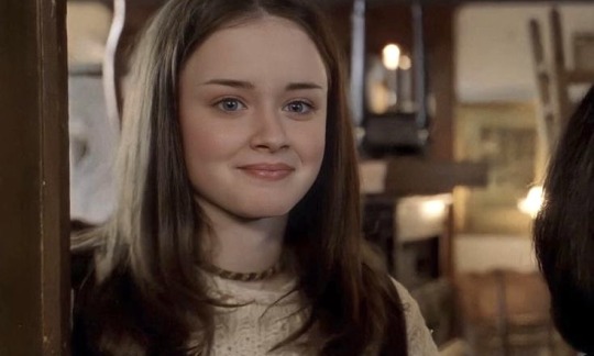

Wake up early so you have plenty of time to get ready before school; if you want to, you can change your alarm to the Gilmore Girls theme song!!
Open your curtains and let in some fresh autumn air; maybe you'll even catch a glimpse of the morning mist!! :)
If you want to, you can play an episode of Gilmore Girls in the background while you get ready to set the mood for the day and motivate yourself… <3
Do your skincare, brush your teeth, fix your hair, maybe some light makeup… the usual haha
Put on a cut and cosy outfit; if you want something Rory-inspired, you could go for a cute knitted sweater and some flared jeans, for example!!
Check your bag and make sure you didn't forget anything!! Also, make sure to bring your current book, so you can read on the bus or between classes. :)
Make yourself a nice breakfast and Tea or coffee!! Having a warm drink before going outside is an absolute autumn essential. <3
If you have some extra time, go through some of your school notes and coursework so you will be extra prepared for class!! :)
Also, make sure to check out my "Rory Gilmore Autumn" playlist on Spotify; if you're going for a cosy autumn vibe or are just looking for a new study playlist, I'm sure you will love it!! <3
As always, Please feel free to add your own suggestions and tips in the comments!!
✩‧₊*:・love ya ・:*₊‧✩
#malusokay#girl blogger#it girl#dream girl#that girl#aesthetic#coquette#pink blog#pink pilates princess#pinterest#rory gilmore#gilmore girls#chilton rory#lorelai gilmore#chaotic academia#light academia#dark academia#autumn aesthetic#autumn#fall vibes#fall aesthetic#just girly things#just girly posts#girlblogging#study aesthetic#study blog#studyspo#manifesting#morning routine#romantizing school
2K notes
·
View notes
Text
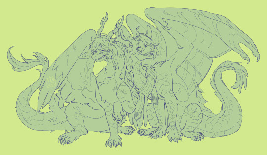
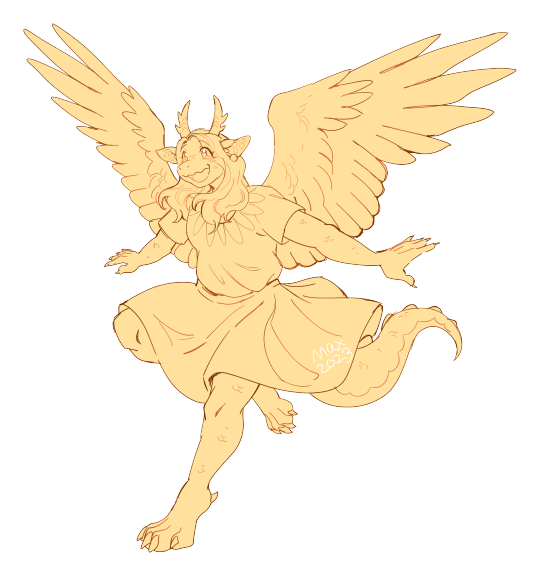
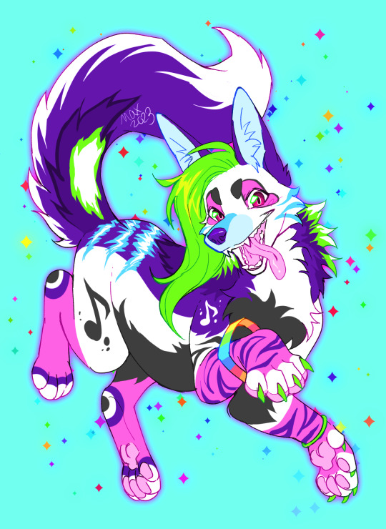

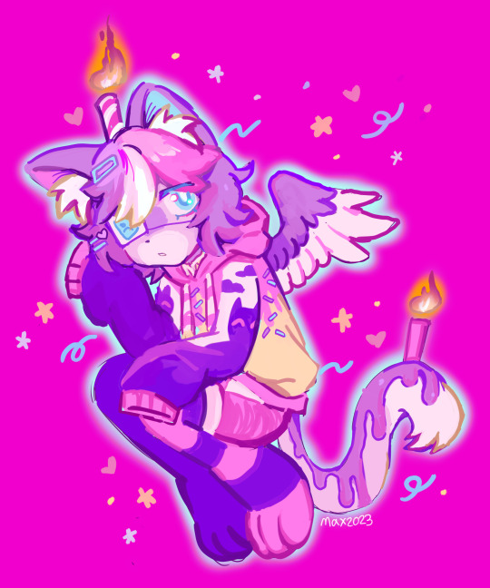
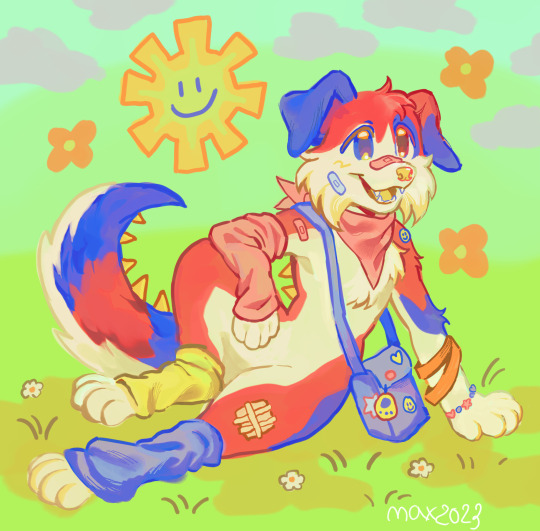
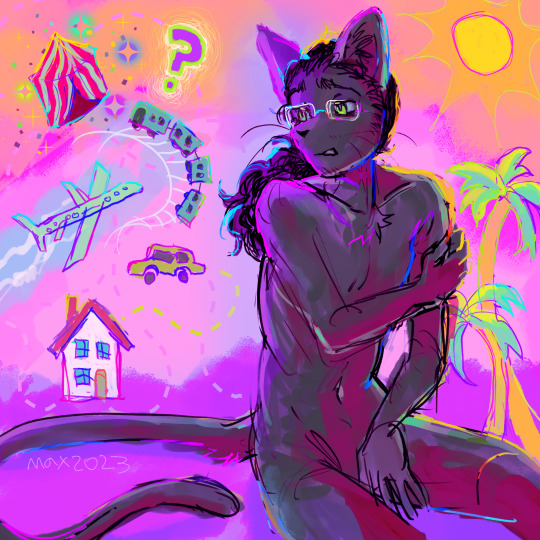
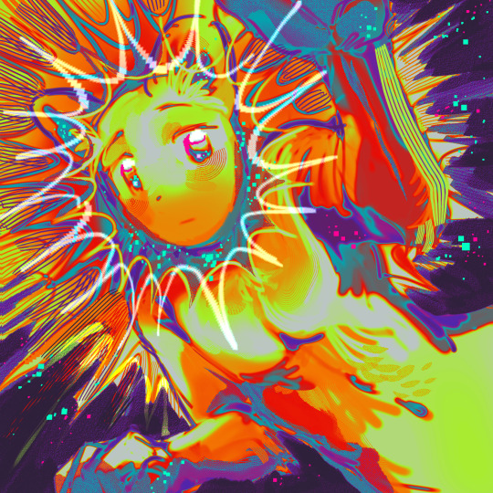
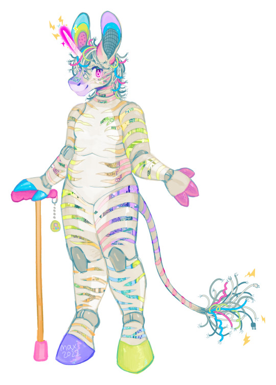
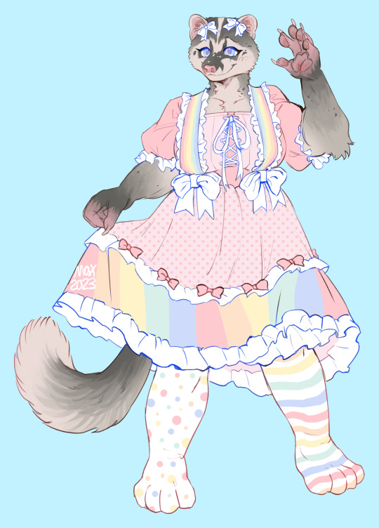
I AM TAKING COMMISSIONS!!! please reblog even if you're not commissioning it helps a lot :3 i need to earn money to keep up with my monthly wheelchair rental payments
1: uncolored lines: $30 head, $60 halfbody, $80 fullbody
- examples are the first 2 images, first image features x2 characters which is x2 price
2: colored lines: $60 head, $80 halfbody, $100 fullbody
- examples are the second 2 images
3: painted style: $80 head, $100 halfbody, $150 fullbody
- examples are the middle 2 images, small background elements/patterns are included
4: experimental style: $70 head, $90 halfbody, $120 fullbody
- examples are the second to last 2 images, background elements/promps/patterns are included
5: custom character design: $170
- examples are the last 2 images, you will need to provide the desired species, body type, clothing (if any), and general theme. mood boards and additional info is also appreciated
note: all prices may increase if your character is highly complicated
payment is through paypal or kofi, DM me if you're interested!
#art#furry#furry art#furry fandom#sfw furry art#safe fur work#furry commission#furry commissions#furry art commission#furry art commissions#furry artist#anthro#anthro art#anthro artist#anthro commission#furry oc#anthro oc
708 notes
·
View notes
Text
𝖆𝖘𝖈𝖊𝖓𝖉𝖆𝖓𝖙 𝖔𝖇𝖘𝖊𝖗𝖛𝖆𝖙𝖎𝖔𝖓𝖘 🪽
This post contains both natal & synastry observations!
These are my personal observations based on people Ive met and celebrities and are not to be taken as facts. The rest of the chart has to be taken into consideration so not everyone will relate.

• Having Saturn and Neptune both aspecting the Ascendant is perfect for a model. The Saturn effect makes the model look cold and untouchable. But the dreamy Neptune effect makes the onlookers delulu enough to think they might be able to look like the model too if they buy the product the model is wearing.
• Ascendant ruler in the 10th house people makes someone come across as authoritative.
• Capricorn Risings wants to come across as somebody with high status. Might like to wear their work uniform or ”the original” and ”timeless” brands. The kind of people to wear their stethoscope and white coat on their profile pic.
• Mars Square Ascendant can have this tense ”you better watch yourself” look.
• When your Lilith conjunct someones Ascendant they might represent everything you just cant be with. Huge age difference seems to be the most common theme here but also different religions especially if Lilith is in Sagittarius. If Juno is involved yall might make it work anyways but if not it can be secret relationship. Ascendant person feels like the Lilith person see right through them.
• Bella(695) conjunct Ascendant shows up a lot in the charts of beauty queens. Both Vanessa Williams and Priyanka Chopra have Bella conjunct Ascendant and Priyanka won Miss World and Vanessa won Miss America.
• Ascendant ruler conjunct the Ascendant seems to give a very strong personality and presence. Both Madonna and Beyonce have this.
• Ascendant Ruler in the 2nd house = making money bc of your looks. Ex. Pamela Anderson.
• Ascendant ruler in the 2nd house or vice versa might change their look a lot when they get money. Might like to spend money on their looks. Kylie Jenner for example have her 2nd house ruler in the 1st house.
• Venus/Ascendant usually have a beauty mark, very often beside the eye or the Marilyn Monroe mole.
• One of the easiest ways to recognize a venusian ascendant is the lips. They seem to often be heartshaped, a prominent cupids bow or just a very soft and plump look. Pouty mouth.
• Ascendant Ruler in the 9th house might have a look that you see instantly where they come from or the opposite. Might get a lot of questions about their cultural background.
• Someone with planets conjunct your Ascendant in synastry will make sure you notice them. Because they sure as hell noticed you and you better reciprocate or they will start acting all rude to get your attention.
• Pluto conjunct Ascendant in the Fama(408) Persona Chart makes you THAT bitch. Makes me think of the lyrics ”you know im the face of the city bitch, thats what you mad”
• Lilith aspecting the Ascendant can make someone look very ”goth” even if they dont even have that style.
• Pluto conjunct Ascendant liked to hide and protect themselves which is seen on how they style themselves. Might like sunglasses, a lot of makeup, a lot of tattoos, wearing a cap, military clothes, walking around with a bulldog.
• Dainty(9758) conjunct Ascendant makes someone look so delicate.
• Air Ascendants seems to just know everyone.
• I cant stand Venus Square Ascendant in synastry. Im a Cap Rising and so many Aries Venuses said I was boring and too serious. I know its true but the Cap Venus guys love it. The issue with this aspect is that there seem to be some kind of attraction but at the same time something bothering the Venus person. And if the rest of the synastry is good it can make Venus want to still be around Asc but still be bothered by them. And I cant stand relationships where you only ”half” like eachother.
© 2023 Zeldas Notes All Rights Reserved
1K notes
·
View notes
