#was just messing about in Ibis paint lol
Text
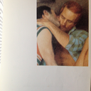
funtime freddy and bon bon doodle !!! (probably my favourites)
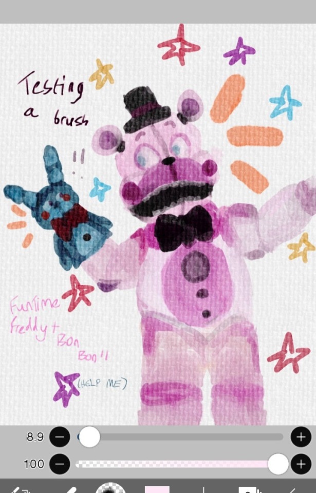
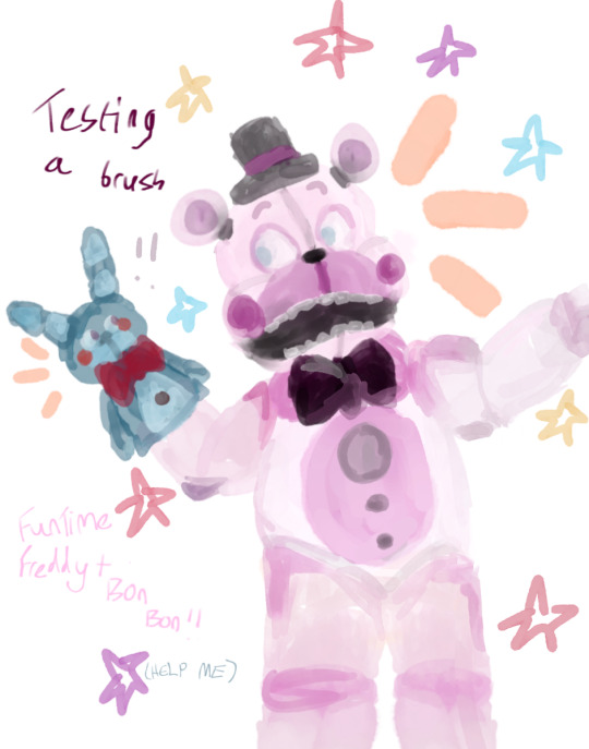
#was just messing about in Ibis paint lol#i haven't drawn them since 2017#bon bon kinda looks like one of those bootleg (bonnie) plush toys IM SORRY 😭😭 i forgot how to draw him#fnaf#five nights at freddys#sister location#art#r7inyz scribbles#fnaf fanart#funtime freddy#bon bon#five nights at freddys sister location#sister location fanart#ibispaint art#phone doodle#the brush i used was alright but i don't really know how to properly blend it yet???if that makes sense??#one of those custom ones#anyways S.L had an absolute chokehold on me when it first came so i was feeling a lil nostalgic today when drawing this#colours look faded in the 2nd one because i was using a textured page thing
29 notes
·
View notes
Text
I messed around with Vil's luxe couture live2d in ibis paint a little bit and

He would literally benefit so much from a less crowded design with all of those gemstones AND a more cohesive colour palette. The apple thing on the belt is the same as the detailing on the shoes (which is more clear with the black shoes that actually work with the colour palette) and the altered choker just pulls attention to his face a bit more than the gold one did.
If I had the energy I'd have given him lace gloves instead of plain black and changed his shoes altogether but this just shows how a few little tweaks could make this sprite and design just a little nicer to look at. Hell, some gold details on the gloves would probably work if they're smaller and compete less for attention - idk the designs just bothers me quite a bit for this event.
More complaining about the clothes for this event under the cut because turns out I feel more strongly about this than I thought I did lol
Ace is the only one who looks decent and his trousers still don't fit him right. Honestly, I think the other guys would look better if they all had slightly different accent colours that work well for the colour scheme altogether AND made the outfits look better on themselves (like the brown for Ace's outfit being more of a red instead.)
Their outfits look samey and as if they could swap clothes and still look alright (or as alright as they can look in those live2d sprites) whereas events like the harveston or bunny events had distinct colours or details that actually. Suited each character. Like the clothes were for them or something idk it's just kinda annoying to me how these designs obviously have less care put into them smh.
I mean, the outfits look okay in the card art - but I still think they're just kinda. Not so great as far as event clothes go
16 notes
·
View notes
Text
so this is my take on human Caine
keep in mind that this is all my headcanons and imagination, and I'm going with the theory that he is an AI and he wasn't a human before
(again it's my hc!) also minor tw for drvg mention
so going with that logic, man is an AI, for his whole life all he was, was lines of numerical codes and suddenly he's thrown into this world and becomes a human, as we all are aware a human body needs to comply to the laws of physics, biology, etc., it has needs that need to be taken care of for it to function right which an AI in a digital world doesn't need to do so imo all of that had to mess with his head a lot, I think that there is a high possibility that he would experience some kind of body dysphoria, he would feel that this isn't HIS body, that something isn't right, something doesn't fit etc., that would be pretty logical
complete change of how his brain operates (idk what he had as an AI but let's also call it a brain lol), human body operates on five basic senses, which is something that he didn't have to submit to, the list of "senses" he had as an AI in a digital world is probably long as fuck and now he has to lean on only five basic ones? that gotta suck and be absolutely difficult (which should be obvious, imagine suddenly becoming blind or deaf, now you need to learn to operate with even less senses than you had, fucking sucks), back in the digital world he could do practically everything with little effort and now? he is limited by this human body/world and all the laws it needs to obey
still on those senses, I think they are all over the place because of the sudden change so he would be prone to sensory overloads or something like that
he literally needs to learn all social rules, written and unwritten, and overall the basis our world works on, which we had YEARS to learn about as we grew up, and yeah as an AI he had some info about humans and our world 'cause he had direct contact with us back in the digital world but it wouldn't be even close to enough to live here among us (heh) completely out of nowhere
because of all of this, I think that he would be a total train wreck and he would be very prone to fall into some unhealthy habits, like for example imo he could easily get addicted to drugs (idk what kind tho), he takes some pills and he can "get back" to his old life at least for a moment? sign him up! for that short period of time, he could feel "right" again, he could have control again [I'm also leaning towards the idea that he could develop some kind of control issues considering who he was back in the digital world as an AI], drugs give you a high which on you can imagine/hallucinate/feel a lot of things so yeah, he could easily get addicted to those, especially if his trips would revolve around him being back in his digital world, his home
and nope, it's not me projecting onto my fav character yet again, not at all (I'm a big liar)
but fr tho, I think it would make sense if he actually was an AI who was never a human and somehow he got out of the digital world with all circus crew
and I made a visual of him in a picrew! (if anyone will want it, I will drop the link to it)
I made some small adjustments in ibis paint lol, like the eye color and the roughly drawn Glasgow smile scars (for some reason it just fits him??? cause he was literally all teeth and it connected in my brain??? idk but my mental imagine of him as a human has those scars, can't do anything about it) + a bit longer lines under his eyes
he would look like he's in his really late 20's or early 30's
bonus, cause I found that t-shirt in the maker lol, Jax gave it to him
a playlist I made and some footnotes with fun hcs
he would love the movie "The Greatest Showman", can't tell me otherwise
I think he wouldn't have a specific music taste, no specific genre etc. but I think he would enjoy music from 80's and 2000's
he cried watching Bambi
his fav candy is Skittles
for the first two weeks the only thing he would eat was any variation of buttered bread, breakfast? toast with butter, dinner? buttered bread with salt, supper? toast with butter but this time with no crust, he would have continued this if Ragatha didn't step in and practically force feed him scrambled eggs one morning and then continued to do so with other foods until he stopped eating just bread
he likes Lady Gaga
he's not allowed caffeine, under any circumstances, never again, the circus gang decided that as a group
surprisingly, he enjoys horror movies
Jax showed him that one video of car driving through the hills (iykyk), he fell out of his chair
his room is very cluttered, messy but in this artsy-homey way
he picks on his skin a lot, especially when he's nervous and because of that his hands are covered in band-aids
he once saw Zooble smoke and asked if he can try, now he joins Zooble on "smoke breaks" because he picked on the habbit, Zooble kinda feels bad about it
#tadc caine#the amazing digital circus#tadc#tadc theory#human caine#headcanon#my hcs#playlist#the amazing digital circus Caine#tadc zooble#tadc jax#tadc characters#long reads#long post#picrew#footnotes#theory#headcanon time#Spotify
32 notes
·
View notes
Note
Heyy, I’ve been reading your wonderful one piece works for a while — and I couldn’t stop wondering how are you actually doing those magnificent headers?
Like… hello? The great quality, with additional 3D-alike details I could catch by my eyes? I got only Ibis Paint X on mobile, since I’m only a young man that literally two months ago went on a life-time ‘adventure’ of living alone in a small apartment.
In short — I got no money to pay for additional graphics/drawing programs, not yet at least
Hello!
Thank you! I'm glad you enjoy my writing - I'm curious to know what's your favorite piece / part? Also I'm so happy you like my headers? Makes it feel worth it to spend time on them! :D
I have excellent news for you, I used a mix of Canva and Photopea. They're both FREE!
I'll be explaining the process for making these two kinda? The full tutorial is below the cut, to be courteous to the other folks, hope you don't mind?
Though I am hearing that Canva has given people some grief. But Photopea is just *chefs kiss*
If you've ever used photoshop, Photopea is essentially a free photoshop, and it even has the automation tools! An absolute lifesaver when you have multiple layers you want to export (but that's for larger projects not this)
I'm going to assume you have basic knowledge of layers in digital drawing programs for this. If anything isn't clear: ask me, I'll clarify!
//-------------------------------------------------
My General Process is:
Search for official art / images
bring it into canva / photopea
crop / arrange images to match the dimensions
select a thematic color that is associated with the character
separate the foreground from the background
mess around and test things until they work
//--------------------------------------------------
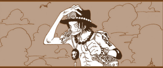
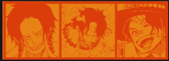
Given "Louder than Words" is the latest one I've made, I'll start with the process for it.
Dimensions: 3000 x 1055 px
dpi: 96
//-------------------------------------------
Let's Get Crackin'
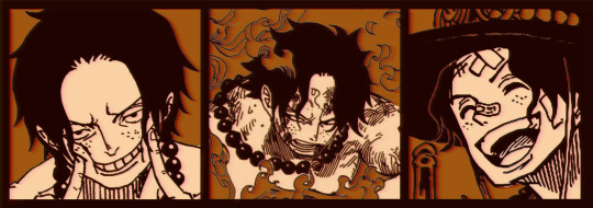
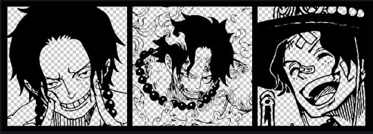
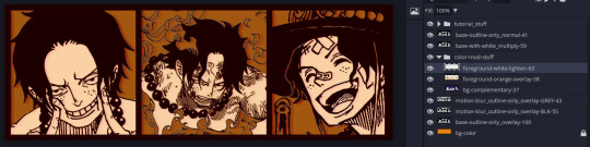
Alright let's grab some official art so we're not using any fanart without the artist's permission
I try to pick images that feel relevant enough to what I'm trying to make.
For example: the image for the Matching banner shows the ASCE tattoo which is super important in that fic
2. Let's arrange them onto a banner where each individual image has the same/similar dimensions to the rest
That's probably part of why you like these. To a certain extent they have similar dimensions, so they have a uniformity that's pleasing to the eye! (It's not perfect because I threw perfectionism to the wind because this is tumblr not my portfolio)
Tip: if you have 3 images and only 2 that have similar dimensions, and the 3rd one can't be cropped logically: but the one that's a different aspect ratio in the middle!
3. lets arrange them in such a way that the borders all feel like they're the same/equal width/thickness
you might find that you have to shrink some images for this, that's fine.
ALTERNATIVELY: if you're going with one image crop it so it's just the relevant info and it matches the dimensions (3000 x 1055 px)
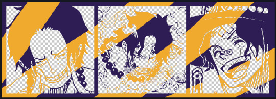
We have our base! Now let's add some color, and direct the viewer's eye together!
4. pick out a color that you think matches your character / vibe - that color is going to be your background
Given I'm making an Ace banner: orange is the color I'm going with
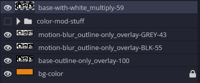
I went and named my layers for this lol. The numbers represent the opacity, and they aren't important. I just kept changing the opacity until I liked the way things looks. But here's the secret to the 3D feel:
Motionblur (+ moving it about)
Separating the foreground and background and dulling out the background.
I'm going to show you my process so you can see the effects, but first let's give you some quick skills:
//------------------------------------
SKILLS / THINGS I THINK ARE HELPFUL
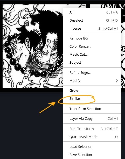
//------- Select Similar
magic wand -> select something -> right-click -> select similar
This works best when you have high contrast images (like manga panels that are black and white). You can select the black or the white areas. Depending on what works better for you.
TIP!
Invert selections with ctrl + i
Say you know that you want to select everything but Ace's face in the second panel. Select his face with the magic wand then ctrl + i, and that's the only thing NOT selected


TIP!!!!!!!!!!!!!!!
Please, please, please, duplicate your original image and work on the duplicate layer. This helps you SO much. !!!!!!!!!!!!!!!!!
TIP!
Check your selection tolerance! This could be why too little, or too much is being selected.

//------- The Move Tool
Shortcut key: v
While the move tool is active, you can nudge the stuff on whatever layer with your arrow keys
Shift + arrow key = 10 px move (generally)
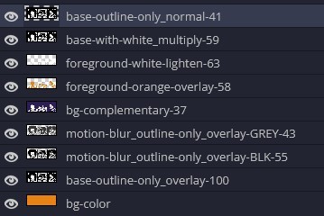
//------- Layer Locking
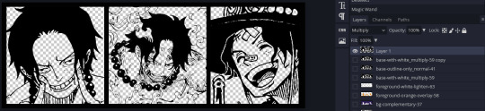
1- Layer Blending Mode (see Overlay vs Multiply vs Normal) for how this can affect results)
2- Opacity: how see through it is / isn't
3- Lock Transparency (it's the little checker board)
4- Lock Layer (looks like a lock)
5- Lock icon that appears when anything on the layer has been locked
More on 3 Lock Transparency: You can only paint on / modify what's on that layer. You CANNOT add anything to any area that is already transparent
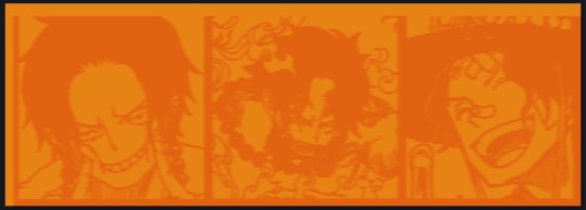
Here's a demo of what you can do with this power:
Here's the original Image - notice how it's just the lineart with a transparent background.
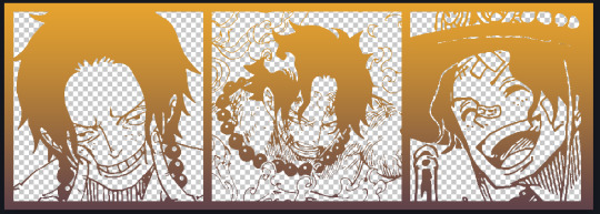
It's powerful: abuse it
//------- Overlay vs Multiply vs Normal
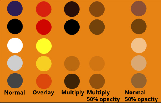
I think seeing this is the best way to visualize how different modes can affect the color.
//--------------------------------
Back to the Tutorial
!!I IMPORTANT NOTE !!
Please play around with the opacity slider to figure out what opacity works best for you on the multiple different layers we're about to make / work with. It's up to your own style to figure this out.
Next: please feel free to not follow all of it. Add more layers, add less layers, take the base principles and go wild! :D
5. Separate the lineart from the background and save it as a new layer
6. Duplicate it and set it to overlay, or set it to overlay immediately
7. Duplicate that lineart layer twice and set the blending mode to overlay
8. lock transparency on the top one and change it to be a dark grey
9. Apply motion blur to both:
Main menu bar -> Filter -> Motion Blur
I made it so that the grey layer was blurrier than the black layer
10. More them around a little to give it a "3D effect" as you called it.
It creates shadows under the lines - I was aiming for an effect similar to chromatic aberration (chromatic aberration is a valid way to add punch to your stuff too!)
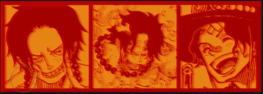
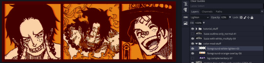
So this is what things look like now - painful, but let's keep going
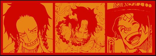
11. Duplicate the ORIGINAL / BASE lineart layer, that you DID not apply motion blur to -> set the blend mode to multiply (reduce opacity for it to actually take effect)
okay that's less painful
here's what the layers look like right now:
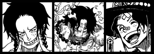
let's bring more focus to Ace's face, and push the background farther away:
12. Use the magic wand tool to quickly select large areas of the faces / focal area / foreground and the lasso tool to refine things
TIP!
Hold shift + click -> add to selection
Hold Alt + click -> subtract from selection
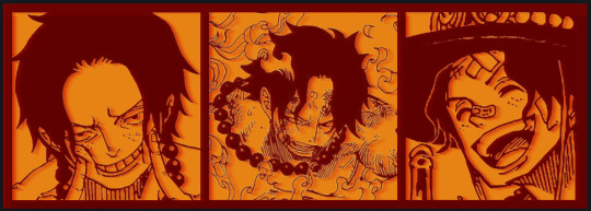
13. On a new layer with blending mode -> lighten, fill that selection to be white
If you look at it, you'll notice that it is ALREADY starting to draw our attention to his face, but the background is kinda aggressive, so let's dim that down
TIP!
Right-click on the gradient tool to find the paint-bucket tool

TIP!
Sample All Layers:
Turning this option off makes it so that you only work with the content on THAT specific layer. Turning it on makes it so that it is working while taking all other layers into consideration.
14. ctrl + click on the "white foreground" layer to select the contents of that specific layer (pink thing is your mouse)
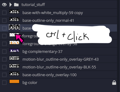
15. ctrl + i to invert selection and ON A NEW LAYER (layer mode -> multiply) fill that with a complementary color
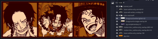
16. I did one last thing where I took the original base (before we separated the lineart) and added it to the very top and played with the opacity to get something less in your face (layer blend mode was set to NORMAL)
And that's it!
More considerations that I take:
I want the banner to be "thin" or not square, so it doesn't take up too much screen real estate on people's devices
I don't want readers having to scroll too much to get to my writing (which is the whole point of the post, let's not waste their time making them look for things)
I want the banner content to be relevant enough?
ie: with Matching: I wanted the ASCE tattoo to be visible. With matching I wanted Ace to not look too happy in some of them.
I'm also trying to avoid spoilers, I hated getting things spoiled, so I'm trying to be careful that the images I pick don't spoil anything really.
Congrats on starting life on your own! I did that whole living by myself thing too! Tip: keep the pantry stocked with lentils, beans, pastas, baking essentials, rice. They really come in a clutch when you're hungry.
#photopea resources#photopea psd#tutorial#tutorials#tumblr banner#photoshop#photoshop tutorial#digital art#fuck adobe#adobe photoshop
9 notes
·
View notes
Photo

This art piece made me scream into the fucking void omfg, this was brutal. 77 layers and a lot of folders on Ibis Paint X. Hopefully I didn’t miss any mistakes cause I did when I showed this to Discord, and while I was posting this I almost forgot to unhide Ben’s pillow.
In one of the Ben 10 Discord’s I’m in, someone was like “Hey I’m working on a Ben 10 character mixtape and was tempted to add Brutal by Olivia Rodrigo for Ben just for these lines.” And I was like “Yo I’m tempted to draw that!” And here we are 4 days later. (In app time says like 16 hours and 18 minutes lmao.)
More details about the drawing under the cut cause, boy oh boy does Allie have a lot to talk about with this piece.
I used a lot of screenshots from the show as a reference in order to draw how I saw this in my head. The second one was actually a reference to Young Justice episode Misplaced where Billy saw Robin, Kid Flash, and Aqualad on the TVs from the store he was walking past.
“I feel like no one wants me” I was originally just going to do only Azmuth and Ben, but I wanted to do a three thing and I ended up going with Julie since their relationship in UA was rocky. (I also debated using Grandpa Max over her, but I couldn’t think of a time where Max was like that.) Also fun fact everytime I kept writing “feel” I did “fell” and took me so long to get it right. I was gonna go with a school background, but I couldn’t get it right so I went with what I did.
Y’all know how when your life is a mess everyone seems like a shadow to you and everything around you is fuzzy? That’s what I was going for there. Also the fact that people want Ben for his aliens, not himself.
“And I hate the way that I’m perceived” For the news report I did use the screenshot of that pose itself because I honestly couldn’t get it right when trying to freehanded it nor did I want to straight up trace it cause of how I had the TV screens. Figured there was no harm in using the screenshot itself for it. Just like “feel”, I had a tough time writing “perceived” correctly, I kept doing “pre-” over “per-”. Listen pretty sure I’m dyslexic so bare with me, English is hard.
“I only have two real friends” Despite the fact that Kevin and Gwen are in their Season 3 Alien Force outfits, this takes place in UA. I went with those outfits for that lyric simply because I wanted to lmao. (And I guess cause it makes more sense cause before Vilgax came back the trio was having a good time? It makes sense I swear.)
“And lately, I’m a nervous wreck” I was originally using a photo of Danny from Danny Phantom as a reference cause he’s been a nervous wreck in some episodes, and I couldn’t remember Ben ever being nervous like how I wanted to draw him to do a reference. But Danny just ended up being thrown out the window when that wasn’t working out, ended up doing what I did though.
I was originally gonna color the floor, but I was playing around with brushes on Ibis and that happened. I kept it cause it worked for what I was going for lol.
Also just a FYI, my DeviantArt is Kira Sema so that’s why my watermark in the panels say that over my actual name/username here. I’m trying to keep my newer artwork with a consistent watermark that leads somewhere if someone were to look up the name. (Despite the fact I’m still very backlogged on uploading old/current artwork to my DA.)
#Ben 10#ben 10 fanart#ben 10 uaf#ben 10 alien force#ben 10 ultimate alien#ben 10 art#ben tennyson#gwen tennyson#kevin levin#azmuth#julie yamamoto#brutal olivia rodrigo#lyric art#Fun fact I don't even have this song on my playlist yet I drew a whole goddamn art piece of it#Sad Ben hours#One of these days imma make an animatic cause I've had ideas for my own stuff lol
19 notes
·
View notes
Note
How do you make your role-swap edits? Do you draw them or do you cut/paste pieces together? I wanna make edits like that too, but I'm not sure what the best way of going about it would be
Oh! I actually draw them in ibis paint X, but I’m sure any drawing program would work. I’m not too good at teaching or explaining, so if you are still confused I’ll add a speedpaint video of my process at the end. Besides, you can do it however it works for you.
My first step is usually to find a screencap/picture that I want to edit, let’s say I want to edit this picture of Deku to look like Bakugo instead!

My first step is to find a reference photo of Bakugo that matches the angle of this picture. Since it’s front facing it’s pretty easy to get a picture.
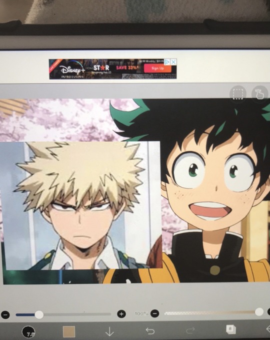
It doesn’t completely matter what size it is! I usually like to make it slightly bigger than what the OG head is, so that I can change the shape later if needed.
But after that, you want to lower the opacity and trace over the lines and shading of the hair, then use eye dropper to fill in the same colours.

Depending on the reference image, you’ll have to draw extra parts of the hair that aren’t shown, but this one is fine. Once you’ve done the lines and coloured in, make sure to combine the layers so you can move it easier.

After that, I use the transform and liquify tool to move the hair around so it fits the shape of the head. For this one I forgot to do the colouring in, but it just means more work for me. Once you do that, just create a new layer on top to retrace if it gets too blurry. Think of it as your first draft layer on how your hair should look, and then do the final draft to make it pretty.
Of course this is just a preference, you don’t have to do it, but I feel like it makes the edit look a little less rough.
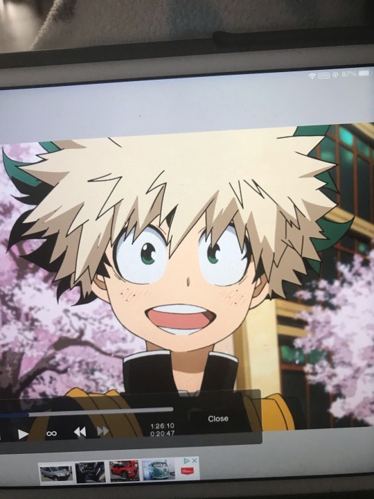
Now, you probably have some monstrosity like on the left. This is the part where I use a copy pen and a dip pen or felt tip pen tool to cover in the parts where Deku’s hair shouldn’t show.
I use the copy pen to copy the texture of the cherry blossom trees over his hair, and a regular felt pen to do the branch details. The windows in the back I also draw over, copying the colours as best I can. For softer transitions I like to use air brushes. I also cover up Deku’s face and freckles, I eyedrop the skin tone and cover up anything unneeded.
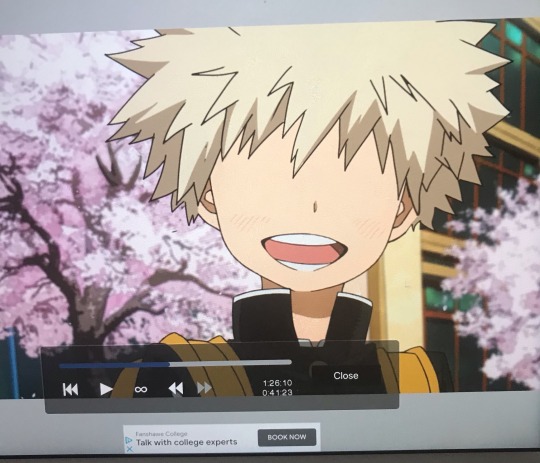
Once this is done, you can start with the eyes. I like to do them last because I need to figure out the placement with the hair.
Alright, so for the eyes it’s about the same process as the hair. I trace over a reference and color and place it. But it might be hard to find a “happy” Bakugo like the one above.
For me personally, I use this image.

Since Bakugo isn’t going to be a squinty gremlin if he’s got Deku’s personality of course! I trace over the eyes (I trace over the more visible one then mirror it), then make the pupils a bit bigger so he’s not scared looking.

You can eyedrop colours for his eyes from anime screenshots of him, and maybe mess with the eye positioning for a while to make it look good. (Make sure to combine the layer LOL)
But anyways, final touches! Just add shading underneath the hair and at the top of the eyes. Make sure everything is coloured in and covered up, and the final touch I like to put, is blurring.
Sometimes the screen cap you use will be too low quality and your edit will look strange on top, in that case I use the blur tool and put it on 5% opacity. Blurring your layers will help make it fit in better and be less sharp!
As I said, I’m really bad at explaining, but I hope this helped anon! Good luck on your edits I’m sure they’ll end out beautiful 💚
(Speedpaint process, about 1 hour of work)
35 notes
·
View notes
Text
idk if this is gonna be long but I chat stupid shit about my drawing so I'm putting it under a readmore so it doesn't clog the tl
I really wanted to draw the duotone skin for them even though I knowwww k4's skin is like. either all pale or pale and with gray mottle rn because it's cool and I just wanted to do it okay o(-(
the hair is definitely not as good as it might could've been(shape/rendering) but I left it like that for the style + time. also the lighting on it made me really ????? but i think I'll worry about making it better on another drawing
same with the face actually--usually I like doing blush, less angular faces etc but I was going for a Look so no blush
the shading was a mess this time around bc I basically did no painting at all and only used layer modes. general shading was two multiply layers, the highlights was an add layer and a bunch of other hard light/an overlay gradient for color correction. usually I paint but here I just took a color and erased/applied at different opacity for the look. which is why it looks kind of messy. could've merged everything down and painted from there but ehhhh yeah
the eyes are painted a tiny tiny bit but again not really
wish ibis had square brushes because the texture on this,,,oof o(-( I'm starting to really like square brushes; they make kleki(a very low quality browser program) pretty decent actually. also ibis gradient maps are locked behind a subscription because of course they are
I haven't transitioned fully to tablet art even though it notably feels like "better quality" > finger drawing > mouse pad because of familiarity and convenience. not a big fan of having to sit down at one place for a long time lol, especially my desk which is really uncomfortable for my hands. so this was a phone drawing. plus side of that is that I get the timelapse from ibis.
think I'm going to try to put my biggest projects on my tablet for my sanity and resulting texture/quality but it's still really nice to be able to draw on the go or whereever as is the case with phone art
I kind of wish there was like. a google drive for art or smth so I could work on the same projects between devices but that's just not possible probably
1 note
·
View note
Note
how do draw?
Oh geez what a broad question lol
It depends on what you want to know i guess! The advice i give you always depends on what you want to know since just straight up drawing is a whole mess of different tactics and styles.
My process is probably different than a lot of other people's, since i start all my art traditionally but always end it digitally lol
I guess I'll just tell you my process! Which may not help much with your question, but its a place to start i guess! (I'd take pictures while doing this but my sketchbook is downstairs and I'm stuck in a zoom meeting ;-;)
First i start with a sketch. If I'm having trouble with the pose, I'll draw a tiny figure in the corner of my page to help me get the basic form down. During the sketch, i start with the basic form and then begin sketching outfits and details, always starting with the torso and then ending with the hair and face!
Next i take a picture of the sketch and plug it into my art app i have on my phone- i use Ibis Paint for anyone who's wondering btw, its a great app for beginners and very user friendly and free too!!
Then I ink the sketch! Depending on the size of the drawing or the look I'm going for, my line thickness can change, but recently I've been pretty consistently using a line thickness of 5.0. For the hair i use a force fade of 40% on both the begining and end of the line too and for the laces on shoes and boots and for facial details i use a 4.0 thickness.
Next i do colors. I brush in a temp background color- usually like a simple light grey or brown- and then i just splash in colors in big blobs. I do this because in the past i would spend eons trying to select the entire area i wanted to color FIRST and the process added like an hour onto my art.
Then once all the the colors are in place and chosen, i crop it all down to fit the area i wanted colored. I also do my eyes durring this, and i actually do my eyes specifically different than i draw everything else- i choose a flat color, then i move the color selector in one direction or the other while also darkening or lightening the base color. Idk if that makes sense I'm just gonna show you a picture for this one-


And then i blend the colors together. The darker color is always on top while the lighter is always on the bottom.
After doing all the flat color i go back and color my lines! I do this by selecting a color just darker or lighter than the flat color of the part I'm working on- ex: if the shirt i had was a light blue, I'd make the lines around the shirt a slightly darker blue. Note: i don't do this for the face- the way that i draw eyes and faces makes doing this look odd. Instead what i do for eyes and faces, is where the face overlaps with the hair, I'll take an even darked color than the lines i used for the hair and make everything that overlaps that color, while the rest of the face is a soft greyscale or black.
After i color lines i go in with shading. First i decide whether or not i want cool or warm shading, then I pick one solid color and shade it all- i don't change the opacity of the colors i use to shade until the end though, and when i do change the opacity its always at 50%.
Along with shading, i do my highlights. Unlike with shading though, i hand pick the color of my highlights based on the color of what i am highlighting. If what I'm highlighting is a dark red, I'll pick a lighter red to highlight it with. I hardly use a hard white to highlight unless the base color is already light enough.
Then lastly, i do the background, sign the picture and add any other details i think are needed!
Anyway sorry if this wasn't what you were looking for, but if you come back asking a more specific question about how i draw I'd be more than happy to answer!!
3 notes
·
View notes
Last Seen Blogs
clickmtl
Montrealer
yenyenyeeen
Yenyen
learninginapublicmedium
LearningInAPublicMedium

ht-holding
HT Holding
trikyart
chillin' relaxin'