#1960's 1970's era architecture
Text
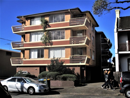
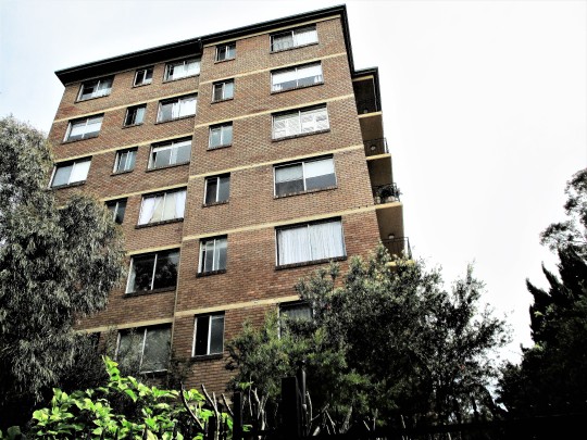
1970's era apartment building. Fully occupied. Rozelle.
#vintage#1970's#apartments#streetscape#flying balconies#facade#1960's 70's era architecture#street scene#skyline#affordable housing#inner west sydney
103 notes
·
View notes
Text
Classic Rock Songs
Classic rock songs are a cherished part of music history, known for their timeless appeal and enduring popularity. Here's a brief overview of the history of classic rock songs:
Origins: Classic rock as a genre emerged in the mid-1960s and reached its zenith through the 1970s. It evolved from the rock and roll genre of the late 1940s and early 1950s, characterized by a fusion of various musical elements, including blues, R&B, and country.
The 1970s Golden Era: The 1970s witnessed a classic rock explosion with the rise of bands like Led Zeppelin, Pink Floyd, and Queen. Their albums and singles became anthems of a generation, defining the classic rock sound.
Subgenres: Classic rock is not limited to a single style; it encompasses a wide range of subgenres, from blues rock (e.g., Eric Clapton) to progressive rock (e.g., Yes) and folk rock (e.g., Crosby, Stills, Nash & Young).
Top Artists and their hits: Classic rock boasts a rich history of iconic bands and timeless hits. Here are some of the top classic rock bands and a selection of their most famous hits:
The Beatles: The Beatles were a British rock group that left an indelible mark on the music industry. Formed in Liverpool, England, in 1960, the band consisted of four principal members:
John Lennon
Paul McCartney
George Harrison
Ringo Starr
The Beatles grew out of a shared enthusiasm for American rock and roll. They started as a skiffle group called "The Quarrymen" and went through various name changes, including "The Beatals," before settling on "The Beatles."
Some of their hits:-
"Let It Be"
"Yesterday"
"Hey Jude"
"Come Together"
Led Zeppelin: Led Zeppelin, one of the most iconic rock bands in history, was formed in London in 1968. The group consisted of:
Robert Plant (vocalist)
Jimmy Page (guitarist)
John Paul Jones (bassist and keyboardist)
John Bonham (drummer)
The band initially came together as the New Yardbirds, with Jimmy Page being the final lead guitarist for the British blues band, The Yardbirds. However, they quickly changed their name to Led Zeppelin.
Some Of their Hits are:-
"Stairway to Heaven"
"Whole Lotta Love"
"Kashmir"
"Immigrant Song"
Pink Floyd: Pink Floyd is an iconic English rock band that was formed in London in 1965. The band gained an early following as one of the first British psychedelic groups, and they went on to become a seminal force in the world of rock music.
The original members of Pink Floyd included:
Roger Waters
Nick Mason
Richard Wright
Syd Barrett
They initially met while studying architecture at the London Polytechnic in Regent Street, London. The band's early years were marked by the leadership of Syd Barrett, who played a pivotal role in shaping their psychedelic sound. However, due to Barrett's deteriorating mental health, David Gilmour was brought in to replace him.
Pink Floyd's music journey saw them pioneer the concept album, achieving significant success in the 1970s with albums like "The Dark Side of the Moon" and "The Wall." These albums remain classics in the rock genre and are celebrated for their progressive and experimental approach to music.
Some of their greatest hits are:-
"Comfortably Numb"
"Wish You Were Here"
"Another Brick in the Wall"
"Time"
Queen: Queen is a renowned British rock band formed in London in 1970. The band was founded by Freddie Mercury (lead vocals, piano), Brian May (guitar, vocals), Roger Taylor (drums, vocals), and John Deacon (bass).
Throughout their illustrious career, Queen became known for their eclectic and dynamic musical style, blending rock, pop, and opera elements. Their music was characterized by powerful vocals from Freddie Mercury and the distinctive guitar work of Brian May.
Some of Queen's most famous songs include "Bohemian Rhapsody," "We Will Rock You," "We Are the Champions," "Another One Bites the Dust," and "Radio Ga Ga." Their 1975 album "A Night at the Opera" features the iconic track "Bohemian Rhapsody," which is often considered one of the greatest rock songs ever recorded.
Some of their greatest hits are:-
"Bohemian Rhapsody"
"We Will Rock You"
"Somebody to Love"
"Radio Ga Ga"
The Eagles: The Eagles are an iconic American rock band formed in Los Angeles in 1971. The band's founding members included Glenn Frey (guitars, vocals), Don Henley (drums, vocals), Bernie Leadon (guitars, vocals), and Randy Meisner (bass). Over the years, the lineup evolved, with members like Joe Walsh and Timothy B. Schmit joining the group.
Some of their greatest hits are:-
"Hotel California"
"Take It Easy"
"Desperado"
"Life in the Fast Lane"
These classic rock bands and their hits have left an indelible mark on the music industry and continue to be celebrated by music enthusiasts around the world. Their songs are considered classics and are frequently played on classic rock radio stations.
Check out more rock songs hits on https://musicfreak.in/classic-rock-songs-playlist/
Influence: Classic rock has left an indelible mark on the music industry and inspired subsequent generations of musicians. It remains a touchstone for artists in various genres, and its influence can be heard in contemporary rock music.
Modern Relevance: Classic rock's appeal endures in the 21st century, with new generations discovering and appreciating the genre's iconic songs. Classic rock radio stations and music festivals keep the spirit alive.
Classic rock songs are more than just music; they are a cultural phenomenon, a bridge between eras, and a testament to the timelessness of great artistry.
For More Playlists Visit our website:- https://musicfreak.in/
2 notes
·
View notes
Text
Pelé Will Live Forever
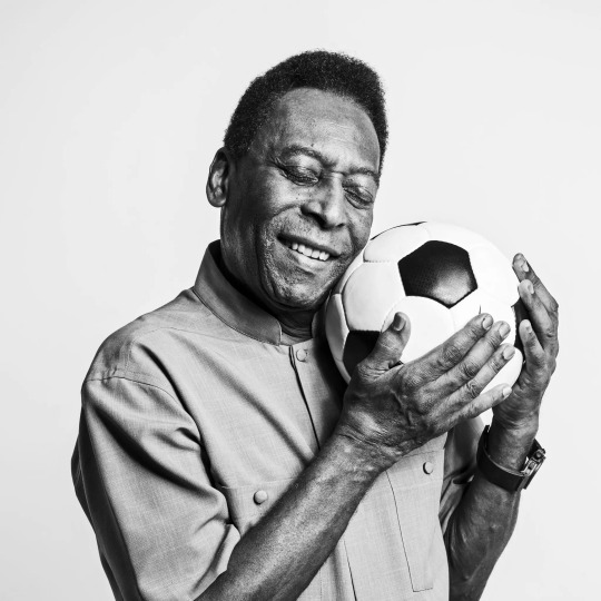
Pelé once confessed that he had long been troubled by a conundrum, one he’d only be able to crack when he met God, face-to-face, and could demand an explanation.
What plagued him was a feeling of dual identity: There was “Pelé,” the world’s greatest living sports legend of the 20th century, but also “Edson Arantes do Nascimento,” the ordinary guy whose job it was to watch over Pelé, shouldering the weight of his quasi-supernatural existence.
Pelé, who passed away on Thursday at the age of 82, felt, perhaps with some humor, that he was due some kind of answer as to why he had been given this double fate, upholding a godlike status in the world’s eyes, yet still feeling all too human. At his death, he wondered, who would die, given that both the incarnate demigod and the simplest of creatures coexisted inside him?
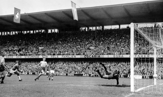
Anyone who saw him play will have no doubt God really did owe him an explanation. Pelé, the most consummate, luminous figure of perfection to ever grace a soccer field, was swept into fame at a very young age, unaware in the beginning of his own exceptionality. According to him, his most personal aim was to achieve the unrealized greatness he glimpsed in his father, who’d been an admirable but obscure player, to redeem him from a failed soccer career. Before he knew it, he was the top idol of the most popular sport on the planet, making his thunderous arrival at the 1958 World Cup, at the age of 17.
All this belongs to a bygone era of sports innocence. Soccer games were broadcast on the radio, immediately turning them into oral storytelling, steeped in legend and myth. Pelé’s career relied first on the radio and then television, cementing his fame there in 1970, when the Brazilian team captured the country’s third World Cup title. There is no visual record of much of his career, including some of his greatest goals. But throughout the 1960s, Pelé was unanimously known as the King of Soccer, bolstering his majesty with the natural nobility of someone who understood the value of his celebrity for every peasant with whom he identified.
No one else combined his speed and dribbling skills, the ability to shoot with both feet, his precise and devastating ground and aerial play, a magical sense of timing with the ball, an instantaneous understanding of what was going on around him, all grounded in a robust and rigorously balanced athleticism. Even so, the Pelé-effect isn’t just a sum, unique it may be, of quantifiable skills.
A poet once remarked that Pelé seemed to drag the field with him toward the opposing goal, like an extension of his own skin. A philosopher conceded, playfully, the possibility of glimpsing flickers of the Absolute in him. The beauty and intelligence of his body in action, plus his eagle eye and the unpredictability of his tricks, made Pelé appear to be operating on a different frequency from the other players, watching in slow motion the same game he was participating in at high speed, while others around him seemed to be doing the reverse.
The phenom was quickly discovered and embraced on every continent, long before the introduction of large-scale marketing campaigns. It’s because his existence connects with the world through a symbolic alignment of a different nature. Beyond being recognized and revered in the traditional circles of European football, this affable Black man, ambassador of a peripheral country and performing in a nonverbal language, was perceived, celebrated and loved in the most diverse corners of the world as the eloquent assertion of a grandeur greater than any political and economic supremacy.
In Brazil, Pelé’s arrival on the world stage coincided with that of the nation’s new capital, Brasília, founded in 1960, and its innovative architecture, and the success of bossa nova music. It’s been said that a goal by Pelé, one of Oscar Niemeyer’s curves or a Tom Jobim tune sung by João Gilberto were like a “promise of joy” from an exotic marginal country that seemed to be offering the world a smooth if profound passage from popular vernacular to modern art, without the costs of the Industrial Revolution. The dictatorship that followed, beginning in 1964, gave signs, recurring and persisting to this day, that this path wasn’t so direct or so simple, to say the least.

Behaving in accordance with the dictates of traditional Brazilian cordial sociability, masking insidious structural racism and social inequality, Pelé did not adopt Muhammad Ali’s swaggering rebelliousness, or the passionate, political zigzags of Argentina’s Diego Maradona, nor did he pursue the carnivalesque style and tragic arc of Garrincha, the other great Brazilian star of his generation. Instead he remained a tacit and grandiose witness of Blackness in action.
More Dionysian, politicized and mercurial than Pelé, Maradona never ceased to be Maradona, at the cost of being consumed by the flames of his glory and his downfall. By dispensing with questioning God, Maradona made himself God and his own writhing demons. Garrincha and Maradona rose and fell without ever being able to separate themselves from the experience.
Pelé, meanwhile, had Edson. Among the geniuses of our time, he is safeguarded by his double, who takes on life’s contingencies and personal dramas on a lessened scale. Even if younger generations never got the chance to go head-to-head with his magnificent, indescribable appearance on the field, thanks to his guardian angel, Pelé is spared from ruin, remaining immortal in life.
Maybe God, if He exists, will reveal this to him.
By José Miguel Wisnik (The New York Times)
#edson arantes do nascimento#Pelé#Brazil NT#seleção brasileira#Santos FC#football#fussball#fußball#foot#fodbod#futbol#futebol#soccer#calcio#José Miguel Wisnik#The New York Times#NYT
9 notes
·
View notes
Text
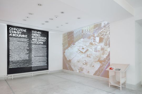
Demolitions
for Czechoslovakia’s architectures between 1960s–1980s is a controversial subject. The public may still regard it negatively, owing to a lack of information or an adverse experience with the country’s regime before the Velvet Revolution.
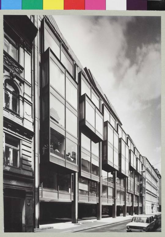
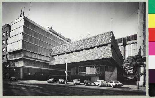
Omnipol Building by Zdeněk Kuna, Zdeněk Stupka, Milan Valenta, Josef Zdražil, Ladislav Vrátník (1974–1979) | Photo © Kamil Warta, National Gallery Prague
youtube
Erosion of Transgas (2020) by NGP/Loom on the Moon
Helena Doudová, the curator of the exhibition NO DEMOLITIONS! Forms of Brutalism in Prague, presents Brutalism buildings in Prague that prominently enter the urban scene. The nearly two hundred and fifty original architectural plans, photographs and models come mostly from the Architecture Collection of the National Gallery Prague. The examples of the most progressive architecture works feature the Kotva Department Store, the former Central Telecommunications Building at Žižkov (marked for demolition), the former Federal Assembly, Hotel Intercontinental and Barrandov Bridge and the recently demolished Transgas complex.
“No Demolitions!” is a quite straightforward title for an exhibition. What is happening in Prague and the Czech Republic, that led you to organize this exhibition and choose this title?
With the exhibition we intended to highlight the values of late modern and brutalist architecture in Prague that becomes either demolished or refurbished beyond the point of recognition. Some of the buildings ceased to exist throughout the one year since we started working on the topic. We intended to show that the buildings by the architects like Karel Prager, Karel Filsak, the husband-and-wife team Machoninovi and Šrámkovi have built edifices, which are comparable with the most prestigious architecture production of the former Western Europe and the US.

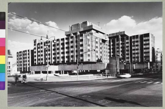
Center of Home Design by Věra Machoninová, Vladimír Machonin (1971–1981) | | Photo © Kamil Wartha, National Gallery Prague
The Trade Fair Palace is an exclusive choice for an architectural exhibition; why did you choose this location?
It is a building with strong symbolic meaning, a real jewel of functionalist architecture but at the same time it is difficult to present an exhibition due to technical parameters as light because paper plans and photography are very sensitive to it. The gallery floor plan worked quite well in a sequence, so the exhibition concept fit quite well. Ondřej Císler created vitrines with colored large plans and prints from the architecture collection of the National Gallery in Prague. Plans are contrasted with the photography of the deteriorated state of the buildings by Olja Triaška Stefanović.
In many countries of the former East Bloc, protecting Late Modern architecture creates a specific challenge, as these buildings are widely associated with the negative perception of the political era they were created in. This can very easily lead to iconoclastic gestures, as we have seen in the case of Skopje 2014. What can art history, museology and the wider profession do against this phenomenon?
The negative public opinion toward these buildings is a cluster of multiple problems. One general problem not only in the Central or Eastern Europe is the poor long term maintenance, which makes the buildings appear even more brutal than intended in the architecture design. As the exhibition shows, the architects were thinking of the public space around these buildings, inserted artworks and parks, as a number of designs show.
Secondly, the political associations are difficult, but also controversial to me. I very much think that the socialist state invested into large public buildings before 1989 and did provide socially accessible culture programs, sports, etc. So to me the brutalist buildings are valuable and authentic through their aim to belong to the community but also undercover propaganda. One can’t change people's memories or their experience with communism, but it’s not the fault of buildings that were ironically planned in the golden sixties in the time of the political détente in Czechoslovakia.


The exhibition | Photo © Katarína Hudačinová, the National Gallery Prague
In comparison, no large public building in Prague has been built since 30 years, what shows the shift of the capital flow with privatization. Nowadays, the real estate investors misuse the negative public opinion to demolish high quality buildings to acquire lucrative plots in the city centre for private investment. In many cases it would have been possible to reuse the brutalist buildings at a lower expense, like for example the Embassy of CZ in Berlin.
The National Gallery seems to be a prestigious place for the exhibition about the architecture of an era that is widely disputed and is also a strong institutional statement; how are Czech academics and professionals reacting to the events around the architecture of the 1960s, 1970s, 1980s?
I very much believe in the power of the exhibition as a tool for mediation and education, but also bringing up controversial or uncomfortable topics. That is the position the National Gallery has. Its architecture collection is centred around post-1945 architecture so it is logical to present it in an innovative perspective. Brutalism has received international acclaim in architecture history since 2010s, so we have had many academic discussions, but to me it is important to bring the phenomenon to the public. It is interesting that the expression is the same in former East and West, the only difference is that in the former West the buildings like the MET Breuer are celebrated, while in the former East these buildings are admired by the professionals and despised by the wide public.
In most of our countries we see the profession and the public speaking out to protect some of these buildings, in Hungary this happened by the proposed demolition of Zoltán Gulyás’ Chemolimpx office building in the early 2010s, and more recently when the government announced the demolition of Csaba Virág’s soc-hi-tech Electric Power Distribution Center. There are similar stories in Czechia and Poland - how do you explain the public being so involved in these cases?
Yes, there is an entire movement of active architecture historians, architects and interested public. David Crowley, the head of arts department of the NCAD in Dublin, is a great observer of these shifts, which demonstrate a renewal of the consciousness for public sphere and public spaces in general. So far the protests have been unsuccessful in confrontation with the investment pressures, a culmination point was the demolition of the Transgas building, public protests accompanied the demolition of Hotel Praha, and eventually rescued railway station in Havířov. Crowley says this a unique trait in Central Europe as he has not seen such engagement in the UK or Ireland. In Germany, the heritage protection of post-war buildings is really advanced by now, but there are not such strong public initiatives to me...

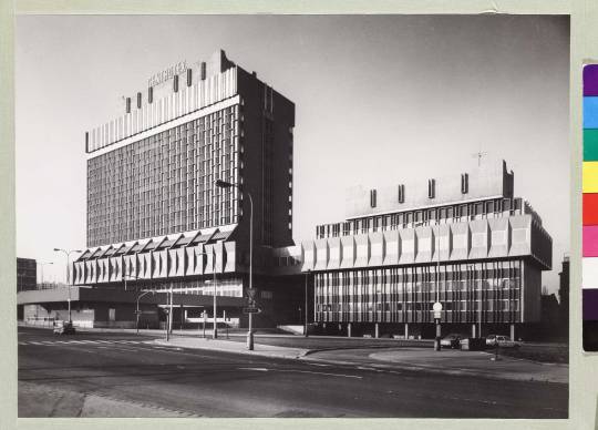
Transgas Complex by Ivo Loos, Jindřich Malátek, Václav Aulický, Jiří Eisenreich, Jiří Kozák, Jan Fišer (1966–1978) | Photo © Kamil Wartha, National Gallery Prague
Why did you choose brutalism as a specific style to sum up these buildings? Strictly speaking, the term is quite well defined and confined to a specific group of mostly British and American buildings, what is brutalism in your definition?
The usual association is béton brut, with the main inspiration of Le Corbusier. At the same time, I took at hand Rayner Banham, who speaks about three criteria, in short – the figure, the revealed construction and authenticity of material, which would better comply with the notion of brutalism in variety. Also brutalism has been changing from the expression of the Smithson's Hunstanton school, to let's say Paul Rudolph. In such way brutalism became an international expression with multiple specifics.
Hotel Intercontinental by Karel Filsak, Karel Bubeníček, Jiří Louda, Jaroslav Švec a kol. (1968–1974) | Photo © Kamil Wartha, National Gallery Prague
The notion of brutalism has been a subject of a dispute in the curatorial team with Petr Vorlík, Klára Brůhová (CTU Prague) and Radomíra Sedláková (NG Prague). We assumed the Czech architecture was influenced by brutalism, to a smaller or larger extent depending on every architect. Architecture of late modernism in Czech shows finer handling of material such as glass, mosaics, of wooden cladding, a variety of bright colours, that do not particularly express the notion of brutalism associated with rough concrete. The houses do in a way respect the scale of the surrounding city, are most often broken down in a composition of smaller volumes, reference bay windows of surrounding houses, etc.
PZO Centrotex Building – Václav Hilský, Otakar Jurenka (1972–1978) | Photo © Kamil Wartha, National Gallery Prague
At the same time the label brutalism is in public drawn to all kinds of buildings, which have with little or nothing to do with late modernism, actually, are clad in stone. So as architecture historians we strived to differentiate and raise public awareness on the topic.
Is there a specific Czech brutalism? Are there any national or regional characteristics in this era?
This is not an easy question. Brutalism was a global and a local phenomenon. Interestingly, in the Czechoslovak architecture we see magazines that iconic brutalist buildings were published, like La Tourette, or the architecture by Stirling in the 1960s and 1970s. So the information iron curtain was more semi-penetrable in terms of architecture knowledge and expression, like Ákos Moravánszky says. The regional specifics construction processes, the quality and variability of materials, which was lower in the former Eastern block, and also the public opinion which incorrectly associates the buildings with state socialism.
We are talking about the architectural production of an era that produced an incredible amount of buildings. How is it possible to create a canon for such a recent past and what do you think about the monumental protection regarding these buildings? What should be protected and how? Can you also name a few example, interesting buildings (and interiors) from Czechia?
A unique example is the already heritage protected Kotva Department Store by architect's team Věra and Vladimír Machoninovi.
Kotva department store in Prague. | Photo © Olja Triaška Stefanović
The former Federal Assembly is another iconic example of a daring construction originally intended for bridges. It encloses the former classical modernist stock exchange building and complements the ensemble anew. Interiors have unfortunately been refurbished and only very few items are present in the museums.
Former Federal Assembly Building Prague. | Photo © Olja Triaška Stefanović
A unique example is the Czech embassy in Berlin with intact interiors. A contested interior reconstruction is currently Hotel Thermal by Machoninovi in Karlovy Vary. At least five outstanding buildings have been demolished in Prague, countless have been refurbished. Only two above-named brutalist buildings are heritage protected, other like Hotel Intercontinental by Filsak, or Centrotex by Hiský, Motokov by Kuna should become protected as unique works of art and architecture.
___
Interview by Dániel Kovács and first published in Epiteszforum.
Photo © Jan Faukner
Helena Doudová is curator of the Architecture Collection of the National Gallery Prague. She gained curatorial and museum experience as research and curatorial fellow of the International Museum Program in the German Museum of Books and Writing in Leipzig in collaboration with the University of Erfurt and the German Federal Cultural Foundation 2016/2017, as a Robert Bosch Fellow at Architecture Museum of the TU Munich – Pinakothek der Moderne (2011–2012) and as an intern in the German Architecture Centre DAZ in Berlin (2013–2014). She initiated and curated NO DEMOLITIONS! Forms of Brutalism in Prague, Baugruppe ist super!, Image Factories: Infographics 1920-1945: Fritz Kahn, Otto Neurath. She is a PhD candidate at the Institute of Art History of the University of Zurich. She was awarded DAAD research scholarship and Aktion Österreich scholarship.
***
NO DEMOLITIONS! Forms of Brutalism in Prague
From 6.3.2020 to 22.11.2020 at the Trade Fair Palace – 3rd floor
Dukelských hrdinů 47, 170 00 Praha 7 Map
Curator: Helena Doudová
Collaborating experts / co-curators: Klára Brůhová (FA CTU in Prague), Radomíra Sedláková (NGP), Petr Vorlík (FA CTU in Prague)
71 notes
·
View notes
Text
Here are some of my takeaways from the Lecture 1 in Brief Introduction to Software Development.
Colossus, 1994
World’s first programmable, electronic digital computer.
Programmed by switches and plugs not by stored program.
Prototype Colossus Mark 1, was shown to be working in December 1943, was in used of Bletchley Park early 1944.
It is also used in WWII to decipher codes from Germans.
Made by British.
In today’s software it is called the encryption/ decryption utility program.
ENIAC (Electronic Numerical Integrator and Computer)
First programmable general purpose digital computer, 1946.
It can program to work in many functionality.
Jon Von Neumann (machine)
Architecture of today’s computer
Stored programs
Smartphone
Architecture is based on John Von
Supercomputer
Parallel computers
FORTRAN
Use to create simply programs
1st successful programming language
FORmula TRANSlation- designed by JOHN BACKUS in 1956
It took 18 years to finish
The resulting compiler remained to be the best optimizing compiler for many years.
FORTRAN I- FORTRAN IV, FORTRAN 66, FORTRAN 77, FORTRAN 90, FORTRAN 95
Intended for engineer and scientific
John W. Backus
1953
IBM
Altair Computer
1st personal computer
N. Wirth
1950’s period essential to era of computing
Invented the POSAD
Microcomputers first appeared on the market in 1975 (Commodore, Tandy, and Apple; much later, IBM entered the market)
Software
Interface between computer systems and the humans. Consists of programming instructions and data that tell the computer how to execute various task.
Today, higher- level languages are written for easier to human programmers converted into low- level machine code that computer understand.
First piece of software was written by computer scientist Tom Kilburn on June 21, 1948.
Kilburn & Freddie Williams built one of the earliest computer, the Manchester Small- Scale Experimental Machine (SSEM) (“baby), SSEM was programmed to perform Mathematical Calculations using machine code instructions.
Computers were programmed with punch cards in which holes denoted specific machine code instructions.
Fortran, one of the very first higher- level programming language, published 1957.
Statistician JOHN TUKEY coined the term “software” in the article about computer programming.
Other programming language FORTRAN, COBOL, Basic Pascal, and C arrived over the next decade.
Personal Computer Era
1970’s and 1980’s software hit the big time with the arrival of personal computers.
Apple released the Apple II, its revolutionary product to the public April 1977.
Visicals/ Spreadsheets software for personal computing, was wildly popular and known as the Apple Killer App. Software was written in specialized assembly language and appeared, 1979.
IBM entered the market with computers used as IBM pc, launched 1981.
Open Source Software, major innovation in the history of software development, first entered the mainstream 1990’s, used by the Internet.
Linux kernel, the basis for the open source, Linux OS, 1991.
Interest in open- source software spiked in the late 1990s, after the 1998 publication of the source code for the Netscape Navigator browser, mainly written in C and C++.
Noteworthy is the release of Java Bean Sun Microsystem in 1995.
Software Development Today
Software Engineering
Term “programming” commonly use through the mid- 1960’s and referred essentially to the task of coding a computer.
“Software engineering”- referring to the highly disciplined, systematic approach to software development and maintenance- NATO- sponsored conference, 1968.
In the conference, the difficulties and pitfalls of designing complex systems were explored in depth. The prominent tools were languages reflecting procedural, modular and object- oriented styles of programming.
Software History
Martin Campbell- kelly
So here are all the notes that I jotdown.

1 note
·
View note
Note
Hey! I am a Volturi S T A N and I really enjoy how cultured they are. They’ve had enough time to study every era in art intensively, and I wonder what their favorite would be. From Ancient to Romanticism, what era in art is the favorite of each Volturi guard?
Welcome fellow stan! Sorry this took longer than expected! I’ve taken a lot of art history courses so I probably gave this more thought than necessary! Also I went more with art styles rather than time periods, because that just seemed to make more sense to me. Hope that’s okay!
Aro - You’re asking Aro to choose just one art style? Not going to happen. He’s collected art from everywhere and everywhen will insist that all of it has equal artistic merit. Yes even that broken new-age art mobile made of paper mache and plastic straws stuffed in the corner behind one of Botticelli’s angel paintings.
Marcus - Without Didyme, he’s got a maudlin streak. So he’s quite into vanitas paintings, and Gothic Architecture. Mostly, he prefers history to art, however.
Caius - He prefers art that is technically impressive and realistic as possible. For this reason, Realism has a strong appeal. Scientific drawings also fascinate him. He’s got a large collection of “undiscovered” Michelangelo’s. He also prefers technically impressive Baroque music. And minimalist architecture. But he has absolutely no understanding of or interest in heavily abstracted styles, like Impressionism, Cubism, and thinks most modern art is a phenomenal waste of time. It’s his most common argument with Aro, outside of official business.
Sulpicia - Has a strong preference for female artists, especially those who depicted women being violent. Style isn’t especially important. Her favorites include Minoan bullfighters, a lot of angry women in the 1970s/1960s and Artemesia Gentileschi. She’s also big into fashion and makeup. A choker of pearls, blood-red lipstick and eyeliner sharp enough to kill a man are her go-tos.
Athenodora - She’s more into poetry than pictures and sculptures. She especially likes poetry that’s flowery, but has a rigid structure. Free-form poetry is for the weak. Haikus, Greek Dramas, and iambic pentameter are where it’s at. She’s also got a fondness for plays, Shakespeare, of course, but also Opera, Kabuki theater, and modern musicals. She drags Caius along whenever she can, and he not-so-secretly enjoys it.
Didyme - (She’s still alive, dammit). Art to her is about emotion. If it doesn’t make her feel something, why make it? She especially loves the colors in Impressionism. But also has a fondness for abstract geometric patterns and loud, splashy Modernist art. Like her brother, her tastes clash horribly, and any room decorated by her is an absolute eyesore. Marcus (who thinks it’s kind of adorable) is good-natured about it. And he’s a bit less grim with her around.
Alec - That picture of George Washington riding a T-Rex and wielding a light-saber while wearing 3-D glasses just about sums up what Alec likes. He’s 12, so add enough flames, guns, robots and lasers and he’ll love it.
Jane - Medieval art. It’s what she grew up with. But it’s also pretty grotesque at times (we’ve all seen those medieval art memes, right), and strikingly pretty on other occasions. Which suits her. Also, all the paintings/tapestries depicting witch burnings are good motivation.
Heidi - She’s got a sense of humor, so she likes the Rococo Era. Not so much the architecture styles, or the dresses–that’s more Aro’s speed–but she likes how most people look at the paintings (like this one) from the era and just see a bunch of fancily dressed people and completely miss all the innuendos. They certainly go over Felix and Demetri’s heads, and that’s the way she likes it.
Demetri - Art Deco. It’s clean, sharp, angular, stylish. He loves it as an art style, as an architecture style, and if he could get away with it, he’d wear 1920s tuxes all the time too.
Felix - Roman art and especially Roman Architecture is Felix’s favorite. So stately and strong–like he is. He kind of wishes the Volturi fortress was built a little bit more like a Roman temple than a labyrinth of sewers, but he gets why it has to be that way.
Renata - Music is more her forte than painting or sculpture. And, while it’s hard to compete with Aro, who can learn new instruments just by touching a virtuoso, she’s gained proficiency in the harp, the flute, the cello, and the piano. She also sings. But never anywhere she thinks someone else can hear her. Of course, thanks to super-vampire hearing, they all can. And they think her singing voice is lovely. But they know she would die of embarrassment if they admitted they could hear, so they never tell her.
Corin - Prefers embroidery and hand-sewing to most other arts. She also took up knitting and crochet. And prefers to make things with flowers on them. She also likes literature, especially those by women authors, like the The Tale of Genji, the works of Jane Austen, Eileen Chang, and many anonymous women writers.
Santiago - Dadaism, Surealism and especially Salvador Dali, whose political paintings greatly influenced his country while he was human.
Chelsea - Art has never been the reason why she’s part of the guard. To her it’s eh… okay. Which was always a source of frustration for Aro when he tried to pamper her with gifts. “What do you mean you ‘don’t like paintings’? You cannot simply dislike all paintings?” But it got even worse when Afton arrived.
Afton - Doesn’t understand art at all, and it’s one of the many reasons Aro hates him. You see, Afton was born after the invention of the camera and thinks realistic art is a waste of time (why not just take a picture?) and abstract art is just pointless splatters that any child could replicate. Oh, and cartoons are only for children. All of which he’s managed to get Chelsea to believe too.
Yeah….
He does appreciate practical art like pottery. But he refuses to call it “art” and insists it’s like furniture, which he claims is somehow different. (hint: it’s not!)
#volturi#volturi headcanons#twilight#twilight saga#the whole gang is here#aro volturi#marcus volturi#Caius Volturi#afton volturi
68 notes
·
View notes
Photo
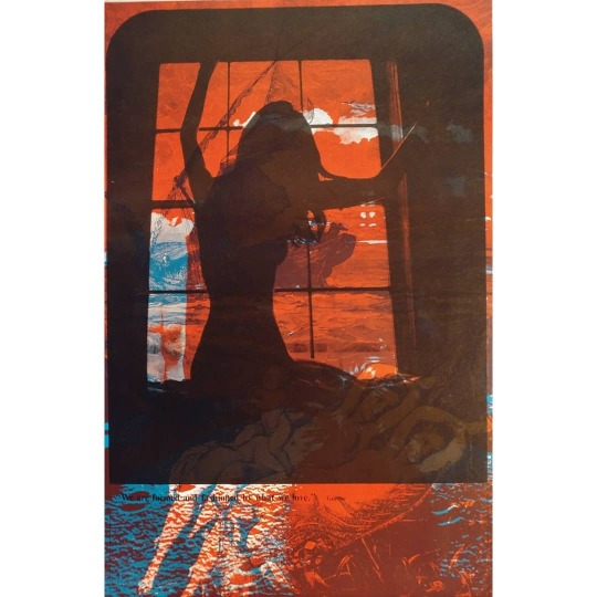

Original 1970 offset lithograph from artist Sätty printed over photo of Nude Woman In Window by Mike Powers, designed by Dale Smith above quote from Goethe: "We are formed and fashioned by what we love." Celestial Arts CA86 Orbit Graphic Arts, a poster printing company based out of San Francisco during the 1960s/1970s, distributed this overprinting by Sätty who was famous for creating mind-blowing and now highly collectible collages, having been exhibited at the MoMA, Boston Museum of Fine Arts, San Francisco Museum of Art and several other major museums listed below. If you look at the last photo, you'll see two of the base images (both available for purchase if interested) over which he would print layers of other illustrations. www.etsy.com/shop/BillsArchives One of the better-known poster artists when the psychedelic era was in full flower in the 60's, Wilfried (Wilfred) Podriech, also known as Sätty, was as much a part of the scene as Dr. Hip or the Grateful Dead. For a few years, his life had been one long summer of love. He staged huge parties where socialites and hippies mingled, in a subterranean basement of the pre-earthquake building where he lived on. He was schooled in architecture, engineering and design, and spent some time working in Brasilia before he settled in San Francisco in the early 60's. It was the threshold of the psychedelic era, and Sätty soon began making posters, developing an extraordinary collage technique that brought together both the technological and surreal sides of his background. Drawing from his enormous collection of 19th-century illustrations, and using his knowledge of overprinting, collage, overlays, paints and offset lithography, Sätty superimposed and juxtaposed images to create layered compositions of such wildness, density and subtle detail that they speak more tellingly than any static visual records of the time could do. His transformations of the original materials range from the discreet addition of a few whimsical oddities in the foreground of an etching, to the full-out hallucinations of an opium den or a ballroom swirling with romantic delirium. And the fact that these are all 19th-century images, radically revised by a 20th-century eye, gives one the eerie sense of shifting back and forth in time, space and perception. There's a startling sardonic humor in Sätty's visionary history, but there is love as well for the reckless, plunging voracity of those early days. EXHIBITIONS One Man Shows: • Moore Gallery, San Francisco; 1968. • Berkeley Gallery, San Francisco; 1970. • Goethe Center, San Francisco; 1971. Group Shows: • San Francisco Museum of Art; 1967. • Moore Gallery, "Second Joint Show", San Francisco; 1968. • Museum of New York City; 1969. • Boston Museum of Fine Arts; 1969. • Sun Gallery, San Francisco; 1969-1971 • National Museum of Art, Belgrade, Yugoslavia; 1970. • National Museum, Warsaw, Poland; 1970. • Gary Standiford Gallery, San Francisco; 1970-1971. • Richmond Art Center, California; 1971. • Museum of Modern Art, New York; 1971. • Arts and industry exhibition, San Francisco; 1971. • Dr. Reidar Wennesland Art Collection (public Exhibition), San Francisco; 1971. • Gallery: The Poster (with David singer), Los Angeles; 1972. • Kristiansand Art Association, Norway; 1972. • The Palace of the Legion of Honor, San Francisco; April-June 1975. GUEST LECTURES • The artist's studio, San Francisco; 1970. Lecture for members of the Society for the Encouragement for Contemporary Art concerning "Art and the Electronic Media". • Berkeley Gallery, San Francisco; 1971. Lecture about the artist' work for members of the San Francisco Museum of Art. • San Francisco Art Institute; 1971 and 1974. Two lectures in printmaking and one lecture for students at the artist's studio. • College of Arts and Crafts, Oakland; 1974. Lectures on "Photo and Printmaking" with slide show. • San Francisco State University, Art Department; 1974. "Imagination vs. Media" with slide show. • San Francisco Museum of Art; 1974. "Media and Poster Art" with slide show. • San Francisco State University, Literature Department; 1975. "Composition" with slide show. PUBLISHED ILLUSTRATIONS Washington Post (Book World- syndicated Sunday supplement) 1973-1975- nine illustrations. • Rolling Stone (26 issues) 1969-1975. • Berkeley Barb, 1969. • East Village Other, 1969. • Organ (7), 1970. • Oz Magazine, England (3 issues), 1971-1974. • Clear Creek (10), 1971-1972. • KPFA folio, 1971-1972. • Ramparts (4), 1972. • Communication Arts Magazine (2), 1972. • Sunday Paper (illustrated in collaboration with David Singer), 1972. • Equilibrium (5), 1973. • Video City- Radical software (2), 1973. • Living Daylights, Australia (2 illustrations from "Time Zone", 1974. • Village voice, 1975. COVER ART • Washington Post (book World syndicated Sunday supplement, 1973-1975: The Sovereign State of ITT, by Anthony Sampson. Gravity's Rainbow, by Thomas Pynchon. Through Russian Eyes, by Anatolii Gromyko. Richie, by Thomas Thompson. Before Civilization, by Colin Renfrew. The Clockwork Testament, by Anthony Burgess. • California Living, Los Angeles, 1969. Two color posters as part of cover. • The East Village Other, New York, 1969. • Berkeley Barb, Berkeley, 1969. Two covers • KPFA Folio, Berkeley 1972. • Publisher's Weekly, New York, April 1975. • The San Francisco Sunday Examiner And Chronicle, 1975. RECORD ALBUM COVERS • "GHANDARVA", Beaver and Kraus; Warner Bros., 1971. Five color cover with David Singer. • "The Occult", United Artists, 1973. A variety of interviews and music. Color cover and back plus 1 color and 12 black and white illustrations in booklet explaining the album. • "The Miraculous Hump Returns from the Moon", The Sopwith Camel, Warner Bros, 1973. • "Feel", George duke, MPS Records, 1974. Separate European release, MPS Records , 1975. • "The Aura Will Prevail", George duke, HPS Records, 1975. BOOKS • The Cosmic Bicycle: Straight Arrow Books, San Francisco, 1971. Limited hardbound edition, regular softbound edition. 160 9"x 12" pages. 79 black and white and 8 four color illustrations. Four color cover and back. • Time Zone: Straight Arrow Books, San Francisco, 1973. 9" x 12" softbound edition, 160 pages, 84 black and white illustrations. Three color cover and back. ISBN: 0879320281 0879320672 (pbk.) BOOK ILLUSTRATIONS AND COVERS • Biafra Good-bye, 1970 • Rolling Stone Book of Days, 1970-71 • One Eighty Five, 1973 • The Axis of Eros, 1973 • Madness Network News Reader, 1974 • Monsters, 1974 • The Index of Possibilities-Energy and Power, 1974 • The Rainbow Book, 1975 • The Annotated Dracula, 1975 • The Hashish Eater, 1975 • The Illustrated Edgar Allan Poe 1976
#Satty#Mike Powers#Dale Smith#Celestial Arts#Orbit Graphic Arts#Goethe#Psychedelic Posters#PsychedelicArt#lithograph#collage#Wilfried Podriech#Wilfred Podriech#Sätty#museum collection#museum collections
4 notes
·
View notes
Photo

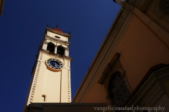
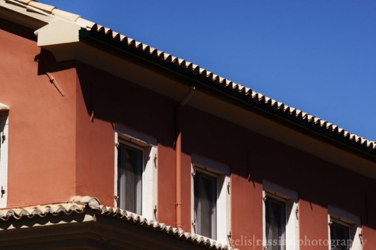
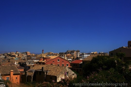
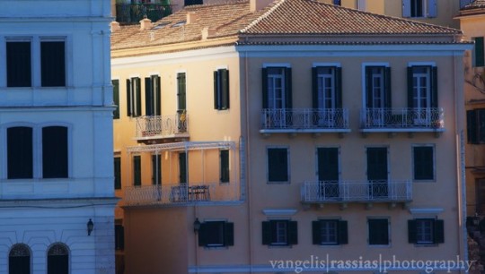
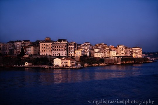

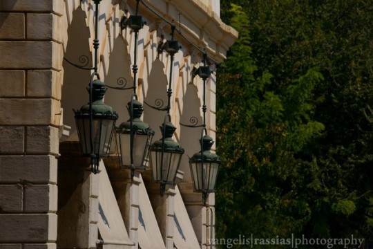
Corfu old town.Ionian sea,Corfu island.Greece.
Contax RTS II,Carl Zeiss lenses T*,Sony A 900,Sony lenses,Sony RX10
Powered by Dell
Corfu or Kerkyra Greek: Κέρκυρα, Ancient Greek: Κόρκυρα,Latin: Corcyra; Italian: Corfù) is a city and a former municipality on the island of Corfu, Ionian Islands, Greece. Since the 2011 local government reform, it is part of the municipality of Corfu island. It is the capital of the island and of the Corfu regional unit. The city also serves as a capital for the region of the Ionian Islands. The city (population 24,838 in 2011) is a major tourist attraction, and has played an important role since antiquity.
The ancient city of Corfu, known as Korkyra, took part in the Battle of Sybota which was a catalyst for the Peloponnesian War, and, according to Thucydides, the largest naval battle between Greek city states until that time. Thucydides also reports that Korkyra was one of the three great naval powers of fifth century BC Greece, along with Athens and Corinth. Medieval castles punctuating strategic locations across the city are a legacy of struggles in the Middle Ages against invasions by pirates and the Ottomans. The city has become known since the Middle Ages as Kastropolis (Castle City) because of its two castles.
From 1386 to 1797, Corfu was ruled by Venetian nobility; much of the city reflects this era when the island belonged to the Republic of Venice, with multi-storied buildings on narrow lanes. The Old Town of Corfu has clear Venetian influence. The city was subjected to four notable sieges in 1537, 1571, 1573 and 1716, in which the strength of the city defenses asserted itself time after time, mainly because of the effectiveness of the powerful Venetian fortifications. Will Durant claimed that Corfu owed to the Republic of Venice the fact that it was the only part of Greece never conquered by the Ottomans.
In 2007, the old town of the city was inscribed on the UNESCO World Heritage List. The municipal unit of Corfu city has a land area of 41.905 km2 (16.180 sq mi) and a total population of 39,674 inhabitants.
The old fortifications of the town, formerly so extensive as to require a force of from 10,000 to 20,000 troops to man them, were in great part thrown down by the British in the 19th century. In several parts of the town may be found houses of the Venetian time, with some traces of past splendour. The Palace of St. Michael and St. George, built in 1815 by Sir Thomas Maitland (1759–1824; Lord High Commissioner of the Ionian Islands) is a large structure of white Maltese stone. Near Gasturi stands the Pompeian style Achilleion, the palace built for the Empress Elizabeth of Austria, and purchased in 1907 by the German emperor, William II.
Of the thirty-seven Greek churches the most important are the cathedral, dedicated to Our Lady of the Cave; St. Spiridon's, with the tomb of the patron saint of the island; and the suburban church of St Jason and St Sosipater, reputedly the oldest in the island. The city is the seat of a Greek and a Roman Catholic archbishop; and it possesses a gymnasium, a theatre, an agricultural and industrial society, and a library and museum preserved in the buildings formerly devoted to the university, which was founded by Frederick North, 5th Earl of Guilford (1766–1827, himself the first chancellor in 1824) in 1823, but disestablished on the cessation of the British protectorate.
Based on the ICOMOS evaluation of the old town of Corfu,it was inscribed on the World Heritage List. The ICOMOS experts have noted that "about 70% of the pre-20th century buildings date from the British period" and that "whole blocks were destroyed" in the Old Town by the German World War II blitzes; these were "replaced by new constructions in the 1960s and 1970s". The urban fabric was classified as being predominantly of the Neoclassical period "without special architectural features for which it could be distinguished".
The town of Corfu stands on the broad part of a peninsula, whose termination in the Venetian citadel (Greek: Παλαιό Φρούριο) is cut off from it by an artificial fosse formed in a natural gully, with a salt-water ditch at the bottom, that serves also as a kind of marina known as Contra-Fossa. The old city having grown up within fortifications, where every metre of ground was precious, is a labyrinth of narrow streets paved with cobblestones, sometimes tortuous but mostly pleasant, colourful and sparkling clean. These streets are called "kantounia" (καντούνια) and the older ones sometimes follow the gentle irregularities of the ground while many of them are too narrow for vehicular traffic. There is promenade by the seashore towards the bay of Garitsa (Γαρίτσα), and also an esplanade between the town and the citadel called Liston (Λιστόν) where upscale restaurants and European style bistros abound. The origin of the name Liston has several explanations: many former Venetian cities have a square of that name, coming from a Venetian word meaning evening promenade, but it can also refer to the closed-list aspect of an up-scale area reserved to the nobility registered in the Libro d'Oro.
The citadel was depicted on the reverse of the Greek 500 drachmas banknote of 1983-2001.
The city of Corfu has a long tradition in the fine arts. The Philharmonic Society of Corfu is part of that tradition. The Museum of the Philharmonic Society of Corfu presents in detail the musical heritage of the island .
#Corfu Island#corfu old town#medieval#historical#culture#angevins#italy#great britain#ottomans#music#philarmonics#castles#fortresses#urban exploration#island#greece#ionian sea#french#russians#old city#architectural#architecture#gardens#palaces#ancient greece#byzantines#photography#architectural photography#sonyphotography#dell
1 note
·
View note
Text
Lecture 1: What is Contemporary Art?
The outcomes for this lecture were to: understand the term ‘contemporary’ in the art world, what factors can be linked with contemporary artwork and finally to explore some practitioners and movements within contemporary art.
According to Tate, the term means: “...contemporary art is loosely used to refer to art of the present day and of the relatively recent past, of an innovatory or avant-garde nature.” However, my take on the subject is that at one point in time, all works of art were once contemporary. It is generally agreed that Contemporary Art started around the 1960s and included many movements within.
A Timeline of Movements:
· Early 1950’s- Word Art
· Mid 1950’s- Pop Art
· Late 1950’s- Minimalism
· 1960- Fluxus Movement
· 1960’s- Conceptualism
· 1960’s- Photo- Realism
· 1960’s- Installation
· 1960’s- Body Art
· Late 1960’s- Feminist Art
· 1965- Video Installation
· 1966- Supports/ Surfaces
· 1966- Post- Minimalism
· 1967- Arte Povera
· 1969- Projection Art
· 1960’s-1970’s- Earthworks
· Early 1970’s- Contemporary Realism
· 1970’s- Graffiti Art
· 1970’s- Performance
· 1976- School of London
· Late 1970’s- Transavanguardia
· 1980- Contemporary Photography
· Early 1980’s- Neo- Expressionism
· Early 1980’s- Computer Art (Digital)
· 1980’s- Neo- Pop
· 1988- Young British Artists (Britart)
· Late 1980’s- Deconstructivism
· 1990’s- Cynical Realism
· 1990’s New Leipzig School
· 1999- Stuckism
After reading Smith’s ‘What is Contemporary Art?’, I have come to my own conclusion that there is in fact no actual answer as it is so fluid, includes so much different media, more about the concept and you can never be wrong.
I came into the session with a pessimistic attitude since I am not the biggest fan of Contemporary Art, however, after researching about Ryan Gander, I have started to change my opinion. Since 2003, Gander has produced an immense amount of work in multiple forms: sculpture, writing, painting, architecture, clothing, installation and performance. The artist also curates’ exhibitions and presented television shows for the BBC. He is described as a conceptual artist but rejects the term as he sees himself as more of a ‘Proper-Gander-ist’. My favourite piece by Gander is ‘I…I…I…’ which is an animatronic mouse with his head poking through a wall. Scattered along the floor are pieces of plaster and dust. When near the mouse, you can hear him trying to say a speech; it is his 9-year-old daughter who did not really know what to say. I like this installation as it is an interactive piece and you can feel like part of the artwork, I also enjoy how Gander does not take himself or his art too seriously and wants the audience to have just as much fun as he is having.

This introductory lecture presented so many eras of art that I had no idea were influenced and incorporated within contemporary art, all the way from the ‘50s to the ‘90s. Alongside researching Ryan Gander, this discovery of new movements completely altered my opinion of Contemporary art to something more positive as now I know how much influence it has had on art overall.
1 note
·
View note
Text
Designer George Nelson: Well Ahead of the Parade
"You don't think your way to creative work. You work your way to creative thinking.” --George Nelson
George Nelson’s Early Years
George Nelson was born on May 28, 1908 to Simeon Nelson and Lillian Canterow Nelson in Hartford, Connecticut, where his parents owned and operated a drug store.(1) His early childhood was uneventful. As a young man, Nelson sought “refuge in Yale’s architecture school during a rainstorm, he quickly found himself entranced by the student work on display” Nelson then decided to study architecture at Yale University. He began his studies in 1924 and “graduated with a degree in architecture [in 1928]. In 1929, Nelson was hired as a Teacher's Assistant while pursuing his second bachelor's degree [in Fine Arts] at Yale” (1). He earned that degree in 1931.(2)
George Nelson Goes Abroad
The following year, “Nelson competed for and was awarded a Rome Prize, which provided a two-year stipend to study at the American Academy in Rome, where he lived from 1932–34” (3). During his studies in Europe Nelson had the opportunity to interview Europe’s leading architects, including Mies van der Rohe, Le Corbusier, and Walter Gropius among others. During his interview with Mies van der Rohe, the architect asked Nelson for his thoughts on Frank Lloyd Wright’s work. Nelson was embarrassed to admit that he was not familiar with Wright. (1)
During his stay in Rome, George Nelson married Francis Hollister. The couple returned to the United States in 1935. (1) “By [then] Nelson was an associate editor of the magazines Architecture Forum and Fortune, and the next year he was running his own architectural practice in New York with William Hamby” (3). Nelson and Hamby collaborated on a home for “inventor and industrialist Sherman Fairchild, [which] was one of the first modernist townhouses in New York” (2). The structure is set off from the other brownstones around it by its modernist façade, and it features an innovative floor plan. Nelson and Hamby’s firm closed in 1942 at the start of World War II. For the duration of the War, Nelson continued to write about architecture and design. (1)
Nelson’s writing brought him into contact with the innovative designers Eliot Noyes, Charles Eames, and Walter B. Ford.(1) During the war Nelson taught architecture at Columbia University in New York City. In 1941 he became a “member of the Architecture Committee of the Museum of Modern Art [in] New York” (4). Nelson and architect Henry Wright collaborated on the Storagewall concept and in the same year published the book Tomorrow’s House.(4) In 1942 Nelson originated the concept of “Grass of Main Street” that eventually “evolved into the [open-air] pedestrian mall” (2).
George Nelson Joins Herman Miller
Nelson’s articles on design “came to the attention of D.J. De Pree, president of the Michigan-based furniture manufacturer Herman Miller” (3). Nelson designed his first collection for the firm in 1945 and was named their design director in 1947. De Pree referred to Nelson as “as someone ‘thinking well ahead of the parade’” (3). While at Herman Miller Nelson not only was responsible for designing many of the firm’s most popular furniture he, also recruited some of the most outstanding design talents of his time, “including Charles and Ray Eames, Alexander Girard, Isamu Noguchi” (2) and Harry Bertoia. (1) Nelson’s most iconic work for Herman Miller was the Platform Bench (1947), the Bubble Lamp (1952), the Marshmallow Sofa (1956), and the Swaged-Leg furniture line (1958). (2)

George Nelson, Platform Bench (1947). Image source.
George Nelson Associates is Established
With money earned at Herman Miller, Nelson opened a design studio in New York City in 1947.(1,2) In 1955, Nelson “incorporated it into George Nelson Associates, Inc.” (1), and although Nelson had by this time left Herman Miller, his design firm continued to consult with the company. During this time Nelson was also “regularly [serving] as an editor for Interiors” (2). At his own firm, as he had done at Herman Miller, Nelson continued to employ the top designers of the era, “Irving Harper, George Mulhauser, Don Chadwick, Bill Renwick, and John Pile” (1) among many others. George Nelson Associates took a pioneering holistic approach to design with the “the practice of corporate image management, graphic programs, and signage” (1). An excellent example of this approach is the work the firm did for the pharmaceuticals manufacturer Abbott during the mid-1950s.(2) The company continues to use the original corporate logo today, and it looks as contemporary as ever.
George Nelson, Bubble Lamp (1947). Image source.
Nelson’s Bubble Lamp
In 1947 Nelson became obsessed with a spherical Swedish lamp he had seen. He badly wanted one for his design studio, but the $125 price tag was too dear. He set about designing a spherical lamp of this own. He recalled seeing “a newspaper photograph...a fleet of ships being sprayed with a self-webbing plastic for preservation during storage” (5). What if he could design a metal frame onto which this plastic material could be sprayed? By the next day, “he had crafted a spherical metal frame and tracked down the maker of that spiderweb-like plastic” (5). In 1952 Bill Renwick a designer working for George Nelson Associates refined the lamp design which was manufactured by the Howard Miller Clock Company (not to be confused with Herman Miller). In 2016, Herman Miller obtained the rights to sell the Bubble Lamp, and it remains popular as well as affordable. Designer Johnathan Adler said of the Bubble Lamp, “It’s an atomic take on a Japanese paper lantern” (5).
American National Exhibition in Moscow
Nelson was commissioned by the United States in 1959 to design a pavilion for the American National Exhibition in Moscow. The pavilion incorporated one of the earliest uses of large multi-screen presentations. The pavilion, however, became historic not so much for Nelson’s forward-thinking designs, but for being the site of Richard Nixon and Nikita Khrushchev’s ''kitchen debate'' (4).
Having divorced Frances Hollister, that same year George Nelson married Jacqueline Griffiths in 1960.(2) Not much is known about the circumstances surrounding the disintegration of the marriage to his first wife, nor are there details regarding his relationship with Ms. Griffiths.
George Nelson and Robert Propst, Action Office 1 Credenza with shelves (1964). Image source.
George Nelson and the Action Office
“In 1960 Herman Miller created the Herman Miller Research Corporation under the direction of Robert Propst, and the supervision of George Nelson” (1). The purpose of the research firm was to study changes in the workplace that had taken place in the Twentieth Century and in particular how the use of office furniture evolved with these changes. “After consulting with experts in psychology, anthropology, and various other fields, Propst created the Action Office I line which was executed by” (1) George Nelson Associates. The Action Office I line was introduced in 1964, but was not successful.(6)
Nelson and Propst disagreed on the best environment to “best suit a corporate office worker” (6), so “Nelson was removed from the project” (1). Nelson’s departure allowed Propst to explore his concepts of an office space that could be modified without costly renovations. “Action Office II was based around the mobile wall unit that defines space” (6); it has become commonly known as “the cubicle” (1,6). Unlike Action Office I, the subsequent line was a resounding success. Nelson, however, always renounced the project. In 1970, he sent a letter to Herman Miller's then Vice-President for Corporate Design and Communication, Robert Blaich, deriding the dehumanizing effect of the Action Office II, which allows the office planner to pack the greatest numbers of employees in the smallest amount of space.(5)

A desk inspired by George Nelson and Robert Propst’s Action Office I Collection for Herman Miller (left) used in a set from Stanley Kubrick’s film, “2001: A Space Odyssey” (1968). Image source.
George Nelson’s Influence and Legacy
In addition to George Nelson’s iconic, innovative furniture designs, he had the ability to recognize and nurture great talent in other designers. As mentioned earlier, he collaborated with designers Charles and Ray Eames at Herman Miller, and after Nelson opened his own studio, hired many designers whose work for George Nelson Associates would become iconic. Nelson’s “skill as a writer helped legitimize and stimulate the field of industrial design by contributing to the creation of Industrial Design Magazine in 1953” (1). Nelson also served as editor-in-chief of Design Journal from 1968 to 1973.(2) In 1977, he published the groundbreaking book How to See. Designer “Ralph Caplan, said, ‘He was quickly identified by all industrial designers who could read and write that he was better able than anybody to express what they did for a living and why it was important’”(4).
George Nelson Associates, Inc. for Herman Miller, attributed to Irving Harper, Marshmallow Sofa (1956). Image source.
Accolades for George Nelson
George Nelson was “named a fellow of the Industrial Designers Society of America” (2) in 1966 and made a member of the organization’s board in 1969. The following year Nelson became an Honorary Fellow of the American Institute of Interior Design. He also served as a visiting lecturer at Harvard University in Boston and as a visiting professor at the School of Architecture, at Pratt Institute in Brooklyn, NY.(2)
George Nelson retired and closed George Nelson Associates in 1984. The same year he became a scholar in residence at the Cooper-Hewitt Museum.(1,2) He died in New York City in 1986.(4) In 2008, the Vitra Design Museum held a retrospective of George Nelson’s work to commemorate the 100th anniversary of his birth.(2)
References
Wikipedia.com (2 June, 2021). George Nelson (designer). https://en.wikipedia.org/wiki/George_Nelson_(designer)
George Nelson Foundation, (2012). Introduction. http://www.georgenelsonfoundation.org/george-nelson/index.html
George Nelson (1908-1986), USA: Biography and more. http://www.georgenelson.org/biographymore.html
Slesin, S., (6 March, 1986). George H. Nelson, Designer of Modernist Furniture, Dies. https://www.nytimes.com/1986/03/06/obituaries/george-h-nelson-designer-of-modernist-furniture-dies.html
Martin, H., (16 November, 2016). The Story Behind George Nelson's Iconic Bubble Lamp. https://www.architecturaldigest.com/story/the-story-behind-george-nelsons-iconic-bubble-lamp
Wikipedia.com (April 9, 2021). Action Office. https://en.wikipedia.org/wiki/Action_Office
0 notes
Text
1970's-era mixed housing with some apartments rent-controlled for low income earners. Newtown.
#vintage#1970's#apartment block#affordable housing#social housing#1960's 1970's era architecture#streetscape#rent control#low rent#facade#skyline#inner west sydney
63 notes
·
View notes
Text
FOMA 9: Radical Open Architecture
Our ninth edition of Forgotten Masterpieces focuses on two Dutch architects from the period between 1950’s until the 1970’s, Herman Haan and Frank van Klingeren, which are relatively unknown outside the Netherlands. Although they differ in their architecture, what connects them is their position towards an open society, which was – sometimes quite literally – realized in their work. Besides that, they were both media (television mainly) personalities in an era when this was not common among architects.

Materiality of the Haan’s House. | Photo by Violette Cornelius
Herman Haan (1914-1996), a typical architect’s architect, was admired among colleagues, but hardly known by the general public. In his case it must be noted that he was very well-known in the 1960’s outside the profession because of the media attention (television, newspapers, books) he received for his travels and explorations in and around the Sahara and Mali. In Mali he documented the life and artefacts of the Dogon people and he was leader and initiator of an expedition that discovered the remains of the forefathers of the Dogon: the Tellem people. In fact, he had travelled to Africa on a yearly basis (mainly in and around the Sahara) since he was a young boy, and one could say that he lived two full lives; one of an adventurer/ explorer/ archaeologist and another life as an architect in the Netherlands. He was a sort of an architect Indiana Jones.

Herman Haan among the Dogon. | Source via Partners Pays-Dogon
As an architect he was one of the incidental participants of the Team 10 family and he brought Aldo van Eyck into contact with the Dogon people. He was also one of the Team 10 members that attended the famous CIAM meeting in Otterlo (NL) in 1959, that caused CIAM to break up definitely. His work consists mainly of private houses. It is very much within the post-war, modernist tradition of Team 10, but with a special open brutality and a humanist twist. He was one of the first modern architects that re-used building materials in his designs.
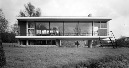


Herman Haan’s house in Rotterdam, 1951-53. | Photo by Violette Cornelius
Haan build the radically open house for himself and his wife Hansje on a piece of land at the edge of Rotterdam, where the debris of the demolished city centre during a bombardment in 1940 was collected. It consists of two elongated volumes: an elevated, floating open volume with the living room above and a small architect’s studio underneath half of this volume, and a second, closed volume with garage and two small bedrooms. In-between is a double height open space that connects both volumes as an entrance lobby.
The main feature of the living room volume is the set of four glass sliding doors, that can all be opened at the same time, thus literally opening the living room to the outdoors and the view over one of the main entrance roads of the city (and Haan did not believe in the use of curtains either). Another feature is the open kitchen, if not one of the first in architecture, then certainly of one the most radical open kitchens ever. It consists of a simple, small cooking table with a floating kitchen sink that stands in the middle of the living room and is connected to the open fire chimney only. Cooking is a social activity, so Haan had learned in Africa.
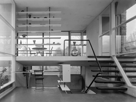
Open space and open kitchen. | Photo by Violette Cornelius
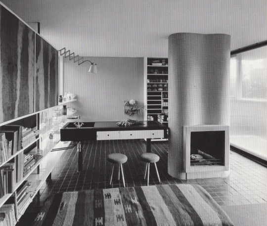
The bricks of the closed bedroom volume used in the interior are re-used pavement bricks from the quays of the Rotterdam harbor. An old poplar tree that stood on the site was cut into veneer and used as a finishing layer of cupboards all around the house. Parts of the stone flooring was salvaged from the rubble heap on which the house is build. The house is still standing, but the radical openness proved to be too much for the current owners. It is today surrounded by a wall of conifers, and parts of the glass facades are closed off.
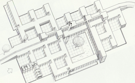
Patio Student Housing, Drienerlo Enschede, 1964-65. | Source Rijksdient voor het Cultureel Erfgoed
Herman Haan was asked by his mentor Willem Van Tijen (a first generation functionalist modernist) to build a batch of student housing for the campus of a new technical university in Enschede. It is unquestionably his most African project. The concept was based on the Matmata cave dwellings of southern Tunesia, famous for being the home of Luke Skywalker in Star Wars IV. It is also his most structuralist design, a so called mat-building based on a continuous square configuration, that was also one of the Team 10 tropes. The design consists of seventeen square units, joined in a larger configuration. Each unit consists of a patio with student rooms on two sides. Eight students live in such a patio unit (six one-person rooms, one two-person). Access to the rooms is from the patio, so each student room has his own front-door. Access to these patio’s themselves is mainly from the roof of the one - storey complex. A foot-path and bicycle road crosses the roof of the complex. The roof itself was one of the first green roofs in the Netherlands, sowed in with grasses. In the middle of the complex a larger central square and pool serves as a meeting place for the student community. The same pavement bricks from the quays of Rotterdam harbor, that he used in his own house and other projects, were used extensively in this one too. The project was recently fully restored and established as a National Monument of post-war architecture.

Frank van Klingeren selling his open architecture. | Source via Nieuwlanderfgoed
Frank van Klingeren (1919-1999), a Provo in a business suit was, unlike Herman Haan, a real outsider in the Dutch architecture scene of the 1960’s and 1970’s. Trained as a construction engineer, he was a self-taught architect that kept away from architecture gatherings or cliques. He was more at home among people from avant-garde theatre of the period, than among ‘Forum’ architects like Van Eyck, Bakema and Hertzberger, although he shared a lot of his ideas with the latter. They even received the Fritz-Schumacher-Preis in 1974 together, Hertzberger for his Centraal Beheer office in Apeldoorn, and Van Klingeren for ‘t Karregat in Eindhoven. Both buildings celebrating multi-functionality and an openness towards change.
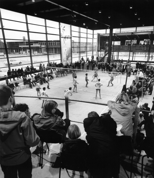
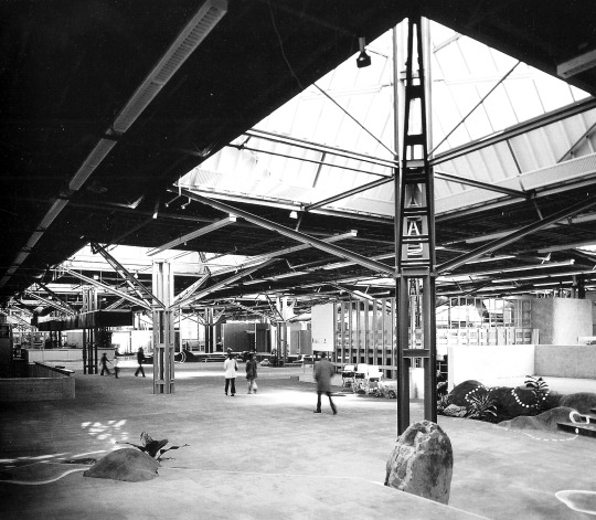
Although Van Klingeren was quite productive as an architect from the late ‘50’s to the mid ‘70’s, his main claim to fame was established with the design of three consecutive multi-cultural community buildings or Agora as he called them; De Meerpaal in Dronten, Agora in Lelystad and ‘t Karregat in Eindhoven. But his media presence was broader than that. Especially after finishing De Meerpaal, he evolved towards a counterculture societal critic and television personality, while keeping his distance from direct involvement in flower power, hippie or provo movements. He was in that sense a Provo(cateur) in a business suit.


De Meerpaal, Dronten, 1965-1967 | Photo by Jan Versnel
Asked for a simple multipurpose community building with provisions for amateur theatre and music, sports and a small café for new inhabitants of the pioneer-village Dronten that was being built in the new polder Flevoland, Van Klingeren did much more than that, and in a sense also much less. He gave more space, more functionalities and more possibilities, but less stuff (walls, floors) and in a way less architecture. Van Klingeren was inspired by the village squares or agora of the Mediterranean that functioned as meeting places, open-air theaters and playground, while showing a generic, in fact absent, architecture. In this sense his agora can be seen as a sort of architectural urbanism.
De Meerpaal is in fact nothing more than a covered village square, protected from the northern climate by glass walls. It is a large glass-and-steel box measuring 50x70 meters with a couple of smaller brick boxes (some art and exhibition rooms, a tilted box with restaurant/ café, and a small staff office) added along the edges. In the middle of the covered space an oval open-air theatre - soon dubbed ‘The Egg’ - is the main architectural gesture. There are hardly any walls inside, neither are there many spaces for any specific function. All functions mix, sometimes causing hindrance. According to Van Klingeren, hindrance leads to conversation and mutual understanding. De Meerpaal was used for many different functions; the weekly market, agricultural exhibitions, sports, parties, large scale meetings etcetera. The oval theatre with its central stage (the setting of audience and use could be changed easily, anything was possible except a traditional proscenium set-up), became a place where alternative theatre groups loved to perform.
De Meerpaal was also the main stage for large size, live national television productions and games, until large-scale studios were built in Hilversum. Besides this television attention for Dronten, it was also equipped with a (rotating) film screen on which, besides normal movies, live television could be screened of the so-called Eidophor technique. Thus, the whole village could watch the news or football matches together from the indoor terrace of the café. De Meerpaal has, with some merit, been compared to Cedric Prices (unbuild) Fun Factory of the same time. But while Fun Factory can be called a machine for multi functionality, full of specific intentionality, De Meerpaal is more like a generic square where the intentionality of use and meeting is not outspoken, but nevertheless - maybe more so than in Fun Factory - more open to chance and unpredictable uses.


Agora Lelystad, 1966-1972 | Photo by Jan Versnel
While construction work for De Meerpaal was still going on, Van Klingeren was commissioned to design a similar multifunctional building for Lelystad, the second new town to be built in Flevoland. It was planned to become the largest city and capital of the new polder province. The first design elaborated further on the open concept and mix of functions of De Meerpaal. In this case the scale was larger and Van Klingeren managed to lure in the churches (three different denominations) into the collective. Although each church would have its own space, it was to be open like the open-air theatre and - as Van Klingeren argued - since these spaces would only be used on Sundays, they could double as extra theatre and meeting spaces for the rest of the week.
Meanwhile it was decided that not Lelystad but a newer town Almere to be built closer to Amsterdam would be more important and bigger, and construction of Lelystad was delayed. This meant that the scale and budget of Van Klingeren’s Lelystad Agora diminished too. Instead Van Klingeren proposed the opposite; to enlarge the program with shops and housing facilities (hotel, boarding house), but to do this within the limited budget (to do more with less, was one of his favorite slogans). He proposed a U-shaped steel post-and-beam structure of three storeys, to be left open and to be colonized over time by the people and by entrepreneurs. The ground floor would still be like De Meerpaal, only a swimming pool was added. This open ground floor would be connected to the adjoining park so that Van Klingeren started to title the different zones in the lay-out as if they were landscapes: theatre landscape, youth-cave, swimming and undressing landscape. All in an open ‘wall-less’ setting. While De Meerpaal could be called urbanism (realised with architectural means), this last design for Lelystad would have been a landscape design instead, growing over time. The proposal proved to be too radical for Lelystad and a toned down. Conventional Agora was built in the city centre by one of Van Klingeren former employees.


‘t Karregat Eindhoven, 1970-1973 | Photo by Jan Versnel
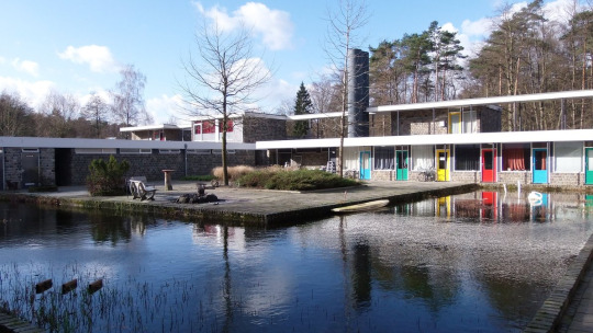
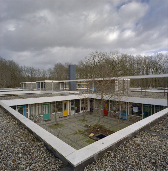
Van Klingerens attention had already shifted towards Eindhoven. There he was given the opportunity to build another multifunctional community building for a new experimental housing project. This time it would include – besides the cultural and sports facilities – a small shopping mall (bakery, greengrocer, a small supermarket) and a health facility with general practice (the café serving as a waiting room) and a pharmacy. But the real experiment was the inclusion of two elementary schools and a nursery school. These too would be built without any internal walls to speak of, one organic whole with the rest of the spaces and facilities, a field of communal activity. Children, according to Van Klingeren, would learn their arithmetic next to the supermarket cash desk, mothers could meet each other at the café bar after bringing their kids to school.
The one storey building (or rather the enclosed and climate controlled landscape) is situated underneath a flat roof with an open steel structure, that is supported by steel umbrellas; pyramid shaped skylights on open steel columns. All services (air-conditioning, electricity, rainwater drainage and ventilation) are positioned in sight within the steel roof structure, and can be accessed (and changed when the floor configuration is changed) from below. The perimeter facade is built-up out of off-the-rack components (mainly from the glass-house industry). In general, there is a certain high-tech feel to the architecture, albeit with the informal sloppiness of a self-built community house. Named ‘t Karregat (cart-sink after the shopping carts that would gather there) it was opened in 1973 without hardly any change in the original concept. After a couple of years, the schools without walls proved to be too much for the teachers, that went into the experiment without any primary experience whatsoever in new schooling methods. Glass partitions were applied, but besides that the openness was maintained and ‘t Karregat became an overnight success, also because the community ran the cultural facilities for themselves.
Afterlife
Both De Meerpaal and ‘t Karregat were highly successful until the 1990’s. When De Meerpaal, formerly publicly owned, was privatized in the 1980’s the open space was divided into smaller areas, and finally plans were made to demolish it around the year 2000. Protests from the architecture community and the State Architect managed to save the structure, especially the roof and The Egg. But several theatre spaces and a public library (all very much enclosed) were added so that the new Meerpaal can hardly be called open anymore, at least not in the sense that it was open in the 1960’s, both architecturally and functionally. More or less the same fate came over ‘t Karregat. After a successful period of a couple of decades, plans for demolishment were halted, and it is now restored; but a smooth false ceiling has killed the informal sloppiness of the original, partition walls have been added, patios are cut into the roof. Operation succeeded, patient died.
One may wonder whether this open architecture of De Meerpaal and ‘t Karregat was not so much geared towards it’s own time, and so much part of the open society, that it failed to be open towards societal change in the 1990’s. It very well may be the case, but then so is the architecture of the renewal. One of the protesting architects against demolishing De Meerpaal, Kas Oosterhuis, proposed to wrap the building up in plastic and to wait until society and technology would have been advanced towards a new phase fitting the original intentions of De Meerpaal. This would actually have been a great solution, and one has the feeling that now, only fifteen years after, the new Meerpaal feels old, and the old Meerpaal would fit much better in our current times, which are media driven, semi-virtual, but also with a longing for the open society of 50 years ago. The plastic could have been wrapped of already.
---
#FOMA 9: Piet Vollaard

Piet Vollaard is an architect and architectural critic working in Rotterdam. Besides monographs on both featured architects; ‘Herman Haan, architect’, Rotterdam (1995) and ‘Hinder en ontklonteren, architectuur en maatschappij in het werk van Frank van Klingeren’ with Marina van den Bergen, Rotterdam (2003), his publications include several Architectural guides to the Netherlands with Paul Groenendijk, Smart Architecture with Jacques Vink and Ed van Hinte, Rotterdam (2003); Positions, six Dutch architecture photographers with Simon Franke and Allard Jolles, Rotterdam (2010); Making Urban Nature with Jacques Vink and Niels de Zwarte, Rotterdam (2017), on nature-inclusive design in an urban context. He was founder and editor in chief of ArchiNed (1996-2013), and visiting teacher at several architecture schools in the Netherlands. His current activities focus on urban nature in a designer and ecologists collective The Natural City, and Stad in de Maak / City in the Making a collective of architects, designers and artists working in the field of commoning and activating empty buildings and related urban activism.
325 notes
·
View notes
Text
Towards Relational Design by Andrew Blauvelt
Is there an overarching philosophy that can connect projects from such diverse fields as architecture, graphic and product design? Or are we beyond such pronouncements? Should we even expect such grand narratives anymore?
I’ve spent more time in the field of graphic design, and within that one discipline it is extremely difficult to pinpoint coherent sets of ideas or beliefs guiding recent work — certainly nothing as definitive as in previous decades, whether the mannerisms of so-called grunge typography, the gloss of a term such as postmodernism, or even the reactionary label of neo-modernism. After looking at a variety of projects across the design fields and lecturing on the topic, new patterns do emerge. Some of the most interesting work today is not reducible to the same polemic of form and counter-form, action and reaction, which has become the predictable basis for most on-going debates for decades. Instead, we are in the midst of a much larger paradigm shift across all design disciplines, one that is uneven in its development, but is potentially more transformative than previous isms, or micro-historic trends, would indicate. More specifically, I believe we are in the third major phase of modern design history: an era of relationally-based, contextually-specific design.
The first phase of modern design, born in the early twentieth century, was a search for a language of form that was plastic or mutable, a visual syntax that could be learned and thus disseminated rationally and potentially universally. This phase witnessed a succession of “isms” — Suprematism, Futurism, Constructivism, de Stijl, ad infinitum — that inevitably fused the notion of an avant-garde as synonymous with formal innovation itself. Indeed, it is this inheritance of modernism that allows us to speak of a “visual language” of design at all. The values of simplification, reduction, and essentialism determine the direction of most abstract, formal design languages. One can trace this evolution from the early Russian Constructivists’ belief in a universal language of form that could transcend class and social differences (literate versus oral culture) to the abstracted logotypes of the 1960s and 1970s that could help bridge the cultural divides of transnational corporations: from El Lissitzsky’s “Beat the Whites with the Red Wedge” poster to the perfect union of syntactic and semantic form in Target’s bullseye logo.
The second wave of design, born in the 1960s, focused on design’s meaning-making potential, its symbolic value, its semantic dimension and narrative potential, and thus was preoccupied with its essential content. This wave continued in different ways for several decades, reaching its apogee in graphic design in the 1980s and early 1990s, with the ultimate claim of “authorship” by designers (i.e., controlling content and thus form), and in theories about product semantics, which sought to embody in their forms the functional and cultural symbolism of objects and their forms. Architects such as Robert Venturi, Denise Scott Brown, and Steven Izenour’s famous content analysis of the vernacular commercial strip of Las Vegas or the meaning-making exercises of the design work coming out of Cranbrook Academy of Art in the 1980s are emblematic. Importantly, in this phase of design, the making of meaning was still located with the designer, although much discussion took place about a reader’s multiple interpretations. In the end though, meaning was still a “gift” presented by designers-as-authors to their audiences. If in the first phase form begets form, then in this second phase, injecting content into the equation produced new forms. Or, as philosopher Henri Lefebvre once said, “Surely there comes a moment when formalism is exhausted, when only a new injection of content into form can destroy it and so open up the way to innovation.” To paraphrase Lefebvre, only a new injection of context into the form-content equation can destroy it, thus opening new paths to innovation.
The third wave of design began in the mid-1990s and explores design’s performative dimension: its effects on users, its pragmatic and programmatic constraints, its rhetorical impact, and its ability to facilitate social interactions. Like many things that emerged in the 1990s, it was tightly linked to digital technologies, even inspired by its metaphors (e.g., social networking, open source collaboration, interactivity), but not limited only to the world of zeroes and ones. This phase both follows and departs from twentieth-century experiments in form and content, which have traditionally defined the spheres of avant-garde practice. However, the new practices of relational design include performative, pragmatic, programmatic, process-oriented, open-ended, experiential and participatory elements. This new phase is preoccupied with design’s effects — extending beyond the design object and even its connotations and cultural symbolism.
We might chart the movement of these three phases of design, in linguistic terms, as moving from form to content to context; or, in the parlance of semiotics, from syntax to semantics to pragmatics. This outward expansion of ideas moves, like ripples on a pond, from the formal logic of the designed object, to the symbolic or cultural logic of the meanings such forms evoke, and finally to the programmatic logic of both design’s production and the sites of its consumption — the messy reality of its ultimate context.
Design, because of its functional intentions, has always had a relational dimension. In other words, all forms of design produce effects, some small, some large. But what is different about this phase of design is the primary role that has been given to areas that once seemed beyond the purview of design’s form and content equation. For example, the imagined and often idealized audience becomes an actual user(s) — the so-called “market of one” promised by mass customization and print-on-demand; or perhaps the “end-user” becomes the designer themselves, through do-it-yourself projects, the creative hacking of existing designs, or by “crowdsourcing,” producing with like-minded peers to solve problems previously too complex or expensive to solve in conventional ways. This is the promise that Time magazine made when it named you (a nosism, like the royal we) person of the year in 2006, even as it evoked the emerging dominance of sites such as MySpace, Facebook, Wikipedia, Ebay, Amazon, Flickr and YouTube, or anticipated the business model of Threadless. The participation of the user in the creation of the design can be seen in the numerous do-it-yourself projects in magazines such as Craft, Make and Readymade, but they can also be seen in the generic formats for advertisements and greeting cards by Daniel Eatock.
Even in most instrumental forms of design, the audience has changed from the clichéd focus group sequestered in a room answering questions for people hiding behind two-way mirrors to the subjects of dogged ethnographic research, observed in their natural surroundings — moving away from the idealized concept of use toward the complex reality of behavior. Today, the audience is thought of as a social being, one who is exhaustively data-mined and geo-demographically profiled — taking us from the idea of an average or composite consumer to an individual purchaser among others living a similar social lifestyle community. But unlike previous experiments in 1970s-style community-based design or behavioral modification, today’s relationship to the user is more nuanced and complicated. The range of practices varies greatly, from the product development methods employed by practices such as IDEO, creators of the famed Nightline shopping cart, to the “social probes[,]” of Anthony Dunne and Fiona Raby who create designed objects, not to fulfill prescribed functions but instead use them to gauge behavioral reactions to the perceived effects of electromagnetic energy or the ethical dilemmas of gene testing and restorative therapies.
Once shunned or reluctantly tolerated, constraints — financial, aesthetic, social, or otherwise — are frequently embraced not as limits to personal expression or professional freedom, but rather as opportunities to guide the development of designs; arbitrary variables in the equation that can alter the course of a design’s development. Seen as a good thing, such restrictions inject outside influence into an otherwise idealized process and, for some, a certain element of unpredictability and even randomness alters the course of events. Embracing constraints — whether strictly applying existing zoning codes as a way to literally shape a building or an ethos of material efficiency embodied in print-on-demand — as creative forces, not obstacles on the path of design, further opens the design process demanding ever-more nimble, agile and responsive systems. This is not to suggest that design is not always already constrained by numerous factors beyond its control, but rather that such encumbrances can be viewed productively as affordances. In architecture, the discourse has shifted from the purity and organizational control of space to the inhabitation of real places — the messy realities of actual lives, living patterns over time, programmatic contradictions, zoning restrictions, and social, not simply physical, sites. For instance, architect Teddy Cruz in his Manufactured Sites project, offers a simple, prefabricated steel framework for use in the shantytowns on the outskirts of Tijuana — a structure that participates in the vernacular building practices that imports and recycles the detritus of Southern California’s dismantled suburbia. This provisional gesture integrates itself into the existing conditions of an architecture born out of crisis. The objective is not the utopian tabla rasa of architectural modernism — a replacement of the favela — but rather the interjection of a micro-utopian element into the mix.
Not surprisingly, the very nature of design and the traditional roles of the designer and consumer have shifted dramatically. In the 1980s, the desktop publishing revolution threatened to make every computer user a designer, but in reality it served to expand the role of the designer as author and publisher. The real “threat” arrived with the advent of Web 2.0 and the social networking and mass collaborative sites that it has engendered. Just as the role of the user has expanded and even encompasses the role of the traditional designer at times (in the guise of futurist Alvin Toffler’s prophetic “prosumer”), the nature of design itself has broadened from giving form to discrete objects to the creation of systems and more open-ended frameworks for engagement: designs for making designs. Yesterday’s designer was closely linked with the command-control vision of the engineer, but today’s designer is closer to the if-then approach of the programmer. It is this programmatic or social logic that holds sway in relational design, eclipsing the cultural and symbolic logic of content-based design and the aesthetic and formal logic of modernism’s initial phase. Relational design is obsessed with processes and systems to generate designs, which do not follow the same linear, cybernetic logic of yesteryear. For instance, the typographic logic of the Univers family of fonts, established a predictive system and closed set of varying typeface weights. By contrast, a Web-based application for Twin, a typeface by Letterror, can alter its appearance incrementally based on such seemingly arbitrary factors as air temperature or wind speed. In a recent design for a new graphic design museum in the Netherlands, Lust created a digital, automated “posterwall,” feed by information streams from various Internet sources and governed by algorithms designed to produce 600 posters a day.
Perhaps the best illustration of this movement toward relational design can be gleaned through the prosaic vacuum cleaner. In the realm of the syntactical and formal, we have the Dirt Devil Kone, designed by Karim Rashid, a sleek conical object that looks so good it “can be left on display.” While the vacuum designs of James Dyson are rooted in a classic functionalist approach, the designs themselves embody the meaning of function, using color-coded segmentation of parts and even the expressive symbolism of a pivoting ball to connote a high-tech approach to domestic cleaning. On the other hand, the Roomba, a robotic vacuum cleaner, uses various sensors and programming to establish its physical relationship to the room it cleans, forsaking any continuous contact with its human users, with only the occasional encounter with a house pet. In a display of advanced product development, however, the company that makes the Roomba now offers a basic kit that can be modified by robot enthusiasts in numerous, unscripted ways, placing design and innovation in the hands of its customers.
If the first phase of design offered us infinite forms and the second phase variable interpretations — the injection of content to create new forms — then the third phase presents a multitude of contingent or conditional solutions: open-ended rather than closed systems; real world constraints and contexts over idealized utopias; relational connections instead of reflexive imbrication; in lieu of the forelorn designer, the possibility of many designers; the loss of designs that are highly controlled and prescribed and the ascendency of enabling or generative systems; the end of discrete objects, hermetic meanings, and the beginning of connected ecologies.
After 100 years of experiments in form and content, design now explores the realm of context in all its manifestations — social, cultural, political, geographic, technological, philosophical, informatic, etc. Because the results of such work do not coalesce into a unified formal argument and because they defy conventional working models and processes, it may not be apparent that the diversity of forms and practices unleashed may determine the trajectory of design for the next century.
Andrew Blauvelt, Towards Relational Design (2008) Design Observer, 07.09.20
0 notes
Text
The 25 Rooms That Influence the Way We Design
The 25 Rooms That Influence the Way We Design
https://ift.tt/38uI6hs

Continue reading the main story
Credit...Video by Scott J. Ross
The 25 Rooms That Influence the Way We Design
Three designers, two journalists and an interiors photographer gathered at The New York Times to make a list of history’s most enduring and significant spaces. Here are the results.
On an October afternoon, our six-person jury — Tom Delavan, the design and interiors director of T Magazine; Gabriel Hendifar, the creative director of the Manhattan-based lighting and design studio Apparatus; the architect Toshiko Mori; the architect and designer Daniel Romualdez; the veteran design journalist Suzanne Slesin; and the interiors photographer Simon Watson — assembled in a featureless conference room at The New York Times to discuss the most influential rooms of all time. By that, we meant “influential” in its truest sense. We wanted the jury to identify the spaces that not only changed the way we live but also changed the way we see, places — whether pleasing, provocative or completely novel for their eras — that not only informed our panelists’ individual practices as designers and documenters but also challenged how we all, as humans, think about beauty, strangeness, originality, décor, proportion, furnishings, art and the multivalent connections therein that define memorable rooms: ones that, above all, offer a new kind of visual lexicon. These are rooms, in other words, that have influenced and inspired interior design throughout the decades, shaping how our mind identifies and assesses a space, any space.
Image

From left: Tom Delavan, Toshiko Mori, Daniel Romualdez, Suzanne Slesin, Gabriel Hendifar and Simon Watson, photographed at The New York Times on Oct. 14, 2019.Credit...Sean Donnola
No one was expecting unanimity; if taste is individual, then discord among this cohort was inevitable. And yet we had asked each of them to nominate their 10 to 15 favorite rooms ahead of time, which the group would whittle to a list of 25. The overlaps were obvious front-runners: Four people chose the soaring, glass-walled sitting area of Pierre Chareau’s Maison de Verre, built in Paris in 1932, while Cy Twombly’s objet-filled 1960s living room in his Roman apartment, Rem Koolhaas’s elevator-cum-office built in 1998 for a disabled client in Bordeaux and Yves Saint Laurent’s art-covered 1970s Parisian salon were also submitted by several panelists. A lively conversation ensued for nearly three hours: What’s more important, the architecture or the design? Are the best spaces dictated by the people who inhabit them? The designers who create them? The period they reflect? Or some magical alchemy of all those things? Should public areas like hotels and restaurants be given as much weight as private, residential ones? And, actually, what is a room?
That last question animated the conversation from beginning to end, as each of our experts made arguments both concrete and philosophical about the human need to gather and connect in enclosed space, sometimes with the intimacy-creating aid of walls and ceilings, but other times not. (We drew the line on gardens — even ones with hedge walls — which everyone decided didn’t qualify.) By the end, we had narrowed upon a mutually satisfying definition of what makes a room and a list of about three dozen worthy examples, the images of which we laid out on a massive conference table, assessing them for final inclusion: Do we have too many museums and, speaking of, is the spiraling rotunda of New York’s Guggenheim more of a room or a building unto itself? Is the living room of the Finnish furniture designer Alvar Aalto a better representation of midcentury Scandinavian Modernism than that of the Danish furniture designer Finn Juhl? Where are all the female-led projects? (“We have to remember that architecture, like many industries, was male-dominated for much of history,” Delavan said. “And the field of interior design — while originally led by women, though now more evenly split between genders — is only a century or so old.”)
Eventually, consensus was reached, though that doesn’t mean the list is necessarily finished or complete: The royal “we” in this story’s headline was, in many cases, applied by our panelists to their own work, the way that they think about design while largely practicing in North America and Europe, which unfortunately means that entire continents such as South America and Africa weren’t under consideration as much as they would have been with another group. There’s a heavy emphasis on contemporary projects, places that everyone had seen with their own eyes. (“Just blame it on the editors,” Romualdez joked, to which Slesin responded, “What’s amazing, if we had to do this tomorrow, is how different it would be.”) So the result that follows — which is ordered chronologically, from oldest to newest — is, at its very least, one history of design in the West on one day from one group of highly opinionated people, all of whom would probably have rather found themselves in any of the rooms below. — KURT SOLLER
This conversation has been edited and condensed. The room summaries are by Nancy Hass.
1. Stonehenge in Wiltshire, England (circa 1600 B.C., architects unknown)
It took Neolithic builders nearly 1,500 years to complete Stonehenge, the outdoor enclosure of nearly 100 enormous upright stones on Salisbury Plain in the south of England. The origin of the structure, which is thought to have been a burial ground or perhaps a place of pilgrimage — the stones are aligned to frame sunrise during summer solstice and sunset during winter solstice — defies logic: The iconic 30-foot-tall three-piece sandstone pillars that stand in the center can be traced to local quarries, but how did a civilization without the wheel transport the inner ring of bluestones, some weighing four tons, from their origin point 200 miles away in Wales? Thought to have been finished around 1600 B.C., over the eons Stonehenge has been attributed to the ancient Celtic high priests called druids and the Arthurian wizard Merlin. But modern historians and archaeologists largely agree that a series of indigenous British tribes worked on the site in stages, over hundreds of years, each culture gaining technological sophistication through the centuries, creating an open-air chamber that stands as an indelible template for enclosure, space and ambitious monumentality.
Tom Delavan: My colleague Kurt and I were discussing what qualifies as a room, and we thought, “Well, a room has walls, or something that could define a wall. But does it need to have a ceiling?”
Simon Watson: For me, a room is a place for people to inhabit together in solidarity, I suppose.
TD: So residential, you’re saying?
SW: Not necessarily. It’s a place where people can gather; it’s what we humans do. I tried to go back as far as I could, and Stonehenge seemed like an obvious choice. I’m not sure if we know much about it, but what we do know is that it was a space where people gathered: Whether they prayed or whether they had conversations about their day, it was a place where people came together. And, for me, that was the definition of a room. It doesn’t have a ceiling. And I don’t think the difference stands in the make of walls, but it creates a space.
Gabriel Hendifar: Or is it just about some spatial organization that communicates intention, whether that intention has a ceiling or not? A room is something that’s been organized to serve some function, whether that is spiritual or shelter, residential or commercial.
SW: And you can go forward in history from Stonehenge to the Pantheon, which is one of the greatest rooms in the world. I’m not suggesting that the Pantheon came from Stonehenge, but rather that the circle is a humanist form we understand. It is the shape that creates a togetherness, in a way. It’s instinctual.
Toshiko Mori: Well, also, Stonehenge has a reference to astronomy. It’s human enclosure, with references to the world outside earth. So, the ceiling in this case is a sky. I think that’s the beauty with it, that it actually exists between ground and sky.
2. The Pantheon in Rome (125 A.D.; architects unknown)
The Roman Pantheon is not only the world’s best-preserved Classical building — it was completed by the emperor Hadrian on the site of an earlier structure of the same name that was probably a sanctuary — but is also likely the first in which the interior, not the exterior, is the focus: It was a precursor to the elaborate decoration of public spaces in later centuries, as well as a model of perfect balance. While its portico, reached by wide steps of Numidian yellow marble, was made in classically Greek style (squared off, with granite columns) once you enter the circular part of the building, you find a shrine to the motifs and mathematical obsessions of the Roman Empire. The rotunda is 142 feet in both diameter and height — a perfect hemisphere — with a 27-foot-wide oculus at the top of the domed ceiling. The dome itself is made of a porous type of limestone, like pumice, mixed with concrete, and has five rings of 28 rectangular coffers. Altered over the eras by successive rulers, including Pope Urban VIII, who in 1626 removed the original bronze girders from the porch roof to make them into cannons, the Pantheon’s architectural and decorative influence cannot be overstated: Thomas Jefferson’s 1826 library at the University of Virginia is one of many obvious homages.
3. The Shokin-tei tea pavilion in Kyoto (circa early 17th century; architects unknown)
The Katsura Imperial Villa near Kyoto, built in the early 17th century, profoundly influenced architects such as Frank Lloyd Wright and Le Corbusier, both of whom spent time in Japan. And with good reason: The 16-acre property, with many outbuildings and exquisite gardens, is a clear expression of how Zen Buddhism’s graceful influence is woven through Japanese culture and design — and is a vivid illustration of why those aesthetic codes still feel utterly contemporary. There are several free-standing tea pavilions on the property, all made to amplify a sense of pureness, reverence and isolation (each celebrates a different season and allows the gardens to be seen from various angles), but Shokin-tei, the tribute to winter, is the one that stands out for its unexpected modernity. With a thatched roof and three sides that face the property’s large pond, it’s notable for the blue-and-white checkered handmade paper that covers a central alcove and sliding doors. The loggia is held up by three oak logs, left natural with their bark intact. Rustic and bold, the teahouse is pleasingly geometric, a hallmark of traditional Japanese architecture.
Kurt Soller: How many of your choices were influenced by having seen these places in real life? Tom made this great point about how, for many people, most of these spaces only exist through pictures.
Suzanne Slesin: That’s why I included the Katsura teahouse, because I’d been there. I went on a tour, and I think we were the only Westerners. It was pouring rain. You’re wearing this translation earpiece, and you go around and the guide was talking, talking, talking in Japanese, and everybody was taking it very seriously, and then the translation was just: “teahouse.” So I just took the picture and I stood there and I thought, “It’s really beautiful, but I’d like to know more about it.”
TM: It’s incredibly influential. A literary reference. So that’s why the Japanese guide would go on and on and on to talk about —
SS: We understood nothing. But to me, this was extraordinary: Of course, Japanese interiors are influential, but this blue and white, I mean, anybody could do that today. And it would be amazing.
TM: The Bauhaus school [in early 20th-century Germany] had seen it. I have to be a little careful about this immediate link because it’s been an argument, a scholarly argument. But it’s very interesting to think about.
4. The parlors of Georgian homes in the United Kingdom (circa 1714-1830; various architects)
There is no perfect room, of course, but the parlor of the typical Georgian home — built throughout London and Edinburgh during the reigns of King George I through King George IV — may come close. The rooms are large, but not in the cavernous, ill-planned way of a McMansion or a billionaire’s high-rise penthouse on Central Park: They are, instead, models of proportion. Usually square, with ceilings around 16 feet high, the parlors’ symmetry was based on the Classical architecture of Rome and Greece, filtered through the lens of the Renaissance but scaled down to accommodate a single family. Unlike the neo-Gothic revival, which began as early as the mid-18th century, or the late Victorian period at the end of that century, both of which prized ornament, there was a spareness to Georgian style, which makes it feel modern today. Windows, placed with mathematical precision, were large and often shuttered — Georgian builders seemed to understand that in the late afternoon, taking tea, one might want to ease gently into the dusk.
SW: The Georgians started this idea of creating very livable proportions in rooms. When you go through them, the scale is huge, with vast windows, but you feel completely comfortable, because the proportions are so perfect. So these big spaces become calm, wonderful places to be in, to live in and socialize with your family or your friends.
KS: Has it influenced how people live now?
Daniel Romualdez: I think they bring the influence.
SW: I think people miss it. I’m looking around me [here in Midtown Manhattan] and I happen to see these vast skyscrapers going up and people living in these enormous spaces. I’ve been in them. You walk in and you think, “How could you live here?” The proportions are wrong. First of all, you need sunglasses all day long.
DR: All that glass!
5. Pierre-François-Henri Labrouste’s reading room at the Sainte-Geneviève Library in Paris (1851)
The Sainte-Geneviève Library, in the Fifth Arrondissement, has roots dating back to the sixth-century manuscript collection of the Abbey of Sainte-Geneviève, though its soaring reading room was built over 13 years, starting in 1838, by the Beaux-Arts architect Pierre-François-Henri Labrouste, who had spent his early career mastering the use of iron in grand railway stations and thus was a virtuoso at evoking grandeur. The nearly 20,000-square-foot, two-story structure is defined by exposed cast-iron arches, suspended over iron columns like parachutes billowing above a giant classical arena. The room, which is now part of Paris’s university system, stands as one of the finest neo-Classical interiors in Europe, influencing the Gothic Revival that swept late 19th-century France as well as the innovative spirit of the architect Louis Sullivan, who at the turn of the 20th century pioneered the use of iron and reinforced concrete in the American skyscraper.
TD: I bet it’s such a nice place to be, between the light and the space.
SW: But it’s also so delicately supported.
TM: Yes, because of the cast-iron work. So it’s a new technology, but within tradition. The motifs of all the cast-iron elements are plants, so it refers to nature, which softens the technological aspect: Otherwise they could have made it look like trusses, but they didn’t. There’s also a visual relationship to the books’ paper, which comes from plants. This influenced the Boston Public Library, the Butler Library at Columbia University, the Doe Library at U.C. Berkeley and others, so this whole idea of a collective reading room is an important example.
6. The Bloomsbury Group’s studio at Charleston in Sussex, England (circa early 20th century)
Inspired by the bright, fluid figuration and sharp abstraction of Post-Impressionists including Gauguin and Matisse, who led the way to High Modernism after World War I, the visual artists of the Bloomsbury Group ran wild at Charleston, the Sussex, England, farmhouse where the married painters Vanessa and Clive Bell and Vanessa’s lover Duncan Grant lived for decades. Virtually every surface in the house, a way station for intellectual bohemians including Vanessa Bell’s sister, the novelist Virginia Woolf, is covered in joyous drawings. In the living room, barely clad classical figures dance across the hearth, and books spill out from shelves. The house, preserved after Grant’s death in 1978, is the embodiment of the revolution that shook the art and design world, its handcrafted ethos driven by the class-driven conflict that took root in England between the wars.
SS: The Bloomsbury rooms combined all the arts together, and this was both unique and very influential. They also represent a coming together of all the arts in a place and time that, although it has passed, is very current in terms of how people engage with design.
KS: And the craft of it all, too, the idea that [the Bloomsbury-adjacent guild known as] the Omega Workshops seems so visually relevant now.
SS: Exactly. I think that’s something people are talking about now. [A few decades ago,] I remember knowing about this and thinking, “Oh, it doesn’t suit my Modernist sensibility. It’s cluttered.” But now I’m looking at it very differently, and I think it’s both charming and bohemian, which is very attractive.
DR: Why did that change?
SS: Well, things happen in life. Some of the things that you like 30 or 40 years ago, you’re less interested in, or you get bored with them. Even well-known designers, like you, Daniel, your style changes. It depends on your clients, but also the way you feel.
DR: Yeah. What persists for you?
SS: I still love Minimalism and Modernism.
DR: Do you think the Modernists’ influence is waning? You know, 30 years ago, when I was in architecture school, that’s all we talked about.
TD: Since I started working at magazines [in the early 2000s], Modernism has basically been watered down. It’s sort of softer; it’s not about an absence of decoration, or anything similarly social or political. It’s just about simplicity.
SW: It’s become more cushy and comfortable.
DR: But don’t you think it’s also, like, a status symbol? A buzzword?
SW: Yes, in every single place in the world.
DR: And you just think, “Oh, I know about Modernism. I’m going to do that even though everything about this room has nothing to do with it.”
7. Jean-Michel Frank’s living room for Marie-Laure de Noailles’s hôtel particulier in Paris (circa 1925)
The Jazz-era Parisian arts patron Marie-Laure de Noailles blithely disregarded convention. She and her husband, Charles, underwrote the Dada-inflected films of Luis Buñuel and Man Ray and bought arms for the anti-Franco forces. Their 16th Arrondissement apartment sparked the career of Jean-Michel Frank, an interior designer who stripped away the early-18th-century moldings from the vast rooms and squared off the giant opening between them. The walls of the apartment (which was returned to its ornate origins by the designer Philippe Starck in 2003 for the Musée Baccarat) were covered in parchment panels hung with paintings by Dalí, Picasso and Miró. And the severe living room furniture that Frank made for the couple continues to inspire contemporary design; created from lush materials including shagreen and mica, the pieces combine geometric discipline with the mark of the artisan’s hand.
8. Pierre Chareau’s salon for Jean Dalsace’s Maison de Verre in Paris (1932)
Bathed in sunlight during the day and lit at night with a phosphorescent lantern glow, the Maison de Verre may well be Paris’s most radical residence. Resembling a box made of glass blocks capped by a single traditional apartment, it was commissioned in the late 1920s by Jean Dalsace, a gynecologist who bought an 18th-century Left Bank hotel, determined to reinvent it as a Modernist mansion. Unable to evict the top-floor tenant, he built around her. The architect, Pierre Chareau, conceived the edifice as a series of interlocking forms, with the doctor’s office on the first floor and two private levels above. Simultaneously labyrinthine and airy, with several sets of stairs and a double-height salon behind the monumental glass wall, it has been compared in impact to Le Corbusier and Pierre Jeanneret’s Villa Savoye (1931) on the outskirts of the city. But unlike that imposing International Style monolith of reinforced concrete, the Maison de Verre possesses a lyrical delicacy owing to the work of the iron artisan Louis Dalbet, who created such touches as perforated mechanical screens to separate spaces and a rolling steel-pipe library ladder with wood inlays. After remaining in the Dalsace family for more than 70 years, the house was bought in 2005 by the history-obsessed American collector Robert M. Rubin, who meticulously restored it.
KS: The Maison de Verre was the most submitted project among our panelists: Four of you chose it —
DR: If I remembered, I would have put it on my list.
GH: Me too.
SS: I mean, it has everything: It has a new structure, it looks to the future, it has furniture that is not just traditional but also modern. Everything about that house — the traffic patterns, the materials, the siding of it, the way it’s used — is really a 20th-century development. And it’s beautiful. I mean, I think it’s beautiful.
DR: It changed the way we designed, you know, these glass-wall houses. The coziness. The multilevel living room.
TD: It’s very comfortable, which isn’t always the case for things that are modern.
9. Finn Juhl’s living room at his home in Charlottenlund, Denmark (1942)
The Danish designer Finn Juhl, along with his countryman Hans Wegner, established the vanguard of Scandinavian furniture design in the 1950s and ’60s with pared-down yet softly contoured pieces made largely of oil-rubbed walnut, maple and teak, and seats and backs covered in nubby upholstery. They were a complete break from the fussy neo-Classical style that preceded them and, because of new manufacturing processes engineered at the same time, were instantly copied. Trained as an architect, Juhl used the ultramodern house he built for his family and lived in for close to 50 years in a suburb north of Copenhagen as a laboratory, tweaking the setting to accommodate new volumes and contours. The house had an open plan — radical for the time — and each ceiling of each room was painted a different color to create different moods. In the living room, where Juhl placed one of his Chieftain chairs and Poet sofas, the beige was intended to evoke the feeling of being under a canvas, especially when sunlight hit it.
SS: I first saw it published in the October 2012 issue of Marie Claire Maison, and I thought, “The art, the furniture, the space, everything is of one mind and very, very simple and modest, but extraordinary.”
TD: The proportions are so nice, even though it’s not grand.
SW: Typical Scandinavian mind-set.
SS: But really, I love the palette and the tile work. The hearth, it’s like a little carpet. I think this has a lot to do with the way people think today.
KS: How so?
SS: Well, I tried to think about the trends — I’m not talking about grandiose houses, like what’s happened to the Hamptons — that can influence the ways people want to live today. One of them is smaller, more modest spaces. But still quality, not cheap in any way.
10. Le Corbusier’s Le Cabanon in Côte d’Azur, France (1952)
Charles-Édouard Jeanneret, the Swiss architect known as Le Corbusier, loved the Mediterranean, with its incomparable light, rough-hewn local architecture and rocky shoreline. In 1952, he built the one-room Le Cabanon for his wife, Yvonne, to use as a summer getaway. Merely 12 feet by 12 feet, it had no real bathroom, just a toilet near the bed, nor a kitchen; the couple took their meals at an adjoining cafe reached by an internal door. With an exterior that resembles a Canadian log cabin and interior plywood walls, it was constructed using Le Corbusier’s so-called Modulor principles — an anthropomorphic scale of proportions based on the movement of the human body — down to the built-in furniture, making it a diorama of the architect’s revolutionary worldview.
SS: I visited this about two years ago, and I could not believe how perfect it was and how it was really the most modern. I mean, it’s one room that allows for sleeping, eating, relaxing and more clever things, too: Guest rooms that pull out of a box, a bathroom mirror that slides open to become a window.
TD: Just that you could live in such a compact —
SS: One of the most important architects of the 20th century conceived of this in the most modest, most beautifully done way, and that was his choice. And one shouldn’t need anything else.
DR: Super functional. Do you know how he lived in it? I mean, was it meant to be a retreat?
SS: I think he spent every summer there.
SW: Yeah, and that’s where he ended up dying [in 1965]. He went to swim and never returned.
11. Nancy Lancaster’s living room at her flat in London (1958)
Among the great paradoxes of the influential style widely known as English Country — a dotty dishevelment characterized by cozy sun-bleached chintzes, antiques from various periods and brightly hued walls — is that it was brought to Britain from the American South in the 1920s, by the Virginia-born socialite Nancy Lancaster, who owned the Mayfair design firm Colefax and Fowler. Inspired by her romanticized memories of plantation houses (including her grandfather’s) that had fallen into disrepair after the Civil War, Lancaster, who lived in England virtually all her adult life, tapped into what her biographer Robert Becker called a corresponding “abstract nostalgia” for a British way of life that had been obliterated by the wars. While she lived largely at Ditchley Park, an estate in Oxfordshire, it was the lacquered egg-yolk yellow living room of her flat above the firm’s Avery Row showroom, completed in 1958 (she died in 1994 at the age of 96) that stood — until just a few years ago, in fact, when the firm moved — as a shrine to her aesthetic, with its barrel ceiling, faux-marble baseboards, braided swags, oversize chandelier and array of comfortable seating. The room has been a lodestar to a generation of American collectors and designers, among them Sister Parish, Mario Buatta and Mark Hampton.
DR: I think you all must think I’m nuts to have chosen the butter-yellow room. I just know that you all would have thought that was weird. But I honestly think design goes in waves, and clients are actually looking at chintz again, which is surprising.
TM: I’m not so sure about Nancy Lancaster. I don’t get it.
DR: I’m going to stand up for her. I just think we are living in a bubble. There’s a lot of stuff being done now that looks like this. Many things I see on Instagram are using similar materials and creating a similar atmosphere.
12. Philip Johnson’s Four Seasons dining room in New York City (1959)
When the Four Seasons restaurant — the epitome of the steel-and-glass International Style, created on the ground floor of the Ludwig Mies van der Rohe-designed Seagram Building — opened in the late ’50s, it was a tourist trap. Not until the late ’70s, when, under new owners, its Grill Room (one of two dining areas connected by a corridor hung with a massive Picasso tapestry) was named the ultimate power lunch spot by Esquire, did Philip Johnson’s extraordinary feat get its due. But it is the Pool Room, now operated as a seafood restaurant called the Pool, that stands as the most vivid reminder of the architect’s commitment to tranquil austerity. Other fancy restaurants of the time were fussily French with cushy banquettes, but Johnson embraced a brash, unadorned rectangularity, with 20-foot ceilings and massive windows shaded only by curtains of rippling, undulating chains. Although the classic midcentury furnishings — not accorded historic status when the building was declared a landmark in 1989 — were auctioned off a few years ago, when the current owners took over, the room’s combination of hushed chicness and uncompromising discipline endures, a testament to the relationship between Mies van der Rohe and Johnson, master and student.
SW: I never ate there [in its original incarnation]. But the pool just struck me as something that functioned very well in the space. Also, it was outrageously chic, it was glistening. It just seemed so refined.
TM: And civilized.
SW: And civilized. Even though half the people in the room were probably crooks.
Everyone laughs.
SW: But it worked, it definitely worked.
13. Cy Twombly’s living room at his apartment in Rome (circa 1966)
The Virginia-born abstractionist Cy Twombly came to Rome in the late 1950s, and soon after, he married the Italian portraitist Tatiana Franchetti, sister of his patron Baron Giorgio Franchetti, with whom he bought an apartment in a 17th-century palazzo on the Via di Monserrato; it had been built for the Borgias. He immediately had the place stripped of generations of old paint to reveal whitewashed walls and pale blue doors with gold moldings; the large rooms and abundant light became a perfect setting for his enormous oil paintings, with their calligraphic graffiti on pale backgrounds, punctuated with phrases from classical allegory or from poets such as Stéphane Mallarmé and John Keats. Particularly in the main sitting room, the artist had an intuitive sense of how best to punctuate the works in his home: He offhandedly mixed them with slightly run-down gilded antiques upholstered in bleached shades, plaster busts that could be found in flea markets throughout the city and bits of silver. The effect is ethereal yet unpretentious, airy, elegant and livable.
DR: To me, Twombly created a whole new atmosphere. Think of all the rooms on Park Avenue today.
TD: It’s a certain “I didn’t try too hard,” which I feel is kind of its own design aesthetic. Even his art, which was super edgy, was not considered great art at that time.
GH: It’s like, “I just happened to be in this palazzo.”
TD: The antiquities were not expensive then. He was buying stuff at the equivalent of a flea market.
SW: I mean, those big busts aren’t antiquity. They’re 19th century. And no offense to Twombly, but they’re a dime a dozen in Rome, and everybody has them. You know?
TD: But to his credit —
SW: To his credit, it all works very well. I’m just trying to break it down. The room itself isn’t outstanding. It’s what’s in it.
DR: To me, it’s all about atmosphere. And you can have a perfect room with no atmosphere, and it doesn’t succeed. So where does the architecture of that room begin and where do the objects and the installation and the installation designer fit in? Which comes first?
TM: Because of those questions, I actually chose extreme examples. Like the Neue Nationalgalerie in Berlin, which was designed as a completely universal space. It’s spectacular: It’s just a ceiling and then there’s continuity of interior and exterior. To me, this was the definition of the conceptual idea of a museum. In a sense, as a space, this is a room that is essentially universal and infinitely transformative. As a concept, it’s amazing.
14. Ludwig Mies van der Rohe’s main exhibition gallery at the Neue Nationalgalerie in Berlin (1968)
As Mies van der Rohe’s last major building (he died a year after it was opened), the massive structure embodies the legendary architect’s preoccupation with open, flexible spaces with minimal enclosure — a radical notion for a museum hall at the time — and complex engineered solutions that seem virtually invisible. With a nearly six-foot-thick steel flat roof painted black (a grid ceiling inside holds lighting) and an architecturally austere presence, it comprises two distinct levels. Visitors climb three flights of stairs to the entrance and the main special exhibition gallery, a hangar-like space supported by cruciform columns on either end, where the art, mostly from the 20th century, is often hung on temporary walls and other innovative structures, revealing the space’s flexible nature. The building is currently undergoing a massive restoration by the British architect David Chipperfield.
15. Stanley Kubrick’s suite in “2001: A Space Odyssey” (1968)
A room does not have to be realized to be seminal: The final, indelible scene of “2001: A Space Odyssey” is set in a huge suite meant to be a luxurious zoo environment for the film’s protagonist, the wayward astronaut Dr. Dave Bowman. Stanley Kubrick, a notorious perfectionist, said it was intended to look as though created by a master race that wanted to observe Bowman in a comfortable setting through the remainder of his life: He ages, dies and is reborn in the room in a few cinematic minutes. Kubrick resisted what might have been an obvious trope of the time — making the room a neon pop palace of blobby plastic furnishings — instead positing what an alien race might consider soothing and elegant to a 20th-century human. The result is a mixture of inaccurate replicas of Louis-era French furniture and neo-Baroque statuary set into alcoves, all gently illuminated by floor tiles lit eerily from below.
DR: Watching that movie, I didn’t remember the plot, because all I did was obsess about this room.
SS: It’s outer space. I mean that’s really a definition, to me, of Modernism, of originality. I mean, it’s terrifying.
GH: It’s sort of atemporal, it’s about the future and the past.
SW: It’s kind of Philippe Starck-y in a way.
TM: I think one can trace nearly everything he’s done to this movie.
16. Donald Judd’s master bedroom at his loft in New York City (1968)
In 1968, Donald Judd, then 40 and fresh off a Whitney Museum retrospective, bought a derelict five-story SoHo factory built in 1870 to use as his home and studio. Although by the late 1970s he was spending much of his time in Marfa, Texas, he lived and worked in New York off and on until his death in 1994, punctuating the loft’s vast rooms with art and objects, creating a template for late 20th-century American Minimalism. After a restoration by the Judd Foundation, run by his son and daughter, the building — which opened to the public in 2013 — remains intact, as pristine as one of the sculptor’s welded metal boxes. Works by Dan Flavin, Claes Oldenburg, Carl Andre, Marcel Duchamp and others remain in the exact positions that Judd placed them. But the top-floor master bedroom best encapsulates the residence’s style: On the wall hangs an early Judd piece in wood, Oldenburg’s “Soft Ceiling Lights at La Coupole” (1964-72) and a John Chamberlain crushed car fragment known as “Mr. Press” (1961). The bed, on a low plinth, is counterpoised with a 19th-century Italian settee, and the angles of a Flavin fluorescent work echo the cast-iron windows overlooking Mercer Street. The neighborhood may no longer be recognizable as the postindustrial wasteland that Judd found in the ’60s, but in the fifth-floor chamber, his vision of SoHo — raw, hand-forged, radical — lives on.
TM: When you talk about someone’s personality driving a space, it’s iconic.
SW: I went there with a friend of mine who is an architect in, I think, 1992, when Judd was still alive. He was still using it then, and what really struck me were these simple elements: the way the floor and the ceiling were the same, and how the objects were placed in this beautiful loft. It seemed so pure, so perfect.
TD: For some reason, I always thought it would be a difficult place to live.
KS: But specific to the person that lived there, right?
TM: Yeah, yeah, yeah.
TD: Yeah, but then his children lived there.
TM: I have to say … I lived in the Maison de Verre, and it’s a horrible place to live.
KS: But should livability be a criteria here?
DR: To keep my business sustained — to have clients come back: yes.
SW: I agree.
DR: I mean, I’m not an artist. I went to architecture school. I ended up decorating, even though I wasn’t trained for that. But the only way my practice will continue is if my clients come back, and most of that is about livability and practicality. You don’t want things falling apart. The last thing you want to get is a phone call about how the air conditioning points at the shower.
17. Yves Saint Laurent’s salon at his apartment in Paris (1970)
The couturier Yves Saint Laurent and Pierre Bergé, his partner in life and business, bought a nine-room, nearly 6,500-square-foot duplex at 55 Rue de Babylone in Paris’s Seventh Arrondissement in 1970 and spent the following decades perfecting it. The designer, who died in 2008 at age 71, layered it with Renaissance bronzes, paintings by Goya and Picasso, the severely modern furniture of Jean-Michel Frank and Eileen Gray and witty anthropomorphic sculptures by Claude and Francois-Xavier Lalanne. His eye for combining old with new — he took elements from the classically minded Rothschild clan and was inspired by the ultra-minimalist Paris hôtel particulier that Frank decorated in the 1920s for the family of the art patron Marie-Laure de Noailles (see above) — remains remarkable, especially in the before-and-after of the double-height salon, its paneled walls the color of burnt sugar. It’s a master class in creating a room that is beautiful from the start yet flexible enough to evolve over the years in tandem with one of the greatest collectors of all time.
KS: Daniel, when discussing Yves Saint Laurent’s apartment, you wanted us to consider it before and after his art was installed, right?
DR: Yes, when I work with clients, I know they’re going to collect art — but they don’t have that art yet — so we need to make the room beautiful for when they first move in. So I show them pictures from the YSL living room when it was empty, more or less, and when it was laden with works by Picasso and others decades later.
GH: What’s interesting to me about this is that it’s wildly chic, but it expresses a certain sort of internal psychology. This room to me is about addiction. It’s about being compelled to collect, to fill space with objects that say something to you about who you are — and about how that affects how we design the spaces we live in, how these spaces communicate something about our psychology.
SW: Or who we think we want to be?
TD: Right.
TM: This relationship of art and life and intimacy — the way the paintings are placed in strange ways, the proportions of the objects — is really interesting to me.
GH: It’s beautifully manic. There’s something about addiction here. I want to get into his head to understand.
18. David Hicks’s living room at his estate in South Oxfordshire, England (1973)
The courtly, charismatic British designer David Hicks grew up amid the chintz and antiques that characterized English interiors of the early 20th century, but at the dawn of the 1960s, he shocked the system with supersaturated clashing shades (red with violet, chartreuse with deep forest), octagonal patterned carpets and a daring mix of 19th-century furniture, Asian objects and Pop abstraction. His taste quickly became synonymous with upper-class cool, and it was he who coined the now-ubiquitous term “tablescape.” In his own red-and-pink living room on his South Oxfordshire estate — which has since become an enduring influence on contemporary designers including Miles Redd, Vicente Wolf and Steven Gambrel — black lacquer accents, layered patterns and oversize objects underscore his lasting aesthetic legacy.
TD: I was always impressed that Hicks could take these 18th-century antiques and bring them to the present.
SS: I don’t think he was afraid of mixing — you know, I wouldn’t talk so much about eclecticism, but that was really it. He was very sure of himself, and I think people may have questioned it, but he just did it. And it was bold.
DR: I mean, when we think about how long his influence has been, it’s been going for like —
SS: This is from the ’70s.
TM: I think his idea of pattern on pattern on pattern is super interesting.
GH: I think that’s the defining character. It’s the graphic nature — even the way he outlines the wall planes. That feels like a very Hicks thing.
19. Paul Rudolph’s living room for Halston’s townhouse in New York City (1974)
If there is one photograph that conveys the essence of the 1970s — at least its louche, glamorous side — it’s the Harry Benson shot of Halston in his 32-foot-tall living room on the Upper East Side. The fashion designer’s stylishly gaunt frame may be burned into the collective memory, but it’s arguably his house — that sharp-edged, almost extraterrestrial abode — that will forever haunt us. Designed in 1966 by Paul Rudolph, who was for years the dean of Yale’s architecture school, and remodeled once Halston bought it in 1974, the 7,500-square-foot townhome was famously a locus for celebrities, including Andy Warhol, Bianca Jagger and Liza Minnelli. Rudolph, widely credited for bringing Brutalism to the United States, eschewed comfort, practicality, even safety in much of his work, opting instead for maximum minimalist drama. Although Gunter Sachs, the Swiss industrialist who was an owner of the house after Halston’s death in 1990, mitigated some of the Rudolphian details, including the ubiquitous gray industrial carpeting, the vertiginous floating staircase to the mezzanine still shocks, especially when imagining the partygoers who must have tried to descend it in stilettos: It has no handrail. That’s just one of the defining details that the designer Tom Ford, who bought the house earlier this year, is likely to leave alone.
DR: In some ways, it’s influenced all these glass-tower apartments. I can’t think of anything more glamorous since then.
SS: It is glamorous. And I think right now we’re in a glitzy period but not a glamorous period. And this was glamorous without being glitzy. It had this “wow” factor for its time, and yet it was pretty tame in a way.
GH: Everything comes up from the floor, with that wall-to-wall carpet drawing you down. I find it very earthy and sensual and grounding in a way.
DR: Your point is fantastic. I was feeling uncomfortable with these super tall rooms.
SS: Also, isn’t it really a portrait of Halston? It’s exactly him. I couldn’t separate that house from him: the way he looks, the way he was, what he represented, the clothing — everything.
20. Ricardo Bofill’s living room at La Fábrica in Sant Just Desvern, Spain (1975)
Architectural postmodernism, which became prominent in the 1980s, combined classical elements with Brutalist materials like cement and iron, often pumping up details to cartoonish proportions. But La Fábrica, a 32,000-square-foot former cement factory outside Barcelona that Ricardo Bofill, now 80, converted into a home and office in 1975, illustrates the style at its most inspiring. With over 30 concrete silos, cavernous machine rooms and nearly 2.5 miles of underground tunnels, this reimagining of a complex that had been built during Spain’s postwar boom was a mammoth undertaking that is, after nearly 50 years, still in process. By keeping many of the original details, including massive if narrow arched windows and exterior metal staircases, Bofill — whose firm Taller de Arquitectura is known for Barcelona Airport’s Terminal 1 — has transformed the space into vast public areas, expansive libraries and cozy bedrooms, some tucked into the formerly abandoned silos. The central living room, with two stories of arches, exposed pipes and oversize billowing white drapes, reflects the inherent dynamism of repurposed spaces.
GH: To me, this represents this idea of reclaiming industrial space and rejiggering it for habitation, putting a human-scale softness inside a space that is not meant to do that. I think this says so much about how we live now — how much of Manhattan and Brooklyn, for instance, are being developed.
SS: The outside of this is the scariest building you’ve ever seen. It’s all turbines.
GH: There’s this tension between the building’s past life, which was really industrial and felt anti-human, and its current use as a backdrop for domestic life.
21. Andrée Putman’s office for the French Minister of Culture at the Palais-Royal in Paris (1984)
Jack Lang, who became France’s Minister of Culture under François Mitterrand during the 1980s, brought with him not merely a stylishly shaggy haircut and custom-made jewel-toned shirts that he wore beneath a well-cut suit but a fierce passion for interior design. Perhaps unsurprisingly, he hired Andrée Putman — then the doyenne of Parisian design, who had conceptualized Morgans Hotel in New York and redone the interior of the Concorde — to reconceive the ministry’s ornate offices in the 17th-century Palais-Royal in the First Arrondissement. She paired the elaborately gilded boiserie walls and outsize chandelier with a pale-hued suite of geometric postmodern furniture, including barrel chairs and a half-moon desk so aesthetically significant that it was kept by at least five successive French presidents. Her fearless mixing of styles and periods — unheard-of at the time — led the way for designers to introduce modern, even minimalist, furnishings into historic structures, weaving a new, more layered narrative
GH: This room speaks specifically to what furniture does, and about how the intervention of nonnative pieces to a historical room completely changes what you see. I just think this is incredibly genius.
22. Vincent Van Duysen’s living room at his house in Antwerp (1993)
Sensual minimalism might seem oxymoronic, but if there is a signature style of our era, that may be its proper sobriquet. In the 1990s, the Belgian designer Vincent Van Duysen, now 57, pioneered such environments — unfashionable at the time — which are both under-decorated and gracefully patinated. They take from early 20th-century Modernism a sense of lofty proportion and a lack of color and embellishment but avoid the coldness of steel and tempered glass. Instead, with raw, textured fabric and wood to bring out the soul in sparingly arrayed and geometrically precise furniture, Van Duysen’s interiors evoke silence and calm. Nowhere is this truer than in his own Antwerp living room, where light illuminates elemental shapes and defiantly plain bleached linens in shades of oatmeal and pure white.
KS: Tom, you had chosen very pale rooms, very white rooms. How come?
TD: I saw Van Duysen’s early apartment when it was published in the early ’90s; it still feels like so much of what’s happening now is based off that sort of linen-and-oak-floor look. It’s not overly polished, but it has a sort of fanciness.
23. Philippe Starck’s lobby for Ian Schrager’s Delano Hotel in Miami Beach (1995)
The Delano, on Collins Avenue in South Beach, was not the first boutique hotel (that title likely belongs to Morgans, also an Ian Schrager brainchild, which debuted in New York City a decade earlier), but it remains simultaneously archetypal and original. Born of a collaboration between Schrager, the Brooklyn-bred impresario of Studio 54, and Starck, the Harley Davidson-riding Parisian designer, the interior renovation of the 1947 hotel, with its historically protected pink stucco facade, was intended to, in Starck’s words, reflect the “deep elegance of a poor people who have a very clean house.” His approach contrasted vividly with the neon-adorned Art Deco hotels that were then being modernized along the strip, and helped give birth to the contemporary Miami aesthetic. The 14-story hotel currently has 194 sparsely furnished, white-on-white rooms above a cathedral-ceilinged lobby corridor with gleaming dark floors and semi-sheer floor-to-ceiling white curtains that billow in the breeze. In niches along the way sit a Salvador Dalí chair and the iconic overscale banquette from which countless guests have started taking selfies.
SS: Starck’s whole philosophy was influential both in other hotel lobbies but also in the way people looked at their bedrooms, their entryways and particularly their bedrooms. I mean, this was one of the first all-white projects, with the whole idea of creating excitement of being in a hotel versus the fear of being in a space that you don’t know, that’s not comfortable. That whole dichotomy of thinking in terms of designing spaces — and in how that changes how people experience their own homes — was very interesting. Visiting the lobby of the Delano was like entering a classical temple.
SW: I remember walking in in the ’90s, and I had the same feeling as you have when walking into a gothic cathedral. It turned everything around.
TD: It was sort of breathtakingly beautiful, but the proportions are also very functional.
24. Rem Koolhaas’s elevator office at Villa Lemoine in Bordeaux (1998)
In the late 1990s, the French publisher Jean-François Lemoine and his wife, Hélène, were in the midst of planning a hyper-modernist family villa overlooking the city of Bordeaux when he was in a car crash that left him partially paralyzed. Undeterred, they hired the Dutch architect Rem Koolhaas, whose firm OMA built them an elaborately engineered house to enable Lemoine unparalleled mobility without sacrificing the couple’s desire to push beyond conventional volumes. Instead of keeping things on a single elevation with openings wide enough for a wheelchair, Koolhaas created three levels partly wedged into the hill, centered around a 10-foot-by-11-foot elevator platform set up as an office for Lemoine. Powered by a hydraulic lift, the platform moves freely between the floors. It can hover between, lending spectacular unobstructed views, or become flush to the kitchen at the base or disappear into the glassed-in center-level living area; at night, it rises to become a corner of the cantilevered top floor expanse that holds the bedrooms, which have porthole-like windows punched through weathered metal cladding. Lemoine died in 2001, and the house remains in the hands of Hélène. Their daughter, Alice, and her husband, Benjamin Paulin, son of the legendary furniture designer Pierre Paulin, have recently transformed the home into a temporary exhibition space showing Pierre Paulin’s furniture.
DR: Would you say the room that’s the most influential in the home is the office that goes up and down?
TM: That whole idea of a room itself. Since the entire study is an elevator, the owner could access his whole home, which makes the person who is disabled become the most empowered person. It’s an ongoing issue: How do you make a disabled person not a secondary citizen within their own environment?
25. Ryue Nishizawa’s Teshima Art Museum in Teshima, Japan (2010)
The Japanese island of Teshima, about an hour and a half south of Okayama in the Seto Inland Sea, is a place with chaste beauty, a population of barely 1,000 and, since 2010, a nonpareil one-artwork museum. Shaped like a flattened droplet of water straining to return to the sea, the Teshima, designed by the Pritzker-winning architect Nishizawa (co-founder of the Tokyo-based firm SANAA) is rendered in pale concrete, with no structural pillars, just curved walls that slope to meet the canopy of ceiling and two elliptical openings that allow in the elements. But as you stand in the vast space in your bare feet (shoes must be removed at the door), it’s the interaction of the structure with the subtle and strange environmental sculpture, “The Matrix” (2010), by the elusive artist Rei Naito, that makes the room seem so otherworldly. Water trickles down from a ribbon dangling from the rim of one of the apertures; at first, you think that this alone is creating the small pools on the floor. But as you look more closely, you realize that water is scooting across the roughly textured surface like a wriggling family of salamanders. The floor itself, it turns out, is the matrix, pocked by the artist with pin holes that allow groundwater to filter upward, animated by unexplained physical forces, creating a perpetually changing canvas.
TD: How high is the ceiling?
TM: About 15 feet. Not so high. It’s very intimate; only limited numbers are allowed in. It’s a very personal experience because you’re not allowed to speak and you’re kind of restricted.
SS: It’s also freezing.
KS: Is this a room to the rest of you? Just to play devil’s advocate.
SS: It is! I think it’s a room.
DR: I think it’s a sculpture.
SS: This is comparable, I think, to the “Space Odyssey” room.
TM: It’s got one oculus. So it seems influenced by the Pantheon.
TD: Going back to our original definition, a room is an enclosed place where people gather for a reason.
KS: This is contained in some way.
SW: Look, here’s what I think we’re learning today: There’s no one definition of a room.
https://ift.tt/2RKumsG
via The New York Times
December 10, 2019 at 02:22PM
0 notes
Text
MoMA 2019, Part 1: Surrounds & Permanent Collections
Most visits to New York include a stop at the temple of modernism, the Museum of Modern Art (MoMA). But this was my first visit since the massive multi-year expansion and renovation was completed. In some ways, it seems that not much has changed, but in other ways it has changed considerably, starting the members-only entranceway leading to a larger and more open lobby.
The second=floor atrium remains very much the same as it has been since the expansion in the early 2000s, a cavernous space looking up to all exhibition floors of the museum. It often is used to display monumental pieces or immersive performance works. Handles, a performance and sculptural piece by Haegue Yang combined both.
The name refers to the handles on all of the sculptural elements that allowed them to be slowly moved around the space by the performers. In between these motions, the performers gathered for vocal chanting that brought to mind the work of Pauline Oliveros. The sculptures and wall and floor elements had a simple geometric quality that reminded me of children’s building blocks. They also had bells and other sound elements mounted, again something that brought to mind Oliveros.
var quads_screen_width = document.body.clientWidth; if ( quads_screen_width >= 1140 ) { /* desktop monitors */ document.write('<ins class="adsbygoogle" style="display:inline-block;width:600px;height:100px;" data-ad-client="pub-5176416568130778" data-ad-slot="2974773354" >'); (adsbygoogle = window.adsbygoogle || []).push({}); }if ( quads_screen_width >= 1024 && quads_screen_width < 1140 ) { /* tablet landscape */ document.write('<ins class="adsbygoogle" style="display:inline-block;width:600px;height:100px;" data-ad-client="pub-5176416568130778" data-ad-slot="2974773354" >'); (adsbygoogle = window.adsbygoogle || []).push({}); }if ( quads_screen_width >= 768 && quads_screen_width < 1024 ) { /* tablet portrait */ document.write('<ins class="adsbygoogle" style="display:inline-block;width:600px;height:100px;" data-ad-client="pub-5176416568130778" data-ad-slot="2974773354" >'); (adsbygoogle = window.adsbygoogle || []).push({}); }if ( quads_screen_width < 768 ) { /* phone */ document.write('<ins class="adsbygoogle" style="display:inline-block;width:600px;height:100px;" data-ad-client="pub-5176416568130778" data-ad-slot="2974773354" >'); (adsbygoogle = window.adsbygoogle || []).push({}); }
From the atrium, I always head immediately to the sixth floor and gradually work my way back down. The top floor featured Surrounds, an exhibition of large-scale installations by a diverse collection of contemporary artists. Some, like Mark Manders‘ Room with Chairs and Factory, were large singular pieces, with a gallery-sized replica of a factory. Others were large compositions of smaller elements. For example, Dayanita Singh‘s Museum of Chance was composed of numerous photograph prints made by the artist, assembled into large modular panels that could be easily rearranged in any number of configurations.
In his installation Architecture Is Everywhere, Sou Fujimoto challenges us to see the “architecture” in everyday objects. His installation is a field of small objects ranging from colored geometric design elements to potato chips placed on an array of pedestals.
The “architecture” in each object is readily apparent when one is invited to see it. Even the potato chips are curvilinear forms that might be at home in a 1960s futurist public space.
Perhaps the most of fun of all the installations was Sarah Sze’s Triple Point (Pendulum). A colorful collection of everyday objects are arranged, somewhat precariously, around a circle as a pendulum swings freely above, threatening mayhem of destruction. However, that never happens and instead, we end up with an intricate but chaotic dance.
The name of the piece, which derives from the “triple point” where water can exist simultaneously as ice, liquid, and vapor, illustrates the sense mix of chaotic and coexistence in the installation.
Descending to the fifth floor, some of the changes to the museum became more apparent. The terrace cafe overlooking the sculpture garden had been removed (actually, moved to a new location on the sixth floor), and replaced by an open gallery space showing various sculptures by Constantin Brancusi.
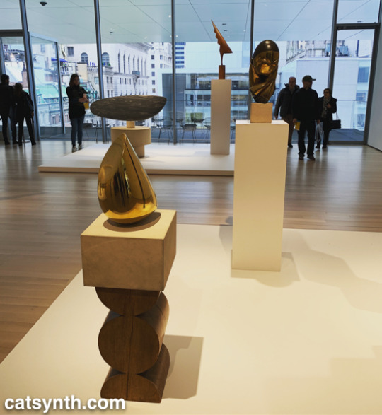
The remainder of the fifth floor and the entirety of the fourth floor housed an expanded and increasingly labyrinthine set of galleries for the permanent collection. The first gallery, which featured the oldest and most traditional works such as Van Gogh and Matisse, was by far the most crowded space in the entire museum. I quickly left to find some more open spaces and truly modern works, which began to appear in the 1910s and 1920s. In addition to Dada favorites, there were works celebrating machines, industry and the break with traditional forms of painting. Francis Picabia’s Dada Movement and Man Ray’s chess set are exemplars of these directions.
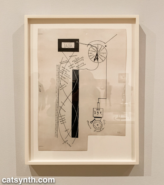

Georges Ribemont-Dessaignes‘ Silence depicts a musical instrument attached to machinery, perhaps speaking to the contradictory nature of music made by machines.
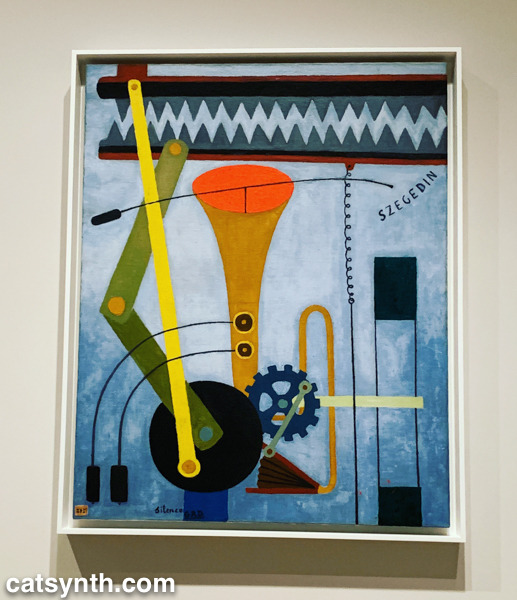
There was also a lively world of modernism and abstraction in Russia before the 1917 revolution, as exemplified by Kazimir Malevich’s minimalist Supremacist Composition: Airplane Flying.
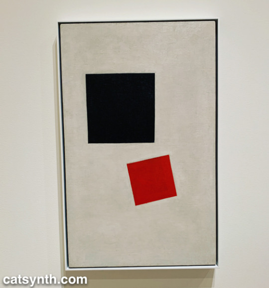
The expanded galleries included a room of design pieces from the interwar period (these were previously displayed in the separate design gallery on a rotating basis).
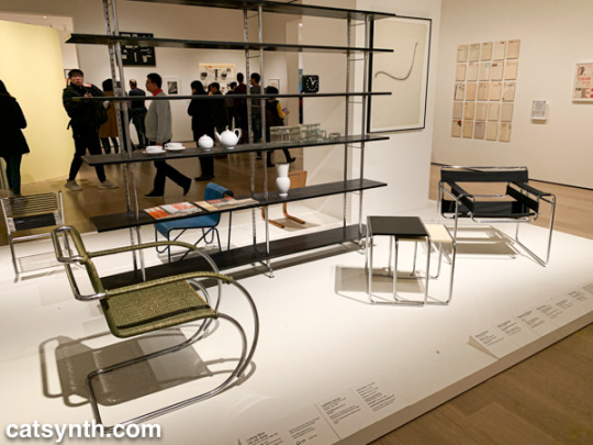
There was also a new space devoted to so-called “outsider artists” of the period, including Morris Hirshfield. I was particularly drawn to his portrait of a white cat titled Angora Cat.
The collection continued on the fourth floor with the period between the end of World War II and the 1970s. This is usually my favorite section to linger in, with many iconic works of the 20th century. The Jackson Pollock’s are of course back on full display, but so is Lee Krasner, who is finally getting her due as a leading abstract expressionist painter.
The expanded galleries have given more room for women and other underrepresented artists. The photography of Helen Levitt was featured in a room that also included artists depicting life in Harlem in the 1950s. I particularly liked this photograph of hers with a black cat.
This sculpture by Barbara Hepworth is quite minimal, with the perfection of the sphere balancing with the “squishier” curves of the taller element.
There were also pieces that showed the works of artists beyond their most well-known. I would not have guessed this painting with other-worldly plant-like creatures as the work of Mark Rothko were it not for the title card.
There were of course pieces that did exemplify artists as we know them. Ellsworth Kelly had large geometric blocks of color, as one would expect.
I looked around these galleries in vain for perhaps my favorite work in the collection, Piet Mondrian’s Broadway Boogie Woogie – it’s like visiting an old friend when I see it – but it was nowhere to be found. [Spoiler alert: I did eventually find it and it will be featured in Part 2 of this series.]
As we move into the late 1950s and the 1960s, abstract expressionism gives way to more conceptual art and works in different media. This was the beginning of Fluxus, with its instructional pieces, happenings, and ephemeral works on cheap materials. There was an entire wall of “scores” for performance works by Yoko Ono. These are always fun – most have clear instructions that one could use to perform them today, though I wonder what was expected from the large black dot.
This is also the era of Nam Jun Paik’s experiments with analog video. Zen for Television takes video art to its most minimal, with a single line of a continuous signal on the screen. However, the vintage television set itself becomes a specific idea when viewed in the 21st century.
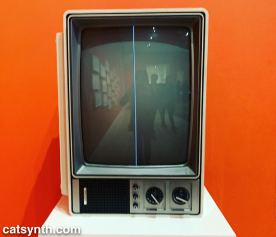
Abstract designs persist in this period, but also take on an industrial and repetitive nature. Sol Lewitt takes this to the extreme, but others Geraldo de Barros left room for variation, and perhaps to the works on paper from Fluxus.
Among my favorite photographers of this period are Hilla and Bernd Becher. There work depicting old industrial buildings and placing them into artistic compositions has been a huge influence on my own photography.
Even after this whirlwind through three floors, seven decades, and multiple exhibits, there was still much of the museum to cover; and I was determined to cover the entirety in one day. In the end, I succeeded, and the remainder of the visit will be covered soon in Part 2 of this series.
MoMA 2019, Part 1: Surrounds & Permanent Collections was originally published on CatSynth
#Art#barbary hepworth#constantin brancusi#dayanita singh#ellsworth kelly#francis picabia#georges ribemont-dessaignes#geraldo de barros#haugue yang#helen levitt#kazimir malevich#lee krasner#man ray#mark manders#mark rothko#modern art#Modernism#moma#morris hershfield#museum of modern art#nam june paik#new york#NYC#review#sarah sze#sol lewitt#sou fujimoto#yoko ono#catsynth
0 notes
Text
Uptown, Chicago,1965 NO.31
Bryanna Malandro
Danny Lyon
All of Danny Lyon’s published series are part of a new type of journalism know as “New Journalism”. This type of journalism began in the 1970’s. Photojournalists such as Danny Lyon immersed themselves in their stories. In the past, photojournalists tried to remain objective and removed from the story. Lyons often focused on feelings and became friends with the people he photographed. Some of those he photographed were workers in the demolition of buildings in lower Manhattan. Others were people he met on the streets of Downtown Chicago. He knew their names, their jobs and often the sad stories of their lives on the streets. Lyon had the ability to engage people. This allowed them to be themselves in front of a camera. The two bodies of work that I chose for this project are “The Destruction of Lower Manhattan” 1967 and “Uptown Chicago” 1965.
“The Destruction of Lower Manhattan” is best described as an” urban renewal”. Industries were leaving lower Manhattan and leaving behind a city abandoned and decaying buildings that were falling apart. The financial district moved to midtown Manhattan and fruit/vegetable suppliers moved to New Jersey causing the Washington Street market to close. All that remained in this part of lower Manhattan were 19th century residential and industrial buildings. The buildings were empty and falling apart. The plan was to demolish the buildings and streets of lower Manhattan and build a “new neighborhood”. This neighborhood was designed to attract middle- and upper-income people which was referred to as “urban renewal”.
Danny Lyon realized the end of an era was coming upon us. Lower Manhattan as we knew it would soon to gone as if it never existed. Lyon picked up his camera and began taking photographs. He took photographs of the decaying buildings and the workers hired to remove these buildings. These series of photographs became known as the series “The Destruction of Lower Manhattan”. Lyon took a picture of each building before it was destroyed. Many of the photographs in this series are the only pictures of entire blocks of buildings that were located on Fulton Street and West Street along the Hudson. Many of the pictures in this series are taken with a 35mm camera. Others were taken with a view camera. In this series, Lyon took photographs focusing on the buildings, demolition works and the last remaining people still working in the area.
The 2 photographs I chose from “The Destruction of Lower Manhattan” series are the following:
82 Beekman Street, New York, 1967
This is one of a series of black and white still photographs which document the demolition of older buildings in lower Manhattan, making room for newer and more modern buildings. This picture captures the view of a partially demolished building from an elevated height. It shows men working using a burner to cut the bolts in the cast iron front of 82 Bleeker Street. The cast iron is smashed into pieces with a sledgehammer. Eventually, the building is reduced to a pile of rubble. This picture conveys feelings of coldness and sadness. It is very sad that this beautiful 19th century building is being destroyed and removed. This building has so much architectural detail. The new and more modern building that will replace it could never have the same beautiful curbside appeal.
Staircase, 183 William Street, New York, 1967
This photograph’s emphasis is shapes. The staircase is mostly in a triangular form but also can be viewed as the letter Z. It has clean, concise straight lines. The light, shade and shadow creates warm and cold tones. This picture creates a feeling of order and peace. However, soon after this picture was taken, the staircase was broken apart never to be photographed again. This picture, as well as the series “The Destruction of Lower Manhattan” gives me a feeling of sadness. This area was transformed from beautiful, detail-oriented buildings, to a pile of trash. It is almost like a death has occurred.
In the series “Uptown Chicago”, Danny Lyon used documentary photography taking photographs of people in tough, poor neighborhoods. Lyon returned to Chicago, where he had studied photography. He began spending time on the rough streets of Uptown Chicago. At this time (1965), Uptown Chicago was the home of Appalachian immigrants. He took pictures of the people in this struggling neighborhood. Lyon realized later in his life that there were two groups of people in Uptown Chicago. There were “those that made it out and did well and those that were so addicted and were still there”. This series documents a sad era in Uptown Chicago. It is a series of photographs of young people living in the city. They are still black and white photographs. Typically, we would walk right by a group of kids like this without really focusing on them. These photographs capture a moment in time allowing us to the study the individuals and details of their surroundings.
Uptown Chicago, 1965, Plates 30,31
The young boys in these photos appear to be sloppy. Their clothing is wrinkled, dirty and oversized. Their surroundings seem to be that of a lower-class community. There is discarded garbage on the floor and graffiti on the walls. In pictures 30, the boys seem younger in age than those in picture 31. They appear to lack supervision and direction. I get the feeling they are looking for trouble. The boys in picture 31 appear to be an older version of the boys in picture 30. They may be older in age, but seem stuck in the same spot in life. They appear to not have progressed in life and maybe never will. The two bodies of work are similar in nature in that they are both black and white photos. They both are documentary, meaning they were taken to document a specific time and/or event. Also, they both contain photographs taken in the mid 1960’s. The photographs are all gelatin silver print. This is when a black and white picture is developed using 3 layers- papers, baryta and gelatin. The differences are that “The Destruction of Lower Manhattan” are photographs of buildings. These buildings are being destroyed and can never be put back together again. Their existence is over. The buildings are objects and do not have feelings or emotions. The subjects in the series “Uptown Chicago” are photographs of young boys. Their life story has not been written yet. They have a chance to change their lives for the better. Unlike the pictures of the buildings in Manhattan, they have emotions and feelings.
Works Cited Page
Danny Lyon-Message to the Future
Author Julian Cox
0 notes
Last Seen Blogs

1sthisevenre4l
Vixen

jacksteyvattales
The Abyss stares...

thefunkmachine1
The Funk Machine


beearthive
Bee