#21 layers on my canvas
Text
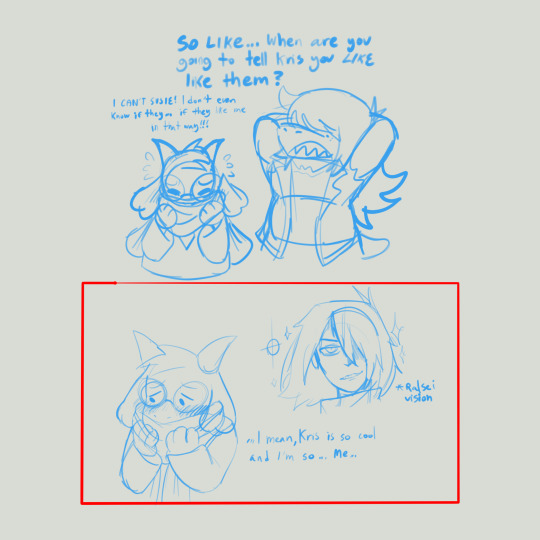
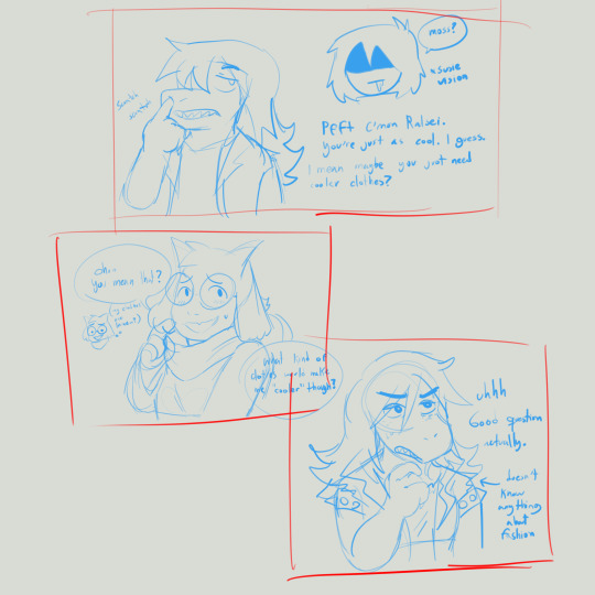
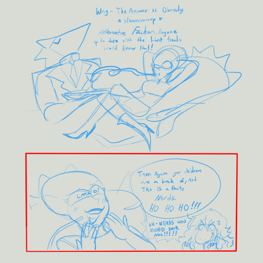
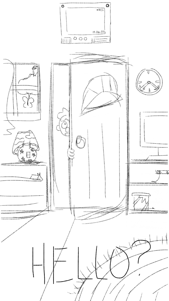
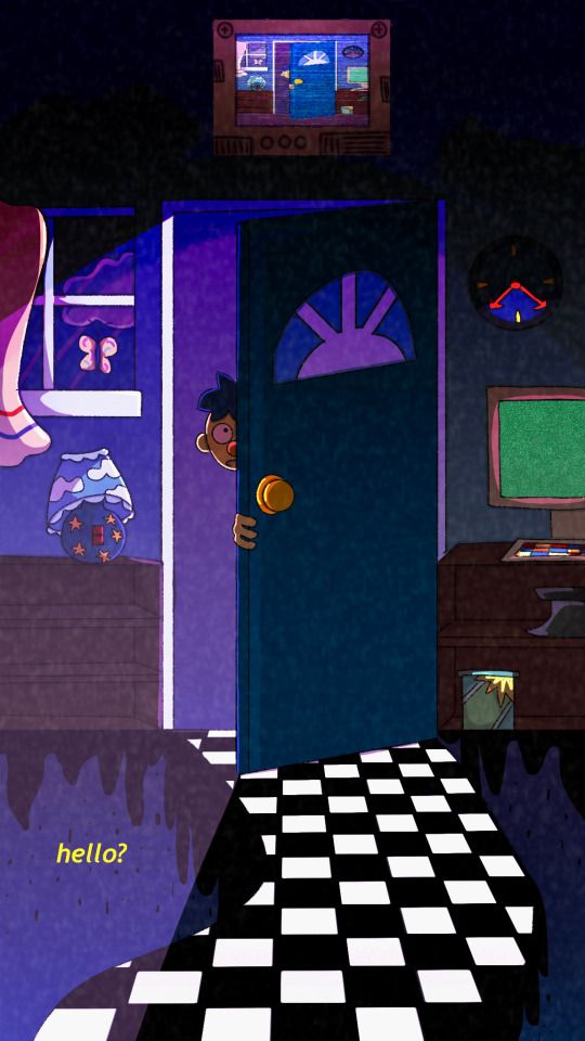
has anyone done this one before/gen
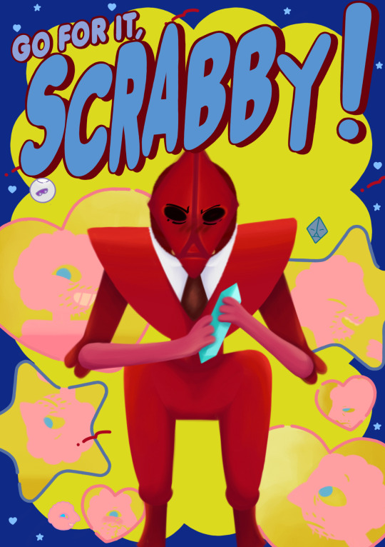
i think it fits him so well he has so much simpery potential/hj
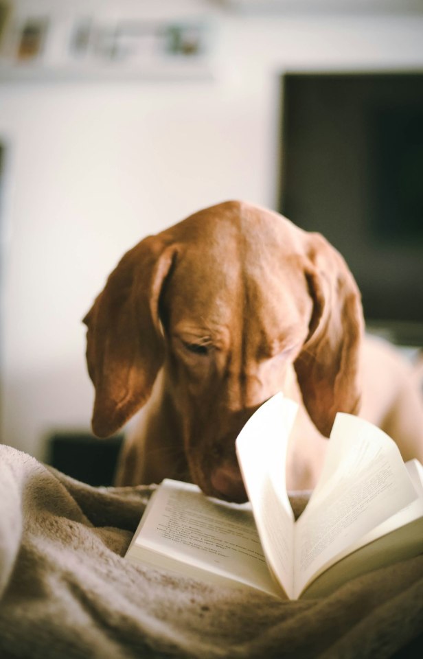
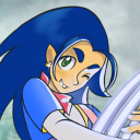
#scarab took up#21 layers on my canvas#prismo took up about 14 i think#miraculously sketchbook didn’t crash#that’s the power of old man yaoi <3#prohibitedwish#prismo#scarab#fionna and cake#at:f&c#my art#LOOK AT MY BLORBOS THEYRE AUTISM :-))))#can you see scarabs teeth i accidentally deleted them and had to redraw them#they took like 30 minutes#i’m never drawing them again/j
241 notes
·
View notes
Text

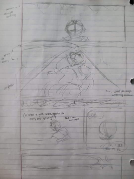
(Wip) I’m about to cook so hard
#art#my art#artists on tumblr#dnd#dnd art#art wip#wip#sketch#dnd sketch#thought it would be fun to share some of my process#I’m currently 5 hours in and I’ve only done about 1/3 pf the lineart#I also slightly fucked up making the canvas bigger because now I only have 21 layers to work with#so pray for me ig#campaign: key to the apocalypse
40 notes
·
View notes
Text
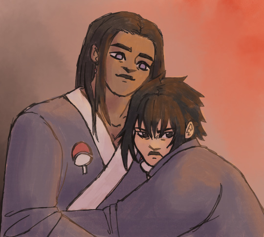
nejisasu doodle! a universe where the hyuuga's slavery bs doesn't get ignored and Neji and Sasuke are better off for it (and also they're married)
#digital art#naruto fanart#artists on tumblr#hyuuga neji#uchiha sasuke#doodle#nejisasu#sasuneji#i personally have hit them with the aspec and qpr beam#but it can be read as romantic lol#sasuke is totally a huge ass brat in a happier world#but like in an adorable and funny way#i really wanted to draw sth digitally so i just went through my sketchbook and drew a scene i liked#also i experimented with brushes a bit because normally i start with a flat ass no texture colour layer#and i think csp did not like that because when i first exported the file it was like 21 fucking MB#like normally my pngs end up around 5 MB#and the canvas was the same size#i figure since there was no real continuous plane of colour more information has to be saved? anyway i scaled the png down by like 50 perce#this is inspired by an au of mine in fact the sketch i adapted was for that au but i decided fuck it#vanilla characers (-ish) it is#yall i cant fucking believe how the hyuuga side branch is treated in the series#and how sasuke is treated!! kakashi fr acts like hes a spoiled brat when his entire family was murdered and he was fucking tortured#and has been alone since he was like 7#yeah he is a bit of an ass but spoiled??#also kakashi fr saying in the prelims that the hyuuga are konoha's best clan like excuse me what dojutsu do u have in ur eyesocket??#its wild ive been reading naruto parallel to writing my fanfic for the first time and its certaintly... something#also the sandaime going like each person in the village is my preicous person uhuh each person except all of the uchiha apparently#and except the hyuuga side branch. and all the people sent on traumatising missions#and all the people he lets danzo kidnap and brainwash#and naruto who he let grow up all alone. and all the people he sends to die fighting for a perpetual cycle of violence :D fun stuff!
16 notes
·
View notes
Text

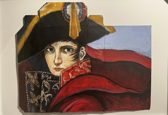
Napoleon Crossing the Alps , painted by me
Start Date: December 22, 2022
approx. 21" x 17" , acrylic + dry watercolour paint , on the back of a cardboard lego box
( art process + close ups + catpoleon in the keep reading )


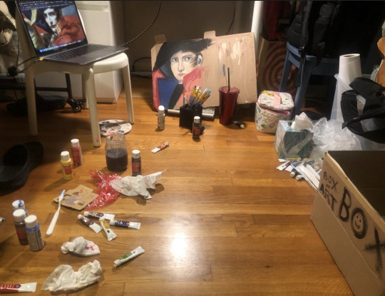
Day 1 stuff
The idea actually started in my history class after my final exam, I sketched Napoleon Crossing the Alps in my history notebook and showed it to my teacher and he liked it so :D I also had a fever while painting this bc my immune system SUCKS but I'm okay now! ( i think?). Funny story, if you look at the picture of my art layout on my bedroom floor, the paints that I used were the watercolour tube thingies that you are supposed to mix with water but I thought they were acrylic so that's why it came out a different texture. So if you actually touch the painting, his face is softer than the rest of the painting, which is pretty cool thinking back on it. This was my first time painting so I didn't have a set up or anything so I just took the floor as a space :0) I also finished a base layer of paint the next day
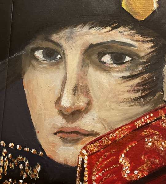
Face close up
I'm actually really proud of the face because it somewhat resembles him... i think. The hardest part was the area around his eyes since the colour always came out too dark or too saturated and stuff. This was the part I used watercolour paint for on accident so I was able to just smooth it out with my fingers and I ended up practically finger painting the face. Also i practically bs-ed the nose and the mouth. I didn't know how to draw either of those things because my former art style was very anime inspired so I would just draw a line and call it a day. I still haven't gotten down how to draw a mouth or nose but it's fineeee
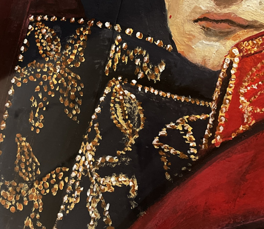
Shiny Jacket Things (idk what they're called)
THESE THINGIES ARE THE BANE OF MY EXISTENCE– literally in the painting, their location is kind of vague so I practically came up with my own pattern. I'm not even sure if I painted this correctly. I started with a yellow but it didn't look shiny enough. But literally a week later I found metallic acrylic paint which is AWESOME so I used a copper colour over the yellow and then added some white for the shine. If i ever paint Napoleon again I literally might just not paint these.
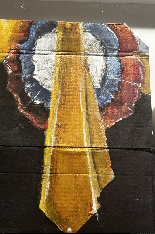
The Cockade
I'm actually really proud of this! This was on the day I found my metallic acrylic paint. I actually did each colour separately so I started with red, then blue, then white, then yellow. The hardest part was painting in the shadow of something that wasn't even on the canvas yet haha. Even though it's not shiny in the painting, i wanted to give it some luster to stand out against the plain black hat so I lightly went over some areas with my metallic paint :D

CATPOLEON >:D
I made the ears in the colours of the french flag on purpose hehe. So i was in my room doing homework and being bored and I thought to myself, what would cheer me up? And the little voice in my head said to put cat ears on Napoleon so I did it !
Final Thoughts:
I think I did pretty well for my first painting! I had literally no idea what I was doing and honestly I think there's something wrong with my paint, but I literally got them at a craft store so that's probably why. Next time, I will not drink the paint water out of curiosity and I'm not gonna paint on the floor since I got paint on my floor. But overall, I'm proud of myself and that's what really matters :D hope you all like it too!
#napoleon#napoleon bonaparte#napoleonic#napoleonic era#napoleonic wars#napoleon painting#my art tag#french revolution#emperor napoleon#painting#original art#illustration#i tried#art#historical painting#french#history#french history#artist#paint#fanart#jacques louis david#jacques-louis david#neoclassicism#napoleon bonapainting#hyacinthart
73 notes
·
View notes
Text
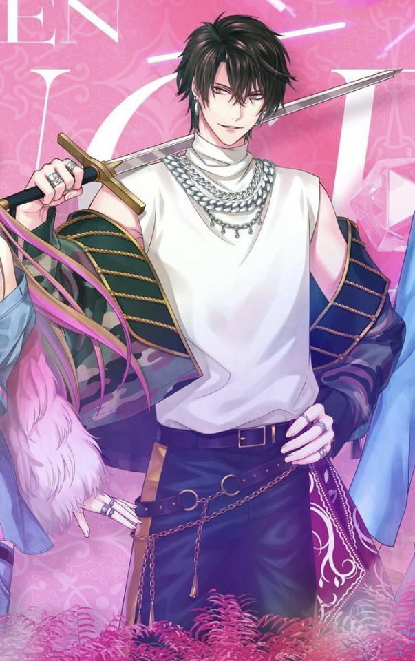
critiquing + ranking the ikepri outfits this year
although no one asked, i just wanted to give my thoughts on them. i’m not a fashion student or anything so perhaps i shouldn’t be writing this but it’s an opinion piece so whatever. also my feelings about the character won’t affect my thoughts, this is just about the outfits. with that said, just know that i don’t really like camouflage; it’s very hard to pull off and too much of it looks a little meh. nobody in the fandom agrees on who looks the best but it’s okay. this is not meant to hate, i am just giving my opinion, feedback if you will. the artists and everyone working on this worked hard and i appreciate their work.

anyways let’s get into it going left to right
first we have gilbert
he’s not the worse offender, but it’s still hard for me to look at and say i like it. the camo is hidden under the layers which i think is nice because it’s more a little more subtle but still central. i don’t get the blue jewels tho is he trying to match with silvio? did he steal it from silvio? anyways i also cant hate the mesh jacket. i was thinking that it should be plain but now i think that his outfit as a whole would look too plain if it didn’t have the designs on them.
i’d honestly rate his outfit a 6/10
next we have clavis leopard guy
idk man this ain’t it. i don’t get their obsession with animal print like i get that it’s their animal crest and whatnot but it’s just ugh😩 it’s a personal thing but i think they’re kinda ugly. bro looks like it’s 2015 and he got that leopard print shirt from forever 21. the purple and the camo together just ain’t it either, despite him having the least amount of camo. i do like that his accessories are cohesive and he’s keeping his multiple belt aesthetic. he said “emma’s showing tummy so im showing tummy too” but overall, the outfit just kinda looks awkward.
it’s gonna be a solid 3/10 for me sorry
chevaliers outfit deserves to be burned im sorry
the worst offender. go to jail do not pass go and do not collect $200. y’all did not just layer animal print with camouflage. in my opinion the prints clash because camouflage is already a busy print with multiple colors. you add that to the tiger print and it just doesn’t make sense anymore. i think maybe it would’ve been more cool if the vest was camo and the lapel/cuff parts were black? or that gold color that’s already on it? i do like the jewels on his cropped jacket tho, it matches his accessories and adds a bit more flavor to that cream white.
-10/10 just no
i’m doing emma this time and i don’t like this outfit
genuinely don’t know what’s going on here. i’m very confused. is the blue parts supposed to be denim? why are there two different animal prints attached to her hip? and why fur? nothing is working together it’s like they were all assigned a group project but everyone misunderstood what they agreed on and they started to work on completely different things and when it was time to present, they just mixed it all together and hoped that it would work. i do like the denim x camo thing tho i think that could work
4.5/10 i think…
next leon
slayed. the camo isn’t in your face obnoxious and it doesn’t clash with the other elements of the outfit. this is definitely leon redemption arc from last year’s outfit. i like that the camo is able to stand on its own! his white sleeveless turtleneck provides a sort of canvas for the camo and i think it’s great. however i don’t really like chunky jewelry/accessories so the chains don’t really do it for me i think it would’ve been cool if they did dog tags or something because they went with a military kind of vibe with the camo.
you know what? 8/10 it was good it’s easy to look at and hard to hate also it’s a big step up from last time.
up next we got licht

i’m not sure how i feel about his blue with the camo. emma’s blue denim thing she has going on looks more grunge and that kinda works with the camo imo. but licht just looks like he could be a university student? there’s a lot of layers and i wonder if he’s getting hot in there 😹 when i first saw it, i was talking to a friend and i said he looks so boxy, he looks like a transformer about to say “autobots roll out” and then transform into a radio or something 💀 also why is he wearing an attach-on fur tail?
there’s some color clashing layers going on and he’s like an onion with all those layers 5/10
finally we have silvio and im tired of this camo theme

at this point i don’t even know what’s going on anymore. there’s so many shades of blue and im not sure i like it. y’all got dark blue, turquoise, and teal, and even his hair is like minty blue? i guess that’s just his aesthetic his color palette. his jacket is sparkly already but he had to add some sparkly jewels too lol. the square patch of camo just feels kind of slapped on there? i know they love their animal prints but maybe swap the Dalmatian print dog collar for a camo bandana? he can wear it around his neck like how dogs do 😹 it also switches it up a bit because literally almost everyone is wearing necklaces and you’re running out of ideas because leon is already doing the chunky layered chains.
4/10 that’s all
also i feel like if they wanted to have some color, they should try some colored camo
so in conclusion:
best
1. leon
2. gilbert
3. licht
4. emma
5. silvio
6. clavis
7. chevalier
worst
29 notes
·
View notes
Text
How to draw in my art style:
1. Put on kikuo
2. Stare at colors you think work well together and try to replicate them
Also 2. Color as close to the colors you want, and if you're in procreate, use curves and color balance stuff to adjust the colors more to your liking
3.lose your mind as you slowly realize that someday you might have to work a 9-5 if your art doesn't take off
4. Take a shower and cry underneath the water as you sing sad songs under your breath that you forgot the words to so you end up going "umm blahalasbak sob sob oh yay chorus time"
5. Go back to your art and then transfer that slight feeling of insanity and sadness into if
6. Use an overlay layer as shadows :D put blues and purples in those shadows, then on the lighter side use yellows and pinks
7. Find random texture brushes and experiment with those
8. Realize holy shit I have to pee
9. Get distracted for 3 hours straight
10. Try to draw again but your cat is now sitting in your chair so I guess you can't draw anymore
11. Throw your cat to assert dominance
12. Use some kind of hard light or vivid light layer or something and then take saturated colors and SCRIBBLE EVERYWHERE
13. Have fun, take a couple drinks of water and make sure that Kikuo music is still playing so the drawing is the most amount of crazy
14. Get curious about what the Kikuo lyrics are about, look it up, and then have to sit in your chair thinking "why the hell was I dancing to that holy shit."
15. Think about those lyrics and, I quote, "what the hell" while scribbling more (make sure youre having fun"
16. Make sure the lineart is still visible. If not, just redo it with a dark saturated purple on multiply
17. Realize you forgot to flip the canvas. flip it, and have a mental breakdown
18. Reconsider why you even are trying to do art in the first place
19. Fix it up. Oh wow that looks better good for you
20. Post it online and then get positive feedback and go >:D
21. Realize holy shit I forgot to fix that and then spin in circles in a spinny chair until you start to feel sick
22. Get distracted for the rest of the day
AND THATS MY SECRET GUYS!!! I HOPE THIS HELPS YOU GUYS MAKE SILLIER ART!! MAKE SURE TO PUT YOUR EMOTIONS INTO THE DRAWING AND GO CRAZY!!!
9 notes
·
View notes
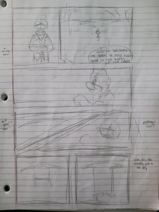
Text
Not an official comic update but I always feel bad deleting the OG sketches of the pages that are already finished, so I am dumping them here! take it as some sort of Director’s Cut (lol)
(This is mostly a post for me tbh)
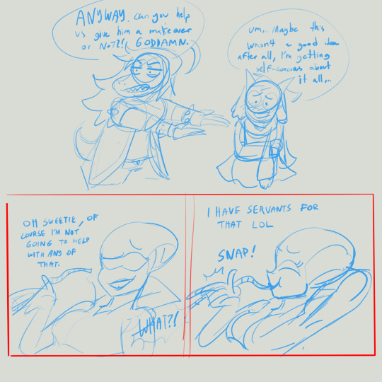
[sketches for pages 1 to 7]
I did all of these in a single procreate canvas, so uh that’s why I have had to delete the og sketches in order to stop running into the layer limit lol…
Anyway, seeing these vs the final pages makes me really proud of my progress haha (but damn my sketches are super messy as ever)
Will probably post a similar collection in the future once we reach page 14 (in case you’re wondering, I’ve sketched up to page 21! I think the comic will end up being 21 to 30 maybe pages in the end. Exciting!)
I just hope to land the ending in a way that satisfies me. And soon because the moment toby announces chp3 my life will be over (aka my vague canon setting will dissolve).
So yeah!!! Here’s to me working a bit faster on The Makeover comic! 🥂 (Its official title in my mind lol)
21 notes
·
View notes
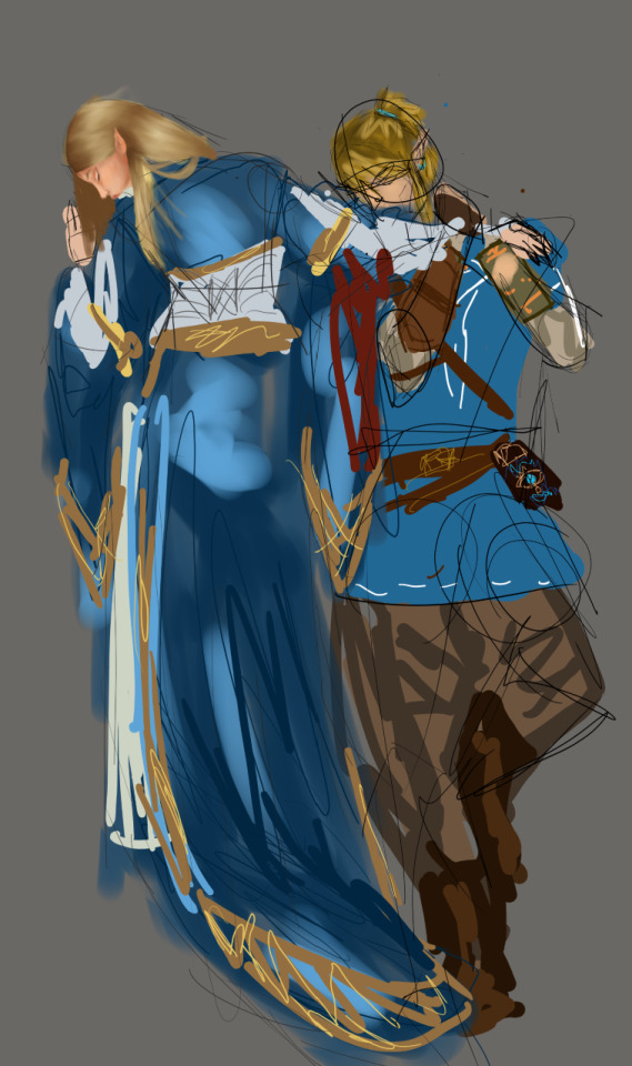
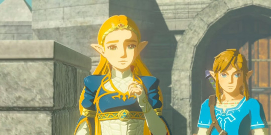
Text
Redoing an old zelink wip in honor of Tumblr's collective reembracement of zelink!!! Uder cut, discussion and pictures.
Based on the piece Meeting on the Turret Stairs. first one is the old one started december 2022, second is new started last night. New one is a lot rougher and obviously I have BARELY started it, I'm still working some of it out placement-wise (mostly zelda's sleeves tbh, hence everything being messy and easy to erase and recreate), and I think I'll still use the face from the old one, just recolored a bit. working on the hair now. PLeasantly suprised to see that even my rough sketch planning/colorblocking has improved by a lot since dec 21! Still not the msot legible but leagues better for the purpose it serves. Most notably, I chose to be more faithful to their in-game outfits. I chickened out on the original because I lacked the skill and patience, but I've come a lot farther now and feel up to the task. Also, I've learned that when doing intricate detailwork like hair, maybe don't work on a canvas that's only 1k by 1.4k. Looks okay from a distance, gets pixely real quick, especially around the 'smooth' edges. My main issue right now is figuring out which parts of zelda's dress are metallic and which aren't, honestly. is all the yellow part metallic??? just the arm bands and belt thing???
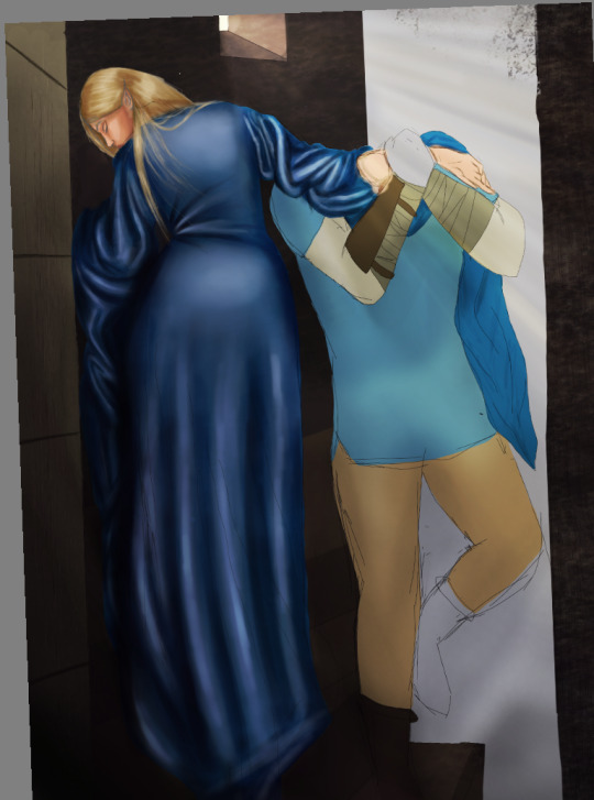
^^metallic questions!!!!
Also of note, all of the first one is done without clipping layers, mask layers, overlay, any of that shit. How??? NO IDEA. I could not do it again. Wouldn't want to. equal parts impressive and ridiculously hard for no reason other than ignorance of how digital art actually works.
8 notes
·
View notes
Note
1, 9, 21, and/or 23!
1: How would you describe your style?
uhhhhhhh crunchy. scrungy. round. i WISH it was angular but it is not. it's like part soft and part grainy??? i don't know?????? oh yeah and don't forget the Warrior Cats Taught You How To Draw, Didn't It
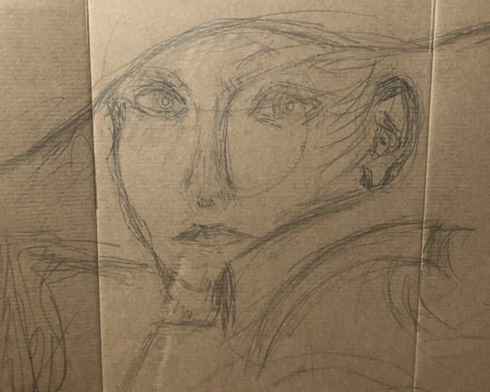
9: Show us a finished piece right alongside the original sketch.
OH NO i usually delete my sketch layers (because contrary to the intended use of the program, i MUST have at least fifty layers of complete images per canvas and uhhhh lots of merging going on there. so that i don't get lagged to hell) BUT HERE'S A FEW I'VE SALVAGED
i don't remember what part of the comic this was supposed to be
drawing from!!! ten months ago. oh jeez
there's another ten months ago one
oh and here's some panelling for part (i think 21?) of my comic, i think this counts
21: Something you would like to improve on?
everything lol. but AT THE MOMENT i really really really want to get better at composition and a variety of perspectives and how to give more depth to an arrangement of figures AND how to draw more expressive movement/poses. i'll work on it!!
7 notes
·
View notes
Text

finally took off the limiters (read: plugged in my tablet instead of just drawing on my phone) so i got to use layers and select tool and an actually workable canvas size so i started with hc/design stuff for the captain. chickenscratch transcriptions and elaboration under the cut. (this old agent 3/captain's name is typhoon and they use they/he!)
it is once again a late-night drawing/posting moment where im choosing to post immediately instead of potentially just not releasing anything bc i got cold feet after waking up the morning after. i'm making an effort to make sense but if anything is not comprehensible or you just want more details, the ask box is open. i'd love to talk about what ive got for any of my characters so far! moving along in about the order i drew/wrote things in, let's start here

left text: "10-year consecutive 'worst posture' award winner."
right text: "(its okay they don't have bones)"
i started off drawing them doing The Thing that is captain's idle pose for the majority of the game but i didnt like the first sketch so i was like "okay i want a Good line of action and then im gonna build around that" and this is what came of it. they just like extremely twisted around and would absolutely be destroying their spine if they had one bc that was just the flow of the sketch apparently. i was gonna also color this but i didnt really like how it was going and i started losing the details of the pose the longer i went (i dont really like how the look of the clothes came out and it probably shows) so i just kind of left it.
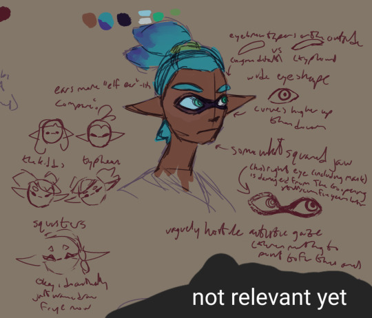
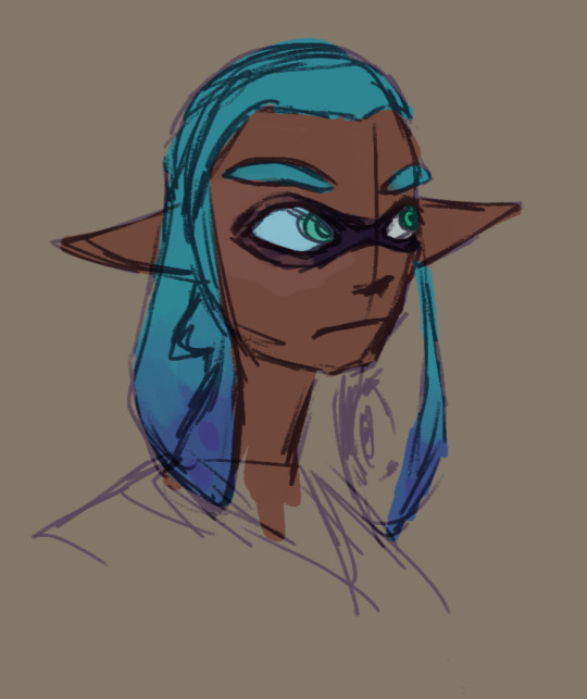
right text (it was written first) 1: "eyebrow tapers on the outside / [drawing of a default masculine inkling eyebrow from a front-facing angle, labeled:] in-game default / vs / [drawing of typhoon's eyebrow from the same angle, labeled:] typhoon"
right text 2: "wide eyeshape / [drawing of typhoon's eye from the front without the accompanying inkling mask] / curves higher up than down"
right text 3: "somewhat squared jaw"
right text 4: "(his) right eye (including mask) is damaged from The Goopening still, even five years later"
left text 1: "ears more 'elf ear'-ish / compare"
left text 2: "the kiddos [representing the overall player inkling design, roughly 14]" / "typhoon [who is 21, as they were 14 during the events of splatoon 1, which was 7 years ago now. i dont want to get super long-winded in the middle of transcription so hold these tidbits for a second]¹
left text 3: "squisters"
left text 4: "okay i do actually just wanna draw frye now"
bottom text: "vaguely hostile autistic gaze (there is nothing to point to for this one)"
ive been doing a lot of jumping around fleshing out my splatoon ocs (which currently consists primarily of my agents) and like essentially reentering my splatoon mind. to start with, each of my player agent ocs were on some level self-inserts of differing amounts (i mean theyre literally like. inkfish you to a certain extent. like in many respects theyre pretty much blank slates by design (or lack thereof as promo material just uses one of the default options which are by no means mandatory given the whole player settings screen existing and yknow. being acknowledged. you get it right)) but by now they're pretty separate. there are some more overarching themes to them though that im keeping in, like a sort of longing for identity in the transition from teenager to adult where others seem to be more realized. if that makes sense. finding and wrangling with one's senses of identity and purpose so far is a thing for all of these guys. gee i wonder where that came from. anyways the thought i had to like cut out for flow is actually not going to be that great to do that to bc i was thinking i'd segue into that but i didnt like this next part is more of a design thought
¹my current working hc which informs the designs of my splatoon ocs so far includes the idea that ear shape is something that can vary not just from person to person but also with age and that the thinner, pointed, more traditionally "elf-like" ear (seen in the squid sisters, grandpa cuttlefish, and frye, as examples) might be more common the older an inkling is, compared to the blunter, more equilateral triangle-ish shape from the younger player inklings and others. of importance, this isn't hard and fast, not even to typhoon's design, as i can also very easily come back to it later and be like "hm. yeah i dont actually feel like doing this for them", but i was thinking about the ear shape from that inkling development chart from however many years ago and was like .. okay actually i don't remember what i thought in detail im really about to conk out honestly. but for example, dallas (my agent 4), who's just 2 years younger doesn't have the elf-y ears either (well hes not supposed to, but i dont think it really showed last post 💀) because that's just not how his ears look or will look (likewise for a less fleshed out non-agent character who is also an inkling and of a similar age). not to mention, of course, the many band members who are inklings with the triangular ears, as the idea is again that the elf-ear look becomes More common with age, not that it Is common immediately. even still, though, typhoon's ears arent the exact same shape as callie and marie's either, but more sort of in between them and the player inklings. all this to say, my goal is in part to have some variety more particular to splatoon than just general humanoid frame things outside of the hairstyles bc thats something that i have struggled with and so as it stands im basically tossing things at the wall to see what sticks and either working from there or tearing it all down and starting over.
anyways i like to also draw typhoon's tentacles down. the shapes are fun. sometimes they want them away from their face but sometimes they don't care
long-ass tangent aside, here comes another one unless i immediately decide i would rather be asleep now that it's almost 3am

left 1, ripley (new agent 3): "Are they... okay?"
left 2, callie: "Oh, they're just like that!"
right: "Actually just kind of spacey, they give off a sometimes imposing energy. Bad at communicating otherwise, they tend to just kind of go with it. Overall naturally deadpan, surprisingly oblivious a lot of the time."
i dont know why i started going pokedex mode there but i do know it was before 1am when i wrote that. i have a Bunch of shit written down in various places (personally. i don't have very much more than the barest introductory stuff up yet bc of the fact that im still ironing out a bunch of these things) and it was at this point that i realized i cant really distill it into notes but i'll explain a little bit. splatoon 1 was huge for me as a budding artist and someone like. beginning to actually Think about things? it was the first thing i really found myself world-building with, it was a huge factor in me having realizations about myself, and even if retroactively so (after all, taunt parties were a thing in brawl and i played the shit out of that), got me thinking about video game communication and (likely not the right term) pseudo-languages and a whole bunch of other things. some of these don't directly relate to typhoon's development but what does relate to it is .. oh the train of thought literally disappeared actually. uh.
the text next to the signature: "back at it again with the clipped studio at fucking midnight" [it is 3am now]
oh yeah right shit. neurodivergence. as was bestowed unto me, i hath bestoweth It upon Mine Cephalopodes. that was the train of thought probably. i took the way i end up just kind of Not looking when i start thinking sometimes and exaggerated it to be possibly a little unnerving bc i just think it would be fun to have typhoon just end up looking accidentally a bit creepy bc shit man i be feeling like that sometimes. he just like me fr. i have more words but not the time im sleepy honk shoo
#my art#sketch#colored sketch#splatoon#csp#yeah FUCK you samsung notes (im going to be back to it in a week if even that)#im baring my three squid hearts to yall a little with this one so please dont make 2am me regret this okay? alright? okay.#but yeah this is a warning the section under the cut is long as hell so genuinely buckle in i guess#i bolded the starts of the transcriptions but thats about all i can think to do without messing dangerously with formatting
2 notes
·
View notes
Text
Index of work
this presents a list of all posts on my tumblr for Year One Semester One of LSAD, organised by category, and may be helpful for navigation or to gain a quick overview
posts are present in reverse chronological order
reblogs can be found @k00282417-reblogging
please click "keep reading" to view the index
"TEMPORARY" Project
05 Jan '23 - project statement and y1s1 reflection
15 Dec '22 - display of work for assessment
12 Dec '22 - clay mask with painted eyes
12 Dec '22 - finished risograph prints
11 Dec '22 - pen and ink for riso (full inks)
09 Dec '22 - pen and ink for riso (lineart)
07 Dec '22 - clay mask
06 Dec '22 - acrylic painting on canvas
06 Dec '22 - sketchbook work: planning painting and swatches
01 Dec '22 - sketchbook work: moretta portrait sketch and text
29 Nov '22 - sketchbook work: eyes moretta with text
27 Nov '22 - masquerade - digital painting
25 Nov '22 - embroidery on patchwork
22 Nov '22 - A2 charcoal sketch
20 Nov '22 - sketchbook work: spider diagram
08 Nov '22 - video clip collage, DaVinci Resolve
06 Nov '22 - sketchbook work: life drawing and typography
29 Oct '22 - digital collage / typography, inspired by Jenny Holzer
27 Oct '22 - dark/light animated gif
27 Oct '22 - photography, digital art and collage
27 Oct '22 - colour/colourless animated gif
26 Oct '22 - sketchbook work: planes of the face and wire experiment
24 Oct '22 - fabric mask experiment
23 Oct '22 - plaster mask 2
19 Oct '22 - plaster and papier-mâché moretta mask
19 Oct '22 - sketchbook work: life drawing and mask ideation
11 Oct '22 - decorative net deconstruction video
11 Oct '22 - decorative net, knot work experiment
05 Oct '22 - sketchbook work: spider diagrams on "temporary"
04 Oct '22 - experiments with throwing wheel
30 Sept '22 - "RADIUS" group project
Reflections on Workshops
28 Nov '22 - layer and colour separation (risograph)
28 Nov '22 - photoshop video editing and animation
14 Nov '22 - filo constructions
14 Nov '22 - introduction to photoshop and animation
20 Oct '22 - fabrication workshop and 3D printing
10 Oct '22 - photography and light
03 Oct '22 - drawing with clay
03 Oct '22 - blind contour drawing
Reflections on Seminars and Lectures
24 Dec '22 - Reflection on Drawing Seminar
23 Dec '22 - Reflection on Creative Recording Seminar
23 Dec '22 - Reflection on Colour Seminar
21 Dec '22 - Reflection on 3D Studies Seminar
20 Dec '22 - Reflection on Form Development - Clay Seminar
19 Dec '22 - Reflection on Relief Print Seminar
19 Dec '22 - Reflection on Typography Seminar
25 Nov '22 - Reflection on Composition Seminar
10 Nov '22 - Reflection on Paul Madden lecture
Art and Artist Research
05 Jan '23 - Barbara Kruger (research began 04 Nov)
04 Jan '23 - Jenny Holzer (research beginning unknown)
02 Jan '23 - David Curcio (research began 04 Nov)
03 Dec '22 - Renaissance (2006), dir. Christian Volckman
25 Nov '22 - Nobuyoshi Arāki (research began on 14 Oct)
23 Oct '22 - The 'Moretta' or 'Servetta Muta' Mask Research
14 Oct '22 - quote excerpted from Katy Kelleher's article on the history of Verdigris as a colour
06 Oct '22 - Janine Antoni
2 notes
·
View notes
Text
Blooming Flower Power: iPad Coloring How-To & Free Downloadable Pages To Brighten Your Day
New Post has been published on https://aisdesigns.gift/blooming-flower-power-ipad-coloring-how-to-free-downloadable-pages-to-brighten-your-day-21/
Blooming Flower Power: iPad Coloring How-To & Free Downloadable Pages To Brighten Your Day
Coloring by number on an iPad offers a digital and interactive twist to the traditional coloring experience. With a multitude of coloring apps available like Procreate and places to download coloring sheets like on Creative Fabrica -OR- like these free coloring books here in my shop, users can choose from a wide range of beautifully designed templates, intricate patterns, and vibrant color palettes.
https://youtube.com/shorts/0Te3lV7zBdA?feature=share
Visit Art+Science Designs on YouTube
-Coloring Pages by Creative Fabrica-
To download color-by-number pages from Creative Fabrica, you can easily access a wide array of engaging and beautifully designed templates that cater to all ages and preferences. Creative Fabrica offers a user-friendly platform where you can browse and select from an extensive library of coloring pages, each featuring intricate designs and numbered sections. With a few clicks, you can download these pages in various formats like PDF or image files, making it convenient to print them out and start coloring. Whether you are looking for relaxing adult coloring sheets or fun and educational activities for children, the Creative Fabrica collection of color-by-number pages is a valuable resource for creative enthusiasts of all ages.
–Coloring on an iPad in Procreate–
Procreate is a versatile digital painting and illustration app for the iPad that can be used for various creative purposes, including coloring by number. To create a color-by-number image in Procreate, you will need to follow this outline:
Open Procreate
Unlock your iPad and locate the Procreate app on your home screen.
Tap on the Procreate icon to launch the app.
Create a New Canvas in Procreate
Once Procreate is open, tap the button in the upper right corner to create a new canvas.
Choose the canvas size and orientation that you prefer. For coloring by number, you can choose a standard square canvas.
Download & Import or Create Your Image
Sale Product on sale
Flower Coloring Book Page in Volume 2 | Edit In Canva | Hand Drawn, Ready-to-print Digital | Purchase Includes Up To 30 Bonus Pages
$2.00 $0.00
Add to cart
Sale Product on sale
Flower Coloring Book Page in Volume 2 | Edit In Canva | Hand Drawn, Ready-to-print Digital | Purchase Includes Up To 30 Bonus Pages
$2.00 $0.00
Add to cart
Sale Product on sale
Flower Coloring Book Page in Volume 2 | Use In Canva | Hand Drawn, Ready-to-print Digital | Purchase Includes Up To 30 Bonus Pages
$2.00 $0.00
Add to cart
You can either import an image to color by number or create your own. To import, first get my flower coloring book for free. Then, tap the “Actions” (wrench) icon, then “Add” > “Insert a Photo” and select an image from your device. To create your own image, you can use Procreate drawing and painting tools.
Add Numbers
Select the Text tool by tapping the “Aa” icon in the toolbar.
Choose a color for your numbers. For coloring by number, it is common to use black.
Add a number to each area you want to designate for a specific color. You can do this by tapping on the canvas and typing the number.

Create Separate Layers
To make it easier to color each section, create a separate layer for each number. To do this, tap the layer icon (two stacked squares) and then tap the icon to create a new layer. Name each layer according to the number it represents.
Make sure you draw or color within the appropriate layer for each number to keep the sections separate.
Start Coloring
Choose the color you want to use for a specific number by selecting the color from the color wheel or the palettes.
Use the drawing and painting tools to fill in the areas with the corresponding numbers on the appropriate layers.
Repeat for Each Number
Repeat the process for each number, creating a new layer for each color.
Save Your Work
To save your progress or the final colored-by-number image, tap the wrench icon (Actions) and select “Share” or “Save.”
Export or Share Your Image
You can export or share your colored-by-number image as needed. You can send it to friends, post it online, or use it for various creative purposes.
Remember that Procreate offers a wide range of brushes and tools to enhance your coloring by number experience, so feel free to explore and experiment with different styles and effects.
0 notes
Text
bio/cv
BIO: Born in 1994 in Genova, Italy to two Ukrainian immigrants. Veronica has found herself to be attracted to the world of art since an early age. interested in music, painting, sculpture, drawing and in the recent years; digital media. In 2017 she moved to Aberdeen in Scotland and started studying at gray's school of art in the contemporary art practice course. She started specialising in video, digital art, and installations. Her passion for sound art and electronic music has moved into a discovery of the art of vjing. After graduating in 2021 with First Class Honours she has moved to the city of Edinburgh to continue her art career. Veronica also freelances as a poster and cover art designer.
Veronica is part of the audiovisual duo mutomajor, of the creative collective PowerPot and Ukrainian events and radio Pentane Cast.
🦠 Live VJ sets- Hanoi Monsoon Fesival, 21 and 22/10/2023
🦠 Live performance and installation - The Field of Heritage, Monsoon Festival, Hanoi Vietnam 15/10/2023 (British Council x Vietnam Season 2023)
🦠 Live VJ set - Animal Farm: Klangkuenstler, SWG3 Glasgow, 15/09/2023
🦠 Live VJ set - Microsteria. 17/03/2023 Summerhall, Edinburgh
🦠Spotify canvas + album art for Narciss and Nasty, released by Warner Music 02/2023
🦠Boiler Room video for Transmoderna / Dixon , 02/2023
🦠Live VJ set for Myriad, as mutomajor, Glasgow 21/10/2022
🦠Live VJ set for Plant Bass’d - DJ MELL G, Glasgow 14/10/2022
🦠Visuals/performance for EYVE, Cryptic Nights, Glasgow 13/10/2022
🦠Live VJ set Edinburgh Disco Lovers 01/10/2022
🦠Live VJ set for Cultivate Festival, (LF SYSTEM, Patrick Topping, OBSKÜR, Airwolf Paradise, Rebuke, etc) Aberdeen 24-25/09/2022
🦠Live VJ set - Shoot Your Shot - fka.m4a, Glasgow 17/09/2022
🦠Live VJ set - Circle, EPiKA , Edinburgh 17/06/2022
🦠 Commission for Fermnywoods Contemporary Art “Lisovyk” 05/2022
🦠Live visuals for TontoTechno at Mash House, Edinburgh, 21/05/2022
🦠Live visuals for CULTIVATE festival in Aberdeen 15/05/2022 (visuals for Hannah Laing, Liam Doc, Ross from Friends, SKREAM)
🦠 HERETIK audio-visual live performance at Sonica Festival, Glasgow 10/03/2022
🦠Group Exhibition Gray’s School of Art, Virtual Degree Show 07/2021
🦠 Group Exhibition “Subterranean Virtualscapes” showcasing Italian Digital artists - Virginia Bianchi Gallery 07/2021
🦠 Interview and cover of a-n Degree Show Guide 2021
🦠 Open Call- Sonic Bites (Cryptic) 06/2021
🦠 Art Residency @ Agora Digital Art 02/2021
🦠 Video for tracks: Shawn Cartier , Mod-R , RECON , Kaiser , mk54 , Franck
🦠 Live streams during UK lockdown (Eclipse Lunar , RARE Thursday, TWS , TLF)
🦠 Pre-Degree Show (Gray’s School of Art 2020)
🦠Live VJ set- Monami 003 13/03/2020
🦠Curator for Monami 003- Digital Art Exhibition 13/03/2020
🦠Live VJ set- Bohemia: Asquith (14/02/20),Tunnels Aberdeen
🦠RE:Liminal (Art Gallery) exhibition, Aberdeen 31/01/2020
🦠Live VJ set- Re-Analogue Festival (01/02/2020)
🦠Live VJ set- Monami: IDA (17/01/2020)
🦠Live VJ set - Monami launch night (30/11/2019) Tunnels, Aberdeen
SPAMM.fr featured video 2019
🦠SKO-SCO exhibition in Skopje, Macedonia Jan 2019
Artist statement: I am researching in-depth the issues of filters, selfies and social media curation on people’s psychology and self-esteem. I’m looking into selfie dysmorphia or also known as Snapchat dysmorphia, a psychological condition that causes an individual to prefer the “filtered” version of themselves.
I like to integrate aspects of club culture and underground electronic music which have become a huge part both of my life and my art practice. I want to merge the two together creating a 360º experience for the viewer with uses of vibrant videos and visuals, sound art and electronic music composition.
Corrupting and glitching files is an ongoing theme in my artwork, I want to continue to integrate that into my projects. Together with programs such as “TouchDesigner” I can add yet another layer of distortion to the piece. Through that type of node coding, I can change the reality of the artwork even more giving it another aesthetic and meaning. Combining gifs and altering ready-made videos creates a digital surrealist re-elaboration of existing work. This “recycling” of video material brings a new life to files lost in cyberspace, giving them another opportunity to tell another story. I like to edit the videos I’ve corrupted and created in Premiere Pro, this gives me the opportunity to put together a narrative of these diverse clips.
With the addition of sound art, it creates an audio-visual experience for the viewer that will transport them into a digital world full of glitching colours and powerful images.
Program knowledge: Adobe Photoshop, Adobe Illustrator, Adobe Premiere Pro, TouchDesigner, Spark AR, Blender, Audacity
1 note
·
View note
Text
FAS3000: Secondary Artist (for digital print)
Peter Blake
For my digital print workshop I have chosen Peter Blake’s work to inspire my future samples. Blake uses vibrant coloured images from pop culture and collages it with fine art to illustrate modernity and nostalgia within his digital prints. The images he uses are vintage and nostalgic to collage them together with some illustration for the background to show the blend and relation of nostalgia and modernity (where things constantly change). I am inspired by his layering of small cut out images on top of a big image/illustration, which serves a canvas for layering and tell his narrative.
He also uses contrasting vibrant colors to represent nostalgia and modernity and so I felt like it would suit my theme of the coexistence of plants and buildings. Peter Blake was born in Dartford, Kent and went to Gravesend Technical College school of arts and the Royal college of arts. I chose Blake to inspire my digital prints as he uses some illustrations for the background, whilst, using vibrant coloured images on top to show contrast, and thus this technique will help me visually communicate mu narratives of the coexistence of plants and buildings by using my primary images and cut out coloured shapes to show contrast. I will use this technique as an inspiration in my sample, except perhaps making my primary image as the background (illustration) and then cut out shapes like rectangles (as reflected in the primary images with the shape of the bricks and pattern) and put on top to show the juxtaposition between them. The colored blocks and leaves would become more vibrant when heat pressed as there won’t be multiple colours or patterns on top to stop the concentrated area of the color, compared to an image where there are a lot of colours and patterns and so would end up less vibrant and than just a block of colour as there is a lot going on in the image, and so this would show contrast and visually communicate the coexistence of plants and buildings. Peter Blake also could relate to my narrative as he uses collages of illustration and images in his work to visually communicate his story, and so this links to the collage prints that I want to do in print workshop where I combine my primary images and previous samples together. 
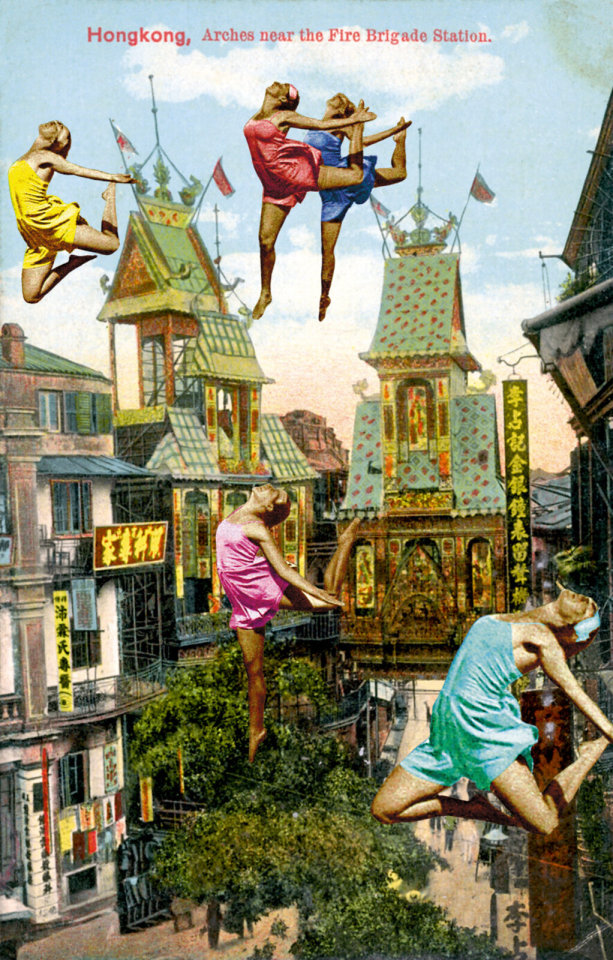
Peter Blake. (2011) Dancing Over Hong Kong. Digital Print with Silkscreen Glaze. 39 x 28 x 2/5 in 99 x 71 x 1 cm. Edition of 88. Available at: https://www.artsy.net/artwork/peter-blake-dancing-over-hong-kong [accessed 25 October 2023]

Peter Blake. (2010). Paris- Man Up. silkscreen on somerset tub size 410 gsm. Image size 38 x 21.5cm, 22 × 14 3/5 in | 56 × 37 cm. Edition of 100. Available at: https://www.artsy.net/artwork/peter-blake-paris-10-man-up [Accessed 25 October 2023]

Peter Blake. (2010). Paris- Butterflies II. Image size: 38 x 21.5 cm, 21 1/2 × 14 3/5 in | 54.5 × 37 cm. Edition of 100. Available at: https://www.artsy.net/artwork/peter-blake-paris-butterflies-ii [accessed 25 October 2023]
0 notes
Text
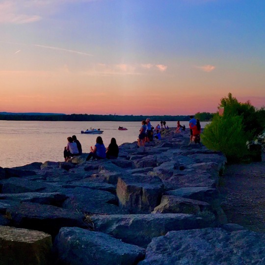
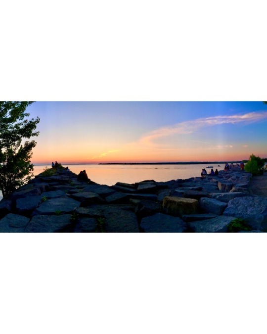
APP’s R great 4 posting panorama photos. It splits the pic into however many pieces U like. My pano was shot manually on my iPhone & horizon isn’t completely straight. So I adjusted the split photos so I could make the horizon level. Once U post the sliced pano & swipe left the image looks continuous & lines up perfectly, that is if the pano was shot perfectly level. A few APPs I’ve tried out to slice the pano photo vertically is Panorama Crop & PanoraSplit. I liked the PanoraSplit over the other. For this platform we can’t post post photos in a sequence or 3 across but U can see what I meant by looking at the 1st pics they line up exactly in the right place to view the 2 together as 1 photo would be.
APP’s can add space around a pano shot so it doesn’t get cropped by the parameters of diff platforms. Photoshop can B used 2 layer a pano on top of a black, white or any color box. But APPs R really easy to use. Here a list of some of the APP’s I’ve tried out: Collagable, Canva, Picsart, SnapSeed, I’m told any collage APP can achieve this, & lastly I found InstaSize. Appropriate name & it had options to correspond with many diff social media platforms. I used InstaSize for the pano in this post. If using Collageable just select the single pic photo frame at top left corner when APP opens, import pano photo, use 2 fingers & pinch pic reducing the size so it fit the frame, you can choose how much or how little white space around the pano you want, lastly save 2 camera roll. Most of these have many options to achieve the look you like, different background colours, gradients, including patterned or plain to choose from.
Let me know if U like my little tutorial or if U have questions.
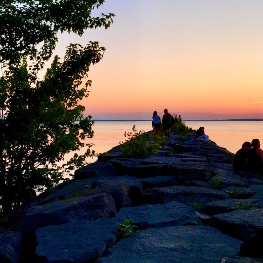
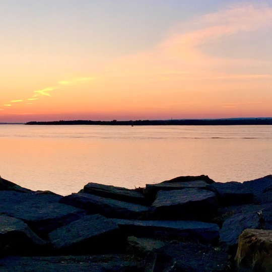
Captured Summer Solstice evening June 21, 2023, at Britannia Park, Ottawa, Canada.
#ottawacanada#pano#panorama#posting pianos#instructions#panoramicscene#landscape#summerlandscape#riverscape#sunsetscape#sunsetlandscape#river#riverscene#beach#beachphoto#beach scape#beachscene#britanniabeach#sunset#sunsetbeach#endofday#watchingsunset#summer#summersolstice#summerishere#summer photography#summershere#outdoor#outdoorphotography#photowalk
0 notes
Text
Virtual Sketchbook 1
1. WRITING AND RESEARCH –
As an introduction, tell us one little known fact about you. One fact about me is that I love the beach but I can’t swim.
2. Then, in list form, detail 5 new facts you were able to find out about your assigned artist or the art work.
”The Swing" is a famous artwork created by Jean-Honoré Fragonard in 1767. It is an oil painting on canvas that measures 81 x 64 cm. The painting is currently housed in the Wallace Collection in London.
The painting depicts a playful and romantic scene set in a lush garden. A young woman is shown sitting on a swing, suspended from ropes attached to a tree branch. She is elegantly dressed in a pink silk gown and is surrounded by foliage and flowers.
One of the notable features of "The Swing" is the composition. The woman on the swing is positioned in the foreground, while a male admirer hides in the bushes, looking up her dress as she swings. This element adds a sense of secrecy, scandal, and voyeurism to the painting.
Fragonard's painting style in "The Swing" is characterized by loose brushwork and a delicate palette of pastel colors. The overall aesthetic is Rococo, a decorative and ornate style that was popular in the 18th century. The painting captures the elegance and frivolity associated with the Rococo period.
"The Swing" is considered one of Fragonard's most celebrated works and a prime example of Rococo art. It reflects the themes of love, seduction, and the pursuit of pleasure that were prevalent during the era. The painting's beauty, charm, and provocative undertones have made it an enduring and iconic image in art history.
3. Write a short paragraph (4 sentences) answering these questions: Did the way you think about the art change from the first time you looked at it? Do you see anything different in the art now? Upon first viewing Fragonard's artwork "The Swing," I was captivated by its beauty and the intricate details of the scene. However, as I delved deeper into its meaning and symbolism, my perception of the art changed. I began to appreciate the underlying themes of seduction, voyeurism, and social conventions that the painting conveys. With a fresh perspective, I now notice the hidden figure in the bushes, the playfulness of the swing, and the subtle expressions on the faces of the characters. The art has become more layered and thought-provoking, revealing new elements and narratives with each observation.
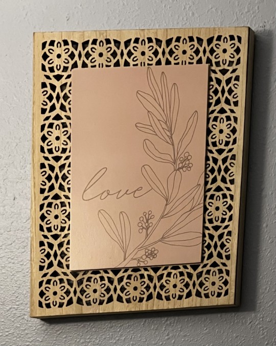
2. ART AND WRITING -The artwork caught my attention because of the carved design of the border. The artwork has a border made of wood and a drawing of flowers. I am not sure of the media that was used. The purpose that it serves for me is a reminder to have self-love. I do think it’s beautiful. I believe the flowers and the color of the background make the artwork look graceful.
3. WRITING A SELF-PORTRAIT - The “baggage” I would bring along would be analyzing the work in a unique perspective. I am 21 years old. The gender I primarily align with would be female. I am from Texas. I am Latina. I really enjoy biking and going to the gym. I’m not a member of an organized group. I work at Lakewood Ranch Medical Center. My attitude and curiosity makes me who I am.
4. ART PROJECT (SELF-PORTRAIT) – I am fascinated with life itself, the way that God created everything with a purpose. We sometimes focus on the bigger things in life to make us happy. But I believe that it's the smaller things that hold more purpose and true joy. It is as simple as enjoying the late-night sky and all the stars that fill it. Thinking of all the amazing things the world has to offer us.
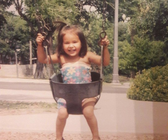
This is my self-portrait. Innocence brings out the excitement of the simple things. Enjoying life its self without a care in the world. I think this portrait describes my true self. As we age we lose focus of what’s truly important. I like to enjoy things with an open mind as if it’s new. Feeling that joy of doing something fun for the first time.This is my self-portrait. Innocence brings out the excitement of the simple things. Enjoying life itself without a care in the world. I think this portrait describes my true self. As we age, we tend to lose focus of what is truly important. I like to enjoy things with an open mind as if it is the first time I experienced it, feeling that joy of doing something fun for the first time.
1 note
·
View note
Last Seen Blogs

followingeggs
sister, you don't know the half of it
all-soul-crossover-comic
All Soul
cherishmysmile-blog
I'm a motherfucking bitch
kalimay44
kali

pinkiight93
Pinklight93