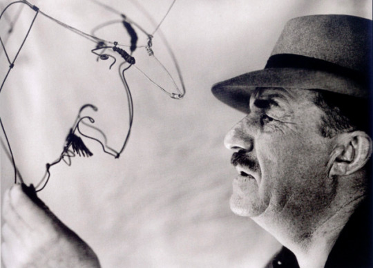
#Portrait made by Alexander Calder
Photo
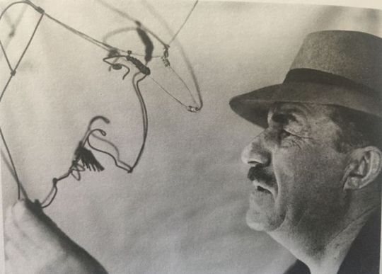
Fernand Léger Before his Wire Portrait by Alexander Calder
Photo by Walter Limot
1934
#Photo by Walter Limot#Fernand Léger#Portrait made by Alexander Calder#Wire#Portrait#art#photo#Fernand Léger Before his Portrait made by Alexander Calder
7 notes
·
View notes
Photo
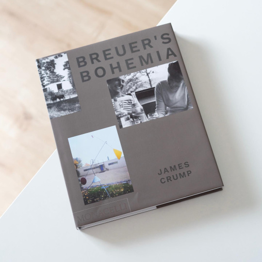
Great modernist architecture more often than not blossomed in a particular socio-cultural climate, be it 1920s Berlin, 1930s Los Angeles or 1950s Litchfield, Connecticut. Litchfield? Yes, Litchfield, the picturesque small town home to a considerable number of Marcel Breuer houses. These houses were built between the early 1950s and mid-1970s for progressive clients enjoying the beautiful nature surrounding the town and consecutively introducing a bohemian, avant-garde spirit to the rather conservative community. The central figure around which these activities revolved was Rufus Stillman who, after seeing Breuer’s house in the MoMA garden, commissioned him to built the first Stilman house in Litchfield and who subsequently became best friends with the architect. The fascinating story of Stillman, his circle and the Breuer houses has been explored by filmmaker and art historian James Crump in both the documentary „Breuer’s Bohemia“ and the eponymous book recently published by Monacelli Press: Crump combines architectural and cultural history in a page-turning narrative that elucidates both the genesis of numerous of his New England houses and the people commissioning it, a left-wing, well-to-do clique of bohemians interested in modern art, an anti-bourgeois lifestyle and, of course, modern architecture. While the latter group revolved around Rufus Stillman and his neighbour and business associate Andrew Gagarin, Crump also ventures out into Wellesfleet and a number of cottages Breuer designed for himself and friends like György Kepes. This community also included Alexander Calder, Walter and Ise Gropius as well as Arthur Miller (and eventually mixed with the Litchfieldians) and cultivated a carefree air characterized by lots of alcohol, nudism and leisure. Just like the documentary the book „Breuer’s Bohemia“ is truly gripping and offers a fascinating peek into a microcosm made up of people seeking to leave behind traditional forms of life with the help of modern architecture as designed by Marcel Breuer. An intimate, emphatic portrait!
#marcel breuer#architecture#usa#mid century modern#architecture book#monacelli press#american architecture#book
26 notes
·
View notes
Text
Reading Response 3
“Untitled” (Portrait of Ross in L.A.), Felix Gonzales-Torres, 1991
Patrons were encouraged to take a piece of candy when viewing the work.

“Layer Drawing, Light of the Sunrise 2”, Nobuhiro Nakanishi, 2012
“Controller of the Universe”, Damian Ortega, 2007
youtube
“HYPER-REALITY”, Keiichi Matsuda, 2016
youtube
“Ascension”, Bill Viola, 2000
Time and Motion
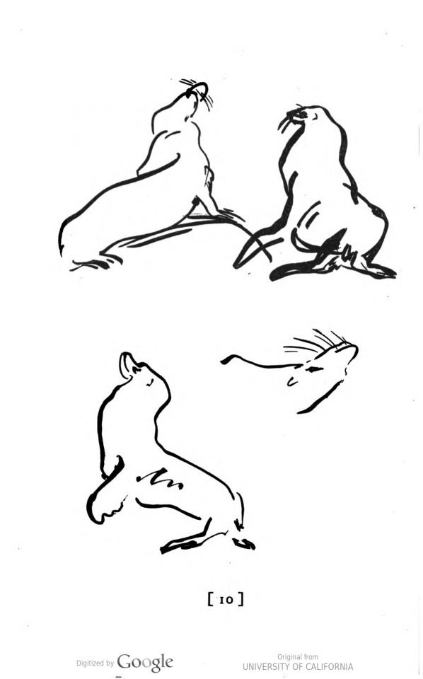
In Chapter 6: “Time and Motion” from Making Art Form and Meaning, Terry Barrett discusses how often the ideas of time and motion impact art. In the beginning of the chapter, they describe the definitions of time in the context of art. It was interesting to see how they defined each term because it made me think of how time influences art in many ways. I think that art that uses Actual Time is something that is super interesting because the pieces only last for a moment until the moment ends. Afterwards, one may not be able to experience such a moment again. On the other hand, Implied Time alludes to the passing of time. I think when most people think of time in art, it involves Recorded Time, such as photos, videos, and so on. In addition, I liked the way Barrett explained Motion through the examples they used. Motion either can be physical or the illusion of motion. In the panel from Persepolis: The Story of a Childhood, it uses implied motion as your eyes follow the moving characters while in Alexander Calder’s Tower with Pinwheel, the mobile physically moves. Lastly, I found the way that Barrett described time and motion to be very understanding and introduced many helpful examples.
Projection: Vanishing and Becoming
In “Projection: Vanishing and Becoming” by Sean Cubitt, they explore how projection and shadow aided in the creation of art, ideas, and human development. Cubitt establishes how art in the past once began due to light being projected against a wall allowing one to see what is there and what is not through the telling of stories. Also, Cubitt explains how projection has numerous, different meanings depending on its context in the world, such as psychological and scientific. Within psychology or philosophy, projection can be seen as projecting onto others or the perception of reality. It was interesting to see how projection influences so many aspects of society including art and technology. Is projection a false sense of reality? How do we know when a projection is real or not? Does it matter if one believes it to be true or real? I find this interesting as technology advances and the world becomes more virtual and so does art. In addition, Cubitt does discuss “virtual” images as vanishing points that are absences in the technology of projection. While the definition of projection and absence are thoroughly discussed in the article, everyone has their own projections about the world and how those ideas are projected in art.
3 notes
·
View notes
Photo
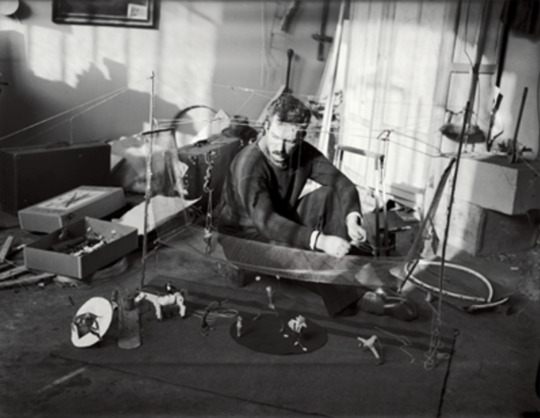
André Kertész Alexander Calder in His Studio with Some of the Wire Sculptures in His “Cirque Calder,” Paris 1929
“In the Spring of 1926 I made some toy animals of curtain rods, broom handles, etc., and wire. Later, a few dolls, which I animated.... In the Winter of 1927–1928 I made some more toys for a friend to take home as gifts, and having shown them to De Creeft, a Spanish sculptor with a very acute sense of humor, I was urged by him to make some more toys and to expose them at the Salon des Humoristes. I did this and then began to make more elaborate toys, with articulation, in which the movements got more and more realistic, always adhering to the same basic materials. In this way I have developed quite an elaborate circus of which animation is one of the chief characteristics....
At that time (last Spring) I did not consider this medium to be of any signal importance in the world of art; merely a very amusing stunt cleverly executed.... However, wishing to return to Paris, I felt it would be quite justifiable to have an exhibition here, where "clever stunts" are highly appreciated, so I came over 3 months ago and set to work, carving wood and twisting wire. These new studies in wire, however, did not remain the simple modest little things I had done in New York. They are still simple, more simple than before; and therein lie the great possibilities which I have only recently come to feel for the wire medium... Before, the wire studies were subjective, portraits, caricatures, stylized representations of beasts and humans. But these recent things have been viewed from a more objective angle and although their present size is diminutive, I feel that there is no limitation to the scale to which they can be enlarged...... One of the canons of the futuristic painters, as propounded by Modigliani, was that objects behind other objects should not be lost to view, but should be shown through the others by making the latter transparent. The wire sculpture accomplishes this in a most decided manner.”
Alexander Calder, “Statement on Wire Sculpture” 1929
47 notes
·
View notes
Photo


Watched in May
A Russian Youth (Мальчик русский)
Sicario
Fedora
LoveTrue
The Platform
Water Lilies (Naissance des pieuvres)
The Assistant
The Half of It
Tomboy
The Last Man on Earth
Beanpole (Дылда)
Mommy
The Fall
Girlhood (Bande de filles)
Carnival of Souls
Marguerite & Julien
Portrait of a Lady on Fire (Portrait de la jeune fille en feu)
This Magnificent Cake! (Ce Magnifique Gâteau!)
Romantic Comedy
Transnistra
Eraserhhead
The Farewell
Emma.
Late Night
Charlie's Angels
Birds of Prey (and the Fantabulous Emancipation of One Harley Quinn)
The Ancestors Came
Suicide by Sunlight
Anthropocene: The Human Epoch
A Perfect 14
Westwood: Punk, Icon, Activist
Free Radicals
Aniara
Vivarium
La Pointe-Courte
Diary of a Pregnant Woman (L'Opéra-Mouffe)
Salut les Cubains
Uncle Yanco (Oncle Yanco)
GUO4
Atlantiques
Sitara: Let Girls Dream
Lions Love (Lions Love... And Lies)
Živan Makes a Punk Festival (Živan pravi pank festival)
Plastic and Glass
The So-Called Caryatids (Les Dites Cariatides)
The Octopus (La Pieuvre)
Hyas and Stenorhynchus (Hyas et sténorinques, crustacés marins)
Sea Urchins (Les Oursins)
Bernard-L'Hermite (Bernard-l'Ermite)
The Sea Horse (L'Hippocampe ou "cheval marin")
Voyage to the Sky (Voyage dans le ciel)
Le Vampire
Freshwater Assassins (Assassins d'eau douce)
How Some Jellyfish Are Born (Comment naissent des méduses)
Shrimp Stories (Histoires de crevettes)
The Love Life of the Octopus (Les Amours de la pieuvre)
Acera, or The Witches' Dance (Acera, ou le Bal des Sorcières)
Pigeons of the Square (Les Pigeons du square)
The Slumber Party Massacre
Jane B. par Agnès V.
The Cranes Are Flying (Летят журавли)
Crystal Swan (Хрусталь)
Take Me Somewhere Nice
Microhabitat ( 소공녀)
The Unforeseen
Did not finish
Swiss Army Man (Daniel Kwan and Daniel Scheinert, 2016)
Braid (Mitzi Peirone, 2018)
A Secret Love (Chris Bolan, 2020)
Calder's 1927 Great Circus (Le Grand Cirque Calder 1927, Jean Painlevé, 1955)
Did not like
Sicario (Denis Villeneuve, 2015)
The Platform (Galder Gaztelu-Urrutia, 2019)
The Half of It (Alice Wu, 2020)
Sitara: Let Girls Dream (Sharmeen Obaid-Chinoy, 2019)
I could take them or leave them
Fedora (Billy Wilder, 1978)
LoveTrue (Alma Har'el, 2016)
This Magnificent Cake! (Ce Magnifique Gâteau!, Emma De Swaef & Marc James Roels, 2018)
Romantic Comedy (Elizabeth Sankey, 2019)
Eraserhhead (David Lynch, 1977)
Late Night (Nisha Ganatra, 2019)
Charlie's Angels (Elizabeth Banks, 2019)
Free Radicals (Len Lye, 1958)
Aniara (Pella Kågerman and Hugo Lilja, 2018)
Birds of Prey (and the Fantabulous Emancipation of One Harley Quinn) (Cathy Yan, 2020)
The Ancestors Came (Cecile Emeke, 2017)
GUO4 (Peter Strickland, 2019)
Živan Makes a Punk Festival (Živan pravi pank festival, Ognjen Glavonić, 2014)
The Unforeseen (Laura Dunn, 2007)
Films I enjoyed
A Russian Youth (Мальчик русский, Alexander Zolotukhin, 2019): Went into this with the single aim of improving my Russian. Loved the back-and-forth between “the story” and the orchestra playing the score to said story. The “story” itself is also tragically moving
Water Lilies (Naissance des pieuvres), Tomboy, Girlhood (Bande de filles) and Portrait of a Lady on Fire (Portrait de la jeune fille en feu) (Céline Sciamma, 2007, 2011, 2014, 2019): I saw all four of Céline Sciamma’s films practically in a row! I liked all of them, don’t think I prefer one over another. And I recognise she’s a talented filmmaker, even though she’ll probably never be a favourite
The Last Man on Earth (Ubaldo Ragona and Sidney Salkow, 1964): A good... vampire-zombie film... that is worth sticking with even though you might find it too ordinary at first
Beanpole (Дылда, Kantemir Balagov, 2019): This story is fucked up! I liked it up to a certain extent, but I suspect it was mainly because of the historical and geographical setting. If you like post-WW2 Russia and this is the film for you
Mommy (Xavier Dolan, 2014): The portrayal of the titular mother hit a bit too close to home... This was my first Xavier Dolan film and I was not disappointed. Only drawback: Céline Dion’s song “On ne change pas” has been stuck in my head ever since
The Fall (Jonathan Glazer, 2020): It was... good? From the publicity it received on Mubi, I thought this was going to be a feature film, so yeah, I was disappointed, I loved Sexy Beast and Under the Skin so much
The Farewell (Lulu Wang, 2019): I really liked it, I think this didn’t get nearly enough praise -- but I was expecting something life-changing when I “only” found this very good
Emma. (Autumn de Wilde, 2020): This adaptation felt like Autumn de Wilde really, really wanted her film to be shown in as many classrooms as possible. It was enjoyable! I liked her additions to the book, and I appreciate the challenge she took up
Suicide by Sunlight (Nikyatu Jusu, 2019): A good short vampire film about Black vampires who are protected from daylight by their melanin
Anthropocene: The Human Epoch (Edward Burtynsky, Jennifer Baichwal, Nicholas de Pencier, 2018): Stunning visuals, sobering message. Somewhere between Koyaanisqatsi and Unser Täglich Brot in tone
A Perfect 14 (Giovanna Morales Vargas, 2018): This, by necessity, doesn’t cover everything on the subject of plus-size models, and practically speaking I didn’t learn anything -- but it’s well-made, and the personal stories of the main interviewees make a good, contrasted portrait
Westwood: Punk, Icon, Activist (Lorna Tucker, 2018): I came out of this feeling as if Vivienne Westwood wasn’t that interesting of a person, which I’m sure wasn’t the director’s intention... still, it was informative enough
Plastic and Glass (Tessa Joosse, 2009): A short somewhat-documentary about a choir in a recycling facility. Good music
The Slumber Party Massacre (Amy Holden Jones, 1982): Finally saw this! Very surprised to learn this was written by Rita Mae Brown. It was good as far as slashers go and of course, it is nice to watch something from that era that is not appallingly sexist
The Cranes Are Flying (Летят журавли, Mikhail Kalatozov, 1957): I guess I had to read about this afterwards in order to see how unusual it was for the time it was made. While I watched it I enjoyed the way it was filmed but the story left me indifferent, and I thought it lacked subtlety
Crystal Swan (Хрусталь, Darya Zhuk, 2018): A very aesthetically pleasing story set in 1990s Belarus, about a young woman who wants to emigrate to Chicago for the love of house music... the story will keep taking you unexpected places from there. The costumes are perfect, the soundtrack is interesting. It does feel a little as if it were made for export, and I thought it relied quite heavily on stereotypes about Slavs
Take Me Somewhere Nice (Ena Sendijarević, 2019): This coming-of-age road movie about a Bosnian girl who was raised in the Netherlands and comes back to visit her father in hospital has everything... drugs, violence, death, even cute dogs. The pastel palette makes it very satisfying
Microhabitat ( 소공녀, Jeon Go-woon, 2017): This film about a woman with a minimum-wage job who would rather leave her flat than quit smoking and drinking whisky just spoke to me
La Pointe-Courte, Diary of a Pregnant Woman (L'Opéra-Mouffe), Salut les Cubains, Uncle Yanco (Oncle Yanco), Lions Love (Lions Love... And Lies), The So-Called Caryatids (Les Dites Cariatides), Jane B. par Agnès V. (Agnès Varda, 1955, 1958, 1964, 1967, 1969, 1984, 1988): I decided to watch all of Agnès Varda’s films that are on Mubi France and that I haven’t seen already, in chronological order. This feels a bit like a chore sometimes, but I find it rewarding. It’s strange to think that even a few years ago hers was a name I’d heard a few times but that didn’t mean anything to me. And I know I can be merciless when it comes to French cinema. Anyway... I like what I’ve seen so far (the above plus Cléo and Vagabond), I like that someone can just pick up her film camera and make a short about caryatids... generally speaking I like Varda’s approach to film that makes it seem more accessible to people like me. I don’t think all of her films are particularly good, but I like that she made all of them. I never did particularly like Cléo, and I didn’t particularly like La Pointe-Courte in spite of the fact that it was shot very close to where I’m from. Of the above, my fave was probably Lions Love, even though (or because?) it doesn’t very much feel like a Varda film. Uncle Yanco is a close second. I’ve got three feature films left now
Films I loved
The Assistant (Kitty Green, 2019): Unfortunately enough, this reminded me of an internship I did a few years ago... I found it uncomfortably realistic, and thus very good. Julia Garner is perfect, as usual
Carnival of Souls (Herk Harvey, 1962): I watched this because it is a classic, expecting it to be over-the-top and not nearly as scary as I found it... a very good surprise
Marguerite & Julien (Valérie Donzelli, 2015): It’s hard to talk about this in a way that will make people want to see it without making me sound like a huge weirdo but here goes. It’s a story about a brother and sister who are madly in love with each other. It takes place in a fantasy past and is told like a fairytale. If you think it’s impossible to turn this premise into a good film please watch this
Transnistra (Anna Eborn, 2019): With this film I discovered the existence of the tiny unrecognised state named Transnistria... I also discovered Alla Pugacheva, who is part of a great nostalgic Russian soundtrack with Kino amongst others. The story is one of those documentaries about youth that punches you right in the gut. Definitely recommended
Vivarium (Lorcan Finnegan, 2019): This is the type of what, for lack of a better term, I call “minimal science fiction” that I really enjoy. I’ve thought about it a lot since then. I don’t know why people generally didn’t seem to like it. I thought the premise was terrifying and nightmarish, and the actual film effectively claustrophobic. Plu:s Imogen Poots
Atlantiques (Mati Diop, 2009): This is the short, not the feature film of the same name. I’ve heard a lot about Mati Diop and I saw this the second it became available on Mubi France -- and I didn’t regret it. Can’t wait to see Atlantiques, long form
The Octopus (La Pieuvre), Hyas and Stenorhynchus (Hyas et sténorinques, crustacés marins), Sea Urchins (Les Oursins), Bernard-L'Hermite (Bernard-l'Ermite), The Sea Horse (L'Hippocampe ou "cheval marin"), Voyage to the Sky (Voyage dans le ciel), Le Vampire, Freshwater Assassins (Assassins d'eau douce), How Some Jellyfish Are Born (Comment naissent des méduses), Shrimp Stories (Histoires de crevettes), The Love Life of the Octopus (Les Amours de la pieuvre), Acera, or The Witches' Dance (Acera, ou le Bal des Sorcières), Pigeons of the Square (Les Pigeons du square) (Jean Painlevé, 1928, 1929, 1929, 1930, 1934, 1937, 1945, 1947; Jean Painlevé and Geneviève Hamon, 1960, 1964, 1965, 1972; Jean Painlevé, 1982): I didn’t know who Jean Painlevé was before I decided to watch The Octopus. As it turns out, I am a sucker for well-made nature documentaries, and since all of these are short films, I ended up watching them all, in order of release, over the course of one afternoon. It’s a little bit crazy that these were getting made as early as the 1920s, and I can’t imagine what it would have been like to see them in theatres nearly a hundred years ago. Anyway these are all good, although I wasn’t expecting the vivisection that seems to have been par for the course in the early days
*
Yes, I really did watch 65 films in May. It becomes a little less impressive considering a fair amount of those were shorts, but still. Unemployment!
I have access to Outbuster now in addition to Mubi and Netflix, this time through my boyfriend’s account. It’s a French thing I think, and very cheap, but I’ve only just tried it with Microhabitat. Of course it was the Mubi Library thing that just completely sent me over the edge, and I want to watch all the things.
In June I hope to finish Agnès Varda’s filmography on Mubi and maybe watch some more Tarkovsky!
27 notes
·
View notes
Text
So, I was fascinated about this Starlog Magazine from 1982 that made mention of this artist named Deborah F. French who worked with Jim Henson on the Dark Crystal, and could find little on. https://steamedtangerine.tumblr.com/post/640587836720103424/so-i-happened-upon-an-old-starlog-magazine-from
However, a different Deborah, who had also worked on the Dark Crystal, had appeared that sent me down an investigative rabbithole:
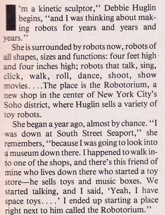
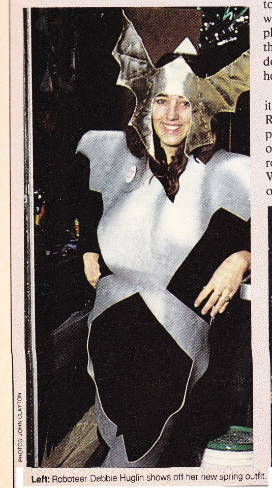

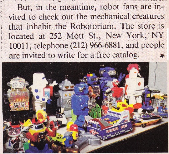
Deborah Huglin was this very talented artist who opened an amazing shop in New York that was short-lived (too short-lived for Spy Magazine to catch upon) that specialized in a collection of robots.
I searched online and found this:
https://ephemeralnewyork.wordpress.com/2009/08/11/the-robotorium-of-mott-street/ with this image:
According to an early IMDB entry:
Along with production and acting, Debbie is a professional sculptor who has 21 years of formal art training under her belt along with degrees in Art, Sculpture, Humanities and Repatriation Archaeology. She does museum quality classical sculpture and portraits. She also works in Mid-Century Modern style, as she has since she worked with Sandy (Alexander) Calder as a kid in her home town where Calder was creating a bank building from the ground up. She is as comfortable making mobiles and stabiles as carving portraits or making large water features at country clubs.
Debbie loved working with Jim Henson who had a great time at her robot store, Robotorium, Inc. on Mott St in Little Italy in New York City in the early 1980s. Debbie just got back on the puppeteer production wagon as Production Designer for The Teenie Tones, an in production children's marionette and music SciFi/21rst Century Mid-Century Mod series created by Emmy Award-winning producer, Barbara Valentine of Ravel Media Group. Stay tuned for the next exciting adventure!
Yet, the story gets more interesting and unfortunately tragic:
This blog entry- http://www.michaelgingrich.com/mytests/huglin.htm -describes Huglin as an amazing person gifted in arts and music, who was involved with work on Dark Crystal, Labyrinth, and Fraggle Rock, and in later life Huglin worked as an art instructor at Chuckawalla Valley State Prison in Blythe. As an activist in the American Indian community, she advocated returning Indian artifacts to tribal descendants. Once a month, Huglin and Vogel transported two life-size, work-in-progress sculptures of Kumeyaay women to the San Diego Art Institute's Museum of the Living Artist in Balboa Park. They brought tools and plaster so that visitors and schoolchildren could give sculpting a try.
The major sadness is that she went missing in March of 2008 while hiking around the San Jacinto Mountains, her body later found-no foul play suspected.
It was because of some obscure sci-fi article about a robot shop in New York that sent me off to find more info about this amazing person.
1 note
·
View note
Text
Gagosian at FIAC
October 14, 2019

FIAC
Artists on the French Riviera
Booth/Stand B33
October 17–20, 2019
Grand Palais, Paris
__________
Gagosian is pleased to participate in FIAC 2019 with Artists on the French Riviera, a special presentation that explores twentieth-century artistic life on the Côte d’Azur. On display are works by Alexander Calder, Jean Cocteau, Alberto Giacometti, Yves Klein, Fernand Léger, Man Ray, Henri Matisse, Francis Picabia, Pablo Picasso, and Edward Quinn, among others.
This presentation is an homage to the famous interior of the Villa Santo Sospir at Saint-Jean-Cap-Ferrat. While staying at Santo Sospir between 1950 and 1963, Jean Cocteau “tattooed” the villa’s bare walls and ceilings with tempera illustrations of Greek mythological deities. Gagosian re-creates Cocteau’s fantastical figures at FIAC in an immersive, theatrical display that evokes the spirit of one of the Riviera’s architectural treasures.
A wide array of works produced during each artist’s stay in the South of France will be available, including a selection of photographic portraits by Quinn, and ceramic pitchers and plates by Picasso. Various paintings and works on paper—such as Cocteau’s ink drawing Faune en larmes (1939), executed in the same fluid, linear style as his Santo Sospir frescoes, and Picasso’s unique framed and painted ceramic work Couple (1963)—demonstrate the creative scope that the Riviera afforded the many artists who made the region their studio and home.
A vivid mobile by Calder, Boomerangs and Targets (1973), and a notable Giacometti sculpture, Tête sur socle (Tête sans crâne) (c. 1958), represent the ongoing relationship between these artists and the Fondation Marguerite et Aimé Maeght. Located outside of Nice in the famous village of Saint-Paul-de-Vence, the foundation’s building was designed in 1964 by the Catalonian architect Josep Lluís Sert in collaboration with various painters and sculptors, resulting in a museum complex that harmoniously blends art, nature, and architecture.
To receive a PDF with detailed information on the works, please contact the gallery at [email protected].
To attend the fair, purchase tickets at fiac.com.
_____
Jean Cocteau in front of one of the several murals he painted on the walls of Francine Weisweiller’s Villa Santo Sospir, Saint-Jean-Cap-Ferrat, France, 1954. Photo: Edward Quinn
22 notes
·
View notes
Text
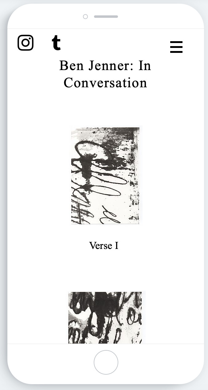
In Conversation

‘In Conversation’ exhibition poster.
Today would have been the opening of my solo exhibition if there was no lockdown in place. Rather than discuss what could have been I chose to continue with my aspirations of exhibiting my work but consider it in the context of a virtual gallery.
I researched existing exhibition posters when contemplating the design for my own and chose to produce a minimalist design that consisted only of the title, the date and one of my prints. As asemic writing is derivative of abstract art this was a nod to predecessor artists whose posters follow this format. Seeing as the exhibition was to be viewed online I did not feel it necessary to include any further details and enjoyed the minimalist approach. This poster was used on social media as a teaser while I finished putting together the website. It was included on my Instagram story periodically and on the day of the opening the date was replaced with the website URL.
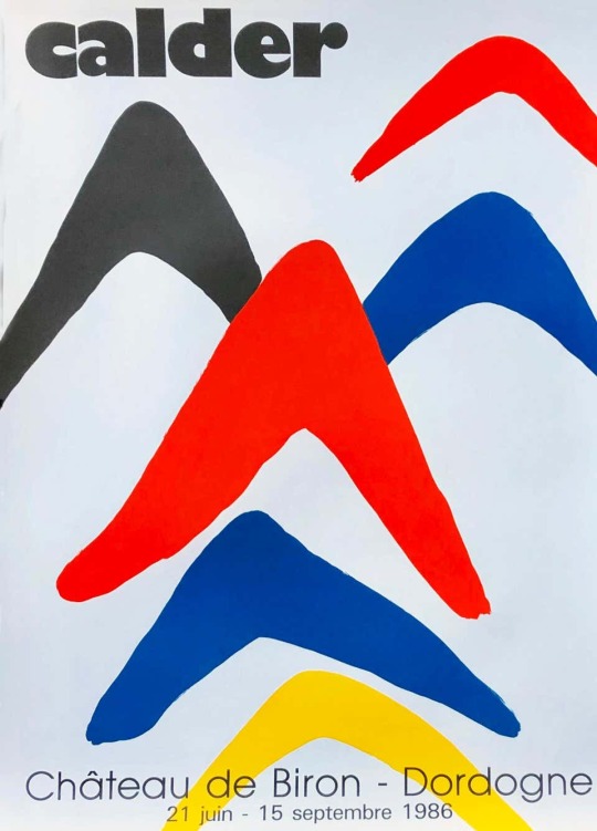
Alexander Calder at the Château de Biron, 1986 - exhibition poster.
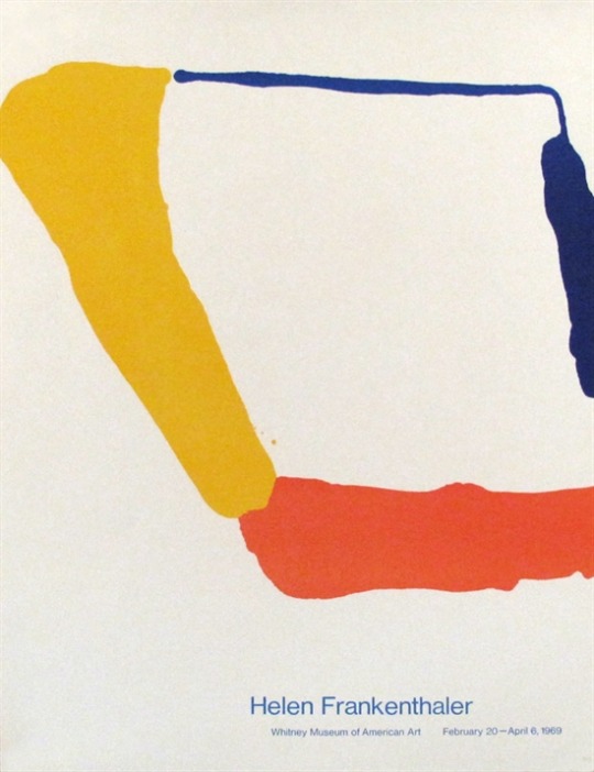
Helen Frankenthaler at the Whitney Museum of American Art, 1969 - exhibition poster.
I have learnt a lot from this experience of website building, and also coordinating an exhibition. I did find it nerve-racking seeing as I had never exhibited on my own before nor had any prior knowledge of web designing.
My aim was to exhibit my work alongside collaborating artists who’s work was a response to my own. The idea being that my work was an open conversation for all to join, a dialogue between art works and indeed between disciplines. Unfortunately given the isolating nature of the lockdown it has been difficult for some creatives to remain motivated and as a result I only obtained one response. I thought that if I were to include this it might get lost in the rest of the exhibit, I would not want for the curation of the show to appear piecemeal. As a result I have decided to postpone this aspect of the exhibition for a later date, this gives the other artists the opportunity to recuperate from the current situation and hopefully reclaim some creative stimulation. Therefore the exhibition I put together was solely a showcase of the work I have made since September 2019. In a way I think this is a much conclusive end to the module and to the academic year.
I did include a contact function on the website so that viewers might reach out in hopes of furthering the conversation, the dialogue could potentially grow in to something even more exciting in the future.

Screenshot of the contact page and invite to collaborate.
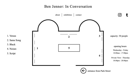
Screenshot of my completed website based on The Vestibules floor plan.
Once I had got an understanding of how to construct the website to suit the aesthetic I was aiming for I then discovered that it would look completely different on a mobile phone than it would a desktop computer. This is predominantly due to the simple fact that a mobile phone is portrait as opposed to the desktop being landscape. Though both formats utilise the same buttons and functions they need to be assembled independently.
The main difference between the two layouts was the artworks on the desktop appear in a row, remaining true to the layout of the exhibition. However the portrait format of the mobile phone dictated the artworks be displayed in a list. This was an unavoidable compromise and not did not concern me too much. Having said that I did want the mobile phone layout to be as true to the desktop layout as possible. Luckily the method of construction was relatively similar, albeit with a few restrictions. It was important to me that the exhibition be accessible on mobile phones seeing as this is predominantly how people will have access to the internet.

Screenshot of my completed website based on The Vestibules floor plan, mobile phone format.
Screenshot of my completed website based on The Vestibules floor plan, mobile phone format.
I am still planning to exhibit this body of work in reality and am in discussions with The Vestibules to consider when this might be possible. This would obviously need to fall in line with government advice. In the meantime you are invited to attend the exhibition in its virtual format at www.benjenner.co.uk .
#practice#processes#website#virtual#virtual exhibition#virtual gallery#contemporary art#gallery#exhibition#coronavirus#COVID-19#printmaking#masters#mamdp
1 note
·
View note
Photo
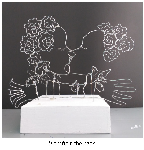
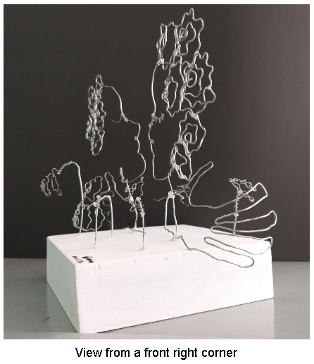
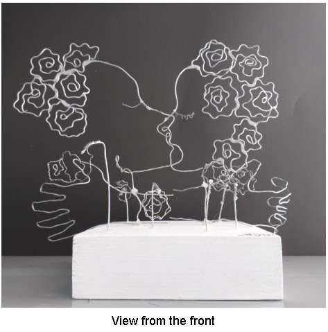
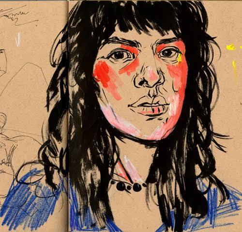
Chloé Williams, British/Filipino
Looking Passed the Pain, 7 December 2018
Wire portrait sculpture
38 cm (width) x 30 cm (height) x 21 cm (depth)
Manila, Philippines
My intention was to show “Fear” as an illusion. This work is inspired by Alexander Calder. The foreground and background of the final artwork have roses are present. The roses on the left are wilted while the roses on the right are upright to emphasise what I intended to show which is fear as an illusion. In the middle ground, a contour of two different lovers are seen, one being a man the other a women. The figures are only a contour of the side profiles of two faces and two hands. The lovers are in the act of showing affection towards each other through a kiss. A man’s hand is seen curled around the neck of the women showing the abusive characteristic in the artwork and the hand of a woman seems as if it is caressing the man’s neck showing the love. These components oppose each other in terms of positivity and negativity. Love is positive whereas pain is negative. Notice how the flowers on the male's side are wilted to emphasise the dark secret the man is holding which is how he abuses his lover.
I decided to use the emotion, love and make it seem as if these are two lovers, however, the artwork actually shows an image of an unhealthy relationship. This artwork represents the toxic and abusive relationships in our time and culture, where people decide to stay in a relationship because often they don’t realise they are in an unhealthy and damaging association. The artwork was made to aware people about how this is an ongoing issue present in many relationships and that this issue should be given more attention to.
Form
My intention was to show my theme, “Fear” as an illusion. The wire portrait sculpture, Looking Past the Pain was completed in 2018 and it is 38cm wide, 30 cm high and 21 cm deep. In the foreground and background, roses are present. The roses on the left are wilted while the roses on the right are upright to emphasise what I intended to show which is fear as an illusion. In the middle ground, a contour of two different lovers are seen, one being a man the other a women. The figures are only a contour of the side profiles of two faces and two hands. The lovers are in the act of showing affection towards each other through a kiss. A man’s hand is seen curled around the neck of the women and the hand of a woman seems as if it is caressing the man’s neck.
In Looking Past the Pain I used similar techniques used by my artist inspiration, Alexander Calder, to develop my artwork. When developing the artwork, lines were the main focus of the artwork since I was using wire to create the outline of different figures. The artwork presents organic shapes so it is more realistic, using geometric shapes to outline an image of a human face would make it difficult to be recognised by some. There is a lot of negative space because the artwork is basically linear, the artwork is based on outlining and contouring the shape of different figures. There were no additional colours added when outlining the figures I intended to represent, I just used the materials original colour so that the audience is more focussed on what I intend to show. The block that holds the wire is painted in white to bring out the artwork, no additional colours are added so that it doesn’t divert the audience from the figures. Textures were rarely used.
The roses in the foreground and background have a rough texture since the thin wires were twisted. In Looking Past the Pain value was used through the outlines made by wires, doesn’t use any shades or tone, the artwork lacks a lot of elements but the audience is able to recognise what is shown through organic shapes and lines.
The main focus of the artwork is the two lovers situated in the middle ground, it is the main focal point because it brings out the meaning behind my intention. The focal point of the artwork begins at the face of the two figures and it moves towards the hands seen around the necks of both of the lovers and lastly, it moves to roses placed around the figures. The artwork is asymmetrical because it consists of roses placed randomly and the two faces seen aren’t similar in size. In terms of proportion, the work shows realistic proportion, however when criticizing the scale, it is not made to scale, the roses are significantly small and the outline of the figures a large. To conclude, I unify my work by contouring figures and making the image of the two lovers significantly large compared to the roses to enhance the meaning behind my intention.
Theme
The artwork Looking Past the Pain gives the impression two lovers in the artwork are happy and in love, however, the hands give a different meaning. The man’s hand seen on the woman’s neck is aggressive and abusive because it is clawed around the neck showing that he is choking the woman. Whereas the woman’s hand on the neck of the man is relaxed and expresses a feeling of passion. Having said that, this artwork actually represents a toxic and abusive relationship. This artwork shows that despite the pain the woman is experiencing or has experienced, she is blinded by any form of passion. The woman doesn’t realise the state she is in because of her love for the man, she is blinded by love, this expresses fear since it is concerning. The audience is positioned in a way that makes the artwork seem as if there is nothing to be concerned about, when looking at the artwork from the front, we aren’t fixated on the hand of the man grabbing onto the neck of the woman, although we the audience is brought around, we are able to see a change in meaning, we are able to recognise the grabbing hand. The roses seen surrounding the lovers were used to bring out the meaning behind my intention. Roses in general are used for romantic reasons. The wilted roses represented how love was dead while the upright roses showed the opposite. Having said that, the emotion, love was one-sided in this relationship.
Context
In the artwork, Looking Past the Pain my intention was to show fear as an illusion. By doing so, I decided to use the emotion, love and make it seem as if there are two lovers, however, the artwork actually shows an image of an unhealthy relationship.
The artwork is significant for the time and culture because there are many different toxic and abusive relationships where people decide to stay within because often they don’t realise they are in an unhealthy and damaging association. The artwork was made to aware people about how this is an ongoing issue present in many relationships and that this issue should be given more attention to.
Through many stories and experiences heard by friends and family, I wanted to be able to address the issue since it isn’t a very popular topic. I didn’t necessarily experience an event but I have witnessed it from my friends’ relationships as well as the relationships between the members of my family. These experiences have impacted myself as an artist because it made me realise that this issue should be given more attention to and that it should be recognised and discussed so that those who have experienced it can express a feeling of relief.
Reflection
During the process of developing this studio, my intention was to show fear as an illusion and that was done by making an artwork express a feeling of love but showing that the feeling of love was abusive and unhealthy and not passionate. I believe I was able to allow the audience to understand my intention, through the symbols of roses and gestures of the face and hands of the artwork.
Twisting the wire was a technique where I worked effectively. At first, it was challenging especially with the thick wire although with the help of pliers it made it much easier. Using thick wire was difficult to hold from a given height since it is heavy but using a glue gun was a great solution or using a thin wire instead to make the eyes and the roses surrounding the two figures in the middle solved the challenge since it is much lighter. In terms of improvements, I could improve with how the roses were glued onto each other to make the hair. Some parts had too much glue, this was because the glue was extremely hot and it was difficult to control the amount of glue that exited the glue gun. This artwork was based on outlining and therefore lines were the main focus and I believe I worked effectively on this since it is easy to recognise the figures in the artwork. I also worked effectively on scale and proportion, the artwork showed a realistic proportion but not a realistic scale. I intended to make the scaling the way it is so that the audience is focused on the lovers in the middle.
The focal point of the Looking Past the Pain begins at the two faces of the artwork. Then the audience works their way down the hands on the neck of these two faces and lastly, it moves towards the roses surrounding the two people. The artwork is unified through the use of twisting and curling outlines and symbols. The contouring allows people to recognise the people in the centre and the other figures and it allows people to understand the meaning behind my intention. The symbols used were roses and these were used the emphasise my intention. Since colour was not used to enhance meaning the twisting of wire was important in the artwork, I believed that using colour would divert the audience's attention away from the true meaning behind my intention.
In conclusion, the artwork looks incomplete due to missing features of a head and face, however, this only because I didn’t want the audience to be distracted and diverted from the true meaning behind my intention. When having people criticize my artwork, they were able to identify the feeling expressed, although they didn’t completely recognise the abusive and concerning side to it until after I discussed about the roses and the hands. Although, overall, the audience talked about how my representation did show fear as an illusion.
3 notes
·
View notes
Text
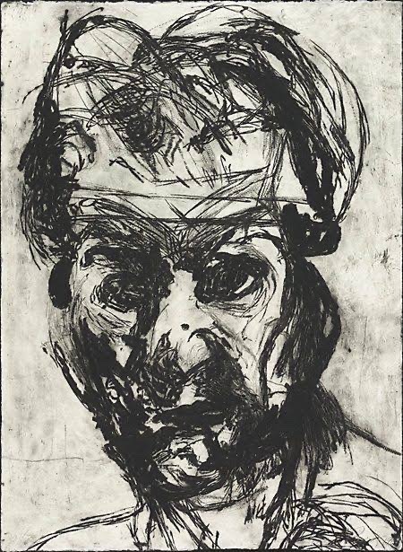
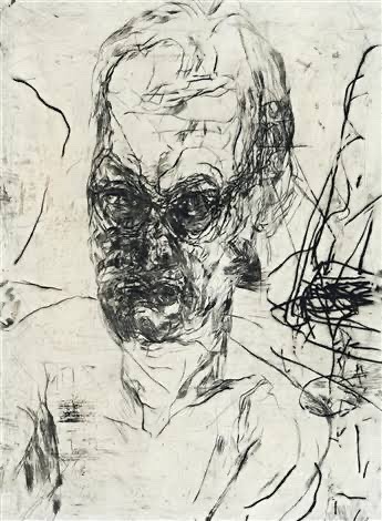
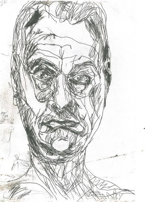
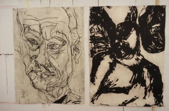
Research: Draw Draw Draw Project.
Mike Parr Mark making artist
Parr's performances explore physical limits, memory and subjectivity. They often depict self mutilation or extreme physical feats.
Parr spent his childhood in rural Queensland, Australia. He was born with a deformed arm, and this physical feature is prominent within his art work.
Parr’s impression taking is a striking contrast, both emotionally and visually to his video/ installation work, composed of beautiful engravings featuring many different types of lines, using the mark making technique. Parr was fascinated with observation and the possibilities and responses of memory distortions.
Parr’s early work was designed to get a reaction from the audience, although he also focused on exploring issues of identity, memory and states of being. He particularly used his body as a performative tool, often using his prosthetic arm and testing his body’s physical limits through resistance challenges.
In the early 1980s he started a collection called “the self portrait project”, Parr’s self portrait studies first took the form of painstakingly hand drawn copies of performance photographs. Subsequent drawings acknowledge accidental blurs and smudges, with parr generating purposeful distortions through the introduction of a mirror and manipulating the grid.
Life after death collection, combines charcoal, pastel and acrylic on paper; it depicts the artist’s face over and over, in varying states of distortion, as though disappearing or disintegrating.
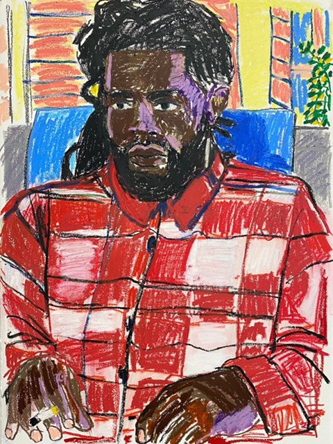
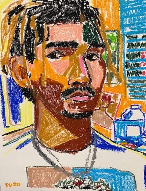
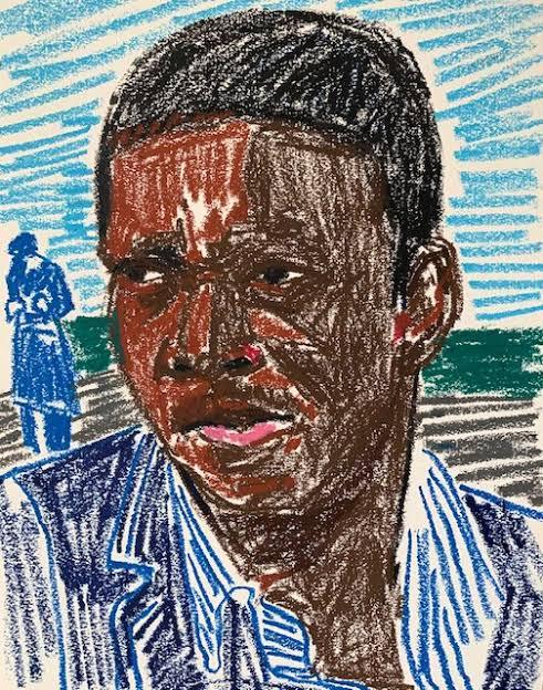
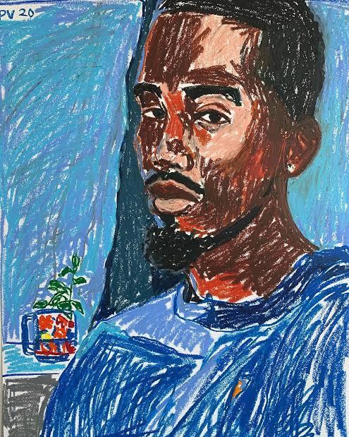
Paul Verdell
Is an American artist, who is specialized in drawing portraits of many different people that he can find as reference, by using different kinds of colors and lines with his crayons.
Verdell was born in Long Beach, California. At the age 13, his family moved to Fremont, Ohio.
Paul Verdell paints and draws a variety of people with plenty of personality. Like most artists, he has drawn since he was little, but didn’t make a real go of the medium until he was in his mid 20s. That he was decided to go back to school, enrolled in Bowling Green State university, and took a painting class when the first semester came around. Paul eventually developed his unique artistic style, by doing drawings, that him doesn’t consider that good, but he is comfortable with that style. His mark making technique is assertive, created with force and with energy. Paul’s work may seem as if it has loss control imbued within the lines, but his artworks are also vividly representative of the person or object he’s depicting; it’s delicate balance that he’s mastered without purposely pushing his style in a certain direction.
What I like most about his work, is his use of colors, with oil pastels , where he creates different tones on the skin of his characters, using the technique of mark making, which is perhaps more impressive, since it is a very different or unconventional technique for making portraits, that’s why it’s so interesting.
With time, he realized how much colour and expressiveness the textured medium adds to the canvas, and started to experimenting with more and more different types of colors.
The artist isn’t trying to make a statement with his work. In his words, “I’m just here to paint. The viewer can take whatever that want to take out of it”.
Saul Steinberg
Romanian artist by birth was one of the most important artists of 20th century. A designer and cartoonist in the publishing industry from 1936 to 1999, he spent a considerable part of the 20th century publishing in prominent magazines on the world stage, specially in the New York. The famous cover for the New Yorker that showed the view of the world according to the average American.
In his drawings, Steinberg’s lines seem to reinvent themselves as they progress, creating different kinds of shapes and sizes, sometimes using one single line.
Steinberg’s greatest contribution was his demonstration that the drawn lines is equivalent to thought. Indeed, Steinberg is rarely concerned with outward physical appearance and is much more interested in what and how people perceive what they see. His interest in the human psyche isn’t academic. His playful, childlike doodle quality maintains an elegant deftness that succinctly describes a wide range of subjects. His quirky way to draw, sometimes reminiscent of Dada art, also crossed over into the fine arts world.
much of the humor and mystery in his work occurs in the way he relates humanity’s lack of understanding.
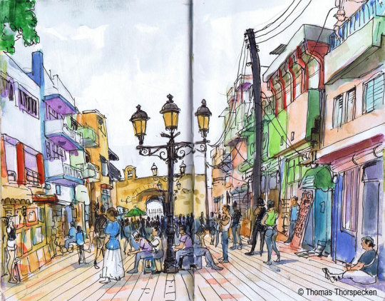
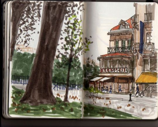
Urban Sketching
The drawings of urban spaces are gaining more and more admires, and this work certainly has a good baggage to please this audience, as it addresses a range of drawing techniques, which ranges from elementary theory to the more specific technique used by illustrators this modality.
Techniques and perspective tips combined with the composition tips presented in the work, are a combination that certainly makes all the difference when choosing and enhancing the scene that we will sketch, whether it be designing buildings, mansions, parks, people, animals, etc. the inclusion of the curved perspective is also another highlight, as it goes beyond the usual three vanishing points that the author usually address. The techniques, in this sense, are not many, but the author certainly selected those that generate the most impact. The watercolor for example, is his primarily tool, where he uses for the most of his drawings.
This book has been very useful for me for a long time, even today I use it as a reference. I always preferred to draw on my desk, with a reference photo. But I know that I need to let go, and learn to draw outside, just by watching, and trying to finish quickly.
I live in São Paulo for a while, and sometimes when I walk I always have a small sketchbook in my pocket and a watercolor kit. Sometimes I paint trees, sometimes buildings with interesting shapes and colors, from time to time some birds. Anyway, I learned a few things from this book, although I still prefer to draw in my studio, calm and do the drawing with all the time in the world, it is very important that I draw what is around me, so that I learn to train my eyes, in addition to drawing totally random things, which sometimes the internet cannot provide.
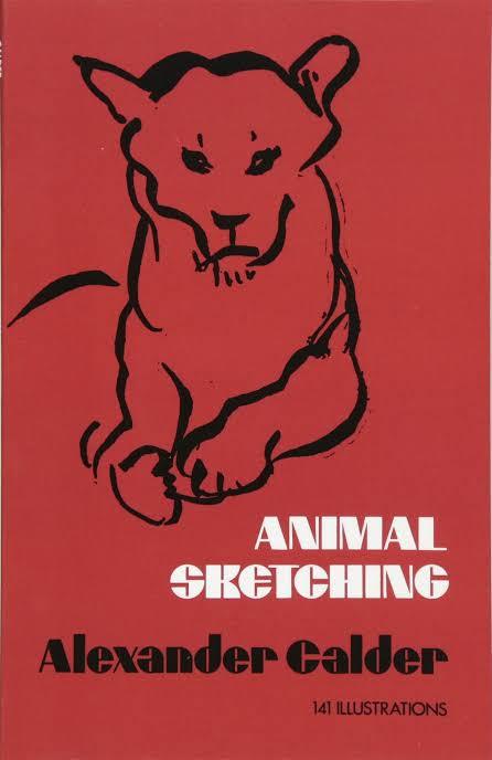
Alexander Calder Animal Sketching
Alexander Calder is a renowned sculptor and inventor of mobiles, and here he brings the simplicity of lines and spirit of movement to the art of animal sketching.
The purpose of the book is to help people like me to draw animals as we can see them.
Calder captures the emotions and attitudes of animals in a few quick lines, the person can quickly obtain a lasting groundwork in animal sketching.
This book really helped me, because I drew animal few times, and I was always thinking in the proportions and finalizing the drawing, but I learned that before doing that perfect drawing, I have to understand the movement and the poses, not necessarily making a masterpiece right in the begging, but train and have some fun on doing it.
This book contain several animal sketches, like cats, dogs, deers, cows, horses. All this animals doing different poses and actions for training.
Juan Linares
Juan Linares is a Spanish illustrator and painter, who specializes in drawing mainly different environments (Urban sketching), from streets to buildings with a different style of architecture. He mainly understands the perspective and depth of the environment. Uses various types of materials, such as acrylic markers, even alcohol-based pens. But his preferred tool, of course, is watercolor, which he always uses, when walking in the streets of his city Barcelona, where he paints narrow streets, with the small bistros, from the famous La Sagrada Familia church made by Gaudi.
Linares says, that he’s been drawing professionally since 1984. Starting his architecture studies. He drew in sketchbooks, notebooks, and in blackboards. He has a preference in drawing food and buildings.
What I like about Linares's drawings, is the way he can put light and shadows, besides the buildings being magnificently well done, very carefully and calmly (he explains that if you are drawing in some environment it is good to be calm, and patience without feeling the need to finish quickly).
He has traveled to some places in the world, including Brazil itself, where he sketched the museum of Niterói, designed by the architect Oscar Niemeyer, besides the Christ the Redeemer in Rio de Janeiro.
Juan Linares is a great artist, and I really admire the passion he puts in each of his drawings. And I wish to see more of his works, of famous architectures of the world.
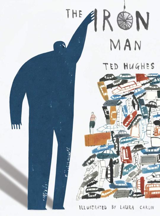
Laura Carlin
Laura Carlin was born is Glastonbury, England. She studied at Buckinghamshire university, followed by The Royal College of Art.
Laura has illustrated many children’s books for Walker Books Ltd, including The Iron Man by Ted Hughes which won many awards, specially praising for Laura’s illustrations.
She has also drawn for a whole host of publications including The New Yorker, The Guardian and Vogue, among many others.
Laura’s works frequently touches on emotionally complex subjects and adult themes of loss , social injustice and environmental change.
As an illustrator Carlin has worked with several contemporary children’s authors including Nicholas Davies for her book The Promise about a young thief whose life has changed after stealing a bag of acorns and Michael Morpurgo’s book The Kites are Flying ! , a story centered on the conflict between Israel and Palestine.
One of the reasons why, I like so much her work, it’s because she has the ability to convey a plethora of emotions through the smallest details on the pages, combining with childlike drawing style and with a sentimental narrative, it’s very brave of her, to do books for children, with such difficult themes to explore.
Research: Show and Tell Project
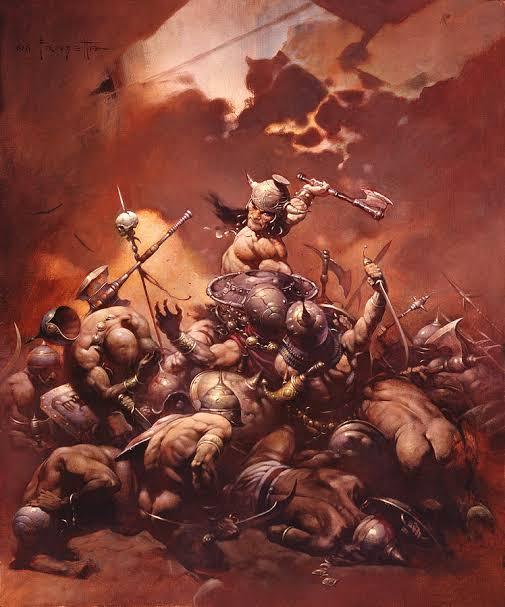
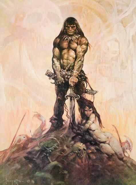
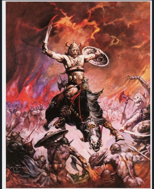
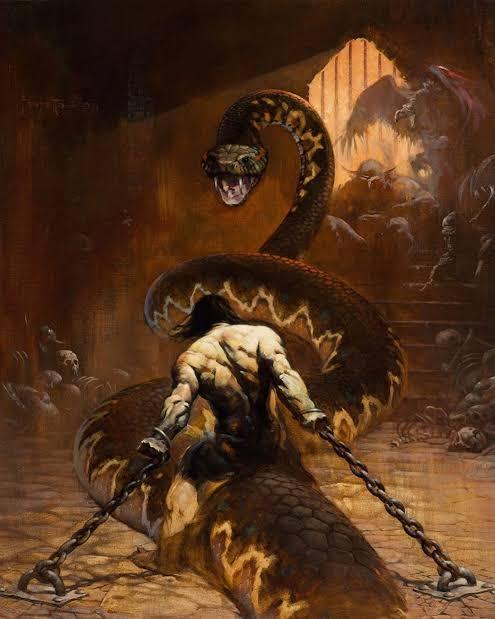
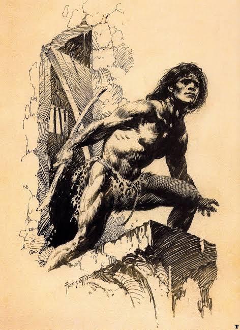
Frank Frazetta
Frank Frazetta was an American illustrator and painter, who became extremely well known for having defined the look, of the character Conan the Barbaro, created by Robert. E.Howard in the 1930s.
Frank was born in Brooklyn, New York, and from an early age he showed his skills as an artist. As a child, at the age of 8, he studied at a small art school called Brooklyn Academy of Fine Arts.
His illustrations are inspired by the great painters of the late 18th and 19th centuries, who portrayed mythological legends.
For me it’s not just the wonderful color palette he used, the wild and original streak or the phenomenal technique he developed. Of course, these things are fundamental, but in my understanding, the most important thing is that he defined practically everything we know in terms of visuals, mainly in the fields of fantasy, witchcraft, barbarism and even a little bit of science fiction.
His paintings defined some characters that we know today, like Tarzan and John carter, that he brought a new life to the characters of Burroughs, not to mention the images of Conan, who made the illustrator famous. Imagine that before him, the Sword and Sorcery look did not exist. The Conan that appeared on the covers of books since the 30s of the last century gets to laugh today. Frazetta was the first to understand the world created by Robert E. Howard.
The reason I chose frazetta as a reference is because I like fantastical worlds so much, and I love to learn anatomy, and frazzetta understood a lot of that, with his extremely vibrant colors, and extremely strong characters, who faced terrible monsters, who disturbed the peace.
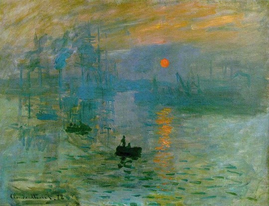
Claude Monet
Claude Monet is the main and most dedicated representative of the impressionist movement. He always preferred paintings outdoors, regardless of weather conditions,in order to capture all the effects of nature. Early in his career he was misunderstood, especially by his family, resulting in financial difficulties for years. Only around the age of 40 did he start selling his paintings, he died as a rich and well known artist.
He started to paint from a very young age which earned him some money, selling caricatures, with the money he bought painting materials. In 1858 he met Eugene Boudin, a landscape painter who encouraged him to paint outdoors. The following year he moved to Paris to specialize his techniques. At that time Paris attracted the most varied artists in the world and there Monet met Camille Pissarro and Manet among other avant-garde artists.
In 1874, the first impressionists exhibition was held in Paris, featuring works by Monet, Renoir, Degas and Cezanne. The term Impressionism, derives from Monet’s painting called Impression, Sunrise (1872).
It was the art critic Louis Leroy to call the artistic movement: Impressionism. It was a way of understanding this type of painting that did not follow the standards established by the academy and its realistic paintings.
When looking closely at an impressionist work, you see only separate brushstrokes that look like blotches without contour. Seen from afar, the brushstrokes organize for our eyes creating shapes and luminosity.
His works of art followed, as a main theme, the landscape of nature.
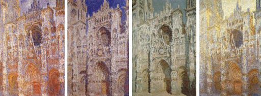
He worked harmoniously with colors and lights, creating beautiful and strong images. In the artistic context, is good to mention the series of paintings that he made on the Cathedral of Rouen (1892-1894), where the artist portrayed the constructions at different times of the day, with variations in brightness.
Monet and the impressionist artists, were no longer interested in themes related to the nobility, to the church, or to producing portraits that were true to reality. They wanted to see the painting as work in itself.
Ridley Scott
Ridley Scott is one of the most well-known film directors of all time. He made several films of different genres, but his most well-known genre is science fiction, making films like Alien, Blade Runner, The Martian and Prometheus.
But before before of being a director, Scott was applying to the Royal College of Art, one the most acclaimed art colleges at the time, to be a designer.
Scott always liked drawing , but he saw that he had no way of being a painter. His teachers always argued that his paintings were more illustrations than paintings.
So he saw that the Royal College of Art, had a particularly strong Graphic Design Department, which would give him a more specific creative target and a broader canvas. He was accepted by the college, and started his studies in 1958 and finished in 1961.
In his words, he considered design college to be extremely competitive, everyone in his class tried to compete with each other to see who was better. And Scott realized that he needed to fight hard to be among the best. “It could be very competitive, with no much being given away and everything kept close to you chest. You observed all the time, watched everyone else did and tried to do better and be the most original”.
Since graduating, Scott has said that he has become extremely perfectionist, and has tried to do as much of his work as a designer and a filmmaker in the best possible way.
After working as a set designer, and director in British television, he began in 1967 to direct commercials, eventually numbering more than 2,000 for his own company. His attention to visual stylization in his commercials, including distinctive atmospheric lighting effects, continued into the feature films that he began to directing in 1977.
In 1979 Ridley Scott releases what is considered his debut film and his masterpiece, the movie Alien. Starring Sigourney Weaver as Ellen Ripley, Scott is credited with having a heroine take point in the ensuing hunt aboard the Nostromo spaceship. Scott’s paintings and illustrations are close to pointillism with tiny points that result in images of high definition and extreme detail.
A highly detailed approach marks his style. His eye for composition, lighting, and design seems to explain his ability to visualize a movie in his mind. He claims to have and eidetic memory and the ability to recall images with high precision.
https://www.youtube.com/watch?v=tjD82nKybUA


Roxie Vizcarra
Roxie Vizcarra is an artist, who worked as the senior illustrator of Rockstar Games, who worked closely on the iconic Grand Theft Auto v and Red Dead Redemption 2 marketing campaigns.
The Peruvian-American artist was just out of college- she earned her bachelor’s degree from the Parsons School of Design in New York- when she was approached by Rockstar games in 2009.
Vizcarra was Rockstar game’s first female illustrator. The first project she worked on was Grand Theft Auto IV: Liberty City.
The first game Vizcarra worked on since its inception was the original Red Dead Redemption, released in 2010.
Vizcarra draws her art from spaghetti western movies and holds the work of “Golden age” illustrators such as Bob Peak and Robert McGinnis in high regard.
For most of her career, Vizcarra’s process began by drawing in sketchbooks (she’s a fan of traditional ink), which she then uploads and adds digital colors through Photoshop.
However, for a year or two she has been using Procreate on the IPad, which is very flexible for her purposes. She also takes references photos when she doesn’t have a clear idea of what the illustration should look like, either of others or of herself, in the desired pose.
Vizcarra shows unusual humility; she insists on not taking credit for herself and repeatedly refuses to attribute specific drawings to one person or another, or to go into the why’s and how’s of illustrations.
Vizcarra’s work is really interesting, and it explores the more of the side of markenting. In making covers and posters extremely flashy for the public, and in addition to using references to posters from old western movies, maybe that is what attracts me the most. I really like the western theme, and I always liked the way she created the poster for games like red dead redmeption 2 and GTA, with extremely warm colors, with references of very old artists, who perhaps few remember, but she always tries to put some of them into her work.


Show and Tell Digital Collage research
Terry Gilliam
Is a famous American-British director, screenwriter, animator, artist and comedian, and who is known for directing and acting in some of the films of the English comedy group Monthy Python, in addition to making films that are extremely difficult to understand, as if madness were the main character in all his films.
Terry Gilliam began his career as an animator and photographic cartoonist; one his first jobs was for the Help ! Magazine.
Gilliam preferred cut-out animation, which involved pushing bits of paper in front of camera instead of photographing pre-drawn cels. The process allows for more spontaneity than traditional animation along with being comparatively cheaper and easier to do. He also preferred to use old photographs and illustrations to create sketches that were surreal and hilarious.
Gilliam was one of the founders of Monty Python. At first, he was accredited as an animator ( his name appeared separate from the remaining 5 members in the credits), later he also joined the series as an actor. Their animations linked the sketches of the program and defined the group’s look in other types of media ( such as Vinyl discs, book covers and the opening sequence in the films).
Gilliam polished a unique style, created fantastic worlds, worked with great stars for the biggest studios, and sweated tight budgets to execute his vision, not always sharp but always brilliant.
Caco Neves
Caco Neves uses digital collage as a platform, he created, for the past 10 years, illustrations for zines, magazines, advertising pieces, vignettes for TV and the web and, more recently, he was summoned by the Vogue art team to create the cover for the Vogue Experience 2017.
After spending a season in London, where he learned to give movement to his creations with the techniques calls Motion Collage, Caco returned to Brazil and, in a moment of creative rest, when he was creating for himself and not for a client, worked on a psychedelic vignette, then he sent it to MTV, to see if they liked the style, and they asked to use this commercial but to make some adjustments.
For Caco, the success of digital collage in the last decade is a reflection of the time we live in. “ The internet brought access to images- digital collections became public- and photoshop became popular.”
He has worked for several national and international companies, and his work is very dear to his collaborators, very much for his creativity, and for the choice of technique.
0 notes
Text
Henri Matisse and his Côte of many colours
Beside the glittering water of the swimming pool, a tanned woman lies back on a lounger and unhooks her bikini. Above her the moving arms of a giant sculpture by Alexander Calder flick bars of shade across her skin. On the other terrace lunch is being served by crisp-shirted waiters, the clatter and chatter of well-heeled diners drifting through the bright air. And here in the darkened dining room, where tall windows reveal both views, I am standing in one of the holy places of the world of art.
Welcome to La Colombe d'Or. Only in France would this mixture of sun, fun, glamour and food be called a temple of art. But through the gloom of the unlit room I can see why. Lining the white walls between the massive fireplaces and the brown shutters are rows of paintings by the modern masters. Some were gifts from grateful regulars, others offered in payment for food or lodging in the days when the artists were poor and the restaurant was run by a local peasant’s son.
In pride of place is a painting of a cactus by Picasso. Nearby are two lobsters on a plate by Georges Braque, inventor of Cubism. On the far wall is a Montmartre street scene by Maurice Utrillo, last of the Impressionists. And here by the door is a portrait by Henri Matisse, the artist who brings me here.
This Thursday, Matisse is celebrated in a major exhibition at London’s Tate Modern. It will feature the largest-ever showing of his “cut-outs” – the swirling collages that he snipped from brilliantly coloured paper. He called the technique “drawing with scissors”. Tate Director Nicholas Serota has called this show “once in a lifetime”. And I have come here, to the Côte d'Azur, to follow Matisse’s trail and find his inspiration.
I’m starting in the hills high above the coast, in the pretty medieval village of St-Paul-de-Vence. From the 1920s it attracted artists, who spent their days painting the landscape and their evenings in La Colombe. The guest book has signatures from the giants of Modernism, and slowly their fame pulled in others – writers, singers, film stars and directors. To eat a plate of sea bass with a glass of chilled rosé de Provence, on the sun-drenched terrace under a mural by Fernand Léger, is as close as you can get to a magical era when the world was seen anew in a playground by the sea.
Today St Paul is still awash with artists, its winding lanes filled with galleries and studios. Some cater to the tourist trade, but in the window of Galerie le Capricorne I spot an etching by Chagall. I duck inside. The back room is hung with original prints by Picasso and Chagall, and a lovely line drawing of a woman’s head by Henri Matisse.
Matisse himself lived in the neighbouring village of Vence. I drive there along a winding hill past tall cypress trees. It’s scruffier than St Paul, but the old centre is a perfect circle of ancient stone alleys where locals are shopping for fish on slabs of ice and vegetables from the hills. And it has one great claim to fame: the Chapelle du Rosaire, a nunnery chapel entirely designed by Matisse. I park outside.
“This work is the outcome of four years of exclusive work, and it is the result of all my active life,” wrote the artist. “I consider it my masterpiece.” From the outside it’s a white shed with a corrugated roof. Inside it’s a revelation. Down a flight of dim-lit stairs is a big room of purest white, the walls whitewashed, the floor in marble. On two walls are stark line drawings some 20ft tall, of a saint in robes and the stations of the Cross. In the centre is a vast hunk of yellow sandstone, roughly cut as the altar. And flooding it all with ripples of sudden colour are two walls of stained glass windows, pouring into all this piety the warmth of the hot South in shades of sun-yellow, sky-blue, grass-green, in imagery of flowers and cacti and leaves from the tree of life. It is perhaps the world’s first installation by an artist, an entire environment you can walk through and experience in three dimensions. And it glows.
A nun interrupts my musings to whisper that mass begins in 15 minutes. I wander out to find the house where Matisse lived. Down an unkempt driveway between holiday villas, I glimpse it. La Rêve is a big square Provençal house surrounded by palm trees and looking towards the sea. It is not open to the public, but artists can book to stay in its rooms and paint. I can’t actually see any easels in the garden, but perhaps they are all out in the hills, working in the footsteps of the masters.
As dusk settles I check into my hotel, the art-themed Maison du Frêne. It’s a jokier version of an art installation, the tall rooms painted red and lined with quirky contemporary work – a sausage dog after Jeff Koons, a lampstand made from a golden Kalashnikov, some startling African statues built from jerry cans. I pop across the road to a classic Provençal restaurant, L'Auberge des Seigneurs, where chickens roast on a spit before a crackling fire, and then retire for the night with Warhol’s multiple Marilyn Monroes smiling above my bed.
Matisse lived in Vence during the Second World War, seeking somewhere quiet and safe. But for most of his adult life he lived in Nice, and that’s where I’m heading next. It’s an hour’s drive to the elegant old city which he discovered in 1917. En route is the unspoilt hilltop village of Haute de Cagnes, and the house where Renoir lived. On the mantelpiece in Renoir’s dining room is a photo of Matisse visiting the old master.
“I decided never to leave Nice,” wrote Matisse in 1950, “and remained there nearly my entire life.” Born and raised in the gloom of northern France, he was dazzled by the luminous light of Provence. Along the coast from here in 1905 he pioneered the wild colours of the Fauvist movement, and in a series of hotel apartments in Nice, from the 1920s on, he painted the colour-drenched series of “odalisques” – sensual harem women lolling on sofas, influenced by visits to Algeria just across the water.
The stylish Cimiez district was his main haunt in Nice, and I stop at the grand building of the Hotel Regina, where he lived. Built in honour of Queen Victoria, who liked to winter in Nice, it has now been converted to flats. The grand entrance lobby is still there, with its chandeliers and double staircase. Old photos of the artist’s hotel suite show cut-outs pinned to the walls and spilling over the floors. Studio assistants described exhausting sessions as the artist scissored the hand-painted papers and directed where on the canvas they should be pinned. Often they were repositioned for days or weeks until a final composition satisfied. The process seems similar to a jazz jam session, sampling and improvising on a series of ideas – Matisse’s first major cut-out project was indeed a book of scenes called Jazz.
Up the street is the Musée Matisse, a lovely old Provençal villa in an olive grove where he liked to walk. The collection is small but delightful, surveying the arc of his career, from murky Impressionism in 1890s Paris, to the freedom of the Nice years. And on the first floor are the cut-outs: not just walls of beautiful images of blue nudes and tropical fish and blowsy flowers, but the tiny paper scraps from which these were formed. A row of gold frames holds each fragile cut shape, in blue or purple, green or cream, and you can glimpse the marks where his scissors ran. Seen up close, they are pure splashes of colour and form, affirmations of joy that make you smile.
Next door to the museum is the cemetery of Cimiez, where Matisse is buried. Past a jumble of stone angels, I find a little stairway to a quiet terrace, where a simple slab of stone is surrounded by purple irises and white lilies, their strong shapes and bold colours fitting for this devotee of line and colour who finally fused both in a form that went beyond painting. “I don’t think that I have ever found such balance as I have in creating these paper cut-outs,” he reflected. “Only much later will people realise to what extent the work I am doing today is in step with the future.” Beside the path I find a yellow flower and lay it on his tomb.
~
Jonathan Lorie · 13. April 2014.
0 notes
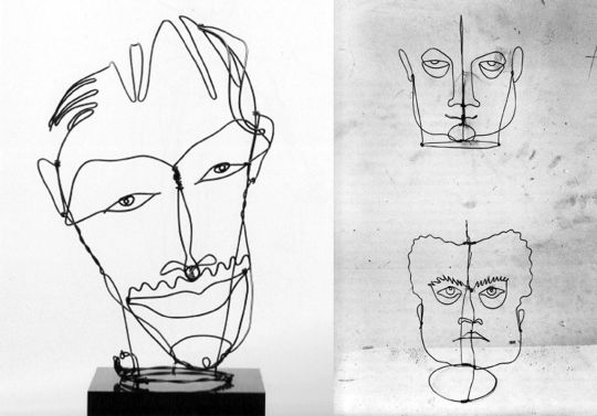
Photo
Walter Limot Artist Fernand Léger Holding His Wire Sculpture Portrait Made by Sculptor Alexander Calder, Paris 1934
109 notes
·
View notes
Photo
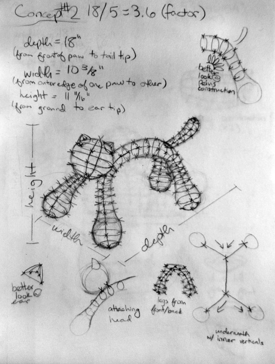

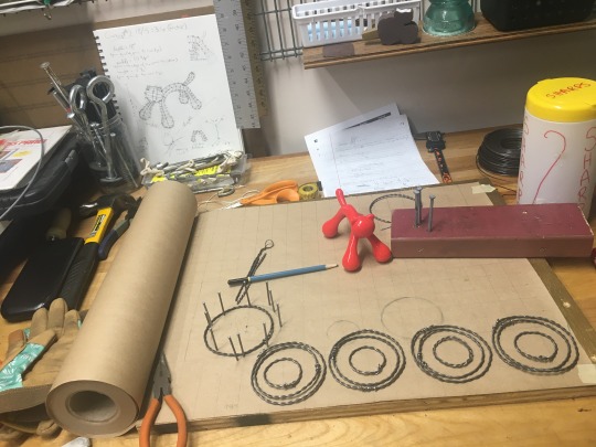
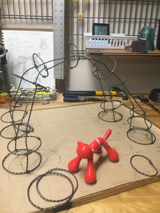

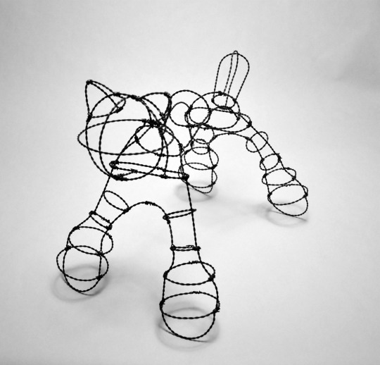

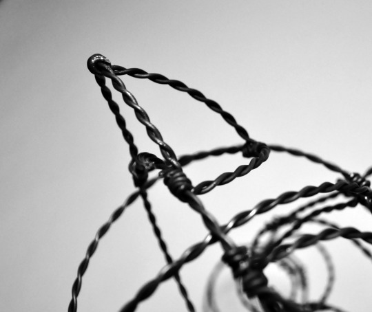
Kitty-in-the-Round, 18″x11″x12.5″ (LxWxH), Rebar Tie Wire
Looking at Alexander Calder’s sculptures in wire, I wanted to try my hand at it. I liked how Calder sculpted the contours of the portraits in such a minimal way, so that was something I wanted to try to imitate with this piece. I think what I wanted most from this progress was growth. Several times throughout the creation of this piece, I felt frustrated or discouraged, but I kept pushing through, and I created a piece that I can be a little proud of.
A large part of the process of creating this sculpture was truly figuring out how to best handle the wire. I constantly found myself frustrated with trying to tie the pigtail connections, as the wire would flail about anytime I applied more than just a little pressure. Then, I found that if I started the first twist of the wire with my fingers, rather than using the pliers the whole time, I could control the entire piece much better. I also struggled a little with measuring my reference object. The cat is so rounded and so small that I needed to use string to measure its dimensions, which caused some discrepancies among measuring.
I think, as I seem to find in a lot of my projects, I’ve found the greatest success in (or at least feel the happiest with) the little details of my project, particularly the ears and the tail of the cat. I think that because those were among the last objects I created, they feel the most refined, since I had the best handle on my technique at this time. I think I also made a good decision to simplify my sculpture from what I had planned in my concept sketch. I think I might have gone crazy if I tried to create 5 tiny rings per leg. The four were enough of a struggle for me.
This project helped me grow as a creator, helping me push past my desire for perfection and simply do the best I can. Also, it was fun, for me, to learn a new technique. I think I’m going to give my poor fingers a break from wire, but should I ever decide I want to create a new wire sculpture, I have plenty of spare wire left over!
0 notes
Text
2017 Holiday Newsletter
Welcome to the 2017 Politics and Prose Holiday Newsletter. As always, we’re proud to present a selection of some of the year’s most impressive books. Happy holidays to all!
Graphics

Chris Ware’s new collection, Monograph by Chris Ware (Rizzoli), assembles countless strips, pages, magazine covers, sculptures, photographs, and other things into a thorough and astoundingly generous retrospective of the artist’s career. It comes replete with commentary written by Ware himself, who charts his path from RAW to Jimmy Corrigan to Building Stories and beyond. Reading this book is like touring the interior of a vast and seemingly impossible mechanism carved from space metal, while your tour guide chats amiably and bemoans the lack of carpets. There are also individual booklets within the book that you can flip through, and several of his New Yorker covers depicted in their full glory. For any fan of the cartoonist, this is probably the single best purchase you could make this holiday, a blueprint for everything Ware has done over the past few decades. But for artists, this is something even better: Chris Ware opens the door backstage, shows you how he performs the magic tricks, and then gives you a chance to do it yourself. - Adam W.
Art and Artists

The Art Museum, by the editors of Phaidon Press, brings together an astonishing cross-section of work from around the globe and throughout time, reproduced in over 1,600 beautiful color images. The reader can jump from virtual room to virtual room by flipping the pages, or stay in one place for a comprehensive study. This book is perfect for an art lover, a person who wants to learn about art, or someone who loves art but whose feet just can’t take the Smithsonian anymore. A single book doesn’t get more entertaining or informative than this, and finally there is no crowd standing in front of what you want to see. - Bill L.

Women Artists in Paris: 1850-1900 (@yalepress) edited by Laurence Madeline, former curator at the Musée d’Orsay, is a must-own for art lovers, historians, and feminists alike. This stunning exhibition catalogue presents over eighty paintings by thirty-seven different artists. Paris in the late nineteenth century was considered the place for artists to train, and people came from around the world to develop their technique. This catalogue is a testament to the exceptional and varied work produced by the women who journeyed to Paris to pursue their artistic ambitions. These artists fought to achieve recognition at a time when artistic talent and creative genius were thought to be reserved for men, all the while also trying to adhere to the social norms that governed the lives of respectable women. They persevered in the face of rejection and condescension, and created masterful works of art in the process. The scholarly essays that open the book are fascinating and well worth the read, but the catalog of full-page color reproductions that follow are what readers will find irresistible. Here you will encounter works by household names like Mary Cassatt alongside those by artists still waiting to achieve the widespread public recognition they are due, such as Marie Bashkirtseff and Cecilia Beaux. - Alexis J. M.
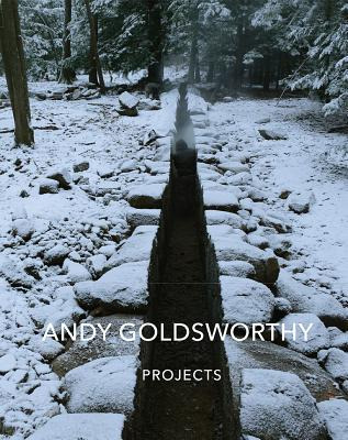
Projects (@abramsbooks) chronicles forty-four Andy Goldsworthy installations around the world, as they change and evolve with their environments. This book, a companion volume to Goldsworthy’s Ephemeral Works, includes stunning photographs, site maps, and an extensive interview. You’ll find his usual cones and labyrinths made of wood and stone, but unlike his “ephemeral” works, whose construction marked an endpoint, these pieces began life only when Goldsworthy finished them, for they evolve as they are weathered by the seasons. Goldsworthy documents, for example, walls covered in porcelain clay, as they dry, crack and tear away, and enormous slate chambers, enclosing wind-fallen branches, which gradually transform as moss and fungi cover them. He repaves an ancient forest track with rectangular stones and cuts a new path across an Ohio estate, always maintaining 950 feet above sea level. An igloo of woven branches sits inside a pit, accessed through a doorway via steps in a terraced wall. A flowing line of fallen cypress weaves through eucalyptus trees, which overtake a California landscape. But whatever he does in these installations, Goldsworthy invites us to experience nature freshly. This gorgeous, glossy volume will make an extraordinary gift for the art or nature lover in your life. - Amanda H.D.

Rothko: The Color Field Paintings (@chroniclebooks) is a tribute to one of the greatest periods by a single painter in art history. Mark Rothko (1903-1970), one of the leading Abstract Expressionists, pioneered the large, flat fields of solid color that Clement Greenberg dubbed “color field painting.” He worked his way toward them throughout the 1940s, and by 1949 had “arrived,” as his son, Christopher Rothko, says in the Foreword. The artist pursued color fields for the rest of his life, arranging two, three, and four color rectangles in dramatic and shimmering patterns that establish kinetic relationships between the viewer and the canvas. Presenting fifty of Rothko’s iconic paintings in chronological order, this book allows you to watch the artist develop his style and discover what the colors and rectangles could do; you can see the shades deepen, and darken. The volume also allows you to savor the full, luminous power of each composition, giving you the images one by one, with plenty of white space for the colors to breathe. Janet Bishop, curator of painting and sculpture at the San Francisco Museum of Modern Art, provides a commentary on Rothko’s legacy. - Bennard F.
Alexander Calder (1898-1976) was the son and grandson of sculptors, but when he went to school he studied engineering. Later, committing himself to art, he chose painting, like his mother. It took a few years before he accepted his fate and turned to sculpture. This brief period of indecision is the single moment of angst in the life of one of the twentieth century’s most joyful and original modern artists. Inheriting his father’s dexterity as well as his “playful, lively, fantastic” tendencies, Calder (Knopf) dedicated his life to animating the inanimate. In Jed Perl’s lively, affectionate, and thorough account to 1940, Calder’s life was pretty much on track from the start. With the avant-garde “always part” of it, he grew up in the artistic circles of both France and the U.S., a peripatetic life he continued. He was an incorrigible punster (see his work A Merry Can Ballet) and everything he did was infused with humor. Perl traces Calder’s jeux d’esprit from the early portraits and objects he made by bending wire, works that “suggested rapidly executed line drawings leaping into the third dimension,” to the elaborate Cirque Calder that was meant to be performed, not just looked at, and on to his abstractions, which were also a “menagerie…of unexpected forms” in motion, and which Perl, in the spirit of his subject, describes as “motions galumphing, jagged, swishy, swirly.” As playful as they were serious, these mobiles (named by Duchamp) and stabiles (so-called by Jean Arp) revolutionized sculpture, taking a stationary form, making it move, and creating new relationships between the viewer and the art. Perl is tireless in tracing Calder’s influences, which included Miró, Klee, Hélion, Saul Steinberg, Mondrian, Edgar Varèse, Martha Graham, and Malcolm Cowley. All were his friends, and Perl’s engaging, scholarly, and buoyant biography—and its 400-plus photos—makes it easy to see why. - Laurie G.
Among the few things known about Vivian Maier: she was a great photographer. She worked as a nanny. She was born in New York, lived in France from age six to twelve, grew up in a splintered family, spent the last fifty years of her life in Chicago, and left tens of thousands of photos, negatives, slides, and undeveloped rolls of film in storage. Once these surfaced after being auctioned off, their new owners began the myth-making that Pamela Bannos, a professor of photography, both charts and refutes. Her Vivian Maier (Chicago) is a kind of Emily Dickinson of photography; while she roamed the streets relentlessly, she let no one in. Her neighbors thought she was homeless because she spent so much time on a park bench. In lieu of friends to interview, Bannos turned to the photos for clues to Maier’s life. She has studied seemingly every image Maier recorded, and follows in her footsteps from Maier’s first forays with a camera in the early 1950s, in France, through her development as a prodigious street photographer in New York and Chicago, and her travels through Europe, South America, and Asia. Looking at what Maier looked at, Bannos reads these images beautifully, giving insight about Maier’s brilliant sense of composition, her experiments, and her ever-evolving technique. She identifies the cameras Maier used, points out angles, notes lighting and shadows, and traces recurrent themes. She brings the pictures to life so vividly, and is so convincing about what was in Maier’s mind at the moment she framed each shot, that this eloquent photographic interpretation itself becomes a masterful biography of Maier not as an eccentric but as a true artist and an uncommonly independent woman. - Laurie G.
Vermeer Diptych

The ne plus ultra of Vermeer art books, Vermeer in Detail (@abramsbooks) is a conclusive cataloguing of all thirty-two paintings by the master, accompanied by 170 extremely intimate—often full page—magnifications. Satisfyingly, in this one volume is everything the eye can take in from a Vermeer painting, elucidated by a thorough presentation of all the documentation and research we do have about the dismayingly mysterious, historically unreachable Johannes Vermeer. And yet this canonical volume’s greatest asset is the lightness with which author Gary Schwartz wears his learning. An American art historian residing in the Netherlands, Schwartz delivers prose unencumbered by any scholastic staidness or over-certainty, taking an intelligent but lightsome tone wholly befitting Vermeer’s oeuvre (“Dear Reader: it’s every Vermeer scholar for himself on this one,” he avers at one point). The manner in which Schwartz groups his chosen details into chapters is itself a revelation, providing fascinating insight into life in 17th- century Delft, as well as into Vermeer’s technical genius, yet nowhere detracting from the sheer awe of viewing the Old Master at such microscopic proximity. - Lila S.

A fascinating exercise and assay, Traces of Vermeer (@oupacademic) serves as an elucidating technical accompaniment to the broader scope of Vermeer in Detail. Jane Jelley is, first and foremost, a painter. But she has become something of a reconstructive art historian through her engagement with Vermeer and his artistic process. Vermeer’s startling command of light, the snapshot-like quality of his 17th century masterworks, has long baffled even his greatest admirers. It would seem he used a camera obscura as an optic aide, but how exactly Vermeer might have used it—and whether its use in some way detracts from his genius—has been highly controversial. Jelley brings a vast knowledge, and, more importantly, practice, of traditional painting techniques to this discussion: grinding one’s own pigment, preparing canvases, long apprenticeships, third glazes. Through trials in the studio, she proposes a novel suggestion as to how exactly Vermeer could have used a camera obscura lens to arrive at his compositions, plot them onto canvas, and then prepare and layer paint to create his unparalleled works. The process, she maintains, would only further elevate Vermeer’s genius. Jelley’s engaging prose is a boon to both scholars and casual art appreciators. - Lila S.
6 notes
·
View notes
Photo
Lovely review of my Warhol bio by Michael Millner in the US edition of The Spectator:
“An extraordinary and revealing biography — surely the definitive life of a definitive artist….There is something interesting, revealing or humorous on just about every page. Gopnik deftly excavates his data mine. His prose is precise and pointed, and his year-by-year narrative clips along. He is also a master of pithy and informative character and historical sketches.”
Magus of mass production
Warhol by Blake Gopnik
Ecco, pp.976, $45.00
reviewed by Michael Millner
This article is in The Spectator’s April 9, 2020 US edition.
‘If you want to know all about Andy Warhol,’ the artist said in the East Village Other in 1966, ‘just look at the surface: of my paintings and films and me, and there I am. There’s nothing behind it.’
This quotation re-appeared in 2002 on the US Post Office’s commemorative Warhol stamp. It’s fabulously fitting for a stamp that reproduced a self-portrait, but when scholars recently compared the audiotapes of the interview with the printed version, the passage wasn’t on the tapes. Warhol sometimes invented interviews from whole cloth. He answered questions with a gnomic ‘yes’ or ‘no’ or, refusing to speak at all, allowed proxies like his ‘superstar’ Edie Sedgwick to answer for him. After all, he was just surface — leather jacket, shades, wig. The magus of mass production was there and everywhere forever, but nowhere in particular.
This negation of personality seems a publicity ploy, or the evasiveness of a shy man, or possibly the self-protection of a gay man in pre-Stonewall America. It was all of this, but also much more. The self-as-surface routine was perfect for a new kind of celebrity, one founded less on accomplishment and talent and more on presenting a surface for the projected desires of a mass audience. Authenticity and the sense of a deep self were obstacles to the creation of this new celebrity persona. Warhol made millions by autographing screen prints that were mass-produced by anonymous assistants.
Warhol somehow understood how this all worked. Born in 1928 in Pittsburgh to working-class Catholics from eastern Europe who barely spoke English, he realized the power and danger of being known to the world. The flipside of ‘15 minutes of fame’, Warhol suggests again and again, is death. The paintings of Marilyn Monroe memorialized her suicide; those of Jackie Kennedy, her suffering following her husband’s assassination. After Warhol survived his own assassination attempt in 1968, he allowed Richard Avedon to photograph the surgeon’s scars that crisscrossed the surface of his torso.
There is no narrative development or personal bildungsroman in Warhol’s art, and his affectless manner resists psychologizing, the biographer’s stock-in-trade. His images are impressions, flashes whose immediacy, flatness and repetition carry little sense of progression. The Brillo box contains no story, and the subject of a film like Empire, with its eight hours of static footage of the Empire State Building, remains inanimate.
Despite Warhol’s resistance, Blake Gopnik has written an extraordinary and revealing biography — surely the definitive life of a definitive artist. He accomplishes this through broad and deep, even obsessive, research into what he calls Warhol’s ‘social network’. Gopnik reports that he consulted 100,000 period documents and interviewed 260 of Warhol’s lovers, friends, colleagues and acquaintances. Warhol kept everything — he was a hoarder, collector and archivist all his life — and Gopnik has left no archival folder unopened or box unperused. Across 976 pages and more than 7,000 footnotes on a separate website, he recreates the swirl of ideas, culture and especially
people that orbited Warhol.
Warhol famously thought of his studio as a factory, producing work after work off an assembly line. The catalogue raisonné of his paintings, drawings, films, prints, published texts and conceptual works would, if it were ever completed, rival that of the other master of 20th-century self-replication, Picasso. Gopnik has surveyed it all.
There is something interesting, revealing or humorous on just about every page. Gopnik deftly excavates his data mine. His prose is precise and pointed, and his year-by-year narrative clips along. He is also a master of pithy and informative character and historical sketches:
‘Warhol’s Pop wasn’t about borrowing a detail or two from commercial work, as many of his closest colleagues [like Robert Rauschenberg] did; it was about pulling all its most dubious qualities into the realm of fine art and reveling in the confusion they caused there. ‘He wants to make something that we could take from the Guggenheim Museum and put it in the window of the A&P over here and have an advertisement instead of a painting,’ complained one early critic of Warhol’s, getting it right, but backward: Pop pictures started in the windows and then migrated to the museums.’
Warhol is about the Age of Warhol as much as Warhol himself. We learn about the new possibilities of gay life in 1950s New York, the city’s underground film scene, the history of silk-screening (so important to Warhol’s art), the fluctuations of the art market, the history of department-store window design. We learn about fascinating things we may not even want to learn about, such as the size and color of Warhol’s penis. (Large and gray, like the Empire State Building.)
Warhol arrived in New York City in 1949 and quickly made a name for himself as a commercial illustrator, especially of women’s shoes. He lived for two decades with his mother, Julia, one of his most influential muses, and sought out an emerging coterie of gay artists including Truman Capote, with whom he had a stalkerish infatuation. The great Pop paintings of the early 1960s transformed American art. No less important was Warhol’s mid-Sixties salon and studio, the Silver Factory (silver because wallpapered in aluminum foil). This perverse and fecund anti-commune of ‘superstars’ and hangers-on spawned Lou Reed and the Velvet Underground, as well as Warhol’s wannabe assassin, Valerie Solanas. On June 3, 1968, Solanas shot Warhol in the name of feminist revolution. His heart ceased beating on the emergency room table before a determined surgeon saved him. In the 1970s, he turned to what he called ‘business art’, mainly portraits of other famous people. He died in 1987, aged 58, after gallbladder surgery. Gopnik unpicks many of the conventions of Warhol’s non-biography. Warhol wasn’t an aesthetic rube when he arrived in New York. He had received an extraordinary avant- garde education from four years at the Carnegie Tech art school and at the Outlines gallery, which had brought Jackson Pollock, Alexander Calder, Joseph Cornell, Francis Bacon, Merce Cunningham and many other transformative artists to Pittsburgh in the 1940s. Warhol did not suddenly reinvent himself as a Pop artist in the early 1960s. As he built a successful career illustrating advertisements in the Fifties, he regularly tried to cross the line between commercial and fine art — a crossover he finally achieved in late 1961 with ‘Campbell’s Soup Cans’.
Warhol was baptized ‘Drella’ by acquaintances — part bloodsucking Dracula and part innocent yet social-climbing Cinderella. But Gopnik also argues that one of Andy’s greatest desires was for compassionate companionship. This was never achieved. The ‘routine’ gallbladder surgery which led to his death was anything but routine. He had been very ill for weeks but avoided treatment out of a lifelong fear of surgery and a misplaced faith in the healing powers of crystals.
Emphasizing Warhol’s radical ambiguity in art and life, Gopnik makes it impossible to say anything easy about him. His Warhol is a complex artist practicing what Gopnik, in a marvelous turn of phrase, calls ‘superficial superficiality’. The Warhol brand, the images of branded goods, famous faces and dollar bills, celebrates consumerism but also leaves us a little nauseated from our commodity fetishism. Warhol’s endless ‘boring’ films are hard to ignore because they give us so much space and time to think. They are studies in modern emptiness, and thus deep meditation. Warhol the critic of modern celebrity was also one of its greatest adulators.
This double image of Warhol seems just right. ‘His true art form,’ Gopnik writes, ‘first perfected in the first days of Pop, was the state of uncertainty he imposed on both his art and his life: you could never say what was true or false, serious or mocking, critique or celebration... Examining Warhol’s life leaves you in precisely the same state of indecision as his Campbell’s Soup paintings do.’
Gopnik’s analysis of Warhol’s ambivalence evokes another great observer of midcentury American culture. Lionel Trilling, the gray-suited lion of Columbia’s literary studies, would have hated Warhol, had he deemed the Silver Factory worthy of a visit. Still, Trilling’s America is Warhol’s:
‘A culture is not a flow, nor even a confluence; the form of its existence is struggle, or at least debate — it is nothing if not a dialectic. And in any culture there are likely to be
certain artists who contain a large part of the dialectic within themselves, their meaning and power lying in their contradictions.’
To Trilling, the great American authors contained ‘both the yes and the no of their culture, and by that token they were prophetic of the future’. Warhol absorbed and reflected the affirmations and negations of his America — but was he prophetic of ours?
Yes and no. For a long time now we have lived in the Age of Warhol. If he were alive today, he would film us staring blankly at the social networks on our smartphones, hour after hour, while nothing and everything go on and on. By retaining ambivalence, Warhol allowed us to recognize and experience the deepest ethical dilemmas of American life — and he paid a price for being our screen and mirror.
0 notes
Last Seen Blogs
airini
airini

bahlinka
BAHLINKA

charlieschances
Untitled

robynmeif
Robyn’s Ramblings
mariamnorris
Whatever