#SoftBlurring
Text
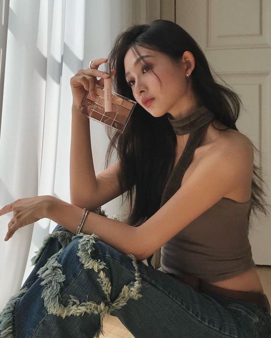
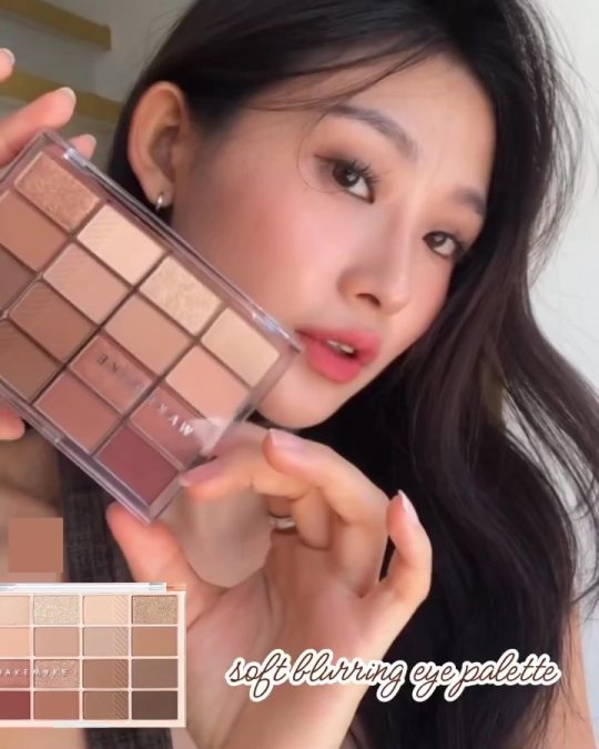
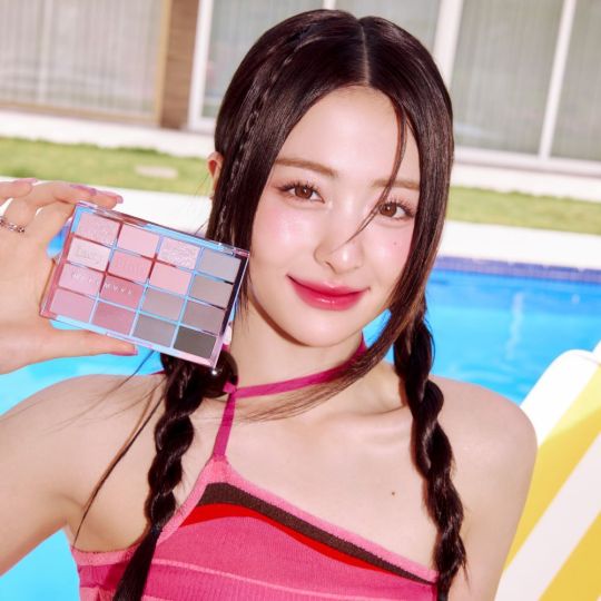
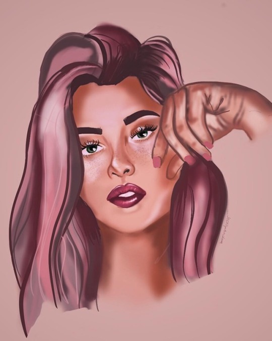
Trang điểm mắt nhẹ nhàng và tinh tế: WakeMake Soft Blurring Eye Palette
Xin chào! Đây là BeautySAIGON.
Hôm nay, chúng ta sẽ tìm hiểu kỹ về bảng
màu mắt Soft Blurring của Wake Make.
Wake Make là thương hiệu mang đến nhiều màu sắc và
chất liệu khác nhau phù hợp với màu sắc cá nhân!
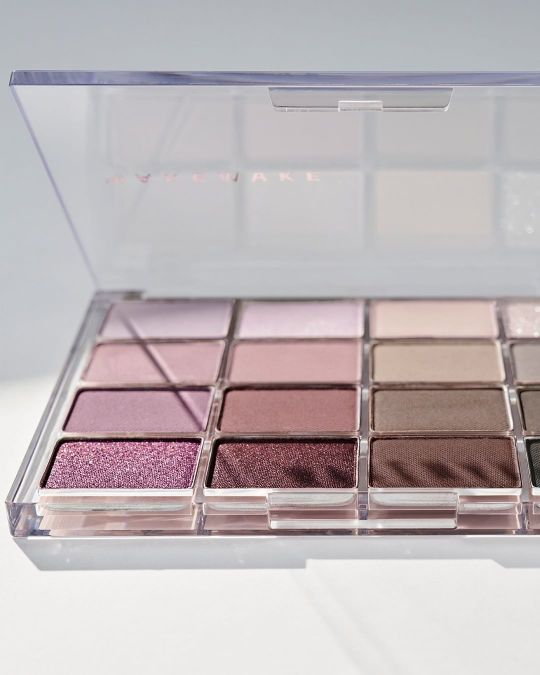
Bảng màu mắt Soft Blurring bao gồm 16 màu sắc tinh tế,
từ màu nền đến màu nhũ, được cấu tạo bởi nhiều chất liệu phong phú.
Sản phẩm này được nhiều người yêu thích
nhờ màu sắc xuất sắc và cảm giác sử dụng mềm mại.
Từ bây giờ, chúng ta sẽ xem xét kỹ lưỡng về cảm giác sử dụng,
thành phần chính, cách sử dụng, cách áp dụng, v.v.

Mỗi bảng màu được chia theo các tông màu như Spring Warm,
Summer Cool, Autumn Warm, Winter Cool, v.v.,
Lần này, tôi sẽ chi tiết hơn về hiệu quả,
cảm giác sử dụng, thành phần chính, cách sử dụng,
cách áp dụng, v.v. của Muted Coral Blurring mà tôi đã sử dụng trực tiếp.
Bảng màu này có thể được sử dụng như một lớp nền không có ngọc trai,
một bóng mắt shimmer với một chút ngọc trai,
đến một bóng mắt glitter với ánh sáng lấp lánh,
được chia thành 16 mức độ sáng và độ đậm phù hợp với tông màu da.
Với tông màu Autumn Warm, một chút màu hồng ấm được thêm vào,
và màu nâu được pha trộn, tạo ra một không
Hãy để tôi kể cho bạn nghe về các
thành phần chính của Mute Coral Blurring.
Bảng màu này gây kích ứng da.
Nó bao gồm một số thành phần.
Ví dụ, axit hyaluronic giúp cải thiện độ ẩm và độ bóng của da;
Chiết xuất hoa cúc có tác dụng làm dịu da và chống viêm,
Có collagen giúp da đàn hồi và giữ ẩm.
Ngoài ra, paraben, màu nhân tạo, phốt pho có hại cho da.
Không có nước hoa, vv bao gồm.
Vì vậy ngay cả những người có làn da nhạy
cảm cũng có thể tự tin sử dụng.
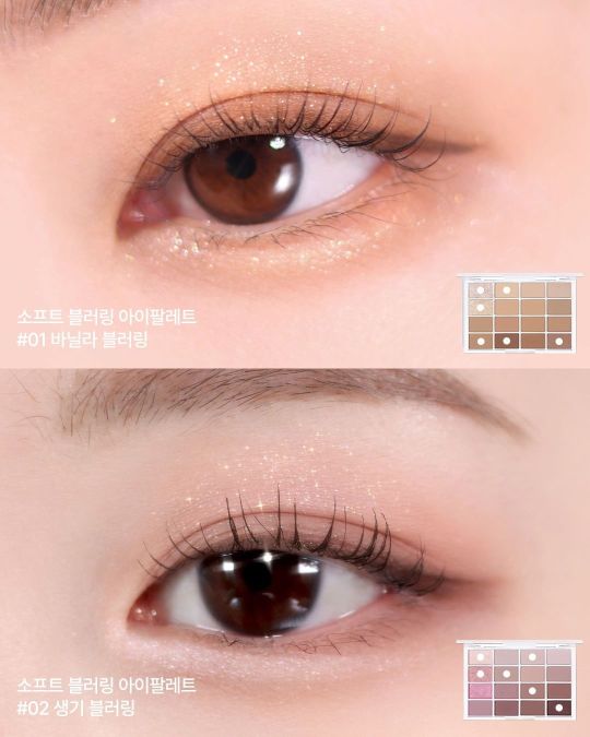
Bây giờ, hãy để tôi chỉ cho bạn cách sử
dụng tính năng làm mờ san hô tắt tiếng.
Bảng màu này kết hợp nhiều màu sắc và công thức khác nhau.
Bạn có thể trang điểm theo bất kỳ cách nào bạn muốn.
Tôi thường thoa một lớp nền không ngọc trai lên toàn bộ khuôn mặt.
Đánh bóng mí mắt bằng bóng lung linh,
Thêm điểm nhấn cho phần trước mắt của bạn bằng phấn nhũ lấp lánh.
Sau đó, dùng cọ thoa nhẹ màu tối lên khóe mắt.
Kết thúc bằng bút kẻ mắt và mascara.
Điều này sẽ khiến bạn cảm thấy tự nhiên và bình tĩnh.
Trang điểm tông màu ấm áp mùa thu đã hoàn tất.
Nó có thể được sử dụng không chỉ để trang
điểm mắt mà còn có thể dùng để đánh má.
Nếu bạn làm điều này, bạn có thể đạt được một mức độ mờ san hô bị tắt tiếng.
Bạn có thể trang điểm với cảm giác thống nhất.
Cuối cùng, làm mờ san hô
Tôi sẽ cho bạn biết cách sử dụng nó.
Nó được tạo thành từ những màu sắc phù
hợp với tông màu ấm áp của mùa thu,
Những người có tông màu khác nhau
cũng có thể sử dụng nó một cách thích hợp.
Những người có tông màu ấm mùa xuân nên có tông màu mơ.
Nếu bạn sử dụng bóng lung linh hoặc bóng lấp lánh làm điểm nhấn,
Bạn có thể tạo ra một hình ảnh tươi sáng
và tươi sáng với tông màu ấm áp của mùa xuân.
Nếu bạn có tông màu mùa hè mát mẻ,
hãy sử dụng phấn mắt màu hồng nhũ.
Sử dụng bóng lấp lánh
Bạn có thể lưu giữ hình ảnh mát mẻ và sạch sẽ của tông màu mát mẻ mùa hè.
Những người có tông màu mùa đông mát mẻ sẽ trông có màu nâu.
Nếu bạn sử dụng phấn mắt lấp lánh hoặc lớp nền không ngọc trai,
bạn có thể có được tông màu mùa đông mát mẻ.
Bạn có thể tạo ra một hình ảnh bình tĩnh và sang trọng.
Nếu bạn lựa chọn và kết hợp những màu
sắc phù hợp với tông màu da của mình,
Bạn có thể tận dụng hiệu quả hơn tính năng làm mờ san hô bị tắt tiếng.
Wakemake làm mờ mềm mại như thế này
Tôi đã tìm hiểu về i-palette.
Hãy thể hiện vẻ quyến rũ tự nhiên và cá tính của bạn với sản phẩm này!
#WakeMake#SoftBlurring#EyePalette#MakeupArtist#DailyMakeup#BeautyBlogger#ColorPalette#MakeupLook#EyeMakeup#MakeupItems#CoolToneSkin#WarmTone
0 notes
Text

olympus digicam softblur in the foodcourt
15 notes
·
View notes
Photo
"I've been embraced by a new community. That's what happens when you’re finally honest about who you are; you find others like you."-Chaz Bono Model: @happyhullaballoo Wanted to quickly share this as it was one of the first photos I've taken with my lensbaby velvet. It gives it a lovely blurred glow which I'm looking forward to using more. #photography #portraitphotographer #portraitphotography #photographer #glasgowphotographer #PRIDE #modelphotography #LGBT #LGBTQIA #bisexual #pansexual #asexual #lensbaby #lensbabyvelvet #blurry #softblur #nonbinary #boundlessphotography https://www.instagram.com/p/CfmilsHNWrg/?igshid=NGJjMDIxMWI=
#photography#portraitphotographer#portraitphotography#photographer#glasgowphotographer#pride#modelphotography#lgbt#lgbtqia#bisexual#pansexual#asexual#lensbaby#lensbabyvelvet#blurry#softblur#nonbinary#boundlessphotography
1 note
·
View note
Text
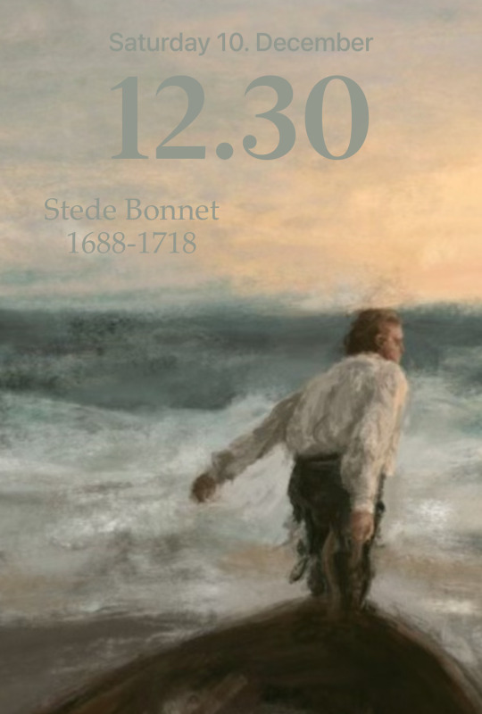
This is for Stede.
Background @softblurred
8 notes
·
View notes
Photo
Yeah, I’m tired and feeling empty - Jeremy Zucker • • • •#moodz #stipple #stippling #grunge #septum #sleep #bags #bagsundereyes #digital #procreate #basic #dotwork #illustration #male #digitalart #student #studentrgd #rgd #sketch #tumblr #septum #color #grunge #aesthetic #procreate #applepencil #ipadpro #adobe #adobedraw #monochrome #monochromatic #softblur
#studentrgd#dotwork#illustration#procreate#male#bags#applepencil#adobedraw#adobe#digital#ipadpro#aesthetic#stipple#grunge#monochrome#softblur#student#rgd#septum#sketch#color#monochromatic#sleep#tumblr#digitalart#bagsundereyes#moodz#stippling#basic
2 notes
·
View notes
Photo
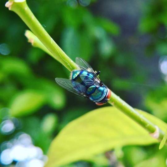
Bokeh #fly #Lumia950 #photography #housefly #nature #green #blurbackground #bokeh #softblur #pleasant #colorful #photo (at Vallampatla, Illanthakunta, Rajanna-Siricilla)
#pleasant#blurbackground#green#colorful#photography#nature#softblur#lumia950#photo#housefly#fly#bokeh
0 notes
Photo

Yesterday's sunset blazed the westward trail from this beloved island to our next destination, where we'll find family on a hilltop in the Costa Rican jungles. ¡Hasta pronto, @manexrey ✌️💚🤙 . #nomadventures #sunsets #puertorico #softblur #cameraplus #nextstop #puravidaherewecome (at Playa de Isla Verde)
0 notes
Photo

Flash forward 2017 Photo: @dean__elliott Makeup: @karina_lobos Model: Melina @melinoto from @weloverebel Santiago - - #flashbacktothe80s #stylesofthepast #softblur #colourgel #studiophotography #deanelliottphotography #santiago #fashionportrait #retrostyle #neonlight #matangaestudio #actitudematanga (at Santiago, Chile)
#actitudematanga#colourgel#studiophotography#flashbacktothe80s#retrostyle#neonlight#matangaestudio#softblur#deanelliottphotography#fashionportrait#santiago#stylesofthepast
0 notes
Text
Edit Away – The quest for a perfect HDR
A big thanks to everyone for visiting! This photo has 55’000 views and 550 favorites!
View Large ‘Edit Away’ On Black
(This is a re-edited HDR of Forest Railroad Bridge)
Note: Below tutorial was written for Photomatix Pro 2.22. Photomatix latest software version has similar but slightly different settings.
The quest for the perfect HDR – A Photomatix Tutorial
I’ve had a few people ask me how I make my HDRs, so I decided to post the guide here.
I’m not really explaining what a HDR is, as that has been explained really well before. (Check the links there too)
I use Photomatix, which you can try for free and download here: www.hdrsoft.com
I use the full (pro) version, which gives you the option to do Tone Mapping. I didn’t have that option with the free basic version, so you will have to buy the pro version as far as I know to make HDRs and to tone map them.
I almost always used a tripod so far, and generally make 3 exposures (3xp). These xp would all be 2 stops apart. So one with the highest xp (xp +2), one with xp 0, and one with the lowest xp (xp -2). For some photos I also used 5xp, where they are all 1 stop apart. I shoot JPG, as my camera doesn’t have RAW shooting options. 🙁 Sponsor me for a new camera? 🙂 Donate with Paypal
One thing you should keep in mind is that more xp has its advantages and or disadvantages.
Advantages of more xp
Higher color range – More different xp to get the color information from.
Less blur in some cases – If you are photographing things that are close to you in windy conditions, like leaves on a tree that are 1m or closer away from you, taking 5xp or even 7xp or more, will make sure that at least some of the photos will be aligned. This reduces blur on the final HDR because the 1 or 2 photos that might be unaligned will not be as visible if you have 5 that are. If you would only take 3xp, there is a great chance that if one of them is unaligned, it will show pretty clearly in the HDR, which is not always nice. I am not talking about soft blur, which usually does look pretty nice; I am talking more about seeing two leaves overlapping each other for example, which is not what we want. The more xp you take, the higher chance you have of your unaligned photo turning out to add soft blur, which is good.
Disadvantages of more xp
More work & takes longer – Logically, you are going to have to take an extra 2 or 4 photos. Sometimes you have to work fast because of changing conditions or movement, photographing people that have to sit still for a long time is hard for example.
More possibility of unaligned photos – Of course, the more photos you take, the higher the chance is that you get one that is not aligned. With only 3xp, if you are fast and your camera is stuck securely, and it’s not windy, you have a good chance that you won’t have any unaligned photos. But if you take 7xp there might just be one or two that won’t be aligned. Still, this might be part of the advantages as I explained above, since that might result in an accidental soft blur.
Soft blur
I have used this technique on some of my HDRs, and I think it looks very nice. So how do I do this? Well, if you haven’t found out yourself yet, it’s pretty easy. Blur one of the photos; usually I take the middle one or one that is a little overexposed, xp 0 or xp +1. However you do this is of course up to you, and I will let you experiment for yourself with that. I used Gaussian blur in Photoshop with a blur of 5 or 10 pixels.
Then you make the HDR as normal, and I have done this in 2 ways so far. Let’s say we have a photo that we made 3xp of and we use xp + 1 to blur. Either you can replace xp +1 with the blurred version, and make a HDR of 3xp of which one is blurred, or you can add the blurred version to all 3 originals. Then you will have 4xp. I like this result better usually and it’s not really more work.
Tip: Make the HDR from the normal exposures first, then blur one of the exposures, and add it to the other exposures, take them into Photomatix again, and use the button “Previous Settings” to get exactly the same HDR coloring and contrast etc as you got in the non-blurred HDR.
Edit: To get a blurred photo, of course you can also just set your camera to macro mode or make an unfocussed photo by focussing incorrectly. Doing this gives different results than blurring with Gaussian blur in Photoshop.
Edit 2: Lately I have been using a different method. Finish the HDR, then open it in Photoshop. Double the layer, and do a gaussian blur between 10 and 50 pixels or so. Set the layer to "overlay" mode and reduce the opacity to 50% or so if that looks better. Play around with the brightness and saturation of the blurred layer as this can give some nice effects as well. I sometimes also only blur certain parts of an image if that looks better.
Tone Mapping
This it one of the most important steps in getting a nice HDR. Take your time for this. I spend more time tone mapping sometimes than taking the photos.
I will explain the tone mapping in Photomatix, as that is the only program I have used so far.
If tone mapping is a magical machine that can create beautiful dreamy photos, then this machine has 7 weird dials and levers that can help you find the right combination of the perfect HDR.
Of course I must say that making a perfect HDR also requires perfect photos… 🙂
I will explain these "levers and dials" only as far as I know, I am no pro, I just try things out myself as well. The italic text is from Photomatix’s help file.
Luminosity
Adjusts the brightness of the shadows and the amount of local contrast enhancement. Moving the slider to the right has the effect of boosting shadow details and brightening the image. Moving it to the left gives a more natural look to the tone mapped image.
Slide this to the left to make the image generally darker, and to the right to make it brighter. I have more often used it to make things brighter so far, because I love bright daylight images, but if you want a more natural, or darker image, maybe the left side is better.
Strength
Controls the strength of local contrast enhancements. A value of 100% gives the maximum increase in local contrast.
Be very careful with this setting. This is one of the strongest edits. Play with it as much as you like, you will see the difference. It depends as well on what your photo is. If you have clouds in the photo, setting this higher than 50% often creates grey shadows on clouds that are the typical ugly HDR. I have only seen a very few HDRs with dark clouds that looked good. I only set this to 100%, or often around 70% when I have few or no clouds or sky in the photo. This setting can be set lower to reduce halos around clouds and other subjects in your photo as well.
Color Saturation
Controls the saturation of the RGB color channels. The greater the saturation, the more intense the color. The value affects each color channel equally.
Set this low to create a flat image with less color, or to the right to make a bright colourful image. I often set this (too?) high, because I love color.
White Clip & Black Clip
Both sliders control how the minimum and maximum values of the output image are set. Moving the sliders to the left increases global contrast. Moving it to the left reduces the clipping at the extremes. The White Clip slider sets the value for the maximum (pure white or level 255). The Black Clip slider sets the value for the minimum (pure black or level 0).
I usually set White Clip anywhere between 0.250% – 5.000% and Black Clip pretty low around 0.100%. Setting black too high, often creates halos around clouds, and makes the image seem weirdly dark.
Smoothing
Controls the amount of smoothing of luminance variations. A higher value tends to give a more natural look to the image. A lower value increases sharpness.
I agree completely with Photomatix, and can only add that I prefer High, or Medium. I hardly ever use the lower settings, but have a look at them anyway just in case.
Microcontrast
Controls the accentuation of local details. The default value (0) is the optimal value in most cases. However, this control may be useful in the case of a noisy image or when the accentuation of local details is not desirable (e.g. seams of a stitched pano in a uniform area may become visible when local details are too much enhanced).
So I assume that with the default value they mean “Very Low”? Im not sure. At least, Microcontrast does what it says it does. It makes the contrast between small details Very Low, Low, Medium or High. I usually use Medium or sometimes High. I find the lower values make the image too flat.
For the rest you find buttons under tone mapping for Settings to use Previous tone mapping settings, Default settings provided by Photomatix, these have never looked good according to me, and load and save settings. Save your settings if you think they look good and you want to use them more often. I use preview size 768, which is unfortunately the highest, I would like a higher resolution. (Set this size to be default: View > Default Options > tab HDRI > Preview Size 768.)
Hope this all helps; I would love feedback or suggestions. Let me know what you do differently, I’m interested in everyone’s techniques, as HDR is a powerful tool that can give very nice results if used correctly.
I will post this guide on some of the HDR groups, as I think it will be interesting for everyone!
Enjoy your quest for the perfect HDR!
and if you’ve found it, let us know of course! 🙂
Christiaan
Posted by Christiaan Leever NL on 2006-05-14 00:10:45
Tagged: , forest , railroad , bridge , hdr , softblur , dream , green , catchycolor , netherlands , nederland , holland , rails , train , tracks , tutorial , help , quest , learn , technique , tone mapping , luminosity , strength , saturation , white clip , black clip , smoothing , microcontrast , exposure , high dynamic range , 81 Points
The post Edit Away – The quest for a perfect HDR appeared first on Good Info.
0 notes
Photo

Look how cute this Hello Happy is! 😍💕 @benefitcosmeticsuk @debenhamsbeauty #benefitcosmetics ———————————————— What are your favourite foundations?? 💕 ———————————————— New blog posts and reviews on my website! Link in Bio! ☝🏻🤗💕 ———————————————— #slavetomakeup #motd #makeuptalk #happy #softblur #lipgloss #norvina #makeupartist #makeup #venus #slay #beautyguru #beautycommunity #bbloggeruk #hudabeauty #vegas_nay #anastasiabeverlyhills #sleekmakeup #porefessional #highlighter #moonjelly #muafollowtrain #makeupreview #softglampalette #modernrenaissance #glowkit https://www.instagram.com/p/BuGtSStBrYI/?utm_source=ig_tumblr_share&igshid=h8ac43ui6iqy
#benefitcosmetics#slavetomakeup#motd#makeuptalk#happy#softblur#lipgloss#norvina#makeupartist#makeup#venus#slay#beautyguru#beautycommunity#bbloggeruk#hudabeauty#vegas_nay#anastasiabeverlyhills#sleekmakeup#porefessional#highlighter#moonjelly#muafollowtrain#makeupreview#softglampalette#modernrenaissance#glowkit
0 notes
Photo

I decided to switch foundations now that my skin is behaving itself! 😍💕 @benefitcosmeticsuk @debenhamsbeauty #benefitcosmetics ———————————————— What are your favourite foundations?? 💕 ———————————————— New blog posts and reviews on my website! Link in Bio! ☝🏻🤗💕 ———————————————— #slavetomakeup #motd #makeuptalk #happy #softblur #lipgloss #norvina #makeupartist #makeup #venus #slay #beautyguru #beautycommunity #bbloggeruk #hudabeauty #vegas_nay #anastasiabeverlyhills #sleekmakeup #porefessional #highlighter #moonjelly #muafollowtrain #makeupreview #softglampalette #modernrenaissance #glowkit https://www.instagram.com/p/BuGtQibBS4f/?utm_source=ig_tumblr_share&igshid=dsv1yf8dfbic
#benefitcosmetics#slavetomakeup#motd#makeuptalk#happy#softblur#lipgloss#norvina#makeupartist#makeup#venus#slay#beautyguru#beautycommunity#bbloggeruk#hudabeauty#vegas_nay#anastasiabeverlyhills#sleekmakeup#porefessional#highlighter#moonjelly#muafollowtrain#makeupreview#softglampalette#modernrenaissance#glowkit
0 notes
Photo

Flash forward 2017 Photo: @dean__elliott Makeup: @karina_lobos Model: Nathalia S. from @weloverebel Santiago - - #flashback #sunglasses #softblur #colourgel #attitude #deanelliottphotography #santiago #fashionportrait #retrostyle #neonlight #actitudematanga #matangaestudio (at Matanga Estudio)
#retrostyle#flashback#softblur#attitude#matangaestudio#sunglasses#colourgel#actitudematanga#fashionportrait#neonlight#deanelliottphotography#santiago
0 notes
Photo

Flash forward 2017 Photo: @dean__elliott Makeup: @karina_lobos Model: Melina @melinoto from @weloverebel Santiago - - #flashbacktothe80s #stylesofthepast #softblur #colourgel #studiophotography #deanelliottphotography #santiago #fashionportrait #retrofuture #electrosynthpop #neonlight
#softblur#neonlight#retrofuture#colourgel#stylesofthepast#fashionportrait#studiophotography#deanelliottphotography#electrosynthpop#santiago#flashbacktothe80s
0 notes
Photo

Flash forward 2017 Photo: @dean__elliott Makeup: @karina_lobos Model: Melina @melinoto from @weloverebel Santiago - - #flashbacktothe80s #stylesofthepast #softblur #colourgel #studiophotography #deanelliottphotography #santiago #fashionportrait
#colourgel#deanelliottphotography#fashionportrait#studiophotography#stylesofthepast#softblur#santiago#flashbacktothe80s
0 notes
Last Seen Blogs


leafstick
Untitled

hastajunianto-blog
Hasta
malkavian-shrink
"We are all a little mad in here~"
to-the-moon-julie
Stay Classy