#artist tools
Note
Hello Mieau, would you mind to give a tour of the art materials you use? xo
Yeah, sure! Let me see, here is what I mostly use:
For digital art I love to draw with Clip Studio Paint, paired with Photoshop for touch-ups and preparing files for printing. My tablet is a Wacom Intuos Pro medium. I also have an Ipad pro with a CSP subscription, that I use sometimes.
For traditional art recently I'm mostly just sketching but my favorite brand of sketchbook is definitely Maruman! The pages are very thin so it's a good reminder that a sketchbook has to be used in a lighter way, it can't be perfect. I have different sizes!
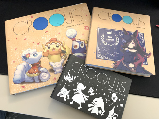
Pencil-wise I like to use Kurutoga (it's a brand of mechanical pencils that automatically rotates the nib, so you go trough them more efficiently). Basic kneaded eraser. And for book signings I use Faber Castell Polychromos (they are very hummm... "soft"?) for a nice colored under-sketch paired with some fine nib permanent black marquer!

21 notes
·
View notes
Text
Free Procreate brushes (tips are welcome and appreciated <3)
I hope you enjoy these! I love painting animals!
83 notes
·
View notes
Text
Hot artists don’t gatekeep!
I came across a series from @/alinalal_ on TikTok & I just had to share them here as well. If this helps you, or you want to support an artist, please reblog this post AND follow alinalal_ on TikTok!!!
All links are written out (thanks tumblr) but you can also click the SOURCE LINK to be taken to my allmylinks page where I've linked everything :)
Practising & Learning:
Practice Figure Drawing - line-of-action.com
Learn Perspective - drawabox.com
References:
Character design reference - characterdesignreferences.com
Reference at Specific Angle - sketchfab.com
Resources:
Film screencaps for studies - film-grab.com / fancaps.net
Free icons for projects - thenounproject.com
Free Stock Images - pixabay.com, unsplash.com, pexels.com, commons.wikimedia.org
More Interesting Faces - earthsworld.com
Brushes:
Free Environment brushes - Devin Elle Kurtz brushes
Advice etc.
Advice - dearartdirectior.tumblr.com
Rates of Illustrators - litebox.info
Quality of life:
Colour Palettes - coolors.co
Poses in motion - bodiesinmotion.photo
Combine references in 1 place - pureref (vizref/mobile)
#artist tips#artist tools#thank you to op ilysm#supportcontentcreators#dearindies#WHO TF ELSE DO I TAG
32 notes
·
View notes
Text
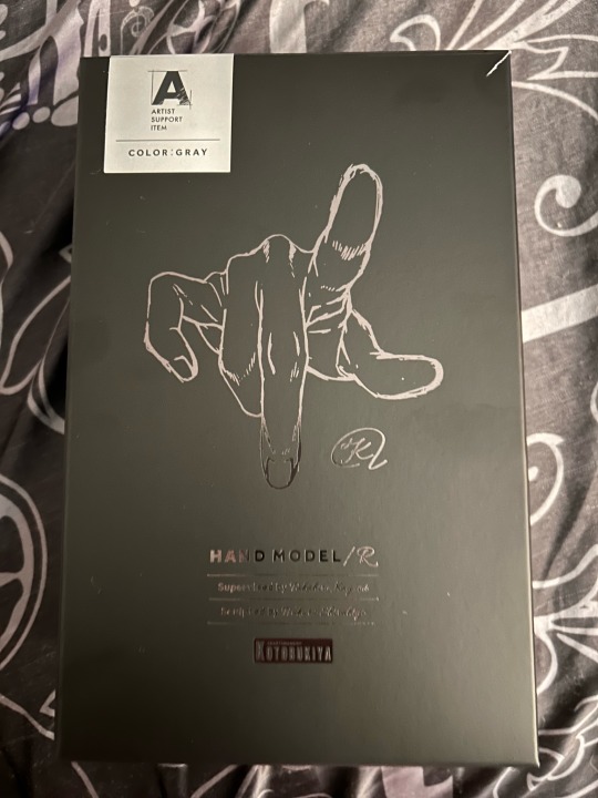
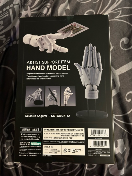
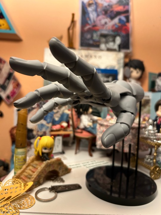
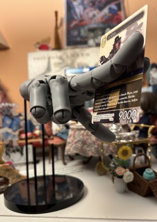
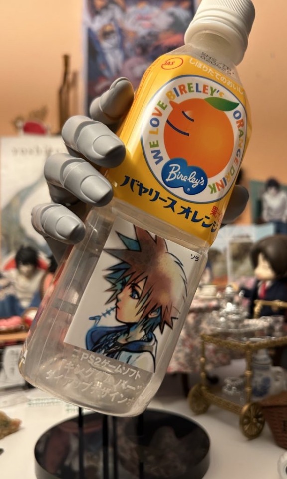


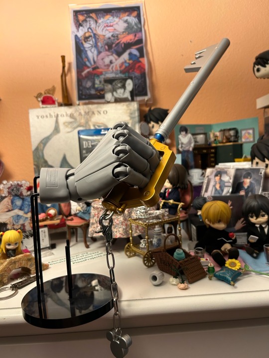
Kotobukiya Artist Support Hand R
Ahhh it’s so posable, love it. I heard the left version comes out in June but haven’t seen anything about preorders for that one 🥺
6 notes
·
View notes
Note
Hi, I just wanted to ask you something if it's no problem to ask.
I really like the old comic feeling your arts have and I would like to know which brushes, textures and color palletes you use? Or any advices for that type of art and where I could possibly find sources that could help learn about.
Hiya!
I draw in procreate and use these products from Retro Supply


And recently I bought KraftTone by True Grit Texture Supply which has an identical halftone system to Colorlab, but I wanted to know the difference. That being KraftTone has their CMY values (slightly) darker to give a gritty feel compared to Colorlab who gives you brighter color.
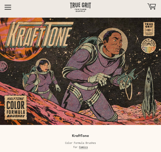
Before either of these products were available I used Debaser by True Grit Texture Supply. Instead of mixing your own halftone colors, Debaser has them ready to go. Just import the color file and brush in where you want the color. I still use this when I’m lazy or don’t wanna put in the extra effort 😅 (it still looks great tho!).
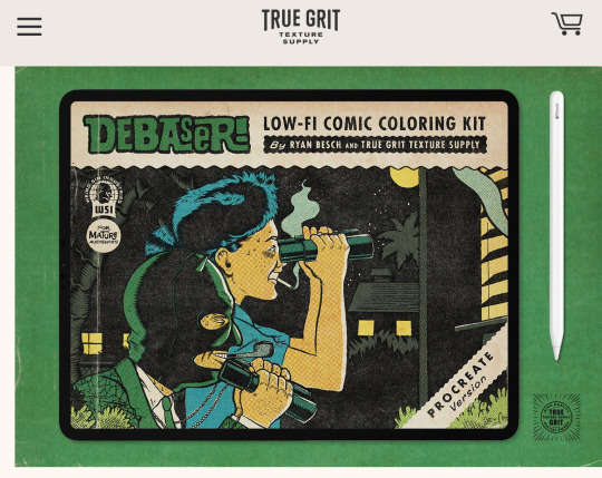
All these products come included with textured paper, inkers, distress effects and color chart references all of which I use in my art. 👍 These are all available for photoshop, illustrator, and Affinity. And I think right now only KraftTone is available for Clip Studio Paint. I can go into more depth about these products if you want to in another post.
If you don’t know about the comic color process and print here’s a quick article that will help you understand better.
You can find comic references anywhere. I get mine from Pinterest! Searching “vintage/retro comics” will give you a plethora of images that you can click through and get more similar images or find neat websites like this one!
Details I take note of when starting a piece:
If the colors and blacks will be vibrant or faded
If the print will be clean or bleeding and shifted ( or if I’m using halftones at all or solid color)
If the comic will have an overall yellow tint from age
How will I ink the lineart


There isn’t really a guide that teaches you how to achieve every single iteration of comic style. You get your lineart and halftones down and from there you experiment with effects depending on what look you want to achieve, which is the fun part imo. But on the retro supply website under “resources” they offer tutorials how to achieve various effects and art styles.
If you plan on mixing your own halftones it’s easier color it like normal then translate that color to halftones. The products I use all offer a solid color palette to the corresponding halftones to make the process easier because it does get a tad confusing especially if you forget what color formula you were using ( it’s a pain to match the colors tbh b/c they’re not labeled), I should pre color my stuff, but I don’t and I end up fumbling over myself. Lol.
Hope that helped some! Cheers!
#resources#artist tools#vintage comics#retro comics#retro supply#true grit texture supply#supplies#links
132 notes
·
View notes
Text
#artist#artist tools#digital art#procreate art#procreate brushes#procreate#clip studio brush#clip studio assets#krita brushes#itchio#sakura art#sakura flowers#sakura
13 notes
·
View notes
Text
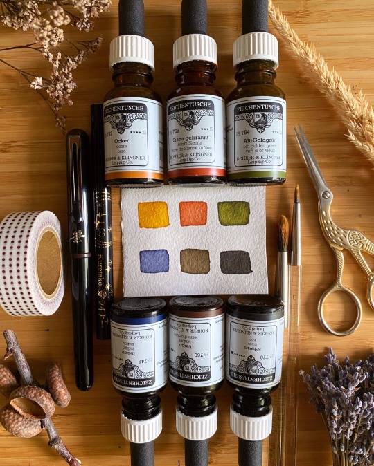
Inktober 2023 tools 🎨
I’m excited to share the tools I will be using for Inktober this year ✨
🎨 Rohrer & Klingner Ink
🖊️ Pentel Pocket Brush Pen in Sepia & Kuretake AI Liner in Black
🖌️ Holbein Brushes
📜 Arches Coldpress Paper
Prompt list will be shared later this week 🎃
#inktober2023#ink#inktober#art supplies#artist tools#artist supplies#illustrator#artist#colored ink#drawing tools#brush pen#holbein brushes#kuretakebrushpen#kuretake#rohrerandklingnerink#pentel canada#Pentel pocket brush#archespaper#archeswatercolorpaper#archescoldpress
2 notes
·
View notes
Text

Most badass legendary tool I’ve ever had the glory of drawing with THESE THINGS ARE GOLD
Strong ink flow! Stroke thickness control! Great pigment! Comfortable to hold! No sputtering ink! ✅✅✅✅☝️☝️☝️☝️☝️☝️❗️❗️❗️❗️
If you have the chance and like using cheapy pens n’ art tools, Get this son ov’a mothers NOW
Ok thank u for listwning to me scream about a 2$ pen i found on the floor at walmart 3 months ago
3 notes
·
View notes
Text
2 notes
·
View notes
Text
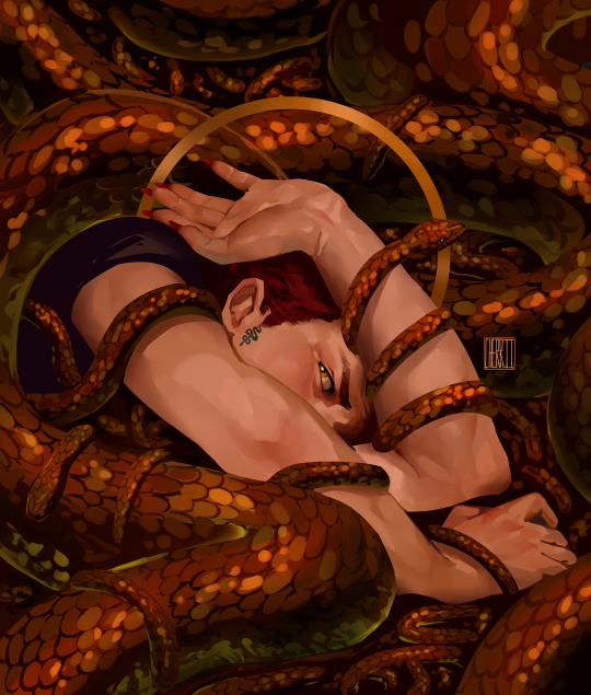
just to hide outside your door 🐍🍎
#my art#good omens#good omens 2#crowley#anthony j crowley#aziracrow#fan art#artists on tumblr#digital art#illustration#paint tool sai#good omens fanart#good omens season 2#gomens#portfolio
105K notes
·
View notes
Text
https://nightshade.cs.uchicago.edu/index.html
1 note
·
View note
Text
An Artist's Friend: "Mr. Initial Man"
If you guys ever need a way to reference differing heights, I recommend the online tool by the listed name up there. It really helps you decide how your shorter characters should stand alongside your taller ones, like it being especially helpful with determining Claire's small size against all other characters.
It's just a simple search away, so no need for me to really link it; just type it into your search engine, it'll be the first result that pops up.
0 notes
Text
The Fierce and Furry Face of My Beloved Zelda
Capturing the Personality of My Grumpy Cat Zelda in Digital Art
As a proud cat mom, I couldn’t resist drawing my Calico cat Zelda’s intense and grumpy little face. This furry feline has a ton of personality and loves nothing more than sleeping, cuddling, and giving everyone in the room a judging stare. But despite her sassy attitude, I can’t help but adore her and capture her likeness in my…

View On WordPress
#art inspiration#Art Materials#art process#Art Techniques#Art therapy#Art Therapy for Anxiety#Art Therapy for Stress#Art Tips#artist#Artist Tools#artistic style#Calico Cat#cat#cat art#cat drawing#cat drawings#Cat Lover#cats#Creative expression#curiosity#cute cat#digital art#digital art design#digital artist#digital artist shop#digital comic creator shop#Digital Pen#Digital Tablet
0 notes
Text
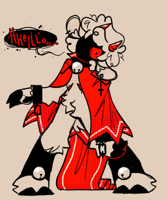
POSSESSION.
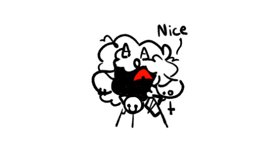
bonus for visual explanation 😌
#I HAD AN IDEA AND I HAVE NO IDEA IF ITS BEEN DONE BEFORE#BUT IT SEEMED SO COOL..#also used this to test out new tools i found....#honk doodles#artists on tumblr#art#cult of the lamb#cult of the lamb fanart#cotl#cotl lamb#cotl fanart#Trambs
2K notes
·
View notes
Text

At long last no more shaky speedpaint vids! Got this phone holder so now when I record paintings or show something I’m currently drawing, no more shakiness. I’m so happy 😭 lmao oh that wasn’t a pic it was a video welp lol
6 notes
·
View notes
Last Seen Blogs
skintagsdissolved
Skin Tags Dissolved
weirdbadore
KALOKAGATHIA

miandoana
Puta La Vida
alpacaffe
Hi, I'm cringe!