#at least not hand drawn 2d digital ones
Text
Suhana- The Tastemakers By Creative Splash

The perfect blend of spices, a dash of delightful flavour, and loads of goodness- all packed in one box- only at Suhana! Suhana has the title of being one of the most loved brands in India as they supply foodies with irresistible spices that add flavour to food and life!
Creative Splash agreed to make the recipe for generating eye-catching content for Suhana. We spilt the beans and came up with fun and catchy ideas. Suhana filled our basket with their new range of ‘Cuppa’ instant food mixes. We had many products on the table and that also gave us a spacious cooktop to make yummy videos!
What happened ahead of that? Let’s see-
The Challenge-
Suhana is a big name in the food industry. The Cuppa range was making its grand entrance in the ready-to-eat food industry and we had to make sure that all the eyes were glued to it. In minimal time, we had to take maximum efforts. The main challenge was to introduce the products in less than 10 seconds for the Cuppa range and make the videos in a crisp timeline, so as to cater for the target audience. Suhana introduced the line with a colourful scheme. Right from finding colours that would complement each other, the queue was quite long.
The Provision-
Fun and colourful power-packed videos!
Okay, that was just a compressed version of what we meant but to extract our ideas from the file, we mixed and played with 3D and lots of motion graphics. The line of products had a range that included instant Poha, Jeera rice, Dal Tadka, Dal Khichadi, a great Veg Kadai Mix, and much more. We built some scenarios, gave it a mini storyline, made 3D models of Suhana’s star cast, and got the show running.
Innovative, catchy, fun? What could it be? A medley of stop-motion video and little motion graphics adorning it! Yes! A playful theme was already set by the ingredients that danced their way onto the kitchen top. We made them appear one by one using stop motion and we also added some VFX- especially minimal motion graphics to make it even more joyful. For eg- To exaggerate the process of mixing, we added circular hand-drawn elements that orbited along with the ladle. The ingredients were already colourful and we pepped them up even more by dressing them in lens and light flares. The Suhana Veg Kadhai Mix video played through a splash of visual treatments, fun elements and ultimately, lovely taste!
The Cuppa range was fit in short promotional videos, and we decided to use 2D, 3D and motion graphics to make the most out of it. These videos ran for 10-20 seconds while sticking to the motive- maximum outcome in minimum time. The Cuppa range and the videos had one common point- they were made for people having less time on sleeves. A quick recipe and a quicker video struck the chords of the audiences’ hearts!
For every product, we had a direction: for example-
For this film, we made a series of perfect pairings of friends and gossiping, movies and popcorn, and so on. The final slide revealed the match of Jeera Rice and Dal Tadka. What we did here was the usage of motion graphics and 2D animation to bind the script together. In 18 seconds, we wanted to demonstrate the connection between each of the elements in correspondence with the other and then, in the end, we presented an amazing mix of Dal Tadka and Jeera rice in the form of Suhana’s Cuppa range. The colour palette for this video was bright and lively so as to keep up with the tone of the video. The yellow colour indicates creativity and optimism while the purple one drives enthusiasm.
With a run-time of 9 seconds, we made a cool 3D video for Suhana’s Jeera Rice! Keeping the timeline to a single-digit number, we showed how the process is as simple as it looks and it actually takes the least amount of time! The scene opened with the 3D model of the product popping in and as the lid opened, the tastemaker paved its way out. We wanted to get the perfect blend of 2D and 3D for making the water flow smoothly. And thus, to make it realistic, we rooted for water simulation. We extensively used 2D particular as well. The lid then sat back on the bowl and the dish was ready. Using such apt graphics, we proved that the process of making Cuppa was very easy and a great choice.
Here, we created a scene that would be extremely relatable- thereby increasing connection with the frame. The happy trip turned not-so-happy when the car crashed and indeed, that stole a lot of time and energy. Starting with that note, we established the need of having something instant and easy. We put in the limelight Suhana’s products like Dal Khichadi and Masala Dal Khichadi. 3D models of the Cuppa bowls were designed and colour schemes of the background and elements were set in contrasting yet attractive tones.
The Outcome-
Suhana ran their campaign using these videos. The Cuppa range was new in the market and we gave Suhana what they wanted- excitement! The videos ran for a short span of time but communicated the purpose, and attracted the crowd. Suhana could reach its target audience with our videos. They used the videos on their website and social media and that helped them gain more engagement and promising sales!
#3d animation#2d animation#suhana#products videos#motion graphics#animation studio in pune#advertising videos
0 notes
Text
Trending NFT art
As we all have come up with lots of trading stuff in our day-to-day life. So there is a brand new sector for trading too. It represents physical goods, such as artwork, music, in-game items, or movies, which is what is referred to as an NFT. They are often encoded using the same software as many other cryptocurrencies, and they are frequently bought and sold online in exchange for other cryptocurrencies. NFTs have been around since 2014, but they have just recently gained popularity since they are becoming more and more popular among people, who meant to buy, sell or even create digital art. Just in 2021, the NFT market saw staggering spending of $41 billion, which is almost as much as the entire global fine art market. A digital asset known as an NFT is a representation of a real-world item, such as artwork, music, in-game items, or films. They are regularly purchased and traded online in exchange for cryptocurrencies, and they are typically encoded using the same software as many other crypto.
NFT Growing Market
As people’s confidence in NFT Arts values has grown, the NFTs market has drawn thousands of artists and quickly raised its market value. For example, in just March 2021, 509,000 NFT artworks were sold for a whopping $85 million, which is a sizable sum of money. Here are the top art trends in the NFTs market. A wide array of trending art styles are produced and encouraged by the diverse market for arts and artists.
Regardless of how you feel about NFTs, some of these emerging trends may alter how we use the internet, market goods, and purchase and consume art, and even make and listen to music. Jake Kay, a member of the Bored Ape Yacht Club, believes that the promise of Web 3.0 and NFTs will finally materialize in 2022.
So let’s give a slight tour of the trending NFTs
Futuristic Design
In futuristic art, the vibrant color palette and powerful chromaticism that convey the urgency and motions frequently portray the dynamic moment of future living. Some NFT artworks with futuristic illustrations.
3D Design
The most prevalent technique used in the gaming industry is the 3D look. With measurements for height, width, and depth, three-dimensional art will provide works that can be viewed from all directions and angles, just like real-world things.

Japanese anime-specific manga style
Anime (Japanese-favored) style is yet another dominant artistic movement in human history. It takes a stand in the art world for the importance of Japanese anime culture as well as the value of art. Anime style is typically presented in a 2D format.
Pixelated Design
Pixels (a tiny square dot) are the building blocks of any digital art, and the more pixels we have, the clearer the image will be. The pixelated art style, on the other hand, is when a small number of pixels are intentionally used to create artwork that is quite harsh and blocky.

Miniature Art
Last but not least, Mini-art is a popular fashion among many individuals. Naturally, the mini-art style makes one feel “little”! The mini-art characters should be little, adorable, and straightforward. Here are some well-known Mini-art NFT projects.

Most popular trend: Futuristic Zodiac
Living in an uncertain environment makes it more important for people to genuinely know who they are and predict their future, which explains why Zodiac has never lost popularity as a trend. For all artists, the zodiac has been the most prolific source of artistic inspiration due to its wide range of potential perspectives and the connotations associated with each sign.
As conventional to digital arts have evolved, so have art styles, which have seen a shift from 2D to 3D futuristic trends as additional dimensions require more sophisticated techniques. Futuristic Zodiac would be the next great thing in the NFTs market, where Crypto Communities are looking for innovative projects with high-valued artistic talent and financial resources, based on these two factors.
There are more arts like this with a specific name given to that particular art. There are many such photos paintings, games, and music which is there on this platform and this is growing immensely with a greater speed. This would be becoming the future of art or not this is still not confirmed, but right now it is at hype.
Conclusion
Is it the Art Collecting of the Future? The NFT sector is changing so quickly that it’s difficult to predict whether it will even endure a decade or not, making this issue tough to answer. However, regardless of whether the surge continues, NFTs have already changed the art world, according to curator Hans Ulrich Obrist. It’s difficult to predict anything because cryptocurrency prices and NFT pricing fluctuate minute by minute. NFTs do, however, have such great potential that they will probably remain for at least a few years.NFTs could be just another significant step toward a world that is more fully digitalized given how many changes the digital world has already undergone.
Recommendations
The UMBL NFTs have received the most recent praise from the crypto communities for successfully integrating the three largest trends at the moment: the Zodiac concept, the futuristic style with the mechanical future of engine look, and the Social-Fi Metaverse. A passport to the Zodiac Universe with a variety of socializing and money-making opportunities can be obtained by adopting one of the NFTs in that collection.
0 notes
Text
Understanding the process of 3D Animation
3D animation is basically the idea of creating moving objects in a 3 dimensional digital environment, as opposed to regular animation we are used to, which is largely 2 dimensional. The images are supposed to have 3 dimensions, and move within a three dimensional space, or at least appear to do so, because similar to 2D animation, 3D animation process also involves a series of consecutive images that appear to move since they are shown in a very fast sequence.
There are three main steps to a 3D animation process, without getting into complex details:
· Modeling
In this phase, the objects and characters are constructed. This basic phase of 3D animation process uses mathematical representation for all the elements. A shape is taken and molded into a completed 3D mesh. A simple object or a “primitive” is taken and is extended and grown into a shape that can be refined and detailed. A geometric surface representation of any object can be achieved in specialized 3D software such as Maya or 3Ds Max. The 3D models are then given details like color and texture. This is followed by a process known as rigging, which sets up a skeleton for the animation character that will allow it to move.
· Layout and Animation
After the previous work is complete, one can move on to the actual animation, which is the next step in 3D animation process. Here, the 3D object created can be moved around freely. There's keyframe animation, in which the animator manipulates the objects frame by frame, much like traditional hand-drawn cartoons. Other ways of animation include arranging items on splines and configuring them to follow the path of the curve, or importing motion capture data and applying it to a character rig. Another option to animate is to leverage the physics engines integrated into your 3D application, such as when your scene requires objects to fall.
· Rendering
Once the animator is satisfied with the animation as well as the light and camera work, they can move on to rendering. Similar to video, rendering in 3D animation is what completes the process, depicting the final output of the process. When dealing with a 3D animation, every scene is separated and rendered into multiple layers including objects, colors, background, foreground, shadows, highlights, et cetera. The layers are going to be united again in the post-production stage. This is essentially rendering or compositing, which is the final step in 3D animation process.
0 notes
Photo

I have a syllabus made for my character design bootcamp and will be posting exercises as I complete the tutorials! I plan to release everything in two stages- a rough cut (like this post!) and a final, professional-looking PDF-adjacent set. The final will come with an actual daily schedule and weeklong plan, but for right now all roughs will be posted as standalone exercises if you wanna try em out!
All will be tagged as “chaDes bootcamp.”
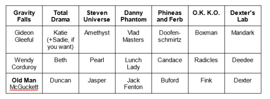
Disclaimer: as an animation nerd who loves cheap 2d animation, this syllabus is geared towards character designs that aren't inherently complicated; chief inspirations will be gravity falls, steven universe, total drama, and danny phantom, for example. It also focuses entirely on bipedal, human (or incredibly humanoid) characters. While these tips can probably be used for more detailed art styles and non-bipedal characters, they don't consider such, so you're on your own buddy. If you intend to do character design bootcamp multiple times, or are new to character design in general, consider using all bipedal characters your first time around.
Warm-up: Style Swap
Task: Pick a character with a distinct body type from one 2D animated show, and draw them in the style of a different show.
Question: What is a distinct body type?
A distinct body type is one that is unique within the context of its own show, that varies from a given template immensely. Generally, side characters have the most distinct body types, while background characters and main characters have the least distinct body types.
What to avoid
Here are some characters that do NOT have distinct body types, and therefore should NOT be used for this warm-up:

Danny Phantom. Within the context of the show, Danny's body shape and silhouette are common enough to be reused on his two closest friends, his sister, and numerous background characters; his silhouette is very generic for the universe he exists in. If you want to draw a Danny Phantom character for this warmup, consider the Lunch Lady, Skulker, or Amorpho.
Gwen, Izzy, and Bridgette from Total Drama Island. Total Drama has a habit of using similar or identical body shapes for female characters, which will give you little to work with. Better total drama candidates include Beth, Eva, or even Dakota (from roti).
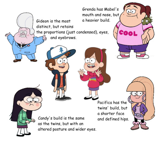
Dipper and Mabel Pines from Gravity Falls. Their designs are a base from which all other designs, especially those of other kids, sprout (compare to Pacifica, Gideon, Grenda, and Candy; notice how all four designs are variations on the twins). Some of the best characters would be Manly Dan, Robbie, Fiddleford McGuckett, or Lazy Susan.
Anyone from the main cast of Equestria Girls. There is no variation whatsoever in these body types; and no, hair does not count as variation.

Additionally:
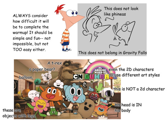
Be wary when picking your characters that they aren't too distinctive so as to make them untranslatable. Steer away from:
Phineas from Phineas and Ferb. The triangle head is all well and good until it looks absurdly incorrect in any other art style.
Most characters from The Amazing World of Gumball. These characters have great potential for humanization, but because they lack distinctive human features, it's incredibly difficult to fit them to any other art style.
Some fusions from Steven Universe. Multiple limbs and facial features will clutter a design, especially on a simpler style. Again, while these designs have the potential for humanization, this warm-up isn't about redesigning, it's about style matching.
TL;DR:
Too many words? Too much to think about? Here's a simple chart you can follow for quick warm-ups. Pick one character from one show, and a separate show to match styles with.
Enough lecture. Let’s draw something.
Follow-Along
After picking a character, select a show to style-match. When style-matching, keep in mind the style context in which the original characters exist, and how that style context changes between shows.
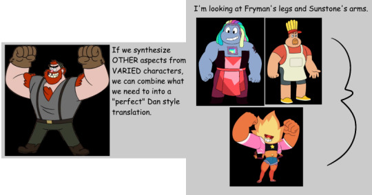
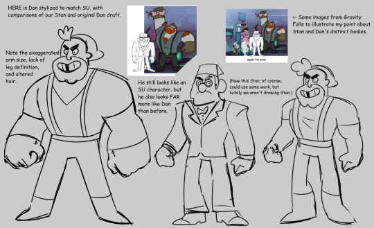
For example: Let's take Manly Dan from Gravity Falls and draw him as if he were a background human in Steven Universe.
Our first instinct might be to take the buffest main character we know of, Jasper, and draw Dan with her exact body type.

However, Dan exists in a world where other buff characters exist; Stan Pines, for example, is in-universe relatively muscular and large. We should set our baseline for buff characters to Stan.
Knowing this, we can probably use Jasper as a standin for Stan's level of buffness; after all, there are some characters who are physically larger than Jasper in the show.
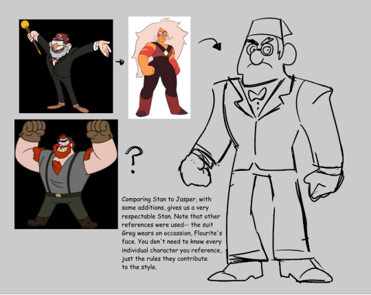
All together, we know now that we should draw Dan as larger and with broader shoulders than Jasper, because he is stronger within his own style context than Jasper is in hers.
Summary and Review
This warmup should teach you to pay attention to style rules and silhouettes. At the same time, it should give you a larger palette to work with-- every different face shape, nose, torso block and eye shape is a new tool to add to your character design toolkit, that you can use later in any of your own designs.
Don’t spend longer than 30 minutes on a single sketch, especially if you’re frustrated.
Pay close attention to what you’re doing, and think about every shape.
Remember that good design and good illustration are not necessarily the same thing.
Godspeed.
#chaDes bootcamp#tutorial#character design#wheee this is messy if you read all the way thru it lemme know and let me know what should be changed#while i respect that captioned images are super important... if you use a screen reader i dont think you have a use for art tutorials#at least not hand drawn 2d digital ones#ALSO IF YOU DO ANY OF THE EXERCISES I POST... SHOW ME#I WANNAN SEE#anyway this is something that i really really wish wehad done in my college class#bc we sort of walked away ill equipped to handle specific styles and with very few ideas of the vast possibilities#in human character design
186 notes
·
View notes
Text
do some people think that all 2d animation nowadays is put into the Flash Machine with zero effort and comes out as is lol
#it's not even flash professional anymore it's been FIVE YEARS#anyways learn how animation works#2D puppet animation is an art and no not everything is done in Animate or ToonBoom nowadays ugjrjfhfhrhdjdj#a lot of mainstream cartoons are still hand drawn#like not even hand drawn like me using adobe animate for tradigital i mean like it's LITERALLY drawn on paper#then scanned and colored digitally. at least that's one common practice
3 notes
·
View notes
Note
after finishing the 3rd movie i wish it kind of came out later than it’s intended original movie release because i bet if it came out in theaters more people would talk about this movie :( it did get some talk when the trailers first hit and it was probably mostly the memes around keanu reeves but man i wish more people saw this movie i would say this is the least talked about sb movie in the trilogy so far
one complaint i really would say about the movie is the kamp koral stuff kind of felt forced? while it’s very cute and i acknowledge this movie is probably set in an alternate universe considering it ended with everyone getting snails and retconning how spongebob met others and their ages, kamp koral itself felt like it could be removed and only a few things would need tweaking around, but it isn’t terrible though or bad just felt like a force thing just to get the spin off started anyways
i love the animation so much! wish more people talked about it like at first i was hesitant of hearing it was going to be 3d i mainly worried about it either trying way to hard to have very detailed textures where you can see all of spongebob’s pores or just looking really flat and not interesting and while i still prefer spongebob to be in 2d the cgi they use was actually really great and managed to capture the spirit of spongebob, everything was nicely stylized and the movements didn’t feel inflated which i think a lot of cgi suffers from and it felt like a 3d cartoon with smear frames and exaggerated faces and those moments where it does seem like a lower frame count it doesn’t feel cheap and more like trying to tastefully capture limited hand drawn tv animation, the animation crew did a great job considering they were on a lower budget than other bigger studios like disney with their 100 million budgets compared to the movie’s 60 mil, i hope when the 4th movie is out they go with the same style and studio if they go with the cg route again (most likely), the animation itself i feel like is also pretty underrated considering talks now these days with animation studios going more stylized and cartoony than trying to be realistic i feel like the spongebob movie here should be talked about more when discussing stylized cg animation
omg so sorry i went off, i just have so many thoughts in the movie and i loved it! thanks for hearing me!
Yeah I wish it did too. The movie was so much fun to see in theatres! I should know because I saw it in theatres because there was a brief period where they played it in theatres in Canada. Let me tell you, it was STUNNING on the big screen. I think the movie wouldn't have had such a bad rap if it did come out in theatres (its the weakest of the 3 but idk the whole movie going experience enhances your feelings about a movie, or maybe that's just me)
But I get why they gave it a digital release. The movie was delayed so many times. I've been anticipating the 3rd spongebob movie since they announced it back in 2016. They said February of 2019, then spring of 2019, then summer of 2019. Then the spring of 2020. Then the pandemic hit.
They moved the release date how many times???? They couldn't hold it off any longer and honestly there isn't an end in sight for this pandemic anyways. Might as well drop it when people are at home and safe.
I agree that the kamp koral stuff was forced. That's what me and my friend thought when we went to see it. Some people thought it was really cute. I didn't care for it much. But back then I was more super iffy about if it disrespected Hillenburg or not. I was surprised how short the kamp koral stuff was. I feel like if you cut those scenes out then it wouldn't have changed the movie much.
I kinda wished they replaced the kamp koral scenes with actual reanimated scenes from the original show. I still feel like that would've been better. Too bad.
I know the movie suffered from a lot of corporate meddling hence why it feels like a weird mashup of different stuff and why the kamp koral bit feels so forced. Tbh the actual kamp koral mini series could've happened without the movie. As far as we do know. It doesn't necessarily change how Spongebob meets Gary.
By this weird spaghetti plot line. Spongebob met Gary at kamp koral but didn't adopt him. He was friendly to Gary but it wasn't years later where he was put in thr pet shop for spongebob to adopt. In the kamp koral show, Gary is a baby living in a snail colony that the other camp counselors can't stand. I'm assuming he probably got swept up by animal control and put in a pet shop later on. It's just a bunch of uncessary details but eh I don't care much about it now. They couldn't elaborate on all that in the movie so it just felt weird.
The animation for the movie was at least gorgeous. And from what I know, the cgi in the movie was a test to see how cgi would work for kamp koral. Hillenburg was hesitant about cgi but ended up liking how the movie looked. From what I know, kamp koral was meant to be traditionally animated. But tv animation is VERY different from movie animation. And comparing the movie to the tv show, the tv show doesn't look that good and is loaded with animation errors too😭
Its no surprised the movie achieved Hillenburg's expectations tho.
I LOVE 2D animation and I admit I was very hesitant about cgi. Its not bad but every movie wants to be cgi nowadays. And for spongebob, he's a difficult character to translate into cgi to begin with. Kudos to the crew for making it work, and not just work, but look better than a lot of the cg animated movies of today.
I know the 4th movie is a sandy movie. I wonder how the cgi will work? I think Sandy was the one who didn't look very good in sponge on the run. She looked kinda creepy. Her design in sponge out of water where she was cgi looked so much better. I hope they fix this issue before her movie comes out. She deserves to have a stunning movie look ya kno? Though some of the crew members are every protective of sandy so I can imagine they'll definitely fix it.
I don't mind your talk! It was a fun read and you made a lot of good points. The internet trashed sponge on the run so hard mostly because of misinformation. Its nice to see it gets some love. I reaaaally wish the animation was more noted for. It looked gorgeous but everyone was too focused on hating it to notice :(
#Ask#spongebob#spongebob squarepants#the spongebob connoisseur#sb#spongebon squarepants#spongebob meme#Spongebob movie#sponge on the run#kamp koral
2 notes
·
View notes
Note
Do you have any types for new artist with aphantasia? You're the first ever artist i've met who has it like me and i find myself struggling a lot ):
Tips? Mostly just use a lot of reference and don’t be afraid to work through a sketch a lot to get it to look the way it’s supposed to, I’ll often grab a whole limb and rotate it with the transform tool then draw over again. Drawing like this feels like... you get better at packing on the pieces and finding the combinations that work instead of trying to realise an idea that was already formed, at least for me.
I only have digital tips but it might be worth learning to photobash your references -- photobashing is taking prexisting photos, textures and stock, then putting it together and painting over to get the image you want. It’s used a lot in concept art but I’ll use it to make location references for my stories because I can’t visualise the locations at all. Like this, and after I’ve done this I can just reference the final image instead of bashing my official art (never posted this pic btw, only refer back to it) --

Another thing to try is I know that it’s very hard to think in 3D when you can’t think visually at all so it might be worth trying to stylistically lean into the flatness and make use of the fact that you’re drawing on a 2D plane. One of my favourites I’ve done is this (below) where there’s not REALLY an in-front or behind in a fully realised way but I tried to stack/overlap different features like I was laying thin slices over each other, then differentiated it through values instead of perspective.
It might be good to put some extra attention into the light and dark balance of your stuff because Things Being Different Colours (Or Textures) is usually something the aphantasic brain can grasp better when it comes to differentiating parts of your piece.
The other thing with this particular piece is I couldn’t grasp the composition so I ASKED FOR HELP. @xxtrashcatxx and I share these characters so I simply asked her for direction and she sent stained glass windows and a pose she’d drawn of two people hands clasped. When we work on the official Dies Irae illustrations she outright draws the thumbnails for me because collab powers with someone who can make mental images. So connecting with artist friends can be a great help.
Scaling down a bit, it also um might take longer than average to grasp art basics because you’re basically training your hands to think for you instead of just drawing. Finding your Aesthetic might be more a conscious choice you have to make, I know when my visualisation skills were GOING (because I used to have them, just a little bit, when I was younger, then developed brain issues lol) I spent a while artistically lost because the idea of drawing cool things didn’t occur to me when I could no longer see the cool things in my head. Sometimes you need to look at other art to be reminded of what you’re allowed to DO. Or maybe I’m just boring inside LOL
Now I very intentionally keep reference folders, pinterest boards, inspiration hoard, got my reblog sideblog, just as much intentional guidance as possible. Running theme here is if you need the help, use it. Look at to tutorials. Do studies or appropriations when the original idea just won’t come, there’s a reason my therapy art is highly-referenced adaptations of classical art or just a plain portrait sometimes. Original Idea Original Pose Original Composition is what I consider a high effort piece, but to chill out and draw for fun I’ll often just reference stock photo poses or magazine covers instead, it’s lower stress that way and I still get the practice in.
I don’t know a lot of artists with aphantasia besides @iliothermia who does the most delicately and lovingly detailed transmasc art I’ve seen and is a massive inspiration to me, in part BECAUSE of his aphantasia; the fact that someone with the same kinda brain as me is already making the kind of art I love the most and doing it such a tender and well-realised way gives me ARTISTIC HOPE FOR THE FUTURE WOOOOO
Thanks for the ask, keep at it, I hope this was ANY? Help? Good luck too.
20 notes
·
View notes
Text
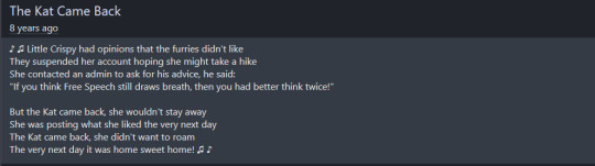
That Krispy Cat: A Warning, part 3
The last of the images cause I don’t want this bitch on my computer anymore.
Knowing tumblr I kept the images hidden JUUUUST in case no one reads the fine print and can’t tell I’m being critical of this and gets me in trouble.
VVV ((Just in case you thought the JewishGriffon piece assured everyone that Crispy couldn’t POSSIBLY hate people of color, some of her earliest Nazi art had her character Klaus beating up Amigo Bear. She also made Amigo into a liberal strawman. )) VVV

((Dialogue to one of her TROLLARIOUS pictures that featured Amigo:
Amigo Bear: *muttering* "Your leader was a !@#$% little #@%^!@$^*!, you fascist feather duster..."
General Klaus: "Fräulein, Ich vant you to cover your ears und shut your eyes as tight as you can."
Crispy: "How come, General?"
General Klaus: "Klaus ist about to say und do very bad sings zhat he does not vant his little Edelweiß to see or hear."
Crispy: "Alrighty!"
General Klaus: "WHO SAID ZHAT ABOUT DER FÜHRER? WER DIE FICK GESAGT? WHO'S ZUH SCHLEIMIG LITTLE COMMUNIST-SCHEISS SCHWANZLUTSCHER DOWN ZHERE, WHO JUST SIGNED HIS OWN DEATH VARRANT? NIEMAND?! GOTTVERDAMMT STALIN SAID IT! HERVORRAGEND! VHICH VUN OF YOU VANTS TO BE ZUH FIRST TO FIND OUT ZUH HARD VAY VHY MEIN FEINDE CALLED MIR DER BUTCHER BIRD?" ))
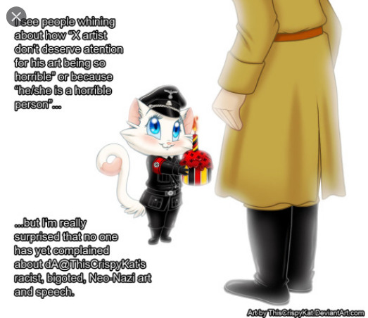
^^^ ((BUTOPHERARTISGOODSOYOUCAN’TCOMPLAIN
also the disc. for this pic before it was deleted had a ‘joke’ about cooking Jews in ovens. Oh and yes, that IS Hitler she’s giving that ugly ass cupcake too.))
^^^ (( - Thanks dA I never would have known I had a notifications unless eclipse blah -
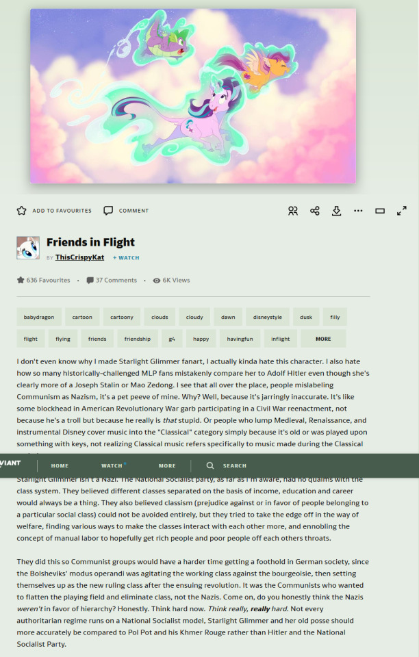
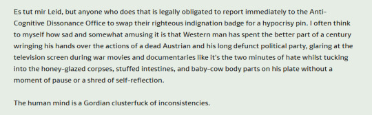
This is one of her rants about how #Triggered she is that Starlight be compared to the Nazis when she runs a communist cult. Because A) that’s the real problem here and B) I too get upset when people say my OC is based on Jeffrey Dahmer when he’s so CLEARLY based on Ed Gein, Bwwwaaaah D> D> D> !)) ^^^
VVV ((Ugly art of her friend’s awful OCs.)) ^^^

VVV ((Crispy showing off why no one wants to be a patriot in our country.)) VVV

((FYI, Crisp, that attitude will make the Hamilton fans stronger so just keep that SJW-flinging coming you little SJW.
WHAT?! Social Justice is a broad term and as Crispy’s plainly demonstrated, you can circle it around and make a majority-class sound like the real underprivledged if you have enough fancy frou frou know-how and furries. Also, if a Social Justice Warrior constitutes someone who takes their cause soooo seriously that they’re annoying/petting/cruel/stupid about it....idk I think Crispy qualified.))

^^^ ((Crispy and her friend muse about what other races occupy the world of MLP in her headcanon. This, more than any other dA disc. and picture shows you her brand of “Segregationist-Nationalism is OKAY” thinking, cuz the art of these different races isn’t super offensive or cruel and neither are the characters. BUT if you scratch under the surface you’ll find that Crispy really likes these different people staying in their place and not in “someone else’s” country.
THEN, this same kind of thinking is used to convince you any mix of cultures is just cultural appropriation, again acting like she and her Nazi-stans are the only ones standing up to actual bigotry.)) VVV
^^^ ((Crispy makes the world a worse place by bringing up actual decent points; like how Americans dress Thanksgiving up as progressive and for the natives when we all know that’s not true...all to better her worldview.
fyi, GET OUT whenever you see a selfproclaimed Nazi fawn over Native Americans, because: Nazi Germany had a deep fascination with American Indians and used their struggles about their land being taken away from them to justify their eugenic genocide.)) ^^^
^^^ (( Crispy laughing it up on Furaffinity how she couldn’t be banned from her Furaffinity and then mysteriously never using her site there wowie.)) ^^^

^^^ (( Crispy complaining about SOPA cause her freedom of speech and blahblahblah.
Freedom of Speech is important. Unfortunately what people like Crispy don’t understand or care for is there’s no freedom of consequence. )) vvv

VVV ((LOL Joseph Mengele was such a stinkah let’s tell blithe jokes about him. At least WE AREN’T LIKE HIM!!!)) VVVV

VVV ((Early onset eugenic BS from her Spyro stuff that would be easy to miss if you didn’t know what this woman was talking about)) VVV

((Crispy admitting she thinks gays are pointless cuz they don’t reproduce but apparently loves them anyway. Also big shock Crispy’s seen Hetalia.)) VVV
VVV ((Crispy probably wanting Weeaboos to attack her cuz aren’t Japan’s animations so laaaaaaazy?!!?!? GUUdd think’ I’m a naziaboo! Germany’s never made any shitty animation evah. You know what, I lied. She doesn’t deserve Hetalia. She just doesn’t.)) VVVV
VVV ((Crispy dragging Brazil down with her as the apparent “Best South American Country”. Yikes.)) VVV
VVV ((More “it’s trolling ergo it’s not harmful” shit. Bulgarians probably do deserve their own Care Bears, but they certainly don’t want yours Crispy.)) VVV

VVV ((Disc. for her Richard Spencer bear art)) VVV

------
I know, I know...this isn’t what you wanted to read today, guys. I know it’s offensive and I’m sorry if it made you ill. I also know I’m putting my own blog under fire by showing these images here but I think that should say something about dA’s bad policies that this art gets a filter slapped on it and nothing more when the artist is blatantly pro-fascist.
Crispy resonates with me so much - and no it’s not cause I DARED to be “triggered”.
It’s because, for one, she was talented. I MEAN I HAVE EYES! That’s some nicely drawn digital stuff I’m not gonna deny. She had some cool rewrites and sequel ideas that, had it come from someone else I would have eaten up and faved to hell and back onceupona2012. But I didn’t, where a ton of MLP and furry fans did because they undervalued their own talents and would say “well it’s pretty who cares about the message?”
Unlike so many commercial+published artists, it’s REALLY hard to separate the art from the artist here because the artist is so connected and a part of her art and storytelling. If you fav her art, even if you didn’t like her, that was telling Crispy she’d won. It’s so defeating to have other artists say their gonna ignore their gut for the sake of prettypretty-Don-Bluth style art. And yes, that stigma DOES affect my view on 2D purists btw.
Crispy was so holier than thou’, and that attitude also was appealing to dA folks, not to mention her knowledge of art history by the time she dropped off the radar. Crispy was the kind of person who’d make long, detailed, justified rants against the design and color choices in Hazbin Hotel and then a bunch of antis would eat her redesigns up only to learn the awful truth later and embarrass themselves cuz they were so taken up by the craft they didn’t know they were reblogging a fucking Nazi.
Not to underplay Viv’s wrongdoings of course, but I’m sorry; the two aren’t comparable on the problematic artist meter. THAT’S HOW BAD CRISPY WAS.
If this somehow was just a faze and she’s come to her senses or doesn’t really think this shite she preaches...I don’t care. She said some vile shit and fuck no I’m not forgiving her. It’s like KenDraw or Shadman. You’ve changed your life around and realized you’ve done/drawn nasty shit that’s done real harm? Cool....I’m still not talking or ever promoting you, ya dingbat. You ain’t no Roman Polanski or Doug Tennaple. You’re a singular internet artist and any support of the project has to go to you - and you suck!
ThisCrispyKat was a wakeup call that showed me these people not only still exist but will be allowed to get away with it. I was very touchy bout this kind of thing back in the day. Fuck, I STILL AM TOUCHY. The rabbit holes I found thanks to Crispy opened up to reveal communities where people think my hair color’s going extinct. People would detail how much they wanted to rape me - a natural blonde - and kill my friends and family for not looking like me. That they want to jerk off in my naturally curly hair and see me in glowy German princess gowns preparing them dinner.
Crispy and other Nazistans would look at me; a blond-haired blue eyed Polish/German American woman and think I need to be “fixed” because I DARE to repeat propaganda that the Nazis were bad. They’d call me a traitor for thinking that celebrating the Nazi party ISN’T German pride.
HOW DARE YOU TELL ME THAT’S GERMAN PRIDE! I’LL SHOW YOU GERMAN PRIDE YOU EGOSTROKING-LIMPDICKED ATTENTION WHORES.
People like Crispy make it 1000x harder to actually show interest in German things. Because I AM interested in German shit btw.
Like for real: it’s a country I’d love to visit one day (at least the black forest, which is where my mom’s fam comes from). I love German art and German fairytales slap. I really do want to explore my heritage through art and stuff.
But guess what? Much as Crispy would argue to the contrary I DO know my WWII history and beyond and FUCK YOU if you honestly think jerking it to cuddly Nazi-furs is empowering or just “showing your interest in history”. Take your own advice and read a god-damn book.
TL;DR: I DO NOT have to be proud of Nazis to enjoy German culture and if you think otherwise, FUCK YOU. It’s a slap in the face to everyone even if you are ‘just trolling’ and it in no way values actual German’s feeling on the matter. It’s annoying how people undervalue real people just for the sake of fan art.
The Nazis were evil. They were racist, eugenic-genocidal idiots who killed over six million Jewish people, Romani, Slavs, Jehovahs Witnesses, disabled people, Poles, homosexuals and prisoners of war. They would have killed my dad’s side of the family if they were in Poland at the time. They made bullshit tanks that killed the people making them and didn’t work on the battlefield. Their leader was a fat, farting one-testicaled bastard who preferred animals to people.
They ruined everything for everyone and then took the easy way out, leaving the Germans that were left in the hands of the also-genocidal Soviets and Americans. Germany is still paying their war debts and now, 70-80 years later everyone else wants to laugh off this dark period of history with memes and forget what they did, and as such, are forgetting the victims of the genocide.
I have 0 tolerance for Nazi things for the sake of HUMANITY, let alone the individual groups they target. I don’t have to have German ancestry or know a single Jewish person to tell you any of this. It’s fucking history.
Eat shit.
#tw: nazi#tw: neonazi#tw: swastika#tw: antisemitism#cultural appropriation#kimba the white lion#thiscrispykat#altright#classic spyro#My Little Pony: Friendship is Magic#balto#animals of farthing wood
15 notes
·
View notes
Text
Meet Indiana-based Artist Daniel Mitsui
DANIEL PAUL MITSUI is a Hobart, Indiana-based artist specializing in ink drawing on calfskin and paper. His work is mostly religious in subject, inspired by medieval illuminated manuscripts, panel paintings and tapestries. www.danielmitsui.com
CATHOLIC ARTIST CONNECTION: Where are you from originally, and what brought you to Hobart, IN?
DANIEL MITSUI: I was born at Fort Benning, Georgia, where my father was an infantry officer. I grew up in the suburbs of Chicago, and lived in Chicago for most of my adult life. About two and a half years ago, I moved with my wife and four kids to Hobart, Indiana, which is sort of the easternmost edge of Chicagoland.
How do understand your vocation as a Catholic artist?
"Catholic Art" can mean a number of different things: art that happens to be made by a Catholic, whatever it is; art that communicates Catholic ideas and values; art that explicitly treats the Catholic religion as its subject; or art that is considered "sacred" art, meaning that it is intended to communicate religious truth and to assist prayer.
Most of my artwork is of this last kind, so I understand my task as twofold. First, I do my best to follow an established tradition as far as composition and arrangement are concerned. Sacred art should corroborate sacred scripture and liturgy, and the exegesis of the Church Fathers - because it too is a means by which the memory of Jesus Christ's revelation is carried forward through the centuries.
Second, I do my best to make the art as beautiful as possible, because the experience of beauty is a way for men and women in a fallen world to remember dimly the prelapsarian world, and to grow in their desire for reunion with God. As I wrote in one of my lectures:
It is important "not to consider sacred art a completed task, not to consider any historical artifact to be a supreme model to be imitated without improvement. To make art ever more beautiful is not to take it away from its source in history, but to take it back to its source in Heaven. Sacred art does not have a geographic or chronological center; it has, rather, two foci, like a planetary orbit. These correspond to tradition and beauty. One is the foot of the Cross; the other is the Garden of Eden."
I am Catholic, and an artist, so I have no objection to being called a "Catholic artist.” However, I do not want to make an advertisement of my personal faith or piety, to suggest to other Catholics that they ought to buy or commission artwork from me because of the sort of person I am, rather than because of the artwork's own merits. An artist who would make an advertisement of his personal faith or piety has received his reward.
At this time, my personal mission is to complete a large cycle of 235 drawings, together making an iconographic summary of the Old and New Testaments and illustrating the events that are most prominent in sacred liturgy and patristic exegesis. I call this the Summula Pictoria, and I plan to spend the next twelve years of so working to complete it, alongside other commissions. I already have spent more than two years on it, mostly on preliminary research and design work.
Where have you found support in the Church for your vocation as an artist?
The Catholic Church is of course much more than its institutional structures; it is all the faithful. Most of my patronage comes from private individuals rather than parishes and dioceses. I do receive some commissions from ecclesiastical institutions - in 2011 I even completed a large project for the Vatican - but I do not go out of my way to secure them. In ecclesiastical institutions, there tend to be committees involved, and a whole lot of politics; the usual result is that an artist spends time preparing proposals, reserving his most interesting ideas, and just fighting for permission to make the best artwork possible. I feel sorry for artists like architects and sacred musicians who, by the nature of their medium, have to do this. I avoid it whenever possible.
I choose to make artwork that is small enough and inexpensive enough that private individuals can commission and buy it. I think this may be the future of Catholic art patronage; there is not much reason to think that ecclesiastical institutions will be able to provide it much longer. You can look at the demographic changes, at the money lost both through diminishing donations and lawsuits because of clerical scandals, at the amount of artwork already available as salvage from closed parishes - none of this suggests that ecclesiastical institutions will become great patrons of new sacred art any time
soon.
How can the Church be more welcoming to artists?
I think that sacred art should have four qualities: it should be traditional and beautiful, as I said already; and it should be real and interesting.
What the clergy and theologians of the Church could do to help artists is to advance an argument for art that has these qualities. They have not advanced this argument much lately, and a good number of them probably don't even believe it.
By "real" I mean that sacred art ought, at least as an ideal, to be made by real human hands or voices. Music sung or played in person is a different thing, and a better thing, than an electronic recording. A picture drawn by hand is qualitatively superior to picture printed by a computer. There is at least a rule on the books that liturgical music needs to be sung or played live, not off of a CD, but even there a lot of fake things are broadly tolerated: bell sound effects played from speakers in a tower, or synthesizers dressed up in casings to look like pipe organs. Visual artists don't even have this sort of rule in place for them. Printing technology - both 2D and 3D - is now so sophisticated that I worry about it displacing human artists, without the clergy or theologians objecting.
I fear that some time soon, one of the great artistic or architectural treasures of Christianity will be ruined - more completely and irreparably than Notre Dame de Paris - and that in response to demands that it be rebuilt exactly as it was before, living artists will dismissed from the task as untrustworthy. Instead, a computer model will be constructed from the photographic record, and everything will be 3D printed in concrete or faux wood. Once that happens, a precedent is set, and living artists and architects thenceforth will compete, most likely at an economic disadvantage, against computers imitating the old masters.
I don’t oppose reproductions themselves; I have digital prints on display in my own home, and I sell digital prints of my own artwork. I listen to recordings of music. I do oppose the idea that these can, in themselves, provide a sufficient experience of art and music. I oppose the idea that sacred art and music can be fostered through attitudes that would have made their existence impossible in the first place.
By "interesting," I mean that art and music should command attention. So many Catholics have gotten it into their minds that the very definition of prayer or worship is "thinking pious thoughts to oneself.” They close their eyes and obsess about whether they can think those pious thoughts through to a conclusion without noticing anything else. With this mindset, art and music are praised as"prayerful" simply for being easy to ignore. Art or music that are particularly excellent are condemned as "distracting.”
This, really, is wrongheaded. Distractions from prayer are foremost interior, the result of our own loud and busy and selfish thoughts. Sacred art or music that draw us out of our own thoughts, that make us notice their beauty, are fulfilling their purpose; they are bringing us closer to the source of all beauty, God.
I can't remember the last time I heard a living priest of theologian say as much.
How can the artistic world be more welcoming to artists of faith?
I don't really think that it makes sense to speak of an artistic world as opposed to any other world, at least when it comes to sacred art.
This art is meant to be in churches, or in homes, or in any places where people pray - that is to say, anywhere. It belongs to everyone.
I have no objection to seeing my artwork in galleries or museums, but I don't seek out those spaces; I try to make my artwork available to anyone, as directly as possible.
How do you afford housing as an artist?
The medium in which I chose to work - small scale ink drawing - does not require a very large working space, and uses no toxic materials or dangerous equipment. So really, all I need is a room in which to work. It doesn't need to be a space outside the home, or away from my kids.
So affording housing as an artist is, for me, the same as affording housing in general. I moved to my current home after my wife and I decided that our family was too large to stay in apartments any more; we have four children, and wanted a yard of our own for them. We wanted to be near Chicago, but everything on the Illinois side of the border was too expensive. It took about six months of house hunting, and one temporary move, before we found what we wanted, and we had to borrow most of the money to buy it. So I don't know that I should be giving out advice, except perhaps to urban artists who are "apartment poor" like I used to be, not to let that situation go on too long.
I advise any artists who are still early enough in their careers not to be wedded to a particular medium to consider how their choice of medium will affect what sort of living space they will need eventually, especially if they hope to have a family. If you want to paint pictures or make prints that require pigments or chemicals too toxic to have around young children or pregnant women, that is something you should be prepared to deal with in advance.
How do you financially support yourself as an artist?
My artwork is my livelihood. About half of my income is from commissioned drawing, and about half from print sales, licensing and book royalties. I do teach, write and lecture on occasion, but this is not a significant part of my income. I've never had a residency or a grant, and I do not seek them out.
I've had my own website, www.danielmitsui.com, since maybe 2005, and use this as the primary means of displaying, selling and promoting my work.
What are your top 3 pieces of advice for Catholic artists?
In one of my lectures, Heavenly Outlook, I gave three pieces of advice to anyone who want to appreciate or make sacred art, and I will repeat them here:
First, never treat art like data.
Second, be guided by holy writ and by tradition itself: liturgical prayer, the writings of the church fathers and the art of the past.
Third, do not consider sacred art a completed task. Do not consider any historical artifact to be a supreme model to be imitated without improvement.
Please pray for me, and for my family.
#daniel mitsui#hobart#indiana#visual art#artist#catholic#catholic artist#catholic artists#catholic art#art#catholic artist connection
5 notes
·
View notes
Photo
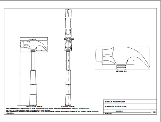
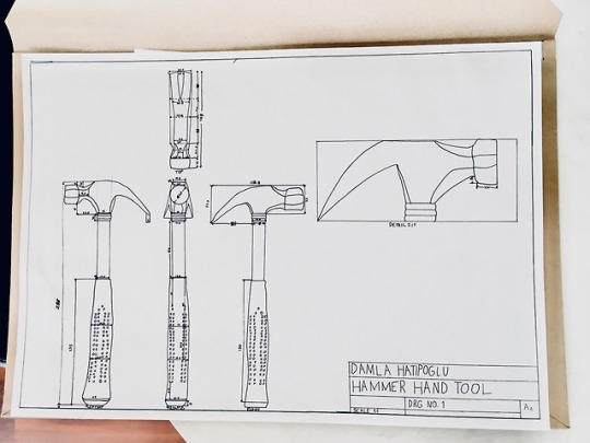


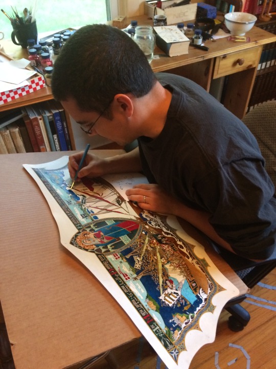
PROJECT 1- HAMMER TOOL
This project was assigned to us so we could have a broad understanding of the CAD programme Rhino. We were to create a 2D technical drawing of a hand tool of our choice. The minimum amount of views we had to display was 4; at least one of them had to be either
a cross-sectional view
an enlarged detail view
or an auxiliary view.
I chose to do the top, front, left side and enlarged detail view as I felt those were more manageable for my skillset. Another requirement of this task was that we had to complete the drawing with a title block, a border, an optional zoning chart, and 10 thoughtfully placed dimensions.
The submission was to be sent via the university ’s online Moodle system in PDF format. The due date was Thursday of week 6 and we had 3 weeks to complete it. We had a week 5 checkpoint in which we submitted the handmade version of our drawing. This was so that we remained on track and we at least had one component out of our hair before the final submission.
My experience:
I feel like I learned a lot about Rhino and about myself while completing this task. I have been having difficulties juggling the 3 courses workloads. This submission was one of the times it hit me really hard in the face that I wasn’t doing a good job at managing my time. I started the handmade portion of the submission in the middle of week 5 which is quite late, to be honest. The hours I put into that portion were not as many as I hoped I would. That’s why the penmanship is a bit sloppy. But I did learn how to properly draw tools with curves so that’s good.
After feeling embarrassed about that submission I tried to make sure I actually mastered Rhino good enough to complete the task so I dedicated all of my weekend to do just that. I had never worked with any type of digital technical drawing programme before which was, in my opinion, a fact that held me back. But I must admit that the dedicated hours spent that weekend came a bit late.
That week I spent around 35 hours tirelessly trying to whip out a CAD that was presentable enough to be submitted. I took advantage of the 24/7 space generously provided by the Squarehouse. I bought a mouse so I could move my drawing with ease. I resolved my ever so fragile Rhino 5 (Mac) that kept on crashing throughout the weeks. I reached out to a good friend to accompany me while I was working so I could ask my questions to her while I was quickly running out of time.
My CAD process:
When I started the front view, I made the decision that the right side view I included in my hand-drawn technical drawing was obsolete so I deleted it.
The curve, point, line, and offset were my most commonly used tools.
I ran into Maks while I was working in the Squarehouse and with Paris, they taught me how to use construction lines by simply putting those lines on another layer and changing the color.
To complete the head of my hammer on the left side view, I wanted to first complete the top view so I could transfer some of the measurements from there. But some measurements were simply not lining up. That’s why I did it the other way around which worked out pretty well.
Paris helped me change the size of the grid so that I could fit all of my drawing on there.
I started off my front view on the origin thus completing that was much easier than the other views. The amount of calculation that I did for the left side was wild.
To save some time, instead of drawing the same thing twice without giving any more information I scaled up a portion of my left side view for my detailed view. I didn’t choose to do a cross-sectional because it wouldn’t add anything to the drawing.
I also didn’t draw the tiny dots on the handle because it didn’t add anything to the drawing.
I had difficulties figuring out how to print the PDF. They showed us how to do it in class and I listened but I still found it hard to replicate. At the end that is what made my submission late and really held me back.
2 notes
·
View notes
Photo
Micah Lidberg Interview
American-based artist Micah Lidberg creates complex illustrations laced with movement, humour and fanciful characters.
With a love for nature, colour and the absurd, Micah illustrates hyper-detailed intersections of the world around us, coloured with his unique and often twisted imagination.
His work garnered the attention of Lacoste, which led to his collaboration on their 2012 summer line, consisting of polo shirts and sneakers.
His illustrations and commercial works have been featured on everything from the pages of the New York Times and Nylon Magazine to album artwork, posters, book covers and typography.
Micah’s frenzied, wild characters form twisted tableaus with hidden narratives as they play within the surreal world which the artist has created, coming to life as you dive into his land of complex psychedelia, colour and fun.
Brent Randall: The amount of detail in your work is infinite, every time I see a piece of yours, it’s almost like a Where’s Waldo or Animalia search for hidden gems. Is your process organic in its development or do you set out and plan those hidden, humorous elements early on?
Micah: Well, it’s a little bit of both. Before I set out to start working on a piece, I imagine what the general layout is going to be. In that way, I do plan an environment for hidden gems to live in. However, all the little moments and stories don’t become a reality until I get down to the actual, final drawing. They take form when I begin to address each little square inch of the piece.
Brent Randall: What are some of the challenges you face when working on collaborative projects?
Micah: When two unique parties come together, it can be hard to align their separate visions into a cohesive idea. Communication, both in style and frequency, can either help or hinder the project’s progress. The major challenge is usually time. Everyone involved has competing schedules and I considered it a small miracle when anything is completed.
Brent Randall: Tell me about your process. Do you start with physical pencil sketches or is all of your work digital from the very start?
Micah: My work has two phases, a physical phase and a digital phase. Almost everything I make is completely drawn by hand on paper. All the originals drawings are produced in black and white and then get scanned so they can be arranged, cleaned up, and coloured.
Brent Randall: Do you have any particular typography dislikes or quirks.
Micah: I have a funny and special place in my heart for monospaced fonts. I really like boring, logical, rational systems. If it’s not that, I really enjoy their counter part, like big emotional and illustrative typefaces. Everything in between those two categories often loses my interest, unless the balance is perfectly mixed.
Brent Randall: If you could have one of your pieces printed or displayed on any medium, of your choice, no matter how big or small—What and where would it be?
Micah: It might be rear-projected on to a giant piece of glass. I’m not sure. I see most of my pieces through my imagination. The closest simulation of that would be through the projection of pure light. I would say a hologram as well, however, my work lives in a strange world between 2D space and some implied 3D space. I don’t know if it’d look quite right if it were translated into a literal 3D world.
Brent Randall: Your works are loaded with colour, movement and humour, often set in an acidic kind of wilderness.
So, Micah...did you take heaps of LSD in the woods when you were younger?
Micah: [Laughs] I’ve been asked many times if I do drugs. And it’s usually by people who’ve had experience with hallucinogens. The boring but honest answer is no. It might be a bad idea for me...
All of my work comes from my sober imagination. I’m not sure what an influenced imagination would be like for me. It might be a little too much.
I think my interest in the kind of work I do comes mostly from my childhood, or at least; the spirit of my childhood.
I loved going out and playing in the woods and being mesmerised by all the things going on around me. Have you ever turned over a log in the the woods, Brent?
Brent Randall: Yeah of course. I was born and raised in Australia, half of my childhood was spent either running through the bush looking for snakes, catching frogs and poking bugs...Or being bitten, stung or chased by the creatures that I shouldn't have poked, caught or looked at.
Micah: The moment we do, an entire micro-universe of bugs, creatures and life goes scattering everywhere. It’s kind of like biological fireworks. That’s the feeling I’m after in my work.
Interview by Brent Randall | Sketches by Micah Lidberg
Micah Lidberg Website
#micah lidberg#illustrator#illustration#lsd#lineart#drawing#typeface#interview#drugs#typography#dinosuar
2 notes
·
View notes
Text
Summative assessment
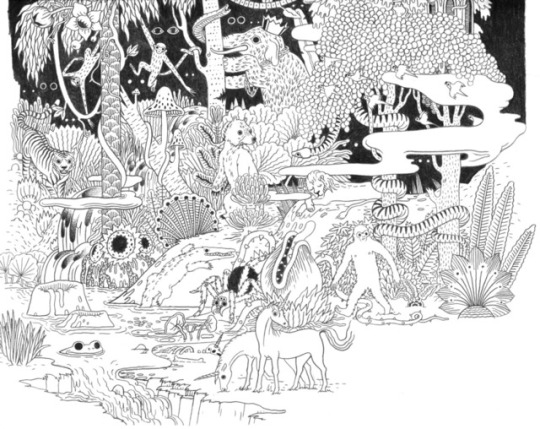
One of the Themes that I looked at and enjoyed on a Monday lecturer was ‘the labyrinth and the Maze’. In the text Tim Ingold talks about walking, imagining and the education of attention. After this Monday lecturer my research consisted in looking at a lot of labyrinths and mazes. What is the difference between a labyrinth and a maze? A labyrinth has a single path which winds through it where as a maze can have many paths. So mostly you can get labyrinths in mazes or they can be separate. The design of the labyrinth simultaneously represents a puzzle and a solution, a journey and an arrival.
The word labyrinth comes from a Greek mythology. It was designed by the legendary artificer Daedalus for king Minos of Crete at Knosses. It was to hold a monster who was born from the kings wife and the love with a bull. So this is how the story went. So King Minos ordered the labyrinth to be built as a prison for minotauros. Minos' wife Pasiphae had made love with a bull and the king thought that it should be hidden from the world especially as it fed on human flesh.
A labyrinth is an ancient symbol that relates to wholeness. It combines the imagery of the circle and the spiral into a meandering but purposeful path. It represents a journey to our own centre and back again out into the world. Labyrinth have long been used as meditation and prayer tools.
In the text, ‘The Labyrinth and the Maze', by Tim Ingold, goes on talking about that the streets are a Labyrinth. So when you go out on the streets or go in the city it’s explaining your ability to walk around and not knowing where to go. However it argues that the city is not a labyrinth when you consider yourself a business person. It goes on to explain that in your everyday life you get use to your surroundings and making that part of the regular routine on the way to work and it just becomes a place passing by rather than a place to wonder. I think I can argue the fact that I do think that a city or a street is like a labyrinth or a maze. My reason to this is that I believe that although some people walking around the city is normal in there every day life however, can at least one of those people say that they didn’t need to use Google maps to find there way, or signs to guide them out of the maze. Now imagine a world without signs and devices to help you out and what do you call your self in city walking around not know which way to go. Lost in the city. By architectural theory labyrinth has been linked to the archaic encounter between the nomadic and the city.
When talking about a city, we use the word labyrinth metaphorically hinting towards movement patterns. James Donald’s, ‘imagining the Modern City', shows the city and its architecture can be at once rational and irrational, observed and imagined, theoretical and empirical. show a different understanding of space, seeing it as something other and more than a field of mathematical calculation and political instrumentalism.
Some say that the labyrinth looks like a ‘natural’ pattern, reminding of the finger-print, or the interlacing intestines or the brain. I think I can relate to this as when you look at a labyrinth especially the circle ones, it does look like it and reminds us about the body of a human. It reminds us of these natural, biological forms due to the belief the labyrinth is culturally created. So this meaning that it is and artificial construction, made by humans for humans. “The idea of a labyrinth is a place in which we lose ourselves in order to find ourselves is intriguing,” said Anthony Bostrom. With this quote I believe in some level is true, but the problem that people have is if they are completely lost physically, they would mentally not be able to cope. So in some sense everyone needs a pull to their Direction I believe. ‘ To be inside and maze is to be a wildered or afraid, but it’s also to be inside a structure- lost but only up to a point.’ This quote strengthens my theory. Being exposed and not knowing it.
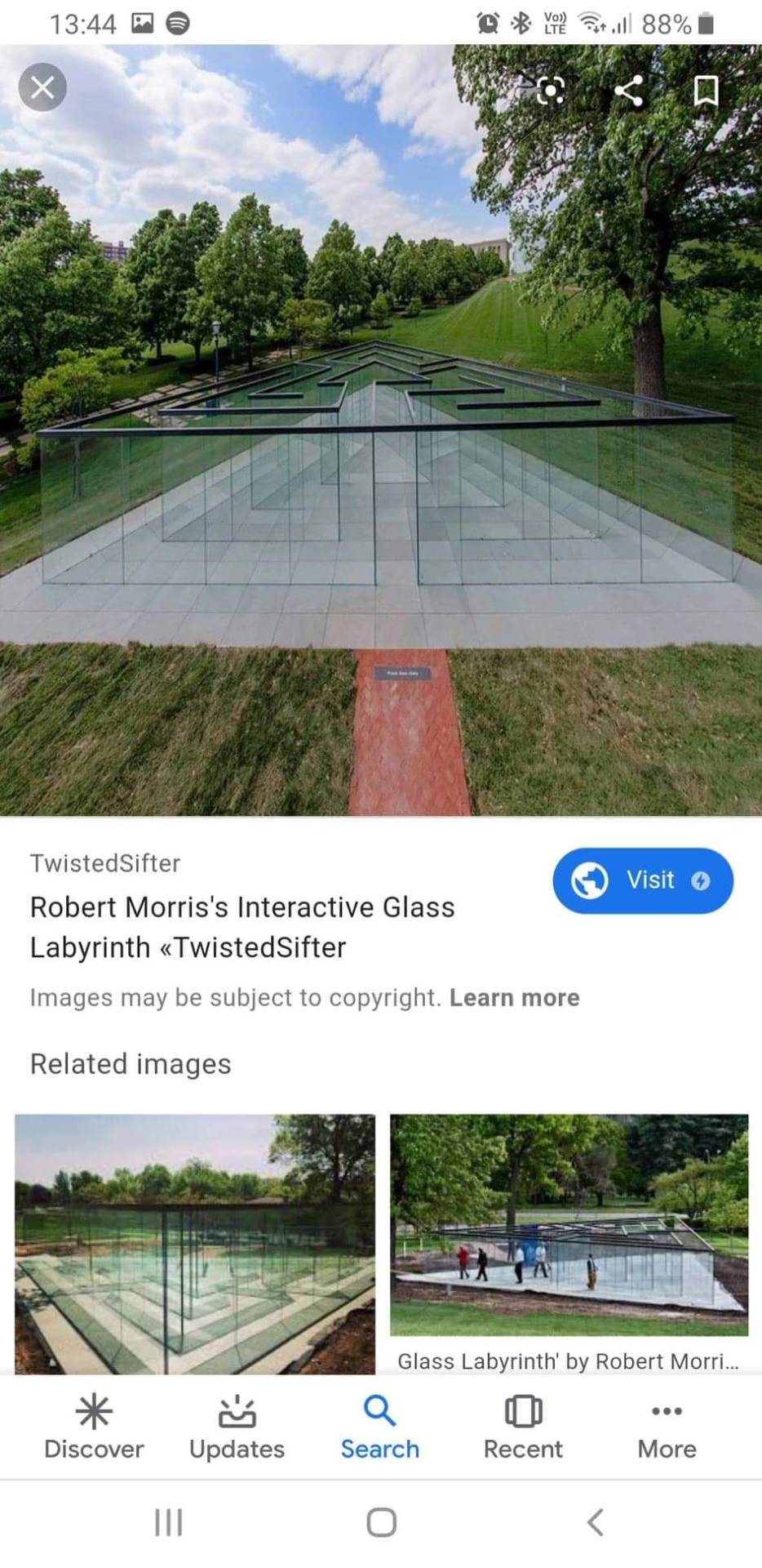
Robert Morris (born February 9th 1931 and died November 28th 2018) is an American artist and sculptor which designed the outdoor labyrinth as a 6-month long interactive illustration in the Donald Hall sculpture park at the nelson-Atkins Museum of art. Built on a base of concrete stone the 7-ft tall glass structure with more than 400 tons and took more than 80 crew workers to build on the site.
Why I liked this piece? The piece, glassed labyrinth, engaged with the public allowing them to experience the excitement as well as the overwhelming of bumping into the see through glass. What I find quite funny is probably the amusement this piece would of created, and making it fun. Roberts work consisted in hand making a sculpture which the public could go through. His work was made from glass which made me consider that most labyrinths or mazes have a wall you can't see through whereas his didn't. It made me think of the difference and come up with theories. Can you see through, do you know your Direction? Going back on the text I read on a walk on a Monday lecture, ‘the maze and labyrinth’, I remember him saying “education along the lines of the Labyrinth does not provide novices with stand points or positions, but continually pulls them from any positions they might adapt. I would of liked to experience going through the labyrinth and to understand more on why people would of bumped into the walls a lot? In some sense I can only relate to a piece like this by remembering going to a fair ground and going through a room full of mirrors. I have a hint that in some kind of way these two scenery are quite similar. What is quite different compared to this labyrinth to others is that most consistent shapes used in a labyrinth would be circles, squares or rectangles. So why did he choose a triangle? Triangulated and constructed of glass plate wall capped with bronze, speaks to the present in the language of modern architecture and design- streamlined, dynamic, transparent and elegant.
The transparent piece allows visitors to see each other and the landscape, while wandering around. The aim was to reach the centre and find the way out of the triangular form. This modern and unique stunning glazed piece was designed for people to experience, explore and enjoy. In his earlier work he explored space as an extension of the self. The viewers were forced to become aware of their sense of place, direction, memory, etc.
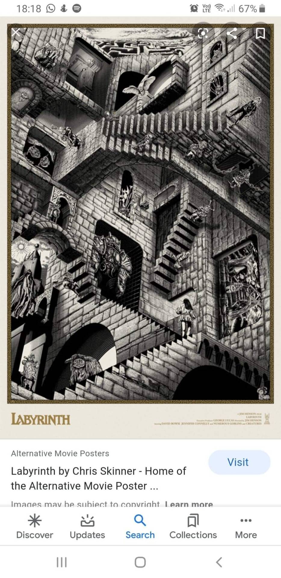
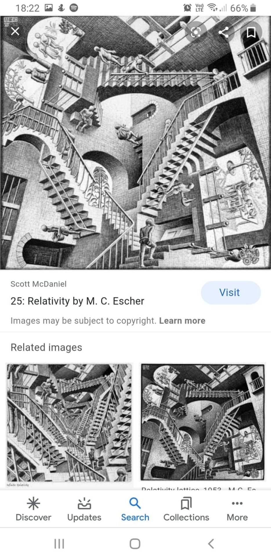
I also came across a work by Chris Skinner which is an graphics illustrator from Derbyshire. He has 14 years experience in design. He also works in several different companies making graphic design which meets the clients needs. He has worked with different range of sectors such as, broadcasting, motion graphics, print, etc. His main focus is illustration although, he has done work that consisted in 2D digital, 3D modelling, digital sculpting, motion graphics etc. Chris has his own distinctive style: it comprises a mixture of hand drawn elements and 3D modelling. The work I looked at presented the actual film from the Labyrinth and it included some of the characters from the goblin City. His piece was an print for the 1986, musical ‘labyrinth’. For inspiration, he used the original of the staircases- which was in the scene of the movie of Sarah’s bedroom wall- Relativity by M.C. Escher.
I like this piece because it consists the characters from the film which is one of my all time favourites. What I really find fascinating is that he also included some of the scenarios which are seen in the film. Right at the top of the image you have a sketch of the maze that Sarah the main character had to go though to get to the goblin city. On the right of the piece you can see another part where Ludo and Sarah had to go through the sewer part which there they met two new friends. I think that with this piece I can relate so much to it. It also tells the story of the labyrinth and where Sarah travelled and went by to get to the goblin city and get her little brother back, toby before the goblin king turned him into a goblin.
Escher (born June 17th 1898 and died March 27th 1972) was an Dutch graphic artist who made mathematical inspired wood cuts, lithography and mezzotints. His work ‘Relativity’ is a lithograph print which was printed in December 1953. It creates a visual image of a world where gravity ceased to exist. His drawings plays tricks on the audience eyes, fooling their mind to think that it never ends.
Escher’s work features mathematical objects and operations including impossible objects, etc. Even though he believed he didn’t have the mathematic ability, he still went on making a whole book full of work. In all his work that he did, they all consisted repetition of either the same object or piece. In his earlier work he drew from inspiration from nature, studying insects, landscapes, and plants.
His work creates an art movement of surrealism with a unique 3-dimensional style. Within the imagery of the lithograph is seen as an architectural structure. It has been said that Escher through his research, his did went on looking at the mathematic structure of things such as buildings, rather than the building on the outside. In his work ‘Relativity’, it reflects the different rules of gravity rather than the common form of gravity known in the real world. I find it quite fascinating to look at this piece as to that persons down, is someone’s down. It’s like being a child again and being on that climbing frame with different directions. The people in the piece do not seem to be concerned or affected by the gravity difference.
A book that I looked at which consisted his work, told me that his approach though all his pieces consisted the similar way he would do it as well the repetition.
The difference between Chris’ work and Escher’s work is that the people in Chris’ piece are given an identity as it reflects the film ‘labyrinth’ and Escher’s piece, the people are not given an Identity as they are all the same. They are not given a face as he does not want that to be the attention to his audience. His aim was more to do with repetition of the staircases and looking at the mathematics of the structure. The similarities of theses two pieces is that they both consist staircases and have no sense to gravity. They both also have the same styles. For example, they are both prints, only use black and white and no colour, and the use of the 3-dimensional style/structure. The use of just using black and white gives it a sense of the piece being old and an sophisticated design, it gives it importance in the world. Imagine if was in colour, would the audience it’s trying to attract change? ‘The three-dimensional world may be projected onto a two-dimensional plane to create the illusion of space', this quote made me think of these two works as in a way these two pieces do this I think.
Similarities and differences between these three pieces of work. We can say that with Chris’ and Escher’s pieces are very similar, where as with Robert’s work, its different from these two pieces. What I can say about all three pieces is that they do have that architectural structure feeling to all of them. Even though their formats were quite different in showing of there types of labyrinths, it help me understand what they really wanted to get out of their pieces. With Robert’s he wanted the audience to explore and enjoy his work by making it engaging for the audience. Escher’s and Chris’ were more about allowing the audience to engage though the sense of sight. The type of audience Robert’s piece attracts are very different compare to Escher’s and Chris’ piece. Reason being is that Robert’s work is presented in a park which everyone goes to, children, runners, adults, artists, etc.
With Robert’s work you can see through and it questions all because you can see through it and you see what you want to get to, you want to get there quicker and without the struggle. I think there’s so many pathways in the persons way and they forget about that. With other Labyrinths you can’t see through the walls which, I think it makes it even more easier for you to know which way you are going so for example if you are a student learning science and you want to be a science teacher, to get there you need to go through certain things such as GCSEs and all that. You know that there are different paths in front of you which you have to go forward as there’s no other way. Where as I think that with Robert’s work because you can see through, it makes it more difficult to know what path you are on at the moment as you can see the finish line. In my theory I think that if you see the finish line you rush like a sprinter wanting to win in a race and knowing this I think with what ever path they are on they just want to get through it quickly.
In my conclusion after looking at all theses in my research, I have questioned myself in my making and why I chose tunnels as an approach to my inspiration of the labyrinth? And why I have created them as a solid object (in clay)? Are tunnels labyrinths, and what are the differences between my work and the artwork I looked at? So, what if I took a walk though Colindale and I saw a tunnel and that’s why I chose to do a tunnel, in my sense the tunnel was part of my journey and labyrinth conclude in this. Looking back at Robert’s work he didn’t stick with a shape that connects with a labyrinth on what we know, we normally see shapes such as circles and squares, not triangles. Knowing this I used the same approach as him and looked at a labyrinth being different. For example, the sewers of London are not seen and are well known as a labyrinth. They are like the forgotten parts because they are not pleasant to be included however, they are labyrinths/mazes that are in this world working right under us as we speak. And come to think of it tunnels can be the labyrinth of your journey on an underground train. As an artist I can say where I am still with my work is still experimenting and developing my work in a context as a labyrinth. And in relation to what I have spoken about I can strongly say that I have a strong understanding of the meaning of a labyrinth.
Labyrinth are part of everyone life, you just got to look at things in a different way. I do believe that the city works as a labyrinth or reminds us of the pattern using architectural structure and having different directions which still can lead us to the same destination. I see the labyrinth as a movement of patterns or dance. It has been said that labyrinths have been used for humans entertainment in dance, moving left to right, up or down.
The pieces that I also looked at does present the labyrinth very well I believe. The reason why I think this is because work brings the overwhelming and the feeling of an labyrinth as well as consisting pathways like a labyrinth. So it refers to a labyrinth when you see the pieces too.
References/bibliography
https://www.theguardian.com/books/2018/jul/28/myth-monsters-and-the-maze-how-writers-fell-in-love-with-the-labyrinth
https://www.citylab.com/design/2014/07/why-every-city-needs-a-labyrinth/373965/
Henning Eichberg,IFO/Research institute of sport, gerlev, Denmark,2004,p1-9
https://www.ancient.eu/Labyrinth/
James Donald, imagining the modern city
http://australianhumanitiesreview.org/2000/06/01/review-imagining-the-modern-city-by-james-donald/
https://www.academia.edu/1330469/THIS_HERE_NOW
https://mymodernmet.com/robert-morris-glass-labyrinth/
https://books.google.co.uk/books?id=JHRnAPobeo0C&pg=PA35&lpg=PA35&dq=labyrinth+robert+morris+what+other+people+say+about+it&source=bl&ots=ofUYTfgmas&sig=ACfU3U2QJPAGAlbb_0pOpNEDEIsZf6mX4w&hl=en&sa=X&ved=2ahUKEwjTssvoyszoAhXjTRUIHXotAl0Q6AEwDnoECAYQAQ#v=onepage&q=labyrinth robert morris what other people say about it&f=false
https://www.debutart.com/artist/chris-skinner
April Cheetham, a ceiling of identity: anamorphosis as double vision in contemporary art practice, liverpool John Moores University, May 2012, p1-155
Tim Imgold, the maze and the labyrinth, p1-12
Georg Simmel, the metropolis and mental life, p1-9
Massey, A place called home, place and identity, London (1992), p1-17
0 notes
Text
30 Day Art Challenge FAQ
Welcome to our new members, and Welcome back returning Members! Here is the new and updated FAQ and Rules for the 30 Day Art Challenge!
Rules:
Each and every day, you must create and upload a piece of work, 2D or 3D, regardless of its state of completion.
Each piece must have been started on the same day as its submission; we aren’t looking for masterpieces, here.
Submissions can be made using any medium, but must be converted to PNG, JPG or PDF.
Submit your name with your challenge, If you are using a screen name, let the executives of DAC know what your screen name is.
Submissions for each them day are due before the next challenge goes up (Example: The next challenge is posted at 7am, then you need to hand in before 6:59am)
New themes are released every day at around 7 am- 9 am, so complete the old submissions first if you fall behind. If you aren’t going for the grand prize, feel free to complete the challenges in any order.
Remember that the chosen themes are meant to inspire you, not restrict you, Be creative! :)
You have the right to an Appeal - be respectful and understand we’re 4-5 people having to tag, validate, register and record every submission. If you think your post was missed, didn't submit or you were missed form the winners let us know.
You must be able to prove that a post was either completed on time with enough time to submit it on time, or that it was a hardware issue causing submission problems. Tablets sometimes have issues with submission, if you have issues submitting and have been given leniency another form of submission should be used. If not, hardware issues are not the fault of the executives or club.
FAQ:
How do I submit my work?
Here’s how :)
What is a 30-day challenge?
A 30- day challenge is when an individual, or a group create artwork for a consecutive 30-days in a row on various themes.
WHY WOULD YOU DO THIS TO US!?
The goal of this is to get us to industry level, where we need to be submitting work all day everyday. Also to improve the general quality and speed of our art. Over the next 30 days, We’re going to grow together. :D
There’s no way in hell I have the time for this!
If you’re worried about not having enough time to do a piece, MAKE TIME! Even if you only have 15 minutes free time, alter your scope so that what you make in 15 min looks fantastic. Remember, whatever you can imagine that works towards the theme is acceptable. It is in your best interest that you submit work everyday, HOWEVER if it is completely impossible for you to submit that one piece, you don’t HAVE to.
What if I don’t want to do it digitally / I don’t have a tablet?
Well, this is the DIGITAL art club, so while we’d obviously prefer digital submissions, we understand If this isn’t always an available option. For any hand drawn art, we will require you to scan it or take a picture of it (since at least then you can still post-process in Photoshop or another digital painting tool).
What can I win?
We are awarding prizes to members who can complete a total of 25 days or 30 days without missing any submissions. You are allowed to be late ONLY once, so long as you submit the piece on the next day. Winners will discover the prizes upon winning them at the end of the challenge (no spoilers!).
MOST importantly:
This is a HARD challenge, but it is totally worth it. It will increase your understanding of digital art platforms, increase your understanding of shape, form and style, and help you be more comfortable with what you can complete in that time. You WILL see an improvement in your art, and there’s nothing wrong with a lesson in time management at the same time!!!
Art on!
-Digital Art Club
1 note
·
View note
Text
Omorfos Kosmo | Haikyuu x Reader
Okay, I know, y'all are probably wondering why I started another AU for Haikyuu!!, but honestly I couldn't help myself. I saw feasting's and artenon's MMO AU for Haikyuu!! and I was hooked. I was drawn into it so quickly and I got so excited because, as a gamer myself, I love any and all MMO AU's. I'm a sucker for them. I even end up watching so many different game animes simply because I want to see their take on the whole idea of games meshing with reality.
Anyways, this plot bunny stemmed from my love for games and also my love for the anime Log Horizon (if you haven't watched that, please do, it's so great. Too bad I'll never know if a season 3 will come out). Anyways, I hope you guys enjoy this, and I'll probably keep writing since I do have an affinity for video games and such. ROFL.
Sobs so glad I was given permission to finally post this. ;___;
Prologue - Log Out Unsuccessful
Hinata groggily sat up, rubbing his eyes. The clanking of metal hitting metal caused his eyes to shoot open as he realizes that he was not in the bed that he never once considered leaving. After all, today is Saturday, in other words, a day of relaxation and possibly setting against the side of his house or calling up Kageyama to get some more volleyball practice in. But all of that is thrown out of the window when Hinata observes his surroundings.
Am I... No, it can't be. He quickly scrambles to his feet, creating the same clanking of metal again and he looked at his appearance. You have got to be kidding me. His hands were shaking as his eyes raked over his own appearance, or whatever he could see from looking down. On his feet were two metal boots, each of them daunting and sharp as the ankle brace of the boots wrapped around the front of the ankle and then back to its heel. The boots almost reached his knees, with an adorning metallic wing decorating the outer part. He blinked as he looked back to his arms. Silver arm bracers, with a simple yet classy looking wing design protected his arms from any impact. His shoulders braced with two matching silver pieces, with the right shoulder adorning another wing. His torso and back were protected by an odd piece of armor that didn't quite cover the entire body, but had covered the entire left part of it, as though protecting the most vital part of him; his heart. Attached to the metal piece was an orange fabric that started from mid-torso and descended with the metal that traveled to towards the left. Beneath it all was a simple black tunic and pants, both of them meant for ease of movement and warmth and insulation when needed. He patted his waist, feeling the familiar twin swords attached to the back of his belt and he didn't know if he was excited or scared. Because this confirmed one thing.
He was inside the game world now.
No. No. No. No. No.
Hinata panicked. Maybe he's been playing too much and this was a dream? He's had plenty of weird dreams before, but this one probably takes the cake. He immediately uses his right hand to swipe downwards in the air, and if his attire didn't confirm his suspicion of his location, then the current digital screen flashing in front of him confirmed it. His bright brown eyes flickered with anxiety as he read over the screen that he had grown familiar to over the past few months.
ID: Hinata
Main: Warrior
Level: 70 - EXP 0/100%
Guild: Karasuno
Fun fact: Him and Kageyama are still the best combi even in a game. Their playing styles mesh so well that even other two-player combis are jealous of them.
This has to be a dream there's no way.
He looks at the bottom of his menu, seeing the familiar log out button and he clicked it. Only to be faced with one of the worst responses ever.
Log Out Unsuccessful.
No way. This can't be happening. So this isn't a dream? And I'm-
Hinata's thoughts are cut off though by the ping on the right side of the digital screen in front of him.
Kenma!
Hinata fumbles as he clicks to answer, and he hears Kenma's voice in his head.
"Shouyou," Kenma's voice cut through the fear and tension within Hinata and he almost deflates from relief. "Are you there?"
"Y-Yeah!" Hinata responded, shouting into the air. It was then that he realized that he had logged in at a strange location. Although he wasn't quite sure if he should say logged in or awaken, he didn't know which term was better for this situation. He hears Kenma sigh and the pudding head male continued, "Shouyou, raise your left hand to your ear. You can hear me but I can't hear you until you do that."
Immediately Hinata swiped his hand up to his ear and he asked, "C-Can-"
"Yes, I can hear you," Kenma cut him off. "Shouyou, listen to me." Hinata nodded and Kenma took the silence as acknowledgement, and he took in a deep breath before continuing, "We're inside Omorfos Kosmo... the game. I don't know how this happened, but it seems as though all players that were logged in before the update have been sent.. here."
Kenma struggles to find the correct term to explain and he mutters, "I don't know where you're logged in, but get to a safe place as soon as you can. No one knows the consequences of dying in the game anymore and..." Kenma pauses, "And we're safer in numbers. The friend system still works; it still shows who's online and offline, but we can't message each other unless we've seen each other in person now."
"Then how are we talking right now?" Hinata asked, confused. He began to walk, his hands near his blades in case anything may happen. But even then Hinata wasn't even sure how effective that was. Did the game play still work as it did back on the CPU? But then that means he'd have to click the skill before using it... But does that work? How does he click a skill mid battle when it's based on real-time action and feedback?!
"It seems as though the people we were last partied with are all message-able..." Kenma muttered, and Hinata swears he heard Kenma swear under his breath, but he doesn't say anything. And he coughs clearing his throat, "Sorry about that, I just found Lev. He was stuck between two rocks. Anyways," Hinata hears Kenma cut off. He was about to panic until Kenma's voice came back, "Find your guild. We'll meet up later."
"Oh.. Okay." Hinata mumbled a response as he hears the connection cut. He sighs and he mumbles, "I wonder if maps still work..?"
Hinata awkwardly swiped left again, hoping that he could figure out how to open his maps, only to see a giant block of text from Kenma.
ID: Kenma 9:09
Shouyou, you're probably going to be confused. I haven't figured out how skills work yet since I'm still doing the technical stuff. But here's what I know, you can tell other people later if they haven't figured it out. Kuroo plans on posting this on the guild bulletins at the guild hall in town.
ID: Kenma 9:10
Right hand swipe leads to your Character profile and Menu
This leads you to your character stat, friends list, equipment list, inventory, skills, and... the like.
Left hand and right hand together to make a square - Map
Map can be moved around and is transparent to the screen... if you're not good with playing with a map in your face, move it out of the way to the corner of your eye or something. There's a check box that allows it to stay on screen until you uncheck that box to remove it.
Party and Guild are now on tabs with the friends list... so you just have to swipe left or right. I forgot which was which.
ID: Kenma 9:11
I hope that helps.. if anything, contact me. Before anyone else does at least. I need to make sure Kuroo doesn't do something stupid.
Hinata's signature sunny smile spread over his face. It's been a good while since he woke up that the smile has been missing and he quickly clicked the reply button, pleased to see a keyboard appear in front of him.
ID: Hinata
Thanks Kenma!
Hinata quickly pulled up his friends list and the green lights beside three of the many names brought hope to him.
Kageyama, Tanaka-senpai, and Noya-san are all online!
His finger was about to reach for the message button, but the sudden snarl and growls that surrounded him forced him away from it. Immediately he grabbed his swords, expertly twirling them out of their sheaths as though he had been doing this for years.
Although honestly, it's only been months since the game came out, and it's limited to Japan only for now
. He blocked and parried, but he couldn't activate his skills.
Shit. Shit. Shit.
Hinata jumped out of the way, immediately dodging and rolling away from the monsters that surrounded him.
Twilight wolves?! But it's morning! They don't spawn unless-
Hinata's thoughts were cut off by the roar that resounded throughout the area. It was only then that Hinata came to realize where it was. On the map through a computer screen, there were patches of 2D ruins that were often used as spawn points, but this special area was a miniature field boss.
Oh man, I don't know if I can solo a pack of Twilight wolves and the Black Roar.
Hinata watched as the clearing was suddenly filled with Twilight Wolves, and at the giant ruins that no one would dare to approach solo, stood the Black Roar. At level 70, the previous cap level, it wasn't something that was too intimidating. But in this strange world and situation in which no one knew how the game mechanics worked anymore, the Black Roar was not something he wanted to go against. The monstrous bear stood on its hind legs. Its entire body heaving with each breath of poisonous gas. Each roar stunned everyone in the field and immediately Hinata regretted not taking up Tsukishima's offer of spare ear-plugs that were meant to fight bosses like these.
How do I attack? How do I block?! None of my skills are working and I can't click on them fast enough and
- Hinata barely dodged the attack from the Twilight Wolves around him, and he gritted his teeth.
If I can't use a skill then-
His thought process was cut as he waited for the impending swing and roar from the Black Roar.
I'm doomed.
#jenbean writes#omorfos kosmo#haikyuu game au#game au haikyuu#haikyuu x reader#haikyuu#hqlit#reader insert#game au#game verse#hinata shouyou
15 notes
·
View notes
Text
Grace Lee analysis
Grace Lee is an independent animator from the UK who currently works in London. She is one of the more lesser known artists out of the few I have selected to analyse and learn from, but I think considering the process and techniques of all sorts of artists will help me in my final project regardless of their fame. She made a short series of looping animations with vivid imagery and colouring which inspired me to do a 2D animation in the first place, and her short film ‘The Baths’ was shown on television and at numerous British film festivals.
Lee has a vimeo where she uploads some of her work. One in particular stood out to me, as it was not a polished animation, but a video of her process as she animated one of the trees for one of her short looping animations. This was very helpful as it showed her entire animating process including lining and colouring. She used the ‘onionskinning’ feature to animate frame-by-frame, as this emulates the traditional method of tracing parts from the previous frame onto paper as traditional animation does. Even with computers, we still use techniques created for hand-drawn 2D animation, so this reinforces my view that traditional techniques are as important to study as the more modern, digital ones today. While watching I also saw that she didn’t colour her lines until she was fully finished with lining the original animation, and I realised that this was a much better approach to the one I had previously been using while experimenting with Animate. Overall this process video has actually taught me a lot and I will most likely be using a very similar process while digitally animating myself.
vimeo
In the video, Lee also seems to animate different parts of the scene separately, then put the animations together for the final shot. Here we see that she is animating a tree, but at the end of the process video we see the tree animation being played alongside the rest of the scene. While I was animating some tests for my final piece, I also animated single parts of the scene first rather than drawing each part of the scene out for each frame. Watching this process video has somewhat reassured me that my process was at least somewhat effective, and I should do this for my final piece to be more efficient with my workflow. Drawing and animating different parts of a scene would also make me more likely to catch mistakes and be able to fix them without ruining the rest of the animation. This feels similar to how precomposing things in After Effects works, as a precomposed scene can be edited without effecting the other aspects of the animation that were not precomposed with it.
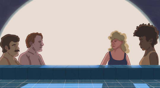
Similar to Rachel Kim’s art style, Lee’s animation tend to have lining that isn’t completely smooth and flowing from each frame. I feel like Lee’s vivid and unique subject matters and style make this work well, and also reminds me of my own rotoscopes in the past that had similar lining problems. However this could also mean that Lee herself uses rotoscoping for her animations, as everything else in the animation seems to animate slightly differently with less lineart discrepancy, and the movement of humanoid characters has a very realistic look to it that I think would be difficult to achieve if it wasn’t rotoscoped. Rotoscoping for my final piece is an option I could explore, although it does have certain advantages and disadvantages that I would have to consider (similar to using a messy lineart style inspired by Rachel Kim). Rotoscoping could help me save time as I wouldn’t have to storyboard and sketch out frames to trace off, but the movement style may not fit the tone of the animation I end up doing. However recording videos of people doing motions I want to animate for reference is always an option I could explore.
vimeo
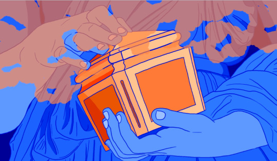
0 notes
Photo


Digital Principles Outcome and Review
My initial goal when working on the digital morph outcomes was always to try and push beyond the expectations of the brief. Ever since we were given the extended deadline to compensate for the lack of lessons we had, working on this project. I wanted to take this opportunity by the horns and produce an outcome that went beyond what Helen and Peter were expecting by incorporating elements and a much more planned and thought out design process allowing me to showcase not only a strong final product but a gripping and clear development in how my work has evolved throughout the course of the project towards hand in.
From the initial developments that led to me expanding and challenging my ideas on the project. I knew from the offset that I wanted to create an animation that challenged my drawing technically, by exploring the use of perspective and depth throughout the animation. Giving me the opportunity to really push the exaggeration of my actions and cater towards the animation principles in regards to more common tropes such as squash and stretch, slows in / slow outs, overlapping actions and follow-throughs.
Having had the chance to best manage my time to giving myself the needed dedication to solely working on this project. I believe this gave me the best opportunity to create the outcome that I am happy with today. With at least 6 key identifiable iterations and takes on the project, I feel that this is one of the first instances of my work that I have produced where I have been able to show a clear and concise development throughout the progression of my work. Including both artistic influence and cultural influences based on the morphs original context of reflecting a film.
Rough Beginnings
Having become accustomed to using TVPaint in the first unit, this is something I wanted to continue throughout my studies and was determined to integrate within my own work as I progressed throughout the project.
As a means to roughing out my initial ideas, working in this software gave me the best opportunity to note down and get an understanding of the timing and style of my animation. As I came to creating my first series of rough passes that led to final hand-drawn animated outcomes. This clear and significant breakdown of the process gave me a clear indication of how I want to pursue my work and how I can adapt it down the road to the other software and processes I want to include throughout my final outcome.
Having a clear plan allowed me to consider in the early stages of production how I can incorporate other elements such as texture, secondary actions and the amalgamation of what would be done digitally versus traditional animation. In the hopes of best planning the upcoming weeks to best manage my time and create the best possible outcome. Using TVPaint was a nice change of pace and definitely introduced me to the project in a familiar setting, allowing me to establish my ideas without going outside my comfort zone and pursuing software such as aftereffects and adobe suite without a plan.
Digital Transition
The majority of my time throughout this project was dedicated to translating my hand-drawn animation to a series of shape layers in adobe illustrator and photoshop. Having set the foundation of my work by setting out the action and timing of my animation in TVPaint. Essentially I just had to trace my hand-drawn animation in adobe illustrator frame by frame, consisting of around anywhere between 2-16 shapes layers per frame.
This took up the majority of my production time as I need to ensure that the solid shapes matched up and best replicated the linework made up of my traditional rendition of the animation.
Having worked in greyscale throughout the whole process, this is the first instance in where I began to inject colour into my animation, separating and differentiating each movement of the animation by indicating a varying shade of orange and red to best reflect the tones, themes and colour palette used within the film ‘Whiplash’ itself. At this stage of production I had produced an animation that met and reflected the needs of the brief, but felt that with the remaining time I could pursue and push the outcome further to best exhibit my initial intentions and expectations of the work that I hoped to produce, based on the artist research and influence I had gathered across the weeks of production so far.
Going Beyond the Brief
Adding an additional layer of depth to my work, to create a more composed and final outcome, I added a significant layer of gradient and texture to my work. Based on the various influences I have referenced in the weeks prior, I had taken what had best complimented and accented their work, to translate to my own through my own interpretation.
Individually texturing each frame with a series of photoshop brush layers, I wanted to convey a sense of chattering and constant motion even in the moments of slower action and anticipation throughout my movement. To create a smoother transition from the more unbelievable movements throughout the animation, my intention for the texturing would have been to cover and mask some of the imperfections that the shape layers initially brought due to their quick change in design. This also brought a sense of motion to segments of the animation in which a frame is held to convey a constant state of life even though the props are not moving.
I'm extremely happy with how this element came out as I was able to bring another layer of depth to the animation by introducing a range of tonal values that gave physicality to the props. Rather than this flat 2D dynamic which I had seen in a lot of my peers work and wanted to stray away from. Adding this texture was the best representation of my initial ideas and how I wanted to pursue this project beyond the brief to create something to a more professional and what I perceive to be industry standard. Whilst there are elements that I would change in regards to the animation, I feel that having challenged myself with the use of perspective and shift between morphs justifies some of the sloppier elements of my outcome as I actively pursued to go outside of my comfort zone.
Reflection of the Film
With the original intention of the ‘Guess the Film’ motive, my goal was not only to replicate the film through the use of props but how I used the animation in terms of its timing and pacing. A highly stressful and change of pace movie, I wanted to replicate this through both the quick, erratic and ever-changing movement alongside the quick-cut almost stepped animation in regards to the hand and notebook segments of the animation. This juxtaposition between the fixed animation versus the fluidity was meant to represent the changing tones throughout the film that show the struggle between the creativity and devotion of the characters throughout the film.
Although a more obscure film not known to the general public even though it won three Oscars and a nomination for best picture, I feel that my animation clearly represents the film through identifying the main plot points and theme through a series of plots and actions that take place throuhgout my animation. And I’m really happy and proud of how this outcome came out with. And look forward to producing more content like this in the future.
To summarise;
I created an animated outcome that went beyond the expectations of the brief by pursuing elements of texture and colouring that brought the animaiton to life.
Considered how my outcome reflected the intentions of the brief and drew comaprisons to the film it was based on.
How can I go ahead with my other projects, and use my time to focus on the mystery box task?
I highlighted the importance of working in a variety of software and mediums to bring an amalgamtion of both traditional and digital elements to my work.
0 notes
Last Seen Blogs