#cinemegraph
Text
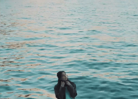

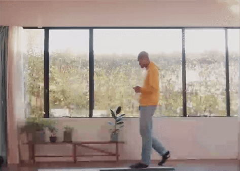


Kent Ito - 「My Factor」
#my gifs#kent ito#伊東健人#seiyuu#tsukimichi#i realized a lot of these shots remind me of cinemegraphs which are very cool#the entire mv is such a vibe though i love it#also i named one of the clips 'totto eating like he's in an avengers post credit scene' fjdopsjfpdos
1 note
·
View note
Text
OHHHH MT GOD. oh my gOD. OHHHH MY GOD. doona ep 5. ohhh my god. this fcking show. i was not sold on it when i saw the trailer but I kept seeing the name everywhere n i was like. okay. might as well see what it’s about and ohhhh myyyy goddd. this fcking show is a solid 10 (wavering a tiny bit) from me. it’s charm. its CHARM. im so charmed by the characters n their relationships ohhh myyh god and its cinemegraphic holy shit. also this episode. this episode. crying at won jun and Jin joo. that fcking scene between them and then DOONA!!!!!!!!!!!!!! that last scene. screaming, clenching my fists and screaming again. oh my godddd.
#yuki talks doona#lee doona n lee won jun relationship is fcking weirddddd n i love them so much#SO EXCIYED to see what ep5 brings#also im so charmed by lee won jun as a male lead. He’s just a lil guy !!!!! He’s so awkward !!!!!! he’s so <3 to me i Love them#and doonaaa doonaaaa DOONA#<3 <3 <3#god their scenes#that one where she sleeps on his lap and they hold hands in fcking GONE#their first kiss. holy SHIT#the way they flim this kdrama is sooook gooooookood i can NOT#also cryin n not fine at the part where jin joo wanted to play the game n was hitting at it to work n won Jun was like. its broken holy fcki#fcking SHIT#im gone#also 😭😭😭😭😭 jin joo going it’s us. and crying and won jun not saying anything or looking at her and then going too much time has passed#im SCREETXHING#jin joo & won jun ohhhhh my god#anyways. this fcking SHOW
1 note
·
View note
Video
Animation loop for the Funky Panda May 2020 art.
21 notes
·
View notes
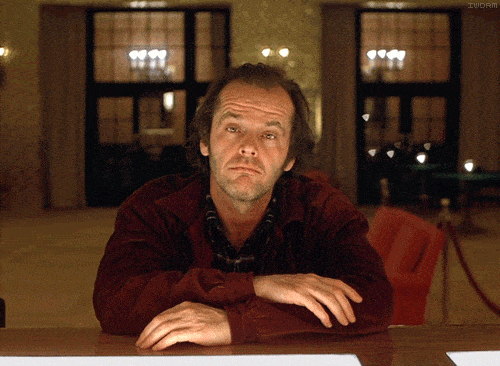
Photo
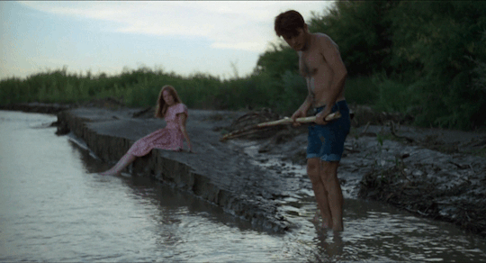
Badlands (1973), Terrence Malick
#badlands#terrence malick#martin sheen#sissy spacek#cinema#film#criterion collection#looping gif#cinemagraphs#cinemegraph#movie cinemagraphs#movie cinemagraph#movie gifs#movie gif#gifs#gif#artists on tumblr
36 notes
·
View notes
Photo

Cyborg Heart
13 notes
·
View notes
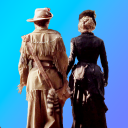
Photo
1 note
·
View note

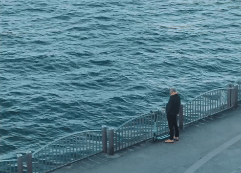
Photo

@livingstills
#uploads#art#vertical#waves#gif art#motiongraphic#photography#cinemegraphs#dark#dusk#glow#goldenindie#shadow#sunsets#seascapes#cloudscapes
27 notes
·
View notes
Photo
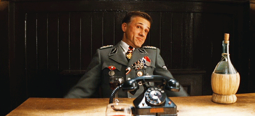
1. Christoph Waltz. This is the type of GIF I’m most familiar with, it expresses an extremely recognizable emotion and is used as a stand-in for text.
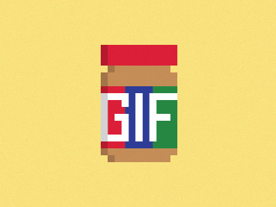
2. GIF. I found this in one of our readings. I find the subtext humorous; people are always fighting about how to pronounce ‘GIF.’ Supposedly, the ‘correct’ way is with a soft ‘g,’ like the peanut-butter brand. This is the way I first learned to pronounce it before I ever heard it spoken. I never considered using a hard ‘g’ until I heard other people say it that way. Even though I know it’s wrong, it’s the way I say it now. For some reason I find it more satisfying.

3. Cofee Cinemegraph. I’d never really heard of this type until I watched that PBS video. Many GIFs give me a headache, so I find these to be pleasantly soothing. This one has a unique application.

4. Relaxed Cat. This is a rare instance of a cat being depicted peacefully on the internet. He’s quite cute, and I like the color balance.

5. Meercat TV. This is an example of how one can have a subtler message. People are always staring at their screens when they’re out in nature.
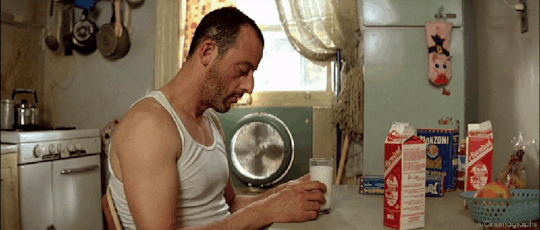
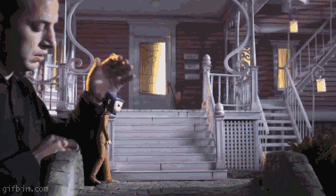
6. From Leon the Professional. I like this movie; I find that this animation of the fan communicates a lot more about the scene than it would have as a still image.

7. by Tom Haugomat. I don’t really know what the context of this one is, but things like this really interest me in GIF’s storytelling potential. I could almost imagine a digital comic comprised entirely of text and short GIFs. That would be cool.
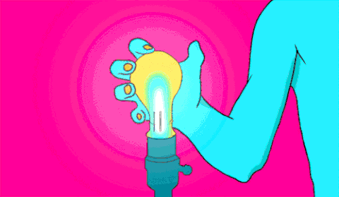
8. Lightbulb crushing, author unknown. I love the chaotic colors here. This is an instance where the headache-inducing aspects of the medium serve the content iteself. It looks shocking and painful.
9. Again, showcasing excellent storytelling potential. This is a making of GIF; it so effectively communicates the effort that goes into animating, but it also has a subtle message about the artist’s relationship with their work. Really cool.

10. Bowie. This is a really cool tribute, I think. Many folks just think of Ziggy when they think of Bowie. I think this highlights his career well.
3 notes
·
View notes
Photo

Bangtan Cinemegraph #1 JK #2 #3 #4 #5 #6
teaching myself to make cinemagraphs cuz i gotta be productive in my free time #responsibleadulting
21 notes
·
View notes
Text
Month 6 Reflection
Connecting/Synthesizing/Transforming - What research did you conduct and utilize to arrive at the design decisions you present?
I conducted my research to focus on captivating an audience. The results showed that the best way to get the audience’s attention were to tell stories, and incorporate moving visuals, and still images that can offer an appropriate insight in order to accumulate a following that would be interested in the product or service. With the combination of using motion and visual effects on my text and other elements, my aim was to create a story that would grab my audience’s attention in an attempt to entertain and inform.
Problem Solving - What design problem were you solving? What design problem does the medium you designed for solve according to the industry? How did you solve the problem?
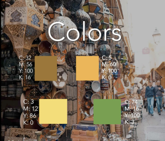
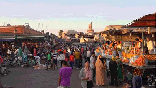
The design problem I tried to solve was the issue of capturing the exact vision I wanted for both my motion concept and dynamic vision board. I wanted to explore the idea of telling a story through a cinematic novel that that would capture the attention of my target audience. As well as inform the audience about the wondrous city of Marrakech, and what it has to offer. The travel industry is constantly filled with concerns about issues pertaining to costs, hotels, cleanliness, and travel accommodations. My design goal was to use motion to excite individuals about Marrakech, so that they can enjoy their vacation in a stress free environment. My design problem was to successfully convey a truthful and entertaining representation of what makes Marrakech worthy of a consumer's money and time. By using a dynamic vision board to and incorporating effects with the titles and headers. The words and pages did not move the way I initially wanted them to. When I rendered the final product. To fix this, I cut the title sequence a second shorter so that the page transition would look as if the words turned when the page turned. The dynamic vision board gave accurate descriptions of the colors, and textures and the background images and videos corresponding design element in the foreground. But with teh colors portion. My color scheme swas showing faintly . All the audience could see was the blocks of colors. I then de-saturated the background image so that the small text would be more visible.
Not every motion and effect captured exactly what I wanted to portray. For example, as shown in one of my storyboard reiterations I explained that the word “Explore” would whisk away from the scene as the word turned into sand particles in the sandy desert of Marrakech and would rush off as the next scene unveiled itself. That effect did not display itself because as I followed the Youtube tutorial, I found out that I did not have proper tools to execute the effect, instead I allowed the word to fade out. tools that was displayed in the tutorials. The problems I encountered were solved due to my ingenuity spirit and finding easier ways to execute certain effects. In the end I still feel that my design portrays an exact interpretation of my theme.
Innovative Thinking - How does your work compare to others in the industry? How did you approach the subject of innovation? How is your work innovative?
My work differs from others in the Industry because of I am trying to capture their hearts and connect with people who thrive off an adventure and not knowing what may come out of their time there. The ones who live off of spontaneity and not knowing what’s around the corner, and to enforce that being like that is okay, also being mindful of your experience there and enjoying every activity and aspect that a new environment can offer. My work dives into a story of possibilities that will be offered at Marrakech and encouraging that visitors experience more than just a nightlife, but nature, the history, and appreciate the lessons they can learn while there. I approach innovation by implementing my cinematic skills. I have a background in film production and cinema and understand value in how telling a story can connect to so many people, and make my textures, colors, and typography to incorporate into all aspects I planned on covering. Textures included that of soft fabric and that of sanded concrete that that can tell a story of what the architecture has been through. The city tells a story that wants to be told. The cinematic approach to make to relatable and entertaining.
Acquiring Competencies - What did you learn overall throughout this process? Any new software? Techniques? Skills? Explain.
I learned new techniques regarding how to use keyframes to create a motion piece as well as using photoshop for a cinemegraph. I also learned the importance of music and sound and what difference sound makes to make a piece enhance your piece. Experimenting with diegetic sounds and certain music to provide a feeling that gets the heart racing and amped up. Music can help the user understand the narrative clearly.
In addition to demonstrating the above, reflect on your experiences in this course and state where you plan to go from here. Post your reflection in your Mastery Journal in 2-3 paragraphs.
My experience in this class has been challenging yet satisfying. I always wanted to experiment with motion design, and the topic of motion design is one of the reasons why I entered graduate school. The lectures have been great with facilitating the knowledge I already knew about branding and creating content with adding skills such as incorporating motion with words, and images, and learning about motion concepts can enhance your product to a consumer. I had trouble with obtaining the exact idea that appeared in my head. And found that it was taking a longer time than anticipated, so I used a various amount Youtube tutorials to try and help me use other features to create my desired concept. I also liked the idea of writing in a journal because I used it to get out my frustrations when I was stuck on something. And also I wrote down tutorial tricks, and I wrote down how I solved my problems step by step will help me out in the future If I wanted to use that same effect. I have a personal resource I can look up. The video discussion with the group was also new territory but necessary. I felt that hearing classmates go through similar struggles and their approach and thoughts helped me stay motivated, and also helped with my communication skills which is also a great industry skill.
Final Cinemagraph:
In order for this Cinemagraph to look like it was in a loop, I copied and pasted the same clip side by side and reversed the second clip so it looks like the man on the right hand side is leaning back and then leaning forward in a continuous loop.
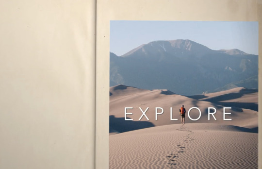
I originally wanted the word “Explore” to turn into sand particles and move off screen. Since I could not get the exact motion effect I wanted, instead, I faded the word explore before the page turned in the book.
0 notes
Video
Animation loop of Funky Panda’s August 2020 art featuring the Tiger Spaceport; home to over 300 endangered frozen earth tigers!
9 notes
·
View notes
Text
Gone Girl (2014), David Fincher
#gone girl#david fincher#ben affleck#rosamund pike#movie cinemagraphs#movie gifs#movie gif#gif#gifs#film#movies#cinemegraphs#cinephile#cinema#film stills#cinemagraphs#cinemagraph#movie cinemagraph#letterboxd#artists on tumblr
70 notes
·
View notes
Text
Colour Grading-Research
Christopher Doyle

Christopher Doyle was born in Sydney, Australia in 1952, he went through many different jobs in Asia before finding photography as something he enjoyed.

Doyle, who is mainly known for his work on Chinese films, moved into cinematography from photography in 1983 and found his passion for movie making. He is also known for helping create music videos for bands such as Texas.
Colour grading in his films are very typical of the cinematic colours blue/green and orange. Nearly every still you see features these colours. The blues help create a calmness or sadness within the film. It is quite an extreme use of cinematic colours opposed to more subtle uses in cinematographers films like Danny Cohen. The oranges create a sense of warmth and heat, safe, and from the frame above I feel this is portrayed rather well.
Danny Cohen
Danny Cohen is a British cinematographer known for his work on films such as The Kings Speech, Les Miserables and the Danish Girl. He started off as a photographic technician before progressing through the movie industry and finally becoming a director of photography/cinematographer.
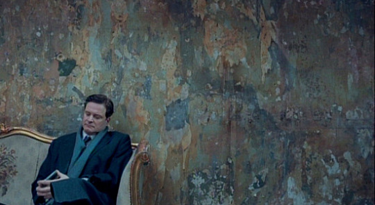
Cohen is well known in his films for his interesting lighting set ups, such as in the Kings Speech all lighting was outside of the Kings office and light for example was placed in places such as outside a skylight window to create natural looking daylight even when it started to get dark outside.
Danny Cohen has a more subtle colour grading style where the greens and blues are there but not overwhelming. This is the same with the oranges. This is also reflected in the way he uses light, very subtle.
Emmanuel Lubezki
Emmanuel Lubezki us a Mexican cinematographer. Lubezki has been nominated and won many awards for his cinemegraphic work, his most recent award being an academy award for cinematography on the Revenant. However, Lubezki is also know for his photography as when he works on films he often takes film stills of the magnificent locations and scenes he is shooting.
For example on the Revenant, nearly all scenes were shot in natural light which Lubezki would have considered, this would be to create a certain colour and tone to the full movie. Many of Lubezkis pictures are of cinematic colour and tones which reflects from his cinematography in movies.
The revenant in particular mainly features blues, earthy colours such as blues and browns. Lubezkis films are heavily colour graded also to help create the mood of the film. These blues also create a sense of lonliness especially in the film the revenant.
1 note
·
View note
Last Seen Blogs

latenight-ramen
いらっしゃい
youknowwobbles
I'm kinda mad at you.

spicynoodles14
Spicy_noodles

iliv4theart
Artsy Fartsy

smileupdentals1
Untitled