#gfx help
Text

.. LET'S DRIVE !
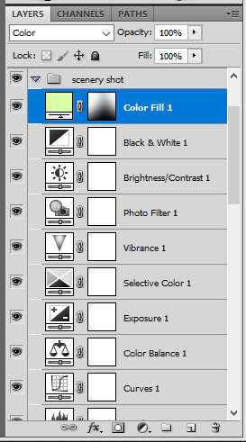
carplay inspired template // by chamhwis !
originally created for this set. please like/reblog if you download ! to use this template, all you need is basic knowledge of photoshop (clipping masks, changing colors). this template does not include coloring layers. the font used is poppins !
DOWNLOAD HERE
** please read the rules i've included in the psd & reach out if you have any questions.
feel free to tag me in your creations if you use this! i track #hijaehyukkies or you can @ me in a reply or send me a link directly to anything you make ♡
#psd template#gfx template#gfx help#template psd#gfx resources#marekwan#usersoppa#wabisarah#aleksbestie#useroro#userjuju#laura.track#userzaizai#usergyukai#tuseral#userfairy#eripsds#eripsds.template#.resource tag#been a while since i uploaded a template ahhhhhhhhh
351 notes
·
View notes
Text

hello everyone ! as i'm finishing up my gfx blog, i'm going to be posting a few free packages of stream assets. that said, if i were to charge for them, how much would y'all pay? i want to ensure they're affordable as i've seen packages for $70+, which while makes sense, i feel is steeped. so please vote down below the price you'd be willing to pay !

2 notes
·
View notes
Note
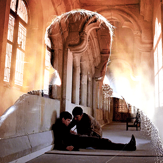
Hi! Can I ask how you did the double exposure gifs for your merlin set? They're beautiful btw!
heyy, thank you!! of course!
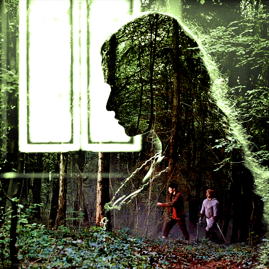
it's actually not very hard, the trick is to find the right shots for this. here's how i did it (reference gifset), under the cut.

for this tutorial i will be:
— using photoshop cs5 on windows
— assuming you know how to make gifs using the timeline
— have basic coloring, sharpening, groups, and layer masks knowledge
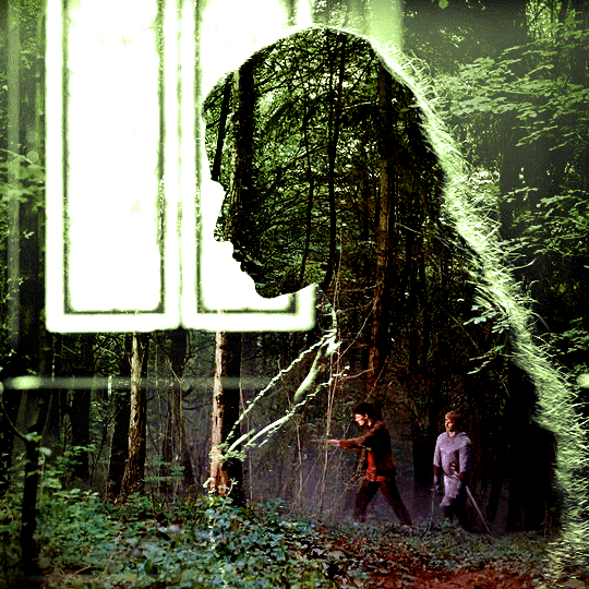
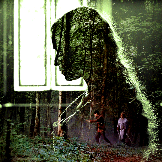
I. CHOOSING THE RIGHT SHOTS
the ultimate trick to pull this off is to choose the right image. in order to do the double exposure, you need a silhouette shot that has these:
a defined and dark silhouette with a background that is not too busy
enough contrast between the silhouette and the background
the silhouette should take at least 50% of the space
not too much movement
here are a few examples of why they work and why they won't:
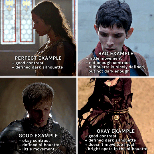
gwen: perfect example since this shot is already quite contrasted with a defined silhouette. there won't be a lot of work needed to make this one work.
merlin: not a great example because even tho there's a somewhat good contrast between him and the background, the silhouette is just too bright, not dark enough.
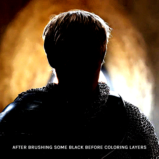
arthur: another good example, even if there are some bright spots on his face and armor. since he's not moving too much, you can definitely brush some black over him to make his silhouette darker (i'll explain/show later)
morgana: this one could work because the contrast is great, but of course her skintone is very bright against the black clothing. that being said, since the movement is not too bad, it could be possible to brush some black over her and move these layers with keyframes (as mentioned for arthur's example). i haven't tried it tho, but i think it would work well enough.
once you have your silhouette shot, you need another gif for the double exposure. what works best, in my opinion, are:
wide, large shots
shots with no to little camera movement (no pan, zoom, etc), but the subjects in the shot can have little movement of course
pretty cinematography/scenery shots
i find these are easier to find and make it work, it's not as "precise" as with silhouette shots. it's mostly just trial and error to see what works best with the silhouettes.
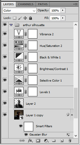
II. PREPPING THE SILHOUETTE
for the effect to work, we want a silhouette that's dark as possible. i'm gonna use the gwen and arthur shots as examples.
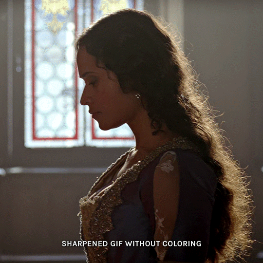
for the gwen gif, i started by sharpening, and then upped the contrast by quite a lot so her silhouette is mostly black, while retaining some nice details. i've used only 3 layers here:

selective color layer: in the blacks tab, playing with the black slider (value: +10)
brightness/contrast layer: added a lot of contrast (+61) and a bit of brightness (+10)
black and white layer: on top, its blending mode set to soft light and at 20% opacity. gives a bit more depth and contrast

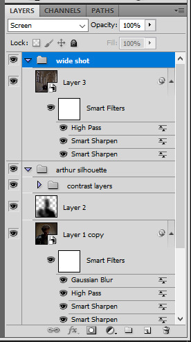
then for the arthur example, i've also sharpened it first, and added contrast layers in this order (the skintone looks horrible, but it won't matter soon lol):
levels layer: black slider at 0, grey slider at 0.76, white slider at 104
selective color layer: in the blacks tab, black slider at +10
brightness/contrast layer: brightness at +1-, contrast at +47
black and white layer: on top, its blending mode set to soft light and at 20% opacity. gives a bit more depth and contrast
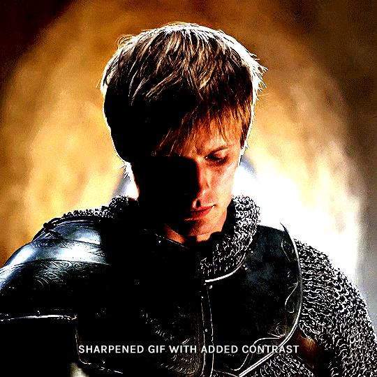
as you can see, half of his face is still quite bright. to correct that, create a new empty layer and put it between the gif and the coloring layers.
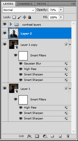
using a really soft brush and the black color, brush some black over his face and body on that new empty layer. you can edit the layer's opacity if you want, i've set mine to 71%. since arthur doesn't move much here, there's no need to keyframe this layer's position. for the morgana example, this is where you'd need to play with keyframes to make it work. here's where i'm at now after this:
you can always edit this layer later if you need, after doing the double exposure blending.
once the silhouette is all ready, you can put all layers in a group and rename it (i've renamed mine silhouette).
III. BLENDING
now the fun part! import the wide/scenery shot in photoshop, then resize it to the same height of your silhouette gif. make sure the gif is a smart object layer, and sharpen it. finally, bring this gif onto the silhouette canvas (by right clicking the smart object > duplicate layer). once you have both gifs onto your canvas, put the wide shot gif layer in a group, and set this group's blending option to screen.

you can then position the wide/scenery gif the way you like it in the canvas. this is how it looks for both examples after i've done that:

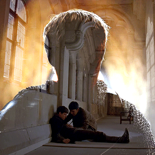
if the blending mode screen doesn't give you the best result, so you can play around with other blending modes (such as lighten and linear dodge in these particular cases), but generally speaking, screen is the real mvp here haha.
IV. COLORING
now that the double exposure effect is done, we need to color the gifs to bring them together. i went with simple coloring here, simply enhancing the colors that were already there. just make sure that the coloring layers for each gif are in their respective groups. here's how i've colored both examples:
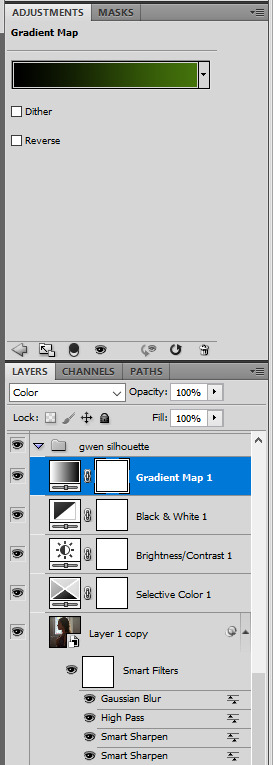
gwen silhouette group: i added a gradient map layer on top of the contrast layers in black to green and set the blending mode to color
scenery shot group: multiple coloring layers, with a green color fill layer (blending mode set to color), with a layer mask so it only affects the top half of the gif
for the arthur gif, i did something very similar but with warmer colors. i didn't use a gradient map for arthur though:
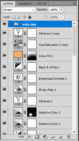
arthur silhouette group: i made the yellow warmer, closer to orange/red, with a hue/saturation layer, and added more vibrance. didn't feel like it needed a gradient map layer here though.
wide shot group: basic coloring layers to enhance colors from the merlin & daegal shot, and an orange color fill layer set to the color blending mode.
at this point you're pretty much done. just need to add some final touches and typography (if you want).
V. FINAL TOUCHES
a small and completely optional detail, but i wanted to soften the edges of the wide gifs. to do so i've duplicated the smart object gif layer and removed the sharpening filters (right click on smart filter > clear smart filters). put this layer on top of the other smart object layers (but still below the coloring).
then with this same layer still selected, go to filter > blur > gaussian blur... > 10px. this will give you a very blurry gif, but we only want the edges of the canvas to be softer. so add a layer mask to this layer. with a very large and soft brush (mine was at 0% hardness and about 800px size), brush some black onto the layer mask to remove the blur in the middle of the gif.

you can play with this layer's opacity or gaussian blur amount if you want (by double clicking on the gaussian blur smart layer filter). here how both examples look with this gaussian blur layer:

you can also mask some of wide/scenery gifs if you'd prefer, so it shows less outside of the silhouette. just put a layer mask on that whole wide shot group and brush some black or grey on the layer mask. it's what i did for the gwen gif, with a very soft brush and i set the mask density to 72% (i kept the arthur one as is tho):

and that's how i did it! hopefully that was clear enough :)
#alie replies#*ps help#resource#tutorial#allresources#*gfx#usercats#usersmia#userrobin#userfaiths#usertina#usermoonchild#userchibi#uservivaldi#usertreena#userraffa#userriel#userelio#usermadita#usersmblmn
968 notes
·
View notes
Photo
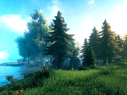


VALHEIM (2021) ♡ dev. Iron Gate Studio
scenery in the meadows 3 / ?
#valheim#gamingedit#vgedit#gamingscenery#video games#dailygaming#indiegaming#gif#.gfx#userknight#usergalactic#userstrawberry#usermarceline#usernuclear#aartyom#usergamer#userredacted#my video folder is so bloated bc i keep recording stuff and not making gifs >_< help
473 notes
·
View notes
Photo
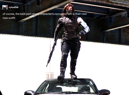

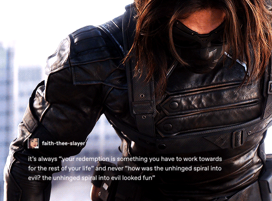

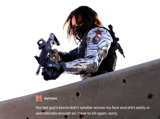
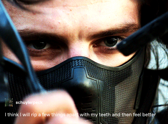


bucky barnes + text posts - winter soldier edition (3/??)
#everyone say thank you to raffaella for helping me with the the text effect 🙏🙏🙏#*textpostmeme#**#*tb#*bucky barnes#*marvel#marveledit#buckybarnesedit#usermalin#usertammy#userraffa#usersavana#userpavlova#userzo#userlindir#useraurore#*gfx
2K notes
·
View notes
Note
Heya nik! could i request the typography for this anidala set? (love the lightsaber in the battle couple one howww??? )
hi shale!! happy to share <3
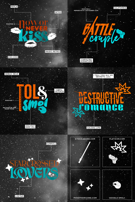
as always, links to the fonts under the cut:
perla
intro
magic retro
kiss kiss
california
carolina signature
bebas neue
abril fatface
holyfat
i tell you all my secrets
caldas life
sunroll
lostar
549 notes
·
View notes
Text
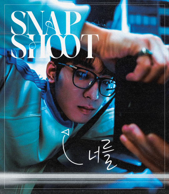
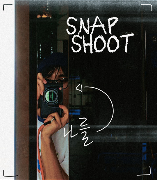
snap shoot, camera lens pointed at you
#did this at 1am#hourlywonwoo#fywonwoo#hourlydk#svt#seventeen#dk#lee dokyeom#lee seokmin#wonwoo#jeon wonwoo#*gfx#*svt#little smth fun#i feel awkward tagging people in gfx help#svtsource
284 notes
·
View notes
Photo
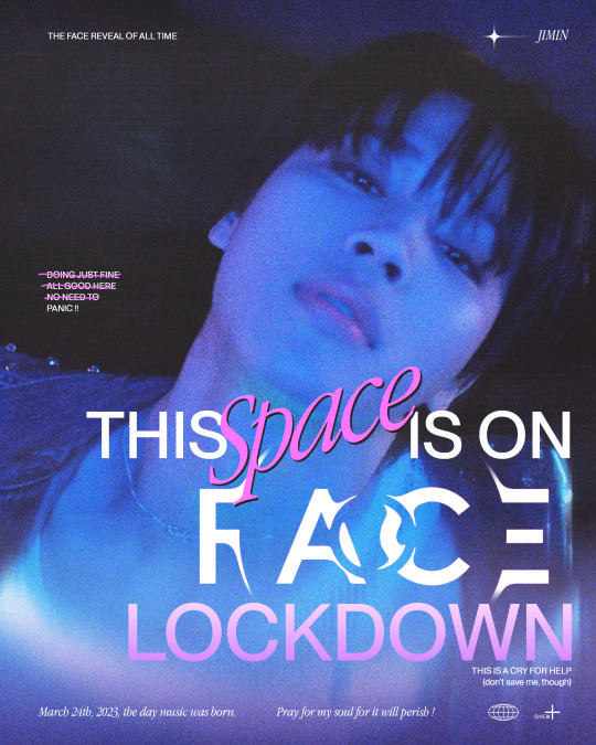
who is not ready for FACE !!
#for those in need#like me !!#bts#bangtan#jimin#face#btsgfx#dailybts#don't take it seriously but i'm being srs#pls send help in the form of leave me alone#*latest#*gfx#*ryenisveryserious#*posters
411 notes
·
View notes
Text

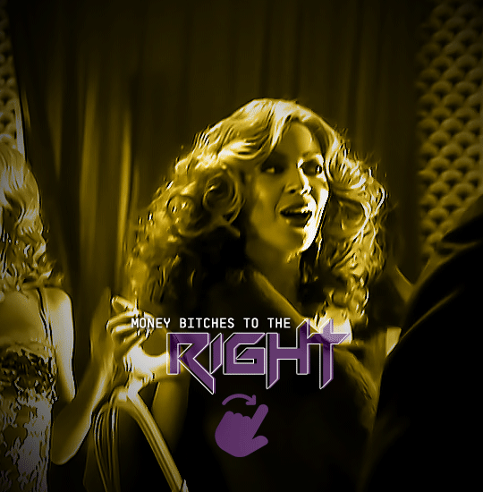

RENAISSANCE 1-YEAR COUNTDOWN
act i, track xv: PURE/HONEY
#beyonceedit#usermusic#femaledaily#pscentral#ganjacat#usercee#userwocs#userraffa#tusermimi#dailywomen#dailymusicqueens#flawlessbeautyqueens#renaissance1yr*#beyoncé#*#gif*#gfx*#one more after this and i will finally be free#although ngl making all of these was so much fun#it helped me step out my comfort zone and be more creative which i like
81 notes
·
View notes
Note
do u have any advice for making gfx? i really like yours and your concepts are always so creative
ahh, thank you so much, you have no idea how much this means to me 🥹 i'm really hard on myself about my gfx. but i absolutely love making them, and i'd love to share some advice with you!
i'm not sure if you already make gfx or not, so i'll include some things about getting started along with general advice / stuff geared to someone who already has some experience so that hopefully, wherever you are in your journey, something here might be helpful. i hope i'm not just giving you info you already know JBDJB 😭 so feel free to come back and let me know if you need something different ... if you have specific questions about a particular set or anything else like that, i always welcome that too! this got long, so i'll put it below the cut.
1. getting started
- i'll write this point assuming you've never made a gfx before, so if you have, feel free to skip it! the only program i use is photoshop for gfx. and the main thing with these that i didn't know at first is that you can (and should) use a bigger canvas than what you would for gifs ! my typical size for a gfx panel is somewhere around 1080x1200 px. if you are placing gifs anywhere in them, you will likely have to resize down to meet tumblr file size limits.
- some things that you should know how to do in ps: creating a clipping mask, rasterizing/resizing, smart filters, eyedropper tool, and different blending techniques such as overlays. if any of these things sound like 'omg what???' (they did to me as a beginner) let me know and i'm happy to explain more!
- for total beginners, my biggest recommendation is to start by using templates. this helps you get a feel for what layers go into a gfx in the styles that you like, and makes it easier to start making some cool things and boost your confidence before you feel comfortable starting entirely from scratch and developing your own style. you can search 'psd template' here on tumblr, or on deviantart (i'll talk more about sites i use to find things below). just make sure you read each creator's own rules before you use something. i also make templates! you can find them here. i don't require credit and you can edit mine basically however you want, aside from combining them with other templates.
2. finding inspiration
aside from things i see right here on tumblr, source material that just really speaks to me, or ideas that pop into my head while i'm driving (seriously ... almost all my gfx ideas come to me while i'm in my car or out taking a walk 😂), my favorite places to look for inspo are behance and deviantart (both of which are also great for finding elements you can use for free!).
usually i have at least a baseline idea before i go into any gfx, so i know what to search for to find some design ideas -- for example, 'yearbook design,' 'retro advertisement,' 'lyric poster,' 'zine,' 'y2k,' 'film photo story,' etc are all things i've searched before. if i have used a source for inspiration, it will always be linked in my caption, so definitely take a look if there are any in particular that you love to see that inspo source! (as a general note, you should always link back to your own inspiration sources, it's just the right thing to do)
3. my process (from idea into photoshop)
once i have an idea and i've gathered some inspiration, i usually sketch out my basic layout idea into a notebook. with gfx, composition is something you need to keep in mind within each individual panel as well as the set as a whole. i think about what i want the main focus to be and what basic elements i want in each panel. then i will start gathering my resources and start getting things in photoshop! often, i don't really know what it's going to look like until i start putting it together. that's kind of half the fun though.
throughout making most of my gfx, i consult at least one friend on layout, colors, etc especially if i'm not liking something or i'm just stuck and don't know what would make it better. i HIGHLY recommend getting feedback and utilizing other sets of eyes to get your best quality work. i know there are some things i just can't possibly think of on my own, especially when i've been thinking about and looking at something for way too long. once my panels are finished i export them as a png and arrange them on tumblr to see the whole thing together before i post!
4. finding elements i.e. fonts, textures, pngs, etc
again, behance and deviantart are great places for this! on behance, it's best to search 'freebie' with what you're looking for because otherwise all the options may be stuff you have to pay for. but they have SO many textures, pngs, fonts, any resource you can think of.
with deviantart, be mindful of people who just compile texture/png packs from other sources/artists, because that's basically impossible to properly credit (and you really should do your best to do that). but DA is a great source for things like brushes and hand-drawn elements, and templates too! again, just be sure to read all of op's rules before using their resources.
-places to find fonts: behance, fontspace, dafont, and ofc google!
-places to find free pngs/icons (i use these for all of my social media templates and more): flaticon
-photos you can use for free are available on unsplash
-mockups you can use for free are available on behance, unblast, and pixel surplus
5. other important bits
- as i've mentioned a few times throughout CREDIT is so important when you are using other people's resources, and using anyone else's work as your inspiration. i always credit when required and often credit even when not required, and just in general always try to mention where i find all my resources especially for sets that i've used a lot of different things for. of course, we can only do our best with this, and i've definitely made mistakes or just lost where i found something in the process of making things, so just have good intentions and try to do what you can to ensure you're giving credit where it's due - it also helps other people find things that they can use for their own work!
- don't be afraid to experiment and try things out, i think really what i love so much about gfx is that there are literally infinite possibilities, styles, and ways to improve. keep an open mind and know that nothing is out of your range if you can find the right resources.
happy creating, and please know i'm available to talk about anything you have questions on, or if you want to utilize me for feedback !! <3
#wah i hope this is helpful at all 😭 again if you have anything i can speak to more specifically i'm more than happy to#this comes at a good time bc i've been really beating myself up over some gfx i've been working on#so i'm really glad that you like mine and i'd really love to help in any way i can ~!#when i first got started making gifs i NEVER thought i'd be a gfx maker and then i was like i'll never NOT need a template#but now i make everything on my own and even make my own templates! so honestly just keep at it is my biggest advice#i have so much to improve on still but the journey is super fun and rewarding#alright i've written enough here i think JBDGJHB#erimail#mail from: anonymous friend!#.resource tag#gfx help
25 notes
·
View notes
Text

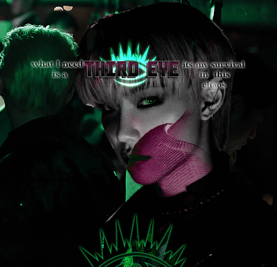

Third Eye
#omgggggggg this was hard help me#skz#stray kids#lee felix#bystay#skz gfx#staysource#flashing tw#userbeepls#usersa#usertsu#userwinterfloral#usersun#usermissye#bitsforkitts#adriblr#<3#juiceofmoons#juiceofmoonsedits#lets all ignore that I gave up on the last one ! :(#I was meant to be learning digital art#I wnted to draw felix but its quite late now rip
129 notes
·
View notes
Photo

KIM TAE-HEE & BAEK DONG-JOO in MAY I HELP YOU 일당백집사 (2022) dir. Shim Soo-Yeon and Park Sun-Young
#may i help you#one hundred won butler#kdramaedit#usergif#kdrama#lee hyeri#lee jun young#*#kd;mihy#d;gfx#sk;leehyeri#sk;leejunyoung
125 notes
·
View notes
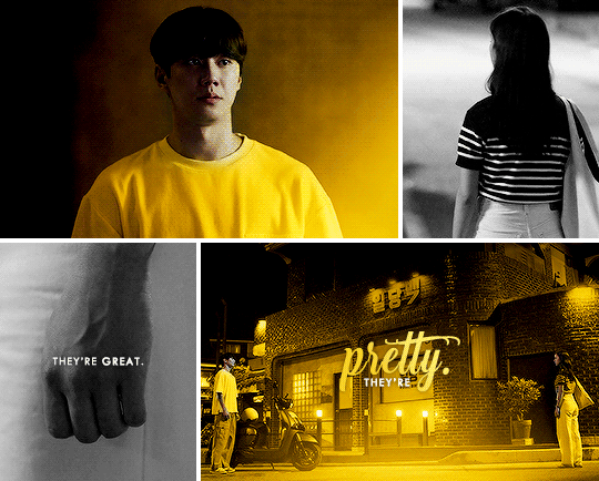
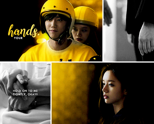
Text

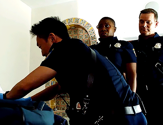
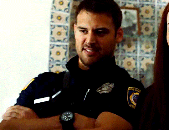


9-1-1 ‣ S03E1: Kids Today
#911edit#911#911 fox#911 abc#userknight#usercam#.gfx#loud exhale. i hope these turned out okay. believe it or not my first 911 gifset is NOT a buddie edit (we'll get there)#instead its this scene where i think about eddie's face journey 24/7. and just so happens to be the s3 std incident. sorry ⛷️#i have a lot of edit ideas and for some reason i picked this one to start with 👍#AND TY AGAIN @HOUSEWIFEBUCK FOR ALL UR HELP!!!
86 notes
·
View notes
Photo

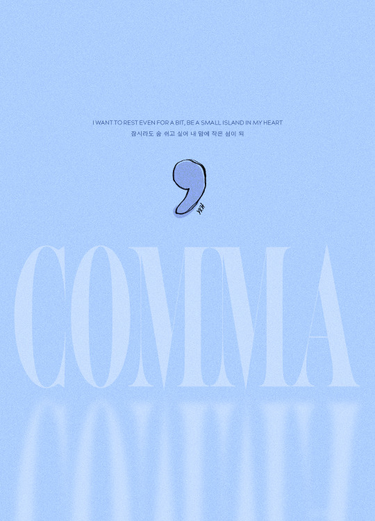
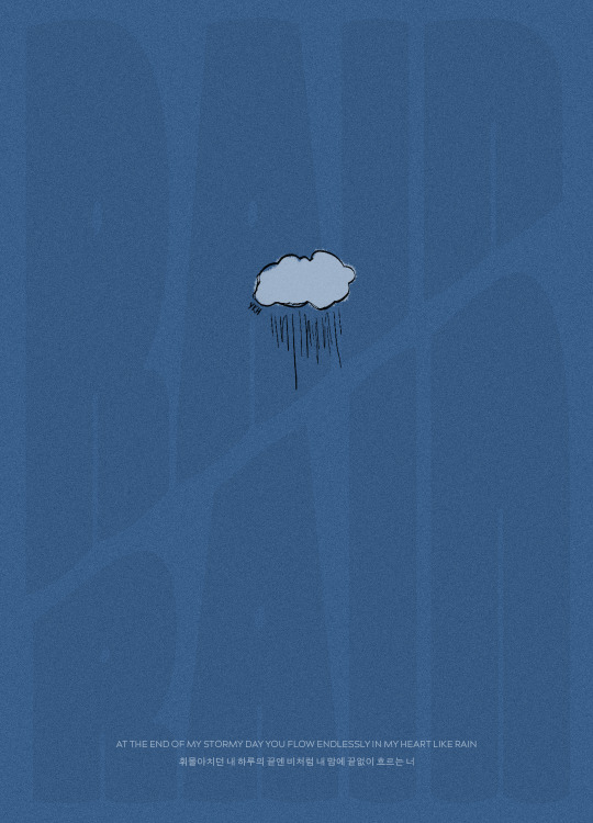
ONE YEAR WITH VOYAGER
KIHYUN THE FIRST MINI ALBUM ✧ MARCH 15, 2022
quick cc note (yes u can all roll ur eyes!! i don’t know why i’m like this either!): can you believe it’s been a whole year since kihyun’s solo debut!!! i’m not going to say that it shifted the trajectory of my life.... but i will say it has been a constant companion ever since it dropped, and has woven itself into my sense of self in the way that music you really, really love makes its way into your very dna. in the future, when i hear these songs, i know that it’ll make me think of this specific time in my life and that it’ll make me smile.
you all must be so tired of me saying this by now LOL but please indulge me once again as i say: i’m just really thankful to kihyun! like yes in a jokey parasocial way where i smile when he sends a message on bubble or posts on the fancafe, but like. on a genuine level, not joking at all, in a “hearing his voice singing some of my favorite songs can calm me down or lift me up or settle me in my own skin depending on what i need from it” way.
each of the songs on this single album is so special to me — especially comma! — but i think the other thing i treasure so much about it is that at this point, right before his solo debut, i had fallen head over heels for his voice and i was absolutely DYING at the way i was scrounging for OSTs spread across three different spotify profiles to hear him sing a song on his own. (i’m NOT kidding he had songs under KIHYUN and Kihyun and YOO KIHYUN.) when his logo trailer dropped i could feel something shifting in my brain chemistry. similar to the way i felt something shifting when i heard the first lovesong teaser.
when you know, you know.
anyway this has been just. rambly and vaguely embarrassing, sorry if you read all that! i can’t wait for more of kihyun, both in a group capacity and a solo one. i am always looking forward to what he does next. i will be bereft for a year and a half while he’s gone but i trust him wholly that he will leave behind some covers and videos to carry us through, and he’s been singing so much on play! that it’s like he’s giving us a stockpile to fall back on. and we will always, always have voyager to accompany us as we embark on our various journeys, big and small. ♡
#kihyun#yoo kihyun#monsta x#mx7net#monstaxedit#mx#mine: gfx#mx.meg#kpopgfxs#hewwo..... sorry u all have to deal with me being very sappy all the time like this but!!#i cannot help who i am...#so i OBVIOUSLY had to make something for voyager anniversary <3#kith. love u all. sorry i've been so sporadic on the dash lately !!#usermowah#usergyukai#hijaehyukkies#marieblr#wabisarah#marekwan#userkyutie#aleksbestie#rosieblr#ayatracks#useryeonjuins#tuserchrissy
85 notes
·
View notes
Note
would you be open to sharing the fonts used on the wednesday edit you made? theyre so cool
hi!! thank you!! I love typography :') and I'd be happy to share the fonts I used for this set I made for usergif:

links to the fonts under the cut!
from top to bottom, left to right:
Traveling_Typewriter
1942 report
Sacred Bridge
Wednesday Logo (I duplicated the S and made a lil triangle for the apostrophe)
Astigma
Intro
Lust Script
Marola
doctor punk
California sun
IM FELL DW Pica
Shrikhand
Neon Bines
NEON LED Light
Lakestreet
Wild Growth
Vintages
Silvus
Cache
Doky
708 notes
·
View notes
Photo
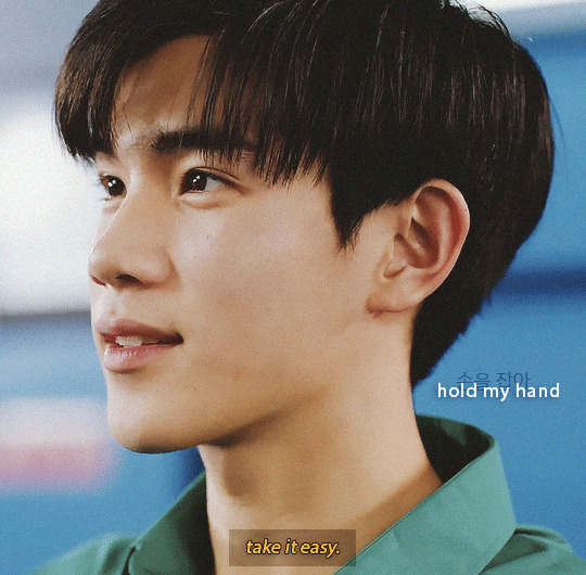

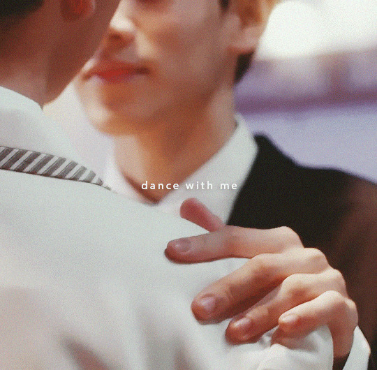

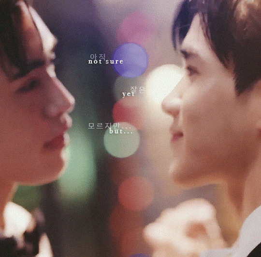
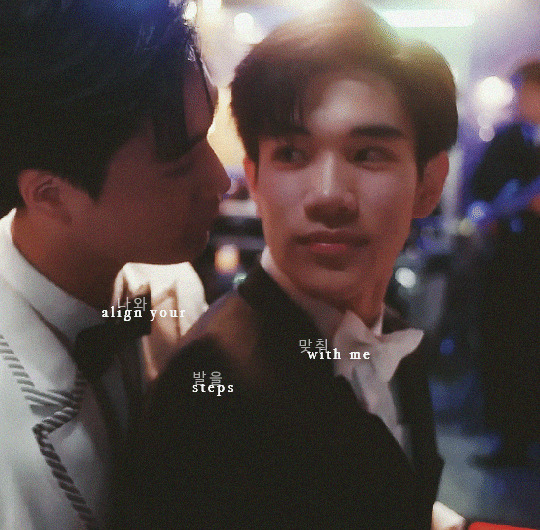
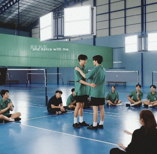
tinngun x beyOnd
ib.
#tinngun#tinn x gun#geminifourth#gemini norawit#fourth nattawat#my school president#msp#*gfx#*my school president#*dramas#userfern#you would love this show btw#this quality is absolute ass Help im still figuring out my new computer#these could be better but i really like the middle 2 i think
100 notes
·
View notes
Last Seen Blogs

estigmxs
Caótica
blue-baby-icicle-odinson
HEY Y'ALL

muses-of-kira
Multiple Muses, Multiple Hearts
clovistheconbat
We're all CONbatants in life.

butchh52
Untitled