#hate drawing the helmet
Text
A small comic on the Pikmin 2 debt complete ending!
Please read from left to right! Enjoy 🤓

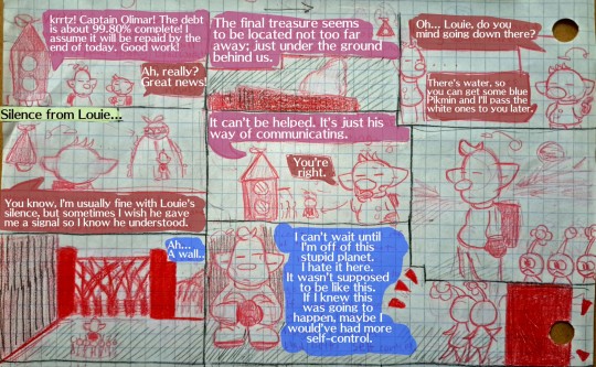


Just my take on the debt completion ending of pikmin 2... i guess kind of louies thoughts idk ... i think i rushed it a bit to the king of bugs part but i kept on forgetting what i wanted to do next in the panels and it caused me to skip ahead and looking back on it there was a whole part i wanted to do TBH but whateveaaa.
Anyways hwres the original pages not edited with text 🤓

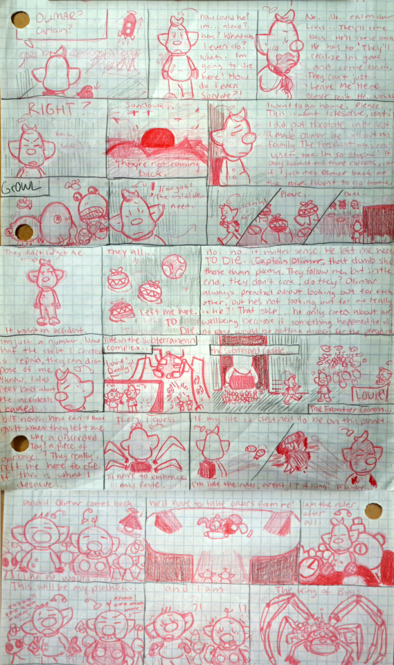
#pikmin#pikmin 2#louie pikmin#olimar#king of bugs#pikmin louie#yayyyyy i rlly like how the original pages came out ive never really done comics before so it was a challenge and i think i handled it well#i love LOUIE#Holy carp#also note when louie has his hand up to his face its over his helmet I didnt forget aboutit i promise#theres only like 1 panel where i forgot the antenna for the helmet i think just ignore#hate drawing the helmet#sorry for the titan dweevil panel i was NOT gonna try not after kjust rendering that thing like a couple weeks ago for a drawing
67 notes
·
View notes
Text
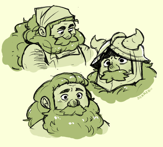
come on, be senshible.
#art#senshi#dungeon meshi#i get to see my beautiful wife in animation tomorrow#HUZZAH#also marcille was 100% the one to make him tie is beard back after getting a piece of it in a dish lol#also also i hate drawing the horns on his helmet. i did not try very hard this time. simply do not look at them.
5K notes
·
View notes
Text
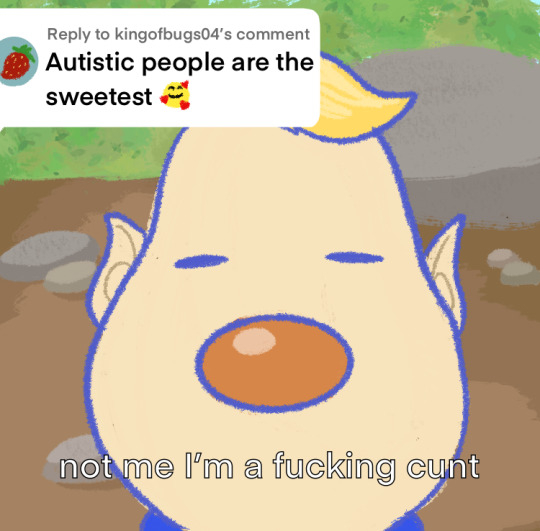
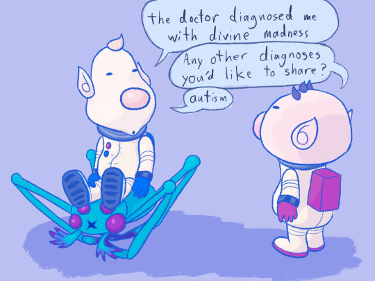
this post was fact-checked by real louie patriots 👍
#they don’t have their helmets in the second one cause i hate drawing ‘em. they’re just inside don’t worry#pikmin#olimar#louie#clover's art#500
983 notes
·
View notes
Text
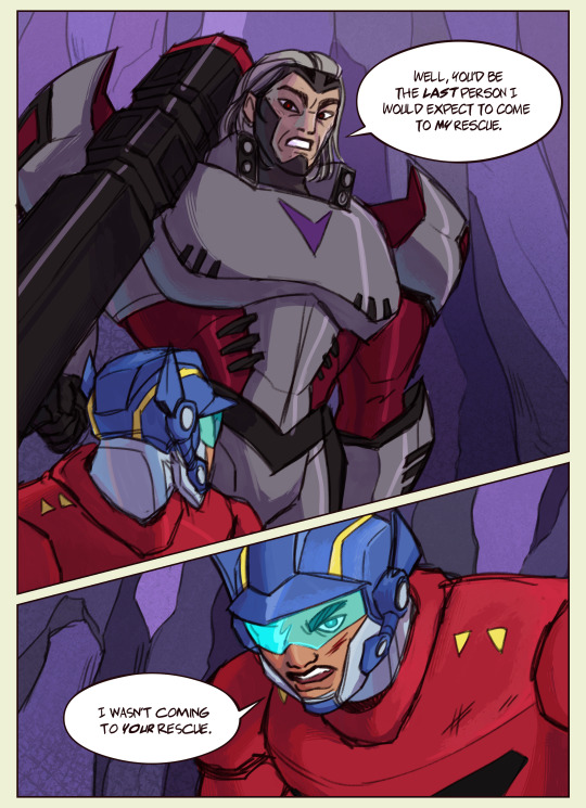
redraw of a bit from a bridge too close
#my art#transformers animated#megatron tfa#optimus prime tfa#humanformers#i was so so so so so close to drawing them in their casual clothes bc i hate drawing op's helmet as an actual helmet but its a super hero a#they need to be in super power gear. so i persevered and it turned out alright#a bridge too close is so fucking funny optimus gets grabbed by his scruff and used as a shield and just kind of waved around#my perceptionof human proportions is a little bit fucked by tf rn i don;t think people can be shaped like whatever megatron is doing
874 notes
·
View notes
Text

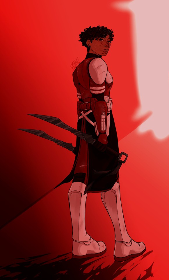
I got really inspired by those fics where Fox has to go on weird ass covert missions for palpabitch, if you're one of those writers i love you
#obligatory quality warning. why does it do me like this#i did this in a single sitting please be proud of me#i even did two versions i will admit im liking the one with the helmet more#i hate drawing their helmets so the fact i like it more is crazy#commander fox#star wars#the clone wars#sw tcw#coruscant guard#corrie guard#he is my silly#also fox has swords because he fucking deserves them
853 notes
·
View notes
Text
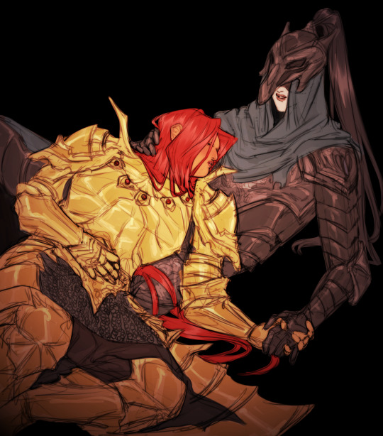
would you be mad if i posted old dark souls art...
#i know they don't even interact.OBVIOUSLY. in the game but i really wanted to draw them#dark souls#dark souls fanart#dragonslayer ornstein#knight artorias#artorias the abysswalker#my art#i really like ornsteins helmet but i didn't know how to draw it#kinda hate this tbh but who cares
117 notes
·
View notes
Text
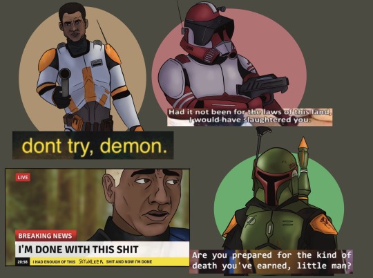
*shows up to the Clone Wars fandom 8 years late* hi
#the clone wars#Star Wars#boba Fett#commander cody#captain Rex#commander fox#my art#I watched it in college and then had a ….bad time. in life#and didn’t really did anything with it#but hi. I got bitten by the Star Wars bug again#some of my favorite guys + fox. he’s here bc I hate his helmet#and I wanted the challenge#also I know this is tbobf Boba and not clone wars Boba#my reasoning? I like drawing him#🪐
2K notes
·
View notes
Text

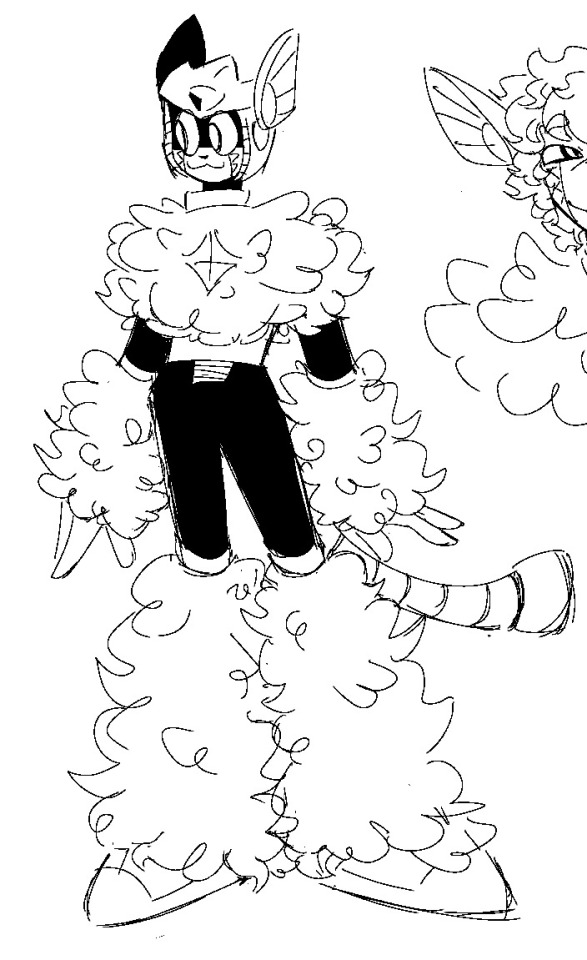
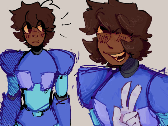


giant doodle dump because I don’t think any of these deserve their individual post
some stardroids stuff!!! x and zero stuff and then copybot n blues
#idk I’ve been drawing a lot just haven’t gotten anything postable#just shoving all of these into one post and calling it day#megaman#mega man#classic megaman#rockman#megaman x#mega man x#blues#protoman#copybot#stardroids#hey guys how tf do you draw sunstar#I hate his helmet it’s so. fuck#fuckshaped#sunstar#terra#pluto#mercury#gonna draw blues so more im so normal abt him#not a art tag#art dump
103 notes
·
View notes
Text

axl adventure 2
#red’s art#mega man#mega man x#axl megaman#he just looks like the kinda guy who’d do the sonic adventure pose u feel me?#this was fun but AAUGGG i hate drawing the armor it’s so hard. how do ppl do it#i’m willing to try again for the cat ears on his helmet tho… stupid woo woo boy affectionate
262 notes
·
View notes
Text
Ant and Maddie are absolute chaos gremlins when left alone in a room together, which means i love the idea of their friendship. Have some incorrect quotes about it


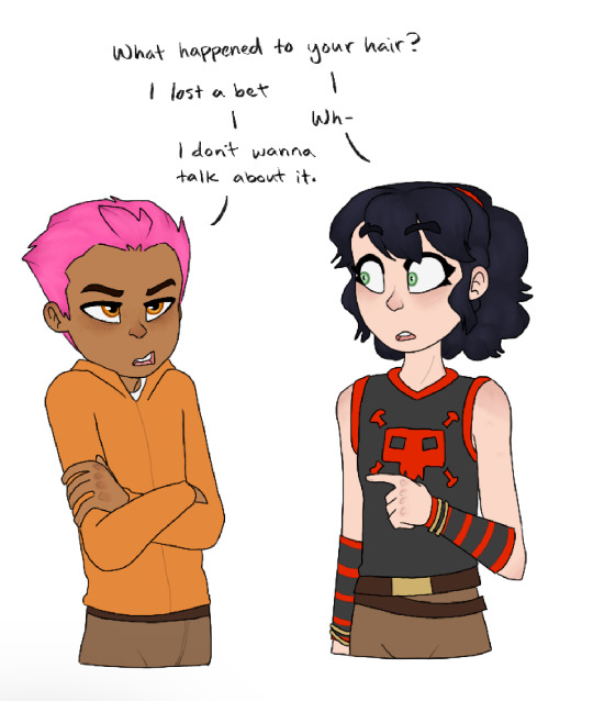
#I don’t know how to draw rebreather helmets#you think i would when one of my favorite fandoms takes place nearly entirely underwater#but I don’t#i love these two so much you dont even know#as soon as they start getting along everyone who knows them immediately wishes they still hated each other#neither of their families have known peace since these two became friends#the deep 2015#ant nekton#antaeus nekton#mad madeline#incorrect quotes#the deep cartoon
39 notes
·
View notes
Text

**shoves their heads together** now kith 🤓
#dungeons and daddies#dndaddies#dndads#dndads s2#dndaddies s2#nark#nark nation#lark oak garcia#lark oak#nicholas foster#nicholas close#nick foster#nick close#my art#oooouuughghh they both turned out so pwetty in this one#nick took forever to draw tho i HATE drawing faces from that view cos i always fuck it up but i managed somehow after 40 attempts#ughhhh nark my beloved#helmet by steve lacy vibes#ALL THAT NOSTALGIA BEEN UP ON A DOWNER#I CANT MAKE YOUR EYES SEE. GON BE WHAT ITS GON BE#DONT COME BACK AROUND ME. NO NEVERRRR#YOU WERE SO AUTOMATIC SO TOU KNOW I HAD TO HAVE IT#BUT LOVING YOU WAS A HAZARD SO I GOT MY HEART A HELMETTTTR
387 notes
·
View notes
Text


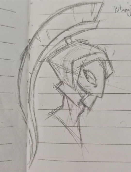
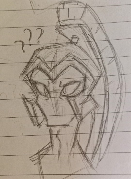

I hope you guys don't mind me posting some practice sketches and a render (?).
#This sketches are drawn from memory btw#but atleast I finally drew him right#gonna turn the second sketch into an actual drawing soon#I'm terrible at traditional art#I REALLY hate drawing his helmet plume AHHH-#general z-9#duck dodgers#practice sketch#my art#PLEASE STEP ON ME-#why am I EXTREMELY down bad for a cartoon character that only appears in 2 episodes#I want to have his babies#<- I apologize in advance for those who read these tags
24 notes
·
View notes
Note
You said don't get you started on Ice's helmet or you'll be mean... please be mean. Please be mean to him. What is so disastrous about his helmet design?
my time has come. i will be mean to him. (thank you for getting me started on this. it bothers me every time I watch top gun.) this is also gonna be so long. yippee!
stopthatfool's issues with Tom "Iceman" Kazansky's helmet! aka this bad boy right below. (I'm sorry if anyone loves Ice's helmet, it's just not for me)
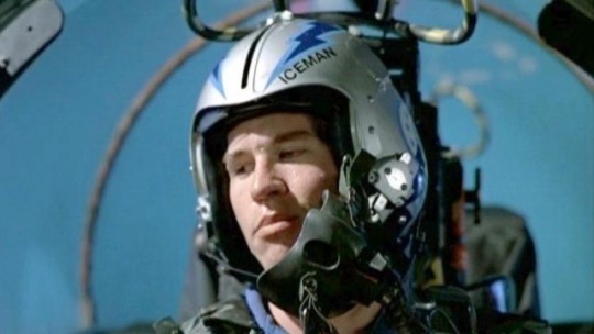
The placement of his name. WHY is it on the side? Both him and Slider have their names on the side. That makes me think it's a squadron thing? (the VF-213s) but regardless i don't care cuz i think it's stupid. (again sorry if someone thinks its genius. ok i'll stop apologizing)
My biggest issue with the fact it's on the side is that it creates this uneven weight distribution. The side with his name feels considerably "heavier" than the side without.
And the thing i don't understand is that Ice's name is evenly numbered!! He could fit 3 letters on either side of the line that comes down the helmet! the letters wouldn't be unevenly distributed, so I don't know why he felt the need to put it there!!
Here, I have "annotated" his helmet and provided other viewpoints of his helmet!

The font/typeface! Ice.. is that ARIAL?? and it's not even bolded??? so not only is his name to one side and weirdly small... it's skinny and unbolded. (like you're THE Iceman. Don't you want your name big and bolded? I shouldn't be searching for your name when you're Mr. Iceman!)
Looking at his helmet head-on, part of his name isn't even visible.. like ok ICEM!
And then! There's this weird switch up in the shapes and line types that he used-- the angular and sharp points of the lightning bolts and the half circles surrounding the squadron logo (is it a logo?? idk im gonna call it a logo)
What i think Ice is trying to do here is create a "connection" between the circular part of the logo and the lightning bolts as the bolts go all the way to the back of the helmet... but in my opinion... it's not working. like at all.
The comparison between the harsh lines of the bolts and then the curves is just kind of hard on the eyes (for me anyway). I just don't know where to look. Should i be following the leading lines of the lightning bolts? Or the curves of the half-circle things? Or should I be following the line of the lightning bolt in the logo?
And all throughout that... i barely end up seeing the name on the helmet.
Continuing off the logo... for Top Gun 1986, Ice and Slider are in the VF-213 squadron, but the movie switched the logo to the VFA-25s that looks like this on their flight suits-
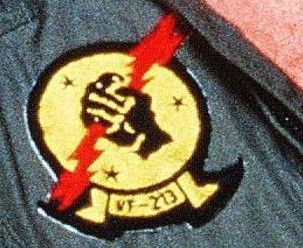
(yes that is the best quality image i could find from the movie my bad) So why does the logo on his helmet look like this???
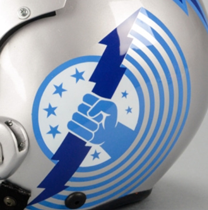
WHY do the fingers look like that. they look like hotdogs im so sorry. (logistically it was probably easier for the decals to be printed and then applied like this. but. we're not talking about technicalities here. right now i'm tearing apart the entire composition of Ice's helmet.)
I like version of the logo on their flight suits soooo much better! It's got more "rhythm" and flow to it that the lightning bolts lack! Plus no hotdog fingers.
Ok ok, now on the colour scheme. The harsh and bright blues I don't mind. Like yeah, you're The Iceman, punch me in the face with blue. I can forgive that. The thing that really bothers me.. is the silver/grey base of the helmet.
It's this really harsh grey that really doesn't help with the already harsh blues. I think he should've continued with the blue he has going. cuz this grey ain't working, king.
Ok, anyway. Since I should be studying, I'm obviously doing anything but studying. So i redesigned ice's helmet. ya idk.

it's kind of wonky.. but whatevs (ignore how the lightning bolt on the side view doesn't line up with the front view) (and ignore the inconsistences in the lettering. i was lazy and did it by hand)
I also didn't want to completely change/get rid of the aspects of Ice's helmet. So the changes aren't huge (except for maybe the name placement/"font")
ok I changed the background colour (finally, it's less all up in your face now) I continued with the blues and lessened the intensity just a little bit. I really wanted his name to be front and center!
Now the colour scheme is also consistent. No random black lettering (again, in arial???) there's now black in both his name, the outline of the lightning bolts and the logo!
Now his name is evenly distributed! See how it fits on either side of the line that comes down the center of the helmets from '86? See how you can actually see his whole name? See how it's heavier and fits the whole "iceman" theme better? (at least in my opinion)
Come on, Ice! You should've used the leading lines provided by the lightning bolts to guide people to your name! There's now a fun little overlapping moment!
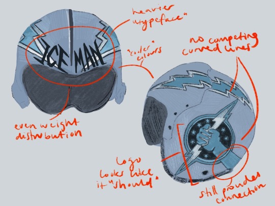
(ignore how i forgot to dot one of the i's in distribution whoops)
No more weird half circle things! No more conflicting leading lines! But! I decided to extend the arm of the squadron logo to continue the line of the lightning bolt as it moves backward. I think this makes the circle of the logo fit better, while simultaneously creating that "connection" he was trying to get in his actual design.
The lack of half-circle things also allow for the logo and lightning bolts to just "be." There's no distraction. it's not overly "busy" anymore (like maverick's helmet). It's simple, but he's The Iceman! He doesn't need it to say/have more!
And the use of the "actual" logo seen on Slider and Ice's flight suits creates that sense of movement that was absent before! Plus no hotdog hands!
Is this new proposed design perfect? Absolutely not! The logo and the lightning bolts still create a weird point of almost intersection that still bothers me. But I think fundamentally, there's always going to be issues with these two components: the circle will never quite fit in, and the lightning bolt the hand is holding will always "cut" the whole thing in half, creating a weird separation in the helmet, that will always bother me.
Anyway, this was a lot of fun! (I love being mean to these guys. they need their egos brought down a couple pegs!)
#now if only i put this much effort into my actual assignments regarding composition breakdowns....#looking at it now. i think i just spelt distribution wrong. blegh. whatever.#ICEMAN! big bold letters! like oh yeah! that guy!#long story short! i hate his helmet!#i hate hate HATE your hair and makeup today#like that clip from rupauls drag race u know?#top gun#top gun 1986#iceman#tom iceman kazansky#stopthatfool goes crazy and explodes#stopthatfool draws
59 notes
·
View notes
Note
can you add kai tp the pile holding lopez's head like a teddy bear i think that'd be funny

got two for kai and lopez each omg here they r i did not trace a mkv helmet nuh uhhhh
completed pile
#i can barely draw the fucking armour fuck those fuckass helmets#i hc caboose and wash to wear their helmets almost all the time but i only draw them w it off bc i hate drawing those fucking things#add the next trooper thru my inbox!#kai rvb#lopez rvb#wash rvb#caboose rvb#grif rvb#simmons rvb#donut rvb#sarge rvb#tucker rvb#church rvb#im so clogging the tag im so sorry#rvb#red vs blue#my art
20 notes
·
View notes
Text

kiddo
alternate versions because im indecisive 😍

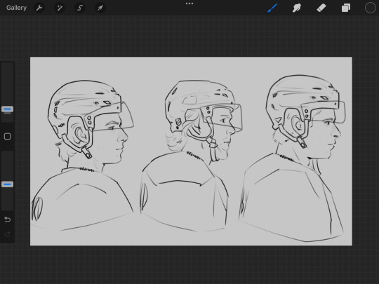
the screenshots r so fun im ngl
#family portrait ftw 🗣️#alexa play mirrors by justin timberlake#chicago blackhawks#edmonton oilers#pittsburgh penguins#connor bedard#connor mcdavid#sidney crosby#hawks lb#oilers lb#pens lb#hockey art#sid n connor m are lookin a lil weird but that’s ok#also i don’t wanna talk about the fact that I copied sids helmet from connors 😓😓#my art#lowkey I hate drawing younger people cause they have no wrinkles 😣😣#like#where’s your flavor baby#favorite!
38 notes
·
View notes
Text

Drew up a Kiramai Red a few weeks ago and now he cheers me on while i’m working.
(Most of my little Airstrike doodles fell down a while ago so i had to replace them aaahah!)
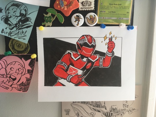
#machin sentai kiramager#kiramager#super sentai#kiramai red#atsuta juuru#ink drawing#I think Kiramai Red is the most difficult for me to draw which is a challenge~! His helmet has a lot of shapes.#mmmm starninger is hard too but thats only cause i can't draw stars waaahaha#he looks like hes giving me a thumbs up which is great too#thanks juuru... yeah lets have a nice time drawing~!#oh! i finally got to use this masking fluid pen i bought for his chin line!! it works great and i was really excited about it!#if anyone hates using masking fluid cause it keeps wrecking your brushes i recommend finding a pen type!#had to do a little cleanup but it was fun
137 notes
·
View notes