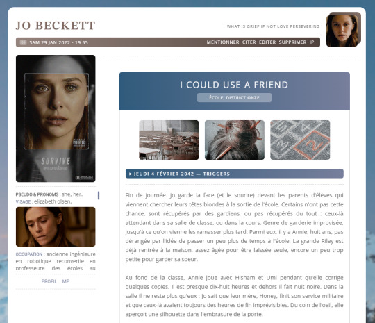
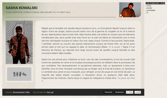
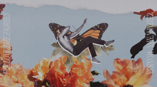
#header de fond
Text
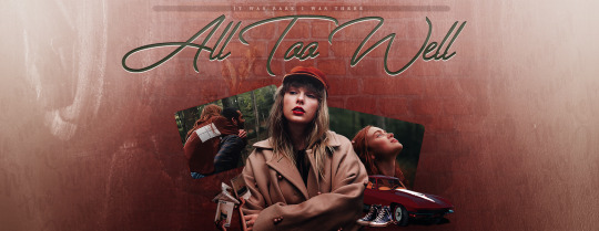
#all too well#all too well movie#all too well music video#taylor swift#taylor#swift#header#dylan o'brien#header de fond
20 notes
·
View notes
Text
Ranking every new anime I watched in 2023, Pt. 3: #10-6
hey, i just started a ko-fi for my writing and possible other creative outlets. this post will also be available there, so please check it out and consider tipping/donating as i'm currently between jobs. the tumblr version of part 1 can be found here and part 2 here.
I didn't mean to drag this out quite so much, but I ended up writing a TON for the top 10, so for the sake of everyone's attention spans (and so I can buy some time to finish my top two) I broke it up into two more posts.
ALSO! I've embedded a link to each show's OP in the title of each entry. I wanted to give more of a visual element to each show outside of the header images, plus there have been some incredible OPs this year. I've gone back and edited them into the prior posts as well.

10. Trigun Stampede
It’s funny, I had fond memories of watching Trigun on Adult Swim in my adolescence, to the point where I used to count it among my all-time favorite anime for a while, but I didn't realize until this year that I hadn't actually sat down and watched it from beginning to end. It’s honestly a very uneven watch, and it’s clearly split into two parts: The first, a dieselpunk western revolving around a mysterious goofball with a big-ass gun and a bounty on his head, and the second a slightly more somber revenge quest as he is forced to survive his way past a rogues gallery while vowing not to take any lives. Still, it was a hit among western anime fans for a reason, and it was formative to me even back when I thought anime was kinda cringe.
Trigun Stampede is far from a faithful reinterpretation of Yasuhiro Nightow’s manga nor of the original Madhouse production. Meryl Stryfe is no longer a jaded veteran insurance adjuster but a much younger muckraking journalist. She’s no longer tailed by the gentle giantess Milly Thompson, but rather following her senpai, the gruff, bleary-eyed Roberto De Niro (the names in Trigun have always rocked). Nicholas D. Wolfwood isn’t an affable priest with a dark past; he’s all dark past now. And Vash the Stampede, now rocking a fuckboy undercut, is less of a mercurial wisecracker with a soft side and more of a reluctant gunman freaking it in a sensitive style.
Stampede wastes no time differentiating itself from any previous version of Trigun. Vash’s history is no longer a mystery waiting to be uncovered; it’s a driving factor of the plot as his brother Knives seeks revenge on humankind for their use and exploitation of “plants,” an alien race to which the two seem to be connected, as an energy source. This was always an element of the original anime that I felt went unexplored, so it was fascinating to see Stampede dive right in. It’s a great introduction to the story for people who haven’t seen the original, and full of unexpected turns for existing fans. It’s still built on the bones of Trigun as we know it, but it is very much its own thing.
People made a lot of hay about Vash’s new appearance, but I think it works. The huge pleather trench coat, spiky flat-top, and tiny glasses remain an iconic 90s design, but I believe the 90s is where it belongs. This take on Vash is just as capable but much more self-effacing, tortured, and averse to violence. This is a younger Vash, and it’s clear that his history with Knives is a much fresher wound, rather than the dull, nagging ache in the original. This is a gentler (but no less talented) Vash, so I think the softboy look suits him this time around.
I also spent most of the season quietly insisting to myself that the original version of Meryl is much better (and cuter) than the Stampede variant, and I still stand by that, but the updated version definitely grew on me. I mean, just look at that hat. But it’s clear from the jump that Stampede’s first season is very early in this version of the Trigun story (you may notice that the bounty on Vash’s head is much, much less than the famous 60 billion double-dollars), and Meryl has some growing to do (and presumably a whole lot of professional frustration) before she becomes something like the one we knew and loved around the turn of the 21st Century.
I’m still yet to watch Beastars, but it’s immediately apparent why Studio Orange was entrusted with the Trigun IP. This show looks incredible. This is some of the best CG animation I’ve ever seen outside of a Pixar or Spider-Verse movie. Characters are amazingly expressive and oscillate between naturalistic, weighty movement and cartoony flailing. Action scenes are inventive and dynamic and stand up to even the wildest sakuga. And yet, it still looks like an anime. It still retains the classic 24fps look and even occasionally trades in the CGI for hand-drawn animation for effect. We are long past the botched Berserk revival: This is what CGI anime should look like.
It’s plainly obvious that Trigun has always carried influences from landmark western media like Mad Max and Dune (not to mention Fist of the North Star, but that one always wore its Mad Max influence on its sleeve), so it’s been an unexpected delight to see those influences take a new shape now that both franchises have seen major updates since the last iteration of Trigun went off the air. For all of the alien technology and technicolor glowing lights, Trigun takes place entirely in a desert setting, and it’s impossible to see these chase scenes and not immediately think of Fury Road, or halfway expect to see Villanueve’s take on the Fremen popping out of the dust clouds.
Stampede is a very welcome entry to a franchise long believed to be well and truly over, and the more eyeballs on Trigun, the better. It’s evident by the end of this season that this take on the story is only just beginning, and it has already taken unexpected departures from the story as we already knew it. I can’t wait to see where it goes from here, but that’s mostly because we have confirmation that Milly will be in the next season. It can’t get here quickly enough.

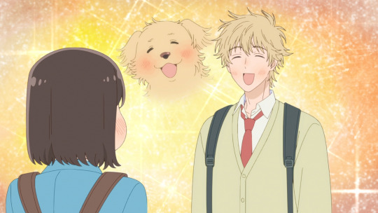
9. Insomniacs After School
I watched and read a frankly absurd amount of romance-centric anime and manga this year, especially of the slice-of-life variety, to the point where even by the early summer I thought I'd had my fill. I'm overjoyed to say that Insomniacs After School proved me dead wrong.
What a treat this was. It's a simple enough premise: A boy with insomnia is sent on an errand to his high school’s abandoned observatory, where he finds a classmate sleeping because she suffers from insomnia as well. They quickly find out that the observatory is a perfectly quiet environment for the both of them, and that they actually get restful sleep around one another. In order to get away with making use of the area, they resurrect the school’s astronomy club and find a genuine love for astrophotography and, you guessed it, one another.
You couldn’t have picked a more apt studio to adapt this work than Liden Films. Call of the Night made a splash last year for its saturated, vibey nightscapes, and Insomniacs’ gorgeous astral visuals carry that mantle. The nighttime backdrops of the quiet suburbs, wide-open beaches, and lush countryside are nothing short of stunning, and Isaki’s adolescent wonder at the world’s hidden beauties reminded me, and I do not say this lightly, of something Miyazaki would’ve animated.
On a couple of occasions this year, I’ve been able to step back from an anime, take a breath, and simply say “That was beautiful.” Insomniacs gave me one such occasion. Even putting the visuals aside, the story itself is lovely and would have made this the feel-good anime of the year, if not for the next entry on this ranking. I would have more to say, but Insomniacs After School speaks for itself. Give it a shot.
8. Skip and Loafer
There are so many standalone adjectives I could use to describe this one, and most of them are ones that would normally make me want to impulsively run the other way like “comfy,” “feel-good,” “wholesome,” what have you, but I think the most comprehensively I can boil it down to a single word is “lovely.” Everything about it just gives you the warm fuzzies, and almost makes me think that the “I want more stories with no conflict” dorks might actually be onto something.
It’s a simple one: Mitsumi, a dorky teenage go-getter with her entire life planned out, moves to Tokyo from her no-horse beach town to attend one of the country’s best prep schools, but much like everyone who played the first two hours of Persona 5, she quickly gets lost in Shibuya’s subway station on the first day of school. She runs into Sousuke Shima, a laid-back boy from the same school who’s also running late, because that’s, like, what he does, and manages to wrangle him into running to school with her.
Mitsumi quickly draws attention from her classmates, not only from delivering a speech as the incoming class representative (and subsequently barfing all over her teacher), but because she inadvertently made fast friends with the hottest, most popular first-year in the school. This attracts the attention of social climbers and jealous hangers-on, but Mitsumi hardly notices. She’s used to knowing everyone in her school back home, so she wastes no time reaching out and seeing what’s up with anyone who’ll give her the time of day.
A lot of Skip and Loafer revolves around the roles for which we think we’re destined in a controlled social environment like high school, and how easily the preconceptions you have of other people can be shattered if you just get to, like, talk to them for 20 seconds. Mitsumi’s friend group quickly fills itself out with people who wouldn’t give each other so much as a passing glance at first, but come together so naturally that you almost can’t believe they weren’t friends already.
Shima, for his part, also struggles with those preconceptions; for as laid-back as he seems on the surface, he’s a habitual people pleaser and is constantly playing a role. He’s so caught up in the performance that he doesn’t quite know what’s going on half the time or how he really feels about most things. Mitsumi is so naturally magnetic, though, that he does seem to genuinely enjoy his time with her, and vice versa. You can see where this is headed, if the gorgeously-animated dances they do together in the OP weren’t enough of a tell.
Everything about Skip and Loafer is just downright pleasant. Character models are simple and sketchy, the color palette is awash in pastels and neutral tones, and the soundtrack is peppy and whimsical. It’s a warm hug of a series, and at no point does it feel cloying or manipulative. High school slice-of-life is pretty bloated as a genre, and I watched a ton of those this year, but there’s just something so charming and magnetic about Skip and Loafer that instills in me a sort of false nostalgia for the ideal high school experience I never had.
Also: Nao-chan. Exceptional trans representation. We do not get enough of that in anime and she is a breath of fresh fucking air. I would die for her.

7. The 100 Girlfriends Who Really, Really, Really, Really, Really Love You
And now for something much less wholesome.
I really don’t seek out harem anime. Tenchi Muyo was formative to me as a tween, and a rewatch last year ended up being a major catalyst in getting me back into anime, but despite it being widely considered the second-ever harem anime, it hasn’t left much of a legacy in the ones that followed. Harem anime from the 00s onward has largely been formulaic wish-fulfillment slop that runs itself in circles as a perpetual money-making machine rather than developing any sort of plot (see: Hina, Love and Girlfriend, Rent-a-). I know I covered Girlfriend Girlfriend earlier, and while that’s nothing like Tenchi either, it does scratch an ever-present itch for stupid, madcap, relentless anime bullshit.
The 100 Girlfriends Who Really, [...] Really Love You, meanwhile, sees that itch and takes a fucking chainsaw to it. To say everything about it is over-the-top would be an understatement: The top is Hyakkano’s floor. This show gives you everything you could ever want in a harem comedy, but to the extreme: It is your dad making you smoke the whole carton. It is Hell’s donut machine, and you are Homer Simpson. Satire is often at its best when it pushes the boundaries of absurdity, and 100 Girlfriends revels in that push like a horny bulldozer. This is not genre subversion, it’s genre explosion.
The headcount isn’t the only wildly outsized element of this series; every single member of the titular harem, each a tick on the checklist of every -dere archetype you can imagine, pushes the slider of each of their character tropes so far to the right it’s breaking the track. The deredere is a ball of deranged horniness, the tsundere betrays her intentions so compulsively that she’s functionally incapable of lying, and the kuudere is so robotically devoted to pure efficiency that it’s salient to mention that her name is literally pronounced “Nano A.I.” If you can think of an anime girl archetype, she is in this (or will be in future seasons), and she is the apotheosis.
And yet, this show still bothers to make each one of them an actual character. Harem anime has such a low bar to clear on that front, yet most entries in the genre still bang their dicks against it. Hyakkano's titular girlfriends, at least the ones introduced in the first season, are actual characters with actual backgrounds, actual motivations, actual growth, and actual reasons to like the protagonist beside the premise. They’re all founded on stock anime tropes, to be sure, but the original manga’s author actually put in the work to give them, you know, personalities. And above almost all else, they actually like each other too! This isn’t exactly a full-on polycule (though two of the girls are prone to making out with each other on occasion), but for as deeply weird as this family unit is on paper, they actually come across as a group of people who love and care for each other rather than everyone cattily jockeying for the same position.
And not for nothing, but Rentaro is easily one of the best harem protagonists I’ve ever seen, and again, this is coming from a Tenchi Muyo fan. I do enjoy Naoya’s over-the-top earnestness in Girlfriend Girlfriend, but Rentaro is the gigachad version. He is exceedingly patient, kind, and understanding of each of these girls’ unique quirks and qualities and quickly grows to learn to manage them in conflict and help them work through their insecurities, and he loves them back in kind and puts in the work to make equal time for each of them. He doesn’t want to “fix” these girls; he sees them for who they are and proactively does everything in his power to accommodate them. He's like if Tadano from Komi Can’t Communicate actually got the harem he deserved. Putting aside the fact that he’s, y’know, 100-timing his girlfriends, he comes across as just a really good partner.
I also want to be clear: For its rampant, fanservice-laden anime bullshit, this show is genuinely hilarious. It’s not some kind of “how did this shit even get made” trainwreck; it is a comedy first and foremost, and the comedy hits exactly as intended. The comic pacing is buckwild, the visual gags are so rampant that they’re almost difficult to keep up with, and the translators, at least in the version I watched, did an outstanding job of localizing the constant wordplay. It’s also so unapologetic in its horniness that you can’t help but admire it a bit; 100 Girlfriends knows exactly what it’s about, and it dares you to say something.
There’s a very good chance this won’t be for you. 100 Girlfriends is constantly pushing the boundaries of good taste, but never in an offensive way and never truly at its characters’ expense. Geoff Thew calls it the “most 'harem' harem anime,” but I'd argue that it’s the most "anime" anime: It is every trope you’ve ever seen in romcom anime cranked up to a thousand and smushed up against your nose. This shit hits like Panera lemonade. It is peak trash. If you have a tolerance for anime bullshit, this show may very well test that, but I still cannot recommend it enough.
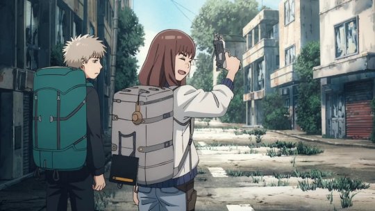
6. Heavenly Delusion
Didn’t think I’d be getting into more than one post-apocalyptic anime this year, but I’d seen this one recommended so many times that I felt this list would be incomplete if I didn’t watch it. Don’t ask me about Pluto.
Heavenly Delusion (Hulu lists it under its Japanese title, Tengoku Daimakyo, for some reason) splits its runtime between two different stories: The first, a pair of young travelers making their way across a ruined Japan in search of nebulous goals neither is sure even exist; the second surrounding a group of adolescents in an unnervingly idyllic walled garden in some sort of school setting. The narrative flips between these two sporadically, rarely ever showing its hand in how they are even remotely connected.
On the post-apocalypse side, we follow Maru and his bodyguard-for-hire, Kiruko, as they trek across the country to deliver Maru to someplace called “Heaven,” while at the same time, Kiruko is in search of a pair of men from their youth. They are often beset by bandits, cults, and most crucially, horrifying monsters called “Man-Eaters,” which Maru has the unique ability to kill. On the school side, we see a group of gender-ambiguous kids in an enclosed space, constantly monitored and kept in a very controlled environment. Everything feels.. wrong. Nobody seems entirely human. There is a lingering and seemingly taboo curiosity about what lies outside the walls. I hesitate to say any more.
There is phenomenal human drama in here, and sparks so many conversations about transhumanism and human nature, gender, trauma, community, all things I’m not smart enough to really dive into. But to even address these topics here is to give the game away, and Heavenly Delusion is a story better left unspoiled, even if, a full season in, I’m still not 100% sure what’s going on.
This show is gorgeous in ways I’m still struggling to articulate. The character designs, animation, lighting, and cinematography are so immaculate that I repeatedly had to remind myself that I wasn't watching a movie. Heavenly Delusion looks like a grungy Shinkai film: Character models are immaculately realized and fluidly animated, the light and shadow effects are some of the best I’ve ever seen in TV animation, and action sequences are visceral and unpredictable. Maybe all I needed to say is that it was made by much of the same Production IG staff in charge of Psycho-Pass.
I want to say as little about what happens as possible, because the mystery is the main draw of Heavenly Delusion, but I feel the need to warn that there is a very dark and sour turn near the end of the season in the form of some strongly implied sexual violence. It was thematically unnecessary, and once that side of things is resolved, everyone just kinda… moves past it. It doesn’t ruin the show, I still recommend it heartily, but be forewarned. I found it upsetting, but more in the “did this REALLY need to be in there?” sense. The mounting tension and slowly-unfolding existential horror in this series are otherwise expertly woven into the narrative, and this part landed with a wet thud.
This is a much longer story than most of the season would have you believe, and it ends with far more questions than answers. One side of the story leaves off with an open end, and the other with a massive cliffhanger, which left me a little cold but with interest piqued for the next season. For what it is right now, though, Heavenly Delusion is a nearly perfect, endlessly thought-provoking mystery and one of the most gorgeously ugly things I’ve seen this year.
67 notes
·
View notes
Text

Étape de la création du header pour Wicked Little Town.
Je vais tenter d'expliquer comme je peux mon processus de création. Désolé si c'est un peu bordélique. 😅
Vous pouvez cliquer sur afficher davantage pour voir:
J'ai choisi la première photo avec la fenêtre car j'aimais le reflet sur le parquet et que ça marcherait avec l'extérieur enneigé que j'imaginais. J'aimais aussi les moulures sur le mur, je les ai donc gardé mais moins fan du chandelier, surtout qu'il n'était centré, je l'ai fais disparaitre. Puis voulant une scène plus aérée, j'ai utilisé le "generative fill" de photoshop et le "stamp tool" pour agrandir la pièce.
Je suis partie à la recherche d'élément qui pourrait raconter l'histoire des personnes qui vivraient dans cette maison, un canapé, un chien, un chat, un couple qui avait une excellente ombre qui marcherait super bien avec ma fenêtre (parfois, je cherche pas trop loin 😂 ). Le design devant représenter la saint Valentin sans être trop "romantique" et le thème de l'anniversaire sans être trop "anniversaire". J'ai rajouté des petits chapeaux sur le chien et le chat, des fanions, une photo du couple sur la commode et sur l'étagère, la décoration de leur gâteau de mariage. A chaque élément ajouté, il fallait donner une ombre, un reflet dans le parquet si nécessaire et changer le coloring des objets pour qu'ils correspondent à l'ambiance de la pièce. Et puis, j'adore les plantes et les livres, donc il fallait évidemment que j'en rajoute. Je trouve que ça donne un côté plus cosy.
Pour l'extérieur, étant donné que la ville où se trouve le forum a un lac et est entouré de forêt, je suis partie sur ça.
Pour la version sombre, j'ai changé l'image d'extérieur avec une qui avait des reflets de la maison allumée dans l'eau du lac. Et c'était parfait pour le Corgi, il existe tellement de photos d'eux que j'en ai trouvé un allongé, quant au chat, il est parti à l'aventure. J'ai changé le verre d'eau sur la table pour un verre de vin, l'horloge au mur montre maintenant 1h du matin et puis, j'ai allumé les lumières. C'est des petits détails, mais je trouve que ça continue à raconter un peu l'histoire du couple, peut être qu'ils se sont installés sur le canapé pour boire un verre et le chien s'est endormi alors qu'ils discutaient ? 😊
Pour l'animation, j'ai passé les headers à After effects, j'ai trouvé sur pexels une vidéo d'un chat noir, il a donc été rajouté à l'extérieur et il cherche son amie, la chatte à l'intérieur de la maison. (peut être qu'elle est allée le retrouver la nuit 👀), j'ai rajouté un effet neige qui tombe que j'ai trouvé sur youtube et la nuit, un oiseau qui passe rapidement devant la fenêtre. C'est assez discret, mais on peut voir le reflet de la neige animé sur le parquet, surtout la version sombre.
Pour la typographie du titre, j'ai utilisé Scotch Display qui est un fond Adobe, je trouvais que une typographie serif donnait un côté plus cosy et romantique. Et pour la tagline, c'est Caslon, parce que j'aime Caslon. 👀
Je pense que j'ai fais le tour, si vous avez des questions, hésitez pas à les poser dans les commentaires de ce poste et merci d'avoir réussi à lire jusque là. 🫣
liste des images utilisées:
pexels-eberhard-grossgasteiger-1624503
pexels-serkan-atay-19730755
pexels_videos_1536279 (1080p)
Falling Snow Realistic Overlay Loop
pexels-curtis-adams-8583905
pexels-taryn-elliott-4440123
pexels-emma-bauso-2253870
pexels-karolina-grabowska-5726036
pickawood-rwa0Yh38FeA-unsplash
samantha-gades-BlIhVfXbi9s-unsplash
kari-shea-3_cyj5YkhTs-unsplash
jeffery-ho-TIN_Lh9-Y7g-unsplash
markus-spiske-UaQ1t-nQHyk-unsplash
annie-spratt-JruJFy08KB8-unsplash
pexels-maksim-goncharenok-4352247
sunguk-kim-WTKvaChRvBg-unsplash
pexels-karolina-grabowska-5726036
nataliia-kvitovska-MYwbqIfccvg-unsplash
pickawood-rwa0Yh38FeA-unsplash
filipp-romanovski-pDbhjYjrWpk-unsplash
content-pixie-6CFCrt-7tHw-unsplash
fatty-corgi-EpRAM95thHU-unsplash
pexels-serkan-atay-19730755
fatty-corgi-wHgkrmuMFOY-unsplash
pexels-anna-shvets-4587992
alexander-london-mJaD10XeD7w-unsplash
35 notes
·
View notes
Text
TIPS : Optimisation de votre design
Je vois beaucoup de forums prometteurs ouvrir dernièrement, où la hype se build énormément jusqu’au jour du lancement. Malheureusement, les bases des designs ne sont souvent pas solides, ce qui impacte directement la communauté qu’ils auraient pu recevoir. Quelques tips de ma part pour qu’un design reste simple tout en étant efficace, et surtout fonctionnel ;
Harmonie des couleurs ;
Difficile d’accrocher à un design lorsque les contrastes des couleurs font violence. Dans un premier temps, il est évident qu’il faut toujours prévoir les couleurs du design en fonction de son header (ou inversement). La palette de couleurs doit rester cohérente et harmonieuse, ce qui n’est souvent pas le plus simple à créer. Si vous ne sentez pas l’inspiration venir, vous pouvez tout à fait utiliser l’outil pipette de photoshop pour récupérer quelques couleurs du header à disposition, ou bien utiliser des plateformes comme Coolors, qui génèrent des palettes prédéfinies en fonction de vos attentes. Lors des dernières années, il a aussi été remarqué que les designs aux couleurs douces ont tendance à attirer plus de monde que les saturées.
Concernant le choix de la couleur des paragraphes, veillez à ce que celle-ci soient assez contrastée, tout en ne jurant pas avec le design. Par exemple, si vous avez un fond blanc, ne mettez jamais un noir à 100%, cela pourrait alourdir le design. Un gris foncé fera parfaitement l’affaire, et adoucira le tout.
Lisibilité des textes et choix polices ;
Beaucoup de designer vous diront une chose ; ne jamais mélanger différentes familles de polices, comme les Sherif (polices à empattement ; ex. Times) ou Sans Sherif (polices sans empattement ; ex. Arial). Cela dit, il y a évidemment quelques variables à prendre en considération. Si vous choisissez d’utiliser une police Sherif pour vos titres, les paragraphes devront toujours utiliser eux une police Sans Sherif : la raison est simple, ceux-ci sont souvent plus petits, et une police à empattement aura tendance à alourdir votre design. De plus, cela le rendra très certainement “vieillot” ou alors le tirera vers un univers légèrement plus fantastique.
Il est évident que les polices ne devront pas être trop petites de façon à privilégier l’accessibilité, je ne vais pas m’étendre sur le sujet, j’ai vu certains threads passer sur le sujet qui regroupent déjà beaucoup de ressources.
Optimisation des images ;
C’est surtout ce point là qui m’a fait penser qu’il fallait que je fasse ces tips. Vous ne savez pas à quel point, pour les utilisateurs d’écrans rétina, il peut-être douloureux de tomber sur des designs prometteurs, mais dont les dimensions ne correspondent plus aux normes du web de nos jours. Forumactif est une plateforme vieillissante et dont les limitations se font de plus en plus ressentir, cependant il y a toujours des moyens simples de les contourner.
Un écran rétina a ses pixels multiplié par deux, c’est pour cette raison que de nos jours les avatars sont passés du 200*320 au 400*640 de façon à ce que ceux-ci restent parfaitement nets pour tous les utilisateurs. Dans cette optique, les designs des forums doivent également être adaptés, et de ce fait, votre header devrait faire deux fois la taille de ce que vous aviez prévu pour votre forum. Si celui ci a un affichage de 800px de largeur, alors en développement sur Photoshop, vous devrez le créer en 1600px. Ensuite, un simple code dans le css pour le réduire à 800px lui permettra d’atteindre sa pleine qualité pour tous les utilisateurs.
Dans le cas contraire, les utilisateurs d’écran rétina verront votre design flou et pixelisé, et ne seront donc logiquement pas invités à s’inscrire.
Optimisation du codage ;
Là encore, certaines nouveautés échappent encore aux créateurs, ce qui les empêche malheureusement d’avoir un forum facilement adaptable, créant une perte de temps et de fonctionnalités. Le codage est une zone assez vaste qui est propre à chacun, je ne pense par exemple pas qu’il y est une bonne ou mauvaise façon de coder à partir du moment où le résultat obtenu est fonctionnel. Cependant, j’insisterai surtout au niveau des couleurs, sur le fait d’utiliser impérativement des variables ( var(--x) ) à la place des couleurs fixes (#000000 par exemple). Une variable vous permet lors des changements de design, de cibler toutes les parties utilisant la même couleur, en même temps. Par exemple, votre premier design avait un même bleu quelque part, noté à la variable "c1", le prochain design demande du rouge, eh bien vous aurez juste à changer une seule fois la couleur de cette variable "c1", plutôt que d’avoir à chercher le code du bleu dans chacune des parties où il est utilisé. Gain de temps incroyable ! J’appuie sur le fait qu’il est jamais trop tard pour coder de cette manière !!! Votre forum peut être créé depuis 10 ans et adopter aujourd’hui ce changement, ça ne vous demandera normalement pas énormément de temps à adapter le tout.
Certains forum manquent également de place dans leur CSS, il est alors tout à fait possible d’ajouter une seconde page (je dirais même fortement conseillé) hors forumactif. Vous pouvez utiliser des logiciels gratuits comme Brackets pour coder du css, puis l’enregistrer en xx.css ; suite à cela, l’héberger sur Google Drive ou bien DropBox, et l’ajouter en lien extérieur via la balise <link href=“nomdelapage.css" rel="stylesheet"> dans le template “Haut du Forum”. (Vous trouverez facilement d’autres balises link au début de cette page, mettez cette balise à la suite et hop.
Version sombre (please) ;
Avec l’utilisation des variables, vous aurez également la possibilité d’installer très facilement une version sombre sur votre forum. Je ne répèterai jamais assez l’importance de celle-ci. Lorsqu’il est 23h, que les yeux sont fatigués mais que l’inspiration est là, passer le forum en version sombre est un réel bénéfice pour tout le monde.
Petit tutoriel simple et efficace créé par bigbadwolf pour une installation réussie par ici ;
https://comptoirdesrolistes.tumblr.com/post/650710791464583168/bigbadwxlf-tuto-dark-light-mode-pour-passer
Voilà voilà, j’espère que ce message (plus long que prévu aha) saura guider ceux qui s’y connaissent parfois moins en la matière ! J’oublie probablement pas mal de choses à vrai dire, mais je crois que le principal concernant l’optimisation est là !
Bonne journée à tous !
92 notes
·
View notes
Text
Me
Basic stuff:
Other blogs: @just-tryand-stopme @endwolldel @dailydoseofbill
I am a minor
Real name: haha you don't get to know
I am a cishet ace so don't be weird about that
Pronouns: idc do whatever
Stuff I post: Fandom stuff, memes, asexuality stuff, important stuff every now and then. I am your typical reblogger.
What to expect: inconsistency
Fandom stuff:
Fandoms I'm in: Artemis Fowl, Downton Abbey, The Legend of Hei, Nimona, Les Misérables, Cats are Liquid, Bill Wurtz, Corner Gas
Fandom tags:
lxh (for the Legend of Hei)
Les mis
Sometimes "Downton Abbey", but mostly "Thomas Barrow"
the rest are as just the names of the franchises
DNI if:
You discriminate people
You're going to be creepy
You're an uncensored 18+ blog
Other:
My personal rambles, thoughts, vent, etc. will be tagged with "ramblelele" (three "le"s, one for each word in my url).
Disclaimer: you may see me rb/post some Harry Potter or Fantastic Beasts content, but I do not support jkr or transphobia in any way.
My profile picture is a picrew and is also not my real appearance
My blog is a safe space. Do not derail my posts with hate.
Anything else? Idk? I'm an INFP 9w1. I am Christian. I don't vibe with eat the rich but I won't try and stop you from vibing with it. My ask box is always open :) et je peux parle un peu de Français, mais mon grammaire et autographe sont horrible. I write, but I almost never post it. I use the queue sometimes and try to reblog most of what I like. Normally it takes things a day and a bit to get posted, sorry :(
It's fine and great to tag me in picrew chains/tag games! Let me know if you don't want me to tag you.
I'll tag undescribed, video's and gif's
Note: undescribed videos and gifs will be tagged with "video" or "gif", whereas ones with descriptions will be tagged as "described video" or "described gif"
Spotify
I think that's all?
oh yeah . . .
if you're wondering why my header image or banner or whatever it's called says "binden". . .
https://www.tumblr.com/acewithobsessions/733427288002150400/was-he-fond-at-park-yet-or-binden-missing?source=share
I'm leaving this here
28 notes
·
View notes
Text
WHAT REMAINS DESIGN (3/?)
J'ai pour habitude de maquetter tout l'index du forum donc j'aurais dû vous parler du QEEL et du footer. Sauf que j'ai tendance à passer du temps dessus et bloquer pour des raisons que j'évoquerais plus tard.
Je me suis rendue compte avec un précédent projet qui n'a pas abouti que j'avançais mieux en passant directement à l'affichage des sujets.
C'est une des page qu'on voit le plus après les catégories selon moi donc ce que j'en ferais m'aiderait à concevoir le reste du forum.
Donner une utilité à la bannière
C'est une des idées dont je suis le plus fière sur ce projet. Ok j'ai la flemme de faire des bannières et des PA élaborée mais autant rendre cette flemme utile mdr.
J'aime beaucoup les bannières de fond, les homepage full screen, car elles sont très immersive. Leur problème (à cause de la structure de FA) c'est qu'elles sont présentes sur toutes les pages. A termes, c'est juste pénible de scroller pour atteindre le contenu de la page.
En gardant l'image de fond et en remplaçant le titre du forum par le titre du sujet je trouve que ça permet de mettre le contexte/utilité de la page plus en avant.


Néanmoins avec cette idée il fallait résoudre un problème technique. Le haut des pages d'un forum sont générés par le template overall_header (au-dessus du bandeau de pub) et que les titres de sujet et autre infos sont dans le template viewtopic_body (sous la pub). Petit tour de magie pour cela, j'ai créé un bloc avec tout les éléments (titre, boutons...) et j'ai simplement utilisé la fonction .appendTo() pour déplacer le tout dans le bloc #header sur toutes les pages à l'exception de l'index. (S/O à @1019-code pour m'avoir aidé sur ça!)
Recyclage des posts
Pour les post eux-mêmes, j'ai rien réinventé. On adorait notre travail sur les posts de No Humanity (précédent projet de @frenchandfurious) donc vous reconnaitrez sans mal les similitudes.
J'ai également proposé à Margot le choix de se débarrasser du bloc d'information de profil sous l'avatar, persuadée qu'elle allait me dire non. Quand elle m'a dit "ok" sans hésité j'ai compris que j'avais carte blanche pour beaucoup de chose mdr. Pourquoi ce choix ? Bah, sans détour, je trouve ça moche. On a tendance à écrire des pavés dans un bloc qui fait 200px de large, réduire la taille du texte en 11px pour que l'effet justifié ne sépare pas les mots et on y met tellement d'info qu'on fait des onglets. Ceux qui ont codé des onglets de profil savent à quel point c'est CHIANT à faire.
J'aime l'idée de résumé brièvement le perso en quelques informations clés : âge, occupation, allégeance, habitation (et encore habitation je le trouve peut-être de trop (pardon Margot j'allais t'en parler)). Idée qui tient aussi parce que je savais que j'allais travailler un profil en pop-up (plugin wombat par Monomer) plus important.
Aussi, très contente d'avoir une structure suffisamment épurée et large pour avoir une police à 15px !
Pour le côté technique, ça se tient essentiellement au super script de Flerex et le retour de .appendTo() partout. Et devinez quoi ? C'est une fonctionnalité déjà incluse dans le Blank Theme ! Et oui, vous êtes nombreux à me demander comment déplacer des champs de profil alors que j'ai déjà tout mis à disposition 😎
Footer de post
C'est un élément que j'ai retrouvé sur beaucoup de forum et j'avais vraiment envie de l'appliquer ! Ca remplace un peu l'onglet "hors rp" et identifie super vite la personne derrière l'écran. Je crois que ça nous vient pas mal des forums anglophones et illustrés.
Voici une liste des forums que je me souviens avoir pris comme source d'inspiration :
fivemoreminutes.forumactif.com/
withoutawarning.jcink.net
lostangels.jcink.net (ancien design)
Oui meh
Je suis aussi contente du résultat mais je pense que les posts seront sujet à amélioration dans des futures versions.
Je savais pas où mettre les liens de gestion (date, editer, supprimer, citer...) alors je les ai sorti de la structure mdr. C'est pas hyper malin en terme de responsive design, ça doit être coupé sur certain écran.
Je trouve que c'est une solution un peu facile le petit dégradé de couleur des groupes en coin. Ca mériterait d'être utilisé plus judicieusement comme sur No Humanity.
L'intégration de l'avatar me fait douter. J'avais tenté un effet ambilight sur la maquette mais bof.
Margot tenait à un champs libre sous l'avatar et je sais que beaucoup de joueur l'aime aussi. Perso, j'en suis pas fan. A voir comment je peux mieux travailler son intégration.
Je me suis rendue compte en faisant ce post que j'avais pas mis la petite citation des joueurs sous l'avatar mdr
36 notes
·
View notes
Text


mimsy "mims" chowdhury picked up their key from the front desk 10 years ago! the thirty-two year old uses [she/her] pronouns and is a teaching assistant at universidad de bellas artes de valparaíso from london, united kingdom. according to their apartment application, people have told them they look a lot like mishti rahman, and the character they identify with most is camille preaker from sharp objects. santa moneda gives you a warm welcome, and we hope you enjoy your stay.

hello, hello everyone! (^..^)ノ i'm soul ( she/her, 21, est ) and this is my very unhinged girl, miss mimsy! the header credit goes to thatporcelain. i'm a bit of a newbie to this side of tumblr, so please be gentle on me if i mess up or you see me post the same shit over and over again.
trigger warnings: familial death and mental health issues.
playlist. pinterest board. wanted connections.
ೀ basics .
full name: mimsy "mims" chowdhury.
birthdate: february 21st, 1991. ( thirty-two )
zodiac: pisces sun, scorpio moon, libra rising.
gender: cis woman. ( she/her/hers )
residence: one bedroom apartment with her pet bunny affectionately named momo after her favorite snack growing up.
orientation: demiromantic/sexual.
class: enrolled as a phd student at universidad de bellas artes de valparaíso, concentrating in physics, minoring in mathematics. currently a full time teaching assistant to the mathematics' department's head. also helps out with the debate team.
neurological: lacks any sense of social propriety, which exacerbates her cognitive dissonance and emotional dysregulation. probably depressed, but she'll blame it on her burgeoning quarter-life crisis and go about her business like usual. will put herself in risky situations occasionally.
tropes: ambiguous innocence, bratty half-print, broken ace, and uncanny valley girl.
tdlr: think… sikowitz from victorious if he slayed. beast mode, but make it girlboss. very much the cooky, zany, what-have-you scientist! a woman in stem! ( scheming, theorizing, eavesdropping, making plans )
ೀ dig deeper .
positives: lion-hearted, observant, humorous, and thoughtful. very neurotic and high-strung. ( in a productive way, of course )
negatives: mendacious and reticent by fault. unreadable at times.
likes: exotic fruits, candid pictures, vanilla lattes, neon genesis evangelion, woodland animals, painting her nails, the smell of fresh laundry, arguing with a smile, fashion houses like sandy liang + blumarine + tong/shushu, sonny angels, reddit ( sigh ), game theory, people that live underneath her skin, and her pet bunny.
dislikes: corny jokes + people, loud noises, being out in the heat too long, distant people ( even though she is ), fingernail tapping, and breaking down to taylor swift songs.
style: hyper-feminine, fond of flowy silhouettes, ruffles, and ribbons. never seen in pants, even during the colder months. already bought every piece from kimchi blue's urban outfitters line. prefers muted colors. cannot walk in high-heels whatsoever, so you'll always find her in her mary-janes. never seen without gold jewelry! will do her eyeliner no matter what, feels naked without it. known for putting bows in her hair and her side bang which is oddly shaped like a radical sign.
family: born and raised in london to an overly protective public safety worker, his estranged wife, and their first daughter who would soon pass after the couple's divorce. mimsy grew up in a tumultuous household, learning the art of people pleasing and inherently soaking up other people's grief as she did when her older sister passed away. she felt as if she had to out-preform in every aspect of her life after, haphazardly throwing away anything that couldn't aid to the betterment of her studies and professional life. since individuality was not appreciated nor encouraged in her upbringing, she struggles with her ever-shifting personality and by extension, letting others understand and know her. she thinks she misses her sister more than she remembers her.
hobbies: collecting lip-glosses, jump-scaring her friends, grading papers, origami, and watching obscure movies.
personality: mimsy is very definition of female hysteria. clever and unconventional, priding herself in the personality she dug out of the semblance of a person she used to be back home. her mannerisms display her quirky character, often having a cheeky little grin across her face regardless of the occasion. silver-tongued and witty, plans her words carefully and meticulously, never at a loss for words. she likes to banter and will often take playful quips at others for the sake of stirring a reaction and can be rather sadistic about it. she is incredibly perceptive and observant. she picks up on things that no one else does, and can figure people and their feelings out flawlessly. she likes to think of herself as invincible, but she can be hilariously caught lacking if you look close enough. has a karmic pull to her, often acting as a beacon to others to express thoughts that they would otherwise keep to themselves. embraces the macabre despite her cutesy disposition and is honestly pathetically intense underneath all of her jokes.
ೀ tidbits .
one unfortunate event away from turning into the joker.
moved to valparaíso, chile about ten years ago to complete her undergrad years far away from home, wanting to throw herself into being self-efficient and capable compared to how shackled she felt in her previous home life.
struggles a lot with her individuality as a person and how much of her life is really her own.
very fond about the ideology behind fate and the progression / patterns of time, mainly why she's so interested in game theory. surprisingly very devout despite not having a particular religion she believes in.
personification of the nerd with glasses and finger emoji combination, unironically goes "actually…"
that one friend who’s chill as fuck but is harboring a deep indescribable sadness!
into pretentious indie music. :eyeroll:
honestly... her pinterest says it all + i will be adding to this as i go on!
ೀ wanted connections .
i have a few outlined plots as a pop-up on my theme, but here are some more ideas i would love to have for mimsy:
she's currently kicking her feet, giggling to herself because she's been planting little baby figurines all over the apartment building and your muse decides enough is ENOUGH!
i would love her to meet her match when it comes to intellect ( particularly in board games ) and have them always stump the other + always find themselves at standstills, completely frustrated knowing they're only two steps away each to another stand-off.
mimsy is constantly losing her shit and has to continuously label her belongings with her initials, so maybe your muse is hellbent on finding out who the hell "m.c" is?
"the reading comprehension in valparaíso is piss poor..." "who said we piss on the floor!?"
nonsensical banter threads are always wanted by me! i've been out of the tumblr game for a while; i much prefer getting to know other muses and forming connections based off conversations, so please don't hesitate when it comes to plotting!
always looking for your quintessential frenemies, fwbs, casual package thievery, unfriendly neighbors, severe angst with a sprinkle of unseriousness, whatever your little heart desires!
5 notes
·
View notes
Photo
PREMADE HEADER :: 1000*560.
LIBRE || contact par mp ou via discord
© mad’eyes.
INFORMATIONS ET POSSIBILITÉS
Modifications : titre et textes, image principale (si fournie), palette (si fournie), fond (unie/texture, etc.)
En version animé ou non
Suite : avatars pnj, icons (si moodboard fournies), boutons
J’ai un edt compliqué, merci de me prévenir en avance si vous souhaitez des modifications. Je peux vous fournir le psd si vous le souhaitez, mais le crédit n’est absolu pas optionnel.
Crédit images : affiche du film Métropolis, fond de sblngr.
Fonts : Longshot, Bebas Neue et Barcode.
#rpg ressources#ressources rpg#premade header#premade#header#forum rp#retro#metropolis#libre service#rpg francophone#header*#header forum#headers#banner#banner forum#mad'eyes#j'ai été inspiré de ma dernière fournée#pas sûr de la typo#ouvert aux suggestions
19 notes
·
View notes
Photo
header - disponible (1800x1000)
changement possiblement : photo de fond, titre, papillon, ajout d'un slogan.
© kidd.
24 notes
·
View notes
Text
Commandes Ouvertes
Hola tout le monde!
Ayant un peu de temps libre et l’envie de grapher, j’ai décidé d’ouvrir mes commandes. Vous trouverez les information importantes les concernant à la suite!
SUGGESTIONS
Vous pouvez passer dans mes messages ou sur mon ask pour me suggérer des célébrités qui vous plaisent et que vous souhaiteriez voir sur mon tumblr.
AVATARS
Je fais des avatars en format 400x640. Vous pouvez me passer commande -en anonyme ou non- en m'envoyant via ask ou par message le nom de la célébrité souhaitée, une galerie imgbox avec des images de bonne qualité ainsi qu'un petit mot sur votre personnage et l'univers du forum. Il est possible de demander à ce que je fasse des avatars animés, mais cela me prendra plus de temps à faire. N’hésitez pas à me préciser si il y a un style d’avatar que vous aimez plus que d’autres!
HEADERS
Vous pouvez passer une commande de header ou de design complet pour votre forum. Pour cela, il faudra m'envoyer au minimum la taille du header, le titre du forum, une palette de couleurs, le nom de la ou les célébrités que vous souhaitez voir sur la création, le lien du forum, ainsi qu'un exemple de header qui vous plait. Néanmoins, ce sera beaucoup plus facile pour moi de faire quelque chose qui vous plait si j'ai plus d'informations. N'hésitez donc pas à me mettre une galerie de photos pour les célébrités, ainsi que le fond, plusieurs exemples de headers, etc. Si vous avez besoin de la suite du design, il me faudra également les tailles de chaque élément.
10 notes
·
View notes
Note
Hello, j'espère que tu vas bien et que je ne te dérange pas ? Je fonde un forum rpg et au sein de l'équipe nous souhaitions te demander si tu serais être intéressé.e par la confection d'un thème pour celui-ci ? Ton style est vraiment fascinant alors nous avons pensé à toi ! J'admets qu'une commande comme ça est une première pour moi alors je ne sais pas si c'est comme ça qu'il faut procéder.
Coucou ! Merci beaucoup du compliment 🥰
Je répond ici mais pour les deux messages 😊 Ça serait avec plaisir pour le thème graphique de ton forum en plus je me disais justement que j'avais bien envie de graph pour du header ces derniers temps 😏
Le mieux ça serait qu'on en discute sur Discord directement, je t'envoie mon Discord en privé pour qu'on puisse voir les détails ensemble !
2 notes
·
View notes
Text
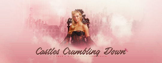
#castles crumbling down#Castles Crumbling#taylor swift#speak now#from the vault#elle f#elle fanning#elle#header#header de fond
0 notes
Text
Proposition création de header
Hello, hello !
Je jette une petite bouée à la mer : si quelqu’un a besoin d’un header de rpg pour minimum fin aout/mi septembre, j’ai envie de refaire un peu de design cet été vu que je n’arrive plus à écrire.
Trois minis infos
Je fais des suites simples (boutons and co) mais pas de trucs type PA (je ne sais même pas si ça se fait encore 😂).
Je ne fais pas de header de fond (sinon mon ordi explose)
Ce serait uniquement pour un forum fantastique ou SCI-FI (car pour les citys, j’ai déjà 99problems pour @littleharleen ❤️
Et si vous voulez @code-lab fait des supers commissions de codage, on a toujours voulu faire un truc ensemble aloooors... une pierre deux coups 😂
Pour donner une idée de ce que je fais : https://imgbox.com/g/UVjuNmSlCx
Si vous êtes intéressé·e, envoyez moi un DM et on verra ça ! Je me réserve le droit de refuser si je sens que l’univers ne m’inspirera pas ✨
12 notes
·
View notes
Text
+ Shout Out aux Createurices +
Avec l’initiative d’ @awonaa et son post pour mettre un peu de bienveillance au sein des créateurices de tumblr, je me prête au jeu également.
1. Un·e ou plusieurs des dernier·e·s créateurices que vous avez découvert
Dans mes derniers abonnements (en dehors des jolies découvertes que j’ai fait avec ce tag) sont @lunnyii dont l’univers me transporte à chaque fois que ce soit avec ses avatars ou ses icons, @icemacklin dont l’esthétisme est impeccable à mes yeux.
2. Un·e ou plusieurs des premier·e·s créateurices que vous avez suivi
Alors après avoir remonté ma liste d’abonnement je peux dire que @fassophy, @p0is0n-ivy et @wingardum sont les premières créatrices que j’ai suivis !
3. Un·e ou des créateurice·s à qui vous n’avez jamais osé dire combien vous aimez ses créations
Oulà, dure de choisir mais j’ai toujours eu des coups de coeur pour les avatars de @thinkky, @loudsilencecreations, @ellaenys et @all-souls !
4. Un·e ou des créateurice·s dont vous avez suivi l’évolution
Parmi les créateurices que je suis depuis pas mal d’année il y a a forcément ma partenaire in crime @ambrosegraph, ma petite dino préférée @horyia et @shaira-waters et @hemerasmoon.
5. Un·e ou des créateurice·s qui mériterait d’être plus connu·e
Catégorie compliqué mais je dirais @iloveyuiknow qui fait des crackships incroyables mais également @prettygilrlavatars qui fait des pépites niveau avatars !! Je trouve que @littlewildling-rpg mériterait également à être plus connu avec ses colorings colorés et frais !!
6. Un·e ou des créateurice·e grâce à qui vous découvrez de nouveaux faceclaims
Dur de choisir mais je dois dire que @andthesunrisesagain est vraiment une source de diversité pour les fcs avec souvent de nouvelles têtes dont je n’ai jamais entendu parlé ! @itsamooncalf fait également parti des tumblr qui me font découvrir de nouveaux visages !
7. Un·e ou des créateurice·e qui brille·nt sur plusieurs supports
Sans réfléchir @visenya-den entre avatars, icons, header de fond, header simple, mise en scène, gifs, peinture, dessin, etc... y’en a pour tous les gouts et j’admire son talent et sa polyvalence !
13 notes
·
View notes
Photo

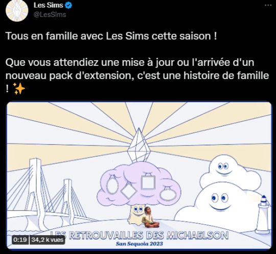
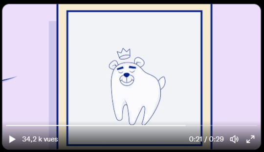
La première Roadmap de 2023 des Sims a été révélée !
Je suis plus qu’excitée par cette annonce puisqu’elle tease très très fortement sur du gameplay FAMILLE !
https://twitter.com/i/status/1612861181655486465
Ce teaser est très intéressant car il annonce :
- Une grosse mise à jour (les nourrissons) ;
- Deux kits (dont les images semblent être un sous-vêtements et un autre avec un dentifrice qui rappelle les concepts art partagés au Behind the sim Summit) ;

- Une nouvelle extension (avec comme indice une dent ressemblant à un ours, sisi je vous jure !) ;
- Un live le 31 janvier.
On peut voir sur le teaser un arbre avec des cadres (pour les annonces) qui fait fortement pensé à un arbre généalogique. On pourrait rêver d’une mise à jour de l’arbre généalogique des sims et aussi la possibilité d’avoir des tantes/ oncles/ cousins, etc. dans le CAS ! (qui serait un véritable game changer !).
On peut voir dans le fond à gauche un pont. Celui-ci me fait penser au concept art que nous avons lors du BEHIND THE SIMS SUMMIT. Et cette image avec la femme se baladant avec son porte-bébé et son enfant/bambin sur un vélo fait beaucoup pensé à Générations.

Enfin en bas de l’image nous avons l’inscription “Les retrouvailles des Michaelson- San Sequoia 2023″. Les retrouvailles font penser à une fête de famille. Quant au San Sequoia on pourrait imaginer une autre ville type San Myshuno. Ce serait génial d’avoir une nouvelle map type ville ! Ca changerait et se serait super agréable de commencer dans les appartements d’une nouvelle ville !
N’oublions pas non plus le header twitter du compte des Sims français que je vous ai mis en haut de ce poste qui dit bien “une histoire de famille”... Ca sent bon, non ?? hein ??
Personnellement je vois bien la mise à jour la semaine prochaine ou la suivante. Le live de fin du mois présenterait l’extension qui pourrait arriver début mars... et qui serait (croisons les doigts) une extension Générations, basé sur du gameplay famille intergénérationnel !
Et vous, vous en dites quoi ?
#roadmap#sims#ts4#les sims#les sims 4#sims 4#the sims 4#review#extension#generation extension#generation#infants#kits#bathroom
2 notes
·
View notes
Photo
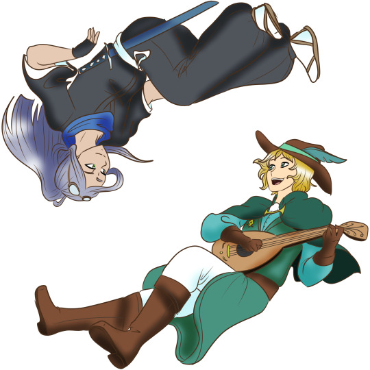
{ ooc } With my promo finally out in the wild (and yes, please do reblog it and spread it around), I just want to take a sec to share the pièce de résistance that I sat on for weeks now: the new artwork introduced in the promo proper, featuring my beloved boys and main muses! Kōtarō Ryōhei, the ace windstorm wielder and second-in-command of the 13th Division! Forwin Tyrell, whose veins flow with the blood of the Wind Caller and lungs are filled with songs! Together, they make this blog galeforged!
By all means, do commission @bluerosefantasy! Her art’s plastered all over the blog for a reason (I love her stuff!). Blue is especially active on Twitter though, so reach out to her on there!
Oh, and if you like cool graphics like the ones in my promo, or even... my brand new header image—

—and want something like that yourself, might I suggest commissioning @keikakudori, who’s open for a wide range of options that ought to suit your needs (with more information riiiight here)? Of course I would recommend Lucifer’s services after my boys were made to look even handsomer!
Just wanted to ensure additional credit was given where it was due... and also show off my sons more. I will always taken an opportunity to show off my sons more. GAZE UPON THEM AS I WOULD, WITH CEASELESS FONDNESS-
#{ ☁️ winds at rest beyond the sky ☁️ ooc ☁️ }#{ the humble bard takes the stage 🎶 forwin — face 🎶 }#{ even without wings i can still fly 🌪️ kotaro — face 🌪️ }#{ ooc: GAZE UPON THEM-!!!!!!!! }
2 notes
·
View notes
Last Seen Blogs

villain-in-love
No Shame Whatsoever

moniqarts-blog
Monica

assassinwoof
Everything you can imagine is real

ryanzhelp-blog
RyanZhelp