#i like the coloring and the clips and the layout and the font
Text

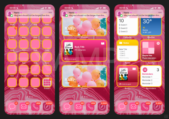
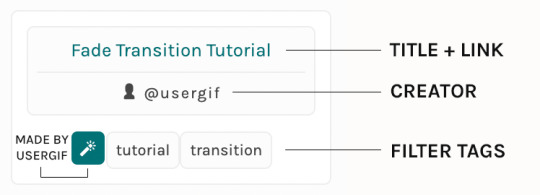
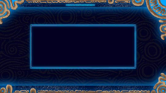
HOW TO: Make an iPhone Layout
+ Downloadable Template
Hi! I've gotten a few messages asking for a tutorial on my iPhone gifsets — but instead of only doing a tutorial (that would probably be triple the length this one already is), I decided to turn my layout into a template with all the bits and bobs! In the "tutorial" under the cut, I'll share everything you'll need, a free template download, and quickly go over how to use this template. :)
Disclaimer: This template uses Video Timeline and this tutorial assumes you have a basic to intermediate understanding of Photoshop.

PHASE 1: THE ASSETS
1.1 – Download fonts. These are the fonts used for all assets I've included in my template:
– SF Pro or SF Pro Display (Regular, Medium, Bold): Either version works, they look nearly identical. You can download directly from https://developer.apple.com/fonts/ or easily find it via Google
– Bebas Neue: Free on Google Fonts, Adobe Fonts, and dafont
– Times New Roman (Bold): Should be a default font in Photoshop

Make sure to download and install any of the fonts you don't already have before opening my template. That way, once you open the template file, all the settings (font size, weight, spacing, color, opacity, etc.) are as intended.
1.2 – Download my template.
Before you use my template, all I ask is that you don't claim or redistribute it as your own and that you give me proper credit in the caption of your post. Making these iPhone gifsets takes me a longgg time and turning this layout into a template took several hours too.
DOWNLOAD TEMPLATE VIA KO-FI ← This template is completely free to download (just enter $0), but if you feel inclined to tip me, I appreciate you! 💖
BTW this template also includes some of my frequently used icons!
NOTE: If, for some reason, you open the template and see the pop-up shown below, click "NO" — otherwise, the fonts will be all messed up:
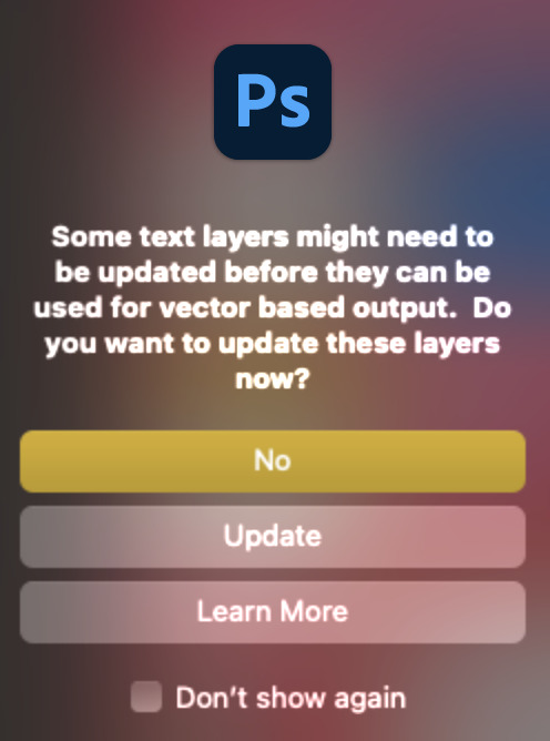
And if you see this triangle with an exclamation point by a text layer, don't double-click it — it'll mess up the font as well:

PHASE 2: THE GIFS
I'm just going to briefly go over gif sizes and my recommendations. Also, keep in mind when grabbing your scenes, you'll want all of these gifs to be the same amount of frames.
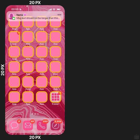
2.1 – Background Gif: 540 x 540 px.
I recommend this size so you have a good amount of visibility for the gif behind the iPhone wallpaper. I also recommend making this black and white (or in my case, black and white with a slight blue tint — idk I just like the way it looks) so the wallpaper coloring can stand out.
2.2 – Wallpaper Gif: 230 (w) x 500 (h) px.
Keep in mind the very narrow dimensions of the wallpaper! And also keep in mind that you'll have a bunch of apps and widgets covering the image. I try to use wide shots (or layer my clips into looking like wide shots). Also, keep in mind your color scheme for your set and your character's aesthetic! I tend to focus on one or two colors for the wallpaper.
I usually position the wallpaper to the side with 20px bumpers, so there's lots of space to see the background:
2.3 – Large Photo Widget Gif: 201 (w) x 96 (h) px.
2.4 – Small Photo Widget Gif: 94 x 94 px.
PHASE 3: THE TEMPLATE – "IPHONE" FOLDER
In this section, I'll try to quickly walk you through how to use this template and some bits that may require extra instructions. I'll be going through each folder from top to bottom.
3.1 – Status Bar.
Time, Service, and WiFi are pretty self-explanatory. In the Battery folder, you can use the shape tool to adjust the shape layers labeled "Fill (Adjustable Shape!)" to customize the battery level.
3.2 – Message Notification.
Again, these are pretty self-explanatory. I've already masked the circle for the contact photo, so you can simply import any photo and use the transform tool to shrink it down. The circle is 24x24 px. If you don't want to use a photo, there's another folder called Default Initials.
If your message text can't fit the text box, the message should end with ellipses which is how iOS caps off long texts.
3.3 – Blurred Banner (IMPORTANT)
This folder is easy to miss because there's only one placeholder layer in there. On iPhones, the area behind a banner notification and the dock get blurred (including the wallpaper and any apps).
What to do: Make a duplicate of the apps in Row 1 and/or widgets that intersect the message banner, convert them all into one smart object, apply a Gaussian Blur filter (Radius: 3.0 pixels) on the smart object, and move the smart object into this masked folder!
(There's another masked folder in the Wallpaper folder for the dock which I'll go over in that section.)
3.4 – Apps
Turn off the yellow guide if you don't need it to keep things aligned and turn off layers you don't need by clicking the eye icon. Replace the "App" placeholder text with your app name, change the color or gradient of the square to compliment your color scheme, and add your custom app icon overlay!
If you can't find an app icon you need from the ones I provided, flaticon.com is a great resource. Also, if you can only find the filled version of an icon, check out this tutorial for how to make any text or shape into an outline.
Also, each app folder has 4 notification bubble options (1-4 digits). Again, you can toggle these on and off as you need!
3.5 – Big Widgets
I like using these when my wallpaper has A LOT of negative space to fill. I included the Photos and Books widgets in my template, but there are lots of widgets available on iPhones. You can check some of the other ones I've done here, or if you have an iPhone, simply try adding some widgets to your phone!
There are also widgets bigger than these, but they would take up half of the phone screen which is why I don't use them for these edits.
3.6 – Small Widgets
The only thing I'll say about these — because they're pretty straight forward — is there are a lot more weather themes than I included in my template. Also, if you set your character's phone to evening, the weather widget will show a dark background (sometimes with stars), so keep that in mind.
Speaking of, I've included Light Modes and Dark Modes for, I think, every applicable widget.
3.7 – Page Dots
These barely perceptible dots indicate that your character has more pages of apps than shown in your gifset (so if an anon tries to come at you, you can just say "it's on the next page of apps" /j /lh)
3.8 – Dock
Again, the dock has notification bubble options and I've included the default app designs, custom filled designs, and custom outlined designs for iMessage, Phone, Email, and Safari (there's also a FaceTime alternative if that's how your character rolls). These are usually the apps people keep in their Dock, but this is fully customizable too. So, if your character is, like, super obsessed with Candy Crush or something and needs it in thumb's reach — you can put it in the dock.
3.9 – Wallpaper
This whole folder is masked already to a 230x500 px rounded rectangle.
Inside, you'll find another "Blurred Portion" folder for the area behind the message banner notification and the dock.
What to do: Duplicate your gif layer and place it in this folder, remove any sharpening filters, and apply a Gaussian Blur filter (Radius: 3.0 px). Be sure to add any coloring/adjustment layers ABOVE this folder and your original sharpened gif layer.
PHASE 4: EXPORT
We made it!
I hope this template makes it super easy for you to recreate this layout! If you decide to try it out, feel free to tag me with #usernik.
If you notice anything wonky about the template, kindly let me know so I can fix it! And if you have any questions about how to use this template, please don't hesitate to send me a message! I just ask that you try to be specific in your question so I'm able to answer you the best I can!
#gif tutorial#completeresources#userpickles#usersmia#userabs#usertreena#alielook#userkosmos#usershreyu#userzaynab#tuserabbie#useryoshi#usersalty#tuserlucie#usernanda#userelio#userhella#usercats#gfx*#resource*
757 notes
·
View notes
Text


RESOURCE DIRECTORY 2.0 + HOW TO NAVIGATE USERGIF
Hello! We hit 10k followers! I want to take this moment to thank all our wonderful followers and the talented members of usergif! We created this blog less than 2 years ago and are constantly blown away by your support and beautiful creations. As a thank-you, we're proud to announce our new and improved resource directory!!! Shout out to arithemes' custom page which allowed us to create a more streamlined and organized directory for everyone to use. Under the cut, you'll find a guide to help you find exactly the resource you're looking for on our blog. Happy gifmaking! :)

THE UPDATED DIRECTORY
All resources are in alphabetical order first by the creator's URL (at the time of entry), then by the resource's title. Each title is a clickable link that'll redirect you to the original post. Beneath that, you'll find the creator's URL and the resource's relevant filter tags:
As always, whenever I add new entries to the directory, you'll see the last date listed on the right side of the blog here:
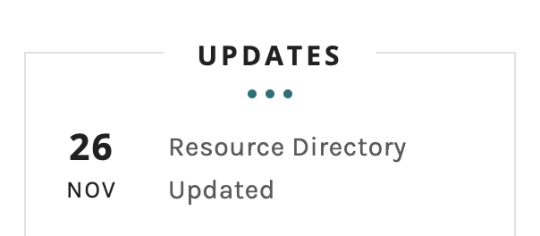
If you don't see one of your recent tutorials listed there, please be patient. I update the directory on a monthly basis, but only add resources that have already exited our queue.
THE FILTERS

Please note: the Source section has exclusive filters, meaning you can only select one at a time. In the Type and Effects sections, you can select as many filters as you want. However, if you select 2 filters in one section, like "animated" and "blending," it'll show results for any resource with either of those tags, not necessarily resources that include both of those tags.
Here's a breakdown of how we categorize our resources:
Source:
↳ all: posted by any creator
↳ usergif: posted by usergif
Type:
↳ all: click this to reset filter selections
↳ action: pre-recorded photoshop functions that can be replayed
↳ basics: non-effects-related resources to help new gifmakers get their feet off the ground (please remember usergif is not a resource for beginner-level gifs and focuses on intermediate to advanced gif effects. however, we thought it would be helpful to keep some basic resources available)
↳ brush: various brush shapes like ripped paper edges or intricate textures
↳ fonts: names and links to fonts or font packs
↳ template: pre-made, downloadable layouts and designs
↳ texture: overlays that add a different finish to a gif such as Ben Day dots (retro comic dots) or glitter
↳ tutorial: any post that provides an explanation for a gif effects process
↳ other
Effect:
↳ all: click this to reset filter selections
↳ animated: an effect that applies movement to an element such as rotating text or wiggling shapes
↳ blending: aka double exposure, this effect combines two or more gifs layered on top of each other
↳ color: specifically for color manipulation, an effect in which the original colors are completely different (e.g. a blue sky colored to look pink)
↳ glitch: an effect where color channels are toggled and layered over the original gif to give a flickering effect
↳ layout: multiple gifs on one canvas like a collage (e.g. hexagon layout) or poster-style templates
↳ overlay: an added element layered above a gif (excluding text) such as a shape, another gif confined to a shape, a texture, etc.
↳ transition: an effect that stylizes the passage from one scene/clip into another, such as a fade, glitch, linear wipe, or motion blur transition
↳ typography: any kind of stylized text added over a gif (does not include basic captions)
You can find examples of all these gif effects via their respective tags on our Nav!
THE SEARCH BAR

This search bar functions the same way as the search bar in the upper right corner of our main blog and the search function on Tumblr's mobile app.
Tumblr search allows you to generate results using keywords found in the body of the post or the tags. So, if you're looking for a post but can only remember it having the word "rotoscoping," you can type that in either in the directory's search or blog's search and find any post on our blog that mentions the exact keyword "rotoscoping."
THE NAV & TAGS
Tags function differently from search keywords as these relate to exact words and phrases found only in the tags, not the body of the post. Our members use tags to categorize original posts and reblogs. Some of our most frequently used tags are listed on our Navigation Page and saved in the mobile search function pictured below:
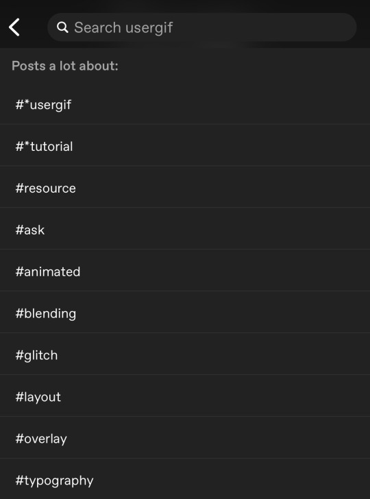
But if you ever want to quickly navigate a tag, simply add /tagged/word to the end of our url to find that tag! For example, if you want to see all the posts we've tagged as a #tutorial, just go to usergif.tumblr.com/tagged/tutorial.
BROKEN LINKS
Whether it's due to a creator frequently changing their url, the absence of an automatic blog redirect, or my own mistakes when coding the directory — you may stumble upon a broken link. Here's what to do:
If a creator has changed their username but their blog doesn't automatically redirect you to the new blog, check if they listed their new user name in the title of their old blog like I did:
In this case, simply replace the url you landed on with this new url. For example,
https://sith-maul.tumblr.com/post/692130400398704640/how-to-make-an-animated-google-search-overlay-a
→ would become →
https://cal-kestis.tumblr.com/post/692130400398704640/how-to-make-an-animated-google-search-overlay-a
However, if you can't figure out the creator's new url or in the case that I messed up the link due to human error, feel free to send us a message so I can help find the source or correct the mistake!
WHERE TO FIND THIS INFO AGAIN
If you ever need to access this guide while using the directory, simply click the "i" button here:

And that's it! We hope this revamped directory is a lot more efficient and helpful. Thank you again for all your support and for helping us reach this follower milestone!
#*usergif#*usergifdirectory#completeresources#usershreyu#userace#uservivaldi#userbecca#usertreena#userzaynab#alielook#usernanda#userhella#userelio#useraish#userabs#tuserabbie#tusermona#usersmia#tuserlucie#usercats
244 notes
·
View notes
Note
can you please make a tutorial for your santa gift graphics? i'm not totally new to photoshop but i could use some help <3
Ohh okay, this will be a bit long, so bear with me, dear Anon.
I'm going to use this one as an example:
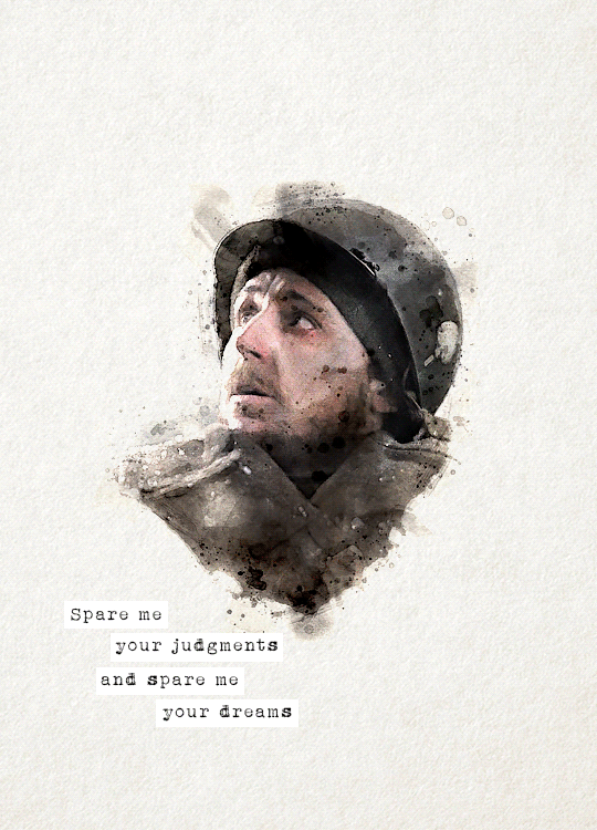
You'll need three new documents: one for creating the watercolour portrait, one for the watercolour elements in the background, and a third one for the final edit.

Let's start with the portrait. I'm using a free photoshop action for the watercolour effect, which you can download here with a complete tutorial. After using the action, you'll need to make some adjustments, but it's still faster this way. Change the blend mode of the "watercolor artist" group to screen and slightly turn down the opacity if needed to make the details more visible

In the second document, use the watercolour action the same way again to create the red elements in the background. You can download the photo I used here. I highly recommend using Unsplash, they offer plenty of free high-resolution stock photos, and unlike on Pinterest, the photographers are actually credited.
Create the third document; mine is 540x750. I used an ivory paper as a background, but it should work with a canvas texture or even a simple white/light layer. Pick whatever you like.
After you're done with the watercolour actions, paste the portrait into your third document. Adjust the size and position, then change the blend mode to multiply. Name the layer "portrait."
Next, paste the background elements too, and also change the blend mode to multiply. I changed the saturation and vibrance to make the red pop more, but it's optional. Name the layer "background elements."
Now that you see everything together, you can play around with different adjustment layers, contrast, colouring, etc.
Now, open the video you'd like to use for the animation, in a separate document. I used this one, but there are other similar free videos on this website, pick what you like the most. If you want to make the process quicker, pick one that's already a high-contrast black and white.
After you've opened it, you can use the timeline to cut out the part you'd like to use, adjust the speed, etc. In this case, I just doubled the speed which you can do by clicking on that little triangle, and used the full video.

Create a video timeline in the third document. Go to Window -> Timeline -> Create Video Timeline. It's an important step, don't forget about it. Once it's done, copy and paste the video layer into the third document, and name the layer "video." Make sure the "video" layer is right above the "background elements" layer because you're going to need to create a clipping mask. You can do that by right-clicking on the "video" layer and choosing create clipping mask, or you can hold down the alt key and left-click between the two layers. When it's done, you can adjust the size of the "video" layer, rotate it, flip it, etc., depending on how you want your animation to look
After that, set the blend mode of the video layer to screen. If you've done everything correctly, you should have your animation now.
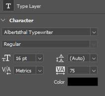
It's time to add the text. I used this font, size 16. I divided the text into 4 lines for easier adjustment of the position.
Once you're happy with the layout, create the white stripes, each on a different layer. This way, you can move them around separately if you'd like to change the position of the text. I like to make the text and stripe layers into a group so the layers are less chaotic, but you can skip this step.
The only thing left in the editing part is the invisible frame. Click on the "background elements" layer and add a layer mask. Select the brush tool, 50px, 100% hardness, and set the foreground color to black. Now, draw a line from corner to corner. Holding down the Shift key, click on one corner using the brush, then click on the next one, and repeat until you're done with all four sides. Your layers should look something like this now.

Before saving, make sure that all the layers on the timeline are the same length and start/finish at the same time.

If you're done, go to File -> Export -> Save for Web (Legacy). These are the settings I used for this particular edit, but feel free to experiment and use what you like the best.

I tried not to complicate it too much, but it's difficult to explain everything in writing, so if you have any questions, I'm always available :)
16 notes
·
View notes
Note
ive just watched your like 'how i make a gif' video, like the sped up process, and firstly, i had no idea how complicated it was but also (I feel like this is so stupid) but I can't for the life of me, work outr what you're actually doing?? i have no experience w photoshop so that probs doesn't help but i honestly like have no idea what like the sliders and stuff are for,, ty :)
i’m so glad you wrote this back bc that’s exactly why i made that video! gifmaking process is different for every gifmaker (the feedback i received was very funny bc we all do stuff completely different to one another). and as ames put it a few days back, it’s not only the time we spend making the gifs but perfecting the best way to make them, perfecting our sharpening, coloring and overall process
anyways, i’ll try to explain how my process works the best and simplest way i can :-)
1. choosing the clips: as you may see, the first thing i do is select the piece of footage i want to make into a gif, and to make my process simpler, i pre-trim a video into specific moments (these are my clips) and then, i select from that clip the moment i want to gif.
2. selecting the frames: then, once the clip is selected and imported onto photoshop, i now have to select the frames i will use for each gif. as you may know, most footage is in either 30fps or 60fps. fps= frames per second. so in my video, the footage was 60fps, meaning each second has 60 frames in my workplace. usually for a gif, i choose between 60-100 frames. this is where the first magic happens: i will carefully choose which frames i want to present to make the gifset look nice, while also thinking about how many gifs i will make. so in this example i did 4 gifs of 100 frames each (they need to be under 10M, if it went over that size i would remove frames). i wish choosing these moments were easy for me, but i’m obsessed with movement and little moments, so this alone can take me about half an hour in total lol
3. resizing: tumblr posts have a length of 540px (pixels), so your gif needs to be this size. the height is optional, and for the example that one had a height of 450px which is quite big if you multiply it by 4 gifs ! but also making your height bigger means more pixels available so better quality, but also a more heavy gif (which might result in less frames)
4. sharpening: do you know how some gifs look crispy and sometimes grainy? well this is made in this step. i think sharpening is vital to make the gif more professional looking. you can’t see how much sharpen i added because i made this with an action, but trust me it’s there heh. and to sharpen the whole gif and not just one frame, i need to turn the gif into what is called a “smart object”, meaning everything i add, either sharpen or grain, will be added to each of the frames i selected.
5. coloring: then once you have your gif ready, it’s time for the fun part: making your gif look nice! and you can see that i have many many layers that change the way the gif looks. for example, you have the brightness/contrast adjustment layer, which changes exactly that in the gif. or selective color allows me to change each color of the gif individually, etc. i made a coloring tutorial a while back, and although i don’t color like that anymore, i still use most of the same adjustments.
then repeat this process for the amount of gifs you want to make and post them on tumblr.com where it will get more likes than reblogs fjskfn. and that’s it for a simple gifset! now, blending, captioning, using fonts, making layouts… thats another thing that takes a lot longer, but the basic process stays the same.
if you have any further questions or you want a proper tutorial lmk! i love nerding out about photoshop <3
5 notes
·
View notes
Note
hi mem! i love your work. i was looking at your 'scott as nogitsune' set and i wanted to ask: how do you decide whether to go with big gifs vs smaller ones for a set involving typography?personally i go big but the way you did that set is so well done and coherent, i'm v inspired 🥰 sorry i hope this makes sense
ah this was so kind 🥺 i'd be happy to walk you through the thought process for that set!
deciding how the text is divided is usually my first step for figuring out what a set is going to look like. for the nogitsune set, i chose a quote that easily breaks up into four lines, so either i could have 4 gifs with text on each, or 8+ if i wanted textless gifs in between. this is already a plus as i personally prefer quotes that break up into even numbers for side-by-side sets, as that way you can start the first gif with text, and end the last gif with text if you’re doing a zig zag pattern.
i should probably also mention that part of the decision for that specific set was that originally, i was going to use a clip from a 480p video:

so a style that used heavy color block & maybe wasn’t a full 540 would’ve allowed me to fudge the lack of detail better. this was useful also as i knew i wanted a mixture of black & white & red for the Drama™ of it all, and i personally really like it when that kind of layout is every-other, which lends itself really nicely to a side-by-side look. side-by-side/smaller gifs also allow for a lot of cropping, which is great when you want to focus on specific details.
...also, sometimes i just feel like it! especially during an event when im doing a lot for one character, variety can be a fun challenge. i like how the gifs feel like they’re interacting visually so much more when they’re smaller, instead of more like a separate unit.
so! in sum, smaller gifs are especially helpful when you:
have footage constraints
want to crop heavily
are focused on contrast
just want to!
ok now some thoughts on typography.
part of the struggle with doing side-by-sides is that it’s really easy to get overcrowded really fast, or conversely, for them to all start blurring together. because of this, i generally prefer to do text on every-other gif going down, like in the nogi set.

there are a few things that help tie the text to the set: the red colour matches the red of the opposing gifs, while still popping out of the b&w gif they’re on. The slant on one of the text blocks adds dynamics and movement, whereas the horizontal text on the other helps you linger there for a bit. the font work is also not something super complicated, as at the end of the day it’s just an accent font and a supporting font.
this isn’t the only way to do text on side-by-sides, ofc, as you can do one for every gif—if there’s variation.
specifically, the sort of variation wherein one side is very dynamic, but the other side is very calm, like in the kira set:
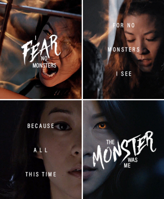
doing the heavy text on both sides would make the gifset harder to read, as you’re getting too much information vying for your attention at once. so here, i balanced it out by having an accent font on 1&4, but then just the supporting font on 2&3.
i think side-by-sides are also fun bc they allow for that mixing of font work in ways a large blended gif wouldn’t, so you can either highlight lone images (like in the nogi set) or add special emphasis to parts of the quote (like the kira set).
i’m not sure how much i’ve actually answered your question, but hopefully this was at least a tiny bit fun. 🥰
#asks#personal#memtorial#gifmaking#content creation#teen wolf#mem speaks (to herself)#also to the anon that's asked about a blending tutorial#i haven't forgotten you#it's just gonna be a lot#so i keep putting it off#but i haven't forgotten
5 notes
·
View notes
Text
✨✨✨WOW! ✨✨✨I I can't resist sharing with you the message we received from Sarah, who talks about how printable art has changed everything in her approach to interior design. Thanks to her for telling us about her experience 🔽 🔽 🔽
👉 Hi, I'm Sarah and I love decorating my home with printable art. It all started when I was looking for some affordable and easy ways to spruce up my living room. I stumbled upon a website that offered hundreds of printable art designs, from vintage posters to modern watercolors. I was amazed by the variety and quality of the artworks, and I decided to give it a try.
I downloaded a few of my favorite prints and printed them at home on high-quality paper. I bought some cheap frames from a local store and hung them on my wall. I was so happy with the result! The prints looked like real paintings, and they added so much color and personality to my space. I received many compliments from my friends and family, who couldn't believe that I made them myself.
🧲 I was hooked. I started browsing the website more often, looking for new prints to add to my collection. I discovered that I could also customize some of the prints, by changing the colors, fonts, or sizes. I had so much fun playing with different options and creating my own unique artworks. I also learned more about different styles and artists, and I developed a new appreciation for art.

I realized that printable art was not only a cheap and easy way to decorate my home, but also a hobby and a way of expressing myself. I enjoyed changing the prints according to my mood, the season, or the occasion. I never got bored of looking at my walls, because they always reflected my personality and taste.
Some of the prints that I adore are:
- A watercolor of a fall mountain and forest, with vibrant colors and a serene atmosphere. It makes me feel cozy and relaxed, and it matches the season perfectly.
- A vintage painting of the seasons by Giuseppe Arcimboldo, with fruits, flowers, and vegetables forming human faces. It's so creative and whimsical, and it adds a touch of humor and art history to my wall.
- A painting of Spring in the Parc Monceau by Claude Monet, with bright colors and a lively atmosphere. It captures the beauty and charm of the park in Paris, and it makes me feel like I'm there.
- A vintage painting of a group of birds perched on branches, with realistic details and a warm tone. It's charming and delightful, and it brings a bit of nature and life to my home.
I also experimented with different ways of displaying my prints, such as using clips, strings, or shelves. I found that this gave me more flexibility and creativity, as I could rearrange them easily and create different layouts. I also liked mixing and matching different prints, such as combining vintage and modern styles, or contrasting colors and themes. I felt like an interior designer, creating my own gallery wall.
I also shared my passion for printable art with others, such as my friends, family, and online communities. I gave some of my prints as gifts, and they were always well-received. I also posted some of my pictures on social media, and I got a lot of positive feedback and questions. I enjoyed connecting with other people who loved printable art, and I discovered new sources and ideas.
Printable art has become more than just a way of decorating my home. It has become a way of expressing myself, learning new things, and having fun. I love being able to choose and change my prints whenever I want, and I never get tired of looking at them. Printable art has made my home more beautiful and personal, and I'm so happy that I found it! ❤️❤️❤️
#ArtLovers #printable #Monet #painting #printablewallart #downloadable #forest #wallart #etsydigitaldownloads #printableart #DownloadableArt
0 notes
Text
Honkai Impact 3rd Manga Station
Create and divide panels for your pages as easily as drawing lines. You can easily edit the shape, gutter width, and layout, as well as edit all your panels at once for consistency across your story. View all your pages at once with the page management feature in Clip Studio Paint EX. It’s easier than ever to check the flow of your story with this essential feature for comics, manga, or zines. Clip Studio Assets offers tens of thousands of commercial-license materials such as brushes, images, tone, balloons, backgrounds, and 3D materials that can be downloaded and used them at any time.
You can create every stroke exactly as you imagine with our powerful brush engine. อ่านการ์ตูน Clip Studio Paint works with your device to reflect every nuance of your pen, even up to the 8192 levels of pen pressure detected by Wacom tablets. Spread the word with your content and get a kickback on each sale you bring. Work files can be output to e-book formats such as Kindle and EPUB.
All you need to create your comic, manga or webtoon, right at your fingertips. After a series has run for a while, publishers often collect the chapters and print them in dedicated book-sized volumes, called tankōbon. These can be hardcover, or more usually softcover books, and are the equivalent of U.S. trade paperbacks or graphic novels.
Further edit complicated frame layouts by changing frame size or frame line thickness. Clip Studio Paint has many useful functions unique to comic/manga production. With 64���bit OS and multi-core processor support, Clip Studio Paint makes the most of your device’s capability, and the layer folder feature lets you manage layer-heavy files with ease. Auto-generate natural-looking shadows from lineart and filled areas and then fine-tune them by adjusting the position and angle of the light source and setting the shadow’s color. Use the text tool for single speech bubbles or manage your whole page dialog at once with the Story Editor. Perfect for adding whatever text you need, with detailed settings for fonts and character spacing.
There are so many features that really help my work flow in comics. The story feature is a great way to keep organized on longer projects. I also really like how you can customize everything to suit your own needs perfectly. The iPad version is brilliant too, making Clip Studio Paint totally portable so I can easily work on print-ready files anywhere. Slam Dunk has 170 million copies in circulation, making it the seventh best-selling manga series in history. In 1994, it received the 40th Shogakukan Manga Award for the shōnen category.
In 2010, Inoue received special commendations from the Japan Basketball Association for helping popularize basketball in Japan. An anime feature film, titled The First Slam Dunk, was released in Japan in December 2022. A number of artists in the United States have drawn comics and cartoons influenced by manga. Give your manga or comic some drama with essential effect lines, with dedicated tools to instantly create action lines and speed lines. You can also download more action line materials or draw your own with specialized rulers.
In addition to presets, Clip Studio ASSETS offers an extensive library of additional brushes of all kinds, including decoration brushes that can draw continuous patterns, that can be downloaded at any time. Pencil and pen tools reproduce realistic-looking lines, bringing your work to the next level. Customize stabilization, pen pressure, and more to your exact specifications. EX has a feature where you can create a manga work containing multiple pages. You can arrange and reorder pages while viewing the entire document, reducing errors when creating your work. Get a taste of your finished book using our 3D print preview complete with accurate settings for pages and binding!
You can even choose how your work is viewed - as a book or as a scroll - for easy reading. With the Teamwork function, multiple users can collaborate with team members to create and edit different pages on a single multi-page work file uploaded to the cloud. Anything you create such as materials, works, and software settings, can all be saved on the cloud. Use your materials, works, and software settings at home, work, or school. Import your own files or download pre-made buildings, furniture, crowds, vehicles, and many other materials to lay down your composition.
As a self confessed old technophobe, it’s incredibly easy to learn... Whether you're stuck on a new feature or need technical help, you can rely on our free customer support. We’re proud of our excellent customer satisfaction rate, and happy to be there when you need us. The developer, SHUEISHA Inc., indicated that the app’s privacy practices may include handling of data as described below.
With 1000 new materials every month on Clip Studio ASSETS, you’ll always find something to match your personal style. You can also import Photoshop dual brushes (ABR) and customize every aspect of your brushes, giving you a limitless supply of tools. Before printing check the binding and finish of the final product with the 3D preview feature.
I can express myself freely in Clip Studio Paint without any restrictions. Later on, Sakuragi realizes that he has come to actually love the sport, despite having previously played primarily because of his crush on Haruko. Kaede Rukawa—Sakuragi's bitter rival (both in basketball and because Haruko has a massive crush, albeit one-sided, on Rukawa), the star rookie and a "girl magnet"—joins the team at the same time. Together, these misfits gain publicity and the once little-known Shohoku basketball team becomes an all-star contender in Japan who gained a popularity after defeating one of the powerhouse highschool teams at Interhigh.
Then, simply use the URL so your readers can access your work in an embedded viewer. Import and export RGB data for web content and CMYK data for printing. You can also work in a CMYK preview to see your colors just as they’ll look when printed. Easily split long webtoon canvases into multiple files for export, or export a multi-page webtoon as a single file with a host of export settings for easy uploading to the webtoon platform of your choice. Take the trial to discover a new drawing experience supported by our powerful brush engine, in-built stabilization options, and adjustable pen pressure sensitivity, unlike anything you’ve experienced before. Upload your multi-page comic, illustration portfolio or webtoon to Clip Studio SHARE to share your work in an embedded viewer to your friends, family and followers.
Discover new features with official tutorials on “TIPS,” or swap advice with others on our Q&A forum “ASK”. Smart enough to fill line art with small gaps and capture tiny unfilled areas, our fill tool is the perfect assistant for quickly laying down flat colors. No more hassle over unfamiliar objects and background materials with our range of 3D materials! Easily access movable 3D references for accessories, vehicles, buildings, and more. A user favorite, make adding perspective and realistic depth to your backgrounds easy with our specialized ruler tools. Adjust the eye level and perspective as much as you need, and draw directly along the guidelines.
You can start creating work immediately without worrying about detailed page settings. Choose from preset templates for color or black-and-white comics, webtoons, etc. I've been using it since Manga Studio 4 and now use it for pretty much 100% of my professional work.
Use photos as part of your next creation by importing as reference or converting to line art to use in your backgrounds. Check your camera roll to see how many images are waiting to be part of your next piece. Complex patterns are easy with decoration brushes, saving you time on repetitive details like clouds, plants, lace, and ribbons. Create your own custom brushes or discover what others have made on Clip Studio ASSETS. I’ve been using CSP for the last few years, and I love how intuitive it is. The brushes are a special standout - even without downloading extra ones, the existing ones really do feel like the real thing.
Draw smooth, crisp lines or create weighted lines without ever applying pressure to your pen! Weighted lines can be created with a function that calibrates pen pressure based on multiple test brushstrokes. Upload multi-page works on Clip Studio SHARE, from comics, to illustration portfolios, or vertically scrolling webtoons.
Set multiple vanishing points and draw your ideal building or room! You can also drag and drop 3D materials to quickly match existing rulers. Connect with creators from around the world through our online services in seven languages.
Tone materials offer endless applications such as clothing patterns, backgrounds, effects, and textures. Use various tools to add, remove, paint tones, or change a tone’s pattern immediately after pasting it. You can even convert color and gray images into tone with a single click.
Now you can check your pages, margins, and page numbers before sending your data to the print shop. Draw your vector lines with a natural and smooth feel, then resize and edit line thickness and shape without losing line quality. Clip Studio Paint also comes with handy features like the vector eraser, which lets you erase up to intersecting lines.
1 note
·
View note
Text
Sequence pictures to gif
#Sequence pictures to gif for free
#Sequence pictures to gif how to
#Sequence pictures to gif install
#Sequence pictures to gif software
#Sequence pictures to gif series
Download your design or share it with the world directly from the online editor. You can use your GIF as social media images or online ads that’ll engage with your audience better. See an element that you like? Add it to your layout by using our easy-to-use drag-and-drop tools. Change the font, tweak the color, animate the words, and you’re done! Effortlessly drag and drop elements Use the text tool in our online editor to create subtitles, captions, or annotations. Our vast collection of design elements and features will help you create the perfect GIF and capture them in motion. Add frames and effects to your layout and add an animation effect to make it more attractive. Extensive library of media elementsįind static and animated stickers, illustrations, and other graphic elements on our app to complement your design. Apply free and premium animations to give an exciting flair to your GIFs. Highlight big ideas with eye-catching movements that make your design flicker, pop, or skate across the screen. Get every element of your custom video or image in action with Canva’s animation option that allows you to have fun with your designs and draw more attention. Who knows? It might just be the next viral reaction GIF.
#Sequence pictures to gif how to
Lastly, download the video turned GIF and choose the format. Learn how to import an image sequence into an animation folder, as well as some tips for transforming your new sequence after import. Then, create and customize the GIF-to-be add captions, illustrations, or animations. Simply upload the video onto the editor and trim the clip.
#Sequence pictures to gif series
for the GIF.Use our GIF maker from video to capture moments from a funny clip, the TV series of the moment, or even personal video footage. I hope this quick tutorial was useful to you and you know how to take a set of images and create a GIF out of it, and adjust the framerate, looping, etc. As we saw earlier, the loop parameters are –īy setting the loop parameter to 0, we get the following GIF that plays infinitely.
#Sequence pictures to gif for free
We do this by controlling the -loop parameter and setting it to 0. Extract animated GIF to PNG images for free online, simply upload the GIF file and click start button, you can download all the frames in PNG files quickly. Now, let’s take a look at creating a GIF that loops infinitely. You can see that the GIF completes much faster, right? ffmpeg -f image2 -framerate 10 -i simpimgs%03d.jpg -loop -1 simpson_10fps.gif Looping a GIF using FFmpeg Now, let’s speed up the GIF by increasing the frame rate to 10 fps as follows.
0 = loop infinitely and this is the default value.įrameRate of the GIF created using FFmpeg.
-loop -1 means that the GIF should not loop.
-framerate 1 means that FFmpeg will display each image for 1 second (frames/second).
-i simpimgs%03d.jpg – list of input images for the GIF file.
ffmpeg -f image2 -framerate 1 -i simpimgs%03d.jpg -loop -1 simpson.gif Here is the command line for creating a GIF file using a series of images and the FFmpeg tool. Now that you have the necessary images to create the GIF, let’s proceed to the next step. To learn how the commandline parameters work, do read the article linked above. The basic command is as follows – ffmpeg -i simpsons.mp4 -vf "select='not(mod(n,10))',setpts='N/(30*TB)'" -f image2 simpimgs%03d.jpg You can do this using FFmpeg easily and the process is explained in this tutorial: Thumbnails & Screenshots using FFmpeg – 3 Efficient Techniques. To generate a set of images from a video, you need to take periodic screenshots or thumbnails from the video. Share a GIF and browse these related GIF searches. Once you have FFmpeg installed on your computer, you can proceed with this tutorial. Looking for photo sequence stickers The best GIFs for photo sequence.
#Sequence pictures to gif install
If you don’t have FFmpeg installed, then you can download it from here or install it using these instructions for Windows, Mac, and Linux. FrameRate of the GIF created using FFmpeg.Creating a GIF from Images using FFmpeg.Olympusat Innovates with PlayBox Neo Solutions for Time Delayed Playout Across U.S. TVU Networks Cloud-Based Video Solutions Enable Live, Remote Table Tennis Tournament for Beijing Sport University Students Mediaset Italia chooses WHATS’ON as the scheduling solution for a transformed content supply chain Live GB News coverage of Queen Elizabeth II’s State Funeral to be delivered by AsiaSat and OCGL via their satellite and live streaming platformsĬhilean Football Association to Scout Future Sports Talent with PixellotĪd Fraud on the Rise in APAC- IAS Media Quality Report Mobius Labs partners with Cloudinary to offer next-level tagging and retrieval of digital assets The GIF dimensions 400 x 273px was uploaded by anonymous user. Zero Density Wins Best of Show Award at IBC 2022 Open & share this gif sequence, images, with everyone you know.
#Sequence pictures to gif software
Disguise Unlocks Scalability in Production with r22 Software Release
0 notes
Photo
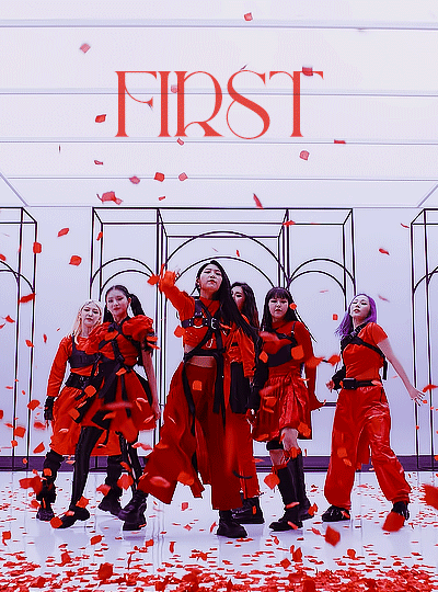
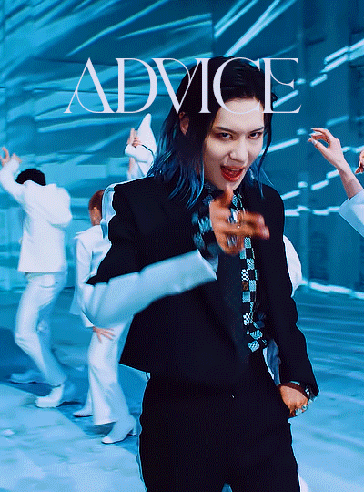
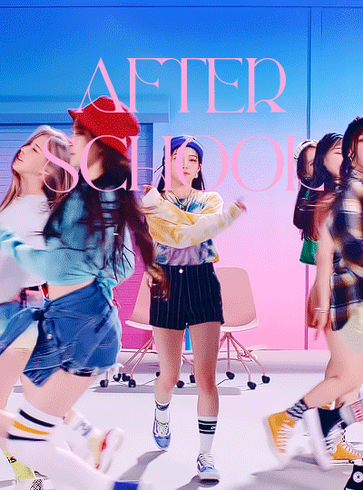
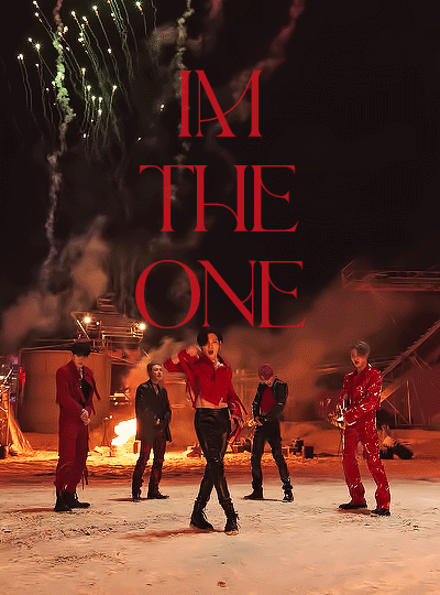
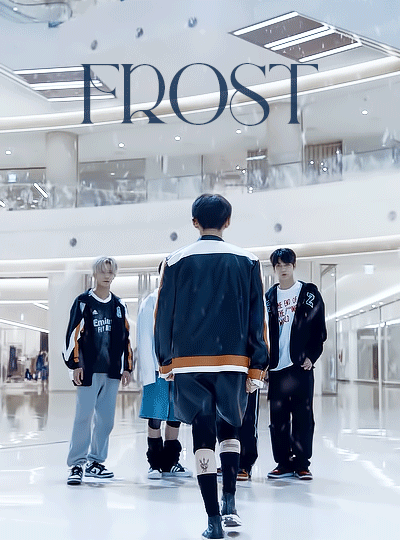

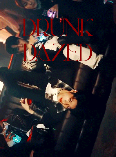
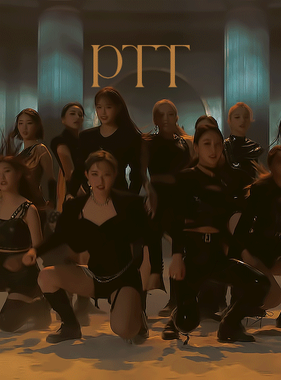
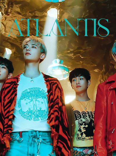
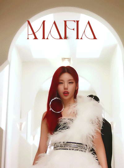
TOP KPOP SONGS OF THE FIRST HALF OF 2021
first by everglow | advice by taemin | after school by weeekly | fireworks (i’m the one) by ateez | frost by tomorrow by together | i’m not cool by hyuna | drunk-dazed by enhypen | ptt (paint the town) by loona | atlantis by shinee | mafia in the morning by itzy
honorable mentions: libido by onlyoneof, easy by wjsn black, don’t call me by shinee, after school by weeekly, asap by stayc, gambler by monsta x, unnatural by wjsn, love so sweet by cherry bullet, make it by 2pm, ring ring by rocket punch, love so sweet by cherry bullet, my turn/bad habits by cravity, and many many bsides <3
tagged by; @soppa @yootaeyanq @hongjooong @seonfiles and @song-mingi thank u so much !!
tagging; most everyone has done it already but i’ll tag @wonsang and @yeekies and @introtae !!! no pressure to do it heh <3
#flashing tw#everglow#long post#shinee#ateez#txt#taemin#itzy#enhypen#loona#weeekly#hyuna#luna.gifs#lunagifs#thank u to miss vivi for the font <3#i really like how this turned out tbh#i like the coloring and the clips and the layout and the font#and the font colors#they're all picked from the coloring in the gifs so the shades match :3#it turned out nicce !!!#esp the drunk dazed gif like god damn fogijdfiogjdoifjg#looks NICE
778 notes
·
View notes
Photo
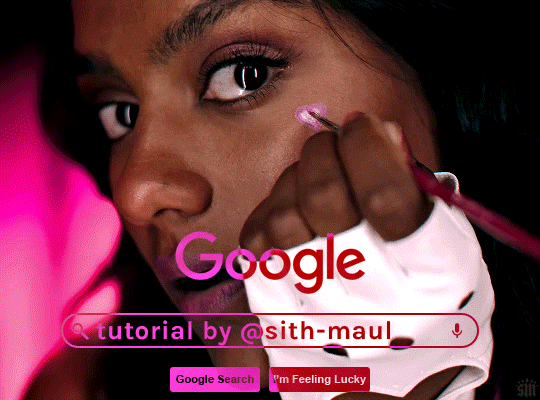
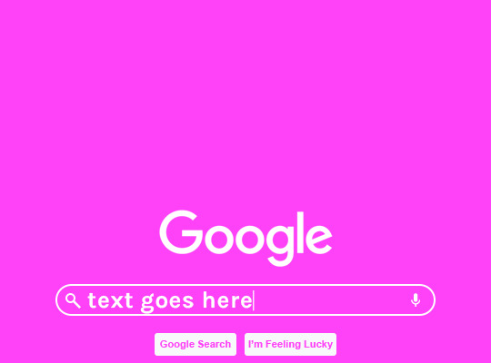
HOW TO: Make an Animated Google Search Overlay
A few people have asked how I did the effect in my pinned post and this set. So, in this tutorial, I’ll show you how to do this typing animation and give you a download to a template I made for the overlay! Disclaimer: This tutorial uses Video Timeline and assumes you have a basic understanding of gif-making in Photoshop.
PHASE 1: THE BASE GIF
I’m not going to show how I made this gif, but if you need any tips on basic gif-making, I have my full gif tutorial here. Instead, here are some tips for making a gif with this effect:
1.1 – Make your gif 540px width, especially if you’re using my template. My gif is 540x400.
1.2 – Use more frames. If you have a lot of characters in your search bar text, you’ll want to make a longer gif (i.e. one with more frames). The gif I made above was only 50-ish frames, so I doubled them and reversed the duplicates so it would play like a boomerang. That gif is a total of 98 frames 😅
1.3 – Have a “feature color” aka choose one color to make pop and make it the same as the overlay. Also, lots of contrast is especially ideal when you have an overlay set to Difference/Exclusion. (Check out the color tutorials on @usergif if you need help making your colors pop!)
PHASE 2: THE OVERLAY
2.1 – Download my template if you’re doing this layout
I made this template myself, so all I ask is that you don’t claim it as your own and that you give me proper credit if you decide to use it! Get the PSD with the transparent background here!
2.2 – Download the font Karla (optional)
The font I used for the search bar is Karla, a Google Font. It’s not THE Google Font, but I like the way it looks — which is more important to me than accuracy for this part. Here’s the Google Font link.
2.3 – Import the overlay
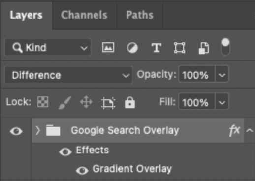
You can either drag the whole folder onto your gif from tab to tab or right-click the folder, select Duplicate Group, and select your gif as the destination document. Just make sure this overlay group is above your base gif!
2.4 – Set the overlay blending options
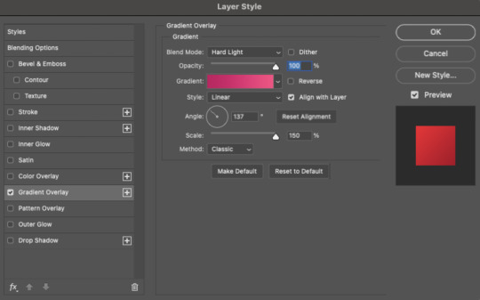
If you’re using my .psd, all the settings are already in place! If not, to get the metallic color effect, simply set the overlay to Difference:
Then, add a gradient overlay that matches your base gif feature color. Here are my settings:
PHASE 3: THE TYPING ANIMATION
*Anakin Skywalker voice* This is where the tedious stuff fun begins...
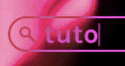
3.1 – Add your full text
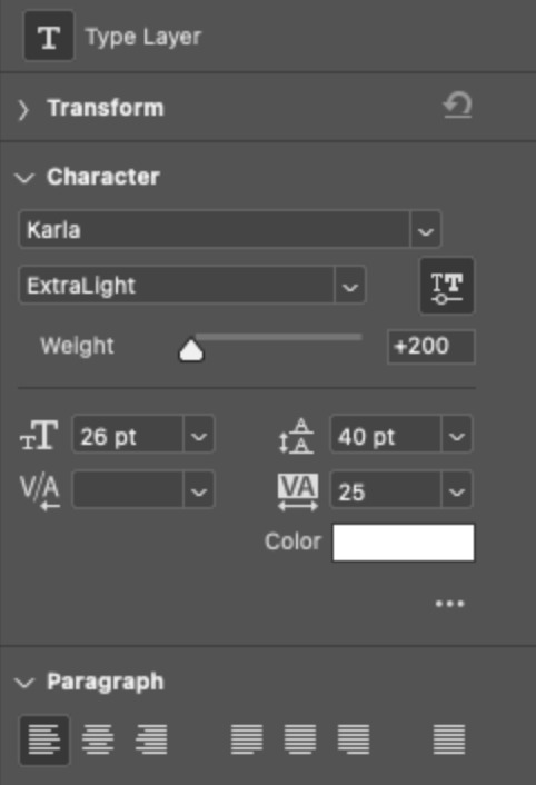
Create a text layer with the full text you want in the search bar! Here are my text settings:
— Font: Karla Bold
— Size: 26 pt
— Letter Spacing: 25
3.2 – Create a layer mask
This is how we’re going to create the typing effect without typing a new layer each time. You can add a layer mask to your text layer, use the Marquee tool to create a box around all but the first letter of your text, then fill the box with black to erase it. Now, all you can see is the first letter ‘t’
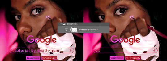
Btw the reason we wouldn’t use keyframes for something like this is because we want each letter to appear in a flash, not with a smooth, sliding reveal like a fade transition.
3.3 – UNLINK THE LAYER MASK
This is super important so you can freely move the layer mask with each letter. Just click that chain so it disappears!

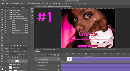
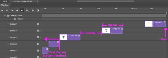
3.4 – Trim the text clip SEVERAL times
When I say several times... I’m not joking lmao:

Btw, you can click these images to view them at full size and zoom! Now, this part is a little tricky for me to break down into steps, but here are some key tips:
TIP A – Trim, Move Layer Mask, Repeat
To make it as easy as possible on yourself, the best method is this:
— Start with your original text layer (pre-trim) with the layer mask only exposing 1 letter
— Move the playhead (red vertical line with the blue arrow) to the spot you want to trim (see Tip B) and click the scissor icon to split the clip
— On the copied layer, move the layer mask (white box in the layer panel) to the right to expose another letter. Make sure your layer mask is unlinked (See Step 3.3)! You can see my layer mask moving by the dotted lines in the gif below.
— Move the playhead the same amount of spaces as before and trim again: you should now have the original trimmed clip (first letter) and a second trimmed clip (second letter)
— Repeat until you’ve done all the letters AND the spaces
TIP B – Make your trimmed clips about 0.03 seconds long.
I’ve found this works well for me, especially because I’m working in Video Timeline. It reduces the amount of duplicate frames I get because, for whatever reason, Timeline pauses every 0.03 seconds (at least for me when I click the forward button).
In the section above the pink line (image below), you can see I started with my full text clip. Then, under the pink line, you can see how I used the scissor/trim tool to clip them each to a duration of 00:03.

↑ Note: That screenshot is zoomed into the Timeline 100%. The other screenshots are zoomed out which is why the clips look bigger here.
TIP C – Your text shouldn’t start at the very beginning.
Give yourself some space to let the cursor blink a few times, just like when you pause while typing on a computer. Where you start your typing animation is up to you! In the image below, you can see the first small purple block starts about 1.06 seconds into the gif:

TIP D – Backspace
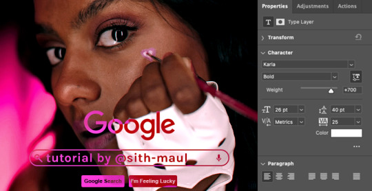
I’m sure you’ve probably figured this out already, but to get the backspace effect I have in my gif, you just move the layer mask to the left to cover the letters you want to “delete.” Then once they appear “deleted,” just edit your next text layer clip with the new word you want to replace it with! (In my gif, I deleted “nik” and replaced it with “@sith-maul.”)
Here’s what the gif looks like without the blinking cursor animation:
Now that’s all explained, you basically do a similar thing with the blinking cursor! But no layer masks are involved :)
PHASE 4: THE TEXT CURSOR ANIMATION
4.1 – Create a text layer with just a vertical line like this one → |
I’m using the same Karla typeface as before, but thinner. Here are the settings:
— Font: Karla ExtraLight
— Size: 26 pt
4.2 – Trim, Move, Repeat (Letter Version)
This step will be super easy because each cursor clip that follows a letter will be the exact same duration as the letters you’ve already done: 0.03 seconds long. Take a look:
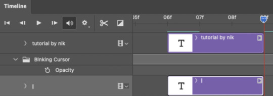
For each letter you reveal, move the text cursor so it’s slightly to the right of the letter, like this:
Do this for all the letters and even the spaces!
4.3 – Trim, Move, Repeat (Blinking Version)
This type of text cursor is slightly different because:
— These clips are “slower.” The reason is that the Letter Version cursor goes too fast for the Blinking Version. So I doubled the duration of the blinking cursor to 0.06 seconds!
— There are spaces between these clips that are the same duration as the clips themselves: 0.06 seconds.
— This text cursor starts at the very beginning of the gif and continues after the text is finished “typing,” directly after the last Letter Version cursor.
Just add however many blinking cursors you want to the beginning and end of your gif, skipping over the parts where you already did the Letter Version!
Here’s how it looks in the Timeline at the beginning of my gif:

Here’s how it looks in the Timeline at the end of my gif (note: it continues directly after the last Letter Version cursor):
Here’s how the blinking cursor would look at the same speed (0.03) as the letter version:

Here’s how the blinking cursor looks at double the duration (0.06):

PHASE 5: EXPORT
That’s it!! Just convert from Timeline back to Frames and export your gif! As always, I recommend checking your frames when you convert from Video Timeline back to Frame Animation — just in case you may have gotten any duplicate frames. Again, if you want to know more about that process, my full gif tutorial is here!
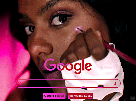
And ta-da, here’s the final gif!

And that’s it! I really hope this makes sense because I’m not really sure it does 😅 But if you have any specific questions, my ask box and DMs are open! <3
Also, check out these gorgeous recreations of this effect from @steverobin (Keke Palmer set) and @jakeyp (Jake Peralta set)!
#gif tutorial#completeresources#allresources#userelio#userannalise#usershreyu#useryoshi#useralison#uservalentina#userkosmos#usernums#tuserkay#userk8#tuserabbie#uservivaldi#userstar#usersole#resource*#gfx*#google*#this tutorial is long overdue oops lol
2K notes
·
View notes
Note
Sorry if you've answered this before and I missed it. How did you make the Sheikah slate screens?
Nobody's asked me that before, what a good question! Where to start...
First off, I used some references and assets from around the internet (the sheikah eye, the slate background, sheikah font, etc.) Last year, when ALUW was still a baby blog, I drew it all up and the template looked kinda bad. I didn't have all that stuff so I just had to add filters provided by Medibang. A little of the sheikah font from back then was actually drawn from this template I had gotten bc I didn't know how to download fonts. But that quickly got tired so I learned how to do it :).
Nowadays the template is a lot cleaner and kept as a PSD file. This way I can easily switch from Photoshop, Clip Studio, and Medibang.

The slate layout was traced from a screenshot and then colored in CSP. The background was taken from here and the colors were chanded so they fit the ALUW colors. This is actually from the same person who built the sheikah theme. That's what I use for the new ALUW theme. They've actually created a lot of themes!
As you can probably see in the bottom left, all of these parts are on different layers in a folder. This makes the file easier to animate.
I create my texts and drawings in Medibang in different folders and save them as different PSD files so I can access them in PS, MPDs and (I assume, I haven't tried) CSPs don't work. I make the gifs there.
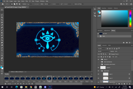
It's all in the timeline. I don't like using PS at all, so this is the only thing I do with it. I export the gif to web once I'm done.
I hope that answers your question...
I had the sheikah eye ever since the beginning of the blog. I actually, wrongfully got mad at someone for using it, but around the same time I realized that I was being dumb XP
everyone has their moments... I still feel bad for it though.
67 notes
·
View notes
Text
best of 2021
post your favorite or most popular post from each month this year!
thank you @jimmeo-kookliet for tagging me to do this! i can’t really decide if i want to post all my favorites of each month or the post that got the most notes, so i might just...put both? i’m adjusting the prompt for the fun of looking back on everything i made this year, but if i tag you please feel free to follow the prompt however you’d like. i think i giffed more in 2021 than i ever have in my life and i’ve been doing this for a looong time. i have a lot of mixed feelings about it as we wrap this year up, but i can wholeheartedly say that i had a lot of fun creating things this year and appreciate everyone who still goes out their way to share not only my content, but others’ as well.
i’m gonna put all this under a cut!
🔮 january
my favorite: bangtan full house
technically this is my second favorite because my actual favorite also got the most notes so see that one below, but this set idea was a close second because it was so random. the idea popped into my head while watching this dvd and i thought the way they were turning towards the camera gave off cheesy 90s sitcom intro energy, so i ended up downloading the full house font and this set came to be. i also did a ton of selective color correcting to get completely rid of the bright purple color of the screen behind them, so i’m still pretty proud of this! i absolutely did not expect the reaction it got at all! i even posted a video version with the theme song for the full effect lmfao.
most notes: favorite taehyung moments
just a really cute compilation of some of my all time fave taehyung moments. it’s still such a precious set to me and i had a good time making it. maybe i’ll make a part two one day!
🔮 february
my favorite: bias wrecker jungkook
i just loved the purple color scheme of this set! it wasn’t really planned, but i still think it’s one of the prettiest sets of jungkook i’ve made.
most notes: winter package taehyung
understandable, look at him
🔮 march
my favorite: vmin comp
most notes: bandana taehyung
i looooved making comps for the make me choose meme, i should bring it back
🔮 april
my favorite: yellow taehyung
i think this is one of my biggest comp sets that absolutely nobody asked for
most notes: fluffy hair taehyung
as he should!!! AS HE SHOULD!!!
🔮 may
my favorite: butter mv comp
what a fun night this was let’s go back
most notes: taehyung at gyeongbokgung palace
i very fondly call this footage the “look at all those chickens” clip
🔮 june
my favorite: sowoozoo vcr jungkook
i love the coloring i did on this a lot especially since those vcrs were very orange-y. this set looks like it could be from a movie...chef’s kiss
most notes: tata mic
because of course it did
🔮 july
my favorite: black/blonde hair hoseok
this was the first time i experimented with a layout of this sort and i thought this turned out really cool! giffing hobi is such a treat for me and i need to do it way more because it gives me so much serotonin
most notes: yoonkook comp
THIS SET WAS SO MUCH FUN TO MAKE AND I’M STILL IN LOVE WITH IT!!!!
🔮 august
my favorite: red plaid taehyung
he’s so cute what the fuck :/
most notes: taehyung samsung commerical
i’m really not sure why this did well, i put very little effort into it lmao
🔮 september
my favorite: ON mv making film taehyung
self explanitory
most notes: esquire taehyung
i’ve had this blog since october 2020 and this is only the second time i’ve had a post hit 5k notes (and 4k too for that matter)
🔮 october
my favorite: taehyung trying to bulk up
literally WHAT is this man doing. the way i leaped off my bed when this scene popped up in the bangtan bomb with no warning
most notes: dramatic taegimin
honestly same
🔮 november
my favorite: motsone tae and his tongue
i haven’t rested since he did this and it took me over a year to finally get to gif it in HD so
most notes: taehyung’s fond of jimin face
VERY RELATABLE CONTENT
🔮 december
my favorite: motsone jungkook
soooo pleased with how this set turned out and the purple/pink colors flowing so naturally. i experimented a bit with sharpening, especially with this dvd and i think this is the prettiest jk set since the bias wrecker one i made in february!
most notes: funniest taehyung moments
thank you kim taehyung for making us laugh so much this year <3
that’s it!!!
i’m gonna tag some of my fave creators of this year but PLEASE do not feel obligated to do this!
@intokook @jeonbunkook @taeunwoo @kimtaegis @tcehyungs @taeyoonge @hobeah @jeonjcngkook @userjiminie
18 notes
·
View notes
Text
gif maker appreciation tag: skamverse edition
yeah this is a tag that has been going on in spring but you know it’s better later then never🤩 also it’s still pretty much down time for gif makers so it’s a good time to hype content creators here <3 thanks everyone who tagged me i couldn’t find everyone but you are for sure will be mentioned here later❣️
if you’re a gif maker...
a gifset you’re really proud of: sobbe gifset that took my pretty long to do and im very happy with results:+) i love how the coloring turned out and i tried new fonts thingy and i think it looks cool. only regret that i haven’t done it earlier when the tag was more alive. and also very proud of my traditions set my beloved
a gifset of your favorite remake: i don’t have a favorite one but i am focused mostly on wtfock and i really liked the one i made for finale and it made me pretty emotional while i was making it ngl
a gifset that you wish would get more notes: literally every gifset lately because it feels like all tags are dead now but i really liked robbe + pink and think it deserves more love
a gifset where you tried something new: tried transition from b&w to colors on elu gifset and wont repeat it ever again, it took hell a lot of time
spread the love!
a gifset of your favorite remake: i will mention a lot of more wtfock gifsets later but for now the ones that have a lot of characters and are my favs are this lockers gifset that make me so emo and this one with main’s bedrooms is so aesthetically pleasing and im obsessed with this wtfockdown gifset :.) what a gold time. and gifset with all mains is so huge and beautiful
a gifset of a remake you haven’t watched/ don’t like/ isn’t your favorite: i only watched few clips from new seasons of skam fr so i will count it as a remake i haven’t watched. @feminizedbf is making the best gifsets for these seasons and im honestly in awe of his creativity and devotion bc the tag was so dead during the time the season was airing and the gifsets got only few notes which is very unfair because these gifsets deserve all the love. my favs are new gen + name etymology, favorite episodes and the one with nikita gill and this one absolutely broke me thank u
a gifset with a cool layout: idc care about the rules and will include 944838 gifsets because i can and they all are so so pretty and there are way too many talented people there. sobbe + the night we met @nyttvera is a masterpiece and i still think about it daily, also very like her layouts here and here. vendredi 20h27 by @feminizedbf in comics style is insane love it so much. i call @sandersyasmina a queen of layouts for a reason and this one with ohn is my favorite. it was hard not to include everything @sanderdriesen made because they all are so creative and beautiful and i will try to keep it short and not write essays on each of them. ohn and moving drawings of robbe, hotel clips, sobbe journey, dinsdag 16:31, are the ones that blew my mind and AND my favorite gifset of all time😙 also i very liked yasmina each episode series that @sanderxrobbee had going on, layouts on these gifsets are so cool. really loved layouts on gifsets for sobbe anniversaries @nellsdani was making and especially this one for woensdag 21:21 (and and really love this one for ohn and with robbe). @fatoujallovv is always so creative with layouts and kieutou gifset is one of my favorites
tag someone who does beautiful coloring:
@fatoujallovv @arzkiya-hai @nyttvera @birthdaysentiment @robbeijzermans @lucasotteli @mirroroferisedx @nellsdani are queens of coloring, im in awe every single time, they always chose the best color combinations and their gifsets are so vibrant and pretty
tag someone who inspires you to make gifsets: there are so many people from my sweet anons who send me asks that make me motivated to people whose creations i see on my dash because it always makes me want to go to ps to experiment or details in gifsets makes me inspired to do something but when it comes to support these people are always here😙❣️ @arzkiya-hai @hidden-joy @sandersyasmina @sanderdriesen @nellsdani @letisnotonfire @dagcutie @sonderthroughthestreets @nyttvera @indimlights
tag someone who you’ve discovered recently:
@debussyatmidnight started making gifsets not so long ago and her gifsets are so pretty i wish i was making gifsets like that when i only started making them❣️
32 notes
·
View notes
Note
I've been really into graphic design lately and I want to start! do you have any tips?
Hey, thanks for asking, I guess I do have some tips
• For absolute beginners I'd recommend first looking into graphic programs and finding the best fit for what you want to create - the adobe cloud is great but to start out there are many free alternatives. If you're into drawing as well I'd recommend checking out Procreate.
• Study the basics - e.g. look at the difference between vectors and pixel graphics, file formats (jpg vs png vs tiff etc.), look up different methods to cut out images as it's something you'll probably need at some point, and maybe also have a look at recent design or color trends (that's always fun, too). Also advisable as a beginner is to study general do's and don'ts (for example working with text, website design or layouting have some clear rules for what works and what doesn't - most people already have a sense of aesthetic but it's always a good idea to prevent creating some graphic design is my passion meme stuff, see r/crappydesign or the likes).
• If you want to create with the intention of publishing your works effectively on certain platforms (like Instagram) it's always clever to look up which formats work best (1080x1080 is standard square for Instagram for example). If you want to create wallpapers look up common sizes and set up your canvas accordingly.
• Find inspiration and ideas - of course you need at least a rough idea about what you want to create. I for example love all things 80s, so for inspiration I look up 80s media, technology, fashion etc. to find things I could incorporate in my designs (e.g. patterns, color schemes, shapes, fonts etc.). An amazing platform for this is Pinterest of course, but I also frequently use unsplash.com (free to use gorgeous photography that you can use right away for your designs), youtube (for tutorials mainly) and lots of tumblr blogs.
• If you want to use photos make sure you know about copyright and fair use - platforms like Pinterest mostly feature copyrighted images, so never just use an image without considering this. Always ask first and give credit.
• Watch lots of tutorials - in the beginning I had no idea about the capabilities of graphic programs and was often wondering how artists were able to create certain things. So of course you need to learn somehow and watching tutorials on youtube is a great way to do so. It’s also fun to just look through random design tutorials until the algorythm shows you something you really like and want to recreate or use for your own works. Like this I also learned lots of basics (advanced working with layers, clipping masks, transparency, layer styles, filters and all kinds of photoshop tools).
• Familiarize yourself with the graphic program of your choice. Check out which tools are available and try to use them. Experiment with shapes, brushes, text, gradients, etc. Set up your workplace according to your needs and look through all options, settings and tabs to see what your possibilities are. Play around with a photo and try to edit the hell out of it. Like this you’ll probably already find some tools or settings that inspire you and ways you might want to incorporate them into your designs.
• Recreate and adopt. Recreating artworks that inspire you or designing along tutorials is the best way to learn in my opinion, as it is with drawing as well. As you learn new techniques you can begin to incorporate more and more of them into your own artworks, your drafting process will change as you’re able to consider more ways to reach your design goal, and you will also gain lots of new inspiration as well. When I discovered the possibilities of layer mixing I began designing with them in mind and just playing around yielded some amazing results; I made note of my favourite styles and now am frequently using them in my designs.
• Draft and save inspiration. I always carry my sketchbook around and doodle things when I have a few minutes of time or when inspiration hits me. You often see things in the real world that strike you as interesting, so make sure you don’t forget about them later when you want to design. This can be posters, flyers or other design works but also nature, people, clothes, etc. Taking written notes also works great for me. For collecting inspiration online I mostly use Pinterest (create artboards for specific aesthetics and pin all images that fit and inspire you in some way so you can look them up later as reference), but I also have lots of bookmarks neatly organized to save images that aren’t on pinterest. I never just copy and save on my computer because I might not know who to credit later.
• Refine your own aesthetic, polish your artworks and take challenges. Try to design outside of your comfort zone (I’m really not a fan of working with Adobe Illustrator for example but need it a lot for my job so I decided to use it more at home for my own art and am now quite fond of some of the tools) and challenge yourself - e.g. you can try to design within a certain decade’s aesthetic, participate in online design challenges, ask for requests from friends or followers, etc. Keep up with design trends (especially if you’re planning to sell your artworks in some way at some point).
• Less is more. Edit edit edit. Something I still struggle with given that the 80s aesthetic I love always screams more is more. Train your abstraction ability (making pixel art or super minimalist things is a great way to practice). Learn what an artwork / layout / website etc. really needs and what can be scrapped. Don't be afraid of blank spaces. Never bedazzle just for the sake of filling space.
That’s all I can think of right now, hope this helps ♡ if you have questions about specific things you can always hit me up.
39 notes
·
View notes
Note
✨ can i.... do i... yeah.... SLCKSKLD ive always been curious abt this cause u say how all my works are ur favourite ):< i am not worthy of such a compliment
OKAY WOO!! cmere. cmere and let me fight say nice things about your work. i know i always say that... everything you make is my favorite so. i’m going to pick my MOST favorite favorites, but keep in mind. they’re all my favorite. just in general, you have just a fantastic eye for design! i know you favor neutral and earth tones but when you venture out you do a great job with palettes that pop without like. making your eyes burn. and you are GREAT with fonts. literally cannot wait to see what you make in the future really!!!
hmm.... this is gonna go under the cut. in no particular order!!
1. okay okay so. i might be fond of this because it was the first piece of Wootent(TM) i saw BUT. i really love all the little details and easter eggs you slipped into your netflix edit! like really all the details... insane. i know i mentioned i noticed how you hid your handle and integrated it into the edit and i was like... op is CLEVER. a THINKER. ;aldskfjldksfj. not to mention i was sooo delighted by the fact that you incorporated both video and still graphics into the post. like why don’t we do that more? we should do that more. i actually hate video work so i won’t be doing that. but. in general. if people like video they should do it more. it was really the way i was like. help i want this netflix show so badly.
2. i know you!!! said you were fighting every step of the way with this one aslkdfjalsdjf but i loved your top kpop songs of 2021 so far set. it was really fun and creative and you colored the gifs beautifully. the spinning records were so cute and again i loved the overall layout of each song.
3. a;sdkfjls;ldkf i only have three slots left help!!! okay okay so. gyugle! it was just SUCH a cute idea to begin with. and then you really. worked so hard on every little detail!! the neutral color palette... the icons... all of the motion graphic elements... all of the emails, the file names, the sidebar.... INSANE. i literally could NEVER i bow down in awe at your patience etc. and i’m still sobbing about how cute the bear ears are.......
4. moarevival ul:kin yeonjun. obviously. the 3d rendering, insanely cool. as i said. i could never!! it looks so good too ahhhh. so skill level to achieve all of this aside, this one is a personal favorite because this is an aesthetic i tend to favor! the neutrals and blacks are delicious.... really.... and every single panel is perfect on its own, and then altogether it’s so harmonious and pleasing to the eye. like literally when you dropped this i spent. so much time staring at each individual panel and then all of it together and i’m still so so so impressed by it! (my favorite panel is probably! the second one...... loved the transition from the abstract shapes to those photos of yeonjun split across the circle. also typeface-wise, great choice as always + i love an outline font. very ~editorial~ feeling like really i could keep this talking about this one but i’ll spare you!!!
5. YELLOW CAB X YEONJUN!!!!! really really i looooved this one so much. first of all. fight teaser...... lives rent free in my head it’s really my favorite of the two concepts like theeee way it made me feel..... and then you slapped that together with yellow cab?? the taste... the taste. i loved the colors and how well you integrated the aesthetic of yellow cab throughout each panel AND i loved the way certain graphic elements were split across images too! makes it flow so well. i adored every single element you clipped gifs into but the microsoft paint window ESPECIALLY. the overall look of this was so killer you have such a great eye for balance and for being intentional about every part of your graphics. i never ever feel like you slap something on just for the sake of it, everything you add has a reason and that’s like. THE key to good graphic design. every decision with a purpose. you’re so so good already <3 and you’re just going to get better <3 i mean it when i say you are one of the most creative designers i’ve come across and literally in grad school. evaluating art directors was. one of my jobs a;dslkfjsdlkffak so!!!
bestie i’m so sorry that was so long. <3 but. wootent fan blog first txt blog second!!! mwah ily keep up the amazing work, you KNOW i’ll be hyping you up!!
5 notes
·
View notes
Text
Shawn James Goodwin — Four Valuable Lessons about Graphic Design
When it comes to graphic design, I(Shawn James Goodwin) am an idiot. I’m not embarrassed to admit it, although I probably should be since I manage the marketing for three exhibit companies. Yet, there’s rarely a day that I don’t make graphic design decisions about our websites, sales literature, email marketing broadcasts, and trade show displays. Does my lack of graphic design expertise show? I certainly hope not. Frankly, I think we do a pretty good job.
Like most marketing managers, or any manager who understands his or her limitations, I rely on talented people, such as graphic designers. Not only do they understand the tools, such as Photoshop, Illustrator, or Quark, but they spend their days immersed in graphic design issues. They understand the nuances and the trends. They remind me that this color text on that background is unreadable and that I’ve created visual clutter and confusion in my effort to say and show too much. If I ask them to add a “star burst” with a price, they guide me to a more contemporary solution that doesn’t reek of 1980’s clip art.
Fortunately, I’ve learn some valuable lessons over the years regarding graphic design, which I’ll share. These aren’t font, color, or layout tips. Remember, I’m an idiot. These are tips for anyone working with graphic designers, tips that hopefully will save you time, money, and slow the aging process.
Four Valuable Lessons about Graphic Design
It’s Your Project, Part 1: I’d hate to be a graphic designer and work with most clients. Their expectations are unrealistic, their directions are vague, and their budget is pitiful. Most clients don’t know what they want and expect the graphic designer to be psychic. Clients will use terms like “modern” and “visually striking” and “colorful” and expect those concepts to be transparent to anyone. They are not, any more than a “tree” looks the same to someone living in New England or the Pacific Northwest or Australia.
Take ownership of your project. The more information you convey to the graphic designer, the more effort you put into prepping the project, the more likely the final result will match your objectives. Take the time to collect examples of ads, websites, and sales flyers that you like. Graphic designers are visual. They’ll take those cues and use them to create your design. Too often I hear someone say, “I wanted something original and didn’t want to influence the creative process by being too specific or showing them examples.” Really? When did vagueness become a muse? Go ahead and be lazy. Just don’t pretend that your laziness is a brilliant creative design strategy.
It’s Your Project, Part 2. Let’s say you decide to ignore my advice in Part 1. I’m not offended, but I am snickering behind your back. Your graphic designer loves and hates you. You’ve made their job much harder, but you’ve made them a little richer. Most graphic designers work on an hourly rate with incremental time minimums. You are now paying for pondering and investigating and false starts. Each back and forth is getting you closer to your perfect design, but you’re paying for the privilege of having a graphic designer at your beck and call. If you work best following this process and have the budget, then hire a graphic designer full time or recognize that time is money, your money, and don’t complain when you get the final bill.
Mind Meld = Success and Increased Productivity. I’ve worked with the same graphic design firm for over four years. They are good, which is the most important criteria. Equally important is that we now have a history together. They understand what I want. I understand how best to communicate with them. They understand the exhibit industry and, in fact, have gone out of their way to learn about the trade show business — the graphic requirements, the shows, the publications, and much more. They have grown with us and have been instrumental in developing the graphics and branding for multiple product lines and marketing programs.
The lesson . . . once you’ve found a graphic designer (or design firm) that you respect and like, it pays to remain loyal. They’ll watch your back with ad agencies and suppliers. They’ll guard your branding, even when you want to trample all over it because of a wild idea at 2 am with a shelf life of 24 hours. You’ll develop a communication shorthand, which saves you money and them aggravation. Each project is still your project but getting from point A to Z, generally skips about half the alphabet.
Trust Your Instincts. It got you this far, and unless you have a history of flops, bad decisions, and marketing Hindenburgs, you’ve learned something valuable along the way. Be open to advice. But trust your instincts. If you are wrong, it was only a job in a down economy with little chance of future employment.
Finally, be amazed. There are lots and lots of people who call themselves graphic designers. Just as there are lots of people who call themselves investment advisors (GRRR!) or bankers (double GRRR!). When you find a talented graphic designer, one who syncs with your vision and your personality, hold on tight and be amazed.
Shawn James Goodwin a graphic designer from Ottawa, Canada. Contact us for logo designing, graphic designing and Social Media Marketing.
2 notes
·
View notes
Last Seen Blogs
lil-phox
少しキツネ LIL PHOX
evermored
@austenskate
laptopgamingorg
Laptopgaming ORG
draemo
sailorfukulab
セーラー服 研究所