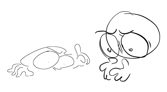
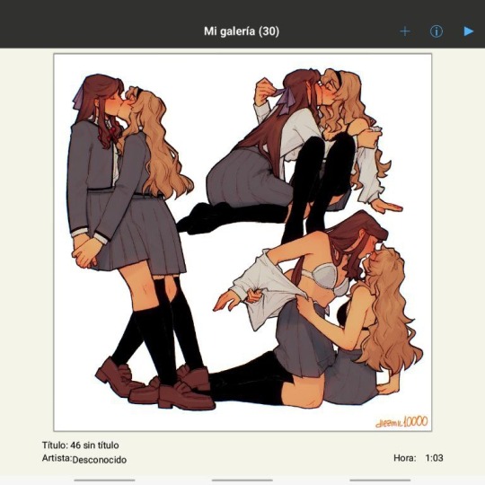
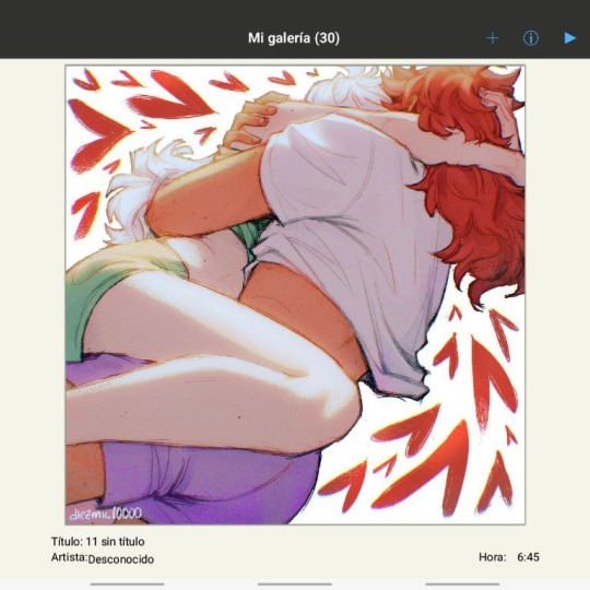
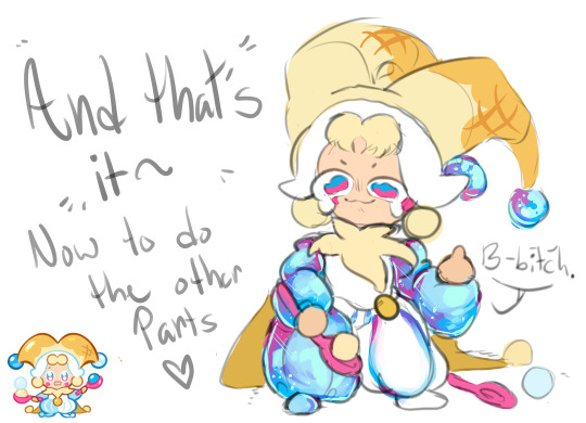
#this was not a very good brush to choose to do the lineart it was a pain but it was too late to change bc i realized it was
Text

dizzy okay?
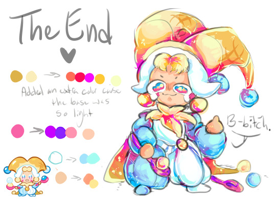
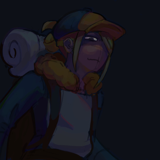
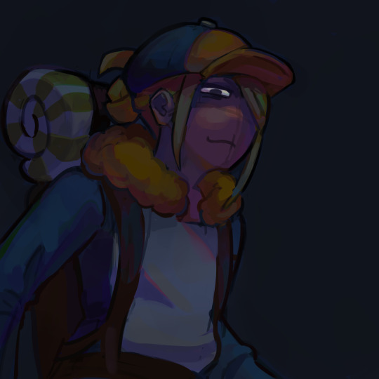
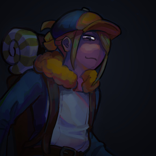
#my art#guilty gear#← scary#i tried to draw this the fastest i could before the new character announcement.... 🚶 then i got too lazy to draw necro and undine#i added more frilly stuff to her outfit bc i love to draw dresses like that theyre so cute but also i#didnt take a closer look at it bc i havent finished watching strive storymode yet o7#so all i did was look at the blurry screenshot from the wiki#she is so everything she is so nightcore anime girl okay... she has so many friends#still deciding how i want to draw her i want to change something on the face maybe hmmm#dizzys design is so cutes i rly like her :-) i love her hair it was rly fun to draw#this was not a very good brush to choose to do the lineart it was a pain but it was too late to change bc i realized it was#a pain halfway the drawing 🤸........it was fun its fun for shading though 👍#fun! ^_^
210 notes
·
View notes
Text
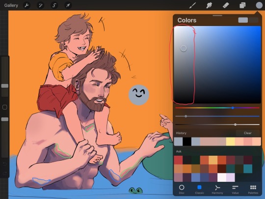
How I color manga panels: a tutorial
I'm no expert at doing recolors, I'm simply an artist who's occasionally too lazy to do my own lineart, and uses that of my favorite mangaka's so I can focus on other styles to simply have fun with my colors. I always try and choose panels or pages that are high quality, to avoid too much pixelization. Often I end up sourcing these from scanners or google images.
As far as programs, I use Krita (a free software). This all can be done with the standard brushes and tools that come with the software. But for some of the coloring, I have brushes from brush packs i like to use, as well as a few brushes I have customized myself. The main ones I use are from David Revoy, so if you want a recommendation for a great free brush pack, that's mine.
For this example I'll be using this panel from Chapter 58 of Moriarty the Patriot (I believe this would be Volume 15 of the manga) that I posted earlier here.

I'm not including the step where I crop the image, but I personally chose to remove some of the white borders that are needed for a traditional volume's page borders. Since I'm doing digital art, I don't always include them.
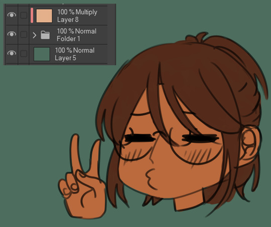
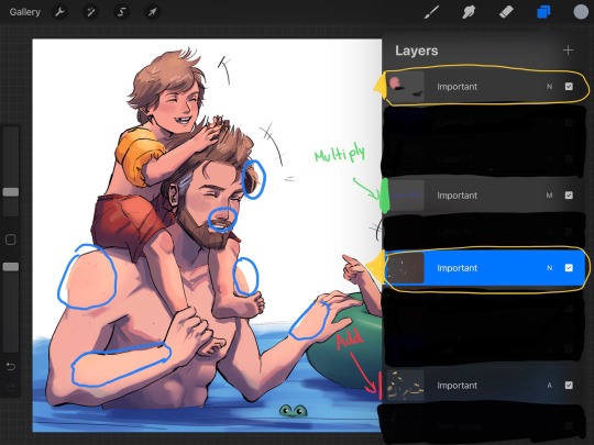
My next step is always to outline and fill the individual base layers. This includes the speech bubbles, each character, any independent props, the panels themselves and the backgrounds. There's no correct way to do this, but personally I use a brush to outline the object, then fill tool to well. Fill it, as well as the rectangle tool for the panels or straight lines I need to do.
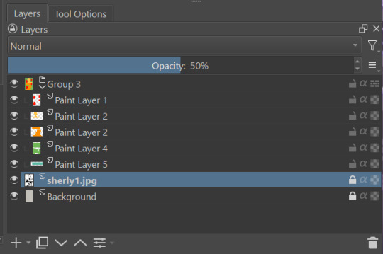
For layers, I usually put all of these color base layers in a single group that's set to multiply, and change the opacity of the base panel so that I can fill the blacked out areas with a solid color easily, here you can see I was working with the base panel at 50%, but honestly i just kind of turn it down to whatever I think looks good.
The colors I use for this step are usually brightly saturated rainbow colors so it's easy to tell the different elements apart from each other. So you end up with something that ends up looking rather horrific like this:
From here, I usually create a copy of the base panel to put over the top of the colors. This way I can have transparency for the colors on some of the blacked out parts, but don't loose some of the nuance of the shading entirely. Moriarty the Patriot is a very black heavy cell style, which is the style I find the "panel above, panel below" method works best on. However as I work on the colors, I tend to toggle between having it on or off.
It's about here where I start doing my coloring. Of course this will depend on your coloring style and art habits, however personally, I like to start with the characters. I use those colored layers as the base layer I can clip my coloring layers to.
I will often turn off the layers that I'm not currently using so I don't have to deal with eyestrain, and will change the base layer to something more suitable (often a grey or light tan) so my color theory doesn't get all messed up. The bright colors in previous steps are to make sure they're visually separate. Now they've been established, I don't have to worry about that.

I don't usually label my layers, but for the sake of the tutorial I have to make it clearer which layer grouping is which.
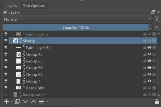
I find in this step because of the multiply layer the colors can be a bit washed out, so I tend to either use much more saturated colors than I usually do, or switch to another layer style like Linear Burn of the overall color group to make the colors pop more. Ultimately though this comes down to personal preference. If your coloring style is very de-saturated, you might not have any problems with it. (I do suggest making your base color white, so the coloring of the base panel isn't off, you'll see in the screenshots above I forgot to when working on Sherlock. Ignore my mistake)
For the parts of the image where it's primarily blacked out (such as Sherlock's hair or coat) I don't bother shading at all, and only do the highlighting, as the black takes care of the darkest tones anyways.
During my coloring, I also add a separate grouping above everything for adding rendering and details above the panels. This includes things like the eye highlights (which I always do in pure #000000 white) and making certain parts of the heavily blacked out areas pop more.
(those refs and paint layer 13 are what I'm using to color pick off of, and keep the shading colors consistent throughout the piece. There's probably a better way to do it, but I just paste them directly into the image and then delete them at the end, paint layer 43 is a color dodge layer, and so has to be outside of the layer grouping to work)
Comparison of the art without:

And with the top details and white highlights:

It's a pretty subtle difference, but I find it's the little things that truly make the piece. Especially with the strands going over the face, they need just a bit more to make them really pop. I also just really like my fancy eyes which is hard to do without the top layer.
Insert several hours of coloring here, and about another hour just trying to figure out what gradient to use for the background, and you end up with the the base colors. From here I usually mess with overlay layers as well to get the colors to all look fancy and nice together without having to do color theory (pro tip /lh).
I forgot to grab screenshots while doing the background, but for the top panel I essentially just used the [deevad 5c screentones] brush and a transparency mask to add a screentone gradient, and totally didn't google "splatter overlay" or something like that and picked something off of google, and added some borders.
Because both the base manga panel and manga panel over the top are both not at full opacity, if there is text in the page or panel (such as this one) I like to copy the just the text part of the panel and add it as full opacity in the "colors" folder to make sure it's legible and matches up the rest of the colors.
And after all that, its basically done. I'll sometimes continue to mess around with certain aspects to make sure I like how it look, but that's essentially it. This is when I add my signature, and then it's queued to post!

#krita#long post#eyestrain#art tutorial#tutorial#digital art#my art#manga recolor#manga edit#manga pannel#manga coloring#sherlock moriarty the patriot#moriarty the patriot fanart#yuukoku no moriarty#moriarty the patriot#james bonde#james bonde mtp#artists on tumblr#art resources#art help#art tips#drawing tips
62 notes
·
View notes
Note
Brushes maybe?
I’d love to figure out how you render that way ur stuff is so good! Any advice you could give maybe? The texturing is STUNNING
Hi! Thank you :]
To be fair, I'm not sure where to start as I have multiple ways to draw things, but I'll try. (Also I might show more if you choose an example if you had any specific brushes in mind)
For most recent art my favourite brushes that were used in rain world fanart have some color jitter. It's a feature that can be enabled in clip studio, but I'm sure that other programs have similar setting.
When I'm less confident in general execution of the idea or have many details to pay attention to and want to take things slowly i like to use oval marker brush. It doesn't have any texture and has somewhat soft edges so i can work from very loose blob of sketch. Its flat shape that doesn't turn with the movement allows me to "chisel" out the shapes and volume in the drawing. That's why many prefer using flat brushes instead of round.
Sometimes I straight up sketch with thin brush for lineart and clean excess lines so it looks like lineart instead of drawing one over the sketch layer from scratch. This hoverer requires a lot of practice and generally clean confident strokes so I resort to it rarely and use it for more stylised cartoonish things. Tip: you can also duplicate lineart and blur the layer and lower its opacity so the whole thing will look more interesting and less sharp.

And then there's this thing :) not sure what to add here other than that they're pretty.
As for the advice hmmmm… Probably I'd say that many brushes show their potential if you adjust your style to each, like you'd usually do with traditional medium. While keeping one favourite consistent style may be comforting, and I respect that as drawing should be what brings you joy, sometimes experimenting might be useful for you. I do have limited amount of styles for some of my favourite brushes and don't go as crazy as I could, but sometimes it feels more satisfying to let the brush guide your process with its shapes and textures instead of breaking it into your already existing pattern.
At least that's what I've been enjoying recently :) Keeping up with developing multiple styles might distract you from learning other aspects, so to choose what's better is always up to you.
I wish I'd had more in-depth advices on how to render in general but figuring it out was a complex and long process for me as well
#hrishchask#first ask! yay#my art#i assume that op probably wanted me to give them some brushes as files but i have no idea how to export the entire pack lmao sorry#i probably build sentences in a weird way but english isn't my first language sorry
39 notes
·
View notes
Note
Hii this question is random sorry but I see the way you draw and I'm like WOW and obviously you don't have to do anything but I was just wondering like the brush you use and how you pick your colors? Cause your art tastes like playing videogames on the floor surrounded by cousins while it's hot and the fan is trying so hard. And also little kid soup BUT THE GOOD KIND. YK?
little kid soup is crazyyyyyyyyyy but i use 1. csp & SU cream pencil for lineart, waterpen 2 for flat colors (but its a very basic one you could use literally any kind of brush), sometimes i use the default gouache brush to make my colors less flat because i do not render, and then for shading i use mirre's marker
as for colors, i just choose the colors i like and just keep them muted and on low contrast? i also keep my palettes very minimal, otherwise im not really putting much technical thought into my coloring style i just tweak it until i like it :)
also i play around a lot with overlays!
#but one thing that helps is to just flat color thw whole piece very roughly to see what you like and what you dont like#rather than coloring bits and pieces in detail and realizing onöy afterwards that it kinda doesnt have the look that you want for the whole#asks
29 notes
·
View notes
Note
For the feedback on the brush: I personally think it makes your art seem a little more cartoon-ish, which I think suits your style (which is amazing by the way, I just wanna, wanna squish) (Also! The brush reminds me of the artstyle in Gravity falls)
I know the kinda struggle one may have with the line weight (I use brushes like these all the time, they can absolutely get frustrating at times)
I know tons of artists (or rather artsytles) that use a brush that doesn't vary depending on how fast you draw with in or how much pressure you're putting on it, and it doesn't look cheap at all!
I think the other brush looks very good as well, but if I had to choose, I actually think I'd rather have the new one that doesn't vary depending on how you draw (I personally would draw thicker lineart with a brush like that, or atleast on the outside, but you do you and your art is amazing :] )
Long story short: I like both very much, your artstyle is squishy, and respect you've been doing this for 500 days and have literally been one of the hughlights of my day (I don't watch Etho too often, probably should, but still :D)
This ask made me think so much about like my art style and like why does the pixel brush just.. feels better. I think it has to do with my transition from sketch to line work
Heres a random sketch (not the best example but work with me.) Both are pretty expressive i think

And here’s the line work with both of them. I noticed with the line work one I was so focused on trying to make some of the line weight makes sense that I lost some of the expressiveness of the original sketch. Meanwhile with the other one i was able to keep some of that expressiveness??
Idk, this is just for me. I love using brush pens in real life but i think with digital art I tend to be overly perfectionist. Meanwhile with traditional art i have a mindset of “if it’s on the paper it stays on the paper” So im less likely to be all focused on mistakes? Idk if this is even true, it could be a completely different reason that i didnt catch when i was drawing but this is my best guess atm. ALSO TYSM FJDSKFSJESKD honestly im just happy that other people are still interested in my silly little ethos and people are willing to give feedback on my art and help me improve. Thank u for such a detailed ask :3
23 notes
·
View notes
Note
Hi hi, hope you're doing well!!
Wanted to ask if you could explain how you pick colours! They're always so appealing to look at...
(If you could also explain how you pick blush colours it'd be great! I never manage to pick good ones, no matter how hard I try :'))
hi anon, i'm doing fine!! it's summer right now where i live and that's healing all my problems (◡ ω ◡)
i have recorded the process of some of my drawings and everything is posted in my youtube channel (in twitter too), so i'll drop the link here and try my best to explain the coloring part to you. the short answer is that none of the colors you see in my drawings are similar to those i initially picked.
i try to keep my lineart loose but i pay attention to the outlines so i can quickly select the outer parts, invert the selection and fill it with the bucket tool. my base colors are all 100% opaque and i don't use any fancy brushes here.
as to how i pick colors, i never use the color picker tool, i eyeball everything. that's important for me because i tend to make all of them warmer: the greens are dark yellows, the pinks are light reds, and everything that's close to blue is very desaturated. i do this even for drawings that turn out much different later, unless i have a very specific vibe in mind from the beginning. i also never use pure whites for anything, and if something is black i make it part of the lineart.
then i always color my lineart!! there's no trick to that, the layer is in normal mode and i just paint it with a darker color than what's below it. i usually add the shadows and highlights at this stage of the drawing too. you're going to kill me for this but shade with gray set in color burn or linear burn (never multiply). i just don't want to think about color variety at this stage because it makes things more difficult for later. sometimes i add textures and some basic color correction here (curves, color balance, layers set in overlay, etc.) but i mostly leave that for the next part.
as to how i choose blush colors, i usually pick the base color and move it towards the saturated end of the color wheel, and a bit more pink. sometimes i add a multiply layer and airbrush hot red over the base colors at low opacity. coloring the lineart with hot colors surrounding the blush areas helps a lot too :)
i also almost always duplicate the lineart, blur it and set it in linear burn (i paint this layer in a light gray). this adds a lot of depth to the drawing, especially if later combined with the bloom effect.
the key to why the colors in my art pop so much is that i don't enjoy drawing as much as i enjoy postprocessing pictures 😂🤣😅👌✌️👍 once i'm satisfied with the "base" colors i merge everything except the background, open a new canvas and go crazy with filters and textures. that's why i use ibispaint X even if i do the lineart elsewhere (krita), and even if it works a bit wonky with big canvases.
i do something different for each drawing here, so first i'm going to explain my reasoning so that you understand my process: i used to have a problem of using very strong colors that overshadowed my beloved lineart into which i had put a lot of effort, so my goal nowadays is to make everything look less contrasted without losing the visual impact of saturated colors. that way the lineart remains a strong point and not just a way to separate one color from another.
what i usually do is duplicate the new merged layer, set it to exclusion mode, add a gradient map and play with the opacity. then i duplicate that and do the same thing with another gradient or another blending mode. i tend to add like 3-6 layers of bullshit over my drawings, including textures and other filters like "bloom" or "sharpen". i understand everything that's going on there but i don't think too deeply about it, i just pick whatever looks best.
for the final touches i always pull up the saturation and contrast (since a lot of it gets lost in the process), and i usually have to manually change some colors (ibispaint X has a filter to do that) or tweak the curves. then i add chromatic aberration, noise set to overlay and little polka dots set to linear dodge.
here are some comparisons of the before and after of recent drawings. the 1st one is very subtle, but you can clearly see how much warmth and depth it gains it gets after all the postprocessing. the 2nd one is so different that i understand why you're curious about how i pick colors. i don't think i can replicate that look just from picking nice colors, there's a lot more going on!! the 3rd one personally feels like it had potential lost (i liked the yellow highlights), but the colors were too strong and all over the place, so the finished result looks more intimate and calm and i like it a lot more.

thank you for the interest anon, i'm very happy that you like the way i color things and i hope i have explained myself. good luck with your own journey!!
24 notes
·
View notes
Note
Hello!! I'm trying to get back into digital art but basically starting from scratch again (like I think my last serious work was in 2016 lol orz). I really, really love the way you do lineart - from the brush settings, to the way they're colored, to the line weight...! I was wondering if you have any tips, tutorials, tools you recommend? (Especially about lineart but for anything and everything is cool too! Again, your art and aesthetic are very <3)
Oh you're too sweet, thank you for the kind words!! And that's so great to hear, it's never too late to start drawing again! You'll have so much fun ^_^
And hmmm lineart tips...I just use the default G pen in medibang paint for my lines, it's just a basic brush with a little bit of texture which I like! I'm not sure which program you're using but i definitely recommend medibang or firealpaca if you're just starting out because they're really simple free programs! super beginner friendly!
When I color in the lineart I rarely use just plain black for the colors, I usually go for a darker shade of an existing color in the palette(I color in the lineart after I lay down the flats for the piece! and sometimes make little edits if I choose to add shading) As for line weight, it definitely helps to study from life! like in areas where you'd imagine a lot of shadows I like to use thicker lines if that makes sense?? I'm not super good at explaining this LOL but i just like to keep it varied with both thin and thick lines!
hope I was able to help a little bit!! I know you'll create something great!! <3
4 notes
·
View notes
Note
I've been using Ibis Paint X for a little while and I need some advice, how do you make everything so, neat? Clean? Idk a good word for it. I can't ever seem to figure out how to have things, not look very, very pixely.
A big canvas size is usually the way to fix when art looks pixelated, sometimes the canvas could be too small and reduces the image quality.

When I choose a canvas size for a comic page I always make sure the H is at its max at 4096 ( also as long as it doesn't go below 3000 it's fine too) cause it increases the image quality. W doesn't really matter, you can set that pretty much however you want.
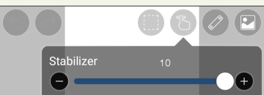
Also make sure the brush stabilizer is all the way up. It helps make your brush strokes neater and cleaner, especially when doing lineart. Makes the lines a lot smoother ^^
57 notes
·
View notes
Note
hii, sorry to bother but i absolutely adore your art and i was wondering what program and brushes you use to make the "cg art" i guess? like, the ones that look like cgs from the game!! its so gorgeous!!
Oii sweetie! Don't apologize, you're welcome and ask is always open for talks, headcanons or questions! I hope you are patient and enjoy reading, because I want to be much more detailed! 💕💕
Initially, I'm going to go for the main thing that's the program! I draw on my phone because I do not have tablet or computer, and this information is very important because MANY things are limited and different from the smartphone compared to computers and tablets!
Program/App I use:
This is the app I use! (Need to update actually)
ibis PaintX is a great tool for digital arts and illustrations! ALL my arts and drawings I do in this app because, among the other drawing apps, in my opinion this is the best and what I'm used to the most!
However, it is not my favorite!! Some brushes do not act in a very "soft" way or something I do does not leave my drawings very professional, so I think in quality it leaves to crave a little! If you can pay, choose Clip Studio Paint instead! It is really professional and along with Photoshop, are the best for any digital art. Clip Studio Paint was made more for art, manga, poses, more anime-oriented!

There are many paid functions and as I am still a student (and i don't get all my parents' money) I can't afford it! But if you can, invest!!!!
The style painting I follow:
It is important to take into account the style of painting that I follow and i am inspired to paint my cg comissions, because they have a big difference between them that influence rather in the choice of brushes. If I'm not mistaken, was there an exchange of illustrators after HDB? Satoi who originally designed it and from More Blood the cgs adopted another style of painting, look at the example below:
Hauted Dark Bridal // Chaos Lineage
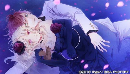
See how this greatly influences the brushes, as they are and have different textures! Notice the difference in atmosphere too, isn't it different?!
I use the HDB painting style because it looks more deeper, with more contrast and this beautiful glow around the edges 🥴💜 But it's just my preference okay? I've been saying since you've been looking for my influence!
The line always gave this more watery look, so here comes the watercolor brushes!
Diabolik lovers, although changing the style, always handled the water brushes always with great dexterity in their designs. What I really appreciate so 💜 I'll leave here a picture with the brushes I use, all being water or watercolor! Some more softs and Airs, others harder and with striking edges:
( The appl was in PT-BR and I did not find how to change to ENG, so I hope you find them! 💭😅)


The App also has texture options for papers and watercolor papers but I DON'T use them.
How do I paint?
I'll leave here a mini tutorial very basic of how I do to paint and mix all that paint! For this, I made a drawing somewhat simple and disproportionate kkk but what counts is a new perspective for you to understand!
For the lineart I use the Drawing Pen! The pen pattern for most common lineart, a more uniform and solid stroke for your drawings.
When I finish the lineart, I move on to the painting step! And before using all those water brushes, I first paint the design with the Hard Pen to give a base color and create a better harmony afterwards, because the watercolor and water brushes themselves are kind of transparent and need a base to harmonize much better with art!
See that the base color gave a good start to the water brushes. The skin is already ready with the water brushes and with a water more Air I gave that smoky aspect on the neck, to give a more vivid /real skin contrast and take the pallor. To paint the shadow of the neck I also used the Hard Pen, because the watercolor of ibis PaintX has very hard edges, so I turned on the Alpha Lock on the layer and painted with the brush inside; to give that watercolor look but not get that rigid edge.

When I finished the skin I went to the details of the hair. It looks less like my cgs because there aren't as many details on the strands and hair, but the brushes are always the same. Sometimes I use the Hard Pen for contrast and shadows, sometimes I use watercolor, sometimes I use water brush, anyway; always switching to one that I think makes it better.
These were the brushes I used to paint and finish the illustration:
I point out here at the end that I'm not satisfied with my art, and that I still think there's more quality missing and in the brushes of ibis PaintX. It's not one of my favorites but I feel like it's one of the only ones I've been able to adapt to and like more, maybe I'll do another tutorial in the future.
Even if you asked me about the brushes and my handling of each of them, you have the total free pass to paint as and in the order you want ❤️❤️ even if they are the same brushes the art may end up not getting equal, because each of us have our own unique styles and wills! Paint as you see best! ❤️❤️💜💜💜
Thank you for the ask, I wish I had posted more photos but I reached the limit, so I hope I helped with these images I put sweetie!!
#cute ask#question: what do brushes and app you use in your cg arts#diabolik lovers#anonymous#admin notes#thank you so much!!! 💕💕💕🍭🍭🍨#brushes and preferences
46 notes
·
View notes
Note
I want to preface this by saying that I really enjoy and look up to the work that you do. Do you have any advice for improving digital drawing skills? How you do anatomy, how you found and chose your tools and workflow, that sort of thing.
Hey thanks that means a lot, and I appreciate the questions!! I have a feeling this’ll end up being a long-winded explanation, so strap in.
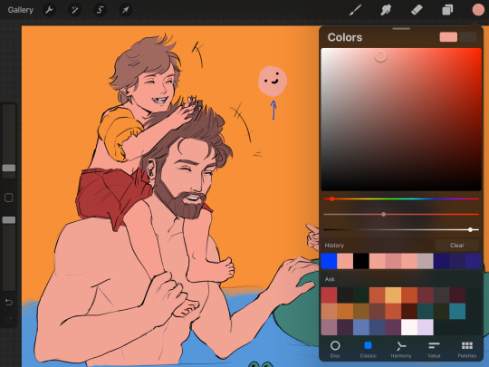
To begin with I tried a lot of different programs, but I ended up on procreate because it just feels the most natural to me! I draw on an ipad with an apple pencil, pretty standard stuff there.
As for the specific tools I use in procreate I actually just use the default round brush under paintbrushes for pretty much everything. Aside from a few more technical brushes for effects and patterns and whatnot, but all those are default brushes too!
When I first started digital art a couple years ago I really had no experience with it whatsoever. I had done traditional art throughout my whole life up until that point, but digital was a whole new beast. A lot of my skills with traditional work definitely carried over, especially once I started to get more comfortable working in digital.
The main thing I can tell you, and which I’m sure you’ve heard countless times already is practice practice practice! You don’t have to slave away practicing eight hours a day and devoting your life to it, but make sure you’re drawing smart! Any drawing is good drawing, but if you really want to improve try and make your practice a bit more focused. Pick one specific thing you struggle with at a time and work on them individually. Drawing from reference is always a good place to start.
As for my workflow, it’s honestly pretty horrible, but it works for me, so that’s all that matters tbh. You just gotta mess around with different things until you figure out what feels most comfortable and natural to your process.
Typically I’ll start from a reference, then once I’ve got enought of the figure down I’ll start to make adjustments with the liquify tool and clean up lines. I personally don’t use any sort of gesture or skeleton when I sketch, I just go straight into the lines and adjust as I go, then clean them up to a point I’m happy with. I also use a ton of layers so I can move around parts easier.
After this I start painting in my flat colors on a layer below the lineart, pretty standard stuff there! Typically when I choose colors I try and keep them all in the same family or tones, so you’ll see all my vampires have very cool tones and a lot of purple. Even the black and white colors have some cool tints in them.
Once my flats are finished I move on to the shadows. I start with the biggest section of color first, usually the skin, and make a clipping layer above it. I set the clip layer to overlay, then depending on the skin tone I use a very dark blue or dark red color for the shadows. This also often takes a bit of adjusting transparency and other values, but I’ve eventually gotten a feel for it.
When actually painting in the shadows I start pretty basic just to block out shapes and get an idea of where I want the light source to be. Then I go back in finer detail. Once I finish with a pass of shadow, depending on how it looks I’ll duplicate the layer, adjust transparency, then use gaussian blur to soften the edges while keeping the original shapes in tact. I also use the smudge tool occasionally for finer adjustments as well.
I do a similar process for each block of color until it’s to my liking. Sometimes, especially on the skin tone, I’ll go back and add another overlay layer above the shadows to do some countershading, which just makes things look a bit more three dimensional.
Once all the shading is finished I go back on the skin very gently with a soft, red airbrush to give it a bit of warmth and life, especially around the face. After this I use a white noise brush on another overlay layer to add some subtle highlights and skin texture. For shiny things like hair I make yet another overlay layer, and use a random brush pack I found online that has some nice water effects.
Once all the rendering and other effects are complete I then go back to my lineart layer, make a duplicate, then color it in red with a clipping mask. I take this new red lineart and bring it all the way down to above where the skin tone layer is. This has a very subtle effect, but it makes all the difference imo. After that I go back to the lineart layer once again and make a clipping layer above it, then gently use a red airbrush around where the light hits brightest. I do the same with a dark blue airbrush on the parts with the most shadow. This gives the lineart a bit of variation in color!
Lastly I just sorta wing the background most of the time so I can’t give you much assistance there haha.
Again, apologies for the super long explanation that probably makes zero sense, but I hope you’re able to at least glean some amount of knowledge from my process!!
2 notes
·
View notes
Text
FAQ
~~~~~~~~~~~~~~~~~~~~~~~~~~~~~~~~~~~~~~~~~~~~~
1.0 TOOLS
.01 What materials/programmes do you use?
iPad Pro 2020, 12.9” with Apple Pencil Gen 2
iOS Procreate (drawing process)
Photoshop 2022 (post-edit process) + XP-pen Deco 01 (v2) tablet
.02 What brushes are you using?
I use a combination of brushes released by Lotusbubble, JingSketch, Jeremy Fenske, and Devin Elle Kurtz.
.04 Where would you suggest I learn about…
anatomy: Morpho Anatomy books, life drawing classes, pinterest, theposearchives (dA)
colour theory: Marc Brunet’s tutorials, Colour.adobe resources
character design: Marc Brunet’s tutorials
.06 Art book recommendations?
Here’s a list of my favourite books:
Creating a Champion (The Legend of Zelda: Breath of the Wild)
The Art of Raya and the Last Dragon
The Art of Encanto
Tokyo Storefronts by Mateusz Urbanowicz
The Art of Heikala by Heikala
The Art of Kiki’s Delivery Service
.07 Do you do tutorials?
Not at the moment. But in the future I would like to do tutorials on my Patreon page.
2.0 Art and Bee
.00 Who are you even?
I am a very short girl, who enjoys drawing fandoms such as Harry Potter and The Legend of Zelda. As of now, I am 26 years old, and I work as a freelance artist and ESL teacher. I LOVE peach tea.
.01 Did you go to art school?
No. I am self-taught. I actually have masters in chemistry. I dropped out of my Chemistry PhD in my first year because I realised that science is not something I want to pursue in my life. I do not regret studying chemistry though - it was a very interesting and valuable experience. Would I have the chance to choose now though, I’d go study degree in Illustration.
.02 Who are your favourite artists?
Here are some that I often turn to for inspiration:
Mimimaru, Heikala, Mateusz Urbanowicz, Ladowska, Mehkuni, Devin Elle Kurtz, Marc Brunet and many others.
.03 How do you motivate yourself to draw every day?
I really make sure I draw what I enjoy. There are days I wake up and I do not feel like picking up my pen. When this happens, it is about time to turn back to studying. I go to my Morpho books, youtube tutorials and my favourite artists and I dedicate the day to anatomy studies, colour theory etc. That way I do feel accomplished although no illustration is done in the process.
.04 How to get out of art block?
Take a break. No seriously. If art frustrates you, it is time to put it down and take-a-well-deserved-break. I hit the wall 2-3 a year and usually, it comes after a big project or when I refuse to pace myself.
This relates to the previous questions, but when a time like this hits, I often restrict myself to no art for up to 3-5 days. Instead, I go back to passive studying - watching tutorials, watching an animated film, reading some books, playing video games for inspiration.
Sometimes it also helps to switch a medium. So for example I go from digital to traditional.
.05 What is you digital art process like?
I start with light gesture drawings followed by detailed soft lineart. Then I shade in black and white. When this is done, I turn the black and white sketch to red (using curves) and with multiply layers, I block in the basic colours. Then I create a normal layers and I begin to paint in all other details. I often finish the background first before I move on to the characters.
.06 Why don’t you do traditional anymore?
In 2020 I had to move to my parent’s house for 4 months while I was recovering from an illness. I had to leave all my traditional media in my flat in a completely different country. I only had my old iPad with me, which was the only way I could do art. I have been drawing digitally on my iPad since.
Once in a while, I still use the good old pencil and paper, but I found that digital painting gives me great creative freedom and helps me to visualise my light-up fantasy brain cells. hahaha
In general - I just enjoy digital painting more at the moment.
I still do oil painting once in a while tho!
3.0 USE OF MY ART
.01 Can I use your art for my pfp?
Yes, BUT! Please do message me for permission and make sure you credit the art appropriately.
.02 Can I use your art for bookbinding fanfictions?
Now - please read this carefully.
I ONLY allow use of my art in fanfiction bookbinding if it’s a NON-PROFIT bind (ie only cost of materials is paid for). Please DO message me in dms (ig, twitter, tumblr) if you want to use my art in your binds. The chances are most likely I will say yes and be very excited to see the outcome!!!
4.0 COMMISSIONS
.01 Are you available for commissions?
Yes! You can find the link to all the details here.
.02 Why are your commissions so expensive?
I only charge for labour and the time spent on the commission. For a full-illustrated type of commission, I can spend up to 30 hours working on it, hence the high price.
.03 How long will your commission take?
I ask for my customers to count with 2-4 weeks from the date the payment is received. This is because often I have a couple of projects before I commence on your commission. I also count in any unexpected events such as an illness, my teaching job hurdles, art block, and inspiration dips.
.04 What you will/will not draw for me?
Will do: humans (fanart, OCs, irl), pfp’s, larger illustrations, and character designs
Will NOT do: nsfw, fetishes, gore, mecha, furry, animals/pets, hateful art, ships I am not comfy with
1 note
·
View note
Photo

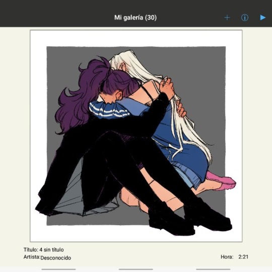
Okay so I generally have two styles for doing shaded stuff
Painted and then my “holographic sticker” style with the dots and that one swishy dotty gradient pen. This is for my painted style!!! Long story short here’s a tutorial on how I do that for some friends on discord hehe.


AND TADAAAAAA THATS HOW I DO IT~~
cant read my absolutely ADDHORENT handwriting? No worries!!!! Captions/Transcript + some extra notes below !!!
TRANSCRIPT!
Step 1: Lay down your flat colors! I always color drop everything to make sure its as close as possible. The only time I don’t color drop is if I’m adjusting a red to a more pinkish color!
Step 2: Shading time! The first step is to choose what color you want to work with!! Remember that when you’re shading that SATURATED IS BETTER. Don’t darken the color unless you really need to. Just make it more saturated and/or cooler. Cooler colors are darker than warm tones. So if you need to adjust go saturated - cooler - and then lastly darker if needed!!
For the sake of the tutorial make 3 colors.
The first one a saturated color / A DARKER saturated color / a complimentary or contrasting color. This is our lightest to darkest scale!
To start off take your first color and cell shade ONE FLAT COLOR or SECTION with it!!!! Do NOT use this for the ENTIRE drawing!! Work in pieces!!!
Step 3: Add a gradient to that cell shade~~ So you just used 1/3 colors to cell shade with. Now take your other two colors and create a gradient with it!!! You’ll want a blendable brush for this. I like CSP’s oil flat brush! Make sure your contrasting color is in the darkest spots!
Step 4: Blend with the flat color bordering your cell shade!! AKA just make the border that meets the cell shade softer.
Honestly, dont worry about making it clean. Really all you need to do is take a few strokes of the flat color and put it into the cell shade a little and youre good to go. I like doing little dashes. Also when you do this feel free to take that yummy contrasting color and make it bleed up towards the lighter color!! It’s not accurate with like how shading works or whatever, but it looks super fucking cool.
Step 5: Highlights!! Its time to add some highlights!! Basic rule for highlights.
Warm flat color = cool toned highlight!
Cool flat color = warm toned highlight!
Literally just put this color anywhere you want a shine and then take that color and OUTLINE the cell shade like riiiiiight up against the lineart. Trace your lineart with this color where its darkest basically. This counts as your “backlighting” and all that nonsense, but more importantly it just looks cool. If your highlight is too bright for the shadows you can also outline with your flat color!!
Step 6: Details!! Add sparkles and shit. I also like little lines. Draw diamonds, fish, stars, planets, flowers, etc etc. Whatever the fuck you want! I use the highlight color or I use a slightly lighter version of it to do this
Aaaaand youre done!!!!!
I don’t do all of these in this order obviously, usually I wait until I do EVERYTHING with cell shading before I add my highlights and details, but for the sake of doing one section of the tutorial I figured it would be easier to see how its done. If you wanna try drawing this way just know that with time you dont need to plan out your colors and eventually youll just know what to do as you go along and you’ll probably jump around a bunch.
My tips are make it messy, have fun with it, dont worry about all the little details until the very END (i.e lines or patterns on the clothes. You’ll just cover it up otherwise), and feel free to fuck with your glorified cell shade as much as you want!!!
Dont over think it either~ Its literally just a cell shade with a gradient + highlights that outline the lineart where its darkest. Thats alllll it is~
Hope this helped and have fun drawing guyssssss
#im actually shit at drawing tutorials#but i hope this explained some of it lmfao#if this made even a little sense ill be happy#art tutorial#shading#my art#cookie run#lmao tagging that anyways
148 notes
·
View notes
Note
hello, do you have any sort of tips for someone who is new at art? your coloring is always so immaculate,just so perfectly done. i really mine were half as pretty as yours but they are so bad and dull :/
Wow I'm flattered that you like the way I color things! Bc for the most part idk what the fuck I'm even doing, it's all about trying things out and seeing if it looks alright.
I'm not a professionalist and I don't believe there's only one correct way of creating art, so please, don't take it too seriously. This is just how I do things (and im gonna use a very simple sketch for it).
So, I'm starting off by coloring. Every color has it's own layer - I have layers dedicated for hair, skin, etc, and I put them in a folder.

Then, I create a new layer above the folder (and fill it with color showed below) and clip it to the folder. I set the blending mode of the layer on multiply. And then, it already looks better! Multiply layers work like a charm.
The next thing I do is shading. I do the shading on the same layers that i filled with colors. Basically I copy colors using an eyedropper (for example i copy the color of the hair -with a multiply layer visible!- and i draw over the hair using a soft watercolor brush in places that i want to shade, on a layer dedicated to hair). That's another advantage of using multiply layers - you basically don't need to choose colors for shading by yourself, all you need to do is use eyedropper ;)

Then I do the lighting - i create a new layer above my multiply layer and set it on hard light. For lighting, i use a very similar color to the one i used for multiply layer. I use a soft brush for lighting.

And then I'm always finished. I only draw additional lighter lines on hair, and change the colors of the lineart. I like to leave the outline black, though. And I'm done!

So, in short- if you have a problem with dullnes of your colors, I'd reccommend you trying multiply layers and experimenting with the warm tones. The other thing I've noticed is that the way your colors look depends on the device you're using. For example, before I post anything, i always send it to my phone to check if the colors look alright and aren't too much. Because my computer screen views colors as more dull than they actually are.
But like I said, especially if you're new, it's important to just check things out. Check if shading with soft brushes works for you, because who knows? Maybe you will prefer shading with a hard brush? Maybe you'll end up liking doing messy lineart, orrr you will completely fall for clean lines and hard brushes? You'll figure it out, eventually. Good luck! :)
#okay so i had a really hard time expressing myself in english this time but i hope you understood at least half of my ramblings lmao#bamask
60 notes
·
View notes
Note
hello !! i'm absolutely in LOVE with your art and i wanted to know how did you colour and choose your colour palette (especially the skin,,,) in your latest uncle obi post ? 😳👉👈
i dunno how to explain but there's that soft yet sharp?? pink glow that contrasts with the skin tone and the blueish-shadows and it's so so pretty...
plz continue to make beautiful art and take care of yourself 💖
AAAA TYSM 💖💖💖 I’m literally the worst explaining these things tho :’) I’ll try my best :’o
Also little disclaimer before starting: drawing is just my hobby so I’m not posting this as a tutorial (?) this is just to show you my process aaaa, I’m sure a professional would help you a lot more than me with this but I hope I’m able to help you in someway 💖💖💖) (also, I know someone else asked me about my drawing process a while ago, it had to do with shading, lighting and color picking, but I wasn’t sure how to respond until now aaaa, sorry about the delay 😔, I’ll answer both questions here)
Ok, so first of all, I choose my background color :0. Background colors affect how your eyes perceive all other colors so it’s very important for me to start with that (like white background makes you choose whiter (?) or less saturated colors. Red background: redder colors, etc)
When I want a white background, I tend to use another color at first and then when I’m finished, I change it back to white just because most of the time my colors are not that good when I’m painting on a white canvas.
This drawing, for example, I painted first on a yellow background and later I changed it to white :) (this also applies to complex backgrounds... I always start with painting the background)

Then I open a new layer and place base colors :). I pointed out the color I used on Obi’s skin :)...
Now I open another new layer, set it to clipping mask and I paint a little bit of blush here and there on the skin with the standard round brush on approximately 40% opacity. I also use the same color for the lips :). (I covered up stuff that is not necessary with black to not confuse you lol 💖)
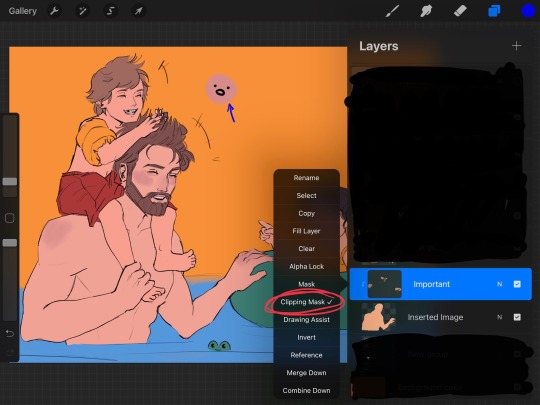
Now here’s where the fun begins :D... I have two things I apply to pick shadow colors and light colors
1. First I pick my “most common” colors (these would be the purpleish/blueish for shadows and kind of a yellowish tone for light, I circled them with blue on the pictures) but how did I got to these? (This might sound so stupid but it works for me lol) (look at the pictures below to understand better 😂) When I want to pick a color for shadows, I slide the color picker to the left, and if I want to pick a color for lighting, I slide it to the right :D ISKDMDKKF LOL Yes you read well aaa it doesn’t always works but 90% of the time does lol, if I’m using pretty “normal” lighting like this one on a drawing, works perfectly 😂
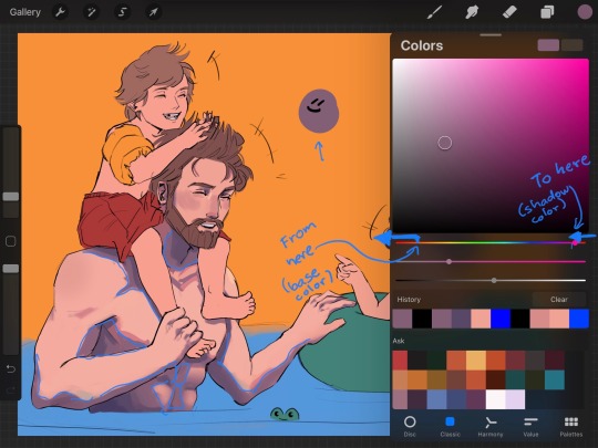
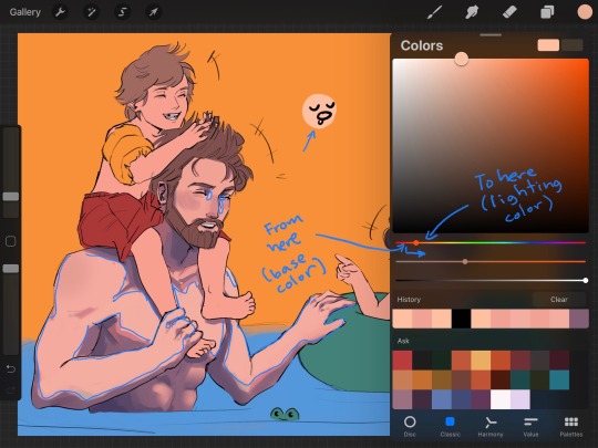
There’s no rule for me to know exactly where to “stop sliding” lol I just test how it looks and also play around with saturation a little. I must poin out, I never use the same color on all shadows (like a solid cell of color) I pick more tones of purple/ blue for shadows and more tones of yellow for lighting to put in there so it looks more natural. I use the airbrush to help me with that as well as the round brush.
2. So this is what really makes it look good. First some VERY short theory to understand why I do this and to help you apply it on other things. Light can not only come from a direct light source (like the sun, a lamp, fire, etc), light bounces, and when it bounces it kind of “brings the colors with it”
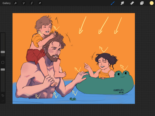
The arrows are pointing the direction of sun light. See what it does?
So when I’m coloring, I pay attention to the surroundings. In this case, light bouncing from the water, light bouncing from the green float tube, light bouncing from Luke’s red shorts, etc, all coming to Obi’s skin. Adding these, imo, makes everything look awesome
Of course, as the light bounces more and more, the colors become less saturated. Let’s take the light coming from the water for example. How do I choose the right color to paint this light on Obi’s skin?: I go to the blue tones and I just pick a very desaturated tone :), with the help of the standard round brush with approximately 40% opacity, I put a little bit of blue tones where I believe this light will hit the skin (circles with blue⬇️)
*Red circle is showing where the less saturated colors are*
This drawing was made kind of fast lol, so I didn’t really pay much attention to this here, but other drawings of mine show this better :0.
The “pink glow” you mentioned is something that I like to add to separate light from shadow :) you can see it above pointed in green⬆️ (I just like how it looks aaa)
Finally I change the background color to white.
I also add some freckles to the arms and chest
I add a multiply layer with 40%- 50% opacity and, with a blue saturated tone, I darken some places I wish to be more dark (like the abdomen, Obi Wan’s neck, some parts on the water, etc)
I open another layer set on “add” (15%-20% opacity) and, with a yellowish saturated tone, I lighten some other places like hair, arms, float tube, etc
Finally I open a layer (or two) above everything (layers marked with yellow) and I start painting over the lineart where I consider needs some work (I marked those places with blue), sometimes I also add texture with other brushes in this layer too :0.
And that’s it oof lol, hope it wasn’t too long ;;; also ignore grammar mistakes aaa English is not my first language :’D
#obi wan kenobi#art process#ask#artists on tumblr#my art#coffe chats#hope it’s not super confusing :’)#coffe art
266 notes
·
View notes
Text
gonna post progress pics from my volo painting and write a bit about my process since some1 asked for them!
excluding adjustment layers this has 20 layers in all. i wont show all of them bc some of them just have minor differences but ill show my general progress
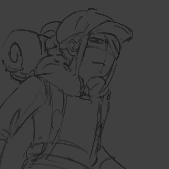
sketch. just super loose but has enough visual clarity to be able to work off of and not have to fix issues caused by poor anatomy etc later
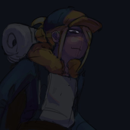
background color + painting under sketch. to choose colors, i go on the color wheel and just kinda choose colors freely and almost randomly & paint w them by very lightly pressing with a hard round elliptical opacity brush set to a large size, blending other colors on top of them this way. i dont use this brush the whole way through but honestly i couldve and it still wouldve turned out good
a lot of trial and error but because were doing it so loosely its pretty easy to find something that works quickly (also sorry the painting is so dark at this point oops)
developed painting a bit more and upped saturation in some places using an adjustment layer.
to get a lot of the color variations im getting here, i colorpick from other areas of the piece, ie colorpicking from the face and using it as subtle lighting for the hair, seeing i like how those colors look, and using that as a jumping off point and using a more intense pink for the hair shading. you can also see i got some of the yellowish on the sleeping bag or whatever tf he has on his back from the hair/hat/etc, just brushed it on there really lightly and it looks cool. another place i like to colorpick from is where the sketch overlaps with the colors underneath, it creates some interesting desaturated colors.
you can also see im developing linework a tiny bit here, its pretty early on and a lot of it will be painted over later anyways but i start being like, okay the 3d forms i've been making are working, let's draw on top of the sketch a bit to encapsulate those areas
but yeah uhh definitely a lot of this is just testing stuff out when i'm this early in the painting, i am aaaalways in motion, never stopping and just working off of instinct and what looks cool. and if i mess something up, i can just erase it and i'll have the layer underneath to fall back on.
also im just straight up not thinking about anything at this point unless im trying to closely replicate a reference image, which i didnt do very much. i use reference for eeeeeeverything i make. i took a pic of myself at a similar angle to this and then loosely based the sketch off of it, looked at pics of volo, later on looked at some reference of how ppl paint fabric, grabbed some pics of how i drew one of my ocs who makes a similar expression w his eyes, grabbed images of other digital paintings i'd made! because i wanted to work in a certain style i'd done maybe only twice before. for reference images, i use pureref, which i would highly recommend to any artist, especially ones without dual monitors (like me). basically just allows you to make a reference board and pin it on the very top of your screen
just developed more in the same fashion, then threw a couple adjustment layers over it. i toned back some of these adjustments later but yeah. you can see the lineart really starting to come together, a lot of the color variation on it colorpicked from accidental overlapping colors that ended up looking cool. btw i need to make it clear i do lineart and rendering on the same layers. also i did the stripes on the pack just by using a multiply layer, then giving it more love on the layer immediately above it so it doesnt look cheap
more rendering, got a vignette going w a multiply layer. actually started using reference for fabric folds. theyre really simply done honestly and dont look like. amazing. but they work
painted over the vignette in the background to make it a bit more interesting & not just a gradient, more rendering as usual, threw in some subtle highlights to make it a little more interesting! i probably couldve gone further with them honestly. also decided to do a really subtle outline around him cuz it looks cool. lineart is basically done at this point and this is where i started to think i was just about done

desaturated it a little bit, re-added some details i forgot about, generally fiddled with stuff and corrected some mistakes, added signature. and its DONE. i think this took me about four-four and a half hours? yeah something like that
other general notes:
-probably favorite part of this is the sleeping bag or whatever the hell that thing is on his backpack
-not entirely happy with how i did the fluffy part, it has some really cool color shifts but it doesnt feel like a proper 3d form all the way through to me. definitely pretty 2 dimensional in spots, but i was like eh i dont care enough to fix it
-although i think the pose works well enough, its definitely another example of me using pretty static poses and basic composition in my art. which isnt too terrible but i really need to start getting outside of my comfort zone on that stuff. this definitely couldve looked cooler if i developed the pose more and did better foreshortening but i didnt cuz that shiht is hard to me. im really awful at foreshortening
-on that same note, i worked off of the first sketch i made and didnt warm up beforehand which you do NOT want to do. thumbnail stuff out and make multiple sketches. 80% of the time the sketches following the first one will be better
-IM NOT AN EXPERT lots of stuff i still need to learn dont follow this 1:1
OVERALL im really satisfied with this though especially for how quickly it took me to make it. & i hope this was interesting, lmk if you have any more questions on my process !
12 notes
·
View notes
Note
do you have any advice for drawing nsft art? you’ve made me want to get into it
cjbcjdhdhd SO funny u send this ask to ME of all ppl, as tho im any good at drawing sexy art at all-
anyway i dont have any Advice, per se, since im just sort of.... doodling??
but heres what i do when im drawing horny art:
1] i use a brush in firealpaca that looks like using a pencil on paper! this makes my lines very soft and idk vague? bc i feel like the soft lines catch Feeling and Movement better than super solid lines
2] blushy blushy blushy when ur Aroused your skin flushes and tbh tbh i just think its So Cute to have my blorbos flushing all the way down- anywhere that gets Flushed is fair game! i do cheeks collarbones shoulders tiddies lower tummy inner thighs booty knees elbows
3] expressions! no matter what the bodys r doing, if the expressions Good, the arts Good! no advice here except to practice expressions ffhhfjdhfhdhhdhf
and then ofc general art advice you should always sketch out poses before committing to them, layer sketches of increasing detail on top of each other (i usually just do pose planning then clean sketch but im lazy and dont proper lineart often)
and choose uhhh darker more desaturated color pallettes??? idk i always eyeball my colors but when i actually fully color horny art i push darker and grayer to give it a Nightime Mood look
anyway thats all i got as usual just look at a bunch of art from different artists u like and compare contrast what theyre doing what u like what u dont and also ull never get anywhere if u dont practice so jump in w both feet!!
11 notes
·
View notes
Last Seen Blogs
earthe
nostalgia
agothgirlsdiary
𝔞𝔰𝔥

fullheartart
FullHeartArt
hidden-sereitei-of-konoha
The Hidden Sereitei of Konoha